
Introduction: Bridging the Care Gap Through Visualization
In the high-stakes world of Assisted Living and Senior Care, administrators and Directors of Nursing face a perpetual balancing act: maintaining the "high-touch" warmth of resident care while managing the "high-tech" demands of regulatory compliance. The industry is currently undergoing a massive digital transformation, moving away from fragmented paper charts to integrated, cloud-based Electronic Health Record (EHR) platforms. However, for many facility leaders, this shift is met with anxiety about complexity, staff training, and the fear that technology might depersonalize the resident experience.
This is where strategic video visualization becomes a critical Go-To-Market lever. It is not enough to simply list features like eMAR (Electronic Medication Administration Record) or census management; your visual content must prove that your software is an enabler of care, not a distractor.
The market momentum is undeniable. The global assisted living software market is projected to reach US$1.5 Billion by 2030, signaling a rapid maturation of the buyer's mindset. Yet, the adoption barrier often isn't budget—it's the perceived operational disruption. To dismantle this objection, your visual strategy must focus on efficiency gains. Leading platforms are now demonstrating that optimized software reduces administrative time by up to 30 percent per caregiver shift, a statistic that speaks directly to the heart of the staffing crisis.
At Advids, we believe the most effective video content bridges the physical/digital divide. It visualizes how a click on a screen translates to a nurse having five more minutes to hold a resident's hand. This guide provides 30 expert-curated visual examples designed to lower cognitive load, build trust, and articulate the complex ecosystem of modern assisted living operations with clarity and empathy.
1. Abstract 2D flat vector organic modern motion graphics with glossy textures
TOFU | Brand Awareness
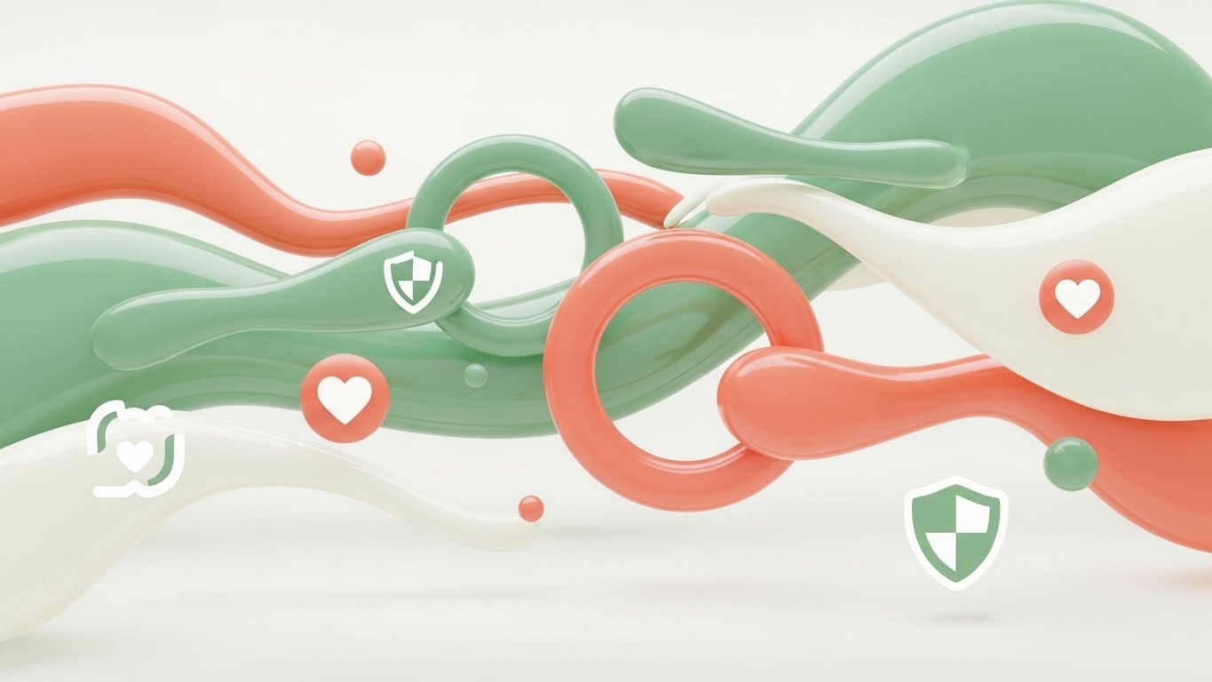
Harmonizing Tech and Resident Wellness
The Visual & Narrative Approach
This style utilizes a sophisticated, "soft-tech" aesthetic designed to disarm anxiety associated with complex software adoption. The visualization features fluid, organic shapes in a calming palette of sage green and warm coral, which continuously morph and flow into one another. These "care circles" gently overlap, representing the seamless handoff of data between nursing staff, pharmacy partners, and family members. Glossy, liquid-like textures reflect light, creating a sense of premium safety. Floating icons—such as the digital shield for compliance and the heart for resident wellness—drift through these organic streams, reinforcing the symbiotic relationship between security and care.
Psychological Impact & KPI Focus
- Niche Psychology: Senior care professionals are often overwhelmed by "alert fatigue" and sharp, aggressive interfaces. This style uses biophilic design principles (organic shapes, nature-inspired colors) to subconsciously signal safety, harmony, and ease of use. It combats the fear that software will be "rigid" or "cold" (Rule 36).
- Operational Impact: By abstracting the "Care Network" into fluid connections, it visualizes the concept of interoperability without getting bogged down in technical schematics. It is ideal for improving Brand Awareness (KPI 1.1) by associating the platform with a feeling of effortless capability.
Strategic Implementation & Trade-offs
- Best Use Case: Top-of-Funnel (TOFU) website hero backgrounds or loopable assets for trade show booths where you need to catch the eye without demanding high cognitive attention.
- Duration: 15-30 seconds (Loopable).
- Trade-off: While excellent for mood and branding, this style is suboptimal for explaining specific features (like how to sign an eMAR). It lacks the literal detail required for product demos.
Companies using similar video content -
Caremerge – Resident engagement and care coordination platform.
K4Connect – Smart living solutions for senior communities.
2. 2D Line Art Animation
TOFU | Market Education
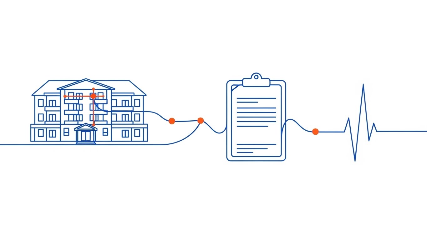
Streamlining Connectivity and Precision
The Visual & Narrative Approach
This visualization strips away all visual noise to focus on the purity of connection. A single, elegant electric blue line travels across a pristine white canvas, morphing dynamically to tell the story of the resident journey. It begins as the outline of a multi-story facility, transitions into a digital clipboard representing admission, and finally evolves into a stylized heartbeat pulse. Crucially, small, solid dots in vibrant orange appear at the intersection points of the line, representing "data capture nodes" where critical information is secured. The animation is rhythmic and precise, conveying a sense of clinical accuracy and reliability.
Psychological Impact & KPI Focus
- Niche Psychology: For Directors of Nursing concerned with "lost charts" or missed documentation, the unbroken line serves as a powerful visual metaphor for the Continuity of Care. It reassures the viewer that nothing falls through the cracks.
- Operational Impact: The orange data nodes visually reinforce the concept of Audit Trails—a critical compliance requirement in assisted living. It visually proves that every action is tracked and accountable. This style supports Market Education (KPI 1.3) by simplifying complex workflows into a singular, logical path.
Strategic Implementation & Trade-offs
- Best Use Case: YouTube explainer videos (Introductory level) and "About Us" pages where the goal is to articulate the platform's core philosophy.
- Duration: 45-60 seconds.
- Trade-off: The minimalism can feel "low budget" if the animation physics aren't top-tier. It risks being too generic if the specific "morphs" (facility to clipboard) aren't relevant to the niche.
Companies using similar video content -
PointClickCare – Comprehensive EHR for senior care management.
MatrixCare – EHR, RCM, and analytics for long-term care.
3. Generative AI cinematic video
TOFU | Shaping Brand Perception
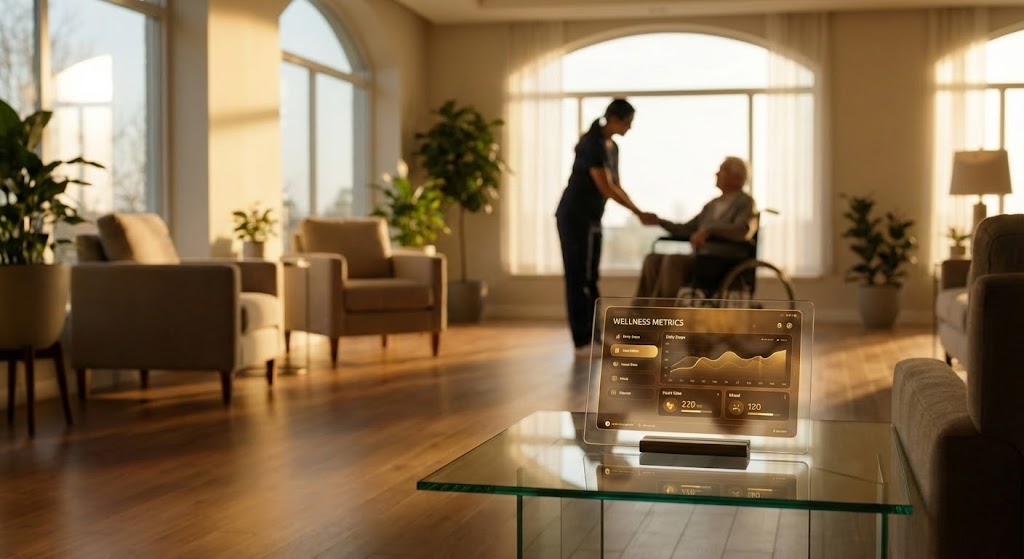
Merging Compassion with Digital Clarity
The Visual & Narrative Approach
This style leverages high-fidelity Generative AI to create a visionary, "North Star" representation of the assisted living environment. The scene is set in a sun-drenched, upscale lobby, bathed in warm, golden lighting that evokes the feeling of a high-end hospitality experience rather than a clinical facility. The focal point is a sleek, transparent glass device on a foreground table, displaying a glowing, amber-hued dashboard of resident wellness metrics. In the soft-focus background, a silhouette of a care professional interacting gently with an elderly resident reinforces the "high-tech, high-touch" narrative.
Psychological Impact & KPI Focus
- Niche Psychology: Facility owners and investors are driven by prestige and quality of life metrics. This visual style appeals to their aspiration to run a world-class, modern community. It positions the software as a premium asset that enhances the facility's reputation.
- Operational Impact: The transparent device symbolizes Organizational Transparency—the ability for management to see through the noise and understand the health of the business and residents instantly. It targets Shaping Brand Perception (KPI 1.5) by elevating the vendor from a "tool provider" to a "visionary partner."
Strategic Implementation & Trade-offs
- Best Use Case: Connected TV (CTV) spots, OTT advertising, and keynote presentations at industry conferences (e.g., Argentum, LeadingAge).
- Duration: 30-45 seconds.
- Trade-off: This is a "mood piece." It sets a high expectation. If the actual software UI is clunky or dated, this video creates a brand gap that can lead to disappointment during the demo phase.
Companies using similar video content -
Yardi Senior Living – Full suite for senior living management.
Sentrics – Resident engagement, safety, and well-being solutions.
4. Abstract 3D AI Visualization
TOFU | Product/Solution Differentiation

Visualizing Collective Cloud Intelligence
The Visual & Narrative Approach
This visualization moves beyond the physical facility to depict the "Collective Intelligence" of the platform. Using a macro, low-angle perspective, we see a complex, brain-like neural network floating in a deep void. The network is composed of glowing golden connections and Deep Purple data nodes, each shaped like a tiny medical cross. These nodes pulse and fire signals, representing the millions of daily interactions—medication passes, ADL (Activities of Daily Living) updates, and vitals checks—occurring within the cloud ecosystem. The connections form a cloud structure, symbolizing the platform's robust architecture.
Psychological Impact & KPI Focus
- Niche Psychology: CTOs and IT Directors at large multi-site chains worry about scalability and data integrity. This visual metaphor speaks their language, representing the software as a robust, living organism that grows and learns.
- Operational Impact: The "medical cross" nodes subtly remind the viewer that this is healthcare data, not just spreadsheets. It emphasizes the Cloud Architecture and Data Security aspects, critical for Product Differentiation (KPI 1.7) in a crowded market.
Strategic Implementation & Trade-offs
- Best Use Case: Website Hero sections (background video) or the opening sequence of a technical deep-dive webinar.
- Duration: 10-20 seconds.
- Trade-off: It is highly abstract. Without voiceover or context, a non-technical administrator might find it confusing or irrelevant to their daily struggle with staffing ratios.
Companies using similar video content -
Prime Care Technologies – Data and analytics for long-term care.
Foresight Health – AI-powered insights for senior care.
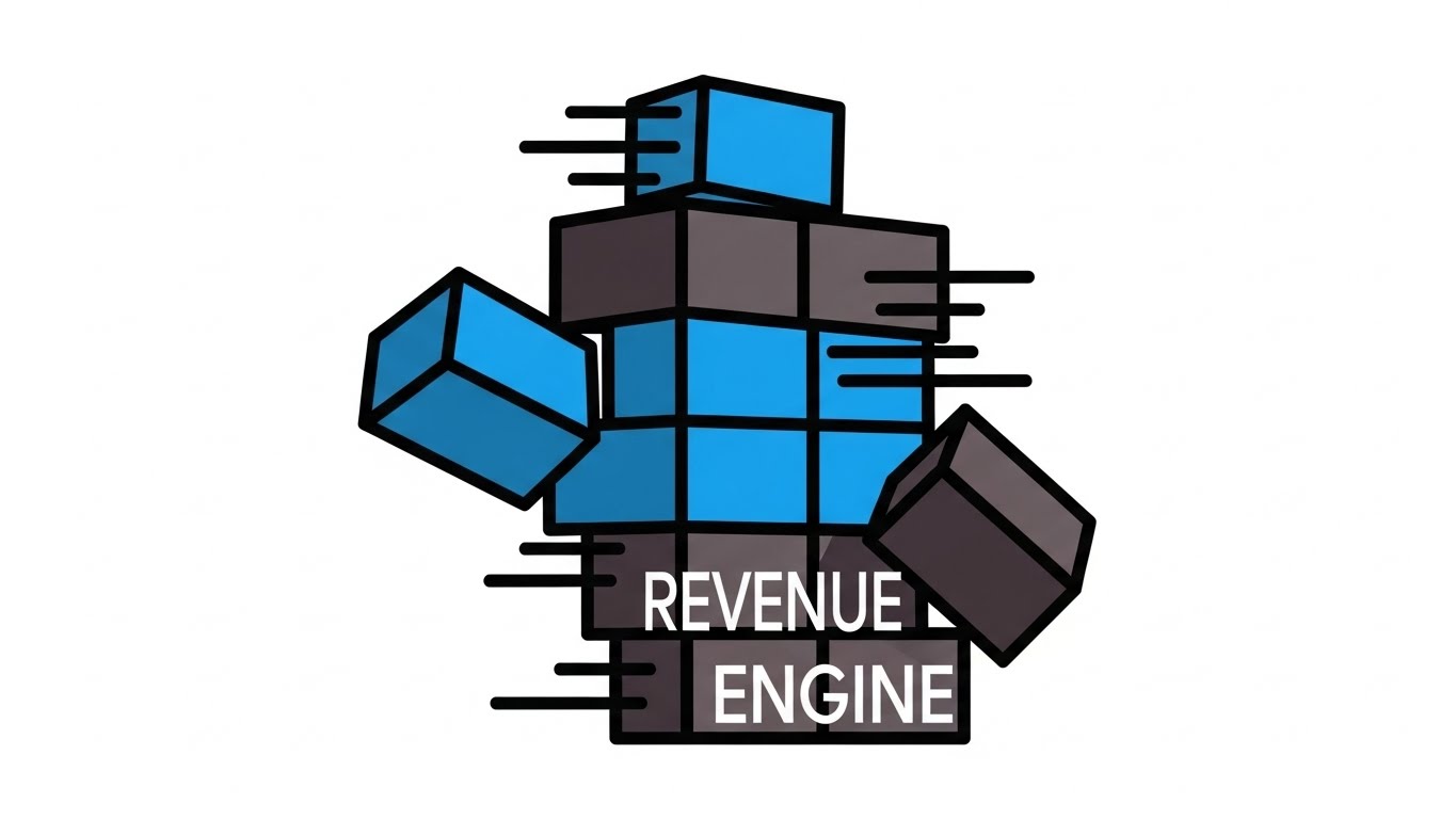
5. Bold Kinetic Typography (Visual)
TOFU | Vertical Social Organic
Energizing Compliance and Structural Growth
The Visual & Narrative Approach
Designed strictly for the "scroll-heavy" mobile environment, this style uses aggressive, high-contrast visuals to grab attention instantly. Massive, blocky text in vibrant tangerine and deep violet twists and locks together (resembling Tetris blocks) to form the literal shape of a building, representing a solid foundation. Fast-paced motion blur effects add energy. Surrounding the text blocks are flying plus signs and checkmarks, symbolizing health and compliance. The background is a solid, high-contrast electric yellow, ensuring the content pops off the screen even in bright sunlight.
Psychological Impact & KPI Focus
- Niche Psychology: In a feed full of sterile stock photos of elderly people, this bold, graphic style acts as a pattern interrupt. It appeals to the younger demographic of administrators and marketers who are looking for modern, agile solutions.
- Operational Impact: The locking blocks metaphorically represent Modular Architecture—the idea that the software is the stable base upon which the entire facility's operation rests. It drives Vertical Social Engagement (KPI 3.5) by being visually "sticky."
Strategic Implementation & Trade-offs
- Best Use Case: Instagram Reels, TikTok (B2B niche), and YouTube Shorts.
- Duration: 9-15 seconds.
- Trade-off: It lacks nuance. You cannot explain complex clinical workflows here. It is purely for awareness and brand recall ("The orange and purple company").
Companies using similar video content -
OnShift – Workforce management for healthcare.
SmartLinx – Workforce management for long-term care.
6. AI generated mixed media video
TOFU | ABM Awareness
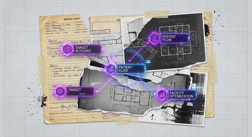
Moving from Analog Clutter to Precision
The Visual & Narrative Approach
This style visually dramatizes the transition from the "old way" to the "new way." It uses a collage aesthetic, blending torn paper textures of traditional medical charts with sleek, animated 3D interface elements. The visuals layer black-and-white photos of architectural facility plans with vibrant, neon-purple digital overlays of "Target Account" data nodes. The aesthetic is gritty yet futuristic, using stop-motion effects to transition between the "old way" of paper documentation and the "new way" of digital precision. The background features a textured, graph-paper grid.
Psychological Impact & KPI Focus
- Niche Psychology: Many facilities are still clinging to paper because it feels "tangible." This style acknowledges that history (the paper textures) while showing the inevitable evolution to digital. It validates the user's past while pointing to the future.
- Operational Impact: It specifically targets ABM Awareness (KPI 2.2) by visualizing the Facility Optimization process. It shows that digital tools don't just replace paper; they layer intelligence on top of the physical infrastructure.
Strategic Implementation & Trade-offs
- Best Use Case: Programmatic Display Ads and personalized ABM (Account-Based Marketing) campaigns targeting specific facility chains.
- Duration: 15-30 seconds.
- Trade-off: The "gritty" aesthetic might be perceived as "messy" by ultra-conservative brands that prefer clean, sterile medical imagery.
Companies using similar video content -
American HealthTech – EHR for long-term care.
ECP – eMAR and clinical software for senior living.
7. Split Screen: Optimized Reality and UI
MOFU | Competitive Displacement
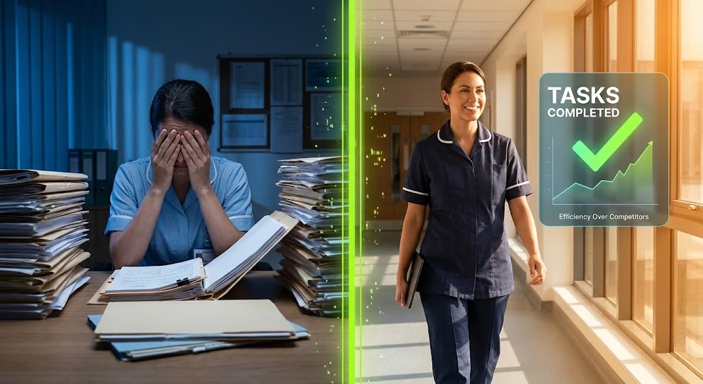
Contrasting Chaos with Optimized Efficiency
The Visual & Narrative Approach
A powerful comparative framework that divides the screen with a glowing, vertical lime green line. On the left (The Problem), we see a high-quality photo of a stressed nurse buried under piles of paper files in a dimly lit office (cool blue tones). On the right (The Solution), the same nurse is walking confidently down a sunlit, warm-toned corridor, holding only a slim tablet. Crucially, the right side features a floating, abstract UI overlay showing "Tasks Completed" with a green checkmark, visually demonstrating the efficiency gain over competitors.
Psychological Impact & KPI Focus
- Niche Psychology: This speaks directly to Burnout and Staff Retention. It shows the nurse that the software is there to liberate them, not burden them. It promises a better work-life balance.
- Operational Impact: It serves the goal of Competitive Displacement (KPI 1.13) by visually highlighting the Opportunity Cost of staying with legacy systems (or paper). The "Tasks Completed" graphic proves operational velocity.
Strategic Implementation & Trade-offs
- Best Use Case: LinkedIn Video Ads and mid-funnel retargeting campaigns.
- Duration: 30-45 seconds.
- Trade-off: It can feel manipulative if the "stressed" side is too exaggerated. The acting must be subtle and realistic to maintain credibility with actual care staff.
Companies using similar video content -
WellSky – Home health, hospice, and post-acute care solutions.
Casamba – Therapy and home care software.
8. Clean UI Workflow (Light Mode)
MOFU | Feature Education & Demonstration
Simplifying Clinical Documentation for Nurses
The Visual & Narrative Approach
This is the "hero" product shot. It features a floating, high-fidelity UI screen with rounded corners, displaying an Electronic Medication Administration Record (eMAR). The UI uses a palette of clinical white, soft sky blue, and alert red for critical notifications. Data elements are abstracted into clean bars and toggle switches. The background is a soft, blurred view of a residential living room, providing context. The lighting is bright and even, simulating a high-end software product demo, emphasizing clarity and ease of navigation.
Psychological Impact & KPI Focus
- Niche Psychology: The #1 objection from nurses is "Is it hard to learn?" This visual style screams Intuitive Design. It lowers the Cognitive Load by showing a decluttered, spacious interface that looks as easy to use as a consumer app.
- Operational Impact: It supports Feature Education (KPI 1.8) by focusing on Task Completion Rates. It visually demonstrates that complex clinical workflows have been distilled into simple, linear steps.
Strategic Implementation & Trade-offs
- Best Use Case: Product pages, feature release updates, and sales decks.
- Duration: 45-90 seconds.
- Trade-off: It is not emotional. It is purely functional. It relies on the UI actually being good—if your software is ugly/cluttered, this style will expose that weakness.
Companies using similar video content -
PointClickCare – QuickMAR – eMAR solution for medication administration.
Medtelligent – ALIS – Assisted Living Software for operations.
9. Lifestyle Stock with UI Overlay
MOFU | Building Trust & Credibility

Humanizing Data-Driven Satisfaction Metrics
The Visual & Narrative Approach
This style merges the human element with digital proof. It features a high-quality lifestyle stock shot of a diverse, smiling care team standing in a hallway. The focus is sharp on a female nurse in the center holding a tablet. Overlaid on the tablet and floating slightly in the air is a semi-transparent, futuristic UI graph showing "Resident Satisfaction" trending upward in bright turquoise. The lighting is natural and diffuse, combining human warmth with technological proof.
Psychological Impact & KPI Focus
- Niche Psychology: Trust is the currency of senior care. This visual combines Social Proof (smiling, competent staff) with Data Proof (the upward graph). It assures decision-makers that happy staff and good data go hand-in-hand.
- Operational Impact: It targets Building Trust & Credibility (KPI 1.9) by visualizing the Outcome of the software (satisfaction), not just the input. It bridges the gap between "using software" and "getting results."
Strategic Implementation & Trade-offs
- Best Use Case: Meta (Facebook/Instagram) Ads and general social media content where human faces stop the scroll.
- Duration: 15-30 seconds.
- Trade-off: Stock footage can look generic ("cheesy smiling doctors"). It is crucial to use high-end, authentic-looking cast members who look like actual caregivers, not models.
Companies using similar video content -
Caremerge – Resident engagement and family communication.
LifeLoop – Resident engagement and family communication platform.
10. 2D Character-Driven Story
MOFU | Overcoming Objections
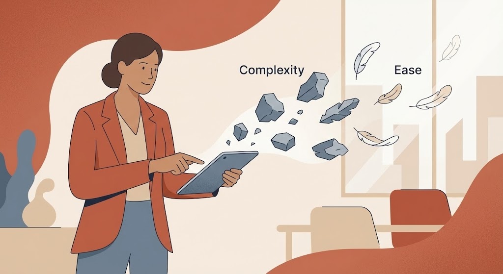
Transforming Administrative Burdens into Lightness
The Visual & Narrative Approach
This style uses narrative illustration to address abstract pain points. A stylized, non-cartoony female administrator character stands in a modern office. The art style uses flat colors with subtle grain textures in earthy tones like terracotta, beige, and slate blue. She is depicted effortlessly swiping away floating gray rocks (representing "Complexity") which transform into light, floating feathers (representing "Ease"). The character stands in a simplified, modern office setting, visually addressing the objection of complexity.
Psychological Impact & KPI Focus
- Niche Psychology: This directly addresses the Emotional Burden of administration. The metaphor of "rocks to feathers" validates the feeling of heaviness users currently feel and offers a visual promise of relief. It is empathetic storytelling.
- Operational Impact: It is designed for Overcoming Objections (KPI 1.11) related to implementation drag. It simplifies the Change Management story into a single, understandable moment of transformation.
Strategic Implementation & Trade-offs
- Best Use Case: YouTube Organic Search (educational content) and email nurture sequences for hesitant leads.
- Duration: 60-90 seconds.
- Trade-off: Character animation is resource-intensive to produce well. If the character moves awkwardly, it lowers the perceived quality of the brand.
Companies using similar video content -
Relias – Compliance training and risk management for healthcare.
StoriiCare – Digital care planning and activities management.
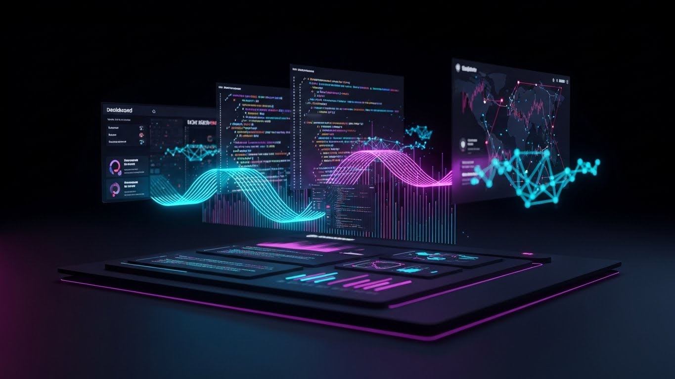
11. Rapid UI Feature Montage
MOFU | Driving Demo Requests
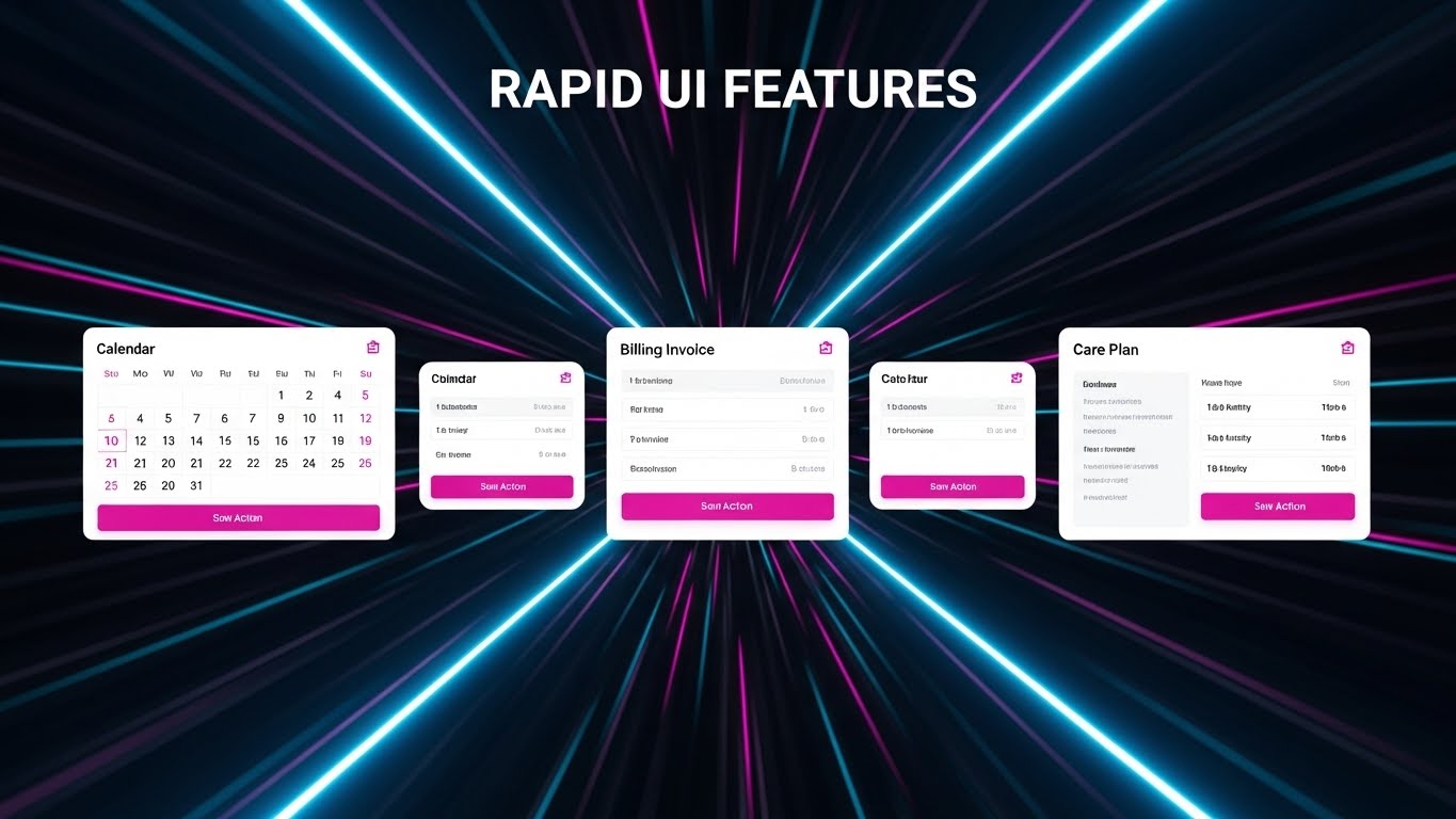
Accelerating Clinical Workflows
The Visual & Narrative Approach
This style is designed to inject immediate energy into the evaluation phase. It utilizes a high-velocity "speed tunnel" effect—radial blur lines in electric blue—to center the viewer's focus on a rapid succession of simplified UI screens. We see a Clinical Calendar, a Billing Invoice, and a Care Plan snap into the frame, pause for a micro-second, and then zoom past. Key action buttons, such as "Approve Care Plan" or "Submit Claim," are highlighted in vivid magenta to guide the eye. The pacing is fast and rhythmic, synchronized with an upbeat tempo to simulate high-speed user proficiency.
Psychological Impact & KPI Focus
- Niche Psychology: One of the primary frustrations for nursing staff is "click fatigue"—the fear that software will slow them down. This visual metaphor subconsciously communicates speed, responsiveness, and momentum. It promises that the platform keeps up with the frantic pace of a shift.
- Operational Impact: By showcasing multiple modules (Clinical, Financial, Operational) in quick succession, it implies a Unified Platform. This targets Driving Demo Requests (KPI 2.1) by creating curiosity about the breadth of the solution without bogging the viewer down in details.
Strategic Implementation & Trade-offs
- Best Use Case: Skippable YouTube Pre-Roll ads (where you have 5 seconds to hook the viewer) and retargeting ads for users who visited the "Features" page.
- Duration: 15-20 seconds.
- Trade-off: The pace is too fast for actual learning. Do not use this to teach how to use a feature; use it only to demonstrate that the feature exists and is fast.
Transitioning from clinical speed to financial health, the next style focuses on visualizing the bottom-line impact for the facility owners.
Companies using similar video content -
Eldermark – Integrated senior living software suite.
HCS – Financial, clinical, and payroll for long-term care.
12. Dynamic Data Visualization
MOFU | ROI Justification Hook
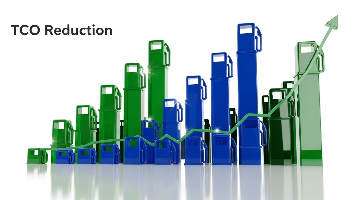
Visualizing Financial Health
The Visual & Narrative Approach
This visualization speaks the language of the CFO. It features abstract, 3D extruded bar charts rising powerfully from a digital floor, rendered in glossy obsidian and vibrant emerald green. A glowing gold line graph—symbolizing "Revenue Recovery"—weaves through the bars, trending sharply upward. The visualization transforms abstract concepts like "Lost Billing Capture" or "Acuity-Based Revenue" into tangible, rising structures. The low-angle "hero" shot makes the data feel monumental and solid, reinforcing financial stability.
Psychological Impact & KPI Focus
- Niche Psychology: Margins in assisted living are razor-thin. Administrators and Investors are risk-averse. This style validates their need for Financial Security and Growth. It visualizes the "hidden money" the software helps recover through better documentation.
- Operational Impact: It directly addresses ROI Justification (KPI 8.1). By visualizing data as a physical, growing structure, it moves the conversation from "software as a cost" to "software as an asset builder."
Strategic Implementation & Trade-offs
- Best Use Case: LinkedIn organic posts targeting CFOs/Owners and "Why Us" pages in the ROI section.
- Duration: 20-30 seconds.
- Trade-off: It is heavily abstract. To be effective, it must be paired with a voiceover or strong on-screen text that contextualizes the graph (e.g., "Recover $500 per resident per month").
While data appeals to the rational mind, the fear of change is emotional. The next style directly addresses the "old vs. new" conflict.
Companies using similar video content -
HealthRev Partners – Revenue cycle management for post-acute care.
PointRight – Predictive analytics for post-acute care.
13. 2D Animation & UI Composition
MOFU | Demand Gen & Lead Capture

Contrasting Legacy Clutter with Modern Ease
The Visual & Narrative Approach
This style uses a "Compare and Contrast" narrative to visually displace legacy competitors. On the left, a stylized "Old Tech" robot—clunky, gray, and tangled in wires—looks confused and overwhelmed. On the right, a "New Tech" character—sleek, fluid, and glowing in teal—effortlessly organizes floating UI data blocks which snap into place with magnetic precision. The background uses a split gradient to reinforce the transition from the dull, gray past to the vibrant, sunshine-yellow future.
Psychological Impact & KPI Focus
- Niche Psychology: Many facilities are terrified of the "switch cost" (the pain of changing software). This visual metaphor acknowledges the clumsiness of their current situation (validating their pain) while presenting the new solution not just as "better," but as fundamentally easier.
- Operational Impact: It targets Demand Gen & Lead Capture (KPI 1.6) by triggering the desire for an upgrade. It visually simplifies the concept of Data Migration—showing it as a clean, magnetic snapping into place rather than a messy manual process.
Strategic Implementation & Trade-offs
- Best Use Case: Meta (Facebook/Instagram) ads and display banners where you need to stop the scroll with a clear "Before/After" story.
- Duration: 15-30 seconds.
- Trade-off: The illustrative style can be perceived as "playful." Ensure the copy remains professional to avoid trivializing the serious nature of resident care data.
Moving from the workflow level to the macro-facility level, we visualize the holistic impact of the software on the real estate asset itself.
Companies using similar video content -
Cantata Health Solutions – Acute and post-acute EHR.
American Data – Long-term care software solutions.
14. Low-Poly 3D Modeling
BOFU | ROI Justification

Holistic View of Facility Expansion
The Visual & Narrative Approach
This visualization zooms out to show the "Big Picture" of facility management. Using a clean, Low-Poly 3D aesthetic, we see an isometric view of a senior living community complex. The palette is soft and inviting, with pastel yellows for sunlight. As the video progresses, we see the facility "level up"—new wings appear, and 3D gold coins accompanied by upward-trending green arrows float above the buildings. This effectively gamifies the concept of facility expansion and occupancy growth.
Psychological Impact & KPI Focus
- Niche Psychology: For owners of multi-site chains, the focus is on Scalability. This style strips away the granular detail of daily nursing to show the Asset Value increasing. It appeals to the investor mindset.
- Operational Impact: It supports ROI Justification (KPI 1.10) by linking software adoption to Occupancy Rates and Revenue Per Unit. It visually demonstrates that the software supports the physical growth of the real estate asset.
Strategic Implementation & Trade-offs
- Best Use Case: Slide decks for investor presentations and "Solutions for Owners" website sections.
- Duration: 30-45 seconds.
- Trade-off: It lacks human connection. It treats the facility as a business unit rather than a home. It is best used for financial decision-makers, not clinical staff.
With growth comes risk. The next style visualizes the invisible safety net the software provides against regulatory threats.
Companies using similar video content -
RealPage Senior Living – Property management for senior living.
AlayaCare – Home care, residential, and aged care software.
15. 3D X-Ray Visualization
BOFU | Risk Mitigation
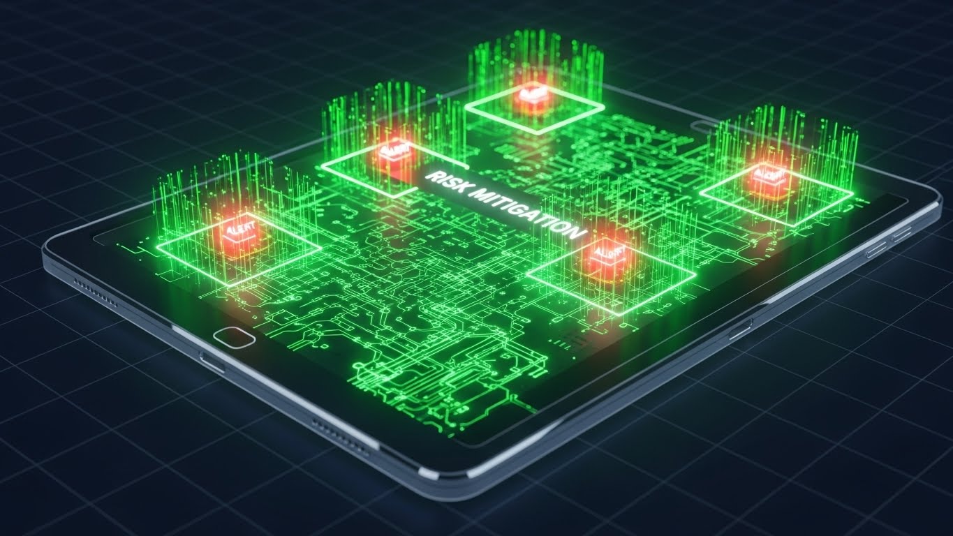
Revealing the Architecture of Safety
The Visual & Narrative Approach
This style is designed to visualize the invisible layer of protection the software provides. We see a high-tech tablet device with a transparent outer casing. Inside, a glowing, organized network of green connections represents the robust backend architecture. Suddenly, bright red "Alert" nodes (symbolizing medication errors or missed assessments) attempt to flare up but are instantly neutralized and contained by a green "Risk Mitigation" field. The aesthetic is technical, precise, and secure.
Psychological Impact & KPI Focus
- Niche Psychology: The greatest fear for a Director of Nursing is a regulatory audit or a lawsuit due to negligence. This visual provides peace of mind. It shows that the software is proactively watching and blocking errors before they become liabilities.
- Operational Impact: It targets Risk Mitigation (KPI 1.12) by visualizing HIPAA Compliance and Error Reduction. It makes the abstract concept of "audit trails" look like an active defense system.
Strategic Implementation & Trade-offs
- Best Use Case: Programmatic Display ads on industry news sites (e.g., McKnight's Senior Living) and technical webinars.
- Duration: 15-20 seconds.
- Trade-off: It is very "tech-heavy." It appeals to the logical brain, not the emotional heart. It works best when the viewer is already evaluating the technical merits of the solution.
To further cement trust with the C-Suite, we must elevate the concept of data security to an enterprise level.
Companies using similar video content -
SafelyYou – AI-powered fall detection and prevention.
Stanley Healthcare – RTLS, fall management, and security.
16. Photorealistic 3D Renders
BOFU | The Economic Buyer
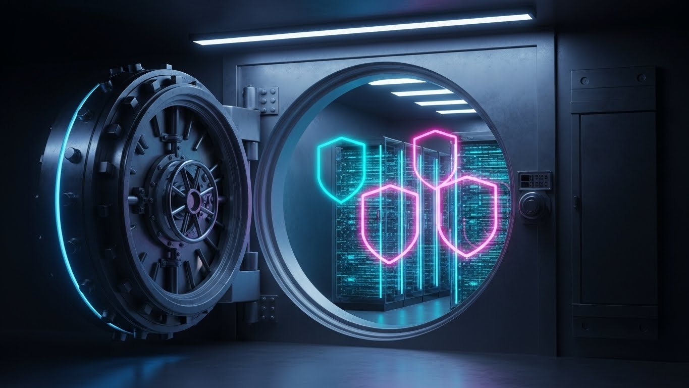
Securing the Organization's Digital Assets
The Visual & Narrative Approach
To close the deal with the C-Suite, we must position data as a precious asset. This style features a cinematic, photorealistic 3D render of a heavy, brushed steel bank vault door swinging open. Inside, however, we don't see cash; we see glowing, organized stacks of translucent server racks and floating holographic shields. The lighting is dramatic—cool blues and deep shadows—conveying the feeling of impenetrable security, similar to a high-end cybersecurity commercial.
Psychological Impact & KPI Focus
- Niche Psychology: For the CEO and CFO, data breaches are an existential threat. This visual speaks the language of Institutional Trust. It elevates the software from a "charting tool" to an "enterprise security vault."
- Operational Impact: It is tailored for The Economic Buyer (KPI 7.1). It visually answers the question: "Is our data safe?" without needing a single line of code. It symbolizes Cybersecurity and Business Continuity.
Strategic Implementation & Trade-offs
- Best Use Case: The "Security" or "Trust Center" page of the website and BOFU email sequences to executive stakeholders.
- Duration: 10-15 seconds (Loopable).
- Trade-off: High production cost. It creates a very serious tone, so it should be used sparingly—specifically when addressing security, not when discussing resident engagement.
While the C-Suite looks at security, the IT Director looks at integration. This next style proves the software can speak to the rest of the tech stack.
Companies using similar video content -
Netsmart – Post-acute EHR solutions.
WellSky – Comprehensive post-acute care software.
17. Dark Mode UI Showcase
BOFU | The Technical Buyer
Highlighting Interoperability and Modern Tech Stack
The Visual & Narrative Approach
This style caters specifically to the IT Directors who influence the buying decision. It showcases the software's dashboard in a sleek "Dark Mode," using a Cyberpunk-inspired palette of neon cyan, laser pink, and deep violet. Unlike the simplified nurse views, this visual shows complex API integration maps and code snippets transforming into elegant data streams that flow into the central hub. It looks sophisticated, modern, and powerful.
Psychological Impact & KPI Focus
- Niche Psychology: IT professionals often fear that healthcare software is "legacy junk" wrapped in a new logo. This aesthetic proves the platform is Modern, API-First, and Developer-Friendly. It signals that the software will play nicely with their existing tech stack.
- Operational Impact: It targets The Technical Buyer (KPI 7.3) by visualizing Interoperability and Real-Time Data Processing. It confirms the platform's robustness.
Strategic Implementation & Trade-offs
- Best Use Case: LinkedIn Video Ads targeting job titles like "CTO," "IT Director," or "CIO" in the senior care space.
- Duration: 20-30 seconds.
- Trade-off: This is likely too complex/dark for the clinical user (Nurse/DON) who prefers the clean, white, "medical" aesthetic. Keep this targeted strictly to IT personas.
As the deal nears the finish line, we need to visualize the partnership itself, merging the digital and human worlds.
Companies using similar video content -
K4Connect – Smart living solutions for seniors.
Philips – Care Orchestrator – Connected care solutions.
18. 2D Graphics Over Live Action
BOFU | Sales Cycle Acceleration

Visualizing the Partnership Momentum
The Visual & Narrative Approach
As the prospect moves toward the final decision, this style helps visualize the "handshake." It utilizes a high-quality live-action photo of two professionals (representing the Facility Admin and the Software Partner) shaking hands. Floating between them, anchored in the 3D space of the photo, are crisp 2D vector graphics: a document icon stamping "Contract Signed" and a rocket ship launching. The graphics are bright orange and white, popping against the blurred office background.
Psychological Impact & KPI Focus
- Niche Psychology: Decision paralysis often happens right at the end. This visual uses Success Imagery to subconsciously signal that signing is the beginning of success (the rocket), not just a legal obligation. It frames the transaction as a partnership launch.
- Operational Impact: It drives Sales Cycle Acceleration (KPI 1.14). It visualizes the Onboarding Kick-off, reassuring the buyer that the vendor is ready to launch immediately upon signature.
Strategic Implementation & Trade-offs
- Best Use Case: Bottom-of-Funnel (BOFU) email campaigns (e.g., "Ready to get started?") and retargeting ads for users who abandoned the pricing page.
- Duration: 10-15 seconds.
- Trade-off: It can feel generic if the "handshake" photo looks too staged. Authenticity in the base image is key.
For those who stall at the last moment, a gentle, abstract nudge is often more effective than a hard sell.
Companies using similar video content -
Accushield – Visitor management system for senior living.
Cubigo – Resident experience platform for senior living.
19. Abstract 2D Motion Graphics
BOFU | Cart/Signup Abandonment
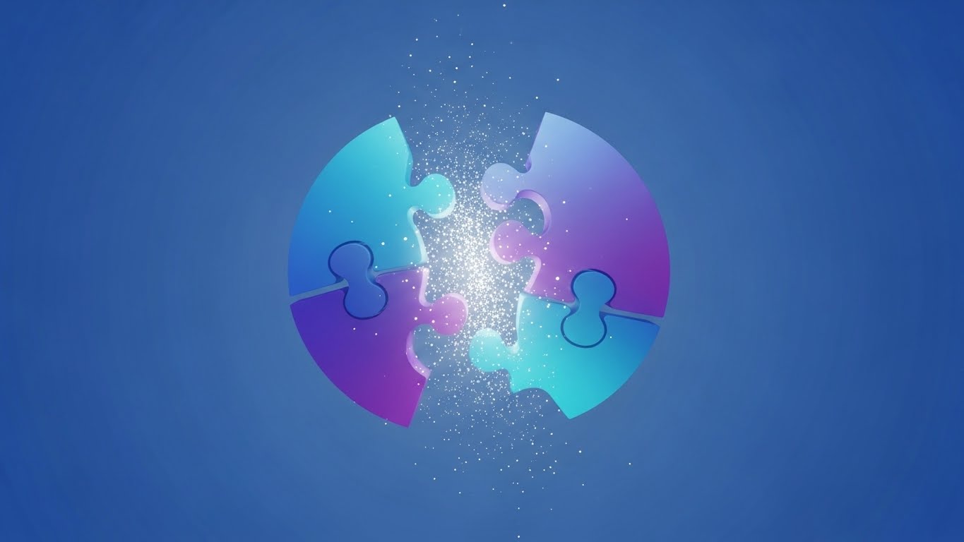
Encouraging Final Action and Resolution
The Visual & Narrative Approach
Designed for re-engagement, this abstract style taps into the human desire for completion. We see a fractured circle—representing an incomplete process or a "missing piece" of the facility's operations—rendered in gradient blues and purples. Smoothly, the separated shards drift together and snap into a perfect, glowing whole. Upon connection, the circle emits a satisfying burst of white light and particle confetti, symbolizing the resolution of the user's problem.
Psychological Impact & KPI Focus
- Niche Psychology: This leverages the Zeigarnik Effect—the psychological tension caused by unfinished tasks. It subtly urges the prospect to "close the loop" and finish their signup or request. It frames the software as the Missing Piece.
- Operational Impact: It targets Cart/Signup Abandonment (KPI 5.4). It doesn't need to show UI; it needs to evoke the feeling of satisfaction and wholeness that comes from solving a problem.
Strategic Implementation & Trade-offs
- Best Use Case: Social Media Retargeting (Meta/Instagram) for users who dropped off during a form fill.
- Duration: 6-10 seconds (Loopable).
- Trade-off: Totally abstract. It relies 100% on the accompanying ad copy to make sense. Without the text "Complete your setup," it is just a moving shape.
Finally, to remove the last barrier of skepticism, we must prove that the digital plan will translate into a functional reality.
Companies using similar video content -
CareSmartz360 – Home care software for agency management.
ShiftCare – Home care and disability support software.
20. Wireframe to Reality Transition
BOFU | Objection Handling & Friction Reduction
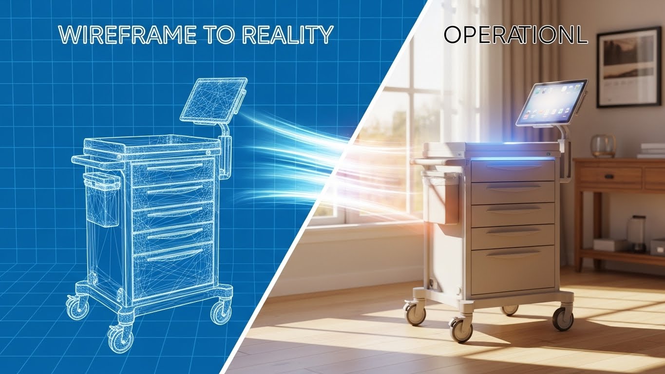
Making the Implementation Tangible
The Visual & Narrative Approach
This powerful visual addresses the fear of implementation failure. The screen is split diagonally. The left side shows a technical "blueprint" wireframe of a medication cart, rendered in white lines on a blue grid. A sweeping light beam moves across the screen, transforming the wireframe into a fully rendered, photorealistic image of the smart cart in a warm, sunlit resident room. This effectively visualizes the journey from "Plan" to "Reality."
Psychological Impact & KPI Focus
- Niche Psychology: Buyers often worry, "It looks good on paper, but will it work in my building?" This style validates the planning phase (the wireframe) but quickly resolves it into a beautiful, functioning reality. It bridges the gap between Theory and Practice.
- Operational Impact: It focuses on Objection Handling (KPI 5.2) regarding implementation friction. It visually accelerates the timeline, implying that turning the plan into reality is a smooth, illuminated process.
Strategic Implementation & Trade-offs
- Best Use Case: The "Implementation" or "Onboarding" page of the website and sales decks addressing deployment timelines.
- Duration: 15-20 seconds.
- Trade-off: Requires high-quality assets for both the wireframe and the final render. If the transition is jerky, it implies a "glitchy" implementation process.
Companies using similar video content -
Medtelligent – ALIS – Assisted Living Software implementation.
CareVoyant – Integrated software for post-acute care.
21. Macro UI Micro-Interactions
Onboarding | Accelerating Time-to-Value

Igniting Confidence in Digital Adoption
The Visual & Narrative Approach
This style zooms in—literally—on the moment of action. We see an extreme close-up (macro) of a digital "Start Shift" button on a UI screen. The button is pill-shaped, colored in a vivid gradient from lime green to teal. As an invisible cursor interacts with it, the button creates soft, fluid ripples of light, providing immediate visual feedback. The surrounding pixels are visible but artistically softened, blurring out the complex menu structures to focus entirely on this single, achievable task. It isolates the "First Win" for the user.
Psychological Impact & KPI Focus
- Niche Psychology: New software often intimidates non-technical care staff. By focusing on a micro-interaction, this visual removes the clutter and focuses on the tactile satisfaction of the interface. It triggers a dopamine response associated with "getting it right."
- Operational Impact: It targets Accelerating Time-to-Value (TTV) (KPI 1.15). By visually rewarding the user for basic interactions, it encourages exploration and reduces the fear of "breaking the system."
Strategic Implementation & Trade-offs
- Best Use Case: Welcome emails ("Log in to your new dashboard") and in-app tooltips guiding the first login.
- Duration: 3-5 seconds (Loopable).
- Trade-off: It is hyper-specific. It doesn't show the full workflow, only the feeling of the workflow. It is a mood setter, not a tutorial.
Companies using similar video content -
ECP – eMAR and clinical software for medication administration.
StoriiCare – Digital care planning and activity logging.
22. Isometric 3D Workflow
Onboarding | Self-Serve Onboarding
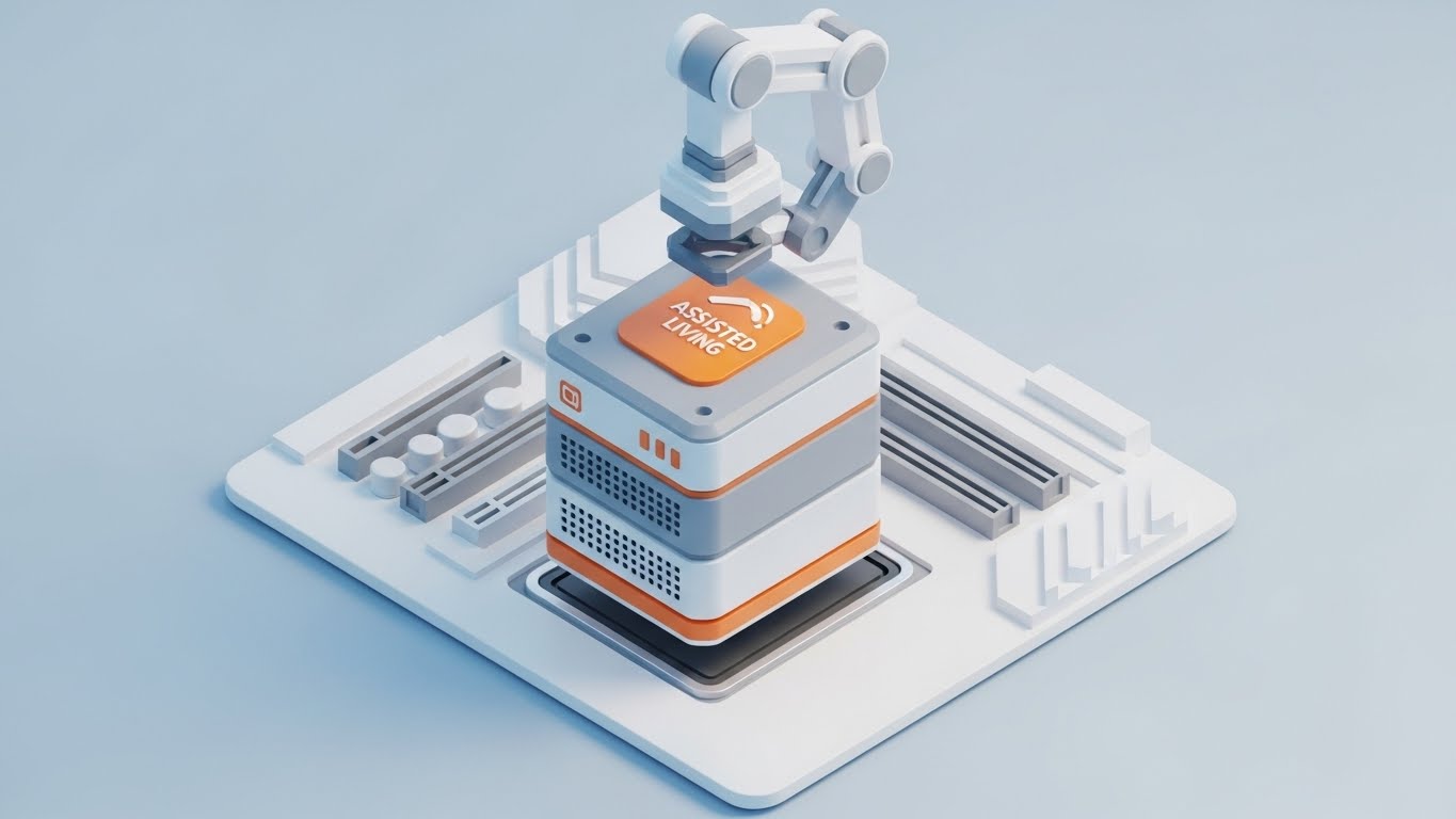
Visualizing Frictionless Integration
The Visual & Narrative Approach
This style gamifies the implementation process. We see a clean, isometric 3D view of a "plug-and-play" installation. A stylized server block, branded with the "Assisted Living" icon in safety orange, is being lowered by a precise robotic arm into a perfectly matching slot on a white motherboard. The lighting is soft and shadowless (ambient occlusion), giving it a pristine, surgical feel. The animation is smooth and mechanical, conveying that the software fits perfectly into the facility's existing infrastructure without force or friction.
Psychological Impact & KPI Focus
- Niche Psychology: IT Directors and Administrators fear "integration hell." This visual uses the metaphor of modular assembly to promise compatibility. It suggests that the software is a "component" that completes the system, not a foreign body that disrupts it.
- Operational Impact: It supports Self-Serve Onboarding (KPI 2.4). It visualizes the concept of API Interoperability without using lines of code, reassuring the buyer that the technical setup is standardized and reliable.
Strategic Implementation & Trade-offs
- Best Use Case: Knowledge Base articles on "Integrations" and technical documentation headers.
- Duration: 10-15 seconds.
- Trade-off: It can feel impersonal. It depicts hardware/software, not people. It should be used to explain technical concepts, not resident care.
Companies using similar video content -
Prime Care Technologies – Integration solutions for long-term care.
HCS – Modular system for long-term care.
23. Minimalist Flat 2D Vector
Onboarding | Reducing Implementation Friction
Visualizing the Shift from Chaos to Order
The Visual & Narrative Approach
This style uses minimalism to preach the gospel of organization. A top-down, flat vector illustration shows a simplified care desk. We see abstract geometric representations of a tablet, a coffee cup, and a stack of paper files. As the animation plays, the gray paper files fade out and vanish, while the bright teal tablet glows and pulses. The palette is restricted to mint green, charcoal gray, and crisp white. Clean transitions and hard edges define the objects, focusing entirely on the concept of decluttering the workspace.
Psychological Impact & KPI Focus
- Niche Psychology: The "messy nurses' station" is a universal pain point. This visual validates the desire for a clean, organized workspace. It positions the software not as "more work," but as the remover of clutter.
- Operational Impact: It targets Reducing Implementation Friction (KPI 1.16). By visually subtracting elements (the papers), it implies that the software simplifies the job description, leading to higher staff buy-in.
Strategic Implementation & Trade-offs
- Best Use Case: "Getting Started" guides and printed Quick Reference Cards (QRCs) placed at nursing stations.
- Duration: Static or 5-second loop.
- Trade-off: The style is very simple. It may not appeal to enterprise buyers looking for "powerful" features, but it resonates deeply with the end-users (staff) who crave simplicity.
Companies using similar video content -
AccuCare – EHR for assisted living facilities.
CareControl – Care management software for senior living.
24. Generative AI Realistic Character Video
Retention | Reducing Support Overhead

Humanizing the Help Desk Experience
The Visual & Narrative Approach
When users are stuck, they want a human, not a bot. This style uses a high-fidelity, Generative AI portrait of a friendly customer support agent. She has warm skin tones, a genuine smile, and wears a smart blazer. The background is a soft-focus, modern tech support center with bokeh lights in brand colors (teal/white). She looks directly into the lens, nodding slightly, conveying infinite patience and accessibility. This visual anchors the "Help" section, making the support team feel tangible and present.
Psychological Impact & KPI Focus
- Niche Psychology: Frustration with software often leads to churn. This visual leverages the Face-ism Effect—we trust human faces more than text. It reassures the user that "We are here for you," reducing the anxiety of being stranded with a technical problem.
- Operational Impact: It targets Reducing Support Overhead (KPI 1.18). By embedding this welcoming face into FAQ videos, you lower the emotional temperature of frustrated users, potentially reducing the aggression in support tickets.
Strategic Implementation & Trade-offs
- Best Use Case: The landing page of the "Knowledge Base" or the intro to video tutorials.
- Duration: 15-30 seconds (Intro).
- Trade-off: Authenticity is key. If the AI generation has artifacts (glitchy eyes/mouth), it becomes creepy ("Uncanny Valley") and destroys trust. Quality control is paramount.
Companies using similar video content -
Relias – Support for compliance training.
MedTrainer – Compliance and learning management system.
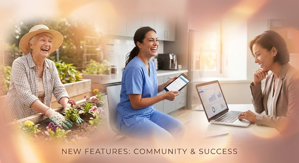
25. Aspirational Stock Montage
Retention | Proactive Support/Announcements
Celebrating Holistic Community Success
The Visual & Narrative Approach
This style moves the focus from the software back to the people it serves. It blends three distinct scenes: an elderly resident gardening (joy), a nurse laughing with a tablet (ease), and an administrator looking at a laptop with satisfaction (success). The images are seamlessly blended with soft, feathered edges and overlaid with subtle "light leaks" in warm amber and rose gold. It creates a cohesive emotional narrative that links the software's function to the community's happiness.
Psychological Impact & KPI Focus
- Niche Psychology: Senior care is a mission-driven industry. This visual reminds the user why they use the software: to improve lives. It connects the mundane task of data entry to the higher purpose of resident wellness.
- Operational Impact: It supports Proactive Support & Announcements (KPI 9.2). It is perfect for "Good News" emails—feature updates, success stories, or quarterly reviews—reinforcing the value of the subscription.
Strategic Implementation & Trade-offs
- Best Use Case: Email marketing headers, newsletters, and holiday greetings to clients.
- Duration: Static or slow-motion video (10-15 seconds).
- Trade-off: It can feel generic if the stock photos are too "perfect." The lighting and diversity must feel grounded and realistic to the specific region of the client.
Companies using similar video content -
It's Never 2 Late (iN2L) – Engagement technology for seniors.
Sagely – Resident engagement for senior living.
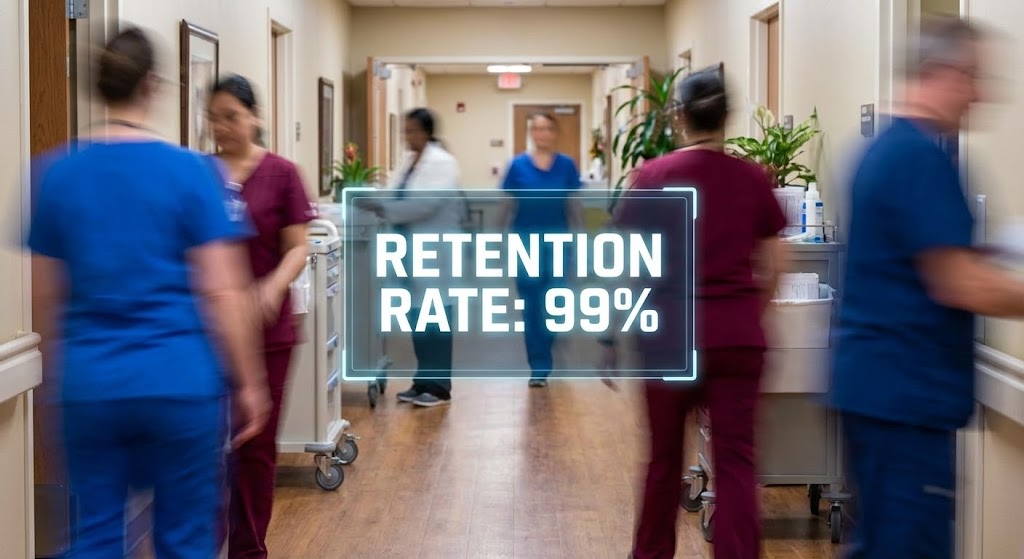
26. Hyper-lapse Stock Footage with Data
Retention | Reducing Churn
Visualizing Constancy Amidst the Rush
The Visual & Narrative Approach
This style visually contrasts the chaotic reality of a care facility with the stability of the software. We see a hyper-lapse (fast-motion) video of a busy assisted living hallway. Staff members are streaks of color (scrub blue, maroon) moving efficiently. Stabilized in the center of this motion blur is a crisp, static, floating holographic data box showing "Retention Rate: 99%" (or a similar stable metric) in bright white text. The data box remains perfectly still while the world rushes around it.
Psychological Impact & KPI Focus
- Niche Psychology: Directors of Nursing feel like they are constantly "putting out fires." This visual positions the software as the Eye of the Storm—the one reliable, stable point of truth in a chaotic day. It offers a psychological anchor.
- Operational Impact: It targets Reducing Churn (KPI 1.19). It visually demonstrates that while the facility is busy, the data is under control. It reinforces the reliability of the platform.
Strategic Implementation & Trade-offs
- Best Use Case: LinkedIn organic posts and case study videos showing "Day in the Life" usage.
- Duration: 10-15 seconds (Loopable).
- Trade-off: Requires high-quality footage. If the blur is too messy, it just looks chaotic. The "stabilization" effect of the text is the critical visual hook.
Companies using similar video content -
PointClickCare – Data stability for senior care operations.
Eldermark – System reliability for senior living software.
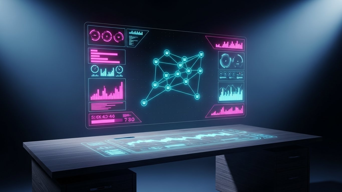
27. Holographic UI over 3D Render
Retention | Driving Referrals & Advocacy
Illuminating the Power of Connections
The Visual & Narrative Approach
To encourage partners to refer others, we visualize the value of the network. A realistic 3D render shows a high-end wooden executive desk (representing the decision-maker). Hovering above it is a futuristic, semi-transparent holographic UI shaped like a web of connected nodes. The nodes, representing people or partner facilities, glow in cyan and pulse with light when connections are made. The hologram casts a faint, realistic blue glow onto the wood grain, grounding the future in the present.
Psychological Impact & KPI Focus
- Niche Psychology: Executives value their network. This visual implies that joining the platform connects them to a larger, high-tech ecosystem. It appeals to the desire for Status and Connectivity.
- Operational Impact: It supports Driving Referrals & Advocacy (KPI 1.21). It makes the "Partner Program" look sophisticated and valuable, rather than just a transactional affiliate scheme.
Strategic Implementation & Trade-offs
- Best Use Case: "Refer a Friend" email campaigns and Partner Program landing pages.
- Duration: 10-20 seconds.
- Trade-off: It is abstract. It sells the concept of networking, not the specific reward. It needs strong copy ("Join the leaders") to be effective.
Companies using similar video content -
K4Connect – Smart community network for seniors.
Cubigo – Community platform for resident experience.
28. 3D Parallax UI Presentation
Expansion | Driving Deep Feature Adoption
Unveiling Advanced Analytics Layers
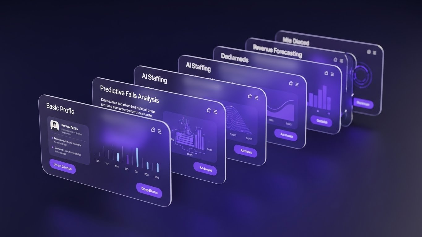
The Visual & Narrative Approach
This style is used to upsell existing clients on advanced features they aren't using. It uses a 3D parallax effect where multiple translucent UI screens are stacked in deep space. The camera angles from the side, revealing that behind the front screen ("Basic Profile") lie deeper, more complex layers: "Predictive Falls Analysis," "AI Staffing," and "Revenue Forecasting." The depth of field draws the eye deeper into the stack, visually promising that "there is more to discover."
Psychological Impact & KPI Focus
- Niche Psychology: Users often get stuck on the "Basic" tier. This visual creates Curiosity and FOMO (Fear Of Missing Out). It shows them that they are only scratching the surface of what the tool can do.
- Operational Impact: It targets Driving Deep Feature Adoption (KPI 1.17). It visually differentiates the "Pro" features from the "Basic" ones by giving them physical depth and prominence.
Strategic Implementation & Trade-offs
- Best Use Case: Website "Features" page (Advanced Section) and in-app upsell modals.
- Duration: 15-20 seconds.
- Trade-off: It can be visually busy. The text on the rear screens doesn't need to be readable, but the headers must be clear to tempt the user.
Companies using similar video content -
PointRight – Predictive analytics for post-acute care.
Foresight Health – AI features for senior care.
29. Futuristic Neon/Dark Mode
Expansion | Driving Upsell/Cross-sell
Highlighting Elite Add-on Capabilities
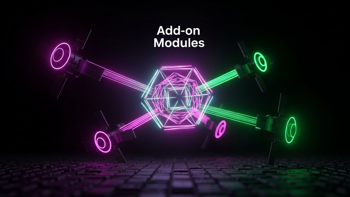
The Visual & Narrative Approach
This style signals "Premium." It abandons the clinical white for a sleek, dark mode aesthetic. A central, glowing geometric core (the main software) floats in a dark void, surrounded by orbiting "satellite" modules in neon magenta and laser green. Beams of light connect the satellites to the core, symbolizing "Add-on Modules" like Pharmacy Integration or Telehealth. The aesthetic is high-contrast and sophisticated, suggesting that these features are powerful, elite upgrades.
Psychological Impact & KPI Focus
- Niche Psychology: Dark mode and neon accents are associated with "Pro" tools and high-end tech (like Bloomberg terminals or gaming rigs). This visual signals to the buyer that these add-ons are serious performance enhancers for their business.
- Operational Impact: It targets Driving Upsell/Cross-sell (KPI 1.20). It differentiates the "Add-ons" as distinct, valuable assets that orbit and enhance the core value proposition.
Strategic Implementation & Trade-offs
- Best Use Case: Pricing pages (Enterprise Tier) and "New Module Release" announcements.
- Duration: 10-15 seconds.
- Trade-off: It breaks the "warm/clinical" brand guide. Use it only for high-end, technical add-ons to create a sense of exclusivity.
Companies using similar video content -
Stanley Healthcare – Advanced security and fall management modules.
SafelyYou – AI-powered fall detection add-ons.
30. Isometric 2D Motion Design
Expansion | Establishing Thought Leadership
Mapping the Holistic Care Ecosystem
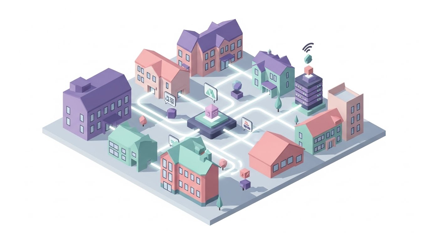
The Visual & Narrative Approach
The final style zooms out to the maximum level: The Ecosystem. An isometric 2D motion design features a stylized assisted living campus. The buildings are rendered in flat pastel shades of lavender, soft pink, and mint. Connecting the buildings are glowing white data pipelines carrying small, floating geometric shapes (resident data) to a central server hub. The scene conveys a fully interconnected ecosystem, positioning the brand not just as a software vendor, but as the central nervous system of modern care.
Psychological Impact & KPI Focus
- Niche Psychology: Large enterprise chains want a Partner, not a tool. This visual demonstrates Scale and Vision. It assures the buyer that the platform can handle complex, multi-site operations and unify them into one view.
- Operational Impact: It supports Establishing Thought Leadership (KPI 1.4). It visualizes the Internet of Things (IoT) and Connected Care concepts, validating the vendor's position as an industry leader.
Strategic Implementation & Trade-offs
- Best Use Case: Annual Reports, Keynote backdrops, and "Vision" pages on the website.
- Duration: 30-60 seconds (Loopable).
- Trade-off: It is a "Big Picture" visual. It doesn't sell a specific feature; it sells the Company Vision. It is an investment in brand equity.
Strategic Knowledge Base: The Visual Operations Doctrine
To transform these 30 visual examples into a cohesive business strategy, we must move beyond "content creation" and embrace "visual operations." This framework synthesizes the guide into three actionable segments, positioning Advids as your strategic partner in this transformation.
Strategic Alignment & Visual Architecture
Goal: Defining the "Visual Operating System" before a single pixel is rendered.
- The Cognitive Load Audit: Before creating visuals, audit your current training materials. If a PDF manual takes 20 minutes to read, the goal of the visual (Style 2, 8) is to reduce that comprehension time to 2 minutes. Advids uses this "time-saved" metric to justify video production costs.
- Role-Based Visual Mapping: Do not use the same style for everyone. Use High-Speed/Low-Drag styles (Style 11, 21) for nurses who need quick answers on mobile devices. Use Deep Data styles (Style 12, 16) for CFOs and Admins who view data on desktop monitors.
- The "Glanceability" Standard: In an assisted living environment, staff are constantly interrupted. Visuals must be designed for "glanceability"—the ability to understand the message (e.g., "Compliance Check Passed") in under 1 second (Style 7).
- Brand Voice Consistency: Your software likely consists of disparate modules (Billing, Clinical, CRM). Use a unified visual language (e.g., the "Fluid Circles" of Style 1) to make these different tools feel like one cohesive platform.
- The Advids Strategic Audit: We don't just make videos; we define your Visual Operating System. We audit your entire user journey to identify where visuals can replace text to reduce friction.
- Standardization vs. Customization: For core clinical features (eMAR), use standardized, clean styles (Style 8). For marketing and sales, use bespoke, emotional styles (Style 3, 9) to differentiate your brand voice.
- The Cross-Departmental Bridge: Use visuals to unify terminology. If Sales calls it "Resident Tracking" but Support calls it "Census Management," use a visual metaphor (Style 4) to bridge that gap and create a shared language.
- Legacy System Integration: Visualizing the invisible connection between old on-premise nurse call systems and your new cloud platform (Style 17) is crucial for winning the trust of IT Directors.
- Accessibility in Care: Ensure all motion graphics (Style 5) meet WCAG accessibility standards. High contrast and clear typography are not just aesthetic choices; they are requirements for an aging workforce.
- The Mobile-First Mandate: 80% of your users (caregivers) are mobile. All 30 styles must be legible on a 6-inch screen. Avoid tiny text; rely on bold iconography (Style 21).
Operational Adoption & Implementation
Goal: Embedding visuals into the daily workflow to drive utilization.
- Overcoming "Big Brother" Anxiety: Staff often fear tracking software. Use empathy-driven visuals (Style 1, 10) to frame the software as a "Guardian Angel" (safety) rather than a "Watchdog" (surveillance).
- The Micro-Learning Shift: Replace the "1-Hour Webinar" with a library of "30-Second Micro-Clips" (Style 11). Staff can watch these in the hallway on their phone right before performing a task.
- Just-in-Time Support: Embed specific visual styles (Style 23) directly into the helpdesk or tablet interface. When a user hovers over "Admissions," a 5-second loop should visually explain the step.
- Gamification of Training: Use "Level Up" visuals (Style 14) to track training progress. visual scorecards encourage staff to complete their compliance training modules.
- Reducing Support Ticket Volume: There is a direct correlation between proactive visual guides and reduced call center load. Use Style 24 (The Empathetic Expert) to answer Tier 1 questions before they become tickets.
- Remote Onboarding: For multi-site chains, you cannot fly trainers to every location. Use 3D simulations (Style 22) and screencasts to train distributed teams consistently and remotely.
- Visualizing SOPs: Transform text-based Standard Operating Procedures (SOPs) into visual process flows (Style 2). A visual map of the "Fall Protocol" is faster to read in an emergency than a text binder.
- Feedback Loops: Use interactive video elements (Style 19) to gather user feedback. If a user abandons a video halfway, it signals a confusing feature.
- Scalable Localization: If you are expanding to global markets, use abstract styles (Style 1, 4) that rely on iconography rather than on-screen text, reducing translation costs.
- Leadership Communication: When rolling out a major update, use high-end Cinematic styles (Style 3) from the CEO to signal the importance of the initiative to the entire organization.
Measuring Impact & Future-Proofing
Goal: moving from "Vanity Metrics" (Views) to "Business Metrics" (ROI).
- Beyond "Views": Do not measure video success by "views." Measure it by Time-to-Competency. How much faster does a new nurse learn the eMAR system with video vs. text?
- The "Idle Time" Metric: Correlate better visualization with reduced software navigation time. Every minute saved on a screen (Style 7) is a minute returned to resident care.
- Compliance Velocity: Measure how fast new regulations (e.g., PDPM changes) are understood across the organization when introduced via video (Style 15).
- Retention and Churn: High-quality UX visualization reduces frustration. Measure the LTV (Lifetime Value) of clients who engage with your visual academy vs. those who don't.
- The AI Visual Frontier: Prepare for the future where visuals are generated in real-time based on resident data. Style 30 (The Connected Future) positions you as a leader ready for this shift.
- Scalability of Assets: Build a library of "Atomic Visual Units" (icons, backgrounds, characters) that can be remixed. This ensures that as your feature set grows, your visual library grows with it efficiently.
- The Advids Partnership: Visual strategy is not a one-time project; it is an ongoing evolution. Advids serves as your long-term partner, ensuring your visual assets evolve in lockstep with your software updates.
- Benchmarking Success: "Good enough" visuals are a competitive risk. If your competitor looks like Style 16 (Enterprise Vault) and you look like a generic cartoon, you lose the trust war before the demo begins.
- The ROI of Safety: Quantify the reduction in "Medication Errors" or "Missed Billing" that occurs after implementing visual training aids. This is your strongest ROI argument for the C-Suite.
- Final Call to Innovation: Treat video as infrastructure. Just as you invest in servers and code, invest in the visual layer that translates that code for the human mind. The future of Assisted Living software belongs to those who can make the complex feel simple.
This concludes the 30-Point Video Style Guide. By systematically applying these styles across the buyer's journey—from the first moment of awareness to the long-term partnership—you transform your software from a utility into an indispensable care companion.
Companies using similar video content -
Yardi Senior Living – Campus management for senior living.
AlayaCare – Holistic care platform for aged care.
Author & Editor Bio


