
 /home/wwwroot/advids.co/design/index.php on line 425
Introduction: Bridging the "Grease-to-Code" Gap
The automotive aftermarket is navigating its most significant operational overhaul in decades. We are transitioning from an era defined by static paper catalogs and phone-tag ordering to a high-velocity, digital-first ecosystem. For the "Modernizing Operations Director," the challenge is no longer just sourcing the part; it is ensuring the data surrounding that part—fitment, availability, and tracking—is as reliable as the steel itself.
The core friction point lies in the Physical/Digital Divide. How do you translate the tactile reality of a brake caliper, a suspension strut, or a complex transmission kit into a digital interface that mechanics and distributors trust implicitly? The stakes are incredibly high. The industry is witnessing a massive shift, with 70% of aftermarket sales expected to occur online by 2025. This signals that the future of wholesale and B2B procurement is undeniably digital. Yet, skepticism remains. Buyers, burned by inaccurate fitment data (ACES/PIES errors) and clunky legacy systems, hesitate to fully embrace new platforms without visual proof of competence.
Visualization is your strategic lever to overcome this resistance. It is not merely "marketing content"; it is an operational tool to reduce cognitive load, validate fitment accuracy, and demonstrate the seamless integration of your software into their daily workflow. By effectively visualizing your solution, you can unlock the 30% efficiency gains that industry leaders expect from digital transformation.
This guide presents the first 10 "Gold Standard" visual styles, curated specifically to solve the unique communication challenges of the auto aftermarket—from explaining complex logistics to building human trust in B2B partnerships.
1. Minimalist Flat 2D Vector
TOFU | Brand Awareness

(Minimalist Flat 2D): Vector Logistics – Streamlining Global Supply Chains
The Visual & Narrative Approach
This style employs a "clean-room" aesthetic to tackle the complexity of logistics. By reducing the chaotic web of global shipping into Electric Teal dotted lines and stylized hexagonal nut icons, the visual language strips away the noise. The simplified white delivery van moving toward a central hub acts as a beacon of order. The narrative focuses on "clarity," "reach," and "frictionless movement."
Psychological Impact & KPI Focus
- Niche Psychology: Logistics managers often feel overwhelmed by the opacity of the supply chain. This clean, shadowless style induces a sense of Control and Predictability. It assures the viewer that the software organizes chaos into a logical flow.
- Operational Impact: Ideal for reducing the Bounce Rate on landing pages by quickly communicating the concept of "End-to-End Visibility" without getting bogged down in gritty details.
Strategic Implementation & Trade-offs
- Best Use: "How It Works" sections explaining multi-location inventory syncing.
- Duration: 30-45 Seconds.
- Trade-off: While excellent for clarity, it lacks emotional weight. It explains the process but fails to sell the product quality.
Companies using similar video content -
Descartes Systems Group – Descartes Logistics Solutions – Streamlining global supply chain logistics.
2. 2D Line Art Animation
TOFU | Category Creation

(2D Line Art): Linear Morphing – Bridging Hardware and Cloud
The Visual & Narrative Approach
This style creates a visual metaphor for Digital Transformation. The continuous line drawing creates a mesmerizing morphing effect, transforming a heavy mechanical V8 engine block into a weightless cloud icon. The precision of the Crimson Red and Slate Blue strokes mimics technical blueprints, appealing to the engineer's eye for detail. It visually argues that software is the natural evolution of hardware.
Psychological Impact & KPI Focus
- Niche Psychology: It bridges the gap for the "Old Guard" who may be skeptical of SaaS. It validates their hardware reality while gently leading them toward a software future.
- Operational Impact: Drives Brand Recall and Share of Voice on platforms like LinkedIn, where the elegant motion stands out against loud, salesy ads.
Strategic Implementation & Trade-offs
- Best Use: LinkedIn organic posts introducing "Cloud-Native" aftermarket solutions.
- Duration: 15-20 Seconds (Loop).
- Trade-off: The abstraction is high. It is a conceptual tool, not a tutorial. Avoid using this for detailed UI walkthroughs.
Companies using similar video content -
Tekion – Tekion Automotive Cloud – Morphing legacy systems into cloud-native solutions.
3. Isometric 2D Motion Design
TOFU | Market Education

(Isometric 2D Motion): Isometric Grid – Visualizing Warehouse Intelligence
The Visual & Narrative Approach
Isometric design offers a "God's Eye View" of the operation. The precise grid serves as the foundation, symbolizing the structured data of a Warehouse Management System (WMS). By integrating tiny server racks directly into the shelving rows, the visual communicates that inventory storage and digital data are inseparable. The Sunburst Yellow accents draw the eye to the movement of goods, highlighting efficiency.
Psychological Impact & KPI Focus
- Niche Psychology: Warehouse Ops Directors crave Space Optimization and Order. This style visually demonstrates that your software maximizes every square inch of their facility.
- Operational Impact: Increases Time-on-Page for educational content (blogs/whitepapers) by visually simplifying complex logistical workflows like "Zone Picking" or "Cross-Docking."
Strategic Implementation & Trade-offs
- Best Use: Explainer videos for WMS or ERP integration features.
- Duration: 60-90 Seconds.
- Trade-off: It can feel impersonal. It demonstrates scale effectively but lacks the human element of the shop floor.
Companies using similar video content -
Manhattan Associates – Manhattan Active WM – Visualizing warehouse layout and inventory flow.
4. Generative AI Cinematic Video
TOFU | YouTube

(Gen AI Cinematic): Cinematic Workshop – The High-Tech Service Bay
The Visual & Narrative Approach
This style brings the viewer into the aspirational future of the garage. The low-angle shot emphasizes the textured concrete floor—grounding the visual in reality—while the Vibrant Purple and Cyan rim lighting signals a modern, tech-enabled environment. The mechanic is presented as a highly skilled professional, empowered by technology. It is atmospheric, moody, and premium.
Psychological Impact & KPI Focus
- Niche Psychology: It combats the "dirty garage" stereotype. It appeals to the shop owner's desire to be seen as a Modern Professional. It builds emotional resonance by elevating their daily work environment.
- Operational Impact: Drives Subscriber Growth and Retention on YouTube. The high production value (achieved via Gen AI) positions the brand as a leader in the "Future of Repair."
Strategic Implementation & Trade-offs
- Best Use: Brand anthems and "Vision" videos on the Home Page or YouTube Channel.
- Duration: 60-120 Seconds.
- Trade-off: Gen AI can struggle with specific details (like readable text on a screen). Use it for mood and vision, not for specific software UI demos.
Companies using similar video content -
Bosch – Bosch Automotive Aftermarket – Aspirational vision of future service bays.
6. Low-Poly 3D Modeling
MOFU | Differentiation

(Low-Poly 3D): Geometric Data – Structuring Complex Components
The Visual & Narrative Approach
This style strips a complex mechanical part (suspension strut) down to its geometric essence. By rendering the components in low-poly facets of Safety Orange and Metallic Silver, the visual removes the surface "noise" (rust, grease, texture) to reveal the clean engineering data underneath. It is a visual metaphor for "Clean Data" and "Structured Catalogs."
Psychological Impact & KPI Focus
- Niche Psychology: Technical buyers and Data Managers appreciate this style because it represents Accuracy and Structure. It implies that your platform understands the "bones" of the product (ACES/PIES data).
- Operational Impact: Supports Differentiation by positioning the platform as a "Data-First" company. It cuts through the clutter of generic stock photography.
Strategic Implementation & Trade-offs
- Best Use: Website headers or feature blocks explaining "Fitment Accuracy" or "Data Standards."
- Duration: 15-30 Seconds.
- Trade-off: It is abstract. Do not use this if the goal is to show the physical quality or finish of a specific part brand.
Companies using similar video content -
Salsify – Salsify PIM – Structuring complex product data for digital catalogs.
7. Photorealistic 3D Renders
MOFU | Feature Education

(Photorealistic 3D): Macro Fidelity – Validating Product Quality
The Visual & Narrative Approach
When the goal is to sell a specific part, nothing beats photorealism. This style zooms in to show the grain and metallic flecks of a ceramic brake pad—details that mechanics use to judge quality. The Glowing Emerald Green overlay highlights the embedded technology (wear sensor), visually merging the physical product with digital intelligence (The X-Ray View).
Psychological Impact & KPI Focus
- Niche Psychology: It overcomes the Skepticism of online buying ("Will it fit? Is it cheap junk?"). The high fidelity builds Tactile Trust, allowing the viewer to "inspect" the part digitally.
- Operational Impact: Directly reduces Return Rates by clarifying product features before purchase. Increases Conversion Rates on Product Detail Pages (PDPs).
Strategic Implementation & Trade-offs
- Best Use: Electronic Parts Catalogs (EPC), digital brochures, and feature highlights.
- Duration: 15-30 Seconds (Loopable).
- Trade-off: High rendering costs. Requires high-quality CAD data. Best reserved for high-margin or flagship products.
Companies using similar video content -
OEConnection (OEC) – OEC Parts – High-fidelity display of specific auto parts for ordering.
8. Aspirational Stock Montage
MOFU | Building Trust

(Aspirational Stock): Trusted Partnership – Humanizing B2B Commerce
The Visual & Narrative Approach
Software facilitates business, but people do business. This style captures the "moment of truth"—the handshake. The warm sunlight and lens flare create an optimistic atmosphere. The tablet tucked under the shop owner's arm is a subtle prop, signaling that the seamless interaction is powered by your platform. The focus is on the human connection, professionalism, and reliability.
Psychological Impact & KPI Focus
- Niche Psychology: Addresses the fear of being "just a number" in a digital system. It reassures the buyer that the technology enhances, rather than replaces, the Personal Relationship.
- Operational Impact: Builds Brand Trust and Social Proof. Essential for MOFU content like email nurture sequences and "About Us" pages where emotional connection drives the next step.
Strategic Implementation & Trade-offs
- Best Use: LinkedIn ads, Case Study intros, and Email Marketing headers.
- Duration: 30-60 Seconds.
- Trade-off: Generic stock can look fake. Ensure the "shop owner" looks authentic to the industry (not a fashion model).
Companies using similar video content -
Epicor – Epicor Aftermarket Solutions – Humanizing B2B partnerships in auto parts.
9. Bold Kinetic Typography
MOFU | ABM Awareness

(Bold Kinetic Type): Kinetic Impact – Disrupting Legacy Inertia
The Visual & Narrative Approach
This is a visual shout. The massive 3D block letters form a wall of "legacy obstacles" that is shattered by a high-speed piston projectile. The stark Black, White, and Kinetic Red palette creates maximum contrast. The heavy motion blur conveys speed and power. It is aggressive, loud, and impossible to ignore.
Psychological Impact & KPI Focus
- Niche Psychology: It utilizes Pattern Interrupt to stop the scroll. It appeals to the aggressive, growth-oriented mindset of sales directors and business owners who want to "crush" the competition.
- Operational Impact: Drives Click-Through Rate (CTR) in display ads and Account-Based Marketing (ABM) campaigns. It creates a sense of urgency and momentum.
Strategic Implementation & Trade-offs
- Best Use: Programmatic Display Ads, Event Teasers, and Competitor Conquesting campaigns.
- Duration: 6-10 Seconds.
- Trade-off: It delivers emotion but not information. It must be paired with a strong headline or CTA to be effective.
Companies using similar video content -
Shop-Ware – Shop-Ware – Disrupting legacy shop management systems with speed.
10. Abstract 2D Flat Vector Organic
MOFU | Shaping Brand Perception
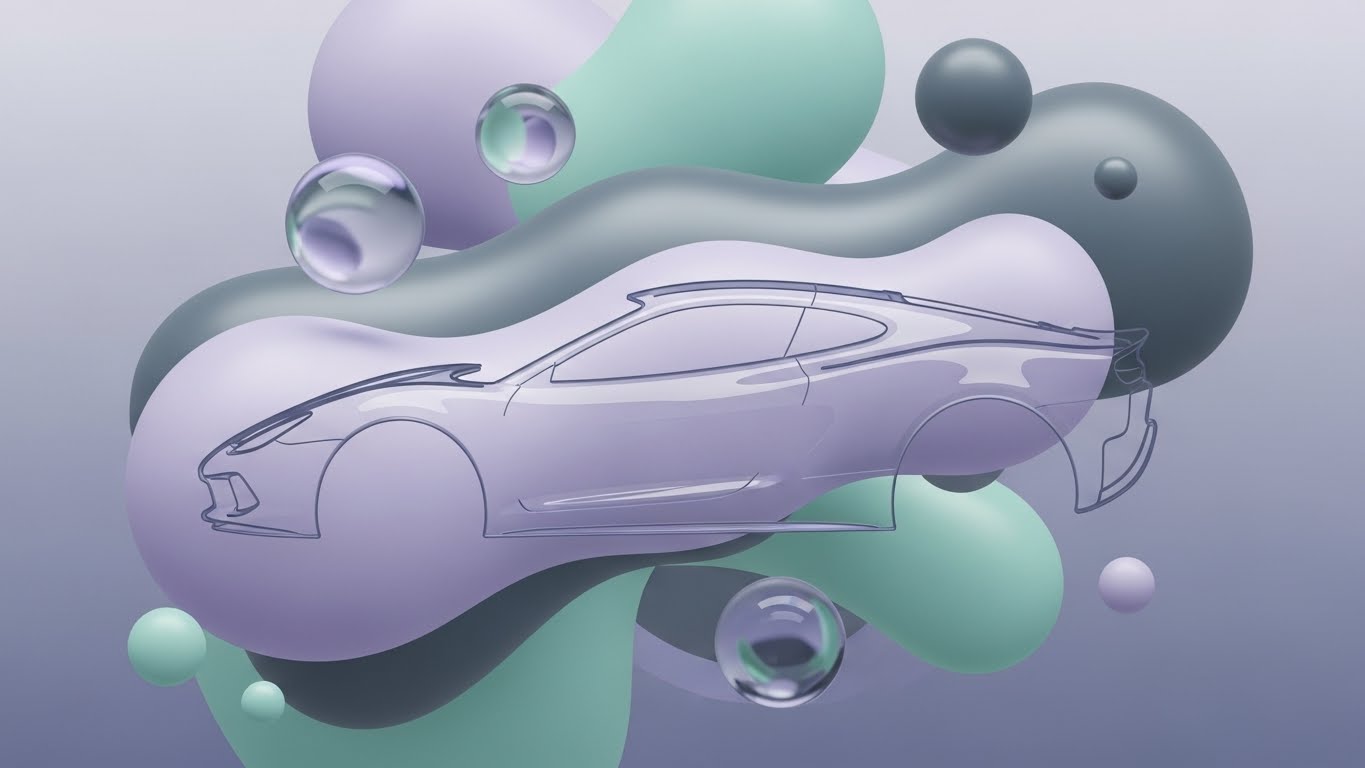
(Abstract 2D Organic): Fluid Agility – Modernizing User Experience
The Visual & Narrative Approach
This style breaks the mold of industrial rigidity. Fluid, organic blobs with a glass-like sheen morph seamlessly into a car chassis. The Pastel Lavender and Mint Green palette is radically modern for the auto sector. It visualizes the concept of Agility—software that molds to the user's needs rather than forcing them into a rigid box.
Psychological Impact & KPI Focus
- Niche Psychology: It eases UX Anxiety. It signals that the platform is modern, intuitive, and "light"—similar to the consumer apps they use daily (like Spotify or Uber). It distances the brand from "clunky" legacy ERPs.
- Operational Impact: Shifts Brand Perception towards "Innovation" and "User-Centricity." Useful for rebranding or launching new, flexible features.
Strategic Implementation & Trade-offs
- Best Use: UI/UX intros, website backgrounds, and social media branding.
- Duration: 15-30 Seconds.
- Trade-off: Risk of being too abstract. It must be anchored with copy that explains why the software is flexible, or it may look like "vaporware" to traditionalists.
Companies using similar video content -
Salesforce – Sales Cloud for Automotive – Visualizing agile and user-centric CRM solutions.
11. Lifestyle Stock with UI Overlay**
MOFU | Driving Demo Requests

(Lifestyle Stock with UI): Augmented Certainty – Visualizing "Available-to-Promise"
The Visual & Narrative Approach
This style bridges the gap between the human workforce and digital intelligence. We see a service desk professional in a blurred Navy Blue environment—a relatable setting for any distributor. However, the focus is the glowing inventory list and the prominent Coral Pink "Check Mark" floating holographically above the screen. This visual confirms that the part is not just listed; it is physically allocated. The narrative is one of "Stock Certainty" and "Confidence at the Counter."
Psychological Impact & KPI Focus
- Niche Psychology: It directly targets the "Counter Anxiety" familiar to sales staff—the fear of promising a part that isn't actually on the shelf. The holographic checkmark serves as a visual dopamine hit, signaling Reliability and Accuracy.
- Operational Impact: Highly effective for Retargeting campaigns targeting users who visited pricing pages but didn't convert. It visually promises a frictionless, error-free workflow, driving Demo Requests.
Strategic Implementation & Trade-offs
- Best Use: Retargeting Display Ads and Social Stories inviting users to "See it in Action."
- Duration: 10-15 Seconds (Loop).
- Trade-off: Relies on stock footage. The UI overlay must be high-quality and perspective-matched to avoid looking like a generic tech support ad.
Companies using similar video content -
PartsTech – PartsTech – Visualizing real-time parts availability at the counter.
12. Wireframe to Reality Transition
MOFU | Competitive Displacement

(Wireframe to Reality): Blueprint Fidelity – From Digital Spec to Steel
The Visual & Narrative Approach
This split-screen technique creates a powerful "Before and After" metaphor without using a timeline. The Vivid Lime Green laser scans across the image, instantly transforming a technical blue-and-white wireframe into a heavy, photorealistic steel gear assembly. It visually argues that your software’s data (the wireframe) is perfectly synchronized with the physical reality (the steel). It screams "Precision."
Psychological Impact & KPI Focus
- Niche Psychology: Addressing the "Fitment Fear" is crucial. Buyers worry that digital catalogs have errors (ACES/PIES mismatches). This style validates that your platform is built on Engineering-Grade Data, not just scraped lists.
- Operational Impact: A critical asset for Competitor Comparison Pages. It visually demonstrates superior data fidelity, helping to displace legacy providers known for catalog errors.
Strategic Implementation & Trade-offs
- Best Use: "Why Switch" landing pages and direct sales presentations.
- Duration: 20-30 Seconds.
- Trade-off: Requires specific matching assets (CAD model vs. Photo). Misalignment between the two halves ruins the effect and destroys credibility.
Companies using similar video content -
Alldata – Alldata Repair – Transforming technical blueprints into real repair solutions.
Mitchell 1 – ProDemand – Bridging digital repair data with physical vehicle components.
13. Dynamic Data Visualization
BOFU | ROI Justification

(Dynamic Data Viz): The Profit Ascent – Visualizing Revenue Trajectory
The Visual & Narrative Approach
This style abstracts the financial journey into a physical ascent. The data isn't just a flat line; it's a Neon Cyan road spiraling up a mountain of Deep Charcoal financial bars. It turns "Revenue Growth" into a destination. The Magenta accents mark key milestones—integrating a new location, automating returns, or expanding to e-commerce. It is clean, sharp, and undeniably upward.
Psychological Impact & KPI Focus
- Niche Psychology: Business owners and investors respond to Momentum. This visual taps into the aspiration of scaling the business. It reframes software costs as fuel for this ascent.
- Operational Impact: Essential for Pitch Decks and Executive Summaries. It visualizes the ROI of the platform, helping the Champion within the prospect company sell the investment to the CFO.
Strategic Implementation & Trade-offs
- Best Use: Financial justification slides and "Results" sections of case studies.
- Duration: 15-20 Seconds (Loop).
- Trade-off: It is abstract revenue data. It assumes the viewer cares about high-level growth, so it may not resonate with a floor-level parts manager who cares about features.
Companies using similar video content -
Blue Yonder – Blue Yonder Luminate Planning – Visualizing supply chain efficiency and profit growth.
ToolsGroup – ToolsGroup SO99 – Demonstrating inventory optimization and revenue trajectory.
14. Futuristic Neon/Dark Mode
BOFU | Risk Mitigation
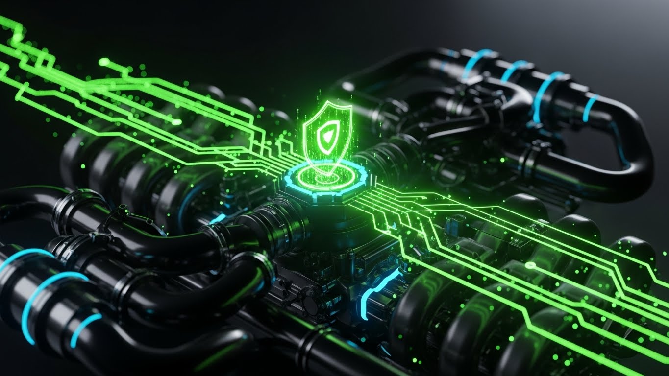
(Futuristic Neon/Dark Mode): The Digital Fortress – Engineered Security
The Visual & Narrative Approach
We visualize the platform as the "Engine" of the business, but with a cybersecurity twist. The Neon Green circuit lines represent safe data flow through dark metallic pipes, converging on a pulsing Shield Node. It combines the imagery of automotive engineering with the language of cybersecurity. The Pitch Black environment emphasizes the "sealed" and secure nature of the system.
Psychological Impact & KPI Focus
- Niche Psychology: Data breaches and downtime are the nightmares of the modern distributor. This style uses "Dark Mode" aesthetics—associated with elite tech—to convey Robustness and Impenetrability. It reassures the IT Director.
- Operational Impact: Increases confidence during the Security Review phase of the deal. It visually answers the question, "Is my customer data safe?" without needing a spreadsheet.
Strategic Implementation & Trade-offs
- Best Use: Security compliance pages, IT architecture overviews, and "Reliability" guarantees.
- Duration: 15-30 Seconds.
- Trade-off: Can feel "too gaming-oriented" if the neon is overused. Keep it sleek and professional, not arcade-like.
Companies using similar video content -
CrowdStrike – Falcon Platform – Engineered security for automotive data.
Claroty – Claroty Platform – Visualizing robust OT/IoT cybersecurity for industrial assets.
15. 2D Animation & UI Composition
BOFU | Sales Cycle Acceleration
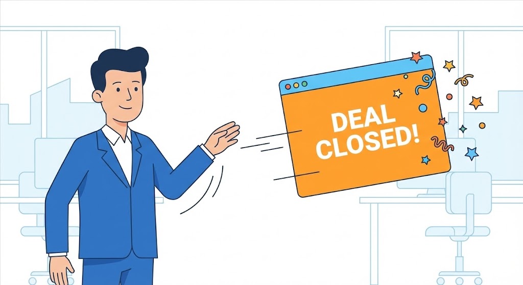
(2D Animation & UI): The Closer – Frictionless Deal Execution
The Visual & Narrative Approach
Sales shouldn't be a grind. This style uses a lighthearted, Flat 2D aesthetic to visualize the joy of a closed deal. The sales rep character effortlessly swipes a large floating UI card to the right, triggering a burst of Bright Orange and Sky Blue confetti. It gamifies the CRM aspect of the software, suggesting that using the platform is as easy and rewarding as a modern consumer app.
Psychological Impact & KPI Focus
- Niche Psychology: Sales teams often resist new CRMs because they fear data entry. This style promises Ease of Use and Gratification. It frames the software as an enabler of success, not a tracker of activity.
- Operational Impact: Perfect for Email Nurture campaigns aimed at Sales Managers. It visually communicates "Faster Sales Cycles" and higher adoption rates among their teams.
Strategic Implementation & Trade-offs
- Best Use: "For Sales Teams" feature pages and internal adoption training videos.
- Duration: 10-15 Seconds.
- Trade-off: It is playful. Ensure it doesn't trivialize the complexity of B2B sales for enterprise clients.
Companies using similar video content -
Zoho CRM – Zoho CRM – Gamifying sales processes for faster deal execution.
HubSpot – HubSpot CRM – Illustrating frictionless sales and marketing workflows.
16. Split Screen: Optimized Reality
BOFU | Economic Buyer

(Split Screen): Executive Command – The Pulse of the Business
The Visual & Narrative Approach
This visual targets the C-Suite. The split-screen connects the Executive (CEO/CFO reviewing a tablet) directly to the Result (Rising Growth Charts in Emerald Green). The lighting is synchronized across the split, suggesting that the tablet controls the charts. It is calm, professional, and focuses entirely on Oversight and Performance.
Psychological Impact & KPI Focus
- Niche Psychology: Executives fear losing touch with the ground reality as they scale. This style offers Visibility and Control. It tells the CEO, "You can monitor your entire empire from this screen."
- Operational Impact: Drives engagement on LinkedIn among decision-makers. It bypasses technical features to sell the ultimate benefit: Business Health.
Strategic Implementation & Trade-offs
- Best Use: Account-Based Marketing (ABM) ads targeting C-Level titles.
- Duration: 15-20 Seconds.
- Trade-off: It’s less effective for the actual users (parts managers) who need to see how the work gets done, not just the result.
Companies using similar video content -
SAP – SAP S/4HANA for Automotive – Connecting executive oversight with business performance.
Oracle – Oracle Cloud ERP – Visualizing C-suite control over enterprise operations.
17. Isometric 3D Workflow
BOFU | Functional Buyer

(Isometric 3D Workflow): The Clockwork Warehouse – Optimizing Internal Logistics
The Visual & Narrative Approach
For the Operations VP, the beauty lies in the flow. This Isometric Miniature reduces a massive, complex warehouse into a manageable, humming machine. The Steel Blue and Warning Amber palette highlights the interaction between static racking and moving forklifts. The tilt-shift effect focuses attention on the dispatch area, visualizing the "Perfect Order" workflow.
Psychological Impact & KPI Focus
- Niche Psychology: It appeals to the "Builder" mindset of Ops Directors who want to design efficient systems. It visually demonstrates Throughput and Organization. It removes the "mess" of the real warehouse, showing the idealized state the software enables.
- Operational Impact: Increases Time-on-Page for technical whitepapers. It allows the viewer to study the workflow logic without reading pages of text.
Strategic Implementation & Trade-offs
- Best Use: Deep-dive pages on WMS (Warehouse Management System) features and implementation guides.
- Duration: 45-60 Seconds.
- Trade-off: High production effort. Requires a good understanding of actual warehouse layouts to look authentic to an expert.
Companies using similar video content -
Tecsys – Tecsys WMS – Optimizing internal warehouse logistics and order fulfillment.
Logiwa – Logiwa WMS – Demonstrating efficient cloud-based warehouse operations.
18. Dark Mode UI Showcase
BOFU | Technical Buyer

(Dark Mode UI): API Architecture – The Developer’s Blueprint
The Visual & Narrative Approach
The CTO and IT Manager care about the stack. This style abandons the "user-friendly" facade to show the API nodes and code syntax. The Deep Purple and Neon Blue "Dark Mode" aesthetic signals that this is a developer-grade environment. It visualizes connectivity, data piping, and modern architecture. It says, "We play nice with your ERP."
Psychological Impact & KPI Focus
- Niche Psychology: IT buyers fear "Spaghetti Code" and closed ecosystems. This style signals Openness, Modernity, and Flexibility. It validates that the platform is built for the future, not patched together from legacy code.
- Operational Impact: Reduces friction during the Technical Due Diligence phase. It visually confirms integration capabilities (e.g., REST API, EDI).
Strategic Implementation & Trade-offs
- Best Use: API Documentation portals, "Integration" pages, and technical sales decks.
- Duration: 30-45 Seconds.
- Trade-off: It is unintelligible to the non-technical buyer. Keep this strictly for the IT/Dev audience.
Companies using similar video content -
Apigee (Google Cloud) – Apigee API Management – Showcasing API architecture and connectivity.
Kong – Kong Enterprise – Visualizing modern API gateway and microservices.
19. Holographic UI over 3D Render
BOFU | ROI Justification Hook
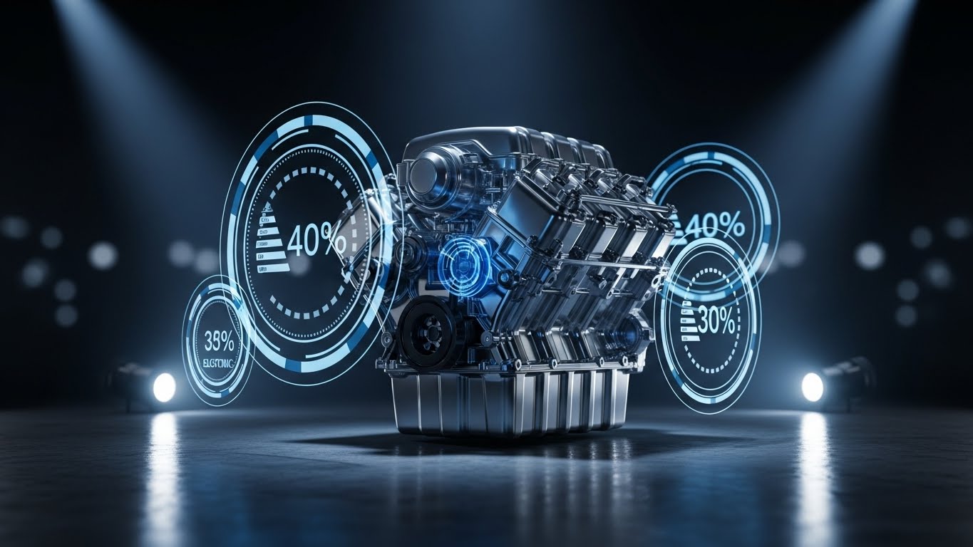
(Holographic UI over 3D): X-Ray ROI – Quantifying Mechanical Efficiency
The Visual & Narrative Approach
This style merges the product with the profit. We take the most recognizable symbol of the industry—the V6 Engine—and overlay it with Holographic Silver and Electric Blue metrics. It visually implies that the software optimizes the core mechanics of the business. It’s an X-Ray view into efficiency, showing that better software leads to a better-running "engine" (business).
Psychological Impact & KPI Focus
- Niche Psychology: It connects the abstract concept of "Software ROI" to a tangible object. It speaks the language of the Pragmatist. It says, "We tune your business like you tune an engine."
- Operational Impact: Highly effective for Remarketing ads aimed at bringing decision-makers back to the table. It serves as a visual reminder of the efficiency gains left on the table by not converting.
Strategic Implementation & Trade-offs
- Best Use: Bottom-of-funnel display ads and closing slides in a presentation.
- Duration: 10-15 Seconds (Loop).
- Trade-off: The metaphor is strong, but ensure the metrics shown (e.g., "15% Efficiency") are backed by real case studies.
Companies using similar video content -
Syncron – Syncron UIO – Quantifying efficiency gains in parts inventory optimization.
Uptake – Uptake Fleet – X-ray view into fleet performance and predictive maintenance ROI.
20. Rapid UI Feature Montage
BOFU | Competitive Switcher

(Rapid UI Montage): Velocity Shift – The Momentum of Modernization
The Visual & Narrative Approach
Speed is the ultimate differentiator. This style uses Fast Red accents and motion blur over a race track background to create a sense of irresistible momentum. The UI screens fly past the camera, suggesting that the platform is fast, the implementation is fast, and the results are fast. It targets the "Switcher" who is tired of slow, clunky legacy systems.
Psychological Impact & KPI Focus
- Niche Psychology: It leverages the Fear Of Missing Out (FOMO) and the desire for Agility. It contrasts sharply with the static, boring imagery of legacy competitors. It signals, "Get on the fast track."
- Operational Impact: Perfect for YouTube Pre-roll and competitor conquesting campaigns. It generates high excitement and clicks by promising an immediate upgrade in operational speed.
Strategic Implementation & Trade-offs
- Best Use: Competitor keywords campaigns (e.g., "Alternative to [Legacy Brand]") and event hype videos.
- Duration: 6-10 Seconds.
- Trade-off: It moves too fast to teach features. Its only goal is to convey speed and modernity. Don't try to explain the dashboard here.
Companies using similar video content -
Shopmonkey – Shopmonkey – Highlighting speed and modernity for shop management.
Fullbay – Fullbay – Accelerating heavy-duty repair shop operations.
21. Clean UI Workflow (Light Mode)
Onboard | Accelerating TTV

(Clean UI Workflow): Frictionless Interface – Accelerating Time-to-Value
The Visual & Narrative Approach
The first interaction a new user has with your software sets the tone for their entire lifecycle. This style utilizes a high-key, airy aesthetic with soft Sky Blue tones to eliminate visual clutter. The focus is entirely on a single, positive action: the click. The large, friendly cursor and pulsing Vivid Green "Activate" button guide the eye, creating a sense of inevitability and ease.
Psychological Impact & KPI Focus
- Niche Psychology: New users often feel "Dashboard Fatigue" or anxiety about breaking something. This clean style lowers the Cognitive Load, reassuring them that the platform is welcoming and impossible to mess up.
- Operational Impact: Critical for the Welcome Sequence. It reduces "Day 1 Drop-off" by visually holding the user's hand through the first login, directly improving Activation Rates.
Strategic Implementation & Trade-offs
- Best Use: "Getting Started" videos and "First Feature Setup" guides.
- Duration: 30-60 Seconds.
- Trade-off: It is simplified reality. While excellent for onboarding, it may feel too basic for power users looking for advanced configuration settings.
Companies using similar video content -
Fleetio – Fleetio – Frictionless interface for fleet management onboarding.
AutoFluent – AutoFluent – Accelerating time-to-value for shop management.
22. Gen AI Realistic Character Video
Onboard | Implementation Friction

(Gen AI Realistic Character): Digital Mentor – Humanizing Automated Onboarding
The Visual & Narrative Approach
Implementation is often seen as a cold, technical process. This style re-injects humanity. We see a relatable Warehouse Manager—not a polished actor, but someone who looks like he knows his way around a shelving unit. His warm smile and open gesture invite the viewer into the process. The Navy Blue polo signals professionalism without the stiffness of a suit. He acts as the "Digital Mentor," guiding the user through the setup.
Psychological Impact & KPI Focus
- Niche Psychology: It combats the isolation of self-serve onboarding. Users feel more comfortable taking instructions from a "peer" who looks like them. It builds a subconscious Rapport before a real human success manager ever makes contact.
- Operational Impact: Enhances Video Completion Rates in onboarding courses. It bridges the gap between a faceless SaaS platform and the human teams that rely on it.
Strategic Implementation & Trade-offs
- Best Use: Module introductions and "Success Tips" within the Learning Management System (LMS).
- Duration: 60-90 Seconds.
- Trade-off: Gen AI characters must be voiced perfectly. A robotic Text-to-Speech (TTS) voice will destroy the illusion of human connection immediately.
Companies using similar video content -
Karmak – Karmak Fusion – Humanizing the implementation process for heavy-duty businesses.
IFS – IFS Cloud – Digital mentor guiding through enterprise software setup.
23. 2D Character-Driven Story
Onboard | Self-Serve Onboarding

(2D Character-Driven Story): Interactive Guidance – Empowering Self-Serve Success
The Visual & Narrative Approach
When users are stuck inside the app, they need quick, friendly help. This Flat 2D Vector style features a stylized character—efficient, equipped with a headset—interacting with a floating kiosk screen. The Primary Blue, Red, and Yellow palette is energetic and clear. The "ideas" floating around her imply that the software unlocks creativity and problem-solving, not just data entry.
Psychological Impact & KPI Focus
- Niche Psychology: It frames support as "Empowerment" rather than "Fixing a Problem." The character serves as a visual avatar for the user's own potential success. It makes the learning curve feel like a game.
- Operational Impact: Vital for In-App Modals and tooltips. It encourages users to try new features ("Self-Serve Adoption"), reducing the burden on the Customer Success team.
Strategic Implementation & Trade-offs
- Best Use: Feature walkthroughs, "What's New" pop-ups, and empty state screens (e.g., "You haven't created an order yet").
- Duration: 15-30 Seconds.
- Trade-off: If the style is too childish, it may alienate senior buyers. Ensure the character design remains professional ("Corporate Memphis-lite").
Companies using similar video content -
WrenchWay – WrenchWay – Empowering mechanics with interactive career guidance.
Bolt On Technology – Bolt On Technology – Guiding users through digital inspection workflows.
24. Macro UI Micro-Interactions
Onboard | Trial/Freemium Activation

(Macro UI Micro-Interactions): Tactile Detail – Encouraging Feature Discovery
The Visual & Narrative Approach
Sometimes, the barrier to adoption is just not knowing what a button does. This style zooms in—extreme macro—on a single UI element: a toggle switch. We witness the satisfying transition from Ash Gray (Inactive) to Vivid Lime Green (Active). By focusing on the texture and the specific change state, we make the digital action feel tactile and significant.
Psychological Impact & KPI Focus
- Niche Psychology: It leverages the Dopamine Loop of checking a box or flipping a switch. It visually rewards the user for taking action. It turns a mundane setting configuration into a "Power Move."
- Operational Impact: Highly effective for Feature Activation campaigns (e.g., "Turn on Auto-Ordering"). It drives users to specific settings pages to replicate the satisfying action they saw in the video.
Strategic Implementation & Trade-offs
- Best Use: GIF-style loops in emails or social retargeting ads prompting users to complete setup.
- Duration: 3-5 Seconds (Loop).
- Trade-off: It lacks context. It shows how to click, but not why. Must be paired with strong copy explaining the benefit of that specific toggle.
Companies using similar video content -
Shop Boss – Shop Boss – Highlighting tactile details for feature activation in shop software.
Fishbowl Inventory – Fishbowl Inventory – Encouraging users to activate inventory features.
25. Abstract 2D Motion Graphics
Retention | Reducing Support Overhead

(Abstract 2D Motion): Fluid Resolution – Calming Support Friction
The Visual & Narrative Approach
When a customer visits the Help Center, they are likely frustrated. This style is designed to de-escalate. Fluid, morphing shapes in Soft Pink and Violet create a calming, hypnotic rhythm. The transition from a "Speech Bubble" (the problem) to a "Checkmark" (the solution) is seamless. It visualizes the support process not as a battle, but as a fluid resolution.
Psychological Impact & KPI Focus
- Niche Psychology: It addresses User Frustration. The soft, rounded geometry and gentle motion subconsciously lower the viewer's heart rate and patience threshold. It reassures them that the answer is simple.
- Operational Impact: Reduces Support Ticket Escalation. By keeping the user calm and engaged with the self-help video, they are more likely to resolve the issue themselves rather than calling support.
Strategic Implementation & Trade-offs
- Best Use: "Common Troubleshooting" videos, password reset flows, and "Wait Time" visuals.
- Duration: 30-60 Seconds.
- Trade-off: It is abstract. It cannot show where to click. Use it for concept explanation (e.g., "How our billing cycle works") rather than technical tutorials.
Companies using similar video content -
Zonar – Zonar – Calming support friction for fleet compliance issues.
Verizon Connect – Verizon Connect – Fluid resolution for common telematics queries.
26. Hyper-lapse Stock Footage with Data
Retention | Reducing Churn

(Hyper-lapse Stock w/ Data): Stability in Chaos – Visualizing Long-Term Growth
The Visual & Narrative Approach
For the Quarterly Business Review (QBR), you need to show the big picture. This style contrasts the chaos of the market—represented by the city traffic light streaks—with the stability of your platform's results. The Clean White Trend Line cuts through the noise, trending relentlessly upward. It visually argues that while the industry (traffic) is chaotic, your partnership delivers predictable growth.
Psychological Impact & KPI Focus
- Niche Psychology: It speaks to the Executive's desire for Control and Consistency. It reframes the volatility of the aftermarket sector as "external noise" while positioning the software as the "internal stabilizer."
- Operational Impact: Critical for Churn Reduction. It reinforces the "Partnership Value" beyond just features, reminding the client of the long-term trajectory during renewal discussions.
Strategic Implementation & Trade-offs
- Best Use: Executive Summary slides in QBR decks and "Year in Review" videos.
- Duration: 15-20 Seconds.
- Trade-off: It is high-level. It doesn't defend against specific feature complaints. It sells the relationship, not the tool.
Companies using similar video content -
E2open – E2open – Visualizing long-term supply chain stability amidst market chaos.
Kinaxis – Kinaxis RapidResponse – Demonstrating predictable growth in volatile supply chains.
27. 3D X-Ray Visualization
Retention | Knowledge Base

(3D X-Ray Visualization): Transparency Core – Deepening Technical Mastery
The Visual & Narrative Approach
Power users want to know how the engine works. This style treats the software (or the auto part) like a complex organism. The transparent glass casing reveals the Matte White and X-Ray Blue internal gears. Floating data tooltips explain the function of each component. It represents "Deep Knowledge" and total transparency.
Psychological Impact & KPI Focus
- Niche Psychology: It appeals to the Expert Mindset. Mechanics and Parts Managers respect vendors who don't hide details. This style says, "We have nothing to hide; look at the engineering."
- Operational Impact: Increases Advanced Feature Adoption. By explaining the logic behind a feature (e.g., how the recommendation algorithm works), users trust it more and use it more effectively.
Strategic Implementation & Trade-offs
- Best Use: Advanced technical documentation, API architecture explanations, and complex part diagnostics.
- Duration: 45-60 Seconds.
- Trade-off: High production cost. Reserve this for your most complex, high-value differentiators.
Companies using similar video content -
Identifix – Direct-Hit – Deepening technical mastery of vehicle diagnostics.
CCC Intelligent Solutions – CCC ONE – Transparent view into collision repair processes.
28. Abstract 3D AI Visualization
Expansion | Driving Upsell/Cross-sell

(Abstract 3D AI): The Neural Chassis – Visualizing Predictive Intelligence
The Visual & Narrative Approach
When selling an upgrade (e.g., an AI forecasting module), you are selling the future. This style visualizes intelligence itself. The Metallic Gold nodes connected by Obsidian Black filaments form the ghost of a car, suggesting that the AI understands the vehicle market at a fundamental, molecular level. The pulsing light represents real-time data processing.
Psychological Impact & KPI Focus
- Niche Psychology: It triggers the Aspiration for Innovation. It makes the client feel they are buying into cutting-edge tech (Tesla-level tech) for their parts business. It validates the premium price of the add-on.
- Operational Impact: Drives Upsell Revenue. It positions the new module not just as a "tool" but as a "Brain" that will outsmart the competition.
Strategic Implementation & Trade-offs
- Best Use: Launch trailers for AI/ML features and "Premium Tier" marketing assets.
- Duration: 30-45 Seconds.
- Trade-off: It is purely conceptual. It must be followed quickly by a real UI demo, or the viewer will suspect it is "vaporware."
Companies using similar video content -
Google Cloud – Vertex AI – Visualizing predictive intelligence for automotive insights.
AWS – Amazon Forecast – Abstract representation of AI-driven demand forecasting.
29. 3D Parallax UI Presentation
Expansion | Driving Deep Feature Adoption

(3D Parallax UI): The Cloud Stack – Elevating the Platform Value
The Visual & Narrative Approach
To justify a renewal or upgrade, you must show the breadth of the solution. This style stacks multiple UI screens in 3D space, floating among clouds. The parallax effect creates a sense of endless capability. The Deep Depth Blue background suggests a professional, enterprise-grade environment. It visually implies, "There is more here than you are currently using."
Psychological Impact & KPI Focus
- Niche Psychology: It combats Feature Blindness. Existing customers often get stuck in a rut, using only 10% of the software. This style visually reveals the "layers" of value they are missing.
- Operational Impact: Increases Customer Lifetime Value (CLTV). It visually reminds long-time customers that the platform has evolved and grown, justifying price increases or tier upgrades.
Strategic Implementation & Trade-offs
- Best Use: Monthly Product Update newsletters and "Did You Know?" email campaigns.
- Duration: 10-15 Seconds (Loop).
- Trade-off: Ensure the screens shown are actually legible. If the angle is too extreme, the data becomes unreadable.
Companies using similar video content -
Microsoft Dynamics 365 – Dynamics 365 Business Central – Elevating platform value with layered UI features.
Acumatica – Acumatica Cloud ERP – Showcasing the breadth of cloud ERP capabilities.
30. 2D Graphics Over Live Action
Expansion | Driving Referrals & Advocacy

(2D Graphics Over Live Action): Augmented Celebration – Driving Social Advocacy
The Visual & Narrative Approach
Advocacy is about celebrating the customer's success. This style takes a gritty, real-world photo of a mechanic team high-fiving—capturing the energy of the shop floor—and overlays it with fun, Bright Yellow and White vector icons (Stars, Thumbs Up). It visually connects the "Digital Win" (software success) with the "Human Win" (team morale).
Psychological Impact & KPI Focus
- Niche Psychology: It validates the team's hard work. It feels like a "High Score" screen in a game, triggering a sense of Achievement and Pride. It makes the brand feel like a cheerleader, not just a vendor.
- Operational Impact: Drives Referrals and Social Shares. Customers are more likely to share content that makes them look good and successful.
Strategic Implementation & Trade-offs
- Best Use: Case Study summary videos, "Customer of the Month" social posts, and milestone celebration emails (e.g., "You processed 1,000 orders!").
- Duration: 15-20 Seconds.
- Trade-off: Requires authentic photography. Stock photos of "happy workers" will feel fake. Encourage customers to submit their own team photos.
STRATEGIC KNOWLEDGE BASE: THE VISUAL OPERATIONS DOCTRINE
The 30 styles above are not merely artistic choices; they are operational levers. To fully capitalize on the efficiency gains promised by digital transformation (the "30% Efficiency" benchmark), organizations must integrate these visuals into a cohesive strategy.
This Visual Operations Doctrine synthesizes the guide into three actionable frameworks for the Modernizing Operations Director and the C-Suite.
STRATEGIC ALIGNMENT & VISUAL ARCHITECTURE
The "Pre-Production" Strategy. Defining the Why and Who before the What.
- The Cognitive Load Audit: Before commissioning a single video, audit your current training materials. If a PDF manual takes 20 minutes to read, the replacement video (Style 10 or 21) must deliver the same comprehension in under 90 seconds. Measure success by "Time Saved," not just "Video Quality."
- Role-Based Visual Mapping: Do not use the same visual language for everyone. The Parts Manager (Desktop/Data) needs "Isometric 3D Workflow" (Style 17) to see the big picture. The Delivery Driver (Mobile/Simple) needs "Minimalist Flat 2D" (Style 1) to see the immediate route. Tailor the complexity to the user's environment.
- The "Glanceability" Standard: In a busy auto shop, nobody watches a video twice. Design purely for "Glanceability." Use high-contrast colors (Style 9) and clear iconography (Style 1) so that a mechanic with greasy hands can understand the concept from a tablet mounted 5 feet away.
- Brand Voice Consistency: Your software likely touches multiple departments (Sales, Ops, IT). Use a unified visual thread—like the Electric Teal in Style 1 or the Kinetic Red in Style 9—to visually tie these disparate systems together, reinforcing the "One Platform" narrative.
- The Advids Strategic Audit: Partner with experts to audit your visual hierarchy. Are you over-investing in flashy 3D promos while neglecting the 2D support content that actually prevents churn? A balanced visual diet is critical for long-term health.
- Standardization vs. Customization: For core software features, use standardized "Clean UI" (Style 21). However, for client-facing pitches to enterprise fleets, invest in bespoke "Hyper-lapse Data" (Style 26) that visualizes their specific city and their specific growth curve.
- The Cross-Departmental Bridge: Use visuals to unify terminology. If Sales calls it "The Dashboard" but Support calls it "The Command Center," confusion ensues. Create a "Visual Dictionary" (Style 6) that establishes the canonical visual representation of every key term.
- Legacy System Integration: Visualizing the invisible link between old hardware and new software is the hardest challenge. Use "Wireframe to Reality" (Style 12) to visually demonstrate how your modern SaaS layer draws data from their ancient on-prem servers without breaking the chain.
- Accessibility in the Shop: The aftermarket workforce is diverse. Relying on voiceovers alone is risky in a loud garage. Prioritize "Kinetic Typography" (Style 9) and strong visual cues so that videos are effective even with the sound off.
- The Mobile-First Mandate: 60% of aftermarket interactions happen on a mobile device. Ensure every visual style—from the complex 3D render to the simple line art—is legible on a 5-inch screen. If the text is too small for mobile, the video is useless to the field rep.
OPERATIONAL ADOPTION & IMPLEMENTATION
The "Deployment" Phase. Embedding visuals into the daily workflow.
- Overcoming "Big Brother" Anxiety: When introducing tracking features, employees often fear surveillance. Use "Gen AI Realistic Character" (Style 22) or "2D Character Story" (Style 23) to frame the technology as a helper and protector, not a spy. Empathy-driven visuals reduce resistance.
- The Micro-Learning Shift: Kill the hour-long webinar. Break training into 30-second "Micro-Interactions" (Style 24). Tag these clips directly to the specific buttons in the software. When a user hovers over "Inventory Audit," a 15-second clip should appear explaining only that feature.
- Just-in-Time Support: Embed "Abstract 2D Motion" (Style 25) videos directly into the Help Desk ticketing system. If a user types "Reset Password," the video should auto-play. This deflates frustration instantly and prevents the ticket from ever being submitted.
- Gamification of Training: Use "2D Graphics Over Live Action" (Style 30) to visualize success. Create "Badge" animations for completing training modules. Visualizing progress triggers the completionist instinct in staff, driving higher training compliance.
- Reducing Support Ticket Volume: There is a direct correlation between the quality of your "Self-Serve" visuals (Style 23) and your support costs. Track the "Deflection Rate"—how many users started to file a ticket but stopped after watching the suggested video.
- Remote Onboarding: For distributed sales teams, physical seminars are costly. Use "Gen AI Cinematic" (Style 4) to set the vision and "Clean UI Workflow" (Style 21) to train skills remotely. This creates a consistent onboarding experience regardless of geography.
- Visualizing SOPs: Text-based Standard Operating Procedures are rarely read. Convert them into "Isometric 3D Workflow" (Style 17) animations. A 60-second animation showing the "Perfect Receiving Process" is worth 10 pages of text in the Operations Manual.
- Feedback Loops: Don't just broadcast; listen. Use interactive video elements (Style 23) to ask, "Did this help?" at the end of a clip. Use this data to identify which features are still confusing users and refine the visuals accordingly.
- Scalable Localization: If you sell globally, avoid on-screen text in the video file itself. Use "Minimalist Flat 2D" (Style 1) where text is separated as an overlay. This allows you to swap languages without re-rendering the animation, drastically reducing localization costs.
- Leadership Communication: When rolling out a major platform change, the CEO should not send a text email. Use "Split Screen: Optimized Reality" (Style 16) to have leadership visually explain the strategic reasons for the change, securing buy-in from the top down.
MEASURING IMPACT & FUTURE-PROOFING
The "ROI" Phase. Quantifying value and preparing for the next wave.
- Beyond "Views": Vanity metrics (likes/views) are useless in B2B. Measure "Time-to-Competency" (how fast a new hire becomes productive) and "Feature Adoption Rate" (how many users activate a feature after watching the video). These are the KPIs that justify the budget.
- The "Idle Time" Metric: In logistics, seconds count. Correlate better visualization with reduced "Software Idle Time"—the time a user spends staring at the screen trying to figure out what to do. "Clean UI" (Style 21) should directly reduce this friction.
- Compliance Velocity: When new regulations (like ELD mandates or ACES updates) hit, speed is safety. Measure how quickly your user base reaches 100% compliance after releasing an explainer video. High-quality visuals (Style 14) accelerate this velocity.
- Retention and Churn: Use "Hyper-lapse Stock with Data" (Style 26) during renewal periods. Remind the client of the value delivered. Companies that reinforce value visually during the contract term see significantly higher renewal rates.
- The AI Visual Frontier: Prepare for the next leap. Generative AI will soon allow for "Real-Time Data Overlays" (Style 28) where the video content is personalized to the specific user's data on the fly. Start building a flexible asset library now to be ready for this shift.
- Scalability of Assets: Don't build "throwaway" content. Build a "Modular Asset Library" (Style 19). If the UI updates, you should only need to swap the screen layer, not reshoot the whole video. This "Component-Based" approach ensures long-term viability.
- The Advids Partnership: Visual communication is not a one-time project; it is an evolving infrastructure. Partnering with a dedicated agency like Advids ensures that your visual language evolves with your software, maintaining consistency as you scale from Series A to IPO.
- Benchmarking Success: "Good enough" is a competitive risk. If your competitor uses "Photorealistic 3D" (Style 7) to show their parts and you use blurry JPEGs, you lose trust. Regularly audit your visual standard against the market leaders (Amazon, Tesla) to stay ahead.
- The ROI of Safety: For shop floor software, safety is a key selling point. Quantify the reduction in accidents or errors attributed to better visual training. Showing a "30% reduction in fitment errors" (Style 6) is a powerful tool for the CFO.
- Final Call to Innovation: Treat video as Infrastructure, not marketing content. In the digital-first aftermarket, your visual interface is your product to the outside world. Invest in it with the same rigor you invest in your code. The future belongs to those who can visualize it clearest.
Companies using similar video content -
AutoZonePro – AutoZonePro – Driving social advocacy for B2B parts ordering success.
NAPA Auto Parts – NAPA PROLink – Celebrating distributor and shop success.
Author & Editor Bio


