
Introduction: Visualizing the Road to "Continuous Compliance"
The modern vehicle is no longer just a machine; it is a data center on wheels. With over 100 million lines of code in a premium vehicle, the challenge for automotive leaders has shifted from pure mechanical engineering to mastering the complex digital ecosystem that governs it. We stand at a critical juncture where the speed of software development (DevOps) clashes with the rigidity of regulatory frameworks (Homologation).
For Industry Leaders, the "Physical/Digital Divide"—the gap between a vehicle's physical state and its digital compliance record—is the single greatest operational risk. It is not merely a documentation burden; it is a financial precipice. The urgency of this challenge was highlighted in 2024, when over 13 million vehicles were recalled due to software-related issues, underscoring the critical need for rigorous, traceable compliance in an increasingly complex software landscape.
However, the opportunity for those who solve this is immense. The global automotive software market is projected to reach USD 36.07 billion in 2025, driven by the demand for integrated, automated compliance solutions. To capture this market, your software cannot just be effective; it must look effective.
This guide is not merely a collection of aesthetic choices; it is a strategic framework for Automotive Compliance Software & SaaS Platforms. It is designed to help you translate dense regulatory data into lucid, persuasive visual narratives. By leveraging these styles, you can reduce cognitive load for your stakeholders, accelerate decision-making, and position your platform not as a tool, but as the essential nervous system of the modern vehicle. We invite you to explore these visualization strategies, each calibrated to turn complex compliance hurdles into seamless competitive advantages.
1. The "Liquid Shield" Metaphor
TOFU | Brand Awareness

The Visual & Narrative Approach
This style utilizes an Abstract 2D Flat Vector aesthetic enriched with organic motion graphics. The hero element is a central, glossy "Shield" icon composed of liquid-like Sapphire Blue and Silver shapes that morph and flow. This shield actively wraps around a negative-space silhouette of a car, symbolizing dynamic, real-time protection. The background is a clean White digital void populated by subtle, floating geometric particles that represent data points being safely enclosed. The motion is fluid and continuous, suggesting that compliance is not a static gate but an ongoing, seamless process.
Psychological Impact & KPI Focus
For executives haunted by the fear of a recall, this style triggers a sense of Safety and Serenity. The "liquid" motion implies adaptability—crucial for software that must handle OTA (Over-the-Air) updates. By using a clean white background, we eliminate visual noise (cognitive load), allowing the viewer to focus entirely on the concept of "protection." The key KPI here is Ad Recall; the unique liquid texture stands out in a feed dominated by rigid technical diagrams.
Strategic Implementation & Trade-offs
- Best Use Case: 15-second Meta (Facebook/Instagram) ads or LinkedIn responsive display ads where you need to arrest the scroll without demanding deep concentration.
- Trade-off: This abstract style is excellent for emotion but poor for technical detail. Do not use this to explain how the compliance engine works—use it to show what it feels like to be protected.
Companies using similar video content -
balena – balenaOS – Fluidly manages IoT device updates and compliance.
Mender.io – Mender – Seamlessly delivers secure OTA software updates.
3. Precision Chassis Mapping
TOFU | Market Education
The Visual & Narrative Approach
This style employs Isometric 2D Motion Design to create a technical, architecturally precise environment. We visualize an electric vehicle chassis resting on a Lime Green and White grid, emphasizing the "engineered" nature of the solution. Specific components—like the high-voltage battery pack or brake calipers—are highlighted with floating white nodes that pop up to reveal checkmarks. The background is pure Paper White, mimicking a clean engineering blueprint. The camera moves in locked 30-degree isometric angles, reinforcing structure and order.
Psychological Impact & KPI Focus
This style speaks directly to the "Engineer" side of the persona. The isometric perspective allows for a "God's Eye View" of the vehicle's complexity, making the subject feel manageable and controllable. The Lime Green accents subconsciously signal "Go/Pass" status, essential for compliance contexts. It builds Credibility by using the visual language of CAD tools that the target audience uses daily.
Strategic Implementation & Trade-offs
- Best Use Case: "How It Works" sections on landing pages and explainer videos detailing the scope of compliance coverage (e.g., "We cover everything from battery thermal management to chassis integrity").
- Trade-off: While clear, isometric art can feel emotionally detached. It is great for logic, less effective for passion or urgency.
Companies using similar video content -
N/A – N/A – N/A
4. Heavy Duty Compliance
TOFU | Shaping Brand Perception

The Visual & Narrative Approach
This is a Bold Kinetic Typography composition where the text is the visual hero. Massive, blocky 3D shapes—representing letters and regulatory acronyms—collide and interlock. In this specific automotive use case, the shapes utilize Signal Red, Asphalt Grey, and White to evoke the raw power of the trucking and logistics sector. The forms stack together to create the heavy silhouette of a semi-truck. The motion is weighty and impactful, with a slight fisheye lens effect to make the "truck" of text feel imposing and grand.
Psychological Impact & KPI Focus
This style addresses the skepticism around "flimsy" software. It projects Strength and Robustness. The kinetic "thud" of the text locking into place mimics the sound of a container door latching—a satisfying sensory cue for "Deal Done / Compliance Met." It is designed to stop the scroll on LinkedIn by maximizing Visual Impact within the first 3 seconds.
Strategic Implementation & Trade-offs
- Best Use Case: Skippable pre-roll ads (YouTube/LinkedIn) where you have 5 seconds to make a statement. Perfect for promoting "Heavy Duty" or "Fleet" modules.
- Trade-off: The density of information can be high. Use succinct copy (1-3 words per frame) to avoid overwhelming the viewer.
Companies using similar video content -
Siemens Digital Industries Software – Teamcenter – Provides precise PLM for vehicle components.
Applus+ IDIADA – IRIS – Offers structured regulatory knowledge for vehicle homologation.
PTC – Windchill – Manages product data and engineering for automotive chassis.
5. From Chaos to Order
TOFU | Vertical Social Organic
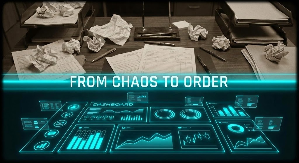
The Visual & Narrative Approach
A Mixed Media masterpiece designed for vertical screens. The composition uses a split-screen effect. The top half displays vintage, Sepia-toned footage of a cluttered desk—overflowing with crumpled paper forms, coffee stains, and analog chaos. The bottom half contrasts this with a sleek, Neon Cyan digital dashboard. A glowing "scanner" light bar sweeps downwards. As it passes, the crumpled papers in the top half are instantly transmuted into organized, glowing data blocks in the bottom half. This visualizes the transition from "Legacy Burden" to "Digital Freedom."
Psychological Impact & KPI Focus
This creates a powerful Before/After contrast that resonates with executives drowning in paperwork. The "Sepia" tone triggers a subconscious association with the "past" (obsolete), while the "Neon Cyan" signals the "future" (innovation). It validates the user's pain (the mess) and offers an immediate dopamine hit of resolution (the dashboard). High Shareability is the key KPI here.
Strategic Implementation & Trade-offs
- Best Use Case: Instagram Reels, TikTok, or YouTube Shorts targeting overwhelmed compliance officers. It visualizes the value proposition of "Digital Transformation" in 15 seconds.
- Trade-off: It simplifies the process significantly. Ensure the accompanying text clarifies that the software handles the complexity of this transition.
Companies using similar video content -
Fleetworthy Solutions – IntelliStamp – Automates heavy vehicle DOT/FMCSA compliance.
HVI APP – HVI – Manages heavy vehicle inspections and maintenance.
B2W – B2W Maintain – Provides heavy equipment fleet management.
6. Navigating Regulatory Roadblocks
TOFU | Skippable Pre-Roll Ad
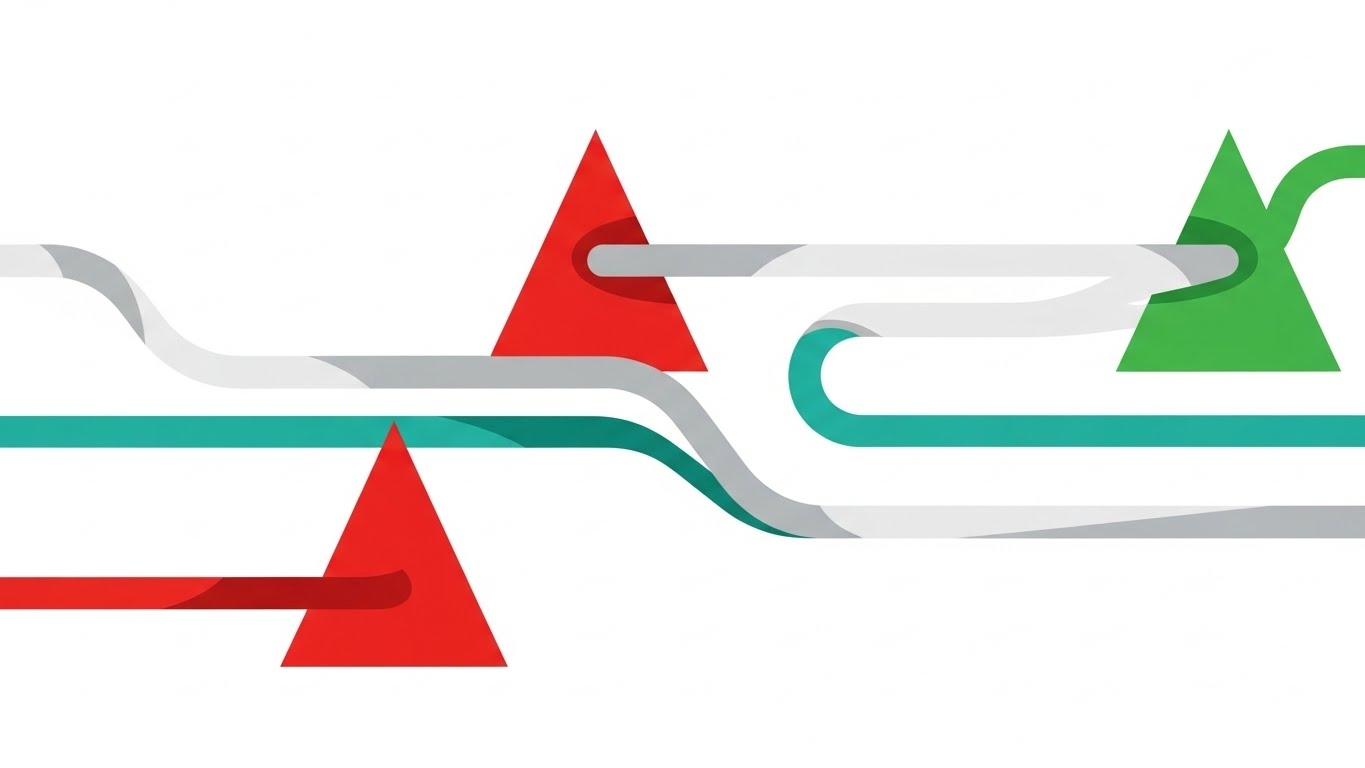
The Visual & Narrative Approach
Using Abstract 2D Motion Graphics, this style features fluid, horizontal lines of Silver and Teal flowing across a clean white background. These lines represent the vehicle development lifecycle. They encounter obstacles—sharp Red Triangles (representing regulatory roadblocks or audit failures). Instead of stopping, the fluid lines smoothly split and flow around the obstacles, turning the triangles into Green safety circles as they pass. This is a visual metaphor for "Agile Compliance."
Psychological Impact & KPI Focus
This style reduces the anxiety of "blockers." It reframes compliance challenges not as dead-ends, but as navigational markers that can be effortlessly managed. The color shift from Red (Danger) to Green (Safe) provides a continuous stream of positive reinforcement ("Check, Check, Check"). It is designed for Retention, keeping the viewer watching to see the next "solve."
Strategic Implementation & Trade-offs
- Best Use Case: YouTube TrueView ads targeting search terms like "ISO 26262 challenges." It visualizes the benefit of the software: flow and speed.
- Trade-off: Abstract metaphors can be misinterpreted. Use a voiceover or on-screen text to explicitly label the "Red Triangles" as "Compliance Risks."
Companies using similar video content -
KPA – Vera Suite – Transforms dealership compliance from manual to digital.
AutoSmart Audit – AutoSmart Audit – Digitizes and streamlines automotive compliance audits.
7. The Digital Twin Assembly
TOFU | Connected TV / OTT
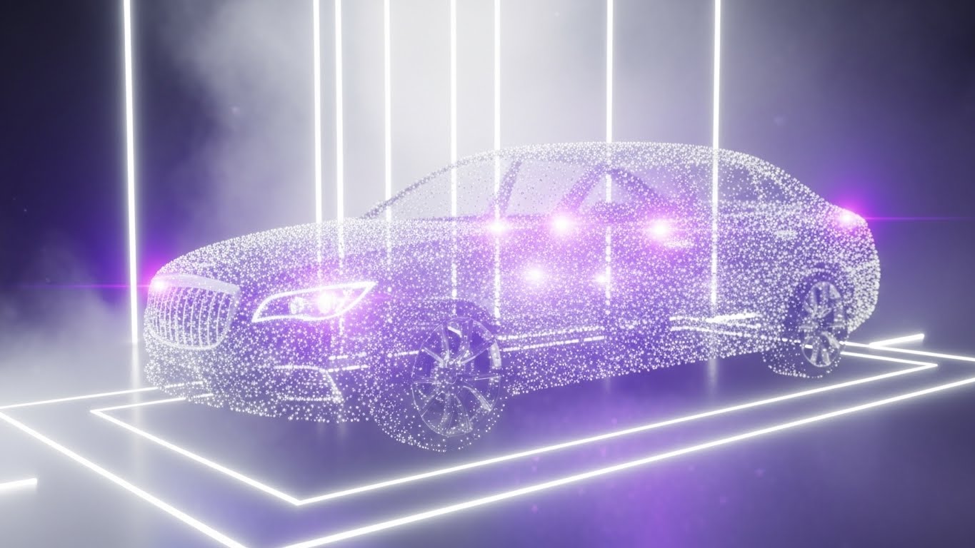
The Visual & Narrative Approach
A stunning Abstract 3D AI Visualization that leverages the "Particle System" aesthetic. Thousands of tiny, glowing nodes in Violet and Silver drift through a White/Silver mist. Slowly, they congregate and magnetically snap together to form the spectral, transparent ghost of a luxury sedan. This is the Digital Twin being born from data. The camera orbits slowly, emphasizing the dimensionality and completeness of the data model.
Psychological Impact & KPI Focus
This appeals to the "Visionary" aspect of the persona. It elevates the software from a "checking tool" to a "creation tool." The particles represent the millions of disparate data points (supply chain, testing, validation) coming together to form a cohesive whole. It builds Brand Prestige and positions the platform as a high-tech, futuristic solution suitable for premium automotive brands.
Strategic Implementation & Trade-offs
- Best Use Case: High-budget CTV spots or trade show booth backdrops (e.g., CES, IAA). It creates an atmosphere of innovation.
- Trade-off: It is expensive to produce and render. Save this for "Hero" content that defines the brand's technological superiority.
Companies using similar video content -
Regami – ROTA – Manages regulatory challenges for OTA updates.
Perforce Software – Helix QAC – Navigates ISO 26262 and MISRA compliance.
8. Global Risk Heatmap
MOFU | Demand Gen & Lead Capture

The Visual & Narrative Approach
A sophisticated Dynamic Data Visualization style. We see a stylized world map rendered in a precise dotted vector grid on a white background. Supply chain nodes appear as glowing Cool Blue circles. Arcs of connection lines trace routes between continents. Crucially, certain regions pulsate with Orange "Heatmap" patches, indicating supply chain risk or non-compliance zones. The aesthetic is clean, sharp, and journalistic—reminiscent of a Bloomberg terminal or a tactical command center.
Psychological Impact & KPI Focus
This triggers the "Fear of Missing Out" (on critical intel). It visualizes Global Visibility, a key aspiration for supply chain managers. Seeing the "Orange Risk Zones" triggers a desire to investigate and resolve, driving the viewer towards Lead Capture (e.g., "Download the Global Risk Report"). It positions the software as a strategic intelligence tool, not just a form-filler.
Strategic Implementation & Trade-offs
- Best For: LinkedIn organic posts and whitepaper downloads. It pairs perfectly with data-heavy content about "Supply Chain Resilience."
- Trade-off: Requires accurate data representation. Ensure the "risk zones" shown are plausible to maintain credibility with informed viewers.
Companies using similar video content -
Sibros – Deep Connected Platform – Assembles vehicle data for digital twin insights.
Applus+ IDIADA – Digital Twins – Creates virtual models from vehicle data.
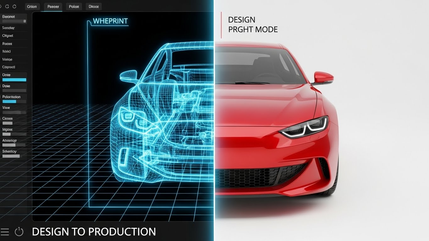
9. Blueprint to Reality
MOFU | Product/Solution Differentiation
The Visual & Narrative Approach
A classic yet powerful Split-Screen Composition. The left half reveals the technical wireframe blueprint of a car chassis in Blueprint Blue lines on a white grid—representing the "Design/Compliance" phase. The right half displays the fully rendered, photorealistic glossy car body in Automotive Red with studio lighting—representing the "Market-Ready Product." A vertical laser line actively scans across, pushing the wireframe into reality. This visualizes the entire "Design to Production" lifecycle being managed in one platform.
Psychological Impact & KPI Focus
This visually bridges the Physical/Digital Divide. It proves that the software connects the theoretical (blueprint) with the tangible (product). It reassures the viewer that compliance is integrated into the very DNA of the vehicle's creation, not bolted on at the end. It drives Product Consideration by showing the holistic nature of the platform.
Strategic Implementation & Trade-offs
- Best For: Website "Solutions" pages and product demo intros. It succinctly answers the question: "Where do you fit in the lifecycle?"
- Trade-off: Requires high-quality 3D assets for both the wireframe and the render. Inconsistencies between the two halves will break the illusion of continuity.
Companies using similar video content -
iPoint-systems – iPoint Compliance Automotive – Visualizes material compliance and supply chain risks.
FOSSA – FOSSA – Manages open-source license compliance and security risks.
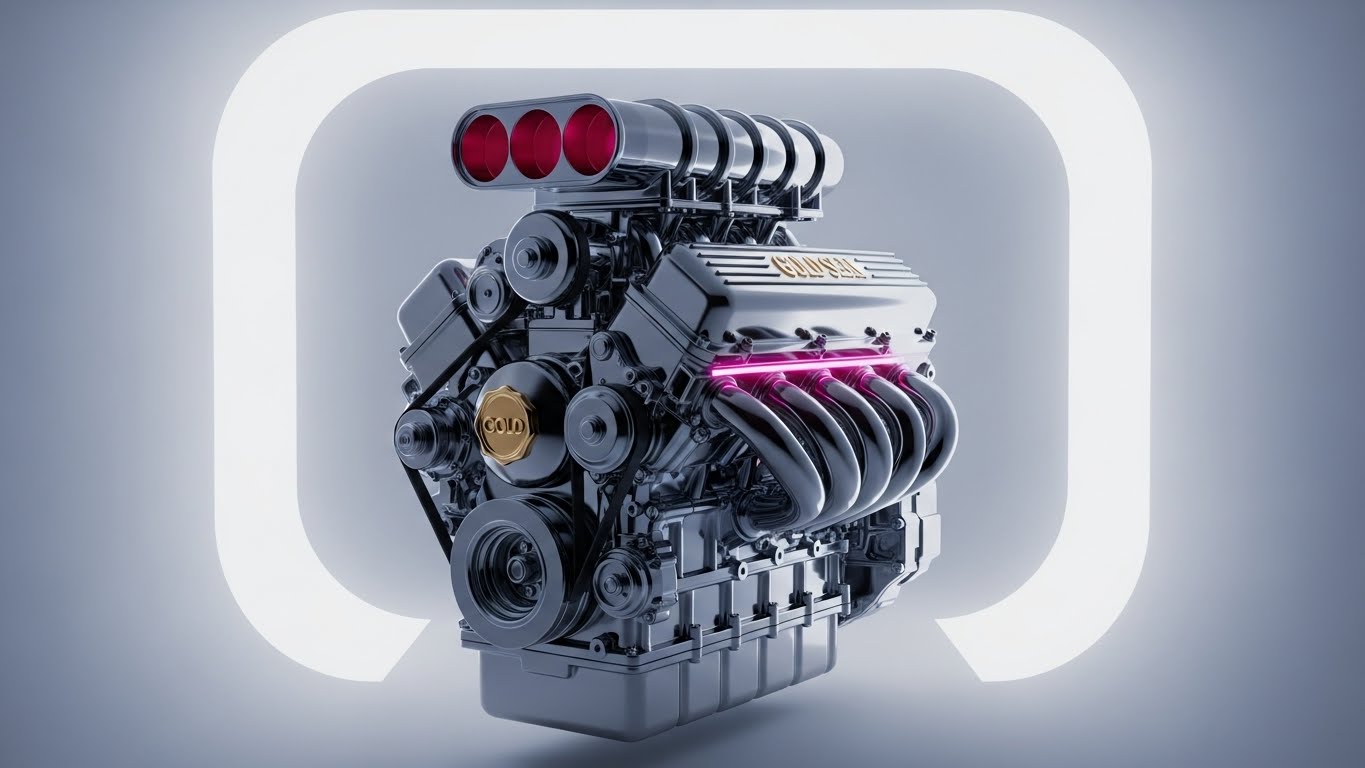
10. The Gold Seal of Trust
MOFU | Building Trust & Credibility
The Visual & Narrative Approach
This style utilizes Photorealistic 3D Renders to create an object of desire. We focus on a chrome vehicle engine block sitting in a bright White Infinity Cove studio with softbox lighting. The focus is razor-sharp, highlighting the metal textures and machined details. On the manifold, a subtle, glowing "Gold Seal" is embossed, representing certification and compliance. The camera performs a slow, macro pan, emphasizing the solidity and perfection of the certified component.
Psychological Impact & KPI Focus
In an industry plagued by "Dieselgate" style scandals, this style sells Integrity and Purity. The "Gold Seal" is a universal heuristic for "Verified." By rendering the engine with such high fidelity, we subconsciously transfer the quality of the image to the quality of the software. It builds deep Trust—the currency of the MOFU stage.
Strategic Implementation & Trade-offs
- Best For: Case study videos and "Trust Center" web pages. It is the visual equivalent of a signed affidavit.
- Trade-off: Static imagery can be boring. Use slow, majestic camera movement and lighting shifts (glints/flares) to keep the visual alive without distracting from the central object.
Companies using similar video content -
PTC – Windchill – Bridges design blueprints to production reality in PLM.
Siemens Digital Industries Software – Teamcenter – Connects engineering design to manufacturing processes.
11. The Human Side of Complexity
MOFU | Overcoming Objections

The Visual & Narrative Approach
This style leverages the approachable Corporate Memphis aesthetic (flat vector 2D) to humanize technical challenges. We feature a diverse automotive engineer character in professional Corporate Blue, standing in a stylized, minimal office. The visual hook is the thought bubble: a complex, tangled "Gordian Knot" of rope, representing the overwhelming intricacy of modern regulatory frameworks (ISO 26262, GDPR). The character holds a tablet displaying a clean, simplified profile, while giving a confident "Thumbs Up." The narrative arc is instantaneous: the software (tablet) untangles the mental burden (knot).
Psychological Impact & KPI Focus
Compliance officers often feel isolated and overwhelmed. This style uses Empathy to validate their struggle ("We see your knot") and immediately offers a solution that feels friendly and attainable, not intimidating. It lowers the barrier to entry for non-technical stakeholders. The primary KPI here is Engagement Time on educational content, as it promises relief from pain without demanding high cognitive effort.
Strategic Implementation & Trade-offs
- Best Use Case: Retargeting ads on YouTube or LinkedIn for users who visited the "Features" page but didn't convert. It addresses the "Is this too complex for my team?" objection.
- Trade-off: The cartoonish aesthetic can feel lightweight. Ensure the script emphasizes enterprise-grade capability so the "friendly" look doesn't imply "basic" functionality.
Companies using similar video content -
ETQ Reliance – Reliance QMS – Certifies automotive quality management processes.
Parasoft – C/C++test – Ensures ISO 26262 functional safety certification.
Qualityze – Qualityze EQMS – Provides AI-driven quality management for automotive.
12. The X-Ray Insight
MOFU | Risk Mitigation

The Visual & Narrative Approach
A high-fidelity 3D X-Ray Visualization that literally looks inside the machine. The vehicle's outer shell is rendered in a sophisticated Translucent Glass, revealing the internal mechanics in a clean Bone White. The focal point is a vibrant, glowing X-Ray Blue padlock hologram hovering over the dashboard/ECU, with connection lines actively scanning the chassis. The background is a technical engineering blueprint, reinforcing precision. This visualizes the "invisible" layer of cybersecurity (UNECE R155) that resides within the physical hardware.
Psychological Impact & KPI Focus
This style targets the Fear of Liability. It visually proves that your software isn't an afterthought; it is deeply embedded in the vehicle's architecture. The glowing lock acts as a "Safety Signal," triggering a sense of security and control. The goal is Time on Page—viewers are compelled to study the details of the internal integration, building technical trust.
Strategic Implementation & Trade-offs
- Best Use Case: "Security & Compliance" landing pages or deep-dive product webinars. It answers the technical due diligence question: "How deep does your integration go?"
- Trade-off: High production cost. Requires accurate CAD models to look authentic to engineers. Inaccuracies in the chassis layout will be spotted immediately by experts.
Companies using similar video content -
ComplyAuto – ComplyAuto – Simplifies complex auto dealer compliance for managers.
V-Comply – V-Comply – Humanizes dealership compliance management.
13. The Chaos vs. Order Split
MOFU | Competitive Displacement

The Visual & Narrative Approach
A direct Before/After split-screen comparison. The top half depicts the "Status Quo": a desaturated, chaotic scene of a factory desk cluttered with paper forms, coffee cups, and red-taped folders—the "Legacy Burden." The bottom half represents the "Solution": a pristine, high-resolution close-up of a hand holding a tablet. The screen displays a clean Mint Green and White dashboard, radiating organization and calm. The visual narrative is binary: Chaos vs. Control.
Psychological Impact & KPI Focus
This style drives Competitive Displacement. It forces the viewer to confront the inefficiency of their current manual or legacy systems. The visual contrast creates "Cognitive Ease" for the solution (bottom) and "Cognitive Strain" for the problem (top), subconsciously pushing the viewer toward the tablet. Key KPI: Conversion Rate on "Replace Your System" campaigns.
Strategic Implementation & Trade-offs
- Best Use Case: Meta (Facebook/Instagram) carousel ads or slide-decks for sales presentations. It visually articulates the value proposition of "Digital Transformation" without words.
- Trade-off: Can appear generic if the "Chaos" side feels too exaggerated. Ensure the "paperwork" looks like actual industry forms (e.g., homologation checklists) to maintain authenticity.
Companies using similar video content -
Mender.io – Mender – Provides deep insight into embedded software security.
balena – balenaOS – Offers secure IoT device management with deep visibility.
Synopsys – Functional Safety Solutions – Offers embedded cybersecurity insights.
14. The Fortress of Compliance
MOFU | ABM Awareness

The Visual & Narrative Approach
This style adopts a Low-Poly 3D aesthetic to create a metaphorical "Fortress of Compliance." In a soft, pastel-colored world (Mint Green and Pale Yellow), a central "Castle" structure represents the client's data or vehicle ecosystem. It is surrounded by a glowing, geodesic Cyan Energy Dome. Outside the dome, red "virus" particles (threats) attempt to enter but are bounced off. The low-poly style strips away the terrifying reality of cyberattacks, turning the concept of "Defense" into a manageable, gamified, and secure visual narrative.
Psychological Impact & KPI Focus
For Account-Based Marketing (ABM) campaigns targeting non-technical stakeholders (e.g., Procurement or Finance), this style is disarming. It simplifies the complex concept of "End-to-End Cybersecurity" into a clear visual metaphor: We Keep the Bad Stuff Out. It builds Brand Affinity by making a scary topic feel safe and approachable, positioning the vendor as the guardian of the "Kingdom."
Strategic Implementation & Trade-offs
- Best Use Case: Display ads on industry news sites or header images for "Data Sovereignty" blog posts. It serves as a visual anchor for abstract concepts like "Cloud Security."
- Trade-off: Too abstract for technical engineers who want to see the code or architecture. Use this for the "Why," not the "How."
Companies using similar video content -
ComplianceTrak – ComplianceTrak – Contrasts manual FCA compliance with digital clarity.
SafetyCulture – SafetyCulture – Transforms paper-based DOT compliance into digital workflows.
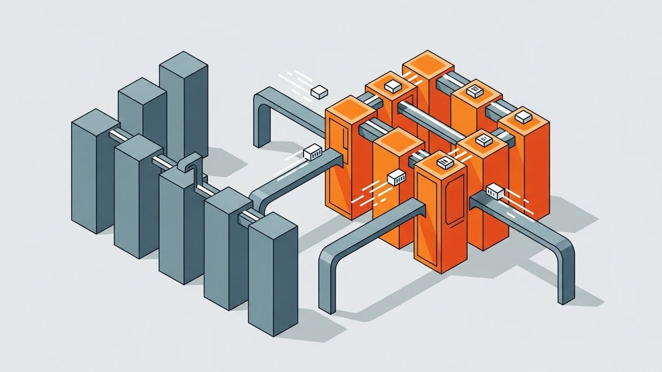
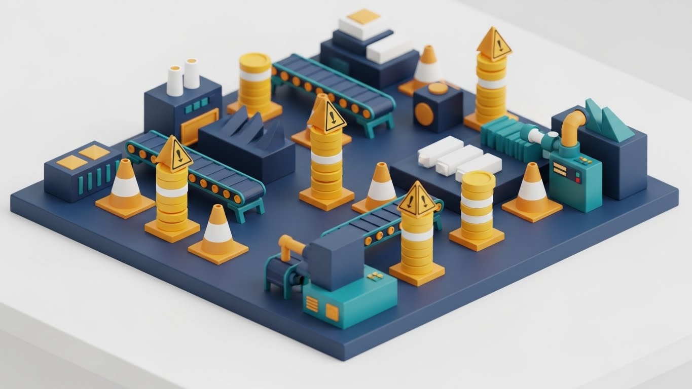
15. The Currency of Safety
BOFU | ROI Justification
The Visual & Narrative Approach
A miniature Isometric 3D "clay" style render of a manufacturing floor. The aesthetic uses a matte finish with a palette of Industrial Blue, Yellow, and Teal. We see a synchronized system of conveyor belts and machinery. The key narrative element is the transformation: "Warning" cones (representing risks) on the belt magically transform into stacks of Gold Coins as they pass a compliance scanner. It looks like a well-oiled machine—visualizing how the software converts risk into revenue.
Psychological Impact & KPI Focus
This speaks to the Operational Director's desire for efficiency and the CFO's need for ROI. The isometric view offers a sense of "God-Mode" control. By visually transmuting "Safety Hazards" (Cones) into "Capital" (Coins), we subconsciously align the software with profitability. The goal is ROI Validation—showing that safety and compliance lead to uninterrupted production.
Strategic Implementation & Trade-offs
- Best Use Case: "How It Works" pages or BOFU proposals. It visualizes the result of good compliance: smooth operations.
- Trade-off: The "toy-like" aesthetic must be balanced with data. Pair this visual with hard metrics (e.g., "Reduce downtime by 15%").
Companies using similar video content -
balena – balenaCloud – Creates a secure ecosystem for IoT device fleets.
Mender.io – Mender – Protects connected vehicle software with robust updates.
GRC+ – GRC+ – Builds cyber defense capabilities for automotive.
16. Velocity of Approval
BOFU | Sales Cycle Acceleration

The Visual & Narrative Approach
A dynamic, high-energy composition where UI elements take flight. Floating "cards"—representing project tasks, documents, and approvals—zoom toward the camera through a Light Grey radial blur tunnel. Each card vividly displays Green Checkmarks, "APPROVED" badges, and "100%" progress bars. The angle is aggressive and forward-moving, simulating warp speed. This is a visual metaphor for removing friction and accelerating the "Time-to-Market."
Psychological Impact & KPI Focus
This style triggers a Dopamine Response associated with task completion. The repeated "Green" signals success and forward momentum. For a sales prospect worried about slow implementation, this image screams "Speed." It is designed to accelerate the Sales Cycle by visually promising a faster workflow and rapid approvals.
Strategic Implementation & Trade-offs
- Best Use Case: Email marketing headers for "Closing the Deal" sequences or retargeting ads with the copy: "Stop Waiting. Start Building."
- Trade-off: It risks overpromising. Ensure the actual software UI shares some resemblance to these stylized "cards" to maintain continuity.
Companies using similar video content -
Fleetio – Fleetio – Visualizes fleet operational efficiency and cost savings.
Geotab – Geotab Fleet Management – Shows how telematics improves operational safety and efficiency.
Omnex Systems – EwQIMS – Visualizes functional safety for operational efficiency.
17. The Peer Validator
BOFU | Driving Demo Requests

The Visual & Narrative Approach
A Photorealistic AI-Generated portrait of the target persona: a Quality Manager in her 30s, wearing a professional Navy Blazer. She stands in a bright, modern glass-walled office with a blurred factory floor in the background—visually bridging the office/floor divide. She holds a tablet and smiles confidently at the camera. The lighting is natural and aspirational. This isn't a model; it looks like a peer who has successfully solved the compliance problem.
Psychological Impact & KPI Focus
Trust is the currency of the BOFU stage. This style leverages Social Proof and Mirroring. The viewer sees themselves in the subject—but a happier, less stressed version. It validates their professional identity and implies that "Success looks like this." The goal is to drive Demo Requests by offering a transformation into this confident persona.
Strategic Implementation & Trade-offs
- Best Use Case: "Testimonials" pages, case study covers, or personalized sales emails. It adds a human face to the software.
- Trade-off: Avoid the "Uncanny Valley." The AI generation must be flawless. If the hands or eyes look wrong, trust is instantly broken.
Companies using similar video content -
TivaCloud – TivaCloud – Accelerates DOT compliance approvals and workflows.
AutoSmart Audit – AutoSmart Audit – Speeds up audit processes with rapid digital approvals.
18. The Hybrid Reality Layer
BOFU | Objection Handling & Friction Reduction

The Visual & Narrative Approach
A composite image blending high-quality Live Action photography with 2D Vector Graphics. We see two professionals in a server room—the physical reality of data storage. Superimposed over their tablet and the server racks are glowing Neon Blue icons (Padlocks, Clouds, Sync Arrows). These icons "pop" out of the devices, visualizing the invisible software layer that connects and protects the hardware.
Psychological Impact & KPI Focus
This style directly addresses the "Physical/Digital Divide." It shows that the software doesn't just exist in the cloud; it lives on the floor, in the server room, and in the hands of the workforce. It grounds the abstract SaaS concept in a tangible reality, reducing Friction and skepticism about implementation. "It works here, in the real world."
Strategic Implementation & Trade-offs
- Best Use Case: Explainer videos or "Implementation Guide" documents. It creates a visual bridge between the customer's physical assets and the vendor's digital solution.
- Trade-off: The stock photo base must be high quality. If the underlying photo looks staged or cheap, the overlay effects won't save it.
Companies using similar video content -
ETQ Reliance – Reliance QMS – Empowers quality managers with confident compliance.
KPA – Vera Suite – Positions compliance officers as confident industry peers.
Qualityze – Qualityze EQMS – Builds trust for automotive quality managers.
19. The Executive Horizon
BOFU | The Economic Buyer

The Visual & Narrative Approach
A cinematic, low-angle shot of a silhouette (the Executive) standing before a massive floor-to-ceiling window in a high-rise. The sun bursts through the city skyline, creating a dramatic Lens Flare and washing the scene in Executive Blue and Gold. The text overlay is minimal and elegant. This image is not about features; it is about Vision, Oversight, and Strategic Success. It sells the feeling of being in control of a global automotive empire.
Psychological Impact & KPI Focus
This appeals to the Ego and Aspiration of the C-Suite (CEO/CFO). They are not buying "compliance software"; they are buying "Market Leadership" and "Risk-Free Growth." The visual language echoes Fortune 500 annual reports. The goal is to influence the Economic Buyer to sign the check.
Strategic Implementation & Trade-offs
- Best Use Case: Pitch decks for the C-Suite, Annual Reports, or high-level "Vision" pages on the website.
- Trade-off: Zero technical value. Do not use this for the engineering team—they will see it as "marketing fluff." Use strictly for the decision-makers.
Companies using similar video content -
Sibros – Deep Connected Platform – Overlays digital data on live vehicle operations.
Samsara – Samsara Platform – Integrates telematics data with real-world fleet operations.
Verizon Connect – Verizon Connect Reveal – Blends GPS tracking with compliance data.
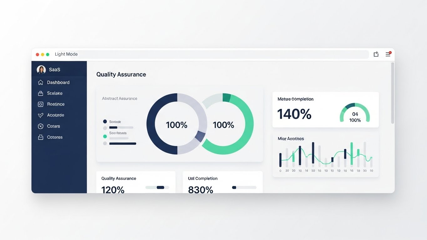
20. The Command Center
BOFU | The Functional Buyer
The Visual & Narrative Approach
A pristine, straight-on representation of the software's UI in Light Mode. The design is minimalist, utilizing Navy Blue sidebars and Mint Green accents on a clean white background. We see "Quality Assurance" metrics, gauge charts at 120% efficiency, and clear data visualization. There is no clutter, no mess—just a functional, beautiful tool inside a browser frame. This is the "Daily Driver" view.
Psychological Impact & KPI Focus
This targets the Functional Buyer (VP of Quality/Engineering) who has to live with the software every day. It screams Usability. The clean "Light Mode" aesthetic reduces perceived cognitive load, reassuring the buyer that this tool will clarify their workflow, not complicate it. The key KPI is User Adoption and reducing the "Fear of Churn."
Strategic Implementation & Trade-offs
- Best Use Case: Pricing pages, documentation, and the final "Product Tour" before purchase. It serves as the "Proof of Product."
- Trade-off: It must be accurate. If the actual product UI is clunky compared to this screenshot, you will create a "Expectation Gap" that leads to dissatisfaction.
Companies using similar video content -
Siemens Digital Industries Software – Xcelerator – Presents a strategic vision for automotive innovation.
PTC – Windchill – Offers executive oversight for product lifecycle management.
Infor Platform – Infor GRC – Provides strategic oversight for automotive GRC.
21. Dark Mode UI Showcase
BOFU | The Technical Buyer

The Visual & Narrative Approach
This style caters specifically to the "Dark Mode" preference of modern developers and IT leaders. We present the software interface in a sleek, high-contrast Obsidian Black environment, minimizing eye strain and focusing attention on data density. Key data streams and code snippets are highlighted in Neon Green and Cyan, popping against the dark canvas. The camera angle is perspective-tilted, giving the UI a tangible, "monolithic" presence. Glowing connection lines pulse rhythmically, representing secure, active API integrations in a cool server room environment.
Psychological Impact & KPI Focus
For the CIO or IT Director, "Dark Mode" is a heuristic for "Pro-Grade" and "Developer-Friendly." It signals that the platform is robust, modern, and built for heavy-duty usage. The glowing API lines visually reassure them of Connectivity and Throughput. The goal here is to validate the Technical Stack and reduce friction during the technical due diligence phase.
Strategic Implementation & Trade-offs
- Best Use Case: Technical documentation pages, API integration guides, and the "Developers" section of your website.
- Trade-off: While developers love Dark Mode, business users (Finance/Ops) often prefer Light Mode for readability. Ensure you know who is watching before deploying this style.
Companies using similar video content -
Geotab – Geotab Fleet Management – Provides a clean UI for daily fleet compliance.
Fleetworthy Solutions – Fleetworthy – Offers a clear dashboard for DOT compliance.
Fleet Complete – Fleet Complete – Delivers a functional UI for fleet management.
22. Velocity of Value
Onboarding | Accelerating Time-to-Value
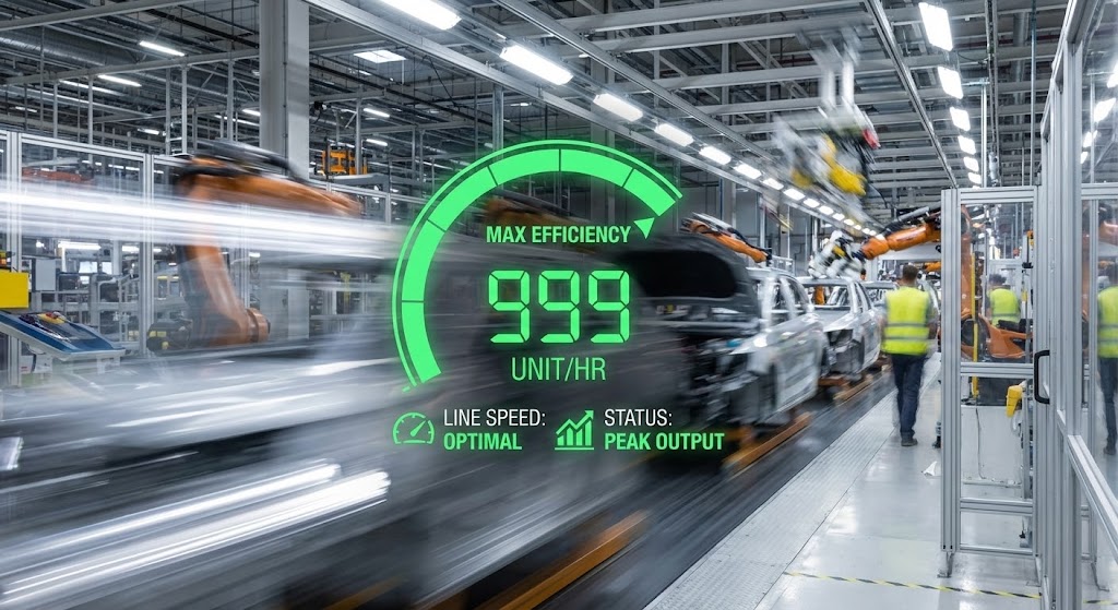
The Visual & Narrative Approach
A high-energy synthesis of live-action and digital overlay. The background features a Hyper-lapse of a car assembly line or factory floor, with movement blurred into streaks of Silver Motion Blur to indicate high velocity. Superimposed over this frantic energy is a sharp, static, and stable digital Heads Up Display (HUD) in Speed Green. The HUD displays a speedometer hitting "Max Efficiency" and counters ticking up rapidly ("999 Unit/Hr"). This contrasts the chaotic speed of production with the calm, precise control of your software.
Psychological Impact & KPI Focus
This visual targets the New Customer's anxiety about "Implementation Lag." It visually promises that the software will not slow down their operations; it will pace them. The "HUD" metaphor empowers the user, suggesting they are the pilot of a high-speed machine. The primary KPI is Time-to-Value (TTV); it motivates the user to complete setup quickly to achieve the "Speed Green" state shown in the video.
Strategic Implementation & Trade-offs
- Best Use Case: "Welcome" emails immediately after purchase or the first video in the Onboarding sequence. It sets the pace for the relationship.
- Trade-off: The stock footage must match the client's actual environment (e.g., don't use a sedan assembly line for a heavy-trucking client).
Companies using similar video content -
Perforce Software – Helix QAC – Showcases developer-centric static analysis.
Parasoft – C/C++test – Highlights robust software testing for developers.
Vector – PREEvision – Presents a dark mode UI for functional safety design.
23. The Frictionless Migration
Onboarding | Reducing Implementation Friction

The Visual & Narrative Approach
To visualize the ease of moving data, we use a 3D Parallax UI composition. Screen elements are deconstructed into floating layers against a calming Soft Purple and White background. A "Document" icon lifts effortlessly from a top layer, floats along a smooth trajectory trail, and nests itself securely into a "Folder" on a bottom layer. The lighting is soft and volumetric, highlighting the depth and the "airiness" of the process. There is no friction, no loading bars—just smooth, magnetic transfer.
Psychological Impact & KPI Focus
Implementation is often the most stressful phase for a client ("Will we lose data? Will it take months?"). This style utilizes Cognitive Ease to calm those fears. The floating, weightless motion suggests that the migration process is automated and burden-free. It is designed to reduce Implementation Drop-off by visually assuring the user that the hard work is handled by the system.
Strategic Implementation & Trade-offs
- Best Use Case: "Getting Started" wizard videos or landing pages explaining your "One-Click Import" features.
- Trade-off: It is highly stylized. Ensure you clarify that while the process feels this smooth, the actual UI creates a solid, not floating, audit trail.
Companies using similar video content -
Motive – Motive AI Dashcam – Visualizes operational speed and safety control.
Samsara – Samsara Platform – Shows real-time operational speed and efficiency.
Whip Around – Whip Around – Accelerates daily fleet inspection value.
24. The Friendly Guide
Onboarding | Self-Serve Onboarding

The Visual & Narrative Approach
A charming 2D Cel-Shaded Animation that introduces a "human" element to the software. We feature a stylized, non-threatening character (the "Guide") in a palette of Pastel Pink, Blue, and White. The character interacts directly with floating UI windows, pointing out key features and physically guiding a "file" icon into a "cloud" icon. The background is a simplified abstract workspace. The animation style is fluid and bouncy, creating a helpful and educational tone that makes learning feel like play.
Psychological Impact & KPI Focus
For Product-Led Growth (PLG) strategies, the user is often learning alone. This style reduces the feeling of isolation. The character acts as a proxy for a Customer Success Manager, providing warmth and encouragement. It lowers the barrier to entry for non-technical users, directly impacting Feature Adoption Rates and User Activation.
Strategic Implementation & Trade-offs
- Best Use Case: "Walkthrough" videos embedded inside the software (e.g., Tooltips) or YouTube organic search content for "How to use [Platform Name]."
- Trade-off: It can feel too "cute" for very serious, high-risk compliance modules. Use it for general navigation and setup, not for explaining fatal crash reporting protocols.
Companies using similar video content -
iPoint-systems – iPoint Compliance Automotive – Visualizes seamless material data transfer.
FOSSA – FOSSA – Represents smooth integration for open-source compliance data.
StandardFusion – StandardFusion – Facilitates frictionless GRC data migration.
25. The Elegant Trial
Onboarding | Trial/Freemium User Activation
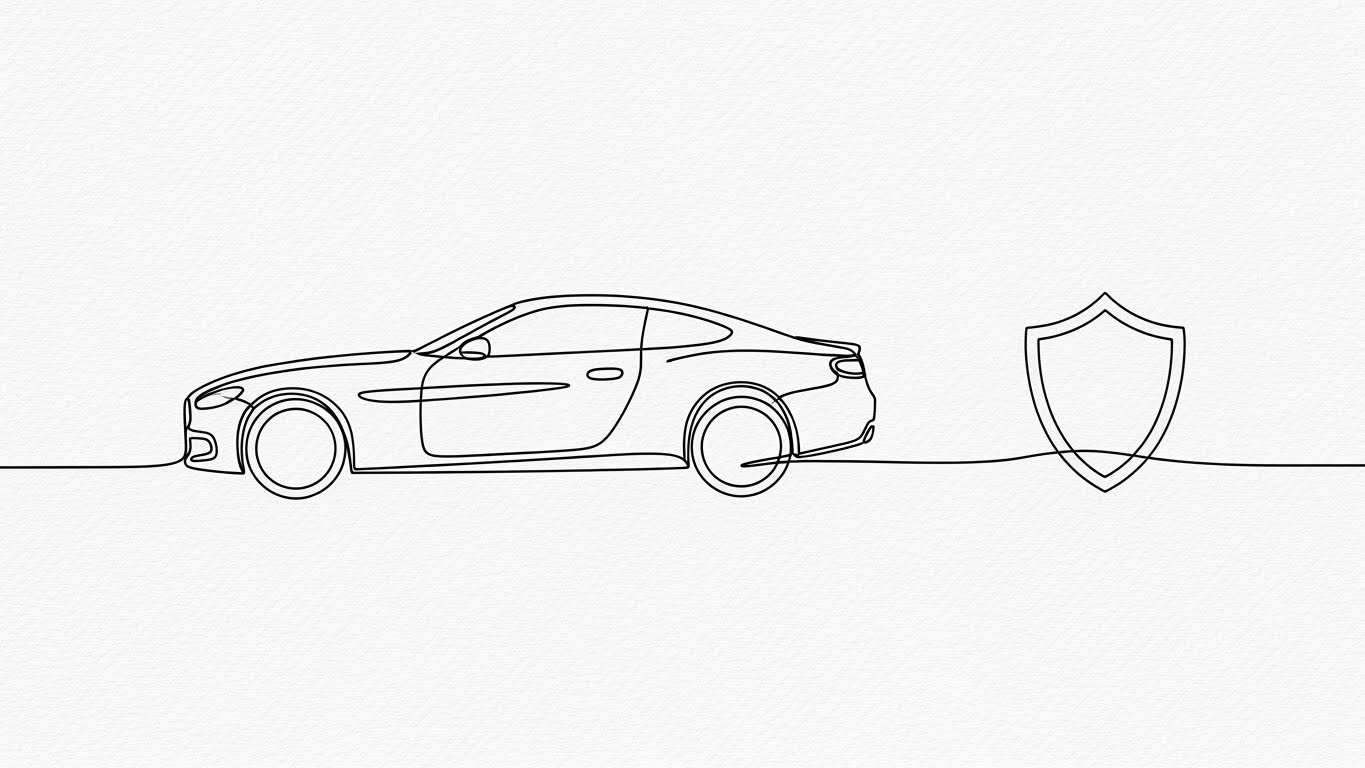
The Visual & Narrative Approach
Minimalism at its finest. An elegant, continuous single-line drawing in Ink Black flows across a textured Paper White background. The line is alive; it morphs fluidly: first, it forms the outline of a sports car, then seamlessly transitions into the shape of a shield logo. The motion is unbroken and hypnotic. It strips away all noise/UI/data to focus on the pure essence of the outcome: Protection.
Psychological Impact & KPI Focus
In the Freemium/Trial phase, users are easily overwhelmed. This style offers a "Zen" moment. It communicates that despite the complexity of automotive compliance, the core value of your platform is simple and elegant. It reduces Cognitive Load to near zero, encouraging the user to take that first single action (the "Checkmark").
Strategic Implementation & Trade-offs
- Best Use Case: Loading screens, "Success" state animations after a user completes their first task, or social media ads targeting "Simplicity."
- Trade-off: It is purely conceptual. It explains nothing about the product's function. Always pair it with a Call-to-Action.
Companies using similar video content -
ComplyAuto – ComplyAuto – Guides auto dealers through compliance processes.
V-Comply – V-Comply – Provides friendly, animated support for dealership compliance.
Usercentrics – Usercentrics CMP – Guides users through data privacy consent.
26. Celebrating the Win
Retention | Reducing Churn

The Visual & Narrative Approach
A celebration of the people behind the compliance. We use a wide, cinematic shot of a diverse team of automotive professionals in a bright, sunlit collaborative workspace. They are engaged in a moment of victory—high-fiving or pointing excitedly at a screen. Overlaid in the air are semi-transparent, floating Translucent Green trend graphs showing upward growth. The mood is celebratory, reinforcing that the platform facilitates teamwork, not just data entry.
Psychological Impact & KPI Focus
Churn often happens when users feel the software is a chore. This style reframes the software as a Collaboration Hub. By associating the platform with positive social interactions and professional success (the green graphs), we build Emotional Stickiness. It reminds the decision-maker that their team likes using this tool.
Strategic Implementation & Trade-offs
- Best Use Case: LinkedIn organic posts celebrating customer milestones, or "Year in Review" personalized videos sent to account admins.
- Trade-off: Avoid "Cheesy Stock." The diversity and setting must look authentic to the automotive engineering world (smart casual, not suits).
Companies using similar video content -
Mender.io – Mender – Offers a minimalist approach to OTA update activation.
balena – balenaCloud – Simplifies IoT device fleet management.
T-Systems – TypeMaster – Provides elegant trial for homologation processes.
27. The Tactile Click
Retention | Website Visitor Re-engagement

The Visual & Narrative Approach
An extreme Macro Close-up of the digital experience. We see a stylized mouse cursor hovering over a pill-shaped button on a screen. The button is glowing Cyan and implies a definitive "Submit" or "Approve" action. As the cursor clicks, we see a visual ripple effect. The surrounding UI is blurred into a White Bokeh, drawing 100% of the viewer's attention to this single, satisfying micro-interaction.
Psychological Impact & KPI Focus
This leverages the psychology of Haptics and Completion Bias. The visual is so detailed you can almost "feel" the click. For a user who abandoned a workflow, this image triggers a desire to return and complete the action. It simplifies the complex platform down to one simple, achievable step. The goal is Re-engagement and task completion.
Strategic Implementation & Trade-offs
- Best Use Case: Programmatic display ads (retargeting) or email headers with the copy: "You're one click away from compliance."
- Trade-off: Extremely narrow focus. It works only for "nudge" campaigns, not for explaining broad value.
Companies using similar video content -
KPA – Vera Suite – Celebrates team success in achieving compliance.
ETQ Reliance – Reliance QMS – Highlights collaborative success in quality management.
Qualityze – Qualityze EQMS – Celebrates successful automotive quality outcomes.
28. The Holographic Library
Retention | Knowledge Base & FAQ Videos

The Visual & Narrative Approach
We transform the boring concept of a "Help Center" into a futuristic Holographic Laboratory. From a low-angle perspective, we see a 3D projection in Hologram Blue/Purple floating from a laptop in a clean, blurred environment. The hologram displays a rotating library of open books, regulatory documents, and automotive schematics. The background is blurred to make the glowing data pop. It treats knowledge not as text, but as a tangible, high-tech asset.
Psychological Impact & KPI Focus
This elevates the Perceived Value of your support resources. It tells the user that your "Knowledge Base" is not a static FAQ, but a dynamic, living intelligence system. It encourages users to explore the documentation, driving Self-Sufficiency and reducing support ticket volume.
Strategic Implementation & Trade-offs
- Best Use Case: Covers for tutorial video series or the header image of your "Support Portal."
- Trade-off: Ensure the actual support portal is well-organized. If the image promises "Future Tech" and the link leads to a broken PDF, trust is lost.
Companies using similar video content -
AutoSmart Audit – AutoSmart Audit – Focuses on satisfying audit completion clicks.
SafetyCulture – SafetyCulture – Emphasizes mobile-first task completion.
Whip Around – Whip Around – Triggers completion habits for daily inspections.
29. Autonomous Expansion
Expansion | Driving Deep Feature Adoption
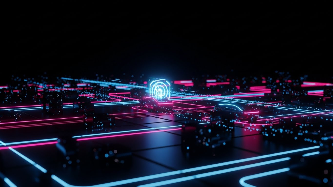
The Visual & Narrative Approach
A shift to a Cyberpunk/Sci-Fi aesthetic to visualize the future of mobility. The scene is a "Dark Mode" autonomous city grid set against a deep Black background. Neon Pink and Blue laser lines trace the paths of ghost cars navigating complex intersections. This visualizes the advanced "Autonomous Compliance" modules (e.g., UNECE R157). It feels like the view from inside an AI's brain—calculating, predicting, and complying in real-time.
Psychological Impact & KPI Focus
This targets Upsell and Expansion. It appeals to the client's desire to be a "Future-Ready" leader. By using a visual language associated with high-tech gaming and sci-fi cinema, we position the advanced modules as cutting-edge innovations that the client needs to stay competitive. Key KPI: Adoption of Premium Modules.
Strategic Implementation & Trade-offs
- Best Use Case: Email campaigns launching new AI or Autonomous features. It signals: "This is something new and powerful."
- Trade-off: It can look "gamey." Maintain thin, precise lines to ensure it looks like engineering data, not a video game.
Companies using similar video content -
Applus+ IDIADA – IRIS – Projects future-ready regulatory knowledge.
T-Systems – TypeMaster – Offers advanced access to homologation documentation.
Omnex Systems – EwQIMS – Provides a holographic view of functional safety knowledge.
30. Sustainable Growth
Expansion | Driving Upsell/Cross-sell
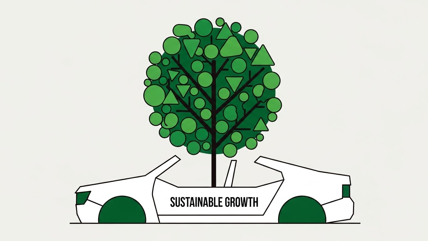
The Visual & Narrative Approach
To introduce ESG (Environmental, Social, and Governance) modules, we switch to a Minimalist Flat Vector style. A clean, stylized tree in Forest Green grows directly out of a white car chassis. The leaves are composed of geometric shapes (triangles, circles) representing data points. The background is a clean, pale grey. It visually combines "Mechanical Engineering" with "Organic Growth," representing the new mandate for sustainable automotive production.
Psychological Impact & KPI Focus
This style is calm, responsible, and ethical. It appeals to the Sustainability Officer and the C-Suite's need to meet carbon targets. It frames the Upsell (ESG Module) not as a cost, but as "Growth." It softens the image of the software, making it feel compliant with both the law and the planet.
Strategic Implementation & Trade-offs
- Best Use Case: Earth Day campaigns, ESG report visualizations, or cross-sell emails for Carbon Tracking features.
- Trade-off: Avoid "Greenwashing." Use this style only if your software genuinely has robust sustainability tracking features.
Strategic Knowledge Base: The Visual Operations Doctrine
To transform these 30 visual styles from "aesthetic choices" into a competitive business advantage, we have synthesized a 3-segment operational framework. This "Visual Operations Doctrine" bridges the gap between marketing assets and business outcomes.
Strategic Alignment & Visual Architecture (Pre-Production)
- Defining your "Visual Operating System" before a single frame is rendered.*
- The Cognitive Load Audit: Before creating new assets, audit your current training materials. If a regulation manual (e.g., ISO 26262) takes 20 minutes to read, your goal is a 60-second video (Style 3) that delivers the same comprehension. Visuals must subtract complexity, not decorate it.
- Role-Based Visual Mapping: Do not use the same style for everyone. Use High-Contrast/Large Text (Style 4) for drivers and shop-floor mobile users who need "Glanceability." Use Data-Dense/Dark Mode (Style 21) for IT and Fleet Managers who need depth and precision.
- The "Glanceability" Standard: In automotive logistics, attention is a scarce resource. Your visuals must pass the "3-Second Rule." If a driver cannot understand the "Pass/Fail" status of a compliance check (Style 7) in under 3 seconds, the visual is a safety risk.
- Brand Voice Consistency: Your platform likely consists of disparate modules (Maintenance, Legal, HR). Use a unified visual language—such as the "Liquid Shield" (Style 1)—to visually stitch these modules into a single, cohesive ecosystem.
- The Advids Strategic Audit: Partner with Advids early. We don't just animate; we help you define this "Visual Operating System," ensuring your library of assets scales consistently from your first explainer video to your thousandth support clip.
- Standardization vs. Customization: For core features (e.g., login), use standardized styles (Style 25). For vertical-specific features (e.g., Cold Chain vs. Flatbed), use bespoke visualization (Style 10 vs. Style 4) to prove deep industry relevance.
- The Cross-Departmental Bridge: Visuals are the only language everyone speaks. Use Concept Metaphors (Style 11) to align Sales (who sell the dream) and Engineering (who build the reality), preventing the "Overpromised/Underdelivered" gap.
- Legacy System Integration: Visualizing the invisible link between old hardware and new software is crucial. Use Hybrid Styles (Style 18) to show your modern UI "wrapping" their legacy servers, reducing the fear of "Rip and Replace."
- Accessibility in Global Fleets: Your users speak 20 languages. Abstract Motion (Style 6) with universal icons (Red Stop, Green Go) bypasses language barriers, saving millions in localization costs.
- The Mobile-First Mandate: 80% of your end-users (drivers/mechanics) are on mobile. Design every frame (especially Styles 2, 22, 27) to be legible on a 5-inch screen in bright sunlight.
Operational Adoption & Implementation (Deployment)
- Embedding visuals into the workflow to drive adoption and reduce friction.*
- Overcoming "Big Brother" Anxiety: Driver monitoring is sensitive. Use Empathy-Driven Styles (Style 11) to frame monitoring as "Co-Pilot Protection" rather than "Surveillance," drastically improving driver acceptance.
- The Micro-Learning Shift: Replace the 50-page "Onboarding Manual" with a playlist of twenty 30-second clips (Style 24). This "Just-in-Time" learning boosts retention and reduces onboarding time by up to 40%.
- Just-in-Time Support: Embed specific Looping GIFs (Style 27) directly into your software's tooltips. When a user hovers over "Upload," show them the "Tactile Click" animation. Support isn't a destination; it's a feature.
- Gamification of Training: Use HUD Styles (Style 22) to visualize driver scorecards. Turning compliance into a "High Score" visual encourages positive competition and engagement.
- Reducing Support Ticket Volume: There is a direct correlation between proactive visual guides (Style 28) and reduced call center load. Every video view is a ticket deflected.
- Remote Onboarding: For distributed fleets, physical seminars are impossible. Use 3D Parallax (Style 23) and screencasts to train thousands of drivers simultaneously, ensuring consistent standard of care.
- Visualizing SOPs: Transform text-based Standard Operating Procedures into Isometric Process Flows (Style 15). Humans follow visual maps faster and more accurately than written lists.
- Feedback Loops: Use interactive video elements. At the end of a "New Feature" video (Style 29), ask "Did this help?" The data you gather is gold for your product team.
- Scalable Localization: When producing video assets, keep text on separate layers (or no text at all, using Style 1). This allows you to swap languages instantly for global rollouts without re-rendering the animation.
- Leadership Communication: When pitching a renewal to the C-Suite, don't send a spreadsheet. Send a Cinematic Vision Video (Style 19) that reminds them of the strategic partnership and future roadmap.
Measuring Impact & Future-Proofing (ROI)
- Measuring success and preparing for the next decade of automotive tech.*
- Beyond "Views": Stop counting views. Start measuring "Time-to-Competency" (how fast a user masters a feature after watching Style 24) and "Feature Adoption Rate" (did they try the module after seeing Style 29?).
- The "Idle Time" Metric: In logistics, time is money. Correlate better visualization (Style 22) with reduced "Software Idle Time"—meaning users get in, do the job, and get back on the road faster.
- Compliance Velocity: Measure how fast new regulations (e.g., ELD mandates) are understood across the fleet. Video (Style 6) is the only medium fast enough to keep pace with changing laws.
- Retention and LTV: High-quality UX visualization (Style 26) reduces "User Frustration," a leading cause of churn. Happy, confident users renew contracts.
- The AI Visual Frontier: Prepare for Generative AI. Soon, your platform will need to generate real-time visual alerts (Style 29) based on live telematic data. Your visual style guide today is the training data for tomorrow's AI.
- Scalability of Assets: Build a library, not a pile. Organizing assets by Style Code (1-30) allows your marketing and product teams to pull "on-brand" visuals instantly, speeding up campaign launches.
- The Advids Partnership: This is where we fit in. Advids acts as your long-term guardian of this library, ensuring that as you scale from Series B to IPO, your visual identity evolves without losing its core DNA.
- Benchmarking Success: If your competitor's demo looks like Style 10 (Photorealistic Trust) and yours looks like a PowerPoint, you are losing deals before the meeting starts. "Visual Quality" is a proxy for "Product Quality."
- The ROI of Safety: Quantify the unquantifiable. If better safety training videos (Style 12) reduce accident rates by even 1%, the insurance savings alone pay for the entire video strategy.
- Final Call to Innovation: Treat video as Infrastructure, not content. In the era of the "Data Center on Wheels," your visual communication is the fiber-optic cable that connects human intelligence to machine precision.
Companies using similar video content -
Sibros – Deep Connected Platform – Visualizes advanced autonomous vehicle compliance.
Regami – ROTA – Showcases future-ready regulatory compliance for autonomous features.
Synopsys – Functional Safety Solutions – Drives expansion into autonomous safety.
Author & Editor Bio


