
Introduction: Visualizing the Nervous System of Modern Mobility
The automotive industry is currently navigating its most profound transformation in a century. We are moving from the era of the internal combustion engine to the era of the Software-Defined Vehicle (SDV). Yet, for many manufacturers and Tier 1 suppliers, the operational backbone—the ERP system—remains a "black box" of legacy code and disjointed spreadsheets. The cost of this opacity is staggering. Recent industry data reveals that major automotive manufacturers now lose $2.3 million per hour due to unplanned downtime. This figure underscores a critical reality: the gap between digital planning and physical execution is where profit evaporates.
For ERP and SaaS platforms serving this sector, the marketing challenge is not just to explain features, but to demonstrate integration. Your audience—CTOs, Plant Managers, and Supply Chain Directors—are burdened by cognitive load. They manage complex ecosystems where a single delayed microchip can halt an entire assembly line. They do not have time to decipher abstract claims. They need to see how your software bridges the physical-digital divide.
This guide presents a strategic visual framework to articulate that bridge. As the global cloud computing in automotive market accelerates at a 16.09% CAGR, the winners will be the platforms that can clearly visualize their value. By moving beyond generic screen recordings and embracing high-impact visualization styles, we can reduce the cognitive friction of adoption and prove ROI.
The following examples (Styles 1-9) represent the "Gold Standard" for B2B automotive software visualization. They are curated to address specific stages of the funnel, from establishing category leadership to validating technical precision.
1. Abstract 3D AI Visualization
TOFU | Brand Awareness

The Visual & Narrative Approach
This style abandons the literal factory floor for the "Digital Twin" of the supply chain. We enter a mesmerizing, ethereal digital space composed of pure white and glowing cyan particles. These particles are not random; they form a complex network of floating nodes that resemble abstract automotive components—pistons, gears, and microchips—connected by pulsing beams of light. The camera floats through this infinite clean data space, highlighting the interconnectivity of a global supply chain. The aesthetic is high-tech and sophisticated, utilizing volumetric lighting and shallow depth of field to create a sense of vast, intelligent scale.
Psychological Impact & KPI Focus
- Niche Psychology: For a CIO struggling with data silos, seeing the entire network connected in one fluid visual is deeply reassuring. It triggers a sense of Omniscience—the ability to see everything at once.
- Operational Impact: It visually proves Interoperability. It validates the promise that your software can connect disparate systems (ERP, MES, WMS) into a single, cohesive intelligence network.
Strategic Implementation & Trade-offs
- Best Use Case: Homepage "Hero" backgrounds or high-level brand manifesto videos.
- Duration: 15-30 seconds (Looping).
- Trade-off: This style is excellent for "Category Creation" (establishing a new way of thinking) but poor for "Feature Education." It is too abstract to explain how a specific module works.
Companies using similar video content -
Siemens Digital Industries Software – Teamcenter – Visualizing complex product lifecycle management.
Dassault Systèmes – 3DEXPERIENCE Platform – Connecting design, simulation, and manufacturing.
2. Abstract 2D Motion Graphics
TOFU | Category Creation

The Visual & Narrative Approach
Cleanliness is the core value proposition here. Utilizing a high-contrast palette of mustard yellow and deep charcoal grey against a bright white background, this style uses geometry to tell a story of order. Geometric shapes representing chaotic logistics—squares, triangles, and circles—float aimlessly on the canvas before magnetically snapping into a perfectly organized, linear workflow. The animation style is flat with hard edges and smooth, vector-based transitions, visually metaphorizing the transformation from supply chain disorder to streamlined efficiency.
Psychological Impact & KPI Focus
- Cognitive Load: The brain loves order. Watching chaotic elements snap into a grid releases a micro-dose of dopamine associated with "problem-solving." It addresses the anxiety of Operational Chaos.
- Operational Impact: It simplifies complex concepts like Just-in-Sequence (JIS) delivery. It effectively communicates that your software is the "invisible hand" that organizes the flow of materials.
Strategic Implementation & Trade-offs
- Best Use Case: Explainer videos on YouTube or LinkedIn feeds where sound might be off.
- Duration: 30-60 seconds.
- Trade-off: It can feel "generic" if not branded carefully. It risks looking like a standard tech startup video rather than an industrial-grade solution.
Companies using similar video content -
Kinaxis – RapidResponse – Orchestrating supply chain planning and execution.
Blue Yonder – Luminate Platform – Streamlining end-to-end supply chain operations.
3. Futuristic Neon/Dark Mode
TOFU | Market Education
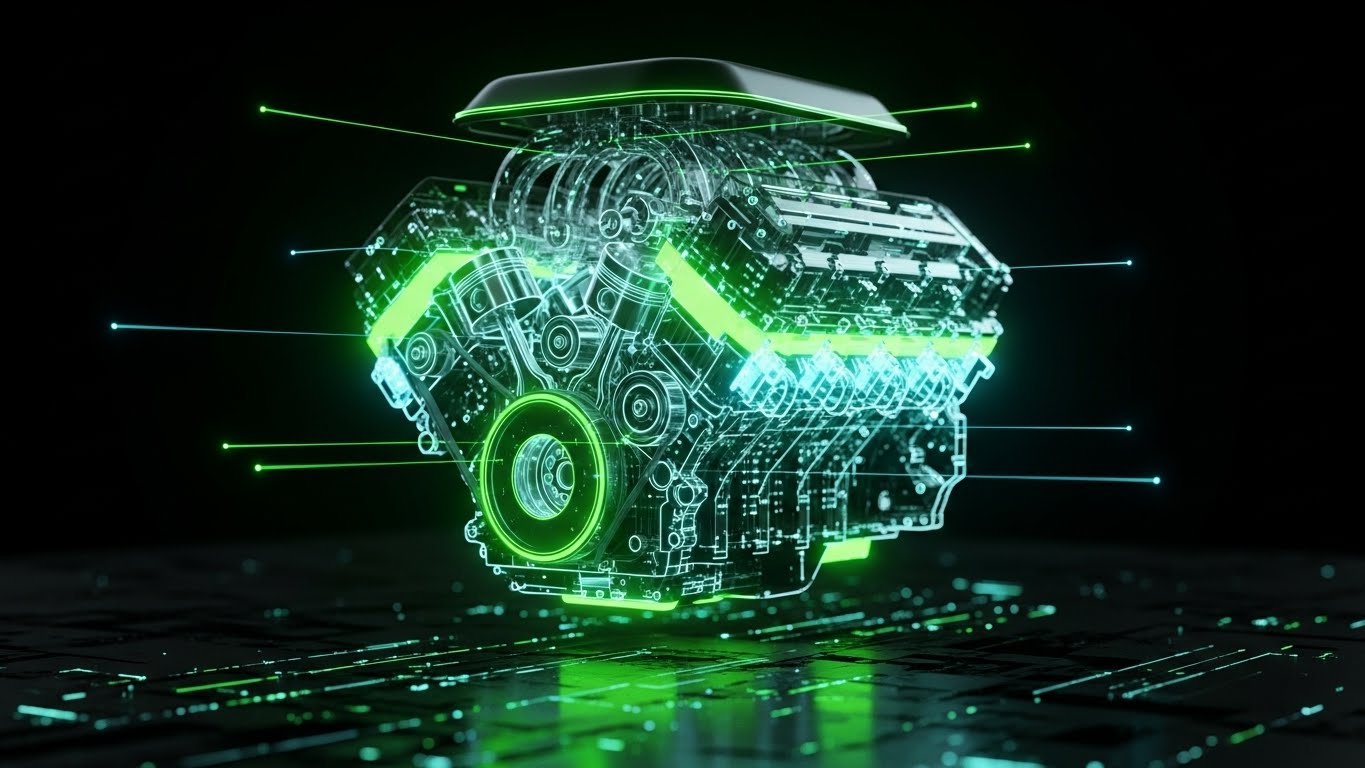
The Visual & Narrative Approach
This style embraces the "Dark Mode" aesthetic favored by developers and modern SaaS platforms. It features a striking visualization of a holographic V8 engine block floating in a void of pure black. The engine is outlined in glowing neon green with laser-sharp edges, revealing internal pistons and valves moving in rhythm. The surface beneath reflects the neon glow, creating a cyberpunk, high-precision aesthetic. The lighting is exclusively derived from the object's own luminescence, emphasizing innovation and cutting-edge automotive technology.
Psychological Impact & KPI Focus
- Niche Psychology: "Dark Mode" is a visual shorthand for "Modern," "Developer-Centric," and "Powerful." It signals that this is not a legacy ERP from the 1990s.
- Operational Impact: By showing the internal workings of the engine, it metaphorically promises Deep Visibility and Predictive Maintenance. It implies the software sees "under the hood" of the machinery.
Strategic Implementation & Trade-offs
- Best Use Case: Social media ads (Instagram/LinkedIn) targeting younger tech-savvy decision-makers.
- Duration: 6-15 seconds (Short loops).
- Trade-off: It can appear "gaming-focused" or "unserious" to very traditional manufacturing boards if overused.
Companies using similar video content -
C3 AI – C3 AI Platform – Delivering enterprise AI for predictive insights.
Uptake – Industrial AI – Providing AI-powered asset performance management.
4. Minimalist Flat 2D Vector
TOFU | Shaping Brand Perception
The Visual & Narrative Approach
Radical simplicity drives this visual. A minimalist flat 2D vector icon set is placed against a solid Teal background. The central graphic is a simplified, geometric delivery truck icon in Coral and White, intersected by a sharp upward-trending arrow. The composition is strictly symmetrical and isometric. The design conveys logistics growth with zero texture or gradients, relying solely on shape and color contrast to communicate the concept of "Logistics Optimization."
Psychological Impact & KPI Focus
- Niche Psychology: On platforms like TikTok or Shorts, you have milliseconds to communicate value. This style removes all decorative noise, forcing the brain to process "Truck + Up Arrow = Better Logistics" instantly.
- Operational Impact: It builds trust through Simplicity. It implies that the software is easy to use and intuitive, countering the fear of complex, clunky enterprise interfaces.
Strategic Implementation & Trade-offs
- Best Use Case: TikTok, Instagram Reels, YouTube Shorts (Vertical 9:16).
- Duration: 10-15 seconds.
- Trade-off: It lacks "Industrial Strength." It is great for awareness but fails to convey the complexity or robustness of an enterprise-grade ERP.
Companies using similar video content -
FourKites – Real-Time Visibility Platform – Simplifying global supply chain tracking.
project44 – Advanced Visibility Platform – Offering instant logistics insights.
5. Bold Kinetic Typography
TOFU | Vertical Social Organic

The Visual & Narrative Approach
This is a stark, high-energy visual designed to stop the scroll. It features massive, sans-serif text blocks in stark white against a solid bold black background. The visual forms of words "SPEED," "SCALE," and "PRECISION" physically collide and displace each other with heavy physics simulations. The typography itself forms the shape of a speeding truck, conveying momentum and industrial strength. The aesthetic is reminiscent of Swiss International Style design—clean, grid-based, but aggressively dynamic.
Psychological Impact & KPI Focus
- Niche Psychology: The speed and collision physics create a sense of Urgency. It appeals to the executive who wants "Action" and "Results," not just theory.
- Operational Impact: It reinforces the concept of Agility. The fast-paced, fluid movement of the text mimics the desired state of a responsive supply chain that adapts instantly to new inputs.
Strategic Implementation & Trade-offs
- Best Use Case: YouTube Pre-roll ads (first 5 seconds are critical).
- Duration: 15 seconds.
- Trade-off: Zero product visibility. It is purely a "Hype" asset and must be followed up with substantive MOFU content.
Companies using similar video content -
Coupa – Business Spend Management – Driving rapid spend optimization and efficiency.
O9 Solutions – Digital Brain Platform – Accelerating integrated business planning.
6. Generative AI Realistic Character Video
TOFU | Skippable Pre-Roll Ad

The Visual & Narrative Approach
This style brings the human element back into the loop. It features a high-production-value scene of a professional female plant manager in a modern, glass-walled control room overlooking a factory floor. She is wearing safety glasses and a crisp white shirt, holding a tablet displaying complex OEE metrics. The lighting is natural and bright, utilizing a palette of natural skin tones and steel grey. The camera focus is sharp on her confident expression, with the busy factory blurred softly in the background, conveying control and leadership.
Psychological Impact & KPI Focus
- Niche Psychology: The target audience (Plant Managers) sees themselves in the protagonist. They don't want to be the stressed worker on the floor; they want to be the calm leader in the glass room. It sells Peace of Mind.
- Operational Impact: It visualizes Remote Monitoring. It demonstrates that the software empowers leadership to manage operations without being physically tethered to the machine line.
Strategic Implementation & Trade-offs
- Best Use Case: Connected TV (CTV) ads, Trade Show displays.
- Duration: 30-60 seconds.
- Trade-off: High production difficulty. AI characters must be flawless; "Uncanny Valley" effects will destroy credibility instantly.
Companies using similar video content -
IBM – Maximo Application Suite – Empowering asset management with AI insights.
GE Digital – Plant Applications – Enabling real-time plant performance monitoring.
7. Aspirational Stock Montage
TOFU | Connected TV

The Visual & Narrative Approach
A vertical, high-key photography composition showing a diverse team of automotive engineers and data analysts collaborating in a sun-drenched, open-plan headquarters. Through the floor-to-ceiling windows, a vehicle test track is visible, grounding the scene in the industry. The lighting is warm and airy, using gold and glass tones. The image captures a candid moment of success—high fives and genuine smiles—associating the software with a modern, positive work culture.
Psychological Impact & KPI Focus
- Niche Psychology: This targets the Employer Branding aspect of the decision-maker's role. It suggests that using this platform leads to team harmony and a modern workplace, helping to attract and retain top talent.
- Operational Impact: It subtly communicates Collaboration and Stakeholder Alignment. It implies that your platform breaks down silos between engineering and analytics.
Strategic Implementation & Trade-offs
- Best Use Case: Instagram Stories, LinkedIn Culture posts.
- Duration: 15 seconds.
- Trade-off: It is the least "product-focused" style. It tells you nothing about the software's capabilities, only the feeling of using it.
Companies using similar video content -
Microsoft – Dynamics 365 – Fostering collaborative business operations.
Infor – CloudSuite Automotive – Unifying teams across the automotive value chain.
8. Wireframe to Reality Transition
TOFU | Aspiration & Identity Hook
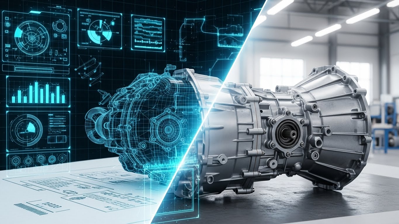
The Visual & Narrative Approach
This style creates a bridge between the digital plan and the physical execution. A split-composition image shows a complex vehicle transmission. The left half is a technical blue and white CAD wireframe blueprint on bright paper texture—precise and mathematical. The right half seamlessly morphs into a photorealistic, metallic alloy render with grease and texture in a bright workshop environment. The transition line is a glowing digital scan effect.
Psychological Impact & KPI Focus
- Niche Psychology: It satisfies the engineer's need for Accuracy. It proves that what is planned in the ERP (the wireframe) is exactly what is executed on the floor (the reality).
- Operational Impact: This is the ultimate visualization of the Digital Twin. It demonstrates the seamless flow of data from R&D to Manufacturing, validating BOM Accuracy.
Strategic Implementation & Trade-offs
- Best Use Case: Website Product Pages, Solution Overview videos.
- Duration: 45-90 seconds.
- Trade-off: Requires high-fidelity 3D assets. If the "Real" side looks fake, the promise of precision is broken.
Companies using similar video content -
PTC – Creo – Bridging CAD design to physical product realization.
Autodesk – Fusion 360 – Connecting design, engineering, and manufacturing.
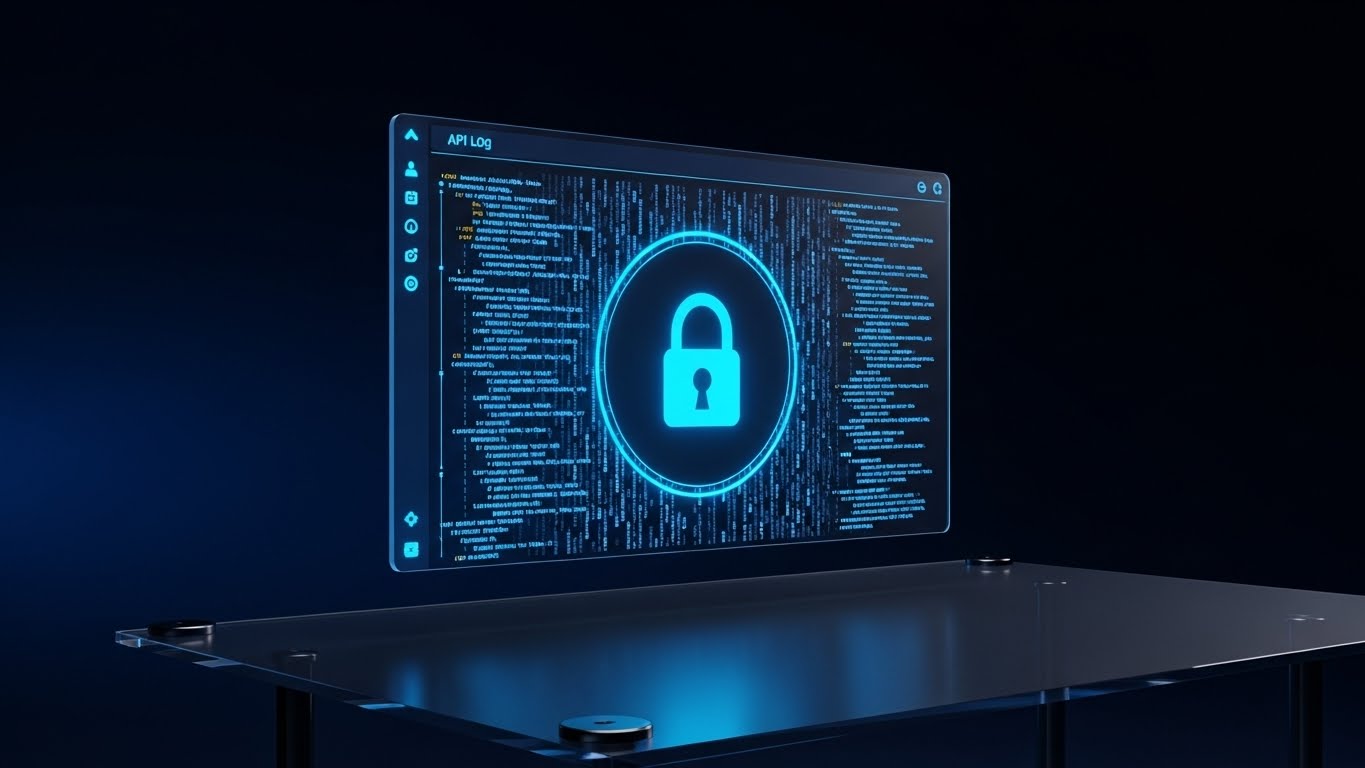
9. 3D X-Ray Visualization
MOFU | Product Differentiation
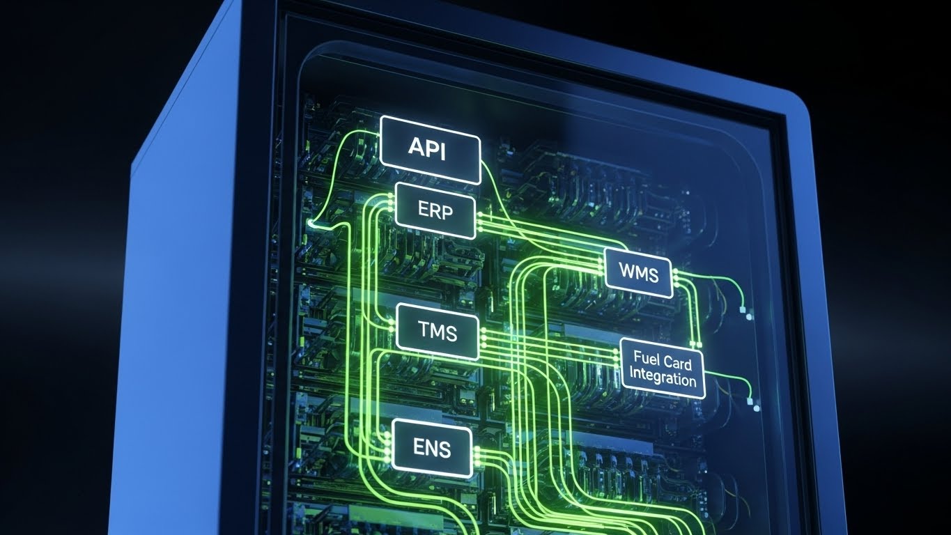
The Visual & Narrative Approach
To explain "Infrastructure Visibility," this style applies a medical-grade X-Ray aesthetic to the IT stack itself. The visual features a server rack unit rendered in translucent glass, revealing the internal "nervous system" of the platform. Glowing green optical cables connect nodes labeled API, ERP, WMS, and TMS, illustrating the seamless flow of data. The object floats in a clean studio void, and the sub-surface scattering lighting makes the digital architecture feel tangible and robust.
Psychological Impact & KPI Focus
- Niche Psychology: The visual metaphor is literal: seeing through the "Black Box." It promises the user they will see inside their data stack, eliminating "integration anxiety."
- Operational Impact: It directly visualizes System Interoperability. It demonstrates that your software allows stakeholders to manage data flow without physical inspection.
Strategic Implementation & Trade-offs
- Best Use Case: Feature demos focusing on API Integration and Architecture.
- Duration: 60-120 seconds.
- Trade-off: It is clinical. While excellent for clarity, it lacks emotional warmth. Use it strictly for explaining how the integration works.
Companies using similar video content -
Software AG – Cumulocity IoT – Revealing the internal workings of IoT integrations.
MuleSoft – Anypoint Platform – Visualizing seamless API-led connectivity.
11. Split Screen: Optimized Reality and UI**
MOFU | Competitive Displacement

The Visual & Narrative Approach
This style leverages the power of immediate contrast to disrupt the "status quo" bias. The frame is divided vertically. The left side captures the "Old Way"—a gritty, slightly desaturated photograph of a logistics desk cluttered with paper invoices, sticky notes, and a landline phone off the hook. The right side stands in sharp, vibrant relief: a pristine render of a laptop screen displaying your platform’s dashboard in clean White and Teal. As the video progresses, the chaos on the left freezes or piles up, while the right side animates smoothly, showing data flowing effortlessly. The visual argument is binary and visceral: stress versus control.
Psychological Impact & KPI Focus
- Niche Psychology: It addresses Cognitive Friction by framing the new software not as "more work to learn" but as "relief from current pain." It offers an immediate dopamine hit of organization to a stressed Operations Manager.
- Operational Impact: It visually quantifies Efficiency Gains. It implies that the time spent shuffling paper (left) is instantly converted into strategic decision-making (right), directly impacting SGA Costs.
Strategic Implementation & Trade-offs
- Best Use Case: LinkedIn carousel ads or direct comparison landing pages.
- Duration: 15-30 seconds.
- Trade-off: It is aggressive. It requires a delicate balance to ensure the "Old Way" looks relatable, not insulting to the prospect’s current reality.
Companies using similar video content -
TIBCO – Data Virtualization – Visualizing real-time data integration and flow.
Confluent – Apache Kafka – Illustrating continuous data streams and event processing.
12. Abstract 2D Organic Motion Graphics
MOFU | ABM Awareness

The Visual & Narrative Approach
Moving away from rigid grids, this style uses fluid dynamics to visualize "frictionless" integration. Against a bright white background, abstract shapes resembling liquid chrome and deep oil black merge and flow. These organic forms represent disparate data streams—sales, inventory, manufacturing—swirling together to momentarily form the silhouette of a car body before dissolving back into a stream of pure, driving energy. The animation is glossy and high-end, evoking the aerodynamic language of modern automotive design while symbolizing the seamless adaptability of a cloud-native ERP.
Psychological Impact & KPI Focus
- Niche Psychology: For the design-conscious automotive executive, this aesthetic aligns your software with the premium vehicles they manufacture. It signals Modernity and Agility.
- Operational Impact: It metaphorically communicates Seamless Integration. Unlike blocky, rigid visuals, the fluid motion suggests that the software adapts to the business, not the other way around.
Strategic Implementation & Trade-offs
- Best Use Case: Account-Based Marketing (ABM) display ads and high-level targeted social campaigns.
- Duration: 10-20 seconds (Looping).
- Trade-off: High aesthetic value, low information density. It builds brand affinity but does not explain specific features.
Companies using similar video content -
Epicor – Kinetic – Transforming chaotic manufacturing into streamlined digital operations.
QAD – Adaptive ERP – Replacing legacy systems with modern, efficient processes.
13. Dynamic Data Visualization
MOFU | LinkedIn Organic

The Visual & Narrative Approach
This style bridges the gap between mechanical engineering and financial reporting. It features a stylized 3D bar chart, but instead of standard bars, the columns are shaped like automotive engine cylinders. Rendered in Corporate Navy and Infographic Yellow with soft studio lighting, these cylinders piston up and down to represent real-time data values—production throughput, revenue, or uptime. Set against an abstract surface resembling a boardroom table, the visual connects the physical performance of the engine with the financial performance of the company.
Psychological Impact & KPI Focus
- Niche Psychology: It speaks the language of the CFO and CTO simultaneously. It visualizes the concept that "Operational Health = Financial Health."
- Operational Impact: It reinforces Data Accuracy. By giving data physical weight and mechanical movement, it implies that the metrics provided by the ERP are as tangible and reliable as the hardware itself.
Strategic Implementation & Trade-offs
- Best Use Case: LinkedIn organic posts sharing industry benchmarks or quarterly performance case studies.
- Duration: 15-30 seconds.
- Trade-off: Needs precise data to be effective. If the animation is generic "up and down" movement without specific context, it loses authority.
Companies using similar video content -
HashiCorp – Terraform – Visualizing fluid infrastructure as code deployments.
VMware – Tanzu – Enabling seamless, cloud-native application development.
14. Isometric 2D Motion Design
MOFU | Competitive Comparison
The Visual & Narrative Approach
This style presents the "Ideal State" of automotive manufacturing. Viewed from a 45-degree orthographic angle, we see a perfectly organized factory floor in soft pastel blue and cool grey on a clean white field. Flat vector art with subtle drop shadows depicts miniature forklifts moving along designated yellow paths and robotic arms assembling cars in perfect rhythm. The scene loops seamlessly, creating a hypnotic sense of order. It removes the grit and noise of a real factory to showcase the logic and workflow optimization your software enables.
Psychological Impact & KPI Focus
- Niche Psychology: It appeals to the Plant Manager’s desire for order. The clean, error-free loop satisfies the craving for a "well-oiled machine" and predictable outcomes.
- Operational Impact: It effectively visualizes Workflow Optimization and Lean Manufacturing principles. It shows how the software orchestrates movement to eliminate bottlenecks and waste.
Strategic Implementation & Trade-offs
- Best Use Case: Blog posts, whitepaper headers, and "How it Works" website sections.
- Duration: 30-60 seconds (Looping).
- Trade-off: Can feel "playful." Ensure the voiceover or accompanying text maintains a professional, enterprise-grade tone to avoid looking like a casual mobile game.
Companies using similar video content -
Tableau – Tableau CRM Analytics – Connecting operational data to financial performance.
Qlik – Qlik Sense – Visualizing real-time business and operational metrics.
15. Isometric 3D Workflow
MOFU | The Functional Buyer
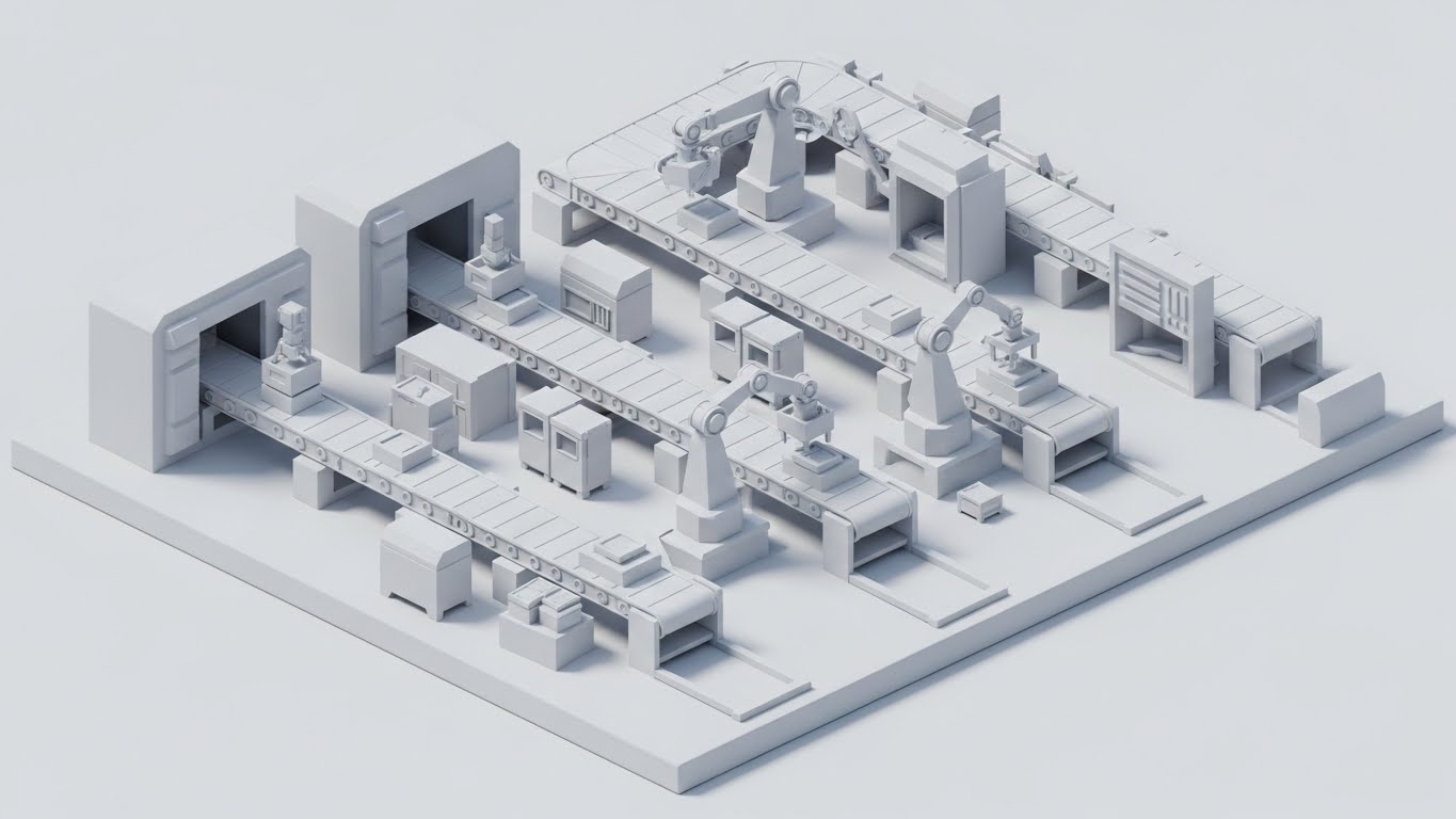
The Visual & Narrative Approach
Taking the isometric concept to a higher fidelity, this style uses a "Clay Render" aesthetic. The entire manufacturing facility is rendered in monochromatic matte clay white with soft ambient occlusion shadows. There are no distracting textures or colors—only form and light. This allows the viewer to focus entirely on the structure of the logistics network: the conveyor belts, the loading docks, and the spatial relationships between inventory and assembly. It is a pure, architectural view of the supply chain.
Psychological Impact & KPI Focus
- Niche Psychology: This strips away marketing "fluff." It signals to the Systems Architect or Engineer that you have nothing to hide. It relies on the strength of the process, not the flash of the graphics.
- Operational Impact: It visualizes Scalability and Infrastructure. The uniform "clay" look suggests that new modules or physical locations can be added seamlessly to the existing structure.
Strategic Implementation & Trade-offs
- Best Use Case: Deep-dive solution pages, technical whitepapers, and investor decks.
- Duration: 45-90 seconds.
- Trade-off: Lack of color means you cannot easily highlight "alerts" or "status changes" without breaking the aesthetic. It is best for structural overviews, not exception management demos.
Companies using similar video content -
Critical Manufacturing – MES – Orchestrating ideal factory production flows.
Tulip Interfaces – Frontline Operations Platform – Optimizing manufacturing workflows with visual apps.
17. Lifestyle Stock with UI Overlay
BOFU | Building Trust & Credibility
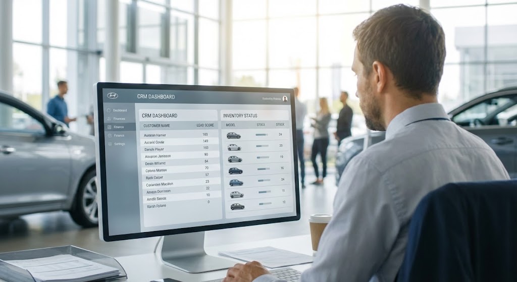
The Visual & Narrative Approach
As we move to the bottom of the funnel, we must re-introduce the human element. This style features a high-quality, over-the-shoulder shot of a dealership finance manager or logistics coordinator. They are seated in a sunlit, modern glass-walled office, with the blur of business activity in the background. The focus is sharp on their screen, where a sleek, semi-transparent UI overlay (in cool office greys and blues) hovers, displaying CRM data or inventory status. The visual grounds the software in its actual use case, bridging the gap between "code" and "daily work."
Psychological Impact & KPI Focus
- Niche Psychology: It builds Social Proof and Relatability. The prospect sees a peer using the tool successfully in a realistic environment, which reduces the fear of adoption.
- Operational Impact: It visualizes User Experience (UX). It demonstrates that the software fits naturally into the daily life of the employee, enhancing their capabilities rather than obstructing them.
Strategic Implementation & Trade-offs
- Best Use Case: Customer testimonials, "Day in the Life" case studies, and website pricing pages.
- Duration: 15-45 seconds.
- Trade-off: Relies heavily on the quality of the stock footage. Generic "people shaking hands" stock will damage credibility; specific, industry-relevant settings are mandatory.
Companies using similar video content -
Körber Supply Chain – Warehouse Management – Illustrating scalable warehouse logistics structures.
Dematic – Automated Systems – Showcasing the structural logic of automated material handling.
18. Low-Poly 3D Modeling
BOFU | ROI Justification

The Visual & Narrative Approach
When discussing money, clarity is paramount. This style uses a simplified Low-Poly 3D aesthetic to illustrate cost savings. A geometric, stylized delivery truck in soft blue sits next to stacks of gold coins that are physically piling up. The facets of the low-poly objects catch the light, making the "savings" feel solid and accumulated. The background is an infinite white studio. The visual metaphor is blunt and effective: "Better Logistics = More Money."
Psychological Impact & KPI Focus
- Niche Psychology: It simplifies the complex TCO (Total Cost of Ownership) conversation into a simple visual equation. It appeals to the Financial Controller who needs to justify the purchase.
- Operational Impact: It visualizes Cost Reduction. Whether it's fuel savings, reduced dwell time, or lower inventory carrying costs, the piling coins make the abstract percentage points tangible.
Strategic Implementation & Trade-offs
- Best Use Case: Sales decks, pricing proposals, and ROI calculator results pages.
- Duration: 10-15 seconds (Looping).
- Trade-off: It is symbolic, not literal. It works best as a supporting visual for a financial argument, not as a standalone explanation of how the savings are achieved.
Companies using similar video content -
UiPath – Robotic Process Automation – Automating repetitive tasks in real-time.
Automation Anywhere – Automation 360 – Visualizing seamless, automated business processes.
19. Photorealistic 3D Renders
BOFU | Risk Mitigation
The Visual & Narrative Approach
To mitigate the risk of "system failure," this style equates the ERP server with the most reliable part of the car: the engine. A photorealistic 3D render views a stylized car chassis from a low angle. Inside the engine bay, instead of a traditional combustion engine, sits a sleek, metallic computer server rack glowing with "Server Green" status lights. The materials—brushed titanium and black plastic—are rendered with ray-traced reflections. It communicates that the software is the new horsepower driving the vehicle.
Psychological Impact & KPI Focus
- Niche Psychology: It addresses Reliability Anxiety. By rendering the server with the same solidity and precision as high-performance hardware, it subliminally assures the buyer that the digital infrastructure is as robust as the physical one.
- Operational Impact: It visualizes Core Infrastructure and Uptime. It positions the SaaS platform not as an accessory, but as the central power unit of the automotive product.
Strategic Implementation & Trade-offs
- Best Use Case: Security compliance pages, infrastructure architecture reviews, and high-stakes sales meetings.
- Duration: 20-40 seconds.
- Trade-off: High production cost. The photorealism must be flawless; any "fakeness" in the render will suggest "fakeness" in the product's reliability.
Companies using similar video content -
CDK Global – CDK Drive – Empowering dealership finance managers with intuitive UI.
Reynolds and Reynolds – ERA-IGNITE – Showing dealership staff using integrated solutions.
20. 3D Parallax UI Presentation
BOFU | Driving Demo Requests
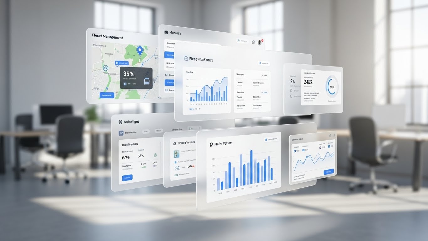
The Visual & Narrative Approach
The final validation is the interface itself. This style presents high-fidelity UI mockups of the fleet or factory management dashboard floating in 3D space. Using a "glassmorphism" aesthetic with frosted white transparency and soft drop shadows, the screen layers separate in depth (Parallax effect) as the camera pans. This reveals the depth of the data—showing that behind the summary dashboard lies deep analytical detail. The background is a heavily blurred, bright modern office, keeping the focus strictly on the software's capability.
Psychological Impact & KPI Focus
- Niche Psychology: It creates a sense of Sophistication and Depth. It tells the user that the interface is modern and user-friendly, but also deep enough to handle complex enterprise data.
- Operational Impact: It visualizes Drill-Down Capabilities. The parallax layering suggests that users can easily move from high-level overviews to granular data points without getting lost.
Strategic Implementation & Trade-offs
- Best Use Case: The "Book a Demo" landing page header or the final slide of a sales presentation.
- Duration: 30-60 seconds (Looping).
- Trade-off: It highlights the UI design. If your actual software UI is dated or cluttered, this style will highlight those flaws. It requires your UI to be "camera-ready."
Companies using similar video content -
Samsara – Fleet Management – Visualizing tangible fuel and efficiency savings.
Geotab – Telematics – Illustrating cost reduction through optimized fleet operations.
21. 2D Line Art Animation**
BOFU | The Economic Buyer
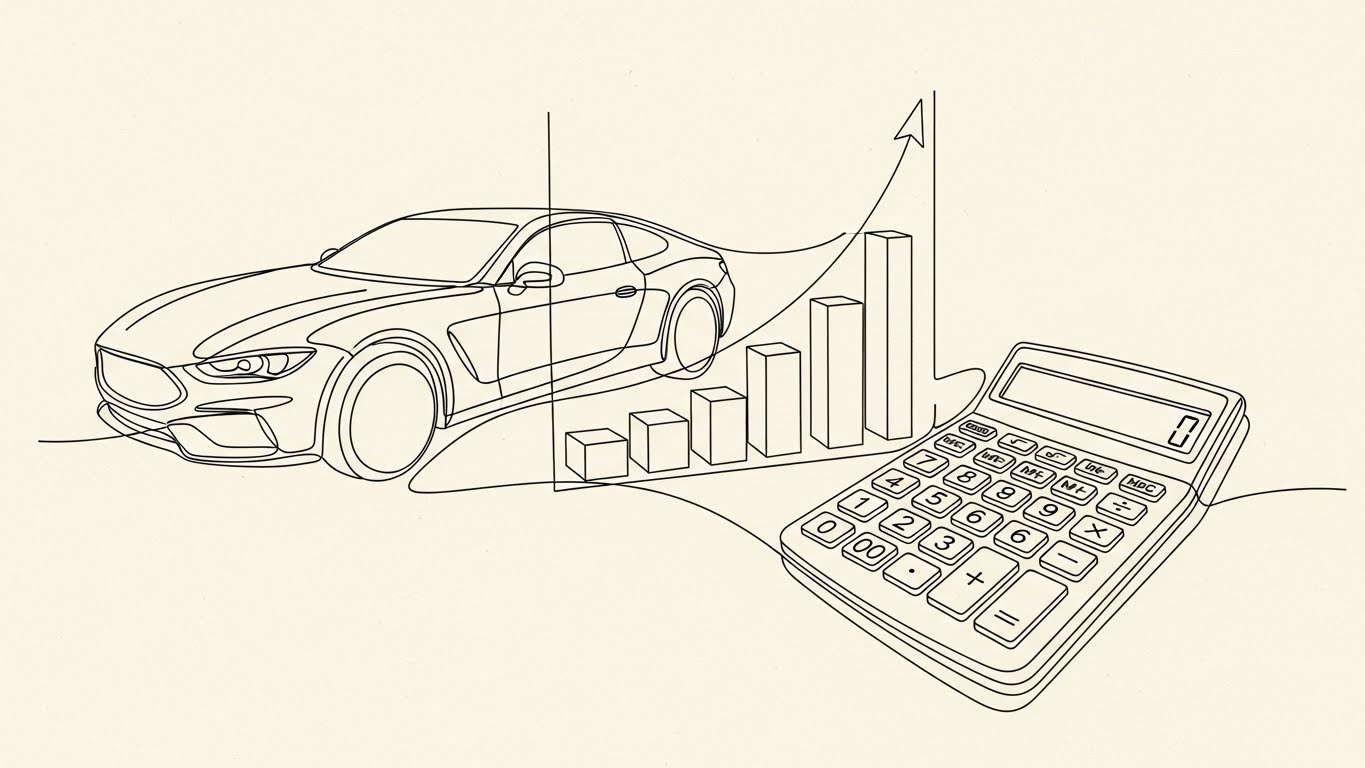
The Visual & Narrative Approach
This style is designed specifically for the CFO and the financial committee. It utilizes an elegant, continuous line art style. A single, precise black line traverses a cream paper-textured background, drawing the outline of a sleek sports car. As the car accelerates, the line seamlessly morphs into a rising financial graph, and then constructs a minimalist calculator or ledger icon. The animation is smooth, unbroken, and mathematically precise, devoid of flashy colors or distractions. It speaks the language of logic, architecture, and bottom-line growth.
Psychological Impact & KPI Focus
- Niche Psychology: The Economic Buyer is risk-averse. They value stability and predictability over "hype." The continuous line represents an unbroken chain of value—from the vehicle asset to the financial return—subtly reinforcing the concept of a secure investment.
- Operational Impact: It visually articulates Cost Control and Margin Analysis. It demonstrates that the software provides a direct line of sight from the physical product to the financial bottom line.
Strategic Implementation & Trade-offs
- Best Use Case: Executive summary videos in proposal PDFs, Investor Relations content, and contract closing decks.
- Duration: 30-45 seconds.
- Trade-off: It is emotionally cool. It lacks the excitement of the "Futuristic Neon" styles, making it unsuitable for top-of-funnel viral awareness. It is a closing tool, not an opening hook.
Companies using similar video content -
HPE – ProLiant Servers – Equating server reliability with automotive engine performance.
Dell Technologies – PowerEdge Servers – Visualizing robust IT infrastructure as core power.
22. 2D Graphics Over Live Action
BOFU | ROI Hook
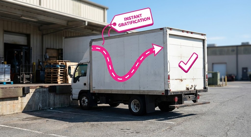
The Visual & Narrative Approach
This style bridges the gritty reality of logistics with the "instant dopamine" of digital success. We see a high-quality, real-world photograph of a white delivery truck at a loading dock. Superimposed over this realistic scene are bright, popping 2D vector graphics in Hot Pink and White. A dotted route line snakes dynamically around the truck, ending in a satisfying "Checkmark" icon on the cargo door. A tag labeled "Instant Gratification" (or "Verified") pops up. The contrast between the mundane asphalt environment and the candy-colored graphics creates a visual hook that promises ease and immediate results.
Psychological Impact & KPI Focus
- Niche Psychology: It appeals to the Dispatcher's desire for completion. The visual "Checkmark" triggers a psychological sense of closure and success, countering the stress of open loops and delayed shipments.
- Operational Impact: It visualizes Proof of Delivery (POD) and Real-Time Tracking. It shows that the software doesn't just record data; it actively validates physical events as they happen.
Strategic Implementation & Trade-offs
- Best Use Case: Retargeting ads on social media (LinkedIn/Facebook) to remind prospects of the "ease" of the solution.
- Duration: 10-15 seconds (Looping).
- Trade-off: It can look "consumer-grade." While engaging, it must be paired with deeper technical content to ensure the buyer knows the platform is enterprise-ready, not just a simple app.
Companies using similar video content -
Trimble Transportation – TMS – Showcasing comprehensive fleet and logistics control.
Omnitracs – Intelligent Vehicle Gateway – Presenting deep data insights through layered UI.
23. Clean UI Workflow (Light Mode)
Onboard | Self-Serve Onboarding
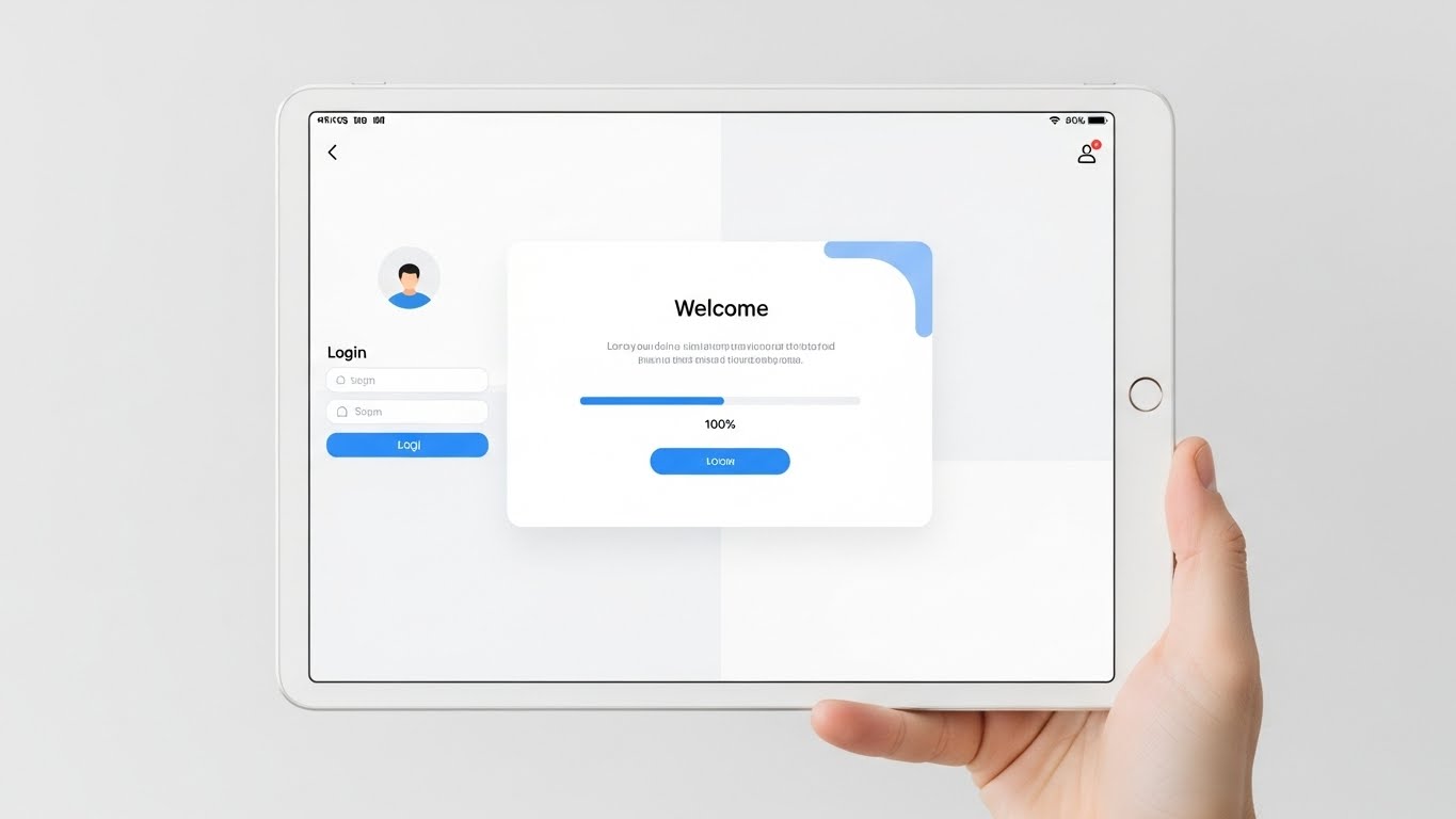
The Visual & Narrative Approach
Adoption fails when users feel intimidated. This style counters that fear with radical simplicity. We see a direct, front-facing view of a tablet screen held by a human hand (providing scale and humanity). The screen displays a pristine, white-themed login interface with rounded buttons in soft Sky Blue. A "Welcome" modal appears with a progress bar hitting 100%. The lighting is soft and shadowless (high-key), emphasizing clarity. There is no clutter, no complex data tables yet—just a welcoming, open door into the software.
Psychological Impact & KPI Focus
- Niche Psychology: It addresses Implementation Anxiety. For a non-technical fleet manager, a complex "black screen" interface is terrifying. This "Apple-esque" aesthetic promises a gentle learning curve.
- Operational Impact: It directly targets Time-to-Competency. By stripping away visual noise, it focuses the user on the single next action, reducing onboarding time and support ticket volume during the rollout phase.
Strategic Implementation & Trade-offs
- Best Use Case: Welcome emails, "Getting Started" video series, and App Store preview images.
- Duration: 30-60 seconds.
- Trade-off: It creates a "Simplicity Bias." If the actual software is complex and requires heavy configuration, this style might set unrealistic expectations that need to be managed later.
Companies using similar video content -
Sage – X3 – Articulating continuous financial logic and precision.
IFS – Cloud – Visualizing unbroken value chains and financial returns.
24. Rapid UI Feature Montage
Onboard | Accelerating Time-to-Value
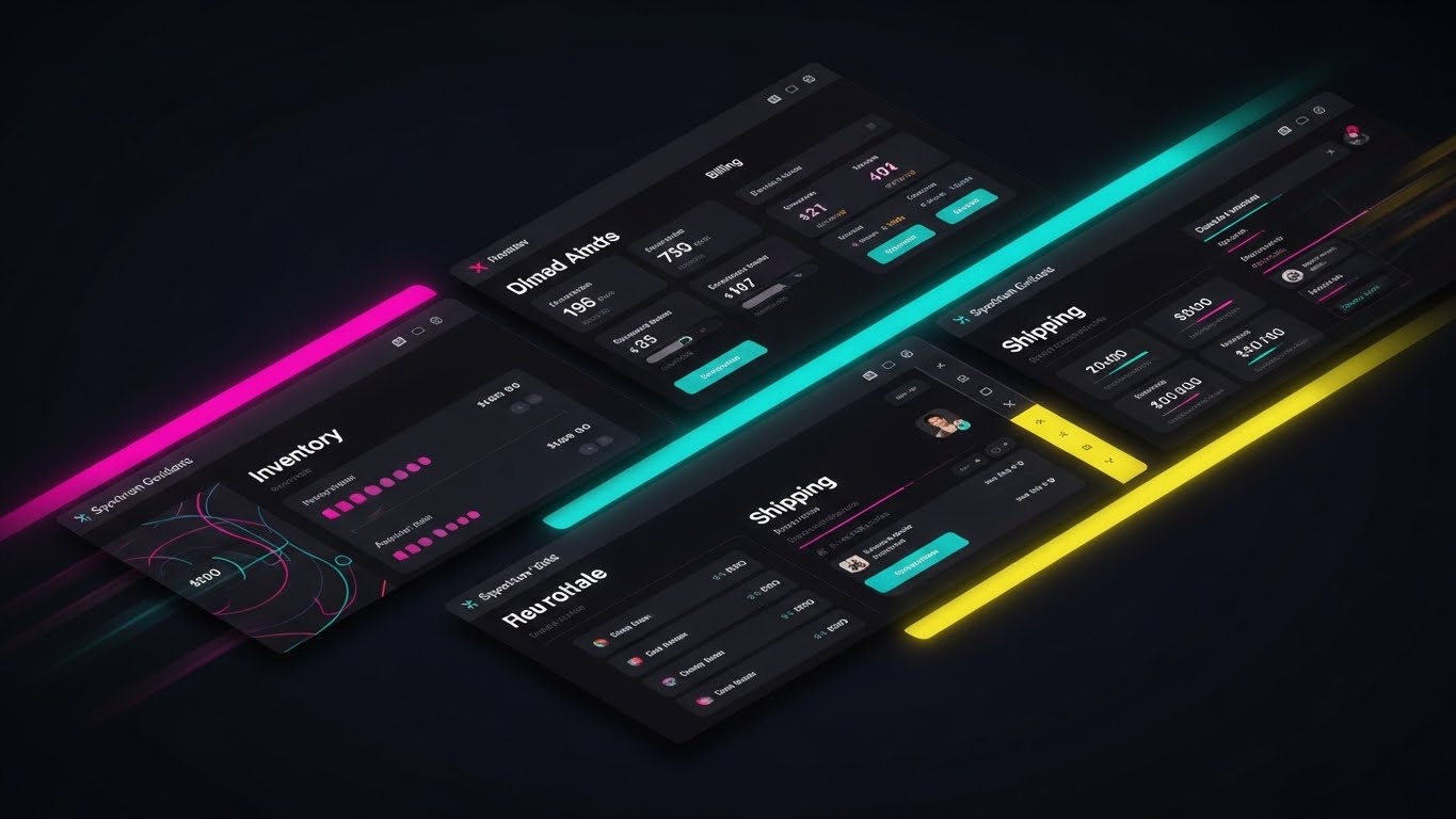
The Visual & Narrative Approach
Once the user is interested, you need to show them the full toolkit. This style uses a high-energy montage technique. Segments of different UI screens—Inventory Management, Billing, Shipping, Driver Logs—are arranged in diagonal slices across the frame. They slide and displace each other in rhythm with an upbeat track. Separated by Spectrum Gradient lines on a dark background, the screens are vibrant and detailed. Motion blur effects suggest speed. It conveys that the platform is a comprehensive "One-Stop-Shop" for all automotive operations.
Psychological Impact & KPI Focus
- Niche Psychology: It triggers a sense of Abundance and Value. The viewer feels they are getting a massive suite of tools for their investment. It combats the fear of "paying too much for too little."
- Operational Impact: It visualizes Feature Parity and Scalability. It shows that as the business grows, the software has a module ready to handle the new complexity.
Strategic Implementation & Trade-offs
- Best Use Case: Post-purchase "Welcome" videos, Feature Release updates, and Quarterly Business Review (QBR) intros.
- Duration: 15-30 seconds.
- Trade-off: It is overwhelming for instruction. Never use this style to teach how to use a feature; only use it to announce the existence of features.
Companies using similar video content -
Motive – AI Dashcam – Augmenting live footage with instant safety verification.
Verizon Connect – Reveal – Overlaying real-time tracking data onto live logistics scenes.
25. 2D Animation & UI Composition
Onboard | Reducing Implementation Friction

The Visual & Narrative Approach
To make the daunting task of "Implementation" feel achievable, this style gamifies the process. It features a friendly, cel-shaded 2D character (wearing generic tech-casual attire) in Vibrant Purple and Orange. The character moves through a side-scroller environment, interacting with floating UI panels. The climax shows the character pushing a large, satisfying "Launch" button, triggering a burst of confetti or positive data particles. The aesthetic is playful and simplified, framing the setup process as a quest with a reward.
Psychological Impact & KPI Focus
- Niche Psychology: It leverages the Gamification effect. By turning a boring setup checklist into a visual narrative of "progress and reward," it keeps the user motivated to complete the configuration.
- Operational Impact: It aims to reduce Drop-off Rates during setup. Visualizing the "Launch" moment gives the implementation team a shared visual goal to work toward.
Strategic Implementation & Trade-offs
- Best Use Case: Implementation wizard videos, "What to Expect" pre-kickoff guides, and Support Portal headers.
- Duration: 45-60 seconds.
- Trade-off: It risks being too "cartoony" for serious engineering teams. Ensure the UI panels shown within the animation are accurate to the product, even if the character is stylized.
Companies using similar video content -
Salesforce – Service Cloud – Presenting a pristine, user-friendly onboarding experience.
ServiceNow – ITSM – Showcasing frictionless entry into service management workflows.
26. 2D Character-Driven Story
Retain | Reducing Support Overhead
The Visual & Narrative Approach
When users have a problem, they want empathy, not just data. This style uses clean, simple illustrations to tell a support story. A stylized user sits at a desk, a thought bubble with a "Question Mark" floating above them—a universal symbol of confusion. A smooth, reassuring line connects them to a floating "Chatbot" or "Support" icon, which instantly transforms the question mark into a glowing "Lightbulb." The palette is calming Corporate Blue and soft skin tones. It strips away the complexity of the software to focus entirely on the experience of getting help.
Psychological Impact & KPI Focus
- Niche Psychology: It builds Trust. It reassures the user that they are not alone. The visual transformation from "Confusion" (?) to "Idea" (!) is a powerful subconscious promise of resolution.
- Operational Impact: It promotes Self-Service Adoption. By visualizing the chatbot/help center as the source of the "Lightbulb," it encourages users to seek answers there first, reducing live agent calls.
Strategic Implementation & Trade-offs
- Best Use Case: Help Center landing pages, automated support email footers, and "How to Get Help" onboarding modules.
- Duration: 15-30 seconds.
- Trade-off: It is generic. It doesn't show the specific solution to a technical bug, only the path to the solution. It is a routing tool, not a teaching tool.
Companies using similar video content -
Oracle – NetSuite – Highlighting a comprehensive suite of integrated business features.
SAP – S/4HANA – Showcasing the vast feature set of an intelligent ERP.
27. Holographic UI over 3D Render
Retain | Reducing Churn
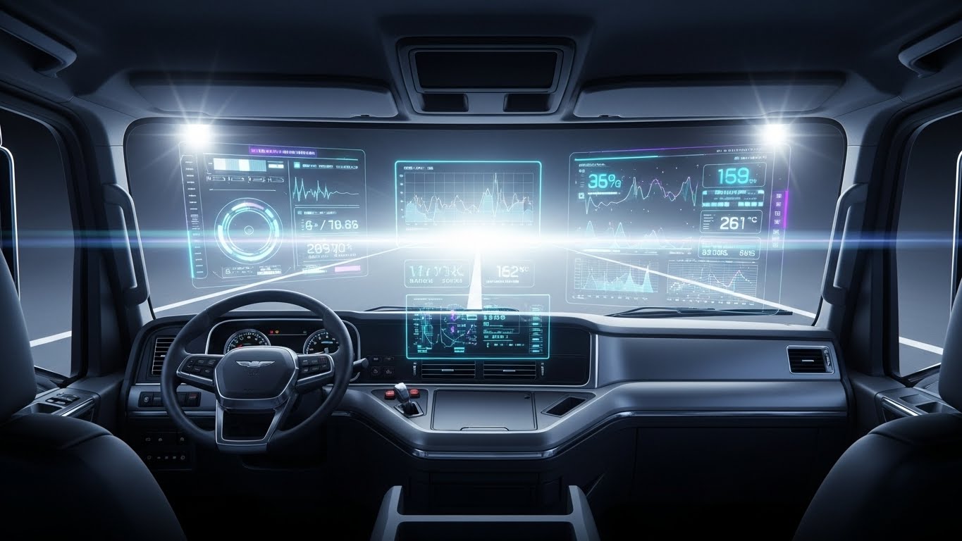
The Visual & Narrative Approach
To retain customers, you must convince them you are building the future. This style uses a POV shot from inside a futuristic truck cockpit. While the dashboard physical geometry is matte grey, a vibrant Cyan and Purple holographic Heads-Up Display (HUD) projects onto the windshield. It displays real-time diagnostics—tire pressure, engine temp, and route efficiency—overlaying the road ahead. This "Iron Man" aesthetic implies that your software turns a standard truck into a smart vehicle.
Psychological Impact & KPI Focus
- Niche Psychology: It appeals to Aspiration. It makes the driver and the fleet manager feel like they are operating cutting-edge technology. It combats the "Grass is Greener" syndrome by showing your platform is already ahead of the curve.
- Operational Impact: It visualizes Augmented Reality (AR) potential and Driver Safety. It suggests that data is available "heads-up" without distraction, linking software features directly to accident reduction.
Strategic Implementation & Trade-offs
- Best Use Case: Roadmap reveal videos, "Future of Fleet" vision presentations, and high-tier renewal discussions.
- Duration: 20-40 seconds.
- Trade-off: High expectations. If your current mobile app is clunky and slow, this futuristic video will create a dissonance that damages trust. Use it to sell the vision or beta features.
Companies using similar video content -
WalkMe – Digital Adoption Platform – Gamifying software implementation and user guidance.
Pendo – Product-Led Growth – Visualizing user progress through product features.
28. Hyper-lapse Stock Footage
Retain | Website Re-engagement

The Visual & Narrative Approach
This style visualizes the relentless, 24/7 nature of the supply chain. We look down from an aerial drone view at a complex highway interchange at night. The streaks of car headlights (Red and White) create rivers of light. Overlaid on this organic flow are bright digital data lines and nodes that mimic the traffic, pulsing in sync with the vehicles. The visual conveys massive scale, suggesting that your software manages this chaotic flow effortlessly, day and night.
Psychological Impact & KPI Focus
- Niche Psychology: It triggers a sense of Magnitude and Global Reach. For large enterprise clients, it confirms that your platform is robust enough to handle their volume. It's a "Big League" visual.
- Operational Impact: It visualizes Uptime and Throughput. The ceaseless motion implies a system that never sleeps, reinforcing the reliability of your cloud infrastructure.
Strategic Implementation & Trade-offs
- Best Use Case: Backgrounds for website login pages, event backdrops, and social media "Status Update" posts.
- Duration: 10-20 seconds (Looping).
- Trade-off: It is impersonal. It lacks human connection. It is purely atmospheric, designed to set a tone of scale and activity.
Companies using similar video content -
Zendesk – Support Suite – Illustrating empathetic customer support journeys.
Intercom – Customer Messaging Platform – Visualizing seamless user problem resolution.
29. Macro UI Micro-Interactions
Expand | Driving Feature Adoption

The Visual & Narrative Approach
Attention to detail signals quality. This style utilizes an extreme macro close-up (simulated camera lens) of a specific UI element—a toggle switch sliding from "Off" to "On," or a button being pressed. The element turns a vivid, glowing Green upon activation. The background is a clean white texture with soft bokeh blur, mimicking a high-resolution retina display. The focus is incredibly shallow, isolating the interaction. This visualizes the "tactile" satisfaction of using a well-designed tool.
Psychological Impact & KPI Focus
- Niche Psychology: It appeals to the User's desire for control and responsiveness. It counters the perception of "clunky enterprise software" by showing an interface that feels responsive, modern, and polished.
- Operational Impact: It visualizes Ease of Use. By focusing on a single click, it reinforces the message that powerful changes (like "Activate Fleet Tracking") are just one simple action away.
Strategic Implementation & Trade-offs
- Best Use Case: "New Feature" email blasts (GIFs), Tooltips inside the app, and Release Note headers.
- Duration: 3-5 seconds (Looping).
- Trade-off: It is extremely narrow. It tells you nothing about the broader workflow, only the specific interaction. It is a "Micro" tool for a "Micro" moment.
Companies using similar video content -
TeamViewer – Frontline – Projecting future AR vision for frontline workers.
PTC – Vuforia – Showcasing holographic UI for augmented reality applications.
30. Dark Mode UI Showcase
Expand | Driving Upsell
The Visual & Narrative Approach
Dark Mode is often associated with "Pro" or "Premium" tiers. This style showcases a widescreen monitor displaying a "Premium Analytics" dashboard in sleek Dark Mode. The background is a dim, modern server room with faint blue bokeh, suggesting data power. The UI uses matte Dark Slate greys with pops of primary Indigo for the data lines. The aesthetic is "Material Design"—flat surfaces with subtle lighting cues. It frames the software not just as a tool, but as a command center for the elite.
Psychological Impact & KPI Focus
- Niche Psychology: It triggers Exclusivity. It visually differentiates the "Basic" user from the "Power" user. It motivates the upgrade by making the higher tier look cooler, more advanced, and easier on the eyes.
- Operational Impact: It visualizes Data Density. Dark mode allows for colored data points to pop more effectively, implying that this tier offers deeper, more granular insights than the standard white UI.
Strategic Implementation & Trade-offs
- Best Use Case: Upsell landing pages, "Pro Tier" webinar backgrounds, and Account Manager presentations.
- Duration: 15-30 seconds.
- Trade-off: Visibility. Dark mode can be harder to read in bright presentation rooms. Ensure high contrast for text elements.
The Visual Operations Doctrine: A Strategic Knowledge Base
Having explored the 30 specific visual styles, we must now synthesize these into a cohesive operational strategy. Visualization is not merely "marketing content"; it is a strategic infrastructure that reduces cognitive load, accelerates adoption, and validates ROI.
This knowledge base is structured into three segments, providing a 30-point framework for implementing a "Visual Operating System" within an automotive SaaS organization.
Strategic Alignment & Visual Architecture
- The "Pre-Production" Strategy – Defining the Why and Who.*
Before a single frame is rendered, the visual strategy must be aligned with business goals. This segment addresses the architectural decisions required to build a scalable visual language.
- The Cognitive Load Audit: Begin by auditing your current training materials. If a PDF manual takes 20 minutes to read, can a Style 2 (Abstract 2D Motion) video convey the same process in 45 seconds? Measure the reduction in "Time-to-Comprehension."
- Role-Based Visual Mapping: Differentiate your visual language. Drivers on mobile devices need high-contrast, large-format visuals (Style 4, Style 27) for readability. Desk-bound Fleet Managers need dense, data-rich dashboards (Style 20, Style 30). One style does not fit all.
- The "Glanceability" Standard: In logistics, attention is a scarce resource. Establish a "Glanceability" standard: can the viewer understand the core message of the video within 3 seconds (sound off)? If not, the visual architecture is too complex.
- Brand Voice Consistency: Your ERP likely consists of various modules (WMS, TMS, Accounting). Ensure a unified visual thread (e.g., a specific shade of Teal or a recurring motion behavior) connects Style 11 (Split Screen) to Style 23 (Clean UI), creating a seamless brand experience across the platform.
- The Advids Strategic Audit: Partnering with a specialized agency like Advids allows for an objective "Visual Audit" of your current assets. We identify where "Stock" assets are diluting your brand and where "Bespoke" motion graphics can unlock understanding.
- Standardization vs. Customization: Use cost-effective templates (Style 7, Style 28) for high-volume, low-stakes content (like generic updates). Reserve high-budget bespoke 3D (Style 1, Style 19) for "Hero" moments that define your category.
- The Cross-Departmental Bridge: Use visuals to unify terminology. If Sales calls it "The Hub" and Support calls it "The Dashboard," confusion reigns. A consistent visual representation (Style 9 - 3D X-Ray) creates a shared mental model for all departments.
- Legacy System Integration: Visualizing the invisible connection between old hardware and new software is critical. Use Style 11 (Split Screen) or Style 8 (Wireframe to Reality) to visually demonstrate how your modern SaaS wraps around and integrates with their existing "Black Box" legacy servers.
- Accessibility in Trucking: The logistics workforce is diverse and often multi-lingual. Relying on Kinetic Typography (Style 5) alone is risky. Prioritize purely visual storytelling (Style 26) that communicates process without relying heavily on English text.
- The Mobile-First Mandate: 80% of your end-users (drivers/warehouse staff) will consume this content on a phone. Ensure all 30 styles are legible when cropped to 9:16 vertical formats.
Operational Adoption & Implementation
- The "Deployment" Phase – Embedding Visuals into the Workflow.*
A video only creates value if it is watched at the moment of need. This segment details how to operationalize your visual assets to drive user behavior.
- Overcoming "Big Brother" Anxiety: Implementing driver monitoring AI often causes pushback. Use Empathy-Driven Visuals (Style 27) that frame the tech as a "Co-Pilot" for safety, rather than a "Supervisor" for punishment.
- The Micro-Learning Shift: Nobody reads the 200-page PDF manual. Slice that manual into fifty 30-second clips (using Style 29 for features and Style 23 for workflows). Embed these directly into the software’s tooltips.
- Just-in-Time Support: Embed specific visual styles into the helpdesk or cab tablet. If a driver triggers an "Engine Fault" code, the tablet should immediately play a Style 5 or 26 video explaining exactly what to do next.
- Gamification of Training: Use Style 25 (2D Animation) to visualize driver scorecards. Making safety training look like a game (with progress bars and badges) significantly increases engagement and retention compared to dry instructional videos.
- Reducing Support Ticket Volume: There is a direct correlation between the quality of your visual guides and the volume of "How-To" tickets. Deploying Style 23 (Clean UI Workflow) videos for common issues is a high-ROI defensive strategy.
- Remote Onboarding: For distributed fleets, physical seminars are impossible. Use Style 20 (Parallax UI) and Style 6 (AI Character) to create a virtual "University" that onboard drivers remotely with the same fidelity as on-site training.
- Standard Operating Procedures (SOPs): Transform text-based SOPs into visual process flows (Style 14). A looping video of the "Perfect Loading Dock Procedure" on a screen in the breakroom is more effective than a binder gathering dust.
- Feedback Loops: Use interactive video elements. At the end of a Style 15 (Isometric 3D) workflow demo, ask the user to click the "bottleneck." This turns passive viewing into active participation and provides data on user understanding.
- Scalable Localization: When expanding globally, voiceovers are expensive to re-record. Prioritize styles that rely on iconography and abstract motion (Style 12, Style 4) which require minimal localization beyond simple text swaps.
- Leadership Communication: Plant Managers need to sell strategy to their boards. Equip them with high-end, cinematic assets (Style 1, Style 28) that they can use in their own presentations to justify the budget for your software.
Measuring Impact & Future-Proofing
- The "ROI" Phase – Measuring success and looking ahead.*
Finally, we must measure the effectiveness of this visual doctrine and prepare for the next wave of technology.
- Beyond "Views": Stop measuring "Views." Measure Time-to-Competency. How much faster does a new user perform a task after watching a Style 23 video versus reading a PDF? This is the metric that proves ROI to your buyer.
- The "Idle Time" Metric: In logistics, idle time is waste. Correlate the deployment of better UX visualization (Style 27) with a reduction in "Software Idle Time" (time spent staring at the screen confused).
- Compliance Velocity: When new regulations (like ELD mandates) hit, measure how fast your user base achieves compliance after watching a Style 19 (Photorealistic 3D) explainer versus reading a bulletin.
- Retention and Churn: High-quality UX visualization (Style 29, 30) increases the "Stickiness" of the product. Measure the LTV (Lifetime Value) of cohorts exposed to your video academy versus those who were not.
- The AI Visual Frontier: Prepare for Generative AI. Soon, you will be able to overlay Style 2 (Abstract Motion) graphics onto real-time video feeds from the factory floor. Build your visual assets now to be compatible with this future augmented reality.
- Scalability of Assets: Build a library, not a graveyard. Create a "Visual Component System"—a repository of 3D models (trucks, pallets, servers) that can be reused across Styles 8, 9, 10, and 18, reducing the cost of future video production.
- The Advids Partnership: Visual strategy is not a one-time project; it is an evolving infrastructure. Advids acts as your long-term library manager, ensuring that as your software updates every sprint, your visual assets (Styles 23, 24, 29) are updated simultaneously to match the new UI.
- Benchmarking Success: Compare your visuals against the "Gold Standard." If your competitors are using generic screen recordings and you are deploying Style 1 (Abstract 3D AI), you own the "Innovation" perception in the market.
- The ROI of Safety: Quantify the unquantifiable. Use insurance data to track if accidents decrease after deploying Style 22 (2D Over Live) safety training modules. The ROI of one prevented accident pays for the entire video budget.
- Final Call to Innovation: Treat video as infrastructure, not content. In the era of the Software-Defined Vehicle, the interface is the product. By investing in these 30 styles, you are not just making "marketing materials"; you are building the user manual for the future of mobility.
Companies using similar video content -
AWS – Global Infrastructure – Visualizing the vast scale of cloud operations.
Google Cloud – Network – Conveying global data velocity and reach.
Author & Editor Bio


