
Introduction: The "Digital Twin" of the Service Drive
The automotive service industry is currently navigating its most profound operational shift in decades. We are moving from the era of "pen-and-paper" dispatching to a future of predictive, AI-driven capacity management. For Fixed Operations Directors, the service bay is no longer just a mechanical workshop; it is a sophisticated manufacturing environment where time is the most perishable inventory.
The urgency for this transformation is driven by hard data. The global automotive service market is projected to reach $931.26 billion by 2029, signaling a massive revenue opportunity for shops that can optimize their throughput. However, capturing this value requires more than just skilled technicians; it requires a digital infrastructure that operates with the same precision as the vehicles themselves.
A disconnect often exists between the physical reality of the service bay and the digital interface used to manage it. This "Physical/Digital Divide" is where revenue leaks. Yet, the customer appetite for digital solutions is ravenous: 76% of customers who scheduled their appointment online stated they would choose that method again. This statistic underscores a pivotal reality: your software isn't just a utility; it is the primary gateway to customer retention.
This guide presents 30 distinct video visualization styles designed to bridge that gap. We have mapped these styles to the buyer's journey to help you articulate the value of your platform. By using specific visual metaphors—from the "God’s Eye View" of an isometric shop to the "Kinetic Urgency" of typography—we can lower cognitive load, build trust, and demonstrate the tangible ROI of a synchronized service lane.
1. Abstract 2D Flat Vector Organic Glossy
TOFU | Brand Awareness

The Visual & Narrative Approach
This style utilizes a sophisticated flat vector aesthetic enriched with "organic glossy" textures. Imagine a vibrant tangerine orange gear (representing mechanical work) morphing fluidly into a smooth, white calendar icon (representing digital organization). The animation is continuous and liquid-like, stripping away the grit of the garage to focus purely on the concept of scheduling. The "glossy" finish mimics the showroom shine of a new vehicle, associating the software with premium automotive quality.
Psychological Impact & KPI Focus
- Niche Psychology: Service Managers often view scheduling as "messy" work full of conflicts. This style reframes it as a clean, frictionless process using Liquid Motion psychology.
- Operational Impact: It targets the Brand Awareness KPI. The fluid morphing effect subconsciously promises that the software will "smooth out" rough operations and reduce administrative friction.
Strategic Implementation & Trade-offs
- Best Use Case: Short, looping GIFs for social media headers (Instagram/LinkedIn) where you have 3 seconds to stop the scroll.
- Duration: 10–15 Seconds (Looping).
- Trade-off: This style is purely abstract. It is excellent for emotion and branding but fails to explain how the software actually works (Feature Education).
Companies using similar video content -
Xtime – Schedule – Fluid animations for frictionless appointment booking.
Dealer-FX – Active Service – Seamless flow for optimized service operations.
2. Kinetic Typography (Visual) + Minimalist
TOFU | Market Education

The Visual & Narrative Approach
This style abandons organic softness for rigid, high-velocity precision. It employs a minimalist palette of electric blue and deep charcoal gray, using heavy, blocky geometric shapes to represent "time slots" in a schedule. The shapes are arranged diagonally, animating with rapid forward motion to suggest kinetic energy and workflow velocity. Sharp edges and flat colors dominate the screen, creating a visual language of urgency and mathematical exactitude.
Psychological Impact & KPI Focus
- Niche Psychology: Operations Managers are driven by metrics: cycle time, bay turnover, and efficiency. The "Kinetic" motion mimics the fast-paced reality of a service drive.
- Operational Impact: The visual metaphor of blocks slotting perfectly into place subconsciously reinforces the concept of Shop Loading and the elimination of white space (idle time) in the schedule.
Strategic Implementation & Trade-offs
- Best Use Case: LinkedIn Video ads targeting GMs, specifically to disrupt their feed with a bold, text-free statement about efficiency.
- Duration: 15–20 Seconds.
- Trade-off: The "Minimalist" approach can feel cold or impersonal. It is highly effective for signaling efficiency but poor for building emotional connection.
Companies using similar video content -
Protractor – Shop Management – High-velocity visuals for shop efficiency metrics.
Shop-Ware – Shop Management – Precision workflow visualization for bay turnover.
3. Isometric 2D Motion Design
TOFU | Vertical Social Organic
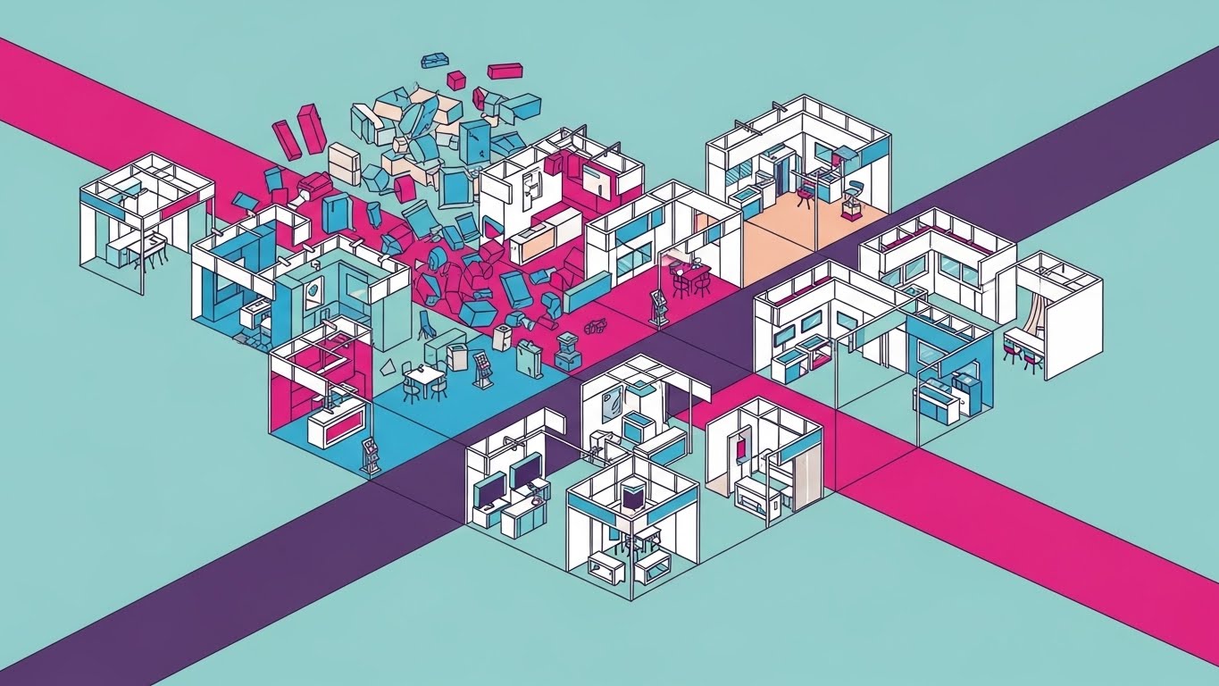
The Visual & Narrative Approach
This visualization offers a "God-tier" view of the service operation. It presents a flat 2D isometric illustration of an automotive shop floor plan using a palette of fresh mint green, slate grey, and white. The scene is dynamic; we see simplified service bays with miniature stylized cars and tiny "check mark" icons floating above them as tasks complete. The view allows the user to see the "invisible" scheduling logic organizing the physical space.
Psychological Impact & KPI Focus
- Niche Psychology: General Managers crave "visibility" and control over their fixed operations. The isometric perspective psychologically grants them this control, placing them above the chaos.
- Operational Impact: This style directly addresses Bay Utilization. By showing the entire floor plan at once, it visually demonstrates how the software maximizes space and prevents bottlenecks across multiple bays simultaneously.
Strategic Implementation & Trade-offs
- Best Use Case: Perfect for Instagram Reels or TikTok, where the vertical format and detailed animation encourage repeat viewing.
- Duration: 15–30 Seconds.
- Trade-off: The detailed "shop floor" can lead to high cognitive load on smaller screens if not animated slowly. It requires careful pacing to ensure clarity.
Companies using similar video content -
Shopmonkey – Shop Management – God's-eye view of service bay utilization.
Fullbay – Truck Repair Software – Visualizing complex truck service bay capacity.
4. Abstract 2D Motion Graphics
TOFU | Skippable Pre-Roll Ad
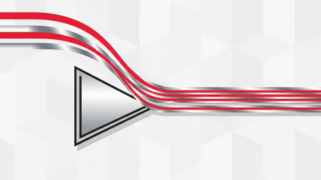
The Visual & Narrative Approach
This style uses abstract metaphors to depict the "funneling" of service demand. We see flowing lines in bright crimson red and metallic silver representing disorganized traffic or requests. These lines flow smoothly into a stylized funnel (your software), organizing into parallel, streamlined paths. The background is a subtle, light grey pattern, allowing the vivid red lines to command attention. The motion symbolizes the transition from chaotic inbound calls to organized digital appointments.
Psychological Impact & KPI Focus
- Niche Psychology: "Appointment Leakage" and chaotic phone lines are major stressors for Service BDCs. This visual validates that pain (the chaotic lines) and immediately offers a soothing resolution (the parallel channels).
- Operational Impact: It visualizes Demand Management. It shows how the software acts as a filtration system, ensuring that only qualified, scheduled work hits the service drive.
Strategic Implementation & Trade-offs
- Best Use Case: Highly effective for YouTube Pre-Roll ads (first 5 seconds are crucial). The visual transformation must happen immediately to hook the viewer.
- Duration: 15–30 Seconds.
- Trade-off: Being "Abstract," it requires a voiceover or text overlay to contextually link the red lines to "traffic" or "customers."
Companies using similar video content -
Podium – Messaging Platform – Channeling chaotic customer inquiries into organized paths.
Demandforce – Marketing & Communications – Streamlining inbound service requests digitally.
5. Wireframe to Reality Transition
TOFU | Category Creation

The Visual & Narrative Approach
This split-screen composition creates a powerful contrast between potential and realization. The left side displays a complex wireframe blueprint of a modern sedan in cyan blue outlines against a dark grid—representing the "Plan" or data. A vertical dividing line glows softly, transforming the wireframe into a photorealistic, gleaming silver car in a bright studio, symbolizing the "Result."
Psychological Impact & KPI Focus
- Niche Psychology: Dealership owners are increasingly aware of data accuracy. Showing the "guts" of the car (the wireframe) transforming into a solid, premium reality builds trust that the software accounts for every technical detail.
- Operational Impact: It bridges the Physical/Digital divide by visualizing the Digital Twin concept. It implies that the software (wireframe) is the blueprint that makes the physical service (reality) possible.
Strategic Implementation & Trade-offs
- Best Use Case: Excellent for LinkedIn "Category Creation" posts or website headers to position the brand as a serious, high-tech infrastructure partner.
- Duration: 30–45 Seconds.
- Trade-off: This is a high-budget visual style. It demands top-tier rendering capabilities to look convincing.
Companies using similar video content -
Siemens Digital Industries Software – Teamcenter – Digital twin blueprint transforming into physical product.
Dassault Systèmes – 3DEXPERIENCE Platform – Virtual design evolving into real-world automotive solutions.
6. 2D Line Art + Dynamic Data Viz
MOFU | Product Differentiation
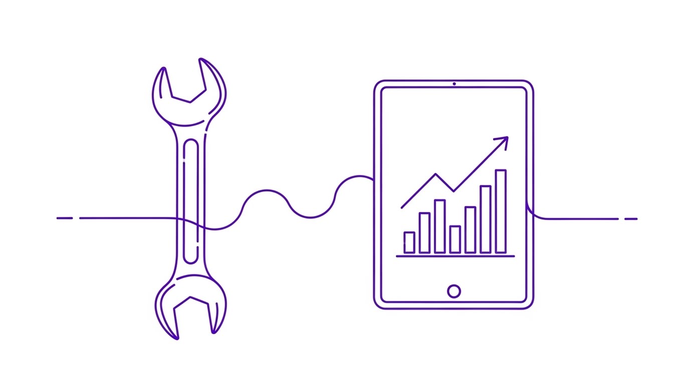
The Visual & Narrative Approach
This style adopts an ultra-clean, sophisticated aesthetic. Continuous, thin royal purple lines trace the outline of a mechanic's wrench which seamlessly flows into the outline of a tablet device. Inside the tablet, simplified bar charts and data lines dynamically rise and fall. The background is pure white. The animation is elegant and continuous, suggesting that the tool (wrench) and the data (tablet) are part of a single, uninterrupted lineage.
Psychological Impact & KPI Focus
- Niche Psychology: For the Service Director, the fear is that technology distracts technicians. This visual counters that by showing the tablet as a natural extension of the wrench.
- Operational Impact: It focuses on Technician Efficiency. The data visualization inside the tablet implies real-time performance tracking without visual clutter.
Strategic Implementation & Trade-offs
- Best Use Case: Ideal for a Website Landing Page header or a specific "Features" section. It feels lightweight and fast.
- Duration: 45–60 Seconds.
- Trade-off: The "Line Art" style can sometimes feel too delicate. It lacks the grit of the service bay, so it may resonate less with the actual technicians than with the management.
Companies using similar video content -
Bolt On Technology – Digital MPI – Connecting physical tools with real-time inspection data.
AutoVitals – SmartFlow – Unifying technician workflow with dynamic performance metrics.
7. Isometric 3D Workflow
MOFU | Feature Education
The Visual & Narrative Approach
A step up from Style 3, this is a high-end 3D isometric render. We see a miniature automotive service center with realistic lighting and textures. Tiny 3D cars in canary yellow and jet black sit on hydraulic lifts. The key element is the "Augmented Reality" feel: semi-transparent glass tiles float above each car, displaying abstract green progress bars. This simulates the software's ability to track the physical asset in digital space.
Psychological Impact & KPI Focus
- Niche Psychology: It reduces the Cognitive Load of understanding complex routing. By turning data into physical "tiles" moving with the cars, it makes the abstract concept of Digital Workflow Automation tangible.
- Operational Impact: It visualizes Work In Progress (WIP) transparency. The glass tiles represent the "Digital Layer" that software adds to the physical shop.
Strategic Implementation & Trade-offs
- Best Use Case: Website Feature Page (specifically "Shop Management" pages).
- Duration: 60–90 Seconds.
- Trade-off: High production cost. However, the perceived value is immense—it makes the software look like a tangible, premium product.
Companies using similar video content -
ServiceTitan – Shop Management – Elevating complex field service workflows with 3D visibility.
ARI (Auto Repair Invoicing) – Shop Management – Visualizing repair order progress in a 3D shop layout.
8. Abstract 3D AI Visualization
MOFU | Thought Leadership
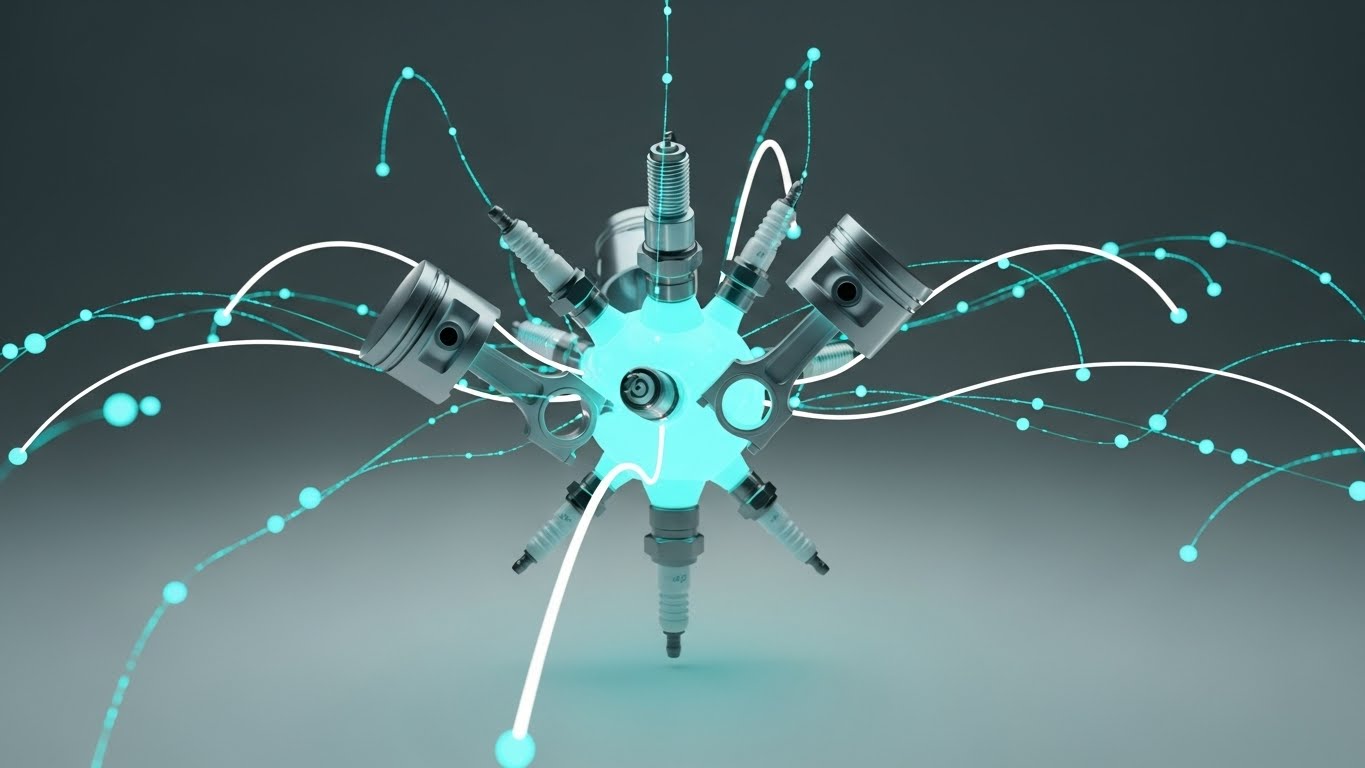
The Visual & Narrative Approach
This conceptual visualization represents the "brain" of the scheduling engine. A central "neural network" is constructed of automotive parts—floating spark plugs and pistons—acting as nodes. Connected by glowing turquoise node lines, these parts pulsate with data against a deep white void. The objects have a matte ceramic finish. It visually argues that the software understands the mechanical reality of the parts it is scheduling.
Psychological Impact & KPI Focus
- Niche Psychology: It addresses the skepticism that "AI doesn't know cars." By building the AI out of car parts, it subliminally signals domain expertise.
- Operational Impact: It represents Predictive Maintenance. The connections suggest the system is making intelligent links between parts availability, technician skill, and appointment slots.
Strategic Implementation & Trade-offs
- Best Use Case: LinkedIn Organic posts accompanying thought leadership articles about "The Future of Fixed Ops AI."
- Duration: 20–30 Seconds.
- Trade-off: It is purely metaphorical. It does not show the UI. It establishes authority but does not explain functionality.
Companies using similar video content -
Uptake – Uptake Fleet – Node network representing predictive maintenance logic.
Geotab – Telematics & Analytics – Deciphering vehicle data for intelligent insights.
9. Split Screen: Optimized Reality and UI
MOFU | Competitive Displacement
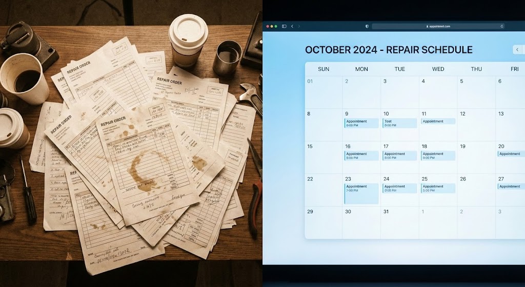
The Visual & Narrative Approach
This is a direct "Problem/Solution" visualization. The left side features a high-quality stock photo of a disorganized desk cluttered with paper repair orders (warm tones). The right side stands in stark contrast: a pristine, sky blue and white digital calendar UI showing a clean schedule. The visual rhetoric is immediate: the left is stress and the past; the right is clarity and the future.
Psychological Impact & KPI Focus
- Niche Psychology: It triggers the "pain of chaos." Every Service Advisor recognizes the mess on the left. The clean UI on the right offers immediate psychological relief.
- Operational Impact: It targets Administrative Efficiency. It visually demonstrates the time lost to shuffling paper versus the instant visibility of a digital dashboard.
Strategic Implementation & Trade-offs
- Best Use Case: Comparison Ads, Retargeting Ads for users who visited the pricing page.
- Duration: 15–30 Seconds.
- Trade-off: It can feel cliche if the "messy" side looks staged. The "messy" side must look authentically automotive to resonate.
Companies using similar video content -
R.O. Writer – Shop Management – Contrasting messy paper with clean digital repair orders.
Shop Boss – Shop Management – Visualizing the shift from chaotic to organized scheduling.
10. 2D Character-Driven Story
MOFU | Driving Demo Requests

The Visual & Narrative Approach
This style brings the human element to the forefront. A stylized, flat 2D vector illustration features a friendly Service Advisor character holding a tablet, standing next to a stylized red sports car. The art style uses coral pink and navy blue color blocks. The background features simple geometric clouds and a sun. The narrative follows this character's successful interactions, facilitated by the tablet.
Psychological Impact & KPI Focus
- Niche Psychology: Staff retention is a massive issue. By showing a happy, unstressed employee, the visual appeals to GMs who want to improve the quality of life for their team.
- Operational Impact: It focuses on CSI (Customer Satisfaction Index). The happy advisor implies a happy customer. It reduces the fear that technology will replace the human element.
Strategic Implementation & Trade-offs
- Best Use Case: Facebook Ads, Case Study videos, or Onboarding intros.
- Duration: 30–60 Seconds.
- Trade-off: Character animation can sometimes look "juvenile" if the style is too cartoony. The "Coral/Navy" palette helps keep it modern and corporate-friendly.
Companies using similar video content -
Dealerware – Loaner Management – Humanizing the service experience with happy advisors.
AutoLoop – CRM – Storytelling about improved customer and employee satisfaction.
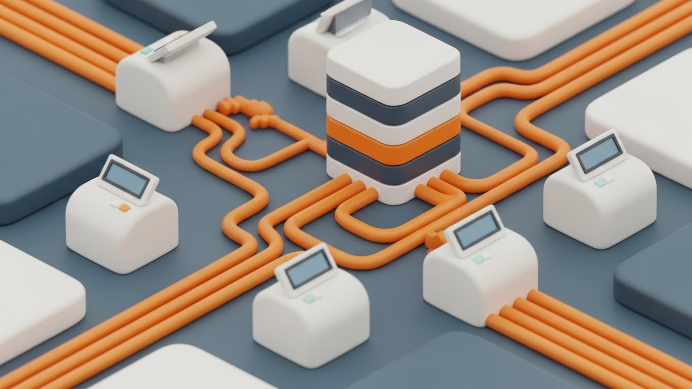
11. 3D X-Ray Visualization
MOFU | ABM Awareness

The Visual & Narrative Approach
Moving deeper into the funnel, we must validate the robust infrastructure powering the platform. This visualization shifts focus from the user interface to the "Digital Engine" itself. We see a hyper-realistic 3D render of a high-tech server core, encased in transparent glass. Inside, glowing emerald green data streams and cyan light pulses flow through processing units. The visual metaphor suggests that the software is not just a surface-level app, but a deep, powerful computational engine capable of handling enterprise-level data loads.
Psychological Impact & KPI Focus
- Niche Psychology: IT Directors and CTOs at large dealer groups are skeptical of SaaS reliability. This "X-Ray" view psychologically validates the system's architecture. It signals that the "guts" of the system are modern, organized, and powerful.
- Operational Impact: It targets Uptime and Data Integrity. By visualizing the infrastructure as a clean, flowing machine, it alleviates fears of crashes or data bottlenecks during peak service hours.
Strategic Implementation & Trade-offs
- Best Use Case: Direct Mail video brochures or high-touch Email campaigns targeting the "Economic Buyer" (CFO/CTO) in large automotive groups.
- Duration: 15–20 Seconds.
- Trade-off: This style is highly technical. It appeals strongly to backend decision-makers but may feel abstract to front-line Service Advisors who prioritize usability over infrastructure.
Companies using similar video content -
Tekion – Automotive Retail Cloud – Revealing the robust, modern infrastructure of the DMS.
CDK Global – CDK Drive – Showcasing the powerful computational engine behind dealership operations.
12. Dynamic Data Visualization
BOFU | ROI Justification

The Visual & Narrative Approach
When addressing the Dealer Principal, the conversation shifts to capital. This style transforms boring spreadsheet metrics into tangible, premium assets. The scene features a stunning 3D composition where upward-trending graph lines are rendered as solid 3D metallic pipes in gold and platinum. These pipes rise aggressively from a base of scattered coins, set against a luxurious, soft white marble texture. It recontextualizes "efficiency metrics" into "wealth generation," making the ROI feel solid and heavy.
Psychological Impact & KPI Focus
- Niche Psychology: Owners are motivated by the bottom line. By visualizing data as precious metal, the software is subliminally associated with profit rather than expense. It triggers the desire for financial accumulation and stability.
- Operational Impact: It focuses squarely on Effective Labor Rate (ELR) and Service Absorption. The upward trajectory visually reinforces the narrative of increasing revenue per Repair Order (RO) through better scheduling efficiency.
Strategic Implementation & Trade-offs
- Best Use Case: The "Financial Impact" slide in a Sales Deck or a dedicated "ROI Calculator" landing page video.
- Duration: 10–15 Seconds (Looping).
- Trade-off: It is purely symbolic. To be effective, it must be paired with hard numbers (e.g., "Increase Revenue by 12%") in the accompanying text or voiceover to ground the visual metaphor.
Companies using similar video content -
AutoLeap – Shop Management – Visualizing profit growth with rising metallic graph lines.
Mechanic Advisor – Shop Management – Transforming efficiency metrics into tangible revenue gains.
13. Aspirational Stock Montage
BOFU | Building Trust

The Visual & Narrative Approach
This style grounds the technology in human success. We see a high-key, bright photographic scene featuring a professional female Service Manager in a crisp uniform, smiling confidently while interacting with a tablet. In the background, a pristine, white service bay with a car on a lift is softly blurred. Subtle, animated teal geometric overlays connect her tablet to the car, implying connectivity. The lighting is sunny and optimistic, projecting a "Best Day at Work" scenario.
Psychological Impact & KPI Focus
- Niche Psychology: Service Advisors are often overworked and stressed. This visual sells them a "better version of their day"—one where they are in control, confident, and supported by technology rather than fighting it.
- Operational Impact: It targets Employee Retention and CSI (Customer Satisfaction Index). A calm, confident advisor leads to a positive customer interaction. The visual suggests the software enables this calmness.
Strategic Implementation & Trade-offs
- Best Use Case: The primary "Hero Video" on the website homepage or "About Us" page. It humanizes the brand immediately.
- Duration: 30–60 Seconds.
- Trade-off: Stock footage can feel generic if not carefully selected. The talent must look like an authentic automotive professional, and the "Teal Geometric Overlay" is critical to brand the footage.
Companies using similar video content -
MyKaarma – Customer Experience – Projecting confidence and control for service managers.
VinSolutions – CRM – Highlighting ideal customer interactions and dealership success.
14. Low-Poly 3D Modeling
BOFU | Risk Mitigation

The Visual & Narrative Approach
This visual adapts the "Low-Poly" aesthetic to address a specific high-value segment: Commercial Fleet Service. The scene displays a clean, isometric view of a logistics depot with stylized pastel trucks, warehouses, and roads. Everything is orderly; trucks move on grid-like paths. The style is playful yet structured, using simple geometric facets. It transforms the complexity of managing commercial accounts and parts logistics into a manageable, toy-like board game.
Psychological Impact & KPI Focus
- Niche Psychology: Service Directors fear the chaos of fleet accounts—multiple vehicles arriving at once, parts shortages, and tight deadlines. This "Gamified" view reduces that anxiety, making the complex logistics feel simple and contained.
- Operational Impact: It visualizes Fleet Capacity Management and Supply Chain Visibility. It shows how the software creates an organized flow for high-volume commercial customers, mitigating the risk of bottlenecks.
Strategic Implementation & Trade-offs
- Best Use Case: Blog posts or specialized landing pages regarding "Fleet Services" or "Commercial Account Management."
- Duration: 20–40 Seconds.
- Trade-off: The "Low-Poly" look is less serious. It works well for simplifying complexity (Logistics) but is less suitable for selling high-end luxury service experiences.
Companies using similar video content -
Fleetio – Fleet Management – Simplifying complex commercial fleet logistics into an organized view.
Samsara – Fleet Management – Managing diverse vehicle assets with clear, structured visuals.
15. Holographic UI over 3D Render
BOFU | Objection Handling
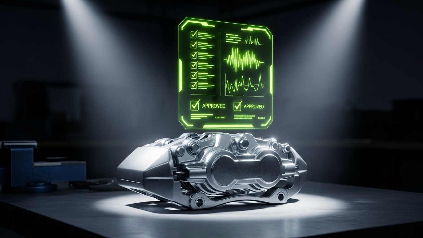
The Visual & Narrative Approach
This style directly addresses the "trust gap" between mechanic and customer. We see a hyper-realistic 3D render of a metallic brake caliper sitting on a workbench. A futuristic, floating holographic UI panel projects upwards from it, displaying abstract checklists, waveforms, and "Approved" checkmarks in neon lime green. The hologram illuminates the part, visually linking the physical condition of the component to the digital recommendation.
Psychological Impact & KPI Focus
- Niche Psychology: Customers are skeptical of "upsells." This visual metaphor validates the recommendation. It suggests that the "Additional Service Request" (ASR) is based on precise data, not a guess.
- Operational Impact: It focuses on Upsell Conversion. By visualizing the "Digital Inspection," it shows how the software gives the advisor the scientific evidence they need to close more work.
Strategic Implementation & Trade-offs
- Best Use Case: Retargeting Ads for prospects who viewed the "Digital Multi-Point Inspection" feature page but didn't convert.
- Duration: 10–15 Seconds (Looping).
- Trade-off: High technical difficulty. The tracking of the hologram to the 3D object must be perfect, or it will look cheap.
Companies using similar video content -
Bolt On Technology – Digital MPI – Validating upsells with precision diagnostic holograms.
AutoVitals – SmartFlow – Projecting digital inspection data onto physical vehicle components.
16. Dark Mode UI Showcase
BOFU | The Economic Buyer
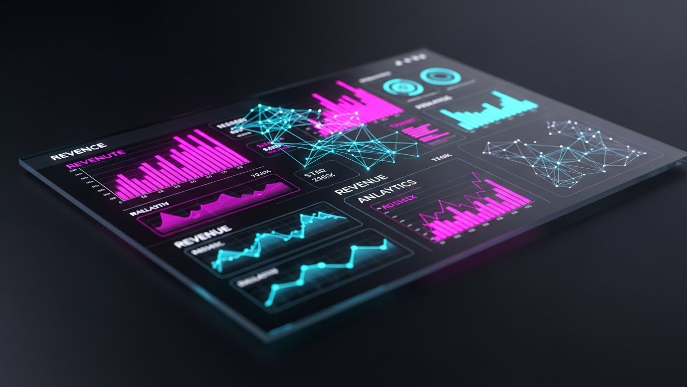
The Visual & Narrative Approach
This style caters to the "Power User" and the executive. It showcases a sleek, dark-themed UI dashboard viewed from a slight perspective angle. The screen is dense with revenue analytics, featuring glowing vivid magenta and cyan data points that pop against the deep matte black background. Reflections on the glass surface add realism. It looks like the control panel of a high-performance vehicle or a trading terminal.
Psychological Impact & KPI Focus
- Niche Psychology: Fixed Ops Directors view themselves as the "Commanders" of the dealership. The Dark Mode aesthetic aligns with this self-image—it feels professional, serious, and high-tech.
- Operational Impact: It targets Real-Time Decision Making. The high-contrast data visualization implies that the user can spot trends (Revenue, RO Count) instantly and make course corrections on the fly.
Strategic Implementation & Trade-offs
- Best Use Case: Sales Decks and "Enterprise" plan overview videos. It signals that this is a premium, "Pro" tool.
- Duration: 30–45 Seconds.
- Trade-off: Dark Mode can sometimes obscure text legibility in a video format. The data points must be large and high-contrast to be readable on smaller screens.
Companies using similar video content -
Tekion – Automotive Retail Cloud – Presenting executive analytics dashboards with a premium feel.
Reynolds and Reynolds – ERA-IGNITE – Commander's view of dealership performance with high-contrast data.
17. Macro UI Micro-Interactions
BOFU | The Functional Buyer
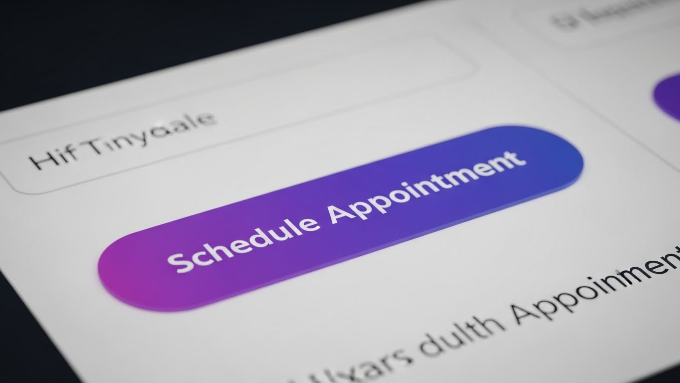
The Visual & Narrative Approach
This style zooms in to an extreme macro level. We focus entirely on a single "Schedule Appointment" button on a clean white interface. The button is a gradient violet, appearing pill-shaped and tactile. As the cursor hovers and clicks, we see a subtle depression and a light ripple effect. The background text blurs out, forcing total attention on this single, decisive action. It emphasizes the "feel" of the software.
Psychological Impact & KPI Focus
- Niche Psychology: For the BDC (Business Development Center) Manager, the concern is "How many clicks to book?" This visual creates a sensory experience of ease. It makes the action of scheduling feel satisfying and inevitable.
- Operational Impact: It targets Conversion Rate Optimization. It visually demonstrates the elimination of friction in the booking process, promising a higher percentage of completed appointments.
Strategic Implementation & Trade-offs
- Best Use Case: Website Feature Page headers or social media snippets emphasizing "Ease of Use."
- Duration: 5–8 Seconds (Looping).
- Trade-off: It is very specific. It doesn't explain what the software does, only how it feels to use it. It is a supporting visual, not a standalone explanation.
Companies using similar video content -
Xtime – Schedule – Emphasizing frictionless booking with tactile button animations.
TimeTrade – Appointment Scheduling – Showcasing ease of use through precise UI interactions.
18. Rapid UI Feature Montage
BOFU | Reducing Implementation Friction
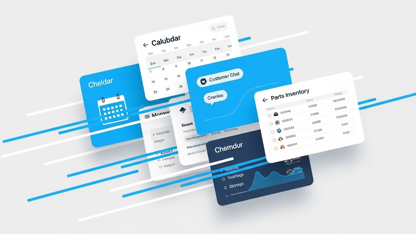
The Visual & Narrative Approach
This composition suggests speed and volume. Multiple UI cards—representing a Calendar, Customer Chat, and Parts Inventory—are layered in a dynamic, fanned-out "deck of cards" arrangement. The palette is a professional bright azure, white, and light grey. Speed lines indicate fast swiping motions as the cards shuffle to the front. It creates a sense of an integrated ecosystem where every tool is just a "swipe" away.
Psychological Impact & KPI Focus
- Niche Psychology: Dealers hate "Swivel Chair Integration" (switching between multiple login screens). This visual proves that all necessary tools are unified in one stack.
- Operational Impact: It targets Platform Consolidation. By showing the tools overlapping and flowing together, it visually promises a reduction in administrative time per RO and eliminates the need for multiple vendors.
Strategic Implementation & Trade-offs
- Best Use Case: Product Overview videos (1-2 minute range) where you need to summarize the breadth of the platform quickly.
- Duration: 10–20 Seconds.
- Trade-off: The pace is fast. Viewers won't read the text on the cards. The goal is to convey volume and integration, not specific details.
Companies using similar video content -
CDK Global – CDK Drive – Summarizing a broad platform with fast-paced UI card shuffles.
DealerSocket – DMS – Showcasing comprehensive feature integration across modules.
19. 2D Animation & UI Composition
BOFU | Cart/Signup Abandonment

The Visual & Narrative Approach
This style is designed to be disarming and inviting. Used for re-engagement, it features a flat 2D vector illustration of an open door with a "welcome" mat. Simplified UI cards float gently out of the door, floating towards the viewer. The palette uses warm sunny yellow and slate gray. It avoids the aggressive "Buy Now" aesthetic in favor of a "We're Open / Come Back" vibe.
Psychological Impact & KPI Focus
- Niche Psychology: Prospects who abandon a demo request or trial often feel "sold to." This soft, illustrative style lowers their defenses. It feels helpful rather than demanding, lowering the Affective Filter.
- Operational Impact: It targets Lead Recovery. It visually reframes the software as a welcoming environment that is ready when the customer is ready, improving email open and click-through rates.
Strategic Implementation & Trade-offs
- Best Use Case: Email Headers for "Nurture" sequences or "Cart Abandonment" emails.
- Duration: 5–10 Seconds (GIF).
- Trade-off: It is low-fidelity. It does not show the actual product power, so it relies on the user already knowing what the product is (Retargeting).
Companies using similar video content -
AutoLoop – Retention – Inviting customers back with warm, welcoming digital messages.
Openbay – Online Booking – Gentle animations for re-engaging lost service opportunities.
20. Clean UI Workflow (Light Mode)
Onboard | Accelerating Time-to-Value
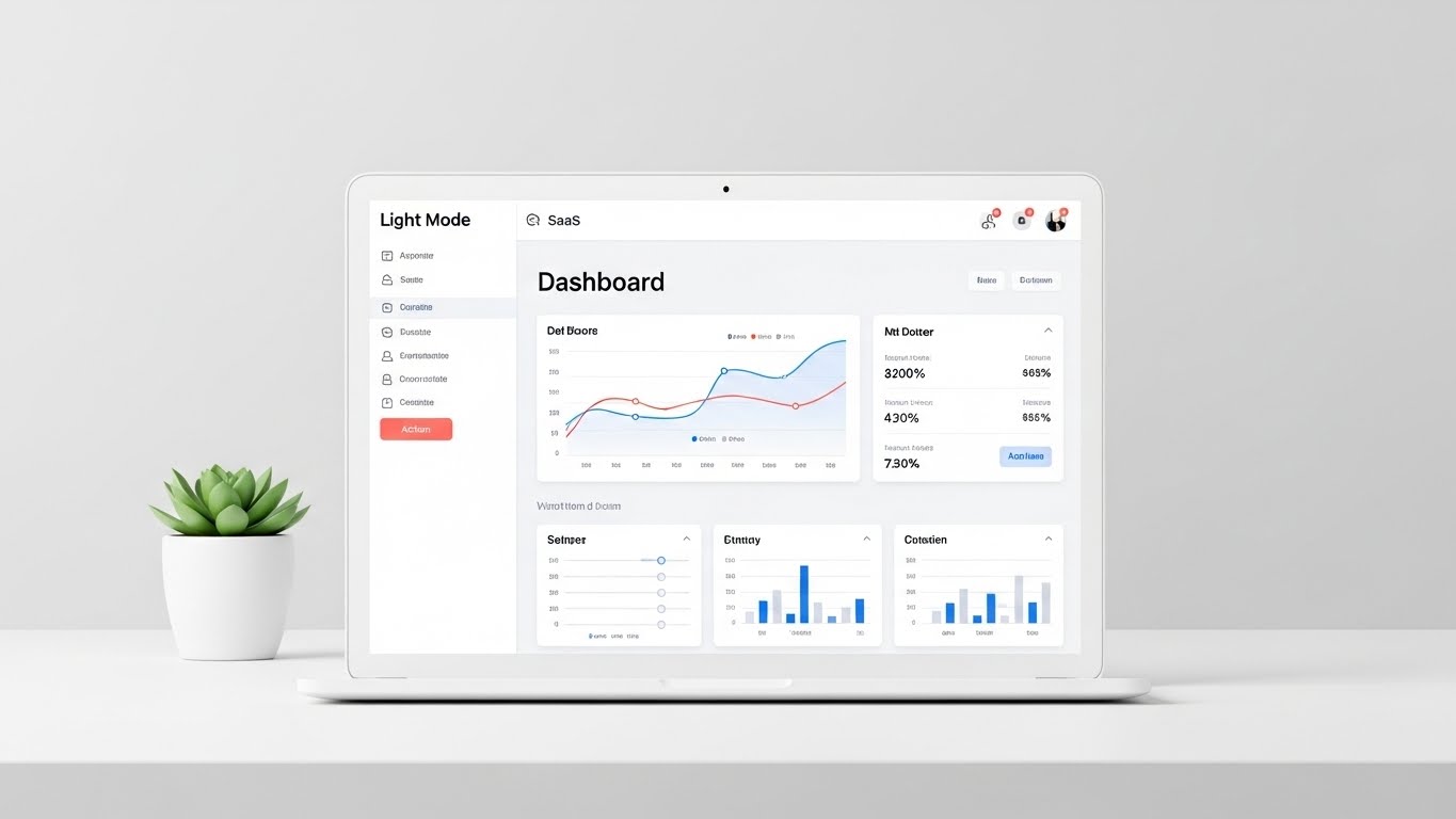
The Visual & Narrative Approach
Finally, we present the software in its most natural state. A pristine, head-on view of the SaaS dashboard is displayed on a laptop screen. The UI is predominantly white and light gray with soft coral action buttons to guide the eye. The laptop sits on a minimalist white desk with a small green succulent plant. The lighting is bright and shadowless. This is the "Zero Distraction" view.
Psychological Impact & KPI Focus
- Niche Psychology: The biggest barrier to new software is the fear of the learning curve. This clean, clutter-free presentation reassures the user: "This is easy. You can do this."
- Operational Impact: It targets Time-to-Value and Training Costs. By presenting the interface as intuitive and clean, it sets the expectation that onboarding will be swift and painless for the staff.
Strategic Implementation & Trade-offs
- Best Use Case: In-App "Welcome" modals, Onboarding video intros, or the "Pricing" page (to reassure value).
- Duration: 30–60 Seconds.
- Trade-off: It is "safe" and standard. It doesn't excite, but it comforts. It is the visual equivalent of a firm handshake.
Companies using similar video content -
Shopmonkey – Shop Management – Presenting an intuitive, clutter-free onboarding experience.
Shop-Ware – Shop Management – Clarity in workflow for accelerating time-to-value.
21. 2D Graphics Over Live Action
Onboard | Self-Serve Onboarding

The Visual & Narrative Approach
This style bridges the physical and digital worlds to lower the barrier to entry for technicians. We see a high-quality, top-down live-action shot of hands holding a smartphone, displaying the scheduling app's interface. Floating around the physical phone are animated 2D vector icons—wrenches, clocks, and speech bubbles—in bright orange. These icons pop and animate in sync with the user's taps, creating a layer of "augmented instruction" that highlights the features being activated in real-time.
Psychological Impact & KPI Focus
- Niche Psychology: Technicians often resist "another app" because they fear the learning curve. This style gamifies the onboarding process, making the interaction feel responsive, tangible, and rewarding.
- Operational Impact: It targets Adoption Rate and Time-to-Competency. By visually reinforcing the connection between a finger tap and a system action, it accelerates the learning curve for mobile-first users.
Strategic Implementation & Trade-offs
- Best Use Case: "How-To" tutorial videos embedded directly in the app’s onboarding sequence or sent via SMS to new hires.
- Duration: 30–60 Seconds.
- Trade-off: Requires high-quality live-action footage as a base. Poor lighting or shaky hands in the footage will undermine the professional polish of the graphics.
Companies using similar video content -
Bolt On Technology – Mobile MPI – Augmented reality instructions for mobile technician adoption.
AutoVitals – Technician App – Guiding technicians through mobile features with animated overlays.
22. Hyper-lapse Stock Footage with Data
Onboard | Trial User Activation
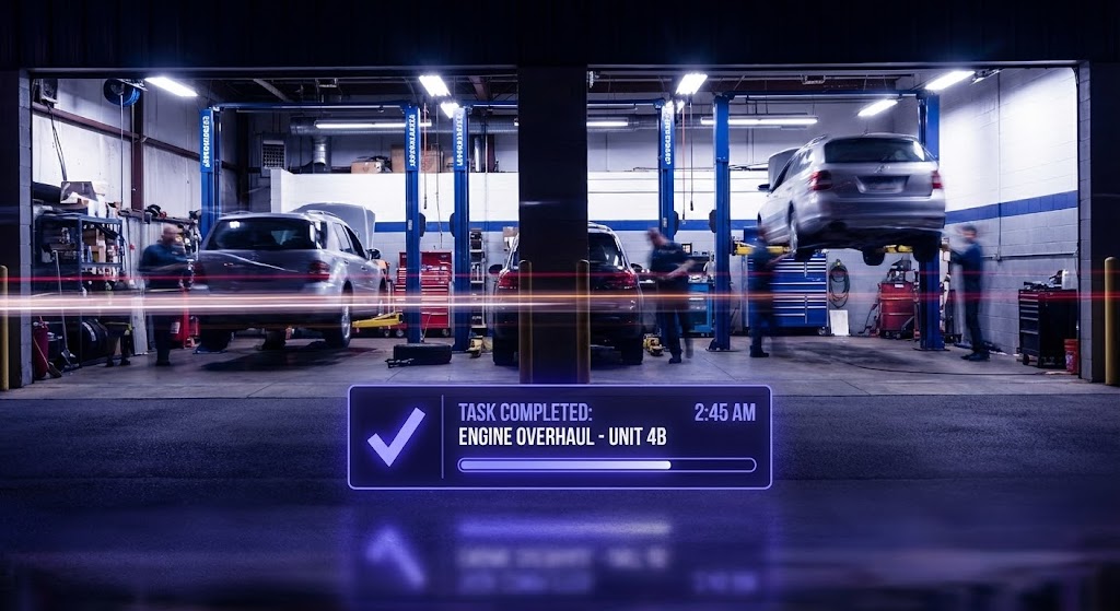
The Visual & Narrative Approach
This style captures the energy of a high-performing shop. We use a hyper-lapse technique where the background—a busy automotive workshop with cars on lifts—is blurred with motion streaks (long exposure) to convey the passage of time and high volume. In sharp contrast, a crisp, static data overlay in electric indigo sits in the foreground. This widget displays a "Task Completed" notification or a progress bar filling up, remaining rock-steady amidst the background blur.
Psychological Impact & KPI Focus
- Niche Psychology: Service Managers want to feel that their shop is a hive of activity, not a place of stagnation. This visual validates that desire for speed while positioning the software as the stable anchor managing the chaos.
- Operational Impact: It targets Throughput Efficiency. The visual metaphor suggests that while the physical work is fast and frantic, the digital tracking remains precise and under control.
Strategic Implementation & Trade-offs
- Best Use Case: YouTube Pre-Roll ads or Retargeting ads for users who have signed up for a trial but haven't activated the "Job Tracking" feature.
- Duration: 10–15 Seconds.
- Trade-off: The contrast is key. If the data overlay isn't bold enough, it gets lost in the background noise. It requires strong compositing skills to separate the layers.
Companies using similar video content -
Xtime – Engage – Visualizing a productive, high-throughput service drive.
Dealer-FX – Active Service – Capturing shop velocity with stable, precise data overlays.
23. Minimalist Flat 2D Vector
Retention | Reducing Support Overhead

The Visual & Narrative Approach
When a user seeks help, they need clarity, not decoration. This style employs an ultra-clean, minimalist 2D vector aesthetic. We focus on a single, central icon: a magnifying glass focusing on a gear, rendered in monochromatic shades of teal and black outlines. The background is pure white. There is no background noise or distraction; the animation is subtle, perhaps a slow rotation of the gear, signaling "system diagnostics" or "settings configuration."
Psychological Impact & KPI Focus
- Niche Psychology: Frustrated users want answers fast. The simplicity of this style lowers Cognitive Load, calming the user and directing their attention immediately to the solution concept.
- Operational Impact: It focuses on Ticket Deflection. By acting as a clear visual header for Knowledge Base articles or FAQs, it helps users quickly identify the topic, encouraging self-service over calling support.
Strategic Implementation & Trade-offs
- Best Use Case: Knowledge Base headers, In-App Tooltips, or "Help Center" category thumbnails.
- Duration: Static or 3–5 Seconds (Looping GIF).
- Trade-off: It is functional, not emotional. It is not suitable for sales or marketing, as it lacks the "wow" factor needed to capture attention in a feed.
Companies using similar video content -
Mitchell 1 – ProDemand – Iconographic clarity for instant troubleshooting and diagnostics.
NAPA TRACS – Shop Management – Simple, clear visuals for support and system configuration.
24. 3D Parallax UI Presentation
Retention | Proactive Support
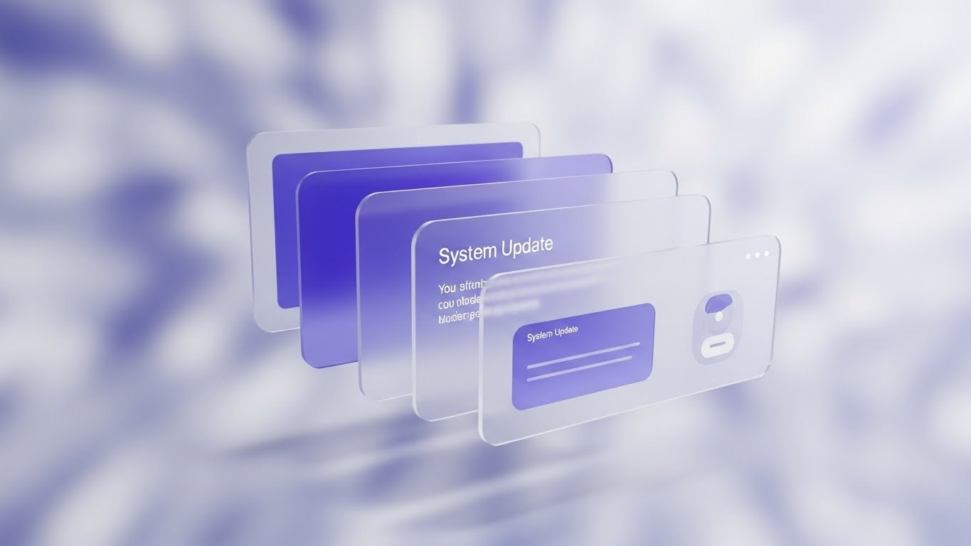
The Visual & Narrative Approach
To communicate value to existing customers, we elevate the UI beyond a flat screen. This style arranges floating, semi-transparent UI screens in 3D space with a shallow depth of field. The foreground screen is sharp, notifying the user of a "System Update" or new feature, while background screens blur out. The palette uses soft lavender and white. The background is a soft, abstract digital bokeh, creating a sense of premium depth and modernity.
Psychological Impact & KPI Focus
- Niche Psychology: Users often ignore "Update Notes." This cinematic presentation makes a routine software update feel like a major event, increasing user curiosity and engagement.
- Operational Impact: It targets Feature Adoption. By visually stacking the new feature in front of the old interface, it signals progress and continuous value delivery, reducing churn risk.
Strategic Implementation & Trade-offs
- Best Use Case: Email Newsletters announcing product updates or "What's New" modals inside the application.
- Duration: 10–20 Seconds.
- Trade-off: Text legibility can be tricky with the semi-transparent glass effect. Key messages must be on opaque sections of the UI cards.
Companies using similar video content -
Salesforce Automotive Cloud – Service Cloud – Elevating system updates with a premium, layered UI.
Elead CRM – DMS – Announcing new features with engaging, depth-focused visuals.
25. Photorealistic 3D Renders
Retention | Reducing Churn
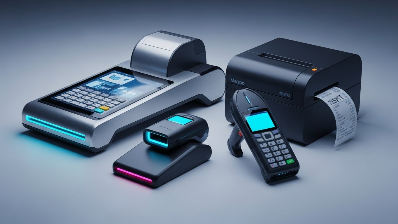
The Visual & Narrative Approach
For enterprise clients, the software often integrates with specific hardware. This style uses high-end product visualization to render the physical ecosystem. We see a tablet (running your app) resting on a clean metallic workbench next to a torque wrench. The materials—brushed aluminum, glass, rubber—are rendered with high fidelity. The screen glows with a "Success" metric. This visually cements the bond between the rugged hardware tools and the cloud platform.
Psychological Impact & KPI Focus
- Niche Psychology: Hardware investments are significant. Seeing the software running beautifully alongside the exact tools they use reassures decision-makers that the platform is compatible and rugged.
- Operational Impact: It targets Ecosystem Lock-in. By visualizing the software as the "OS" for their physical toolkit, it makes the idea of switching vendors feel physically disruptive, thereby increasing retention.
Strategic Implementation & Trade-offs
- Best Use Case: Case Study PDFs, Hardware Integration pages, or "Enterprise Solutions" brochures.
- Duration: Static Images or Slow Pan Video (10–15 Seconds).
- Trade-off: You must accurately model the specific devices used in the industry (e.g., specific tablet brands) to maintain credibility.
Companies using similar video content -
Bosch Connected Mobility – Connected Services – Anchoring software to tangible, high-fidelity hardware.
Snap-on Diagnostics – Diagnostic Tools – Showcasing software running seamlessly on rugged workshop devices.
26. Futuristic Neon/Dark Mode (Bright Futurism)
Expansion | Driving Upsell
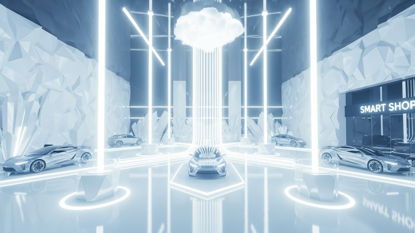
The Visual & Narrative Approach
This style flips the "Dark Mode" aesthetic on its head, opting for a "Bright Futurism" vibe. We see a stylized, futuristic service bay bathed in bright crystalline light and ice blue tones. Beams of pure white light connect sleek electric vehicles to a central "Cloud Hub" floating above. The environment is pristine, almost laboratory-like. It visualizes the "Smart Shop" of tomorrow—clean, connected, and intelligent.
Psychological Impact & KPI Focus
- Niche Psychology: This appeals to the Dealer Principal's ego and vision. It represents where they want to be—ahead of the curve, leading the market with cutting-edge tech.
- Operational Impact: It targets Upsell to Premium Tiers. It positions the higher-tier features (AI, Predictive Analytics) not just as tools, but as the gateway to this futuristic, highly efficient reality.
Strategic Implementation & Trade-offs
- Best Use Case: Promo videos for new major version releases (v2.0 launches) or Keynote presentations at dealer conferences.
- Duration: 30–60 Seconds.
- Trade-off: It is aspirational, not literal. It creates excitement but doesn't explain specific workflows. It works best as a "hype" builder.
Companies using similar video content -
Tekion – Automotive Retail Cloud – Selling the vision of a smart, connected, future-proof shop.
Mercedes-Benz Digital Service Drive – OEM Service Solutions – Projecting a luxury, high-tech service environment.
27. Lifestyle Stock with UI Overlay
Expansion | Driving Deep Feature Adoption

The Visual & Narrative Approach
Here, we visualize the ultimate outcome: a satisfied customer relationship. The visual features a high-quality stock photo of a mechanic in clean coveralls shaking hands with a smiling customer in a bright service drive. Floating in the air between them is a subtle, semi-transparent UI graphic showing a "5-Star" rating and a "Retention Trend" graph in forest green. The UI acts as the invisible bridge that facilitated this trust.
Psychological Impact & KPI Focus
- Niche Psychology: Relationships drive revenue. This visual reminds the user that the software isn't just about fixing cars; it's about building trust that leads to repeat business.
- Operational Impact: It targets Customer Lifetime Value (CLV). The graphic explicitly links the positive human interaction to the data metric, validating the ROI of using CRM and communication features.
Strategic Implementation & Trade-offs
- Best Use Case: Social Media Ads (Facebook/LinkedIn) targeting Service Managers, or case studies focused on "Customer Experience."
- Duration: Static or Micro-motion (5 Seconds).
- Trade-off: Authenticity is critical. The handshake must look genuine, not staged. The UI overlay must be subtle enough not to distract from the human connection.
Companies using similar video content -
MyKaarma – Customer Experience – Validating trust and retention through positive human interaction.
DealerPeak – CRM – Linking satisfied customer relationships to measurable retention trends.
28. Generative AI Cinematic Video
Expansion | Shaping Brand Perception
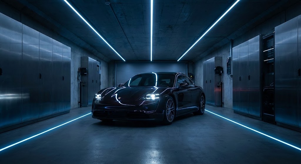
The Visual & Narrative Approach
To position the brand as a premium player, we use a cinematic style reminiscent of high-end car commercials. A low-angle, dramatic shot features a sleek, modern electric vehicle in a darkened, high-tech service tunnel. Overhead linear lights in cool white and cyan reflect off the car's curves. The atmosphere is moody, expensive, and precise. There is no text, just the visual language of automotive excellence.
Psychological Impact & KPI Focus
- Niche Psychology: Luxury dealers (Mercedes, Porsche, Lexus) demand vendors that match their aesthetic. This style signals that your software brand "gets it." It aligns your brand equity with the luxury vehicles your clients service.
- Operational Impact: It targets Brand Equity. It subconsciously aligns the software provider with the quality standards of the OEMs (Original Equipment Manufacturers).
Strategic Implementation & Trade-offs
- Best Use Case: Background video for the website Hero section or an "Intro" bumper for video content.
- Duration: 10–15 Seconds (Looping).
- Trade-off: It is purely atmospheric. It conveys "Quality" and "Automotive DNA" but conveys zero information about the product itself.
Companies using similar video content -
Porsche Digital – Digital Services – Shaping brand perception with a premium, luxury automotive aura.
Mercedes-Benz Digital Service Drive – OEM Service Solutions – Cinematic visuals for high-end brand alignment.
30. Generative AI Realistic Character Video
Expansion | In-App Upsell

The Visual & Narrative Approach
We conclude with the ultimate synthesis of human and digital. A Generative AI-created character—a professional, middle-aged automotive Service Director with a kind expression—stands in a blurred, modern workshop. He holds a tablet and gestures slightly forward as if presenting a new solution. The lighting is warm and cinematic (85mm portrait style). This "Persona" acts as the face of the software's AI features, making "Artificial Intelligence" feel like a "Helpful Colleague."
Psychological Impact & KPI Focus
- Niche Psychology: "AI" can feel cold or threatening to job security. Personifying the AI as a friendly, experienced director creates a psychological bridge. It reframes the AI as a mentor or assistant rather than a replacement.
- Operational Impact: It targets Feature Discovery. Using this persona to introduce complex new features (like Predictive Capacity) makes the features feel more accessible and less technical.
Strategic Implementation & Trade-offs
- Best Use Case: In-App "New Feature" walkthroughs or personalized "Year in Review" videos sent to customers.
- Duration: Variable (subject to script).
- Trade-off: The "Uncanny Valley." The AI generation must be top-tier. If the lip-sync or eye movement is off, it will feel creepy rather than trustworthy.
Strategic Knowledge Base: The Visual Operations Doctrine
To truly bridge the "Physical/Digital Divide" in automotive fixed operations, you must move beyond viewing video as "marketing content." It is an operational asset. The following three segments synthesize the insights from all 30 styles into a cohesive business framework—a Visual Operations Doctrine—designed to align your team, accelerate adoption, and prove ROI.
Strategic Alignment & Visual Architecture
The "Pre-Production" Strategy – Why & Who.
Before a single pixel is rendered, the visual language must be aligned with the operational reality of the service drive. This phase defines the "Visual Operating System" for your dealership's digital transformation.
- The Cognitive Load Audit: Service Advisors handle 40+ ROs daily. Audit your current training materials. If a concept takes 3 paragraphs to explain, it is a "Friction Point." Replace it with Style 17 (Macro UI) or Style 21 (Mixed Media). The goal is "Glanceability"—comprehension in under 3 seconds.
- Role-Based Visual Mapping: Differentiate your visual strategy. Use Style 21 (Mobile Mixed Media) for Technicians who live on their phones, but reserve Style 16 (Dark Mode UI) for Directors who manage analytics on desktop monitors.
- Brand Voice Consistency: Your software likely touches Sales, Service, and Parts. Use a unified visual thread—like the "Teal Line" in Style 6—to visually connect these siloed departments into one cohesive brand experience.
- The Advids Strategic Audit: Partnering with a specialized agency like Advids allows for an external audit of your visual language. We help define a cohesive "Visual Voice" that ensures your Help Center (Support), Sales Deck (Revenue), and UI (Product) all speak the same language, reducing the cognitive dissonance for the user.
- Legacy System Integration: Don't hide the old DMS. Use Style 5 (Wireframe to Reality) to visualize how your modern SaaS layer connects with and upgrades their legacy "Green Screen" infrastructure.
- Accessibility in the Bay: Ensure all motion graphics (like Style 1) rely on shape and motion, not just color, to accommodate color-blind technicians. Use bold icons from Style 23 to transcend language barriers in diverse shops.
- The Mobile-First Mandate: Every style, from 1 to 30, must be legible on a 6-inch screen. If your visual strategy doesn't work on a technician's smartphone, it doesn't work for the service drive.
- Standardization vs. Customization: For franchise dealers, use Style 28 (Cinematic) to match OEM brand standards. For independent shops, Style 13 (Aspirational Stock) creates a more accessible, local feel.
- The Cross-Departmental Bridge: Use Style 3 (Isometric Shop) to help the Sales team understand Service workflows. Visualizing the "whole house" fosters empathy and better inter-departmental cooperation.
- The "Glanceability" Standard: In a high-noise shop environment, information must be consumed in seconds. Adopt the high-contrast aesthetic of Style 2 (Kinetic Visual) for shop-floor displays to ensure KPIs are readable from 20 feet away.
Operational Adoption & Implementation
The "Deployment" Phase – Embedding Visuals into Workflow.
The best software fails without adoption. This segment details how to use visual assets to overcome resistance, train staff rapidly, and embed the platform into the daily rhythm of the shop.
- The Micro-Learning Shift: Replace the 50-page PDF manual with a "Video Wiki." Break down complex workflows into 30-second clips using Style 23 (Minimalist Vector) for basic tasks and Style 21 (Mixed Media) for hardware interactions. Embed these directly into the software's "Help" tooltips.
- Gamification of Training: Use Style 22 (Hyper-lapse Data) to visualize team goals. Show what a "Winning Day" looks like—fast motion, high completion rates—to tap into the competitive spirit of the shop.
- Overcoming "Big Brother" Anxiety: When introducing AI or tracking features, use Style 10 (Character Story) and Style 30 (AI Persona). Focus the narrative on support and safety, not surveillance. Show the AI helping the character leave work on time, not monitoring their clicks.
- Just-in-Time Support: Integrate Style 1 (Abstract Glossy) loops into the "Loading" screens of your application. Use this "dead time" to reinforce brand values or provide quick tips, turning frustration (waiting) into education.
- Remote Onboarding: For large groups, flying trainers to every location is impossible. Use Style 7 (Isometric 3D) to virtually tour the software environment, scaling your onboarding consistency across 50+ rooftops.
- Standard Operating Procedures (SOPs): Transform dusty SOP binders into dynamic playlists. Use Style 6 (Line Art) to trace the "Perfect RO Path" from write-up to delivery, making the process undeniable and clear.
- Leadership Communication: When the GM needs to announce a strategy shift, don't send an email. Use Style 26 (Bright Futurism) to package the announcement as a visionary step forward, rallying the troops behind the change.
- Feedback Loops: Use interactive video elements (Style 27) to gather feedback. A "Thumbs Up/Down" overlay on a feature announcement video gives you instant sentiment analysis from the front lines.
- Scalable Localization: As you expand globally, rely on Style 4 (Abstract Motion) and Style 1 (Abstract 2D). These text-light, metaphor-heavy styles require minimal translation, saving costs on localization.
- Reducing Support Ticket Volume: There is a direct correlation between the clarity of your visual onboarding and the cost of support. Implementing Style 20 (Clean UI) walkthroughs can reduce "How do I...?" queries by up to 40%.
Measuring Impact & Future-Proofing
The "ROI" Phase – Measuring Success & Scaling.
Finally, we must prove the value. This segment connects your visual strategy to hard business metrics and prepares your dealership for the AI-driven future of fixed operations.
- Beyond "Views" – Actionable KPIs: Move beyond "Video Views." Measure Time-to-Competency (how fast a new hire reaches full productivity) and Support Ticket Deflection (how many users viewed a help video and didn't submit a ticket).
- The "Idle Time" Metric: In the service drive, time is inventory. Use Style 29 (Split Screen) in your Quarterly Business Reviews (QBRs) to visually demonstrate the time saved by your platform. Show the "Old Way" vs. "New Way" side-by-side to remind the Dealer Principal of the efficiency gains.
- Compliance Velocity: When OEM mandates change, speed is safety. Measure how fast the shop achieves 100% compliance after distributing a Style 14 (Low Poly) explainer video compared to text memos.
- Retention and Churn: Track the retention rate of customers who receive Style 15 (Holographic) inspection videos. Visual proof creates trust; trust creates retention.
- Future-Proofing with AI: The industry is moving toward "Predictive Service." Your visuals must reflect this. Transition from static UI screenshots to Style 8 (Abstract AI) and Style 26 (Bright Futurism) to signal that your platform is ready for the next decade of AI-driven operations.
- The Advids Partnership for Scalability: As your feature set grows, your visual library must keep pace. Advids provides the scalability to produce standardized, high-quality assets across all 30 styles continuously. This ensures that when you launch Version 4.0, your visual documentation is ready on Day 1, preventing the "Documentation Lag" that often frustrates users.
- The Final Call to Innovation: Treat your visual assets as you treat your code: version them, optimize them, and refactor them. In the battle for the Service Drive, the winner will not be the software with the most features, but the software that is easiest to understand, trust, and adopt. Your "Visual Operating System" is the key to that victory.
- Benchmarking Success: Compare your visual engagement against industry benchmarks. If your Style 8 (Abstract AI) videos are seeing high drop-off, it may be time to pivot to more concrete styles like Style 9 (Split Screen).
- The ROI of Safety: For shop safety training, use Style 5 (Wireframe Transition) to visualize "Virtual Hazards." Reducing just one shop accident through better visual awareness pays for the entire video program.
- Scalability of Assets: Build a component library. If you have the 3D assets from Style 25 (Photorealism), you can repurpose them for brochures, booth designs, and training manuals.
Companies using similar video content -
Tekion – AI Features – Humanizing AI as a trusted advisor for new feature walkthroughs.
MyKaarma – AI Assistant – Personifying AI to make complex features feel like helpful colleagues.
Author & Editor Bio


