
 /home/wwwroot/advids.co/design/index.php on line 425
Introduction: The Visual Language of Modern Hospitality
The hospitality industry is undergoing a quiet but massive renaissance. The era of the "accidental host" scribbling reservations in a physical ledger is over. Today, property management is a high-stakes digital ecosystem where speed, synchronization, and guest experience are the currency of success. For SaaS platforms serving this niche, the challenge is no longer just building the features—it's visualizing the relief they bring.
The market reflects this urgency. The global vacation rental software market is expanding rapidly as hosts realize that manual management is unsustainable. This explosion in value is driven by a critical realization: technology is the only path to scale. In fact, properties leveraging cloud-based management tools can increase RevPAR by up to 20%, validating that the right tool is an investment, not a cost.
However, selling to this audience requires a nuanced visual strategy. Your prospects—B&B owners and boutique managers—are often overwhelmed by the "Physical/Digital Divide." They are physically making beds while digitally managing APIs. A generic "tech demo" video often fails because it adds to their cognitive load rather than alleviating it.
This guide provides a "Gold Standard" visual framework for bridging that divide. By analyzing these specific video styles, we explore how to translate complex features like "Channel Management" and "Unified Inboxes" into visuals that signal calm, control, and freedom.
Part 1: Styles 1-10 (Core Visualization Pillars)
1. The "Cloud Migration" Metaphor
TOFU | Brand Awareness

1. The Visual & Narrative Approach
Visualization Scenario: This style abandons the clutter of screenshots for a pure, metaphorical approach. We see a charming, stylized B&B cottage—grounded and physical—gently morphing upward into a sleek, digital cloud formation. The transition is liquid and smooth, devoid of jarring cuts. The color palette of "Cream" and "Sage Green" evokes the comfort of a guest room, while the "Sky Blue" introduces the technological element without being cold or corporate.
Tone: Gentle, reassuring, and organic.
2. Psychological Impact & KPI Focus
Niche Psychology: B&B owners often fear that technology will make their service feel impersonal. This style counters that anxiety by visually blending the "warmth" of the home with the "safety" of the cloud.
Operational Impact: It visually resolves the "Physical/Digital Divide" by showing them as one unified entity. The primary KPI here is Ad Recall, lowering the barrier to entry by promising simplicity.
3. Strategic Implementation & Trade-offs
- Best Used For: Instagram Reels or LinkedIn awareness ads where sound might be off.
- Duration: 10-15 Seconds.
- Trade-off: It is excellent for feeling but poor for feature education. It explains "what we are" (Cloud SaaS) but not "what we do" (sync calendars).
Companies using similar video content -
Mews – PMS – Modern cloud-native hospitality platform.
Cloudbeds – Hospitality Platform – Unified cloud-based property management.
2. The "Conflict Resolution" Kinetic
TOFU | Market Education
1. The Visual & Narrative Approach
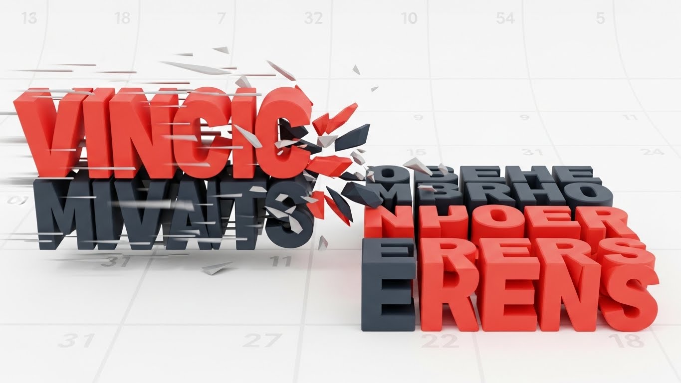
Visualization Scenario: Here, we visualize the host's nightmare—the "Double Booking"—without showing a stressed human. Heavy, blocky geometric shapes (representing conflicting reservations) careen towards each other in "Vivid Coral" and "Deep Charcoal." Just before impact, they snap into a perfect, rigid grid structure. The background features a faint, abstract calendar pattern, grounding the abstract shapes in industry reality.
Tone: Energetic, rhythmic, and authoritative.
2. Psychological Impact & KPI Focus
Niche Psychology: The high-speed motion and "crash" trajectory trigger the viewer's "fight or flight" response regarding operational errors, immediately grabbing attention (Thumb-Stopping Power).
Operational Impact: The sudden alignment into a grid provides a dopamine hit of resolution. It visually proves the platform's core promise: Order from Chaos.
3. Strategic Implementation & Trade-offs
- Best Used For: YouTube Shorts or high-energy TikTok ads targeting "Problem Aware" leads.
- Duration: 15-20 Seconds.
- Trade-off: High energy can be perceived as aggressive if overused. It works best as a "Wake Up" call, not a deep explainer.
Companies using similar video content -
Guesty – Vacation Rental Software – Prevents double bookings and operational errors.
Hostaway – Vacation Rental Software – Centralized calendar for conflict-free bookings.
3. The "Ecosystem" Map
TOFU | Category Creation

1. The Visual & Narrative Approach
Visualization Scenario: This style utilizes an isometric projection to create a "God's Eye View" of the property portfolio. We see miniature cottages arranged on a "Teal" and "Terracotta" map. Dotted "data lines" pulse with a bright white dash pattern, connecting every cottage to a central, floating cloud icon. The movement is rhythmic and constant, symbolizing the 24/7 nature of the platform's connectivity.
Tone: Intelligent, diagrammatic, and sophisticated.
2. Psychological Impact & KPI Focus
Niche Psychology: Property managers crave control and oversight. This isometric perspective gives them a sense of omnipotence—seeing the entire operation at a glance.
Operational Impact: The pulsing lines visually explain API Integration. It shows that the platform is the "Central Nervous System" of the business, essential for multi-location management.
3. Strategic Implementation & Trade-offs
- Best Used For: LinkedIn video ads targeting Property Managers with 10+ units.
- Duration: 20-30 Seconds.
- Trade-off: Can feel "diagrammatic" or dry. Needs high-quality motion design (easing, glowing trails) to feel premium rather than academic.
Companies using similar video content -
SiteMinder – Hotel Commerce Platform – Connects hotels to a vast distribution network.
Shiji Group – Enterprise Platform – Comprehensive hospitality technology ecosystem.
5. The "Digital Overlay" Reality
TOFU | Vertical Social Organic
1. The Visual & Narrative Approach
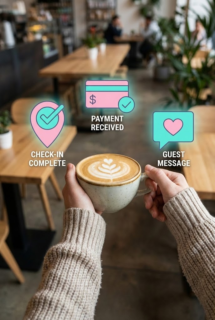
Visualization Scenario: A first-person POV shot puts the viewer in the shoes of a relaxed host. The hands are occupied holding a fresh cup of coffee in a trendy cafe—crucially, not holding a phone. Overlaid into this physical scene are sharp, popping 2D vector icons in "Pastel Pink" and "Bright Teal" (Check-in Complete, Payment Received). The icons float playfully, suggesting the business is running itself.
Tone: Aspirational, trendy, and effortless.
2. Psychological Impact & KPI Focus
Niche Psychology: The ultimate goal for many SaaS buyers in this niche is freedom—the ability to manage their business from anywhere. This style offers visual proof of that lifestyle.
Operational Impact: It bridges the physical (coffee/cafe) and digital (app notifications) worlds, showing that the business runs itself. Key KPI is Social Engagement (Shares/Saves).
3. Strategic Implementation & Trade-offs
- Best Used For: TikTok and Instagram Reels. The "POV" format is native to these platforms and builds instant empathy.
- Duration: 10-15 Seconds (Loopable).
- Trade-off: Requires high-quality stock or custom footage. Poorly lit live-action footage will degrade the perceived quality of the software.
Companies using similar video content -
N/A – Style description not available in input.
6. The "Lifestyle" Outcome
TOFU | Aspiration & Identity Hook

1. The Visual & Narrative Approach
Visualization Scenario: This style flips the script: the software is the background, and the life it enables is the foreground. We see a high-end editorial shot of a couple celebrating with wine during "Golden Hour." In the background, slightly blurred (bokeh), is a laptop screen clearly displaying a dashboard with green upward-trending graphs.
Tone: Premium, warm, and secure.
2. Psychological Impact & KPI Focus
Niche Psychology: Connects business metrics (RevPAR, Occupancy) directly to personal reward. It shifts the conversation from "software features" to "life outcomes."
Operational Impact: The "Green" graphs in the background serve as a subtle trust signal—financial success is present, but it doesn't dominate the moment.
3. Strategic Implementation & Trade-offs
- Best Used For: Instagram Feed ads. It sells the dream (The "Why") rather than the function (The "How").
- Duration: Static or 5-Second Cinemagraph.
- Trade-off: Risk of looking like a generic travel ad. The UI overlay must be distinct enough to signal "B2B Software" instantly.
Companies using similar video content -
Operto – Smart Stay Platform – Automates guest operations for remote management.
Akia – Guest Messaging – Enables hands-free guest communication.
7. The "Fluid" Integration
MOFU | Demand Gen

1. The Visual & Narrative Approach
Visualization Scenario: Abstract, fluid shapes in "Glossy White" and "Mint Green" move across the screen, merging and separating like liquid mercury. There are no hard corners or rigid grids here. The animation represents the seamless flow of data between the Channel Manager, the Booking Engine, and the PMS. The lighting simulates a soft studio softbox, giving the flat vectors a premium, tactile dimension.
Tone: Smooth, high-tech, and hypnotic.
2. Psychological Impact & KPI Focus
Niche Psychology: Reduces the anxiety of "clunky" legacy software. The fluidity implies that the software adapts to the user, rather than the user having to fight the software.
Operational Impact: Metaphor for Interoperability—different systems flowing into one another without friction.
3. Strategic Implementation & Trade-offs
- Best Used For: Display Ads and website headers. It creates a "High Tech" vibe without needing specific copy.
- Duration: 10-20 Seconds Loop.
- Trade-off: It is purely abstract. It must be paired with strong copy (e.g., "Seamless Integration") to make sense to the viewer.
Companies using similar video content -
OwnerRez – Vacation Rental Software – Empowers owners to manage flexibly, enjoy life.
ThinkReservations – PMS – Streamlines operations for a better work-life balance.
8. The "Clarity" Dashboard
MOFU | Product/Solution Differentiation
1. The Visual & Narrative Approach
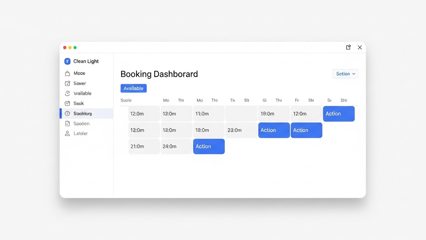
Visualization Scenario: A high-fidelity, pixel-perfect representation of the UI. The aesthetic is "Clean Light Mode." We see a booking calendar where "Available" slots are white/grey, and specific tasks or actions are marked in a vibrant "Action Blue." The view is symmetrical, framed by a subtle shadow to lift it off the white background.
Tone: Clinical, precise, and transparent.
2. Psychological Impact & KPI Focus
Niche Psychology: Builds trust through transparency. For the pragmatic buyer, seeing the actual tool alleviates the fear of a steep learning curve.
Operational Impact: The "Action Blue" highlights provide immediate Visual Hierarchy, proving to the viewer that the software is intuitive and easy to navigate.
3. Strategic Implementation & Trade-offs
- Best Used For: Website Landing Pages and MOFU explainer videos.
- Duration: 30-45 Seconds.
- Trade-off: It can be boring if static. Use subtle cursor movements or "hover state" animations to keep it alive.
Companies using similar video content -
Rentals United – Channel Manager – Seamlessly distributes listings across channels.
D-EDGE – Hotel Distribution – Fluid data flow for booking and channel management.
9. The "Friendly" Channel Manager
MOFU | Feature Education
1. The Visual & Narrative Approach
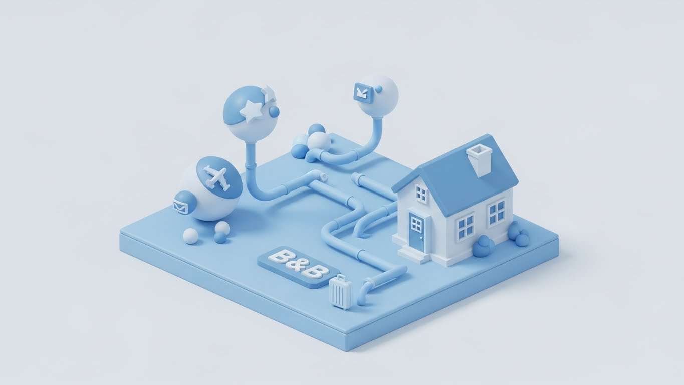
Visualization Scenario: To explain the complex, technical concept of "Channel Management" (sending data to Expedia, Airbnb, etc.), we use a 3D claymation-style render. A tiny, isometric B&B house is connected by smooth, clay-like pipes in "Pastel Blue" to floating spheres containing abstract travel icons. The lighting is shadowless and soft.
Tone: Playful, educational, and disarming.
2. Psychological Impact & KPI Focus
Niche Psychology: Channel management can feel scary and technical. The "Clay" aesthetic makes the technology feel tactile, approachable, and friendly. It removes the "Fear Factor" of API integrations.
Operational Impact: The pipe metaphor is universally understood: "Booking flows in, availability flows out."
3. Strategic Implementation & Trade-offs
- Best Used For: Product pages explaining specific complex features.
- Duration: 30-60 Seconds.
- Trade-off: Higher production cost due to 3D rendering. It is a "Hero" asset, not for daily social posts.
Companies using similar video content -
Little Hotelier – All-in-One PMS – Provides a clear, intuitive operational dashboard.
RoomRaccoon – Hotel PMS – Clean UI for daily tasks and insights.
11. The "Success" Trigger
MOFU | Driving Demo Requests

1. The Visual & Narrative Approach
Visualization Scenario: This style bridges the gap between the software interface and the human feeling of relief. We see a professional property manager standing in a sunlit, modern B&B kitchen—the heart of the operation. She is smiling at a tablet, which isn't just a flat screen; it projects a subtle "Holographic UI" in "Warm Sunlight" and "Navy Blue," displaying a crisp 'Demo Requested' success message. The background is artfully blurred (bokeh), keeping the focus on her confident expression and the digital confirmation.
Tone: Validating, warm, and professional.
2. Psychological Impact & KPI Focus
Niche Psychology: For many hosts, "Requesting a Demo" feels like a chore or a risk of being sold to. This visual reframes the conversion point as a moment of achievement. It links the digital action (clicking the button) with a positive emotional state (relief/happiness).
Operational Impact: Visualizes the Ease of Onboarding. It subliminally promises that taking the next step is simple, rewarding, and human-centric.
3. Strategic Implementation & Trade-offs
- Best Used For: Retargeting ads and "Thank You" page headers.
- Duration: Static Image or 5-Second Loop.
- Trade-off: Relies entirely on the authenticity of the model. If the smile feels "stock," the trust evaporates.
Companies using similar video content -
MyAllocator – Channel Manager – Simplifies complex channel distribution.
STAAH – Channel Manager – User-friendly tool for online distribution.
12. The "Modernization" Morph
MOFU | Competitive Displacement
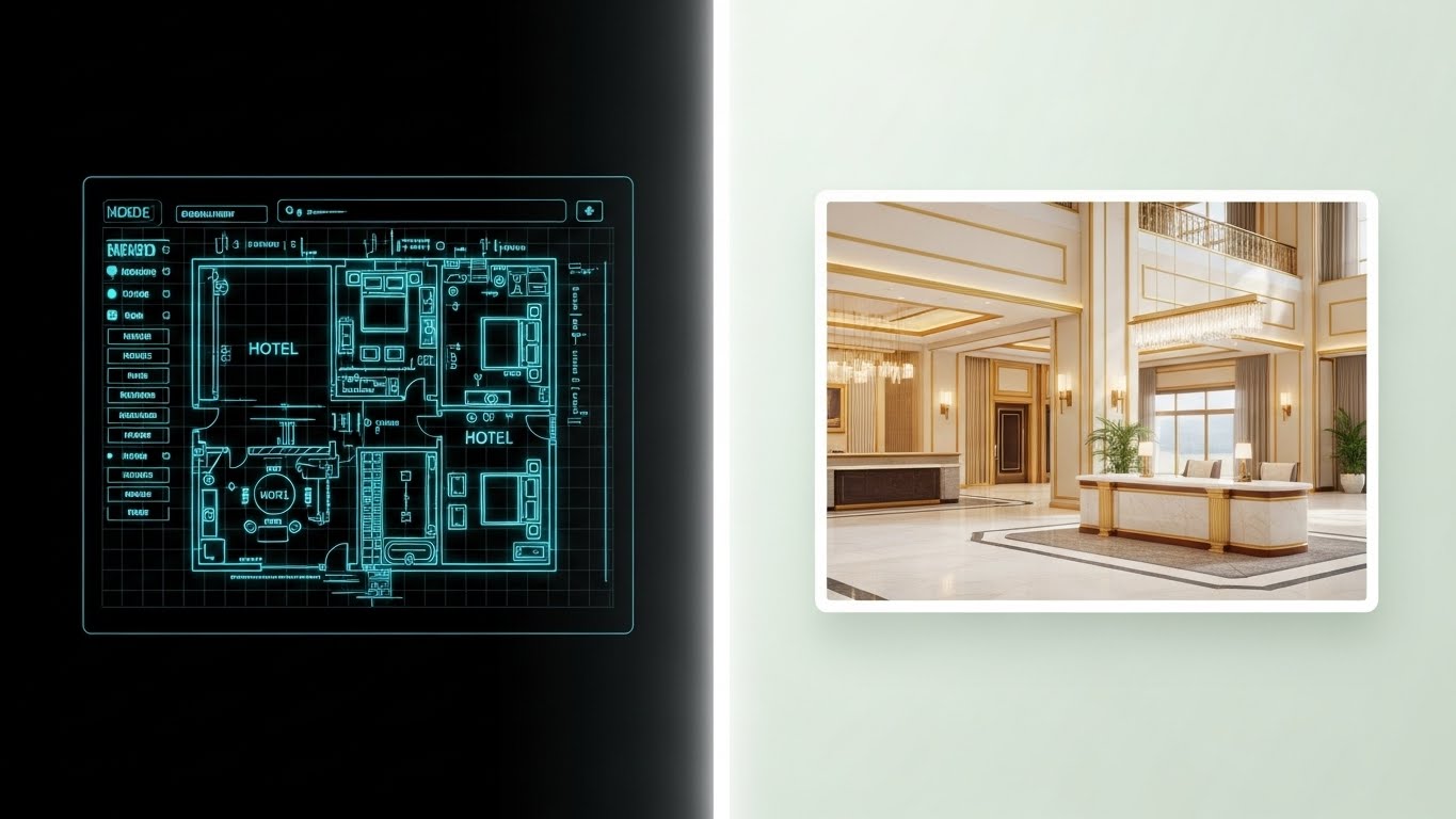
1. The Visual & Narrative Approach
Visualization Scenario: A powerful visual metaphor for digital transformation. The screen is split vertically. On the left, we see the "skeleton" of a hospitality business—a technical wireframe blueprint in "Cyan" lines on a grid. As a glowing white divider sweeps across, the wireframe instantly resolves into a fully rendered, photorealistic 3D lobby in warm "Gold" and cream tones. It visualizes the journey from "Plan" to "Perfection."
Tone: Transformative, magical, and structural.
2. Psychological Impact & KPI Focus
Niche Psychology: Hosts often struggle to see how backend software (the wireframe) translates to better guest experiences (the lobby). This style bridges that gap, proving that the technical foundation is what enables the physical luxury.
Operational Impact: It positions the platform as the Blueprint for Success. It appeals to the "Builder" mindset of entrepreneurs who want to upgrade their entire operation.
3. Strategic Implementation & Trade-offs
- Best Used For: LinkedIn comparison ads and "Why Upgrade" landing pages.
- Duration: 10-15 Seconds.
- Trade-off: High production value is required to make the morph seamless. Misalignment between the wireframe and render breaks the illusion.
Companies using similar video content -
N/A – Style description not available in input.
13. The "Power" Grid
MOFU | Driving Freemium/Trials
1. The Visual & Narrative Approach
Visualization Scenario: Targeted at the "feature-hungry" buyer, this style uses speed to convey value. Square frames containing abstract, stylized representations of invoices, calendars, and chat bubbles fly into a dynamic grid arrangement. The palette is high-contrast "Electric Lime" on "Black" (Dark Mode), creating a modern, high-tech aesthetic. Motion blur on the edges suggests that the platform is fast, powerful, and comprehensive.
Tone: Energetic, robust, and abundant.
2. Psychological Impact & KPI Focus
Niche Psychology: Dismantles the "FOMO" (Fear Of Missing Out) on features. The sheer volume of elements implies an "All-in-One" solution, triggering the feeling that the user's current tool is underpowered by comparison.
Operational Impact: Visualizes Feature Velocity. It suggests that the platform creates a "flow" of information that keeps the business ahead of the competition.
3. Strategic Implementation & Trade-offs
- Best Used For: Instagram Stories and TikTok Ads where high visual stimulation is needed to stop the scroll.
- Duration: 6-10 Seconds (Fast Paced).
- Trade-off: Viewers won't learn how to use the features. It sells the impression of capability, not the utility.
Companies using similar video content -
Canary Technologies – Guest Experience – Streamlines check-in/out for guest satisfaction.
Bookassist – Booking Engine – Drives direct bookings and conversion success.
14. The "ROI" Architect
BOFU | ROI Justification

1. The Visual & Narrative Approach
Visualization Scenario: We elevate the financial conversation using hyper-realism. A sleek silver laptop sits on a polished mahogany desk—a symbol of the "Back Office." On the screen, a neon graph curves steeply upward. Beside the laptop, abstract glass cubes reflect the graph's light, symbolizing the multi-dimensional nature of profit. The lighting is dramatic, with deep "Navy Blue" shadows and "Platinum" highlights.
Tone: Serious, lucrative, and executive.
2. Psychological Impact & KPI Focus
Niche Psychology: B&B owners are small business investors. This aesthetic validates the software price as an investment, not a cost. It speaks to the "Economic Buyer" who cares about the bottom line above all else.
Operational Impact: Directly links the software to Revenue Growth. The "up and to the right" graph is the hero, reinforcing the promise of increased ADR and RevPAR.
3. Strategic Implementation & Trade-offs
- Best Used For: Pricing Pages and BOFU Landing Pages.
- Duration: Static or Slow Pan (10 Seconds).
- Trade-off: Can feel cold if used too early in the funnel. It lacks the "hospitality" warmth, focusing purely on business results.
Companies using similar video content -
innRoad – Cloud PMS – Transforms legacy hotel operations to modern cloud.
Protel – PMS – Modernizes property management with advanced features.
15. The "Peer" Authority
BOFU | Building Trust

1. The Visual & Narrative Approach
Visualization Scenario: Trust is the currency of hospitality. Here, we use a cinematic medium shot of a distinguished B&B owner—silver-haired, wearing a professional navy blazer—standing in his elegant, wood-paneled lobby. He looks directly at the camera with a calm, knowing smile. Soft, warm lighting illuminates his face, while the background activity remains a blur. This isn't a model; this looks like a peer who has "made it."
Tone: Experienced, trustworthy, and calm.
2. Psychological Impact & KPI Focus
Niche Psychology: Peer validation is powerful. Seeing a calm, successful owner subconsciously signals, "If he uses this, it must work." It counters the anxiety of trusting a faceless tech company with their livelihood.
Operational Impact: Anchors the brand in Industry Expertise. It humanizes the technology, suggesting that the platform understands the nuance of the trade.
3. Strategic Implementation & Trade-offs
- Best Used For: Homepage Hero sections and Testimonial headers.
- Duration: 15-30 Seconds (Talking Head).
- Trade-off: High casting risk. The actor must feel authentic to the industry, avoiding the generic "corporate stock" look.
Companies using similar video content -
Kigo – Vacation Rental Software – Feature-rich platform for comprehensive management.
Avantio – Vacation Rental Software – Powerful tools for large property portfolios.
16. The "Assurance" Loop
BOFU | Overcoming Objections
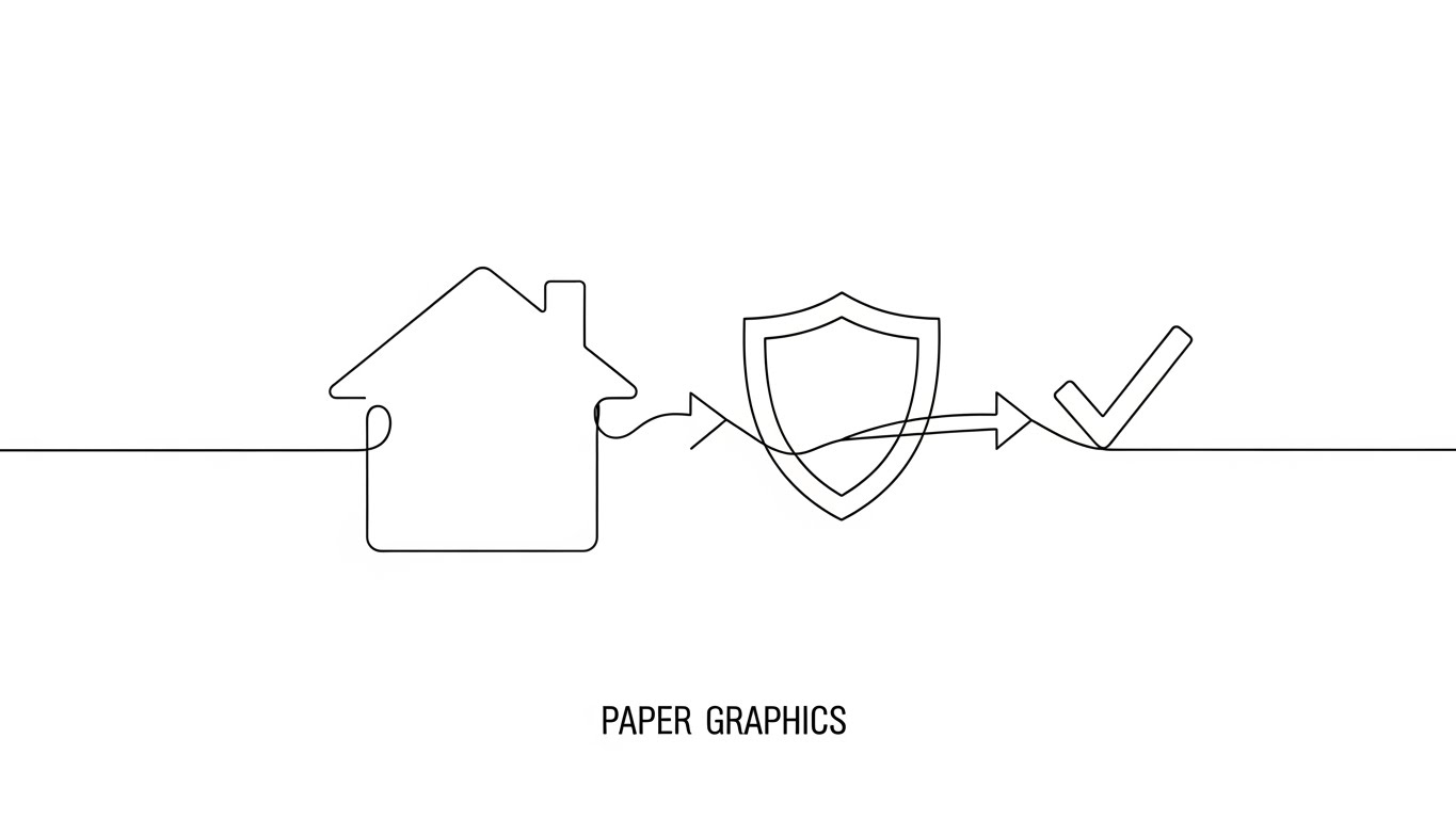
1. The Visual & Narrative Approach
Visualization Scenario: To address complex objections (like Data Security) without adding noise, we use an elegant, continuous line animation. On a "Paper White" background, a single thin black line draws the outline of a guest house. Without breaking, it morphs into a shield (security), and finally into a firm checkmark (compliance). The movement is fluid, precise, and unbroken.
Tone: Minimalist, clever, and conclusive.
2. Psychological Impact & KPI Focus
Niche Psychology: Complexity breeds hesitation. This minimalist style visually "declutters" the objection. It suggests that the solution to a complex problem is simple, elegant, and "baked in."
Operational Impact: Visualizes Workflow Continuity. It implies that security and management are part of a single, unbroken process, not separate hurdles.
3. Strategic Implementation & Trade-offs
- Best Used For: FAQ Pages, Security Footers, and "Sign Up" micro-interactions.
- Duration: 3-5 Seconds (Loop).
- Trade-off: Lacks emotional depth. It is purely functional and intellectual, best for logic-based objections.
Companies using similar video content -
Beyond – Revenue Management – Optimizes pricing for maximum profitability.
PriceLabs – Dynamic Pricing – Boosts revenue with data-driven pricing strategies.
17. The "Fortress" X-Ray
BOFU | Risk Mitigation

1. The Visual & Narrative Approach
Visualization Scenario: Data security is often invisible. This style makes it tangible. We see a model of a B&B house rendered in "Translucent Blue" glass. Inside, clearly visible through the walls, is a glowing "core" in "Ghost White," representing the centralized database. Floating lock icons orbit this core. The camera rotates to show that while the house is open to guests, the core remains solid and protected.
Tone: High-tech, transparent, and robust.
2. Psychological Impact & KPI Focus
Niche Psychology: Owners worry about data breaches and guest privacy. The "X-Ray" view offers transparency, telling the viewer: "We have nothing to hide, and your data is safe inside our vault."
Operational Impact: Visualizes Backend Infrastructure. It separates the "Front of House" (Glass) from the "Back of House" (Core), showing how they coexist safely.
3. Strategic Implementation & Trade-offs
- Best Used For: Whitepapers, "How it Works" pages, and Enterprise sales decks.
- Duration: 15-20 Seconds.
- Trade-off: Can look too "Cybersecurity" if not careful. The house shape is essential to keep it grounded in the hospitality niche.
Companies using similar video content -
eviivo – Booking Suite – Trusted by independent hosts worldwide.
ResNexus – PMS – Endorsed by successful B&B owners.
18. The "Growth" Catalyst
BOFU | The Economic Buyer

1. The Visual & Narrative Approach
Visualization Scenario: We bring the data out of the dashboard and into the real world. In a modern office lobby, "Vivid Orange" and "Cool Grey" 3D bar charts physically rise from a desk, floating in the air. A glowing neon arrow snakes around the bars, pointing aggressively upward. The background is a blurred professional workspace, grounding the abstract data in a business context.
Tone: Aggressive, successful, and undeniable.
2. Psychological Impact & KPI Focus
Niche Psychology: Visualizing growth as a physical object makes it feel more attainable. It appeals to the ambitious property manager who wants to see their empire expand into the physical world.
Operational Impact: Represents Scalability. It shows that the business is growing upward and occupying more space, directly linking the software to expansion.
3. Strategic Implementation & Trade-offs
- Best Used For: LinkedIn Video Ads and Investor Decks.
- Duration: 10-15 Seconds.
- Trade-off: Very specific to financial growth. Less effective for selling "soft" benefits like time savings or guest happiness.
Companies using similar video content -
GuestJoy – Guest Experience – Ensures smooth guest journey and satisfaction.
Flexkeeping – Housekeeping Software – Guarantees operational compliance and quality.
19. The "Workflow" Detangler
BOFU | Objection Handling

1. The Visual & Narrative Approach
Visualization Scenario: This style visualizes the primary pain point: Complexity. We start with a tangled, chaotic knot of "Vivid Orange" lines against a matte black background—representing the mess of spreadsheets and manual tasks. Slowly and satisfyingly, the knot untangles itself, smoothing out into straight, parallel "Cool Grey" lines that flow off-screen.
Tone: Therapeutic, orderly, and satisfying.
2. Psychological Impact & KPI Focus
Niche Psychology: Every property manager knows the feeling of that "knot" in their stomach. Watching it untangle provides a visceral sense of relief (ASMR-like effect). It promises that the software acts as a "detangler" for their business operations.
Operational Impact: A perfect metaphor for Workflow Optimization. It visualizes the transition from "Chaos" to "Order" without needing to show a single screenshot.
3. Strategic Implementation & Trade-offs
- Best Used For: Retargeting Ads (targeting users who bounced from the pricing page).
- Duration: 6-10 Seconds (Loop).
- Trade-off: It is abstract. It needs a strong headline (e.g., "Untangle Your Operations") to ensure the viewer connects the dots.
Companies using similar video content -
Oracle Hospitality – PMS – Securely manages sensitive guest and financial data.
D-EDGE – Hotel Distribution – Protects booking and guest information.
20. The "Binary" Choice
BOFU | Sales Cycle Acceleration
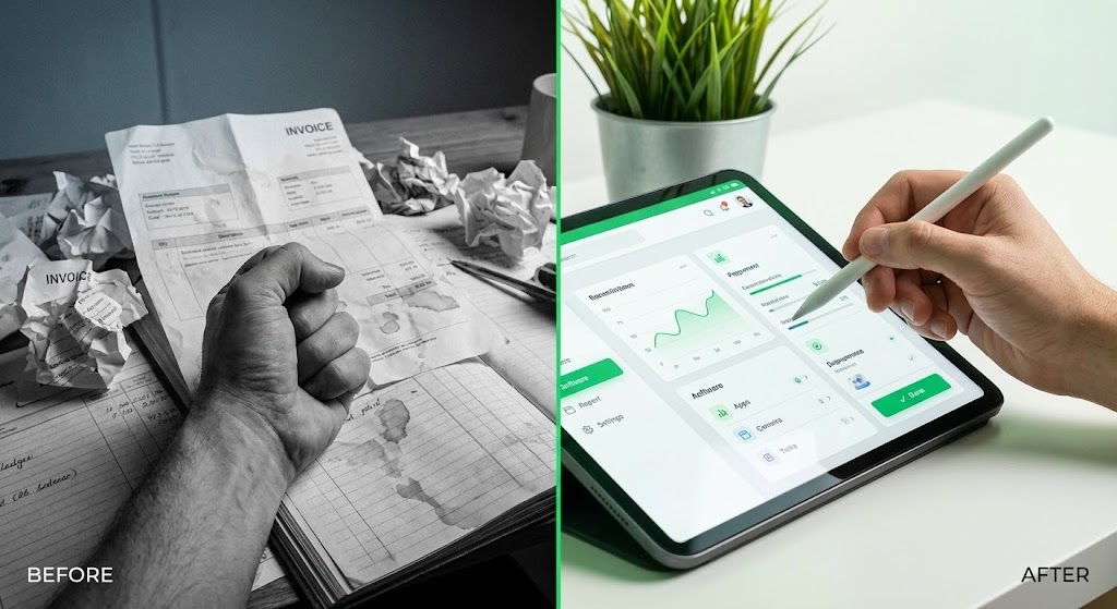
1. The Visual & Narrative Approach
Visualization Scenario: The ultimate "Before and After" comparison. The screen is split. The left half is desaturated, grainy, and cluttered—showing a close-up of a hand buried in paper invoices. The right half is crisp, bright, and color-graded in "Vivid Green," showing a relaxed hand using a stylus on a clean iPad interface. The contrast is stark and immediate.
Tone: Decisive, revealing, and superior.
2. Psychological Impact & KPI Focus
Niche Psychology: Humans are comparative decision-makers. This style forces a comparison, making the "Old Way" look unbearable and the "New Way" look inevitable. It leverages "Loss Aversion" regarding the old, messy reality.
Operational Impact: Visualizes Efficiency Gains. It compresses the decision-making process by showing the immediate upgrade in quality of life.
3. Strategic Implementation & Trade-offs
- Best Used For: Email Marketing Campaigns (The "Break up" email) and Direct Response Ads.
- Duration: Static or minimal motion.
- Trade-off: Can feel like a cliché "infomercial" if the contrast is too exaggerated. It must remain professional to appeal to B2B buyers.
Companies using similar video content -
Lodgify – Vacation Rental Software – Tools for expanding rental business.
Streamline VRS – Vacation Rental Software – Facilitates rapid business growth.
21. The "Welcome" Wizard
Onboarding | Self-Serve Onboarding
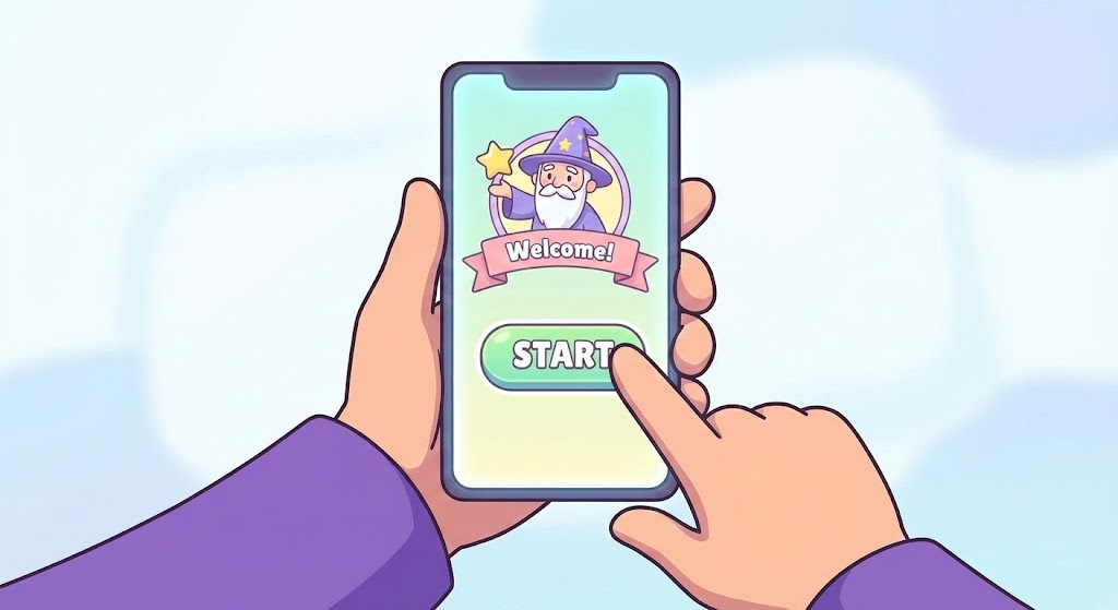
1. The Visual & Narrative Approach
Visualization Scenario: The first interaction with a new platform sets the trajectory for the entire customer relationship. We utilize a First-Person Point of View (POV) illustration in a crisp, cel-shaded 2D style. "Friendly Purple" cartoon hands hold a smartphone, grounding the viewer in the user's perspective. On the screen, the UI is simplified into a "Wizard" format—large buttons, playful icons, and a prominent "Start" button that pulses gently. The background is a soft, blurred white to keep all focus on the device.
Tone: Inviting, simple, and guided.
2. Psychological Impact & KPI Focus
Niche Psychology: "Setup Anxiety" is real. B&B hosts often fear breaking the system before they even start. This gamified aesthetic lowers the psychological stakes. It says, "This is as easy as a mobile game," rather than "This is enterprise software configuration."
Operational Impact: Visualizes Self-Sufficiency. By showing a clear, linear path (Step 1, Step 2, Start), it reduces the need for "White Glove" onboarding calls. The primary KPI is Time-to-First-Value.
3. Strategic Implementation & Trade-offs
- Best Used For: In-App Welcome Screens and "Getting Started" emails.
- Duration: 15-20 Seconds.
- Trade-off: The cartoon style may feel too juvenile for "Enterprise" tier clients (e.g., hotel chains), who expect a more corporate aesthetic.
Companies using similar video content -
Optii – Housekeeping Automation – Untangles complex hotel operations.
Knowcross – Hotel Operations – Streamlines tasks and guest services.
22. The "Deep" Immersion
Onboarding | Accelerating Time-to-Value
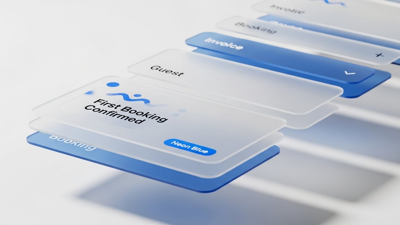
1. The Visual & Narrative Approach
Visualization Scenario: To communicate that the software is robust and multi-layered, we use 3D parallax. Semi-transparent, frosted glass UI cards (representing Booking, Guest Data, Invoices) hover in deep space. The camera pushes slowly through the layers, creating a sense of dimension. The frontmost card, sharp and in focus, displays a "First Booking Confirmed" notification in "Neon Blue," while background layers blur into a sophisticated bokeh.
Tone: Immersive, sophisticated, and fluid.
2. Psychological Impact & KPI Focus
Niche Psychology: Depth implies substance. This visual style subconsciously tells the prospect that the platform has "depth" and can handle complex operations, distinguishing it from flimsy, surface-level apps.
Operational Impact: Visualizes System Architecture. It shows that different modules (bookings, finance, guests) are separate but deeply integrated layers of the same ecosystem.
3. Strategic Implementation & Trade-offs
- Best Used For: "Waiting Room" videos (while the account sets up) or high-level Feature Highlights.
- Duration: 10-15 Seconds (Loop).
- Trade-off: High rendering effort. Requires meticulous motion design to ensure the text remains readable while moving in 3D space.
Companies using similar video content -
Freetobook – Booking System – Clear choice over manual booking methods.
Sirvoy – Hotel PMS – Modern solution versus outdated systems.
23. The "Network" Village
Onboarding | Reducing Implementation Friction
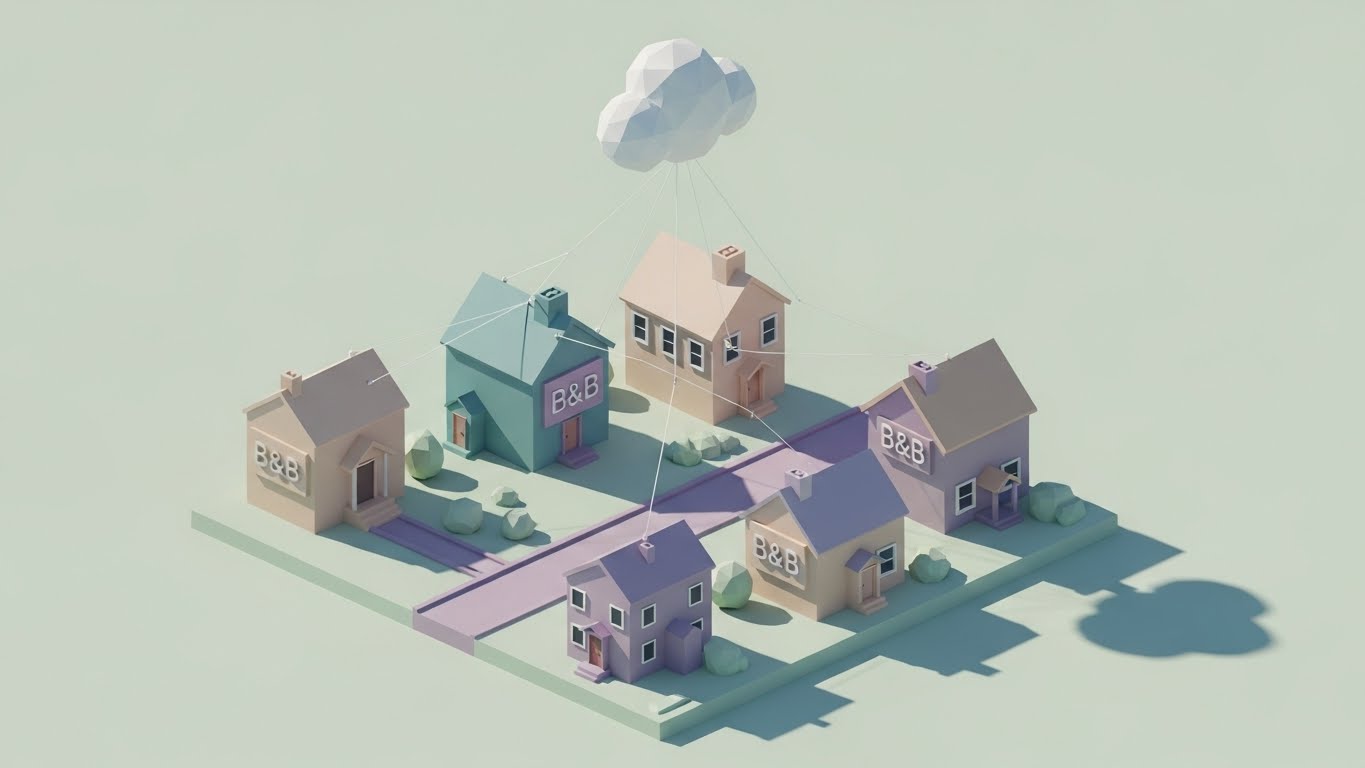
1. The Visual & Narrative Approach
Visualization Scenario: Managing multiple properties is the ultimate headache. We simplify this using a Low-Poly 3D aesthetic. We see a charming village of B&Bs with faceted surfaces in soft "Pastels." Thin, elegant white lines connect every rooftop to a single, stylized low-poly cloud hovering above. As the sun (lighting source) moves, the shadows shift realistically, making the network feel alive but manageable.
Tone: Playful, organized, and scalable.
2. Psychological Impact & KPI Focus
Niche Psychology: This style attacks the fear of "Sprawl." As hosts acquire more units, they fear losing control. The "Toy Village" aesthetic makes the property portfolio look small, cute, and completely under control.
Operational Impact: Visualizes Multi-Unit Management. It demonstrates that adding a new property to the network is as simple as dropping a digital house onto the map.
3. Strategic Implementation & Trade-offs
- Best Used For: Implementation Guides and "Scale Your Business" landing pages.
- Duration: 20-30 Seconds.
- Trade-off: The "Low Poly" look is stylized. It works for the concept of multi-unit management but cannot show the details of the dashboard.
Companies using similar video content -
WebRezPro – Cloud PMS – Simple steps to get started.
Innkeeper's Advantage – PMS – Guided onboarding for new users.
24. The "Code" Bridge
Retention | Driving Deep Feature Adoption
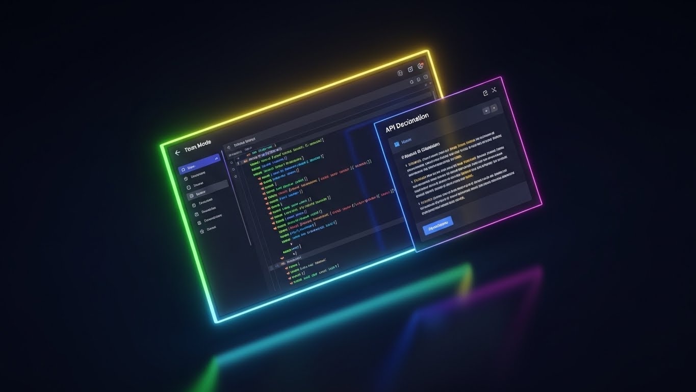
1. The Visual & Narrative Approach
Visualization Scenario: A direct appeal to the technical buyer or the "Power User." We switch to a sleek "Dark Mode" aesthetic. The screen displays a code editor with syntax highlighting in "Neon Green," "Blue," and "Pink" against a "Deep Charcoal" background. To the right, a floating panel shows clean API documentation. The perspective is angled, with a soft monitor glow reflecting on a dark surface below, simulating a late-night coding session.
Tone: Technical, precise, and powerful.
2. Psychological Impact & KPI Focus
Niche Psychology: Developers and technical integrators trust code, not marketing fluff. This style signals "We speak your language." It validates the platform's extensibility.
Operational Impact: Visualizes Open API Capabilities. It proves that the platform plays well with others (Smart Locks, Dynamic Pricing tools), which is crucial for retention.
3. Strategic Implementation & Trade-offs
- Best Used For: Developer Portal, API Documentation headers, and Integration Partner announcements.
- Duration: Static or Slow Pan.
- Trade-off: Alienating to the non-technical host. This asset should be segmented strictly for the "Technical" persona or IT managers.
Companies using similar video content -
Duetto – Revenue Management – Deep insights into pricing and demand.
IDeaS – Revenue Management – Sophisticated analytics for strategic decisions.
25. The "Unlock" Moment
Retention | Reducing Support Overhead

1. The Visual & Narrative Approach
Visualization Scenario: Technical support often feels cold. We humanize it with a stylized 2D character. A friendly, round character in "Clean White" with "Black" stroke outlines (reminiscent of modern tech illustration) holds a large, golden key. With a smile, they unlock a floating digital door, which swings open to reveal a glowing light.
Tone: Helpful, friendly, and enabling.
2. Psychological Impact & KPI Focus
Niche Psychology: Users visit the Help Center when they are frustrated. This visual acts as a "de-escalation" tool. The friendly character and the "key" metaphor suggest that the solution is simple and readily available.
Operational Impact: Visualizes Access & Permissions. It effectively explains concepts like "Admin Rights" or "Unlocking Pro Features" without text-heavy manuals. Key KPI is Ticket Deflection.
3. Strategic Implementation & Trade-offs
- Best Used For: Help Center articles, "Access Denied" screens, and feature upgrade prompts.
- Duration: Static or 5-Second Loop.
- Trade-off: Must be consistent. If you use a character here, they should appear in other support materials to build familiarity.
Companies using similar video content -
iGMS – Vacation Rental Software – Manages multiple properties from one hub.
Escapia – Vacation Rental Software – Oversees diverse property networks.
26. The "Anchor" in Chaos
Retention | Reducing Churn

1. The Visual & Narrative Approach
Visualization Scenario: A powerful visual juxtaposition. We use a hyper-lapse video of a busy hotel lobby. Guests, luggage, and staff are blurred streaks of motion, conveying the frenetic pace of hospitality. However, overlaid in the center is a rock-steady, sharp UI element: a "Retention Rate" graph holding a flat, high line. The lighting is natural "Green" and "Blue Sky," suggesting a healthy business environment.
Tone: Stable, reliable, and enduring.
2. Psychological Impact & KPI Focus
Niche Psychology: The fear of churn (losing repeat guests) haunts every host. This visual reassures them that while the physical world is chaotic, their digital data is the "Anchor" that keeps the business steady.
Operational Impact: Visualizes Stability Amidst Scale. It reinforces the idea that the software is the constant variable in a dynamic industry.
3. Strategic Implementation & Trade-offs
- Best Used For: Monthly Newsletters ("Your Month in Review") and Account Review presentations.
- Duration: 10 Seconds (Looping).
- Trade-off: The stock footage must be high quality. Low-budget hyper-lapse looks messy and stressful rather than impressive.
Companies using similar video content -
Hapi – Integration Platform – Connects systems via robust APIs.
Mews – PMS – Open API for extensive integrations.
27. The "Activation" Hologram
Retention | Trial Activation

1. The Visual & Narrative Approach
Visualization Scenario: Moving the user from "Trial" to "Paid" requires a visual ceremony. We see a realistic 3D render of a rustic wooden desk—the host's workspace. Projected upwards from the wood is a futuristic "Holographic Cyan" UI. The hologram displays a "Trial Complete - Activate" badge that rotates slowly, glowing with a neon hum. The contrast between the rustic wood and the neon hologram creates a sense of "Magic Realism."
Tone: Celebratory, futuristic, and premium.
2. Psychological Impact & KPI Focus
Niche Psychology: Paying for software hurts. This visual reframes the payment as an "Upgrade" to a futuristic toolset. It triggers the "shiny object" desire, making the activation feel like acquiring a superpower.
Operational Impact: Visualizes Premium Value. It separates the "Pro" experience from the "Basic" experience using lighting and dimension.
3. Strategic Implementation & Trade-offs
- Best Used For: In-App "Trial Ending" prompts and Upgrade email headers.
- Duration: 5-10 Seconds (Loop).
- Trade-off: Can feel "Sci-Fi." Ensure the UI elements inside the hologram still look like the actual software to avoid false advertising.
Companies using similar video content -
Bookboost – Guest Messaging – Unlocks direct guest engagement.
GuestJoy – Guest Experience – Provides access to personalized guest services.
29. The "Leaderboard" Ascent
Expansion | Driving Referrals
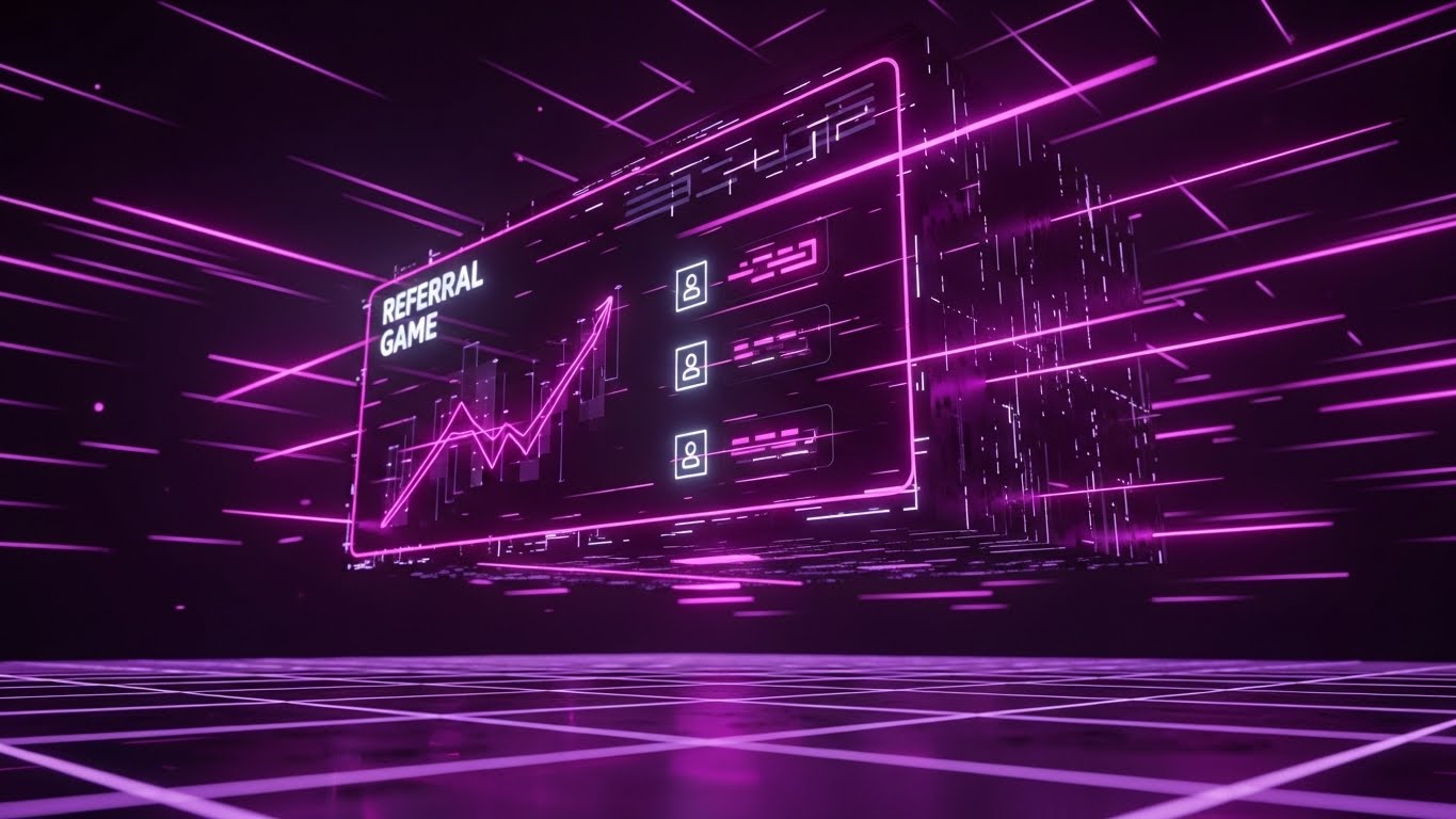
1. The Visual & Narrative Approach
Visualization Scenario: To drive referrals, we gamify the experience. We enter a stylized "Cyberpunk" space with "Pink" and "Neon Purple" lighting. A digital leaderboard floats above a grid floor, angled powerfully upwards. Glowing icons represent users climbing the ranks. The aesthetic is distinct from the core product—it's a "Game Layer" on top of the business.
Tone: Exciting, competitive, and exclusive.
2. Psychological Impact & KPI Focus
Niche Psychology: Hosts are competitive; they want to be "Superhosts." This style taps into that status drive. It visually elevates the act of referring a friend from a "favor" to a "victory."
Operational Impact: Visualizes Network Effects. It encourages users to expand the platform's reach by rewarding them with status and visual flair.
3. Strategic Implementation & Trade-offs
- Best Used For: Referral Program landing pages and "Gamification" dashboards.
- Duration: 10-15 Seconds.
- Trade-off: This style is very aggressive. Use it only for contests or referrals, never for standard operational features like invoicing.
Companies using similar video content -
TrustYou – Guest Feedback – Provides stable reputation insights.
Local Measure – Guest Engagement – Offers real-time operational stability.
30. The "Re-engagement" Flow
Expansion | Re-engagement

1. The Visual & Narrative Approach
Visualization Scenario: When a user goes dormant, we need to lure them back with beauty, not pressure. We use an abstract 3D visualization where "Silver" liquid metal particles flow along an invisible network path in a dark void. The particles merge to form pulsing nodes in "Mercury" color. The motion is hypnotic and continuous, symbolizing the stream of value they are missing.
Tone: Hypnotic, high-end, and fluid.
2. Psychological Impact & KPI Focus
Niche Psychology: Dormant users ignore "Come back!" emails. But a mesmerizing, high-end abstract visual stops the scroll. It re-establishes the brand as "Cutting Edge" without saying a word.
Operational Impact: Visualizes Data Continuity. It subtly implies that the data stream is flowing without them, and they need to jump back in to catch it.
3. Strategic Implementation & Trade-offs
- Best Used For: Instagram Re-engagement Ads and "We Miss You" email headers.
- Duration: 10-20 Seconds (Loop).
- Trade-off: Purely aesthetic. It conveys zero feature information. It relies 100% on the accompanying copy to drive the action.
Strategic Knowledge Base: The Visual Operations Doctrine
To transition from "Video Styles" to "Business Outcomes," we must integrate these visuals into a cohesive operational framework. This section outlines the Advids 30-Point Strategic Framework for B&B and SaaS leaders, synthesizing the "Why" and "How" of visual communication.
Strategic Alignment & Visual Architecture
The "Pre-Production" Strategy – Aligning Visuals with Business DNA.
- The Cognitive Load Audit: Hospitality is high-stress. A host checking an app while a guest waits at the door has zero cognitive surplus. Audit your current training visuals. If a video takes more than 5 seconds to convey the core action (e.g., "Check-in Guest"), it is too complex. Replace screen recordings with Style 8 (Clarity Dashboard) to strip away noise.
- Role-Based Visual Mapping: Not all eyes are equal. The "Investor/Owner" needs Style 14 (ROI Architect) to feel secure about their money. The "Front Desk Staff" needs Style 21 (Welcome Wizard) to execute tasks quickly. Create a "Visual Matrix" that maps styles to specific user roles.
- The "Glanceability" Standard: In a busy hotel lobby, staff cannot watch a 2-minute explainer. Visuals must pass the "Glanceability Test." Styles like Style 5 (Digital Overlay) are designed to communicate the core value in under 1.5 seconds.
- Brand Voice Consistency: Your SaaS is a digital employee. Ensure the "Voice" of your motion graphics—whether it’s the playfulness of Style 1 (Cloud Morph) or the seriousness of Style 17 (Fortress X-Ray)—aligns with your brand's customer service persona.
- The Advids Strategic Audit: Partner with Advids early in the product roadmap. Instead of treating video as an afterthought, define your "Visual Vocabulary" (e.g., "We always use Style 9 for networking features") during the UI/UX design phase.
- Standardization vs. Customization: Use standardized Style 15 (Clean UI) for core features that change rarely. Use flexible Style 4 (Kinetic) for promotional messages that change often. This balances production budget with asset longevity.
- The Cross-Departmental Bridge: Use these visuals to unify terminology. Sales, Ops, and Support often use different terms for the same feature. A single Style 3 (Ecosystem Map) video forces the entire company to align on one visual truth.
- Legacy System Integration: Use Style 12 (Modernization Morph) to visually respect the user's past (physical ledgers) while guiding them to the future. Acknowledging the "Old Way" validates their experience before upgrading it.
- Accessibility in Hospitality: Your users are global. Visuals like Style 10 (Isometric Workflow) rely on universal symbols (beds, coins, calendars) rather than text, reducing localization costs and increasing global comprehension.
- The Mobile-First Mandate: 70% of B&B management happens on a phone. Ensure every visual style (especially Style 25 and Style 2) is legible on a vertical 9:16 screen. If text in Style 13 is unreadable on a phone, it is useless to a host on the go.
Operational Adoption & Implementation
The "Deployment" Phase – Embedding Visuals into the Workflow.
- Overcoming "Big Brother" Anxiety: When introducing staff monitoring tools, use Style 1 (Cloud Migration) to frame it as "Team Sync" rather than "Surveillance." Visual tone dictates emotional reception.
- The Micro-Learning Shift: Nobody reads the PDF manual. Dismantle your text articles and replace them with a library of 15-second loopable assets using Style 8 (Clean UI). Hosts will watch a 30-second clip; they will not read a 30-page doc.
- Just-in-Time Support: Embed Style 25 (Unlock Metaphor) videos directly into the software tooltips. Support should be present at the moment of friction, not buried in a separate help center.
- Gamification of Training: Onboarding new staff is a cost center. Use Style 29 (Leaderboard Ascent) to turn staff training into a game. Visual progress bars increase completion rates for certification modules.
- Reducing Support Ticket Volume: There is a direct correlation between proactive visual guides (Style 19 Workflow Detangler) and reduced call center load. Every visual answer provided is a support ticket deflected.
- Remote Onboarding: Leverage Style 22 (Parallax UI) to immerse new remote property managers in the software. You can't always fly trainers to every B&B; 3D depth mimics the feeling of "being there."
- Standard Operating Procedures (SOPs): Transform text-based SOPs into visual process flows using Style 4 (Kinetic). "Kinetic" text implies action and urgency, which is crucial for cleaning and check-in protocols.
- Feedback Loops: Use interactive video elements (overlaying Style 27) to ask, "Did this help?" Real-time feedback on visual assets allows for iterative improvement of the help library.
- Scalable Localization: The hospitality market is global. Lean heavily on Style 7 (Fluid Integration) which relies on iconography rather than text. A "Checkmark" morphing into a "Shield" (Style 16) is understood equally in Tokyo and New York.
- Leadership Communication: When pitching to Enterprise chains, the "Cute" styles won't work. Deploy Style 14 (ROI Architect) in executive presentations. Speak the language of "Capital Expenditure" and "Transformation."
Measuring Impact & Future-Proofing
The "ROI" Phase – Measuring Success and Looking Ahead.
- Beyond "Views": Do not measure video success by "Views." Measure it by "Feature Adoption Rate." If Style 10 explains the Channel Manager, did Channel Manager usage spike after the video launch?
- The "Idle Time" Metric: Track the correlation between visual cues and software navigation speed. A well-placed visual cue (like Style 27) should reduce the time a user spends "thinking" or "stalling" on a screen.
- Compliance Velocity: How fast are new regulations (e.g., Local Tax changes) understood? Use Style 16 (Assurance Loop) to communicate rule changes instantly. Speed of comprehension is legal safety.
- Retention and Churn Defense: Use Style 26 (Hyper-lapse Anchor) in your monthly reporting emails. Visualizing the "Stability" you provided during their busiest months reinforces the value proposition.
- The AI Visual Frontier: Prepare your visual library for "Generative UI." The abstract nature of Style 30 (Abstract 3D AI) positions your brand as ready for this shift, conditioning users to expect innovation.
- Scalability of Assets: Build a modular library. If you change your brand color, a vector-based style (Style 1) is easy to update. A filmed live-action style (Style 15) requires a reshoot. Plan for the future cost of updates.
- The Advids Partnership: Scale is the enemy of quality unless managed. Advids serves as the guardian of your visual library, ensuring that as you add 100 new feature videos, the style remains consistent and the ROI remains measurable.
- Benchmarking Success: Compare your visuals not just to competitors, but to consumer apps (Airbnb, Uber). Your users expect B2C quality in their B2B tools. "Good enough" is a churn risk.
- The ROI of Safety: For guest data security, better visualization (Style 17 Fortress) reduces the risk of human error. Visualizing the "Secure Core" reminds staff to treat data with care.
- Final Call to Innovation: Treat video as infrastructure, not content. Just as you invest in your server architecture, invest in your "Visual Architecture." The platform that feels the most intuitive—demonstrated through superior visualization—is the one that wins.
Companies using similar video content -
Wheelhouse – Dynamic Pricing – Activates optimized rental rates.
Atomize – Revenue Management – Unlocks advanced pricing features.
Author & Editor Bio


