
 /home/wwwroot/advids.co/design/index.php on line 425
Introduction: The Visualization of Retention
In the B2B sector, the battle for growth has shifted fronts. We have moved from an era of aggressive acquisition to the "Retention Revolution," where the stability and expansion of existing accounts dictate the survival of the enterprise. For providers of B2B Loyalty Program Software, this shift presents a massive opportunity. The global loyalty management market size is projected to reach $41.21 billion by 2032, driven largely by organizations realizing that their customer base is their most undervalued asset.
However, selling loyalty software to a B2B Enterprise is fundamentally different from selling a consumer app. The stakeholders—CTOs, CMOs, and VPs of Sales—are skeptical of "fluff." They don't want to see generic footage of shaking hands; they want to see logic. They need to understand how your platform bridges the physical/digital divide, integrating offline wholesale data with online reward triggers. They need to see, visually, how your API connects their fragmented silos into a unified ecosystem.
The stakes are operational, not just promotional. Research indicates that B2B companies with effective loyalty programs see a 30% increase in cross-selling opportunities. This statistic proves that loyalty is not a cost center—it is a revenue engine. But to unlock this budget, you must lower the "Cognitive Load" of your pitch. You must transform complex tiered logic and integration workflows into clear, compelling visual narratives.
This guide provides 30 expert-curated visual styles designed specifically for the B2B Loyalty domain. From abstract motion graphics that visualize "Customer Gravity" to high-fidelity UI interaction studies that prove "Ease of Use," these examples are your blueprint for communicating value in a language that the modern Retention Architect understands.
1. Abstract 2D Flat Vector Organic Modern Motion Graphics
TOFU | Brand Awareness
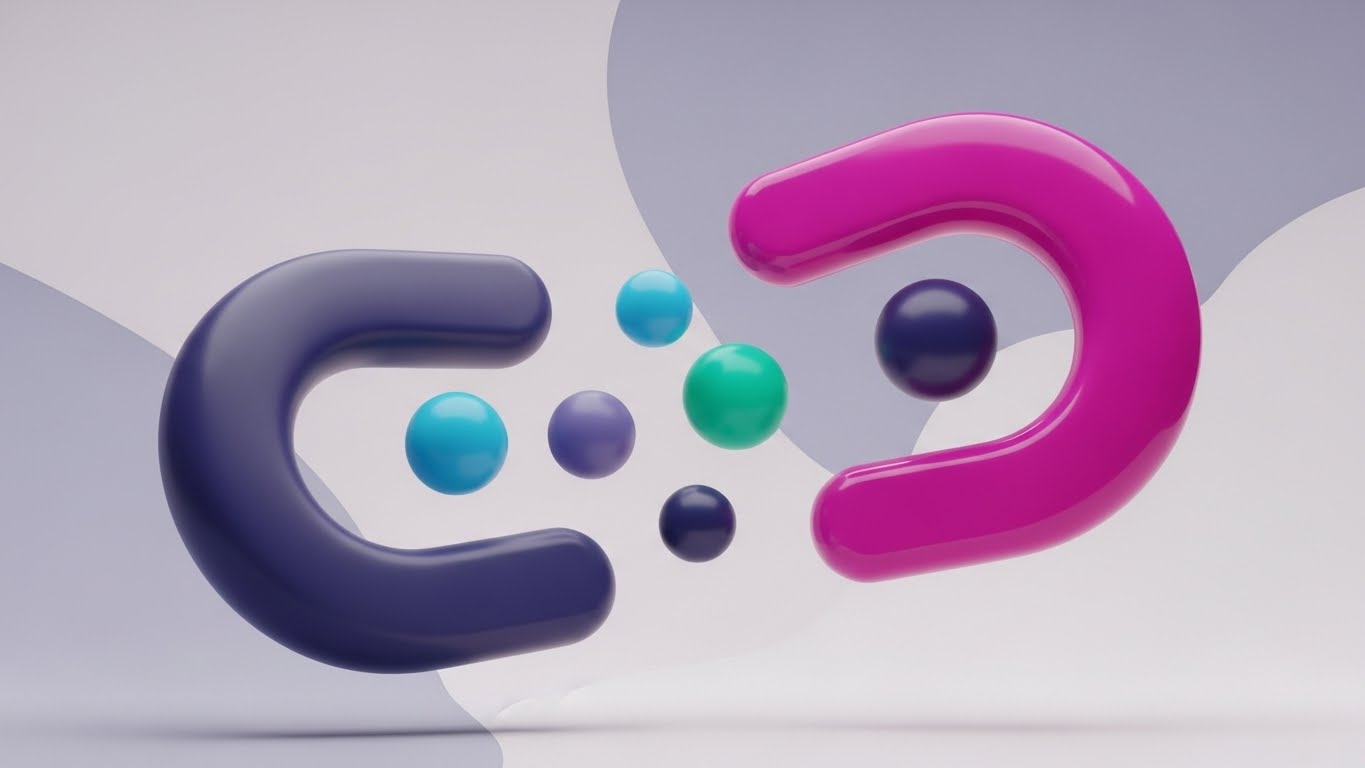
The Visual & Narrative Approach
This style creates a powerful visual metaphor for "Customer Gravity." We see a central magnetic torus shape, rendered in Vivid Magenta, rotating with a fluid, organic grace. It acts as a hub, gently pulling in smaller floating spheres (customers) colored in Cyan and Deep Navy. The background is a soft, seamless gradient, ensuring the focus remains on the interaction. The glossy textures and shadowless lighting give it a premium, modern SaaS feel, distinct from the rigid "tech" look of competitors.
Psychological Impact & KPI Focus
Niche Psychology: B2B buyers often feel like they are chasing customers. This visual flips the script, triggering a sense of relief and control. It visualizes the aspiration of becoming a "Category Magnet"—where customers are naturally drawn in by value.
Operational Impact: It abstracts the complexity of acquisition algorithms into a single, understandable force. It aligns with the KPI of Inbound Lead Velocity.
Strategic Implementation & Trade-offs
- Best Use Case: 6-second bumper ads on LinkedIn/Instagram.
- Trade-off: It is purely conceptual. It builds brand affinity but doesn't explain the product. It must be paired with clear, benefit-driven copy (e.g., "Automate Your Attraction").
Companies using similar video content -
Open Loyalty – Loyalty Program Software – Flexible, API-first engine for gamified loyalty.
Voucherify – Promotion & Loyalty Platform – API-first platform for targeted incentives and rewards.
2. Bold Kinetic Typography (Visual)
TOFU | Market Education

The Visual & Narrative Approach
This style visualizes the "defensive" value of loyalty. We see large, heavy geometric blocks in Electric Orange slamming down to form an impenetrable fortress wall. They actively block and shatter jagged, debris-like shapes (representing churn and competitors) colored in Slate Gray. The composition is diagonal and dynamic, conveying force and resilience. Sharp, hard-edged shadows emphasize the "weight" and solidity of the protection.
Psychological Impact & KPI Focus
Niche Psychology: Fear of loss is a stronger motivator than the promise of gain. This taps into the "Churn Anxiety" of the B2B executive. It frames the software as a necessary infrastructure for survival.
Operational Impact: It provides a tangible visualization for Churn Mitigation. It moves the conversation from "points and rewards" to "security and stability."
Strategic Implementation & Trade-offs
- Best Use Case: High-energy YouTube Shorts or "Problem/Solution" intro hooks.
- Trade-off: The aggressive energy can be polarizing. It works best to grab attention before pivoting to a calmer, solution-oriented style.
Companies using similar video content -
Comarch Loyalty Management – Enterprise-grade solution for complex loyalty programs.
White Label Loyalty – Loyalty Platform – Modular, API-first platform for custom loyalty.
3. Abstract 2D Motion Graphics
TOFU | Shaping Brand Perception
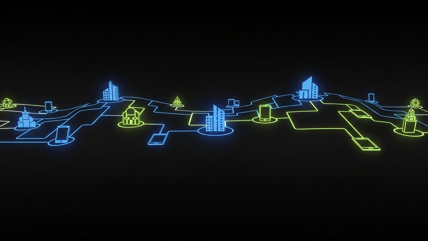
The Visual & Narrative Approach
This style maps the "Invisible Ecosystem." Against a deep Matte Black background, a network of Neon Royal Blue and Neon Lime lines pulse with light. They connect glowing icons representing business buildings, servers, and mobile devices. The lines flow rhythmically, visualizing the continuous transfer of data across a global infrastructure. The aesthetic is "Dark Mode" sophisticated, signaling enterprise-grade technology.
Psychological Impact & KPI Focus
Niche Psychology: Integration is the #1 barrier to B2B adoption. This visual calms the "Silo Panic" by showing a unified, flowing system. It validates the buyer's need for a holistic view of their customer.
Operational Impact: It effectively visualizes API Connectivity and Omnichannel Orchestration without showing a single line of code.
Strategic Implementation & Trade-offs
- Best Use Case: LinkedIn headers, ABM landing page backgrounds, or trade show booth loops.
- Trade-off: It can feel generic if the icons aren't specific. Ensure the "nodes" represent relevant touchpoints (e.g., POS, CRM, App).
Companies using similar video content -
Annex Cloud – Loyalty Experience Platform – Omnichannel loyalty, referral, and UGC solutions.
Oracle CrowdTwist – Loyalty and Engagement – Enterprise loyalty within Oracle CX suite.
4. 2D Animation & UI Composition
TOFU | ABM Awareness

The Visual & Narrative Approach
This style humanizes the admin experience. We see a stylized, flat vector character (wearing a Bright Coral shirt) interacting with a simplified floating UI. The character uses a casual hand gesture to drag a glowing "Reward Gem" into a "Campaign Slot." The UI is abstracted to its essence—Turquoise and White blocks—focusing entirely on the ease of the drag-and-drop action.
Psychological Impact & KPI Focus
Niche Psychology: It addresses the "Usability Fear"—the worry that the software will be clunky and hard to use. By showing a human mastering the tool with a simple gesture, it triggers Mirror Neurons, simulating the feeling of ease.
Operational Impact: It visually promises Operational Efficiency. It suggests that complex campaigns can be launched in seconds, not days.
Strategic Implementation & Trade-offs
- Best Use Case: "Why Us" website sections and introductory explainer videos.
- Trade-off: The abstracted UI is a promise, not a tutorial. It sells the concept of simplicity, not the literal interface.
Companies using similar video content -
Antavo AI Loyalty Cloud – AI-powered, no-code platform for loyalty programs.
Optimove – Gamify – Customer-centric marketing platform for measurable growth.
5. Isometric 2D Motion Design
TOFU | Connected TV / OTT
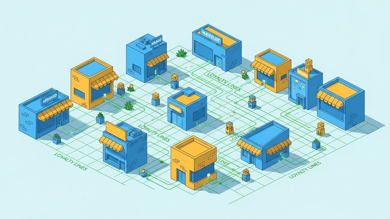
The Visual & Narrative Approach
This style uses an isometric perspective to visualize the "Coalition" model. We see a digital marketplace city with shops in Sky Blue and Canary Yellow, arranged on a grid. They are connected by glowing Grass Green "Loyalty Lines." Small abstract avatars travel along these lines, visiting multiple buildings. It looks like a city-building simulation, conveying scale, growth, and interconnection.
Psychological Impact & KPI Focus
Niche Psychology: This appeals to the "Empire Builder" persona. It validates the aspiration to build a loyalty program that evolves into a loyalty economy. It signals control and oversight.
Operational Impact: It visualizes Network Effects and Partner Scaling. It effectively demonstrates how a multi-tenant platform manages complex relationships.
Strategic Implementation & Trade-offs
- Best Use Case: Blog posts about "Ecosystem Strategy" or long-form vision videos.
- Trade-off: The detail requires a larger screen to appreciate. Avoid using this for mobile-first ads where the tiny avatars might get lost.
Companies using similar video content -
Kognitiv – Loyalty Platform – Collaborative commerce for partner ecosystems.
Loyalty Juggernaut – GRAVTY – Ecosystem-centric loyalty programs with microservices.
6. Clean UI Workflow (Light Mode)
TOFU | Product/Solution Differentiation
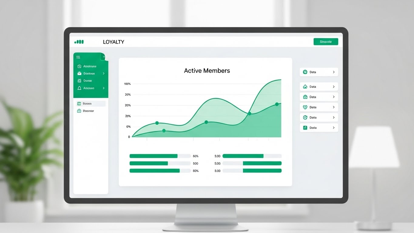
The Visual & Narrative Approach
This is the "Gold Standard" product shot. A high-fidelity UI mockup of the dashboard sits on a minimalist desk. The interface uses Clean White, Soft Gray, and Emerald Green (for positive data). The screen clearly displays an "Active Members" growth graph. The lighting is soft and natural, suggesting a calm, organized workspace.
Psychological Impact & KPI Focus
Niche Psychology: At the MOFU stage, buyers crave "Truth." They want to see the actual tool. The clean aesthetic signals Data Transparency and reduces the anxiety of "Spreadsheet Hell."
Operational Impact: It visualizes Reporting Clarity. It proves that the software can turn raw data into executive-ready insights instantly.
Strategic Implementation & Trade-offs
- Best Use Case: Landing pages for "Free Trial" or "Request Demo."
- Trade-off: It is static. It relies on the UI design being genuinely excellent. If the real product is cluttered, this creates a disconnect.
Companies using similar video content -
TrueLoyal – Loyalty Platform – SaaS platform for transactional rewards and analytics.
CustomerGauge – Account Experience – B2B voice of customer and retention software.
7. Rapid UI Feature Montage
TOFU | Category Creation
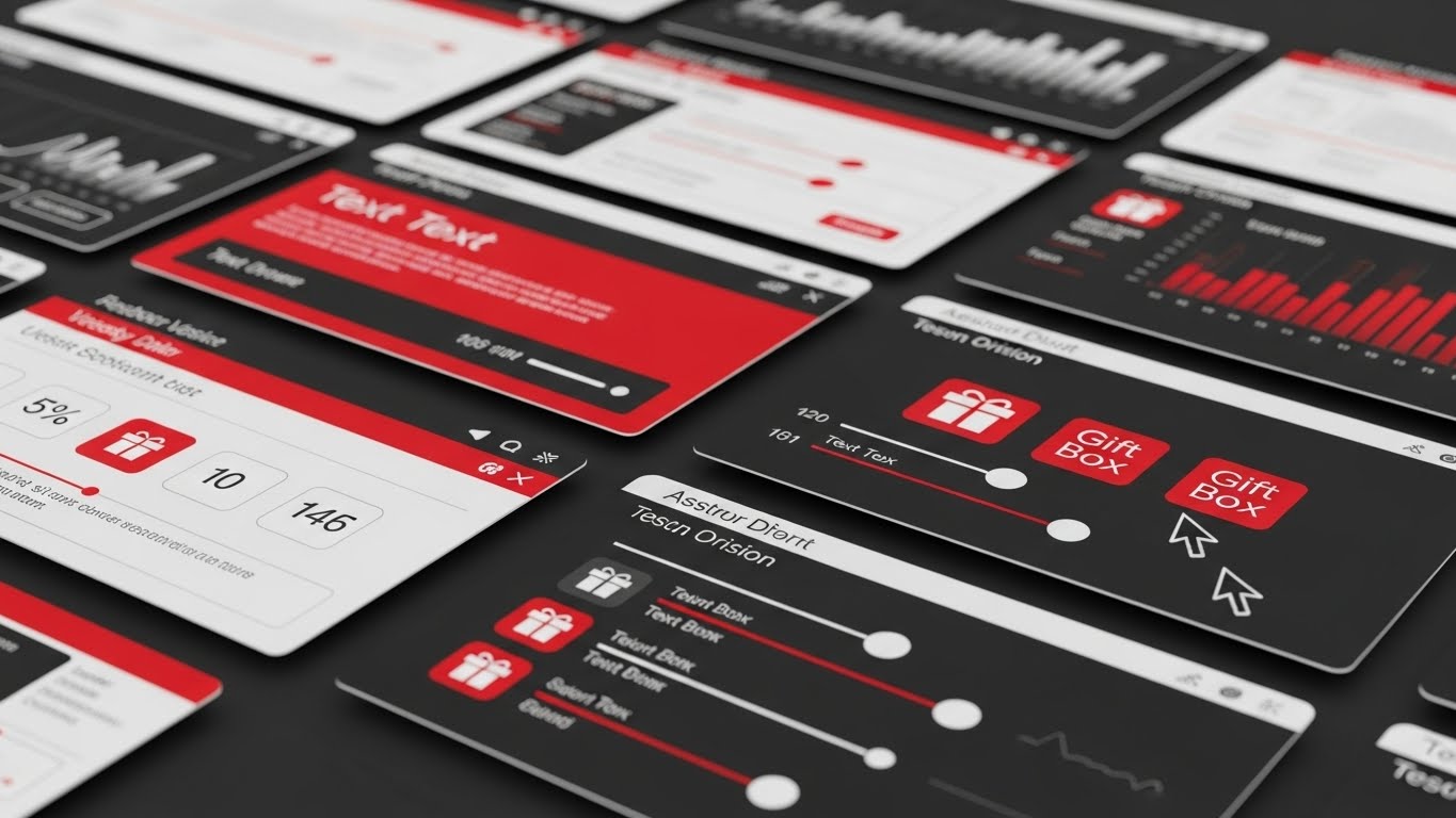
The Visual & Narrative Approach
This style is about velocity. Multiple interface panels (Red, White, Silver) slide in and out with motion blur. We see cursors rapidly selecting icons ("Gift Box") and adjusting sliders. The composition is angled and kinetic, suggesting a high-speed workflow.
Psychological Impact & KPI Focus
Niche Psychology: It triggers "Feature Awe." It visually overwhelms the viewer with the breadth of the platform, suggesting it is a robust, enterprise-grade solution that can handle any complexity.
Operational Impact: It visualizes Feature Depth and Time-to-Value. It implies that the platform is fast, responsive, and comprehensive.
Strategic Implementation & Trade-offs
- Best Use Case: Product sizzle reels or YouTube pre-roll ads.
- Trade-off: Viewers cannot learn a workflow from this. It is for impression, not instruction.
Companies using similar video content -
Talon.One – Promotion & Loyalty Engine – API-first engine for complex promotions.
Capillary Technologies – Loyalty+ – AI-powered omnichannel loyalty and personalization.
8. Macro UI Micro-Interactions
MOFU | Driving Freemium/Trials
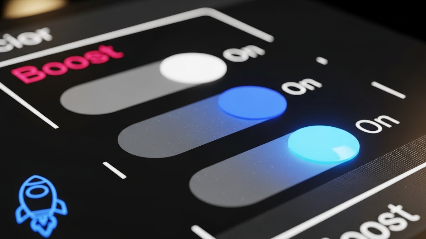
The Visual & Narrative Approach
We zoom in to the extreme macro level. A single UI toggle switch transitions from gray to a glowing Electric Indigo, indicating an "On" state. The background is blurred (Hot Pink bokeh). A rocket icon illuminates.
Psychological Impact & KPI Focus
Niche Psychology: It leverages the dopamine hit of "Activation." It makes the software feel tangible and responsive. It suggests that powerful results are just one click away.
Operational Impact: It visualizes Ease of Implementation. It simplifies complex backend changes into a simple, satisfying toggle.
Strategic Implementation & Trade-offs
- Best Use Case: Social media carousels highlighting specific new features.
- Trade-off: It lacks context. It works best when paired with a wider shot (like Style 15) to show where the button lives.
Companies using similar video content -
Loiale – Unified platform with AI agents for customer retention.
99minds – User-friendly loyalty and promotions platform.
11. Isometric 3D Workflow**
MOFU | The Functional Buyer
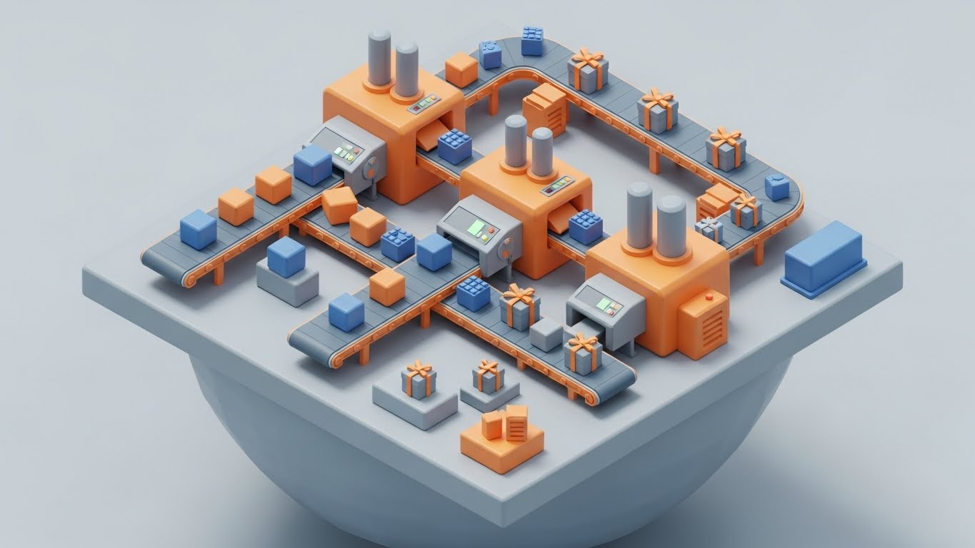
The Visual & Narrative Approach
This style demystifies the backend process by visualizing the loyalty platform as a charming, efficient "Miniature Factory." Rendered in a Claymorphism style with soft, tactile textures in Industrial Orange and Steel Blue, we see raw "Data Blocks" entering on conveyor belts. They pass through processing units (the rules engine) and emerge as neatly wrapped "Reward Packages." The isometric perspective provides a god-like view of the entire logic flow—from transaction to trigger to reward—in a single, self-contained loop.
Psychological Impact & KPI Focus
Niche Psychology: The Functional Buyer (often an Operations Lead) fears that a new loyalty platform will be a "Black Box" of messy code. This visualization reduces Cognitive Load. By gamifying the workflow, it makes the complex orchestration of tiered logic feel manageable, predictable, and robust.
Operational Impact: It visualizes Process Orchestration. It demonstrates that the platform systematically converts raw transactional data into customer value without manual intervention.
Strategic Implementation & Trade-offs
- Best Use Case: Technical whitepapers, "How It Works" website sections, or implementation guides.
- Trade-off: The "toy-like" aesthetic is disarming but can be perceived as too playful for conservative industries (e.g., Banking). Balance it with serious, technical copy explaining the robustness of the engine.
Companies using similar video content -
Fielo (Salesforce) – Salesforce-native loyalty and incentive automation platform.
Cheetah Digital – All-in-one customer engagement platform with loyalty module.
12. Wireframe to Reality Transition
MOFU | Reducing Implementation Friction
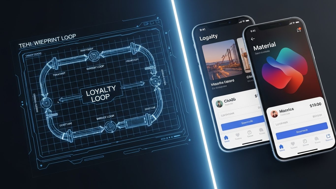
The Visual & Narrative Approach
This style visually answers the critical question: "How long will this take to build?" A split-screen composition shows the evolution of a loyalty loop. The left half displays a technical wireframe blueprint on grid paper, drawn in Blueprint Blue and Chalk White. A glowing vertical scan-line moves across the screen, transforming the wireframe instantly into a high-fidelity, glossy mobile app interface in Vivid Full Color. It visually condenses the timeline from concept to launch.
Psychological Impact & KPI Focus
Niche Psychology: "Implementation Paralysis" is a major barrier. Stakeholders worry about 12-month integration roadmaps. This visual triggers a sense of Velocity. It reassures the technical buyer that the path from strategy (blueprint) to value (live app) is direct and frictionless.
Operational Impact: It visualizes Rapid Prototyping and Time-to-Market. It implies that the platform comes with pre-built frameworks that accelerate the development lifecycle.
Strategic Implementation & Trade-offs
- Best Use Case: Onboarding documentation, "Integration" pages, or proposal slides addressing timeline objections.
- Trade-off: It sets a high expectation for speed. Ensure your onboarding team can deliver on the "rapid launch" promise implied by the visual.
Companies using similar video content -
Arvato Loyalty Management – CRM integration for custom loyalty program development.
Kobie Loyalty Cloud – AI-driven insights for cloud-based loyalty architecture.
13. Split Screen: Optimized Reality and UI
MOFU | Competitive Displacement
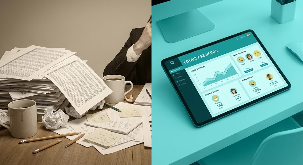
The Visual & Narrative Approach
This is a high-contrast study in "Before and After." The left side, tinted in a stressful Muted Beige, depicts the "Status Quo": a desk cluttered with chaotic spreadsheets, crumpled papers, and cold coffee—symbols of manual management. The right side, bathed in Vivid Teal and crisp light, shows the "New Way": a sleek tablet displaying a clean, organized loyalty dashboard with happy customer avatars. The lighting emphasizes the emotional shift from frustration to clarity.
Psychological Impact & KPI Focus
Niche Psychology: It targets "Spreadsheet Fatigue." Many B2B programs are still managed manually. By amplifying the pain of the current state and contrasting it with the relief of the solution, it triggers a strong Migration Impulse.
Operational Impact: It visualizes Operational Efficiency. It positions the software not just as a tool, but as a lifestyle upgrade for the team managing the program.
Strategic Implementation & Trade-offs
- Best Use Case: LinkedIn carousel ads or competitive comparison landing pages.
- Trade-off: It is a direct attack on legacy habits. The "Chaos" side must look authentically stressful (not comically staged) to resonate with the viewer's reality.
Companies using similar video content -
ReactorCX – Loyalty Methods – Cloud-native SaaS for scalable loyalty programs.
Salesforce Loyalty Management – Enterprise-grade platform for loyalty programs.
14. 3D Parallax UI Presentation
MOFU | Sales Cycle Acceleration
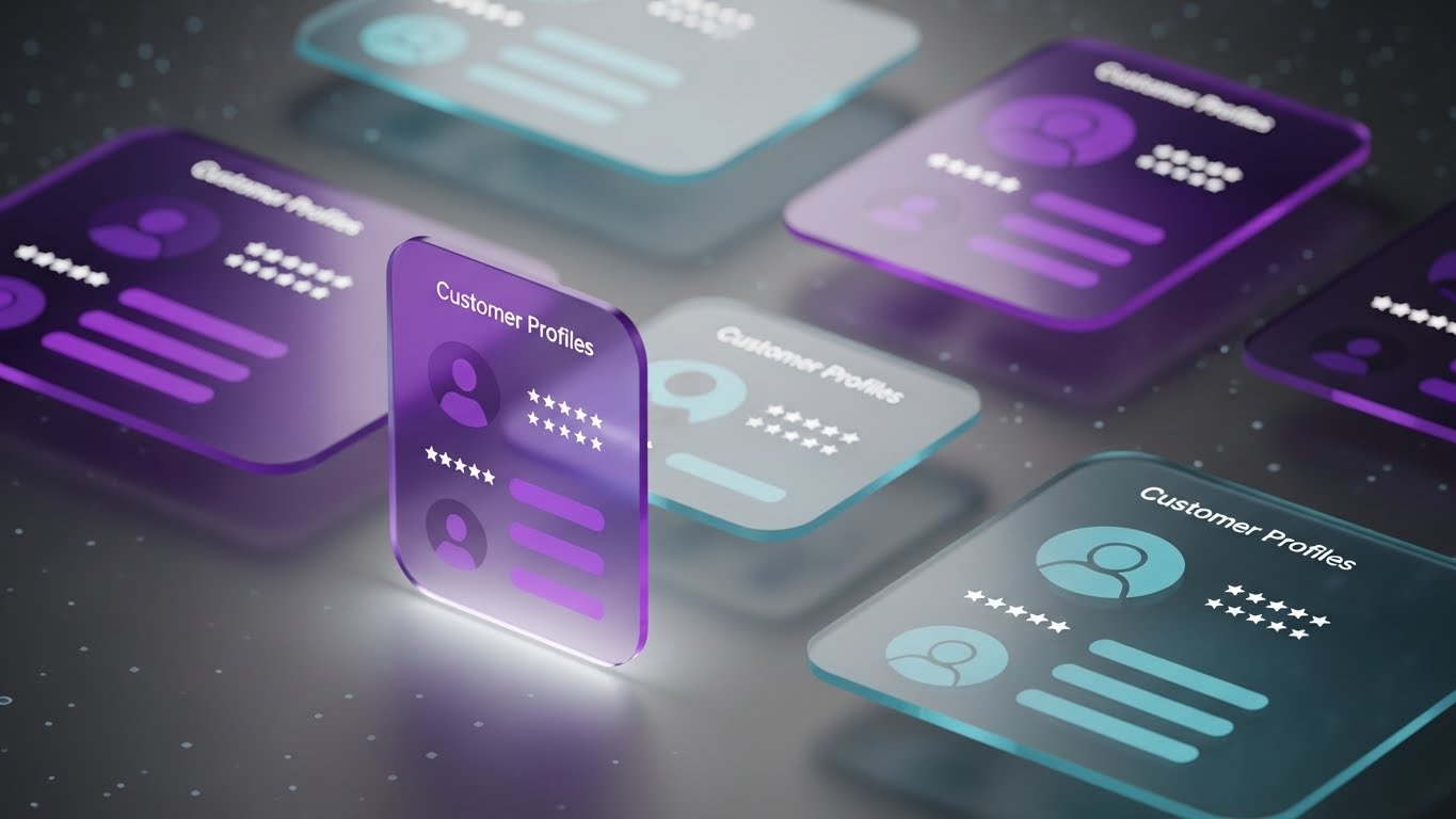
The Visual & Narrative Approach
As prospects evaluate the depth of the platform, static screenshots fall flat. This style uses 3D parallax to float glass-textured UI cards in a deep data void. We focus on "Customer Profiles" rendered in translucent Purple, Magenta, and Cyan. The layering effect allows the viewer to look "through" the top-level profile to see the rich behavioral data stacked behind it. The soft, colored shadows create a premium, high-tech atmosphere.
Psychological Impact & KPI Focus
Niche Psychology: Serious buyers (SQLs) need to know that the data isn't superficial. This "Deep Dive" aesthetic signals Intelligence. It suggests that the platform captures a multi-dimensional view of the customer, satisfying the need for comprehensive insights.
Operational Impact: It visualizes 360-Degree Customer View and Data Granularity. It implies that the system handles complex data hierarchies with elegance.
Strategic Implementation & Trade-offs
- Best Use Case: Email nurture sequences or the opening slides of a product demo deck.
- Trade-off: It prioritizes form over function. Use it to sell the sophistication of the interface, not to teach specific workflows.
Companies using similar video content -
Open Loyalty – Loyalty Program Software – Headless, API-first for flexible loyalty.
White Label Loyalty – Loyalty Platform – Modular, API-first for rapid deployment.
15. Photorealistic 3D Renders
BOFU | The Economic Buyer

The Visual & Narrative Approach
To convince the Economic Buyer (CFO), we must move beyond "points" and visualize "value." This style uses hyper-realistic 3D rendering to show stacks of metallic coins in Gold, Silver, and Bronze, resting on a reflective marble surface. Beside them, a 3D glass arrow ascends sharply. The lighting is cinematic and dramatic. It creates a physical representation of virtual points, giving them weight and value.
Psychological Impact & KPI Focus
Niche Psychology: The C-Suite views loyalty as a financial equation. They need to see that digital points translate into physical value. This visual metaphor reframes loyalty currency as an Asset Class, validating the program's worth.
Operational Impact: It visualizes ROI (Return on Investment) and Program Valuation. It shifts the conversation from software costs to the value delivered to the bottom line.
Strategic Implementation & Trade-offs
- Best Use Case: Pitch decks for executive leadership or "Financial Impact" slides.
- Trade-off: It is symbolic. It must be paired with hard numbers (e.g., "3x CLV") to prevent it from looking like generic stock art.
Companies using similar video content -
HubSpot – CRM – Unifying customer data and loyalty management.
Zendesk – Service – Customer service solution for loyalty and support.
16. Dynamic Data Visualization
BOFU | ROI Justification

The Visual & Narrative Approach
At the bottom of the funnel, data is the ultimate persuader. This style dramatizes the "Up and to the Right" trajectory. We see 3D bar charts rising like skyscrapers, rendered in Forest Green and Lime (the colors of profit). A transparent glass spline curve weaves through them, emphasizing a consistent upward trend. The perspective is low-angle, making the growth look monumental and structural. The clean white background focuses all attention on the metrics.
Psychological Impact & KPI Focus
Niche Psychology: This speaks the language of the Boardroom. It removes abstraction and focuses purely on result: Growth. The "Skyscraper" scale triggers a sense of stability and massive potential.
Operational Impact: It creates a definitive visual for Revenue Lift and CLTV Increase. It serves as the "Proof Point" that justifies the budget investment.
Strategic Implementation & Trade-offs
- Best Use Case: Case study results sections ("The Results") or the final ROI slide in a sales deck.
- Trade-off: It is generic without context. You must overlay specific numbers (e.g., "+35% Retention") to make this visual effective.
Companies using similar video content -
Epsilon Loyalty – Data-driven personalization for enterprise loyalty.
OBASE – Claritan CDP – CDP with campaign and loyalty management.
17. Lifestyle Stock with UI Overlay
BOFU | Building Trust & Credibility

The Visual & Narrative Approach
This style re-introduces the human element to build trust. We see a high-quality photo of a professional woman in a modern office, viewed from over the shoulder. She is analyzing a monitor displaying a "Customer Satisfaction" dashboard overlay in Warm Amber and Navy Blazer. The UI graphics are semi-transparent, blending the digital tool with the physical workspace. It anchors the software in reality.
Psychological Impact & KPI Focus
Niche Psychology: Buyers buy from people, not just machines. This style reassures the stakeholder that the software empowers their teams rather than replacing them. It fosters Trust and visualizes the "Success" of their employees using the tool.
Operational Impact: It visualizes User Adoption and CSM Empowerment. It proves that the software fits naturally into a daily professional workflow.
Strategic Implementation & Trade-offs
- Best Use Case: "About Us" pages, Customer Success stories, or Testimonials.
- Trade-off: Stock photography can feel staged. Ensure the UI overlay is custom and high-quality to elevate the stock image above "generic office" vibes.
Companies using similar video content -
Brierley – Loyalty technology and consulting for ROI.
SessionM (Mastercard) – Loyalty management for data-driven engagement.
18. 3D X-Ray Visualization
BOFU | The Technical Buyer

The Visual & Narrative Approach
The Technical Buyer (CIO) needs to see what's "under the hood." This style uses an X-Ray effect to reveal the internal architecture of a server rack. The casing is transparent, showing glowing "Data Nodes" in Translucent Blue and Neon Grid patterns. A solid, metallic "Lock" structure sits at the center. It visualizes the intangible (code/security) as tangible hardware, signaling robustness.
Psychological Impact & KPI Focus
Niche Psychology: IT Directors are skeptical of "Black Boxes." This style offers (simulated) transparency. By "showing the insides," you signal that you have nothing to hide and that your architecture is sound, secure, and organized.
Operational Impact: It visualizes Infrastructure Integrity and Data Security. It moves the conversation from "features" to "enterprise readiness."
Strategic Implementation & Trade-offs
- Best Use Case: Technical documentation headers, Security Compliance pages, or IT-focused whitepapers.
- Trade-off: It is highly technical. It will alienate a marketing buyer. Use it strictly for the technical evaluation phase.
Companies using similar video content -
Contentsquare – Customer experience analytics for retention metrics.
Voyado – Retail loyalty platform for CLTV growth.
19. Futuristic Neon/Dark Mode
BOFU | Risk Mitigation Hook

The Visual & Narrative Approach
This style creates a dramatic visualization of "Active Protection." In a dark, cyberpunk-inspired void, a glowing Neon Red and Cyber Blue shield stands guard. It actively deflects incoming red sparks (representing fraud or cyber threats). The high contrast and "Dark Mode" aesthetic signal cutting-edge, AI-driven defense mechanisms.
Psychological Impact & KPI Focus
Niche Psychology: Security is often a grudge purchase, but "Protection" is a powerful motivator. This style taps into the fear of data breaches or loyalty fraud. It frames the software not just as a marketing tool, but as a Guardian.
Operational Impact: It visualizes Fraud Prevention and Real-Time Threat Detection. It assures the buyer that their valuable customer data is behind an impenetrable digital wall.
Strategic Implementation & Trade-offs
- Best Use Case: Social media ads targeting CISOs or "Security Features" highlight reels.
- Trade-off: It is aggressive. It works best as a "Feature Spotlight" rather than a general brand visual.
Companies using similar video content -
Reachdesk – Corporate gifting software for customer retention.
Centrical – Gamification for employee engagement and performance.
20. Dark Mode UI Showcase
BOFU | Risk Mitigation
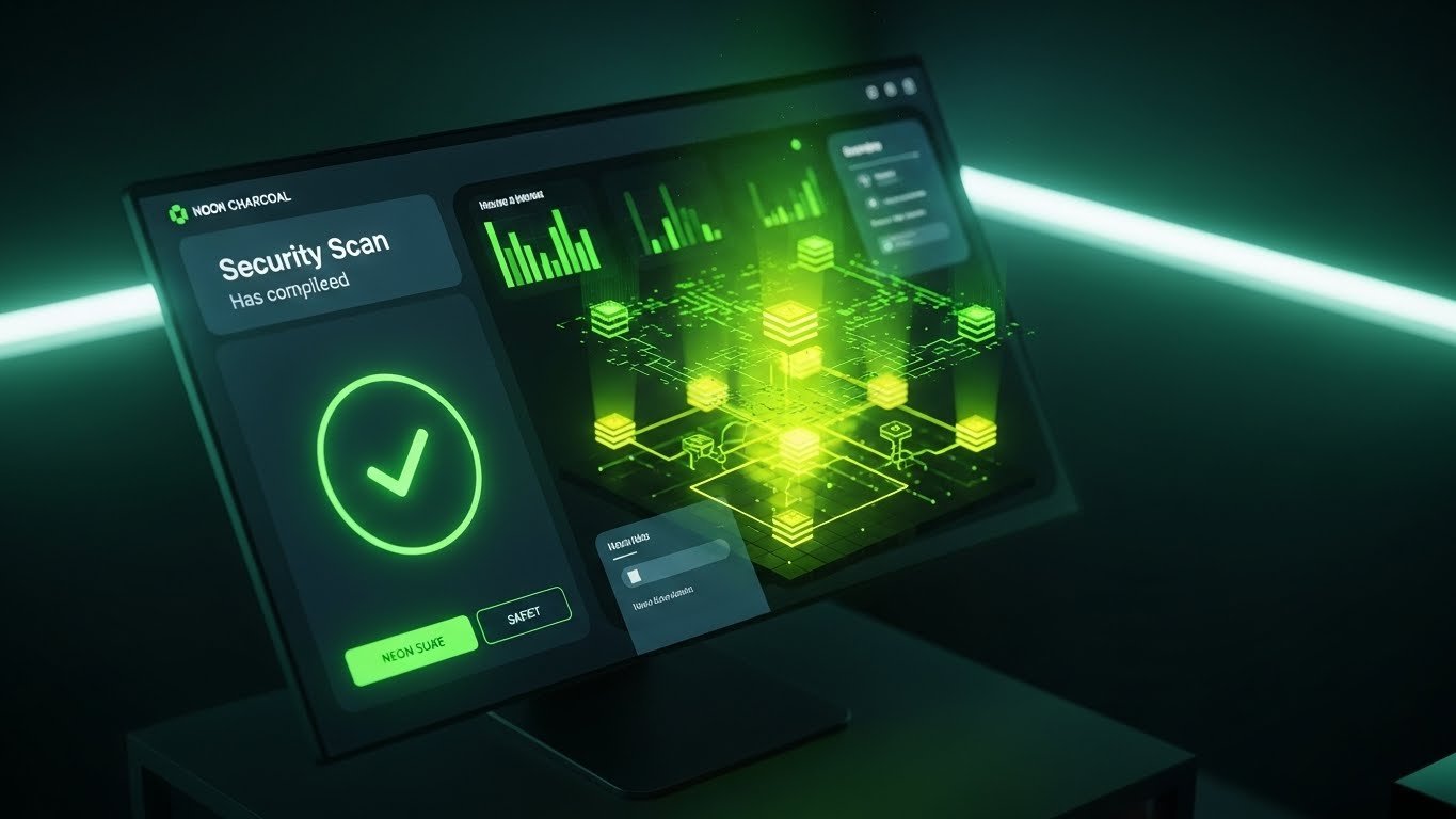
The Visual & Narrative Approach
This is the "Proof of Safety." We see a sleek, Dark Mode interface screen on a monitor, angled slightly. The background is Charcoal and Slate, allowing the Neon Green accents to pop. The screen prominently displays a "Security Scan" completing with a large, reassuring checkmark. It brings the abstract concept of security (Style 19) down to the literal user experience.
Psychological Impact & KPI Focus
Niche Psychology: In the final stages of a deal, the buyer wants reassurance. The "Green Checkmark" is a universal symbol of success and safety. It triggers a psychological "All Clear," reducing the anxiety of the final purchase decision.
Operational Impact: It visualizes Compliance Verification (SOC2, GDPR). It shows that security is not just a backend process, but a visible, confirmable status within the dashboard.
Strategic Implementation & Trade-offs
- Best Use Case: Product pages dedicated to "Enterprise Grade Security" or the final slide in a technical demo.
- Trade-off: Dark Mode appeals to technical users (developers/IT) more than marketers. Ensure your actual product supports Dark Mode if you use this, or label it as a specific "Admin View."
Companies using similar video content -
Microsoft Dynamics 365 Commerce – Loyalty module for enterprise retail.
FPT IS – CX Suite – Digital transformation and IT solutions.
21. Minimalist Flat 2D Vector**
Onboarding | Self-Serve Onboarding

The Visual & Narrative Approach
This style embraces extreme simplicity to communicate "completion." Using a Pastel Blue and Soft Pink palette, we see a stylized, geometric hand placing the final piece—a heart-shaped puzzle block—into a larger system structure. The lines are thick, rounded, and welcoming. The motion is slow and satisfying, emphasizing the "click" of the final connection. It removes all visual noise, focusing entirely on the concept of seamless integration.
Psychological Impact & KPI Focus
Niche Psychology: The onboarding phase is often where "Buyer's Remorse" sets in due to complexity. This calm, orderly visual triggers a sense of Resolution. It reassures the user that the system is logical, finite, and easy to complete.
Operational Impact: It visualizes Self-Sufficiency. It suggests that the setup process is intuitive enough to be handled without a dedicated support engineer, directly impacting Activation Rate.
Strategic Implementation & Trade-offs
- Best Use Case: In-app "Welcome" screens or progress trackers during the setup wizard.
- Trade-off: The "cartoonish" look can feel juvenile if not balanced with sophisticated typography. It is best for micro-moments of success, not high-level sales pitches.
Companies using similar video content -
Zithara – AI-driven customer segmentation and targeting.
GK Software – GK Engage – Retail solutions enhancing shopping experience.
22. 2D Line Art Animation
Onboarding | Accelerating Time-to-Value

The Visual & Narrative Approach
Elegance meets precision in this fluid line art style. A single, continuous line drawn in Black Ink flows across a textured White Paper background. It morphs effortlessly from a generic user outline into a sparkling Star shape, representing the transition to VIP status. There are no fills or distractions—only the expressive, unbroken path of the line. The animation is smooth and rhythmic, suggesting a journey without obstacles.
Psychological Impact & KPI Focus
Niche Psychology: Complexity is the enemy of adoption. This visual metaphor of a "single continuous line" subconsciously signals that the path to value is Unbroken and direct. It alleviates the fear of friction or bureaucratic roadblocks in the program structure.
Operational Impact: It visualizes Program Logic Simplicity. It demonstrates that the software creates a linear, understandable path for customer advancement, supporting Time-to-Value (TTV).
Strategic Implementation & Trade-offs
- Best Use Case: Welcome emails to new admins or "Philosophy of Loyalty" video intros.
- Trade-off: It is abstract. It conveys the feeling of simplicity but doesn't show the mechanics. Use it to set the mood before diving into a tutorial.
Companies using similar video content -
Merkle – Engagement & Loyalty – Data-driven CXM and loyalty.
AdvantageClub.ai – Employee engagement platform with rewards.
23. 2D Character-Driven Story
Onboarding | Trial/Freemium User Activation
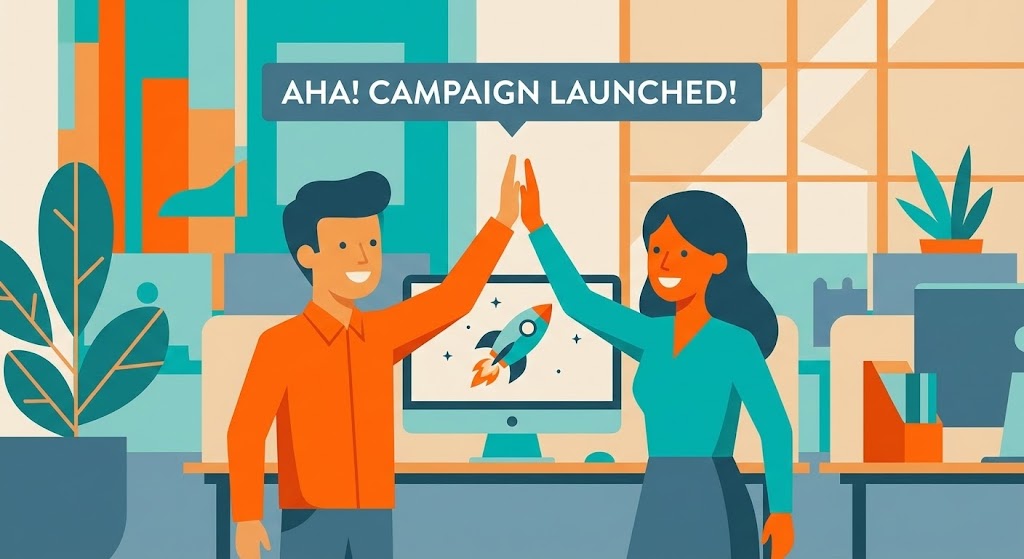
The Visual & Narrative Approach
This style celebrates the human "win." Rendered in flat vector art with Vibrant Orange and Teal, we see two colleagues high-fiving in a modern office. Behind them, a monitor displays a "Campaign Launched!" success screen with a rocket ship icon. The characters are dynamic and joyful. The scene validates the user's effort, transforming a software task (clicking "Launch") into a moment of professional triumph.
Psychological Impact & KPI Focus
Niche Psychology: Software adoption relies on emotional buy-in. By showing relatable characters celebrating, you trigger Social Proof and the desire for that same feeling of accomplishment. It frames the software as a tool for personal and team success.
Operational Impact: It visualizes User Activation. It reinforces the "Aha!" moment, encouraging new users to push through the setup phase to get to the reward.
Strategic Implementation & Trade-offs
- Best Use Case: "Congratulations" overlays after a first campaign launch or case study videos.
- Trade-off: Character styles can date quickly. Ensure the fashion and office environment look modern and relevant to a B2B audience.
Companies using similar video content -
Loyltworks Platform – Modular loyalty platform for repeat business.
Piggy – All-in-one platform for increasing customer loyalty.
24. Abstract 3D AI Visualization
Retention | Driving Deep Feature Adoption

The Visual & Narrative Approach
To sell advanced features like predictive modeling, we need to visualize intelligence. This style uses glowing Electric Blue and Silver particles connecting to form a brain-like neural network in a deep void. The nodes pulse with light as data travels between them, symbolizing the active processing of customer behavior. The aesthetic is ethereal and futuristic, positioning the platform as a "Living Brain" rather than a static database.
Psychological Impact & KPI Focus
Niche Psychology: Retention depends on staying ahead of the customer. This visual appeals to the desire for Omniscience. It assures the user that the AI is working in the background, finding patterns they might miss.
Operational Impact: It visualizes Predictive Analytics and AI Segmentation. It justifies the premium cost of the software by showcasing the sophisticated computation powering it.
Strategic Implementation & Trade-offs
- Best Use Case: Blog headers for "AI Features" or background loops for keynote presentations.
- Trade-off: It is highly conceptual. It must be accompanied by text explaining what the AI is actually predicting (e.g., "Churn Probability").
Companies using similar video content -
Yotpo – Loyalty & Referrals – E-commerce loyalty with points and tiers.
Smile.io – Loyalty Platform – Simple, stylish loyalty for growing brands.
25. Low-Poly 3D Modeling
Retention | Reducing Support Overhead
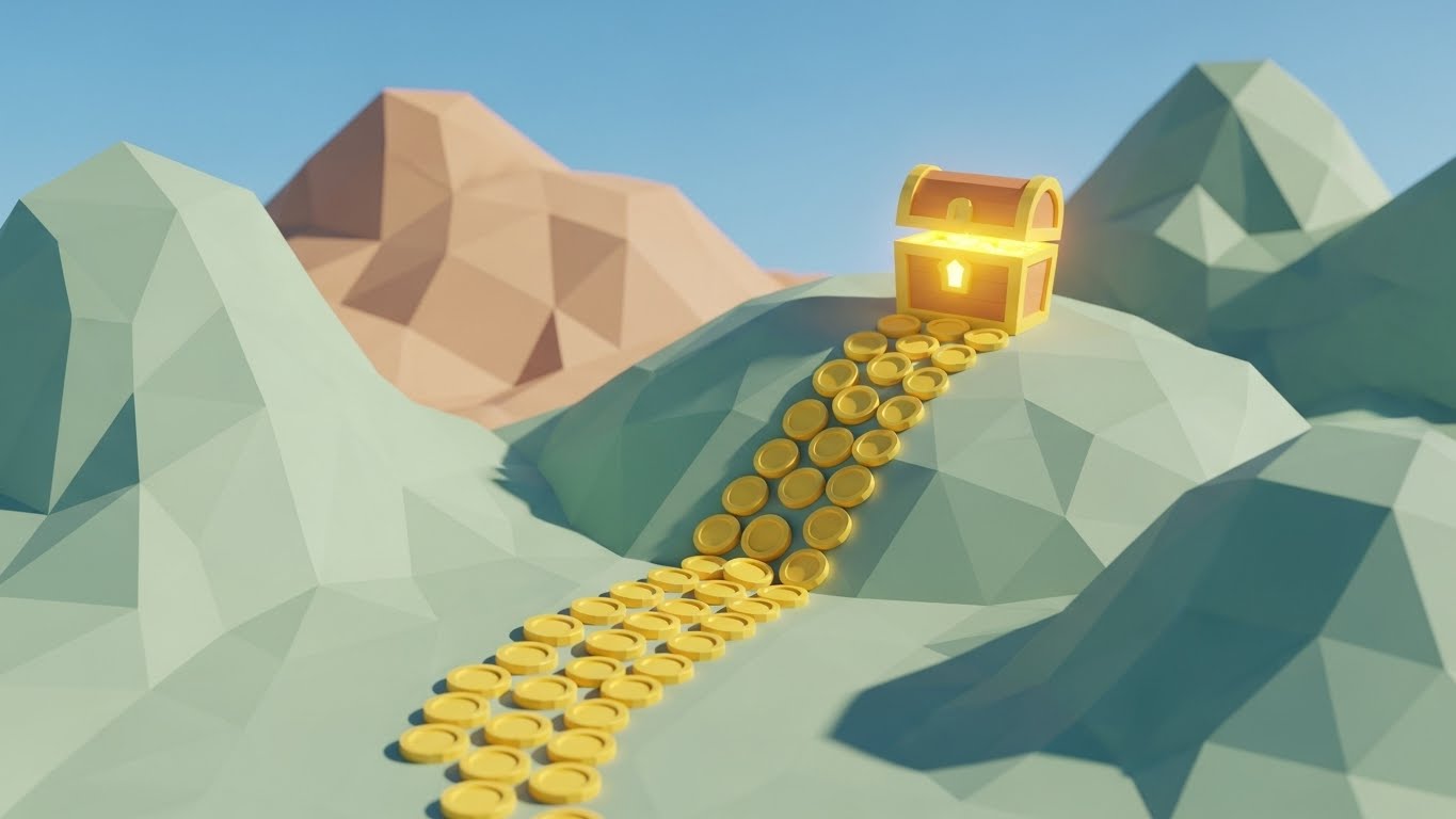
The Visual & Narrative Approach
This style uses a playful, "Gamified" aesthetic to make learning approachable. A winding path made of gold coins cuts through faceted Earth Tone hills, leading to a glowing Treasure Chest. The lighting is bright and sunny, evoking the feel of an adventure game. The low-poly geometry keeps the visual clean and uncluttered, perfect for explaining "Journeys" or "Quests."
Psychological Impact & KPI Focus
Niche Psychology: Learning a complex tool can be boring. This style leverages Gamification Psychology to make the education process feel like play. It reduces the intimidation factor of reading documentation.
Operational Impact: It visualizes Self-Service Journeys. It subtly encourages users to follow the "path" (documentation/tutorials) to find the "treasure" (solution), reducing reliance on support tickets.
Strategic Implementation & Trade-offs
- Best Use Case: Knowledge Base thumbnails, "Academy" lesson covers, or changelog updates.
- Trade-off: It can look "cheap" if the lighting isn't high-quality. Ensure the render looks like a modern indie game, not 90s clip art.
Companies using similar video content -
GrowSurf – Referral program software for B2B SaaS.
MixPanel – Product analytics for customer engagement and retention.
26. Hyper-lapse Stock Footage with Data
Retention | Reducing Churn
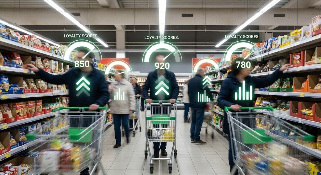
The Visual & Narrative Approach
This style bridges the gap between physical retail and digital data. We see a hyper-lapse of a busy supermarket aisle, with shoppers blurred by speed. Superimposed over them are crisp, sharp White and Green data gauges tracking "Loyalty Scores" and "Spend Potential" in real-time. The contrast between the chaotic, blurry reality and the precise, stable data highlights the software's ability to bring order to operations.
Psychological Impact & KPI Focus
Niche Psychology: Retail clients fear they are "flying blind" in physical stores. This visual triggers a sense of Control. It demonstrates that the software captures data even in high-traffic, offline environments.
Operational Impact: It visualizes Real-Time Analytics and Offline-to-Online Attribution. It proves the platform's value in preventing churn by identifying at-risk customers instantly.
Strategic Implementation & Trade-offs
- Best Use Case: LinkedIn video ads targeting retail executives or "Industry Solutions" pages.
- Trade-off: Finding the right stock footage is critical. The camera movement must be smooth enough to track the graphics effectively.
Companies using similar video content -
TrueLoyal – Loyalty Platform – AI-driven insights for loyalty strategies.
Optimove – Gamify – AI-powered marketing for customer growth.
27. Generative AI Realistic Character Video
Retention | Proactive Support/Announcements

The Visual & Narrative Approach
Scalable support needs a face. This style utilizes high-end Generative AI to create a photorealistic support agent. She has a friendly, professional expression and wears a headset. A semi-transparent holographic "Ticket Resolved" window floats in the foreground. The background is a soft-focus, modern support center. The lighting is cinematic, creating a feeling of warmth and attentiveness, even though the character is synthetic.
Psychological Impact & KPI Focus
Niche Psychology: Customers hate talking to "robots," yet businesses need automation. This style bridges the gap by providing a Human Interface for automated messages. It fosters connection and trust without the cost of live video production.
Operational Impact: It visualizes Proactive Support. It can be used to deliver personalized updates or patch notes at scale, maintaining a "high-touch" feel.
Strategic Implementation & Trade-offs
- Best Use Case: Personalized email updates, quarterly business review intros, or "What's New" videos.
- Trade-off: The "Uncanny Valley" is a risk. Use only top-tier generation models to ensure lip-sync and eye movement are natural.
Companies using similar video content -
Open Loyalty – Loyalty Program Software – Gamified loyalty programs at scale.
Talon.One – Promotion & Loyalty Engine – Rule builder for gamified promotions.
28. Holographic UI over 3D Render
Expansion | Driving Upsell/Cross-sell
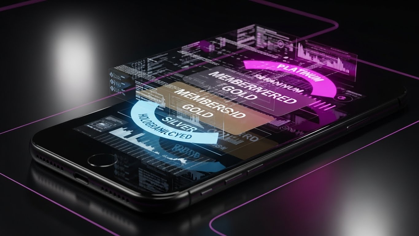
The Visual & Narrative Approach
To drive expansion, we must visualize "Premium." A sleek smartphone lies on a dark, reflective surface. Erupting from the screen is a dimensional hologram of a membership card that morphs from Silver to Gold to Platinum. The hologram uses Holographic Cyan and Deep Purple, glowing against the darkness. It looks expensive, exclusive, and desirable.
Psychological Impact & KPI Focus
Niche Psychology: This appeals to the Aspirational nature of loyalty programs. It visualizes the status and exclusivity that the software enables the client to offer their customers. It sells the "dream" of a high-tier program.
Operational Impact: It visualizes Tier Management and Digital Wallet Integration. It shows the client how their program will look in the hands of their top 1% customers.
Strategic Implementation & Trade-offs
- Best Use Case: Pitch decks for "Enterprise Plan" upgrades or feature announcements for "Mobile Wallet" capabilities.
- Trade-off: It focuses on the end-user experience, not the admin backend. Ensure the client understands this is what their customers will see.
Companies using similar video content -
Capillary Technologies – Loyalty+ – Omnichannel loyalty with real-time analytics.
Voyado – Retail loyalty platform for personalized experiences.
29. 2D Graphics Over Live Action
Expansion | Driving Referrals & Advocacy

The Visual & Narrative Approach
Referrals are social. This style overlays flat, colorful vector graphics onto a candid photo of friends in a coffee shop. "Heart" icons, "Coin" symbols, and chat bubbles in Bright Vector colors pop out from their phones as they laugh. The juxtaposition of the real world (photo) and the reward layer (graphics) illustrates how the loyalty program enhances natural social interactions.
Psychological Impact & KPI Focus
Niche Psychology: It validates the Viral Loop. Clients want to know that their program will generate organic growth. This visual proves that the software turns everyday conversations into measurable referral events.
Operational Impact: It visualizes Referral Mechanics and Social Integration. It makes the invisible concept of "word-of-mouth" visible and trackable.
Strategic Implementation & Trade-offs
- Best Use Case: Social media ads promoting "Referral Features" or case studies on organic growth.
- Trade-off: The photography must feel authentic/candid. Stiff stock photos will kill the "social" vibe.
Companies using similar video content -
SentiSum – AI analytics for customer support insights.
Loiale – Unified platform with AI agents for retention.
30. Aspirational Stock Montage
Expansion | Website Visitor Re-engagement

The Visual & Narrative Approach
This style creates a vision of the "Result State." We see a bright, high-key photo of a diverse business team cheering in a glass-walled conference room. They point to a whiteboard with rising growth lines. The lighting is airy, optimistic, and bathed in Corporate Blue tones. It creates a direct association between the software and team victory.
Psychological Impact & KPI Focus
Niche Psychology: Ultimately, B2B buyers want to be heroes in their organization. This visual mirrors that desire. It shows the Organizational Harmony and success that follows the successful scaling of the loyalty program.
Operational Impact: It visualizes Program Success and Team Alignment. It serves as a visual anchor for "Quarterly Business Review" presentations or renewal discussions.
Strategic Implementation & Trade-offs
- Best Use Case: Retargeting ads for visitors who viewed pricing pages or "Success Story" landing page headers.
- Trade-off: It is the most generic of all styles. It must be paired with a strong headline (e.g., "The Results Your Team Deserves") to have impact.
The Visual Operations Doctrine: A 30-Point Strategic Framework
The 30 styles detailed above are not merely "creative assets"; they are the components of a Visual Operating System for your Retention Strategy. To transition from "making videos" to "driving outcomes," the expert team at Advids has synthesized three strategic frameworks. These segments bridge the gap between aesthetic choices and hard business KPIs.
Strategic Alignment & Visual Architecture (Pre-Production)
Before a single pixel is rendered, the visual strategy must be architected to solve specific cognitive bottlenecks in the B2B buying cycle.
- The Cognitive Load Audit: Do not guess complexity; measure it. Advids recommends auditing your current training materials. If a concept takes 3 paragraphs to explain, it requires a Style 10 (Isometric Workflow) or Style 26 (Wireframe Transition). Visuals should be deployed primarily where text fails.
- Role-Based Visual Mapping: A CTO and a Marketing Manager see the same software differently. Map your styles to their personas. Use Abstract Data Visualizations (Style 18) for the CTO to prove architecture, but switch to Human-Centric UI (Style 4) for the Marketer to prove usability. One size does not fit all.
- The "Glanceability" Standard: In the B2B operational world, attention is scarce. Your visual assets must pass the "Glance Test"—can the value proposition (e.g., "Integration Speed") be understood in under 1.5 seconds? Styles with high contrast and singular focal points (like Style 22) excel here.
- Brand Voice Consistency: Your visual language must be as consistent as your code. Define a "Visual CSS" for your video content—standardizing corner radii, shadow depths, and motion curves across all 30 styles. This creates a subconscious sense of platform stability.
- The Advids Strategic Audit: We often find that SaaS companies have "Visual Debt"—a cluttered mix of old screenshots and new branding. Engaging a partner like Advids to conduct a Visual Audit ensures your library is cohesive, current, and strategically aligned with your product roadmap.
- Standardization vs. Customization: Know when to scale. Use templated styles (like Style 15 - UI Shots) for recurring feature releases. Save your budget for bespoke, high-impact styles (like Style 1 - Abstract Motion) for Tier 1 brand campaigns.
- The Cross-Departmental Bridge: Use these visuals to unify your internal teams. A "Loyalty Loop" animation (Style 11) created for marketing should be the same asset Sales uses in pitch decks and Support uses in help articles. This unifies the company narrative.
- Legacy System Integration: Many B2B buyers are migrating from legacy hardware. Use "Bridge" styles (like Style 13 - Split Screen) to visually validate their current reality before transitioning them to your solution. Do not ignore their past; visualize the bridge from it.
- Accessibility in Visualization: Your user base is diverse. Ensure that text overlays in your videos (Style 2) meet WCAG contrast ratios and that motion graphics do not rely solely on color to convey status (e.g., use icons and colors for "Success").
- The Mobile-First Mandate: Even B2B decisions happen on phones. Ensure all 30 styles—especially complex data visualizations—are legible on a vertical 9:16 mobile screen. If the text is too small, the message is lost.
Operational Adoption & Implementation (Deployment)
A video hidden in a folder creates no value. This segment focuses on embedding these visual assets directly into the user's workflow to drive adoption.
- Overcoming "Big Brother" Anxiety: Tracking customer behavior can feel invasive. Use empathetic styles (like Style 17 - Lifestyle Overlay) to frame analytics as "Understanding" rather than "Surveillance." This distinction is critical for ethical B2B adoption.
- The Micro-Learning Shift: Replace the 50-page PDF manual with a playlist of 30-second Style 7 (Rapid UI) clips. Embed these directly into the dashboard via tooltips. Users learn best when the answer is adjacent to the problem.
- Just-in-Time Support: Integrate Style 25 (Low-Poly Reward Path) videos into your "404" or "Error" pages. Turn a moment of frustration into a moment of guided resolution. This is "Deflection Strategy" in action.
- Gamification of Training: Use Style 5 (Character Story) videos to reward admins for completing certification modules. Visualizing their progress fosters a sense of achievement and increases platform expertise.
- Reducing Support Ticket Volume: There is a direct correlation between the quality of your "How-To" visuals and your support costs. A well-placed Style 11 (Workflow) animation can eliminate thousands of "How do I configure logic?" tickets annually.
- Remote Onboarding: In a distributed world, physical seminars are rare. Use Style 27 (Gen AI Character) to deliver a consistent, high-touch onboarding experience to every new account manager, globally, without travel costs.
- Standard Operating Procedures (SOPs): Transform text-based SOPs into visual process flows (Style 12). Visuals are processed 60,000x faster than text, ensuring that complex loyalty rules are implemented correctly by client teams.
- Feedback Loops: Embed interactive elements into your video player. After a Style 6 (Clean UI) tutorial, ask "Did this help?" The data you gather on video effectiveness is as valuable as the video itself.
- Scalable Localization: If you sell globally, plan for text expansion. Design your motion graphics (Style 2) with "Safe Zones" that allow for German or Spanish text overlays without breaking the design composition.
- Leadership Communication: Empower your champions. Give your client's internal project lead a "Launch Kit" of high-quality visuals (Style 30) so they can sell the success of the program to their own Board of Directors.
Measuring Impact & Future-Proofing (ROI)
The final phase is proving that your Visual Operating System is generating revenue, not just views.
- Beyond "Views": Vanity metrics are useless in B2B. Measure Time-to-Competency. If a user watches a Style 4 (UI Composition) video, do they complete the task faster than a user who didn't? That delta is your ROI.
- The "Idle Time" Metric: High idle time in a dashboard suggests confusion. Correlate reductions in idle time with the deployment of Style 8 (Macro Interaction) tooltips.
- Compliance Velocity: When regulations change (e.g., GDPR), how fast does your client base adapt? Use Style 20 (Dark Mode Security) videos to disseminate compliance updates and measure the speed of "Verification" clicks.
- Retention and Churn: The ultimate metric. Analyze if cohorts exposed to high-touch onboarding visuals (Style 21) have higher retention rates than those who received text-only emails. Visuals sticky; text fades.
- The AI Visual Frontier: Prepare for the next wave. Real-time, data-driven video generation is coming. Your static Style 16 (Data Viz) will soon need to be dynamic, pulling live client data into the render.
- Scalability of Assets: Build a component library, not just videos. Advids creates "Master Kits" where backgrounds, icons, and characters are separate assets, allowing for rapid remixing as your product evolves.
- The Advids Partnership: Visual strategy is not a one-time project; it is a subscription to relevance. Partnering with Advids ensures your visual language evolves alongside your software, preventing your marketing from becoming a "legacy artifact."
- Benchmarking Success: Don't just compare against yourself. Look at consumer apps. Your B2B buyers expect the same visual fidelity from your loyalty software that they get from their favorite streaming service.
- The ROI of Safety: For enterprise clients, security is paramount. Quantify how many security questions were deflected from the sales process by proactively sharing Style 18 (X-Ray Architecture) visuals.
- Final Call to Innovation: Treat your video content as infrastructure. In the Retention Revolution, the company that communicates value the clearest, wins. Your visual strategy is the lens through which the market sees your worth. Polish it relentlessly.
Companies using similar video content -
Sparta Loyalty – Platform for managing customer loyalty programs.
Oracle CrowdTwist – Loyalty and Engagement – Multi-channel engagement and rewards.
Author & Editor Bio


