
Introduction: Visualizing the Invisible Revenue Engine
In the mature B2B SaaS landscape, the battle for market leadership has shifted. It is no longer won solely on the acquisition front; it is won in the trenches of retention. For the modern Vice President of Customer Success or Chief Revenue Officer, the mandate is clear: move beyond "preventing churn" to "engineering expansion." The industry benchmark for elite performance is unforgiving, with top performing companies achieving Net Revenue Retention (NRR) of over 120%. Reaching this tier requires more than just a powerful platform; it requires the ability to make that power visible.
However, a profound "Physical/Digital Divide" exists. Your platform operates in the invisible backend—syncing APIs, calculating health scores, and securing data—while your customer operates in a high-stress physical reality of fragmented tools and manual spreadsheets. When this value remains invisible, adoption stalls. The cost of this disconnect is immediate; conversely, clarity drives efficiency. Research indicates that SaaS companies that utilize video onboarding report 35% fewer support tickets, proving that visual clarity is an operational lever, not just a marketing asset.
This guide is your strategic blueprint for bridging that gap. We have curated 30 "Gold Standard" visual styles, rigorously mapped to the psychological needs of the B2B buyer at every stage of the funnel. These are not merely aesthetic choices; they are cognitive tools designed to reduce load, build trust, and accelerate Time-to-Value (TTV).
From the "Human-in-the-Loop" overlays that validate the CSM's role to the "Isometric Hubs" that resolve integration anxiety, these styles transform abstract code into a compelling narrative of growth and stability.
1. The Human-Metric Symbiosis
TOFU | Brand Awareness

The Visual & Narrative Approach
This style masterfully bridges the gap between the human element of Customer Success and the digital precision of SaaS analytics. The scene features a high-resolution, isometric angle of a confident Customer Success Manager in a sunlit, modern workspace. She is not replaced by the tech; she is augmented by it. A holographic UI overlay floats in the foreground, displaying "Customer Health" metrics. Vivid lime green spheres (signifying health) and charcoal data bars interact with her gaze, creating a seamless integration of physical intuition and digital intelligence.
Psychological Impact & KPI Focus
- Niche Psychology: B2B buyers often fear that automation will de-personalize their service. This style alleviates that Cognitive Dissonance by validating the user's identity as a "tech-enabled expert."
- Operational Impact: It directly addresses Product Adoption and Trust. By isolating key metrics (the green spheres) against a blurred background, we signal that the platform filters noise and delivers clarity, reducing the Cognitive Load for the CSM.
Strategic Implementation & Trade-offs
- Best Use Case: TOFU Brand Awareness videos on the Homepage Hero section to instantly humanize the brand.
- Duration: 15–30 Seconds.
- Trade-off: High Production Value vs. Flexibility. This style relies on perfect motion tracking. If the UI "slides" incorrectly over the footage, the illusion breaks. It sells the feeling of the workflow, not the pixel-perfect details.
Companies using similar video content -
Gainsight – CS Platform – Augmenting CSMs with data insights.
Velaris – AI Customer Success – Providing real-time account visibility.
2. The Unified Ecosystem
TOFU | Market Education

The Visual & Narrative Approach
We utilize Isometric 2D Motion Design to tackle the abstract problem of "Data Silos." The scene opens with chaos—disconnected cubes floating in a white void. Through smooth, magnetic motion, these cubes are drawn together to form a seamless, unified hub. The narration is precise and rhythmic, matching the "click" and "snap" of the connecting elements. The aesthetic is shadowless and crisp, implying a friction-free implementation process.
Psychological Impact & KPI Focus
- Niche Psychology: The target persona dreads "integration hell." This style leverages the Gestalt Principle of Closure, satisfying the brain's desire for order. It visually promises relief from the chaos of fragmented tools.
- Operational Impact: This style visualizes Operational Efficiency and Time-to-Value. It demonstrates that the platform is the "central nervous system" of their retention strategy, essential for reducing the "swivel-chair" effect of managing multiple apps.
Strategic Implementation & Trade-offs
- Best Use Case: Explainer Blogs and "Platform Architecture" pages.
- Duration: 30–60 Seconds.
- Trade-off: Abstract vs. Concrete. It explains the concept of integration perfectly but tells the user nothing about the actual interface. It must be paired with screenshots later in the funnel.
Companies using similar video content -
Totango – Composable CS Platform – Unifying fragmented customer data.
HubSpot – Operations Hub – Streamlining workflows and data synchronization.
3. The Guardian Symbol
TOFU | Category Creation

The Visual & Narrative Approach
Sometimes, complexity is the enemy. This style employs Minimalist Flat 2D Vector art to establish category leadership. The visual anchor is a simple, symmetrical shield icon in "bright coral" (urgency/energy) with a "slate grey" outline (stability). Inside, simplified geometric icons represent the customer base being protected. There are no gradients or distractions—just the pure symbol of protection.
Psychological Impact & KPI Focus
- Niche Psychology: In retention, "safety" is a primary motivator. This style taps into Semiotics, using the shield as a universal signifier of defense. It positions the brand as a "Category Creator"—the standard for protecting revenue.
- Operational Impact: It reinforces Brand Recall and Churn Mitigation. By associating the brand with a "shield," you subtly prime the audience to view the platform as their defense against revenue loss.
Strategic Implementation & Trade-offs
- Best Use Case: LinkedIn static ads or short, 6-second bumper ads for high-frequency retargeting.
- Duration: 6–10 Seconds (Loop).
- Trade-off: Depth vs. Speed. It is low on information density. It builds brand affinity but does not educate on how the protection works.
Companies using similar video content -
ChurnZero – Customer Success Platform – Protecting revenue through churn mitigation.
4. The Chaos-to-Clarity Split
TOFU | YouTube Organic Search
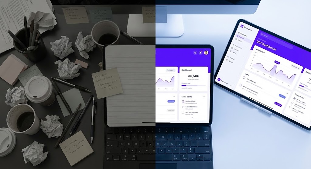
The Visual & Narrative Approach
This Split Screen composition creates a visceral "Before and After" contrast. The left side (the "Old Way") is a dim, desaturated top-down view of a messy desk—the physical manifestation of manual retention tracking. The right side (the "New Way") reveals a glowing, "electric violet" digital dashboard. The transition line moves, allowing the digital order to consume the manual chaos.
Psychological Impact & KPI Focus
- Niche Psychology: It leverages the Contrast Effect. The brain perceives the "New Way" as significantly more desirable because it is immediately juxtaposed with the pain of the status quo. It validates the user's desire to modernize.
- Operational Impact: This visualizes the ROI of Digital Transformation. It directly addresses the "Hidden Cost of Status Quo" by making the inefficiency of manual processes look physically unappealing.
Strategic Implementation & Trade-offs
- Best Use Case: YouTube "Problem/Solution" videos and Sales Decks.
- Duration: 30–90 Seconds.
- Trade-off: Relatability vs. Aspiration. You must ensure the "messy" side doesn't look too exaggerated, or it risks insulting the potential customer's current reality.
Companies using similar video content -
ClientSuccess – Customer Success Platform – Transforming manual tracking to digital order.
Userpilot – Product Experience Platform – Guiding users from confusion to adoption.
6. The Fluid Workflow Morph
MOFU | Product Differentiation

The Visual & Narrative Approach
This style creates a powerful metaphor for Agility. We see abstract liquid shapes in "mint green" and "navy" morphing smoothly against a fluid background. The key moment is the transformation: jagged, disconnected particles (representing friction or "data leaks") dissolve and reform into a perfect, smooth circle (representing a resolved, flexible workflow). The motion is continuous and hypnotic, suggesting a system that heals itself.
Psychological Impact & KPI Focus
- Niche Psychology: It addresses the fear of Rigidity. SaaS buyers worry that new tools will force them into rigid processes. The fluid animation subliminally communicates that the software molds to their needs.
- Operational Impact: This highlights Product Differentiation and Workflow Flexibility. It is effective for communicating "soft" benefits like "seamless experience" which are hard to show with screenshots.
Strategic Implementation & Trade-offs
- Best Use Case: Website headers for "Features" pages.
- Duration: 10–15 Seconds (Loop).
- Trade-off: Metaphor vs. Function. It is purely emotive. It sets a tone of modern sophistication but explains nothing about the product's actual utility.
Companies using similar video content -
Pipefy – Workflow Automation – Adapting processes with flexible automation.
7. The Revenue Growth Spike
MOFU | Feature Education
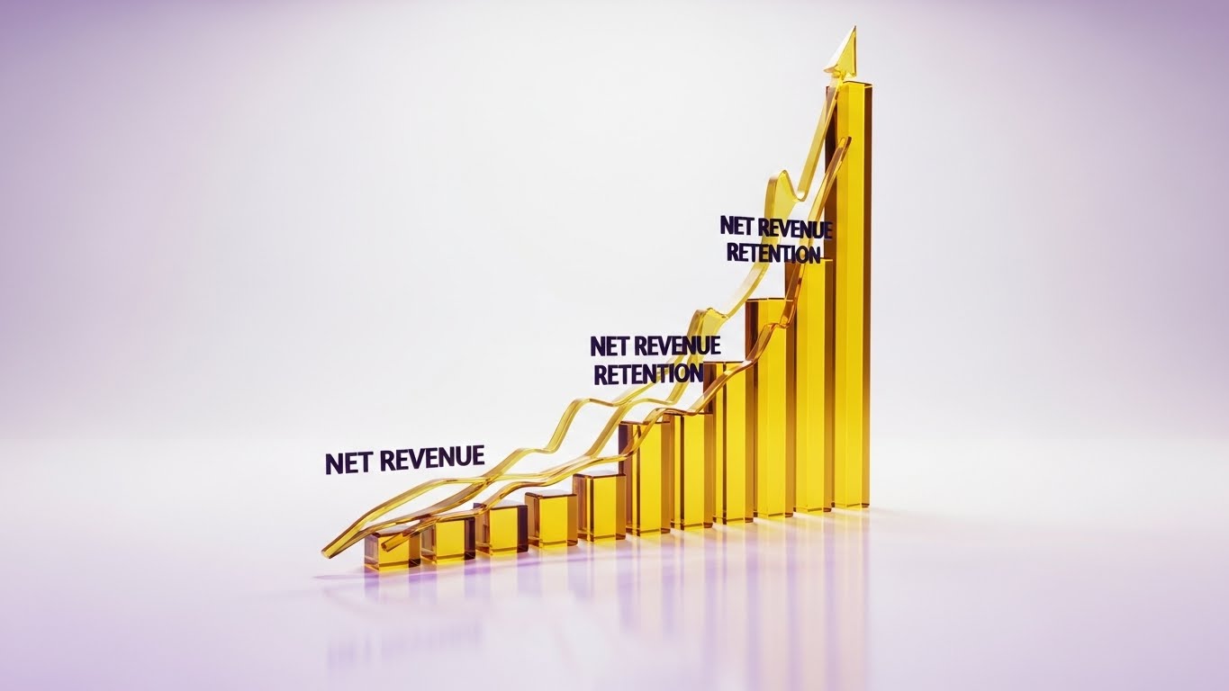
The Visual & Narrative Approach
This is Dynamic Data Visualization at its most premium. We see 3D glassmorphism charts in "golden yellow" rising rapidly against a clean white studio background, representing "Net Revenue Retention." The glass texture refracts light, creating soft purple caustics. The camera follows the upward trajectory, emphasizing velocity and value.
Psychological Impact & KPI Focus
- Niche Psychology: It appeals to the Growth Motivation. The "Gold" color code psychologically links the metric to wealth and value. The transparency of the glass implies Data Transparency and accuracy.
- Operational Impact: This is the visual definition of Feature Education for financial metrics. It makes abstract numbers like NRR look like tangible assets, validating the investment to the CFO.
Strategic Implementation & Trade-offs
- Best Use Case: Quarterly Business Review (QBR) templates and Investor Presentations.
- Duration: 15–30 Seconds.
- Trade-off: Render Time vs. Flexibility. Glassmorphism is computationally expensive. It is best for "hero" charts, not for visualizing real-time, changing data sets.
Companies using similar video content -
Clari – Revenue Orchestration Platform – Visualizing rapid revenue growth and forecasting.
InsightSquared – Revenue Analytics – Driving growth with dynamic data visualization.
8. The Enterprise Vault
MOFU | Building Trust

The Visual & Narrative Approach
The aesthetic shifts to "Dark Mode"—a favorite of developers and IT leaders. In a server-room environment, a massive digital vault door dominates the frame. It consists of glowing, rotating tumblers in "crimson red" and "silver" neon, representing "Encryption" and "Security." The deep shadows and metallic surfaces signal robustness.
Psychological Impact & KPI Focus
- Niche Psychology: It addresses Risk Aversion. Enterprise buyers are risk-conscious. This visual style acts as a "Trust Signal," using the visual language of cybersecurity to assure them that their customer data is safe.
- Operational Impact: It builds Trust and overcomes security objections. It visually demonstrates compliance and governance without needing boring checklists.
Strategic Implementation & Trade-offs
- Best Use Case: "Security" and "Compliance" pages; Technical implementation guides.
- Duration: 20–40 Seconds.
- Trade-off: Niche Appeal. This "Cyberpunk" look appeals strongly to CTOs but may feel too aggressive for non-technical HR or Marketing buyers.
Companies using similar video content -
Salesforce – Service Cloud – Securing customer data with enterprise-grade trust.
Kustomer – CRM for Customer Service – Ensuring robust data protection.
9. The Evolutionary Leap
MOFU | Competitive Displacement
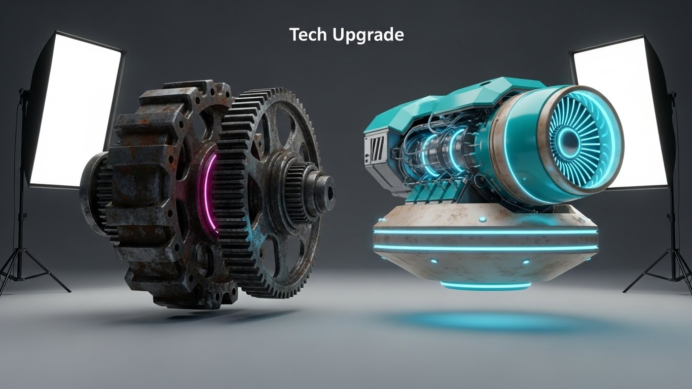
The Visual & Narrative Approach
A side-by-side comparison in a high-end 3D studio. On the left, an old, rusted mechanical gear system grinds slowly (the "Legacy Competitor"). On the right, a sleek, "turquoise and beige" magnetic levitation engine hovers silently (the "New Platform"). A fish-eye lens exaggerates the scale of the new engine, making it appear heroic and advanced.
Psychological Impact & KPI Focus
- Niche Psychology: It triggers Disgust for the old and Desire for the new. It frames the competitor not just as "different," but as "obsolete."
- Operational Impact: It supports Competitive Displacement. It is a visual metaphor for "Efficiency vs. Friction," giving your champions the ammunition to argue for a switch.
Strategic Implementation & Trade-offs
- Best Use Case: LinkedIn Ads targeting users of competitor platforms.
- Duration: 6–10 Seconds (Static or Micro-loop).
- Trade-off: Aggression. This is a direct attack on the status quo. It must be executed with high polish to avoid looking petty.
Companies using similar video content -
Gong – Revenue Intelligence Platform – Upgrading sales and CS with AI insights.
Chorus by ZoomInfo – Conversation Intelligence – Modernizing interaction analysis.
10. The Frictionless Conversion
MOFU | Driving Demo Requests
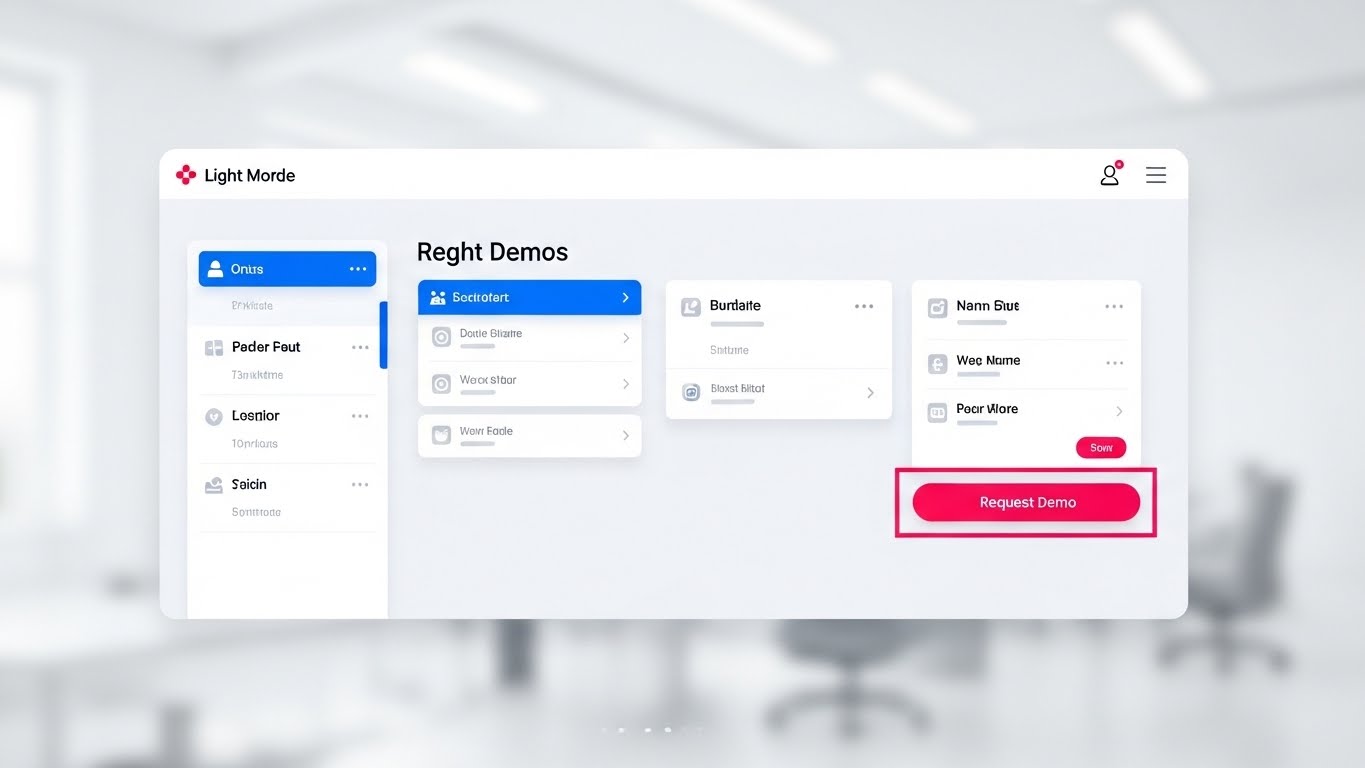
The Visual & Narrative Approach
A straight-on, unangled view of the platform's UI in Light Mode. The design is minimalist, using "clean white" and "light grey" to maximize readability. The focus is drawn immediately to a "Request Demo" button in "hot pink" and "electric blue." The background is a blurred, bright white office bokeh. The cursor moves smoothly to the button, promising ease.
Psychological Impact & KPI Focus
- Niche Psychology: It reduces Choice Paralysis. By removing all visual noise and using the Von Restorff Effect (isolating the pink button), it guides the decision-making process.
- Operational Impact: This acts as the final trigger for Driving Demo Requests. It visually simulates the ease of taking the next step, lowering the barrier to entry.
Strategic Implementation & Trade-offs
- Best Use Case: Landing Pages (Bottom of page) and Retargeting Ads.
- Duration: 10–15 Seconds.
- Trade-off: Utility vs. Excitement. This is the least "exciting" style visually, but it is often the highest converting because it is honest, clear, and direct.
Companies using similar video content -
Dock – Revenue Enablement Platform – Guiding prospects to demo requests.
GUIDEcx – Client Onboarding – Streamlining the path to value.
11. The ROI Factory**
BOFU | ROI Justification

The Visual & Narrative Approach
To conquer the skepticism of the CFO, we deploy an Isometric 3D Clay-Render. The scene depicts a stylized, miniature factory production line on a pristine white surface. Raw, gray "Data Cubes" (customer inputs) enter the system on the left, pass through emerald green processing units (the platform's algorithms), and exit on the right as shiny "Gold Coins" (Expansion Revenue). The composition utilizes a vertical split-screen effect to starkly contrast 'Input' vs. 'Output,' with soft global illumination creating a premium, tactile feel.
Psychological Impact & KPI Focus
- Niche Psychology: This style leverages Reification—making an abstract concept (ROI) concrete. It addresses the "Black Box" anxiety by showing a clear, linear transformation of data into value.
- Operational Impact: It visualizes Revenue Expansion. By simplifying the complex retention process into a factory model, it proves that the platform is not just a tool, but a reliable revenue-generating machine.
Strategic Implementation & Trade-offs
- Best Use Case: "Pricing" pages and final Sales Decks (The "Investment" slide).
- Duration: 15–20 Seconds.
- Trade-off: Simplicity vs. Nuance. It reduces the complexity of customer success to a "factory line," which is great for financial buyers but may feel reductive to relationship-focused practitioners.
Companies using similar video content -
Chargebee – Revenue Management – Manufacturing recurring revenue from subscriptions.
Dreamdata – B2B Revenue Attribution – Showing clear data-to-value transformation.
12. The Architected Defense
BOFU | Risk Mitigation

The Visual & Narrative Approach
Security is the final hurdle in enterprise B2B deals. This style uses a Wireframe to Reality Transition to prove engineering rigor. The top half of the split screen displays a technical, sky-blue wireframe blueprint of a shield on a grid, representing the "Security Architecture." The bottom half reveals the completed, solid steel shield protecting a data cluster. A sharp transition line sweeps across, turning the plan into reality. It signals that security is engineered, not just an afterthought.
Psychological Impact & KPI Focus
- Niche Psychology: It targets the Authority Bias of IT Directors. The wireframe aesthetic speaks their language—structure, planning, and code. It assures them that the platform is "secure by design."
- Operational Impact: This visualizes Risk Mitigation and Compliance. It shifts the conversation from "Is this safe?" to "This is built like a fortress," speeding up the InfoSec review process.
Strategic Implementation & Trade-offs
- Best Use Case: Whitepapers, Security Documentation, and BOFU "Trust" emails.
- Duration: 10–15 Seconds.
- Trade-off: Technicality vs. Emotion. It is cold and clinical. It works for the IT stakeholder but will not resonate with the marketing or sales end-user.
Companies using similar video content -
Pylon – B2B Post-Sales Tools – Engineering robust security for customer data.
LeanData – Lead Routing – Building structured data governance.
13. The Executive Validation
BOFU | Sales Cycle Acceleration

The Visual & Narrative Approach
People buy from people. This style utilizes Generative AI Realistic Character video to create high-end social proof without the logistical nightmare of a film shoot. We see a realistic, professional CEO in a sunlit, glass-walled boardroom. He is nodding approvingly while viewing a transparent tablet displaying a "Success Plan" graph in magenta and cyan. The shallow depth of field focuses entirely on his expression of confidence and relief.
Psychological Impact & KPI Focus
- Niche Psychology: It utilizes Mirroring. The target buyer (often a VP or C-Level exec) sees themselves in the character. Seeing a peer validate the data triggers Social Proof and reduces the anxiety of the final decision.
- Operational Impact: It supports Sales Cycle Acceleration. By visually simulating the "Yes" moment, it subliminally primes the prospect to sign the contract.
Strategic Implementation & Trade-offs
- Best Use Case: Account-Based Marketing (ABM) campaigns targeting the C-Suite.
- Duration: 6–10 Seconds (Micro-loop).
- Trade-off: Authenticity vs. Uncanny Valley. The AI generation must be flawless. If the character's movement is unnatural, it destroys trust immediately.
Companies using similar video content -
Aviso – AI-powered Revenue Operations – Mirroring executive decision-making with AI.
People.ai – Revenue Intelligence – Validating strategic outcomes for leaders.
14. The Economic Flow
BOFU | The Economic Buyer
The Visual & Narrative Approach
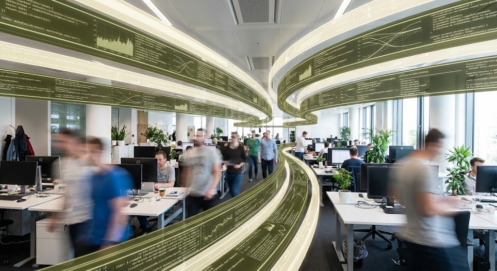
The Economic Buyer cares about efficiency. This style combines Hyper-lapse Stock Footage of a bustling open-plan tech office with crisp, static data overlays. As the employees move in a blur of productivity, olive green and cream data streams flow like traffic lanes above their heads, organizing the chaos. The golden ratio spiral composition guides the eye, suggesting that the software is the invisible conductor of this productivity.
Psychological Impact & KPI Focus
- Niche Psychology: It appeals to the desire for Order. The contrast between the frenetic human activity (blur) and the stable data (sharp) reassures the buyer that the platform brings stability to a high-growth environment.
- Operational Impact: This visualizes Operational Efficiency and Team Productivity. It demonstrates that the platform doesn't interrupt workflow; it hovers above it, enabling speed.
Strategic Implementation & Trade-offs
- Best Use Case: LinkedIn Ads targeting COOs and Operations leads.
- Duration: 15–30 Seconds.
- Trade-off: Generalization. It looks "corporate" and professional but doesn't show specific features. It sells the result of efficiency, not the method.
Companies using similar video content -
Weflow – Pipeline Management – Orchestrating productivity with data streams.
Zoho Revenue Plus – Revenue Operations – Visualizing efficient team workflows.
15. The Micro-Pivot
BOFU | ROI Justification Hook
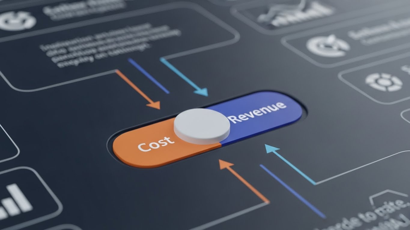
The Visual & Narrative Approach
Sometimes, a big decision comes down to a small detail. This Macro UI Micro-Interaction focuses on a single, powerful moment: a toggle switch flipping from "Cost" (Burnt Orange) to "Revenue" (Indigo). The extreme close-up and shallow depth of field make the switch appear tactile and soft, while the background blurs into insignificance. It visualizes the mindset shift from "Retention as a Cost Center" to "Retention as a Revenue Engine."
Psychological Impact & KPI Focus
- Niche Psychology: It leverages the Focal Point Effect. By excluding everything else, we force the viewer to confront the core value proposition. It implies that switching to this platform is as easy—and binary—as flipping a switch.
- Operational Impact: It crystallizes the ROI Argument. It serves as a visual hook that summarizes the entire business case in one second.
Strategic Implementation & Trade-offs
- Best Use Case: Retargeting Display Ads and Email Signatures.
- Duration: 3–5 Seconds (Loop).
- Trade-off: Context. Without surrounding text, the meaning might be lost. It requires strong copy to anchor the visual metaphor.
Companies using similar video content -
AppEQ.ai – AI Assistant for CS – Highlighting the shift to profitability.
SmartKarrot – Growth Platform – Crystallizing the ROI argument instantly.
16. The Dawn of Value
Onboarding | Accelerating Time-to-Value

The Visual & Narrative Approach
Onboarding is an emotional journey. We use Generative AI Cinematic Video to set a tone of optimism. The shot features a wide view of a stylized digital city skyline at dawn. Volumetric fog glows with lavender and dark grey light, and a bright sunrise breaks over the horizon. Framed by a window element, it symbolizes "New Beginnings." This isn't about the interface; it's about the feeling of relief and potential that comes with a new solution.
Psychological Impact & KPI Focus
- Niche Psychology: It triggers the Fresh Start Effect. New customers are often migrating from a painful legacy situation. This visual validates their hope that "things will be different this time."
- Operational Impact: It impacts Customer Sentiment and NPS. Setting a positive, high-production-value tone early in the welcome sequence builds a reservoir of goodwill.
Strategic Implementation & Trade-offs
- Best Use Case: The "Welcome" Email header or the first frame of the Onboarding Kickoff video.
- Duration: 5–10 Seconds.
- Trade-off: Style over Substance. It sets the mood but teaches the user nothing. It must be immediately followed by practical instruction.
Companies using similar video content -
Rocketlane – Customer Onboarding – Setting an optimistic tone for new beginnings.
Aligned – Client Onboarding – Symbolizing a fresh start for clients.
17. The Frictionless Connection
Onboarding | Reducing Friction

The Visual & Narrative Approach
Integration is the first major friction point in onboarding. This style uses 2D Line Art Animation on a textured paper background to make the technical process feel organic and simple. A single, peach-colored ink line flows across the screen, forming a plug that smoothly connects into a moss-green socket. The motion is continuous and fluid. It reframes a complex API handshake as a simple, natural connection.
Psychological Impact & KPI Focus
- Niche Psychology: It lowers Cognitive Load. Technical diagrams can be intimidating. This "sketch" style makes the process feel approachable and manageable, reducing Integration Anxiety.
- Operational Impact: It accelerates Implementation Velocity. By making the connection look easy, you psychologically prepare the user to complete the setup task quickly.
Strategic Implementation & Trade-offs
- Best Use Case: "Getting Started" Help Center articles and API documentation headers.
- Duration: 10–15 Seconds.
- Trade-off: Detail. It is a metaphor, not a schematic. It cannot replace actual technical documentation.
Companies using similar video content -
WalkMe – Digital Adoption Platform – Simplifying complex integrations with elegant logic.
Product Fruits – Product Adoption – Making technical processes feel organic.
18. The Transparent Engine
Onboarding | Self-Serve Onboarding

The Visual & Narrative Approach
To drive adoption, users must trust the logic. This 3D X-Ray Visualization reveals the inner workings of the platform. We see a complex machine with a translucent royal blue glass shell, revealing internal gears and engines glowing in neon yellow. As the gears turn smoothly, the user understands that there is a robust engine powering their data. It transforms the software from a "magic box" into a "precision instrument."
Psychological Impact & KPI Focus
- Niche Psychology: It satisfies the need for Competence. B2B users want to understand the tools they master. Seeing the "guts" of the machine fosters a deeper sense of ownership and expertise.
- Operational Impact: It promotes Self-Serve Adoption. When users understand the logic of the system, they are less likely to file "How does this work?" support tickets.
Strategic Implementation & Trade-offs
- Best Use Case: In-App Product Tours (The "How it Works" modal).
- Duration: 15–20 Seconds.
- Trade-off: Abstractness. This is a conceptual representation of the algorithm. It doesn't show the actual buttons they need to click.
Companies using similar video content -
Teradata – Data Analytics – Demystifying data processing with X-ray visualization.
UXCam – Product Analytics – Revealing inner workings of user behavior.
19. The Feature Velocity
Onboarding | Trial/Freemium Activation
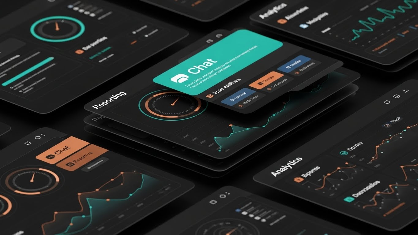
The Visual & Narrative Approach
For Freemium or Trial users, you have seconds to prove value depth. This Rapid UI Feature Montage layers multiple angled UI screens in teal and copper over each other. The camera flies over them in an over-the-shoulder perspective, catching glimpses of "Chat," "Reporting," and "Analytics" icons. The speed and layering suggest an abundance of tools waiting to be unlocked.
Psychological Impact & KPI Focus
- Niche Psychology: It leverages the Perception of Value. The sheer volume of high-quality screens presented quickly suggests that the platform is feature-rich and worth the upgrade price.
- Operational Impact: It drives Feature Discovery and Trial Conversion. It creates "FOMO" (Fear Of Missing Out) regarding the features the user hasn't explored yet.
Strategic Implementation & Trade-offs
- Best Use Case: "Upgrade to Pro" modals and End-of-Trial email sequences.
- Duration: 10–15 Seconds.
- Trade-off: Overwhelm. If it's too fast, it looks chaotic. The motion must be snappy but the icons must remain readable.
Companies using similar video content -
Gainsight PX – Product Experience – Showcasing breadth of product capabilities rapidly.
Mixpanel – Product Analytics – Driving feature discovery for trial users.
20. The Always-On Ally
Onboarding | Knowledge Base

The Visual & Narrative Approach
Support is part of the product. This 2D Cel-Shaded Animation creates a friendly, human moment. A cartoon user character in red is high-fiving a floating, glowing "Help Bot" orb in white. The circular framing acts like a spotlight. It’s a playful, low-stakes visual that reassures the user: "You are not alone."
Psychological Impact & KPI Focus
- Niche Psychology: It builds Psychological Safety. New users fear breaking the system. This friendly avatar reduces that fear, encouraging them to experiment because help is just a click away.
- Operational Impact: It increases Help Center Engagement. A friendly visual invites users to click the support widget, deflecting tickets from human agents to automated resources.
Strategic Implementation & Trade-offs
- Best Use Case: The "Support" widget icon state or "No Results Found" search pages.
- Duration: 3–5 Seconds (Loop).
- Trade-off: Tone alignment. It is very playful. Ensure this matches your brand voice; it might feel too casual for a severe cybersecurity platform.
Companies using similar video content -
Zendesk – Customer Support – Validating the support net with friendly visuals.
Help Scout – Help Desk Software – Reassuring users with accessible assistance.
21. The Dark Mode Code
Retention | Reducing Churn
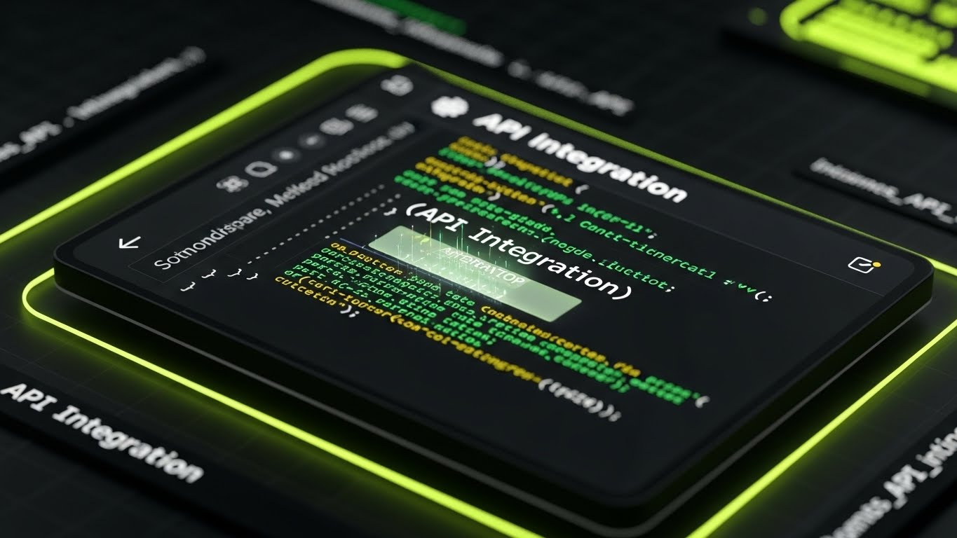
The Visual & Narrative Approach
For technical stakeholders, "Dark Mode" isn't just an aesthetic; it is a working environment. This style features a high-contrast UI capture in "terminal black" with code syntax highlighted in "neon green" and "white." The camera focuses sharply on a block of error-free API code, with a subtle glow emanating from the text. It avoids marketing fluff, presenting the platform as a tool built by developers, for developers.
Psychological Impact & KPI Focus
- Niche Psychology: It targets the Technical Influencer. Developers often veto software that looks "marketing-heavy" or difficult to implement. This style alleviates that friction by validating their preference for clean, precise, and documented code environments.
- Operational Impact: It reduces Technical Churn. By visualizing the ease of the API handshake, it assures the technical team that maintaining this integration will not be a burden.
Strategic Implementation & Trade-offs
- Best Use Case: Developer Documentation, API Portals, and Technical Retention Emails.
- Duration: 10–20 Seconds.
- Trade-off: Exclusionary Aesthetics. This look is highly effective for IT audiences but may feel alienating or "too complex" for non-technical business users.
Companies using similar video content -
Chatwoot – Open Source Support – Building developer trust with precision coding.
Vitally – Customer Success Platform – Showcasing technical integration ease.
22. The Network Resurrection
Retention | Website Visitor Re-engagement

The Visual & Narrative Approach
To re-engage a visitor, you must signal that they are part of something larger. This Abstract 3D Visualization places the camera at a "worm's eye view," looking up at a towering network of nodes connected by beams of light in "violet" and "mint." The composition suggests a massive, secure structure. It creates a sense of awe and scale, implying that by leaving, the visitor is disconnecting from a powerful ecosystem.
Psychological Impact & KPI Focus
- Niche Psychology: It leverages the Fear of Missing Out (FOMO) but in a professional context. The visual grandeur suggests that the platform is a "Market Standard" that they are currently on the outside of.
- Operational Impact: It drives Re-engagement CTR. The high-tech aesthetic differentiates the brand from generic "Come back!" emails, positioning the return as a strategic move.
Strategic Implementation & Trade-offs
- Best Use Case: Display Retargeting Ads and "We Miss You" Email Headers.
- Duration: 6–10 Seconds (Loop).
- Trade-off: Ambiguity. It is purely atmospheric. It grabs attention but relies entirely on the accompanying copy to explain why they should return.
Companies using similar video content -
6sense – Revenue AI Platform – Reconnecting lost nodes in a grand network.
Akita – Customer Success Platform – Re-engaging visitors with a sense of scale.
23. The Leak Repair
Retention | Proactive Support
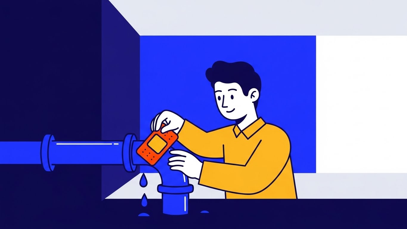
The Visual & Narrative Approach
Churn often feels like a slow leak. This 2D Character-Driven Story visualizes the solution with simple, effective metaphors. A stylized character in "mustard yellow" is calmly placing a patch on a leaking blue pipe in a minimalist room. The use of negative space focuses the eye entirely on the act of repair. It transforms the abstract concept of "Customer Health Alerts" into a tangible act of fixing a problem before it causes a flood.
Psychological Impact & KPI Focus
- Niche Psychology: It utilizes the Idiosyncrasy Credit, allowing a B2B brand to be playful to build rapport. It reassures the user that the platform acts as a "watchdog," spotting issues (leaks) before they become disasters.
- Operational Impact: It highlights Proactive Support. It conditions the user to value the platform's alerts, seeing them not as annoying notifications, but as helpful repairs.
Strategic Implementation & Trade-offs
- Best Use Case: In-App Notifications for "Risk Alerts" and Customer Success Newsletters.
- Duration: 10–15 Seconds.
- Trade-off: Tonal Risk. If the customer is currently angry about a bug, a cartoon might seem trivializing. Use only for preventative messaging, not crisis management.
Companies using similar video content -
SurveySparrow – Feedback Platform – Visualizing proactive care and issue resolution.
Skalin – Customer Success Software – Fixing problems before they escalate.
24. The Augmented Agent
Retention | Reducing Support Overhead

The Visual & Narrative Approach
This style creates a bridge between the digital and the personal. We use 2D Graphics Over Live Action, featuring a real support agent smiling in a bright office. Floating around them are vibrant vector icons in "periwinkle" and "lemon," representing data, answers, and solutions. The graphics "pop" out of the reality, symbolizing how the software augments the human agent's ability to serve, rather than replacing them.
Psychological Impact & KPI Focus
- Niche Psychology: It addresses Automation Anxiety. It frames the AI not as a replacement for human connection, but as a "Superpower" that enables the human to be faster and more accurate.
- Operational Impact: It visualizes Service Efficiency. It shows that the platform empowers support teams to deliver "Instant Help," reducing the perception of wait times.
Strategic Implementation & Trade-offs
- Best Use Case: "Contact Support" Portals and Service Level Agreement (SLA) pages.
- Duration: 15–30 Seconds.
- Trade-off: Stock Limitations. Finding stock footage that perfectly matches the "periwinkle" brand palette can be difficult. Custom shoots or high-end color grading are required.
Companies using similar video content -
Tidio – Conversational AI – Empowering human agents with AI assistance.
Front – Customer Communication – Bridging digital and personal support.
25. The Bauhaus Resolution
Retention | Objection Handling
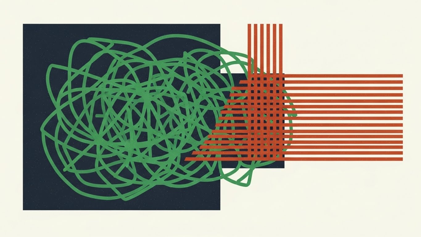
The Visual & Narrative Approach
When a client objects, they are usually expressing confusion. This Abstract Bauhaus-Style motion graphic visualizes the resolution of that confusion. A tangled knot of "forest green" lines (the problem/objection) creates tension in the center. As the animation plays, the lines untangle, straightening into organized, parallel "rust-colored" lines. The grainy texture adds a human, tactile feel to the logic.
Psychological Impact & KPI Focus
- Niche Psychology: It utilizes Cognitive Ease. The brain enjoys seeing chaos turned into order. This visual subliminally primes the viewer to accept the counter-argument (the solution) as the logical, orderly conclusion.
- Operational Impact: It supports Objection Handling. Used alongside FAQs or pricing negotiations, it reinforces the message that the platform simplifies the complex.
Strategic Implementation & Trade-offs
- Best Use Case: Email campaigns addressing "Common Concerns" and FAQ video headers.
- Duration: 5–10 Seconds (Loop).
- Trade-off: Abstract nature. It conveys a feeling of resolution but doesn't explain specific features. It supports the argument; it is not the argument itself.
Companies using similar video content -
Freshdesk Customer Success – Customer Support – Resolving confusion into clear, organized workflows.
monday CRM – CRM Platform – Untangling complex objections into simple solutions.
26. The Expansion Forest
Expansion | Driving Upsell/Cross-sell
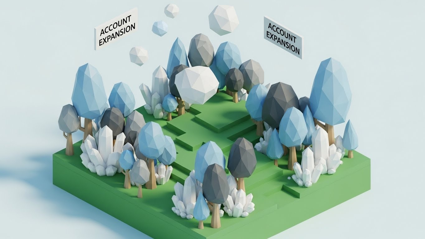
The Visual & Narrative Approach
Expansion shouldn't feel like a cost; it should feel like natural growth. This Low-Poly 3D Modeling scene depicts a digital landscape where faceted trees in "powder blue" and "grey" grow rapidly. As they grow, crystal structures (new features/revenue) form around them. The "Low-Poly" style makes the growth look structured and engineered, rather than organic and messy. It frames the upsell as cultivating an asset.
Psychological Impact & KPI Focus
- Niche Psychology: It taps into the Endowment Effect. The user feels they are building something valuable. Adding more features (upselling) is framed as "fertilizing" their existing investment to get a bigger yield.
- Operational Impact: It visualizes Account Expansion. It shifts the mindset from "buying more software" to "scaling the ecosystem," making the upsell conversation smoother for the CSM.
Strategic Implementation & Trade-offs
- Best Use Case: "Pro Features" tabs within the dashboard and Quarterly Business Review slides.
- Duration: 10–20 Seconds.
- Trade-off: Juvenile Perception. Low-poly can sometimes look like a video game. The lighting must be sharp and professional to ensure it feels like "Data Art," not "Minecraft."
Companies using similar video content -
Catalyst – Customer Success Software – Growing digital estate with upsell/cross-sell.
DemandFarm – Account Planning – Cultivating assets for account expansion.
27. The Network Effect
Expansion | Driving Referrals & Advocacy

The Visual & Narrative Approach
Referrals are about professional status. This style uses a Holographic UI over a Realistic 3D Render of a boardroom table. A glowing network map in "lilac" and "gold" projects upward, connecting different company logos. It visualizes the B2B community. The contrast between the grounded wood table (reality) and the hologram (potential) suggests that the user is the hub of a powerful network.
Psychological Impact & KPI Focus
- Niche Psychology: It appeals to Social Status. It positions the advocate not just as a user, but as a "Connector" in their industry. The "Gold" accents imply the value of these connections.
- Operational Impact: It drives Referral Program Participation. By making the network look exclusive and high-tech, it increases the perceived value of inviting peers.
Strategic Implementation & Trade-offs
- Best Use Case: LinkedIn "Advocacy Program" posts and Referral Landing Pages.
- Duration: 10–15 Seconds.
- Trade-off: Visual Noise. The hologram must be bright enough to be seen against the background but not so complex that the "connection" metaphor is lost.
Companies using similar video content -
Intercom – Customer Communication – Visualizing the power of community connections.
Nextiva – Customer Journey Orchestration – Building a powerful network of connections.
28. The Kinetic Urgency
Expansion | In-App Upsell

The Visual & Narrative Approach
When you need to grab attention inside an app, you need energy. This Bold Kinetic Typography style relies on motion, not imagery. Big, blocky shapes in "ruby red" and "pearl white" collide and rebound on a reflective floor. The movement suggests "POWER," "SPEED," and "IMPACT." It mimics the feeling of a high-performance engine, creating a visceral desire to unlock the "Turbo" capabilities of the Enterprise plan.
Psychological Impact & KPI Focus
- Niche Psychology: It leverages Arousal Theory. The fast-paced motion increases the viewer's pulse slightly, creating a state of heightened attention and readiness to act (click).
- Operational Impact: It drives In-App Upgrades. It cuts through the "banner blindness" of standard static notifications, demanding attention for limited-time offers or new feature launches.
Strategic Implementation & Trade-offs
- Best Use Case: New Feature Announcement Modals and "Limit Reached" paywalls.
- Duration: 5–8 Seconds (Loop).
- Trade-off: Intrusiveness. It is aggressive. If used too frequently, it becomes annoying. Use sparingly for high-value upsells only.
Companies using similar video content -
Revenue.io – Sales Engagement – Demanding attention for in-app upsells.
Mixmax – Sales Engagement – Creating visceral desire for upgrades.
29. The Depth of Capability
Expansion | Driving Deep Feature Adoption
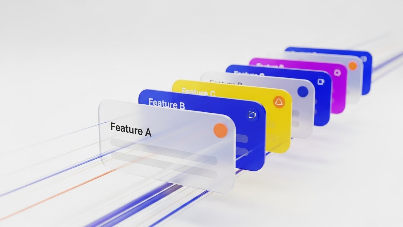
The Visual & Narrative Approach
Deep adoption means going below the surface. This 3D Parallax UI composition physically separates the interface into layers. Floating lists in "cobalt blue" and "tangerine" separate in Z-space, revealing that "Feature A" is just the top layer, while "Feature B" and "C" exist deeper in the stack. The camera zooms through the first layer to the second, visually guiding the user into deeper functionality.
Psychological Impact & KPI Focus
- Niche Psychology: It utilizes the Visual Metaphor of Depth. It combats the "shallow use" of software by visually promising that there is "more beneath the surface," sparking curiosity.
- Operational Impact: It increases Feature Adoption Rates. It visually explains the relationship between basic and advanced features, encouraging users to explore beyond their daily workflow.
Strategic Implementation & Trade-offs
- Best Use Case: Email Drip Campaigns for "Advanced Features" and Power User Webinars.
- Duration: 15–20 Seconds.
- Trade-off: Complexity. The animation must clearly show how to get to the deeper layer, otherwise, it remains just a pretty animation without instructional value.
Companies using similar video content -
Skilljar – Customer Education – Guiding users into deeper functionality.
Guidde – AI How-to Videos – Revealing layers of capability.
30. The Victory Lap
Expansion | Shaping Brand Perception

The Visual & Narrative Approach
Ultimately, clients buy success. This High-Key Photographic Montage captures the emotional result of high retention. A team of professionals in a sunlit glass office is celebrating, throwing papers in the air. The palette is strictly controlled—"aquamarine" clothing and "silver" accents—to maintain brand consistency. It doesn't show the software; it shows what the software delivers: a winning, stress-free team.
Psychological Impact & KPI Focus
- Niche Psychology: It targets Self-Actualization. Every VP of Customer Success wants to be the leader of a happy, winning team. This visual mirrors their highest professional aspiration.
- Operational Impact: It cements Brand Loyalty. It associates the software not with "tasks" or "data," but with the feeling of professional triumph and organizational health.
Strategic Implementation & Trade-offs
- Best Use Case: Case Study Headers, Blog Heroes, and Year-End "Thank You" videos.
- Duration: 10–15 Seconds.
- Trade-off: Cliché Risk. "People throwing papers" is a stock photo trope. It must be executed with high-end lighting and genuine expressions to feel authentic and "earned," rather than cheesy.
Strategic Knowledge Base: The Visual Operations Doctrine
The 30 styles above are the "ammunition." This section is the "battle plan." To transition from merely creating content to engineering revenue, B2B leaders must adopt a holistic Visual Operations Doctrine. This framework synthesizes the visual strategies into three actionable operational segments.
Strategic Alignment & Visual Architecture
"The Pre-Production Mandate"
Before a single pixel is rendered, the visual strategy must be aligned with the retention architecture. This phase ensures that visuals are not just decoration, but functional components of the user journey.
- The Cognitive Load Audit: Conduct an audit of your current onboarding text. Where is the friction? Replace any text block over 100 words with a Style 17 (Frictionless Connection) or Style 25 (Bauhaus Resolution) visual to immediately reduce the cognitive tax on new users.
- Role-Based Visual Mapping: Differentiate your visual output. The "Practitioner" persona (CSM/End User) requires mobile-optimized, high-contrast visuals like Style 21 (Dark Mode) for quick checks. The "Executive" persona (VP/CRO) responds to high-level data aggregation like Style 7 (Revenue Growth Spike).
- The "Glanceability" Standard: In high-stress B2B environments, users don't have time to "watch" videos. Design visuals that communicate the core message within 3 seconds—the "Glanceability" factor—using styles like Style 15 (The Micro-Pivot).
- Brand Voice Consistency: Your platform is a single entity; your visuals must be too. Ensure that the "Human" elements in Style 1 (Symbiosis) and the "Abstract" elements in Style 2 (Unified Ecosystem) share a unified color palette and motion language to prevent brand fragmentation.
- The Advids Strategic Audit: Partner with Advids during the blueprinting phase. An external audit helps define this "Visual Operating System," ensuring that every asset produced serves a specific KPI before production costs are incurred.
- Standardization vs. Customization: Use standardized templates (like Style 10) for repetitive tasks (e.g., "Reset Password") to save budget for bespoke, high-impact visuals (like Style 11) for critical "Money Moments" like contract renewals.
- The Cross-Departmental Bridge: Use visuals to unify terminology. A Style 12 (Architected Defense) video helps Sales explain security to prospects using the exact same visual language that Support uses to explain it to users, creating a seamless experience.
- Legacy System Integration: Visualizing the invisible link between old "Spreadsheet/Legacy" workflows and your cloud SaaS is critical. Use Style 18 (Transparent Engine) to visually demonstrate how your software "talks" to their legacy stack.
- Accessibility by Design: B2B workforces are global. Ensure that text-heavy styles like Style 28 (Kinetic Typography) are paired with metadata and captions for accessibility, and use purely visual styles like Style 23 (The Leak Repair) for universal, language-agnostic understanding.
- The Mobile-First Mandate: Decision-makers are often on the move. All 30 styles must be legible on a 6-inch screen. Verify that details in Style 27 (Holographic UI) remain sharp and readable when viewed on a smartphone by an executive approving a purchase.
Operational Adoption & Implementation
"The Deployment Phase"
A video sitting in a folder generates zero value. This segment focuses on embedding these visual assets directly into the operational workflow to drive adoption and efficiency.
- Overcoming "Surveillance" Anxiety: When introducing productivity tracking or activity monitoring tools, use empathy-driven visuals like Style 24 (Augmented Agent) to frame the technology as a helper, not a "Big Brother" surveillance tool.
- The Micro-Learning Shift: Kill the PDF manual. Replace 50-page guides with a library of 30-second clips using Style 19 (Feature Velocity). Embed these directly into the UI where the user encounters the friction.
- Just-in-Time Support: Don't force users to search for help. Trigger a Style 20 (Always-On Ally) animation inside the dashboard the moment a user hesitates or encounters an error, offering immediate visual guidance.
- Gamification of Training: B2B training is boring. Use Style 28 (Kinetic Urgency) visuals to celebrate training milestones, creating a "Level Up" feeling that boosts engagement with the Learning Management System (LMS).
- Reducing Support Ticket Volume: There is a direct correlation between visual clarity and support costs. A well-placed Style 2 (Unified Ecosystem) video on the "Integration" page can deflect up to 35% of technical queries.
- Remote Onboarding: For distributed teams, physical seminars are impossible. Leverage Style 16 (Dawn of Value) and Style 27 (Network Effect) to create a sense of culture and belonging during remote digital onboarding.
- Visual SOPs: Transform Standard Operating Procedures into visual flows. A Style 29 (Parallax UI) video is far more effective at teaching a complex multi-step workflow than a numbered list.
- Feedback Loops: Use interactive video elements. After a Style 14 (Economic Flow) video plays, prompt the user with a simple "Did this help?" interaction to gather data on asset effectiveness.
- Scalable Localization: Strategies for translating visual assets for global markets are key (Rule 39). Swap the text layers in Style 3 (Guardian Symbol) while keeping the core visual animation intact for cost-effective scaling.
- Leadership Communication: When communicating platform strategy to the C-Suite, do not use screen recordings. Use Style 13 (Executive Validation) to mirror their reality and present the data with the polish and gravity they expect.
Measuring Impact & Future-Proofing
"The ROI & Evolution Phase"
The final phase creates a loop of continuous improvement. It connects the visual output back to the financial inputs and prepares the organization for the next wave of technology.
- Beyond "Views": Vanity metrics are useless in B2B. Measure Time-to-Competency (how fast a user learns via Style 21) and Feature Adoption Rate (clicks after watching Style 26) to prove the ROI of your visual strategy.
- The "Idle Time" Metric: In operations, time is money. Correlate the implementation of Style 15 (Micro-Pivot) visuals with a reduction in "Software Idle Time," proving that clarity increases workforce productivity.
- Compliance Velocity: How fast can the organization digest a new regulation (like GDPR/SOC2)? Measure the speed of compliance adoption when using Style 12 (Architected Defense) versus traditional text memos.
- Retention and LTV: Track the cohort of users exposed to Style 1 (Human-Metric Symbiosis) during onboarding. Higher retention rates in this cohort prove that "humanizing" the brand increases Customer Lifetime Value (LTV).
- The AI Visual Frontier: Prepare for the future. The styles in this guide (like Style 22) are ready for generative video integration, where real-time customer data can be overlayed dynamically onto the video.
- Scalability of Assets: Build a library, not a graveyard. Construct your Style 6 (Fluid Morph) assets in a modular way so that when the UI updates, you only need to re-render the interface layer, not the entire animation.
- The Advids Partnership: Visual strategy is not a one-time project; it is an evolving discipline. Partnering with Advids ensures that as your platform evolves, your visual language adapts, preventing your assets from becoming obsolete.
- Benchmarking Success: "Good enough" is a competitive risk. If your competitor uses Style 9 (Evolutionary Leap) to target your customers, you must respond with higher-fidelity visuals to protect your market share.
- The ROI of Safety (Data): For platforms involving sensitive data, quantify the reduction in security incidents or compliance breaches after deploying Style 23 (The Leak Repair) awareness training.
- Final Call to Innovation: Treat video as infrastructure, not content. The companies that win the next decade will be those that use these 30 styles to build a bridge across the Physical/Digital divide, turning every pixel into a relentless driver of revenue and retention.
Companies using similar video content -
Kapture CX – CX Management – Capturing the emotional result of high retention.
Planhat – Customer Success Platform – Celebrating team success and organizational health.
Author & Editor Bio


