
 /home/wwwroot/advids.co/design/index.php on line 425
Introduction: Visualizing the Invisible Architecture
The modern B2B landscape is shifting from monolithic suites to composable, agile ecosystems. For Digital Experience Platforms (DXP) and SaaS leaders, the challenge is no longer just building superior technology; it is communicating the value of that technology to non-technical decision-makers. We are witnessing a massive "Translation Gap" where engineering innovation outpaces the market’s ability to conceptually grasp it. With the global Digital Experience Platform market estimated at USD 16.05 billion in 2025, the winners will not necessarily be the ones with the best code, but the ones with the clearest narrative.
This guide addresses the specific visual challenges of the DXP and SaaS sectors: How do you visualize "headless architecture"? How do you make "API interoperability" look tangible? How do you prove "seamless integration" without using the same stock imagery of shaking hands? The answer lies in strategic visualization that bridges the physical/digital divide. By shifting from feature-listing to visual metaphors, we reduce the cognitive load on buyers. In fact, 93% of video marketers say video has helped to increase user understanding of their product—a critical lever when selling complex, intangible infrastructure.
The following visual examples are curated to help marketing teams, product leads, and creative strategists align on a visual language that cuts through the noise. These styles are not just aesthetic choices; they are functional tools designed to accelerate comprehension at every stage of the funnel.
1. Abstract 2D Flat Vector Organic Modern Motion Graphics
TOFU | Brand Awareness

The Visual & Narrative Approach
This style abandons the rigid, grid-based visuals typically associated with software in favor of fluid, organic motion. The visualization focuses on a "Digital Ecosystem" concept, where central hubs do not just connect but grow outward into interconnected nodes and leaves. The motion is continuous and biological, suggesting that the platform is a living, breathing entity that evolves with the customer's business. The glossy textures on the lime green and charcoal elements add a premium, tactile quality that makes the abstract concepts feel substantial.
Psychological Impact & KPI Focus
- Niche Psychology: Enterprise buyers often fear "tech debt" and rigidity. By using organic shapes and smooth curves, we subtly signal flexibility, scalability, and vitality—key aspirations for C-level buyers who fear getting locked into a stagnant system.
- Operational Impact: It reduces the intimidation factor of complex infrastructure, positioning the DXP as an enabler of growth rather than a cost center. It is effective for Brand Awareness, creating a memorable visual hook.
Strategic Implementation & Trade-offs
- Best Use Case: Homepage hero sections and high-level "Vision" videos.
- Duration: 15-30 seconds (Looping).
- Trade-off: This style is excellent for mood and concept but poor for explaining specific features or UI workflows. It sacrifices detail for feeling.
Companies using similar video content -
Adobe – Experience Manager – Visualizing interconnected DXP components and content flow.
HashiCorp – Terraform – Illustrating infrastructure as code and cloud resource orchestration.
Liferay – DXP – Representing flexible, open-source digital experience ecosystems.
2. Minimalist Flat 2D Vector
TOFU | Market Education

The Visual & Narrative Approach
Precision meets metaphor. This style utilizes a clean, surgical visual language to depict the removal of friction. The scene explicitly visualizes the destruction of "Data Silos"—represented as solid gray walls—dissolving into vibrant, electric violet pathways. There are no characters or distractions; the focus is entirely on the geometry of flow. The hard edges and lack of gradients communicate absolute clarity and efficiency.
Psychological Impact & KPI Focus
- Niche Psychology: IT decision-makers are overwhelmed by clutter. This minimalist style reduces Cognitive Load, offering a visual "cleansing" experience. It appeals to the desire for order and streamlined architecture.
- Operational Impact: It visualizes Integration Efficiency by answering the "Why change?" question. It shows the immediate relief of unblocking data flows, supporting Market Education goals.
Strategic Implementation & Trade-offs
- Best Use Case: YouTube pre-roll ads and explainer intros focusing on problem/solution dynamics.
- Duration: 45-60 seconds.
- Trade-off: Can feel "cold" or generic if not branded heavily. It lacks emotional warmth, so it must be paired with a strong, benefit-driven voiceover.
Companies using similar video content -
Contentstack – Headless CMS – Depicting seamless content delivery and silo dissolution.
Contentful – Content Platform – Visualizing structured content flowing across channels.
Uniform – Composable DXP – Showing modular integration and streamlined digital experiences.
4. 2D Graphics Over Live Action
TOFU | Category Creation

The Visual & Narrative Approach
This vertical style bridges the gap between the user and the software. We see a real human—a marketing manager in a creative coworking space—interacting with her smartphone. The magic is in the overlay: 2D animated stickers in mustard yellow and navy blue (likes, shares, comments) float up from the phone into the real world. This visualizes the "Invisible Impact" of the DXP, showing that the software creates real-world engagement.
Psychological Impact & KPI Focus
- Niche Psychology: B2B buyers are humans who scroll social media. This style taps into Social Proof and relatability. It humanizes the B2B tool, making it feel accessible and modern rather than "enterprise-heavy."
- Operational Impact: Drives Engagement on platforms like TikTok and Reels. It demonstrates the outcome of using the platform (a happy, productive user) rather than the interface itself.
Strategic Implementation & Trade-offs
- Best Use Case: TikTok, Instagram Reels, and YouTube Shorts for employer branding or user stories.
- Duration: 15-30 seconds.
- Trade-off: Relies heavily on the quality of the live footage. "Staged" stock footage can damage authenticity.
Companies using similar video content -
Salesforce – Experience Cloud – Humanizing customer engagement with overlaid data points.
Optimizely – DXP – Showing real-time experimentation impacting user experiences.
Braze – Customer Engagement Platform – Visualizing personalized interactions on mobile devices.
5. Wireframe to Reality Transition
TOFU | Vertical Social Organic
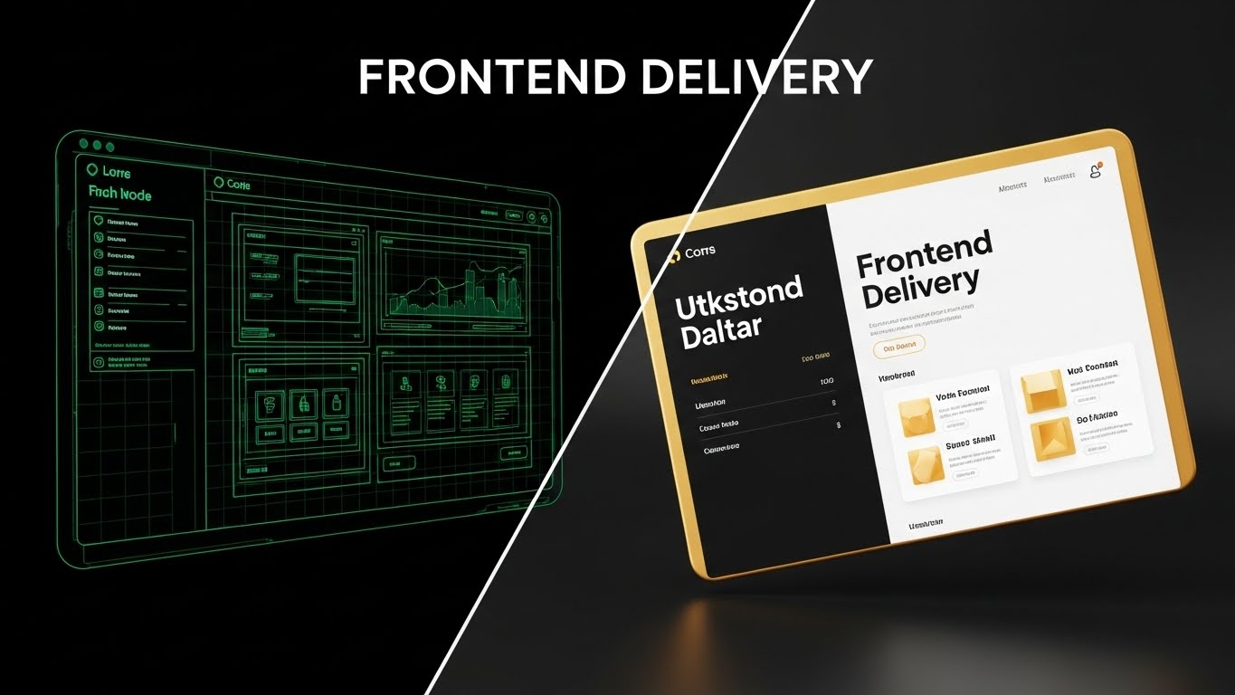
The Visual & Narrative Approach
A powerful split-screen composition that visualizes the "Frontend Delivery" promise. The left half shows the blueprint: a wireframe of a website interface in glowing emerald green lines on a dark grid. The right half shows the reality: the final, polished 3D render in gold and white. The transition line is sharp, acting as a "scanner" that turns code into customer experience instantly.
Psychological Impact & KPI Focus
- Niche Psychology: Developers trust the wireframe (robustness); Marketers crave the render (beauty). This style satisfies both stakeholders, reducing Inter-departmental Friction.
- Operational Impact: It creates Product Differentiation by proving the platform bridges the gap between IT and Marketing—a notorious pain point in B2B organizations.
Strategic Implementation & Trade-offs
- Best Use Case: Website "Features" pages or MOFU product demo videos.
- Duration: 30-45 seconds.
- Trade-off: Requires precise matching of assets. If the wireframe and render don't align perfectly, the illusion of seamless translation is broken.
Companies using similar video content -
Storyblok – Headless CMS – Bridging developer blueprints to visual content experiences.
Builder.io – Visual CMS – Transforming design mockups into live, editable web pages.
Vercel – Frontend Cloud – Showcasing rapid deployment from code to production.
7. Rapid UI Feature Montage
MOFU | Product/Solution Differentiation
The Visual & Narrative Approach
This style simulates the high-speed environment of a power user. We zoom rapidly through layers of sleek, dark-mode UI screens. Digital elements like bar charts and pie charts (in neon green and silver) hover in 3D space, updating in real-time. The perspective suggests a fast zoom-in, creating a "warp speed" effect. Screen glows add a high-tech, premium SaaS feel.
Psychological Impact & KPI Focus
- Niche Psychology: In competitive markets, Speed equals Advantage. This style triggers a "competence heuristic," suggesting that a platform this visually dense and fast must be powerful.
- Operational Impact: It targets Competitive Displacement by visually outclassing clunky, legacy interfaces. It creates "FOMO" regarding data intelligence.
Strategic Implementation & Trade-offs
- Best Use Case: Display Ads (Retargeting) and event sizzle reels.
- Duration: 6-10 seconds.
- Trade-off: The rapid pace makes it impossible to read actual data. It is an impression of analytics, not a tutorial.
Companies using similar video content -
Dynatrace – Software Intelligence Platform – Showcasing quick navigation through performance dashboards.
Tableau – Desktop – Highlighting dynamic data visualization and analytical depth.
Power BI – Desktop – Demonstrating fast-paced reporting and interactive data exploration.
8. Lifestyle Stock with UI Overlay
MOFU | Feature Education

The Visual & Narrative Approach
This style grounds the abstract software in a professional context. We see a high-quality photo of a marketing manager in a modern office, pointing at a laptop. The key element is the augmented reality: a floating, holographic dashboard in royal blue and neon peach hovers above the screen. This emphasizes the "Insight" rather than the hardware, visualizing the "Aha!" moment where human intuition meets machine intelligence.
Psychological Impact & KPI Focus
- Niche Psychology: Executives want to feel in control. This visual positions the user as the Commander, effortlessly manipulating complex data. It appeals to the aspiration of being a "data-driven leader."
- Operational Impact: It is designed to drive Demo Requests. By making the act of analysis look futuristic and empowering, it creates a desire to "get your hands on the controls."
Strategic Implementation & Trade-offs
- Best Use Case: Email marketing headers and case study thumbnails.
- Duration: Static Image or 5-second Cinemagraph.
- Trade-off: The UI overlay must look integrated (lighting, perspective) or it will look like a cheap Photoshop job. The stock footage must be high-end.
Companies using similar video content -
HubSpot – Marketing Hub – Overlaying marketing analytics on a professional's laptop screen.
Pendo – Product Experience – Visualizing user behavior insights over a product manager's view.
Gainsight – Customer Success Platform – Showing customer health scores as holographic data.
11. Abstract 3D AI Visualization
MOFU | ABM Awareness

The Visual & Narrative Approach
This style visualizes the intelligence behind Account-Based Marketing (ABM). Instead of showing a spreadsheet of leads, we present a sophisticated "Neural Network" in 3D space. Glowing nodes in burnt sienna and cream float in a dark void, connected by thin, precise light lines. The camera spirals inward, focusing on specific, brighter nodes that represent high-value target accounts. It transforms the abstract concept of "targeting" into a visual hunt for signal amidst the noise.
Psychological Impact & KPI Focus
- Niche Psychology: Marketing leaders often fear their budget is being wasted on "spray and pray" tactics. This high-tech aesthetic reassures them that the platform uses precision intelligence, not guesswork. It appeals to the desire for Strategic Control.
- Operational Impact: It visualizes Algorithm Efficiency, demonstrating how the software filters vast datasets to identify and prioritize the accounts that matter most, directly supporting ABM strategies.
Strategic Implementation & Trade-offs
- Best Use Case: LinkedIn Video Ads targeting specific companies (ABM campaigns) and product pages explaining AI capabilities.
- Duration: 15-20 seconds.
- Trade-off: High production value is required. If the 3D animation looks low-budget, it undermines the claim of "advanced AI."
Companies using similar video content -
Jira – Software – Gamifying project management workflows as structured islands.
Notion – Workspace – Representing connected knowledge bases and collaborative spaces.
Trello – Boards – Visualizing task management as navigable, structured project maps.
12. Clean UI Workflow (Light Mode)
MOFU | The Functional Buyer
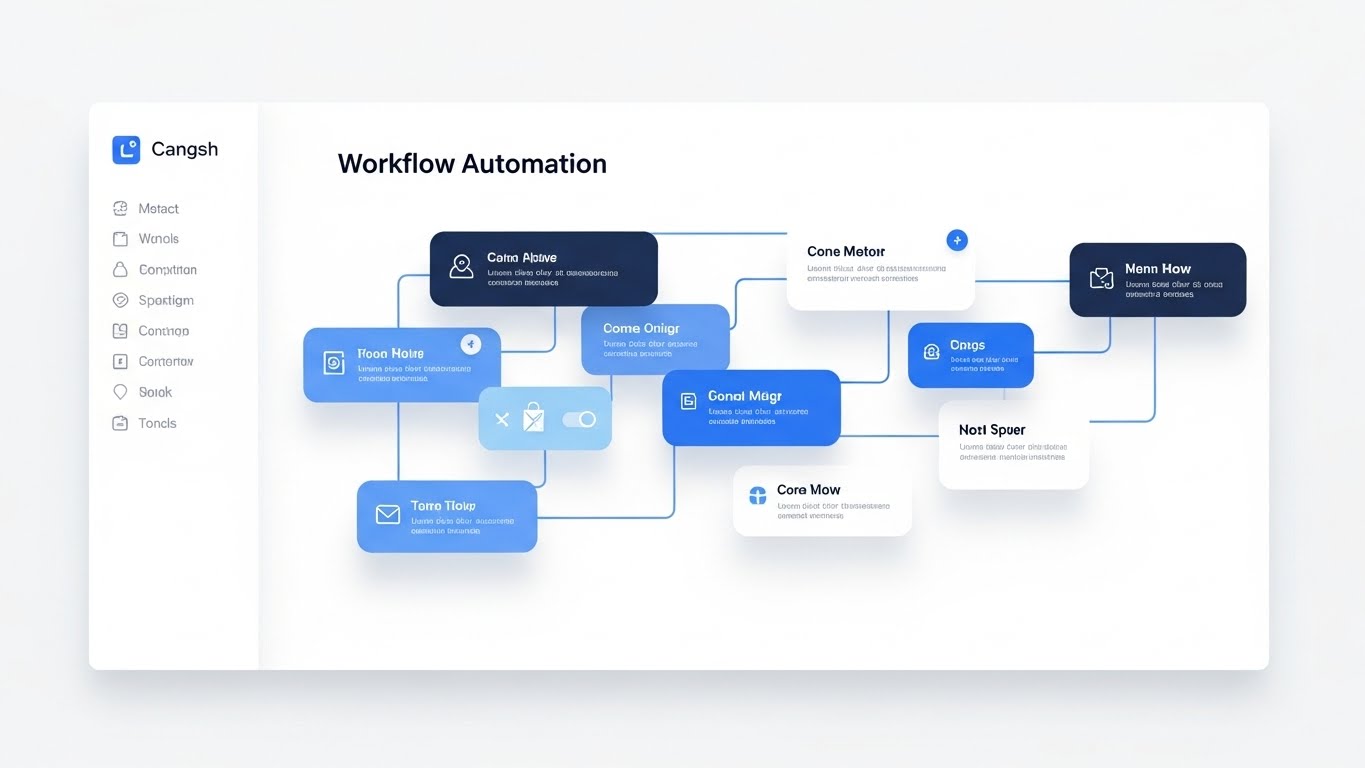
The Visual & Narrative Approach
For the functional user, clarity is king. This style utilizes a pristine, "Light Mode" aesthetic to showcase the "Workflow Automation" canvas. We see a top-down view where abstract content blocks in calming monochrome blues are snapped together with satisfying ease. Soft, diffuse shadows lift the elements off the white background, creating a sense of depth and hierarchy. There is no clutter—only the essential path from trigger to action.
Psychological Impact & KPI Focus
- Niche Psychology: The greatest barrier to adoption for functional users is the fear of complexity ("Will I need a degree to run this?"). This airy, organized visual signals Usability and Approachability. It promises that complex logic can be managed through simple, intuitive gestures.
- Operational Impact: It directly addresses the needs of the Functional Buyer, reducing the perceived learning curve and accelerating internal buy-in during the evaluation phase.
Strategic Implementation & Trade-offs
- Best Use Case: Landing pages for "Product" or "Solutions," and feature-specific explainer videos.
- Duration: 30-60 seconds.
- Trade-off: It sanitizes the experience. Real-world workflows are rarely this clean, so it must be framed as "Ease of Use" rather than a literal depiction of a messy edge-case.
Companies using similar video content -
Asana – Work Management – Illustrating clear project paths and task dependencies.
Zapier – Automation – Mapping logical connections between different applications.
Workato – Integration Platform – Showing seamless workflow automation across enterprise systems.
13. Photorealistic 3D Renders
BOFU | Building Trust & Credibility
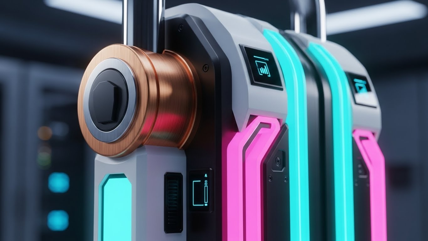
The Visual & Narrative Approach
When discussing security, cartoons and abstractions fail to carry the necessary weight. This style uses photorealistic 3D rendering to create a visceral sense of robustness. A heavy, digital padlock mechanism, rendered in brushed metallic copper and black steel, dominates the frame. The dramatic side-lighting highlights the texture of the metal, communicating invincibility. It translates the intangible concept of "Enterprise Security" into a physical object that feels unbreakable.
Psychological Impact & KPI Focus
- Niche Psychology: Risk officers and IT directors are skeptical of "cloud security." By making digital security look like physical steel, we leverage a powerful Material Metaphor. It taps into the primal association between heavy metal and safety.
- Operational Impact: It is critical for Building Trust & Credibility at the bottom of the funnel. It visually answers the question, "Is my data safe?" without needing a single line of code.
Strategic Implementation & Trade-offs
- Best Use Case: "Security" or "Compliance" pages on the website, and within sales decks.
- Duration: Static Image or 5-second bumper.
- Trade-off: Extremely high production value is required. If the render looks "plastic" or fake, it achieves the opposite effect—making the security seem cheap.
Companies using similar video content -
Bloomreach – Platform – Visualizing AI-driven personalization and customer journey optimization.
DataRobot – AI Platform – Representing automated machine learning model development.
H2O.ai – AI Cloud – Illustrating complex AI algorithms and data intelligence.
14. Dynamic Data Visualization
BOFU | ROI Justification

The Visual & Narrative Approach
ROI is often buried in spreadsheets. This style brings it to the surface as a crowning achievement. We see a steep, upward-trending curve composed of floating crystal bars in turquoise and ruby red. Volumetric lighting from below makes the chart glow, giving the data a "treasure-like" quality. The motion is upward and expansive, visually proving that the investment in the platform yields tangible, valuable growth.
Psychological Impact & KPI Focus
- Niche Psychology: The Economic Buyer (CFO/CEO) cares about value realization. This style transforms boring metrics into Aspirational Assets. It treats data not as a report, but as a reward.
- Operational Impact: It serves as a powerful tool for ROI Justification. In a presentation or proposal, this visual acts as the "emotional hook" that validates the financial logic.
Strategic Implementation & Trade-offs
- Best Use Case: Sales presentations, investor decks, and "Results" case study headers.
- Duration: 5-10 seconds.
- Trade-off: It is purely symbolic. It conveys the feeling of success but doesn't explain how that success was achieved.
Companies using similar video content -
Mendix – Low-Code Platform – Showcasing intuitive drag-and-drop application building.
Appian – Low-Code Platform – Simplifying complex business process automation workflows.
Zoho Creator – Platform – Demonstrating clean, modular app creation and automation.
15. Split Screen: Optimized Reality and UI
BOFU | Overcoming Objections
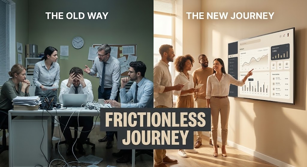
The Visual & Narrative Approach
A classic but highly effective comparative technique. The screen is split: the left side (cool olive green tones) depicts the "Old Way"—a stressed team in a chaotic, paper-filled room. The right side (warm tones) shows the "New Journey"—a happy team in a modern office interacting with a sleek beige and charcoal UI on a large screen. The visual contrast is immediate and binary: Chaos vs. Order, Struggle vs. Ease.
Psychological Impact & KPI Focus
- Niche Psychology: Buyers are often stuck in the "Status Quo Bias." This visual forces a confrontation with the pain of their current reality. It validates their frustration (Left) and offers an immediate escape (Right).
- Operational Impact: Specifically designed for Overcoming Objections regarding the hassle of switching. It visualizes the "Frictionless Journey" to reassure buyers that the transition leads to a better operational state.
Strategic Implementation & Trade-offs
- Best Use Case: Sales decks (the "Before/After" slide) and webinar intros.
- Duration: Static Image or 15-second animation.
- Trade-off: Can feel cliché if the "Old Way" is exaggerated too comically. The struggle must look realistic to resonate with B2B professionals.
Companies using similar video content -
CrowdStrike – Falcon Platform – Visualizing robust endpoint security and threat protection.
Palo Alto Networks – Strata – Representing next-generation firewall and network security.
Zscaler – Zero Trust Exchange – Depicting cloud security as an impenetrable digital fortress.
16. 3D X-Ray Visualization
BOFU | Risk Mitigation

The Visual & Narrative Approach
To prove depth, you must look beneath the surface. This style uses an "X-Ray" effect to reveal the internal structure of a data packet, represented as a cubic container. The outer shell is translucent indigo, revealing a glowing electric lime skeletal structure inside that resembles a shield. This visualizes "Compliance" and internal protocols not as bolt-on features, but as the core DNA of the data structure.
Psychological Impact & KPI Focus
- Niche Psychology: For highly regulated industries (Finance, Healthcare), "black box" solutions are a liability. This style offers Transparency. It reassures the buyer that the system is robust to the core, mitigating fears of hidden vulnerabilities.
- Operational Impact: Supports Risk Mitigation discussions. It visualizes the architecture of safety, making it a tangible differentiator in technical evaluations.
Strategic Implementation & Trade-offs
- Best Use Case: Whitepapers, technical documentation headers, and "Architecture" deep-dive videos.
- Duration: 10-20 seconds.
- Trade-off: Highly technical appeal. It may alienate non-technical marketing buyers who find "backend structure" boring or intimidating.
Companies using similar video content -
Snowflake – Data Cloud – Crystallizing data growth and value realization.
Databricks – Lakehouse Platform – Showing accelerating data processing and analytics ROI.
Alteryx – Analytics Automation – Visualizing automated insights leading to business growth.
17. Aspirational Stock Montage
BOFU | The Economic Buyer

The Visual & Narrative Approach
At the final stage of the deal, you aren't selling software; you are selling a career win. This style focuses entirely on the human outcome. A low-angle shot captures a confident CIO or executive standing in a glass-walled office, looking out at a bright, sun-drenched skyline. The sun flares around their silhouette, bathing the scene in salmon pinks and sky blues. There is no UI, no code—only the feeling of strategic triumph and foresight.
Psychological Impact & KPI Focus
- Niche Psychology: Executives want to be seen as visionaries. This style mirrors their self-image (or desired self-image). It associates the purchase of the platform with personal and professional Leadership.
- Operational Impact: Targets The Economic Buyer by elevating the conversation from "features" to "legacy." It validates the decision as a strategic move that positions the buyer as a forward-thinking leader.
Strategic Implementation & Trade-offs
- Best Use Case: Website "About Us" or "Vision" pages, and the final slide of a sales deck.
- Duration: Static Image or Slow-motion video background.
- Trade-off: It is generic. Without strong brand messaging overlay, it could apply to any industry. It relies entirely on context.
Companies using similar video content -
UiPath – Automation Platform – Contrasting manual, chaotic processes with automated efficiency.
ServiceNow – IT Workflow – Showing "before and after" of streamlined IT operations.
Microsoft Dynamics 365 – Business Applications – Highlighting improved business processes and user experience.
18. Dark Mode UI Showcase
BOFU | The Technical Buyer
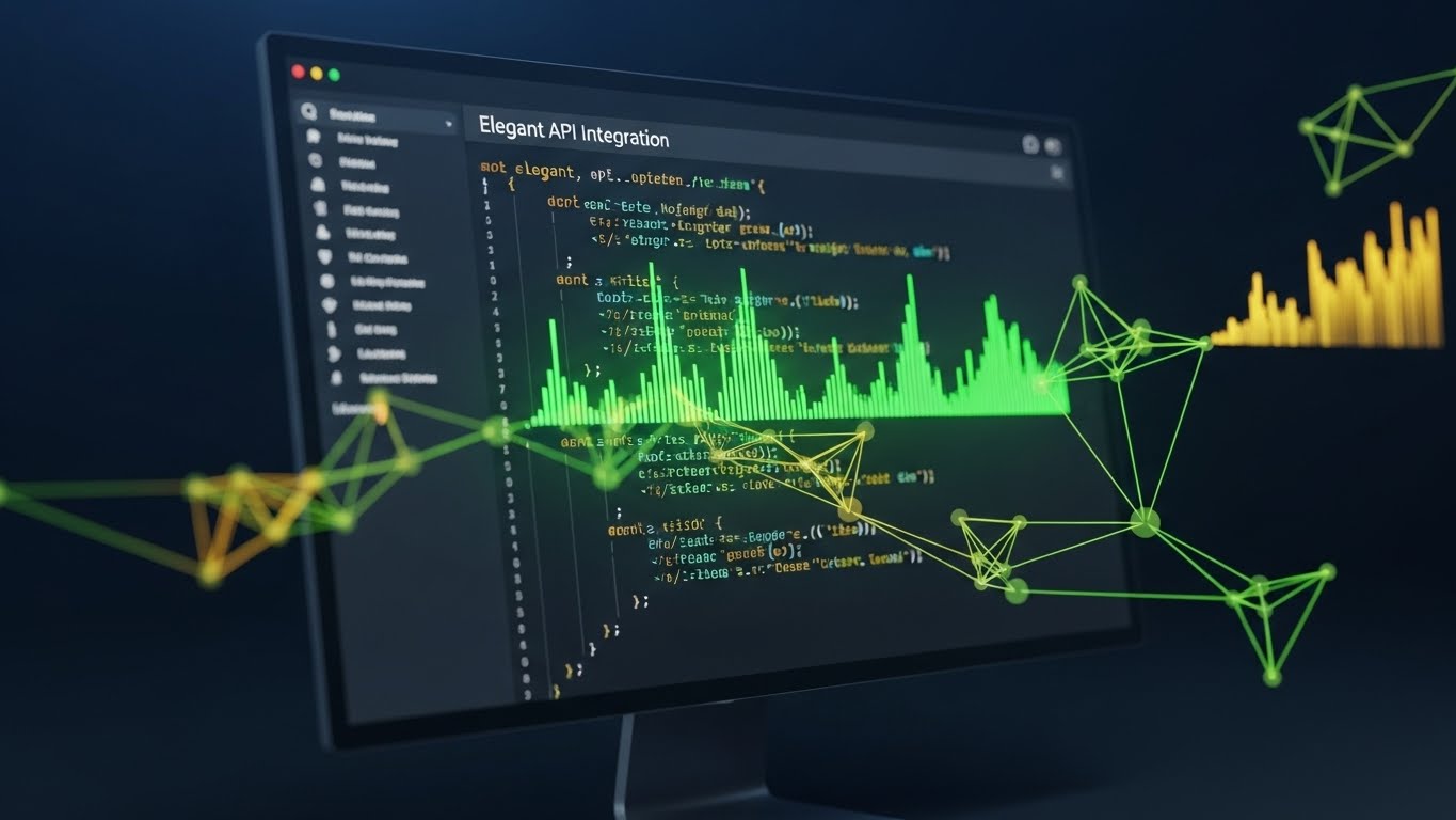
The Visual & Narrative Approach
Developers live in Dark Mode. To win them over, you must speak their visual language. This style presents the UI in a deep matte grey environment, highlighting code syntax and API integration lines in vibrant neon green. The perspective is a direct, immersive screen capture with a subtle monitor glow. It strips away the "marketing fluff" to focus on the elegance of the code and the clean, logical structure of the API.
Psychological Impact & KPI Focus
- Niche Psychology: Developers are allergic to marketing spin. They trust code. This aesthetic signals Developer Ergonomics—that the tool was built by developers, for developers. It respects their preference for high-contrast, low-strain environments.
- Operational Impact: Critical for winning over The Technical Buyer. It proves that the platform is "API-first" and developer-friendly, reducing friction during the technical vetting process.
Strategic Implementation & Trade-offs
- Best Use Case: Developer Portals, API documentation, and technical demo videos.
- Duration: 30-60 seconds.
- Trade-off: Alienates non-technical users who find code intimidating. It should be strictly segmented for technical audiences.
Companies using similar video content -
OneTrust – Privacy & Trust Platform – Revealing internal data compliance and governance structures.
AuditBoard – Platform – Visualizing transparent risk management and internal controls.
Diligent – Governance Cloud – Showing the underlying architecture of secure corporate governance.
19. 2D Line Art Animation
Onboard | Reducing Implementation Friction

The Visual & Narrative Approach
The deal is signed; now the panic sets in ("How hard will this be to install?"). This style uses a continuous, fluid line art animation in powder blue on a charcoal background to soothe that anxiety. A single line morphs smoothly from a plug shape into a socket shape, interlocking perfectly. There are no shadows, no complex textures—just a simple, unbroken flow that represents "Plug-and-Play" connectivity.
Psychological Impact & KPI Focus
- Niche Psychology: Implementation is a major friction point. This fluid, simple motion communicates Ease and Interoperability. It suggests that the system will "flow" into the existing stack without disruption.
- Operational Impact: Targeted at Reducing Implementation Friction in the post-purchase phase. It reassures the team that the integration will be seamless, lowering the barrier to getting started.
Strategic Implementation & Trade-offs
- Best Use Case: "Getting Started" guides, support hubs, and onboarding welcome emails.
- Duration: 5-10 seconds (Looping).
- Trade-off: Too simple for complex feature explanations. It is a metaphorical reassurance, not a technical tutorial.
Companies using similar video content -
SAP – S/4HANA – Evoking visionary leadership and strategic enterprise transformation.
Workday – Enterprise Management Cloud – Portraying executives achieving business success and foresight.
Oracle – Cloud Applications – Illustrating strategic triumph and future-proof business decisions.
20. 2D Animation & UI Composition
Onboard | Self-Serve Onboarding

The Visual & Narrative Approach
The first login is a critical emotional moment. This style combines friendly 2D character animation with flat UI elements to create a celebration. We see a user with semi-realistic proportions smiling as a large, floating "Welcome" card UI pops up. The palette is energetic—hot pink, canary yellow, and cyan. Soft lighting makes the character pop. It frames the onboarding process not as a chore, but as a delightful entry into a new capability.
Psychological Impact & KPI Focus
- Niche Psychology: Users often feel isolated during self-serve onboarding. This friendly, human-centric style provides Positive Reinforcement. It validates their choice and encourages them to take the first step.
- Operational Impact: Drives Self-Serve Onboarding completion rates. By making the experience feel guided and celebratory, it reduces drop-off during the initial setup features.
Strategic Implementation & Trade-offs
- Best Use Case: In-app welcome screens and "First Win" celebration modals.
- Duration: 5-10 seconds.
- Trade-off: Can feel juvenile if overused. It should be reserved for high-level "moments of delight" (welcome, task completion) rather than constant usage.
Companies using similar video content -
GitHub – Enterprise – Highlighting elegant code repositories and developer collaboration.
GitLab – DevOps Platform – Showcasing integrated CI/CD pipelines and code management.
Postman – API Platform – Presenting API development and testing in a developer-friendly environment.
21. 2D Character-Driven Story
Onboard | Trial/Freemium User Activation

The Visual & Narrative Approach
The moment of "Activation"—where a user first realizes the value of the platform—is purely emotional. This style captures that specific "Aha!" moment. We see a close-up, textural illustration of a user’s face, illuminated by the warm, amber glow of their screen. The expression is one of genuine delight and breakthrough. Surrounding them, abstract geometric shapes (triangles, circles) in terracotta and sage green float like digital confetti, visually representing the successful completion of a setup task.
Psychological Impact & KPI Focus
- Niche Psychology: New users often feel anxiety or "imposter syndrome" when learning complex B2B tools. This warm, human-centric visual provides Positive Reinforcement. It mirrors the feeling of competence and success, validating the user's effort.
- Operational Impact: Directly targets Trial/Freemium User Activation. By associating the completion of onboarding tasks with visual delight, we encourage users to push through the initial setup friction.
Strategic Implementation & Trade-offs
- Best Use Case: "Welcome" emails, "First Task Completed" modals, and milestone celebration screens.
- Duration: 5-10 seconds (Looping).
- Trade-off: If the illustration style is too "cartoony," it may feel childish to senior users. It must balance whimsy with professional artistic quality.
Companies using similar video content -
MuleSoft – Anypoint Platform – Illustrating seamless API connectivity and integration simplicity.
Kong – API Gateway – Depicting fluid service mesh connections and plug-and-play ease.
Okta – Identity Cloud – Visualizing effortless identity and access management integration.
22. Hyper-lapse Stock Footage with Data
Onboard | Accelerating Time-to-Value

The Visual & Narrative Approach
To visualize the concept of "Velocity" and rapid implementation, this style utilizes the energy of the real world. A vertical hyper-lapse captures a busy city street at night, where traffic becomes streaks of cobalt blue and tangerine light. Overlaying this kinetic footage are crisp, neon-style graphics: clock faces spinning rapidly and speedometers maxing out. The synthesis of real-world speed with digital metrics communicates a powerful promise: we don't just save time; we accelerate your entire operation.
Psychological Impact & KPI Focus
- Niche Psychology: Implementation lag is a deal-killer. This high-energy visual combats the fear of "sluggish rollout." It triggers a feeling of Momentum and efficiency, reassuring stakeholders that the solution works at the speed of business.
- Operational Impact: Supports Time-to-Value messaging. It is particularly effective in social feeds (TikTok/Shorts) where the visual goal is to stop the scroll with high-contrast motion.
Strategic Implementation & Trade-offs
- Best Use Case: Social media teasers (LinkedIn/Instagram) announcing new speed-focused features or rapid onboarding capabilities.
- Duration: 10-15 seconds (Vertical 9:16).
- Trade-off: The overlay graphics must track perfectly with the camera movement. Poor tracking makes the video look amateurish and disconnects the message.
Companies using similar video content -
Intercom – Customer Messaging Platform – Celebrating user onboarding with friendly welcome screens.
Freshdesk – Customer Support – Showing delightful first-time user experiences in support portals.
Klaviyo – Marketing Automation – Visualizing successful campaign setup with positive reinforcement.
23. Macro UI Micro-Interactions
Retention | Driving Deep Feature Adoption
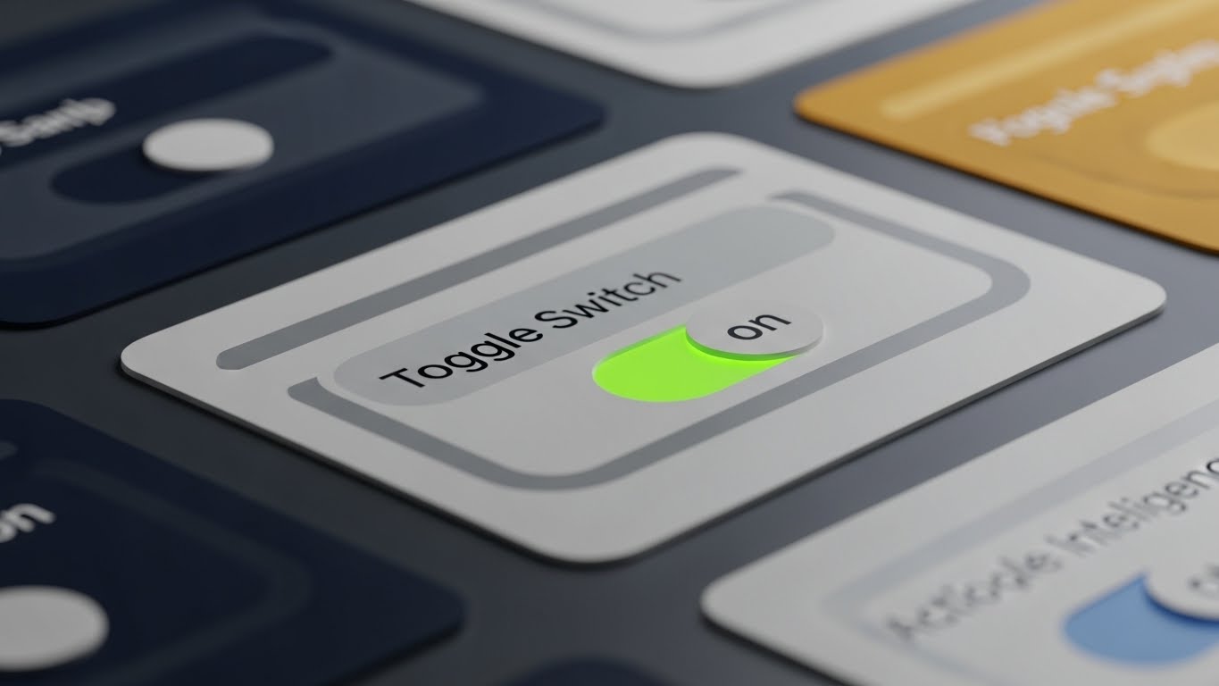
The Visual & Narrative Approach
Adoption lives in the details. This style takes an extreme macro approach, treating the UI like a physical object. We focus on a single "Toggle Switch" in a lilac and deep plum interface. The lighting highlights the beveled edges and the matte texture of the button. As it clicks to "On," a soft neon green light emits from beneath it. This visualizes the satisfaction of control. It transforms a mundane click into a tactile, consequential event.
Psychological Impact & KPI Focus
- Niche Psychology: Power users appreciate craftsmanship. This level of detail signals Quality and Thoughtfulness in product design. It suggests that if the buttons are this well-designed, the backend code must be equally robust.
- Operational Impact: Drives Deep Feature Adoption. By making specific settings or features look "juicy" and satisfying to use, it creates a subconscious desire to explore the interface deeper.
Strategic Implementation & Trade-offs
- Best Use Case: Feature release newsletters, "Pro Tip" emails, and changelog updates.
- Duration: 6-10 seconds.
- Trade-off: It is hyper-specific. It works for highlighting one specific interaction but fails if you need to show a full workflow or dashboard context.
Companies using similar video content -
Lessonly – by Seismic – Capturing the "Aha!" moment of learning and skill acquisition.
Docebo – LMS – Illustrating joyful realization of training completion and knowledge gain.
Pluralsight – Skills – Showing users achieving breakthrough in technical learning.
24. Isometric 3D Workflow
Retention | Reducing Support Overhead

The Visual & Narrative Approach
When users are stuck, they need clarity, not decoration. This style uses a clean, white, isometric 3D perspective to visualize a decision tree or troubleshooting path. It resembles a pristine circuit board where signals (red accent nodes) travel along grey pathways, branching out logically. The shadowless, even lighting ensures maximum legibility. It turns a complex "If/Then" support article into a navigable, physical map.
Psychological Impact & KPI Focus
- Niche Psychology: A confused user is a frustrated user. This orderly, predictable visual style lowers Cognitive Anxiety. It reassures the user that there is a logical path to a solution, promoting a sense of calm and self-reliance.
- Operational Impact: Directly targets Reducing Support Overhead. Visualizing the logic of a problem-solution set helps users self-diagnose, reducing the volume of Level 1 support tickets.
Strategic Implementation & Trade-offs
- Best Use Case: Knowledge Base headers, "Help Center" videos, and technical FAQ pages.
- Duration: 15-30 seconds.
- Trade-off: It can feel clinical. It lacks emotional warmth, so it is strictly functional—best used for support/education rather than marketing.
Companies using similar video content -
Samsara – Connected Operations Cloud – Visualizing urban velocity and accelerated fleet management data.
Geotab – Fleet Management – Highlighting rapid data insights for logistics and efficiency.
FourKites – Supply Chain Visibility – Showing accelerated supply chain data and real-time tracking.
25. Low-Poly 3D Modeling
Retention | Knowledge Base & FAQ Videos

The Visual & Narrative Approach
Education needs to be engaging to be effective. This style reimagines the "Knowledge Base" as a series of low-poly floating islands in periwinkle blue and lemon yellow. Connected by bridges, these geometric landmasses represent different topic clusters (e.g., "Setup," "Analytics," "API"). The playful, faceted aesthetic makes the daunting task of learning a new platform feel like exploring a video game map.
Psychological Impact & KPI Focus
- Niche Psychology: "RTFM" (Read The Manual) is a chore. By gamifying the visual presentation of documentation, we tap into Curiosity. The low-poly style is associated with play and creativity, making learning feel less like work.
- Operational Impact: Increases Knowledge Retention and engagement with educational content. Users are more likely to click through a "map" of islands than a text-heavy list of links.
Strategic Implementation & Trade-offs
- Best Use Case: Video Hub main menu, "Academy" course covers, and FAQ navigation.
- Duration: 10-15 seconds (Looping background).
- Trade-off: The "playful" vibe might seem too casual for highly serious industries (e.g., defense, legal tech). Context is key.
Companies using similar video content -
Amplitude – Product Analytics – Highlighting tactile precision in feature adoption and control.
Pendo – Product Experience – Showcasing satisfying micro-interactions for deep feature engagement.
FullStory – Digital Experience Intelligence – Emphasizing the craft of UI design for user satisfaction.
26. Generative AI Realistic Character Video
Retention | Reducing Churn

The Visual & Narrative Approach
Scale usually kills personalization. This style uses high-fidelity Generative AI to create a realistic, personalized "Customer Success Manager" (CSM). We see a friendly professional looking directly into the camera, smiling warmly, set against a blurred, tasteful home office background in bronze and teal tones. It simulates a 1:1 video call. This allows for scalable, human-like check-ins that would be impossible with human staff alone.
Psychological Impact & KPI Focus
- Niche Psychology: Churn often happens when customers feel ignored. This visual creates a Parasocial Connection, making the user feel "seen" and supported by a human face, even if the interaction is automated. It builds trust through familiarity.
- Operational Impact: Critical for Reducing Churn in the SMB segment where dedicated CSMs aren't financially viable. It humanizes automated retention emails and check-ins.
Strategic Implementation & Trade-offs
- Best Use Case: Automated "Check-in" emails, "Renewal Approaching" reminders, and personalized onboarding welcomes.
- Duration: 15-30 seconds.
- Trade-off: The "Uncanny Valley." If the lip-sync or eye movement is slightly off, it creates distrust. Quality control on the AI generation is paramount.
Companies using similar video content -
Monday.com – Work OS – Visualizing clear project logic and streamlined task management.
ClickUp – Work Management – Illustrating organized workflows for reducing support queries.
Airtable – Connected Apps – Mapping logical data relationships for self-serve problem-solving.
27. Futuristic Neon/Dark Mode
Expansion | Driving Upsell/Cross-sell
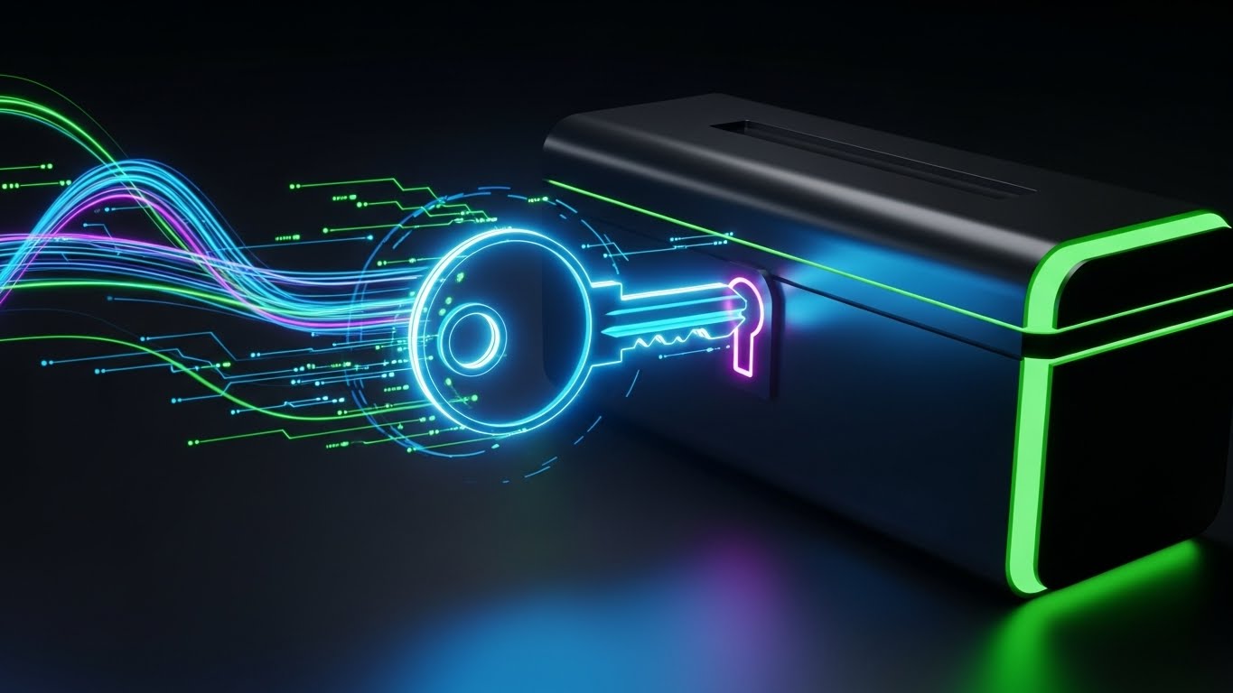
The Visual & Narrative Approach
Upselling is about revealing hidden value. This style uses a high-contrast, "Dark Mode" aesthetic to dramatize the act of unlocking. Against a deep black background, a glowing neon blue and ultraviolet key inserts into a stylized digital chest. Light painting effects create vibrant trails, symbolizing the energy being released. It frames the upsell not as a purchase, but as an access privilege to something powerful and exclusive.
Psychological Impact & KPI Focus
- Niche Psychology: The desire for "Premium" access is a strong motivator. This aesthetic borrows from gaming and cyberpunk culture to signal Exclusivity and Power. It makes the higher tier feel like a "Pro" capability.
- Operational Impact: Drives Upsell/Cross-sell conversion. It visually distinguishes the "Enterprise" or "Pro" features from the standard interface, creating desire through visual differentiation.
Strategic Implementation & Trade-offs
- Best Use Case: In-app paywalls, "Feature Locked" screens, and upgrade prompt modals.
- Duration: 5-10 seconds.
- Trade-off: Can be aggressive. If used too frequently, it feels like a "cash grab." It should be reserved for high-value feature unlocks.
Companies using similar video content -
Confluence – Knowledge Base – Gamifying documentation as structured, explorable content islands.
Zendesk – Help Center – Presenting support articles as an engaging, navigable learning map.
Freshservice – ITSM – Visualizing IT knowledge base topics as interconnected learning paths.
28. Holographic UI over 3D Render
Expansion | Driving Referrals & Advocacy

The Visual & Narrative Approach
To build advocates, you must celebrate their status. This style combines a tangible 3D object—a golden trophy—with a futuristic, holographic UI field. The trophy sits on a pedestal, while the hologram displays a network of nodes (referrals) spreading out in silver light. It visualizes the user's influence and status within the community. The mix of solid gold and ethereal light suggests that their digital advocacy has real-world weight and value.
Psychological Impact & KPI Focus
- Niche Psychology: Advocacy is driven by Status and Recognition. This visual elevates the user, positioning them as a champion. It appeals to the ego and the desire to be recognized as a thought leader.
- Operational Impact: Increases Referrals and Advocacy. It gamifies the referral process, making the act of sharing the software feel like achieving a high score or winning an award.
Strategic Implementation & Trade-offs
- Best Use Case: "Refer a Friend" landing pages, Ambassador Program invites, and "Power User" certification badges.
- Duration: Static Image or Looping Cinemagraph.
- Trade-off: The trophy metaphor is cliché if not executed with high-end textures. It must look like a premium award, not a plastic toy.
Companies using similar video content -
Gainsight – Customer Success Platform – Humanizing automated customer check-ins and support.
ChurnZero – Customer Success – Creating personalized, human-like retention messages at scale.
Intercom – Customer Messaging Platform – Providing scalable, personalized onboarding and support.
29. 3D Parallax UI Presentation
Expansion | In-App Upsell
The Visual & Narrative Approach
When selling an "Ecosystem" or a suite of products, flat screenshots fail to convey scope. This style uses 3D parallax to stack multiple UI screens in deep space. The foreground screens (the current module) are sharp, while background screens (the upsell modules) blur slightly in rust orange and steel blue. As the camera pans, the parallax effect reveals the depth of the platform. It suggests that what the user has is just the tip of the iceberg.
Psychological Impact & KPI Focus
- Niche Psychology: Buyers want a future-proof solution. This visual communicates Scalability. It shows that the platform is deep and expansive, capable of growing with their needs (and budget).
- Operational Impact: Supports In-App Upsell by visually teasing the "rest of the suite." It creates curiosity about the blurred, background modules, prompting exploration.
Strategic Implementation & Trade-offs
- Best Use Case: "Products" landing pages, Suite overview videos, and "What's New" presentations.
- Duration: 15-20 seconds.
- Trade-off: Requires high-resolution UI assets. If the "blurred" background screens are just generic rectangles, the effect of a "connected ecosystem" is lost.
Companies using similar video content -
Stripe – Payments – Dramatizing unlocking premium payment features and API access.
Zuora – Subscription Management – Highlighting exclusive access to advanced billing capabilities.
Recurly – Subscription Billing – Visualizing unlocking higher-tier subscription benefits.
30. Abstract 2D Motion Graphics
Expansion | Proactive Support/Announcements

The Visual & Narrative Approach
Software is never finished; it evolves. This style uses abstract, liquid motion to visualize continuous improvement. A square shape fluidly morphs into a circle, then a star, in a spectrum gradient against a clean white background. The motion is effortless and constant. It represents the concept of "Agility" and the seamless delivery of updates and patches. It reassures users that the platform is a living, adapting entity.
Psychological Impact & KPI Focus
- Niche Psychology: Users fear stagnation and "abandonware." This constant, fluid motion signals Vitality and Innovation. It reassures the customer that the vendor is proactive, constantly refining the tool behind the scenes.
- Operational Impact: Effective for Proactive Support/Announcements. It frames updates and patches not as "fixes" (implying something was broken) but as "evolution" (implying growth).
Strategic Implementation & Trade-offs
- Best Use Case: Blog headers for release notes, system status pages, and "Roadmap" presentations.
- Duration: 5-10 seconds (Looping).
- Trade-off: It is purely metaphorical. It communicates the concept of change but doesn't show what has changed. It sets the mood for the technical details that follow.
STRATEGIC KNOWLEDGE BASE: The Visual Operations Doctrine
This section synthesizes the 30 visual styles into a cohesive business framework. It moves beyond "aesthetics" to define how a B2B Digital Experience Platform must operationally deploy visuals to drive ROI, adoption, and efficiency.
STRATEGIC ALIGNMENT & VISUAL ARCHITECTURE (The "Pre-Production" Phase)
Before a single pixel is rendered, the visual strategy must be aligned with the cognitive reality of the user.
- The Cognitive Load Audit: Do not just create videos; audit the complexity of your current training. If a feature takes 500 words to explain, it requires a Style 12 (Clean UI) visualization. If a concept is abstract (like "Headless Architecture"), it demands Style 7 (Abstract 2D). Map the "Visual Density" to the "Conceptual Density."
- Role-Based Visual Mapping: Different stakeholders process information differently. The Economic Buyer (CFO) responds to Style 14 (Dynamic Data Viz)—upward trends, clean outcomes. The Technical Buyer (DevOps) responds to Style 18 (Dark Mode UI)—code syntax, dark environments. Never serve a CFO a code-heavy video; never serve a Dev a marketing fluff piece.
- The "Glanceability" Standard: In a SaaS environment, users don't "watch" content; they glance at it while working. Visuals (especially Style 23 Micro-Interactions) must be designed for <2 second comprehension. If the user has to pause and rewind to understand the UI overlay, the visual has failed.
- Brand Voice Consistency: Your "Visual Voice" must be as defined as your copy voice. If your marketing uses Style 1 (Abstract Organic) but your support portal uses Style 25 (Low Poly), you create a disjointed brand experience. Advids specializes in conducting this "Visual Audit" to ensure a unified visual language from the Homepage to the Helpdesk.
- Legacy System Integration: The biggest hurdle in DXP sales is the "Replacement Fear." Use Style 2 (Minimalist Vector) to visualize the dissolving of silos rather than the destruction of legacy systems. Frame the new platform as a "connector" (Style 19), not a "destroyer," to lower internal resistance.
- Accessibility First: Visuals must work without sound. 85% of B2B buyers watch video with the sound off (LinkedIn/Mobile). Styles like Style 3 (Kinetic Typography) are essential because they carry the narrative weight through text, ensuring the message lands even in a muted environment.
- The Mobile-First Mandate: Executive decision-makers often approve deals via mobile. Ensure complex styles like Style 11 (Abstract 3D AI) are legible on a 6-inch screen. Fine lines and small UI text will vanish; prioritize high-contrast elements and bold movements for executive summaries.
- Standardization vs. Customization: For core features, use standardized, scalable styles (like Style 15 Split Screen). For high-value ABM campaigns, invest in bespoke Style 26 (Gen AI Personality). Meaningful personalization yields the highest ROI in the "Expansion" phase.
- The Cross-Departmental Bridge: Use visuals to unify terminology. Sales calls it "Revenue Intelligence," Product calls it "Analytics Module," Support calls it "The Dashboard." A unified visual (Style 13 Photorealistic Render) creates a single "Mental Image" that aligns all departments around the same truth.
- The Advids Strategic Audit: Building this architecture requires an outside perspective. Internal teams are often too close to the product to see the complexity. Advids acts as the strategic architect, defining the "Visual Operating System" that ensures every asset serves a measurable business goal.
OPERATIONAL ADOPTION & IMPLEMENTATION (The "Deployment" Phase)
How to embed these visual assets into the workflow to reduce friction and accelerate time-to-value.
- Overcoming "Big Brother" Anxiety: In platforms involving data tracking or AI monitoring, user anxiety is high. Use Style 16 (3D X-Ray) to show transparency. Visualizing the "black box" builds trust. Show how the data is processed to alleviate fears of surveillance or misuse.
- The Micro-Learning Shift: Replace the 50-page PDF manual with a library of 30-second Style 7 (Rapid UI Montage) clips. Modern users learn "Just-in-Time." Embed these clips directly into the UI (via tooltips) to provide help exactly when the friction occurs.
- Gamification of Training: Transform onboarding from a chore into a game. Use Style 25 (Low Poly) visual maps to track progress. Visualizing the "Learning Journey" as a navigable world increases completion rates for certification programs.
- Just-in-Time Support: Reduce Level 1 support tickets by embedding Style 24 (Isometric Workflow) visuals in the chat widget. If a user types "Integration Error," auto-serve a visual decision tree. Visual troubleshooting is 60% faster than text-based troubleshooting.
- Reducing Implementation Friction: The period between "Signed Contract" and "Go Live" is the "Valley of Death." Distinct Style 19 (Line Art) animations in welcome emails can soothe anxiety, visually promising a "Plug-and-Play" experience rather than a painful integration project.
- Remote Onboarding: For global teams, physical training is impossible. Use Style 4 (2D Over Live Action) to bridge the gap. Show real humans interacting with the software to create a sense of connection and culture, even for remote employees.
- Standard Operating Procedures (SOPs): Text-based SOPs are ignored. Convert critical SOPs into Style 12 (Clean UI) process flows. A visual SOP leaves no room for interpretation, ensuring consistent execution of complex tasks across distributed teams.
- Feedback Loops: Use interactive video elements. After a Style 20 (Welcome Animation), prompt the user for a reaction. Visualizing their feedback (e.g., a thumbs up animating into the UI) creates a sense of co-creation and ownership.
- Scalable Localization: If you are a global SaaS, text in video is a liability (translation costs). Prioritize "Visual Metaphor" styles (Style 1, 6, 8) that rely on universal symbols (keys, shields, graphs) rather than English text. This drastically reduces the cost of localizing assets for EMEA or APAC markets.
- Leadership Communication: When rolling out a major platform change, the announcement should come from leadership. Use Style 17 (Aspirational Stock) to frame the update as a strategic win. Visualizing the outcome (a happy, productive team) rallies the troops better than a technical changelog.
MEASURING IMPACT & FUTURE-PROOFING (The "ROI" Phase)
Measuring the success of the visual strategy and preparing for the next wave of technology.
- Beyond "Views": Vanity metrics (views) are useless in B2B. Measure "Time-to-Competency." Did the user who watched the Style 24 troubleshooting video resolve their ticket? Did the cohort exposed to Style 21 onboarding activate faster? Tie visuals to operational speed.
- The "Idle Time" Metric: High idle time in a software suggests confusion. Correlate UI idle time with the deployment of Style 23 (Micro-interactions). Better visual cues should lead to faster, more confident clicking and reduced hesitation.
- Compliance Velocity: In regulated industries (FinTech/HealthTech), speed of compliance is money. Measure how fast the organization reaches 100% compliance after releasing a Style 13 (Security) explainer versus a text memo. Visuals typically accelerate compliance adoption by 2-3x.
- Retention and Churn (LTV): Churn is often a failure of perceived value. Use Style 27 (Neon Unlock) styles in quarterly business reviews (QBRs) to visually remind clients of the "hidden value" they are receiving. Visualizing ROI (Style 14) directly impacts Net Dollar Retention (NDR).
- The AI Visual Frontier: Generative AI is changing content production. Start experimenting with Style 26 (Gen AI Characters) for personalized scale. The ability to generate custom onboarding videos for each account will soon be a competitive baseline, not a differentiator.
- Scalability of Assets: Don't build "throwaway" videos. Build a "Visual Component Library." The 3D assets created for Style 29 (Parallax UI) should be reusable for your trade show booth and your sales deck. Advids ensures your assets are built as modular components, not static renders.
- The Advids Partnership: Visual strategy is not a one-time project; it is an operational discipline. As your platform evolves, your visual language must adapt. Advids serves as the long-term partner, managing the "Visual Version Control" to ensure your training materials never lag behind your code.
- Benchmarking Success: Compare your "Visual Density" against competitors. If they use generic stock footage and you use Style 5 (Wireframe Transition), you win the "Competence Heuristic." Buyers instinctively trust the vendor who explains the complex more clearly.
- The ROI of Safety: For platforms involving physical logistics or hardware, safety is a key metric. Visual training (Style 8) reduces accidents and errors. Quantify this impact: "Visual training reduced critical user errors by 40%." This is a hard ROI data point for the Economic Buyer.
- Final Call to Innovation: Stop treating video as "Marketing Content." Treat it as "Visual Infrastructure." In the API economy, the company that best visualizes the invisible connections wins the market. Your code builds the platform; your visuals build the bridge to the customer.
End of Part 3.
This concludes the Comprehensive Video Style Guide. By implementing these 30 visual styles and the Strategic Knowledge Framework, B2B DXP and SaaS leaders can close the Translation Gap, accelerate adoption, and turn complex infrastructure into a compelling market narrative.
Companies using similar video content -
DocuSign – Agreement Cloud – Visualizing digital agreements and trust as a holographic trophy.
Qualtrics – Experience Management – Elevating customer feedback and advocacy to a digital award.
Medallia – Experience Cloud – Showcasing customer experience champions with holographic recognition.
Author & Editor Bio


