
Introduction: Visualizing the Engine of Global Trade
The B2B commerce landscape is undergoing a tectonic shift. We have moved beyond the age of the digital catalog into the era of the algorithmic supply chain. With the global B2B ecommerce market projected to reach a staggering $32.1 trillion in 2025, the opportunity for platforms that can reduce friction is immense. However, a critical challenge remains: the "Physical/Digital Divide."
Buyers in manufacturing, logistics, and wholesale operate in a world of tangible assets—pallets, containers, and heavy machinery. Software, by contrast, is invisible. The "Digital Operations Architect"—your target buyer—often struggles to trust a sleek dashboard to manage their gritty reality. They are skeptical of "vaporware" and overwhelmed by complexity.
Strategic visualization is the bridge. It is no longer enough to list features; you must visualize flow. The data confirms this shift: 73% of B2B buyers are now willing to spend over $50,000 per order through self-service digital channels—but only if the visual experience instills absolute confidence. Your video content is often the only "sales engineer" a prospect will meet before making a shortlist decision.
This guide provides a strategic visual framework for the modern B2B platform. We have curated 30 distinct video styles, mapped to the buyer's psychological needs at every stage of the funnel. From the "Digital Twin" precision of Generative AI to the "Cognitive Ease" of minimalist vectors, these styles are designed to turn abstract code into concrete business confidence.
1. The Network Effect: Visualizing the Invisible
TOFU | Brand Awareness

The Visual & Narrative Approach
To explain the intangible "nervous system" of global trade, we utilize a sophisticated "Abstract 2D Motion" language. The visual anchor features a Deep Navy background where concentric orbital lines in Gold and Teal rotate and interlock. These fluid shapes function as stylized digital nodes, creating a mesmerizing rhythm that mimics the continuous flow of data across continents. A bright central pulse connects the clusters, symbolizing the synchronization of disparate systems (e.g., ERP and WMS) without the visual clutter of a literal map.
Psychological Impact & KPI Focus
- Niche Psychology: In a fragmented industry, "integration" is the primary anxiety. This abstract motion serves as a visual metaphor for seamlessness. It bypasses the technical complexity of APIs and webhooks, speaking directly to the buyer's desire for harmony and flow.
- Operational Impact: It reduces Cognitive Load, allowing the viewer to feel the stability of the network before they understand the technical specs.
- Primary KPI: Brand Recall (Ad Lift).
Strategic Implementation & Trade-offs
- Best Use Case: LinkedIn Video Ads (15-20 seconds) to stop the scroll with aesthetic purity.
- Trade-off: It is excellent for establishing a "High-Tech" mood but too abstract for explaining specific features. Use it to open doors, not to close technical deals.
Companies using similar video content -
E2open – Networked Supply Chain – Connects global trading partners and data flows.
Descartes Systems Group – Global Logistics Network – Visualizes interconnected logistics data and systems.
Elemica – Supply Chain Operating Network – Facilitates digital collaboration across supply chains.
2. The Digital Twin: Bridging Physical & Virtual
TOFU | Category Creation

The Visual & Narrative Approach
This style bridges the gap between the physical warehouse and the digital cloud. We open with a wide, establishing drone shot of a massive logistics facility at dawn, bathed in "High-Key" sunlight. As the camera tracks forward, the physical cardboard boxes on the shelves undergo a transformation, overlaid by glowing, translucent digital cubes in "Steel Blue" and "Safety Orange." This visual metaphor literally depicts the Digital Twin concept—where every physical asset has a real-time digital counterpart.
Psychological Impact & KPI Focus
- Niche Psychology: This style targets the C-Suite's aspiration. It validates their vision of a modernized, tech-forward operation. By visually blending the grit of the warehouse with the glow of the software, it bridges the Physical/Digital Divide.
- Operational Impact: It signals "Enterprise-Grade" capability. It assures the viewer that the platform is robust enough to handle the weight and scale of industrial logistics.
- Primary KPI: Category Creation (Share of Mind).
Strategic Implementation & Trade-offs
- Best Use Case: Connected TV (CTV) spots or Keynote Openers (30-60 seconds).
- Trade-off: High resource intensity. While Generative AI lowers production costs, maintaining consistent lighting and perspective requires precise prompt engineering.
Companies using similar video content -
Siemens Digital Industries Software – Digital Twin Solutions – Creates virtual models of physical assets and processes.
PTC – ThingWorx – Bridges IoT data with physical operations for insights.
Dassault Systèmes – 3DEXPERIENCE Platform – Virtualizes product development and manufacturing operations.
3. Signal vs. Noise: Simplifying the Supply Chain
TOFU | Market Education
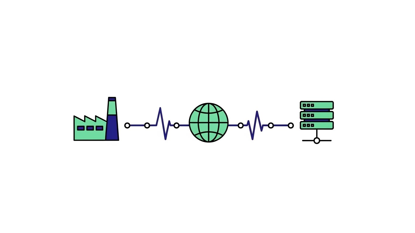
The Visual & Narrative Approach
Complexity is the enemy of conversion. This style combats it with radical simplicity. On a "Clean White" background, a stylized supply chain is reduced to its absolute essentials: a factory icon, a globe, and a server stack, connected by a single vector line. The palette is restricted to "Mint Green" and "Navy Blue" with zero gradients. The only motion is a simple pulse of dots along the line, representing data transfer.
Psychological Impact & KPI Focus
- Niche Psychology: This style offers visual relief. It reassures the Operations Manager that the solution is linear, logical, and manageable. It suggests that the platform untangles the "spaghetti" of legacy systems into a straight line.
- Operational Impact: Highly effective for Market Education, as it communicates the core value proposition ("We connect A to B") in under 3 seconds.
- Primary KPI: Time to Comprehension.
Strategic Implementation & Trade-offs
- Best Use Case: Website Hero sections or "How it Works" simplifications.
- Trade-off: It lacks emotional depth. It explains what you do, but not how it feels to use the product. It is purely functional.
Companies using similar video content -
Odoo – ERP & WMS – Simplifies business processes with integrated modules.
Acumatica – Cloud ERP – Streamlines operations for manufacturing and distribution.
Sana Commerce – B2B eCommerce – Integrates e-commerce with ERP for clarity.
4. Visual Volume: Kinetic Typography for Growth
TOFU | Skippable Pre-Roll Ad

The Visual & Narrative Approach
In the attention economy, you have 5 seconds to hook the viewer. This style uses massive, blocky 3D letters spelling "SCALE" that physically fill the screen. The "Vibrant Red" and "Pure White" palette creates an urgent, high-energy contrast. The text blocks are tilted at a dynamic angle with motion blur, suggesting they are hurtling toward the viewer. The background is minimal to keep the focus strictly on the message.
Psychological Impact & KPI Focus
- Niche Psychology: The sheer size and speed of the typography trigger a physiological arousal response. It taps into the B2B leader's anxiety about "being left behind" and offers speed as the antidote.
- Operational Impact: It communicates "Speed to Market" and "High Volume Processing." It creates a visceral sense of momentum that static text cannot achieve.
- Primary KPI: View-Through Rate (VTR).
Strategic Implementation & Trade-offs
- Best Use Case: YouTube Skippable Pre-Roll Ads (6-15 seconds).
- Trade-off: Zero nuance. It cannot explain how you scale, only that you help scale. It is a hype tool, not an educational one.
Companies using similar video content -
Shopify Plus – Enterprise B2B eCommerce – Emphasizes rapid scaling for large businesses.
BigCommerce – B2B Edition – Highlights fast growth and high-volume transactions.
commercetools – Headless B2B Commerce – Focuses on speed and flexibility for scaling.
5. Vertical Velocity: Arresting the Scroll
TOFU | Vertical Social Organic
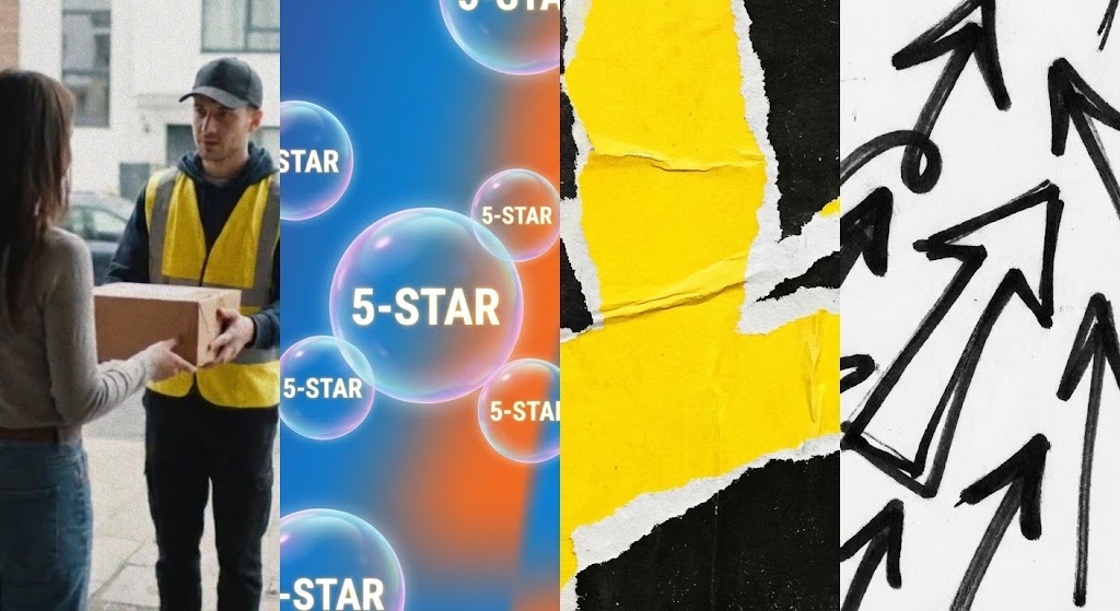
The Visual & Narrative Approach
B2B does not have to be boring. This style embraces the energetic collage aesthetic of TikTok/Reels. It rapidly cuts between real footage of a courier handing over a package and 3D animated bubbles of "5-Star" ratings popping up. Gritty torn-paper textures in "Vivid Yellow" and "Black" overlay the scene, while graffiti-style arrows point upward. It creates a "Raw" and "Authentic" vibe.
Psychological Impact & KPI Focus
- Niche Psychology: This style appeals to the younger demographic of B2B buyers (Millennials/Gen Z) who value authenticity over polish. The "5-Star" imagery triggers a Social Proof bias, implying that the platform delivers happiness, not just software.
- Operational Impact: It visualizes "Customer Satisfaction" (CSAT) and "Last Mile Delivery" success. It shifts the focus from the software to the outcome of the software.
- Primary KPI: Engagement Rate (Likes/Shares).
Strategic Implementation & Trade-offs
- Best Use Case: TikTok or Instagram Reels (15-30 seconds).
- Trade-off: May be perceived as too informal for conservative enterprise clients (e.g., Defense/Banking). Use selectively for D2C-focused B2B brands.
Companies using similar video content -
ShipBob – Omnichannel Fulfillment – Showcases customer satisfaction in delivery outcomes.
Flexport – Freight Forwarding Platform – Visualizes efficient global shipping and logistics.
DHL Supply Chain – Contract Logistics – Highlights successful last-mile delivery and customer experience.
6. The Cloud Manifest: Intangible Value Made Solid
TOFU | Shaping Brand Perception

The Visual & Narrative Approach
To represent the vastness of global data, we turn to the abstract. In an infinite "White" void, thousands of "Silver" and "Cyan" particles flow like liquid along invisible highways. These particles aggregate to form temporary, recognizable structures—specifically shipping containers—before dissolving back into the stream. This represents the fluidity of cloud commerce and the tangible assets it manages.
Psychological Impact & KPI Focus
- Niche Psychology: This style projects Sophistication and Intelligence. The particle animation suggests that the platform is dynamic, able to adapt to changing market conditions.
- Operational Impact: It visualizes "Big Data Analytics" and "Predictive Modeling." It suggests that the platform is not just storing data, but actively shaping it.
- Primary KPI: Brand Perception and Thought Leadership.
Strategic Implementation & Trade-offs
- Best Use Case: Display Ads or Website Backgrounds (Looping).
- Trade-off: High conceptual load. If the viewer doesn't understand the metaphor, it's just pretty moving shapes. Requires a strong headline to anchor the meaning.
Companies using similar video content -
Oracle – SCM Cloud – Visualizes vast cloud-based supply chain data and insights.
Kinaxis – RapidResponse – Transforms complex data into actionable supply chain insights.
Stord – Cloud Supply Chain – Manifests cloud-native logistics infrastructure and services.
7. Isometric Logic: The Architecture of Success
TOFU | Demand Gen

The Visual & Narrative Approach
When you need to show the "God's eye view" of a process, isometric design is the standard. The visual features a stylized Blue and Cyan construction site or logistics hub with clean vector lines. Crucially, as the structure builds, bright Green Checkmark bubbles pop up rhythmically above key stations. The motion is mechanical and precise, visualizing the "Digital Twin" of a factory floor where every step is validated.
Psychological Impact & KPI Focus
- Niche Psychology: Isometric design provides a sense of Control and Omniscience. The viewer sees the entire process at once, which is comforting for operations managers who fear blind spots. The recurring green checkmarks serve as positive reinforcement.
- Operational Impact: Excellent for communicating Process Flow and System Architecture in a non-threatening way. It promises a glitch-free, verified workflow.
- Primary KPI: Lead Generation and Content Downloads.
Strategic Implementation & Trade-offs
- Best Use Case: LinkedIn Organic Posts or Infographic Videos.
- Trade-off: Can feel "start-up" focused. Enterprise clients might prefer higher fidelity. The elements must look specific to the industry, not like stock clip art.
Companies using similar video content -
Manhattan Associates – Warehouse Management System – Depicts organized warehouse operations and processes.
Körber Supply Chain – WMS & Robotics – Illustrates automated workflow architecture and efficiency.
Dematic – Automated Material Handling – Shows precise, controlled logistics processes and systems.
8. The Trust Bridge: From Blueprint to Deployment
MOFU | Product Differentiation
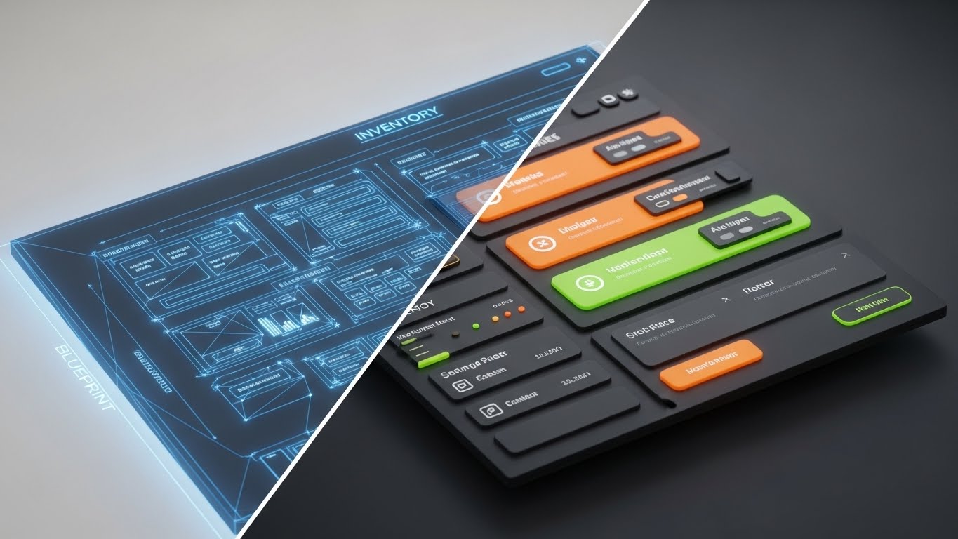
The Visual & Narrative Approach
This style directly addresses the skepticism of "vaporware." We use a split-screen composition. The left half displays a "Blueprint Blue" wireframe sketch of an inventory dashboard—the plan. The right half reveals the fully rendered, photorealistic interface with glossy buttons and vivid data visualization. A glowing vertical line sweeps across the screen, wiping away the wireframe to reveal the "Reality."
Psychological Impact & KPI Focus
- Niche Psychology: Targeted at CTOs and Developers who value Architecture and UI Quality. It proves that the platform is built on solid foundational logic (the blueprint) but delivers a premium user experience (the render).
- Operational Impact: Visualizes "Customization Capabilities" and "Robust Architecture." It implies that the software is engineered, not just designed.
- Primary KPI: Conversion Rate on Feature Pages.
Strategic Implementation & Trade-offs
- Best Use Case: Website Feature Pages or Sales Decks.
- Trade-off: Requires exact matching between the wireframe asset and the final UI shot. Any misalignment breaks the illusion of seamlessness.
Companies using similar video content -
Spryker – Composable Commerce – Demonstrates robust, modular platform architecture.
Adobe Commerce – B2B eCommerce – Showcases development lifecycle transparency and UI quality.
commercetools – Headless B2B Commerce – Proves solid foundational logic to user interface.
9. Cognitive Ease: The Art of White Space
MOFU | Feature Education
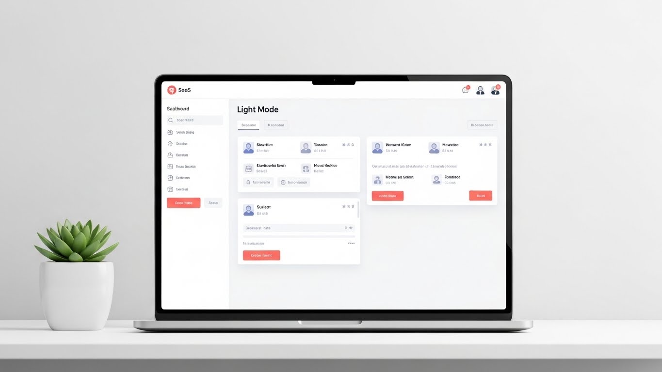
The Visual & Narrative Approach
This visualization focuses on the "Daily Driver" experience. It presents a pristine, high-resolution view of the SaaS dashboard in "Light Mode." The palette is dominated by white and light grey, with "Royal Blue" accents highlighting actionable areas. The screen displays a grid of product catalogs with distinct thumbnails. Soft drop shadows lift the UI cards off the background, adding depth without clutter.
Psychological Impact & KPI Focus
- Niche Psychology: For the end-user (procurement officer), the interface is their workspace. This style promises a Low Stress Environment. It looks clean, organized, and manageable, countering the dread of "clunky enterprise software."
- Operational Impact: Visualizes "User Experience (UX)" and "Catalog Management." It demonstrates that the tool is modern and easy to adopt.
- Primary KPI: Product Adoption and User Onboarding.
Strategic Implementation & Trade-offs
- Best Use Case: Email Marketing Headers or Onboarding Videos.
- Trade-off: It is literal. It doesn't sell the "dream" as much as the "tool." It needs to be paired with benefit-driven copy.
Companies using similar video content -
NetSuite – Cloud ERP – Presents a clean, intuitive interface for business management.
Epicor – ERP for Manufacturing – Offers a low-cognitive load user experience.
Infor – CloudSuite – Provides a streamlined, organized dashboard for operations.
10. The Haptic Digital: Feeling the Click
MOFU | Feature Education

The Visual & Narrative Approach
We zoom in—extreme macro. The screen is filled by a single "Submit Order" button. It features a gradient from "Emerald Green" to lime, appearing slightly glossy/glassy. A cursor hovers, casting a shadow, and clicks. The background is a creamy white bokeh, blurring out distraction to focus entirely on this single action.
Psychological Impact & KPI Focus
- Niche Psychology: This triggers the Completion Bias. It focuses on the satisfaction of "getting it done." The high fidelity suggests precision and responsiveness—qualities attributed to the entire platform.
- Operational Impact: Visualizes "One-Click Execution" and "Frictionless Checkout." It emphasizes the speed of transaction.
- Primary KPI: Feature Usage Rates and Training Comprehension.
Strategic Implementation & Trade-offs
- Best Use Case: Product Launch Trailers (The Climax) or Feature Highlight Reels.
- Trade-off: Cannot stand alone. A video of just a button is boring; it must be a cut-away shot used to punctuate a larger narrative.
Companies using similar video content -
Coupa – Business Spend Management – Emphasizes frictionless procurement and spend actions.
SAP Ariba – Procurement Solutions – Highlights one-click execution for purchasing processes.
HighRadius – Autonomous Finance – Focuses on quick, decisive financial actions and automation.
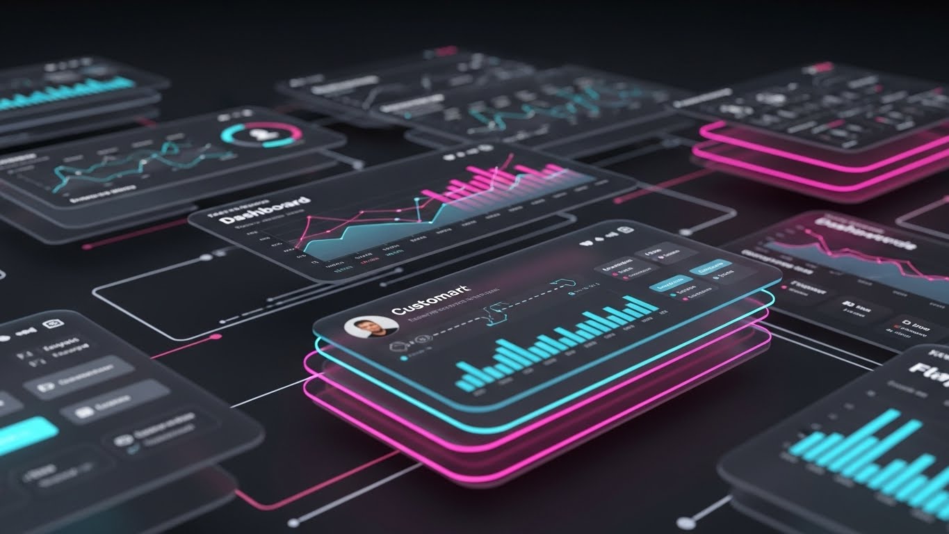
11. The Layered Truth: Depth in Demonstration**
MOFU | Driving Demo Requests

The Visual & Narrative Approach
To transition the buyer from "interested" to "invested," we must demonstrate platform depth. Using a 3D Parallax technique, we float multiple UI screens in a clean, abstract grey space. The foreground screen is razor-sharp, displaying a "Premium Analytics" dashboard with "Soft Violet" and white data visualizations. Behind it, secondary layers (Inventory, CRM) are slightly blurred. As the camera drifts, the layers move at different speeds, creating a visceral sense of three-dimensional depth and architectural substance.
Psychological Impact & KPI Focus
- Niche Psychology: The "Digital Operations Architect" is wary of "hollow" shells—software that looks pretty but lacks backend logic. This visual metaphor subconsciously signals Robustness. It implies that beneath the surface interface lies a deep, interconnected ecosystem of capabilities.
- Operational Impact: Visualizes Unified Commerce and Data Drilling. It reduces the cognitive load of understanding a complex suite by organizing it spatially.
- Primary KPI: Demo Request Conversion Rate.
Strategic Implementation & Trade-offs
- Best Use Case: Landing Page Hero Videos or "Platform Tour" sections.
- Trade-off: Requires high-resolution, pixel-perfect UI assets. If the interface design is outdated, this high-fidelity style will highlight imperfections rather than hide them.
Companies using similar video content -
SAP – S/4HANA – Presents multi-module integration and deep analytics capabilities.
Oracle – ERP Cloud – Showcases interconnected business applications and data drilling.
Infor – CloudSuite – Demonstrates comprehensive platform capabilities and unified commerce.
12. The Operational Microcosm: Controlling Complexity
MOFU | The Functional Buyer
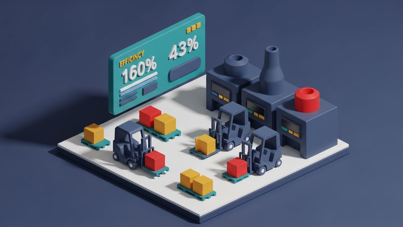
The Visual & Narrative Approach
For the functional buyer managing the warehouse floor, we use a "God's Eye View." Rendered in a tactile "Claymorphism" style, the visual depicts a pristine, miniature isometric factory. Tiny, stylized forklifts move pallets in perfect synchronization on a clean white floor. Floating above the machinery is a Teal interface panel displaying a "160% Efficiency" metric. The lighting is soft and directional, casting realistic shadows that ground the digital data in physical reality.
Psychological Impact & KPI Focus
- Niche Psychology: This style acts as a visual tranquilizer. It takes the noisy, chaotic reality of logistics and renders it as a cute, manageable, and highly organized system. It validates the buyer's desire for Orchestration and Control.
- Operational Impact: Visualizes Warehouse Management System (WMS) integration and Throughput Optimization. It turns the abstract promise of "efficiency" into a visible fact.
- Primary KPI: Whitepaper Downloads / Time on Site.
Strategic Implementation & Trade-offs
- Best Use Case: Technical Solution Briefs or "How it Works" video loops.
- Trade-off: The stylized aesthetic can appear "toy-like." To maintain authority, the metrics displayed must be serious and the workflow logic must be accurate.
Companies using similar video content -
Swisslog – Warehouse Automation – Visualizes miniature, orchestrated factory efficiency.
GreyOrange – Fulfillment Automation – Depicts controlled robotic warehouse operations.
Honeywell Intelligrated – Automation Solutions – Illustrates optimized material flow and throughput.
13. Global Backbone: The Holographic Network
MOFU | Competitive Displacement

The Visual & Narrative Approach
When competing against legacy giants, you must look like the future. We open on a photorealistic, sterile white server room—the physical home of the cloud. Projecting from a sleek rack is a complex, semi-transparent holographic globe in Electric Blue. Glowing white arcs trace trade routes across continents in real-time. The aesthetic is clinical and precise, merging the hardware (server) with the software (hologram) to visualize the platform's backbone.
Psychological Impact & KPI Focus
- Niche Psychology: This appeals to the CIO who worries about "Latency" and "Scale." It utilizes the Halo Effect of high-tech imagery to imply global reliability. It assures the buyer that the platform is not a local app, but a global engine.
- Operational Impact: Visualizes Cross-Border Commerce, Data Sovereignty, and Real-Time Visibility. It positions the platform as a command center for international trade.
- Primary KPI: Competitive Win Rate.
Strategic Implementation & Trade-offs
- Best Use Case: "Infrastructure" pages or Competitor Comparison videos.
- Trade-off: High technical production demand. The motion tracking of the hologram to the 3D environment must be flawless to maintain credibility.
Companies using similar video content -
Project44 – Movement Platform – Projects real-time global trade routes and visibility.
FourKites – Real-time Visibility – Visualizes global supply chain infrastructure and tracking.
Maersk – Integrated Logistics – Shows command center for international shipping and trade.
14. The Frictionless Line: Unraveling Integration
MOFU | Reducing Implementation Friction
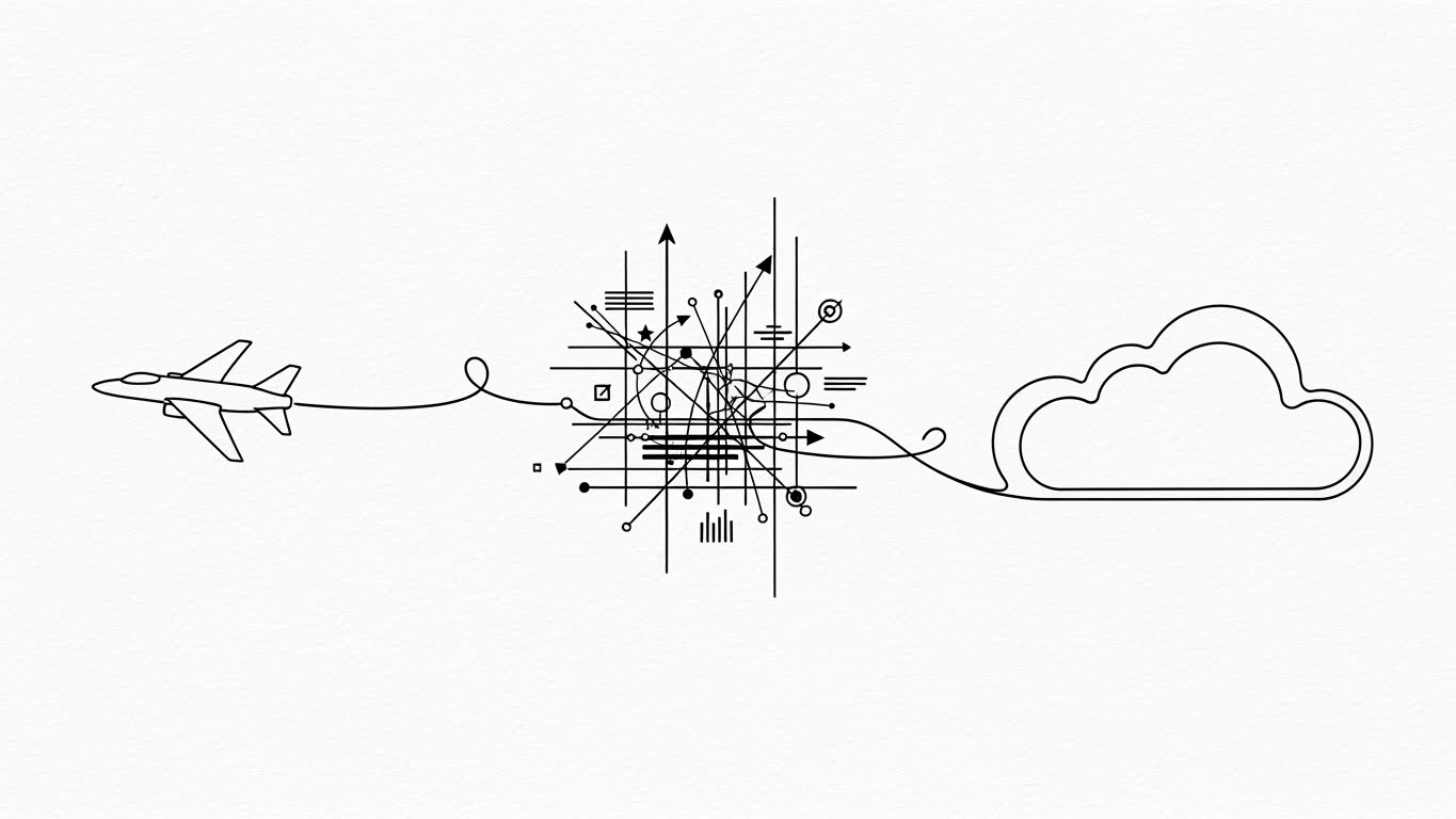
The Visual & Narrative Approach
Implementation fear is the silent deal-killer. We dismantle this with radical simplicity. On a "Stark White" background, a single continuous line in Metallic Gold draws a chaotic, tangled knot. As the animation progresses, the line gracefully unravels, smoothing out into a straight path that connects a stylized airplane icon to a cloud icon. The motion is fluid, unhurried, and elegant.
Psychological Impact & KPI Focus
- Niche Psychology: This appeals to the Principle of Least Effort. The buyer knows their legacy systems are a mess; this visual promises that your platform will not add to the noise, but resolve it. It is a visual metaphor for "untangling" the spaghetti code.
- Operational Impact: Visualizes API Integration, Middleware, and Migration Ease. It sells the experience of the partnership rather than the specs of the tool.
- Primary KPI: Reduction in Sales Cycle Length.
Strategic Implementation & Trade-offs
- Best Use Case: Explainer Videos (Implementation Section) or Support Pages.
- Trade-off: It is purely metaphorical. It captures the feeling of simplicity but explains nothing about the actual process. It must be paired with technical documentation.
Companies using similar video content -
Tradeshift – Supply Chain Payments – Simplifies complex B2B transaction and integration flows.
Elemica – Supply Chain Operating Network – Untangles integration challenges between trading partners.
GEP – Procurement & SCM – Visualizes seamless integration of systems and processes.
15. Velocity Views: The Feature Ecosystem
MOFU | ABM Awareness
The Visual & Narrative Approach
For Account-Based Marketing (ABM) targets who need to see the full scope quickly, we use velocity. Multiple translucent UI screens featuring "Hot Pink" and "Cyan" accents float in a 3D space, rushing towards the viewer like a warp-speed tunnel. The screens display diverse functions—customer profiles, analytics, shipping routes—creating a "Wall of Value." Motion lines blur the edges, emphasizing speed.
Psychological Impact & KPI Focus
- Niche Psychology: This triggers the Availability Heuristic. By flooding the viewer with a volume of features in a short time, they assume the platform is an "All-in-One" powerhouse. It combats the fear of needing multiple point solutions.
- Operational Impact: Visualizes Scalability and Module Diversity. It demonstrates that the platform can handle high-volume data ingestion without blinking.
- Primary KPI: Click-Through Rate (CTR) on Retargeting Ads.
Strategic Implementation & Trade-offs
- Best Use Case: LinkedIn Video Ads or Event Sizzle Reels.
- Trade-off: Low retention of details. The viewer won't remember specific features, only the impression of power. Do not use for training.
Companies using similar video content -
Salesforce Commerce Cloud – B2B Commerce – Rapidly showcases diverse e-commerce functions.
VTEX – Composable Commerce – Floods viewer with module diversity and scalability.
Mirakl – Marketplace Platform – Highlights a wall of value from various features.
16. The ROI Arc: Visualizing Financial Velocity
BOFU | ROI Justification Hook

The Visual & Narrative Approach
At the bottom of the funnel, numbers matter more than features. We visualize ROI with "Studio Quality" abstract art. Emerald Green glass bars rise from the floor in an exponential curve against a clean white background. Small Gold Spheres float and sparkle along the upward trajectory, symbolizing revenue capture. The camera angles upward, physically forcing the viewer to "look up" at the success.
Psychological Impact & KPI Focus
- Niche Psychology: This targets the Economic Buyer (CFO). It associates the platform directly with financial health and liquidity. The green and gold palette triggers subconscious associations with wealth and stability.
- Operational Impact: Visualizes Revenue Growth, Margin Expansion, and Cost Savings. It turns abstract financial projections into a concrete, beautiful object.
- Primary KPI: Proposal Acceptance Rate.
Strategic Implementation & Trade-offs
- Best Use Case: Pitch Decks (The "Business Case" Slide) or Closing Emails.
- Trade-off: Generic if not customized. To be effective, the text overlay must cite specific percentage gains (e.g., "+30% YoY") to ground the art in data.
Companies using similar video content -
GEP – Spend Management – Visualizes exponential cost savings and financial returns.
Coupa – Business Spend Management – Demonstrates financial growth and efficiency gains.
Zycus – Procurement & SCM – Shows clear financial benefits and ROI from solutions.
17. The Digital Fortress: Visualizing Assurance
BOFU | Risk Mitigation

The Visual & Narrative Approach
Security is the invisible objection. We make it visible using a "Cyberpunk Corporate" aesthetic. In a deep Black void, a central cube of data is encased in a glowing Neon Blue shield constructed of geometric lines. Particles (threats) deflect off the shield. The lines pulsate, suggesting an active, living defense system rather than a static firewall.
Psychological Impact & KPI Focus
- Niche Psychology: This addresses Loss Aversion. The fear of a data breach is a powerful motivator. This visual provides a sense of "Impenetrability" and "Sanctuary" for the buyer’s sensitive data.
- Operational Impact: Visualizes GDPR Compliance, Data Encryption, and Threat Detection. It answers the CTO’s security questionnaire without words.
- Primary KPI: Security Review Pass Rate.
Strategic Implementation & Trade-offs
- Best Use Case: Security/Compliance Pages or Trust Center Videos.
- Trade-off: Can feel "scary." Keep the motion smooth and defensive, ensuring it feels safe rather than alarming.
Companies using similar video content -
SAP – Security & Compliance – Visualizes robust data protection within its platform.
Oracle – Cloud Security – Depicts secure cloud infrastructure for enterprise data.
Salesforce – Trust & Compliance – Showcases platform security for sensitive data.
18. The Visionary’s View: Leadership & Legacy
BOFU | The Economic Buyer

The Visual & Narrative Approach
We step away from the interface to show the result of the software. A cinematic shot captures a confident CEO in a Navy suit, standing in a high-rise office. Through the glass, we see a bustling shipping port bathed in Golden Hour light. A subtle, holographic line graph overlays his reflection, trending upwards. It connects the physical trade outside with the digital strategy inside.
Psychological Impact & KPI Focus
- Niche Psychology: This targets the Ego and Identity of the C-Suite. They don't want to buy a tool; they want to buy a version of themselves that is successful and commanding. It validates their strategic vision.
- Operational Impact: Visualizes Market Leadership and Executive Control. It lifts the conversation from "features" to "legacy."
- Primary KPI: Brand Affinity / Deal Size.
Strategic Implementation & Trade-offs
- Best Use Case: Website Homepage (Hero Video) or Annual Report inclusions.
- Trade-off: High risk of looking like generic stock footage. The holographic overlay is critical to tie it back to the specific tech solution.
Companies using similar video content -
SAP – Enterprise Solutions – Connects strategic oversight with global operations.
Oracle – Cloud Applications – Validates C-suite vision for modernized operations.
IBM – Supply Chain Intelligence – Positions leaders with strategic market control.
19. The Developer’s Handshake: Code Confidence
BOFU | The Technical Buyer
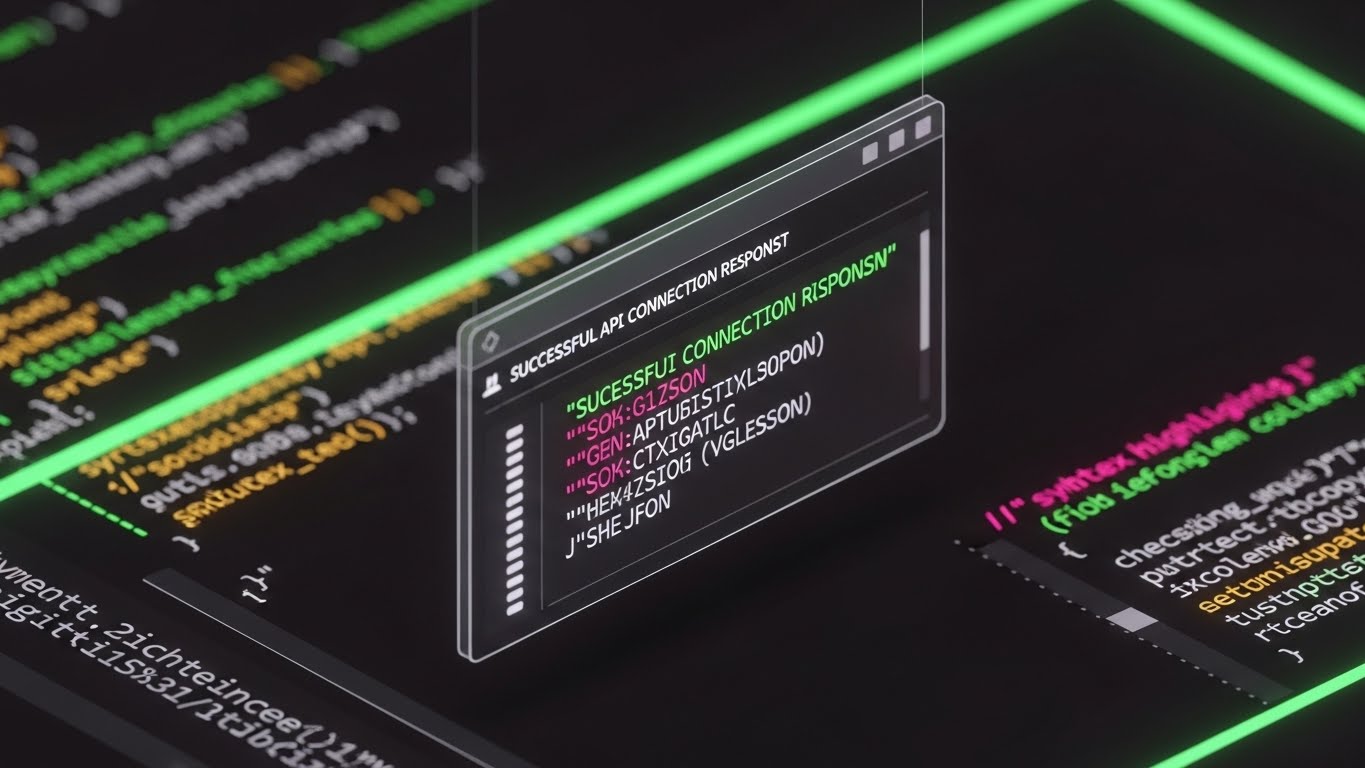
The Visual & Narrative Approach
To win the technical recommendation, we must speak code. This style features a close-up, high-fidelity view of a code editor in Dark Mode—the developer's native habitat. Syntax highlighting glows in Neon Green and Pink. We see a cursor execute a command, and a floating window pops up confirming a "SUCCESSFUL API CONNECTION" response in JSON format.
Psychological Impact & KPI Focus
- Niche Psychology: Developers trust code, not marketing copy. This style signals Competence and Transparency. It proves the platform is "developer-friendly" and built on modern standards, reducing the fear of integration headaches.
- Operational Impact: Visualizes Headless Architecture, API Robustness, and Ease of Customization.
- Primary KPI: Developer Portal Engagement.
Strategic Implementation & Trade-offs
- Best Use Case: Developer Documentation or Technical Demos.
- Trade-off: Boring to non-technical buyers. Keep this strictly for the technical evaluation stage.
Companies using similar video content -
commercetools – Headless B2B Commerce – Showcases developer-friendly API architecture.
Spryker – Composable Commerce – Highlights robust, customizable backend code and APIs.
PTC – ThingWorx IoT Platform – Demonstrates ease of integration for developers.
20. The Reality Shift: Order from Chaos
BOFU | Overcoming Objections

The Visual & Narrative Approach
The strongest closing argument is a direct comparison. We use a split-screen composition. The left side is desaturated, grainy Sepia, showing a stressed worker buried under paper stacks—the "Status Quo." The right side is vivid, sharp RGB, showing a clean desk with a single sleek laptop running the dashboard, bathed in warm light. The contrast is jarring and immediate.
Psychological Impact & KPI Focus
- Niche Psychology: This leverages the Contrast Principle. By placing the pain (chaos) directly next to the cure (order), the value proposition becomes undeniable. It forces the viewer to choose which reality they want to inhabit.
- Operational Impact: Visualizes Digital Transformation and Efficiency Gains. It summarizes the entire value of the platform in one frame.
- Primary KPI: Final Conversion / Closing Rate.
Strategic Implementation & Trade-offs
- Best Use Case: Final Sales Video or "Why Switch?" email campaigns.
- Trade-off: Lack of subtlety. It is a blunt instrument. Ensure the "After" state doesn't look unrealistically perfect, or it may trigger skepticism.
Companies using similar video content -
Blue Yonder – Supply Chain Solutions – Contrasts chaotic legacy with optimized digital.
Kinaxis – RapidResponse – Visualizes transformation from reactive to proactive planning.
Körber Supply Chain – WMS – Shows shift from manual to automated warehouse operations.
21. The Narrative Anchor: Simplification Through Character**
BOFU | Competitive Comparison

The Visual & Narrative Approach
At the decision stage, technical specs often blur into noise. We cut through this with a "2D Character-Driven" narrative that centers on the user, not the code. The visual features a stylized warehouse manager character with "Orange" hair and a "Utility Blue" uniform—distinct but relatable. He stands in a simplified, clean grey vector warehouse. As he taps his tablet, a large, floating Green Checkmark appears in the air, physically validating his action. The art style uses simple geometric shapes and subtle grain textures to feel approachable, distinguishing it from cold, corporate clip art.
Psychological Impact & KPI Focus
- Niche Psychology: This triggers the Similarity Attraction Effect. By depicting a character that looks and acts like the target user (or their staff), we build immediate empathy. It subtly suggests, "This software was built for people like you." It relieves the anxiety that the new tool will be difficult or alienating for the workforce.
- Operational Impact: Visualizes User Satisfaction and Workflow Simplicity. It reframes the software choice as a quality-of-life improvement for the warehouse floor.
- Primary KPI: Competitive Win Rate (Sentiment Analysis).
Strategic Implementation & Trade-offs
- Best Use Case: Retargeting Ads (social/display) or "Day in the Life" comparison videos.
- Trade-off: High risk of looking "B2C" or juvenile if not executed carefully. The character must be performing serious tasks (inventory validation) to maintain professional credibility.
Companies using similar video content -
Odoo – ERP & WMS – User-centric stories of simplified warehouse tasks.
Acumatica – Cloud ERP – Relatable character demonstrating workflow ease.
Epicor – ERP for Distribution – Shows user satisfaction with streamlined processes.
22. The Perfect Order: Photorealism as Proof
BOFU | Sales Cycle Acceleration
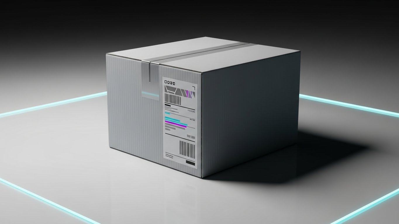
The Visual & Narrative Approach
Ultimately, B2B ecommerce is about moving physical goods. This style uses "8K Photorealistic 3D Rendering" to present the Platonic ideal of logistics. A single, pristine cardboard shipping box sits on a white reflective surface under softbox studio lighting. The shipping label is crisp, with abstract barcodes that glow faintly with "Magenta" and "Cyan" data lines. There is no clutter, no dust—just the pure, unblemished result of a perfect digital process.
Psychological Impact & KPI Focus
- Niche Psychology: This appeals to the Perfectionist in every Operations Director. For them, a damaged box is a failure. This image represents Certainty. It subliminally promises that the software ensures physical perfection and data integrity.
- Operational Impact: Visualizes Order Accuracy, Packaging Compliance, and Fulfillment Quality. It acts as a visual "Seal of Excellence."
- Primary KPI: Sales Qualified Lead (SQL) Conversion.
Strategic Implementation & Trade-offs
- Best Use Case: Email Headers in "Final Proposal" sequences or printed sales collateral.
- Trade-off: It is static. It sells the result, not the process. It must be paired with copy that explains how the software achieves this perfection.
Companies using similar video content -
AutoStore – Automated Storage & Retrieval – Presents pristine, perfect fulfillment outcomes.
Dematic – Material Handling Systems – Visualizes unblemished, accurate order delivery.
Honeywell Intelligrated – Automation Solutions – Showcases flawless packaging and shipping.
23. The Focused Center: Calm in the Chaos
Onboarding | Self-Serve Onboarding

The Visual & Narrative Approach
Onboarding is often where churn begins due to the fear of disruption. To counter this, we use a "Hyper-lapse" technique. The background shows a modern open-plan office with employees moving in a rapid, motion-blurred streak—representing the chaotic pace of business. In the center, in sharp, static focus, a user calmly holds a smartphone. A semi-transparent UI overlay connects the phone to the office environment with thin "Red" data lines. The user is the anchor; the software is the tether.
Psychological Impact & KPI Focus
- Niche Psychology: This addresses Cognitive Overload. It tells the user, "The world is fast, but this tool gives you a stillness of control." It empowers the user as the master of their environment, reducing the anxiety of a new system rollout.
- Operational Impact: Visualizes Mobile Control, Real-Time Monitoring, and Workflow Stability. It demonstrates that the platform works at the speed of business.
- Primary KPI: Time-to-First-Value (TTFV).
Strategic Implementation & Trade-offs
- Best Use Case: Welcome Videos inside the platform or Social Media "Launch" announcements.
- Trade-off: Requires careful compositing. The contrast between the blurred background and the sharp foreground must be exaggerated to land the visual metaphor effectively.
Companies using similar video content -
Zebra Technologies – Mobile Computing – User calmly controls chaos with mobile devices.
Descartes Systems Group – Mobile Logistics – Focuses on user control amidst rapid business pace.
FourKites – Real-time Visibility – Empowers users with stable control over dynamic logistics.
24. Augmented Reality: The Value Overlay
Onboarding | Accelerating TTV
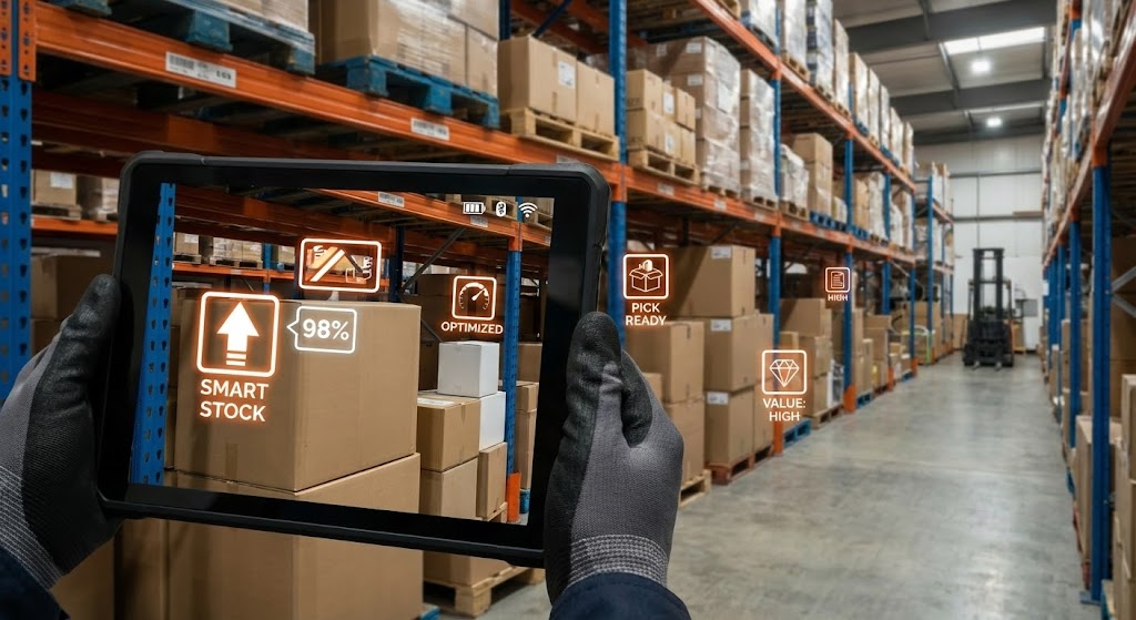
The Visual & Narrative Approach
To bridge the physical/digital divide instantly for new users, we use a Point-of-View (POV) shot. We see through the eyes of a warehouse worker holding a rugged tablet in a real aisle. Overlaid on the gritty reality are bright, "Neon Orange" and "White" 2D vector icons floating over specific boxes. These icons indicate "Pick Ready" status, "Smart Stock" levels, and "High Value" alerts. This "Mixed Media" approach literally paints the value of the software onto the physical world.
Psychological Impact & KPI Focus
- Niche Psychology: This empowers the frontline worker. It validates the concept of Augmented Intelligence—technology enhancing human capability rather than replacing it. It makes the complex database feel intuitive and spatial.
- Operational Impact: Visualizes Inventory Visibility and Pick Path Optimization. It creates an "Aha!" moment for how the software assists physical workflows.
- Primary KPI: Feature Adoption Rate.
Strategic Implementation & Trade-offs
- Best Use Case: "Getting Started" Training Videos or LMS Modules.
- Trade-off: The motion tracking must be flawless. If the digital icons "slip" off the physical boxes, the illusion of precision is broken and the tool looks unreliable.
Companies using similar video content -
PTC – Vuforia AR – Overlays digital information onto physical warehouse environments.
Siemens Digital Industries Software – Teamcenter AR – Enhances physical assets with digital data.
GreyOrange – Fulfillment Automation – Uses AR to guide workers in smart warehouses.
25. The Friendly Interface: Humanizing Support
Retention | Knowledge Base & FAQ

The Visual & Narrative Approach
Technical support documents are often dry and intimidating. We transform them with "Abstract 2D Animation." A stylized user character sits at a desk in a world of soft "Lavender" and "Yellow" tones. A floating "Chat Bubble" with a smiley face pops out of their computer screen, which displays a simplified, non-threatening version of the interface. The motion is fluid and bouncy (using "Squash and Stretch" principles). It reframes "seeking help" from a frustration to a pleasant interaction.
Psychological Impact & KPI Focus
- Niche Psychology: This reduces Frustration Anxiety. When a user is stuck, they are stressed. This calming, friendly aesthetic lowers their cortisol levels and encourages them to engage with the self-help materials rather than rage-quitting or submitting a ticket.
- Operational Impact: Visualizes Customer Support Accessibility and Ease of Resolution. It brands the support experience as positive.
- Primary KPI: Support Ticket Deflection Rate.
Strategic Implementation & Trade-offs
- Best Use Case: Knowledge Base Articles (Headers) or Support Portal Loading Screens.
- Trade-off: Too abstract for complex technical debugging. Use this for "Level 1" support concepts (Password Reset, Basic Nav), not for API configuration guides.
Companies using similar video content -
Infor – CloudSuite Support – Presents a calming, friendly approach to help resources.
NetSuite – SuiteAnswers – Humanizes self-serve support for complex ERP.
IFS – Service Management – Transforms technical support into pleasant interactions.
26. The Face of Success: Scaling Personalization
Retention | Reducing Churn

The Visual & Narrative Approach
To maintain a high-touch relationship with thousands of users, we leverage Generative AI Video. A realistic AI avatar—a professional Customer Success Manager in a "Grey" blazer—looks directly into the camera. The background is a blurred, tasteful home office. She gestures warmly, explaining a new feature update or quarterly result. The fidelity is high enough to pass for a real video call, creating a sense of personal connection at scale.
Psychological Impact & KPI Focus
- Niche Psychology: Users churn when they feel ignored. This style hacks the Reciprocity Norm—users feel they are receiving personal attention, which increases their loyalty. It simulates a "Concierge" experience for mid-tier accounts.
- Operational Impact: Visualizes Proactive Account Management and Customer Centricity. It delivers complex updates in a digestible, human format.
- Primary KPI: Net Dollar Retention (NDR) / Renewal Rate.
Strategic Implementation & Trade-offs
- Best Use Case: Quarterly Product Update Emails or Personalized Check-ins.
- Trade-off: The "Uncanny Valley." The lip-sync and voice synthesis must be premium tier (e.g., HeyGen or Synthesia expert mode) to avoid feeling robotic.
Companies using similar video content -
Salesforce – Service Cloud – AI avatar delivering personalized customer success updates.
SAP – Customer Experience – Scalable, human-like communication for feature updates.
Oracle – CX Cloud – Provides personalized check-ins at scale for users.
27. Organic Growth: Visualizing Lifetime Value
Retention | Proactive Support

The Visual & Narrative Approach
How do you show the health of a business relationship? We use "Abstract Organic Motion." On a white background, "Glossy Pink" and "Glass" liquid shapes morph and flow. They do not clash; they blend. A dollar sign shape seamlessly transforms into an infinity loop, symbolizing the shift from transactional revenue to Recurring Revenue. The texture is sleek, suggesting a premium, friction-free ecosystem.
Psychological Impact & KPI Focus
- Niche Psychology: This appeals to the Growth Mindset. It subconsciously reinforces the idea that the platform is a living, evolving organism that adapts to the client’s needs. It communicates "Sustainability" and "Fluidity."
- Operational Impact: Visualizes Long-Term Partnership and Ecosystem Expansion. It is perfect for communicating "intangible" benefits like stability.
- Primary KPI: Customer Sentiment / NPS Score.
Strategic Implementation & Trade-offs
- Best Use Case: In-App Notifications for Renewals or "Year in Review" videos.
- Trade-off: Highly conceptual. It creates a "feeling" or "mood" but conveys zero hard data. It is an emotional retention tool.
Companies using similar video content -
E2open – Networked Supply Chain – Visualizes evolving, sustainable client relationships.
Kinaxis – RapidResponse – Shows fluid, adapting platform value over time.
Blue Yonder – Luminate Platform – Represents continuous growth and recurring value.
28. The Trust Anchor: Business Outcomes
Retention | Deep Feature Adoption

The Visual & Narrative Approach
To remind the client of the "Why," we return to humanity. A high-quality stock photo captures a celebratory moment: two business people shaking hands in a sunlit boardroom. Overlaying their clasped hands is a subtle, futuristic UI web in "Corporate Blue." A glowing shield icon locks into place over the handshake, symbolizing that the deal is Digitally Secured.
Psychological Impact & KPI Focus
- Niche Psychology: This reinforces Trust and Reliability. It connects the software (the UI overlay) to the ultimate goal of B2B commerce: the successful deal. It reminds the user that the software facilitates their professional success.
- Operational Impact: Visualizes Smart Contracts, Digital Verification, and Secure Transactions.
- Primary KPI: Feature Adoption Rate (Security/Compliance Modules).
Strategic Implementation & Trade-offs
- Best Use Case: Feature Release Emails (Security Updates) or Case Study Headers.
- Trade-off: Generic stock photography is the enemy. The UI overlay must be custom-designed and perspective-matched to elevate the image from "Stock" to "Brand Asset."
Companies using similar video content -
Coupa – Business Spend Management – Reinforces trust in secure, successful transactions.
SAP Ariba – Procurement Solutions – Connects software to successful business deals.
Tradeshift – Supply Chain Payments – Visualizes digitally secured agreements and partnerships.
29. The Deep Dive: Value Under the Surface
Expansion | Driving Upsell

The Visual & Narrative Approach
To upsell a premium module (e.g., Advanced Analytics or Security), we must show what is hidden. We use a 3D X-Ray visualization. A standard shipping container sits on a white floor. The outer walls turn semi-transparent "White Glass," revealing the contents: perfectly stacked, glowing "Electric Blue" boxes. This metaphor demonstrates that the premium tier offers "Visibility" that the standard tier does not.
Psychological Impact & KPI Focus
- Niche Psychology: This triggers the Curiosity Gap and the desire for Omniscience. Operations leaders hate "Black Boxes." This style promises that the upgrade will give them "X-Ray Vision" into their supply chain.
- Operational Impact: Visualizes Granular Tracking, Condition Monitoring (IoT), and Premium Data Layers.
- Primary KPI: Upsell/Cross-Sell Conversion Rate.
Strategic Implementation & Trade-offs
- Best Use Case: Product Pages for "Enterprise Tier" features.
- Trade-off: Technical complexity. The internal assets (the boxes inside) must be modeled with as much care as the exterior.
Companies using similar video content -
Project44 – Movement Platform – Reveals granular tracking and hidden data layers.
FourKites – Real-time Visibility – Offers X-ray vision into supply chain contents.
Elemica – Supply Chain Operating Network – Shows transparent infrastructure and premium data.
30. The Network Effect: Gamifying Growth
Expansion | Driving Referrals

The Visual & Narrative Approach
Referral programs can feel transactional. We make them playful using Low-Poly 3D Modeling. A faceted, colorful world map (Red, Blue, Yellow) features geometric people on different islands (continents). They are connected by glowing white bridges. One character hands a geometric "gift box" to another across a bridge. The lighting is sunny and bright. It visualizes the network effect in a playful, disarming way.
Psychological Impact & KPI Focus
- Niche Psychology: This style leverages Gamification. The toy-like aesthetic disarms the "business" nature of the referral request. It frames the act of referring a peer as building a connection, not just a transaction.
- Operational Impact: Visualizes Global Connectivity, Partner Ecosystems, and The Network Effect.
- Primary KPI: Referral Qualified Leads (RQL).
Strategic Implementation & Trade-offs
- Best Use Case: Referral Landing Pages or "Invite a Peer" modal pop-ups.
- Trade-off: Can feel too casual for high-stakes enterprise. Best used for user-to-user referrals rather than CEO-to-CEO partnership requests.
Strategic Knowledge Base: The Visual Operations Doctrine
To transform these 30 visual styles from "marketing assets" into a cohesive business strategy, we must move beyond production and into Visual Operations (VisOps). This framework outlines how to weave visualization into the very fabric of your B2B platform's lifecycle, ensuring that every pixel serves a specific business outcome.
Strategic Alignment & Visual Architecture
The "Pre-Production" Strategy. Defining the Visual Operating System.
- The Cognitive Load Audit: Before a single pixel is rendered, the "Digital Operations Architect" must define the rules of engagement. If a PDF manual takes 15 minutes to read, the goal is not just to visualize it, but to compress the time-to-comprehension to 3 minutes using Style 3 (Minimalist Vector). Measure the reduction in "cognitive drag."
- Role-Based Visual Mapping: Differentiate your visual language. "Drivers" on mobile devices need high-contrast, large-element visuals (e.g., Style 23). "Fleet Managers" on desktops need dense, data-rich dashboards (e.g., Style 11). One style does not fit all roles.
- The "Glanceability" Standard: In high-stress logistics environments, attention is a scarce resource. Visuals must pass the "Glance Test." A driver or dispatcher should understand the core message of a notification video (like Style 4 - Kinetic Typo) in under 5 seconds. If they have to rewind, the visual architecture has failed.
- Brand Voice Consistency: Your "Visual Voice" must be as consistent as your brand colors. If your marketing uses Style 28 (Lifestyle), your support portal cannot rely solely on dry text. Use Advids to build a unified visual language that spans from the sales deck to the helpdesk.
- The Advids Strategic Audit: Don't guess. Engage Advids to conduct a comprehensive audit of your current asset library against the 30-style framework. Identify gaps where "Invisible Value" (like API security) is failing to be visualized.
- Standardization vs. Customization: For core platform features, use standardized high-fidelity 3D assets ("Style 11"). For specific client scenarios (e.g., Cold Chain vs. Dry Van), use lower-cost 2D vectors ("Style 1") that can be quickly adapted.
- The Cross-Departmental Bridge: Use these visuals to unify terminology. If Sales calls it "The Hub," and Ops calls it "The Mesh," use "Style 1" (The Network Effect) to visually define the term for everyone.
- Legacy System Integration: Visualizing the connection between old hardware and new software is critical. Use "Style 14" (The Frictionless Line) to metaphorically represent the bridge. Never show the ugly legacy interface directly; visualize the flow of data out of it.
- Accessibility in Trucking: The logistics workforce is diverse and often multilingual. Rely on Visual Universals (Style 21 - Green Checks, Red X's) rather than text-heavy motion graphics. A visual-first approach reduces localization costs.
- The Mobile-First Mandate: 60% of logistics interactions happen on a tablet or phone. Ensure all 30 styles—especially complex 3D ones like "Style 11"—are optimized for vertical (9:16) and square (1:1) viewing without losing legibility.
Operational Adoption & Implementation
The "Deployment" Phase. Embedding visuals into the workflow.
- Overcoming "Big Brother" Anxiety: Implementation often stalls due to employee fear of surveillance. Use "Friendly 2D Characters" (Style 21) to explain tracking features as "Safety Tools" rather than "Spyware." Empathy-driven visuals reduce internal resistance.
- The Micro-Learning Shift: Kill the 60-minute webinar. Break training into 30-second "Hyper-Lapse" (Style 23) or "Macro UI" (Style 10) clips. Embed these directly into the software interface at the moment of need (Just-in-Time learning).
- Just-in-Time Support: Stop forcing users to leave the app to find help. Embed "Abstract Vector" (Style 25) loops into tooltips. If a user hovers over "API Keys," show a 3-second loop of where to find them.
- Gamification of Training: Use "Low-Poly" (Style 30) visuals to create driver scorecards and safety leaderboards. Transforming dry performance metrics into a visually engaging game increases participation.
- Reducing Support Ticket Volume: There is a direct correlation between the quality of your visual library and your support costs. Proactively sending a "How-To" video (Style 24) before a major update can deflect 20-30% of inbound tickets.
- Remote Onboarding: For distributed fleets, physical seminars are impossible. Use "Gen AI Avatars" (Style 26) to deliver consistent, high-quality onboarding messages to thousands of drivers simultaneously, in their native language.
- Standard Operating Procedures (SOPs): Transform text-based Standard Operating Procedures into "Isometric Logic" (Style 7) animations. A visual flow of "How to Handle a Damaged Return" eliminates ambiguity and ensures compliance.
- Feedback Loops: Use interactive video elements. At the end of a "Feature Update" video (Style 15), include a one-click "Helpful?" survey. This data is critical for refining your product roadmap.
- Scalable Localization: Global trade requires global assets. Design your "2D Motion" (Style 1) files with separate text layers. This allows you to swap English for Spanish or Mandarin in minutes, not days.
- Leadership Communication: When the CTO presents the quarterly strategy, don't use bullet points. Use "Aspirational Stock Montage" (Style 18) to visualize the company's trajectory. High-end visuals help secure budget and buy-in.
Measuring Impact & Future-Proofing
The "ROI" Phase. Measuring success and looking ahead.
- Beyond "Views": Vanity metrics are irrelevant in B2B. Measure Time-to-Competency (how fast a user learns via video vs. text) and Feature Adoption Rate (did they use the tool after watching?).
- The "Idle Time" Metric: In logistics, time is money. Correlate better visualization (Style 9) with reduced "Idle Time" inside the software. If users navigate faster because the UI is clear, you are saving them measurable hours.
- Compliance Velocity: How fast can you get the entire fleet compliant with a new regulation (e.g., ELD mandates)? Use "High-Velocity Typography" (Style 4) to drive urgent compliance messages and measure the speed of uptake.
- Retention and Churn: High-quality UX visualization (Style 27) creates "Product Stickiness." Track the Customer Lifetime Value (CLTV) of cohorts exposed to your video academy vs. those who were not.
- The AI Visual Frontier: Prepare for the next wave. Soon, "Generative AI" (Style 2) will allow for real-time video generation based on user data. Imagine a monthly report video generated instantly for each client using their own live metrics.
- Scalability of Assets: Build a library, not a landfill. Organize your After Effects and 3D project files so they can be remixed. A "Cloud Particle" (Style 6) asset created for a brand video should be reusable for a website background.
- The Advids Partnership: Visual strategy is not a one-time project; it is an evolving discipline. Partnering with Advids ensures that as your platform grows, your visual language scales with it, preventing the "Frankenstein" effect of mismatched styles.
- Benchmarking Success: Do not just compare yourself to competitors; compare your visuals to B2C giants. B2B buyers bring consumer-grade expectations to enterprise software. "Good enough" is a competitive risk.
- The ROI of Safety: In logistics, safety is a financial metric. Quantify the reduction in insurance claims or accidents achieved through better, more engaging visual safety training (Style 24).
- Final Call to Innovation: Treat video as infrastructure. In the algorithmic supply chain, the screen is the only window into the machine. By investing in these 30 styles, you are not just making marketing content; you are building the user interface of the future.
Companies using similar video content -
Mirakl – Enterprise Marketplace – Gamifies building a connected partner ecosystem.
VTEX – Composable Commerce – Encourages referrals through playful network visualization.
Shopify Plus – B2B eCommerce – Visualizes global connections and community growth.
Author & Editor Bio


