
Introduction: Bridging the Physical-Digital Divide
The global aviation industry stands on the precipice of a new operational standard. We are moving from the era of "handling" baggage to the era of "orchestrating" it. For Operations Directors and Ground Handling Executives, the mandate is clear: absolute digital visibility over every physical asset, from the check-in desk to the aircraft hold.
However, a massive gap remains between the gritty reality of the ramp and the pristine promise of digital data. This "Physical/Digital Divide" is expensive. In 2024, baggage mishandling cost the industry an estimated $5 billion, a figure that represents not just financial leakage but a significant erosion of passenger trust.
The solution lies in advanced SaaS platforms that can integrate legacy infrastructure with modern predictive logic. Yet, adoption is lagging. Currently, only 44% of airlines have fully implemented IATA Resolution 753 tracking at all mandatory touchpoints. This adoption gap is your strategic opportunity.
To close this gap, you must communicate value instantly. You cannot sell a futuristic "Digital Twin" solution with static screenshots or generic stock footage. You need a visual language that reduces cognitive load, proving to stakeholders that your platform turns chaos into control. This guide provides 30 expert-curated visual styles—your "Visual Lexicon"—designed to articulate the complexity of Baggage Logistics Management with clarity, authority, and impact.
1. Abstract 3D AI Visualization
TOFU | Brand Awareness

The Visual & Narrative Approach
Scenario: The screen opens on a pristine, deep white void. A complex network of glowing Cyan and Silver data nodes materializes, forming a 3D map of the globe. Arcing beams of light pulsate between these nodes, representing the real-time transfer of Baggage Source Messages (BSM) across major hubs. Particle effects flow along the arcs, symbolizing the ceaseless movement of data.
Narration Tone: Visionary and Authoritative. "The world doesn't sleep, and neither does your data."
Psychological Impact & KPI Focus
Niche Psychology: C-Level executives fear "Data Silos." This style alleviates that anxiety by visualizing the network as a single, cohesive, living organism. It appeals to the aspiration for Omniscient Control.
Operational Impact: Directly supports KPIs related to Network Uptime and Global Visibility. It positions the SaaS platform as the "Central Nervous System" of the airline's logistics operation.
Strategic Implementation & Trade-offs
Duration: 15-20 Seconds (Loopable).
Trade-offs: This style is purely conceptual. It builds brand authority but fails to explain how the connection works. Use it for the "Big Picture" sell, not for technical training.
Companies using similar video content -
SITA – BagJourney – Visualizing global baggage data flow.
Honeywell – Forge for Airports – Abstracting airport operational data into a cohesive network.
2. 2D Line Art Animation
TOFU | Market Education
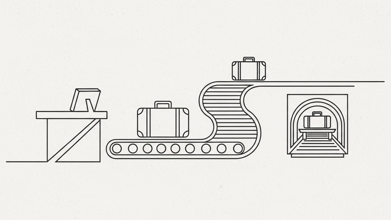
The Visual & Narrative Approach
Scenario: A minimalist masterpiece. A continuous, thin Charcoal Grey line on a textured Off-White background traces the journey of a stylized suitcase. The line morphs effortlessly from a check-in desk to a winding conveyor belt, and finally into the aircraft hold. The movement is fluid, unbroken, and hypnotic.
Narration Tone: Educational and Calm. "Complexity, simplified. From drop-off to take-off, one unbroken chain of custody."
Psychological Impact & KPI Focus
Niche Psychology: Logistics managers are overwhelmed by complexity. This style leverages the Fluency Heuristic—if it looks simple, it must be easy to manage. It promises a frictionless experience.
Operational Impact: Perfect for illustrating IATA 753 Compliance (tracking at four points) without the visual noise of a real airport. It emphasizes Process Adherence and Workflow Efficiency.
Strategic Implementation & Trade-offs
Duration: 30-45 Seconds.
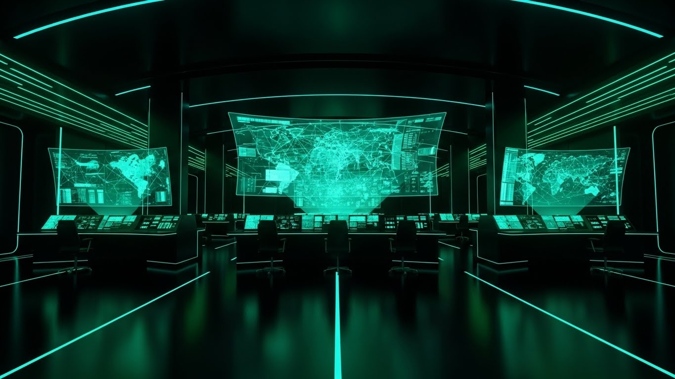
Trade-offs: The minimalist nature sacrifices realism for clarity. It is perfect for explaining concepts (like custody transfer) but poor for showing hardware integration.
Companies using similar video content -
Vanderlande – VIBES – Simplifying baggage handling system workflows.
Siemens Logistics – Baggage Handling Systems – Illustrating baggage journey through sorting.
3. Generative AI Cinematic Video
TOFU | Shaping Brand Perception

The Visual & Narrative Approach
Scenario: An epic wide-angle aerial shot captures a massive, futuristic airport tarmac at sunrise. The "Golden Hour" lighting casts dramatic shadows from parked jumbo jets. The scene is bustling but orderly—autonomous loaders and pristine baggage carts move in perfect synchronization. The palette is Warm Gold, Metallic Steel, and Cool Tarmac Grey.
Narration Tone: Inspiring and Epic. "The dawn of a new era in aviation efficiency."
Psychological Impact & KPI Focus
Niche Psychology: This taps into Professional Pride. It shows the airport not as a place of stress, but as a cathedral of commerce. It aligns your brand with the future of aviation.
Operational Impact: Visualizes Scalability and Hub Efficiency. It suggests that your platform is robust enough to manage the most complex, high-volume environments in the world.
Strategic Implementation & Trade-offs
Duration: 10-15 Seconds (Hero Background).
Trade-offs: Highly emotional but low on information density. It sets the mood but doesn't explain the "how." It is best used as a Hero Background to create an immediate feeling of premium quality.
Companies using similar video content -
Collins Aerospace – ARINC MUSE – Showcasing futuristic, efficient airport operations.
ADB SAFEGATE – Airport Systems – Presenting a grand vision of optimized airport infrastructure.
4. Bold Kinetic Typography (Visual)
TOFU | Skippable Pre-Roll Ad

The Visual & Narrative Approach
Scenario: Massive, geometric block shapes in Vivid Safety Orange and Stark Black collide, slide, and lock together with mechanical precision. They abstractly imply words like "SPEED," "TRACKING," and "SORTATION." The background is clean white to maximize contrast. The motion is aggressive and rhythmic, like a supply chain "Tetris" game.
Narration Tone: Punchy and Energetic. Sound design drives the cut—loud, mechanical locking sounds.
Psychological Impact & KPI Focus
Niche Psychology: "Safety Orange" is the color of the ramp (vests, cones). It triggers immediate alertness. The "locking" motion subconsciously communicates Security and Integration.
Operational Impact: Focuses on Speed and Responsiveness. It suggests that the software is fast, robust, and ready to deploy.
Strategic Implementation & Trade-offs
Duration: 5-6 Seconds (Bumper Ad).
Trade-offs: Zero educational value. Its only job is to stop the scroll and drive a click. Do not use for deep dives.
Companies using similar video content -
Zebra Technologies – RFID Solutions – Emphasizing speed and accuracy of RFID tracking.
Identiv – RFID Solutions – Highlighting rapid data capture and security.
5. Rapid UI Feature Montage
TOFU | Vertical Social Organic

The Visual & Narrative Approach
Scenario: A vertical composition showing a stack of abstract mobile UI cards. Using Glassmorphism (Translucent Blue/Soft White), the camera snaps focus to specific elements: a green dial ticking upwards, a counter hitting 100%. The background blurs to emphasize the active data point.
Narration Tone: Modern and Tech-Savvy. "Power in your pocket. Real-time control, right on the ramp."
Psychological Impact & KPI Focus
Niche Psychology: Addresses the fear of "Desk Tethering." It assures ground crews that the tool is mobile-first and intuitive, reducing User Adoption Friction.
Operational Impact: Visualizes Real-Time Data Access and Mobile Workforce Enablement. It proves that the data flows instantly to where it is needed most.
Strategic Implementation & Trade-offs
Duration: 15 Seconds (Instagram Reels/TikTok).
Trade-offs: The pace is too fast for detailed feature analysis. It works best to generate excitement about the interface (UX) rather than the infrastructure.
Companies using similar video content -
INFORM GmbH – GroundStar – Showcasing mobile UI for ground handling staff.
Ramp IQ – Ground Handling Software – Rapid display of mobile features for ramp operations.
6. Low-Poly 3D Modeling
TOFU | ABM Awareness
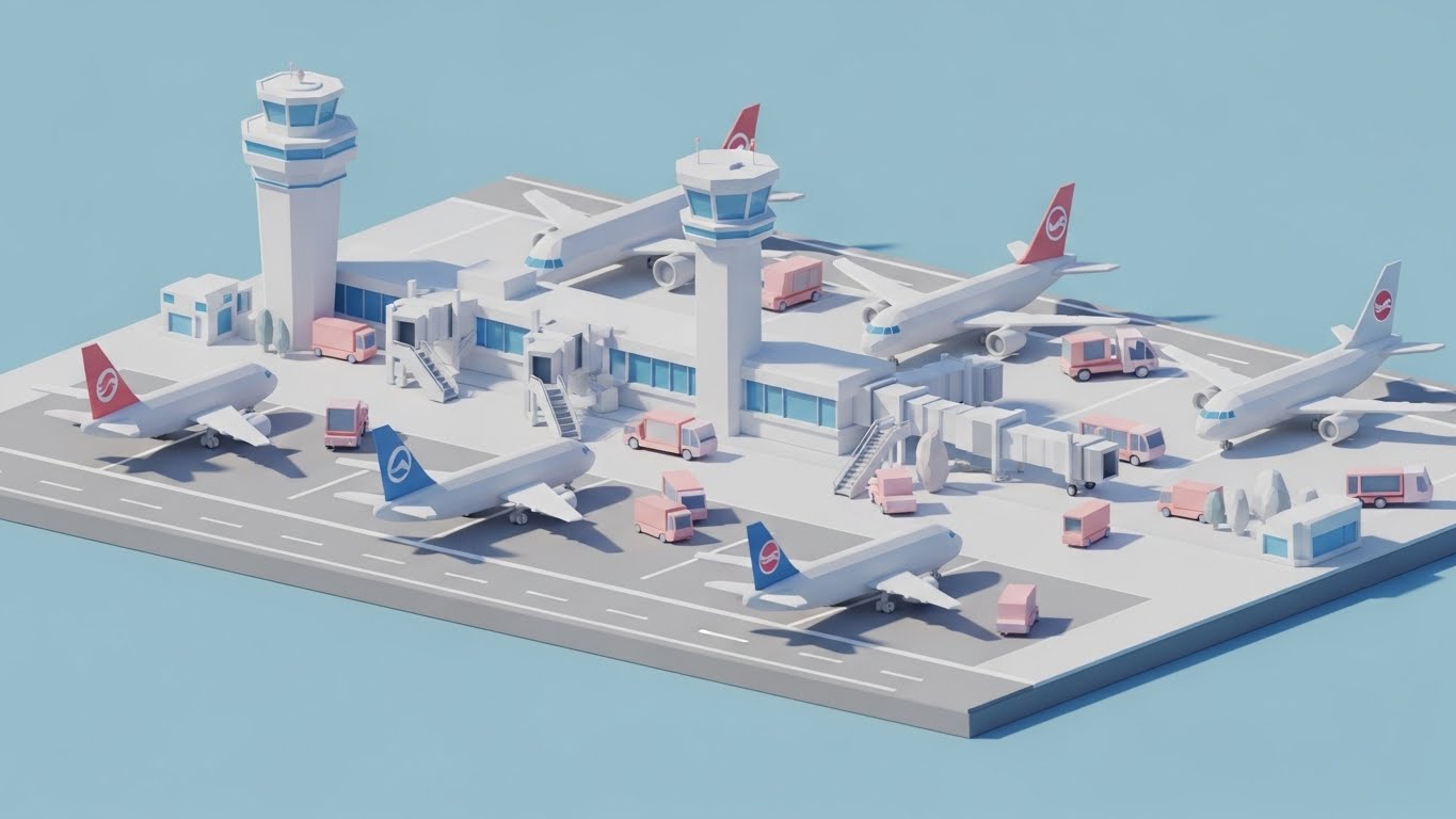
The Visual & Narrative Approach
Scenario: A playful, tilt-shift view of a miniature airport tarmac in Low-Poly 3D. Faceted trucks and planes move in a loop under soft, sunny lighting (Pastel Blue/Pink). It looks like a sophisticated simulation game. A specific airline logo is abstractly placed on a tail fin.
Narration Tone: Friendly and Analytical. "Planning complex logistics shouldn't feel like rocket science."
Psychological Impact & KPI Focus
Niche Psychology: Uses Gamification to make complex systems feel manageable. It reduces the intimidation factor of replacing a BHS.
Operational Impact: Excellent for visualizing Resource Allocation and Scenario Planning. It shows the "Big Picture" without the mess.
Strategic Implementation & Trade-offs
Duration: 10-15 Seconds (Looping GIF/Video).
Trade-offs: Can look "unserious." Ensure the data overlay is professional to balance the toy-like visual.
Companies using similar video content -
Logplan – Logistics Planning Software – Simulating airport logistics and resource allocation.
AirportLabs – A-CDM – Playful simulation for collaborative decision making.
7. Wireframe to Reality Transition
MOFU | Product/Solution Differentiation

The Visual & Narrative Approach
Scenario: A split screen. Left: A Unit Load Device (ULD) in glowing Blueprint Blue wireframe, revealing the internal structure and capacity data. Right: The same container in photorealistic Industrial Steel. A glowing diagonal edge sweeps across, transforming one to the other.
Narration Tone: Technical and Precise. "From digital design to physical reality. Absolute asset accuracy."
Psychological Impact & KPI Focus
Niche Psychology: Bridges the Physical/Digital Divide. It proves to engineers that the software understands the hardware.
Operational Impact: Visualizes Digital Twin Technology and Asset Tracking accuracy, showing that the software sees inside the box to ensure structural and data integrity.
Strategic Implementation & Trade-offs
Duration: 10-15 Seconds.
Trade-offs: Requires high-quality assets to look convincing. If the transition is jerky or the steel texture looks fake, it undermines the message of precision.
Companies using similar video content -
Dassault Systèmes – DELMIA – Transitioning from digital design to physical logistics.
Ansys – Twin Builder – Validating digital twin accuracy for physical assets.
8. Hyper-lapse Stock Footage with Data
MOFU | Demand Gen & Lead Capture
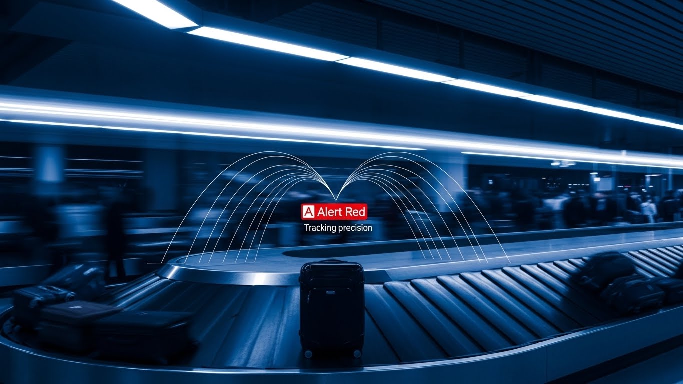
The Visual & Narrative Approach
Scenario: A chaotic, motion-blurred baggage claim (Stock Footage). One suitcase is frozen in sharp focus. An Alert Red tracking bracket locks onto it with a floating data box. The contrast between the motion blur and the sharp data emphasizes tracking precision.
Narration Tone: Urgent and Focused. "In a world of chaos, find the signal."
Psychological Impact & KPI Focus
Niche Psychology: Triggers the Cocktail Party Effect (focusing on one thing in noise). Reassures managers that the system creates order.
Operational Impact: Visualizes Exception Management—the ability of the software to flag the one problem bag (mishandled/lost) amidst thousands of correct ones.
Strategic Implementation & Trade-offs
Duration: 6-10 Seconds.
Trade-offs: Heavily reliant on the quality of stock footage. It visualizes the result of tracking rather than the process.
Companies using similar video content -
Veovo – Airport Management – Highlighting specific events in busy airport environments.
TAV Technologies – TAVBIMS – Pinpointing mishandled bags amidst airport chaos.
9. 3D X-Ray Visualization
MOFU | Feature Education & Demonstration

The Visual & Narrative Approach
Scenario: A transparent "X-Ray" view of a baggage scanner tunnel. Internal gears and sensors glow in Translucent Green and Silver against a Medical White background. The focus is on the internal "vision" of the machine, revealing the density-based detection grids.
Narration Tone: Clinical and Secure. "Deep vision for deep security."
Psychological Impact & KPI Focus
Niche Psychology: Demystifies the "Black Box" of security. Builds trust in Compliance. It satisfies the engineer’s need to see "under the hood."
Operational Impact: Perfect for discussing Security Screening (Level 1-3) and automated threat detection, visually separating the software logic from the physical machine components.
Strategic Implementation & Trade-offs
Duration: 20-30 Seconds.
Trade-offs: This is a technical visualization. It is fascinating to operations managers but may be too detailed for C-level executives.
Companies using similar video content -
Smiths Detection – HI-SCAN – Visualizing internal scanner technology for security.
L3Harris Technologies – ClearScan – Demystifying X-ray security processes.
10. Abstract 2D Organic Motion
MOFU | Category Creation

The Visual & Narrative Approach
Scenario: Moving away from rigid machinery, this style uses rounded, pill-shaped forms to represent RFID tags and sensors. These elements float in a horizontal composition with a glassmorphism effect (Mint Green/Glossy White), connected by thin lines representing network connectivity.
Narration Tone: Smooth and Future-Forward. "The ecosystem of things, connected."
Psychological Impact & KPI Focus
Niche Psychology: Rebrands logistics as "Agile" and "Modern." The organic shapes suggest that the technology is non-intrusive and easy to integrate ("organic adoption").
Operational Impact: It visualizes the Internet of Things (IoT) aspect of modern logistics, focusing on the data relationships between tags and readers rather than the hardware itself.
Strategic Implementation & Trade-offs
Duration: 15-20 Seconds.
Trade-offs: It is highly abstract. It works beautifully to explain "ecosystem" concepts but fails if you need to show specific UI workflows.
Companies using similar video content -
NXP Semiconductors – RFID Chips – Visualizing seamless connectivity of IoT components.
AWS – IoT Core – Abstractly representing data flow in an IoT ecosystem.
11. Split Screen: Optimized Reality and UI**
MOFU | Competitive Displacement
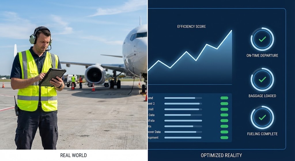
The Visual & Narrative Approach
Scenario: A sharp vertical split-screen composition. Left (Real World): A high-fidelity shot of a ramp agent in a safety vest on a sunny tarmac, scanning a bag with a ruggedized tablet. Right (Optimized Reality): A sophisticated Navy Blue and Electric Blue UI dashboard mirrors the action. As the agent scans, the "Efficiency Score" graph on the right spikes instantly, and "Baggage Loaded" rings toggle to green.
Narration Tone: Comparative and Evidence-Based. "On the ground, it’s action. In the cloud, it’s intelligence. Perfectly synced."
Psychological Impact & KPI Focus
Niche Psychology: Displaces competitors by highlighting Latency. Operations managers fear that software is disconnected from reality. This style leverages Cognitive Coupling, visually proving that the digital tool is a live, breathing extension of the physical workflow.
Operational Impact: Visualizes Real-Time Visibility and SLA Adherence. It demonstrates that the feedback loop between the ramp and the control room is instantaneous.
Strategic Implementation & Trade-offs
Duration: 15-20 Seconds.
Trade-offs: Requires tight synchronization. If the "Real World" footage feels generic or the timing is off, the message of "instant connectivity" is lost.
Companies using similar video content -
INFORM Aviation – Workforce Management – Syncing ramp agent actions with real-time dashboard updates.
GSE Track – Ground Support Equipment Tracking – Showing live GSE movement mirrored by UI data.
12. Lifestyle Stock with UI Overlay
MOFU | Overcoming Objections

The Visual & Narrative Approach
Scenario: An over-the-shoulder shot of a focused Operations Manager in a modern, glass-walled office overlooking the tarmac. He is calm and in control. Floating between him and his monitor is a semi-transparent, Light Blue UI overlay displaying a global map of baggage flows and live tracking analytics. The digital data blends seamlessly with the natural airport environment.
Narration Tone: Reassuring and Professional. "Complete oversight, without the overwhelm. Control your network from a single pane of glass."
Psychological Impact & KPI Focus
Niche Psychology: Addresses Managerial Burnout. It counters the stereotype of the stressed logistics manager firefighting issues. It positions the user as an Orchestrator, offering a sense of calm capability.
Operational Impact: Focuses on Centralized Management and Remote Visibility. It validates the dashboard’s ability to aggregate complex data into actionable, high-level insights.
Strategic Implementation & Trade-offs
Duration: 10-15 Seconds (Website Hero).
Trade-offs: This is a "mood" style. It validates the user experience (UX) but is less effective for deep-diving into specific technical features.
Companies using similar video content -
Lufthansa Systems – NetLine/Ops ++ – Overlaying global flight data on an executive's view.
Sabre – AirCentre – Presenting a calm, controlled executive overview of operations.
13. 2D Character-Driven Story
MOFU | LinkedIn Organic

The Visual & Narrative Approach
Scenario: A clean, corporate Flat 2D Vector animation using Primary Blue and Cool Grey tones. A stylized Operations Director ("Sarah") stands confidently next to a large presentation screen. She points to a rising "SUCCESS" trendline in Corporate Blue. In the background, a simplified control tower sets the scene. The animation is polished and professional.
Narration Tone: Relatable and Empowering. "Meet the team that beat the mishandling metrics. This is the new standard."
Psychological Impact & KPI Focus
Niche Psychology: Utilizes Narrative Transportation. On platforms like LinkedIn, buyers connect with peer success stories. This style projects the viewer’s own career ambitions onto the character.
Operational Impact: Highlights Performance Benchmarking and Success Reporting. It simplifies complex software outputs into a clear "Win," framing the tool as a career accelerator.
Strategic Implementation & Trade-offs
Duration: 30-45 Seconds.
Trade-offs: Must remain strictly corporate. If the illustration style drifts into "cartoonish," it loses authority with enterprise buyers.
Companies using similar video content -
Airport Gurus – Operational Consulting – Illustrating successful project outcomes with relatable characters.
Aviation Software Solutions – AIMS – Humanizing the benefits of efficient airline management.
14. Dynamic Data Visualization
BOFU | ROI Justification

The Visual & Narrative Approach
Scenario: A premium 3D environment where data takes physical form. Rising bar charts made of Translucent Emerald Green glass ascend rapidly. Alongside them, stacks of Gold Discs (abstract coins) accumulate, representing cost savings. Arrows sweep upward, indicating efficiency gains. The lighting is caustic and bright, emphasizing transparency and value.
Narration Tone: Financial and Analytic. "Efficiency isn't just operational. It’s financial. See the compounding value of compliance."
Psychological Impact & KPI Focus
Niche Psychology: Targeted at the Economic Buyer (CFO). It translates operational metrics (bags handled) into the universal language of finance: Profitability. It makes the ROI feel tangible and solid.
Operational Impact: Specifically visualizes Cost Reduction, Repatriation Cost Savings, and Revenue Recovery. It answers the question, "What is the cost of inaction?"
Strategic Implementation & Trade-offs
Duration: 15-20 Seconds.
Trade-offs: High abstraction. Without a voiceover explicitly stating the dollar value (e.g., "$2M Saved"), it remains just a pretty animation.
Companies using similar video content -
SAP – S/4HANA Supply Chain – Visualizing financial impact of supply chain optimization.
Oracle – SCM Cloud – Dynamic charts showing cost savings and efficiency gains.
15. Aspirational Stock Montage
BOFU | Building Trust & Credibility

The Visual & Narrative Approach
Scenario: A cinematic low-angle shot within a sun-drenched terminal. A business traveler walks confidently, pulling a suitcase. A subtle, glowing Cyan digital aura surrounds the bag, pulsating gently to indicate active tracking. The atmosphere is airy and premium, conveying a frictionless travel experience.
Narration Tone: Emotional and High-Stakes. "Trust is earned one bag at a time. Protect your passenger promise."
Psychological Impact & KPI Focus
Niche Psychology: Taps into Brand Reputation Risk. Airlines live or die by passenger sentiment (NPS). This style aligns the software with the airline’s core mission: a happy, loyal customer.
Operational Impact: Visualizes Passenger Experience (PaxEx) and End-to-End Custody. It shifts the focus from "logistics" to "customer service."
Strategic Implementation & Trade-offs
Duration: 15-30 Seconds.
Trade-offs: Relying on emotion over function. It is a powerful "Closer" for a pitch deck but does not explain how the tracking works technically.
Companies using similar video content -
Airside Mobile – Digital Identity – Conveying a seamless, trusted passenger journey.
Vision-Box – Seamless Flow – Aspirational visuals for frictionless, secure passenger travel.
16. Minimalist Flat 2D Vector
BOFU | Risk Mitigation

The Visual & Narrative Approach
Scenario: A razor-sharp, symmetrical vector animation. A Deep Shield Blue icon slides into the center, interlocking perfectly with a Golden Padlock. The background is a stark, clean white. There is no visual clutter—only the strength of the geometry. The locking animation is snap-tight.
Narration Tone: Serious and Definitive. "SOC2 Certified. GDPR Compliant. Security is our baseline."
Psychological Impact & KPI Focus
Niche Psychology: Addressing the Risk Aversion of IT Directors. Security breaches are non-negotiable. This style uses symmetry and stability to signal Unbreakable Integrity.
Operational Impact: Visualizes Data Security Standards and Regulatory Compliance. It checks the mandatory "Safety" box in the procurement process immediately.
Strategic Implementation & Trade-offs
Duration: 5-10 Seconds.
Trade-offs: Extremely static. It communicates a status (Secure), not a feature. Use it as a visual "stamp of approval" segment.
Companies using similar video content -
T-Systems – Airport Solutions – Minimalist representation of robust IT security.
Frequentis – Airport Solutions – Symbolizing secure communication and operational integrity.
17. Isometric 3D Workflow
BOFU | The Functional Buyer
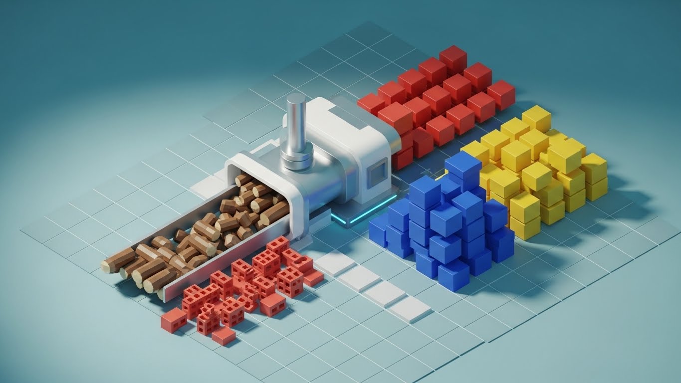
The Visual & Narrative Approach
Scenario: A pristine, tilt-shift Isometric 3D render of a baggage sorting loop. Industrial Yellow conveyor belts transport stylized suitcases (Red, Blue, Yellow blocks) through a complex network of sorters. The background is a clean Light Grey. The motion is clockwork-regular, emphasizing the software's ability to organize chaos into perfect batches.
Narration Tone: Analytical and Process-Driven. "Precision sorting logic. Optimized routing. Zero miss-sorts."
Psychological Impact & KPI Focus
Niche Psychology: Satisfies the Functional Buyer (Operations Manager) who loves logistics. The "Digital Twin" aesthetic respects their expertise and validates the software’s capability to handle complex hardware.
Operational Impact: Visualizes Sortation Logic, Chute Allocation, and Throughput Efficiency. It demonstrates command over the physical infrastructure.
Strategic Implementation & Trade-offs
Duration: 20-30 Seconds (Loopable).
Trade-offs: The "block" visuals are metaphorical. It requires the viewer to understand that the blocks represent baggage batches, not actual toys.
Companies using similar video content -
Beumer Group – CrisBag – Demystifying complex baggage sorting systems.
Trakindo – Baggage Handling Systems – Illustrating efficient baggage flow and sortation.
18. Abstract 2D Motion Graphics
BOFU | The Economic Buyer
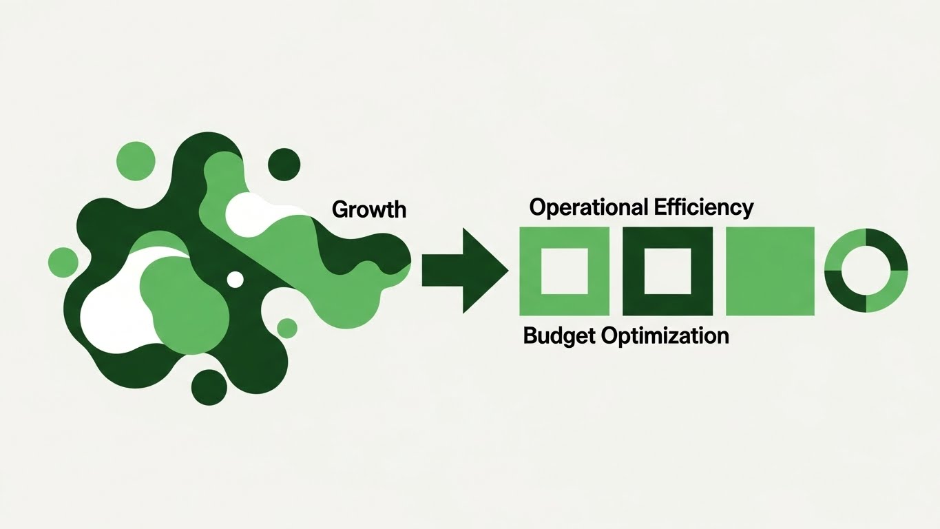
The Visual & Narrative Approach
Scenario: Fluid shapes in Growth Green and White morph on a soft grey background. Chaotic, amorphous blobs (representing waste) flow through a "filter" arrow and emerge as organized, streamlined squares and circles. The motion is rhythmic and satisfying, visually defining the transition from "Operational Friction" to "Budget Optimization."
Narration Tone: Sophisticated and Smooth. "Shape your resources. Eliminate waste. Streamline the bottom line."
Psychological Impact & KPI Focus
Niche Psychology: Uses the Fluency Heuristic to visualize efficiency. The smooth motion subconsciously reassures the Economic Buyer that the transition to the new platform will be frictionless and financially sound.
Operational Impact: Visualizes Lean Logistics, Waste Reduction, and Resource Allocation. It conceptualizes the "cleaning up" of a budget or workflow.
Strategic Implementation & Trade-offs
Duration: 10-15 Seconds.
Trade-offs: Highly abstract. It works best as a "Visual Palate Cleanser" between dense technical sections.
Companies using similar video content -
Google Cloud – Supply Chain Twin – Abstractly showing optimization and waste reduction in supply chains.
Aerogility – AI for Aviation – Fluid graphics representing streamlined operational efficiency.
19. Dark Mode UI Showcase
BOFU | The Technical Buyer

The Visual & Narrative Approach
Scenario: The aesthetic flips to Dark Mode. We see a high-contrast interface designed for power users: scrolling API logs in Matrix Green, network node maps in Electric Blue, and system health graphs. The focus is on the density and precision of the data structure.
Narration Tone: Technical and Robust. "Built on open APIs. 99.99% Uptime. Ready for enterprise scale."
Psychological Impact & KPI Focus
Niche Psychology: Targeted specifically at the CTO/CIO. "Dark Mode" is the aesthetic of the developer. It signals that this is a professional-grade tool, building credibility with technical gatekeepers.
Operational Impact: Visualizes Backend Stability, API Integration, and Data Latency. It proves the platform is robust enough to handle global loads.
Strategic Implementation & Trade-offs
Duration: 15-20 Seconds.
Trade-offs: Alienating to non-technical users. Do not use this for the CEO or Operations Director; it implies complexity. Use strictly for IT vetting.
Companies using similar video content -
Amadeus – Altéa Baggage – Showcasing robust backend for baggage management.
IBM – Cloud Pak for Data – Presenting a developer-focused view of data architecture.
20. 3D Parallax UI Presentation
BOFU | Driving Demo Requests
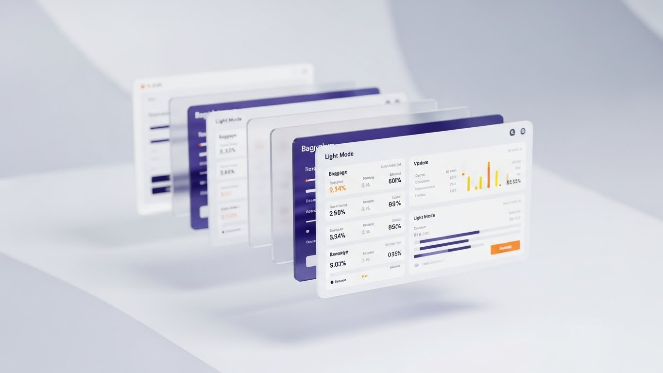
The Visual & Narrative Approach
Scenario: A sophisticated 3D composition where multiple UI screens float in a void. Using a Parallax Effect, the camera pans across the layers. The front layer shows detailed Light Mode baggage metrics in Blue/Orange, while rear layers fade into blur, suggesting depth and a comprehensive suite of tools (Reporting, HR, Fuel).
Narration Tone: Conclusive and Premium. "One platform. Endless capabilities. See the full picture."
Psychological Impact & KPI Focus
Niche Psychology: Triggers the Completeness Heuristic. Seeing the screens stacked implies a comprehensive, all-in-one solution, reducing the fear of needing multiple vendors. It creates a "Premium" perception.
Operational Impact: Visualizes the Full Solution Suite and Module Integration. It is the perfect visual summary to drive the final Call to Action: "Request a Demo."
Strategic Implementation & Trade-offs
Duration: 10-15 Seconds (Closing Shot).
Trade-offs: This is the "Glamour Shot" of the software. It is less about reading the data and more about admiring the scope of the solution. Perfect for the final closing shot.
Companies using similar video content -
Collins Aerospace – ARINC Airport Solutions – Presenting a comprehensive suite of airport management tools.
AeroCloud – Airport Management Platform – Layered UI showing integrated airport modules.
21. Photorealistic 3D Renders**
BOFU | Sales Cycle Acceleration
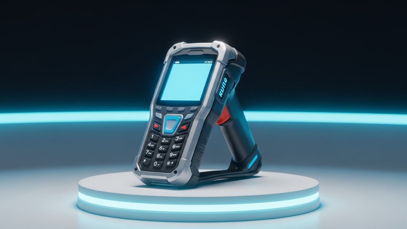
The Visual & Narrative Approach
Scenario: A studio-quality, photorealistic close-up of a ruggedized handheld barcode scanner. The device sits on a pristine white podium, showcasing its Matte Black and Silver polycarbonate texture. The screen emits a faint, cool blue glow, and the trigger mechanism looks tactile and robust. The lighting highlights the build quality, emphasizing durability.
Narration Tone: Tangible and Assured. "Hardware and software, unified. Reliability you can feel."
Psychological Impact & KPI Focus
Niche Psychology: Leveraging the Tangibility Heuristic. Software often feels abstract and risky to buyers; seeing the physical hardware it runs on makes the solution feel "real" and grounded. It reduces the anxiety of software-hardware incompatibility.
Operational Impact: Visualizes Hardware Compatibility and Device Durability. It reassures the procurement team that the software is optimized for the rugged tools actually used on the ramp (Zebra, Honeywell, etc.).
Strategic Implementation & Trade-offs
Duration: 10-15 Seconds.
Trade-offs: Static. This style creates product desire but explains nothing about the software interface. Use it to validate the ecosystem, not to teach the workflow.
Companies using similar video content -
Zebra Technologies – TC52 Mobile Computer – Highlighting the ruggedness and design of their devices.
Honeywell – Dolphin CT40 – Showcasing durable handheld scanners for logistics.
22. Holographic UI over 3D Render
Onboarding | Self-Serve Onboarding
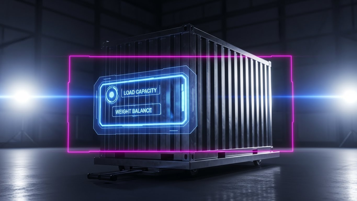
The Visual & Narrative Approach
Scenario: A standard aluminum Unit Load Device (ULD) container sits on a dolly in a dimly lit hangar. Suddenly, a futuristic, transparent Holographic Blue interface projects in front of it, displaying live metrics: "Load Capacity: 85%" and "Weight Balance: Optimal." The hologram casts a realistic faint blue light onto the metal ridges of the container.
Narration Tone: Futuristic and Educational. "See beyond the metal. Instant capacity insights, right where you load."
Psychological Impact & KPI Focus
Niche Psychology: Taps into the excitement of Augmented Reality (AR). It frames the job of a loader not as manual labor, but as a high-tech operation. It empowers the user with "Super-Vision."
Operational Impact: Visualizes Load Optimization and Capacity Planning. It demonstrates how the software helps ground staff maximize ULD usage without manual calculation errors.
Strategic Implementation & Trade-offs
Duration: 15-20 Seconds.
Trade-offs: Can set unrealistic expectations if your actual app doesn’t have AR capabilities. Ensure the narration clarifies this is a visualization of the data available, not necessarily a literal AR headset view.
Companies using similar video content -
PTC – Vuforia – Demonstrating AR overlays for industrial equipment.
Microsoft – HoloLens (for enterprise applications) – Visualizing AR for operational insights.
23. Clean UI Workflow (Light Mode)
Onboarding | Reducing Implementation Friction
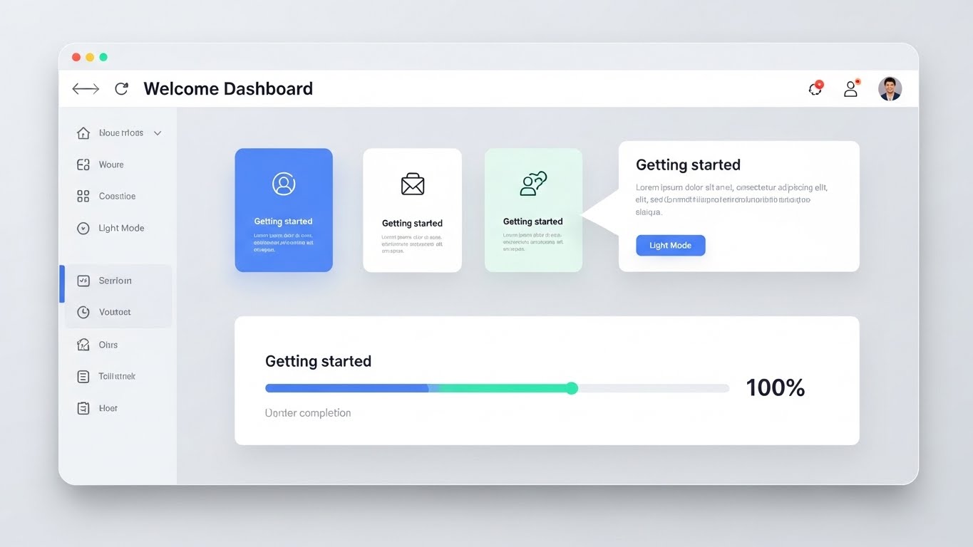
The Visual & Narrative Approach
Scenario: A high-key, pristine presentation of a web browser window. The "Welcome Dashboard" is clean, using a palette of Light Grey, Soft Blue, and Mint Green. A cursor smoothly clicks through "Getting Started" cards, and a prominent progress bar advances to 100%. The lighting is shadowless and even, making the interface look approachable and easy to read.
Narration Tone: Welcoming and Simple. "Day one, done. Get your team up to speed in minutes, not months."
Psychological Impact & KPI Focus
Niche Psychology: Addresses Change Management Fatigue. Operations teams dread complex training seminars. This style uses Cognitive Ease to promise a steep learning curve and a frustration-free start.
Operational Impact: Visualizes User Interface (UI) Intuition and Onboarding Speed. It directly targets the metric of "Time to First Action," proving the system is ready to use out of the box.
Strategic Implementation & Trade-offs
Duration: 30-60 Seconds (Tutorials).
Trade-offs: Lacks drama. It is purely functional. Do not use this for hype; use it for reassurance during the decision or onboarding phase.
Companies using similar video content -
INFORM GmbH – GroundStar (UI) – Clean, intuitive dashboard for new users.
AeroCloud – Airport Management Platform (UI) – Simplifying initial setup and user onboarding.
24. 2D Animation & UI Composition
Onboarding | Accelerating Time-to-Value

The Visual & Narrative Approach
Scenario: A playful, energetic composition. A stylized 3D/2D character (Purple trousers, Teal shirt) points enthusiastically to a floating UI window showing a "Volunteer Hours" graph trending upward. The background features abstract Vibrant Yellow and Grey geometric shapes. The motion is bouncy and responsive, blending character animation with functional UI elements.
Narration Tone: Encouraging and Lively. "Migration made easy. Drag, drop, and watch your efficiency fly."
Psychological Impact & KPI Focus
Niche Psychology: Uses Gamification cues to make administrative tasks feel rewarding. It reframes boring data entry or migration tasks as interactive and positive.
Operational Impact: Visualizes Data Migration Ease and System Setup. It is particularly effective for convincing mid-level managers that setting up the new system won't be a headache.
Strategic Implementation & Trade-offs
Duration: 15-30 Seconds.
Trade-offs: The stylized character may feel too "Start-up" for very conservative legacy airlines. Use primarily for email marketing and internal team hype videos.
Companies using similar video content -
AirportLabs – A-CDM (Onboarding) – Engaging animations for system setup and data integration.
Materna IPS – Self Bag Drop (Setup) – Gamified approach to configuring self-service solutions.
25. Macro UI Micro-Interactions
Retention | Reducing Support Overhead

The Visual & Narrative Approach
Scenario: An extreme macro close-up of a search bar. The focus is razor-sharp on the magnifying glass icon and the cursor blinking. As the search term is typed, the background blurs into a soft Teal bokeh, highlighting the immediate dropdown results. The lighting catches the subtle gradients on the buttons, emphasizing high-end design.
Narration Tone: Precise and Helpful. "Find the answer. Instantly. Knowledge at your fingertips."
Psychological Impact & KPI Focus
Niche Psychology: Triggers the Quality Heuristic. If the search bar—the smallest interaction—is this polished, the entire system must be robust. It builds subconscious trust in the platform's engineering.
Operational Impact: Visualizes Knowledge Base Accessibility and Search Functionality. It subtly encourages users to self-serve via search rather than opening a support ticket.
Strategic Implementation & Trade-offs
Duration: 5-10 Seconds (Loopable).
Trade-offs: Extremely narrow focus. It conveys "quality" but explains no features. Best used as a transition shot or a background header for a Help Center.
Companies using similar video content -
SITA – Customer Portal – Emphasizing precise search and self-service support.
Amadeus – Service Hub – Highlighting detailed UX for support and knowledge access.
26. Isometric 2D Motion Design
Retention | Website Visitor Re-engagement
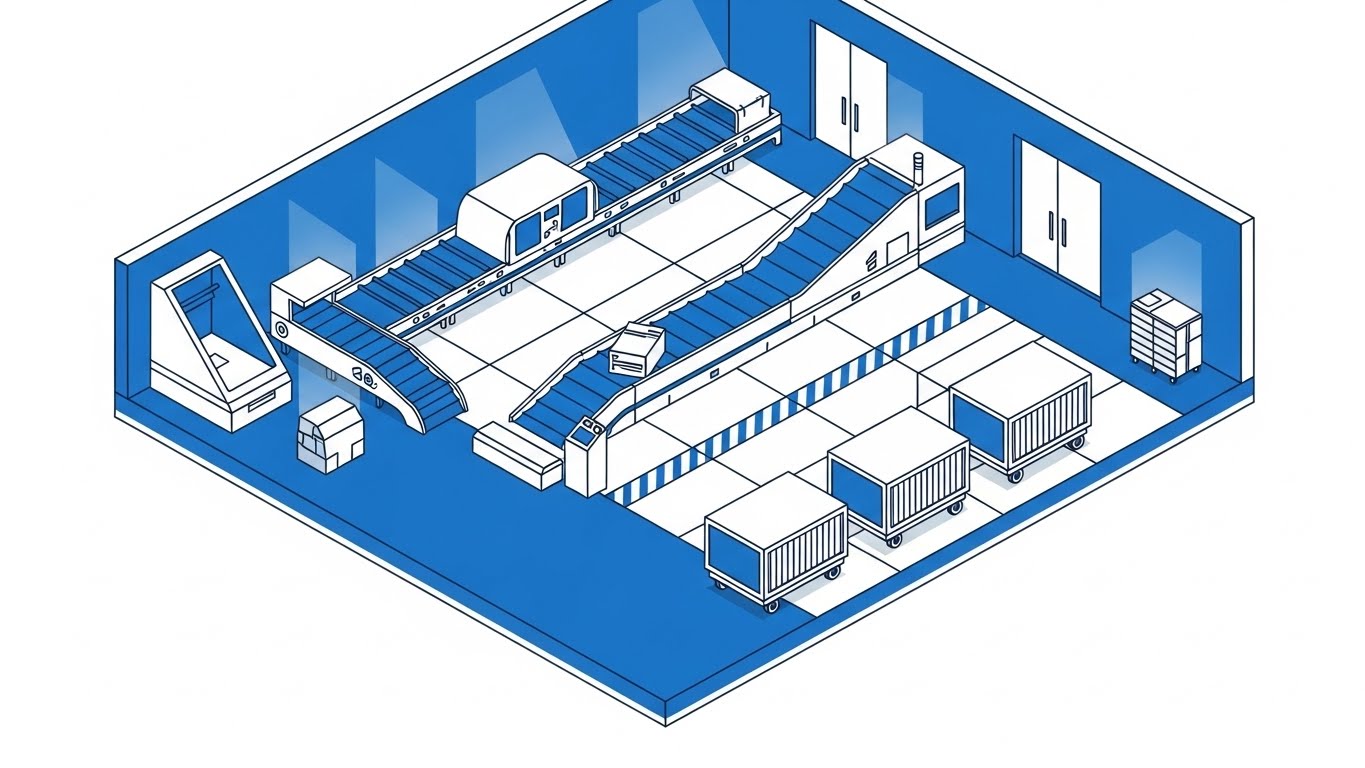
The Visual & Narrative Approach
Scenario: A clean, architectural view of a baggage make-up area on an isometric grid. Blueprint Blue and White dominate the palette. Simplified conveyor belts, chutes, and scanners move in a perfectly looped rhythm. The perspective is a precise 45-degree angle, turning the chaotic baggage room into an organized, logical flow chart.
Narration Tone: Analytical and Structural. "Every bag has a path. Visualize the logic behind the logistics."
Psychological Impact & KPI Focus
Niche Psychology: Appeals to the Systems Thinker. Operations Directors love to see the "flow." This style organizes complexity into a coherent, manageable structure, reducing the fear of bottlenecks.
Operational Impact: Visualizes Workflow Logic, Chute Assignment, and Spatial Organization. It is perfect for explaining how the software manages physical space and routing rules.
Strategic Implementation & Trade-offs
Duration: 15-20 Seconds.
Trade-offs: Can feel impersonal. It removes the human element entirely. Use it to explain the system, not the team.
Companies using similar video content -
Vanderlande – Baggage Handling Systems – Architectural view of sorting logic.
Siemens Logistics – Baggage Handling Systems (Software) – Mapping complex baggage flow with precision.
27. 2D Graphics Over Live Action
Retention | Reducing Churn

The Visual & Narrative Approach
Scenario: A high-quality satellite photograph of the Earth. Overlaid on the realistic globe are glowing Cyan Augmented Reality lines arcing between continents, connecting major airport hubs. Icons pop up at connection points (London, Dubai, New York). The visual blends the reality of the planet with the digital layer of the network.
Narration Tone: Global and Strategic. "From hub to spoke, your network is one. Validated, verified, and visible."
Psychological Impact & KPI Focus
Niche Psychology: Reinforces FOMO (Fear Of Missing Out) on a global scale. It reminds the client of the massive reach they are managing and how essential the software is to keeping it connected.
Operational Impact: Visualizes Network Connectivity and Multi-Station Management. It validates the software's role as the "connective tissue" of the airline's global operation.
Strategic Implementation & Trade-offs
Duration: 10-15 Seconds.
Trade-offs: Generic imagery. A globe is a common trope. To make it effective, the "AR Lines" must look specifically like data streams (binary, packets), not just flight paths.
Companies using similar video content -
SITA – Global Network – Overlaying data lines on a globe to show network reach.
Amadeus – Global Operations – Visualizing worldwide airport and airline connectivity.
28. AI generated mixed media video
Expansion | Driving Upsell/Cross-sell
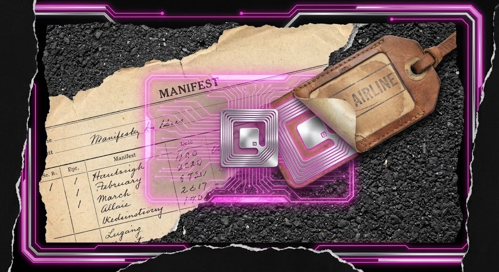
The Visual & Narrative Approach
Scenario: A dynamic, gritty collage animation. The screen splits and tears like paper. On one side, a vintage, weathered leather luggage tag sits on asphalt; on the other, a sleek Silver RFID chip glows with Neon Pink data streams. The textures blend—torn paper manifests transition into digital holograms. The motion is rapid and transformative.
Narration Tone: Disruptive and Bold. "Stop tagging. Start tracking. The future isn't written on paper."
Psychological Impact & KPI Focus
Niche Psychology: Creates Cognitive Dissonance. It visually clashes the "Old Way" (paper, leather, grit) with the "New Way" (Neon, Silver, Data) to make the old way look obsolete and expensive.
Operational Impact: Visualizes Digital Transformation and RFID Migration. It is a powerful tool for upselling clients from basic barcode scanning to advanced RFID tracking modules.
Strategic Implementation & Trade-offs
Duration: 15 Seconds (Social Ads).
Trade-offs: Highly stylized and aggressive. It may be too "artsy" for a conservative boardroom presentation but acts as a perfect scroll-stopper on LinkedIn.
Companies using similar video content -
Zebra Technologies – RFID vs Barcode – Contrasting old and new tracking technologies.
Identiv – Digital Transformation Solutions – Provoking a shift from legacy to modern identification.
29. Futuristic Neon/Dark Mode
Expansion | Driving Deep Feature Adoption
The Visual & Narrative Approach
Scenario: A wide, fish-eye perspective of a futuristic airport control center (OCC). The room is bathed in shadow, illuminated only by the Electric Neon Green glow of curved glass monitors and holographic projectors. Complex network maps reflect off the polished black floor. It feels like the bridge of a spaceship.
Narration Tone: Elite and Commanding. "Total situational awareness. The power to predict, prevented."
Psychological Impact & KPI Focus
Niche Psychology: Appeals to the Hero Complex. Every Ops Director wants to feel like they are running a mission-critical command center. This style glorifies the role of the decision-maker.
Operational Impact: Visualizes Predictive Analytics and Centralized Command. It positions the "Premium/Enterprise" tier of the software as a necessary upgrade for elite performance.
Strategic Implementation & Trade-offs
Duration: 15-20 Seconds.
Trade-offs: It is a fantasy. Real control rooms are messy. This is an aspirational vision to sell the feeling of control, not the reality of the office.
Companies using similar video content -
Honeywell – Forge for Airports (OCC) – Presenting a high-tech, centralized operational control.
IBM – Operations Analytics – Visualizing a futuristic command center for data insights.
30. Generative AI Realistic Character video
Expansion | Establishing Thought Leadership

The Visual & Narrative Approach
Scenario: A cinematic medium shot of a confident CEO-level executive (Navy Blue Suit). He stands in a high-tech airport office with floor-to-ceiling glass overlooking a blurred runway. He looks directly at the camera with a satisfied, knowing smile. Behind him, out of focus, large screens display stable global maps. The lighting is "Golden Hour," conveying warmth and success.
Narration Tone: Peer-to-Peer and Wise. "Leadership is about visibility. When you see everything, you fear nothing."
Psychological Impact & KPI Focus
Niche Psychology: Utilizes Social Proof and Authority Bias. The character represents the "Ideal Self" of the buyer—successful, calm, and respected. It associates the software with career success.
Operational Impact: Visualizes Executive Reporting and Strategic Oversight. It suggests that the ultimate output of the software is not just data, but confidence for the leadership team.
Strategic Implementation & Trade-offs
Duration: 15-30 Seconds.
Trade-offs: Relies entirely on the realism of the AI generation. Uncanny valley effects can destroy credibility. Use only high-fidelity generations.
Part 4: The Strategic Knowledge Base
The Visual Operations Doctrine: 30 Strategic Imperatives
You now possess a "Visual Lexicon" of 30 distinct styles. However, a library of assets is not a strategy. To transform these visuals into business outcomes—ROI, adoption, and efficiency—you must deploy them with architectural precision.
This concluding section synthesizes the insights from all 30 styles into a cohesive Visual Operations Doctrine. Divided into three strategic segments, these 30 imperatives provide the blueprint for integrating visual media into the very fabric of your logistics operation. This is where Advids moves from being a creator of content to a partner in strategy.
Strategic Alignment & Visual Architecture
The "Pre-Production" Strategy. Defining Why and Who before How.
- The Cognitive Load Audit: Before commissioning a single pixel, audit your current training materials (Style 2, 17). If a PDF takes 20 minutes to read, a 30-second motion graphic can likely replace it. Measure the "Time-to-Comprehension" gap.
- Role-Based Visual Mapping: Do not show the same video to a Ramp Agent and a CIO. Use Mobile/High-Contrast styles (Style 4, 5) for ground crews who need speed, and Data-Dense/Dark Mode styles (Style 19, 29) for executives who need depth.
- The "Glanceability" Standard: In logistics, attention is a scarce resource. Adhere to a 3-second rule for operational visuals: if the core message (e.g., "Load Here") isn't understood in 3 seconds (Style 22), the design has failed.
- Brand Voice Consistency: Your software likely spans multiple modules (Check-in, Sortation, Reclaim). Use a unified visual palette (Style 20) across all videos to ensure the "Sorting" tool feels like part of the same family as the "Reporting" tool.
- The Advids Strategic Audit: Leveraging an external partner like Advids during the planning phase ensures your visual language is built on global best practices, not just internal habits. We define the "Visual Operating System" before production begins.
- Standardization vs. Customization: Use cost-effective Stock/2D styles (Style 8, 27) for universal concepts like "Global Connectivity." Save your budget for bespoke 3D/Digital Twin styles (Style 7, 17) for unique, proprietary hardware integrations.
- The Cross-Departmental Bridge: Visuals are the only common language between Sales (who sell the dream - Style 3) and Support (who fix the reality - Style 25). Use the same core assets to align these teams on terminology and promise.
- Legacy System Integration: Visualizing the connection between 20-year-old conveyor belts and modern cloud SaaS is critical. Use Wireframe-to-Reality transitions (Style 7) to prove to engineers that you respect the legacy infrastructure.
- Accessibility in Global Logistics: Aviation is multilingual. Design motion graphics (Style 2, 6) that rely on visual cues and icons rather than voiceover or text, ensuring your training works in Mumbai, Munich, and Montreal without re-editing.
- The Mobile-First Mandate: 80% of your users are non-desk employees. Every style from 1-30 must be legible on a ruggedized tablet or smartphone screen (Style 5). If it doesn't work on mobile, it doesn't work for logistics.
Operational Adoption & Implementation
The "Deployment" Phase. Embedding visuals into the daily workflow.
- Overcoming "Big Brother" Anxiety: Tracking features often generate resistance. Use Empathy-First visuals (Style 12, 13) that focus on safety and efficiency rather than surveillance, framing the software as a "Guardian" rather than a "Policeman."
- The Micro-Learning Shift: Replace the 100-page operational manual with a library of 30-second Micro-Interactions (Style 25). Deliver these "Visual Pills" directly via mobile/tablets to the ramp. This "Just-in-Time" learning dramatically increases feature retention.
- Just-in-Time Support: Embed specific technical animations (Style 17) into the helpdesk ticketing system. When a user logs an issue about "Sortation Jams," automatically serve them the video showing the sortation logic.
- Gamification of Training: Use Character/Success visuals (Style 13, 24) to celebrate milestones. Visualizing a "Perfect Load Week" with high-energy graphics creates a dopamine loop that reinforces protocol adherence.
- Reducing Support Ticket Volume: There is a direct correlation between the quality of your Onboarding visuals (Style 23) and the volume of "Level 1" support calls. Invest in clarity upfront to save thousands in support hours later.
- Remote Onboarding: For distributed global teams, physical seminars are impossible. Use Immersive 3D scenarios (Style 1, 29) to create a sense of physical presence and facility familiarity without a single flight ticket.
- Standard Operating Procedures (SOPs): Text-based SOPs are rarely read. Transform critical safety SOPs into 2D Line Art loops (Style 2). These can play on loop in breakrooms or on dashboard login screens to reinforce muscle memory.
- Feedback Loops: Use interactive video elements. After a driver watches a Safety Procedure video (Style 4), a simple "Thumbs Up/Down" interaction provides immediate data on whether the policy is understood or rejected.
- Scalable Localization: When expanding to new regions, use Abstract/Organic Motion (Style 10) for high-level concepts. These styles are culturally neutral and require zero localization, unlike live-action footage which may need reshooting.
- Leadership Communication: When rolling out a new fleet strategy, do not send a memo. Send a Cinematic Vision video (Style 3, 30) from the CEO. High-production values signal to the company that this initiative is a priority.
Measuring Impact & Future-Proofing
The "ROI" Phase. Quantifying value and preparing for the next decade.
- Beyond "Views" - Actionable KPIs: Stop measuring video "views." Measure Time-to-Competency (how fast a new hire reaches full productivity) and Feature Adoption Rate (clicks on a feature after watching its explainer - Style 19).
- The "Idle Time" Metric: In logistics, time is money. Correlate better visualization (Style 11) with reduced "screen idle time"—the time a user spends staring at the screen trying to figure out what to do next.
- Compliance Velocity: When new regulations (like IATA 753) drop, measure how quickly your workforce reaches 100% compliance. Video-based training (Style 9) historically accelerates this "Compliance Velocity" by 3x compared to text.
- Retention and Churn: High-quality UX visualization (Style 25) reduces user frustration. Track the LTV (Lifetime Value) of clients who engage with your video academy versus those who don't; the former are almost always stickier.
- The AI Visual Frontier: Prepare for Generative Video (Style 28, 30). As AI evolves, you will soon be able to generate personalized training videos for specific airports or specific cargo types in real-time.
- Scalability of Assets: Build a "Visual Lego Kit." By creating modular 3D assets (scanners, bags, belts - Style 6), you can assemble new videos for future features at a fraction of the cost of starting from scratch.
- The Advids Partnership: Scale requires continuity. Partnering with Advids ensures that your library of assets evolves coherently. We act as the custodian of your visual brand, ensuring Style 1 and Style 100 feel like they belong to the same enterprise.
- Benchmarking Success: In a B2B SaaS market, "good enough" visuals are a competitive risk. If your competitor uses Photorealistic 3D (Style 21) and you use blurry screenshots, you lose the perception war before the demo begins.
- The ROI of Safety: Quantify the unquantifiable. Use Simulation visuals (Style 8) to train on hazardous materials. The ROI here is not just efficiency; it is the Insurance Cost Reduction and liability avoidance from preventing accidents.
- Final Call to Innovation: Treat video not as "Marketing Content" but as Digital Infrastructure. Just as you upgrade your servers and scanners, you must upgrade your visual communication. It is the interface between your code and the humans who operate it.
[END OF GUIDE]
Companies using similar video content -
Microsoft – Industry Solutions (Aviation) – Featuring a confident executive discussing strategic vision.
SAP – Executive Insights – Presenting thought leadership through a visionary character.
Author & Editor Bio


