
Introduction: Visualizing the Continuous Close
The financial close is undergoing a profound structural shift. For decades, the month-end process was a retrospective sprint—a high-pressure race to align the physical reality of bank statements with the digital record of the General Ledger. Today, that paradigm is dissolving into the "Continuous Close," where reconciliation happens in near real-time, transforming the Controller’s role from scorekeeper to strategic architect.
The core challenge has never been the math; it is the visibility. The friction lies in the invisible gap between external banking data and internal ERP ledgers. When software successfully bridges this divide, it doesn't just process data; it visualizes the handshake between two complex systems. Effective video communication in this domain must move beyond generic stock footage of calculators. It must articulate the precision, speed, and fluidity of automated matching logic to build trust in the "Black Box" of automation.
This shift represents a massive operational opportunity. With the global reconciliation software market valued at USD 2.01 billion in 2024, the industry is aggressively moving toward automation. The cost of the status quo is simply too high to ignore: recent studies indicate that manual data entry costs businesses an average of $28,500 per employee annually. This financial drain, coupled with the risk of human error, makes the adoption of automated solutions a critical competitive advantage.
This guide explores the visual language of this transformation. We have curated 30 specific visualization styles designed to communicate the value of bank reconciliation software. From abstract metaphors of chaos-turning-to-order to literal UI simulations of straight-through processing, these examples provide a blueprint for marketing leaders to articulate value, build trust, and drive adoption.
1. The Clarity of Order
TOFU | Market Education
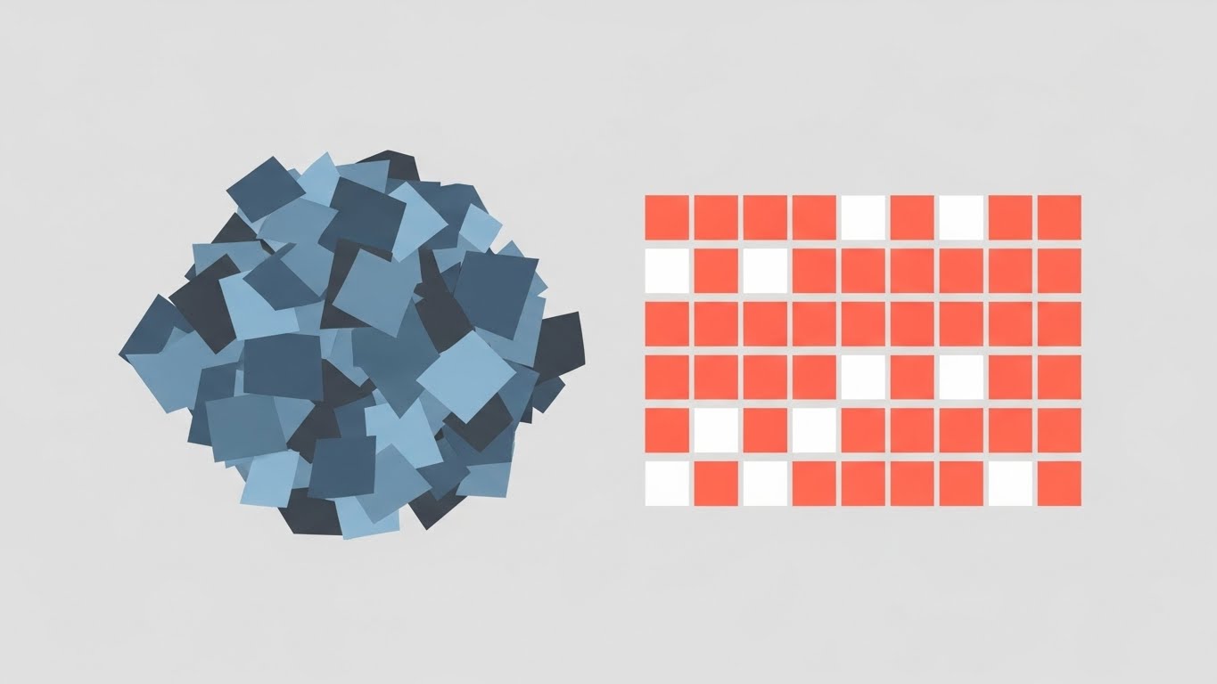
The Visualization Scenario
This style utilizes a clean, "Function-First" aesthetic to visualize the core promise of reconciliation: entropy reduction. The visual narrative begins on the left with a disorganized pile of slate blue and charcoal gray shapes—representing raw, unstructured bank feed data. As these shapes traverse the frame, they are sorted by an invisible logic, clicking satisfyingly into a rigid, perfect grid of vivid coral and pure white squares on the right. The transition is smooth, linear, and shadowless.
Psychological Impact & KPI Focus
- Niche Psychology: The "Modernizer" persona is often overwhelmed by the sheer volume of unmatched transaction rows. This visual directly reduces Cognitive Load by offering a "clean desk" metaphor. It appeals to the accountant’s innate desire for symmetry and balance.
- Operational Impact: This style effectively communicates Time-to-Value. By showing an instant transition from mess to ledger-ready data, it visually shorthands the speed of implementation and the immediate organizational impact.
Strategic Implementation & Trade-offs
- Best Use Case: Ideal for TOFU Social Media (LinkedIn/Twitter) loops. The strong contrast between the "Before" (Chaos) and "After" (Order) works instantly on small screens without audio.
- Strategic Trade-off: While excellent for high-level concepts, this abstract style lacks the technical nuance to explain how the matching occurs (e.g., fuzzy logic vs. exact match). It sells the result, not the process.
Companies using similar video content -
Solvexia – Solvexia Platform – Automates spreadsheet-driven processes for clear data.
Ledge – Ledge – Provides continuous, accurate AI-powered reconciliation.
Xero – Xero Reconciliation – Simplifies bank reconciliation with clear dashboards.
2. The Fluid Merger
TOFU | Brand Awareness

The Visualization Scenario
Moving away from rigid grids, this style uses fluid dynamics to represent "Transaction Matching." Two distinct, organic shapes—one in glossy teal (representing the Bank) and one in soft pink (representing the Ledger)—drift toward the center of a creamy off-white void. Upon contact, they don't just stack; they fuse. The liquid glass textures shimmer as the two colors blend to form a perfect, unified sphere. The motion is slow and hypnotic, suggesting a seamless, friction-free integration.
Psychological Impact & KPI Focus
- Niche Psychology: Finance professionals often fear that integration will be "clunky" or prone to breaking. This visual metaphor alleviates that fear by demonstrating Interoperability as a natural, fluid state rather than a forced mechanical connection.
- Operational Impact: This style highlights Error Reduction. The seamless merger implies a 100% match rate with no jagged edges or "hanging" transactions, reinforcing the concept of a clean audit trail.
Strategic Implementation & Trade-offs
- Best Use Case: Best suited for Brand Awareness campaigns on platforms like Instagram or high-level website headers. It builds an emotional connection to the brand's ease of use.
- Strategic Trade-off: The high level of abstraction means it cannot convey specific features like "multi-currency handling." It is a mood setter, not a product explainer.
Companies using similar video content -
Duco – Duco Reconciliation – Customizable data reconciliation with fluid, no-code interface.
BlackLine – BlackLine – Unifies financial operations with seamless data flow.
Trintech – Cadency – Offers cloud-based financial close and reconciliation services.
3. The Velocity of Validation
TOFU | Shaping Brand Perception

The Visualization Scenario
This style creates a high-energy visual rhythm using massive geometric blocks, referencing Bauhaus design principles. Electric blue and canary yellow blocks—representing heavy data packets—collide in the center of a black frame with palpable force. Upon collision, they instantly align into a perfect vertical stack, emitting stylized white motion lines to emphasize the snap. The aesthetic is aggressive, sharp, and confident.
Psychological Impact & KPI Focus
- Niche Psychology: For a Controller facing a month-end deadline, speed is the primary currency. This aggressive kinetic style taps into the Urgency and Resolution dopamine loop. It validates the user's need for power and rapid processing.
- Operational Impact: This style is a direct visualization of Processing Volume. It suggests the system can handle thousands of transactions per second without lagging, addressing concerns about scalability.
Strategic Implementation & Trade-offs
- Best Use Case: Perfect for Pre-Roll Ads (YouTube) where you have 5 seconds to grab attention. The visual impact is loud enough to stop scrolling.
- Strategic Trade-off: The high energy can feel "noisy" or overwhelming if used for long-form tutorials. It is best used as a hook or a transition, not the main instructional medium.
Companies using similar video content -
HighRadius – HighRadius Automated Account Reconciliation Software – Delivers AI-powered reconciliation at enterprise scale.
FloQast – FloQast Reconciliation Management – Accelerates financial close with rapid processing.
Redwood Software – RunMyJobs – Provides full-stack automation for crucial business processes.
4. Signal From Noise
TOFU | Vertical Social Organic

The Visualization Scenario
This visualization addresses the concept of "Signal-to-Noise Ratio" in financial data. The screen begins filled with "digital noise"—scattered, flickering pixels in lavender and charcoal, representing unmatched variance and data clutter. A sweeper bar moves across the screen, and behind it, the noise is transformed into a clean, rhythmic waveform made of precise mint green vector lines. The composition is symmetrical and frontal.
Psychological Impact & KPI Focus
- Niche Psychology: Accountants constantly battle "data fog"—the inability to see clear trends amidst transactional volume. This visual acts as a Clarifying Agent, promising a reduction in mental fatigue.
- Operational Impact: This aligns with Exception Handling Efficiency. It visualizes the software’s ability to isolate true discrepancies (the signal) from standard transactions (the noise).
Strategic Implementation & Trade-offs
- Best Use Case: Highly effective for Vertical Social (TikTok/Reels/Shorts). The vertical transformation is satisfying to watch and visually explains the "why" of the software quickly.
- Strategic Trade-off: It is somewhat abstract for explaining specific accounting rules. It requires a voiceover or overlay text to contextualize that the "waveform" represents reconciled cash flow.
Companies using similar video content -
Xelix – Xelix Control Centre – AI-powered platform for overpayment and fraud prevention.
DOKKA – DOKKA – Contextual AI automates variance detection and exception handling.
Alteryx – Alteryx – Automates data workflows for reporting and data cleaning.
5. The Instant Completion Loop
TOFU | Skippable Pre-Roll Ad
The Visualization Scenario
This style is a direct representation of user gratification. It centers on a graphic abstraction of a UI progress bar, vivid cyan against a deep magenta background. The bar fills to 100% in a rapid, non-linear burst. Surrounding the bar are abstract "success" icons (circles, checks, shields) which burst outward, blurring slightly to indicate high velocity. The tone is celebratory and efficient.
Psychological Impact & KPI Focus
- Niche Psychology: The "Gamification" of work is a subtle but powerful motivator. This style leverages the Completion Bias—the human desire to see tasks finished. It frames the software as a tool that helps users "win" their day.
- Operational Impact: Explicitly ties to User Productivity. It suggests that the software accelerates the workflow, allowing the team to "green light" the close process faster than manual methods permit.
Strategic Implementation & Trade-offs
- Best Use Case: A staple for Skippable Pre-Roll Ads. The "100% Complete" visual is a universal hook that promises a solution to the viewer's current work-in-progress anxiety.
- Strategic Trade-off: By abstracting the UI, it sets an expectation of simplicity. If the actual product interface is clunky or complex, this marketing style can create an "Expectation Gap."
Companies using similar video content -
Numeric – Numeric – Streamlines financial close with rapid implementation.
FloQast – FloQast Reconciliation Management – Provides quick task completion for accounting workflows.
QuickBooks – QuickBooks – Simplifies bank reconciliation with automated matching.
6. The Audit Trail Loop
TOFU | Instant Gratification Hook

The Visualization Scenario
Eschewing color blocks for elegance, this style uses a single, continuous line in metallic gold against a stark black background. The line acts as a living wire, elegantly twisting and looping to form the abstract outline of a coin. Without breaking continuity, the coin shape rolls smoothly into a rectangular "slot," completing the drawing. The aesthetic is sophisticated, reminiscent of high-end fintech or private banking.
Psychological Impact & KPI Focus
- Niche Psychology: This style appeals to the CFO Persona who values precision and control. The "continuous line" metaphor subtly suggests an unbroken audit trail and data integrity—there are no gaps where data can be lost.
- Operational Impact: Represents Straight-Through Processing (STP) rates. The unbroken line implies that data flows from the bank to the ERP without manual intervention (the "touchless" ideal).
Strategic Implementation & Trade-offs
- Best Use Case: Excellent for Social Media hooks targeting senior decision-makers. The "Dark Mode" aesthetic stands out in bright feeds and implies a premium, enterprise-tier solution.
- Strategic Trade-off: It is purely metaphorical. It tells the viewer nothing about the software's interface or specific features. It is a brand-building asset.
Companies using similar video content -
Trintech – Cadency – Ensures risk governance and audit-ready reporting.
BlackLine – BlackLine – Offers strong internal controls and compliance support.
ReconArt – ReconArt Reconciliation Suite – Provides comprehensive audit trails and data integrity.
7. The User-Centric Victory
MOFU | Demand Gen & Lead Capture

The Visualization Scenario
This style humanizes the software interaction using the "Corporate Memphis" aesthetic. A stylized illustration of a young professional woman (medium-dark skin, curly hair, sky blue blazer) stands in a minimalist office. She is enthusiastically high-fiving a large, floating UI element—a tangerine-colored shield with a white checkmark. The limbs are exaggerated and flexible, and the shading is flat. The mood is joyful, celebrating the partnership between the human accountant and the digital tool.
Psychological Impact & KPI Focus
- Niche Psychology: This addresses the Fear of Replacement. Instead of showing the software doing the job instead of the human, it shows the software supporting the human. It frames automation as a "Digital Colleague" that empowers the user.
- Operational Impact: Focuses on Employee Satisfaction and Retention. By reducing burnout from manual data entry, the software creates a happier, more "celebratory" work environment.
Strategic Implementation & Trade-offs
- Best Use Case: Strong for MOFU Display Ads and retargeting. It reminds the user that their workday could be better/easier/happier with this tool.
- Strategic Trade-off: This style is becoming ubiquitous in SaaS. To avoid "ad blindness," the animation needs to be specific—perhaps the shield represents a specific "Audit Pass" rather than just generic success.
Companies using similar video content -
Prophix – Prophix One Account Reconciliation – Empowers finance teams with user-friendly automation.
FloQast – FloQast Reconciliation Management – Enhances collaboration and user experience.
Sage Intacct – Sage Intacct Reconciliation – Offers built-in collaboration tools for finance teams.
8. The Logic Engine
MOFU | Product/Solution Differentiation

The Visualization Scenario
This style uses an isometric perspective to visualize the "System Architecture." A stylized conveyor belt system, rendered in emerald green and silver, moves diagonally across the screen. Small, uniform cubes (representing standardized data packets) travel along the belt and slide effortlessly into matching slots in a central server hub. The background is a pale lime green. The look is technical but approachable, making complex routing logic look like a well-oiled machine.
Psychological Impact & KPI Focus
- Niche Psychology: For the IT and Systems Admin stakeholders, this visual is reassuring. It demonstrates structure, logic, and order. It visualizes the "Black Box" of automation, making the rules-based engine transparent and understandable.
- Operational Impact: Demonstrates Workflow Automation Logic. It shows that the system can handle high-volume, repetitive tasks (the cubes) without fatigue or error.
Strategic Implementation & Trade-offs
- Best Use Case: Ideal for Website Product Pages and "How It Works" sections. It bridges the gap between marketing fluff and technical diagrams.
- Strategic Trade-off: Can feel impersonal. It risks making the process look too mechanical, potentially alienating users who handle complex, non-standard exceptions that don't fit into "cubes."
Companies using similar video content -
ReconArt – ReconArt Reconciliation Suite – Visualizes rule-based matching and data integration.
Solvexia – Solvexia Platform – Builds automated, scalable, code-free solutions.
Multiview ERP – Multiview ERP – Provides structured reconciliation workflows and automation.
9. The Growth Projector
MOFU | Feature Education & Demonstration

The Visualization Scenario
This style focuses on the "Output" of reconciliation: Visibility. A 3D render depicts translucent, glass-like bar charts rising rapidly from a reflective royal blue floor. The bars are gold and white, refracting light. The camera angle is low, looking up, which makes the growth appear monumental and imposing. The background is an infinite white studio space. The visual metaphor is clear: clear data leads to solid growth and high visibility.
Psychological Impact & KPI Focus
- Niche Psychology: The CFO and Controller care about the result: Cash Visibility. This style validates their need for accurate, real-time reporting. The "Glass" texture suggests transparency—literally "seeing through" the numbers to the truth.
- Operational Impact: Directly links to ROI and Cash Positioning. It visualizes the financial health of the organization improving as a result of the software's implementation.
Strategic Implementation & Trade-offs
- Best Use Case: Perfect for Pitch Decks and Sales Presentations. It provides a "hero shot" that visualizes the ultimate benefit of the investment.
- Strategic Trade-off: It is highly stylized. It does not look like the actual dashboard, so it must be paired with actual UI screenshots in a full presentation to avoid setting false expectations.
Companies using similar video content -
OneStream – OneStream Platform – Unifies financial data for better decisions and growth.
Kyriba – Kyriba – Centralizes information for cash flow and investment decisions.
Planful – Planful – Streamlines financial close with centralized financial management.
10. The Integration Bridge
MOFU | Overcoming Objections
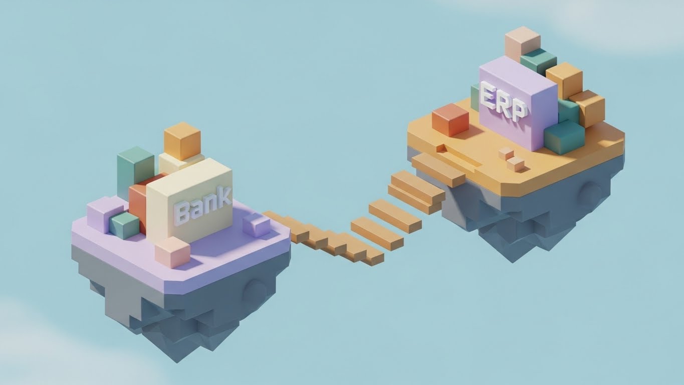
The Visualization Scenario
This style simplifies the complexity of integration using a playful, "toy-like" aesthetic. A low-poly 3D render shows two floating islands in a soft pastel blue sky. One island is labeled "Bank" and the other "ERP." As the viewer watches, a wooden bridge self-assembles plank by plank between them, physically connecting the two landmasses. The lighting is soft ambient daylight. The tone is cute, simple, and illustrative, designed to make a scary technical hurdle look easy.
Psychological Impact & KPI Focus
- Niche Psychology: "Integration Anxiety" is a major barrier to adoption. Prospects worry that connecting a new tool will break their legacy ERP. This friendly visual mitigates that fear by framing integration as a simple, constructive process—building a bridge, not hacking a system.
- Operational Impact: Illustrates ERP Integration Capabilities. It simplifies the conversation around APIs and file formats into a universal symbol of connection.
Strategic Implementation & Trade-offs
- Best Use Case: Great for Social Media Explainer Shorts and introductory blog posts. It disarms the viewer and invites them to learn more without overwhelming them with technical details.
- Strategic Trade-off: The "cute" factor might undercut the seriousness of the solution for enterprise clients who want "Military Grade" security, not floating islands.
Companies using similar video content -
Sage Intacct – Sage Intacct Reconciliation – Offers seamless ERP integration with advanced reconciliation.
Oracle – NetSuite Account Reconciliation – Provides ERP-integrated bank reconciliation.
DualEntry – DualEntry – Connects with various banks and supports multi-entity.
11. The Implementation Blueprint
MOFU | Reducing Implementation Friction

The Visualization Scenario
This style directly addresses the "Vaporware" fear—the suspicion that sales demos are smoke and mirrors. The composition uses a split-screen wipe effect. The left side displays a technical "blueprint" wireframe in schematic blue and white, outlining the robust data architecture. As the eye moves right, the wireframe transforms into a sleek, photorealistic silver tablet device. The screen displays a live, glossy interface with a vivid green "Reconciled" checkmark. The background transitions from a raw construction surface to a pristine white executive desk.
Psychological Impact & KPI Focus
- Niche Psychology: Implementation is often the most stressful phase for a Controller. This visual metaphor offers Psychological Safety by showing a clear, predictable path from plan (wireframe) to execution (reality). It validates that the software is built on a solid architectural foundation.
- Operational Impact: Highlights Time-to-Value. It suggests that the path from signing the contract to achieving the "Green Check" is engineered, structured, and rapid.
Strategic Implementation & Trade-offs
- Best Use Case: Essential for Website "How It Works" pages and implementation guides. It bridges the gap between the technical buyer (IT) and the functional buyer (Finance).
- Strategic Trade-off: It is conceptual. It sells the assurance of the process, not the specific steps (like API mapping), so it should be supported by detailed documentation.
Companies using similar video content -
Trintech – Adra by Trintech – Streamlines financial close with predictable implementation.
BlackLine – BlackLine – Designed for compliance-led enterprise environments.
Numeric – Numeric – Offers rapid implementation for mid-size to large enterprises.
12. The Sentinel Intelligence
MOFU | ABM Awareness

The Visualization Scenario
Security is the bedrock of banking confidence. To visualize the intangible concept of "AI Security," this style uses a high-tech, cybernetic aesthetic. A complex network of glowing neon blue and hot pink nodes floats in a deep purple void. These nodes dynamically swarm and lock together to form the outline of a protective shield, with the text "AI" glowing at the core. The aesthetic uses depth of field and bloom effects to suggest sophisticated, active intelligence guarding the data.
Psychological Impact & KPI Focus
- Niche Psychology: In an era of increasing digital fraud, the CFO views security as non-negotiable. This style taps into the Protection Motivation, positioning the software not just as a calculator, but as an active sentinel.
- Operational Impact: Communicates Risk Management and Fraud Detection. It visualizes the system’s ability to flag anomalies (the pink nodes) before they affect the general ledger, reducing the risk of financial restatement.
Strategic Implementation & Trade-offs
- Best Use Case: Highly effective for LinkedIn Sponsored Content targeting Enterprise sectors where security is a top-three purchase criterion.
- Strategic Trade-off: The "Sci-Fi" look can feel distant from daily accounting tasks. It works best when paired with copy that explains specific security features (e.g., "Anomaly Detection").
Companies using similar video content -
Xelix – Xelix Control Centre – AI-powered for overpayment and fraud prevention.
HighRadius – HighRadius Automated Account Reconciliation Software – Provides AI-driven anomaly detection.
Fiserv – Reconciliation and Exception Management – Offers robust exception management.
13. The Frictionless Surface
MOFU | The Functional Buyer
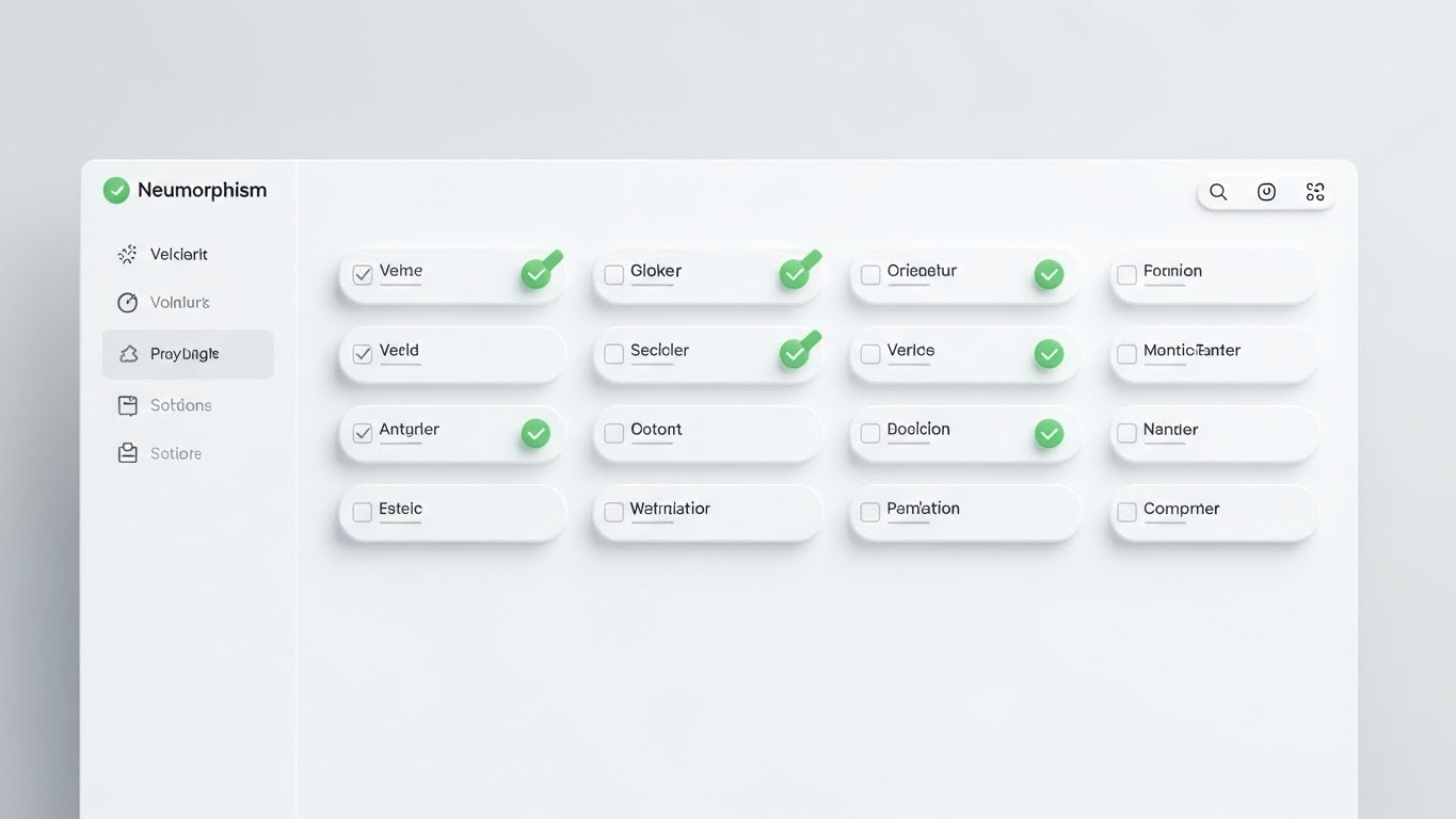
The Visualization Scenario
Moving to the user experience, this style employs "Neumorphism"—a design trend characterized by soft, extruded shadows and low contrast. The interface is rendered in pure whites and very light greys, making the buttons look tactile and soft, like pressed clay. A central checklist is being completed, with items turning into soft green indicators upon matching. The aesthetic is incredibly clean, quiet, and calming, deliberately removing the visual "noise" usually associated with spreadsheets.
Psychological Impact & KPI Focus
- Niche Psychology: Reconciliation is often associated with eye strain and "spreadsheet fatigue." This visual offers a Cognitive Respite. It promises a user interface that is gentle, intuitive, and designed for human comfort.
- Operational Impact: Focuses on User Efficiency. A cleaner interface leads to faster processing times and fewer click-errors, directly improving the efficiency of the finance team.
Strategic Implementation & Trade-offs
- Best Use Case: Perfect for Product Demo Videos and feature walkthroughs. It makes the software look "easy to learn," which is a key factor for teams resisting change.
- Strategic Trade-off: The "softness" might lack the data density required by power users who want to see 50 rows of data at once. It sells "ease," not "volume."
Companies using similar video content -
DOKKA – DOKKA – Focuses on removing work with an intuitive user experience.
FloQast – FloQast Reconciliation Management – Provides a user-friendly view into financial reporting.
Xero – Xero Reconciliation – Features an intuitive dashboard and tailored workflows.
14. The Operational Divide
MOFU | Competitive Displacement
The Visualization Scenario
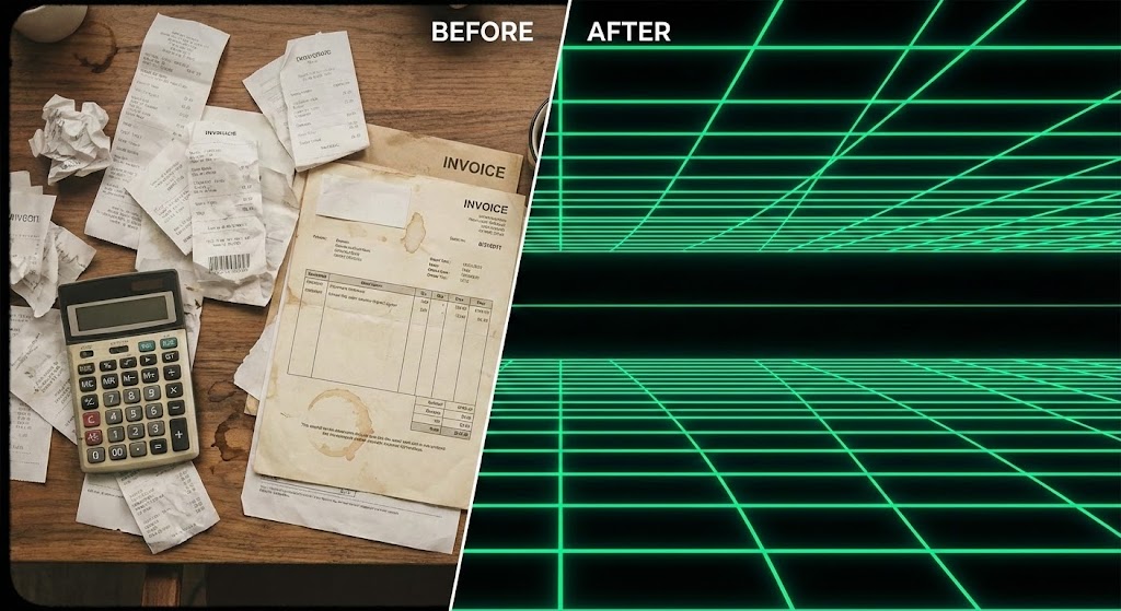
This is the classic "Before and After" elevated to a strategic narrative. The left side of the screen shows a top-down photograph of a chaotic wooden desk, cluttered with crumpled receipts, a vintage calculator, and coffee stains—rendered in desaturated, warm tones. A sharp diagonal line slices the screen. The right side reveals a pristine, neon green and black vector grid, representing the "Digital Twin" of the process. The contrast between the messy analog past and the structured digital future is stark.
Psychological Impact & KPI Focus
- Niche Psychology: It leverages the Contrast Principle. By juxtaposing the stress of the physical mess with the sleekness of the digital order, it triggers a desire for the "After" state. It validates the user's struggle with their current manual process.
- Operational Impact: Visualizes Process Modernization. It communicates that the software doesn't just digitize the mess; it fundamentally structures it, moving the organization from reactive paper-pushing to proactive digital management.
Strategic Implementation & Trade-offs
- Best Use Case: High-performing for Retargeting Ads. If a user visited your pricing page but didn't convert, this visual reminds them of the pain of staying with their current manual methods.
- Strategic Trade-off: It can feel slightly cliché if the "Before" image is too exaggerated. The mess needs to look realistic to maintain professional respect.
Companies using similar video content -
BlackLine – BlackLine – Modernizes accounting procedures by consolidating data.
Trintech – Cadency – Transforms manual processes into standardized workflows.
Solvexia – Solvexia Platform – Automates spreadsheet-driven and manual processes.
15. The Vault Architecture
MOFU | The Technical Buyer
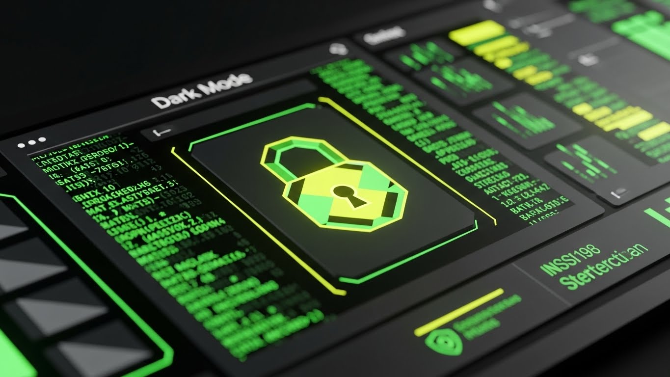
The Visualization Scenario
Targeting the technical stakeholder, this style utilizes a "Dark Mode" aesthetic associated with developer tools and high-end financial terminals. Against a deep matte black background, scrolling columns of abstract data and code blocks are rendered in "Matrix green" and dark grey. In the center, a stylized padlock icon glows with a yellow-green gradient. The look is serious, high-contrast, and impenetrable, conveying robustness.
Psychological Impact & KPI Focus
- Niche Psychology: For the IT Director or System Admin approving the purchase, "Dark Mode" signals Professional Grade software. It aligns with the aesthetics of the tools they trust (IDEs, terminals), subconsciously categorizing the software as secure.
- Operational Impact: Highlights Data Integrity and Compliance. It reassures stakeholders that the data is secure, encrypted, and audit-ready, addressing concerns about cloud vulnerability.
Strategic Implementation & Trade-offs
- Best Use Case: Ideal for Security Whitepapers and the "Security" section of the website. It speaks the visual language of the gatekeeper who holds the veto power.
- Strategic Trade-off: Can be intimidating to non-technical users. It should be used selectively for technical audiences, not for general user onboarding.
Companies using similar video content -
BlackLine – BlackLine – Emphasizes strong internal controls and compliance.
Trintech – Cadency – Focuses on risk governance and compliance control.
Oracle – Oracle Fusion Cloud EPM – Manages and secures data with an autonomous database.
16. The Golden Record
BOFU | The Economic Buyer

The Visualization Scenario
This style creates a premium, tactile feeling of completion. A photorealistic 3D render focuses on a puzzle made of frosted, metallic blue glass. A single, distinct piece—rendered in polished gold—hovers just above the final empty slot in the center. The lighting is exquisite, with softbox reflections highlighting the bevels. The visual captures the precise moment before the piece clicks into place, symbolizing the "Final Close."
Psychological Impact & KPI Focus
- Niche Psychology: The "Month-End Close" is essentially a giant puzzle. This visual triggers the Completion Bias—the deep human need to see a task finished. The gold piece represents the "Golden Record"—the final, reconciled version of the truth that the Controller seeks.
- Operational Impact: Represents Accuracy and Finality. It visually promises that the software ensures every transaction has a perfect match, eliminating the "hanging variance" that keeps accountants awake at night.
Strategic Implementation & Trade-offs
- Best Use Case: Powerful for Case Studies and Annual Reports. It positions the software as the premium solution that "completes" the finance function.
- Strategic Trade-off: Being static or slow-moving, it lacks the energy of kinetic styles. It conveys prestige and status rather than speed.
Companies using similar video content -
Trintech – Cadency – Ensures accuracy and finality in the financial close.
BlackLine – BlackLine – Automates financial close processes for accuracy.
AutoRek – AutoRek Platform – Enhances financial data management quality.
17. The Transparent Engine
BOFU | Building Trust & Credibility
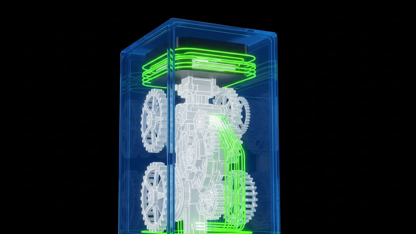
The Visualization Scenario
To combat the "Black Box" anxiety—the fear that automation hides errors—this style uses an X-Ray effect. A stylized server block is rendered in translucent blue glass. Inside, we see a complex assembly of skeleton white gears and mechanisms, meshing perfectly and spinning without friction. Data streams (green light) flow through the gears. This visual implies that while the exterior is simple, the internal engine is sophisticated, robust, and precision-engineered.
Psychological Impact & KPI Focus
- Niche Psychology: Finance leaders are skeptical of "magic buttons." They want to know how it works. This visual metaphor offers Transparency, suggesting that the automation isn't magic—it's mechanics. It respects the buyer's intelligence.
- Operational Impact: Visualizes the Reconciliation Engine's Robustness. It implies the system can handle complex, high-volume transactions (the gears) without grinding to a halt.
Strategic Implementation & Trade-offs
- Best Use Case: Excellent for "Platform Architecture" pages or deep-dive webinars. It helps explain complex matching rules or multi-step logic workflows.
- Strategic Trade-off: It is metaphorical. It serves to build emotional trust in the mechanics, but technical buyers will still want to see the actual API documentation.
Companies using similar video content -
ReconArt – ReconArt Reconciliation Suite – Visualizes internal mechanics of matching logic.
Solvexia – Solvexia Platform – Provides transparent, code-free automation solutions.
Ledge – Ledge – Offers deterministic automation engine with AI layered on top.
18. The Liquidity Pipeline
BOFU | ROI Justification

The Visualization Scenario
This style visualizes cash not as numbers, but as a fluid resource. Using a "claymorphism" 3D style in white and light grey, a miniature automated factory is depicted. Pipes made of translucent tech-blue glass funnel liquid (cash/data) from various sources into distinct, labeled storage tanks (e.g., "Opex," "Payroll," "Investments"). The flow is smooth, controlled, and visibly measured. The isometric angle gives a "God's Eye View" of the entire financial operation.
Psychological Impact & KPI Focus
- Niche Psychology: The Controller wants to feel like the Architect of the Business. This style appeals to the desire for systemic control. It reframes reconciliation from "checking lists" to "managing flow," elevating the perceived strategic value of the task.
- Operational Impact: Illustrates Cash Positioning and Treasury Management. It shows how reconciled data (the liquid) flows into buckets for reporting and investment, emphasizing the utility of the output.
Strategic Implementation & Trade-offs
- Best Use Case: Ideal for Sales Decks when pitching to the CFO. It shifts the conversation from "saving time" to "optimizing capital flow."
- Strategic Trade-off: It abstracts the complexity. Real banking flows are messy. This idealized version sets a high standard for the actual reporting capabilities.
Companies using similar video content -
Kyriba – Kyriba – Focuses on liquidity production and cash visibility.
Modern Treasury – Modern Treasury – Centralizes information for informed cash flow decisions.
OneStream – OneStream Platform – Unifies financial and operational data for planning.
19. The Depth of Field
BOFU | Objection Handling

The Visualization Scenario
To show the depth of the software's capabilities, this style floats UI screens in a 3D space with a parallax effect. The background is a deep ocean blue. Foreground layers are crisp, semi-transparent windows showing specific "Success" states like a cyan "Match Confirmed" icon. Background layers show blurred data grids, implying a deep reservoir of information. As the "camera" drifts, the layers move at different speeds, creating a sense of immersion and sophistication.
Psychological Impact & KPI Focus
- Niche Psychology: This appeals to the Modernist buyer who equates "flat" with "basic." The depth cues signal a multi-dimensional tool capable of handling complex, multi-entity hierarchies (parent/child relationships).
- Operational Impact: Visualizes Drill-Down Capabilities. The layering suggests that while the top-level view is simple (the match icon), the detailed data is always accessible just "one layer deep."
Strategic Implementation & Trade-offs
- Best Use Case: Strong for Website Hero Banners. It looks premium and high-tech, instantly differentiating the brand from legacy, spreadsheet-based competitors.
- Strategic Trade-off: Text on the moving layers can be hard to read. It is purely an aesthetic flex to establish brand authority, not a way to deliver detailed information.
Companies using similar video content -
Oracle – Oracle Fusion Cloud EPM – Provides multi-dimensional planning and reporting.
OneStream – OneStream Platform – Unifies financial and operational data for deep insights.
Multiview ERP – Multiview ERP – Offers real-time access to data for efficiency.
20. The Micro-Moment of Truth
BOFU | Sales Cycle Acceleration

The Visualization Scenario
Sometimes, the most powerful visual is the smallest detail. This style features an extreme macro close-up of a single digital interaction: a toggle switch or a "Reconcile" button. The texture is rendered with high fidelity—brushed metal or soft matte plastic. The animation shows the switch sliding from grey (Unreconciled) to vivid lime green (Reconciled). The lighting catches the ridge of the button, emphasizing the tactile "click."
Psychological Impact & KPI Focus
- Niche Psychology: This taps into Sensory Satisfaction. It creates a phantom tactile sensation, making the user feel the satisfaction of resolving an exception. It simplifies the complex decision into a binary, manageable action.
- Operational Impact: Symbolizes Ease of Resolution. It suggests that the software handles the heavy lifting, leaving the user with a simple, executive decision: Yes or No.
Strategic Implementation & Trade-offs
- Best Use Case: Highly effective in Email Marketing (GIFs). A looping GIF of a switch turning green is a hypnotic, low-bandwidth way to remind prospects of the ease of use.
- Strategic Trade-off: It risks oversimplification. If the actual workflow involves 5 clicks, showing 1 click can be seen as deceptive. It must represent a genuine "Quick Action" feature.
Companies using similar video content -
FloQast – FloQast Reconciliation Management – Simplifies resolution with automated matching.
Tipalti – Tipalti Reconciliation – Automates tasks to cut down on manual work.
QuickBooks – QuickBooks – Offers easy transaction matching and discrepancy detection.
21. The Digital Handshake
Onboarding | Driving Freemium/Trials

The Visualization Scenario
This style bridges the gap between the physical reality of business agreements and the digital reality of the ledger. We see a high-quality close-up photograph of two diverse business professionals shaking hands over a conference table. Overlaid on this organic interaction is a glowing, electric blue vector network, resembling a constellation map. The nodes of the network lock onto the hands, and a "VERIFIED" lock icon animates into existence above the grip. This visualizes the moment a physical agreement is digitally ratified.
Psychological Impact & KPI Focus
- Niche Psychology: Onboarding is a fragile time where the buyer (Controller) wonders if they made the right choice. This visual anchors the concept of Partnership. It reassures the user that the software is not replacing the human relationship, but securing it.
- Operational Impact: Focuses on Vendor Trust and Security. It symbolizes the secure "handshake" between the client's bank and the software's API, reinforcing the concept of an encrypted, verified data exchange.
Strategic Implementation & Trade-offs
- Best Use Case: Essential for Welcome Emails and the first screen of the onboarding wizard. It sets a human, collaborative tone before the user dives into the technical configuration.
- Strategic Trade-off: It requires high-quality stock footage. If the stock looks "cheesy" or staged, it can damage credibility. The vector overlay must look premium to elevate the footage.
Companies using similar video content -
Trintech – Cadency – Secures data exchange with verified trust.
BlackLine – BlackLine – Ensures accountability through comprehensive visibility.
Broadridge – BRx Match – Provides fundamental infrastructure for investing and governance.
22. The Surfer’s Triumph
Onboarding | Trial/Freemium User Activation

The Visualization Scenario
Reconciliation is often described as "keeping your head above water." This style leans into that metaphor with a stylized 2D illustration. A male character (representing the user) in a burnt orange sweater surfs confidently atop a massive, stylized wave. The wave is not water, but neat, white sheets of paper (invoices/statements). Below him, a dark navy sea of disorganized, crumpled papers crashes harmlessly. The lighting mimics a sunrise, casting a beige and gold glow. The character looks in control, not stressed.
Psychological Impact & KPI Focus
- Niche Psychology: This addresses Burnout and Overwhelm. It reframes the user's role from a victim of the workload to a master of it. It validates their struggle (the dark sea) while offering a heroic self-image (the surfer).
- Operational Impact: Targets Adoption Motivation. By associating the software with "flow state" and mastery, it encourages users to engage with the tool during high-stress periods (month-end) rather than reverting to manual habits.
Strategic Implementation & Trade-offs
- Best Use Case: Perfect for Gamification Screens (e.g., "You've reconciled 50% of your transactions!") or internal launch materials. It adds personality to a typically dry process.
- Strategic Trade-off: It is playful. It may not be appropriate for "Crisis Management" communications or serious error reporting, where a more clinical style is required.
Companies using similar video content -
FloQast – FloQast Reconciliation Management – Helps users master accounting workflows.
Prophix – Prophix One Account Reconciliation – Streamlines finance close to take back workday.
Datarails – Datarails – Centralizes Excel-based reporting and reconciliations.
23. The Aligned Team
Onboarding | Self-Serve Onboarding

The Visualization Scenario
To sell the "dream" of the post-implementation future, this style uses high-key cinematic photography. A diverse team of three finance professionals stands in a glass-walled conference room, bathed in warm, golden sunlight. They are looking up at an off-camera screen, smiling with genuine satisfaction. The depth of field is shallow, blurring the city background. The lighting is optimistic and airy. This isn't about the software interface; it's about the feeling of the team having their numbers aligned.
Psychological Impact & KPI Focus
- Niche Psychology: Finance teams often feel siloed and unappreciated. This visual validates their Contribution to the Business. It depicts them not as back-office data entry clerks, but as strategic partners celebrating a win.
- Operational Impact: Reinforces Cultural Buy-In. It visualizes the end-state of "One Version of the Truth," where the entire finance team is looking at the same data and agreeing on the results.
Strategic Implementation & Trade-offs
- Best Use Case: Strong for Case Study Headers and "Success" pages after a major milestone (e.g., "Implementation Complete"). It humanizes the software success.
- Strategic Trade-off: It is generic. Without a specific UI overlay or brand element, it could be an ad for anything. It works best when paired with a headline like "Your Team, Finally Aligned."
Companies using similar video content -
FloQast – FloQast Reconciliation Management – Improves team orchestration and task tracking.
Prophix – Prophix One Account Reconciliation – Built with collaboration in mind for finance teams.
Vena – Vena – Unifies financial planning and analysis for team alignment.
24. The Stable Core
Retention | Accelerating Time-to-Value

The Visualization Scenario
This style visualizes the concept of "Always-On" reliability. The background is a high-speed hyper-lapse video (represented here as a still) of a city skyline at night. Car light trails streak by in red and white, symbolizing the chaotic, fast-paced nature of global commerce. Superimposed in the center is a static, crisp white vector UI dashboard. While the world behind blurs with speed, the data in the foreground remains stable, clear, and readable.
Psychological Impact & KPI Focus
- Niche Psychology: The CFO worries about market volatility. This visual offers Psychological Stability. It creates a contrast that says, "No matter how fast the market moves, your financial data remains grounded and controlled."
- Operational Impact: Illustrates Real-Time Monitoring. It implies that the software is processing the high-velocity transactions (the light trails) in real-time, maintaining a stable ledger without lag.
Strategic Implementation & Trade-offs
- Best Use Case: Ideal for Login Screens or "System Status" pages. It subconsciously reassures the user every time they log in that the platform is robust and active.
- Strategic Trade-off: The background must not be too distracting. The contrast between the busy background and the clean foreground is critical; if the UI gets lost, the message fails.
Companies using similar video content -
Nomentia – Nomentia – Automates bank reconciliation with real-time data integration.
BlackLine – BlackLine – Provides real-time visibility and audit-ready documentation.
Oracle – NetSuite ERP – Offers real-time analytics and dashboarding.
25. The Precision Zoom
Retention | Reducing Support Overhead

The Visualization Scenario
To drive adoption of specific features, this style uses a "Focus and Amplify" technique. A stylized interface screen is shown. A magnifying glass effect with a bright yellow rim zooms in on a specific button or dropdown menu. As the zoom happens, kinetic text pops out: "Auto-Match Rules: ON." The background dims to slate grey to ensure focus. The movement is snappy and precise, mimicking the eye movement of an expert user.
Psychological Impact & KPI Focus
- Niche Psychology: Users often ignore advanced features because they fear breaking something. This visual lowers the Barrier to Entry. By isolating a single action, it makes the complex software feel manageable and learnable.
- Operational Impact: Directly drives Feature Adoption Rates. It functions as a visual "micro-training," showing users exactly where to click to unlock value, reducing support ticket volume.
Strategic Implementation & Trade-offs
- Best Use Case: Perfect for In-App Tooltips and "What's New" release notes. It replaces long paragraphs of text with a 3-second visual loop.
- Strategic Trade-off: It is purely functional. It doesn't build brand emotion, so it should be used for instruction, not inspiration.
Companies using similar video content -
FloQast – FloQast Reconciliation Management – Drives adoption of specific automation features.
Numeric – Numeric – Focuses on feature mastery for mid-size to large enterprises.
Alteryx – Alteryx – Builds repeatable workflows for data transformation.
26. The Knowledge Hologram
Retention | Knowledge Base & FAQ Videos

The Visualization Scenario
This style visualizes the "Brain" of the support system. A 3D render of a silver, mannequin-like human head wears a futuristic headset. A holographic rainbow gradient projection beams out from the headset, displaying a floating, simplified knowledge graph of connected nodes (representing articles, tutorials, and FAQs). The background is a smooth, futuristic grey gradient. It represents the transfer of knowledge from the system to the user.
Psychological Impact & KPI Focus
- Niche Psychology: Users hate calling support. They prefer to find answers themselves. This style appeals to the Autonomy Bias. It frames the help center not as a "manual," but as an intelligent interface that empowers the user to learn.
- Operational Impact: Promotes Self-Service Efficiency. It visualizes the interconnectedness of the documentation, encouraging users to explore the "Knowledge Graph" rather than opening a ticket.
Strategic Implementation & Trade-offs
- Best Use Case: The hero image for the Help Center or "Academy" portal. It positions learning as a high-tech, futuristic capability.
- Strategic Trade-off: It is abstract. It doesn't show the actual help articles. It needs to be paired with clear search functionality to be effective.
Companies using similar video content -
Wolters Kluwer – CCH Tagetik Account Reconciliation & Transaction Matching – Delivers expert solutions blending technology and knowledge.
Kepion – Kepion – Provides cloud-based financial planning and analysis software.
Nanonets – Nanonets – Automates data extraction and document processing.
27. The Global Ecosystem
Retention | Reducing Churn

The Visualization Scenario
For enterprise clients, reconciliation is a global problem. This style features a stylized 3D globe rendered in wireframe dark blue. Glowing gold data streams arc across continents, connecting nodes in New York, London, and Singapore. These arcs converge into a central hub floating above the globe. The visual emphasizes distance, connection, and speed. The aesthetic is "Mission Control."
Psychological Impact & KPI Focus
- Niche Psychology: The Enterprise Controller fears that remote subsidiaries are "going rogue." This visual offers Centralized Control. It promises that the software can reach across borders and bring all data back to HQ.
- Operational Impact: Illustrates Scalability and Consolidation. It visualizes the software's ability to handle multi-currency and multi-entity complexities, a key trigger for upsizing the contract.
Strategic Implementation & Trade-offs
- Best Use Case: Critical for Enterprise Sales Decks and "Global Capabilities" web pages. It answers the question, "Can you handle our overseas branches?" without words.
- Strategic Trade-off: It can feel impersonal to smaller clients. Use this only when targeting the mid-market to enterprise segment.
Companies using similar video content -
Trintech – Cadency – Scales effortlessly across multiple entities and integrates with ERPs.
BlackLine – BlackLine – Handles multiple currencies and geographies efficiently.
OneStream – OneStream Platform – Unifies financial and operational data globally.
28. The Enterprise Vault
Expansion | Driving Deep Feature Adoption

The Visualization Scenario
To justify the cost of an Enterprise security tier, this style uses cinematic drama. A heavy, digital vault door is rendered in a midnight blue server room. The door has glowing neon purple and cyan edges. It is captured mid-spin, opening to reveal a blindingly bright white light inside (the data). Floating binary code particles drift in the air. The look is expensive, heavy, and impenetrable.
Psychological Impact & KPI Focus
- Niche Psychology: Security is often an invisible feature. This visual makes it Tangible. It leverages the Loss Aversion principle—the heavy door implies that what is inside is incredibly valuable and worth paying to protect.
- Operational Impact: Drives Upsell to Enterprise Tiers. It visualizes "Bank-Grade Security" (SSO, Audit Logs, Encryption) as a premium fortress, differentiating the Pro plan from the Basic plan.
Strategic Implementation & Trade-offs
- Best Use Case: The background for "Enterprise" Pricing Columns or security compliance webinars. It signals "Heavy Duty" immediately.
- Strategic Trade-off: It is dark. It creates a mood of seriousness which is good for security, but bad for "Ease of Use." Do not use for user onboarding.
Companies using similar video content -
BlackLine – BlackLine – Offers compliance-led enterprise controls and security.
Trintech – Cadency – Provides risk governance and compliance control for large corporations.
Oracle – Oracle Fusion Cloud EPM – Manages and secures data for global enterprises.
29. The Guided Path
Expansion | Driving Upsell/Cross-sell

The Visualization Scenario
This style blends the human element with digital logic. An over-the-shoulder shot shows a person using a laptop in a sunlit, modern office. The screen emits a holographic projection (overlay) in translucent blue, showing a simple flowchart connecting three nodes: "Start," "Easy Implementation," and "Success." The person's hand is visible on the trackpad, guiding the flow. The image conveys that the complex process is actually user-friendly and guided.
Psychological Impact & KPI Focus
- Niche Psychology: As companies expand, they fear the software will become too complex to manage without expensive consultants. This visual promises Guided Simplicity. It suggests that the software (and the vendor) will "hold your hand" through the expansion.
- Operational Impact: Promotes Professional Services. It visualizes the value of "Implementation Packages" or "Customer Success Managers"—showing the invisible guidance they provide.
Strategic Implementation & Trade-offs
- Best Use Case: Great for Service Pages (e.g., "Premium Support") or renewal emails. It highlights the human-digital hybrid value proposition.
- Strategic Trade-off: The overlay must look intentional, not like a sticker. It represents the "meta-layer" of support on top of the product.
Companies using similar video content -
Prophix – Prophix One Account Reconciliation – Offers hands-on onboarding and training.
Trintech – Adra by Trintech – Provides pre-built reconciliation templates and support.
Kodiak Solutions – Automated Reconciliation for Healthcare – Guides healthcare providers with reliable results.
30. The CFO Authority
Expansion | Driving Referrals & Advocacy

The Visualization Scenario
The final style centers on the ultimate buyer persona. A photorealistic, AI-generated image depicts a professional CFO (woman, 40s) in a navy suit, standing in a high-end executive office. She is looking directly at the camera and smiling with confident authority. In the background, out of focus, is a large monitor displaying a sophisticated financial dashboard. The lighting is cinematic (85mm lens look). This is the face of someone who has "solved" reconciliation.
Psychological Impact & KPI Focus
- Niche Psychology: Buyers emulate success. This visual leverages Social Proof and Authority. It mirrors the aspiration of the target audience—to be the calm, confident leader who has mastered the numbers.
- Operational Impact: Drives Testimonials and Case Studies. It is the visual anchor for "Customer Success Stories." It suggests that using this software leads to career success and executive confidence.
Strategic Implementation & Trade-offs
- Best Use Case: Case Study Thumbnails and "Why Us" pages. It humanizes the brand and provides a face that the audience can identify with.
- Strategic Trade-off: It must look authentic. If the AI generation has "uncanny valley" flaws (bad hands, weird eyes), it destroys trust instantly. High-quality generation is mandatory.
Strategic Knowledge Base: The Visual Operations Doctrine
To transform these 30 visual styles from "marketing assets" into a cohesive business driver, we must implement a strategic framework. This section outlines how to operationalize visual communication within the Finance function to drive Adoption, Efficiency, and ROI.
Strategic Alignment & Visual Architecture (Pre-Production)
The "Pre-Production" Strategy. Why and Who.
- The Cognitive Load Audit: Before designing training materials, audit the "Mental Bandwidth" of your finance team during Month-End. If the visual style is "High Energy" (Style 3) but the user is in "Crisis Mode," the mismatch creates friction. Use "Calm/Minimalist" styles (Style 13) for high-stress workflows.
- Role-Based Visual Mapping: Differentiate your visual language. The CFO needs "Macro-Trend" visuals (Style 9, 18) that show liquidity and risk. The Reconciliation Clerk needs "Micro-Interaction" visuals (Style 25) that show specific button clicks. Do not send CFO-level abstractions to the clerk, and vice versa.
- The "Glanceability" Standard: In a high-volume transaction environment, a user should understand a visual status in <0.5 seconds. Apply "Traffic Light" logic (Red/Amber/Green) to all dashboard visualizations (Style 14) to ensure rapid decision-making without reading text.
- Brand Voice Consistency: Ensure the visual language of your internal training videos matches the software UI. If the software is "Dark Mode," your training PDFs shouldn't be bright white. This Visual Continuity (Style 15) reduces the cognitive jump between learning and doing.
- The Advids Strategic Audit: Use an external partner like Advids to audit your current visual library. We often find that companies have "Frankenstein" assets—mixed styles from different years. A unified "Visual Operating System" builds subconscious trust.
- Standardization vs. Customization: Use standardized "Stock" metaphors (Style 10) for universal concepts like "Cloud Integration." Use bespoke, high-fidelity UI animations (Style 8) for your proprietary "Matching Logic." Don't waste budget animating a generic cloud.
- The Cross-Departmental Bridge: Use visuals to translate Finance concepts for Sales and IT. A "Pipeline" visualization (Style 18) helps Sales understand how their deals impact cash flow, bridging the communication gap.
- Legacy System Integration: When replacing a legacy ERP, visually acknowledge the "Old World." Use "Split Screen" styles (Style 14) to validate the users' past experience before showing them the "New World." Ignoring the legacy system alienates long-time staff.
- Accessibility in Finance: Finance teams are diverse. Ensure all motion graphics (Style 4) rely on shape and contrast, not just color, to accommodate color-blind users (vital for Red/Green financial indicators).
- The Mobile-First Mandate: Controllers approve payments on the go. Ensure all "Approval Workflow" visuals (Style 20) are designed for mobile ratios (9:16), reinforcing that the software works wherever they are.
Operational Adoption & Implementation (Deployment)
The "Deployment" Phase. How to embed visuals into the workflow.
- Overcoming "Black Box" Anxiety: Accountants fear what they can't see. Use "Glass Box" visuals (Style 17) during training to show how the AI matched the transaction. Demystifying the logic builds trust in the automation.
- The Micro-Learning Shift: Replace the 50-page PDF manual with a library of 30-second "Micro-Lesson" videos (Style 25). Tag these videos inside the ERP so users can watch a specific "How-To" without leaving the screen.
- Just-in-Time Support: Embed specific visual styles into the helpdesk. When a user logs a ticket about "Variance," the auto-response should include a "Signal from Noise" visual (Style 4) explaining how to isolate the error.
- Gamification of the Close: Use "Victory" visuals (Style 7, 22) to celebrate milestones. A dashboard that flashes a "100% Reconciled" animation triggers a dopamine release, subtly gamifying the mundane task of data entry.
- Reducing Support Ticket Volume: There is a direct correlation between proactive visual guides and reduced call volume. Analyzing "Search" terms in your help center allows you to create targeted "Screencast" videos (Style 25) for top queries.
- Remote Onboarding: For distributed finance teams, you cannot rely on over-the-shoulder training. Use "Hyper-lapse" and "Casting" styles (Style 24, 29) to simulate the presence of a trainer, creating a virtual "shadowing" experience.
- Visualizing SOPs: Transform text-based Standard Operating Procedures (SOPs) into "Isometric Workflow" diagrams (Style 18). A visual map of the "Procure-to-Pay" process is referenced 10x more often than a text document.
- Feedback Loops: Use interactive video elements. At the end of a "Feature Update" video (Style 5), add a one-click poll ("Did this help?"). This data is more accurate than an email survey.
- Scalable Localization: If you have global teams, use "Icon-Based" and "Abstract" styles (Style 1, 2) for core concepts. These require less translation than text-heavy kinetic typography, lowering localization costs.
- Leadership Communication: When the CFO presents the "Digital Transformation" strategy to the Board, provide them with "High-Fidelity 3D" assets (Style 16, 28). Empowering your champion with professional visuals makes the entire project look more successful.
Measuring Impact & Future-Proofing (ROI)
The "ROI" Phase. Measuring success and looking ahead.
- Beyond "Views": Do not measure video success by "Views." Measure "Time-to-Competency." How much faster does a new hire close their first month after watching the "Visual Onboarding" series compared to the old text manual?
- The "Idle Time" Metric: Correlate better visualization with reduced software navigation time. If users spend less time "looking" for the button because the "Feature Spotlight" (Style 25) showed them where it is, that is calculable efficiency ROI.
- Compliance Velocity: Measure how fast new regulations (e.g., SOX updates) are understood. A "kinetic typography" video (Style 3) explaining a rule change is consumed 600% faster than a memo.
- Retention and Churn: High-quality UX visualization (Style 13) reduces "Frustration Churn." If the software looks easy to use, users are more forgiving of technical bugs. Perceived usability is a retention metric.
- The AI Visual Frontier: Prepare for Generative UI. In the future, the interface will adapt visually to the user's behavior. Your marketing visuals (Style 30) must start educating users on "Conversational Finance" now.
- Scalability of Assets: Build a library, not a landfill. Organize your source files (After Effects, Vector) by "Style Code" so you can rapidly generate new assets when the software updates, without starting from scratch.
- The Advids Partnership: Visual strategy is not a one-time project; it is an operational layer. Partnering with Advids ensures that as your software evolves, your "Visual Documentation" scales in real-time, preventing the "Documentation Gap."
- Benchmarking Success: Compare your visual engagement against industry standards. If your "Feature Release" videos have a <40% completion rate, your style is likely too abstract. Pivot to "Screencast" (Style 25).
- The ROI of Accuracy: Quantify the reduction in "Restatements." If visual training on "Variance Analysis" (Style 4) reduces user error by 15%, that is a direct risk-reduction value that can be presented to the Audit Committee.
- Final Call to Innovation: Treat video not as "Content," but as "Infrastructure." In the Continuous Close era, the ability to visualize data is the product. Investing in this visual language is investing in the speed and intelligence of your entire financial operation.
Companies using similar video content -
BlackLine – BlackLine – Empowers CFOs with modernized accounting procedures.
OneStream – OneStream Platform – Positions CFOs as critical drivers of business strategy.
Oracle – NetSuite ERP – Provides a centralized, real-time view of financial health.
Author & Editor Bio


