
Introduction: Visualizing the "Silent Partner" in Mental Healthcare
The behavioral health sector is undergoing a massive digital renaissance. We are moving from an era of fragmented, paper-based silos to a future of integrated, data-driven ecosystems. For EHR platforms, the challenge is no longer just about storing records; it is about orchestrating care. The market reflects this urgency, with the global behavioral health EHR software sector projected to reach USD 14.22 billion by 2034. This surge is driven by a universal need to modernize infrastructure and support a workforce that is increasingly stretched thin.
However, the barrier to adoption remains high. Administrative burnout is the industry's silent crisis. A 2024 report revealed that 62% reported administrative challenges—such as pre-authorizations and complex documentation—as major hurdles preventing psychologists from participating in insurance networks. This creates a "Trust Gap": clinicians fear that new software will simply replace paper clutter with digital clutter.
To close this gap, your video strategy must do more than showcase features; it must visualize empathy. It must demonstrate that your platform understands the nuance of the therapeutic alliance and works as a "Silent Partner"—handling the noise of compliance and billing so the clinician can focus on the patient.
This guide presents 30 expert-curated visual styles designed to bridge the Physical/Digital Divide. From the therapeutic fluidity of organic motion graphics to the robust stability of compliance visualizations, these styles provide the vocabulary you need to articulate value, reduce cognitive load, and position your platform as the architect of a healthier future.
1. Abstract 2D flat vector organic
TOFU | Brand Awareness

The Visual & Narrative Approach
This style utilizes a "bio-mimicry" aesthetic to align with the clinician's worldview. We avoid cold, mechanical tech imagery in favor of soft, fluid shapes in a calming palette of lavender, mint green, and white. These organic forms gently drift and coalesce to form the silhouette of a human brain. Subtle geometric nodes pulse at the intersections, symbolizing the underlying data connectivity.
- Narrative Tone: The voiceover should be calm, reassuring, and paced slowly. It speaks of "harmony," "clarity," and "connection," positioning the software as a therapeutic tool rather than an administrative burden.
Psychological Impact & KPI Focus
- Niche Psychology: Mental health professionals are sensitive to "Cognitive Load." This visual style uses soft edges and pastel tones to signal Ease of Use and Reduced Stress. It subconsciously promises a user experience that is gentle and intuitive.
- Operational Goal: Brand Awareness. It is designed to stop the scroll on Instagram or LinkedIn by offering a moment of visual respite.
- KPI: Ad Recall and Sentiment Analysis.
Strategic Implementation & Trade-offs
- Duration: 10-15 Seconds.
- Best Use Case: Top-of-funnel brand awareness campaigns targeting clinicians who are burned out by their current legacy systems.
- Strategic Trade-off: This style is suboptimal for feature education. It sets a mood but explains nothing about the actual workflow. Use it to build affinity, not to demo the product.
Companies using similar video content -
My Best Practice – EHR for mental health private practices.
Headway – Free EHR with AI-assisted notes.
TheraPlatform – Advanced telehealth platform.
2. Abstract 2D Motion Graphics
TOFU | Market Education

The Visual & Narrative Approach
Here, we visualize the invisible speed of data. Electric teal and deep navy lines streak across a clean white background, moving from left to right. They connect scattered data points (representing patient records) into a streamlined, cohesive flow. The aesthetic is sharp, vector-based, and precise.
- Narrative Tone: Energetic and rhythmic. The visual does the heavy lifting, implying that the platform organizes chaos instantly. There is no text; the motion is the message.
Psychological Impact & KPI Focus
- Niche Psychology: For Operations Managers, the enemy is "System Lag." This style uses Motion Fluency to trigger a feeling of efficiency and speed. It answers the anxiety: "Will this slow us down?" with a visual "No."
- Operational Goal: Market Education. It helps the viewer visualize abstract concepts like "Cloud Syncing" or "Interoperability."
- KPI: View-Through Rate (VTR) on YouTube.
Strategic Implementation & Trade-offs
- Duration: 6-10 Seconds.
- Best Use Case: Pre-roll ads where you have 5 seconds to hook the viewer before they skip.
- Strategic Trade-off: It lacks human connection. It sells the "Engine," not the "Car." It must be paired with benefit-driven copy to ensure the viewer understands what is being sped up.
Companies using similar video content -
RXNT – Cloud-based behavioral health suite.
InSync Healthcare Solutions – Cloud-based mental health EHR.
Hippocrate – Cloud-based, HIPAA-compliant EHR.
3. Abstract 3D AI Visualization
TOFU | Shaping Perception

The Visual & Narrative Approach
This high-fidelity 3D visualization signals "Enterprise Grade." We see a neural network of glowing cyan and magenta nodes floating in a pristine white void. The camera focuses on a central, spherical cluster of connections—a "Digital Brain" or "Core." The depth of field blurs the edges, keeping the focus on this central intelligence.
- Narrative Tone: Visionary and authoritative. It implies that the platform isn't just a database; it's an intelligent partner capable of Clinical Decision Support (CDS) and predictive analytics.
Psychological Impact & KPI Focus
- Niche Psychology: Security is paramount. This "contained sphere" metaphor subconsciously communicates Data Protection and Sanctity. The clean, high-key aesthetic builds trust in the platform's hygiene and modernity.
- Operational Goal: Shaping Perception. It positions the brand as a market leader in AI and innovation.
- KPI: Time on Site and Bounce Rate Reduction.
Strategic Implementation & Trade-offs
- Duration: 15-30 Seconds (Looping).
- Best Use Case: Website Hero backgrounds or key visual anchors for investor presentations.
- Strategic Trade-off: High production cost. Also, if the actual UI looks dated, this high-tech intro can create an "Expectation Gap" that leads to disappointment.
Companies using similar video content -
Praxis EMR – AI-powered behavioral health software.
Core Solutions – Cx360 – AI-powered EHR for behavioral health.
OmniMD – AI-powered charting and telepsychiatry.
4. Bold Kinetic Typography (Visual)
TOFU | ABM Awareness

The Visual & Narrative Approach
This style visualizes "Compliance" as physical weight. Heavy, blocky geometric shapes in burnt orange and charcoal gray crash together to form a solid, diagonal wall. They interlock like a fortress.
- Narrative Tone: Strong, impactful, and serious. The motion—thud, thud, lock—conveys unshakeable stability. It tells the viewer: "We are your shield against audits."
Psychological Impact & KPI Focus
- Niche Psychology: Compliance Officers and Practice Owners lose sleep over risk. This style uses Haptic Visuals to make "Safety" feel tangible and heavy. It reduces the fear of regulatory fragility.
- Operational Goal: ABM Awareness. It targets decision-makers on LinkedIn who prioritize risk management over clinical features.
- KPI: Scroll-Stop Rate and Engagement.
Strategic Implementation & Trade-offs
- Duration: 10-15 Seconds.
- Best Use Case: LinkedIn feed videos (autoplay) where sound is optional. The visuals scream "Reliability" without a single spoken word.
- Strategic Trade-off: It is somewhat aggressive. It works for "Protection" narratives but is too harsh for "Patient Care" narratives.
Companies using similar video content -
Credible Behavioral Health – Enterprise-level EHR for large organizations.
NextGen Healthcare – Enterprise behavioral health EHR with advanced analytics.
5. Minimalist Flat 2D Vector
TOFU | Vertical Social

The Visual & Narrative Approach
We strip away the tech to focus on the human. Using a thick-line "App Icon" style in pastel pink and blue, we show a Doctor icon connecting to a patient icon via a simple line.
- Narrative Tone: Cheerful, simple, and consumer-friendly. "Telehealth made easy." It borrows the visual language of popular B2C apps (like Headspace or Uber) to suggest ease of use.
Psychological Impact & KPI Focus
- Niche Psychology: Aesthetic-Usability Effect. If it looks simple, users believe it is simple. This style lowers the barrier to entry for clinicians who fear complex setups.
- Operational Goal: Vertical Social Engagement. It targets the end-user (clinician) to drive bottom-up demand.
- KPI: Share Rate and Video Completion.
Strategic Implementation & Trade-offs
- Duration: 15 Seconds.
- Best Use Case: TikTok, Instagram Reels, or YouTube Shorts.
- Strategic Trade-off: It risks looking "cheap" or "juvenile" to enterprise buyers. Use it for "Usability" campaigns, not "Enterprise Security" campaigns.
Companies using similar video content -
Carepatron – Affordable EHR with telehealth.
Sessions Health – Easy-to-use EHR for private practices.
SmartClinix – Affordable all-in-one EHR with mobile app.
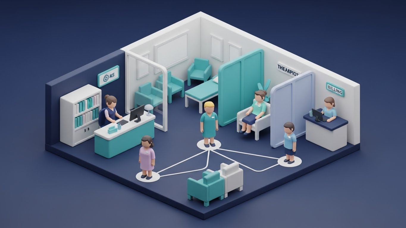
6. Isometric 2D Motion Design
TOFU | Category Creation
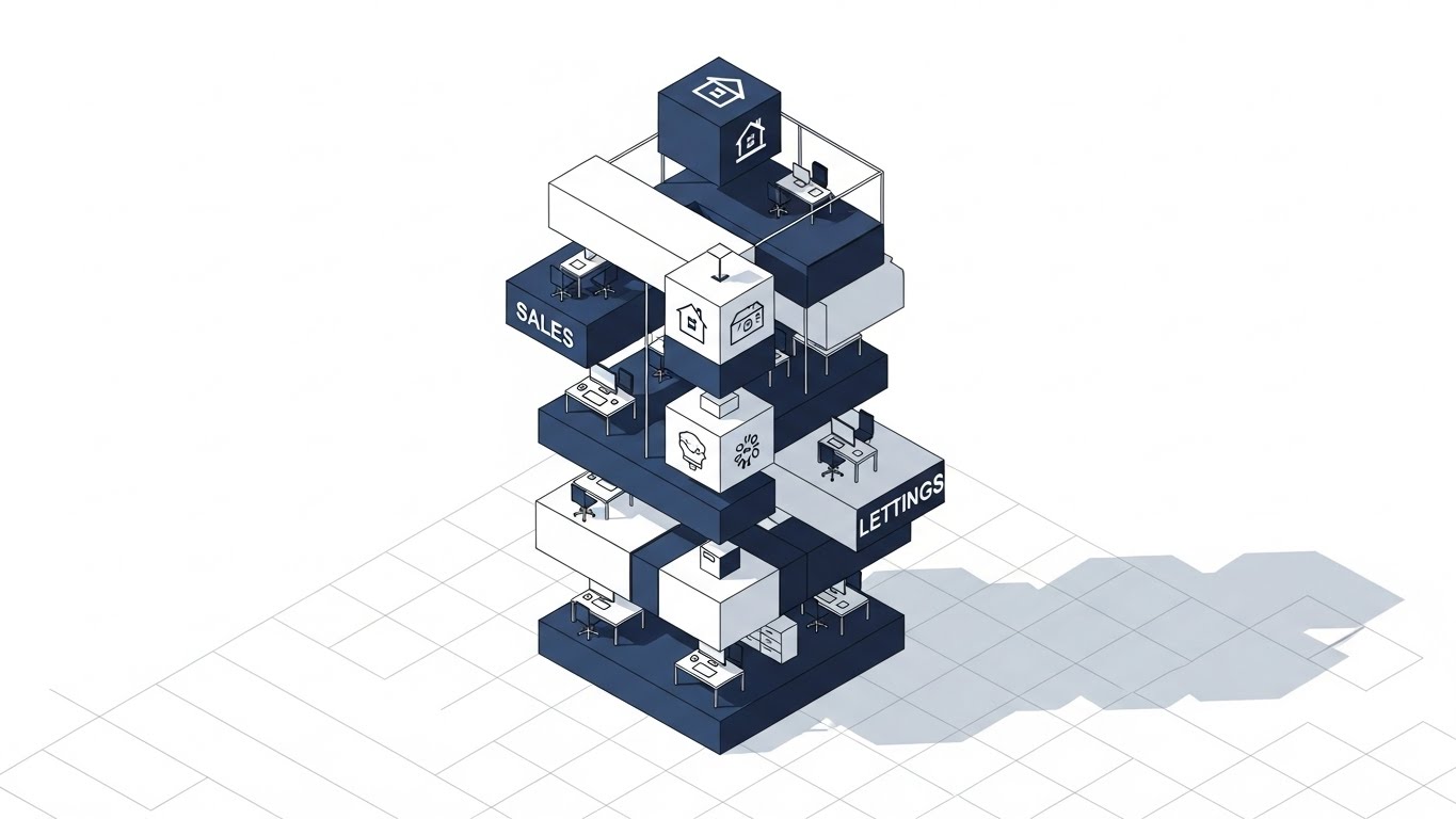
The Visual & Narrative Approach
An isometric "God's Eye View" of a clinic. We see the Reception, Therapy Room, and Pharmacy as connected modules on a grid. White data paths flow between them, visualizing the patient journey.
- Narrative Tone: Strategic and holistic. It visualizes the "Whole Person Care" model, showing how the software unifies distinct departments into one operational organism.
Psychological Impact & KPI Focus
- Niche Psychology: Practice Directors struggle with silos. This style offers Cognitive Control—a clear mental map of how the business runs. It validates the concept of an "All-in-One" Operating System.
- Operational Goal: Category Creation. It elevates the software from "EHR" to "Practice Management Platform."
- KPI: Click-Through Rate (Display Ads).
Strategic Implementation & Trade-offs
- Duration: 30-60 Seconds.
- Best Use Case: Explainer videos or rich media banner ads.
- Strategic Trade-off: Details can get lost on small screens. Ensure the "Data Paths" are thick and high-contrast.
Companies using similar video content -
Practice Better – All-in-one practice management.
CentralReach – Practice management for ABA/therapy.
AdvancedMD – Integrated EHR/PM suite.
7. Wireframe to Reality Transition
MOFU | Differentiation

The Visual & Narrative Approach
A split-screen composition. Left: A grayscale wireframe of chaotic paper stacks (The Problem). Right: A vivid, colorful 3D dashboard (The Solution). A glowing line wipes across, transforming the chaos into order.
- Narrative Tone: Transformational. "Leave the paper chase behind." It visually proves the value of digitization.
Psychological Impact & KPI Focus
- Niche Psychology: Loss Aversion and Relief. It reminds them of the pain of their current state (Left) and offers the dopamine hit of the solution (Right).
- Operational Goal: Differentiation. It clearly separates "Modern SaaS" from "Legacy Paper/Server" workflows.
- KPI: Landing Page Conversion Rate.
Strategic Implementation & Trade-offs
- Duration: 10-15 Seconds.
- Best Use Case: The "Hero" section of a landing page or the opening of a sales deck.
- Strategic Trade-off: The "After" image must be stunning. If the software UI isn't visually impressive, the contrast falls flat.
Companies using similar video content -
SimplePractice – Comprehensive EHR for digital transformation.
Ensora Health – All-in-one mental health EHR.
8. Clean UI Workflow (Light Mode)
MOFU | Feature Education
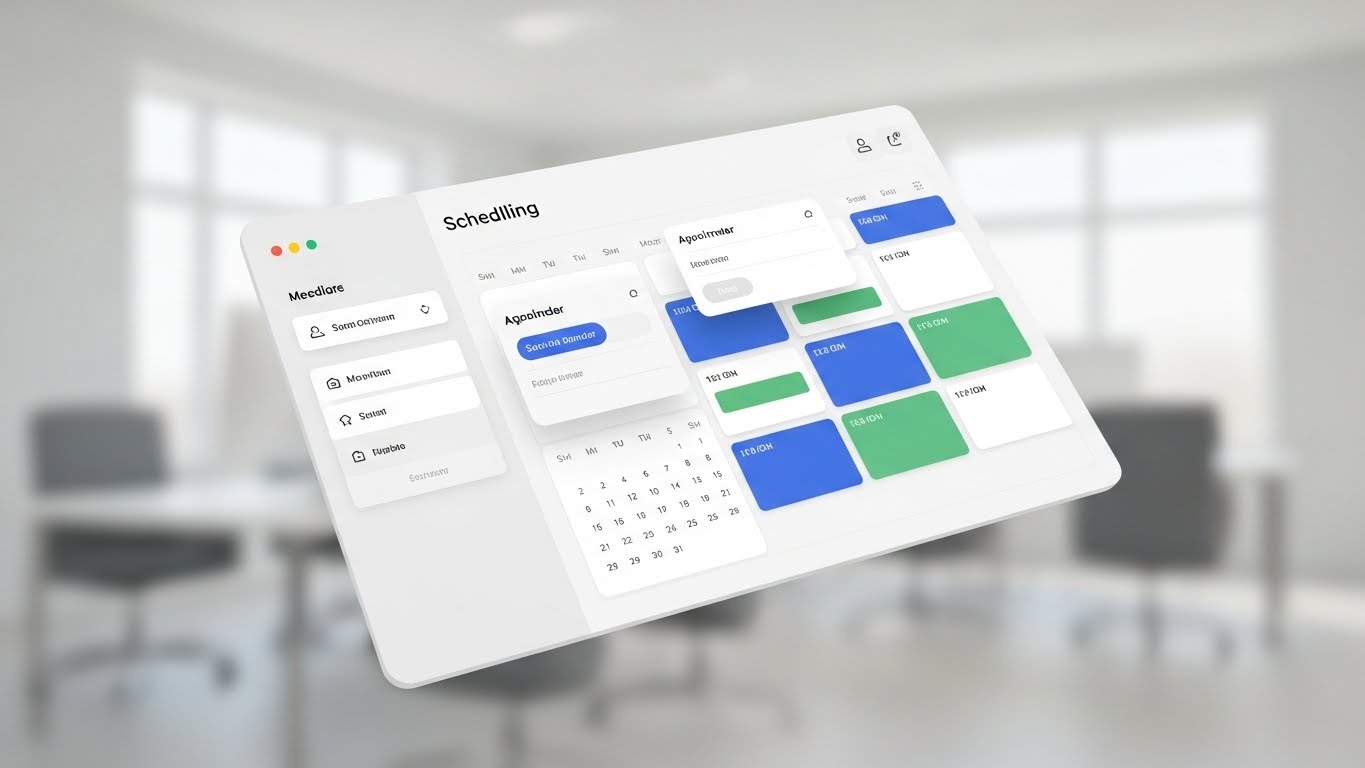
The Visual & Narrative Approach
A pristine, tilted view of the Scheduling Calendar interface. It is rendered in "Light Mode" with soft shadows, making it feel tangible and clean. Color-coded blocks (Royal Blue, Soft Green) show organized appointments.
- Narrative Tone: Educational and precise. It focuses on the specific utility of the feature—preventing double bookings, managing cancellations.
Psychological Impact & KPI Focus
- Niche Psychology: Usability Validation. Clinicians are skeptical of "clunky" interfaces. This style proves the UI is modern, readable, and low-stress.
- Operational Goal: Feature Education. It moves the prospect from "Interested" to "Informed."
- KPI: Email Click-Through Rate.
Strategic Implementation & Trade-offs
- Duration: 30-45 Seconds.
- Best Use Case: Product update emails, onboarding tours, or "Feature of the Month" videos.
- Strategic Trade-off: It is purely functional. It won't create emotional desire, but it will build rational confidence.
Companies using similar video content -
TherapyNotes – Purpose-built EHR with robust documentation.
TherapyAppointment – Budget-friendly EHR with simple design.
Luminello – EHR for psychiatrists.
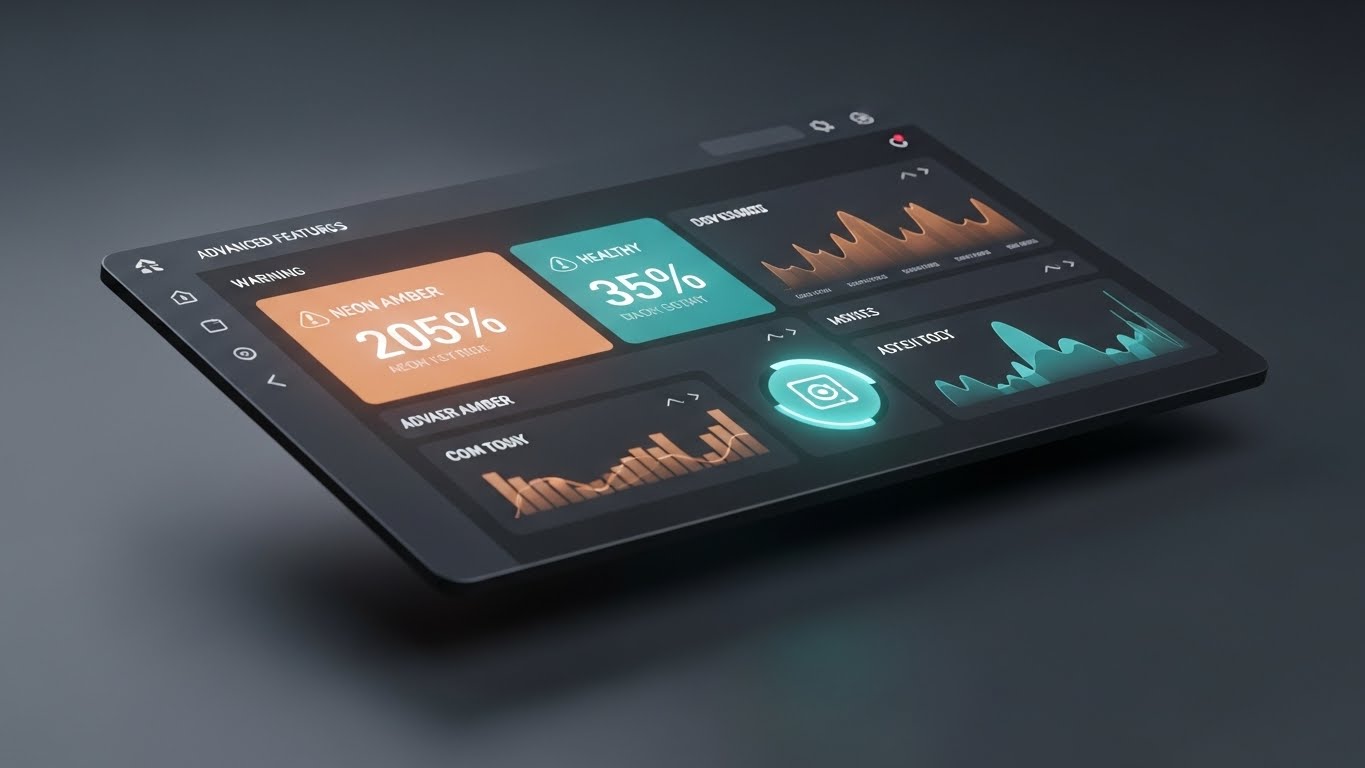
9. Dynamic Data Visualization
MOFU | Demand Gen

The Visual & Narrative Approach
Rising bar charts made of translucent glass and gold accents. They tower like skyscrapers, with light beams (revenue) flowing upwards.
- Narrative Tone: Aspiring and financial. It speaks the language of the CFO: "Growth," "ROI," "Collection Rates."
Psychological Impact & KPI Focus
- Niche Psychology: Prestige and Stability. It positions the practice not just as a clinic, but as a thriving business. It alleviates the fear of financial insolvency.
- Operational Goal: Demand Gen. Attracting the financial decision-maker.
- KPI: Lead Generation (Form Fills).
Strategic Implementation & Trade-offs
- Duration: 15 Seconds.
- Best Use Case: LinkedIn Ads targeting "CFO" or "Revenue Cycle Director."
- Strategic Trade-off: Irrelevant to clinicians. Keep this targeted to the business suite.
Companies using similar video content -
Valant – Behavioral Health EHR with outcome measures.
NextGen Healthcare – Population health analytics.
10. Rapid UI Feature Montage
MOFU | Freemium/Trials
The Visual & Narrative Approach
A high-energy montage of sliced UI screens (Intake, Billing, Notes) flying past the camera. Vibrant colors and motion blur convey speed and variety.
- Narrative Tone: "We have it all." It overwhelms the viewer with the sheer volume of features available.
Psychological Impact & KPI Focus
- Niche Psychology: Fear of Missing Out (FOMO). It suggests the platform is a "Powerhouse" that replaces multiple other tools.
- Operational Goal: Freemium/Trial Signups. It invites the user to "Test Drive" the full suite.
- KPI: Conversion to Trial.
Strategic Implementation & Trade-offs
- Duration: 15-20 Seconds.
- Best Use Case: Remarketing ads or high-energy event sizzle reels.
- Strategic Trade-off: Low comprehension. Viewers won't learn how features work, just that they exist.
Companies using similar video content -
CureMD – Comprehensive EHR for behavioral health.
Vozo Cloud EHR – Cloud EHR for behavioral health.
11. 2D Graphics Over Live Action**
MOFU | Building Trust

The Visual & Narrative Approach
This style bridges the gap between the human clinician and the digital safeguard. We feature high-quality, live-action footage of a confident doctor in a sunlit, modern clinic reception. Superimposed on this organic reality is a crisp, flat 2D vector shield icon in transparent blue with a white outline. The graphic tracks perfectly with the camera movement, appearing to float protectively near the clinician’s chest.
- Narrative Tone: Integrative and reassuring. The visual metaphor reinforces that the software is an invisible layer of protection that supports, rather than replaces, the human element. It says: "You care for the patient; we protect the practice."
Psychological Impact & KPI Focus
- Niche Psychology: Safety Anchoring. Behavioral health professionals are deeply protective of their therapeutic alliances. By anchoring the abstract concept of "Security" (the shield) to a real human face, we subconsciously validate the software as a partner in patient safety, not a liability.
- Operational Goal: Building Trust. It humanizes the tech stack, mitigating the fear of data breaches or impersonal systems.
- KPI: Time on Site (Trust/Security Pages).
Strategic Implementation & Trade-offs
- Duration: 30-45 Seconds.
- Best Use Case: The "Security" or "About Us" page of your website. It connects the technical specs of HIPAA compliance to the real-world environment of the clinic.
- Strategic Trade-off: Requires high-quality custom footage. Stock footage can feel generic; authenticity is key to making the "human" side of this equation work.
Companies using similar video content -
SimplePractice – HIPAA-compliant EHR for patient safety.
TherapyNotes – Secure electronic patient records.
12. 2D Line Art Animation
MOFU | Implementation Friction
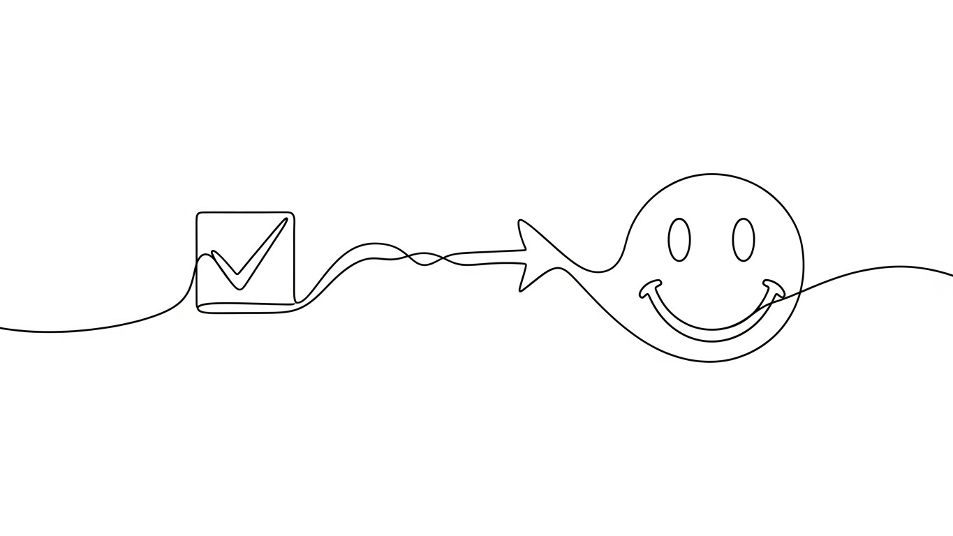
The Visual & Narrative Approach
Elegance through simplicity. Using a single, continuous fine black line on a pure white background, we visualize the concept of "Ease." The line fluidly draws a rigid checklist box, checks it, and then instantly morphs into a relaxed, happy smile face. The animation is smooth, liquid, and unhurried.
- Narrative Tone: Light, airy, and refreshing. It addresses the heavy, often dreaded topic of "Data Migration" with visual levity. "From to-do list to done."
Psychological Impact & KPI Focus
- Niche Psychology: Cognitive Ease. Implementation is the number one friction point for established practices. This stripped-back visual style signals that the process is lightweight and manageable, countering the anxiety of complex onboarding.
- Operational Goal: Reducing Implementation Friction. It visually promises a smooth, stress-free transition.
- KPI: Video Completion Rate (Explainer).
Strategic Implementation & Trade-offs
- Duration: 15-20 Seconds.
- Best Use Case: "Switching to Us" pages or email nurture sequences sent to prospects who are stalling due to migration fears.
- Strategic Trade-off: It is abstract. It captures the feeling of the process but doesn't show the actual steps. Use it to set the emotional stage before diving into technical details.
Companies using similar video content -
OpenEMR – Open source EHR for flexible workflows.
Ottehr – FHIR-native and open-source EHR.
13. 2D Animation & UI Composition
MOFU | Visitor Re-engagement

The Visual & Narrative Approach
This style creates a friendly "Digital Concierge." A stylized, cel-shaded character (designed with professional attire, e.g., violet hair and lime green shirt) stands next to a floating, semi-transparent UI panel. The character points enthusiastically to a specific feature or checklist item, breaking the fourth wall to acknowledge the viewer.
- Narrative Tone: Helpful and non-intrusive. "Did you forget something?" It mimics the supportive nudge of a good clinical supervisor, encouraging the user to complete a task (like a trial sign-up) without being aggressive.
Psychological Impact & KPI Focus
- Niche Psychology: The Helper Effect. Clinicians respond better to "support" than "sales." This style personifies the platform as a helpful assistant that keeps them on track. It triggers a reciprocal willingness to engage.
- Operational Goal: Visitor Re-engagement. Bringing "window shoppers" back to the funnel with a warm, low-pressure visual.
- KPI: Click-Through Rate (Retargeting Ads).
Strategic Implementation & Trade-offs
- Duration: 6-10 Seconds (Looping).
- Best Use Case: Retargeting ads on social platforms for users who abandoned a demo request.
- Strategic Trade-off: Character design is critical. It must look like a modern professional, not a mobile game avatar, to maintain credibility in the healthcare space.
Companies using similar video content -
Carepatron – Client engagement and task support.
Headway – Streamlined client care with integrated tools.
14. Low-Poly 3D Modeling
BOFU | ROI Justification

The Visual & Narrative Approach
We turn abstract financial metrics into physical objects. A neat stack of white documents (claims) physically transforms into rising columns of gold coins. The low-poly aesthetic gives the objects a faceted, tactile weight, while the lighting is premium and soft.
- Narrative Tone: Objective and value-focused. "Turn denied claims into retained revenue." It speaks the language of the business owner who needs to see the bottom-line impact.
Psychological Impact & KPI Focus
- Niche Psychology: Tangibility Bias. Service revenue often feels ephemeral. This style makes "Revenue Cycle Management" look like physical wealth accumulation. It satisfies the brain's desire for stability and resource security.
- Operational Goal: ROI Justification. It validates the price of the software by visualizing the return as a physical asset.
- KPI: Proposal Acceptance Rate.
Strategic Implementation & Trade-offs
- Duration: Static Image or 5-Second Loop.
- Best Use Case: Slide decks for the CFO or Practice Owner during final pricing negotiations.
- Strategic Trade-off: Focuses purely on financial gain. While essential for owners, it should be used selectively to avoid alienating clinicians who prioritize care over profit.
Companies using similar video content -
AdvancedMD – Revenue cycle management.
Tebra – Kareo EHR – Billing and claims management.
15. Macro UI Micro-Interactions
BOFU | Overcoming Objections

The Visual & Narrative Approach
An extreme close-up (macro) 3D render of a fingertip engaging with the interface. We see the skin texture and the soft glow of a vivid orange "Checkmark" button as it is pressed. The background blurs into a clean white bokeh, forcing absolute focus on this single, decisive moment of action.
- Narrative Tone: Satisfying and precise. "One click. Done." It emphasizes the tactile joy of a well-designed tool, promising a responsive experience.
Psychological Impact & KPI Focus
- Niche Psychology: Haptic Validation. Clinicians fear "Click Fatigue." This visual style uses sensory details to simulate the feeling of a responsive, easy-to-use tool. It subconsciously promises a user experience that is low-stress and efficient.
- Operational Goal: Overcoming Objections regarding complexity and usability.
- KPI: Time on Page (Product Features).
Strategic Implementation & Trade-offs
- Duration: 3-5 Seconds (Looping GIF).
- Best Use Case: Embedded next to "Ease of Use" feature descriptions on product pages.
- Strategic Trade-off: It is hyper-specific. It sells the quality of the interface, not the workflow. It serves as a punctuation mark for quality.
Companies using similar video content -
SimplePractice – Intuitive interface for ease of use.
TherapyNotes – Efficient documentation with quick actions.
17. Split Screen: Reality/UI
BOFU | Competitive Displacement

The Visual & Narrative Approach
A stark visual comparison. Left Side: A desaturated, grey-toned office where a stressed administrator is buried in piles of paper. Right Side: A warm, sunlit office where the same administrator smiles calmly, holding a tablet with your sleek UI.
- Narrative Tone: Transformational. "Stop surviving. Start thriving." It acknowledges the pain of the current reality and presents your platform as the liberator.
Psychological Impact & KPI Focus
- Niche Psychology: The Contrast Principle. The brain evaluates value through comparison. By placing the "Pain" directly next to the "Cure," we maximize the perceived value of the solution. It validates the user's struggle and offers a clear exit strategy.
- Operational Goal: Competitive Displacement. It visually argues that sticking with the status quo is a choice for stress.
- KPI: Demo Request Rate (Comparison Pages).
Strategic Implementation & Trade-offs
- Duration: 15-20 Seconds.
- Best Use Case: "Us vs. Them" comparison landing pages.
- Strategic Trade-off: Avoid making the "Left" side look too comical. It needs to look like a realistic struggle to maintain empathy.
Companies using similar video content -
Welligent – Cloud-based EHR for human services.
ICANotes – Documentation efficiency with intuitive design.
18. Photorealistic 3D Renders
BOFU | The Economic Buyer

The Visual & Narrative Approach
A scene of quiet power. A high-end mahogany executive desk hosts a pristine glass tablet displaying a sophisticated analytics dashboard. A blurred coffee cup and metallic pen sit nearby. The lighting is dramatic and glossy, reflecting the premium nature of the tools.
- Narrative Tone: Elite, authoritative, and stable. "Command your organization." It speaks to the CEO who wants the best tools for their growing empire.
Psychological Impact & KPI Focus
- Niche Psychology: Authority Bias. Large behavioral health networks want to feel like major medical institutions. This aesthetic mirrors the branding of Fortune 500 companies, validating the buyer's self-image as a serious executive.
- Operational Goal: Converting the Economic Buyer. It aligns the product with the aesthetics of success.
- KPI: Deal Closure Rate.
Strategic Implementation & Trade-offs
- Duration: Static Image or Slow Pan (10 Seconds).
- Best Use Case: The cover slide of a pitch deck or the background of an "Enterprise Pricing" page.
- Strategic Trade-off: It can feel distant to the frontline therapist. This is strictly for the C-Suite eyes.
Companies using similar video content -
Ensora Health – Transforming practice management from chaos to order.
CentralReach – Streamlining operations for therapy providers.
19. Isometric 3D Workflow
BOFU | Functional Buyer
The Visual & Narrative Approach
A charming, "claymorphism" style miniature of a behavioral health clinic. We see soft, rounded 3D shapes representing the reception, therapy rooms, and billing office. Smooth white lines connect the people in each room, visualizing the invisible flow of patient data.
- Narrative Tone: Structured and logical. "See how it all connects." It breaks down the complex patient journey into a manageable, transparent model.
Psychological Impact & KPI Focus
- Niche Psychology: Gestalt Closure. Operations Managers need to see how the parts form a whole. This style alleviates the anxiety of "Silos" (where clinical data doesn't talk to billing data). It visualizes interoperability.
- Operational Goal: Converting the Functional Buyer. It explains how the clinic works under the new system.
- KPI: Content Download Rate (Whitepapers).
Strategic Implementation & Trade-offs
- Duration: Static Image or 30-Second Explainer.
- Best Use Case: Digital brochures, whitepapers, or training materials explaining the "Patient Lifecycle."
- Strategic Trade-off: The "Clay" style is soft. Ensure the text labels are sharp and professional so it doesn't look like a mobile game.
Companies using similar video content -
NextGen Healthcare – Enterprise solutions for large networks.
Credible Behavioral Health – Authority in enterprise behavioral health.
20. Hyper-lapse Stock + Data
BOFU | Sales Cycle Accel

The Visual & Narrative Approach
We capture the energy of a thriving business. A hyper-lapse video shows staff blurring past in a modern open-plan office—a hive of activity. Floating in the foreground, sharp, neon-blue data widgets remain locked in focus, displaying rising efficiency metrics ("Efficiency: 94%", "Tasks: Complete").
- Narrative Tone: Dynamic and high-performance. "Your practice moves fast; we keep up." It suggests that the software provides the stability needed to manage a fast-growing practice.
Psychological Impact & KPI Focus
- Niche Psychology: Control in Chaos. Scaling a practice feels chaotic. This visual reassures the viewer that the software imposes order and visibility on the chaos of growth. It stabilizes the feeling of rapid scaling.
- Operational Goal: Sales Cycle Acceleration. It creates a sense of momentum and urgency.
- KPI: LinkedIn Engagement and Lead Velocity.
Strategic Implementation & Trade-offs
- Duration: 10-15 Seconds.
- Best Use Case: LinkedIn video ads targeting high-growth practices or private equity-backed groups.
- Strategic Trade-off: Can be overwhelming if too fast. Ensure the data overlays are large and legible to ensure the message of "Control" lands.
Companies using similar video content -
Practice Better – Holistic practice management.
AdvancedMD – Integrated EHR/PM suite.
21. 2D Character-Driven Story**
Onboarding | Self-Serve Onboarding

The Visual & Narrative Approach
To bridge the gap between a new user and a complex system, we introduce a "Digital Colleague." This style features a flat vector character—designed with professional "Corporate Memphis" proportions—acting as a proxy for the user. We see a young clinician (perhaps with a beard and a casual sweater) in a side profile, holding a tablet that glows with a warm "Welcome" light. The background is a simplified, teal and warm yellow abstract home office.
- Narrative Tone: Encouraging and peer-to-peer. The narration mimics a helpful colleague walking you through the basics: "Let's get you settled in."
Psychological Impact & KPI Focus
- Niche Psychology: Social Presence & Relatability. Learning a new EHR can feel isolating. A recurring character creates a sense of continuity and "digital companionship," reducing the anxiety of the unknown (The Affective Filter).
- Operational Goal: Self-Serve Onboarding. It encourages users to explore the platform independently, reducing the burden on your implementation team.
- KPI: Onboarding Completion Rate.
Strategic Implementation & Trade-offs
- Duration: 45-60 Seconds (Module based).
- Best Use Case: The "Welcome" modal video inside the software dashboard or the first email of the onboarding sequence.
- Strategic Trade-off: Character design determines the vibe. Avoid overly cartoonish styles; keep the attire "Smart Casual" to maintain professional credibility.
Companies using similar video content -
Valant – Real-time performance velocity for growth.
Core Solutions – Cx360 – Data-driven operational efficiency.
22. Aspirational Stock Montage
Onboarding | Time-to-Value

The Visual & Narrative Approach
We bypass the software screen entirely to focus on the outcome of the software. A high-resolution photo captures a diverse team of medical professionals high-fiving in a sun-drenched, plant-filled therapy office. The lighting is "Golden Hour"—warm, optimistic, and natural. There are no UI overlays; just raw, human connection and professional triumph.
- Narrative Tone: Celebratory and validating. "This is what success feels like." It reminds the user why they endured the migration: to build a happier, more cohesive practice.
Psychological Impact & KPI Focus
- Niche Psychology: Future Pacing. Implementation is stressful. This visual acts as a "North Star," anchoring the user to the future state of relief and success. It boosts morale during the difficult data migration phase.
- Operational Goal: Time-to-Value Perception. It bridges the emotional gap between the "Purchase" and the first "Win."
- KPI: Email Open Rate and Login Frequency.
Strategic Implementation & Trade-offs
- Duration: Static Image or 5-Second Motion Photo.
- Best Use Case: The "Congratulations" email after contract signing, or the login screen background.
- Strategic Trade-off: It provides zero functional value. It builds emotion but offers no education. It must be paired with clear, instructional text.
Companies using similar video content -
RethinkBH – Software for ABA and pediatric therapy.
Practice Fusion – EHR for child and adolescent psychiatry.
23. Futuristic Neon/Dark Mode
Onboarding | Knowledge Base

The Visual & Narrative Approach
A shift to "Dark Mode" aesthetics to signal power and intelligence. A glowing search bar floats in a deep black void, surrounded by a cyber-blue and neon-purple digital grid. Holographic question mark icons float in the background depth. The search bar pulses, suggesting it is "alive" and ready to answer instantly.
- Narrative Tone: Intelligent and instantaneous. "Answers at the speed of thought." It positions the Help Center not as a dusty library of PDFs, but as an AI-driven knowledge engine.
Psychological Impact & KPI Focus
- Niche Psychology: Competence Trust. When things go wrong, users panic. This high-tech aesthetic reassures them that the support system is sophisticated and capable. It visually aligns your "Help" section with the speed of modern search engines.
- Operational Goal: Knowledge Base Utilization. Driving users to self-solve issues before submitting a support ticket.
- KPI: Ticket Deflection Rate.
Strategic Implementation & Trade-offs
- Duration: 6-10 Seconds (Looping).
- Best Use Case: The header of your Support Portal or "No Results Found" pages.
- Strategic Trade-off: Can feel "cold." Ensure the text prompt inside the search bar is friendly (e.g., "How can we help you today?").
Companies using similar video content -
My Best Practice – Celebrating successful practice growth.
TherapyAppointment – Achieving practice goals with ease.
24. Dark Mode UI Showcase
Retention | Reducing Churn
The Visual & Narrative Approach
A sleek, premium showcase of the interface in "Dark Mode." The tablet is angled on a deep slate background. The UI elements use "Glassmorphism"—semi-transparent panels with neon green data accents that glow. The perspective highlights the depth and polish of the interface.
- Narrative Tone: Elite and modern. "Upgrade your workflow." It appeals to the "Power User" who spends hours in the software and appreciates eye comfort and sleek design.
Psychological Impact & KPI Focus
- Niche Psychology: Perceived Modernity. Users associate Dark Mode with "Pro" features (like Adobe or Coding IDEs). This style subtly communicates that the platform is evolving and staying current with design trends, reducing the "grass is greener" syndrome.
- Operational Goal: Reducing Churn. Keeping long-term users excited about the product's evolution.
- KPI: Feature Adoption Rate (New Updates).
Strategic Implementation & Trade-offs
- Duration: 10-15 Seconds.
- Best Use Case: "What's New" release notes or feature update videos.
- Strategic Trade-off: Readability. Dark mode visuals can be hard to read in bright office environments. Ensure high contrast for text.
Companies using similar video content -
ICANotes – Intelligent knowledge access for documentation.
OmniMD – AI-driven knowledge engine for support.
25. Lifestyle Stock with UI
Retention | Reducing Support

The Visual & Narrative Approach
The perfect blend of physical and digital. An over-the-shoulder shot of a therapist with curly hair relaxing in a cozy armchair, working on a laptop. Floating in the air above the screen are clean, white UI bubbles ("Support," "Chat"). The digital elements cast subtle shadows on the physical room, integrating the two worlds.
- Narrative Tone: Accessible and omnipresent. "Help is always right here." It visualizes support as an integrated part of their daily life, not a separate, frustrating destination.
Psychological Impact & KPI Focus
- Niche Psychology: Psychological Safety. It combats the feeling of isolation that remote or private practice therapists often feel. It visually reinforces that they are never truly alone; the platform (and its support) is virtually present.
- Operational Goal: Reducing Support Friction. Making users feel supported without them needing to pick up a phone.
- KPI: Customer Satisfaction Score (CSAT).
Strategic Implementation & Trade-offs
- Duration: Static Image or 5-Second Loop.
- Best Use Case: The background of the "Contact Us" page or the loading screen of the chat widget.
- Strategic Trade-off: Requires high-end compositing. If the UI bubbles look "stuck on," it breaks the immersion.
Companies using similar video content -
Welligent – Ergonomic power user experience.
CharmHealth – Modern web-based psychiatry EMR.
26. Holographic UI over 3D
Retention | Deep Feature Adoption

The Visual & Narrative Approach
A scientific visualization for the clinical expert. A transparent, glass-like 3D model of a human head reveals a glowing blue brain with firing neural nodes. Surrounding the head are floating holographic rings displaying advanced metrics (Outcomes Data, Medication Adherence). The background is a sterile, futuristic lab white.
- Narrative Tone: Clinical and precise. "Data-driven care." It appeals to the psychiatrist or medical director who values evidence-based practice.
Psychological Impact & KPI Focus
- Niche Psychology: Professional Validation. Clinicians want to feel like scientists. This style validates their work by presenting patient data as sophisticated, high-tech telemetry. It elevates "Note Taking" to "Clinical Analytics."
- Operational Goal: Deep Feature Adoption. Encouraging the use of advanced features like Outcomes Measurement.
- KPI: Adoption Rate of Advanced Clinical Modules.
Strategic Implementation & Trade-offs
- Duration: 15-20 Seconds.
- Best Use Case: Tutorials for clinical features (e.g., Treatment Planning, E-Prescribing).
- Strategic Trade-off: Can feel "medical" rather than "therapeutic." Use carefully with social workers or counselors who prefer a more humanistic approach.
Companies using similar video content -
Healthie – Integrated telehealth and support.
CounSol.com – Contextual assistance for online sessions.
27. 3D Parallax UI Presentation
Expansion | Upsell/Cross-sell
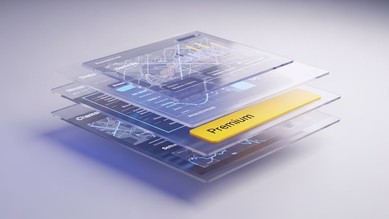
The Visual & Narrative Approach
To sell a "Premium" tier, we must show depth. We use a 3D parallax effect where a standard UI screen explodes into floating layers. The back layer is a map, the middle is a data grid, and the front is a gold "Premium" badge. The camera pans sideways, revealing the depth and complexity hidden within the interface.
- Narrative Tone: Exclusive and expansive. "There is more beneath the surface." It visually argues that the Premium tier isn't just more features; it's a deeper capability.
Psychological Impact & KPI Focus
- Niche Psychology: Perceived Value Depth. Users often think, "Why pay more for the same screen?" This style visually demonstrates that the Premium version has "layers" of added value that are invisible in the standard view.
- Operational Goal: Upsell/Cross-sell. visual justification for price increases or tier upgrades.
- KPI: Upgrade Conversion Rate.
Strategic Implementation & Trade-offs
- Duration: 10-15 Seconds.
- Best Use Case: Webinar transitions or "Upgrade" landing pages.
- Strategic Trade-off: Complexity. It abstracts the UI. Ensure the "Front" layer is still recognizable as the software they know.
Companies using similar video content -
Valant – Scientific clinical precision with outcome data.
Luminello – Advanced analytics for psychiatrists.
29. Generative AI Cinematic Video
Expansion | Thought Leadership

The Visual & Narrative Approach
A grand, anamorphic shot generated by AI. We see a futuristic, sun-drenched behavioral health campus. The architecture is "Biophilic"—curving wood and glass that integrates with nature. People walk calmly in the distance. The lighting is a dramatic teal and orange "magic hour."
- Narrative Tone: Institutional and majestic. "Building the sanctuary of tomorrow." It appeals to the Enterprise CEO who wants to build a legacy.
Psychological Impact & KPI Focus
- Niche Psychology: Grandeur and Stability. Large networks want to partner with vendors who have "Scale." This visual style projects massive scale and stability, suggesting that the software vendor is big enough to support a campus-sized operation.
- Operational Goal: Enterprise Authority.
- KPI: Enterprise Lead Generation.
Strategic Implementation & Trade-offs
- Duration: 10-15 Seconds (Slow Pan).
- Best Use Case: The background of an "Enterprise Solutions" web page or Keynote opener.
- Strategic Trade-off: It is pure mood. It contains no product information. Use it solely for brand positioning.
Companies using similar video content -
Praxis EMR – AI learning from every visit.
Ottehr – AI coding assistant for EHR.
30. Generative AI Realistic Character Video
Expansion | Proactive Support

The Visual & Narrative Approach
We put a face to the AI. A photorealistic, AI-generated video of a Customer Success Agent. She has warm skin tones, professional attire, and looks directly at the camera with genuine empathy. The background is a soft-focus modern support center. This is not a real person, but a generated "Ideal Agent" who delivers a consistent, perfect message every time.
- Narrative Tone: Personal and direct. "We heard you." It creates a face-to-face connection at scale.
Psychological Impact & KPI Focus
- Niche Psychology: Relationship Anchoring. As practices grow, they fear losing the personal touch with their vendor. This avatar (even if AI-generated) signals that there is a "human" element monitoring their success. It bridges the gap between automation and connection.
- Operational Goal: Proactive Support. Delivering bad news (downtime) or good news (new features) with a human touch.
- KPI: Engagement with "Success" messages.
Strategic Implementation & Trade-offs
- Duration: Variable (Scripted).
- Best Use Case: Personalized video messages sent to accounts that are "At Risk" or ripe for expansion.
- Strategic Trade-off: The "Uncanny Valley." The AI generation must be top-tier. If the lip-sync is bad, it destroys trust. Use with caution.
The Visual Operations Doctrine: A Strategic Knowledge Base
The 30 styles above are not just aesthetic choices; they are functional components of a Visual Operating System. To transform these visuals from "Marketing Content" into a "Business Asset," you must implement them using a structured framework.
The following three knowledge segments synthesize the insights from this guide into an actionable Visual Operations Doctrine.
Strategic Alignment & Visual Architecture
The "Pre-Production" Strategy: Why & Who
Before a single pixel is rendered, the "Silent Partner" philosophy must be codified. The behavioral health sector suffers from "Cognitive Load"—clinicians are drowning in data. Your visual strategy must be the life raft, not more water.
- The Cognitive Load Audit: Before approving a visual style (like Style 10 - Rapid UI Montage), audit your user's current stress level. If targeting a burned-out Intake Coordinator, avoid high-energy motion. Use Style 1 (Abstract Organic) to offer visual respite.
- Role-Based Visual Mapping: Do not use one style for all personas.
- The Driver (Clinician): Needs Simplicity. Use Style 5 (Minimalist 2D) or Style 21 (Character Story). They consume content on mobile between sessions.
- The Fleet Manager (Director/CFO): Needs Data Density. Use Style 9 (Dynamic Data) or Style 19 (Isometric Workflow). They consume content on desktop monitors.
- The "Glanceability" Standard: In a crisis intervention or busy intake, a user cannot watch a 2-minute video. Design "Micro-Interactions" (Style 15) that convey meaning in 3 seconds. If the visual requires audio to be understood, it fails the "Glanceability" test for a busy clinic.
- Brand Voice Consistency: Your marketing visuals (TOFU) and your training visuals (BOFU) often look like they come from different companies. Use a "Visual DNA" (e.g., the specific teal hex code from Style 2) that persists from the Instagram Ad all the way to the dark-mode Help Center (Style 23).
- The Advids Strategic Audit: This is where a partner like Advids adds value beyond production. By auditing your entire "Visual Operating System," we help define the rules of engagement—ensuring that every GIF, video, and screenshot speaks with one cohesive "Silent Partner" voice.
- Legacy System Integration: Many practices still use paper or on-premise servers. Visuals like Style 7 (Wireframe to Reality) are critical here. They don't just show the new; they validate the old before transforming it, respecting the user's past efforts.
- Accessibility is Non-Negotiable: Behavioral health workforces are diverse. Motion graphics (Style 2) must be designed with high contrast and legible typography for older clinicians or those with visual impairments.
- The Mobile-First Mandate: 40% of EHR interaction happens on tablets or phones. If your visual style relies on tiny text details (Style 6), it will fail on a smartphone. Always test visuals on a 5-inch screen.
- Standardization vs. Customization: Use Style 22 (Stock) for general "Culture" messaging, but invest in Style 15 (Macro UI) for specific, proprietary feature differentiation. Don't waste budget animating a generic concept; spend it on your unique differentiators.
- Cross-Departmental Language: Use visuals to unify terminology. If Sales calls it "Revenue Cycle" and Ops calls it "Billing," use Style 19 (Isometric Workflow) to visually connect the two concepts into one ecosystem.
Operational Adoption & The "Trust Gap"
The "Deployment" Phase: How to Embed Visuals
The "Trust Gap" is the hesitation clinicians feel when handing over patient care to a machine. Visuals are the bridge. This phase is about deploying the right style at the exact moment of friction to grease the gears of adoption.
- Overcoming "Big Brother" Anxiety: Clinicians fear AI and monitoring. Use Style 11 (2D Graphics Over Live Action) to anchor the tech to a human face. Show the software supporting the doctor, not watching them.
- The Micro-Learning Shift: No one reads the PDF manual. Replace the 50-page guide with a library of Style 8 (Clean UI Workflow) videos. These 30-second clips should be embedded directly into the software's tooltips.
- Just-in-Time Support: When a user searches "How to bill," they shouldn't find a webinar. They should find Style 12 (Line Art Animation)—a simple, linear guide that solves the problem in 15 seconds.
- Gamification of Training: Adoption is boring. Use Style 21 (Character Story) to create a narrative "Level Up" journey for onboarding. Visualizing progress makes the mundane task of data migration feel like an achievement.
- Reducing Support Ticket Volume: There is a direct correlation between the quality of your visual help center (Style 23) and your support costs. Every view of a "Password Reset" video is $15 saved in support agent time.
- Remote Onboarding: For distributed telehealth teams, you cannot do in-person seminars. Style 19 (Isometric Workflow) serves as the "Virtual Map," showing remote workers how their role fits into the larger clinic ecosystem.
- Standard Operating Procedures (SOPs): Text SOPs are ignored. Visual SOPs are followed. Convert your "Intake Protocol" into a Style 2 (Kinetic Data) animation that visualizes the flow of risk and safety.
- Feedback Loops: Use interactive video elements (end cards) to ask: "Did this help?" This data loop helps you refine your visual strategy in real-time.
- Leadership Communication: When the CEO announces a price hike or a platform overhaul, a text email feels cold. A Style 29 (Gen AI Cinematic) or Style 18 (Photorealistic) background video sets a tone of stability and vision, mitigating panic.
- Localization and Culture: If expanding globally, abstract styles like Style 1 (Organic) travel better than live action. Math and shapes are universal; specific office etiquettes are not.
Measuring Impact & Future-Proofing
The "ROI" Phase: Measurement & Evolution
A pretty video that doesn't drive business is just art. We must move beyond "Vanity Metrics" (Views) to "Impact Metrics" (Competency).
- Beyond "Views" - The Competency Metric: Do not just measure if they watched the Style 8 training video. Measure if they successfully used the feature within 1 hour of watching. This is "Time-to-Competency."
- The "Idle Time" Metric: High-quality UX visualization reduces the time users spend "figuring it out." Correlate your visual rollout with a reduction in average session duration for administrative tasks. Efficiency is the product.
- Compliance Velocity: When regulations change (e.g., new CPT codes), how fast does the user base adapt? Send a Style 4 (Kinetic Typography) alert. Measure the speed of compliance adoption compared to text-only alerts.
- Retention and LTV: Users who engage with "Pro Tip" videos (Style 24) have higher retention rates. Track the Lifetime Value (LTV) of the "Video-Engaged" cohort versus the "Non-Video" cohort.
- The AI Visual Frontier: Generative AI (Style 30) allows for personalized video at scale. Imagine every Practice Manager receiving a monthly video report generated by AI, addressing them by name. This is the future of retention.
- Scalability of Assets: You cannot build 30 unique styles for every feature. Build a "Modular Asset Library" (backgrounds, icons, bumpers). Advids specializes in creating these scalable design systems that allow your internal team to produce content faster.
- The Advids Partnership: As the platform grows, your visual needs will outpace your internal capacity. A partner like Advids serves as the "Scale Engine," producing the high-volume help content while your internal team focuses on the high-level brand vision.
- Benchmarking Success: Compare your visual strategy to the consumer apps your clinicians use (Uber, Airbnb), not just other EHRs. The bar for "Good Design" is set by the B2C world.
- The ROI of Safety: For behavioral health, "Safety" is a KPI. Better visualization of "Risk Assessments" (Style 11) leads to fewer missed critical incidents. This is the ultimate ROI: Patient Safety.
- Final Call to Innovation: The Behavioral Health market is projected to reach $14.22 billion. The winners will not be the ones with the most features; they will be the ones who are easiest to understand. Treat your video strategy not as "Marketing," but as "Infrastructure."
The Final Word:
You are no longer just building software; you are orchestrating care. By deploying these 30 visual styles through this strategic framework, you close the "Trust Gap," reduce the cognitive burden on the healers, and position your platform as the true "Silent Partner" in mental healthcare. The future is visual—make it clear.
Companies using similar video content -
Credible Behavioral Health – Institutional vision for large networks.
NextGen Healthcare – Grandeur for population health management.
Author & Editor Bio


