
Introduction: The End of the "Gut Feel" Estimate
The construction industry is currently navigating a profound shift from analog intuition to digital precision. For decades, Preconstruction Directors and Chief Estimators have relied on experience and manual effort to decipher the chaotic flood of subcontractor bids. However, in an era where project complexity is skyrocketing and margins are tighter than ever, reliance on spreadsheet-heavy workflows is becoming a strategic liability. The modern estimator does not just need to manage data; they need to see it.
The visualization of bid data is no longer an aesthetic luxury—it is a strategic necessity for risk mitigation. When estimators can visualize variances, scope gaps, and outliers instantly, they move from reactive data entry to proactive project strategy. This transition is critical because the cost of the status quo is measurable and severe. Industry data indicates that 12% of total project costs are consumed by rework—financial leakage that accurate bid leveling is designed to prevent.
More importantly, the root cause is often visible before ground is even broken. Research confirms that 52% of rework is caused by poor project data and miscommunication. When teams are trapped in manual entry and version control hell, "scope gaps"—those missing line items that eat into fees—become inevitable.
Embracing advanced visualization is the bridge between the physical reality of the job site and the digital accuracy required to fund it. This guide presents a comprehensive visual framework for Bid Leveling and Preconstruction SaaS platforms. By moving beyond generic "corporate tech" aesthetics and embracing visualization styles that speak the language of construction—risk mitigation, scope coverage, and variance analysis—you can turn skepticism into adoption. The following examples demonstrate how to visually articulate the value of bringing order to chaos.
2. Visual Style Definitions (1-10)
TOFU | Market Education

The Visual & Narrative Approach
This Top-of-Funnel asset utilizes a high-end cinematic drone aesthetic to establish the platform's authority. The camera performs a sweeping flyover of a massive urban construction site at dawn—the "Golden Hour" lighting symbolizing a new era of clarity. As the view expands, a sophisticated "Digital Wireframe" overlay in deep navy and electric blue materializes. This isn't just a static grid; it actively "locks on" to the physical steel structures, creating a visual metaphor for how the software captures and organizes the raw reality of the jobsite.
Psychological Impact & KPI Focus
- Niche Psychology: For the Chief Estimator, the jobsite is the ultimate truth. By overlaying the digital interface onto the physical world, we validate the software’s connection to reality. It reduces the skepticism that "tech people don't understand mud and steel."
- Operational Impact: The synchronization of the blue digital grid with the physical building reinforces the concept of "Total Scope Coverage" (Framework ID 1.1).
Strategic Implementation & Trade-offs
- Duration: 15-30 Seconds.
- Trade-off: This style prioritizes emotional impact and brand scale over specific feature education. It sells the vision of control, not the mechanics of the dashboard.
2. The Cognitive Load Reducer
Style Code: 3 | Funnel Stage: TOFU (Market Education)

The Visual & Narrative Approach
This Isometric 2D Motion Design addresses the prospect's primary pain point directly: the chaos of unorganized bids. The scene opens with a cluttered, chaotic pile of white papers on the left, representing the "Old Way"—a disorganized deluge of PDF proposals and Excel tabs. A central tablet device acts as the transformation engine. As the papers fly into the device, they are instantly processed and emerge on the screen as neatly stacked, color-coded cyan and light grey blocks.
Psychological Impact & KPI Focus
- Cognitive Load: The "Chaos to Order" visual arc significantly lowers cognitive load. It promises the viewer that the software will do the heavy lifting of sorting and categorizing, offering mental relief.
- Benefit Visualization: The transition from "messy pile" to "clean blocks" visually codifies the value proposition of normalization—ensuring every bid is compared apples-to-apples (Framework ID 1.3).
Strategic Implementation & Trade-offs
- Duration: 30-45 Seconds.
- Trade-off: The simplified vector aesthetic is excellent for clarity but lacks the "high-tech" feel of 3D. It is best used for explaining concepts, not for demonstrating interface complexity.
3. The Shield of Verification
Style Code: 7 | Funnel Stage: TOFU (Shaping Brand Perception)

The Visual & Narrative Approach
Moving away from literal representations, this style uses organic fluid shapes to symbolize the flow of data. Vivid lime green and charcoal grey streams converge to form a solid, protective shield icon in the center. The absence of hard strokes and the use of glossy textures give the image a modern, "SaaS-native" feel. The motion is smooth and liquid, suggesting that the platform handles data frictionlessly.
Psychological Impact & KPI Focus
- Subconscious Safety: The shield icon is a universal signifier of protection. In the context of bid leveling, it subtly communicates "Risk Mitigation"—protecting the GC from costly scope gaps or bad data (Framework ID 1.5).
- Modernity: The fluid, organic shapes signal that the platform is agile and modern, countering the industry's reputation for clunky, legacy software.
Strategic Implementation & Trade-offs
- Duration: 6-10 Seconds (Loop).
- Trade-off: Being abstract, it requires a strong accompanying headline to contextualize the meaning. Without text like "Secure Your Margins," the shield metaphor might be missed.
4. The Kinetic Alignment
Style Code: 4 | Funnel Stage: TOFU (Skippable Pre-Roll Ad)

The Visual & Narrative Approach
This style leverages Bold Kinetic Typography and physics-based motion to grab attention instantly. Massive geometric blocks in safety orange (an industry standard color) and bold black collide in the center of the screen with a visible impact tremor. Upon collision, they instantly realign into a perfectly symmetrical, interlocked structure. The background is a solid, stark white to maximize contrast and energy.
Psychological Impact & KPI Focus
- Pattern Interrupt: The high-energy impact and "safety orange" palette are designed to stop the scroll on mobile devices (Framework ID 4.1).
- Visualizing "Leveling": The act of collision-turning-into-alignment is a visceral metaphor for "Bid Leveling." It physically demonstrates how the software takes conflicting data points and forces them into a unified, comparable format.
Strategic Implementation & Trade-offs
- Duration: 5-15 Seconds.
- Trade-off: High energy but low information density. It gets attention but doesn't explain how the alignment happens. It must lead to a more detailed landing page.
5. The Reality Validation
Style Code: 26 | Funnel Stage: TOFU (Risk Mitigation Hook)
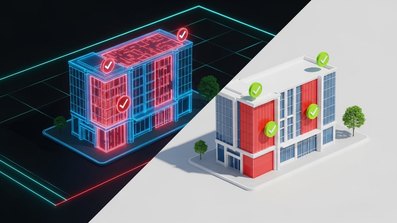
The Visual & Narrative Approach
This Split-Screen composition is a powerful "Problem/Solution" visualization. The left side reveals a translucent blue wireframe of a commercial building with pulsing red zones indicating abstract scope gaps—areas where costs are missing or undefined. The right half transforms into a completed, photorealistic rendering of the building facade with green verification checkmarks overlaying the previously red areas. The lighting transitions from a technical digital glow on the left to natural sunlight on the right.
Psychological Impact & KPI Focus
- Fear & Relief: The pulsing red zones trigger the estimator's fear of the unknown (missing scope). The transition to the photorealistic right side provides immediate psychological relief and closure.
- Validation: The green checkmarks serve as "Trust Signals," confirming that the software has verified the scope coverage, directly addressing the anxiety of financial exposure (Framework ID 8.2).
Strategic Implementation & Trade-offs
- Duration: 15-20 Seconds.
- Trade-off: Requires high-quality 3D assets. If the "Real" side looks fake, it undermines the message of accuracy.
6. The Collaborative Ecosystem
Style Code: 10 | Funnel Stage: MOFU (Product Differentiation)
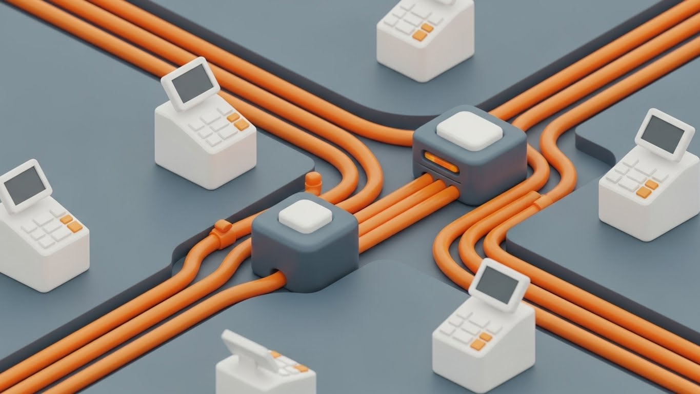
The Visual & Narrative Approach
This Isometric 3D Clay Render treats the software workflow like a physical construction site. It features a miniature, toy-like environment where stylized workers in safety yellow hard hats are physically moving glowing data blocks into a central, silver server tower. The environment is clean and toy-like, with a soft focus background. The palette uses construction yellow, concrete grey, and metallic silver.
Psychological Impact & KPI Focus
- Humanizing Tech: By showing "workers" handling data, we acknowledge the human effort involved in preconstruction while showing how the software augments that labor.
- Process Visualization: This style is perfect for illustrating "Workflow Integration"—showing how data flows from the trade partner (subcontractor) to the central platform without getting bogged down in UI screenshots (Framework ID 1.7).
Strategic Implementation & Trade-offs
- Duration: 30-60 Seconds.
- Trade-off: It is metaphorical. A purely technical buyer might find it too "cute" and prefer to see the actual dashboard. Use this to explain the concept of the workflow, not the specific buttons.
7. The Variance Interface
Style Code: 15 | Funnel Stage: MOFU (Feature Education)
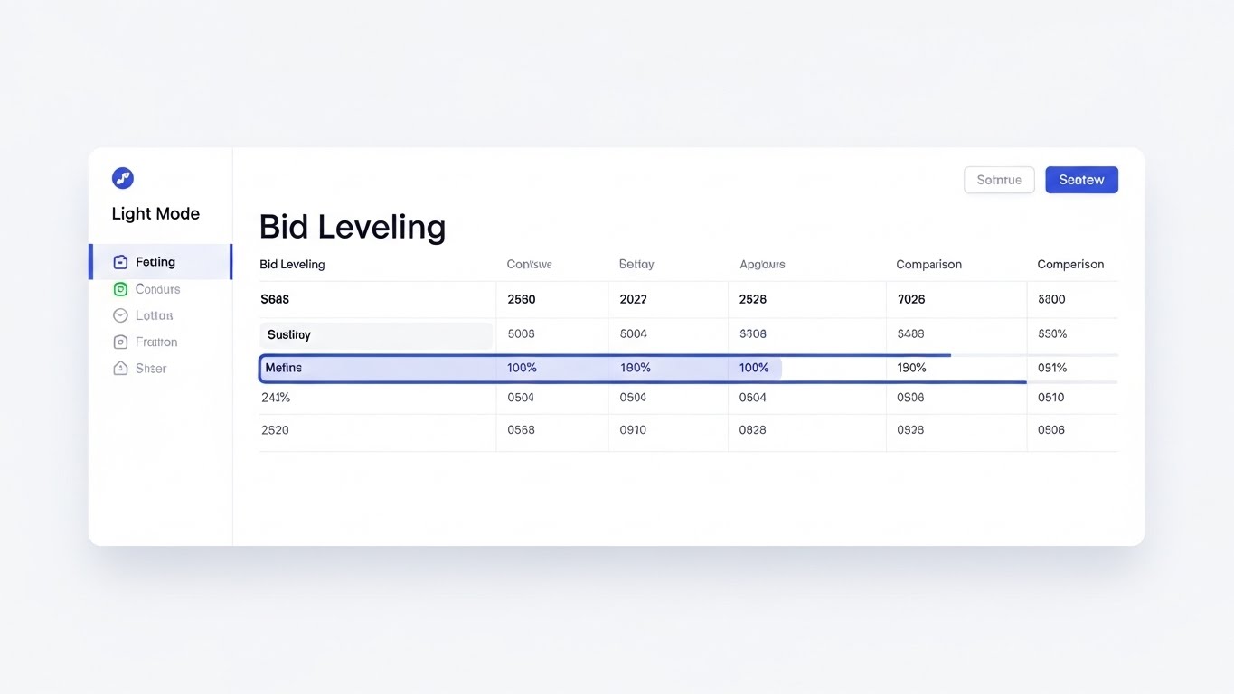
The Visual & Narrative Approach
Here we move to the "Gold Standard" of SaaS marketing: the High-Fidelity Flat 2.0 UI Mockup. The visual focus is a pristine, white-mode dashboard comparing multiple bid columns. Crucially, soft blue highlights are used to draw the eye specifically to the "variance" between columns—the exact rows where bids differ. The interface is simplified, removing extraneous menu clutter to focus entirely on the data comparison experience.
Psychological Impact & KPI Focus
- User Experience (UX) Promise: The clean, airy design combats the industry standard of dense, unreadable spreadsheets. It promises a "Low Friction" experience.
- Focus Management: By highlighting the variance in blue, the visual mimics the estimator's mental process—ignoring what matches and focusing solely on what doesn't. This proves the software "thinks" like an estimator (Framework ID 1.8).
Strategic Implementation & Trade-offs
- Duration: 45-90 Seconds.
- Trade-off: The UI must be accurate. If the data shown (e.g., pricing) is unrealistic, savvy estimators will dismiss it. Use realistic dummy data.
8. The Lifestyle Transformation
Style Code: 27 | Funnel Stage: MOFU (Competitive Displacement)

The Visual & Narrative Approach
This Split Screen video acts as a mirror to the user's current reality and their desired future. The left side is color-graded in cool, desaturated tones, showing a stressed construction estimator buried under piles of paper blueprints in a dimly lit, cluttered office. The right side features the same professional, calm and smiling, using a tablet in a bright, modern, sunlit office with a warm color grade.
Psychological Impact & KPI Focus
- Emotional Resonance: It validates the pain of the current process (Empathy) and offers a tangible vision of a better work-life balance (Aspiration).
- Productivity Contrast: It visually quantifies the "Opportunity Cost" of sticking with the old methods (Framework ID 1.13), aligning with the need for competitive displacement.
Strategic Implementation & Trade-offs
- Duration: 15-30 Seconds.
- Trade-off: Can feel cliché if overacted. The "stressed" side must feel like genuine work pressure, not a cartoonish breakdown.
9. The Executive Success Metric
Style Code: 30 | Funnel Stage: MOFU (Driving Demo Requests)

The Visual & Narrative Approach
This style reintroduces the human face of success. A realistic, professional male estimator in a sharp charcoal suit stands in a modern glass-walled office. He is looking over his shoulder at the camera with a confident smile, pointing to a large monitor in the background. The monitor displays a rising green success metric graph. The lighting is cinematic, utilizing an ARRI Alexa style dynamic range.
Psychological Impact & KPI Focus
- Authority & Status: The visuals sell the status of the "Modern Preconstruction Executive." It appeals to the reader's desire to be seen as a strategic leader who drives growth, not just a number-cruncher.
- Result Orientation: The green graph explicitly links the software adoption to business growth (Revenue/Margin), reinforcing the ROI argument (Framework ID 2.1).
Strategic Implementation & Trade-offs
- Duration: 10-15 Seconds.
- Trade-off: Using AI characters can sometimes dip into the "Uncanny Valley." Ensure the render quality is flawless, or use a real actor if budget permits.
Companies using similar video content -
Procore – Construction Management – Unifying project data from preconstruction to closeout.
Autodesk Construction Cloud – Integrated Platform – Centralizing construction workflows for urban projects.
11. The Structural Insight**
MOFU | Tech Buyer

The Visual & Narrative Approach
This style caters to the analytical mind of the Technical Buyer or Senior Estimator. It utilizes a 3D X-Ray Visualization of a massive structure—represented here as a sophisticated digital cube or stylized skyscraper. The outer skin is rendered in translucent glass, peeling away to reveal the internal steel beams and infrastructure. Inside this structure, glowing white nodes and vertical data lines connect the foundation to the pinnacle, representing the flow of cost codes and structural data. The palette is technical and precise: translucent blue, glowing white, and gunmetal steel.
Psychological Impact & KPI Focus
- Depth of Intelligence: The "X-Ray" effect is a potent visual metaphor for Deep Visibility. It assures the technical stakeholder that the platform doesn't just skim the surface of bid data but penetrates to the granular level of individual cost codes and line items.
- Structural Integrity: By visualizing the internal "skeleton" of the data, you communicate stability and robustness—critical attributes for enterprise software that will handle millions of dollars in project value (Framework ID 7.3).
Strategic Implementation & Trade-offs
- Duration: 30-45 Seconds.
- Trade-off: This is a "Cold" aesthetic. It builds respect for the technology but not necessarily affection for the brand. It is best paired with warmer, human-centric content (like Style 12) to create a balanced narrative.
Companies using similar video content -
Zebel – Preconstruction Analytics – Transforming chaotic bids into structured, data-driven insights.
STACK Construction Technologies – Takeoff & Estimate – Organizing takeoff and estimating data for clarity.
12. The Stakeholder Trust Signal
MOFU | Building Trust

The Visual & Narrative Approach
Technology serves people, and this Aspirational Stock Montage reminds the buyer of the ultimate goal: successful collaboration. The scene captures a photorealistic, high-resolution moment at a commercial construction site during the "Golden Hour." A diverse group of architects, general contractors, and tradespeople—clad in safety vests and hard hats—are gathered around a digital tablet, shaking hands. The warm lighting highlights dust motes in the air and the steel structures behind them, creating an atmosphere of optimism and shared success.
Psychological Impact & KPI Focus
- Social Proof & Trust: In an industry reliant on relationships, showing a functional, happy team validates the software as an enabler of collaboration, not a replacement for human judgment.
- Aspirational Identity: It mirrors the reader’s desired self-image: a leader who fosters unity and delivers successful projects. This builds emotional capital, essential for the "Trust Building" phase (Framework ID 1.9).
Strategic Implementation & Trade-offs
- Duration: 30-60 Seconds.
- Trade-off: Stock footage can feel generic if not carefully curated. The key is ensuring the details—like the PPE (Personal Protective Equipment) and the on-screen tablet data—are authentic to the region and industry standards.
Companies using similar video content -
TradeTapp – Subcontractor Qualification – Shielding projects from subcontractor risk.
InEight – Project Controls – Mitigating project risks with robust control systems.
13. The Complexity Unraveled
MOFU | Competitive Switcher

The Visual & Narrative Approach
For the prospect overwhelmed by a competitor's clunky interface or manual spreadsheets, this Minimalist Flat 2D Vector style offers immediate visual relief. The animation begins with a central, tangled, chaotic knot of dark grey lines—symbolizing the frustration of the current process. Smoothly, efficiently, and satisfyingly, the knot unravels into a single, perfectly straight coral line extending across the frame. The aesthetic uses thick strokes, pastel blue and coral tones, and ample negative space to convey absolute clarity.
Psychological Impact & KPI Focus
- Simplicity Bias: The brain prefers processing simple information. This visual demonstrates the "Ease of Switching." It promises that moving to your platform will untangle their workflow, not add new knots.
- Resolution: The linear transformation visually proves the promise of "Streamlining"—taking the complex reality of bid leveling and flattening it into a linear, manageable process (Framework ID 5.5).
Strategic Implementation & Trade-offs
- Duration: 15-30 Seconds.
- Trade-off: Highly effective for retargeting ads where the user is already aware of the problem. It is too abstract to serve as a standalone product introduction; it needs context (e.g., "Tired of the tangle?").
Companies using similar video content -
PlanHub – Construction Bidding Platform – Aligning general contractors and subcontractors for bids.
SmartBid – Construction Bidding Software – Rapidly aligning bid data for efficient management.
14. The Value Materialization
BOFU | ROI Justification

The Visual & Narrative Approach
When the conversation turns to the CFO, abstract benefits must become tangible value. This Dynamic Data Visualization renders bar charts not as flat pixels, but as physical objects rising from a textured concrete ground. The "Profit" bars are textured in brushed gold, while the "Cost" bars are asphalt black. The camera creates a dynamic upward movement as the gold bars rise significantly higher than the black ones. The studio-quality lighting emphasizes the material difference between "cost" (concrete) and "value" (gold).
Psychological Impact & KPI Focus
- Material Value: By rendering the data as "Gold," you subconsciously trigger the association with wealth and hard assets. It moves the ROI conversation from a theoretical spreadsheet number to a perceived solid gain.
- Contrast & Growth: The physical height difference allows the viewer to feel the margin expansion. It directly addresses the "Economic Buyer's" primary KPI: Net Profit Margin (Framework ID 1.10).
Strategic Implementation & Trade-offs
- Duration: 15-20 Seconds.
- Trade-off: This is a "hard sell" visual. It is best used in pitch decks or pricing pages where the viewer is specifically evaluating the financial logic of the purchase.
Companies using similar video content -
Beck Technology – Destini Estimator – Verifying scope and costs from design to reality.
Autodesk Takeoff – Autodesk Takeoff – Transitioning 2D/3D takeoffs into verified estimates.
15. The Frictionless Lift
BOFU | Overcoming Objections


The Visual & Narrative Approach
One of the biggest barriers to sale is the fear of "heavy lifting" during implementation. This 2D Animation & UI Composition addresses that inertia playfully yet effectively. A stylized character in a side-profile action pose is shown effortlessly lifting a massive, heavy grey block labeled with a "Database" icon. They are aided by a floating, weightless UI bubble in vibrant purple and teal that acts as a balloon, making the heavy block light. The background remains a minimalist abstract void to keep the focus entirely on the action.
Psychological Impact & KPI Focus
- Effort Heuristic: The visual metaphor of "Anti-Gravity" counters the objection that data migration is hard work. It suggests that the software provides the "lift," making the user superhumanly efficient.
- Support & Ease: The UI bubble acts as a "Helper" archetype, reassuring the prospect that the interface itself assists in the heavy lifting of onboarding (Framework ID 1.11).
Strategic Implementation & Trade-offs
- Duration: 10-15 Seconds.
- Trade-off: The stylized, almost cartoon-like nature makes it approachable but potentially less "serious." It works best as a social media interrupt or an email GIF to re-engage stalled leads.
Companies using similar video content -
BuildingConnected – Subcontractor Network – Centralizing subcontractor data for collaborative bidding.
Kahua – Construction Management – Centralizing project data for enhanced collaboration.
16. The Data Fortress
BOFU | Risk Mitigation

The Visual & Narrative Approach
For Enterprise clients, security is non-negotiable. This Futuristic Neon/Dark Mode style adopts a cybersecurity aesthetic to visualize protection. A top-down view shows a digital blueprint grid glowing in neon green against a deep black background. Surrounding this precious data is a glowing shield perimeter constructed of intricate circuit board patterns and digital lock icons. The high contrast between the dark void and the neon shield emphasizes the safety of the data inside.
Psychological Impact & KPI Focus
- Safety & Exclusivity: Dark mode with neon accents is the visual language of modern cybersecurity. It signals "Bank-Grade Security" without saying a word.
- Risk Mitigation: The perimeter shield visualizes the containment of risk. For the IT Director, this image translates to "Compliance" and "Data Sovereignty," checking a critical box in the procurement process (Framework ID 1.12).
Strategic Implementation & Trade-offs
- Duration: 10-20 Seconds.
- Trade-off: This style is very niche. It appeals strongly to IT and Compliance officers but may feel cold to the creative or operational user. Use it specifically in security documentation or technical vetting stages.
Companies using similar video content -
Procore – Bid Management – Highlighting bid variances for clear decision-making.
RIB Software – CX – Streamlining bid management with clear outlier identification.
17. The Boardroom Standard
BOFU | Economic Buyer

The Visual & Narrative Approach
This style speaks the language of the ultimate decision-maker. A Photorealistic 3D Render focuses on a close-up of a high-end mahogany boardroom table. In the foreground, a premium tablet rests on the wood, displaying a crisp financial dashboard with upward-trending percentage indicators in steel blue. The background is artfully blurred (bokeh), hinting at leather executive chairs and a glass wall. The juxtaposition of traditional business materials (mahogany/leather) with modern tech (tablet) implies that this software belongs at the head of the table.
Psychological Impact & KPI Focus
- Status & Authority: The visual setting elevates the software from a "tool for the trailer" to an "instrument for the boardroom." It appeals to the Economic Buyer's desire for control and high-level visibility.
- Strategic Validation: By placing the data in a decision-making context, it reinforces that the platform drives high-level business strategy, not just daily tasks (Framework ID 7.1).
Strategic Implementation & Trade-offs
- Duration: 10-15 Seconds.
- Trade-off: It is static and serious. It lacks the excitement of the kinetic styles but provides the necessary gravitas for closing the deal with senior leadership.
Companies using similar video content -
Buildertrend – Construction Management – Transforming chaotic workflows into organized project success.
CoConstruct – Construction Management – Reducing estimator stress with streamlined processes.
18. The Field Validation
BOFU | Functional Buyer

The Visual & Narrative Approach
To close the loop between the office and the field, this Lifestyle Stock with UI Overlay grounds the digital promise in physical reality. We see a medium close-up of a construction manager in a safety yellow hard hat, standing on a dusty job site. He looks at a laptop screen, and a futuristic, semi-transparent holographic UI overlay projects outward, displaying a large, glowing green "PROJECT COMPLETE" checkmark. The lighting is natural daylight, emphasizing the grit of the job site contrasted with the clean light of the hologram.
Psychological Impact & KPI Focus
- Operational Success: The green checkmark is the universal dopamine trigger for "Job Done." It validates that the software works here, in the dust and noise, not just in the air-conditioned office.
- Functional Bridge: It visually answers the "Functional Buyer's" question: "Does this actually help me build?" The hologram bridging the laptop and the worker says "Yes" (Framework ID 7.2).
Strategic Implementation & Trade-offs
- Duration: 15-30 Seconds.
- Trade-off: Requires excellent tracking of the hologram to the footage. If the overlay "slides" or looks poorly integrated, it breaks the illusion of seamless utility.
Companies using similar video content -
CMiC – Construction ERP – Validating enterprise ROI through integrated financial management.
IFS Cloud – Enterprise Construction ERP – Driving project success with clear financial metrics.
19. The Decision Nudge
BOFU | Cart Abandonment


The Visual & Narrative Approach
When a prospect is stalling, they are often paralyzed by the fear of making the wrong choice. This 2D Character-Driven Story uses a storybook aesthetic to simplify that choice. A stylized character stands at a literal fork in the road. One path is dark, foggy, and cluttered (the status quo); the other is bright green, clear, and inviting. A wooden signpost explicitly points to the green path. The soft pastels and gentle gradients make the decision feel safe and obvious, reducing the anxiety of the "buy" button.
Psychological Impact & KPI Focus
- Binary Choice: It removes nuance and forces a comparison between "Bad Old Way" and "Good New Way." This simplifies the decision matrix for a hesitant buyer (Framework ID 5.4).
- Emotional Safety: The soft, illustrative style lowers defenses. It’s not aggressive; it’s a gentle nudge, making it perfect for "Cart Abandonment" emails where you want to be helpful, not pushy.
Strategic Implementation & Trade-offs
- Duration: 6-10 Seconds (Loop).
- Trade-off: It is metaphorical and "soft." It doesn't show features, so it relies on the user already knowing what the product does. It is purely an emotional closer.
Companies using similar video content -
CostOS (Nomitech) – Cost Estimating Software – Revealing hidden project costs with BIM and parametric data.
Sigma Estimates – BIM Estimating – Gaining deep insight into project cost structures.
20. The Velocity Closer
BOFU | Sales Cycle Acceleration
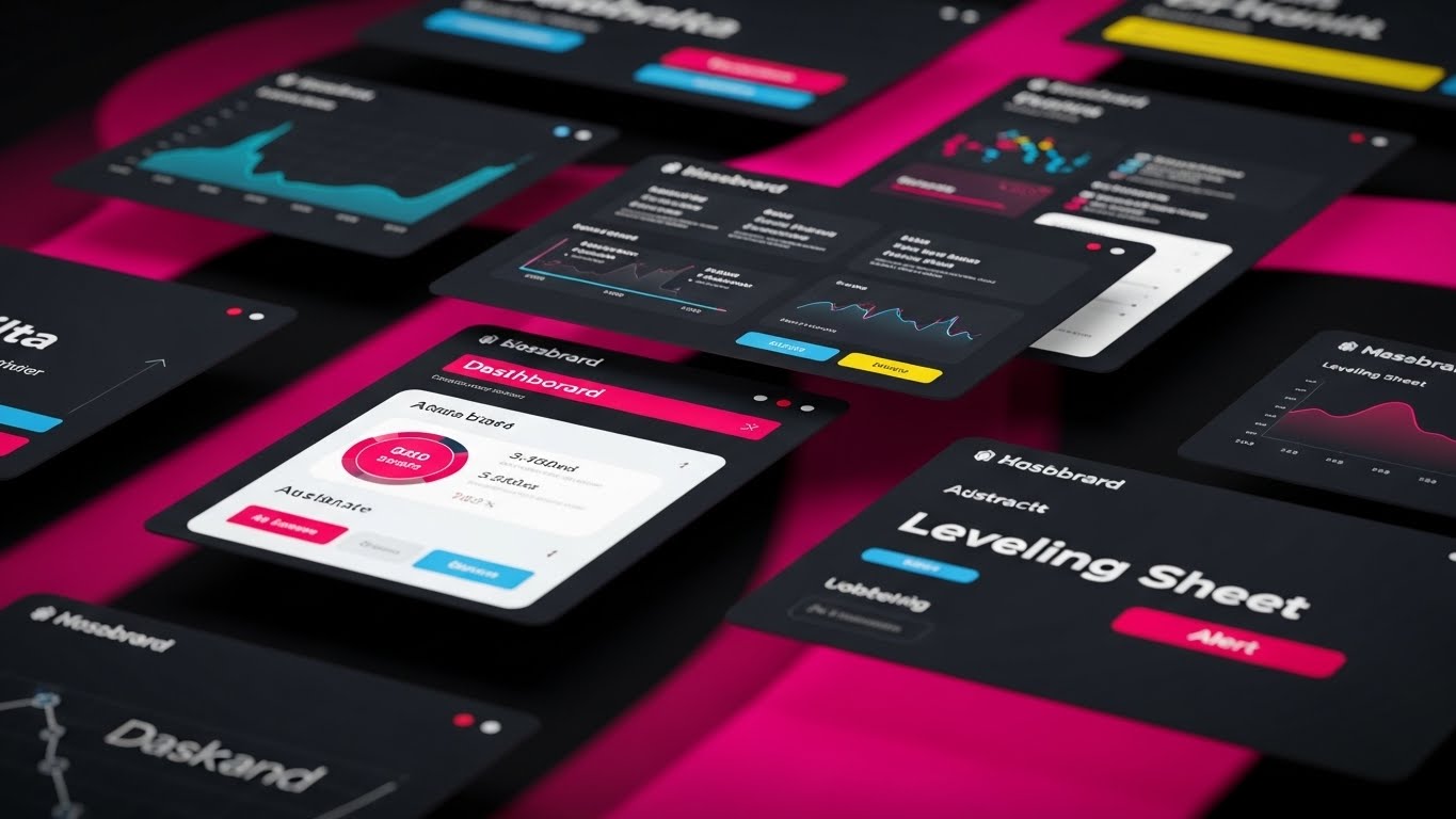
The Visual & Narrative Approach
For the final push, we need energy and scale. This Rapid UI Feature Montage is designed for a fast-paced sizzle reel. The frame fills with tilted, floating UI screens showing abstract dashboards, leveling sheets, and variance reports. They are arranged dynamically in 3D space, with motion blur suggesting high speed. The color palette is strictly on-brand—electric blue, clean white, and alert red accents—against a digital abstract background. The camera flies through this array, creating a sense of infinite capability.
Psychological Impact & KPI Focus
- Perceived Velocity: The speed of the cuts and the motion blur subconsciously communicate "Fast Software." It counters the perception of legacy software being slow and clunky.
- Feature Density: By showing a "cloud" of screens, you visually imply the depth and breadth of the platform without needing to explain every feature. It says, "We have everything you need" (Framework ID 1.14).
Strategic Implementation & Trade-offs
- Duration: 15-30 Seconds.
- Trade-off: High energy but low readability. Viewers won't read the data; they will just feel the "vibe" of modern, fast, comprehensive tech. Use this as the "outriding" visual in a sales deck or the final shot of a demo video.
Companies using similar video content -
TopBuilder – CRM for Contractors – Building trust and strong client relationships.
ProjectMark – Preconstruction CRM – Fostering collaboration and stakeholder confidence.
21. The Frictionless Path**
Onboard | Self-Serve Onboarding
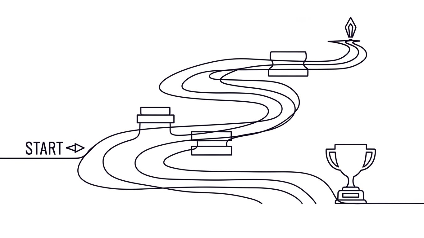
The Visual & Narrative Approach
To combat the intimidation of learning a new complex software, this 2D Line Art Animation utilizes a "Continuous Line" technique. An elegant, ink-black line flows organically across a paper-white background, starting from a "Start" point. It winds smoothly through abstract obstacles—representing common user hurdles—without breaking its flow, eventually culminating at a trophy icon. The variable width of the stroke mimics a calligraphy pen, adding a human, handcrafted touch to the digital journey.
Psychological Impact & KPI Focus
- Cognitive Ease: The unbroken line subconsciously suggests that the onboarding process is a single, fluid journey rather than a series of disjointed, difficult tasks. It promotes the idea of "Flow State."
- Achievement priming: Ending on a trophy icon visually primes the user for a "Quick Win," directly addressing the metric of Time-to-Value (Framework ID 2.4).
Strategic Implementation & Trade-offs
- Duration: 15-20 Seconds.
- Trade-off: This style is highly stylized and does not show the actual interface. It is best used as a "Welcome" video to set the emotional tone before the technical training begins.
Companies using similar video content -
Clear Estimates – Clear Estimates – Simplifying residential estimating with an intuitive interface.
Buildxact – Estimating & Management – Unraveling complex bids into simple, manageable steps.
22. The Value Projection
Onboard | Time-to-Value

The Visual & Narrative Approach
This style bridges the physical workspace with digital potential. A Holographic UI over 3D Render shows a high-end, realistic wooden desk with a coffee cup—familiar items to any estimator. From a lying tablet, a 3D volumetric hologram in vibrant cyan projects upwards, displaying a checklist of completed tasks and rising graphs. The lighting is volumetric, casting soft, realistic shadows on the wood grain, grounding the futuristic tech in a tangible reality.
Psychological Impact & KPI Focus
- Tangibility of Data: By projecting the data into "physical" space, the software feels like a tangible tool that sits on their desk, not just a browser tab.
- Motivation: The glowing checklist signifies progress. It creates a visual dopamine loop, encouraging the user to complete setup tasks to see the "hologram" grow (Framework ID 1.15).
Strategic Implementation & Trade-offs
- Duration: 10-15 Seconds.
- Trade-off: High production complexity. The tracking of the hologram to the tablet must be perfect; otherwise, it looks like a cheap filter.
Companies using similar video content -
Acumatica – Construction Edition – Materializing financial value with dynamic ROI visualization.
Jonas Construction Software – Jonas Enterprise – Justifying investment with clear financial growth metrics.
23. The Perfect Fit
Onboard | Implementation Friction

The Visual & Narrative Approach
Integration with existing ERPs (like Procore or Sage) is a major anxiety point. This Low-Poly 3D Modeling scene addresses it with playful simplicity. Two complex, 3D puzzle pieces—one in primary blue (representing the new software) and one in bright red (the existing stack)—hover in a white void. They snap together with a satisfying, magnetic weight. The faceted, low-poly aesthetic catches the light, emphasizing the precision of the fit without needing complex textures.
Psychological Impact & KPI Focus
- Resolution of Conflict: The visual of "snapping together" resolves the fear of incompatibility. It promises a "Plug and Play" experience.
- Simplification: Low-poly art strips away noise. It tells the viewer, "This isn't messy; it's just two pieces fitting together." This reduces the perceived Implementation Friction (Framework ID 1.16).
Strategic Implementation & Trade-offs
- Duration: 6-10 Seconds (Loop).
- Trade-off: It is abstract. It doesn't prove how the API works, only that it does. It requires supporting technical documentation nearby.
Companies using similar video content -
HCSS – HeavyBid – Effortlessly lifting heavy data for smooth implementation.
ConQuest Estimating Software – ConQuest Estimating – Making implementation feel weightless and easy.
24. The Feature Focus
Retent | Deep Feature Adoption

The Visual & Narrative Approach
To drive adoption of specific, underused features, this Macro UI Micro-Interaction style zooms in to an extreme close-up. We see a single UI toggle switch on a brushed metal surface. As an invisible finger interacts with it, the switch transitions from matte dark grey to a glowing electric green. The shallow depth of field blurs everything else, forcing the viewer to focus entirely on this single, satisfying interaction.
Psychological Impact & KPI Focus
- Micro-Satisfaction: The tactile quality of the switch makes the user want to click it. It gamifies the mundane act of configuring settings.
- Focus: By removing all context and focusing on one button, you reduce choice paralysis, guiding the user to adopt deep features one by one (Framework ID 1.17).
Strategic Implementation & Trade-offs
- Duration: 5-8 Seconds (GIF/Loop).
- Trade-off: This is purely for feature highlighting. It cannot explain workflows, only button functions. Use it in "New Feature" email blasts.
Companies using similar video content -
Procore – Platform Security – Securing enterprise construction data with glowing perimeters.
Trimble Viewpoint – ViewpointOne – Protecting critical project data in a secure environment.
25. The Intelligent Support
Retent | Reducing Support

The Visual & Narrative Approach
When users get stuck, they need to know help is available. This Abstract 3D AI Visualization represents the platform's AI support or predictive capabilities. Thousands of neural pink and violet particles swirl in a clean white digital space to form the shape of a human brain. This brain connects via glowing data streams to a central blue node, symbolizing the connection between human intent and machine intelligence.
Psychological Impact & KPI Focus
- Competence Trust: The sophisticated particle physics suggest a powerful, "smart" backend. It reassures the user that the system is actively thinking to help them.
- Reduced Anxiety: It visualizes the "Safety Net." Users are less likely to churn if they feel the software is proactively supporting their decisions (Framework ID 1.18).
Strategic Implementation & Trade-offs
- Duration: 15-30 Seconds.
- Trade-off: Very abstract. It needs a voiceover or text overlay explaining what the AI is actually doing (e.g., "Predicting Scope Gaps").
Companies using similar video content -
Beck Technology – Destini Estimator – Validating economic decisions with boardroom-ready data.
RIB Software – MTWO – Presenting strategic insights for executive decision-making.
26. The Client Champion
Retent | Reducing Churn

The Visual & Narrative Approach
Retention is built on relationships. This 2D Graphics Over Live Action style humanizes the success story. A high-key, candid photo of a happy client laughing in a modern office is brought to life with animated 2D overlays. Flat vector icons of hearts, thumbs-up, and upward arrows in the brand’s blue palette float and pop around their head. The combination of real emotion and playful graphics creates a "Customer Celebration" vibe.
Psychological Impact & KPI Focus
- Social Validation: Seeing a real human (not a model) happy with the software triggers mirror neurons. The user wants to feel that relief and joy.
- Emotional Stickiness: It reminds the user that the software isn't just about data; it's about making their work-life happier, directly impacting Net Promoter Score (NPS) (Framework ID 1.19).
Strategic Implementation & Trade-offs
- Duration: 10-15 Seconds.
- Trade-off: Requires permission from actual clients to use their likeness. Stock photos can be used but often lack the genuine spark of a real case study.
Companies using similar video content -
Fieldwire – Field Management – Confirming on-site utility with holographic checkmarks.
Bluebeam – Revu – Validating field progress with digital markups and overlays.
27. The Continuous Flow
Retent | Visitor Re-engagement

The Visual & Narrative Approach
For retargeting users who haven't logged in recently, this Abstract 2D Motion Graphics style uses hypnotic, rhythmic movement. Fluid shapes in corporate blue and teal morph and flow into one another in a continuous, seamless loop against a subtle digital texture. There are no hard edges or stops—only forward momentum.
Psychological Impact & KPI Focus
- Subconscious Momentum: The perpetual motion suggests that the platform is always working, even when the user isn't. It is a visual metaphor for "Always-On" productivity.
- Pattern Interrupt: The abstract beauty stands out in a feed of literal construction images, grabbing attention to trigger Visitor Re-engagement (Framework ID 5.1).
Strategic Implementation & Trade-offs
- Duration: 6-12 Seconds (Loop).
- Trade-off: It conveys "feeling" rather than "fact." It must be paired with a strong CTA (e.g., "See what you've missed").
Companies using similar video content -
Buildertrend – Construction Management – Guiding hesitant buyers to a clearer path.
CoConstruct – Construction Management – Nudging users towards efficient project management.
28. The Premium Tier
Expan | Upsell/Cross-sell
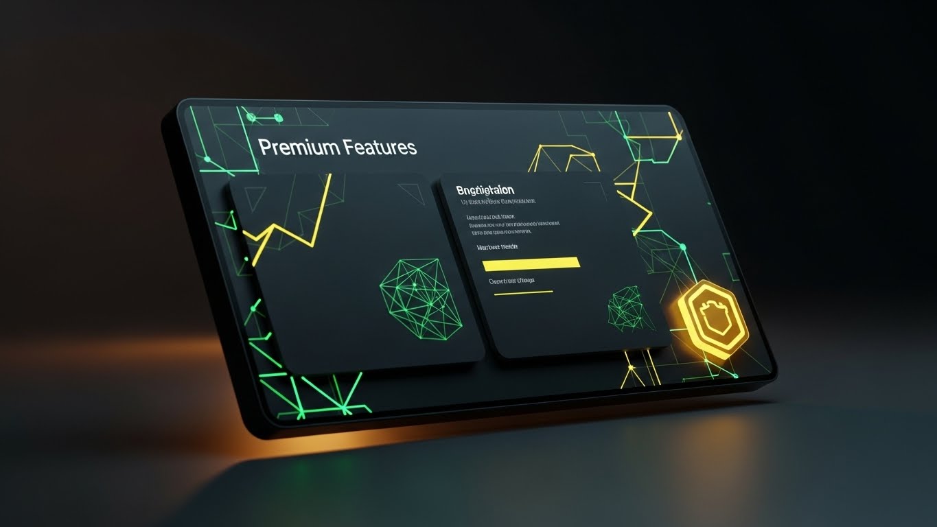
The Visual & Narrative Approach
To justify an upsell to an Enterprise tier, the visual language must shift to "Luxury." This Dark Mode UI Showcase presents the interface in a sleek, high-contrast dark mode—often a premium feature itself. The screen is angled in 3D space, displaying a "Premium Features" panel. A golden, glowing badge icon pulsates in the corner, and the environment is dimly lit with amber bias lighting, evoking a high-end control room.
Psychological Impact & KPI Focus
- Exclusivity: Dark mode and gold accents utilize the color psychology of luxury and premium status. It makes the upgrade feel like a membership to an elite club.
- Desire: It targets the user's aspiration for the "Best Tool Available," driving Average Revenue Per User (ARPU) expansion (Framework ID 1.20).
Strategic Implementation & Trade-offs
- Duration: 10-20 Seconds.
- Trade-off: If your actual software doesn't have a polished dark mode, this visual will be misleading. Only use this if the UI supports the aesthetic.
Companies using similar video content -
STACK Construction Technologies – STACK – Showcasing rapid feature capabilities for quick adoption.
ProEst – ProEst – Accelerating sales with a dynamic display of platform features.
29. The Growth Velocity
Expan | Referrals
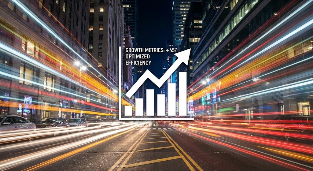
The Visual & Narrative Approach
To encourage referrals, you must prove momentum. This Hyper-lapse Stock Footage captures a busy city street at night with traffic lights streaking in long-exposure lines. Superimposed over this frantic energy is a stable, crystal-clear white data graphic showing a steady upward trend and the text "Growth Metrics: +45%." The contrast between the chaotic speed of the city and the stable, rising graph creates a powerful narrative.
Psychological Impact & KPI Focus
- Stability amidst Chaos: It visually says, "The world is fast and crazy; our results are stable and growing."
- Social Proof: It gives the user a "Stat to Share." Users are more likely to refer a colleague if they can cite a specific metric (e.g., "+45% Efficiency"), driving Viral Coefficient (Framework ID 1.21).
Strategic Implementation & Trade-offs
- Duration: 10-15 Seconds.
- Trade-off: The stock footage must be high quality (4K) to match the crispness of the data overlay.
Companies using similar video content -
Buildxact – Buildxact – Guiding users through a seamless, continuous onboarding journey.
Estimator 360 – Estimator 360 – Accelerating user adoption with a frictionless path.
30. The Future-Proof Layer
Expan | Proactive Support

The Visual & Narrative Approach
The final style emphasizes the depth of the platform. A 3D Parallax UI Presentation deconstructs the interface into floating layers separated by depth. The foreground layer is a crisp "Notification" card in focus blue, while background layers show blurred spreadsheets and dashboards. The camera pans slightly, creating a parallax effect that reveals the "hidden depth" of the software.
Psychological Impact & KPI Focus
- Dimensionality: It visually argues that the software isn't "flat." It has layers of utility that the user might not have discovered yet.
- Proactive Engagement: By bringing the notification to the front, it highlights the platform's ability to alert the user before issues arise (Framework ID 9.2).
Strategic Implementation & Trade-offs
- Duration: 15-20 Seconds.
- Trade-off: Requires a skilled motion designer to separate UI elements into 3D space. It creates a very high-end "Big Tech" feel.
Strategic Knowledge Base: The Visual Operations Doctrine
This section synthesizes the 30 visual styles into a cohesive business framework. It moves beyond "making videos" to establishing a Visual Operating System for your Bid Leveling SaaS.
Strategic Alignment & Visual Architecture
The "Pre-Production" Strategy: Defining Why and Who.
- The Cognitive Load Audit: Before creating Style 2 (The Cognitive Load Reducer), conduct an audit of your current training materials. If your PDF manuals have a "Cognitive Load Score" of 9/10, your video visuals must aim for a 3/10. Visuals are not decorations; they are simplification engines.
- Role-Based Visual Mapping: Different stakeholders require different visual dialects.
- The Chief Estimator (Economic Buyer) responds to Style 17 (The Boardroom Standard)—clean, high-level aggregated data.
- The Junior Estimator (User) responds to Style 7 (The Variance Interface)—granular, tactical, high-contrast UI details.
- Strategy: Do not send the same video to both. Map your 30 styles to specific user roles.
- The "Glanceability" Standard: In the high-stress environment of bid day, an estimator has seconds to make a decision. Your product visuals must pass the "Glanceability Test"—can the value (e.g., a scope gap) be understood in under 3 seconds? Styles like Style 5 (The Reality Validation) are designed specifically for this speed.
- Brand Voice Consistency: Your marketing videos (Styles 1-10) and your in-app onboarding (Styles 21-30) often look like they come from different companies. Use a unified "Visual Language"—if you use "Safety Orange" for alerts in marketing, use it for alerts in the product videos.
- The Advids Strategic Audit: Visualizing complex bid data requires an outside perspective. Engaging a strategic partner like Advids during the "Wireframing" phase ensures that the visual metaphors (like the "Shield" in Style 3) align with the actual competitive advantages of the software.
- Standardization vs. Customization: For core features (Leveling Sheets), use standardized, polished assets (Style 15). For niche, custom integrations, use lower-fidelity, agile styles (Style 2). This balances budget with impact.
- The Cross-Departmental Bridge: Use these visuals to unify terminology. If Sales calls it "Scope Leveling" and Support calls it "Bid Normalization," friction occurs. Create a Style 1 (Digital Foundation) video that defines the lexicon for the entire company.
- Legacy System Integration: The biggest competitor is often Excel. Use Style 13 (The Complexity Unraveled) to visually acknowledge the legacy system (the "knot") and respectfully demonstrate the transition. Don't mock the old way; visually resolve it.
- Accessibility in Construction: The construction workforce is diverse. Visuals (like Style 6) transcend language barriers. Ensure your motion graphics rely on visual cues (colors, shapes), not just voiceovers, to train multi-lingual teams.
- The Mobile-First Mandate: Estimators are increasingly on-site. All 30 styles must be legible on a mobile screen. Avoid tiny text; use bold iconography (Style 4) to ensure the message survives the "small screen test."
Operational Adoption & Implementation
The "Deployment" Phase: Embedding visuals into the workflow.
- Overcoming "Big Brother" Anxiety: Tracking bid metrics can feel like surveillance to some employees. Use Style 12 (The Stakeholder Trust Signal) to frame the data as "Team Protection" rather than "Individual Monitoring." Visual empathy is critical here.
- The Micro-Learning Shift: Nobody reads the 50-page manual. Replace it with a library of 30-second clips using Style 24 (The Feature Focus). Embed these directly into the software tooltips.
- Just-in-Time Support: When a user encounters an error, pop up a Style 25 (Intelligent Support) loop. It reduces frustration by visually acknowledging the system is "thinking" and offering a solution, lowering support ticket volume.
- Gamification of Training: Use Style 21 (The Frictionless Path) to visualize the user's onboarding progress. Showing a "Progress Bar" filling up or a trophy unlocking triggers the completionist instinct in users.
- Reducing Support Ticket Volume: There is a direct correlation between the quality of your "Error State" visuals and call center volume. If a visual clearly explains why an upload failed (using Style 2), the user solves it themselves.
- Remote Onboarding: For distributed Precon teams, you cannot rely on in-person seminars. Use Style 6 (The Collaborative Ecosystem) to simulate the feeling of a shared office, visually connecting remote users to the central server.
- Visualizing SOPs: Standard Operating Procedures are boring. Transform text-based SOPs into visual process flows using Style 10 (Isometric 3D Workflow). This ensures process adherence is higher.
- Feedback Loops: Use interactive video elements (Style 26) to gather feedback. If a user watches a "Help" video to the end, ask "Did this help?" with a simple visual thumbs up/down.
- Scalable Localization: If you expand to new regions, Style 23 (Low-Poly) is easiest to localize because it relies on symbols, not text. Plan your asset library for global scale from Day 1.
- Leadership Communication: When rolling out the software to a new division, the VP needs a "Hype Video" to sell the change. Use Style 20 (The Velocity Closer) to equip your internal champions with high-energy assets that build excitement.
Measuring Impact & Future-Proofing
The "ROI" Phase: Measuring success and looking ahead.
- Beyond "Views": Do not measure video success by "Views." Measure it by "Action." Did the viewer of Style 19 (The Decision Nudge) click the "Buy" button? Did the viewer of Style 24 start using the new feature? Connect visuals to behavioral KPIs.
- The "Idle Time" Metric: High-quality UX visualization (Style 7) should reduce the time an estimator spends staring at the screen wondering what to do. Measure the reduction in "Idle Time" as a metric of visual efficiency.
- Compliance Velocity: How fast can your team adopt new industry standards (like new cost codes)? Use Style 4 (Kinetic Alignment) to push rapid updates. Measure the speed of compliance before and after video implementation.
- Retention and Churn: Visual friction causes churn. If the interface looks old, users leave. Regularly updating your onboarding visuals (Style 22) signals that the product is alive and evolving, directly supporting Net Revenue Retention (NRR).
- The AI Visual Frontier: Generative AI is changing construction. Prepare your visual strategy to incorporate "Real-Time AI Overlays" (Style 25). Show users that you are on the cutting edge of this trend.
- Scalability of Assets: Don't build "Disposable" videos. Build a "Modular Library." The background from Style 1 should be reusable in Style 16. This "Asset Recycling" reduces long-term production costs.
- The Advids Partnership: As your feature set grows, your visual library must grow. Partnering with Advids allows you to maintain a "Living Library" of assets that evolves with your roadmap, ensuring you never have outdated tutorials.
- Benchmarking Success: Compare your "Visual Density" against competitors. If they use text and you use Style 14 (Value Materialization), you win the "Perceived Value" battle before the demo even starts.
- The ROI of Risk Mitigation: Quantify the cost of a "Missed Scope Gap." If Style 5 (Reality Validation) helps an estimator catch one $50,000 error, the video strategy has paid for itself 10x over.
- Final Call to Innovation: Treat video not as "Content Marketing" but as "Visual Infrastructure." In the era of Bid Leveling, the winner is not just the one with the best data, but the one who makes that data the easiest to see.
Companies using similar video content -
Zebel – Preconstruction Analytics – Projecting instant ROI with volumetric data.
Togal.AI – Togal.AI – Visualizing immediate value from AI-powered takeoffs.
Author & Editor Bio


