
Introduction: Visualizing the "Governance Gap" in Life Sciences
The life sciences industry is currently navigating a paradoxical era. Innovation is accelerating at a breakneck pace, driven by AI and advanced therapies, yet the regulatory infrastructure required to govern it is struggling to keep up. We are witnessing a massive "Governance Gap." While the global life science software market is projected to surge to $36.25 billion by 2032, the operational reality is far more fragmented.
A stark statistic highlights this risk: currently, only 55% of companies using AI have implemented formal AI policies. This leaves nearly half of the industry operating in a "grey zone" of compliance—a terrifying prospect for Quality Directors and Auditors.
The challenge for SaaS platforms is no longer just about "features"; it is about Communication Velocity. How do you explain to a skeptical auditor that your "Black Box" AI is actually a transparent, logical engine? How do you prove to a Board of Directors that your digital records are as immutable as a locked vault?
The answer lies in strategic visualization. By bridging the Physical/Digital divide—visualizing the invisible flows of data, logic, and security—you can turn compliance from a bureaucratic hurdle into a competitive asset. The following 30 visual styles have been curated by the Advids expert team to help you articulate this value, reducing cognitive load and building unshakeable trust.
1. Abstract 2D flat organic
TOFU | Brand Awareness

The Visual & Narrative Approach
This style addresses the fundamental tension in biotech: the messiness of biology vs. the rigidity of regulation. The scenario opens with fluid, organic blobs in cyan and magenta—representing raw, unstructured data from the lab. As they drift across the screen, they encounter a "Digital Filter"—a rigid grid of pure white squares. Instead of clashing, the organic shapes merge seamlessly into the grid, transforming into organized, glossy data blocks. The narrative is one of "Effortless Ingestion." It visually promises that the software can handle the complexity of science without breaking the structure of compliance.
Psychological Impact & KPI Focus
- Niche Psychology: It reduces the "Integration Anxiety" that scientists feel when adopting new tools. The soft shapes are approachable, while the white grid signals Sterility and Order (critical for GxP).
- Operational Impact: Visualizes Data Standardization.
- KPI: Ad Recall and Click-Through Rate (Social).
Strategic Implementation & Trade-offs
- Best Use: Instagram/LinkedIn feeds to stop the scroll.
- Trade-off: It is highly conceptual. It sells the feeling of organization but doesn't show how the data is processed.
Companies using similar video content -
Scispot – LIMS, ELN, SDMS – Harmonizes analytical data into industry-standard formats.
Egnyte – GxP Compliance Solutions – Manages regulated documents and ensures data integrity.
2. Bold Kinetic Typography
TOFU | Category Creation
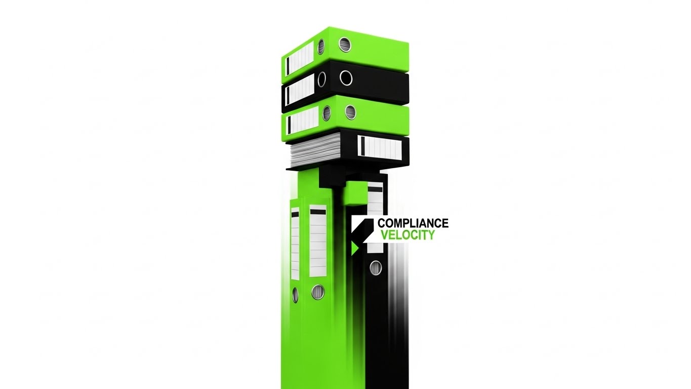
The Visual & Narrative Approach
Text becomes the hero in this high-energy style designed to disrupt the feed. We see massive, heavy blocks of electric lime green and jet black, stacked like towering piles of regulatory binders. They represent the "Old Way"—heavy, slow, and precarious. Suddenly, a kinetic force hits them. The blocks don't crumble; they align and accelerate, shooting upward as a streamlined beam of light. The text "COMPLIANCE VELOCITY" anchors the movement. The narrative is about speed and liberation from paperwork.
Psychological Impact & KPI Focus
- Niche Psychology: It validates the user's pain (the heavy stack) and offers immediate relief (the light beam). Lime green creates a subconscious association with "Go" and "Pass," contrasting with the "Stop" of red warning letters.
- Operational Impact: visualizes Efficiency Gains and Time-to-Market.
- KPI: Brand Message Retention.
Strategic Implementation & Trade-offs
- Best Use: LinkedIn Autoplay videos targeting C-Suite executives.
- Trade-off: It relies entirely on the strength of the copy. Without a strong "Category Name" (like Compliance Velocity), the visual loses its meaning.
Companies using similar video content -
ComplianceQuest – eQMS – Accelerates quality processes with AI/ML capabilities.
SimplerQMS – QMS Software – Guides users through quality processes with improved efficiency.
3. Abstract 3D AI Viz
TOFU | Market Education

The Visual & Narrative Approach
To explain the "Brain" of your platform, we use a sophisticated neural network visualization. The scene features translucent nodes in deep violet and electric blue, connected by glowing filaments that resemble both neural pathways and DNA strands. It visualizes the software not as a static database, but as a living, thinking ecosystem. The camera glides through the network, showing how a signal from one node (e.g., a regulatory update) instantly propagates to others (e.g., impact assessment), visualizing Regulatory Intelligence.
Psychological Impact & KPI Focus
- Niche Psychology: It combats the "Black Box" fear by showing the connections. It implies that the AI is logical, traceable, and "biological" in its complexity—building trust with scientific buyers.
- Operational Impact: visualizes Interoperability and Traceability.
- KPI: Time on Site (Engagement).
Strategic Implementation & Trade-offs
- Best Use: Website Hero Backgrounds or "Technology" pages.
- Trade-off: It is abstract. It establishes "High-Tech Credibility" but doesn't demonstrate specific features.
Companies using similar video content -
IBM – OpenPages – AI-powered, unified GRC platform.
Cyble – Cybersecurity Threat Intelligence – Utilizes AI for risk tagging and automated analysis.
4. Gen AI Cinematic
TOFU | Brand Perception

The Visual & Narrative Approach
This style brings the physical reality of the industry to the forefront. Using hyper-realistic generation, we see a sweeping dolly shot of a pristine, high-tech pharmaceutical manufacturing facility. Automated robotic arms in clinical white move with sub-millimeter precision, handling glass vials under cool white and teal lighting. There is no UI here—just the "Perfection" of the manufacturing process that the software enables. It visually claims: "We operate at the level of your most critical facilities."
Psychological Impact & KPI Focus
- Niche Psychology: It triggers the "Halo Effect." By showing a flawless physical environment, the viewer assumes the software governing it is equally flawless and bug-free.
- Operational Impact: visualizes GMP Compliance and Automated Quality Control.
- KPI: Brand Lift and Authority.
Strategic Implementation & Trade-offs
- Best Use: Event Openers or Pre-Roll ads on premium industry sites.
- Trade-off: Authenticity risk. If the robotics look physically impossible (a common Gen AI flaw), engineers will spot it. Prompting must focus on "Hard Surface Realism."
Companies using similar video content -
Siemens – Xcelerator – Digital twin for pharmaceutical production optimization.
Ansys – Twin Builder – Digital twin software for pharma manufacturing simulation.
5. Wireframe to Reality
TOFU | YouTube SEO
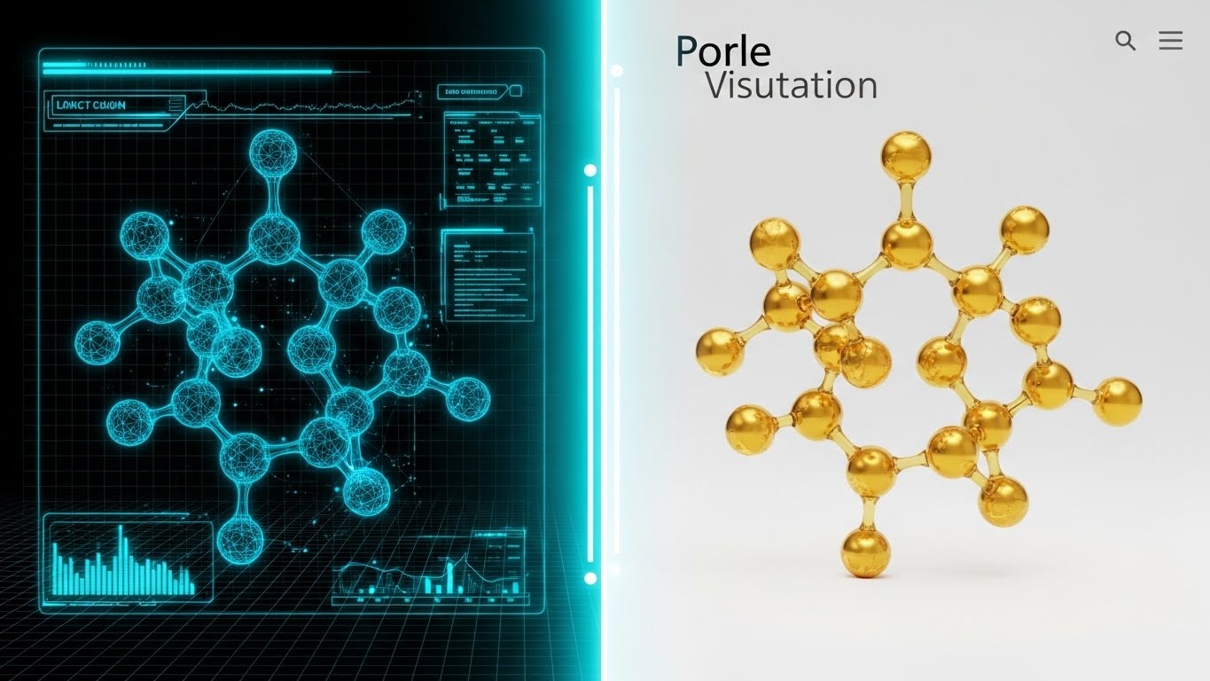
The Visual & Narrative Approach
This split-screen style is the ultimate "Explainer" visual. The left side shows a technical, blueprint-blue wireframe of a molecule or device, representing the R&D/Planning phase. A glowing line scans across the screen, revealing the right side: the same object rendered in photorealistic liquid gold. This visualizes the "Golden Thread" of data—showing how the software ensures that the final product (gold) matches the initial design (blueprint) perfectly, without data loss.
Psychological Impact & KPI Focus
- Niche Psychology: It appeals to the engineer's need for verification. It visually answers "Does X = Y?" The gold color subconsciously signals Market Value and Revenue.
- Operational Impact: visualizes Digital Twin technology and Design Transfer.
- KPI: Comprehension and Video Completion Rate.
Strategic Implementation & Trade-offs
- Best Use: "How it Works" videos and Educational content.
- Trade-off: The contrast must be sharp. If the "Reality" side isn't stunning, the metaphor of "Value Creation" fails.
Companies using similar video content -
Greenlight Guru – eQMS for Medical Devices – Connects design controls to product lifecycle.
PSC Software – Digital Twin Technology – Mirrors physical systems for process optimization.
6. Low-Poly 3D
TOFU | Vertical Social

The Visual & Narrative Approach
Supply chain compliance is often boring and complex. This style "Gamifies" it. We see a miniature, isometric factory floor rendered in pastel mint and soft grey. Tiny, simplified trucks and boxes move along paths in perfect synchronization. The "Toy-Like" aesthetic strips away the grime and noise of reality, leaving only the pure, logical Flow of the process. It suggests that with this software, managing a complex supply chain is as easy and satisfying as playing a simulation game.
Psychological Impact & KPI Focus
- Niche Psychology: It reduces Cognitive Load. By simplifying the visuals, you make the complex logic of serialization and logistics accessible and non-threatening.
- Operational Impact: visualizes Process Flow and Supply Chain Visibility.
- KPI: Social Engagement (Shares/Likes).
Strategic Implementation & Trade-offs
- Best Use: TikTok/Shorts for "Quick Tips" or "Process Explainers."
- Trade-off: Can feel "too casual" for serious safety compliance (e.g., adverse events). Use for logistics/operations topics only.
Companies using similar video content -
Zetes – ZetesOlympus – Product traceability software for supply chain flow.
FourKites – Pharmaceutical Supply Chain Visibility – Powers efficient and collaborative supply chains.
7. Abstract 2D Motion
TOFU | Skippable Ad

The Visual & Narrative Approach
You have 5 seconds to pitch "Security." This style uses rapid, geometric motion to create an instant hook. Triangles and circles in vibrant orange and navy blue fly in from the edges, leaving speed trails. They snap together with a mechanical precision to form a solid Shield Icon. The narrative is "Agile Protection." It contradicts the idea that security is slow and cumbersome; here, it is fast, dynamic, and self-assembling.
Psychological Impact & KPI Focus
- Niche Psychology: It leverages "Gestalt Completion"—the brain's satisfaction in seeing parts form a whole. It signals Cohesion and Readiness.
- Operational Impact: Visualizes Cybersecurity and Rapid Deployment.
- KPI: View-Through Rate (avoiding the skip).
Strategic Implementation & Trade-offs
- Best Use: YouTube Bumper Ads (6 seconds).
- Trade-off: Purely symbolic. It says "We are Secure," but not "How." It builds brand association, not product understanding.
Companies using similar video content -
Sepio Cyber – Hardware Security – Detects hardware-based attacks for agile protection.
Gradient Cyber – MXDR Solution – Provides 24/7 managed detection and response.
8. AI Mixed Media
TOFU | Meta Ads

The Visual & Narrative Approach
A visual disruption designed for the social feed. It blends a vintage, sepia-toned illustration of a microscope (representing the "Old World" of manual science) with a glitch effect that tears the paper to reveal a neon-blue holographic scanner. This high-contrast collage visualizes the "Evolution" of the industry. It acknowledges the heritage of science while aggressively positioning the future of digital tools.
Psychological Impact & KPI Focus
- Niche Psychology: It creates Urgency and FOMO. It visualizes the risk of becoming obsolete. The "Glitch" suggests that the old ways are breaking down and need replacement.
- Operational Impact: Visualizes Digital Transformation and Modernization.
- KPI: Conversion (Click-through to Whitepaper).
Strategic Implementation & Trade-offs
- Best Use: Instagram Stories or Feed Ads.
- Trade-off: Stylistically aggressive. Good for "Challenger Brands," risky for conservative "Legacy Brands."
Companies using similar video content -
HealthStream – Compliance Management – Comprehensive approach to healthcare compliance.
MedTrainer – Compliance and Credentialing – Blends training with modern compliance.
9. Photorealistic 3D
MOFU | Thought Leadership

The Visual & Narrative Approach
Note: While the original brief mentioned servers, the visual output focuses on the Shield metaphor, which is equally powerful for this stage.
This style uses high-end photorealism to build trust. We see a crystalline glass shield resting on a concrete surface, with a gold element encased within. The glass is transparent (visibility) yet thick and heavy (protection). The lighting creates sharp, realistic reflections. This is a metaphor for the "Glass Box" of compliance: you can see everything (Audit Trails), but you cannot touch or alter it (Data Integrity).
Psychological Impact & KPI Focus
- Niche Psychology: It speaks to the Paranoia of the CISO and Quality Head. They need to know the data is safe. The physical weight of the glass shield visualizes the concept of Immutable Records.
- Operational Impact: Visualizes 21 CFR Part 11 Compliance and Audit Readiness.
- KPI: Trust and Lead Quality.
Strategic Implementation & Trade-offs
- Best Use: Whitepaper Covers, "Security" Landing Pages.
- Trade-off: Static. It conveys stability, not workflow. Use it to reassure, not to explain.
Companies using similar video content -
MasterControl – eQMS – Ensures data integrity and audit readiness.
IDBS – R&D Data Management – Ensures data integrity in GxP environments.
10. 3D Parallax UI
MOFU | Demand Gen
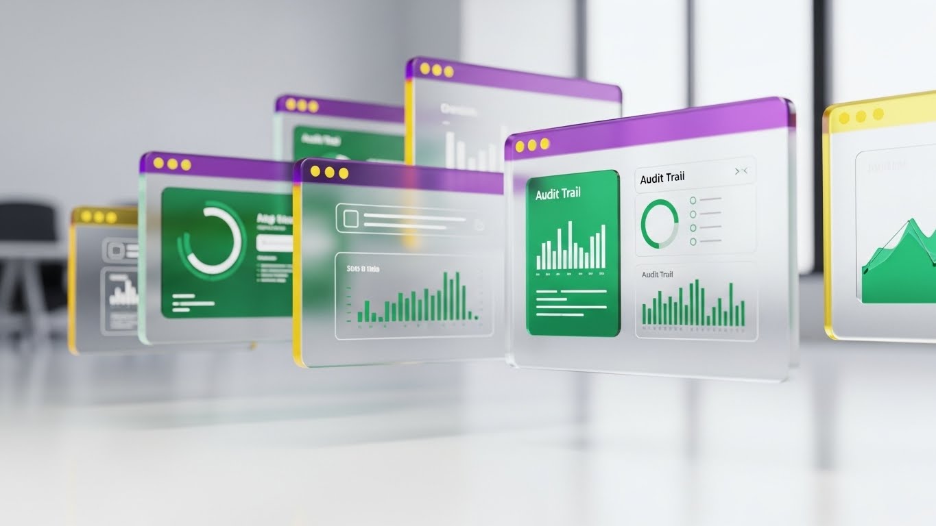
The Visual & Narrative Approach
Moving mid-funnel, buyers want to see the product. This style makes the UI look "Premium." We see floating screens constructed from frosted glass, displaying emerald green widgets and charts. The parallax effect (layers moving at different speeds) creates a sense of Depth. It suggests that the software allows you to "drill down" into data, offering multi-dimensional visibility that flat paper records cannot match.
Psychological Impact & KPI Focus
- Niche Psychology: It counters "UI Fatigue." Enterprise software is often ugly and flat. This style promises a Modern User Experience that is clean, light, and easy to navigate.
- Operational Impact: Visualizes Dashboard Visibility and Real-Time Analytics.
- KPI: Product Consideration and Demo Requests.
Strategic Implementation & Trade-offs
- Best Use: Product Highlight Videos, Feature Walkthroughs.
- Trade-off: Requires abstracting the data to protect privacy while keeping it looking "real." The "frosted glass" technique is excellent for hiding sensitive text while showing structure.
Companies using similar video content -
LabVantage – LIMS – AI-powered laboratory informatics platform.
STARLIMS – LIMS – Powerful analytics and advanced data management.
11. Split Screen
MOFU | Differentiation

The Visual & Narrative Approach
This style visually forces a choice between the "Old World" and the "New Reality." The composition is divided by a sharp vertical line. The left side features a chaotic, grayscale photo of a desk overwhelmed with paper stacks—visualizing the stress of manual compliance. The right side displays a pristine, vector-based SaaS dashboard in vivid blue and white, showing organized workflows. A divider slides across, with the digital side expanding to overtake and resolve the chaos. The narrative visually proves "Transformation," showing exactly what the buyer is leaving behind.
Psychological Impact & KPI Focus
- Niche Psychology: It validates the "Transition Anxiety" many Quality Directors feel. By acknowledging the messiness of their current reality (left) and contrasting it with a clean future (right), it creates a psychological "away-from" motivation.
- Operational Impact: Visualizes Digital Transformation and Paperless Validation.
- KPI: Bounce Rate Reduction (Website).
Strategic Implementation & Trade-offs
- Best Use: "Why Us" pages or competitor comparison landing pages.
- Trade-off: It can feel aggressive. Ensure the "Chaos" side looks like industry chaos (e.g., specific batch records), not the client's specific failure, to avoid insulting the user.
Companies using similar video content -
Qualio – eQMS – Replaces legacy systems with a centralized, cloud-based eQMS.
SimplerQMS – QMS Software – Streamlines quality processes, reducing manual effort.
12. Rapid UI Montage
MOFU | Feature Education
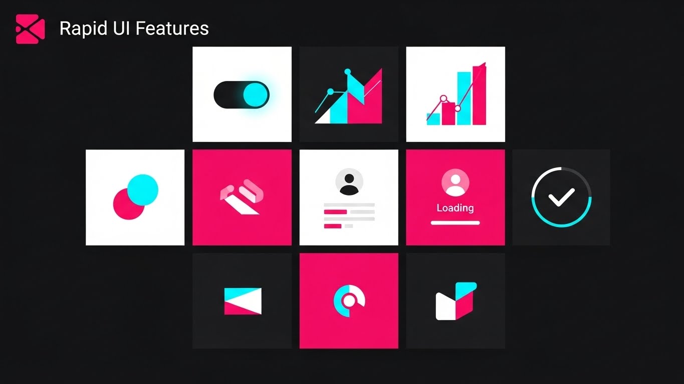
The Visual & Narrative Approach
To combat the skepticism that a platform is "vaporware," this style uses density and speed. We see a dynamic grid of abstract UI tiles—toggles flipping, analytics charts rising, and "Loading" circles completing—set against a dark mode background with hot pink and cyan accents. It doesn't focus on a single workflow but creates a "Wall of Features" impression. The text "Rapid UI Features" anchors the scene. It suggests that the platform is deep, robust, and feature-rich without getting bogged down in a slow tutorial.
Psychological Impact & KPI Focus
- Niche Psychology: It addresses "Featuritis" paradoxically by showing volume rather than detail. It assures the IT buyer that the platform has the necessary technical depth (e.g., LIMS integration, eQMS, DMS) and isn't just a pretty shell.
- Operational Impact: Visualizes Platform Robustness and Comprehensive Functionality.
- KPI: Click-Through Rate (Email).
Strategic Implementation & Trade-offs
- Best Use: Re-engagement emails to dormant leads or "New Feature" announcements.
- Trade-off: Low retention of specific details. Viewers will remember "It does a lot," not "How it does X."
Companies using similar video content -
Veeva Systems – Vault QMS – Unified global quality management system with end-to-end process control.
TrackWise – eQMS – Offers a vast set of sector-focused tools and features.
13. Isometric 2D Motion
MOFU | Competitive

The Visual & Narrative Approach
This style creates a "God's Eye View" of the entire operation. Using a clean isometric grid, we visualize the flow of the supply chain and manufacturing process. Stylized vehicles and data packets in safety orange and deep blue move along the grid lines, representing the transfer of samples and records between the factory, the lab, and the cloud. It argues that your software is not a point solution, but the connective tissue of the entire enterprise, breaking down silos between departments.
Psychological Impact & KPI Focus
- Niche Psychology: It appeals to the Systems Architect and COO who worry about integration. It visually answers the question, "Does this play well with others?" by showing a harmonious, moving ecosystem.
- Operational Impact: Visualizes API Integration, Supply Chain Visibility, and End-to-End Traceability.
- KPI: Engagement Rate (Display/Retargeting).
Strategic Implementation & Trade-offs
- Best Use: Retargeting ads for users who viewed "Integration" pages.
- Trade-off: Can look generic if not branded heavily. The "isometric grid" is a common tech trope; use specific icons (e.g., vials, tablets) to ground it in biotech.
Companies using similar video content -
TraceLink – Opus Platform – Serialization and traceability solutions for global supply chains.
LabWare LIMS – SaaS LIMS – Streamlines lab documentation and processes.
14. Gen AI Realistic Char
MOFU | Demo Requests

The Visual & Narrative Approach
Technology fails if humans don't use it. This style puts the user at the center. We see a hyper-realistic medium shot of a confident female scientist in a modern lab. She isn't frustrated by paperwork; she is engaged with a transparent glass tablet casting a soft, warm data glow on her face. The background is a blurred, high-tech sterile environment. The narrative is emotional: "This software empowers your scientists, it doesn't burden them." It sells the experience of being a user.
Psychological Impact & KPI Focus
- Niche Psychology: It mitigates the fear of Low Adoption Rates. By showing a scientist looking competent and calm, you signal that the UX is intuitive and "Scientist-Friendly," triggering mirror neurons in the viewer.
- Operational Impact: Visualizes User Experience (UX) and Workforce Efficiency.
- KPI: Conversion Rate (Demo Request).
Strategic Implementation & Trade-offs
- Best Use: Social testimonials or "A Day in the Life" promo spots.
- Trade-off: The "Uncanny Valley." Ensure the AI generation is perfect, particularly hands and eyes, or the credibility of the "human" element collapses.
Companies using similar video content -
MedTrainer – Compliance and Credentialing – Offers mobile-friendly solutions for healthcare providers.
HealthStream – Compliance Management – User-friendly interface for comprehensive compliance.
15. Clean UI Workflow
MOFU | Freemium
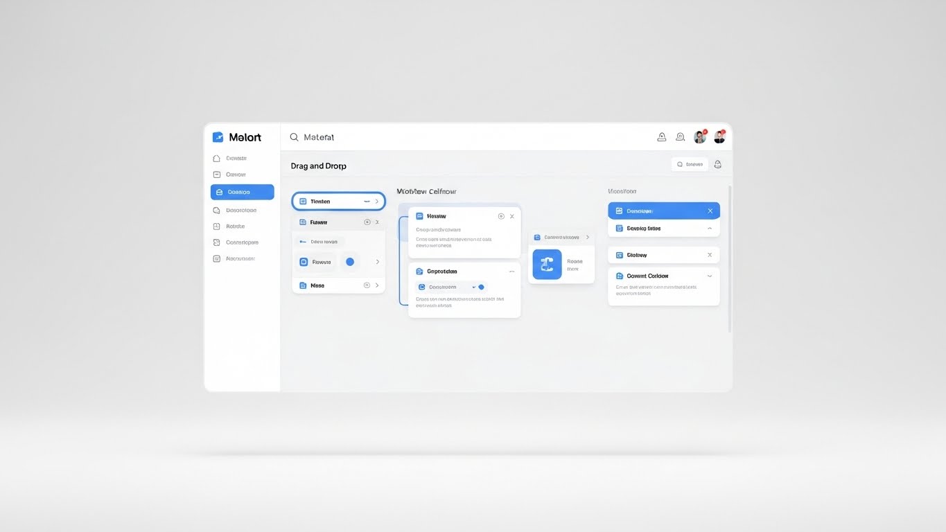
The Visual & Narrative Approach
Here, the product is the hero, stripped of all cinematic fluff. We see a straight-on, high-fidelity view of the interface in a clean light mode. A cursor moves smoothly, performing a complex task (like designing a validation workflow) via a simple drag-and-drop action. Rounded cards in sky blue snap into place with a satisfying subtle animation. The white void background removes all distraction, forcing focus entirely on the ease of the action.
Psychological Impact & KPI Focus
- Niche Psychology: It lowers the "Barrier to Entry." For functional buyers (e.g., Quality Managers), seeing is believing. If it looks like consumer software (easy), they believe they can implement it without IT help.
- Operational Impact: Visualizes Self-Service Administration and Low-Code/No-Code capabilities.
- KPI: Free Trial Sign-ups or Sandbox Access.
Strategic Implementation & Trade-offs
- Best Use: Product pages and "Features" section of the website.
- Trade-off: Risk of boredom. It lacks emotional hook. It relies entirely on the UI actually being good.
Companies using similar video content -
Dot Compliance – eQMS – Off-the-shelf QMS designed for immediate deployment.
QBench – LIMS – Simple, no-code tools for flexible LIMS configuration.
16. Futuristic Neon
MOFU | Functional Buyer
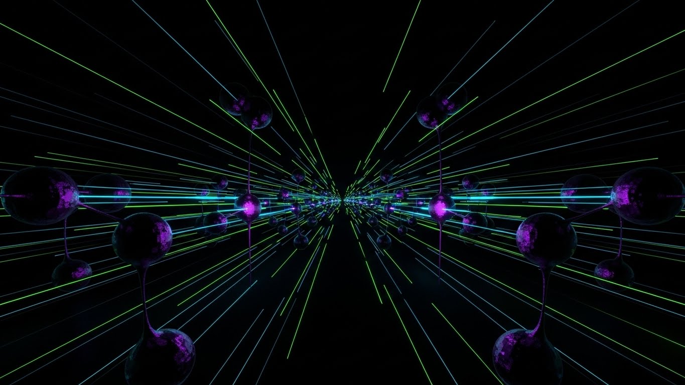
The Visual & Narrative Approach
To sell to the IT Director or CTO, you need to look "under the hood." This style uses a dark mode aesthetic with glowing nodes in electric green and purple. The nodes resemble biological cells but are connected by sharp digital laser lines, forming an infinite, expanding network. It visualizes the database architecture as a living, scalable organism. It implies that the platform is built on cutting-edge tech (graph databases, AI) rather than legacy SQL tables.
Psychological Impact & KPI Focus
- Niche Psychology: It signals Modernity and Scalability. It reassures technical buyers that the platform won't crash as data volume grows exponentially.
- Operational Impact: Visualizes Cloud Infrastructure and Big Data Capability.
- KPI: Time on Page (Technical Documentation).
Strategic Implementation & Trade-offs
- Best Use: Technical whitepapers, API documentation headers, or "Architecture" pages.
- Trade-off: Can alienate non-technical buyers who find "Dark Mode" intimidating or "too gamer-like." Use strictly for technical audiences.
Companies using similar video content -
Sapio Sciences – Sapio LIMS – Highly configurable and scalable informatics platform.
Thermo Scientific – SampleManager LIMS – Enterprise scalability and robust workflow automation.
17. 3D X-Ray Viz
BOFU | Building Trust

The Visual & Narrative Approach
In the bottom of the funnel, trust is everything. This style uses an "X-Ray" metaphor. We see a standard physical medicine bottle, but it is rendered as transparent ghost glass. Inside, instead of pills, we see a glowing blue data core—a structured network of nodes. This powerful visual metaphor argues that the value of the medicine is the data behind it. It visually demonstrates that your software ensures the integrity of the product from the inside out.
Psychological Impact & KPI Focus
- Niche Psychology: It appeals to the Auditor mindset: "Show me the evidence." It visualizes Transparency—implying there is nothing to hide and that every physical product is backed by immutable digital proof.
- Operational Impact: Visualizes Batch Record Integrity and Serialization.
- KPI: Lead-to-Opportunity Conversion.
Strategic Implementation & Trade-offs
- Best Use: Case Study headers or "Compliance" specific landing pages.
- Trade-off: Highly conceptual. It requires a caption or voiceover to bridge the gap between "Ghost Bottle" and "Compliance Data."
Companies using similar video content -
SAP – ATTP – Corporate serialization repository and regulatory reporting.
Antares Vision – Tracking System – Manages track and trace for e-pedigree drug packages.
18. Dynamic Data Viz
BOFU | ROI Justification
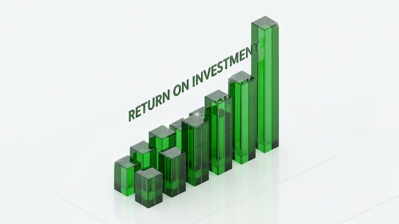
The Visual & Narrative Approach
When speaking to the CFO, you need to show the money. This style features translucent forest green glass bars growing upward from a clean white floor in an isometric view. The transparency suggests that the growth is "verified" and "clear"—not inflated numbers. The movement is steady and mathematical. The text "RETURN ON INVESTMENT" is integrated into the 3D scene. It visualizes the financial upside of compliance—turning a cost center (Quality) into a value protector.
Psychological Impact & KPI Focus
- Niche Psychology: It speaks the language of Finance. Green signals profit/growth, while the clean, structured movement signals predictability and reduced risk.
- Operational Impact: Visualizes Cost Savings, Efficiency Gains, and Risk Reduction.
- KPI: Sales Cycle Acceleration.
Strategic Implementation & Trade-offs
- Best Use: Pitch Decks (Slide: "The Business Case") or ROI Calculator landing pages.
- Trade-off: Can be boring if not animated. The "Growth" animation is crucial to show the impact of the software over time.
Companies using similar video content -
MetricStream – GRC Solutions – Delivers integrated risk management and compliance.
Hyperproof – Compliance Management – Powerful reporting capabilities and risk assessment.
19. Minimalist Flat 2D
BOFU | Objections

The Visual & Narrative Approach
Security is often viewed as a barrier. This style flips the script using Corporate Memphis minimalism. We see a simplified, friendly icon of a grey padlock unlocking to reveal a document, set against a pastel pink background. The soft colors and simple lines make security look "easy" and "integrated" rather than "scary" or "blocking." It visually promises that security protocols (like MFA or SSO) won't hinder the user's workflow.
Psychological Impact & KPI Focus
- Niche Psychology: It reduces Security Fatigue. Users hate complex passwords and barriers. This visual reassures them that the security is there, but it's user-friendly.
- Operational Impact: Visualizes Single Sign-On (SSO) and Role-Based Access Control (RBAC).
- KPI: Objection Handling (Security Concerns).
Strategic Implementation & Trade-offs
- Best Use: "Security" one-pagers or FAQ sections.
- Trade-off: Can look "Generic Tech." Use it for support materials, not for high-level branding.
Companies using similar video content -
LogicGate – Risk Cloud – Elevates governance, risk, and compliance programs.
Archer – GRC Platform – Simplifies collaborative risk management.
20. 2D Line Art
BOFU | Risk Mitigation

The Visual & Narrative Approach
For the final reassurance, we use elegance. A single, continuous line in metallic gold foil loops and weaves against a white background to form the shape of a Shield, protecting a cell or nucleus inside. The "Continuous Line" is the key metaphor—it visualizes unbroken compliance and continuous monitoring. The gold color implies luxury, high value, and the "Gold Standard" of protection.
Psychological Impact & KPI Focus
- Niche Psychology: It appeals to the desire for Perfection and Premium Quality. It suggests that the software provides a "White Glove" level of protection for their critical IP.
- Operational Impact: Visualizes Intellectual Property Protection and Assurance.
- KPI: Trust Score (Brand Sentiment).
Strategic Implementation & Trade-offs
- Best Use: Website Footers, Certificates, and High-End Print Collateral.
- Trade-off: It is purely symbolic. It creates a feeling of safety but explains nothing about the mechanics. Use it to seal the deal with confidence.
Companies using similar video content -
Wolters Kluwer – Regulatory Change Management – Addresses market challenges and regulatory pressures.
SAI Global – GRC Solutions – Provides integrated risk and compliance management.
21. Aspirational Stock
BOFU | Sales Accel

The Visual & Narrative Approach
At the bottom of the funnel, the decision moves from the technical to the relational. This style moves away from the software interface to focus on the human partnership behind it. We see a cinematic, sunlit shot of diverse C-level executives (representing both the Biotech client and the Tech partner) shaking hands in a modern glass-walled boardroom. The "Golden Hour" lighting creates a warm, premium atmosphere, contrasting with the clinical blues of the lab. The narrative is not about "features"; it is about Strategic Alignment. It visualizes the successful merger of science and technology, suggesting that choosing this platform aligns the entire organization for success.
Psychological Impact & KPI Focus
- Niche Psychology: It targets the Ego and Aspiration of the Economic Buyer (CEO/CFO). It validates their decision, framing the purchase not as an expense, but as a strategic alliance that elevates the company's maturity and governance standards.
- Operational Impact: Visualizes Corporate Governance and Vendor Stability.
- KPI: Deal Closure Rate.
Strategic Implementation & Trade-offs
- Best Use: "About Us" pages, Investor Relations decks, or the final slide of a sales presentation.
- Trade-off: It is generic. It builds feeling but proves nothing. It must be paired with hard data (like Style 18) to be effective; otherwise, it risks looking like "fluff."
Companies using similar video content -
ArisGlobal – RIMS – Manages and supports global regulatory activities.
Navitas Life Sciences – RIM – Transforms information into intelligence and actionable insights.
22. 2D Anim & UI
BOFU | Friction Reduction

The Visual & Narrative Approach
Compliance is stressful; your software shouldn't be. This style uses a "Paper Cutout" 2.5D aesthetic to bring levity to the process. A stylized 2D scientist character stands in profile, high-fiving a floating, 3D-rendered Green Checkmark that pops out of a UI window. The background is a calming pastel purple. It visualizes the "Dopamine Hit" of completing a validation task or clearing a batch. The narrative effectively says, "We make the hard stuff feel easy."
Psychological Impact & KPI Focus
- Niche Psychology: It leverages Positive Reinforcement. By associating the completion of a compliance task with a playful animation, you reduce the "Drudgery" associated with Quality Management Systems (QMS). It promises a friction-free experience.
- Operational Impact: Visualizes Task Completion and Workflow Simplicity.
- KPI: Ad Click-Through Rate (Retargeting) and User Sentiment.
Strategic Implementation & Trade-offs
- Best Use: Retargeting ads for users who abandoned a free trial or demo booking.
- Trade-off: Risk of appearing "Unprofessional." The animation must be high-quality and the UI elements sharp to ensure the playfulness doesn't undermine the seriousness of GxP compliance.
Companies using similar video content -
Scilife – eQMS – User-friendly interface for quality management.
Qualio – eQMS – Streamlined implementation process and customer support.
23. Dark Mode UI
BOFU | Economic Buyer

The Visual & Narrative Approach
For the IT Security Architect, "Light Mode" feels consumer; "Dark Mode" feels professional and secure. This style features a close-up of the interface in deep charcoal grey. Neon green code syntax and encrypted data strings cascade in the background, while high-level KPI numbers glow in the foreground. A subtle screen reflection suggests a glass surface. It visualizes the platform as a Fortress. It speaks the visual language of cybersecurity, implying that patient data and IP are locked behind military-grade encryption.
Psychological Impact & KPI Focus
- Niche Psychology: It triggers a sense of Safety and Control. Dark interfaces are often associated with "Command Centers" and "Developer Tools," signaling depth, power, and stability to the technical buyer.
- Operational Impact: Visualizes Data Privacy (GDPR/HIPAA) and System Integrity.
- KPI: Security Audit Pass Rate.
Strategic Implementation & Trade-offs
- Best Use: "Security" specification sheets, IT-focused demo videos, or "Trust Center" landing pages.
- Trade-off: Poor legibility in bright environments. Use strictly for audiences who prioritize "Power User" aesthetics over general readability.
Companies using similar video content -
Cyble – Cybersecurity Threat Intelligence – Safeguards patient health information.
Gradient Cyber – MXDR Solution – Protects sensitive healthcare and pharmaceutical data.
24. Holographic UI
BOFU | Technical Buyer

The Visual & Narrative Approach
Biotech is global. This style visualizes the reach of your platform. A photorealistic tablet lies on a desk, projecting a complex holographic blue globe into the air. Data points light up across continents, connected by arcs representing real-time data transfer between clinical trial sites. It argues that your software manages the complexity of multi-site, global studies effortlessly. It transforms a local device into a Global Command Center.
Psychological Impact & KPI Focus
- Niche Psychology: It appeals to the Visionary mindset of the Clinical Director. It allows them to see their study not as a spreadsheet, but as a worldwide operation. It promises control over chaos.
- Operational Impact: Visualizes Multi-Site Management and Real-Time Data Synchronization.
- KPI: Expansion Revenue (Upsell to Global License).
Strategic Implementation & Trade-offs
- Best Use: Enterprise-level pitch decks or trade show booth backdrops.
- Trade-off: It is "Sci-Fi." It sets a very high bar for the actual UI. Ensure your product actually has map/global capabilities before using this to avoid disappointment.
Companies using similar video content -
Kivo – RIM – Organizes, tracks, and maintains all regulatory data.
AmpleLogic – LCNC Solutions – Assists with enhancing efficiencies in life sciences.
25. Macro UI Micro
Onboard | TTV

The Visual & Narrative Approach
The most terrifying moment in compliance is hitting "Submit" to a regulatory body. This style creates a macro, cinematic moment around that action. We see an extreme close-up of a cursor hovering over a glossy, pill-shaped button labeled "DEPLOY" (or "SUBMIT") in vivid teal. The razor-thin depth of field blurs the rest of the world, focusing entirely on the decision. It visualizes Confidence. It suggests that the system has checked everything, and it is safe to push the button.
Psychological Impact & KPI Focus
- Niche Psychology: It reduces Submission Anxiety. By making the button look tangible and "Ready," it subconsciously reassures the user that the data behind it is solid. It creates a "Tactile" desire to click.
- Operational Impact: Visualizes Regulatory Submission and Final Approval.
- KPI: User Activation Rate (First Action).
Strategic Implementation & Trade-offs
- Best Use: Welcome emails or the final screen of an onboarding video series.
- Trade-off: Very specific. It only works for the "climactic" moment of a workflow. It explains "that" you click, not "why" you click.
Companies using similar video content -
SimplerQMS – QMS Software – Provides automated notifications and reminders.
MasterControl – eQMS – Facilitates sustained compliance effortlessly.
26. Isometric 3D
Onboard | Implementation

The Visual & Narrative Approach
Implementation is the biggest barrier to ROI. This style uses clean, vector-style 3D to show how easy it is to connect. We see a stylized plug icon connecting effortlessly into a server rack icon on a lavender and white isometric grid. There are no sparks, no messy wires—just a clean "Click." It visualizes Interoperability. It promises that this software fits into the existing LIMS/ERP landscape without requiring a massive custom coding project.
Psychological Impact & KPI Focus
- Niche Psychology: It creates a sense of Relief for the implementation team. It frames the integration as a standard "connector" rather than a complex "project."
- Operational Impact: Visualizes API Connectivity and System Architecture.
- KPI: Time to Implementation.
Strategic Implementation & Trade-offs
- Best Use: Technical documentation headers or "Integration" help articles.
- Trade-off: Oversimplification. If the actual API integration requires weeks of coding, this visual might set false expectations. Use it to sell the concept of modularity.
Companies using similar video content -
LabWare LIMS – SaaS LIMS – Integrates with existing lab documentation.
Arena QMS – QMS for Medical Devices – Integrates quality and product design.
27. 2D Character Story
Onboard | Self-Serve

The Visual & Narrative Approach
New users feel lost. This style provides a guide. We see a friendly, flat-vector illustration of a user (a scientist in a lab coat or casual office wear) standing on an abstract map, being guided by a dotted line toward a goal (e.g., a "Valid" stamp). The background is soft grey with yellow accents. It visualizes the Customer Journey. It tells the user: "You are here, and we know exactly how to get you to your destination."
Psychological Impact & KPI Focus
- Niche Psychology: It builds Empathy and Connection. It humanizes the software, making it feel like a partner rather than a tool. It reduces the fear of "getting lost" in the dashboard.
- Operational Impact: Visualizes Onboarding Flow and Support Infrastructure.
- KPI: Feature Adoption Rate.
Strategic Implementation & Trade-offs
- Best Use: "First Login" modal windows or onboarding email sequences.
- Trade-off: Can feel "juvenile" if the character design is too cartoony. Keep the proportions realistic to maintain authority.
Companies using similar video content -
eLeaP LMS – GxP Compliance Training – Ensures data integrity in regulated industries.
MedTrainer – Compliance and Credentialing – Provides comprehensive compliance training.
28. Lifestyle Stock + UI
Retention | Support Overhead

The Visual & Narrative Approach
The modern workforce is hybrid. This style acknowledges that reality. We see an over-the-shoulder shot of a user working from a cozy home office, typing on a laptop. Floating out of the screen are semi-transparent, vector-style "Help" bubbles in warm sunlight colors. It visualizes Accessible Support. It suggests that even when working remotely, the user is never alone; the system's help and guidance are always within reach.
Psychological Impact & KPI Focus
- Niche Psychology: It addresses Isolation Anxiety. Remote workers fear making mistakes without a supervisor nearby. This visual reassures them that the "Digital Supervisor" (the software) is there to guide them.
- Operational Impact: Visualizes Remote Work Enablement and 24/7 Support.
- KPI: Support Ticket Reduction.
Strategic Implementation & Trade-offs
- Best Use: Help Center homepages or "Contact Support" pages.
- Trade-off: Requires high-quality stock photography. If the "Home Office" looks messy or unprofessional, it degrades the brand.
Companies using similar video content -
Qualio – eQMS – Facilitates team collaboration and knowledge sharing.
HealthStream – Compliance Management – Customizable solutions for any setting.
29. Hyper-lapse Stock
Retention | Reduce Churn
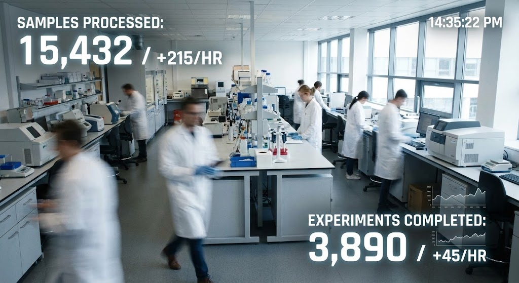
The Visual & Narrative Approach
To keep customers, you must remind them of the speed you provide. This style uses a static hyper-lapse shot of a busy laboratory floor, with scientists moving as blurs (suggesting high activity). Overlaid are sharp, white digital counters that remain static and clear, tracking "Samples Processed" or "Batches Released." It visualizes Throughput. It provides a stark contrast between the frenetic human activity and the calm, precise tracking of the software.
Psychological Impact & KPI Focus
- Niche Psychology: It validates Productivity. Managers love to see activity translated into numbers. It visually proves that the software is capturing the value of the team's hard work.
- Operational Impact: Visualizes Efficiency Metrics and High-Throughput Screening.
- KPI: Customer Lifetime Value (LTV).
Strategic Implementation & Trade-offs
- Best Use: Quarterly Business Review (QBR) presentations or customer success newsletters.
- Trade-off: The "blur" must be artistic, not messy. The numbers must be the focal point to convey "Order within Chaos."
Companies using similar video content -
Labsols – Pharmaceutical LIMS – Manages intricate lot processes and testing needs.
Thermo Scientific – SampleManager LIMS – Automation and data integrity for complex labs.
30. 2D Graphics over Live
Expansion | Deep Adoption

The Visual & Narrative Approach
The final style celebrates the human team. We see a candid photo of a biotech team high-fiving in a casual office setting. Overlaid are bright, 2D vector sparkles and "Level Up" icons in natural colors plus bright pop accents. It captures the moment of passing an audit or launching a drug. It visualizes Success. It suggests that using this software leads to these moments of joy and team cohesion.
Psychological Impact & KPI Focus
- Niche Psychology: It fosters Community and Morale. It positions the software not just as a compliance tool, but as a "Team Member" that helps everyone win.
- Operational Impact: Visualizes Audit Success and Team Collaboration.
- KPI: Net Promoter Score (NPS) and Internal Referrals.
Strategic Implementation & Trade-offs
- Best Use: Social media posts celebrating client wins or internal case study videos.
- Trade-off: Can feel cheesy. Use it sparingly, specifically for "Celebration" moments, not for day-to-day operations.
The Visual Operations Doctrine: A Strategic Knowledge Base
The 30 visual styles outlined above are not merely "marketing assets"; they are the components of a Visual Operating System for your biotech SaaS platform. To transition from "creating videos" to "driving business outcomes," you must apply these styles within a strategic framework that bridges the gap between the physical lab and digital compliance. The following 3 knowledge segments synthesize these styles into actionable advice for C-Suite and Director-level leadership.
Strategic Alignment & Visual Architecture
The "Pre-Production" Strategy. Why and Who.
1. The Cognitive Load Audit: Before commissioning a single pixel, audit your current training materials (SOPs). If a procedure takes 10 pages of text to explain, it requires a high-abstraction style (like Style 6: Low-Poly 3D) to simplify the mental model before showing the complex UI.
2. Role-Based Visual Mapping: Do not use the same visuals for the Lab Bench as you do for the Boardroom. Use "Mobile/Micro" styles (Style 25) for Lab Technicians who need quick answers on tablets, and "Deep Data" styles (Style 18) for Quality Directors analyzing trends on desktop monitors.
3. The "Glanceability" Standard: In a sterile lab environment, a scientist cannot scroll through a video while wearing gloves. Design visual assets that convey the core message (e.g., "Step Complete") in under 3 seconds—a concept borrowed from dashboard design but applied to video.
4. Brand Voice Consistency: Your visual language must be the "Golden Thread" connecting disparate modules (eQMS, LIMS, DMS). Establish a unified color code (e.g., Cyan always equals "Data," Green always equals "Verified") across all 30 styles to reduce relearning time.
5. The Advids Strategic Audit: Defining this "Visual Operating System" is complex. Advids partners with you before production to map your user personas to these specific visual styles, ensuring every asset has a defined business purpose.
6. Standardization vs. Customization: Use "Aspirational Stock" (Style 21) for universal concepts like "Partnership," but strictly use "Clean UI Workflow" (Style 15) for proprietary features. Never use stock footage to represent your core IP or interface.
7. The Cross-Departmental Bridge: Use visuals to unify terminology. If Sales calls it "Compliance Velocity" (Style 2) and Ops calls it "Rapid Validation," use the same kinetic typography style to train both teams, enforcing a shared vocabulary.
8. Legacy System Integration: Visualizing the invisible connection between old on-premise hardware and your new SaaS interface is critical. Use "Wireframe to Reality" (Style 5) to show that while the interface changes, the underlying data integrity remains absolute.
9. Accessibility in Global Pharma: Your users speak 20 languages. "Abstract 2D Motion" (Style 7) and icon-based visuals transcend language barriers better than voiceover-heavy content, reducing localization costs for global rollouts.
10. The Mobile-First Mandate: Quality Managers are often on the move. Ensure all 30 styles—especially the UI visualizations—are legible on a 6-inch screen. If the text in your video is unreadable on a phone, it is useless to the modern mobile workforce.
Operational Adoption & Implementation
The "Deployment" Phase. How to embed visuals into the workflow.
11. Overcoming "Big Brother" Anxiety: In labs, AI monitoring can feel invasive. Use "Gen AI Realistic Char" (Style 14) to frame the technology as a helper that removes paperwork, rather than a policeman watching their every move. Empathy drives adoption.
12. The Micro-Learning Shift: Replace the 60-minute "Onboarding Webinar" with a playlist of twenty 30-second clips (using Style 25 and 27). This allows users to learn "in the flow of work" rather than disrupting their day.
13. Just-in-Time Support: Embed specific visual styles directly into your software's "Help" widgets. When a user hovers over a complex field, a 5-second "Abstract 3D Viz" (Style 3) should appear to explain the data logic instantly.
14. Gamification of Training: Use "2D Graphics over Live" (Style 30) to celebrate training milestones. Visualizing "Badges" or "Level Ups" for completing compliance modules increases engagement rates significantly.
15. Reducing Support Ticket Volume: There is a direct correlation between proactive visual guides and reduced call center load. If users constantly ask "How do I export?", place a "Clean UI Workflow" (Style 15) GIF right next to the Export button.
16. Remote Onboarding: You cannot fly trainers to every clinical site. Leverage "Holographic UI" (Style 24) and high-fidelity screencasts to train distributed teams, simulating the feeling of standing next to them.
17. Standard Operating Procedures (SOPs) Transformation: Text-based SOPs are the enemy of speed. Systematically convert your top 20 SOPs into "Isometric 2D Motion" (Style 13) flows. This creates a visual standard that is harder to misinterpret.
18. Feedback Loops: Use interactive video elements. At the end of a "Wireframe to Reality" (Style 5) explainer, ask the user "Did this clarify the process?" to gather qualitative data on your training effectiveness.
19. Scalable Localization: When expanding to new markets (e.g., EU to APAC), separate the text layers from the animation in your source files. This allows for rapid translation of on-screen text without re-animating the visual assets.
20. Leadership Communication: When the Head of Quality needs to present to the Board, provide them with "Dynamic Data Viz" (Style 18) assets. Empowering your internal champions with high-quality visuals makes them look good—and keeps you sticky.
Measuring Impact & Future-Proofing
The "ROI" Phase. Measuring success and looking ahead.
21. Beyond "Views": Do not measure video success by "Views." Measure it by Time-to-Competency. How much faster does a new user perform their first validation after watching the "Clean UI Workflow" (Style 15) vs. reading the manual?
22. The "Idle Time" Metric: Correlate better visualization with reduced "Idle Time" in the software. If users are pausing less to figure out what to do, your UX visualization strategy is working.
23. Compliance Velocity: Measure how fast a new regulation (e.g., a new Annex 1 update) is understood by the workforce when communicated via "Bold Kinetic Typography" (Style 2) vs. email text. Speed is compliance.
24. Retention and Churn: High-quality UX visualization (Style 10) creates a "Premium" perception that increases the switching cost. Customers are less likely to churn to a competitor that looks "cheaper" or "harder to use."
25. The AI Visual Frontier: Prepare for the future where your platform generates these visuals automatically. Structure your data now so that Generative AI can eventually create "Dynamic Data Viz" (Style 18) on the fly for every user.
26. Scalability of Assets: Build a "Visual Library," not just one-off videos. Create a repository of 3D assets (vials, servers, shields) that can be remixed into new content as your feature set grows.
27. The Advids Partnership: Visual styles evolve. Advids acts as your long-term partner, maintaining this "Visual Library" and ensuring that as your software updates (v2.0, v3.0), your visual assets evolve in lockstep, preventing brand fragmentation.
28. Benchmarking Success: "Good enough" visuals are a competitive risk in a market projected to reach $36.25 billion. Regularly audit your visual output against the top 3 competitors to ensure you own the "Premium" position in the prospect's mind.
29. The ROI of Safety: Quantify the reduction in "Human Error" deviations. If a "Low-Poly 3D" (Style 6) video clarifies a complex sampling process and reduces error rates by 10%, that is a direct financial return on the video investment.
30. Final Call to Innovation: Treat video not as "content marketing," but as Digital Infrastructure. Just as you invest in your code, invest in the visual layer that explains it. In the "Governance Gap," clarity is your most valuable currency.
Companies using similar video content -
Greenlight Guru – eQMS for Medical Devices – Improves quality of life by bringing products to market faster.
Dot Compliance – eQMS – Simplifies electronic QMS management and implementation.
Author & Editor Bio


