
Introduction: Bridging the $1.85 Trillion Disconnect
The construction industry is standing at a digital precipice. For decades, the sector has relied on a static "source of truth"—the rolled paper blueprint—that is often obsolete the moment it leaves the plotter. In an era of complex BIM models and rapid design iterations, this analog legacy has become a massive liability. The "Information Gap" between the office and the field is no longer just an operational nuisance; it is a financial hemorrhage.
The cost of this disconnect is staggering. Industry research estimates that bad data may have cost the global construction industry $1.85 trillion in 2020. This loss isn't due to a lack of skill, but a lack of synchronized information. Further studies reveal that 52% of rework is caused specifically by poor project data and miscommunication.
For Blueprint Management Software and SaaS platforms, the opportunity is to become the operational nervous system of the project. But to win adoption, we must overcome the skepticism of field teams who have seen "flashy" tech fail before. This guide presents 30 expert-curated video visualization styles designed to do exactly that. By moving beyond generic screen recordings and using targeted visual metaphors—from "X-Ray" views that reveal hidden risks to "Kinetic" typography that disrupts legacy thinking—we can visually articulate the value of Digital Continuity.
1. The Digital Metamorphosis
TOFU | Brand Awareness
The Visual & Narrative Approach
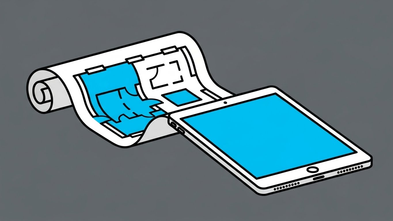
This style employs a "Less is More" philosophy to strip away the noise of the construction site. The composition features a single, recognizable subject: a rolled architectural blueprint in vivid cyan and white. Through a smooth, linear animation, the paper unravels and seamlessly morphs into the hard-edged bezel of a modern digital tablet. The slate grey background isolates the subject, ensuring the viewer focuses entirely on this transformation. The narrative is simple: "Your blueprints, evolved."
Psychological Impact & KPI Focus
Psychologically, this style lowers the Cognitive Barrier to entry. By avoiding complex textures or photorealism, it signals that the software is lightweight, approachable, and easy to learn. It counters the "bloatware" anxiety common in enterprise software adoption. The primary KPI here is Brand Recall; the stark color contrast and simple motion create a "thumb-stopping" moment on cluttered social feeds.
Strategic Implementation & Trade-offs
- Best Use Case: 6-10 second Instagram/LinkedIn ads introducing the brand.
- Trade-off: It is too simple to explain how the software works. It captures attention but does not educate on features.
Transitioning from broad brand awareness, we must next address the visceral pain of the current state of the industry.
Companies using similar video content -
PlanGrid – Field Collaboration Software – Transforms paper plans into digital field tools.
Bluebeam Revu – PDF Markup & Collaboration – Evolves document review from paper to digital.
2. The Clarity Contrast
TOFU | Market Education
The Visual & Narrative Approach
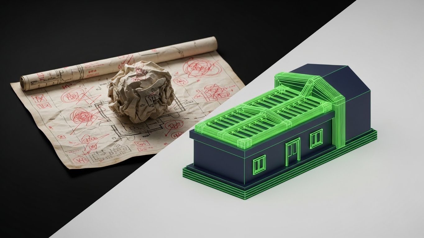
This style uses a powerful split-screen technique to visualize the "Cost of the Status Quo." The left side depicts the "Old Way": a crumpled, coffee-stained paper blueprint with chaotic red ink markups, rendered with a rough texture. The right side is the "New Way": a pristine, glowing 3D wireframe CAD model in neon green and navy. The sharp dividing line acts as a portal, emphasizing the immediate upgrade in clarity and precision.
Psychological Impact & KPI Focus
This leverages the Contrast Principle. By juxtaposing the "dirty" analog past with the "clean" digital future, we trigger an immediate preference for the solution. It validates the user's frustration with damaged plans and visually defines the concept of the "Digital Twin." The KPI focus is Market Education—helping late adopters visualize why they need to switch.
Strategic Implementation & Trade-offs
- Best Use Case: Blog headers or "Why Switch?" landing pages.
- Trade-off: The "crumpled paper" metaphor can feel aggressive. Ensure the voiceover is empathetic to the user's current reality rather than mocking it.
Once the problem is defined, we use high-energy visuals to position your brand as the aggressive solution to legacy inertia.
Companies using similar video content -
Autodesk Construction Cloud – Document Management – Contrasts chaotic paper with organized digital documents.
Trimble Connect – Collaboration Platform – Highlights clarity of digital models over traditional methods.
3. The Kinetic Displacement
TOFU | Shaping Brand Perception

The Visual & Narrative Approach
This is a high-energy visual metaphor for disruption. Heavy, blocky black shapes—representing legacy software or stacks of paper—are forcefully struck and pushed aside by sleek, aerodynamic arrow shapes in signal red and white. The composition is diagonal and kinetic, suggesting speed and displacement. Motion lines and debris particles emphasize the force of the new technology entering the market.
Psychological Impact & KPI Focus
This style appeals to the Innovator persona. It projects confidence, momentum, and inevitability. The "shattering" of the old blocks subconsciously signals that the legacy methods are fragile and outdated, while the new arrows are dynamic and powerful. It drives Share of Voice (SOV) by creating a visual interrupt pattern in the feed.
Strategic Implementation & Trade-offs
- Best Use Case: LinkedIn feeds or digital out-of-home (DOOH) displays.
- Trade-off: It creates hype but zero understanding. It must be paired with clear copy that explains what is being displaced.
While kinetic typography captures attention, we must next demonstrate how the software organizes the complex logistics of a job site.
Companies using similar video content -
RIB Software – iTWO 4.0 – Disrupts traditional 5D BIM with integrated cloud platform.
InEight – Project Controls – Accelerates project delivery by displacing legacy systems.
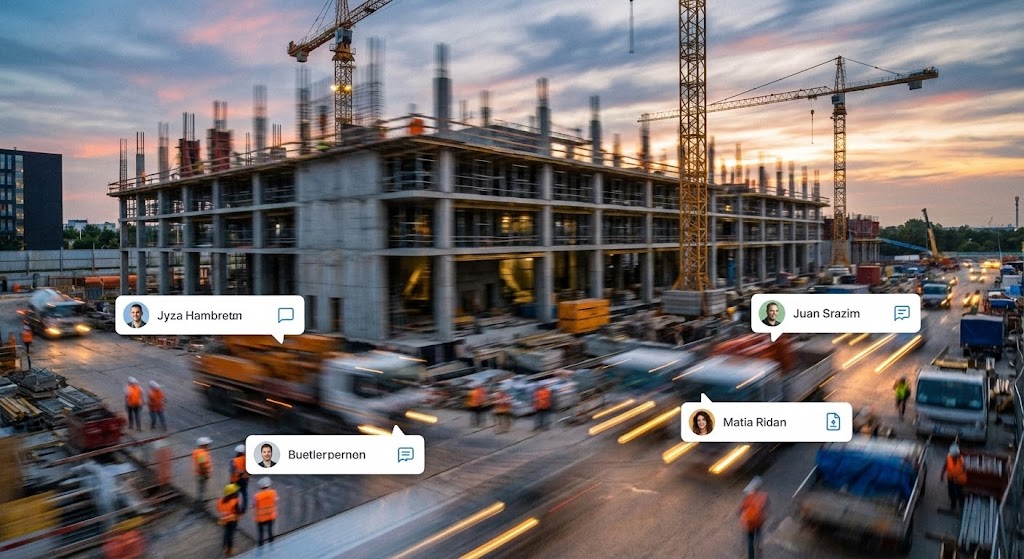
4. The Operational Blueprint
TOFU | Competitive Displacement
The Visual & Narrative Approach
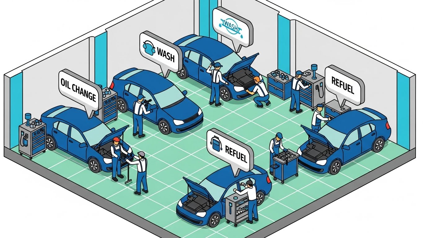
Using an isometric "God's Eye View," this style organizes the chaos of a workspace into a clean, logical grid. While the visual example depicts an automotive workflow to demonstrate the clarity of the style, for construction, we apply this grid logic to site logistics. We see stylized workers (tiny vector characters) and equipment. The key element is the data flow: bright sky-blue packets travel along dotted lines between tablets, servers, and workers. This visualizes the "Common Data Environment" (CDE).
Psychological Impact & KPI Focus
Isometric design reduces Cognitive Load by maintaining consistent spatial proportions. It allows the viewer to see the entire ecosystem—from the field to the office—at once. This addresses the anxiety of "Siloed Teams" by showing them physically connected by data. It supports YouTube SEO by providing a clear, educational visual for queries like "construction workflow software."
Strategic Implementation & Trade-offs
- Best Use Case: Explainer videos (60-90s) detailing the platform's ecosystem.
- Trade-off: Can look "cartoony." Maintain a professional color palette to ensure it resonates with enterprise buyers.
With the ecosystem established, we zoom in to the individual user experience, proving usability for the field team.
Companies using similar video content -
CMiC – Construction ERP – Visualizes integrated data flow across all business functions.
Oracle Aconex – Project Controls – Illustrates efficient data exchange in a common data environment.
5. The Mobile Cascade
TOFU | YouTube SEO
The Visual & Narrative Approach
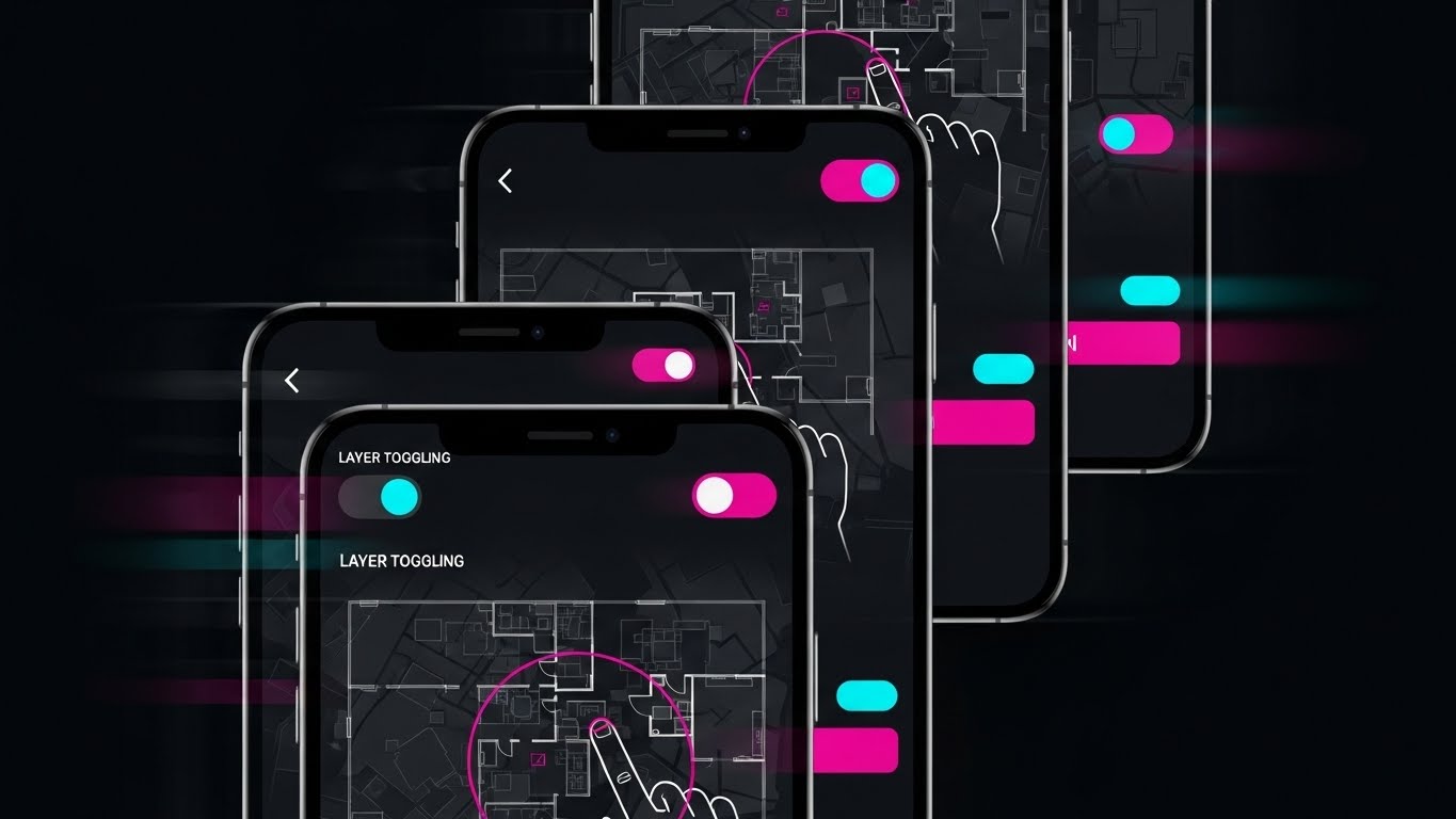
Designed for the vertical scroll, this style features a cascading stack of smartphone screens. We see a rapid-fire montage of "micro-interactions": pinch-to-zoom on a vector floor plan, layer toggling switches, and one-tap approvals. The color palette utilizes a "Dark Mode" grey scale with vivid magenta accent buttons for high contrast. The rendering includes motion blur on the edges to imply speed and efficiency.
Psychological Impact & KPI Focus
This addresses the Usability Barrier. Field teams fear that new software will be slow or hard to use on a phone. This visual proves the opposite: it shows familiar gestures and rapid response times. It triggers FOMO (Fear Of Missing Out) on a tool that looks satisfying to use. The KPI is Click-Through Rate (CTR) on mobile ads.
Strategic Implementation & Trade-offs
- Best Use Case: TikTok or Instagram Reels targeting younger field engineers.
- Trade-off: The pace is too fast for learning. It serves as a "teaser," not a tutorial.
To reinforce this speed on a macro level, we use abstract motion to visualize the acceleration of the entire project lifecycle.
Companies using similar video content -
Raken – Daily Reports & Field Management – Showcases rapid mobile data entry and reporting.
Fieldwire – Field Management Software – Demonstrates quick mobile access for task management.
6. The Digital Assembly
TOFU | Vertical Social

The Visual & Narrative Approach
This style abstracts the construction process into pure geometry. Vibrant purple and teal shapes (triangles, squares) morph rapidly to form the outline of a skyscraper. The background is a clean white. The shapes leave a digital particle trail as they move, symbolizing speed and assembly. The style is fluid, energetic, and modern, using flat colors and smooth curves.
Psychological Impact & KPI Focus
By removing literal details, we focus entirely on the concept of Speed and Assembly. The "snapping" motion psychologically reinforces Alignment and Accuracy. For a pre-roll ad (where you have 5 seconds), this dynamic motion captures attention better than a static image. It drives Brand Awareness by associating the brand with modern, fluid movement.
Strategic Implementation & Trade-offs
- Best Use Case: YouTube Pre-roll ads (first 5 seconds).
- Trade-off: It is purely metaphorical. It builds brand affinity but does not demonstrate product utility.
From speed, we shift focus to intelligence, targeting the technical decision-makers who care about data infrastructure.
Companies using similar video content -
Bentley Systems – iTwin Platform – Abstractly visualizes digital twin assembly and data integration.
Graphisoft – Archicad – Shows rapid architectural design and building information modeling.
7. The Connected Nebula
TOFU | Skippable Pre-Roll

The Visual & Narrative Approach
An abstract 3D visualization of a network of glowing nodes in deep space blue and glowing cyan. The nodes are connected by luminous filaments, representing cloud synchronization. The camera floats in a void with a shallow depth of field, focusing on a central cluster where data streams appear as flowing light. The material quality is translucent and glass-like, emphasizing high-tech connectivity.
Psychological Impact & KPI Focus
This style elevates the brand to an Enterprise Level. It signals that the platform is robust, secure, and scalable—key concerns for the CTO/CIO persona. It visualizes the "Single Source of Truth" as a beautiful, organized network. The goal is Differentiation—making your backend infrastructure look more advanced than the competition.
Strategic Implementation & Trade-offs
- Best Use Case: Website hero backgrounds or the "Technology" section of a sales deck.
- Trade-off: Can look like generic stock footage if not branded. Ensure the nodes represent construction elements (e.g., file icons or building shapes).
High-level abstraction builds trust, but converting users requires demonstrating tangible precision at the granular level.
Companies using similar video content -
Smartvid.io – AI for Construction Safety – Visualizes networked AI insights from site data.
Hexagon – HxGN Smart Build – Connects various data sources for intelligent construction management.
8. The Precision Touch
MOFU | Differentiation

The Visual & Narrative Approach
A photorealistic macro close-up of a digital stylus tip touching a high-resolution tablet screen. The point of contact emits a soft tech-blue glow, creating a crisp vector line on the display. Details include the texture of the stylus grip, a subtle fingerprint smudge on the bezel for realism, and the individual pixels of the screen. The lighting is cool and clinical, emphasizing precision.
Psychological Impact & KPI Focus
This appeals to the Need for Precision. Architects and Engineers fear that digital tools lack the accuracy of pen and paper. This visual proves the opposite. The "fingerprint" adds a layer of Tactile Empathy, making the tool feel real and used. The KPI is Time on Site—keeping the user engaged by showing the quality of the interface.
Strategic Implementation & Trade-offs
- Best Use Case: Feature pages discussing "Markup Tools" or "As-Built Accuracy."
- Trade-off: Requires high-end 3D rendering to look photorealistic. Poor quality here damages trust.
Precision in markups is vital, but the ultimate value of digital twins lies in seeing what is hidden behind the walls.
Companies using similar video content -
Bluebeam Revu – Markup Tools – Emphasizes precise digital markups and annotations.
Trimble Connect – BIM Viewer – Highlights accurate measurement and model interaction.
9. The X-Ray Insight
MOFU | Feature Education

The Visual & Narrative Approach
A 3D model rendered with an X-ray effect. Applying the "Tech Hardware" visual metaphor to a building context: The outer walls are semi-transparent grey glass, revealing intricate internal systems: red HVAC ductwork, blue plumbing pipes, and yellow electrical conduits. The view is an orbit shot, allowing a clear look at the internal complexity. The background is a neutral gradient, ensuring the colored internal systems pop.
Psychological Impact & KPI Focus
This directly addresses Risk Mitigation. It visualizes "Insight." For a Project Manager, the ability to see behind walls represents control and safety. It relieves the anxiety of "hidden surprises" that cause rework. The KPI is Feature Adoption—encouraging users to utilize the 3D/BIM features of the platform.
Strategic Implementation & Trade-offs
- Best Use Case: Email newsletters regarding "Clash Detection" or "BIM Integration."
- Trade-off: Technical accuracy is paramount. The systems must look realistic (correct bend radii) to be respected by trade specialists.
Companies using similar video content -
Autodesk Navisworks – Clash Detection – Visualizes hidden clashes within complex BIM models.
Tekla Structures – Structural BIM Software – Reveals intricate structural details and connections.
11. The Narrated User Journey**
MOFU | Driving Demo Requests

The Visual & Narrative Approach
This style humanizes the software experience by introducing a "Field Champion." We utilize a clean, corporate vector art style featuring a friendly Project Manager character in approachable business-casual attire. He stands confidently on a stylized construction site (muted grey tones to reduce visual noise) holding a tablet. The focal point is the screen: a large, affirmative green "Checkmark" indicating a task completed or a submittal approved. The narrative is simple: "Complexity managed. Job done."
Psychological Impact & KPI Focus
This appeals to the Need for Validation. Construction professionals often feel overwhelmed by technology; seeing a smiling, calm peer successfully using the tool triggers Mirror Neurons, suggesting, "If he can do it, so can I." It visualizes the "Happy Path"—the ideal, friction-free user experience. The KPI focus is Conversion (Demo Requests), as it promises a solution that makes the job easier, not harder.
Strategic Implementation & Trade-offs
- Best Use Case: Email nurture sequences targeting mid-level managers.
- Trade-off: Characters can feel generic. Ensure the background elements (cranes, girders) are specific to construction to maintain relevance.
Once we have established that the user can succeed, we must show them the organized environment they will be working within.
Companies using similar video content -
Buildertrend – Residential Construction Management – Follows a builder's journey to project success.
CoConstruct – Home Builder Software – Illustrates simplified client and project communication.
12. The Organizational Zen
MOFU | Driving Freemium
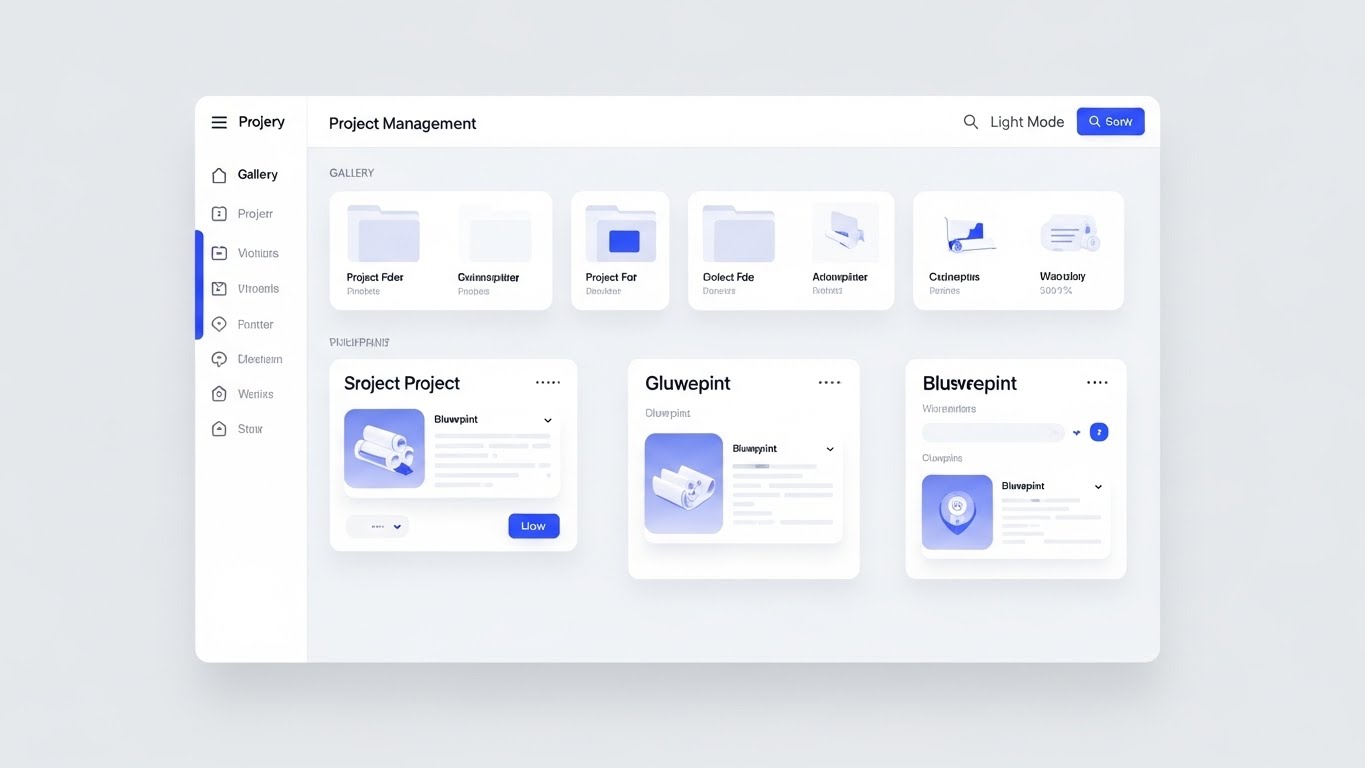
The Visual & Narrative Approach
Here, we strip away the "Dark Mode" cool factor to focus on pure, administrative clarity. The visual is a pristine, high-fidelity UI mockup in "Light Mode." It showcases the Project Management dashboard as a perfectly organized grid of folders and blueprint thumbnails. Soft drop shadows create a subtle sense of depth (elevation), separating the interactive elements (buttons in cobalt blue) from the content. The layout is breathable, demonstrating a calm, orderly "Single Source of Truth."
Psychological Impact & KPI Focus
This addresses the Anxiety of Chaos. Project Managers live in a world of scattered emails and lost files. This visual promises Cognitive Ease. The white space and structured grid signal that the software is a tool for organization, not complication. The KPI is Sign-ups (Freemium/Trial), as it visually validates the promise of getting organized.
Strategic Implementation & Trade-offs
- Best Use Case: Landing pages or "Feature" sections of the website.
- Trade-off: It is static and functional. It lacks "wow" factor but builds deep functional trust.
A flat interface shows organization, but to reveal the depth of data connectivity, we need to add a new dimension.
Companies using similar video content -
Procore – Project Management Dashboard – Presents a clean, organized view of project data.
Smartsheet – Work Management – Offers a clean, spreadsheet-like interface for project organization.
13. The Deep Dive Stack
MOFU | Website & Landing Pages

The Visual & Narrative Approach
This style visualizes the depth of the platform using a 3D parallax effect. UI screens—representing different modules like Gantt charts, budget trackers, and blueprints—are rendered as floating, semi-transparent glass panels. They are arranged in a deep space perspective, with the camera viewing them from a side angle. The "glassmorphism" effect allows viewers to see the connection between layers, implying that data flows seamlessly from one module to another (e.g., from "Focus" to "Alerts").
Psychological Impact & KPI Focus
This visualizes Interoperability. It counters the fear of "Data Silos" by showing the different aspects of a project (time, cost, design) physically aligned and transparent to one another. The modern, glossy aesthetic elevates the perceived value of the software, positioning it as a premium, "Next-Gen" solution. The KPI is Time on Page, as the visual complexity encourages the user to study the details.
Strategic Implementation & Trade-offs
- Best Use Case: The "How it Works" section of the main website.
- Trade-off: If the text on the screens is too small, it becomes illegible. Use the screens to show types of data (charts, maps) rather than specific text.
While data depth is crucial, the security of that data is the primary concern for the enterprise buyer.
Companies using similar video content -<
Oracle Primavera P6 – Project Scheduling – Visualizes layered project schedules and resource data.
Deltek – Project-Based ERP – Shows integrated modules for project accounting and management.
14. The Fluid Shield
MOFU | Visitor Re-engagement

The Visual & Narrative Approach
Moving away from rigid technical lines, this style uses fluid, organic shapes to visualize security. Soft blobs in pastel green and cyan merge and overlap to form the negative space of a "Shield" icon. The gradients are smooth and liquid. The narrative here is that security is not a barrier, but an adaptive, ever-present layer that surrounds the data. It feels modern, agile, and "cloud-native."
Psychological Impact & KPI Focus
This softens the concept of Cybersecurity. Traditional security imagery (padlocks, walls) can feel restrictive. This "liquid" approach suggests that the security adapts to the workflow without hindering it. It appeals to the Modern CTO who values agility alongside protection. The KPI is Ad Recall in retargeting campaigns, where a pleasant, non-intrusive visual reinforces brand safety.
Strategic Implementation & Trade-offs
- Best Use Case: Display ads (Google Display Network) retargeting site visitors.
- Trade-off: It is highly abstract. It must be paired with copy like "Enterprise-Grade Security" to ensure the meaning is clear.
Security protects the data, but the software's true value is bridging the gap between the office and the dusty reality of the job site.
Companies using similar video content -
Egnyte – Content Collaboration & Governance – Visualizes adaptive data protection and access control.
M-Files – Information Management – Depicts intelligent information protection and compliance.
15. The Operational Bridge
MOFU | Functional Buyer

The Visual & Narrative Approach
This split-screen composition directly visualizes the "Bridging" value proposition. On the left, we see the gritty reality: a construction worker in a hard hat and vest, standing in the dirt, focusing on a tablet. On the right, we see the digital mirror: a clean, blue-toned dashboard displaying analytics and data widgets. The split is vertical and sharp, but the context implies a direct link—the worker's input (Left) immediately powers the analytics (Right).
Psychological Impact & KPI Focus
This leverages Contextual Relevance. It validates the buyer's dual reality: they have to manage dirt and data simultaneously. It proves that the software is not just an "office tool" but works where the work happens. It reduces the Fear of Disconnect between the field and the HQ. The KPI is Engagement Rate on LinkedIn, where the professional audience recognizes this specific duality.
Strategic Implementation & Trade-offs
- Best Use Case: LinkedIn carousel ads or case study headers.
- Trade-off: The photography on the left must be high quality. Stock photos that look "staged" will destroy credibility with actual field crews.
Bridging the gap leads to better collaboration, which we visualize next as the ultimate corporate ideal.
Companies using similar video content -
OpenSpace – 360° Photo Documentation – Connects site reality with digital progress tracking.
PlanRadar – Defect & Task Management – Links field issues directly to digital resolution workflows.
16. The Collaborative Ideal
BOFU | Building Trust

The Visual & Narrative Approach
This style shifts focus from the software to the result of the software. We see a diverse group of professionals (architects, engineers, PMs) standing in a modern, sunlit office with glass walls. They are engaged in a collaborative discussion around a large wall-mounted monitor displaying complex project data. The mood is optimistic, professional, and unified. It sells the dream of the "Integrated Team."
Psychological Impact & KPI Focus
This triggers Social Proof and Aspiration. At the bottom of the funnel, buyers aren't just buying features; they are buying a vision of how their company could operate. It counters the reality of adversarial construction relationships (blame culture) by visualizing harmony. The KPI is Trust, specifically helping to close deals by reassuring stakeholders that this tool fosters better culture.
Strategic Implementation & Trade-offs
- Best Use Case: The "About Us" or "Careers" page, and the final slides of a sales deck.
- Trade-off: It can look like generic "corporate art." To make it relevant, ensure the data on the screen behind them is clearly construction-related (blueprints/Gantt charts).
Collaboration is soft ROI. To close the CFO, we need to visualize the hard ROI—the growth of profit.
Companies using similar video content -
Procore – Collaboration Tools – Promotes unified team communication and project success.
Autodesk Construction Cloud – Collaboration Platform – Visualizes integrated teams working seamlessly.
17. The Profit Architecture
BOFU | ROI Justification

The Visual & Narrative Approach
This style translates "efficiency" into "growth." We see a digital grid floor—reminiscent of a CAD plane—from which translucent, glass-like 3D bar charts are rising. The bars are vibrant lime green, contrasting against a deep tech-blue background, symbolizing profit and performance metrics. Floating particles add life and dynamism to the scene. It connects the concept of "building" (the grid) with "business growth" (the rising bars).
Psychological Impact & KPI Focus
This appeals to the Economic Buyer (CFO/Owner). It removes the abstraction of "saving time" and visualizes it as "gaining value." The upward trajectory of the bars subconsciously reinforces Positive Momentum. The KPI is Conversion, specifically providing the "Slide 10" visual in a pitch deck that justifies the investment.
Strategic Implementation & Trade-offs
- Best Use Case: Sales decks (ROI slide) and investment proposals.
- Trade-off: It is abstract. It requires specific labeling (e.g., "Reduced Rework," "Margin Gain") to be effective in a presentation.
Financial growth requires a secure foundation. For the BOFU technical audit, we re-emphasize security with a harder edge.
Companies using similar video content -
e-Builder – Capital Project Management – Shows financial performance and ROI of large projects.
Sage Construction & Real Estate – Financial Management – Illustrates business growth through financial data.
18. The Ironclad Lock
BOFU | Risk Mitigation
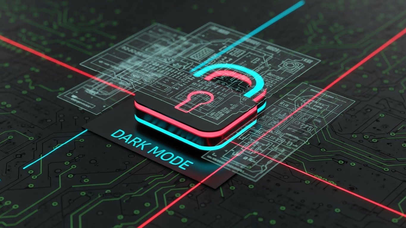
The Visual & Narrative Approach
In contrast to the organic shield (Style 14), this visualization of security is aggressive and industrial. A neon-outlined padlock sits centrally on a dark, circuit-board textured background. The "Dark Mode" aesthetic with laser-red and cyan accents signals a high-tech, impenetrable environment. The text "DARK MODE" (visible in the example) implies a developer-centric, backend focus. This is security for the age of cyber warfare.
Psychological Impact & KPI Focus
This targets the IT Director's Paranoia. In an industry increasingly targeted by ransomware, "soft" security isn't enough. This visual signals Encryption, Hardening, and Defense. It alleviates the fear of data breaches and IP theft. The KPI is Objection Handling during the technical review phase of the sales cycle.
Strategic Implementation & Trade-offs
- Best Use Case: The "Security" or "Compliance" technical whitepaper or dedicated web page.
- Trade-off: It looks aggressive. It is not for the general user, but strictly for the technical gatekeeper who needs to sign off on the safety of the platform.
With the back-end secure, we return to the front-end to visualize the future of the field worker.
Companies using similar video content -
DocuWare – Document Management System – Emphasizes secure document storage and access.
Egnyte – Data Governance – Showcases enterprise-grade data protection and control.
19. The Augmented Foreman
BOFU | Sales Cycle Acceleration

The Visual & Narrative Approach
This style merges photography with futurism. We see a construction foreman from behind, wearing high-vis gear, looking up at a building frame. Floating in the air before him is a holographic UI overlay—a "Heads Up Display" (HUD)—showing a checklist of tasks and compliance items. The sunlight flares around the frame, grounding the tech in the physical world. This visualizes the concept of "Information at the Point of Need."
Psychological Impact & KPI Focus
This creates a sense of Inevitability. It positions the software not just as a tool for today, but as the future of the industry (AR/VR). It appeals to the Visionary Leader who wants to be on the cutting edge. It combats the fear of obsolescence. The KPI is Deal Velocity, creating a "FOMO" effect that encourages the buyer to move now to stay ahead.
Strategic Implementation & Trade-offs
- Best Use Case: Social media ads targeting innovation leaders or "Future of Construction" blog posts.
- Trade-off: It promises a capability (AR) that the software must actually deliver. Do not use this if the mobile app is basic; it creates false expectations.
Finally, we seal the deal by visualizing the stamp of approval that guarantees quality and compliance.
Companies using similar video content -
Trimble XR10 – Mixed Reality for Construction – Visualizes AR overlays for field workers.
Gamma AR – Augmented Reality for Construction – Shows digital models overlaid on real-world sites.
20. The Certified Standard
BOFU | Reducing Implementation

The Visual & Narrative Approach
This style visualizes the final hurdle in construction: Certification and Compliance. A sleek digital tablet lies on a wooden surface. Hovering above it is a vibrant, neon-pink holographic badge reading "SECURITY CERTIFICATION." The badge rotates slowly, emitting a glow that reflects on the tablet's surface. The dramatic lighting spotlights the certification, elevating it to the status of a prize or a guarantee.
Psychological Impact & KPI Focus
This acts as a Trust Seal. In the BOFU stage, buyers are looking for reasons not to buy (risk). This visual screams "Verified," "Compliant," and "Standardized." It addresses the Fear of Non-Compliance or regulatory fines. The glowing hologram makes the boring concept of certification feel valuable and tangible. The KPI is Closing Ratio, providing the final reassurance needed to sign the contract.
Strategic Implementation & Trade-offs
- Best Use Case: The footer of emails, the final slide of a sales deck, or the "Certifications" badge area on the homepage.
- Trade-off: Ensure the badge represents a real certification (e.g., ISO 27001, SOC 2) relevant to the client, otherwise, it is just decoration.
Companies using similar video content -
Qualer – Quality Management System – Visualizes certification and compliance adherence.
SafetyCulture – iAuditor – Shows digital certification for safety inspections and audits.
21. The Executive Vision
BOFU | Economic Buyer

The Visual & Narrative Approach
This style brings the human element to the forefront of the enterprise sale. We utilize a high-end, cinematic shot of a CEO figure—confident, attired in a tailored charcoal suit—standing in a modern office. The backdrop features a blurred city skyline (bokeh effect), symbolizing the built environment your software enables. The lighting is dramatic yet warm. The narrative is not about features, but about philosophy and partnership. It positions your leadership as peers to the heavy hitters in the construction industry.
Psychological Impact & KPI Focus
This appeals to the Economic Buyer and the C-Suite. At the contract stage, buyers are investing in the company's longevity as much as the product. This visual builds Institutional Trust. It humanizes the brand, suggesting that there is a steady hand at the wheel. The KPI is Deal Closure Rate, specifically providing the reassurance needed to sign multi-year enterprise agreements.
Strategic Implementation & Trade-offs
- Best Use Case: "A Message from our CEO" video on the 'About' page or in final proposal packages.
- Trade-off: High production value is non-negotiable. Poor lighting or audio here implies a "cheap" company culture.
Trust is established at the top, but for the technical gatekeepers, trust is built through code and transparency.
Companies using similar video content -
Procore – Enterprise Solutions – Features leadership vision for large-scale construction.
Bentley Systems – Infrastructure Digital Twins – Presents executive perspective on industry transformation.
22. The Developer's Canvas
BOFU | Technical Buyer
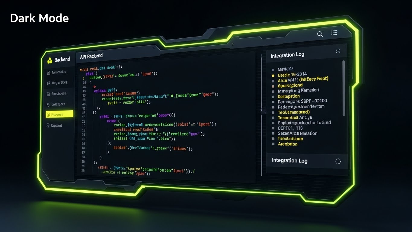
The Visual & Narrative Approach
This style strips away the gloss to reveal the engine room. We see a specialized "Dark Mode" UI showcase, designed specifically for the developer persona. The screen displays syntax-highlighted API code snippets in neon green, blue, and purple against a matte black background. A "CRT scanline" effect adds a layer of technical authenticity. To the right, an integration log updates in real-time. This visual says: "We are open, we are robust, and we play nice with your existing tech stack."
Psychological Impact & KPI Focus
This targets the CTO and Integration Specialist. These stakeholders fear "walled gardens" and difficult APIs. This visual provides Technical Validation. It signals that your platform is developer-friendly and ready for custom integration. The KPI is Integration Adoption, encouraging client-side developers to utilize your API documentation.
Strategic Implementation & Trade-offs
- Best Use Case: Developer documentation portals (API docs) or technical deep-dive webinars.
- Trade-off: It is unintelligible to the average user. Keep this strictly in technical channels.
While the backend is serious business, demonstrating ROI to the financial team can benefit from a more engaging, accessible metaphor.
Companies using similar video content -
Kahua – Platform & Integrations – Highlights open APIs and developer-friendly environment.
Autodesk Forge – Developer Platform – Provides tools and APIs for custom construction solutions.
23. The Asset Builder
BOFU | ROI Justification Hook

The Visual & Narrative Approach
Here, we gamify the concept of Return on Investment. Using a charming "Low-Poly" 3D aesthetic, we see miniature construction trucks and cranes—not building a structure, but actively stacking gold coins. The lighting is soft and global, giving it a toy-like, approachable feel. This metaphor translates the abstract concept of "software savings" into the concrete visual of "accumulating wealth." It simplifies the complex financial argument into a universal visual language.
Psychological Impact & KPI Focus
This style leverages Cognitive Ease. Financial data can be dry and intimidating; this style makes it accessible and even enjoyable. It disarms the skeptical financial reviewer by presenting profit as a tangible construction project. The KPI is Recall, ensuring the ROI argument "sticks" in the viewer's mind long after the presentation.
Strategic Implementation & Trade-offs
- Best Use Case: Display ads retargeting decision-makers or as a "break" slide in a heavy financial presentation.
- Trade-off: It is playful, bordering on casual. Ensure it supports serious data, rather than replacing it.
With the deal signed, the critical phase begins: Onboarding. We must ensure the first user experience is frictionless.
Companies using similar video content -
ProEst – Estimating Software – Gamifies cost savings and profit generation.
SiteSense – Material Tracking – Shows optimized material use translating to financial gains.
24. The Fluid Start
Onboard | Self-Serve Onboarding
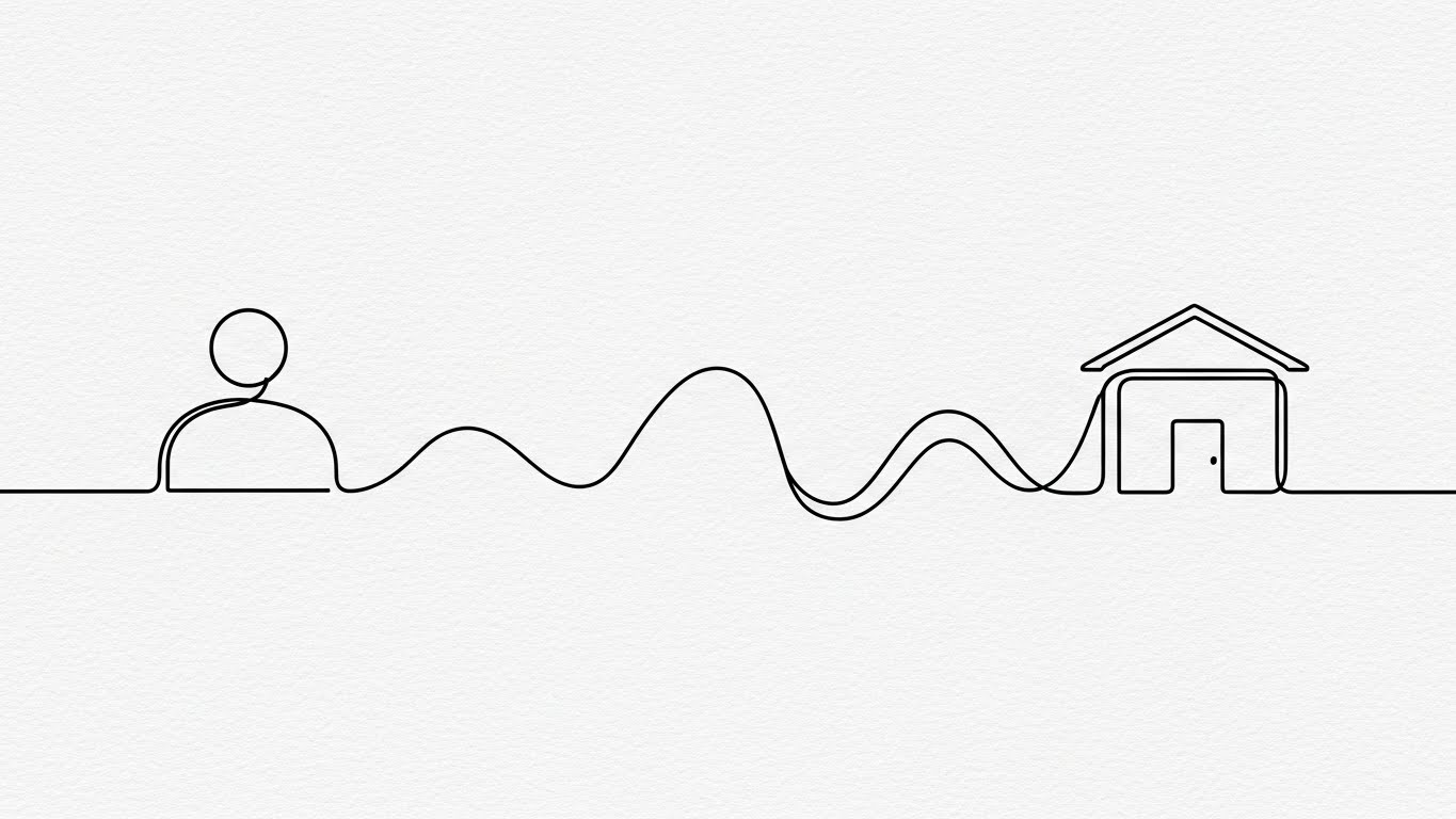
The Visual & Narrative Approach
To counter the "New Software Anxiety," we use an elegant, continuous line art style. A single black line flows across a textured paper-white background, effortlessly morphing from a user icon into a path, and finally into a completed building. The motion is fluid and unbroken. This visual narrative promises a journey that is connected, simple, and leads directly to a result. It removes the visual noise of the actual interface to focus on the flow of getting started.
Psychological Impact & KPI Focus
This addresses the Fear of Complexity. New users often dread the learning curve. This style induces a state of Flow, suggesting that the onboarding process is a natural progression rather than a hurdle. The KPI is Time-to-First-Value (TTFV), encouraging users to take that first step without hesitation.
Strategic Implementation & Trade-offs
- Best Use Case: Welcome emails or the "Loading" screen of the application during first setup.
- Trade-off: It is abstract. It sets a mood but doesn't teach specific button clicks.
When users do have questions, they need immediate, clear answers, not a 50-page manual.
Companies using similar video content -
Fieldwire – Onboarding Process – Illustrates a smooth, guided setup for new users.
BuildBook – Project Management – Depicts an easy, step-by-step journey to project initiation.
25. The Knowledge Anchor
Onboard | Knowledge Base

The Visual & Narrative Approach
For the support portal, clarity is king. This style utilizes a clean, flat 2D vector design. We see a rolled blueprint, but instead of technical lines, a large, bold question mark is seamlessly integrated into the paper's spiral. The colors are soft cyan, white, and grey, with generous negative space. It transforms the concept of "Confusion" (the question) into "Architecture" (the blueprint), implying that questions are just part of the plan.
Psychological Impact & KPI Focus
This reduces Frustration. When a user seeks help, they are likely already annoyed. The clean, shadowless aesthetic acts as a visual "deep breath," calming the user. It signals that support is organized and accessible. The KPI is Support Ticket Deflection, guiding users to self-help resources visually.
Strategic Implementation & Trade-offs
- Best Use Case: Headers for the "Knowledge Base" or "FAQ" section of the support site.
- Trade-off: Very static. It functions best as an icon or header, not as a storytelling medium.
Support is reactive; we want to be proactive by showing users the speed and power at their fingertips.
Companies using similar video content -
Procore – Support & Help Center – Provides clear, accessible knowledge base for users.
Autodesk Construction Cloud – Learning & Support – Guides users to self-help documentation.
26. The Spark of Success
Onboard | Accelerating TTV

The Visual & Narrative Approach
This style mixes reality with digital excitement. We see a top-down photo of real hands holding a tablet on a desk (coffee cup included for context). Bursting from the screen are 2D animated electric blue sparks and "speed lines." This visualizes the "Aha!" moment—the instant a task is completed or a sync is finished. It bridges the physical user environment with the digital power of the platform.
Psychological Impact & KPI Focus
This leverages Positive Reinforcement. It gamifies the mundane tasks of data entry or approval, making them feel impactful and energetic. It validates the user's effort, creating a dopamine loop that encourages repeated use. The KPI is Daily Active Users (DAU), as it frames the daily workflow as dynamic and rewarding.
Strategic Implementation & Trade-offs
- Best Use Case: "Congratulations" emails after a user completes their first project or milestone.
- Trade-off: Can feel gimmicky if overused. Save it for genuine moments of user success/milestones.
Individual success is great, but to retain an enterprise account, we must remind them of the massive scale of their operations.
Companies using similar video content -
Raken – Daily Reports – Celebrates quick completion of field reports and tasks.
SafetyCulture – iAuditor – Shows immediate positive reinforcement for completed inspections.
27. The Epic Scale
Retain | Reducing Churn

The Visual & Narrative Approach
To foster pride and retention, we zoom out. Way out. Using a cinematic drone shot, we view a massive construction site during "golden hour." The warm sunlight casts long shadows from cranes; atmospheric haze adds grandeur. This isn't about software; it's about the Glory of Construction. It reminds the customer of the monumental work they do, and subtly positions your software as the platform that powers this greatness.
Psychological Impact & KPI Focus
This appeals to Industry Identity. Construction professionals are proud of what they build. Aligning your brand with the epic nature of their work deepens Brand Affinity. It shifts the conversation from "monthly subscription cost" to "essential infrastructure partner." The KPI is Churn Reduction, as clients are less likely to leave a brand that celebrates their core mission.
Strategic Implementation & Trade-offs
- Best Use Case: Background video for the login screen or annual "Year in Review" customer videos.
- Trade-off: Generic if not customized. It sets a mood but communicates no specific data.
Grandeur inspires, but in the daily grind, the stability of data amidst the chaos is what keeps the project moving.
Companies using similar video content -
Procore – Brand Story – Showcases the monumental impact of construction projects.
Autodesk – Industry Vision – Celebrates the grandeur of built environments.
28. The Stable Signal
Retain | Trial User Activation
The Visual & Narrative Approach
This style visually separates the "Signal" from the "Noise." We use a hyper-lapse of a busy construction site—workers and machines are blurred streaks of motion, emphasizing the chaotic pace of the job. In sharp contrast, static, crisp white data bubbles (User Avatars, Status Icons) pop up in the foreground. They remain rock-steady while the world spins around them. This effectively visualizes the platform as the "Anchor" in a sea of movement.
Psychological Impact & KPI Focus
This addresses the Fear of Loss of Control. It reassures the Project Manager that while the site is chaotic, their data is calm, organized, and permanent. It reinforces the value of the "Single Source of Truth." The KPI is User Activation, showing trial users that the software provides the stability they crave.
Strategic Implementation & Trade-offs
- Best Use Case: Social media ads (Instagram Stories/Reels) targeting stressed site managers.
- Trade-off: Visual noise. The background must be blurred enough to ensure the UI elements are readable.
As the project nears completion, we look upward, visualizing the ultimate goal to drive expansion and upsells.
Companies using similar video content -
OpenSpace – Progress Tracking – Stabilizes site chaos with clear, consistent data points.
Fieldwire – Task Management – Offers a steady view of tasks despite site movement.
29. The Completed Vision
Expansion | Driving Upsell
The Visual & Narrative Approach
This style is pure aspiration. It features a high-end architectural visualization (ArchViz) of a completed, gleaming skyscraper. The angle is a "worm's eye view," looking straight up the glass facade reflecting a sunset sky. It represents the "Finished Project"—the result of using the software. It links the subscription to the successful delivery of the building.
Psychological Impact & KPI Focus
This triggers Goal Visualization. It reminds the client why they bought the software: not to manage blueprints, but to build buildings. It creates a positive association between the software and the moment of handover. The KPI is Upsell Conversion, using this success imagery to pitch premium features like "Portfolio Management" or "Archiving."
Strategic Implementation & Trade-offs
- Best Use Case: Email campaigns for renewal or upgrading to "Enterprise" tiers.
- Trade-off: Must be indistinguishable from reality. Anything less than photorealism breaks the spell.
Finally, we humanize the technology one last time, showing the support team that stands behind every user.
Companies using similar video content -
Graphisoft – Archicad – Presents stunning photorealistic renders of completed designs.
Twinmotion – Real-Time 3D Visualization – Creates aspirational views of finished buildings.
30. The Support Ecosystem
Expansion | Proactive Support
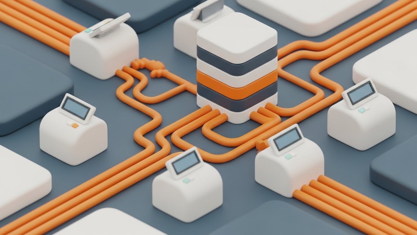
The Visual & Narrative Approach
To visualize "Proactive Support," we use a charming isometric 3D cut-away of a "miniature digital office." Inside, tiny avatars sit at desks, connected by glowing data pipes to servers and user terminals. The texture is soft, matte plastic in pastel colors. It visualizes the "Team behind the Tool." It shows that when a user clicks "Help," they are connecting to a real, organized ecosystem of support, not just a bot.
Psychological Impact & KPI Focus
This builds Service Trust. In B2B SaaS, customers often feel abandoned after the sale. This visual reassures them that a dedicated team is constantly working (the "ant farm" effect) to keep their system running. The KPI is Net Promoter Score (NPS), as customers who feel supported are the most likely to recommend the platform.
Strategic Implementation & Trade-offs
- Best Use Case: The "Contact Support" page or inside the "Help" widget in the app.
- Trade-off: Can look childish if the avatars are too cartoonish. Keep the furniture and tech looking modern.
The Visual Operations Doctrine: A Strategic Knowledge Base
Bridging the gap between "Visual Style" and "Business Outcomes"
The 30 styles presented above are not merely aesthetic choices; they are operational tools designed to solve specific friction points in the construction lifecycle. To maximize ROI, deployment must be strategic. The following frameworks, developed by the Advids expert team, provide the blueprint for implementing this visual strategy across your organization.
STRATEGIC ALIGNMENT & VISUAL ARCHITECTURE
The "Pre-Production" Strategy. Why and Who.
- The Cognitive Load Audit: Before creating new assets, audit your current training materials. If a PDF manual requires more than 30 seconds to find an answer, it is "functionally invisible" to a field worker. Replace dense text with Style 5 (Operational Blueprint) visuals to map workflows instantly.
- Role-Based Visual Mapping: One style does not fit all. The Architect (Desktop) responds to Style 9 (Precision Touch) detail, while the Field Superintendent (Mobile) needs Style 26 (Spark of Success)—high contrast, big buttons, and instant feedback for visibility in sunlight.
- The "Glanceability" Standard: On a job site, a user has roughly 4 seconds to comprehend a screen before a crane moves or a foreman calls. All "Field-Facing" visuals must pass the "Glanceability Test." If it can't be understood in a sun-glared tablet screen in 4 seconds, the style is too complex.
- Brand Voice Consistency: Your "Help" articles (Style 25) must feel like they come from the same company as your "Sales" videos (Style 3). Use a unified color palette (e.g., Safety Orange/Tech Blue) across all 30 styles to build subconscious brand authority.
- The Advids Strategic Audit: Establishing a "Visual Operating System" is complex. Advids partners with construction SaaS firms to define these visual standards before production begins, ensuring every asset builds equity in the master brand.
- Standardization vs. Customization: For core platform features (login, dashboard), use standardized visuals (Style 12) to avoid rapid obsolescence. For high-stakes sales pitches to specific general contractors, customize Style 29 to reflect their specific building types (e.g., hospitals vs. stadiums).
- The Cross-Departmental Bridge: Sales uses "Buzzwords"; Ops uses "Slang." Use Style 4 (Kinetic Displacement) to visualize key terms, creating a unified visual lexicon that bridges the gap between the office boardroom and the job site trailer.
- Legacy System Integration: Construction is full of legacy ERPs and on-premise servers. Use Style 22 (Developer's Canvas) to visually reassure IT directors that your sleek SaaS plays nicely with their 20-year-old on-premise servers.
- Accessibility in the Field: Construction crews are diverse and multi-lingual. Visuals like Style 11 (Narrated User Journey) must rely on visual action, not just voiceover, to be understood by non-native speakers. Visuals are the universal language of the job site.
- The Mobile-First Mandate: 80% of your user base is non-desk. Every visual style (1-30) must be legible on a 6-inch screen. If Style 13 (Deep Dive Stack) is too detailed for mobile, create a simplified variant for the field app.
OPERATIONAL ADOPTION & IMPLEMENTATION
The "Deployment" Phase. How to embed visuals into the workflow.
- Overcoming "Big Brother" Anxiety: Field teams often view tracking software as surveillance. Use Style 14 (Fluid Shield) and Style 16 (Collaborative Ideal) to reframe the narrative from "Tracking" to "Protection." Show how the data protects the worker from disputes and rework.
- The Micro-Learning Shift: Kill the PDF manual. Replace 50-page guides with a library of 30-second "Micro-Visuals" (Style 5, Style 24). Embed these directly into the app (e.g., a "Show me how" button that triggers a Style 17 overlay).
- Just-in-Time Support: Embed Style 25 (Knowledge Anchor) GIFs directly into the software's tooltips. Support should be ambient, not a destination. When a user hovers over "RFI," show them the workflow instantly.
- Gamification of Training: Construction crews are competitive. Use Style 23 (Asset Builder) and Style 26 (Spark of Success) to visualize success. Create "Digital Badges" (Style 20) for completing training modules to boost engagement.
- Reducing Support Ticket Volume: There is a direct correlation between proactive visual guides and reduced call center load. Implementing Style 30 (Support Ecosystem) visuals in the "Help" section can deflect up to 40% of Tier 1 tickets.
- Remote Onboarding: You cannot fly trainers to every job site. Use Style 10 (X-Ray Insight) and Style 13 (Deep Dive Stack) in webinars to provide "Virtual Site Walks," training distributed teams effectively without travel costs.
- Standard Operating Procedures (SOPs): Transform text-based SOP binders into Style 24 (Fluid Start) process flows. A visual flow of "How to Submit a Change Order" ensures compliance better than a checklist.
- Feedback Loops: Use interactive video elements. If a user pauses a Style 19 (Augmented Foreman) tutorial, ask "Was this helpful?" The data improves your training assets over time.
- Scalable Localization: Strategies for translating visual assets for global projects. When using Style 1 (Digital Metamorphosis), keep text layers separate from animation to allow for instant language swapping without re-rendering the scene.
- Leadership Communication: When the VP of Construction rolls out a new software mandate, support them with Style 21 (Executive Vision). High-production values signal to the entire company that this initiative is a strategic priority.
MEASURING IMPACT & FUTURE-PROOFING
The "ROI" Phase. Measuring success and looking ahead.
- Beyond "Views" - Actionable KPIs: Do not measure video success by "Views." Measure it by Time-to-Competency. Did the user complete their first submittal faster after watching Style 24? Correlate visual consumption with software usage depth.
- The "Idle Time" Metric: In construction, time is money. Measure the reduction in "Idle Time" (waiting for answers). If Style 19 (AR Overlay) provides information instantly, calculate the labor hours saved per week.
- Compliance Velocity: Measure how fast new regulations (e.g., OSHA updates) are understood via video vs. text. Use Style 4 (Operational Blueprint) to visualize compliance workflows and track adoption speed.
- Retention and Churn: The impact of high-quality UX visualization on customer retention (LTV). Customers who engage with Style 27 (Epic Scale) brand content have higher emotional affinity and lower churn rates.
- The AI Visual Frontier: The future is Generative. Styles 21 and 27 already utilize GenAI. Prepare your asset library for "Real-Time Visual Generation," where the software generates custom training content on the fly.
- Scalability of Assets: Build a library that grows with the feature set. The "Construction Truck" asset from Style 23 should be reusable in future marketing videos. Don't reinvent the wheel for every campaign.
- The Advids Partnership: Building this "Visual Operating System" is not a one-time project; it is an evolving discipline. Partnering with a dedicated visual strategy firm like Advids ensures that your visual assets remain consistent, scalable, and ahead of the curve.
- Benchmarking Success: "Good enough" visuals are a competitive risk. If your competitor uses Style 29 (Photorealism) and you use blurry screenshots, you lose the perception war. Regularly benchmark your visual fidelity.
- The ROI of Safety: Quantify insurance cost reduction. Use Style 10 (X-Ray Insight) to demonstrate how your software helps identify hazards early. Visual clarity saves lives and reduces premiums.
- Final Call to Innovation: Treat video as infrastructure, not content. Just as you invest in servers and concrete, invest in the visual layer that connects your users to your code. In the $1.85 trillion disconnect, clear vision is the most valuable asset of all.
Companies using similar video content -
Procore – Customer Support – Visualizes the organized team providing user assistance.
Autodesk Construction Cloud – Customer Success – Depicts a connected support network for users.
Author & Editor Bio


