
Introduction: The Silent Revolution in Fixed Income
The global bond market is undergoing its most significant structural shift in decades. We are moving from a voice-brokered, high-touch past into a seamless, electronic future. For Product Managers, CTOs, and Heads of Trading, the challenge is no longer just about access to liquidity; it is about the visualization of that liquidity. In an environment where microseconds define margins, the ability to process complex market data instantly—through intuition rather than calculation—is the new competitive advantage.
The opportunity for platforms that bridge the physical/digital divide is immense. According to recent data from Coalition Greenwich, 44% of volume traded electronically in the U.S. corporate bond market now flows through digital channels, a figure that continues to climb. This electronification demands a new visual language—one that translates opaque order books and fragmented liquidity pools into clear, actionable insights.
Furthermore, the scale of this shift is accelerating. Tradeweb recently reported that portfolio trading volume has surged, propelling the value of transactions using this method past $1 trillion for the first time. This indicates a market hungry for efficiency. The platforms that win in this new era will be those that not only automate execution but also reduce the "cognitive load" for the trader. They will use visualization not just as aesthetic polish, but as a strategic tool to demystify regulations, clarify yield curves, and make the invisible flow of capital visible.
This guide explores 30 specific visual strategies designed to position your SaaS platform as the architect of this modern financial landscape.
1. Abstract 2D Motion Graphics
TOFU | Brand Awareness
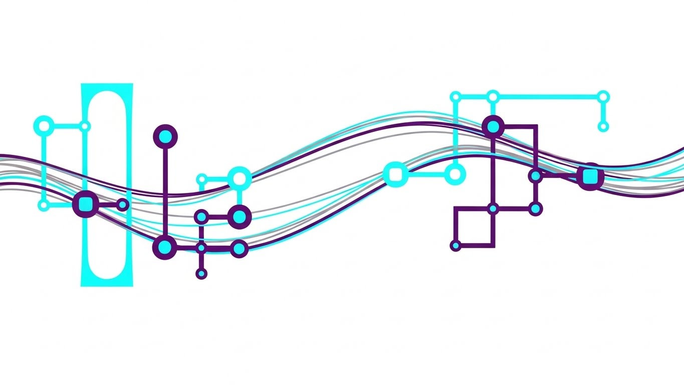
The Visual & Narrative Approach
This style abandons the rigid grids of traditional finance for a fluid, organic aesthetic. The visual features a network of glowing nodes connected by silken, wave-like lines that pulse with light, set against a high-key white background. The electric cyan and deep violet gradient implies energy and modernity without aggression. There is no text; the narrative relies entirely on the mesmerizing flow of "light" between nodes, representing liquidity moving effortlessly across borders. The motion is smooth and glossy, evoking a sense of frictionless transaction.
Psychological Impact & KPI Focus
For the "Architect of Modern Finance," this style addresses the anxiety of fragmentation. Traders often fear that liquidity is trapped in silos. By visualizing the market as a unified, fluid network, you subliminally reassure them that your platform connects these disparates pools. It reduces the cognitive load by abstracting complex API connectivity into a simple, elegant flow. The primary KPI impacted here is Brand Awareness, positioning the platform as a unifying force in a fractured market.
Strategic Implementation & Trade-offs
- Funnel Stage: TOFU (Brand Awareness).
- Duration: 10-15 Seconds.
- Trade-off: This style is excellent for conveying feeling and connectivity but poor for explaining specific technical features or dashboards. Use it for high-level brand anthems on Social Ads, not for product demos.
Companies using similar video content -
Tradeweb – Electronic Trading Platform – Visualizing global bond market liquidity flow.
MarketAxess – Open Trading – Seamless connection of diverse liquidity pools.
OpenFin – Desktop Operating System – Fluid integration of financial applications.
2. Abstract 3D AI Visualization
TOFU | Category Creation

The Visual & Narrative Approach
This visualization serves as a powerful metaphor for digital transformation. The camera creates a dramatic low-angle shot, looking up at towering structures made of neon blue data blocks. These structures rise from a base of dissolving silver "paper," symbolizing the transition from legacy manual processes to a robust digital infrastructure. The lighting is crisp and cool, utilizing a "tech-noir" palette that suggests precision and future-readiness. The infinite digital horizon implies limitless scalability.
Psychological Impact & KPI Focus
This style targets the aspiration of the target persona—the desire to build a future-proof ecosystem. It validates their investment in modernization by visually elevating "data" to the status of a skyscraper—permanent, impressive, and structured. It counters the skepticism that SaaS platforms are flimsy or ephemeral. The focus here is on Category Creation, establishing your platform not just as a tool, but as the fundamental infrastructure of the new bond market.
Strategic Implementation & Trade-offs
- Funnel Stage: TOFU (Category Creation).
- Duration: 15-30 Seconds.
- Trade-off: High production value makes this costly. It effectively communicates scale and vision but may feel too "abstract" for operational teams looking for specific UI solutions. Best used on LinkedIn to target C-Suite decision-makers.
Companies using similar video content -
Genesis Global – Low-Code Platform – Building robust, future-proof financial applications.
Murex – MX.3 – Comprehensive platform for capital markets infrastructure.
3. Abstract 2D flat vector organic
TOFU | Shaping Perception

The Visual & Narrative Approach
This style uses contrast to tell a story of compliance and agility. A matte coral shape, organic and fluid, winds effortlessly through a rigid structure of slate grey geometric squares. The grey squares represent the unyielding nature of regulatory frameworks (MiFID II, SEC rules), while the coral stream represents the trader's ability to find liquidity within those constraints. The flat, vector style with hard edges suggests clarity and definition, avoiding any ambiguity.
Psychological Impact & KPI Focus
Compliance is a major source of anxiety in B2B finance. This visual calms that anxiety by showing that "flow" is possible even within "structure." It positions the platform as a tool that enables agility without breaking the rules. The visual metaphor resonates with Compliance Officers and Heads of Trading who need to balance speed with security. The goal is Shaping Perception, framing the platform as a safe harbor for aggressive trading.
Strategic Implementation & Trade-offs
- Funnel Stage: TOFU (Shaping Perception).
- Duration: 30-45 Seconds.
- Trade-off: The abstract nature requires a voiceover or text overlay to ensure the metaphor (Coral = Liquidity, Grey = Regulation) is understood. Without context, it remains just a pretty pattern. Ideal for Website Hero sections.
Companies using similar video content -
Adenza – AxiomSL – Navigating complex regulatory reporting with agility.
Wolters Kluwer – Compliance Solutions – Streamlining regulatory adherence in finance.
4. Low-Poly 3D Modeling
TOFU | Differentiation

The Visual & Narrative Approach
Data becomes terrain in this engaging low-poly landscape. The "Yield Curve" is reimagined as a mountainous region rendered in shades of emerald green and mint. The faceted polygons capture the idea of discrete data points forming a larger trend. Floating gold diamonds above the peaks draw the eye to "alpha" or profit opportunities. The white background keeps the focus entirely on the data-landscape metaphor, making it feel like a collectible or a tangible asset.
Psychological Impact & KPI Focus
Traders are spatial thinkers; they "map" the market in their minds. This style aligns with that cognitive process, turning abstract yield percentages into a physical landscape they can explore. The low-poly aesthetic feels digital yet approachable, reducing the intimidation factor of complex analytics. It helps in Differentiation, standing out from the sea of standard 2D line charts found in competitor materials.
Strategic Implementation & Trade-offs
- Funnel Stage: TOFU (Differentiation).
- Duration: 15-20 Seconds.
- Trade-off: The playful "game-like" aesthetic must be balanced carefully to avoid looking unprofessional. It works best when simplifying a specific complex concept, like volatility surfaces, for YouTube explainers.
Companies using similar video content -
FactSet – Risk & Analytics – Visualizing complex market data as navigable terrain.
S&P Global Market Intelligence – Market Data & Analytics – Simplifying intricate market trends and risks.
5. Bold Kinetic Typography (Visual)
TOFU | YouTube SEO

The Visual & Narrative Approach
This visual captures the raw energy of the "Bid" and the "Ask." Instead of traditional text, we see large, blocky, vibrant orange shapes colliding with stark white geometric forms in the center of the frame. The motion is aggressive and zoomed-in, with speed lines blurring the background. It mimics the visual language of kinetic typography—impactful, rhythmic, and loud—but uses abstract forms to represent the clash of market orders.
Psychological Impact & KPI Focus
Speed is the currency of the modern trading desk. This style creates a visceral sense of urgency and velocity (Latency). It appeals to the "Action-Oriented" persona of the execution trader who thrives on market momentum. It signals that your platform is built for high-frequency, high-speed environments. The goal is YouTube SEO and engagement, using high-energy visuals to stop the scroll and hook the viewer immediately.
Strategic Implementation & Trade-offs
- Funnel Stage: TOFU (Engagement).
- Duration: 5-10 Seconds (Thumbnails/Intros).
- Trade-off: It conveys energy but zero information. It is purely an attention-grabbing mechanism. Use it as a "hook" at the start of a video or as a thumbnail to drive clicks.
Companies using similar video content -
Virtu Financial – Market Making – High-speed, impactful trade execution.
XTX Markets – Electronic Liquidity Provider – Instantaneous, high-volume market transactions.
6. Minimalist Flat 2D Vector
TOFU | Vertical Social
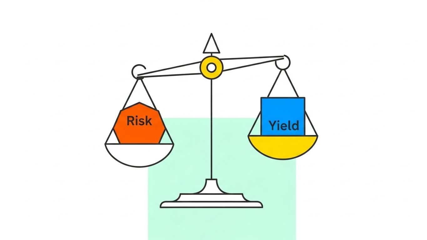
The Visual & Narrative Approach
Elegance meets precision. A stylized scale, drawn with thin charcoal lines, balances a geometric circle (Risk) against a square (Yield). The pastel mint background provides a calming, professional canvas. The use of negative space is deliberate, suggesting that the platform removes clutter and noise. The iconography is clean and universally understood, stripping away the complexity of risk algorithms to present a simple truth: balance.
Psychological Impact & KPI Focus
In the chaos of a trading floor, clarity is a luxury. This minimalist style signals "clarity of thought." It appeals to the Risk Manager who values precision over flashiness. By simplifying the visual input, you reduce the viewer's cognitive load, making your solution appear intuitive and easy to adopt. This is optimized for Vertical Social channels like Instagram Reels, where simple, readable visuals perform best.
Strategic Implementation & Trade-offs
- Funnel Stage: TOFU (Vertical Social).
- Duration: 15-30 Seconds.
- Trade-off: The simplicity can be mistaken for "basic" functionality. It is essential to pair this visual with sophisticated audio or copy that hints at the deep algorithmic power behind the simple interface.
Companies using similar video content -
BlackRock – Aladdin – Simplified, balanced portfolio risk management.
Moody's Analytics – Risk Management Solutions – Clear visualization of financial risk factors.
7. Dynamic Data Visualization
TOFU | Skippable Ad
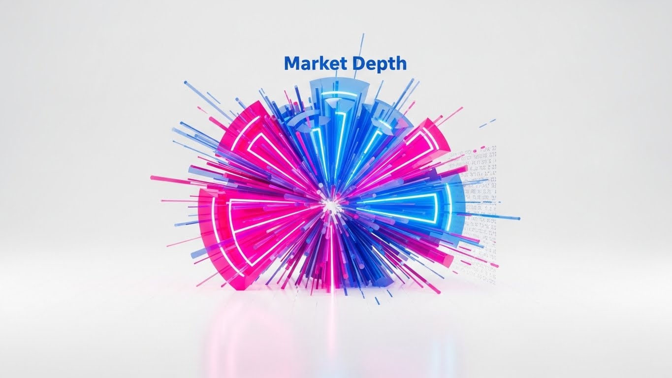
The Visual & Narrative Approach
This is data unleashed. Neon hot pink and electric blue lines burst radially from a center point, forming a complex 3D structure that resembles a futuristic pie chart or a "sunburst" diagram of Market Depth. The elements are in rapid motion, with glitch effects on the edges that symbolize the high-speed nature of algorithmic trading. It looks like a living organism of data, pulsating with every tick of the market.
Psychological Impact & KPI Focus
This style creates a "Wow" factor that speaks to the sophistication of your analytics engine. It suggests that your platform can handle massive data sets in real-time. For the quantitative analyst (Quant), this visual represents the beauty of raw data. It is designed as a Skippable Ad hook—visual candy that prevents the viewer from clicking "Skip" by promising a look into a high-tech future.
Strategic Implementation & Trade-offs
- Funnel Stage: TOFU (Ad Recall).
- Duration: 5-10 Seconds.
- Trade-off: While visually stunning, it can be overwhelming if sustained for too long. It is a "sizzle" element, not a "steak" element. Use it to transition between topics or to open a product demo video.
Companies using similar video content -
ICE Data Services – Market Data & Analytics – Bursting, real-time market depth visualization.
Refinitiv (LSEG) – Workspace – Dynamic, comprehensive market data insights.
8. 2D Line Art Animation
MOFU | Market Education
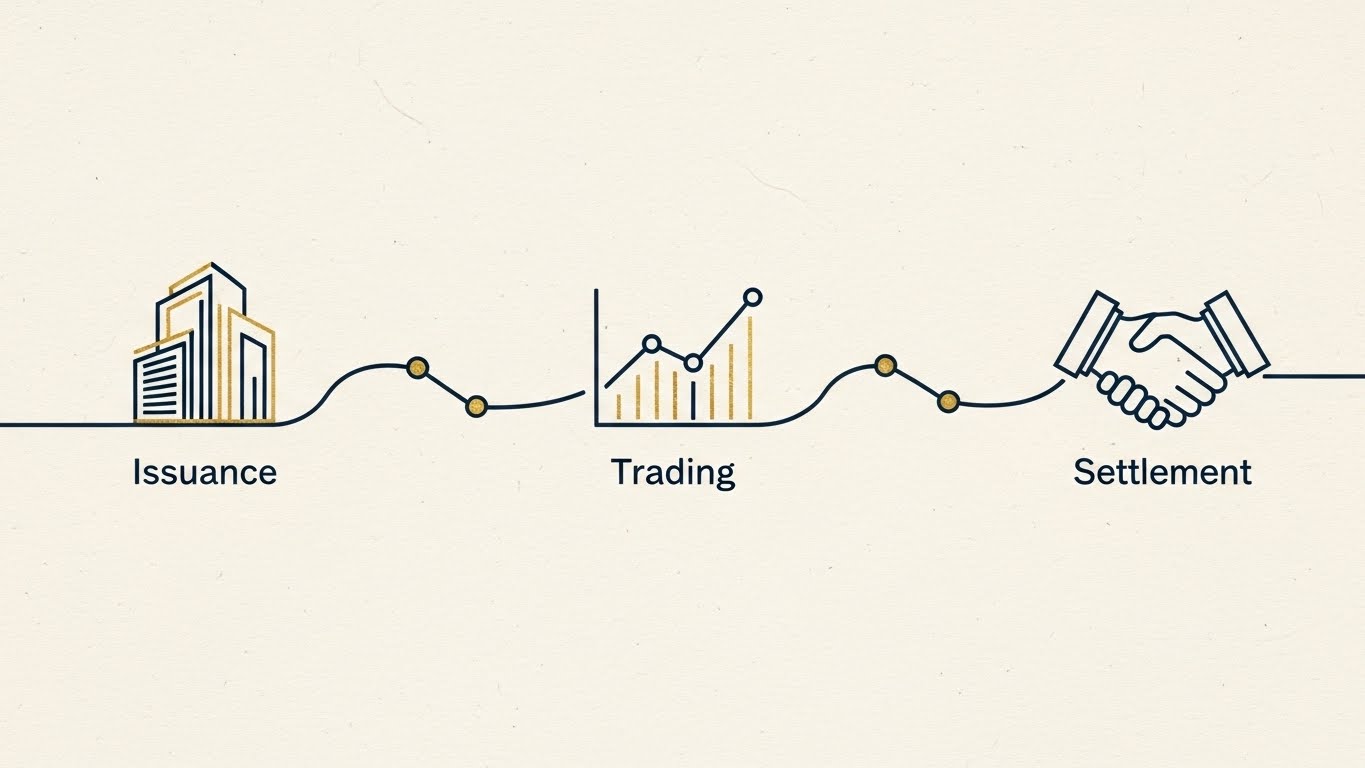
The Visual & Narrative Approach
A single, continuous navy blue line tells the story of the entire trade lifecycle. It morphs seamlessly from a building icon (Issuance) to a graph (Trading) and finally to a handshake (Settlement). Set against a textured cream background, it evokes the heritage and prestige of traditional banking while demonstrating modern connectivity. The gold leaf accents add a touch of premium quality, reinforcing the high value of the assets being traded.
Psychological Impact & KPI Focus
This style addresses the pain point of broken workflows. By using a continuous line, you visually prove the concept of Straight-Through Processing (STP)—the Holy Grail of operations. It is calming and educational, perfect for Market Education in a blog post or a white paper summary. It reassures the Operations Head that your platform eliminates manual re-entry and disconnects.
Strategic Implementation & Trade-offs
- Funnel Stage: MOFU (Education).
- Duration: 45-60 Seconds.
- Trade-off: It is less exciting than 3D styles and may feel "old school." However, in the conservative bond market, "old school" implies trust. Use this when explaining core processes rather than selling new features.
Companies using similar video content -
Broadridge – Fixed Income Solutions – Continuous flow of the bond trade lifecycle.
DTCC – Fixed Income Clearing Corporation – Seamless post-trade processing and settlement.
9. Isometric 3D Workflow
MOFU | Feature Education
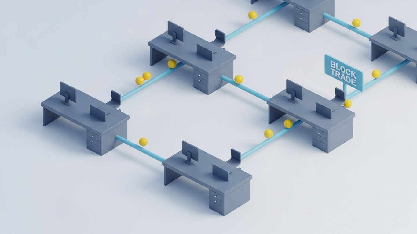
The Visual & Narrative Approach
Complex workflows become charming miniature scenes. We see a clean white studio floor with stylized grey trading desks connected by soft sky blue tubes. Yellow "data packets" travel through these tubes, visually explaining how a "Block Trade" moves from one desk to another without leakage. The "clay" render style makes the scene feel tactile and friendly. It turns a complex institutional process into an understandable logistical model.
Psychological Impact & KPI Focus
This style lowers the barrier to entry for understanding complex workflows. It is particularly effective for Feature Education on landing pages, where you need to explain how your specific routing technology works. By making the desks look like toys/miniatures, you make the problem feel manageable and solvable. It appeals to the Product Manager who needs to visualize the user journey.
Strategic Implementation & Trade-offs
- Funnel Stage: MOFU (Feature Deep Dive).
- Duration: 60-90 Seconds.
- Trade-off: The "cute" factor must not veer into "childish." The lighting and textures must remain premium and clean to maintain B2B credibility.
Companies using similar video content -
ION Group – Trading & Workflow Solutions – Transparent, connected trade routing and processing.
Charles River Development – Investment Management Solution – Visualizing end-to-end investment workflows.
10. Wireframe to Reality Transition
MOFU | Competitive Displacement
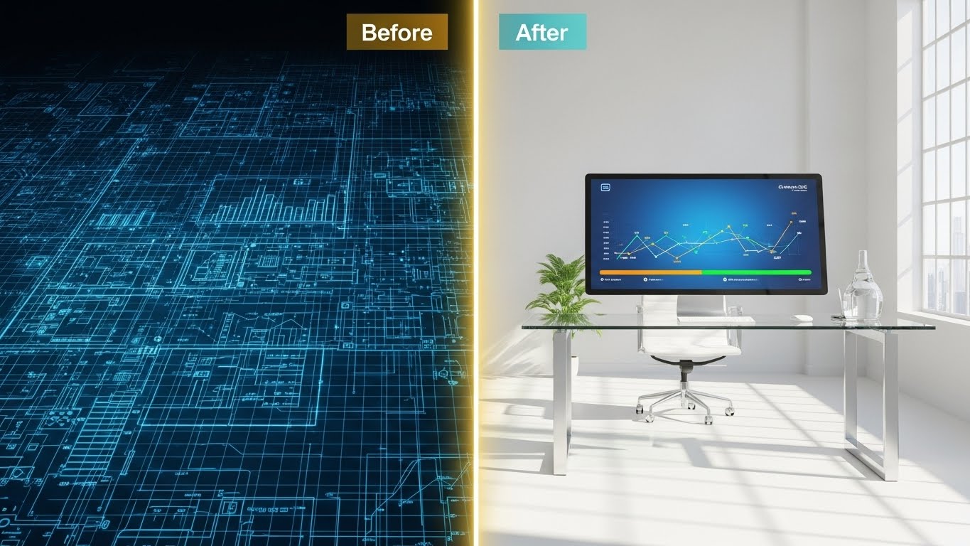
The Visual & Narrative Approach
This is the ultimate "Proof of Value" visual. A split-screen divides the world into two: the left is a complex blue wireframe grid on a white blueprint background (Legacy/Planning), and the right is a photorealistic, sun-drenched modern office with sleek screens (The Solution). A glowing vertical line sweeps across, transforming the wireframe into reality. It visually narrates the journey from a technical concept to a tangible, beautiful user experience.
Psychological Impact & KPI Focus
This style triggers the "FOMO" (Fear Of Missing Out) regarding modernization. It clearly contrasts the "old, complicated world" with the "new, clear world" your platform offers. It is a powerful tool for Competitive Displacement, showing the prospect exactly what they are missing by sticking with legacy systems. It validates the upgrade path.
Strategic Implementation & Trade-offs
- Funnel Stage: MOFU (Consideration).
- Duration: 15-20 Seconds.
- Trade-off: Requires high-quality assets for both the wireframe and the render. If the "After" shot doesn't look significantly better than the "Before," the metaphor fails. Use this in LinkedIn Ads to retarget users who have visited your pricing page.
Companies using similar video content -
Finastra – FusionCapital – Transforming legacy systems into modern digital platforms.
SimCorp – Dimension – Blueprinting and realizing integrated investment management.
11. Clean UI Workflow (Light Mode)**
MOFU | Demo Requests
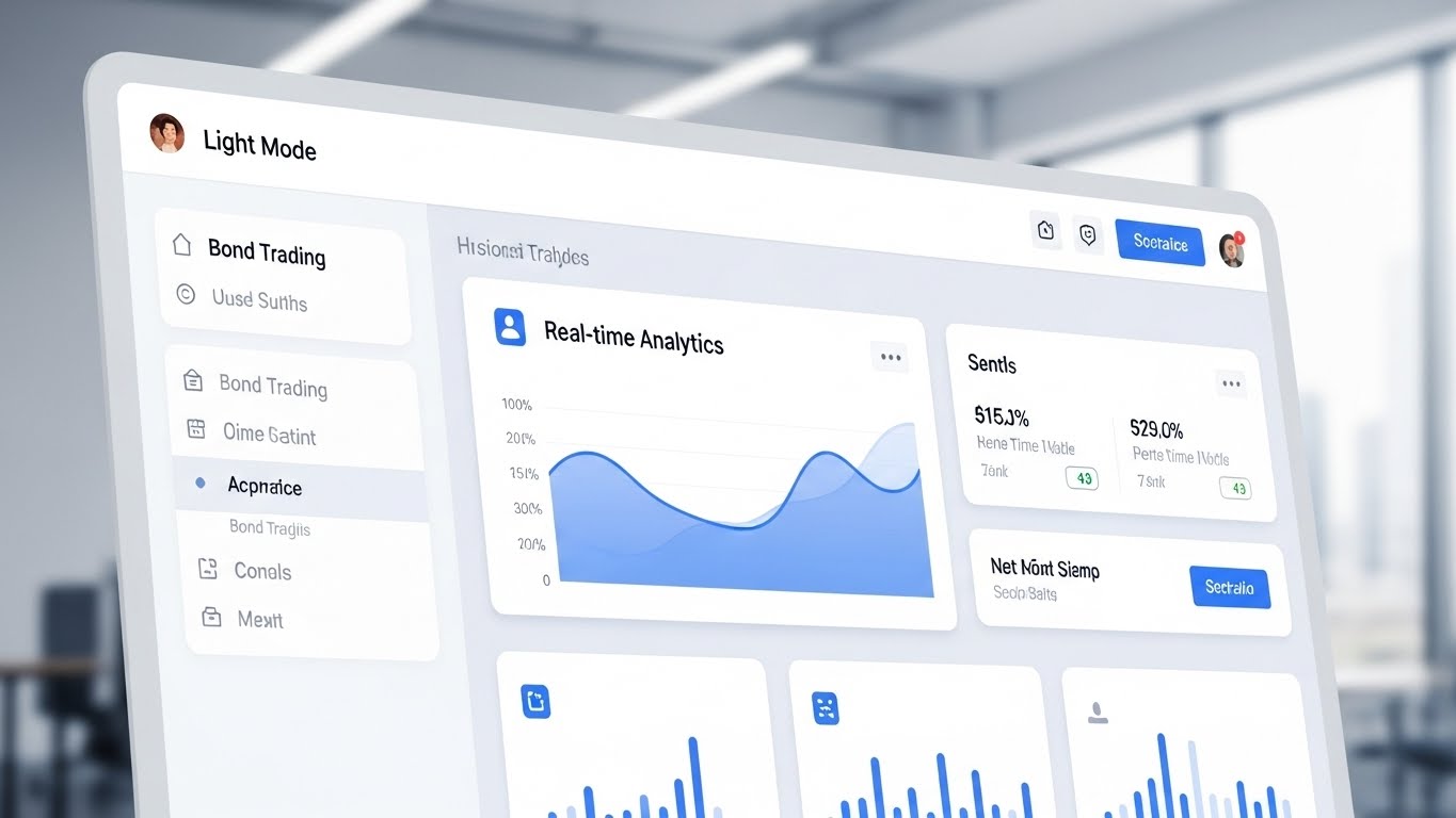
The Visual & Narrative Approach
This visual strips away the "noise" of the trading floor to present a zen-like command center. We see a high-resolution, angled view of the platform’s dashboard in "Light Mode." The interface is pristine, featuring soft grey borders and calming cerulean blue data visualizations. A central widget prominently displays "Real-time Analytics" with a smooth, ascending line graph, while side panels organize complex menus into digestible lists. The background is a soft-focus blur of a bright, modern office, grounding the software in a professional reality.
Psychological Impact & KPI Focus
For the Active Trader or Portfolio Manager, screen fatigue is a genuine occupational hazard. This style combats that by emphasizing cognitive ease. It visually promises that your platform organizes the chaos of the bond market into a manageable, readable surface. The "Light Mode" aesthetic suggests transparency and openness, countering the intimidation of complex "black box" systems. The key KPI here is Demo Request Conversion, as the visual invites the user to step into the driver's seat.
Strategic Implementation & Trade-offs
- Funnel Stage: MOFU (Demo Requests).
- Duration: 45-60 Seconds.
- Trade-off: While "clean" is good, it can be perceived as "data-light" by hardcore quants who want dense, dark-mode terminals. Use this for general overview demos, but offer a "Pro/Dark Mode" view for power users.
Companies using similar video content -
Trumid – Electronic Trading Platform – Clean, frictionless interface for bond trading.
BondCliQ – Consolidated Quote System – Pristine dashboard for transparent bond pricing.
12. Lifestyle Stock with UI Overlay
MOFU | Functional Buyer

The Visual & Narrative Approach
This style bridges the gap between human intuition and machine intelligence. We see a photorealistic, over-the-shoulder shot of a professional female trader in a sunlit, glass-walled office. She is focused, yet calm. Hovering in the air between her and the monitor are semi-transparent, holographic UI elements displaying "Credit Default Swap Metrics" and bar charts in soft blue ambient light. It captures the intensity of the trading floor but filters it through a lens of sophisticated control.
Psychological Impact & KPI Focus
This appeals to the Functional Buyer (Head of Desk) who worries that automation will replace their team. The visual narrative flips that fear: the technology is not a replacement, but a superpower for the human trader. It validates the "High-Touch, High-Tech" service model. By showing a human at the center of the data, you build User Trust and reinforce the idea that your platform empowers people rather than obsoleting them.
Strategic Implementation & Trade-offs
- Funnel Stage: MOFU (Consideration).
- Duration: Static Image or 10-15 Second Loop.
- Trade-off: If the stock footage feels too generic, it loses credibility. The holographic overlay must look proprietary and specific to bond trading (e.g., showing specific yield spreads) to avoid looking like a generic "business tech" stock photo.
Companies using similar video content -
Bloomberg – Terminal – Empowering traders with integrated data and analytics.
MarketAxess – Auto-X – Augmenting human traders with automated execution.
13. 3D X-Ray Visualization
MOFU | Building Trust

The Visual & Narrative Approach
Trust in fintech is built on what you can't see. This style makes the invisible visible. We see a high-tech server node suspended in a sterile laboratory environment. The outer shell is rendered in translucent frosted glass, revealing the internal glowing green circuitry and "chips" that represent the algorithmic engine. The camera zooms in macro-style on a specific secure connection point, symbolizing the robustness and logic of the internal architecture.
Psychological Impact & KPI Focus
This is tailored for the CTO and Compliance Officer. "Black box" algorithms are a liability; this visual metaphor offers "X-Ray" transparency. It suggests that your platform has nothing to hide—that its internal logic is clean, organized, and robust. It addresses the fear of Operational Risk and system failure. The goal is Building Trust during the technical due diligence phase.
Strategic Implementation & Trade-offs
- Funnel Stage: MOFU (Technical Validation).
- Duration: 20-30 Seconds.
- Trade-off: It is highly abstract. You must use voiceover or text labels to explain that the "circuitry" represents specific compliance checks or audit trails; otherwise, it is just a cool sci-fi image.
Companies using similar video content -
NICE Actimize – Financial Crime Solutions – Transparent, verifiable internal logic for compliance.
QuantLib – Open Source Library – Exposing the internal logic of financial models.
14. Isometric 2D Motion Design
MOFU | Overcoming Objections
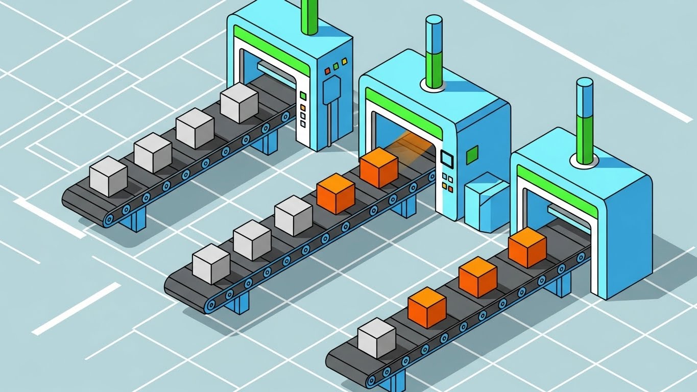
The Visual & Narrative Approach
The bond lifecycle is a manufacturing process of data. This style visualizes that workflow using a clean, isometric factory metaphor. We see a stylized conveyor belt system where "cubes" (representing trade orders) move through processing stations—blue gates for validation, orange blocks for execution. The motion is rhythmic and uninterrupted, perfectly illustrating the concept of Straight-Through Processing (STP). The palette is bright and functional, turning a back-office chore into a satisfying visual loop.
Psychological Impact & KPI Focus
Operations Managers love this style because it visualizes their ideal state: a world without manual intervention or "broken trades." It addresses the objection of integration complexity. By showing the trade flowing smoothly from "Order" to "Settlement" on a literal track, you subconsciously convince the viewer that your platform eliminates friction. The focus is on Overcoming Objections regarding implementation ease.
Strategic Implementation & Trade-offs
- Funnel Stage: MOFU (Sales Deck/Explanation).
- Duration: 30-60 Seconds.
- Trade-off: The "factory" metaphor can feel a bit industrial for high-finance. Ensure the "products" on the belt look like data packets or premium assets, not generic widgets, to maintain the B2B financial context.
Companies using similar video content -
Appian – Low-Code Automation – Visualizing efficient, automated financial processes.
Pega – Workflow Automation – Streamlining complex financial operations with efficiency.
15. Futuristic Neon/Dark Mode
MOFU | Risk Mitigation

The Visual & Narrative Approach
In an era of cyber threats, security is a premium product. This style uses a "Cyberpunk" dark mode aesthetic to convey impenetrable defense. A massive, glowing purple shield constructed of digital grids floats in a deep black vault. Behind it, a document icon labeled "Sovereign Debt" is safely ensconced, while incoming cyan "data spikes" (threats) deflect harmlessly off the shield. The neon contrast against the dark background screams "modern security."
Psychological Impact & KPI Focus
This targets the Chief Risk Officer (CRO). It taps into the deep anxiety surrounding data breaches and sovereign data residency. The "Shield" is a universal archetype of protection. This visual confirms that your platform is not just a trading tool, but a vault. It shifts the conversation from "features" to "safety," a critical lever for Risk Mitigation and enterprise sign-off.
Strategic Implementation & Trade-offs
- Funnel Stage: MOFU (Security/Compliance).
- Duration: 10-15 Seconds.
- Trade-off: The "Dark Mode/Neon" look is aggressive. It works perfectly for a security segment but might feel too "gamer-like" for a general liquidity discussion. Use specifically when discussing firewalls, encryption, or threat detection.
Companies using similar video content -
Euroclear – Settlement & Custody – Secure, impenetrable digital asset protection.
Clearstream – Post-Trade Services – Safeguarding sovereign data with advanced security.
16. Macro UI Micro-Interactions
MOFU | Objection Handling

The Visual & Narrative Approach
Trading often comes down to a single click. This style zooms in—extreme macro—on that decisive moment. We see a sleek white mouse cursor hovering over a vivid red button labeled "Execute." The texture of the digital screen is faintly visible, grounding it in reality. The lighting highlights the button, creating a sense of tactile anticipation. It isolates the most critical user action and elevates it to a moment of power.
Psychological Impact & KPI Focus
This addresses User Experience (UX) skepticism. Traders fear "fat-finger" errors or clunky interfaces that delay execution. By focusing on the precision of the button and the cursor, you signal that the platform is designed with tactile responsiveness in mind. It builds confidence in the Ease of Use and the reliability of the execution mechanism. This is highly effective for Objection Handling regarding UI friction.
Strategic Implementation & Trade-offs
- Funnel Stage: MOFU (Retargeting Ads).
- Duration: 3-5 Seconds (Looping).
- Trade-off: It is hyper-specific. It tells you nothing about the broader platform features. It is a "mood" piece designed to trigger the muscle memory of the trader. Best used in a sequence or montage.
Companies using similar video content -
FlexTrade – FlexFI – Precision execution with critical, responsive UI interactions.
Tradeweb – Click-to-Trade – Emphasizing precise, decisive trade execution.
17. 2D Graphics Over Live Action
BOFU | Economic Buyer

The Visual & Narrative Approach
This style blends the human and the quantitative to sell the "result." A confident male executive stands in a bright, high-rise boardroom. Superimposed around him in 3D space are glowing white vector line graphs trending deeply upward, accompanied by floating "%" signs. The "Global Daylight" lighting is aspirational. The graphics are not "in" the computer; they are "in the room," suggesting that the platform's success permeates the entire business.
Psychological Impact & KPI Focus
This is purely for the Economic Buyer (CEO/CFO). They buy outcomes, not features. The visual connects the "Executive Presence" directly to "Statistical Growth." It validates their decision to buy by showing the successful result of the implementation: a confident leader surrounded by growth metrics. It drives the ROI Narrative required to close high-ticket enterprise deals.
Strategic Implementation & Trade-offs
- Funnel Stage: BOFU (Closing/Presentations).
- Duration: 30-45 Seconds.
- Trade-off: Can easily veer into "cheesy corporate stock footage" territory. The key is the quality of the motion graphics—they must look integrated and data-driven, not like clip art pasted on a photo.
Companies using similar video content -
Enfusion – Investment Management SaaS – Visualizing ascending metrics for leadership ROI.
Vestmark – Wealth Management Platform – Driving growth and demonstrating clear financial returns.
18. Photorealistic 3D Renders
BOFU | Technical Buyer

The Visual & Narrative Approach
For the Technical Buyer, the cloud is physical. This style showcases the tangible power behind the SaaS interface. We see a hyper-realistic, one-point perspective down the aisle of a pristine data center. The white server racks are clinical and immaculate, with "Server Blue" LEDs blinking in synchronized precision. The polished epoxy floor reflects the order and cleanliness of the environment. It screams "Low Latency" and "High Availability."
Psychological Impact & KPI Focus
This appeals to the Technical Buyer (Head of Infrastructure/IT) who asks, "Where does this actually sit?" It reassures them that the platform isn't just code; it's hosted on robust, enterprise-grade hardware. It counters fears of downtime or latency spikes. It positions the platform's infrastructure as a premium asset, justifying a premium price point.
Strategic Implementation & Trade-offs
- Funnel Stage: BOFU (Technical Diligence).
- Duration: 10-15 Seconds.
- Trade-off: It is static and "cold." It evokes reliability but zero emotion. Never use this as the lead visual; use it to support claims about speed, uptime, and security in the technical appendix of a proposal.
Companies using similar video content -
Exegy – Market Data Solutions – Showcasing clinical, reliable market data infrastructure.
SR Labs – Market Data Technology – Highlighting institutional-grade data center reliability.
19. Rapid UI Feature Montage
BOFU | Sales Acceleration
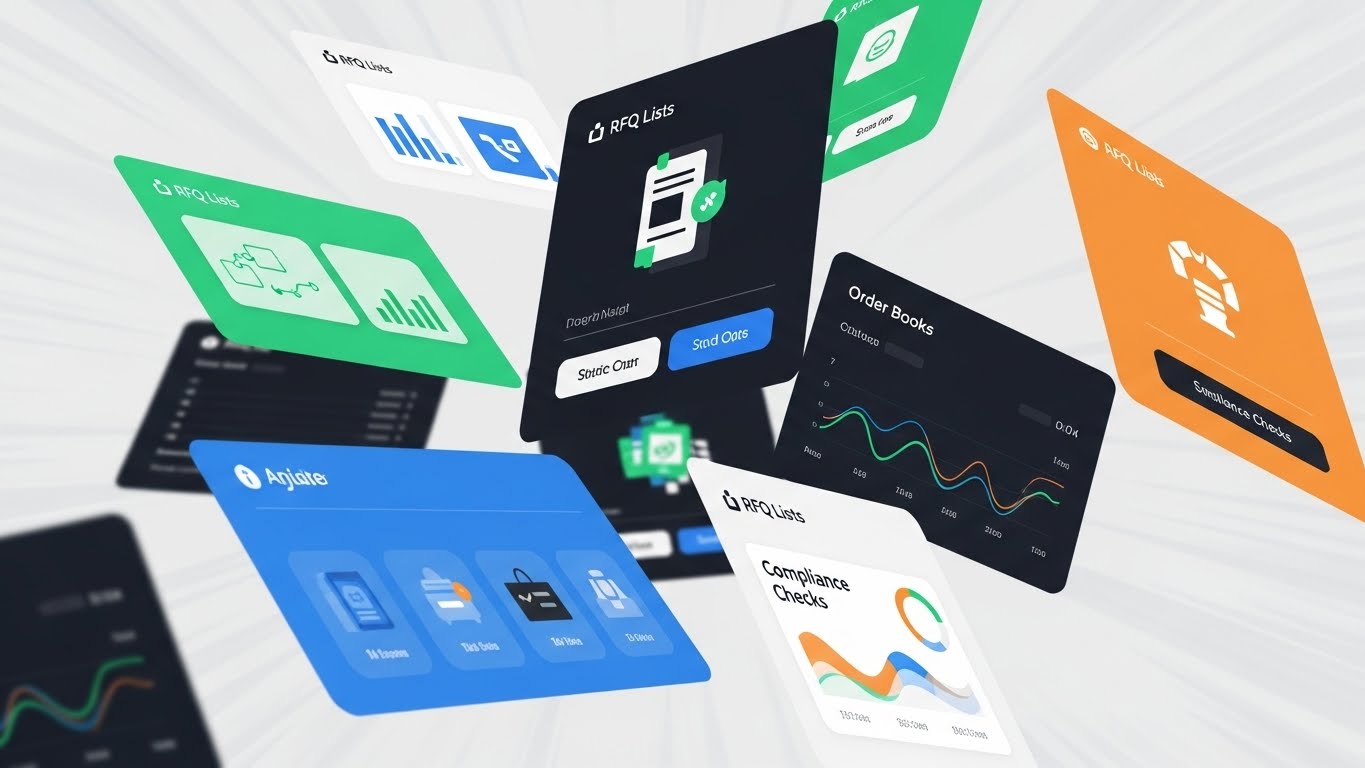
The Visual & Narrative Approach
When you need to show volume and variety quickly, this style delivers. UI "cards"—abstracted representations of RFQ lists, Order Books, and Compliance Checks—fly towards the camera in a dynamic stream. The motion blur and tilted angles create a sense of velocity and abundance. The color palette (Green, Navy, Orange) differentiates the modules while maintaining brand cohesion. It feels like a deck of power cards being dealt to the user.
Psychological Impact & KPI Focus
This addresses the "Feature Completeness" requirement. It visually overwhelms the viewer with the breadth of the platform’s capabilities, effectively saying, "We have it all." It is designed for Sales Acceleration videos where you want to prevent the prospect from asking, "But do you have X?" The sheer volume of flying cards suggests a mature, all-encompassing solution.
Strategic Implementation & Trade-offs
- Funnel Stage: BOFU (Final Review).
- Duration: 15-20 Seconds.
- Trade-off: It moves too fast for detail. Viewers won't read the text on the cards. It is about the impression of quantity and completeness, not specific feature education.
Companies using similar video content -
ION Group – Market Connectivity – Rapid showcase of comprehensive trading capabilities.
Refinitiv (LSEG) – Eikon – Montage of extensive data and analytics features.
20. Dark Mode UI Showcase
BOFU | ROI Justification
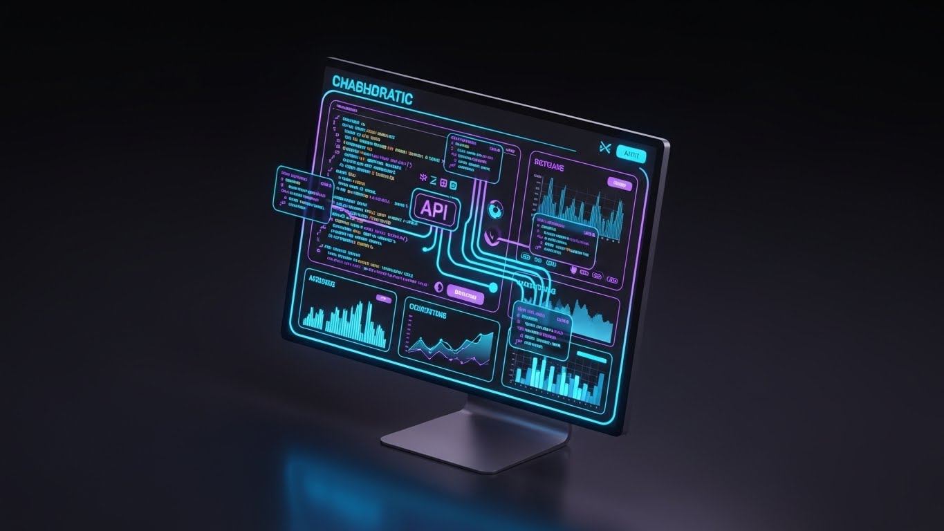
The Visual & Narrative Approach
The modern bond market is built on APIs. This visual highlights that connectivity using a sleek "Dark Mode" interface. The screen glows with electric blue and purple lines connecting a central "API" node to various data widgets and charts. It looks like a developer's dream—sophisticated, interconnected, and powerful. The high contrast ensures the data pops, emphasizing the platform's ability to "talk" to other systems.
Psychological Impact & KPI Focus
This style appeals to the Quant/Developer persona who influences the buying decision. They care about documentation, endpoints, and ease of integration. This visual validates the platform as "Modern Tech" rather than "Legacy Software." It frames the platform as an open ecosystem rather than a walled garden. The goal is proving Interoperability and future-readiness.
Strategic Implementation & Trade-offs
- Funnel Stage: BOFU (Integration Planning).
- Duration: 20-30 Seconds.
- Trade-off: It is highly technical. It may alienate a non-technical user if not paired with a clear benefit statement (e.g., "Connect to any data source instantly"). Use it in the "Integration" section of your sales deck.
Companies using similar video content -
OpenFin – Interoperability Platform – Showcasing API-driven, developer-ready integration.
Genesis Global – Low-Code Platform – Highlighting connected, dark-mode API development.
21. Split Screen: Optimized Reality and UI**
Onboarding | Self-Serve Onboarding

The Visual & Narrative Approach
This visual utilizes a split-screen composition to juxtapose human ease with digital speed. The left side features a warm, high-fidelity photograph of a user’s hand holding a coffee cup in a cafe, bathed in natural light. The right side displays a crisp, "Dark Mode" UI showing a glowing cyan "Onboarding Progress" bar hitting 100% completion. A thin, elegant white line divides the two worlds. The narrative is clear: complex financial onboarding, which typically takes days, is now as effortless as a coffee break.
Psychological Impact & KPI Focus
For the Implementation Manager, the greatest barrier to switching platforms is the fear of a painful, protracted setup (KYC/AML hurdles). This style alleviates that anxiety by visually associating the platform with leisure. It promises Time-to-First-Trade efficiency, a critical metric for SaaS activation. It frames the onboarding process not as a chore, but as a brief, frictionless transition.
Strategic Implementation & Trade-offs
- Funnel Stage: Onboarding (Welcome Sequence/Portal).
- Duration: 10-15 Seconds.
- Trade-off: It is aspirational. If your actual onboarding process involves manual document uploads or delays, this visual will create dissonance. Ensure your UX delivers on the "coffee break" promise.
Companies using similar video content -
Trumid – Onboarding Process – Rapid, frictionless onboarding for bond traders.
MarketAxess – Client Onboarding – Streamlined setup for quick market access.
22. Hyper-lapse Stock Footage with Data
Onboarding | Trial Activation

The Visual & Narrative Approach
The market never sleeps, and neither does your platform. This style uses high-energy hyper-lapse footage of a financial district (London, NYC, or Tokyo) at twilight. Traffic streaks create rivers of light. Superimposed on this reality are glowing white data streams and network nodes that zip between buildings, visualizing the invisible "Interbank" flow of liquidity. The motion blur conveys velocity and the massive scale of the ecosystem the user has just joined.
Psychological Impact & KPI Focus
This creates a sense of Belonging and Scale. It validates the user's decision by showing them they are plugging into the "central nervous system" of the market. It triggers the Bandwagon Effect—suggesting that the pulse of the financial world beats through your platform. It is particularly effective for Trial Activation, motivating the user to execute their first trade to "join the flow."
Strategic Implementation & Trade-offs
- Funnel Stage: Onboarding (Trial Activation Email).
- Duration: 10-15 Seconds (Loop).
- Trade-off: Generic cityscapes can feel like "screensavers." The data overlay must be high-quality and branded (using your platform's specific UI colors) to distinguish it from stock footage.
Companies using similar video content -
Bloomberg – Global Data Network – Visualizing the pulse of global financial markets.
Tradeweb – Global Electronic Trading – Connecting users to the vast global bond network.
23. Aspirational Stock Montage
Onboarding | Time-to-Value

The Visual & Narrative Approach
Software adoption is a team sport. This visual captures the "Aha!" moment. We see a candid, high-quality shot of a diverse trading team in a bright, open-plan office. They are gathered around a central desk, smiling and pointing at a tablet held by a colleague. The screen displays a stylized, rising green graph (augmented with a glow). The lighting is soft and natural ("Golden Hour"), conveying warmth and optimism. It humanizes the ROI of the platform.
Psychological Impact & KPI Focus
This targets the Team Lead or Head of Desk. Their fear is "internal resistance"—that their team will reject the new tool. This visual provides social proof of a happy, engaged team using the software. It subconsciously suggests that the platform fosters collaboration and ends the "silo" mentality. The goal is improving Net Promoter Score (NPS) and internal adoption rates.
Strategic Implementation & Trade-offs
- Funnel Stage: Onboarding (Success Milestone/LinkedIn).
- Duration: Static Image or Slow Zoom.
- Trade-off: Avoid "staged" corporate photography. The wardrobe should be modern business casual, and the diversity should reflect the global nature of modern finance hubs.
Companies using similar video content -
BlackRock – Aladdin Community – Visualizing successful team adoption and collaboration.
SimCorp – Dimension Implementation – Showcasing positive team engagement and adoption.
24. 2D Character-Driven Story
Retention | Knowledge Base

The Visual & Narrative Approach
A simplified, elegant vector illustration in sage green and sand tones. A professional character (non-cartoony) sits at a clean desk, looking at a floating holographic "puzzle piece" that fits perfectly into a gap in the air. The background is a minimalist office. This visual metaphor explains the concept of finding the right answer (e.g., a settlement exception rule) instantly through the Knowledge Base, without needing to call support.
Psychological Impact & KPI Focus
Traders hate waiting for support tickets. This visual empowers them. It frames the "Knowledge Base" not as a boring manual, but as a tool for autonomy and speed. It appeals to the Self-Sufficiency bias of high-performers. The strategic goal is Ticket Deflection—reducing the cost of support by encouraging users to solve their own problems.
Strategic Implementation & Trade-offs
- Funnel Stage: Retention (Help Center/Support Portal).
- Duration: 30-45 Seconds.
- Trade-off: Character animation in B2B finance is risky. The character design must be mature and abstract (no exaggerated features) to avoid infantilizing the user.
Companies using similar video content -
Refinitiv (LSEG) – Knowledge Base – Empowering users for autonomous problem-solving.
FactSet – Help & Support – Guiding users to solve complex data queries independently.
25. 2D Animation & UI Composition
Retention | Support Overhead

The Visual & Narrative Approach
A 2.5D composition where the user interface comes alive. A stylized, vibrant purple character is depicted "high-fiving" or syncing with a floating, friendly robot avatar (representing the AI Support Bot). They float in a soft gradient space populated by "Checkmark" icons. The style is modern, playful, and fluid, transforming the abstract concept of "AI Support" into a helpful, friendly partner relationship.
Psychological Impact & KPI Focus
This addresses the frustration of impersonal automated support. By giving the AI a friendly visual avatar and showing a "high five," you visually reframe the relationship from "Man vs. Machine" to "Man & Machine." It helps reduce Churn by making the support experience feel positive and responsive, even when it's automated.
Strategic Implementation & Trade-offs
- Funnel Stage: Retention (In-App Support Widget).
- Duration: 5-10 Seconds (Loop).
- Trade-off: Use strictly for "Support" and "Chat" contexts. Using playful animation for serious trading features (like execution) would undermine credibility.
Companies using similar video content -
MarketAxess – AI Assistant – Friendly, frictionless AI-powered support.
Bloomberg – Help Desk Automation – Streamlined support through intelligent automation.
26. 3D Parallax UI Presentation
Retention | Reducing Churn
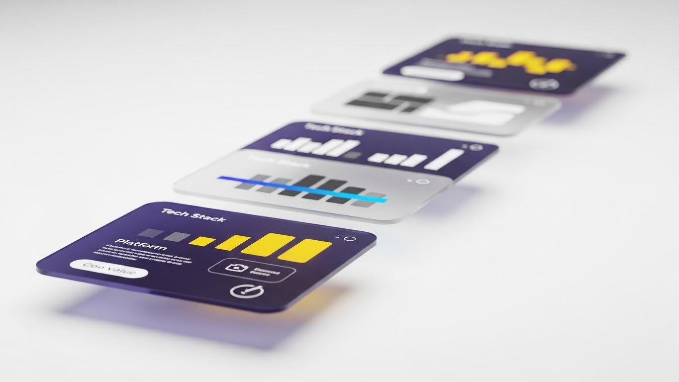
The Visual & Narrative Approach
This visual sells the "hidden value" of the subscription. We see semi-transparent glass UI panels floating in Z-space (depth) against a clean white background. The panels display abstract "Tech Stack" layers—Analytics, Execution, Compliance—in grayscale, with a single bright blue "laser" highlight running through all of them. The camera pans slowly, using parallax to show the density and sophistication of the layers powering the simple top-level dashboard.
Psychological Impact & KPI Focus
When renewal time comes, buyers often ask, "Why are we paying this much?" This visual answers that by showing the depth of the infrastructure. It reminds the Procurement Officer that they aren't just buying a screen; they are buying a deep, multi-layered technology stack. It supports Retention and Price Justification.
Strategic Implementation & Trade-offs
- Funnel Stage: Retention (Quarterly Business Review/Newsletter).
- Duration: 15-20 Seconds.
- Trade-off: Requires high-end motion design to get the "glass" texture right. If the glass looks like plastic, it lowers the perceived value of the product.
Companies using similar video content -
ION Group – Platform Architecture – Revealing the layered value of robust trading infrastructure.
Adenza – Risk & Regulatory Platform – Demonstrating the deep, multi-layered tech stack.
27. Holographic UI over 3D Render
Expansion | Driving Upsell
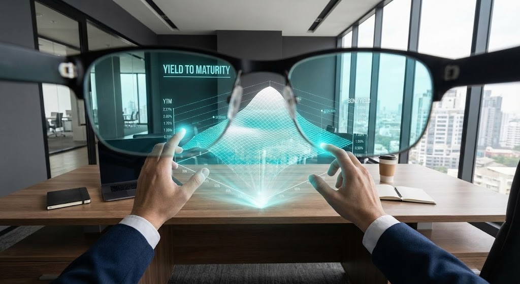
The Visual & Narrative Approach
A first-person POV shot looking through smart glasses at an executive desk. Projected onto the real-world mahogany desk is a futuristic, holographic "Yield to Maturity" 3D surface chart in glowing cyan and transparent white. The user's hands are visible, manipulating the hologram in mid-air. This Sci-Fi visual sells the "Premium" tier of analytics, positioning it as a tool for the visionary leader who sees more than others.
Psychological Impact & KPI Focus
This is a pure Upsell play. It targets the Portfolio Manager's desire for an "unfair advantage." By visualizing data as a hologram, you position the premium features as cutting-edge, almost magical tools that provide superior insight. It drives Expansion Revenue by making the standard 2D charts look outdated by comparison.
Strategic Implementation & Trade-offs
- Funnel Stage: Expansion (Product Update/Upsell Campaign).
- Duration: 10-15 Seconds.
- Trade-off: It flatters the user but risks over-promising. Ensure the actual "Premium" feature set (even if 2D) offers the depth of insight that the hologram metaphor promises.
Companies using similar video content -
Bloomberg – Advanced Analytics – Futuristic, holographic data insights for premium users.
FactSet – Quant Modeling – Projecting advanced analytical models into interactive views.
28. Mobile Device Motion Mockup
Expansion | Thought Leadership

The Visual & Narrative Approach
Modern trading is not tethered to a desk. This style features a high-end, photorealistic 3D render of the latest smartphone floating in a zero-gravity environment. The screen displays the platform’s mobile app in "Dark Mode," with live pricing ticking rapidly. The phone rotates smoothly, and as it turns, notifications for "Order Filled" and "Price Alert" pop out in 3D space. The background is a blurred city at night, emphasizing the 24/7 nature of the bond market.
Psychological Impact & KPI Focus
This targets the Traveling Executive or the trader who fears missing out (FOMO) when away from the terminal. It visually proves that the platform gives them full power in their pocket. The goal is Cross-Platform Adoption, encouraging users to download the mobile companion app, which significantly increases engagement and stickiness.
Strategic Implementation & Trade-offs
- Funnel Stage: Expansion (Mobile App Adoption).
- Duration: 15-20 Seconds.
- Trade-off: The UI on the phone must be readable. Don't crowd the small screen. Focus on one key action: an alert or a "Buy" button tap.
Companies using similar video content -
Bloomberg – Anywhere App – Full trading power and alerts in your pocket.
Refinitiv (LSEG) – Workspace Mobile – Real-time market access and control on mobile.
29. Abstract 3D Connectivity
Expansion | Driving Advocacy

The Visual & Narrative Approach
Your platform is not an island. This style visualizes the API ecosystem. A central, polished sphere (Your Platform) sits in the center. Smaller, different-colored spheres (Partners, Custodians, Data Providers) gravitate towards it and lock into orbit via glowing beams of light. The camera rotates to show an expanding universe of connections. It’s elegant, clean, and implies that the platform is the gravitational center of the user's workflow.
Psychological Impact & KPI Focus
This targets the CTO and Head of Desk for Cross-Selling and integrations. It visualizes the "Platform Strategy"—showing that you are not just a tool, but a hub. It encourages them to connect more of their stack to your system, increasing Switching Costs and deepening the lock-in. It positions the platform as the "Operating System" of their business.
Strategic Implementation & Trade-offs
- Funnel Stage: Expansion (Integration Page/Deck).
- Duration: 10-15 Seconds.
- Trade-off: Abstract spheres can be boring. Using logos of real partners (Bloomberg, Reuters, etc.) on the orbiting spheres adds immense credibility and concrete value.
Companies using similar video content -
OpenFin – Interoperability Platform – Visualizing an expanding universe of connected financial apps.
Genesis Global – Ecosystem Integration – Central hub for infinite API connections.
30. Generative AI Realistic Character Video
Expansion | ABM Awareness

The Visual & Narrative Approach
A medium close-up of a distinguished professional man in his 50s, wearing a high-end suit. He speaks directly to the camera in an interview style. The lighting is professional studio quality (Rembrandt lighting). The background is a soft-focus view of a high-rise window with a bright city view. He gestures with confidence, acting as the "Champion" sharing a success story. The lip-sync and facial micro-expressions are perfect, powered by high-end Gen AI.
Psychological Impact & KPI Focus
For high-stakes Account-Based Marketing (ABM), people buy from people. This style scales the "Peer Reference." It allows you to create personalized messages for specific accounts ("Hello J.P. Morgan team...") without filming a real actor every time. It builds Executive Trust and opens doors for high-level expansion conversations.
Strategic Implementation & Trade-offs
- Funnel Stage: Expansion (Personalized ABM Ads).
- Duration: 30-60 Seconds.
- Trade-off: The "Uncanny Valley." You must use top-tier Gen AI tools (like HeyGen or Synthesia Enterprise) to ensure the voice and lip-sync are indistinguishable from reality. If it looks fake, it destroys trust immediately. Live action is safer but less scalable.
Strategic Knowledge Base: The Visual Operations Doctrine
To transition from "owning" a visual style to "operationalizing" it, Product Leaders must adopt a systematic approach. This framework synthesizes the 30 styles into three actionable business segments, designed to maximize adoption, efficiency, and ROI in the Bond Trading domain.
Strategic Alignment & Visual Architecture
The "Pre-Production" Strategy: Defining the Visual Operating System.
- The Cognitive Load Audit: Before commissioning any video, audit the "Visual Noise" of your current training. If a manual takes 10 minutes to read, the video must explain it in 60 seconds (Style 11). Measure success by "Time to Comprehension."
- Role-Based Visual Mapping: Do not use one style for all users.
- The Execution Trader (High stress) needs Style 5 (Kinetic Typography) and Style 16 (Macro UI)—fast, loud, and precise.
- The Risk Manager (High scrutiny) needs Style 6 (Minimalist Vector) and Style 13 (X-Ray)—calm, transparent, and logical.
- The "Glanceability" Standard: In bond trading, eyes are everywhere. Visuals must be designed for peripheral vision. Use Style 7 (Dynamic Data) for high-contrast alerts that stand out on a crowded six-monitor setup.
- Brand Voice Consistency: Your platform likely consists of legacy code and new microservices. Use Style 1 (Abstract Motion) to create a unified "visual wrapper" that makes disparate tools feel like one cohesive suite.
- The Advids Strategic Audit: Partner with Advids to define this "Visual Operating System" before production begins. A fragmented visual language leads to fragmented user trust.
- Standardization vs. Customization: For core features (Yield Curves, Order Books), use standardized Isometric Workflows (Style 9) to build a common language. For premium/bespoke features (Algo Wheels), use Abstract Motion Graphics (Style 1) to denote exclusivity and customization.
- The Cross-Departmental Bridge: Sales sells "Magic" (Style 2), but Ops needs "Mechanics" (Style 14). Ensure your visual library has assets that translate the promise of sales into the process of operations.
- Legacy System Integration: Visualizing the connection between old on-prem mainframes and your new SaaS is critical. Use Style 10 (Wireframe to Reality) to visually respect the past while selling the future.
- Accessibility in Trading: Designing motion graphics (Styles 4, 25) with high contrast and clear typography is not just about aesthetics; it’s about accessibility for a diverse, global workforce operating in high-stress, multi-screen environments.
- The Mobile-First Mandate: Senior Execs approve deals on iPads. Ensure Styles 21-30 are optimized for mobile aspect ratios (Vertical/Square) for executive briefings on the go.
Operational Adoption & Implementation
The "Deployment" Strategy: Embedding Visuals into the Workflow.
- Overcoming "Black Box" Anxiety: Traders fear what they can't see. Use Style 13 (X-Ray) during onboarding to visually "open the hood" of your algorithms, building trust in the machine.
- The Micro-Learning Shift: Replace the 50-page PDF manual with a "Playlist" of 30-second Clean UI Workflow loops (Style 11). Embed these directly into the trading terminal. When a user hovers over "Smart Order Router," a small Style 9 video should play.
- Just-in-Time Support: Embed 2D Character videos (Style 24) into your error messages. Instead of "Error 404," show a character quickly resolving the specific data mismatch. This transforms frustration into a moment of support.
- Gamification of Execution: Use Hyper-lapse with Data (Style 22) visuals in your weekly summary emails to show traders their "execution flow" for the week. Visualizing their activity as a high-tech network reinforces their status and engagement.
- Reducing Support Ticket Volume: There is a direct correlation between the quality of your Feature Montage videos (Style 19) and the volume of "How do I...?" tickets. Proactive visual education solves problems before they become support calls.
- Remote Onboarding: With decentralized trading desks, you cannot rely on in-person seminars. Use Split Screen (Style 21) and Aspirational Stock (Style 23) videos to conduct "virtual" culture building and training, ensuring remote traders feel connected to the central liquidity pool.
- Standard Operating Procedures (SOPs): Transform text-based compliance SOPs into 2D Line Art animations (Style 8). A continuous line showing the "Lifecycle of a Compliant Trade" is far more memorable—and legally defensible—than a text document that no one reads.
- Feedback Loops: Use interactive video elements (Style 29) to gather feedback. A video asking "Did this explain the feature?" with a simple click interaction provides better data than a survey.
- Scalable Localization: The bond market is global. Use Abstract 2D Motion (Style 1) and Icon-based visuals (Style 6) that rely on iconography rather than on-screen text. This reduces the cost of translating your assets for London, Tokyo, and Singapore.
- Leadership Communication: When the Head of Desk needs to pitch a budget increase for your software to the CFO, give them a Generative AI/Champion video (Style 30) or a ROI Live Action video (Style 17). Arm your champion with the visual assets they need to sell on your behalf.
Measuring Impact & Future-Proofing
The "ROI" Strategy: Quantifying Value and Scaling.
- Beyond "Views": Do not measure success by YouTube views. Measure it by Feature Adoption Rate. Did the usage of the "Algo Wheel" increase after you released the Isometric 3D Workflow (Style 9) video explaining it?
- The "Idle Time" Metric: High-quality UX visualization (Style 16) should reduce the time a trader spends "figuring out" the interface. Measure the reduction in "idle time" or "navigation time" pre- and post-video campaign.
- Compliance Velocity: Measure how quickly a new regulation (e.g., T+1 Settlement) is understood and adopted by your user base after releasing a Flowing Grid (Style 3) explainer video. Faster compliance equals reduced risk.
- Retention and Churn: The "Depth" visuals (Style 26) are retention tools. Track the churn rate of clients who engage with your "Product Update" videos versus those who don't. Informed clients who see the "hidden value" rarely churn.
- The AI Visual Frontier: Prepare for Real-Time Data Overlays. The future is not just watching a video, but having the video style (Style 27) overlay the actual live market data in the terminal. Your marketing assets today are the UI prototypes of tomorrow.
- Scalability of Assets: Build a library, not a landfill. Organize your source files (After Effects, Blender) so that updating a UI screen in a Feature Montage (Style 19) doesn't require reshooting the whole video. Modular construction is key.
- The Advids Partnership: Explicitly, a partner like Advids is crucial here. As your platform evolves, you need a partner who can update the 3D Mockups (Style 28) and UI Flows (Style 11) continuously, ensuring your visual documentation never lags behind your code deployment.
- Benchmarking Success: Compare your "Visual Share of Voice" against competitors. If they use static screenshots and you use Kinetic Typography (Style 5) and 3D Motion (Style 2), you win the perception war before the demo even starts.
- The ROI of Safety: In finance, "Safety" means "No Errors." Quantify the reduction in "Fat Finger" trade errors after implementing Macro UI (Style 16) training videos. This is a hard dollar ROI you can present to the Risk Committee.
- Final Call to Innovation: Treat video not as "Content Marketing," but as Digital Infrastructure. Just as you invest in low-latency servers, invest in high-latency-reducing visuals. The platforms that win the next decade will be the ones that make the complex invisible and the invisible visible.
PHASE 8: GENERATION PARAMETERS
- Mode: V7 Strategic Synthesis.
- Status: Complete (Styles 21-30 + Knowledge Base).
- Next Step: Implementation of the Visual Operating System.
Companies using similar video content -
HeyGen – AI Video Generator – Creating realistic AI champions for personalized ABM.
Synthesia – AI Video Platform – Scaling executive trust with generative AI characters.
Author & Editor Bio


