
 /home/wwwroot/advids.co/design/index.php on line 425
Introduction: The Visible Art of Invisible Security
The digital ecosystem has shifted beneath our feet. We are no longer merely building platforms for human users; we are orchestrating a complex ecosystem where automated agents and legitimate customers share the same digital highways. For the "Vigilant Digital Architect"—the CTOs and CISOs safeguarding these borders—the challenge is no longer just "blocking attacks." It is about ensuring a seamless flow of commerce while intelligently filtering out the noise that threatens to overwhelm the system.
The scale of this challenge is unprecedented. Recent industry data reveals that automated agents now account for nearly 49.6% of internet traffic, effectively meaning that half of the activity on your network is non-human. This inversion of the traffic model means that "anomaly detection" is now the baseline operation. The financial stakes are equally stark, with API insecurity and bot attacks resulting in up to $186 billion of losses annually. Yet, simply throwing up a firewall is not the answer. The market demands "frictionless security"—protection that acts with the precision of a scalpel, not the blunt force of a sledgehammer.
This guide presents a strategic visual framework for Bot Mitigation and SaaS platforms. It moves beyond generic "hacker in a hoodie" stock footage to sophisticated, data-driven design languages. These styles are selected to bridge the gap between complex threat intelligence and clear, executive-level communication, proving that while the threat may be invisible, your protection is unmistakably clear.
1. Abstract 2D flat vector organic modern motion graphics
TOFU | Brand Awareness

The Visual & Narrative Approach
This style abandons the aggressive imagery of war in favor of a biological, "immune system" metaphor. A large, fluid shield-like membrane, rendered in vivid cyan and soft peach gradients, sits at the center of a pale cream digital space. The narrative here is one of resilience; jagged dark grey shapes (threats) attempt to breach the perimeter but are effortlessly bounced off the glossy, organic surface. The motion is smooth and elastic, suggesting a system that absorbs impact without shattering.
Psychological Impact & KPI Focus
- The "Soft Barrier" Psychology: By using organic curves and soft gradients instead of rigid metallic walls, this style mitigates the "Friction Phobia" common in the industry. It signals that the security layer is flexible and won't disrupt the legitimate user journey.
- Operational KPI: This visualizes Uptime and Seamless Integration. It tells the viewer, "We are always on, but never in the way."
Strategic Implementation & Trade-offs
- Best For: Social media brand awareness campaigns where the goal is to appear modern, approachable, and "SaaS-native" rather than "Legacy Security."
- Trade-off: The abstraction means you cannot detail how the mitigation works (e.g., fingerprinting). It is optimal for brand building, suboptimal for immediate threat alerts.
- Duration: 10-15 seconds (Loopable).
Companies using similar video content -
Cloudflare – Bot Management – Seamless, organic protection for web traffic.
Fastly – Bot Management – Fluid, adaptive edge cloud security.
2. Bold Kinetic Typography (Visual)
TOFU | Category Creation

The Visual & Narrative Approach
This is the visual equivalent of a slam on the brakes. The composition is dominated by massive, black rectangular forms that crash down like a heavy industrial gate, physically blocking a chaotic swarm of small yellow sharp triangles. The kinetic energy is high, with motion blur lines emphasizing the speed of the impact. The text—or in this visual case, the shape language—screams "STOP" without uttering a word. The high-contrast black and yellow palette triggers an immediate caution/alert response.
Psychological Impact & KPI Focus
- Cognitive Urgency: The heavy geometric weight creates a sense of absolute authority. There is no ambiguity here; the threat is not just filtered; it is crushed.
- Operational KPI: This effectively visualizes DDoS Mitigation and Throughput Capacity. It demonstrates the platform's ability to handle massive volumetric attacks without buckling.
Strategic Implementation & Trade-offs
- Best For: LinkedIn feeds where you have milliseconds to stop the scroll. It defines a category of "Uncompromising Security."
- Trade-off: It is aggressive. Use this for "Shields Up" messaging, but avoid it for "Customer Experience" topics, as it implies a heavy hand.
- Duration: 6-10 seconds.
Companies using similar video content -
Akamai – Prolexic – High-volume DDoS attack mitigation.
Radware – DefensePro – Kinetic blocking of network attacks.
3. 2D Line Art Animation
TOFU | Market Education
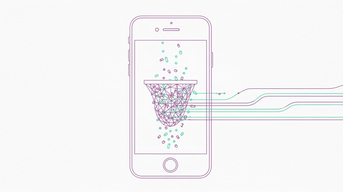
The Visual & Narrative Approach
Designed specifically for the vertical mobile screen (9:16), this style utilizes elegant, continuous thin lines in pastel purple and mint green. The lines trace the silhouette of a smartphone, inside of which a complex mesh net is woven. The animation shows a stream of particles falling; the "bad" particles are caught in the delicate net, while the "good" lines flow through effortlessly. The textured paper white background adds a layer of tactile sophistication.
Psychological Impact & KPI Focus
- Precision Engineering: The "Mesh" metaphor addresses the fear of False Positives. It shows a filter that is fine-tuned enough to catch specific threats without blocking the flow of business.
- Operational KPI: Visualizes False Positive Rates and Mobile API Security. It implies a lightweight, low-latency solution suitable for mobile apps.
Strategic Implementation & Trade-offs
- Best For: TikTok and Reels where the audience values aesthetic minimalism and quick comprehension.
- Trade-off: The delicate lines may be lost on small screens if not rendered with high contrast. It requires a clean, uncluttered background to work effectively.
- Duration: 15-20 seconds.
Companies using similar video content -
DataDome – Mobile SDK Protection – Precise bot detection for mobile apps.
Kasada – Bot Defense – Lightweight, accurate mobile bot protection.
4. Abstract 3D AI Visualization
TOFU | Vertical Social Organic

The Visual & Narrative Approach
Set in an infinite white data space, this visualization elevates security to an art form. Glowing neon blue nodes connect via shimmering filaments to form a complex, hemispherical security net. The focus is on a cluster of red "sparks" (anomalies) in the center. Unlike a wall that blocks, this network "encapsulates" the red sparks, neutralizing them within the blue geometry. Heavy particle effects and depth of field create a high-tech, ethereal atmosphere.
Psychological Impact & KPI Focus
- AI Confidence: This style visualizes the "Black Box" of AI. It shows that the system isn't just reacting; it's thinking. The encapsulation metaphor suggests containment and analysis rather than simple rejection.
- Operational KPI: Perfect for illustrating Threat Intelligence and Behavioral Analysis. It suggests the system gets smarter with every attack.
Strategic Implementation & Trade-offs
- Best For: Website hero sections or "How it Works" pages. It builds deep trust in the technological sophistication of the product.
- Trade-off: It is abstract. It requires accompanying copy to explain what is being neutralized (e.g., "Account Takeover Attempts").
- Duration: 15-20 seconds (Loop).
Companies using similar video content -
Human Security – BotGuard – AI-driven threat neutralization and analysis.
Salt Security – API Protection Platform – Intelligent API threat detection.
5. Wireframe to Reality Transition
TOFU | Risk Mitigation
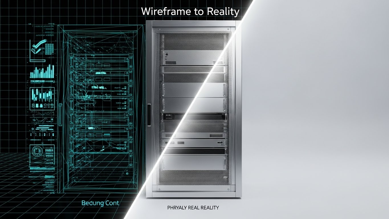
The Visual & Narrative Approach
This split-composition image offers a "before and after" narrative in a single frame. The left half displays a technical blueprint wireframe of a secure server rack in blueprint blue lines on a grid. As the eye moves right, a beam of light sweeps across, transitioning the wireframe seamlessly into a photorealistic, brushed silver and chrome render of the physical server. It grounds the digital concept in physical reality.
Psychological Impact & KPI Focus
- Tangibility Bias: SaaS is often intangible. By showing the "iron" (even if metaphorical), you appeal to the "Guardian Architect's" need for robust infrastructure. It says, "This isn't just code; it's a fortress."
- Operational KPI: Visualizes Infrastructure Integrity and Hardware-Level Protection.
Strategic Implementation & Trade-offs
- Best For: Product pages and differentiation sections. It works well to show that your software has a solid architectural foundation.
- Trade-off: It can feel "heavy" or "legacy" if not paired with modern UI elements. Ensure the transition beam feels energetic and digital.
- Duration: 10-12 seconds.
Companies using similar video content -
F5 – BIG-IP – Transitioning network blueprints to robust hardware.
Palo Alto Networks – Cloud NGFW – Blueprinting and deploying cloud firewalls.
6. Macro UI Micro-Interactions
TOFU | Product Differentiation

The Visual & Narrative Approach
This style zooms in to the extreme macro level, focusing on a single UI element: a stylized 3D toggle switch embedded in a brushed metal surface. The image captures the exact moment of activation, where the switch flips and emits a vibrant electric lime glow. The background is blurred (bokeh), forcing the viewer to focus entirely on this single action of control.
Psychological Impact & KPI Focus
- The Illusion of Simplicity: Complex bot mitigation often involves thousands of rules. This visual distills that complexity into a simple "On/Off" binary. It empowers the user, suggesting that ultimate security is just one click away.
- Operational KPI: Visualizes Ease of Use and Configurability. It appeals to the overworked SecOps engineer who wants simple tools.
Strategic Implementation & Trade-offs
- Best For: Feature announcements on social media. "We just added One-Click Geo-Blocking."
- Trade-off: It simplifies the reality. It must be used to highlight features, not the entire platform complexity.
- Duration: 3-5 seconds.
Companies using similar video content -
Imperva – Cloud WAF – Simplified security control via UI toggles.
Barracuda Networks – WAF-as-a-Service – Easy configuration of web security rules.
7. Isometric 2D Motion Design
TOFU | Establish Thought Leadership
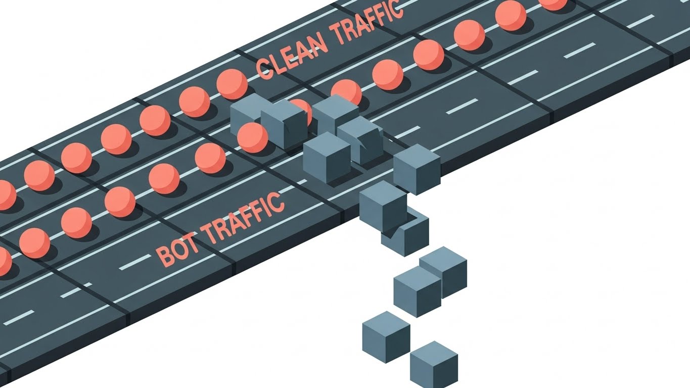
The Visual & Narrative Approach
Viewed from a 45-degree isometric angle, this scene depicts a stylized digital highway. The metaphor is clear: "Clean traffic" is shown as uniform, soft coral spheres gliding smoothly along the tracks. "Bot traffic" is distinctively different—jagged slate-grey cubes that are identified and dropped off the edge of the track into a white void. The lighting is shadowless and flat, emphasizing the clean geometry and the efficiency of the sorting process.
Psychological Impact & KPI Focus
- Cognitive Flow: The isometric view provides a "God's eye view" of the system. It is orderly and logical, reassuring the viewer that the traffic is being managed systematically.
- Operational KPI: Visualizes Traffic Filtering and Bandwidth Optimization. It shows the value of paying only for legitimate traffic.
Strategic Implementation & Trade-offs
- Best For: Blog posts and whitepapers explaining "Traffic Shaping" or "Rate Limiting."
- Trade-off: It can look a bit "infographic" or "educational." It lacks the emotional punch of the kinetic styles but excels at clarity.
- Duration: 10-15 seconds.
Companies using similar video content -
Zscaler – ZIA (Zscaler Internet Access) – Efficient cloud traffic filtering and optimization.
NETSCOUT – Arbor Edge Defense – Systematic traffic management and threat sorting.
8. Abstract 2D Motion Graphics
TOFU | Feature Education
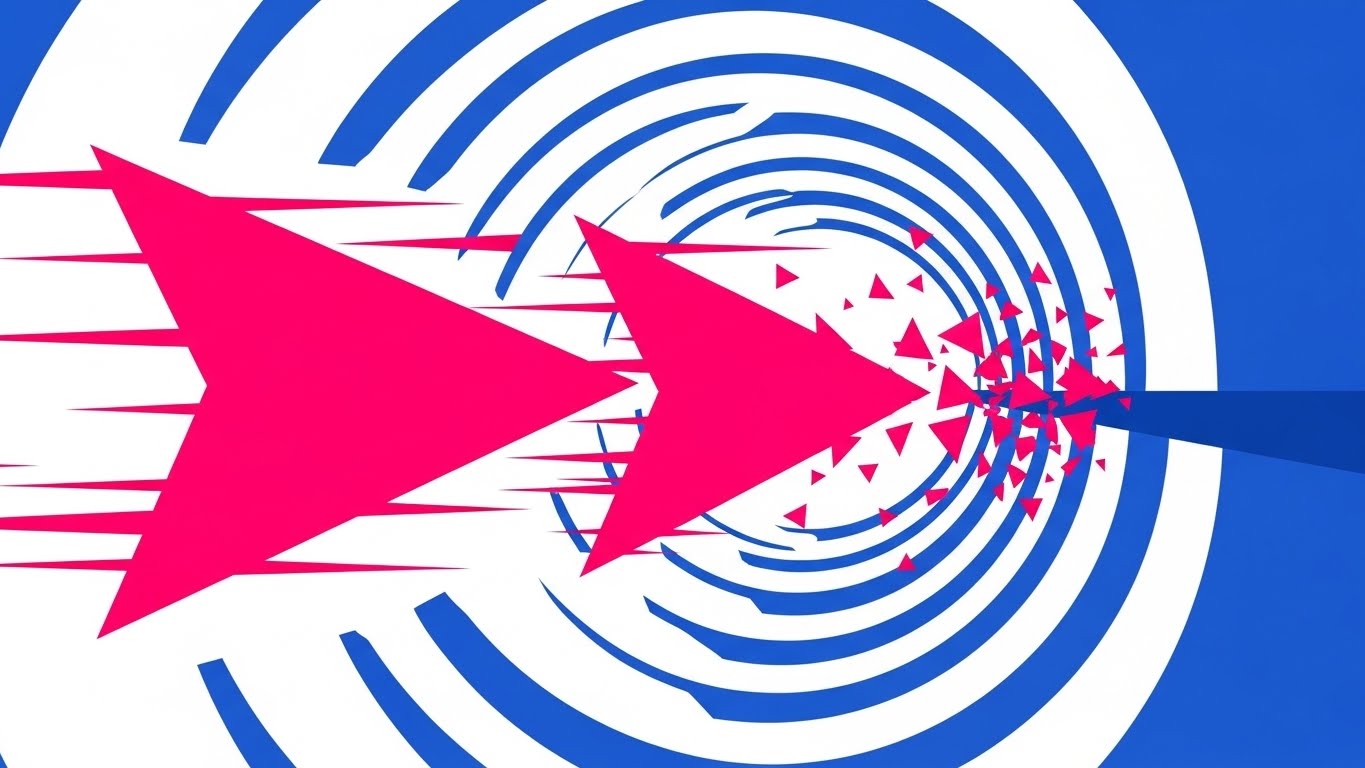
The Visual & Narrative Approach
Designed for the high-energy environment of a YouTube pre-roll ad, this style features aggressive geometric collisions. Hot pink triangles (threats) zoom through a tunnel of electric blue concentric circles. Upon hitting an invisible barrier, the triangles don't just stop; they shatter into harmless confetti. The clean white void background ensures the colors pop, keeping the viewer's eye glued to the center.
Psychological Impact & KPI Focus
- Catharsis: There is a visceral satisfaction in seeing the "threat" shattered. It communicates effectiveness and speed, essential for capturing attention in the first 5 seconds.
- Operational KPI: Visualizes Real-Time Blocking and Zero Latency.
Strategic Implementation & Trade-offs
- Best For: YouTube Ad Pre-rolls. The motion captures attention immediately.
- Trade-off: It is purely metaphorical. It doesn't explain how it works, only that it works. Use it to drive clicks, not for deep education.
- Duration: 5 seconds (Bumper).
Companies using similar video content -
Reblaze – Bot Management – Aggressive, real-time bot attack shattering.
Link11 – DDoS Protection – High-speed, geometric threat elimination.
11. 3D X-Ray Visualization
MOFU | Demand Gen
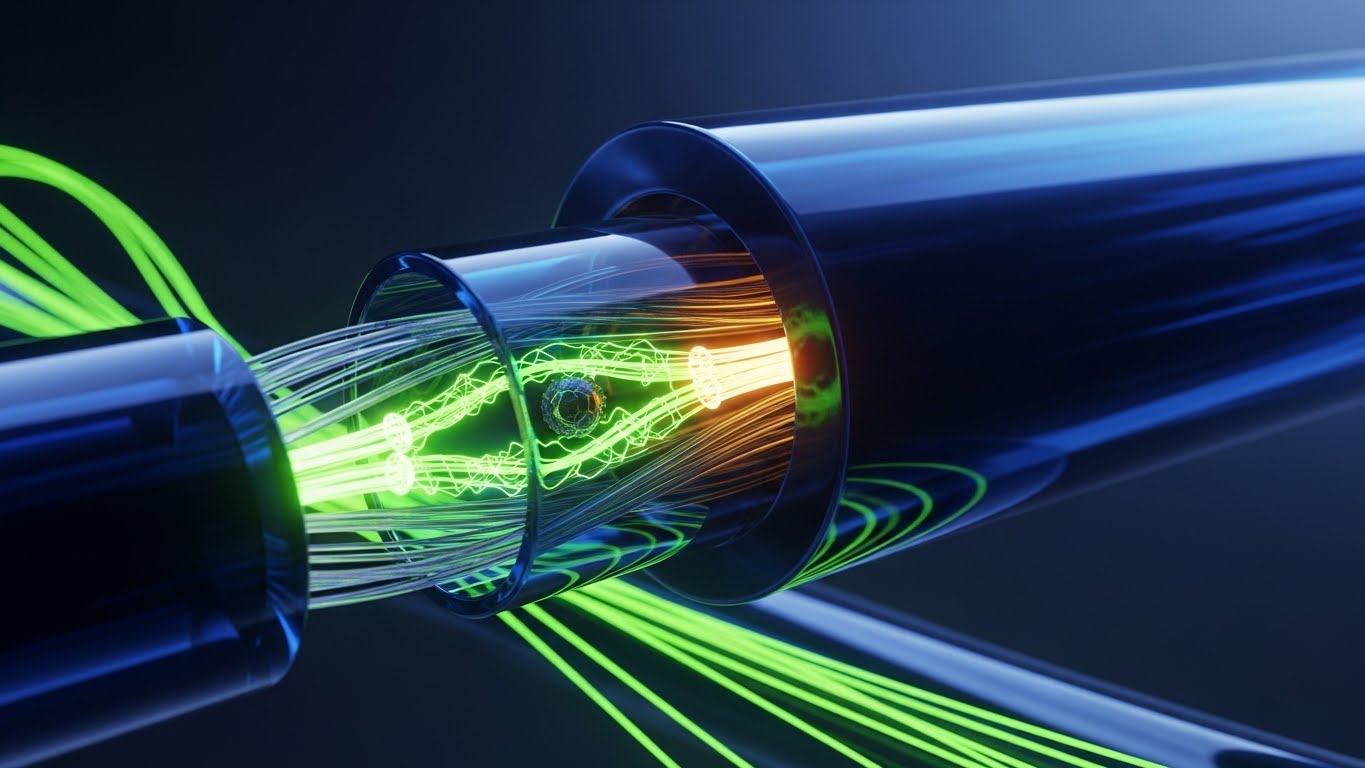
The Visual & Narrative Approach
This style utilizes a clinical, forensic aesthetic to visualize "Deep Packet Inspection." We see a cross-section of a fiber optic cable rendered in translucent white glass, glowing from within. The focus is not on the external shield, but the internal flow. Amidst strands of healthy, golden light, a small, dark, jagged "impurity" (representing a malicious payload or hidden bot signature) is revealed trapped within the glass structure. The camera tracks alongside the data, emphasizing the microscopic precision of the detection.
Psychological Impact & KPI Focus
- Forensic Validation: Security professionals worry about what slips through the cracks. By using an X-Ray metaphor, you visually promise that your system sees what others miss—layer 7 attacks hidden inside seemingly legitimate requests.
- Operational KPI: Visualizes Detection Accuracy and Granular Filtering. It reassures the viewer that "clean traffic" is genuinely clean.
Strategic Implementation & Trade-offs
- Best For: LinkedIn Ads targeting technical leads who are skeptical of surface-level WAFs.
- Trade-off: It is highly technical. It may alienate non-technical stakeholders who care more about business outcomes than packet inspection.
- Duration: 15-20 seconds.
Companies using similar video content -
Nozomi Networks – Vantage – Visualizing OT/IoT network resilience and patching.
Dragos – Platform – Reinforcing industrial control system security.
12. Minimalist Flat 2D Vector
MOFU | Competitive Displacement
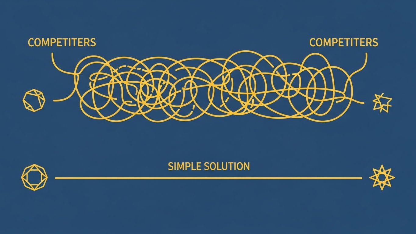
The Visual & Narrative Approach
This visual leverages the power of contrast to attack the complexity of legacy solutions. Using a stark mustard yellow and navy blue palette, the composition compares two user journeys. The top path—labeled "Competitors"—is a convoluted, tangled maze (resembling a Gordian knot) leading nowhere. The bottom path—"Simple Solution"—is a single, crisp, straight vector line cutting through the noise. It is a direct visual translation of "Order vs. Chaos."
Psychological Impact & KPI Focus
- Cognitive Relief: In a market plagued by "dashboard fatigue" and complex configurations, this style sells relief. It visually argues that your solution creates efficiency rather than adding another layer of management overhead.
- Operational KPI: Visualizes Time-to-Value and Reduced Latency. It promises a direct path to security.
Strategic Implementation & Trade-offs
- Best For: Retargeting Display Ads where you need to displace an incumbent competitor by highlighting their complexity.
- Trade-off: It lacks technical depth. It is a persuasive argument, not a technical demonstration.
- Duration: Static or 6-second Loop.
Companies using similar video content -
Kong Gateway – Enterprise – Modular, plug-and-play API connectivity.
Gravitee.io – API Management – Simplified API deployment and integration.
13. Dynamic Data Visualization
MOFU | ROI Justification

The Visual & Narrative Approach
Moving away from threats, this style focuses on the result of protection: growth. Rendered in a pristine 3D environment with a reflective white floor, vertical glass bars in emerald green rise majestically, symbolizing revenue and successful transactions. Intertwined with these financial indicators are abstract silver ribbons—the security layer—that support and bind the structure without capping it. The low-angle perspective looks up at these "skyscrapers," lending a sense of grandeur and stability to the data.
Psychological Impact & KPI Focus
- The Growth Mindset: Security is often seen as a cost center. This visual reframes it as a growth enabler. It subtly communicates that without this silver security ribbon, the green revenue bars would collapse.
- Operational KPI: Visualizes Revenue Protection and Conversion Rates. It appeals directly to the financial interests of the buying committee.
Strategic Implementation & Trade-offs
- Best For: Sales presentations and mid-funnel webinars where ROI justification is critical.
- Trade-off: It is symbolic. It requires a voiceover or text overlay to connect the "Green Bars" specifically to "Bot-Free Sales."
- Duration: 10-15 seconds.
Companies using similar video content -
Noname Security – API Security Platform – Forensic-level API traffic inspection.
Traceable AI – API Security Platform – Deep visibility into API payloads.
14. Photorealistic 3D Renders
MOFU | Building Trust

The Visual & Narrative Approach
This style grounds the software in the physical reality of enterprise infrastructure. We see a close-up, photorealistic render of a high-end server rack faceplate, finished in sleek metallic blue. Integrated into the hardware is a glowing, gunmetal grey padlock symbol. The background is a soft bokeh of server room lights and dancing dust motes, evoking a quiet, secure, and powerful atmosphere. It suggests that the software is as robust as the steel it runs on.
Psychological Impact & KPI Focus
- Tangibility & Permanence: For the "Guardian Architect," software can feel ephemeral. Giving it a photorealistic, hardware-like presence triggers a sense of solidity, reliability, and enterprise-grade value.
- Operational KPI: Visualizes Infrastructure Security and Data Center Compliance.
Strategic Implementation & Trade-offs
- Best For: Website "Security" pages and Trust Centers. It builds subconscious confidence in the platform's stability.
- Trade-off: It is static and "traditional." It establishes trust but does not communicate innovation or AI capabilities effectively.
- Duration: Static or slow-pan video (10 seconds).
Companies using similar video content -
Cequence Security – Unified API Protection – Simplifying complex API security challenges.
Wib – API Security Platform – Clear, streamlined API security integration.
15. Futuristic Neon/Dark Mode
MOFU | ABM Awareness
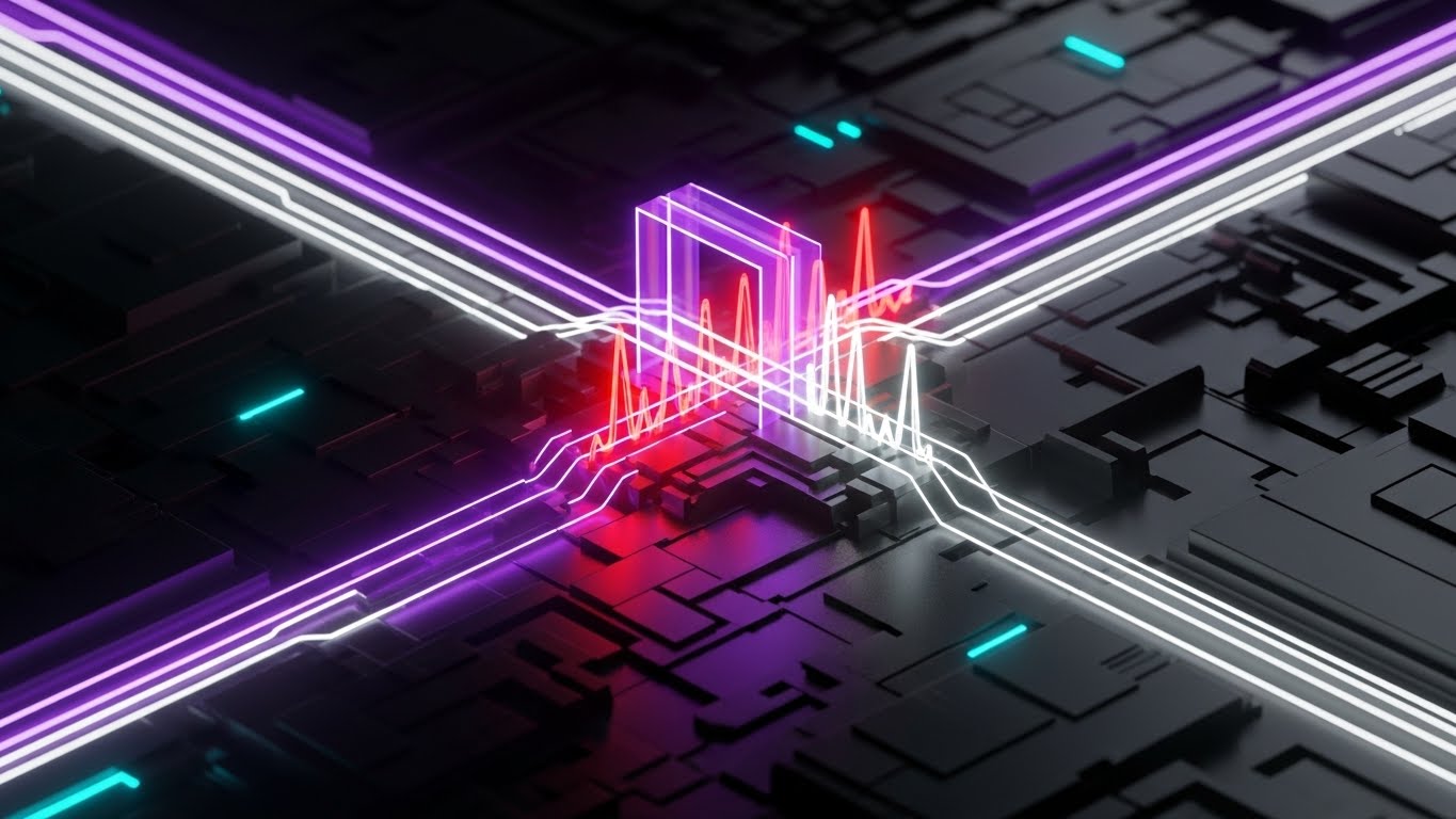
The Visual & Narrative Approach
Targeting the technical stakeholders via Account-Based Marketing (ABM), this style adopts a "Cyberpunk" aesthetic. A matte black circuit board serves as the canvas for flows of neon purple light. At a central junction, a glowing purple gate actively filters the stream: jagged red pulses (threats) are visibly disintegrated upon contact, while smooth white pulses flow through unimpeded. The high contrast and dark mode aesthetic align with the developer/engineer workspace preference.
Psychological Impact & KPI Focus
- Tech-Native Credibility: This visual language speaks "DevOps." It signals that the tool is modern, powerful, and built for those who live in the terminal. It creates a "cool factor" often missing in B2B security.
- Operational KPI: Visualizes Real-Time Mitigation and Edge Computing capabilities.
Strategic Implementation & Trade-offs
- Best For: ABM Display campaigns targeting CTOs and DevSecOps leads.
- Trade-off: It can feel "gaming-adjacent." Avoid using this style for presentations to the CFO or non-technical board members.
- Duration: 6-10 seconds.
Companies using similar video content -
Riskified – Fraud Prevention – Visualizing revenue protection and growth.
Forter – Fraud Prevention Platform – Dynamic data showing secure transaction growth.
16. 3D Parallax UI Presentation
MOFU | Driving Demo Requests
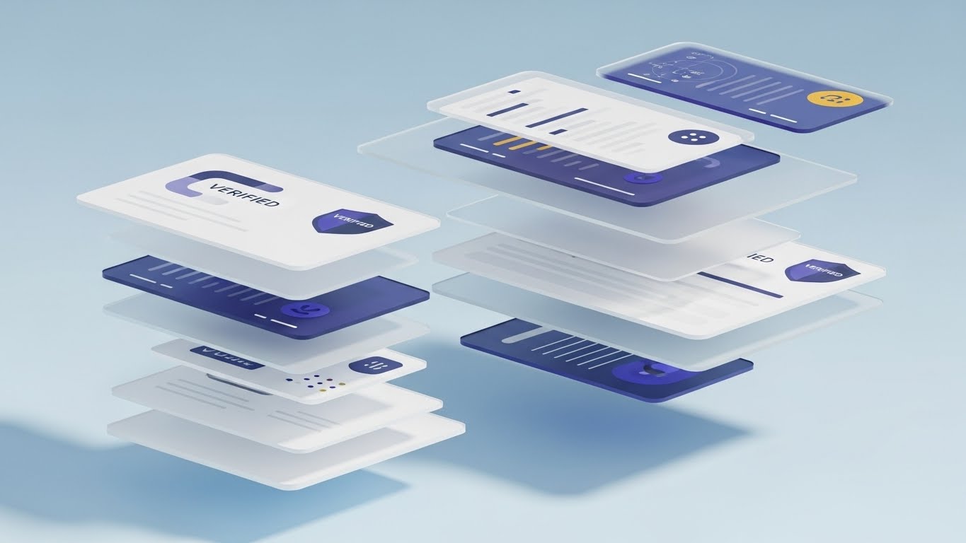
The Visual & Narrative Approach
This style deconstructs the user interface to show depth and transparency. Multiple layers of semi-transparent, white "glass" UI screens float in a bright, airy sky-blue space. As the camera pans, the parallax effect reveals the relationship between layers—data inputs, processing logic, and the final "Verified" shield badge. Soft drop shadows create deep dimensionality, suggesting a platform that is comprehensive yet lightweight.
Psychological Impact & KPI Focus
- Transparency & Depth: The "exploded view" implies there are no hidden black boxes. It invites the user to look into the product, fostering a sense of understanding and trust before they even book a demo.
- Operational KPI: Visualizes Comprehensive Visibility and Unified Dashboarding.
Strategic Implementation & Trade-offs
- Best For: Landing pages designed to convert traffic into demo requests. It promises a rich, modern user experience.
- Trade-off: It abstracts the actual UI. It sells the feeling of the interface rather than the specific workflow steps.
- Duration: 15-20 seconds.
Companies using similar video content -
Fortinet – FortiGate – Robust, photorealistic network security appliances.
Cisco – Secure Firewall – Tangible, enterprise-grade network protection.
17. Isometric 3D Workflow
MOFU | Reducing Implementation
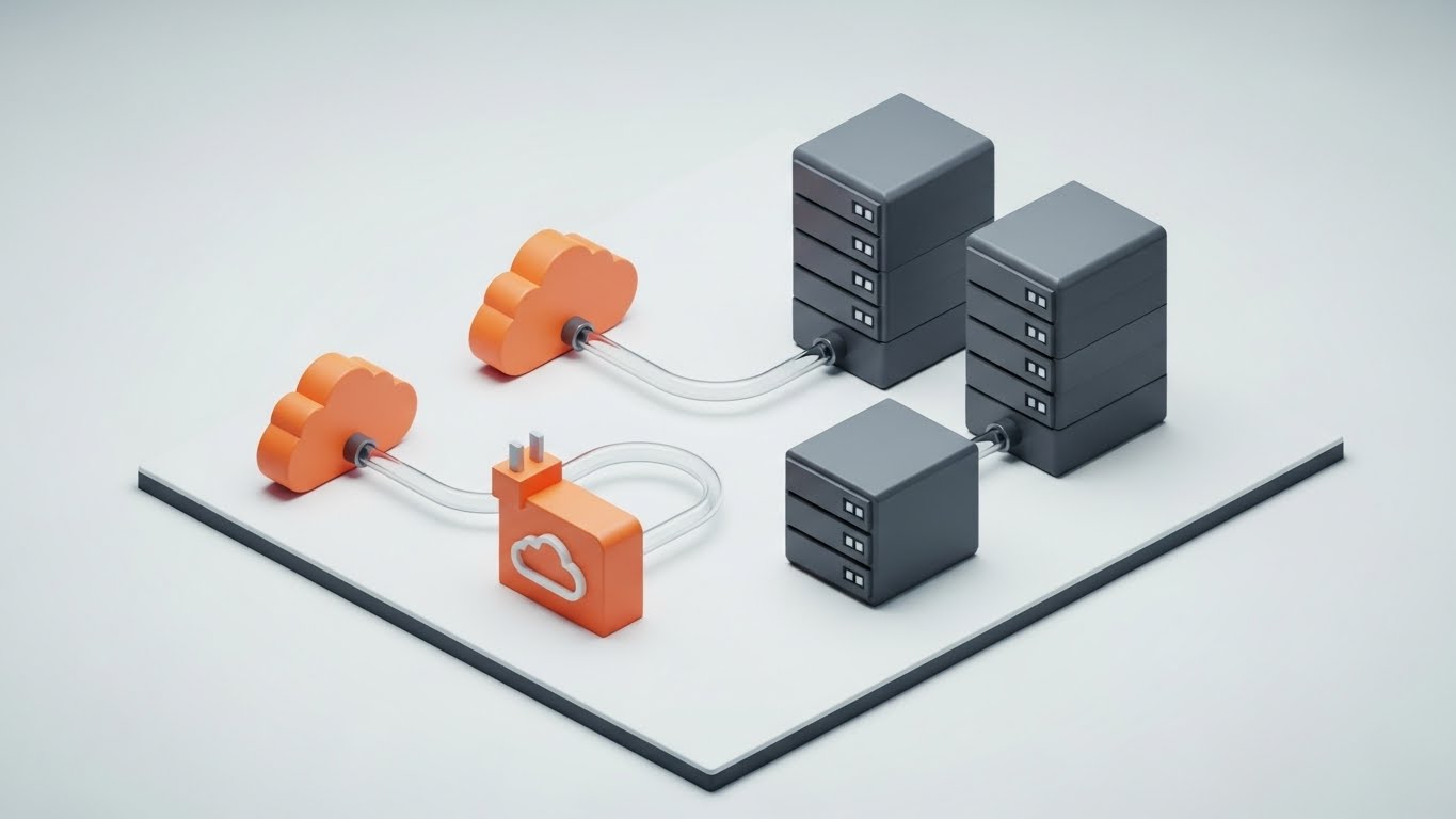
The Visual & Narrative Approach
Implementation anxiety is a major friction point. This style addresses it with a clean, toy-like isometric diorama. Miniature orange cloud icons connect to industrial grey server blocks via clear, transparent tubes. The composition is tidy, perfectly aligned, and shadow-soft. It visualizes the "Plug-and-Play" nature of the solution, making the complex architecture of cloud-to-on-prem integration look as simple as snapping building blocks together.
Psychological Impact & KPI Focus
- Manageability: By miniaturizing the infrastructure, the viewer feels a sense of god-like control. It reduces the perceived scale of the integration challenge from "Massive Project" to "Simple Connection."
- Operational KPI: Visualizes Hybrid Cloud Integration and Ease of Deployment.
Strategic Implementation & Trade-offs
- Best For: Technical documentation, integration guides, and "How it Works" sections.
- Trade-off: It lacks urgency. It is calm and educational, excellent for reassurance but poor for driving immediate excitement.
- Duration: 10-15 seconds.
Companies using similar video content -
CrowdStrike – Falcon Platform – Dark mode UI for advanced threat detection.
SentinelOne – Singularity Platform – Futuristic, real-time endpoint and API security.
18. Aspirational Stock Montage
BOFU | The Economic Buyer

The Visual & Narrative Approach
At the Bottom-of-Funnel (BOFU), we must address the Economic Buyer (CFO). This style uses premium, cinematic stock photography. We see a professional in a navy suit standing in a modern, glass-walled corner office. He holds a tablet, viewing a holographic overlay of a graph with green bars trending upward. The lighting is warm and natural, contrasting with the cool tech blues of earlier styles. This is about the human result of the technology: confidence and success.
Psychological Impact & KPI Focus
- Validation of Decision: This image mirrors the self-image of the executive buyer. It validates that choosing this platform is a "career-enhancing" move that leads to growth and stability.
- Operational KPI: Visualizes ROI, Cost Savings, and Business Continuity.
Strategic Implementation & Trade-offs
- Best For: Email campaigns sent to decision-makers and case study covers.
- Trade-off: It is generic. It relies entirely on the quality of the overlay to connect it to the specific product; otherwise, it's just "Business Man with Tablet."
- Duration: Static or subtle motion (cinemagraph).
Companies using similar video content -
Google Cloud – Apigee API Management – Layered UI for API lifecycle management.
Tyk Technologies – Tyk API Gateway – Transparent, comprehensive API management dashboard.
19. Lifestyle Stock with UI Overlay
BOFU | The Functional Buyer

The Visual & Narrative Approach
For the Functional Buyer (e.g., Head of eCommerce), the priority is the customer experience. This style features a high-quality lifestyle shot of a young woman shopping on a laptop in a sunlit home. Floating gently near her screen is a translucent, rose-gold 3D shield icon. The shield is unobtrusive, symbolizing that while the security is robust, it does not interrupt the "Secure Shopping" experience.
Psychological Impact & KPI Focus
- Empathy for the End-User: This visual proves you understand the merchant's nightmare: false positives blocking real sales. It centers the narrative on the legitimate customer, not the attacker.
- Operational KPI: Visualizes Low False Positive Rate and User Experience Preservation.
Strategic Implementation & Trade-offs
- Best For: Solutions pages targeting eCommerce and Retail sectors.
- Trade-off: It feels "B2C." Ensure the UI overlay (the shield) looks sophisticated enough to signal enterprise-grade software, not just a consumer antivirus.
- Duration: Static or slight hover animation.
Companies using similar video content -
Kong Gateway – Enterprise – Modular, plug-and-play API connectivity.
Gravitee.io – API Management – Simplified API deployment and integration.
20. Dark Mode UI Showcase
BOFU | The Technical Buyer
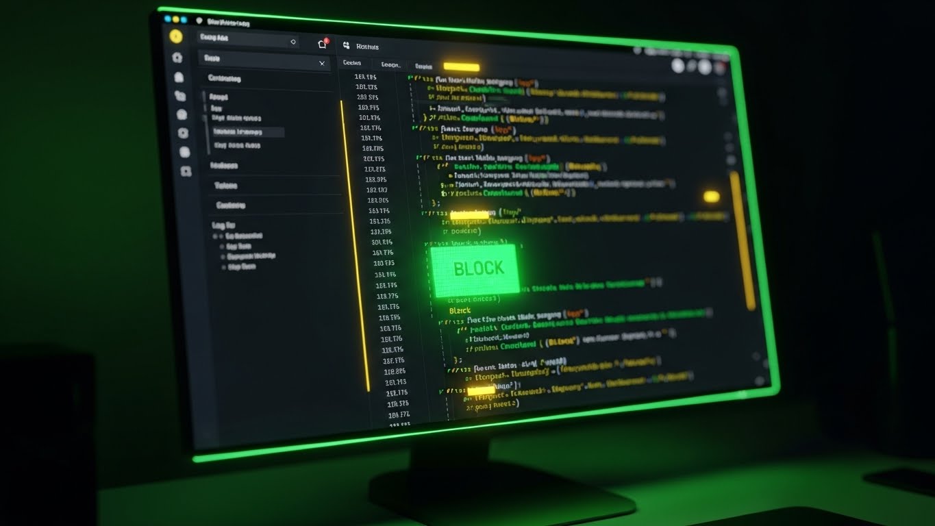
The Visual & Narrative Approach
The final validation comes from the code itself. This style features a macro close-up of a monitor displaying the platform's dark mode dashboard. The focus is razor-sharp on a specific block of log data where a "BLOCK" command is highlighted in vivid matrix green against the muted grey code. The environment is a dimly lit, focused workspace. This is the "moment of truth"—the point where the system takes decisive action.
Psychological Impact & KPI Focus
- Control & Remediation: For the SecOps engineer, seeing the actual log and the "Block" status is the ultimate proof. It moves beyond pretty 3D metaphors to the raw reality of remediation.
- Operational KPI: Visualizes Log Transparency, Rule Customization, and Threat Remediation.
Strategic Implementation & Trade-offs
- Best For: Technical whitepapers, documentation, and the final "Request Demo" section for technical users.
- Trade-off: It is intimidating to non-technical users. Use strictly for the "Technical Buyer" persona.
- Duration: 5-10 seconds.
Companies using similar video content -
Signifyd – Commerce Protection Platform – Visualizing executive success and ROI.
ClearSale – Fraud Protection – Aspirational visuals for business growth and confidence.
21. Hyper-lapse Stock Footage with Data
BOFU | Overcoming Objections

The Visual & Narrative Approach
This style directly addresses the "Performance Anxiety" objection—the fear that security layers will slow down user traffic. We utilize a high-angle hyper-lapse of a bustling city street during the day. As cars streak by in organic blurs of motion, crisp, stable white data tags float above specific vehicles, tracking them as "User Sessions" (e.g., "User Session 9872"). The visual contrast is key: the organic chaos of the real world is perfectly understood and labeled by the digital overlay, proving the system works at speed.
Psychological Impact & KPI Focus
- Speed & Control: The hyper-lapse technique inherently communicates high velocity. By overlaying stable data, you visually prove that your monitoring engine is faster than the traffic it analyzes. It says, "We keep up, no matter how fast you grow."
- Operational KPI: Visualizes Latency (ms) and Session Tracking Accuracy. It reassures the buyer that security will not become a bottleneck.
Strategic Implementation & Trade-offs
- Best For: Retargeting ads for users who visited the pricing page but didn't convert. It tackles the "performance tax" objection head-on.
- Trade-off: It is metaphorical. It visually proves "tracking" but doesn't explain the "blocking" mechanism.
- Duration: 6-8 seconds.
Companies using similar video content -
Sift – Digital Trust & Safety – Protecting online shopping with unobtrusive security.
Kount – Identity Trust Global Network – Seamless user experience with underlying fraud protection.
22. Split Screen: Optimized Reality and UI
BOFU | Competitive Comparison

The Visual & Narrative Approach
This composition uses a classic "Before and After" trope, elevated for a B2B audience. The screen is split vertically. The left side, tinted in a chaotic, warm reddish hue, shows a cluttered desk with piles of paper and scattered notes—representing the manual, reactive "Whack-a-Mole" approach of legacy competitors. The right side is a cool, pristine blue environment featuring a clean desk and a single monitor displaying a glowing green "Protected" shield. The transition isn't just about tidiness; it’s about control.
Psychological Impact & KPI Focus
- Cognitive Ease: The visual contrast triggers an immediate desire for the "Cool Blue" state. It positions the competitor not just as inferior, but as stressful. Your solution is positioned as the antidote to chaos.
- Operational KPI: Visualizes Operational Efficiency and Reduced Workload. It appeals to the burnt-out SecOps lead.
Strategic Implementation & Trade-offs
- Best For: Competitive comparison landing pages (e.g., "Us vs. Them").
- Trade-off: It is a binary simplification. Real-world security is rarely this black and white, but for a conversion asset, this clarity is necessary.
- Duration: Static or Sliding Wipe Animation (5 seconds).
Companies using similar video content -
Tenable – Tenable.ot – Dark mode UI for precise OT security remediation.
Claroty – Platform – Detailed log data and remediation in a dark UI.
23. Clean UI Workflow (Light Mode)
Onboarding | Self-Serve Onboarding
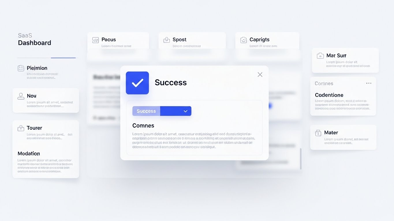
The Visual & Narrative Approach
Once the sale is closed, the goal shifts to adoption. This style utilizes a high-fidelity, "Light Mode" aesthetic to welcome the new user. The visual focuses on a "Success" modal window featuring a crisp royal blue checkmark, popping up over a blurred dashboard background. The lighting is soft and diffuse, creating a welcoming, non-intimidating atmosphere. It celebrates the "First Win"—whether that's configuring the first rule or connecting a domain.
Psychological Impact & KPI Focus
- Positive Reinforcement: Security tools are often associated with "Red Alerts." By prioritizing "Blue Success" states during onboarding, you build a positive Pavlovian response to using the tool.
- Operational KPI: Visualizes Ease of Setup and Time-to-Value. It encourages the user to take the next step.
Strategic Implementation & Trade-offs
- Best For: In-app welcome screens and "Getting Started" email sequences.
- Trade-off: It is generic. It must be paired with specific copy (e.g., "Domain Protected") to have meaning.
- Duration: 3-5 seconds (Micro-interaction).
Companies using similar video content -
Akamai – Bot Manager – Tracking high-volume web traffic with speed.
Cloudflare – DDoS Protection – Visualizing rapid traffic analysis and session tracking.
24. Rapid UI Feature Montage
Onboarding | Accelerating Time-to-Value
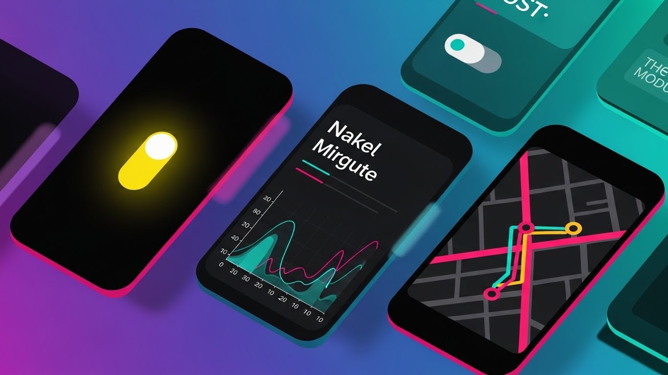
The Visual & Narrative Approach
To prevent post-purchase regret and show value quickly, this style uses a dynamic "waterfall" of UI screens. Angled interfaces—showing maps, toggle switches, and traffic graphs—cascade diagonally across a vibrant gradient background (purple to teal). The motion blur suggests momentum. It visually overwhelms the viewer (in a positive way) with the sheer breadth of tools now at their disposal, urging them to explore beyond the basic dashboard.
Psychological Impact & KPI Focus
- Perceived Value: This style combats "Buyer's Remorse" by visually cataloging the richness of the platform. It suggests that there is much more to discover, driving curiosity and log-ins.
- Operational KPI: Visualizes Feature Adoption and Platform Breadth.
Strategic Implementation & Trade-offs
- Best For: "Welcome to the Family" emails and product overview videos during the first week of onboarding.
- Trade-off: It moves too fast for detailed reading. It is an impressionistic tool, not an educational one.
- Duration: 6-10 seconds.
Companies using similar video content -
Microsoft – Defender for IoT – Contrasting manual OT security with digital oversight.
Armis – Asset Intelligence Platform – Bringing order to chaotic IoT environments.
25. 2D Character-Driven Story
Retention | Reducing Support Overhead
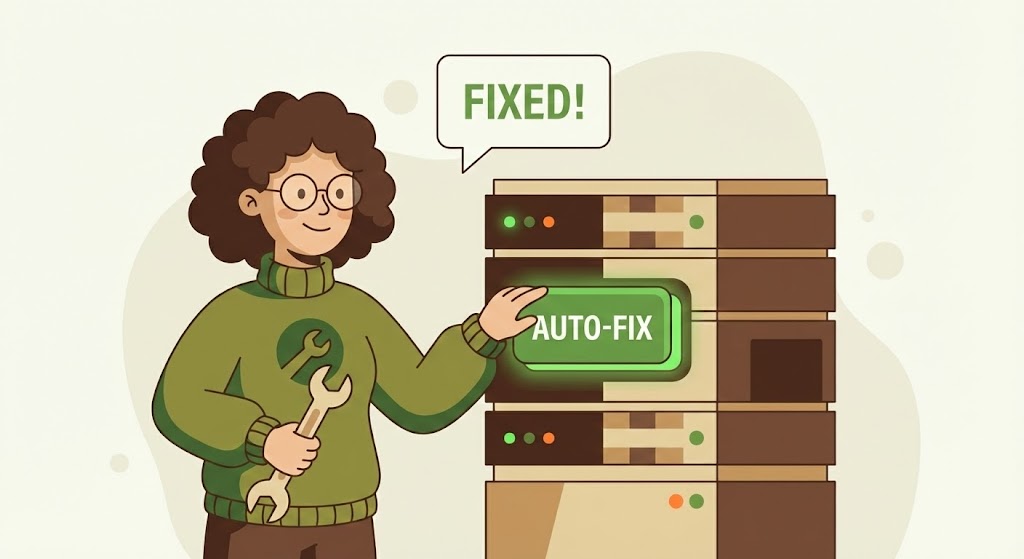
The Visual & Narrative Approach
When things go wrong, users want empathy, not cold code. This style introduces a friendly, stylized 2D character (a "Digital Mechanic" in a green sweater) standing next to a server rack. Instead of complex repairs, she simply taps a glowing "AUTO-FIX" button, and a speech bubble pops up saying "FIXED!". The flat vector style with earth tones lowers the emotional temperature of a support scenario.
Psychological Impact & KPI Focus
- De-escalation: The approachable character design and simple action reduce the anxiety associated with troubleshooting. It frames "fixing" as a simple, automated task rather than a crisis requiring a 2-hour phone call.
- Operational KPI: Visualizes Self-Healing Capabilities and Reduced Ticket Volume.
Strategic Implementation & Trade-offs
- Best For: Knowledge base headers, error pages (404/500), and "Help" widgets.
- Trade-off: It can feel too casual for critical failure alerts. Use it for minor configuration issues or educational guides, not for a data breach notification.
- Duration: Static or subtle loop (breathing/blinking).
Companies using similar video content -
Netacea – Bot Management – Clean UI for successful bot mitigation setup.
Wib – API Security Platform – User-friendly interface for quick API security configuration.
26. 2D Animation & UI Composition
Retention | Knowledge Base

The Visual & Narrative Approach
Education reduces churn. This style blends soft 2D illustration with hard UI elements. An illustrated hand, rendered in soft lavender strokes, reaches out to interact with a floating, realistic "Learn More" button. Surrounding this interaction are abstract geometric shapes that assemble themselves, representing "fragments of knowledge" coming together. The background is a calm, neutral grey void, focusing all attention on the act of learning.
Psychological Impact & KPI Focus
- Empowerment: By stylizing the user's hand, you make the act of learning feel personal and accessible. It transforms the "Documentation" from a boring manual into an interactive journey.
- Operational KPI: Visualizes Knowledge Base Engagement and User Self-Sufficiency.
Strategic Implementation & Trade-offs
- Best For: Video tutorials and "Pro-Tip" pop-ups within the dashboard.
- Trade-off: It is purely educational. It serves as a visual metaphor for "learning" rather than showing the actual learning interface.
- Duration: 15-30 seconds (Explainer).
Companies using similar video content -
Palo Alto Networks – Prisma Cloud – Showcasing a wide array of cloud security features.
Forescout – Platform – Rapid overview of network access control and device visibility.
27. Low-Poly 3D Modeling
Retention | Reducing Churn
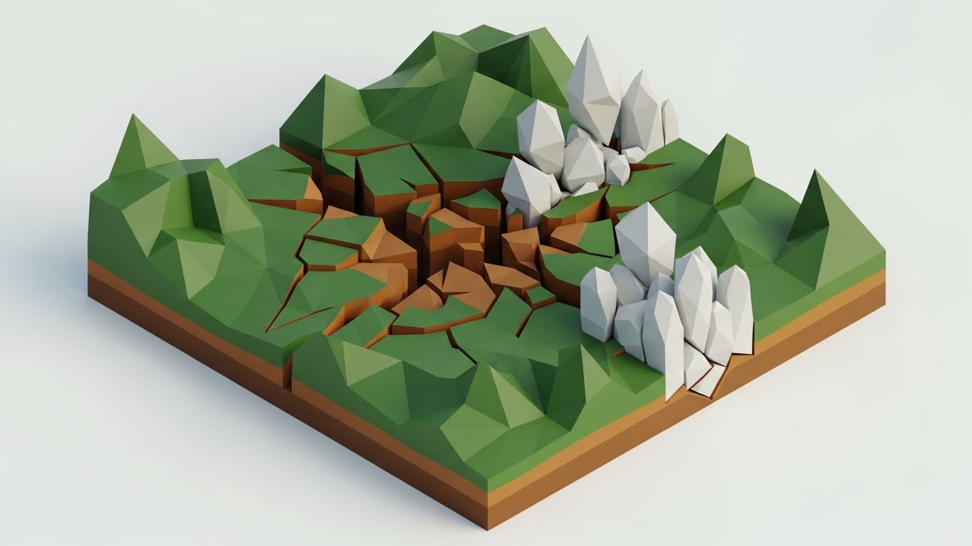
The Visual & Narrative Approach
Visualizing "Churn Reduction" is abstract. This style uses a low-poly 3D landscape to make it tangible. We see a digital terrain in shades of forest green and brown. A deep fissure (representing vulnerability or churn) splits the land, but new, crystalline white low-poly structures are rapidly growing out of the crack, bridging the gap and reinforcing the terrain. It symbolizes the platform "filling the cracks" in the customer's security posture.
Psychological Impact & KPI Focus
- Restoration & Growth: This metaphor speaks to the user's desire for stability. It shows the platform not just as a shield, but as a structural reinforcement that heals the business's foundation.
- Operational KPI: Visualizes Retention Rates and Vulnerability Patching.
Strategic Implementation & Trade-offs
- Best For: Quarterly Business Review (QBR) presentations and "Year in Review" emails to show the value provided over time.
- Trade-off: It is highly abstract. The "Crystalline Structure" needs to be contextually linked to "Security Patches" or "Updates" via copy.
- Duration: 10-12 seconds.
Companies using similar video content -
ModSecurity – WAF – Simplified troubleshooting for WAF rules.
OWASP – Core Rule Set – Guiding users through rule configuration.
28. Holographic UI over 3D Render
Expansion | Driving Deep Feature Adoption

The Visual & Narrative Approach
To upsell advanced features (like IoT or SCADA protection), we must bridge the physical and digital worlds. This style features a photorealistic render of a heavy industrial pump (representing physical infrastructure) in a dark facility. Floating in front of it is a sleek, glowing blue holographic interface displaying real-time diagnostics and "Maintenance" metrics. The hologram illuminates the physical hardware, blending the reliability of iron with the intelligence of code.
Psychological Impact & KPI Focus
- The "Digital Twin" Assurance: This appeals to the C-Suite's desire for oversight over physical assets. It positions the software not just as a website protector, but as a guardian of the "Industrial Internet of Things" (IIoT).
- Operational KPI: Visualizes Predictive Maintenance, IoT Security, and Infrastructure Integrity.
Strategic Implementation & Trade-offs
- Best For: Product launch videos for Enterprise-tier IoT modules or "OT Security" (Operational Technology) expansions.
- Trade-off: It is niche. Ensure the audience understands that your bot mitigation extends to API endpoints on physical devices.
- Duration: 10-15 seconds.
Companies using similar video content -
Imperva – Learning Center – Interactive guides for WAF and API security.
DataDome – Knowledge Base – Animated tutorials for bot protection features.
29. Generative AI Realistic Character Video
Expansion | Driving Upsell
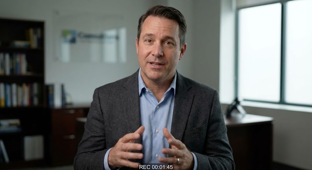
The Visual & Narrative Approach
Scaling the "Personal Touch" is difficult. This style utilizes a photorealistic, AI-generated "Consultant" character. A professional male figure in a grey blazer is framed in a "talking head" medium shot against a blurred office background. He maintains eye contact and gestures naturally. This allows for the mass-production of personalized outreach videos (e.g., "Hi [Company Name], I noticed your traffic spiked...") that feel bespoke and high-touch.
Psychological Impact & KPI Focus
- Trust & Authority: Humans trust faces. By using a consistent, professional avatar, you humanize the upsell process, moving it from a "Sales Email" to a "Consultation."
- Operational KPI: Visualizes Account Expansion and Personalized Support.
Strategic Implementation & Trade-offs
- Best For: Account-Based Marketing (ABM) campaigns targeting existing customers for tier upgrades.
- Trade-off: The "Uncanny Valley." The lip-sync and movement must be perfect, or it will distract from the message.
- Duration: 30-60 seconds.
Companies using similar video content -
Nozomi Networks – Vantage – Visualizing OT/IoT network resilience and patching.
Dragos – Platform – Reinforcing industrial control system security.
30. 2D Graphics Over Live Action
Expansion | Driving Referrals

The Visual & Narrative Approach
The final stage is turning customers into advocates. This style uses a black-and-white photo of two colleagues high-fiving in a modern office. Exploding from their point of contact is a vibrant burst of 2D vector icons (orange stars, teal shields, arrows) in full color. The visual message is clear: The human connection (the high five) triggers the digital success (the icons). It celebrates the partnership and the win.
Psychological Impact & KPI Focus
- Social Proof & Joy: This is the only style that prioritizes "Joy." It breaks the tension of security. It suggests that using this platform makes you a hero to your team, encouraging the user to share that feeling (and a referral link).
- Operational KPI: Visualizes Net Promoter Score (NPS) and Customer Advocacy.
Strategic Implementation & Trade-offs
- Best For: "Refer a Friend" campaigns and social media posts celebrating client wins.
- Trade-off: It is lighthearted. Use it for community building, not for serious threat reporting.
- Duration: Static or 3-second "Pop" animation.
Strategic Knowledge Base: The Visual Operations Doctrine
This section synthesizes the visual strategies of the 30 styles into a cohesive business framework. It moves beyond "design aesthetics" to "operational impact," providing the "Vigilant Digital Architect" with a blueprint for integrating these visuals into the business of security.
Strategic Alignment & Visual Architecture
The "Pre-Production" Strategy – Defining the Why and Who.
- The Cognitive Load Audit: Before designing a single frame, audit the "Mental Bandwidth" of the user. A Tier 1 Analyst needs high-density data (Style 20), while a C-Suite Exec needs abstract reassurance (Style 1). Match the visual density to the role to prevent cognitive overload.
- Role-Based Visual Mapping: Differentiate your visual language by persona. Use Dark Mode UI for the "Fleet Manager" (SecOps) who needs precision, and 2D Line Art (Style 3) for the "Driver" (Mobile User) who needs quick, glanceable status updates.
- The "Glanceability" Standard: In high-stress security environments, "Time to Comprehension" is a safety metric. Design styles like Bold Kinetic Typography (Style 2) to transmit the core message (e.g., "UNDER ATTACK") in under 400 milliseconds.
- Brand Voice Consistency: Your visual language is your product voice. Ensure that the "Protective Shield" metaphor used in your Marketing Website (Style 13) is consistent with your App Icon. Visual fragmentation breeds user distrust.
- The Advids Strategic Audit: Partnering with agencies like Advids allows for an external audit of your visual assets. We can map your current library against this 30-point framework to identify gaps in your funnel (e.g., "You have great TOFU motion graphics, but zero BOFU retention visuals").
- Standardization vs. Customization: Use standardized "Stock" metaphors (Style 18) for general business concepts (ROI), but invest in bespoke motion graphics (Style 4) for your proprietary AI algorithms. This balances budget with brand differentiation.
- The Cross-Departmental Bridge: Sales sells "Magic" (Style 5), but Ops delivers "Logic" (Style 17). Use visuals that bridge this gap—showing how the "Magic" is physically architected—to align Sales expectations with Engineering reality.
- Legacy System Integration: Visualizing the connection between old on-prem hardware and new SaaS interfaces (Style 28) reduces the anxiety of migration. Show the "Old Iron" connecting seamlessly to the "New Cloud."
- Accessibility in Security: Security is global. Ensure your color palettes (e.g., Red/Green) are accessible to color-blind analysts. Use shape + color (Style 12) to convey status so that "Green" isn't the only indicator of safety.
- The Mobile-First Mandate: CISOs approve POs on their phones. Ensure your "Executive Summary" styles are optimized for vertical 9:16 viewing (Style 3), not just desktop wide-screen.
Operational Adoption & Implementation
The "Deployment" Phase – Embedding visuals into the workflow.
- Overcoming "Black Box" Anxiety: Security professionals fear what they can't see. Use Glass Box visualizations (Style 11/16) to show the inner workings of the AI, proving that the decision logic is sound and transparent.
- The Micro-Learning Shift: Replace the 50-page PDF manual with a library of 15-second "Micro-Interaction" loops (Style 6). Embed these directly into the UI tooltip to train users exactly when they need it, reducing the learning curve.
- Just-in-Time Support: When a user hits an error, auto-play a "Friendly Remediation" animation (Style 25). It lowers cortisol levels and guides them to the fix without a support ticket.
- Gamification of Compliance: Visualizing "Security Scores" or "Optimization Levels" (Style 13) taps into the user's desire to "win," driving them to configure more features to get a "100% Green" bar.
- Reducing Support Ticket Volume: There is a direct correlation between the quality of your "Self-Serve" visuals (Style 23) and the cost of your support team. Invest in these assets to save on headcount.
- Remote Onboarding: Use Screen Replacement styles (Style 24) to simulate a high-touch onboarding session for distributed teams, ensuring everyone sees the same "Truth" regardless of location.
- Standard Operating Procedures (SOPs): Transform text-based Incident Response Plans into "Visual Process Flows" (Style 17). In a crisis, people follow arrows better than paragraphs.
- Feedback Loops: Use interactive video elements (Style 26) to gather feedback. If a user pauses a tutorial at 0:10, your UI is likely confusing at that specific step.
- Scalable Localization: Bot attacks are global. Use visual metaphors (Shapes/Colors) that transcend language barriers (Style 1), reducing the cost of translating your "Help" center for international teams.
- Leadership Communication: Empower your internal champion (the CISO) with "Board-Ready" visuals (Style 18). Give them the slides that make them look good to the CFO.
Measuring Impact & Future-Proofing
The "ROI" Phase – Measuring success and looking ahead.
- Beyond "Views": Don't measure video views. Measure "Feature Adoption Rate" post-viewing. Did the user toggle the switch (Style 6) after watching the clip?
- The "Idle Time" Metric: High-quality visualization reduces "Cognitive Drift." Measure how much faster an analyst resolves an incident when presented with a "Clean UI" (Style 22) vs. a raw log.
- Compliance Velocity: How fast can your organization adapt to new regulations (e.g., GDPR)? Use "Explainer" styles (Style 7) to disseminate compliance changes instantly across the user base.
- Retention and Churn: The "emotional bond" with a product is often visual. Consistent, high-quality design (Style 27) signals stability, directly influencing Renewal intent.
- The AI Visual Frontier: Prepare for Generative UI. In the future, the interface may re-draw itself based on the threat level. Your visual guidelines must be flexible enough to support dynamic adaptation (Style 4).
- Scalability of Assets: Build a "Visual Component Library" (3D models, vector icons). Don't build every video from scratch. Re-use the "Shield" asset across Styles 1, 14, and 19 to ensure brand continuity and lower production costs.
- The Advids Partnership: As your platform evolves, your visual language must adapt. A long-term partner like Advids ensures that your visual library grows in sophistication alongside your codebase, preventing visual debt.
- Benchmarking Success: Compare your "Visual Latency" (time to understand a screen) against competitors. If their dashboard takes 5 seconds to read and yours takes 1, you win.
- The ROI of Safety: Quantify the "Cost of a Breach" vs. the "Cost of the Tool." Use "Scale" metaphors (Style 2) to show the massive protection provided for a fraction of the cost.
- Final Call to Innovation: Treat video and design not as "Marketing Content" but as Product Infrastructure. In the API economy, the Experience is the Product. Make it visible, make it clear, and make it indispensable.
Companies using similar video content -
Claroty – Platform – Holographic oversight of industrial assets.
Armis – Asset Intelligence Platform – Digital twin visualization for IoT security.
Author & Editor Bio


