
Introduction: Visualizing the Invisible Infrastructure
The modern commercial building is no longer just concrete and steel; it is a living, breathing digital organism. For Facility Managers, Real Estate Directors, and Sustainability Officers, the challenge has shifted from simply maintaining physical assets to optimizing a complex web of "invisible" infrastructure—data streams, energy flows, and AI-driven logic.
The opportunity for software providers is immense. The global smart building market was valued at USD 103 billion in 2024, signaling a massive shift towards digitized operations. However, selling these sophisticated platforms requires overcoming a significant barrier: abstraction. How do you sell an algorithm that predicts chiller failure? How do you visualize the ROI of an invisible sensor network?
The answer lies in strategic video visualization. By translating abstract data into tangible visual formats, you bridge the gap between digital promises and physical reality. This isn't just about aesthetics; it's about operational clarity. Research indicates that buildings equipped with comprehensive management systems can reduce energy costs by as much as 30%, yet this value often remains hidden in spreadsheets.
This guide presents a curated taxonomy of visualization styles designed to dismantle skepticism and build trust. From the clean lines of minimalist vector art that simplify complex ESG goals, to the granular precision of 3D X-Ray views that reveal the mechanical heart of your operations, these examples serve as a strategic framework. They are designed to lower cognitive load, accelerate stakeholder buy-in, and position your platform not just as a tool, but as the central nervous system of the smart building.
1. The Green Energy Aesthetic
TOFU | Brand Awareness
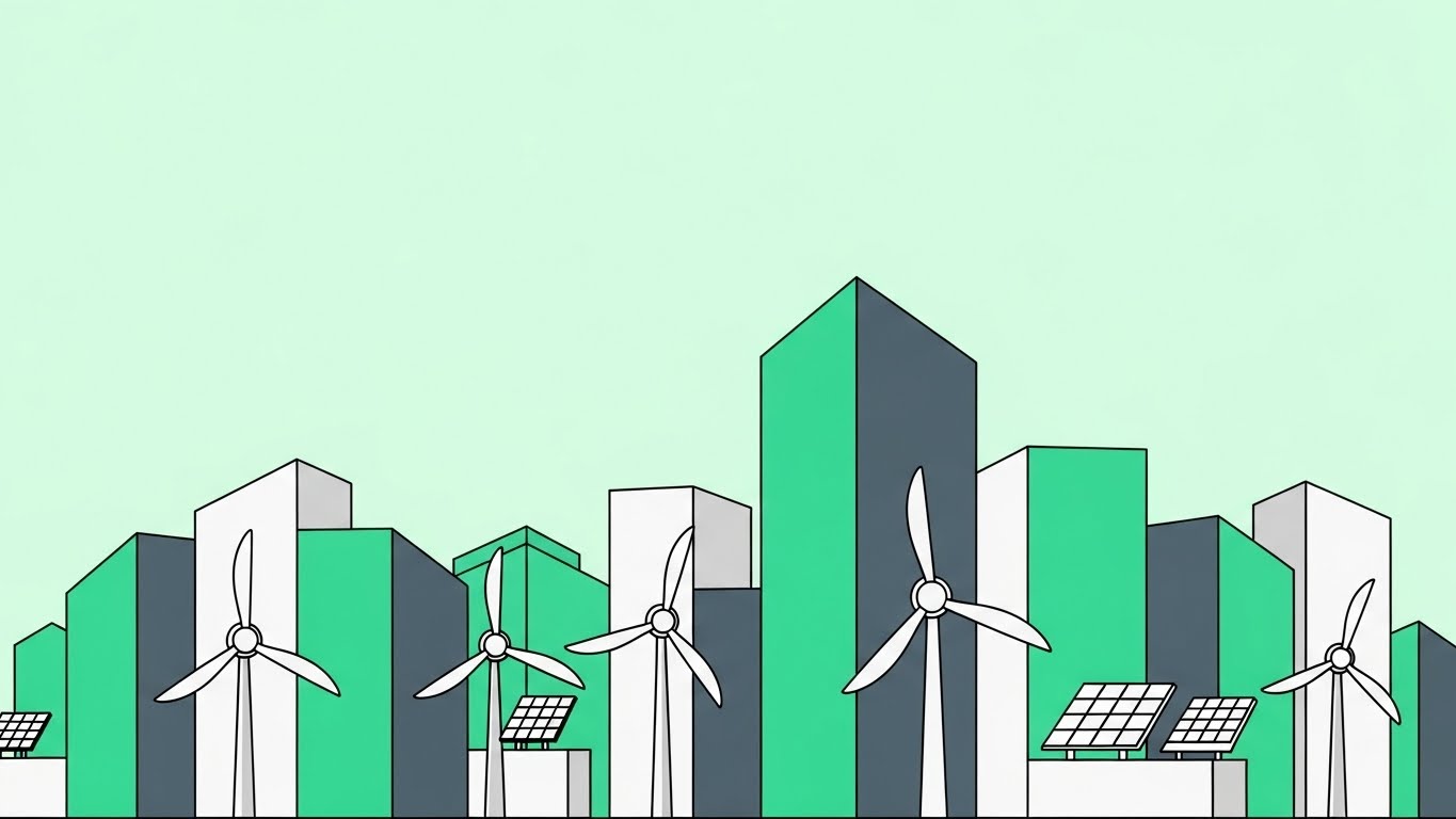
The Visual & Narrative Approach
This style utilizes a "less is more" philosophy to strip away operational noise and focus purely on the concept of sustainability. The scenario depicted uses a pristine, mint-green palette to render a stylized cityscape where architecture and renewable energy hardware (turbines, solar panels) are seamlessly integrated. The aesthetic is clean, geometric, and shadowless. The narration should be calm, aspirational, and future-focused, avoiding technical jargon in favor of broad concepts like "harmony" and "green transition."
Psychological Impact & KPI Focus
Psychologically, the absence of clutter and the use of cool, fresh colors (Mint Green, Slate Grey) evoke a sense of purity and efficiency. This directly addresses the "Green Anxiety" of stakeholders—the pressure to meet ESG targets. By removing the grit of realistic textures, the viewer focuses entirely on the outcome of the software: a cleaner, more efficient asset portfolio.
- Funnel Stage: TOFU (Top of Funnel)
- Goal: Brand Awareness (1.1)
Strategic Implementation & Trade-offs
- Best Use Case: Social media ads (LinkedIn/Instagram) where you have less than 3 seconds to stop the scroll. Ideal for announcing new ESG modules or net-zero initiatives.
- Duration: Short (15-30 seconds).
- Trade-off: This style lacks technical depth. It is excellent for setting a mood but poor for explaining how the software actually integrates with legacy hardware.
Companies using similar video content -
Measurabl – ESG reporting for real estate.
Goby – Sustainability platform for commercial buildings.
2. The Blueprint of Clarity
TOFU | Category Creation

The Visual & Narrative Approach
This aesthetic uses a continuous, single-weight Electric Blue line to draw the "skeleton" of the building. As the line weaves through the transparent architecture, it constructs the hidden arteries of the facility—HVAC ductwork, water piping, and airflow paths. The motion is fluid and continuous, suggesting seamless connectivity. The narration should be precise and architectural, emphasizing words like "flow," "connection," and "backbone."
Psychological Impact & KPI Focus
Line art appeals to the engineer’s brain. It represents blueprints, schematics, and planning. By stripping away surfaces and showing only the infrastructure, you validate the Facility Manager’s reality: that the most important systems are the ones no one sees. It visualizes the "Digital Twin" concept in its purest form—geometry and logic.
- Funnel Stage: TOFU
- Goal: Category Creation (1.2)
Strategic Implementation & Trade-offs
- Best Use Case: LinkedIn feeds and "Our Mission" website sections. It effectively communicates the scope of your platform without overwhelming the viewer with photorealistic detail.
- Duration: Medium (30-60 seconds).
- Trade-off: It can feel cold or overly abstract. It excels at conveying competence but struggles to convey emotion or human impact.
Companies using similar video content -
Delta Controls – Building automation systems.
FIN Framework (J2 Innovations) – Open building automation framework.
3. Visualizing The Intangible
TOFU | Market Education

The Visual & Narrative Approach
Invisible elements like Indoor Air Quality (IAQ) are notoriously difficult to visualize. This style solves that by using abstract, fluid shapes in Teal and Aqua to represent air. Bubble-like forms (fresh air) are shown actively displacing jagged, dark particulate shapes (pollutants). The motion is smooth and biological, almost like cellular respiration. Narration should be soft and empathetic, focusing on "health," "occupant well-being," and "safety."
Psychological Impact & KPI Focus
This style triggers a primal response regarding health and cleanliness. The contrast between the smooth, glossy "good" shapes and the sharp, dark "bad" shapes creates an instant, intuitive understanding of the software’s value proposition: purification and protection. It transforms a technical metric (CO2 ppm) into a visceral benefit (breathability).
- Funnel Stage: TOFU
- Goal: Market Education (1.3)
Strategic Implementation & Trade-offs
- Best Use Case: Blog headers, health & safety landing pages, or waiting room screens in lobbies.
- Duration: Looped animations or short clips (10-15 seconds).
- Trade-off: It is highly metaphorical. It requires accompanying text or voiceover to clarify that this represents a software monitoring process, not a physical filtration system.
Companies using similar video content -
Senseware – IoT platform for real-time data.
Disruptive Technologies – Tiny wireless sensors for environment.
4. The Total Building Control View
TOFU | Shaping Brand Perception
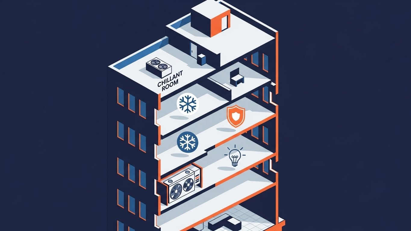
The Visual & Narrative Approach
The isometric perspective offers a "God’s Eye View" of the facility. This visual uses a 45-degree cutaway to reveal multiple floors simultaneously, assigning simple icons (snowflake, shield, lightbulb) to specific zones. The flat color palette (Navy, Orange, White) keeps the focus on structure and organization. Narration should be authoritative and confident, highlighting "centralized control," "multi-site visibility," and "integrated systems."
Psychological Impact & KPI Focus
This style satisfies the desire for order and control. For a Property Manager responsible for dozens of assets, seeing a building neatly sliced and labeled alleviates the anxiety of fragmentation. It visually proves that your software can tame the complexity of a multi-story, multi-tenant environment into a single, manageable dashboard.
- Funnel Stage: TOFU
- Goal: Shaping Brand Perception (1.5)
Strategic Implementation & Trade-offs
- Best Use Case: The primary "How It Works" video on your website homepage. It balances technical accuracy with marketing simplicity.
- Duration: 60-90 seconds (Explainer Video standard).
- Trade-off: Isometric views can sometimes feel "cartoonish" if not executed with a professional color palette. It may not appeal to deep technical buyers looking for schematic-level detail.
Companies using similar video content -
Siemens – Desigo CC – Integrated building management.
Schneider Electric – EcoStruxure Building – Comprehensive building control.
5. The Velocity of Information
TOFU | YouTube

The Visual & Narrative Approach
This style visualizes the invisible flow of data packets across a smart grid. Using high-contrast Violet, Magenta, and Cyan, it depicts geometric shapes (squares, triangles) racing through stylized conduit pipes. The motion is rapid and rhythmic, synchronized with an upbeat, tech-forward sound design. Narration is minimal or fast-paced, focusing on keywords like "real-time," "latency-free," and "instant intelligence."
Psychological Impact & KPI Focus
The aesthetic conveys speed and modernity. It addresses the skepticism regarding "lag" or "legacy slowness." By visualizing data as physical objects moving at high speed, you metaphorically promise a responsive, agile system. It appeals to the IT stakeholders concerned with bandwidth and network resilience.
- Funnel Stage: TOFU
- Goal: Organic Search / YouTube (3.3)
Strategic Implementation & Trade-offs
- Best Use Case: YouTube intros, transition scenes in longer case studies, or background visuals for event presentations.
- Duration: Very Short (5-10 seconds).
- Trade-off: It is purely decorative and metaphorical. It conveys "speed" but explains nothing about the software’s actual function or interface.
Companies using similar video content -
OSIsoft (AVEVA) – PI System – Operational data management.
Lynxspring – Edge-to-enterprise solutions for data flow.
6. The Smart Asset Context
|
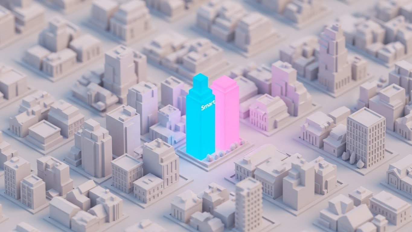
The Visual & Narrative Approach
This style uses a "digital miniature" aesthetic. The entire city grid is rendered in matte white low-poly shapes, creating a neutral background. A single central building glows in vibrant Cyan and Pink, instantly identifying it as the "Smart Building" amidst a sea of dumb assets. The lighting is soft and ambient. Narration should focus on "differentiation," "market leadership," and "premium asset value."
Psychological Impact & KPI Focus
This visual leverages the "Von Restorff Effect" (the isolation effect)—the glowing building stands out, implying that users of your software stand out in the market. It appeals to Real Estate Developers who view technology as a competitive advantage to attract high-value tenants. It frames the software as an asset appreciation tool.
- Funnel Stage: MOFU (Middle of Funnel)
- Goal: Product Differentiation (1.7)
Strategic Implementation & Trade-offs
- Best Use Case: Display Ads and Retargeting Banners. The high contrast draws the eye immediately.
- Duration: Static or Micro-loop (3-5 seconds).
- Trade-off: It is not suitable for showing interior details or specific workflows. It is strictly a macro-level branding tool.
Companies using similar video content -
View, Inc. – Smart windows for building optimization.
Digital Lumens (Acuity Brands) – Intelligent lighting for smart assets.
7. The ROI Proof Dashboard
MOFU | Product Differentiation
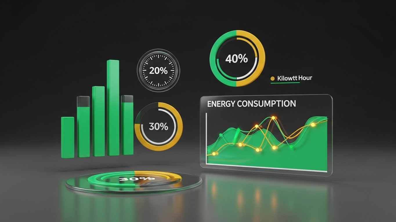
The Visual & Narrative Approach
Here, the abstract becomes quantifiable. Set against a premium Deep Graphite background, Emerald Green and Gold lines chart energy savings and consumption trends. The elements are flat but "pop" with neon-like intensity, using floating bar charts and circular dials. Narration is strictly analytical, citing specific metrics: "kilowatt-hours," "cost savings," "peak shaving," and "operational efficiency."
Psychological Impact & KPI Focus
This serves the "Rational Buyer." It alleviates skepticism about ROI by mimicking the look of a high-end financial terminal. The use of Green (money/energy) and Gold (value) on dark glass suggests sophistication and precision. It tells the CFO that this is a serious financial tool, not just a maintenance toy.
- Funnel Stage: MOFU
- Goal: Building Trust (1.9)
Strategic Implementation & Trade-offs
- Best Use Case: Whitepapers, Investor Decks, and Bottom-of-Funnel (BOFU) sales presentations.
- Duration: Static slides or slow-build animations (10-20 seconds).
- Trade-off: If the data shown is generic, it loses impact. It must ideally represent realistic or case-study-based figures to be persuasive.
Companies using similar video content -
Aquicore – Energy management platform.
GridPoint – Energy management solutions for savings.
8. The Digital Brain Metaphor
MOFU | Building Trust

The Visual & Narrative Approach
This visualization tackles the "AI Black Box" problem. It depicts a neural network as a series of glowing Emerald nodes resting on a precise dark grid. Connections pulse between the nodes, simulating decision-making processes. The camera uses a shallow depth of field to focus on a central "decision node." Narration focuses on "machine learning," "predictive logic," and "automated optimization."
Psychological Impact & KPI Focus
By giving AI a physical form (a glowing network), you make the invisible logic seem tangible and robust. The grid suggests order and structure, countering the fear that AI is chaotic or unpredictable. It positions the software as a proactive "brain" that never sleeps, constantly optimizing the facility.
- Funnel Stage: MOFU
- Goal: ABM Awareness (2.2)
Strategic Implementation & Trade-offs
- Best Use Case: Email marketing headers and "Technology" pages on the website.
- Duration: Short loops (5-10 seconds).
- Trade-off: Like other abstract styles, it requires context. Without proper labeling, it could be mistaken for generic cybersecurity or fintech imagery.
Companies using similar video content -
BrainBox AI – AI for HVAC optimization.
Prescriptive Data – Nantum OS – AI-powered building OS.
9. The Mechanical Reality Check
MOFU | ABM Awareness
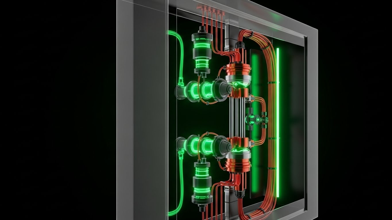
The Visual & Narrative Approach
This style is for the engineers. It utilizes a "glass housing" technique to reveal the internal complexity of a specific building component (e.g., a valve assembly or sensor unit). The outer casing is transparent grey, while the internal copper actuators, red wiring, and green fluid flows are rendered in opaque, metallic detail. Narration is technical and descriptive, focusing on "component-level monitoring," "fault detection," and "diagnostic precision."
Psychological Impact & KPI Focus
This is the ultimate trust-builder for the Functional Buyer (Facility Manager/Engineer). It demonstrates that your software understands the hardware. It’s not just a cloud overlay; it "sees" into the pipes and wires. This visual transparency equates to operational transparency—assuring the user that no fault will go undetected.
- Funnel Stage: MOFU
- Goal: The Functional Buyer (7.2)
Strategic Implementation & Trade-offs
- Best Use Case: Product Pages, Technical Data Sheets, and Training Modules.
- Duration: 30-45 seconds (Slow, detailed pans).
- Trade-off: High production cost. Creating detailed 3D models of specific hardware requires significant effort and reference material.
Companies using similar video content -
Trane Technologies – Tracer SC+ – HVAC controls.
Optimum Energy – HVAC optimization software.
11. The Friendly Complex System
MOFU | Overcoming Objections

The Visual & Narrative Approach
This style creates a distinct psychological shift by utilizing "Claymorphism"—a 3D aesthetic characterized by soft, rounded edges and matte, tactile textures that resemble clay or plastic. The mechanical room, typically a dark and intimidating space, is rendered in welcoming Pastels (Soft Blue, Beige, Salmon). A stylized, miniature Facility Manager stands next to a rounded chiller unit. The narration is friendly and instructional, focusing on "ease of use," "accessible maintenance," and "simplified workflows."
Psychological Impact & KPI Focus
This aesthetic is a direct counter-measure to "Complexity Fatigue." By rendering complex machinery as toy-like and tactile, you lower the intimidation factor for junior technicians or non-technical stakeholders. It psychologically reframes the BMS from a frightening beast into a manageable, almost playful, system. This is crucial for overcoming objections regarding the steep learning curve of new software.
- Funnel Stage: MOFU (Middle of Funnel)
- Goal: Overcoming Objections (1.11)
Strategic Implementation & Trade-offs
- Best Use Case: Onboarding videos, Learning Management Systems (LMS), and "Ease of Use" landing pages.
- Duration: Medium (45-60 seconds).
- Trade-off: The "toy-like" appearance may lack the gravitas required for high-stakes safety presentations or when selling to hardcore engineering directors who value schematic rigor.
Companies using similar video content -
ServiceChannel – Facilities maintenance management.
Accruent – Maintenance Connection – CMMS for asset care.
12. The Edge of Intelligence
MOFU | Feature Education
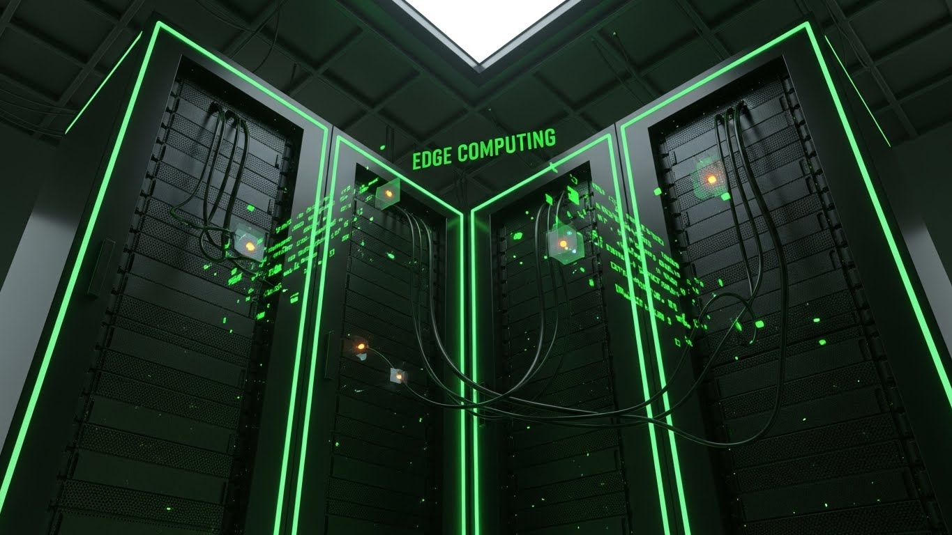
The Visual & Narrative Approach
To visualize the raw power of Edge Computing, this style employs a "Dark Mode" aesthetic synonymous with high-end tech. The environment (a server room or basement IT hub) is rendered in deep Charcoal and Black, illuminated only by the functional glow of Neon Green cabling and holographic data streams. The camera looks up at the towering racks, emphasizing scale. Narration is hushed and intense, using terms like "local processing," "zero latency," and "data sovereignty."
Psychological Impact & KPI Focus
This visual language speaks directly to the IT Director and CIO. It uses the vernacular of cybersecurity and advanced gaming to signal robust processing power. By visualizing the data processing happening on-site (at the edge) via glowing nodes, you visually promise security and speed, addressing the fear of cloud latency or data breaches.
- Funnel Stage: MOFU
- Goal: Feature Education (1.8)
Strategic Implementation & Trade-offs
- Best Use Case: LinkedIn video ads targeting IT professionals and feature highlight reels for technical trade shows.
- Duration: Short to Medium (15-30 seconds).
- Trade-off: The dark, moody aesthetic can feel alienating to non-technical buyers (like HR or Operations) who prioritize human-centric building features over processing specs.
Companies using similar video content -
Spacewell – Workplace management software.
Planon – IWMS – User-friendly facility management.
13. The Digital Twin Realized
MOFU | Lead Capture

The Visual & Narrative Approach
This style blurs the line between simulation and reality. It features a hyper-realistic render of a rooftop cooling tower, complete with imperfections like galvanized steel texture and weathering. Superimposed over this gritty reality is a pristine, semi-transparent Blue HUD (Heads-Up Display) showing real-time temperature and flow metrics. The narration bridges the gap: "See the unseen," "Augmented operations," and "Precision monitoring."
Psychological Impact & KPI Focus
This style builds immense credibility. By showing the hardware with photorealistic grit, you acknowledge the physical reality of the Facility Manager's world. The clean digital overlay then demonstrates exactly how your software enhances that reality without replacing it. It visualizes the "Digital Twin" not as an abstract concept, but as a practical, diagnostic tool that lives on top of their existing assets.
- Funnel Stage: MOFU
- Goal: Lead Capture (1.6)
Strategic Implementation & Trade-offs
- Best Use Case: Website hero backgrounds and high-value product demo videos where detail is paramount.
- Duration: Loopable (10-20 seconds) or detailed pans (30 seconds).
- Trade-off: Extremely high production cost. Requires accurate 3D modeling of specific equipment brands to maintain the illusion of reality.
Companies using similar video content -
Cisco Meraki – Cloud-managed networking.
Optigo Networks – Network infrastructure for smart buildings.
14. The Financial Narrative
BOFU | ROI Justification

The Visual & Narrative Approach
Moving away from hardware, this style focuses on the human decision-makers. It uses a stylized, grainy 2D illustration style with exaggerated proportions to depict a Facility Manager presenting to a CFO. The palette is warm (Burnt Orange, Cream, Navy), creating a corporate yet human atmosphere. The narrative is dialogue-driven or a voiceover explaining the "business case," focusing on CapEx, OpEx, and asset value appreciation.
Psychological Impact & KPI Focus
This addresses the "Economic Buyer" (CFO/Asset Manager). Hardware specs don't sell software to finance teams; financial stories do. This visual style humanizes the transaction, showing the software as a bridge between the boiler room and the boardroom. It validates the Facility Manager's role as a strategic partner who brings value (the rising graph on the tablet) rather than just a cost center.
- Funnel Stage: BOFU (Bottom of Funnel)
- Goal: ROI Justification (1.10)
Strategic Implementation & Trade-offs
- Best Use Case: Case study videos, "Why Us" presentation slides, and email nurture sequences for executive decision-makers.
- Duration: Medium to Long (60-90 seconds).
- Trade-off: It can seem "unserious" to engineering teams if the technical details in the background are incorrect or too simplified.
Companies using similar video content -
Willow – WillowTwin – Digital twin platform.
Bentley Systems – iTwin Platform – Infrastructure digital twins.
15. The Command Center Experience
BOFU | Risk Mitigation
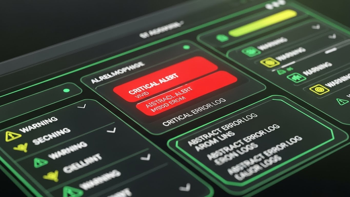
The Visual & Narrative Approach
When safety is on the line, clarity is king. This style showcases the software's interface in a high-fidelity "Dark Mode," utilizing Glassmorphism (translucent, frosted glass effects) to create depth. The focus is singular: a Vivid Red "Critical Alert" popping against the Charcoal background. The motion is subtle—a pulsing glow around the alert. Narration is urgent but controlled: "Instant notification," "Critical fault detected," "Rapid response."
Psychological Impact & KPI Focus
This appeals to the "Risk Mitigation" mindset. Security Directors and Lead Engineers live in fear of missing a critical alarm. This visual demonstrates that your platform cuts through the noise. The dark mode suggests a 24/7 Command Center environment, positioning the software as a professional, vigilance-enhancing tool that ensures nothing slips through the cracks.
- Funnel Stage: BOFU
- Goal: Risk Mitigation (1.12)
Strategic Implementation & Trade-offs
- Best Use Case: Feature vignettes on security pages, mobile app previews, and social proof ads ("Never miss a beat").
- Duration: Short (6-10 seconds).
- Trade-off: Focusing solely on alerts can make the software seem like a "bad news machine." It must be balanced with visuals of optimization and success.
Companies using similar video content -
MRI Software – Property management and financial solutions.
Yardi – Voyager – Integrated real estate platform.
16. From Vision to Operation
BOFU | Competitive Displacement
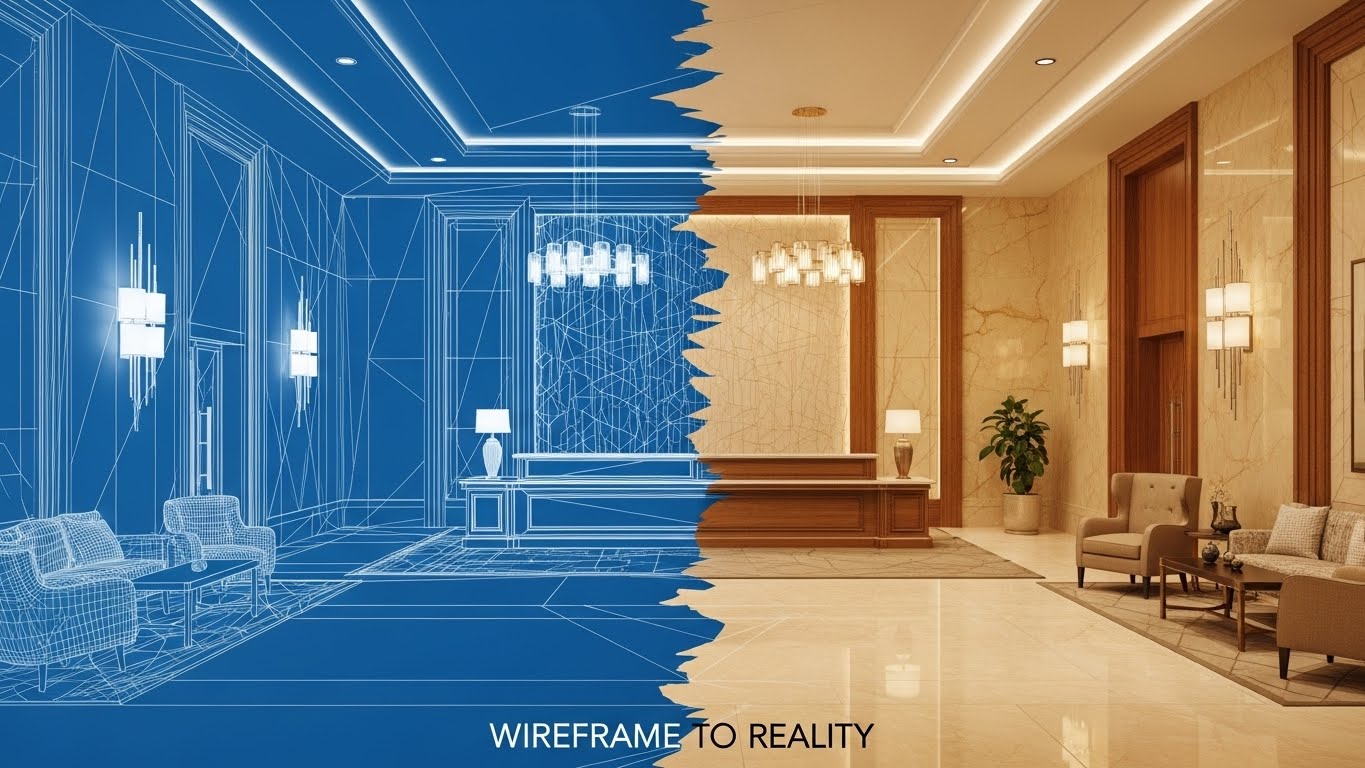
The Visual & Narrative Approach
This powerful visual metaphor uses a split-screen or sliding transition. One side shows the "Blueprint" view (Wireframe Blue/White lines), representing the planning/construction phase. The other side reveals the "Reality" (Photorealistic, warm lighting), representing the operational phase. The transition line moves, showing how the software supports the lifecycle from design to occupancy. Narration emphasizes "lifecycle management," "seamless handover," and "retro-commissioning."
Psychological Impact & KPI Focus
This targets Architects, Developers, and Construction Managers. It visually proves that the data generated during construction isn't lost but is transferred into the operational reality. It serves as a visual guarantee of "continuity," alleviating the fear of the "data gap" that often occurs when a building is handed over from construction to management.
- Funnel Stage: BOFU
- Goal: Competitive Displacement (1.13)
Strategic Implementation & Trade-offs
- Best Use Case: "About Us" videos, partnership announcements with construction firms, and retro-fit sales pitches.
- Duration: Medium (15-30 seconds).
- Trade-off: Requires high-quality assets for both the CAD drawings and the finished photography. If they don't match perfectly, the effect is broken.
Companies using similar video content -
Genetec – Security Center – Unified security platform.
Johnson Controls – OpenBlue Enterprise Manager – Centralized building operations.
17. The Executive Insight
BOFU | The Economic Buyer

The Visual & Narrative Approach
To sell to the C-Suite, you must mirror their environment. This style uses premium, cinematic stock footage of a diverse board meeting in "Golden Hour" lighting. To connect this lifestyle imagery to the product, a sophisticated, floating 3D Pie Chart (Amber/Gold) is composited above a tablet device. The narration avoids technical specs, speaking instead of "portfolio visibility," "stakeholder confidence," and "strategic oversight."
Psychological Impact & KPI Focus
This creates an aspirational association. It positions the software not as a tool for the basement, but as a source of truth for the boardroom. The "floating data" metaphor implies that the insights are elevated, accessible, and ready for high-level decision-making. It validates the purchase decision for the Economic Buyer by showing the end result: clear, presentable data.
- Funnel Stage: BOFU
- Goal: The Economic Buyer (7.1)
Strategic Implementation & Trade-offs
- Best Use Case: Investor decks, annual reports, and homepage banners targeting enterprise clients.
- Duration: Static or Micro-motion (cinemagraph).
- Trade-off: Can feel generic if the stock footage is too cliché. The UI overlay must look custom and integrated, not just slapped on.
Companies using similar video content -
Autodesk – Forge – Developer platform for AEC data.
Matterport – Digital Twins – 3D spatial data platform.
18. The Integration Ecosystem
BOFU | The Technical Buyer
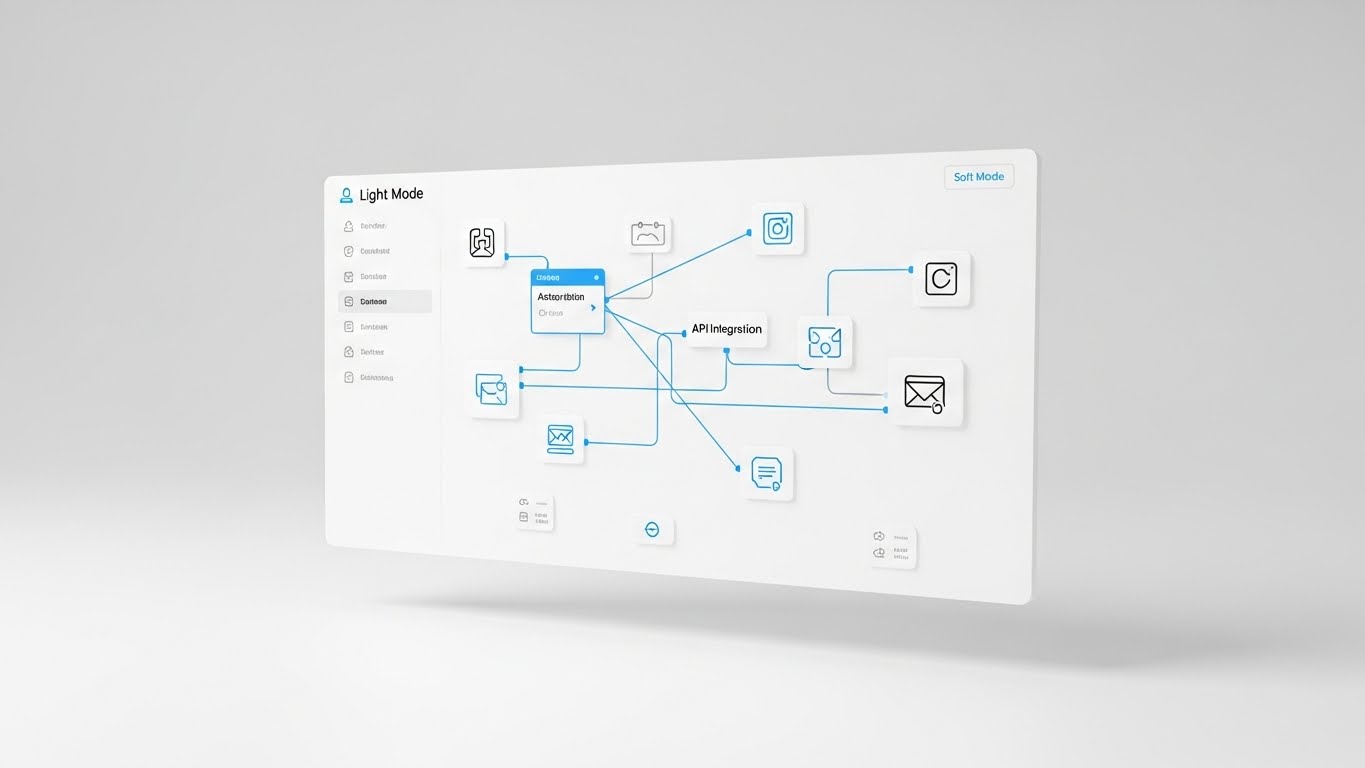
The Visual & Narrative Approach
Integration is often the biggest technical hurdle. This style strips away the environment to focus on a clean, "Light Mode" abstract UI floating in a white void. It visualizes the API ecosystem: nodes representing different software (CRM, HVAC, Access Control) connecting effortlessly via smooth blue lines to a central hub. The aesthetic is sterile, efficient, and organized. Narration focuses on "open protocols," "seamless stack," and "future-proof connectivity."
Psychological Impact & KPI Focus
This calms the Technical Buyer (CTO/IT Manager). The clean, white aesthetic implies hygiene and order. It visually demonstrates that introducing this new software won't create a "spaghetti code" mess. Instead, it acts as an organizing force, simplifying the tech stack. It answers the critical question: "Will this play nice with my existing systems?"
- Funnel Stage: BOFU
- Goal: The Technical Buyer (7.3)
Strategic Implementation & Trade-offs
- Best Use Case: Technical documentation, API integration pages, and deep-dive demo videos.
- Duration: Medium (30-60 seconds).
- Trade-off: It is visually dry. It excites developers but may bore non-technical stakeholders.
Companies using similar video content -
IBM – Envizi – ESG reporting and analytics.
Ecova (Engie Impact) – Energy & sustainability management.
19. The Modern Security Shield
BOFU | Risk Mitigation Hook

The Visual & Narrative Approach
This style elevates the presentation of security features by adding dimension. UI screens are rendered as semi-transparent, floating glass panels arranged in deep space (Z-axis). The camera pushes through the layers, focusing on a glowing "Security Lock" icon on the frontmost screen. The background is a digital abstract. Narration focuses on "multi-layered protection," "encryption," and "enterprise-grade security."
Psychological Impact & KPI Focus
The parallax effect creates a sense of sophistication and modernity. By separating the UI into layers, you visually metaphorize "depth of defense." It makes the software feel substantial and high-tech, countering the perception of web-based apps as flimsy or insecure. It appeals to stakeholders who equate design quality with code quality.
- Funnel Stage: BOFU
- Goal: Risk Mitigation Hook (8.2)
Strategic Implementation & Trade-offs
- Best Use Case: Social media retargeting ads and high-impact intro sequences for sales presentations.
- Duration: Short (5-10 seconds).
- Trade-off: Style over substance. It looks great but doesn't actually show how the security features function or are configured.
Companies using similar video content -
KMC Controls – KMC Commander – Open building automation.
Automated Logic – WebCTRL – Open architecture BMS.
20. The Transformation Proof
BOFU | Objection Handling
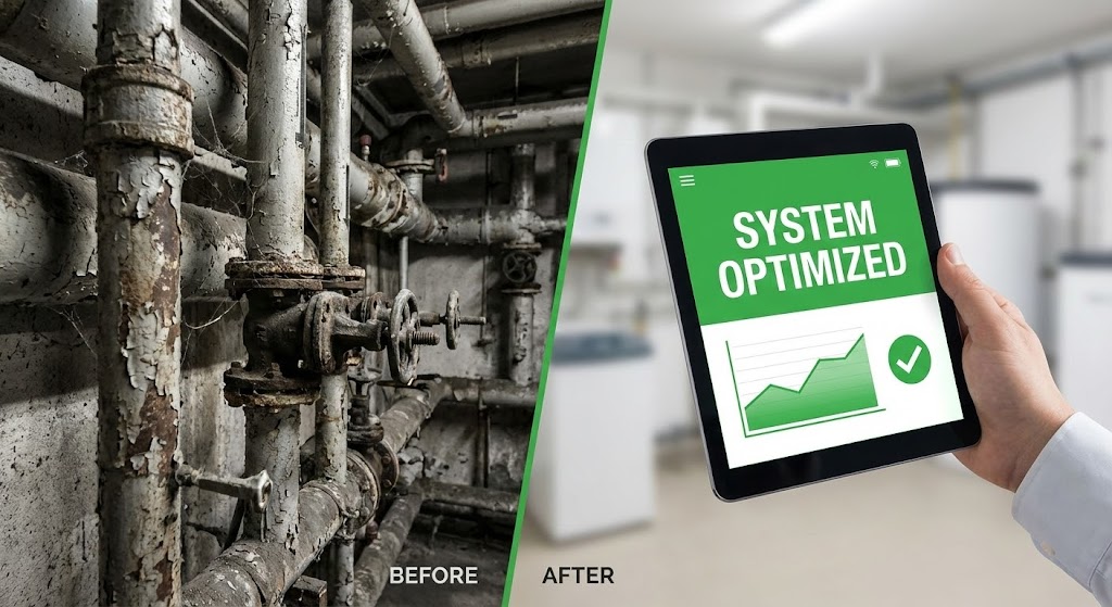
The Visual & Narrative Approach
The ultimate proof of value is the "Before and After." This style uses a sharp split-screen. The left shows the "Before": a gritty, realistic photo of rusted pipes or a chaotic boiler room (Desaturated/Grey). The right shows the "After": a hand holding a tablet with a bright, clean Green/White interface labeled "System Optimized." The contrast is stark. Narration is punchy: "From chaos to control," "From rust to reliability," "Modernize without replacing."
Psychological Impact & KPI Focus
This handles the "Legacy Hardware" objection. It visually proves that you don't need a brand-new building to have a smart building. The software (the tablet) is shown as the transformative agent that cleans up the operational mess. It gives hope to managers of older assets that they too can achieve modern efficiency, validating the Retro-fit use case.
- Funnel Stage: BOFU
- Goal: Objection Handling (5.2)
Strategic Implementation & Trade-offs
- Best Use Case: Landing pages for retro-commissioning services and sales collateral for older asset portfolios.
- Duration: Static Image or Slider Interaction.
- Trade-off: It relies on the "shock value" of the bad condition. It must be used carefully so as not to insult the prospect's current facility, but rather empathize with their challenge.
Companies using similar video content -
Verkada – Command – Cloud-based security.
Openpath – Access Control – Mobile access solutions.
21. The Feature Accelerator
Onboarding | Self-Serve Onboarding
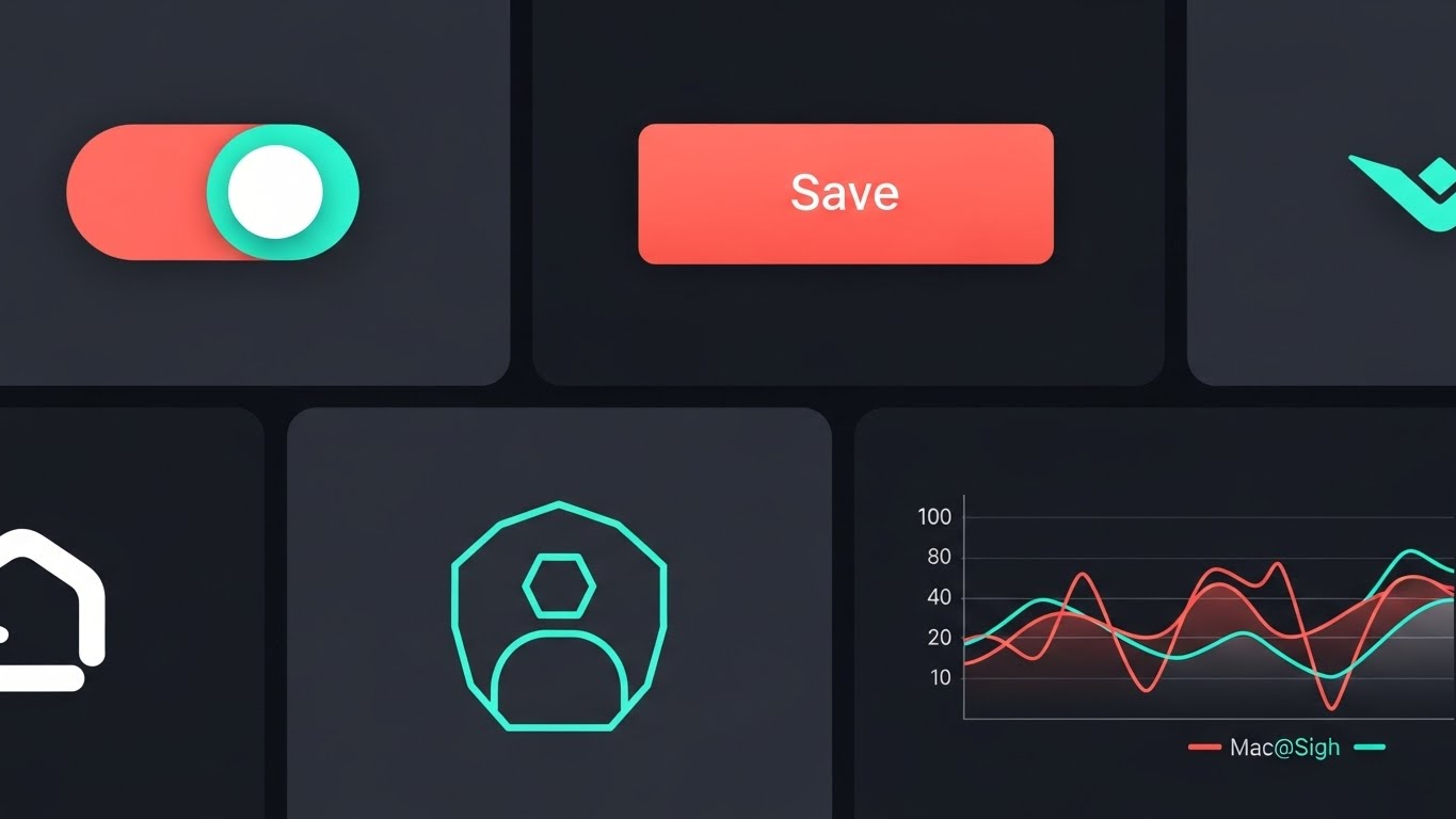
The Visual & Narrative Approach
Onboarding is often where excitement turns into exhaustion. This style reignites the user's momentum by utilizing a dynamic, grid-based collage. Multiple high-value UI interactions—toggles flipping green, graphs spiking, reports generating—are shown activating simultaneously in a synchronized rhythm. The palette is vibrant (Coral, Turquoise, White) against a dark tech background. The narration is punchy and verb-driven: "Configure. Monitor. Optimize. In seconds."
Psychological Impact & KPI Focus
This creates a "Momentum Effect." For a new user feeling overwhelmed by a complex dashboard, seeing rapid, fluid interactions suggests that the software is responsive and easy to master. It combats "Empty State Anxiety" by showing the platform fully populated and active. It visually validates the purchase by demonstrating the sheer breadth of features available at a glance.
- Funnel Stage: Onboarding
- Goal: Self-Serve Onboarding (2.4)
Strategic Implementation & Trade-offs
- Best Use Case: Welcome emails sent immediately after sign-up, "Getting Started" wizard intros, and product update announcements.
- Duration: Short (15-20 seconds).
- Trade-off: It moves too fast to act as a tutorial. It is a motivation tool, designed to get the user to click "Start," not to teach them specific workflows.
Companies using similar video content -
CIM (Connected Infrastructure Management) – Building analytics for existing assets.
Clockworks Analytics – Fault detection for legacy systems.
22. The Tactile Connection
Onboarding | Accelerating TTV

The Visual & Narrative Approach
To counter the feeling that cloud software is "impersonal," this style zooms in to the microscopic level. We see a hyper-realistic 3D render of a fingertip hovering over a glowing "ACTIVATE" button on a glass interface. We see the sub-pixels and the ridges of the fingerprint. When the button is pressed, a ripple of laser-red light visualizes the system's instant response. Narration is intimate and empowering: "One touch. Total control."
Psychological Impact & KPI Focus
This leverages "Haptic Visualization." Even though the user is watching a video, the extreme close-up triggers a sensory response, making the software feel "real," "premium," and "responsive." It builds confidence that the system is listening. It addresses the disconnect often felt between a facility manager and a remote server, making the interaction feel consequential.
- Funnel Stage: Onboarding
- Goal: Accelerating Time-to-Value (1.15)
Strategic Implementation & Trade-offs
- Best Use Case: In-app tooltips, feature highlight reels for mobile apps, and "What's New" modal pop-ups.
- Duration: Micro-shorts (3-5 seconds).
- Trade-off: It is purely aesthetic. It conveys the feeling of quality and responsiveness but provides zero context on the broader workflow or architecture.
Companies using similar video content -
Facilio – O&M Platform – Rapid feature deployment.
Metrikus – Smart Building Platform – Quick insights.
23. The Blueprint Evolution
Onboarding | Reducing Implementation Friction
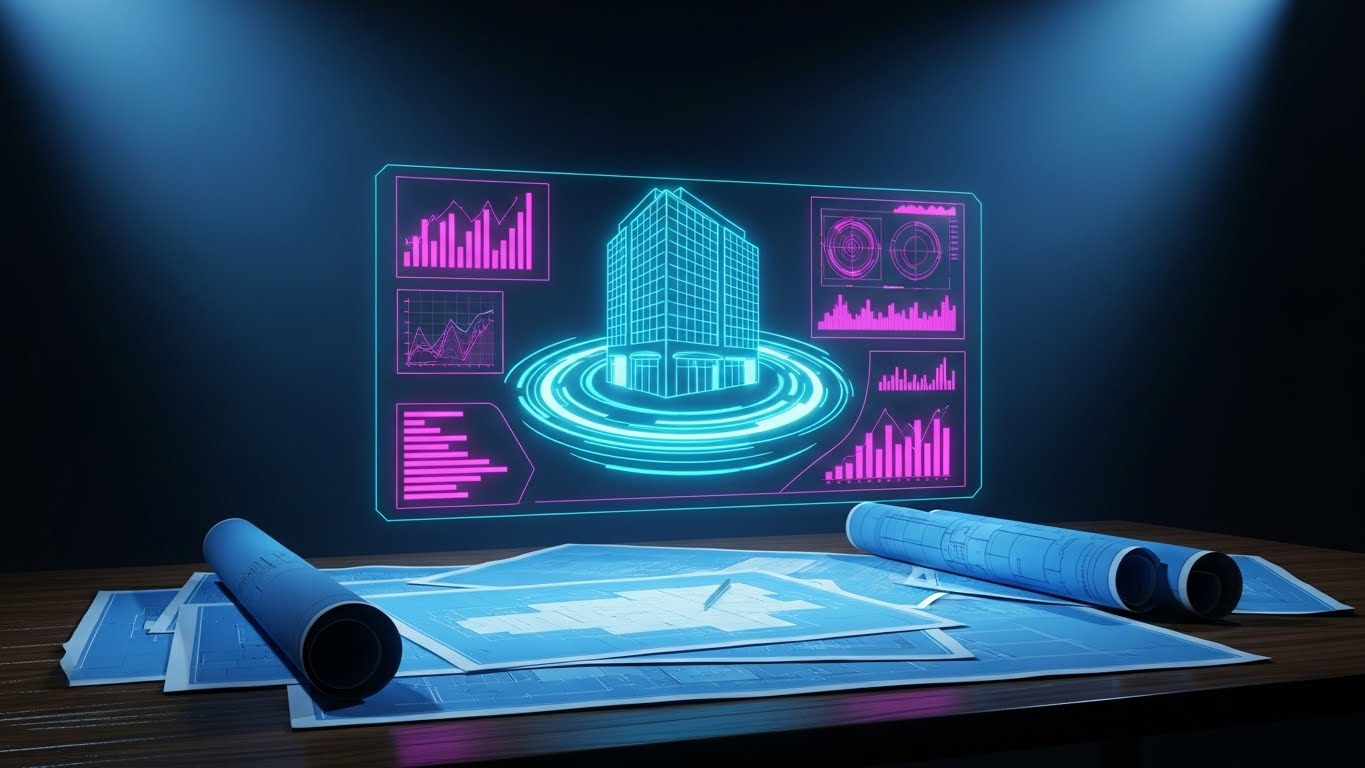
The Visual & Narrative Approach
This style bridges the generational divide in facility management. It begins with a realistic render of a wooden desk covered in rolled-up blue paper blueprints—the "old way." Slowly, a glowing, translucent Cyan hologram of the building rises from the paper, casting a digital light onto the analog surface. Floating metrics appear around the hologram. Narration respects the past while selling the future: "Built on your foundation. Elevated by intelligence."
Psychological Impact & KPI Focus
This appeals to the Traditionalist Stakeholder. It validates their history (the blueprints) rather than dismissing it. By visually showing the digital twin rising from the paper, you position the software as an evolution, not a replacement. This lowers resistance to implementation among staff who fear their traditional skills are becoming obsolete.
- Funnel Stage: Onboarding
- Goal: Reducing Implementation Friction (1.16)
Strategic Implementation & Trade-offs
- Best Use Case: Kick-off meeting presentations and "Migration" guide videos showing how to digitize existing assets.
- Duration: Medium (30-45 seconds).
- Trade-off: Higher production complexity. The lighting interaction between the "physical" 3D render and the "digital" hologram must be perfect to sell the illusion.
Companies using similar video content -
Sharry – Workplace Experience Platform – Mobile-first tenant engagement.
HqO – Tenant Experience Platform – Intuitive mobile interface.
24. The Augmented Technician
Retention | Knowledge Base
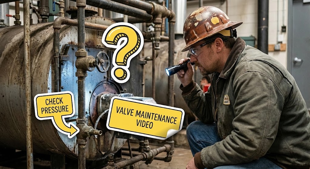
The Visual & Narrative Approach
This style brings the software into the boiler room. It uses high-quality live-action photography or video of a technician in a hard hat inspecting real equipment. Superimposed on this gritty reality are friendly, high-contrast 2D vector icons (Question Marks, Tooltips, Checkmarks) in Yellow and Black. They "stick" to the valves and pipes, mimicking an Augmented Reality (AR) experience. Narration is supportive: "Guidance where you need it. When you need it."
Psychological Impact & KPI Focus
This visualizes Augmented Support. It reassures the field staff that the software isn't just a tool for the boss in the office; it's a helpful companion in the field. It directly addresses the "Knowledge Gap" of junior technicians by showing that information is accessible right at the point of repair.
- Funnel Stage: Retention
- Goal: Knowledge Base & Support (9.1)
Strategic Implementation & Trade-offs
- Best Use Case: Support portal headers, "Troubleshooting" video guides, and mobile app store screenshots.
- Duration: Short loops (10-15 seconds).
- Trade-off: Requires stock footage that matches your specific industry vertical (e.g., healthcare facilities vs. industrial plants) to feel authentic.
Companies using similar video content -
IESVE – Building Performance Analysis – Design to operation.
Honeywell – Forge – Digital transformation for buildings.
25. The Pulse of Occupancy
Retention | Reducing Churn

The Visual & Narrative Approach
To visualize "Occupancy Monitoring," this style uses a hyper-lapse technique. We see a blur of motion—people streaming through a lobby or office. The human activity is chaotic and colorful. Overlayed is a sharp, static, clinical White data grid tracking the "Occupancy Count" in real-time. The contrast between the blurry organic motion and the crisp digital data is the hero. Narration focuses on "patterns," "peak usage," and "space optimization."
Psychological Impact & KPI Focus
This calms the Chaos of Management. Facility managers often feel overwhelmed by the unpredictable flow of tenants. This visual demonstrates that the software sees through the blur. It converts physical chaos into quantifiable data points, reinforcing the value of the software as a tool for clarity and resource planning.
- Funnel Stage: Retention
- Goal: Reducing Churn (1.19)
Strategic Implementation & Trade-offs
- Best Use Case: Quarterly Business Review (QBR) presentations and social media posts highlighting "Year in Review" metrics.
- Duration: Loopable (6-10 seconds).
- Trade-off: If the stock footage is too generic, it fails to resonate. It works best when the environment looks like the client's actual asset class.
Companies using similar video content -
Alerton – Ascent – Mobile BMS access.
Distech Controls – Eclypse – Field service tools.
26. The Human Outcome
Retention | Website Visitor Re-engagement

The Visual & Narrative Approach
Ultimately, buildings are for people. This style pivots away from pipes and wires to show the result of good management. It features high-key, bright photography of a modern, "Biophilic" office filled with plants and natural light. Diverse employees are working comfortably and smiling. The palette is dominated by Sunlight Gold and Fresh Green. Narration is emotive: "Comfort. Productivity. Wellbeing."
Psychological Impact & KPI Focus
This connects the software to Tenant Experience (TenX). It reminds the buyer that energy savings are important, but occupant satisfaction ensures lease renewals. By associating the software with happy, productive humans, you elevate the conversation from "maintenance" to "asset value enhancement."
- Funnel Stage: Retention
- Goal: Website Visitor Re-engagement (5.1)
Strategic Implementation & Trade-offs
- Best Use Case: Email newsletters, renewal pitch decks, and "Success Story" case studies.
- Duration: Static imagery or slow-motion video.
- Trade-off: It can look like a generic insurance ad if not branded correctly. It must be paired with a UI overlay or logo to maintain product relevance.
Companies using similar video content -
Density – Occupancy Monitoring – Real-time space utilization.
VergeSense – Occupancy Sensors – Workplace insights.
27. The Cloud Ecosystem
Expansion | Driving Deep Feature Adoption

The Visual & Narrative Approach
To sell "Cloud Scalability" without being technical, this style uses a playful 2.5D approach. A stylized character (brand colors) hops effortlessly between floating 3D "Cloud" server icons and UI widgets. The background is a dreamy, soft abstract sky. The physics are floaty and light. Narration focuses on "freedom," "expansion," and "limitless growth."
Psychological Impact & KPI Focus
This reduces Migration Anxiety. Moving to the cloud can feel heavy and complex. This visual style makes it look light, easy, and almost fun. It appeals to the "Expander"—the client looking to add more modules or sites. It visualizes the ecosystem as a flexible playground rather than a rigid cage.
- Funnel Stage: Expansion
- Goal: Driving Deep Feature Adoption (1.17)
Strategic Implementation & Trade-offs
- Best Use Case: "New Feature" announcement pop-ups inside the app and upsell email campaigns.
- Duration: Medium (30-60 seconds).
- Trade-off: The whimsical style may not land with "Serious" engineering types, so use it primarily for non-technical users or marketing contexts.
Companies using similar video content -
Comfy (Siemens) – Workplace Experience – Employee comfort.
Robin – Room & Desk Booking – Enhanced workplace experience.
28. The Mobile Commander
Expansion | Driving Upsell/Cross-sell

The Visual & Narrative Approach
Facility management doesn't happen at a desk. This style utilizes a high-quality 3D render of a smartphone held in a hand, superimposed over a blurred background of a mechanical room or a beach (implying remote work). The screen displays the mobile app interface in high definition, with notifications popping up and being swiped away. The motion mimics natural thumb interactions. Narration highlights "control from anywhere," "pocket-sized power," and "un-tethered operations."
Psychological Impact & KPI Focus
This style appeals to the desire for Freedom and Mobility. It visually promises the Facility Manager that they can leave the building without losing control. For the Expansion phase, it drives mobile app downloads and usage frequency. It positions the software as a lifestyle enabler, not just a work tool.
- Funnel Stage: Expansion
- Goal: Increasing Daily Active Users (DAU)
Strategic Implementation & Trade-offs
- Best Use Case: SMS campaigns, App Store preview videos, and footer banners in email signatures.
- Duration: Short (10-15 seconds).
- Trade-off: The UI shown must be the actual mobile responsive view. If the real app is clunky, this video will set false expectations.
Companies using similar video content -
ABB – Ability Building Ecosystem – Scalable cloud solutions.
Tridium – Niagara Framework – Cloud-connected building platform.
29. The Portfolio Forecast
Expansion | Driving Referrals & Advocacy

The Visual & Narrative Approach
To upsell enterprise tiers, you need to show the big picture. This style uses abstract, glowing lines (Gold and Cyan) that form a map of the world, with nodes representing multiple buildings. Data lines shoot upwards from these nodes, converging into a single "Master Dashboard" in the sky. The visual language is grand and cinematic. Narration speaks to "global visibility," "portfolio-wide intelligence," and "predictive asset valuation."
Psychological Impact & KPI Focus
This targets the Executive Buyer during renewal or expansion discussions. It shifts the conversation from "maintaining a building" to "optimizing a portfolio." It visualizes the ROI of scaling the software across all properties. It triggers the "Empire Building" instinct of Real Estate Directors, positioning the software as the command center for their entire domain.
- Funnel Stage: Expansion
- Goal: Cross-Sell / Multi-Site Rollout
Strategic Implementation & Trade-offs
- Best Use Case: Annual renewal presentations, Executive Briefing Centers, and "Enterprise" landing pages.
- Duration: Cinematic (30-60 seconds).
- Trade-off: It is abstract and high-level. It offers no value to the single-site operator.
Companies using similar video content -
Equiem – Tenant Experience App – Remote building interaction.
Brivo – Access Control – Mobile security management.
30. The AI Concierge
Expansion | Proactive Support

The Visual & Narrative Approach
The final style represents the bleeding edge. It uses a hyper-realistic, AI-generated video of a Customer Support Agent. She looks directly at the camera, blinking and breathing naturally, set against a blurred high-tech control room. She speaks with perfect lip-sync, offering proactive advice. The lighting is studio-quality. Narration is conversational: "I noticed a pressure anomaly in Zone 4. Here is the recommended fix."
Psychological Impact & KPI Focus
This redefines Support Scalability. It offers the warmth of human connection with the instant availability of a bot. It creates a "Concierge Experience" for every user, regardless of their tier. It signals that the company is at the forefront of AI technology, reinforcing market leadership.
- Funnel Stage: Expansion/Support
- Goal: Proactive Support (9.2)
Strategic Implementation & Trade-offs
- Best Use Case: Personalized video updates sent via email or embedded in the dashboard as a "Morning Briefing."
- Duration: Variable (Dynamic generation).
- Trade-off: The "Uncanny Valley" risk is real. The generation quality must be flawless, or it will feel creepy rather than helpful.
The Visual Operations Doctrine: A Strategic Knowledge Base
Having explored 30 distinct visual styles, one truth becomes clear: In the world of invisible infrastructure, visibility is value. However, creating a library of pretty videos is not a strategy. To truly leverage these assets, Building Management Software providers must integrate them into a cohesive "Visual Operating System."
This final section synthesizes the insights from all 30 examples into a three-part strategic framework designed to drive adoption, efficiency, and ROI.
Strategic Alignment & Visual Architecture
The "Pre-Production" Strategy – Designing for the Brain
Before a single frame is rendered, the visual architecture must be defined. The goal is to reduce the "Cognitive Load" of the user who is often managing critical systems under pressure.
- The Cognitive Load Audit: Review your current training materials. If a concept takes 3 paragraphs to explain (e.g., "Predictive Chiller Maintenance"), it is a candidate for Style 9 (X-Ray) or Style 2 (Line Art). Map every complex feature to a simplifying visual style.
- Role-Based Visual Mapping: Do not show the same video to the CFO and the Facility Manager. Use Style 17 (Executive Insight) for the boardroom to sell value, and Style 24 (Augmented Technician) for the boiler room to ensure compliance.
- The "Glanceability" Standard: In a control room, operators have seconds to react. Visuals (like Style 15 Command Center) must be designed for "Glanceability"—instant comprehension without reading text.
- Brand Voice Consistency: A BMS often consists of disparate modules acquired over time. Use a unified visual language (e.g., the Electric Blue of Style 2) to visually stitch these modules into a cohesive platform.
- The Advids Strategic Audit: Partnering with a specialized agency like Advids allows for an external audit of your visual assets. We help define this "Visual Operating System" before production begins, ensuring every asset builds toward a unified brand perception.
- Standardization vs. Customization: For core features (Login, Dashboard), use standardized styles (Style 21). For unique selling propositions (Proprietary AI), invest in bespoke, high-end visualization (Style 8).
- The Cross-Departmental Bridge: Sales uses "Blueprints" (Style 2) to promise structure. Support uses "X-Rays" (Style 9) to explain faults. Ensure the visual metaphors align so the customer experience is seamless from sale to support.
- Legacy System Integration: Visualizing the connection between old hardware and new software is critical. Use Style 20 (Transformation) to visually prove that your digital layer respects and enhances their physical assets.
- Accessibility in Operations: Your user base is diverse. Visuals relying on motion and iconography (Style 11) transcend language barriers better than text-heavy manuals, crucial for global facility teams.
- The Mobile-First Mandate: Facility Managers are mobile. All styles, especially Style 24 and Style 25, must be legible on a smartphone screen, not just a desktop monitor.
Operational Adoption & Implementation
The "Deployment" Phase – Embedding Visuals into Workflow
A video sitting in a marketing folder is useless. It must be injected into the user's daily workflow to drive behavior change.
- Overcoming "Big Brother" Anxiety: When introducing monitoring sensors, use empathetic styles like Style 3 (Organic Vector) to frame the technology as "protective" (health/safety) rather than "intrusive" (surveillance).
- The Micro-Learning Shift: Replace the 50-page PDF manual with a library of 30-second clips using Style 21 (Rapid Montage) and Style 22 (Macro UI). This "Just-in-Time" learning reduces onboarding friction.
- Just-in-Time Support: Embed Style 24 (Augmented) videos directly into the software’s "Help" section. When a user is stuck on a specific valve configuration, the relevant visual guide should appear contextually.
- Gamification of Efficiency: Use Style 7 (ROI Dashboard) visuals to show teams their energy savings in real-time. Visualizing progress motivates staff to adhere to sustainability goals.
- Reducing Support Ticket Volume: There is a direct correlation between proactive visual guides (Style 11 Isometric Workflow) and reduced Level 1 support tickets. If users can "see" the fix, they don't call the helpdesk.
- Remote Onboarding: For distributed portfolios, use Style 4 (Total Control) and Style 13 (Digital Twin) to virtually tour and train staff on new interfaces without flying trainers to every site.
- Visualizing Standard Operating Procedures (SOPs): Text-based SOPs are ignored. Convert critical safety protocols into Style 15 (Red Alert) animations that demand attention and ensure compliance.
- Feedback Loops: Use interactive video elements (e.g., branching paths in Style 11) to let users choose their learning path, gathering data on which features confuse them most.
- Scalable Localization: When expanding globally, styles like Style 18 (Clean UI) and Style 6 (Low Poly) rely on universal symbols rather than on-screen text, drastically reducing localization costs.
- Leadership Communication: Use high-end Style 14 (Financial Narrative) videos to help your Facility Manager champions sell your software's value up the chain to their own leadership.
Measuring Impact & Future-Proofing
The "ROI" Phase – Metrics and Evolution
To sustain investment in visualization, you must prove its value. This moves the conversation from "Creative Costs" to "Operational Returns."
- Beyond "Views": Measure success not by video views, but by Time-to-Competency. Did the new visual onboarding reduce the average training time from 2 weeks to 3 days?
- The "Idle Time" Metric: Correlate the deployment of Style 22 (Micro-Interactions) with reduced "idle time" in the app. Better visuals mean users find what they need faster.
- Compliance Velocity: Measure how quickly new regulations (e.g., Carbon Disclosure) are adopted. Videos using Style 1 (Green Energy) can accelerate the understanding of new ESG reporting requirements.
- Retention and Churn: High-quality UX visualization (Style 26 Human Outcome) reinforces the premium nature of the product. Measure Customer Lifetime Value (CLV) against users who consume this content vs. those who don't.
- The AI Visual Frontier: Prepare for Style 30 (Gen AI). The future is real-time, personalized video support generated on the fly. Start building the data structure for this now.
- Scalability of Assets: Build a library of "Atomic Visual Units" (icons, 3D models from Style 6). These assets can be remixed for future videos, lowering the cost of production over time.
- The Advids Partnership: As your feature set grows, so must your visual library. Advids acts as the long-term custodian of your visual brand, ensuring that as you scale from Style 1 to Style 30, the quality and strategic alignment remain unbreakable.
- Benchmarking Success: "Good enough" visuals are a competitive risk in a market valued at $103 billion. Compare your visual standard against the Style 12 (Edge Computing) of top competitors.
- The ROI of Safety: For industrial clients, quantify the reduction in safety incidents or insurance premiums achieved through better visual safety training using Style 15.
- Final Call to Innovation: Treat video not as "content," but as infrastructure. Just as you invest in servers and sensors, invest in the visual layer that makes that infrastructure intelligible. It is the interface between machine logic and human action.
Companies using similar video content -
Johnson Controls – OpenBlue – Portfolio-wide optimization.
Siemens – Building X – Holistic portfolio management.
Author & Editor Bio


