
 /home/wwwroot/advids.co/design/index.php on line 425
Introduction: Visualizing the Invisible
The era of "Dark Data"—where vast reserves of enterprise information sit unanalyzed and undervalued—is coming to a close. For the modern enterprise, the challenge is no longer about gathering data; it is about clarifying it. As we transition from simple reporting to predictive intelligence, the ability to visualize complex abstractions becomes a primary driver of competitive advantage. We are not just building software; we are building the lens through which organizations see their own future.
However, the gap between infrastructure and adoption remains a critical friction point. Recent industry benchmarks reveal that data silos hinder transformation for 81% of IT leaders, creating fragmented truths that stall decision-making. The financial impact of this fragmentation is severe. Analysts estimate the cost of poor data quality is now $12.9 million annually for the average organization. This is the "Chaos Tax" paid by businesses that fail to bridge the divide between their back-end complexity and their front-end user experience.
This guide presents a strategic framework for closing that gap. We have curated specific visualization styles—mapped to the B2B buyer's journey—designed to reduce cognitive load, accelerate stakeholder buy-in, and position your Business Intelligence platform not as a tool, but as the "Single Source of Truth." By leveraging advanced visual styles—from abstract organic metaphors that signify unification to low-poly geometries that visualize integration—we can transform technical features into compelling business narratives.
Let us explore how to turn data into a visual language that resonates, convinces, and converts.
1. The Fluid Truth Integration
TOFU | Brand Awareness

The Visual & Narrative Approach
This style abandons rigid grids for a fluid, metaphorical approach. The visualization centers on a "Clinical White" void where abstract shapes, rendered in a glossy "Electric Cyan" and liquid mercury finish, effortlessly merge. These organic forms represent disparate data sources losing their hard edges to become one unified entity. The narrative tone is sophisticated and serene, using the smooth coalescence of the liquid glass to symbolize the removal of friction in data ingestion.
Psychological Impact & KPI Focus
- Niche Psychology: The target persona often associates data integration with "clunky" breakage and error messages. This fluid aesthetic acts as a psychological balm, promising a frictionless, error-free experience (The "Zen" of Data).
- Operational Impact: It visually solves the "Silo" problem without showing a single server rack. It shifts the KPI focus from "Integration Speed" (technical) to "Unified Clarity" (strategic).
Strategic Implementation & Trade-offs
- Best Use Case: High-level brand films or social ads (Instagram/LinkedIn) where you need to stop the scroll with aesthetic beauty rather than technical screenshots.
- Duration: 15 Seconds (Loop).
- Trade-off: This style is purely aspirational. It does not show how the integration happens, only the result of it. Avoid using this for technical demos or user onboarding.
Companies using similar video content -
Snowflake – Data Cloud – Unifying diverse data for seamless analytics.
HashiCorp – Terraform – Fluid animations representing Infrastructure as Code.
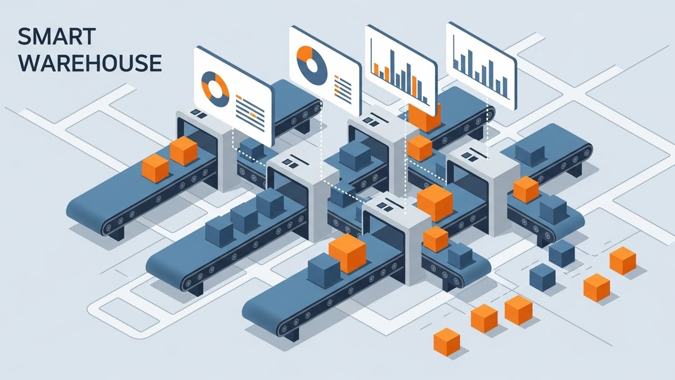
2. Bridging the Geometric Void
TOFU | Market Education

The Visual & Narrative Approach
Set in a bright, infinite void, this scene uses Low-Poly 3D modeling to depict the reality of enterprise infrastructure. Isolated islands of "Slate Grey" rock float in the air, each hoarding clusters of "Vivid Orange" data blocks. The narrative arc visualizes the solution: translucent glass bridges rapidly form between these islands, allowing the orange blocks to flow freely. The aesthetic is matte and clean, turning the abstract concept of "API Connectivity" into a tangible civil engineering project.
Psychological Impact & KPI Focus
- Niche Psychology: "Islands" are a perfect metaphor for the isolation departments feel (Marketing vs. Sales vs. Product). Seeing them connected triggers a sense of relief and organizational wholeness (Gestalt Psychology).
- Operational Impact: This directly addresses the 81% of leaders struggling with silos. It visualizes the "Bridge" between legacy systems (the grey islands) and modern agility (the glass paths).
Strategic Implementation & Trade-offs
- Best Use Case: Explainer videos on LinkedIn that target CTOs. The 16:9 format works well for desktop viewing where the detail of the "bridges" can be appreciated.
- Duration: 30 Seconds.
- Trade-off: Low-poly can sometimes feel "playful" or "indie game-like." Ensure the lighting is premium and the physics are grounded to maintain B2B authority.
Companies using similar video content -
Fivetran – Data Connectors – Connecting disparate data sources with ease.
Denodo – Data Virtualization – Bridging enterprise data silos virtually.
3. The Precision Refining Engine
TOFU | Shaping Brand Perception
The Visual & Narrative Approach
This style utilizes an Isometric 2D Motion Design perspective to map out the "ETL" (Extract, Transform, Load) process. On a clean white canvas, a complex "Mint Green" and "Cool Grey" factory pipeline is assembled. We watch as raw, chaotic shapes (squares, jagged rocks) enter the left side, pass through a "Refining" chamber, and emerge as perfect, glowing spheres on the other. The motion is rhythmic and clockwork-like, devoid of gradients to emphasize engineering precision.
Psychological Impact & KPI Focus
- Niche Psychology: Engineers and Architects love structure. This visual validates their need for order and predictability. It treats data processing not as magic, but as a reliable manufacturing process.
- Operational Impact: It highlights "Data Governance" and "Quality Assurance." The visual transformation from "Jagged" to "Sphere" is a powerful shorthand for "Cleansing Dirty Data."
Strategic Implementation & Trade-offs
- Best Use Case: Website "How it Works" pages or Product Feature sections. It simplifies complex architecture into a digestible diagram.
- Duration: 45 Seconds.
- Trade-off: Isometric views can become cluttered if too many elements are introduced. Keep the pipeline linear and the color palette restricted to 2-3 tones to avoid cognitive overload.
Companies using similar video content -
Databricks – Lakehouse Platform – Refining raw data into structured insights.
Talend – Data Fabric – Precision engineering for data integration and quality.
4. The Skyscraper of Scalability
TOFU | Category Creation

The Visual & Narrative Approach
Tailored for the vertical (9:16) screen, this style uses a dramatic "worm's eye view" to visualize growth. We see bar charts represented not as flat graphics, but as towering skyscrapers made of "Purple Glass." They rise rapidly from a reflective white ground towards a bright sky. The camera movement is upward and accelerating, emphasizing the sheer scale of data volume the platform can handle without crashing.
Psychological Impact & KPI Focus
- Niche Psychology: The fear of "crashing under load" is real for CDOs. This visual projects stability and infinite headroom. It says, "Throw as much data as you want at us; we will just build higher."
- Operational Impact: It reinforces the "Cloud-Native" narrative and scalability KPIs. The transparency of the glass suggests there is nothing to hide—performance is clear and robust.
Strategic Implementation & Trade-offs
- Best Use Case: TikTok or Instagram Reels. The vertical motion matches the user's scrolling behavior, creating a seamless viewing experience.
- Duration: 9-12 Seconds.
- Trade-off: The 9:16 aspect ratio limits the horizontal context. You cannot show a timeline easily; focus purely on the metric of "Growth" or "Volume" (Y-axis).
Companies using similar video content -
Qlik – Sense – Visualizing unlimited data growth with dynamic charts.
VMware – Cloud Foundation – Scaling cloud infrastructure for massive data.
5. The Velocity of Insight
TOFU | Product Differentiation

The Visual & Narrative Approach
This style is designed to hook the viewer in the first 3 seconds. Massive, 3D extruded block letters spelling "SPEED" dominate the screen. They are painted in "Caution Yellow" with "Jet Black" sides, flying through a bright white wind tunnel. A fisheye lens effect exaggerates the motion blur, making the text feel like it is rushing past the viewer. The narrative is visceral: it’s not about reading; it’s about feeling the latency reduction.
Psychological Impact & KPI Focus
- Niche Psychology: In a world of loading spinners, "Instant" is the ultimate luxury. This style triggers the dopamine hit of immediate gratification (Preattentive Processing).
- Operational Impact: It targets the "Real-Time Analytics" value proposition. It positions the platform as a high-performance engine, differentiating it from legacy, batch-processing competitors.
Strategic Implementation & Trade-offs
- Best Use Case: YouTube Pre-roll ads (5-15 seconds). The audio design (whooshes, jet engine hums) is critical here to match the visual energy.
- Duration: 6 Seconds (Bumper).
- Trade-off: Kinetic typography conveys energy, not information. Use it to tease a benefit (Speed), not to explain a feature.
Companies using similar video content -
Confluent – Kafka Platform – Delivering real-time data streaming with speed.
ThoughtSpot – Search & AI-driven Analytics – Instant answers from live data.
6. The Geometric Funnel
TOFU | Vertical Social

The Visual & Narrative Approach
Moving to the Middle of the Funnel, clarity becomes paramount. This style uses a minimalist flat 2D vector aesthetic on a "Paper White" background. A central red funnel icon acts as the processor. Geometric "Navy Blue" shapes (squares, jagged triangles) are pouring into the top, and perfect, uniform gold circles are dropping out of the bottom. The style is strictly flat with zero shadows, distilling the concept of "Lead Conversion" to its simplest geometric form.
Psychological Impact & KPI Focus
- Niche Psychology: Marketing Directors worry about "Leaky Funnels." This visualization offers a comforting promise of 100% capture and standardization. It implies a systematic approach to revenue.
- Operational Impact: It visualizes "Lead Scoring" and "Data Standardization." The uniformity of the gold circles suggests high-quality, actionable output.
Strategic Implementation & Trade-offs
- Best Use Case: Google Display Network (GDN) ads or sidebar banners. The high contrast (Red/Blue/Gold on White) ensures readability even at small thumbnail sizes.
- Duration: Static or Simple GIF.
- Trade-off: It is highly abstract. It assumes the viewer understands the "Funnel" metaphor. Avoid using this for audiences outside of Sales/Marketing/BI leadership.
Companies using similar video content -
Alteryx – Analytic Process Automation – Streamlining data for lead conversion.
Mixpanel – Product Analytics – Optimizing user funnels for conversion.
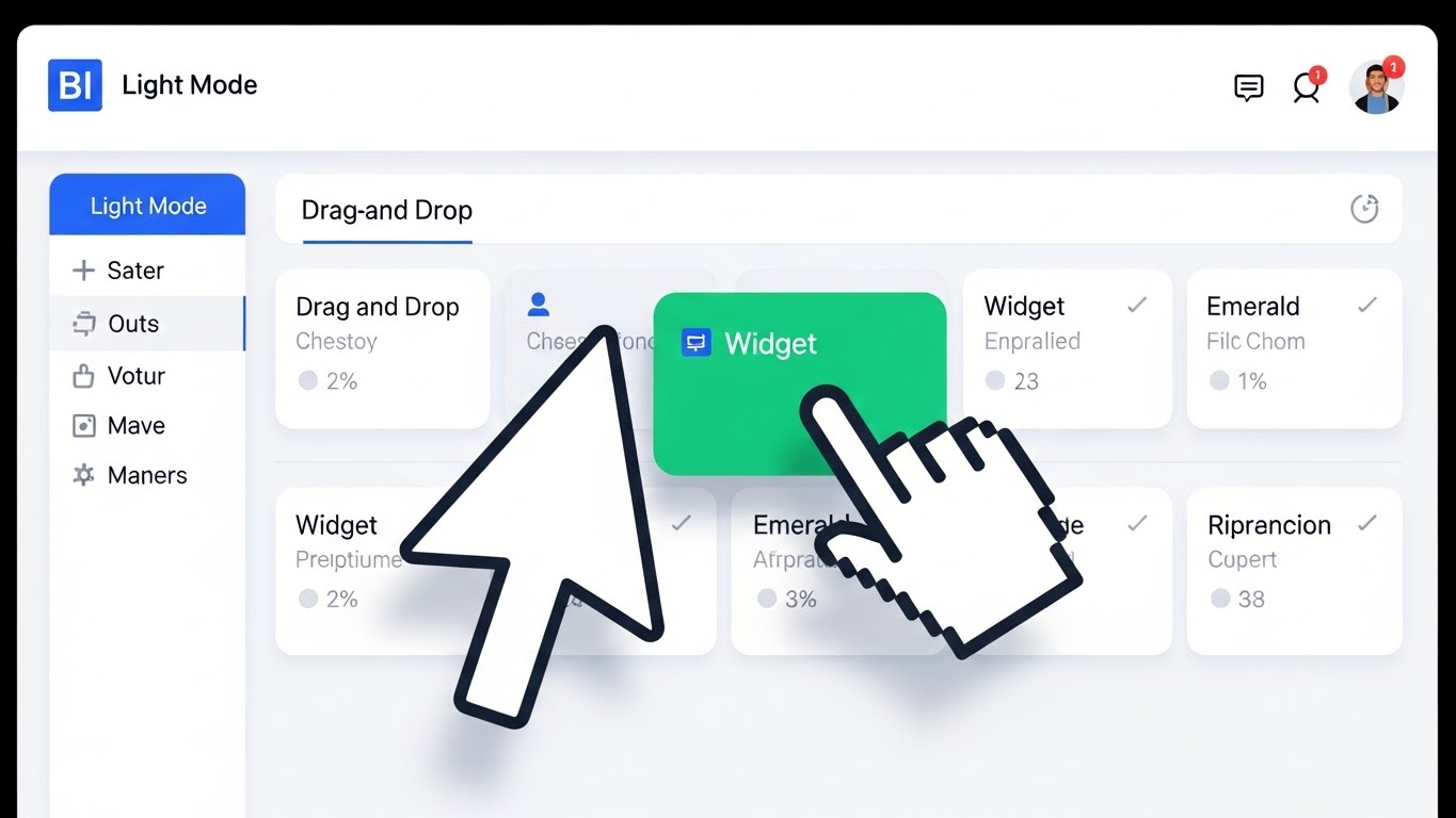
7. The Drag-and-Drop Symphony
TOFU | Skippable Pre-Roll Ad
The Visual & Narrative Approach
This style shifts from metaphor to reality. It features a photorealistic close-up of a computer monitor displaying a "Light Mode" BI interface. The screen is predominantly white and light grey. A stylized cursor is dragging a "Widget" card (Emerald Green) onto a dashboard grid, snapping it into place. The lighting is soft and diffuse, simulating a high-end studio environment. The image focuses on the intuitive "Drag-and-Drop" functionality.
Psychological Impact & KPI Focus
- Niche Psychology: The "Architect of Clarity" wants to empower non-technical users. Showing a simple drag-and-drop interaction alleviates the fear that the tool requires SQL coding skills (Social Proof of Usability).
- Operational Impact: It proves "Ease of Adoption" and reduced training costs. It visualizes the democratization of data—anyone can build a report.
Strategic Implementation & Trade-offs
- Best Use Case: Email newsletters to free-trial users or product update announcements. It effectively teaches a specific mechanic (interaction).
- Duration: 15-20 Seconds.
- Trade-off: Authenticity is key. The UI shown must match the actual product. "Fake UI" in this style erodes trust immediately.
Companies using similar video content -
Domo – Business Cloud – Empowering users with intuitive drag-and-drop dashboards.
Pendo – Product Experience Platform – Guiding users with self-service UI.
8. The Optimized Reality Split
MOFU | Demand Gen

The Visual & Narrative Approach
A split-screen composition. The left half shows a desaturated, messy office desk covered in stacks of paper (The Old Way). The right half shows a pristine, brightly lit white desk with only a sleek tablet displaying a colorful "Vivid Blue" dashboard (The New Way). A sharp vertical line divides the two. This visualizes the contrast between "Manual Chaos" and "Digital Order."
Psychological Impact & KPI Focus
- Niche Psychology: This plays on the "Pain vs. Gain" framework. It validates the user's current frustration (the mess) and offers an immediate visual escape (the tablet). It frames the competitor's solution as "clutter."
- Operational Impact: It visualizes "Efficiency Gains" and "Paperless Operations." It is a direct representation of the "Before/After" transformation promised by the software.
Strategic Implementation & Trade-offs
- Best Use Case: LinkedIn carousel ads or competitive comparison landing pages. The visual contrast communicates the value proposition without a single word of copy.
- Duration: Static or Slide Compare.
- Trade-off: It can feel cliché if overused. Ensure the "Messy" side doesn't look comically exaggerated; it should look like a realistic, stressful office environment to resonate.
Companies using similar video content -
ServiceNow – IT Workflows – Transforming manual processes to digital efficiency.
11. The Human Integration Layer
MOFU | ABM Awareness

The Visual & Narrative Approach
This style brings a human element to the often-intimidating concept of "System Integration," tailored for Account-Based Marketing (ABM) campaigns. Using a clean, flat 2D vector aesthetic, we see a stylized female character—dressed in approachable "Tangerine Orange"—standing beside a server rack. She effortlessly plugs in a "Glowing Blue" cable, illuminating the path to a central hub. The background is a simplified, tech-corporate grey. The narrative humanizes the IT manager's role, portraying integration not as a battle, but as a simple, satisfying connection.
Psychological Impact & KPI Focus
- Niche Psychology: IT buyers targeted in ABM often feel like "mechanics" fixing broken engines. This style casts them as the "hero of connectivity." It creates a sense of competence and ease, using the character's calm demeanor to signal that the platform plays nicely with existing tech stacks.
- Operational Impact: It visually solves the "Compatibility" objection. The glowing cable serves as a visual metaphor for active, healthy data flow, directly addressing KPIs related to "Implementation Time" and "System Uptime."
Strategic Implementation & Trade-offs
- Best Use Case: Personalized LinkedIn ads targeting specific accounts (e.g., "Connect [Company Name]'s Data in Seconds"). The character style feels bespoke and friendly.
- Duration: 15-30 Seconds.
- Trade-off: Character animation can sometimes feel "too soft" for hardcore enterprise architects. Ensure the server rack and tech elements look accurate enough to maintain credibility.
Companies using similar video content -
Cisco Meraki – Cloud-managed IT – Visualizing network transformation from old to new.
12. The Alignment Signal
MOFU | The Functional Buyer

The Visual & Narrative Approach
Business Intelligence is a team sport. This style uses a bright, pastel-toned 2D animation to visualize organizational alignment. A diverse group of three professionals is depicted high-fiving in a modern, white-walled office. Floating prominently above them is a semi-transparent UI window displaying a "Green Upward Arrow" graph. The color palette utilizes soft "Lavender" and "Sky Blue" to evoke calmness and collaboration. The narrative shifts the focus from the software itself to the outcome of the software: a unified team celebrating a win.
Psychological Impact & KPI Focus
- Niche Psychology: The "Functional Buyer" (e.g., VP of Sales) fears that new software will cause friction or adoption resistance. This visual provides "Social Proof" of team cohesion. It promises that the platform brings people together rather than driving them apart.
- Operational Impact: It targets "User Adoption" and "Cross-Departmental Collaboration." The shared view of the data (the floating graph) visually reinforces the concept of a "Single Source of Truth" that eliminates conflicting reports.
Strategic Implementation & Trade-offs
- Best Use Case: YouTube mid-roll ads or "Culture" pages on the website. It works well to humanize the brand during the evaluation phase.
- Duration: 30 Seconds.
- Trade-off: It is light on technical detail. Use this to sell the culture of data-driven decision-making, not the specific features of the dashboard.
Companies using similar video content -
Siemens MindSphere – Industrial IoT – Bridging operational technology with IT.
13. The Fortress of Trust
MOFU | Building Trust

The Visual & Narrative Approach
Security is the ultimate gatekeeper in B2B. This style pivots to a heavy, Photorealistic 3D Render to communicate impenetrability. We see a massive, circular bank vault door made of heavy "Brushed Steel" and industrial mechanisms. The door is slightly ajar, revealing a blindingly bright white light and a glimpse of a pristine server rack inside. The environment is a clean, cold marble hall. The visual weight of the steel door metaphorically weighs against the lightness of cloud data, grounding the concept of "Encryption" in something physically unbreakable.
Psychological Impact & KPI Focus
- Niche Psychology: For the CISO (Chief Information Security Officer), data is a liability if not protected. This image speaks their language: Fortress, Vault, Lock. It alleviates the anxiety of data breaches by visualizing the platform as a physical stronghold.
- Operational Impact: It directly visualizes "SOC 2 Compliance" and "Data Governance." It shifts the conversation from "features" to "risk mitigation," which is often the final hurdle in enterprise deals.
Strategic Implementation & Trade-offs
- Best Use Case: The "Security" or "Trust Center" page of your website. It is also a powerful image for slide decks presented to Legal/Compliance teams.
- Duration: Static Image or Slow Cinematographic Pan (10 sec).
- Trade-off: It is somewhat cold and impersonal. Use it strictly for security validation, not for general user engagement.
Companies using similar video content -
UiPath – Automation Platform – Humanizing RPA for seamless system integration.
Gainsight – Customer Success Platform – Connecting teams for integrated customer views.
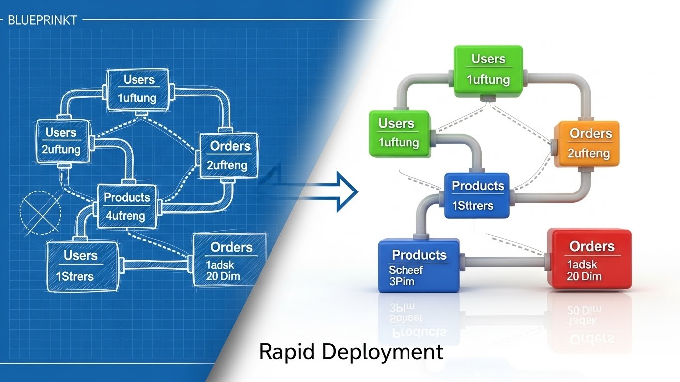
14. The Velocity Blueprint
MOFU | Reducing Friction
The Visual & Narrative Approach
This style visualizes the speed of deployment. It employs a split-screen or wiping transition effect. The left side displays a complex "Blueprint Blue" wireframe sketch of a database schema on a grid—representing the planning phase. A diagonal wiping effect transitions this aggressively to the right side, which reveals a fully rendered, colorful 3D visualization of the same data structure in "Glossy Plastic" textures (Green, Blue, Orange nodes). The narrative is clear: with this platform, you move from "Plan" to "Product" instantaneously.
Psychological Impact & KPI Focus
- Niche Psychology: "Vaporware" and long implementation cycles are major fears. This visual style validates the "Rapid Prototyping" capability. It appeals to the "Builder" persona who wants to see their ideas materialize quickly.
- Operational Impact: It targets the "Time-to-Value" (TTV) KPI. It visually demonstrates that the distance between a raw idea (wireframe) and a functional dashboard (render) is minimal.
Strategic Implementation & Trade-offs
- Best Use Case: Website hero backgrounds or feature sections describing "No-Code" or "Low-Code" capabilities.
- Duration: Loop (5-8 Seconds).
- Trade-off: It focuses on the setup phase, not the usage phase. It is most effective when addressing objections about implementation timelines.
Companies using similar video content -
Dataiku – Everyday AI Platform – Aligning teams with shared AI insights.
Workday – Enterprise Management Cloud – Fostering team harmony with unified data.
15. The Augmented Assurance
MOFU | Overcoming Objections

The Visual & Narrative Approach
To bridge the gap between human intuition and digital validation, this style overlays 2D vector graphics onto high-quality live-action photography. We see a professional male sitting at a desk in a sunlit office, leaning back with a genuine smile of relief. Pop-up 2D vector graphics—specifically "Green Checkmarks" and "Blue Shield Icons"—float in the air around him. The graphics are flat and bright, contrasting with the realistic depth of the photo. This visualizes the invisible "safety net" the software provides.
Psychological Impact & KPI Focus
- Niche Psychology: Analysts live in fear of making a wrong recommendation based on bad data. The floating "Checkmarks" act as a psychological endorsement, signifying "System Verified." It visualizes confidence and stress reduction.
- Operational Impact: It highlights "Automated Error Detection" and "Data Quality Scores." The visual suggests that the software is actively working in the background to protect the user from mistakes.
Strategic Implementation & Trade-offs
- Best Use Case: Social video ads (Facebook/Instagram) targeting mid-level managers. The human element stops the scroll, and the graphics explain the benefit.
- Duration: 15 Seconds.
- Trade-off: Requires high-quality stock footage or custom shoots. Bad stock photography can make this look cheesy and reduce brand trust.
Companies using similar video content -
Collibra – Data Governance Center – Building trust with robust data security.
Varonis – Data Security Platform – Protecting sensitive data like a digital vault.
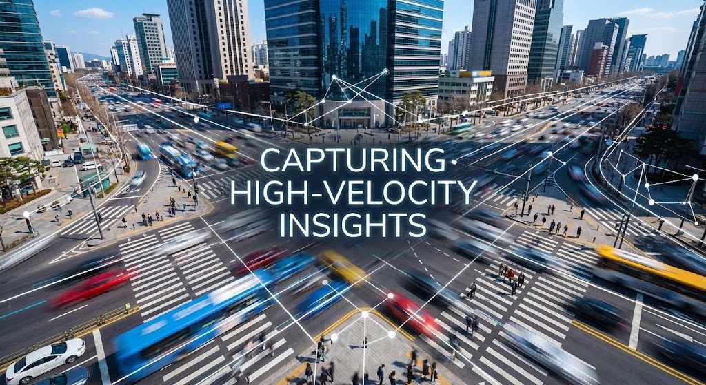
16. The Pulse of Reality
MOFU | Sales Cycle Acceleration
The Visual & Narrative Approach
This style moves the context out of the office and into the real world. It utilizes a hyper-lapse of a busy city intersection during the day, where traffic and pedestrians are blurred streaks of color. Overlaying this chaotic motion are sharp, static "White" data lines and nodes, mapping the movement with precision. The contrast between the organic, blurred motion (the market) and the sharp, stable data lines (the platform) symbolizes the ability to find clarity in chaos.
Psychological Impact & KPI Focus
- Niche Psychology: Decision-makers feel the market moving faster than they can react. This visual validates their need for "Real-Time" awareness. It suggests the platform is a stabilizing force in a chaotic world.
- Operational Impact: It visualizes "High-Velocity Data Ingestion" and "IoT/Edge Analytics." It implies that the platform can handle massive, messy datasets from the real world without blinking.
Strategic Implementation & Trade-offs
- Best Use Case: LinkedIn Stories or background video for "Industries" pages (e.g., Logistics, Retail, Smart Cities).
- Duration: 10-15 Seconds.
- Trade-off: It is metaphorical. If your BI tool doesn't actually handle geospatial or real-time streaming data, this visual might overpromise.
Companies using similar video content -
StreamSets – DataOps Platform – Rapidly deploying data pipelines from blueprint to reality.
Yellowbrick Data – Data Warehouse – Accelerating time-to-value for analytics.
17. The Tangible Insight
MOFU | Driving Demo Requests

The Visual & Narrative Approach
Designed to drive action (Demo Requests), this style creates a craving for interaction. A medium shot captures a confident businesswoman in a glass-walled conference room. She points her finger into the air, interacting with a floating, futuristic AR pie chart rendered in "Coral" and "Navy." The background is bright but out of focus. The visual suggests that data is not just to be read, but to be touched and manipulated.
Psychological Impact & KPI Focus
- Niche Psychology: This triggers the "Endowment Effect"—the idea that we value things more when we feel we own or touch them. By showing a human touching the data, it makes the software feel tangible and accessible, lowering the barrier to entry.
- Operational Impact: It emphasizes "Interactive Dashboards" and "Drill-Down Capabilities." It promises a move away from static PDF reports to dynamic, living data exploration.
Strategic Implementation & Trade-offs
- Best Use Case: Retargeting ads for users who visited the pricing page but didn't convert. The call to action is implicit: "Come touch this."
- Duration: Static or Micro-motion (chart segments expanding).
- Trade-off: Like Style 15, the integration of the UI overlay must be perfect. If the perspective tracking is off, it looks like a cheap filter.
Companies using similar video content -
Salesforce – CRM – Providing peace of mind with verified data insights.
HubSpot – CRM Platform – Assuring data quality for confident decision-making.
18. The Ecosystem at a Glance
MOFU | Driving Freemium/Trials
The Visual & Narrative Approach
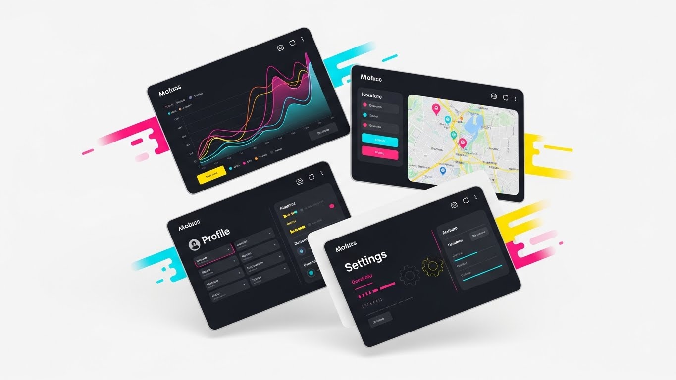
When the goal is to show value density, this style uses a collage technique. A grid of four tilted UI screens floats against a clean white background. The screens display different aspects of the platform: a geospatial map, a line graph, a user profile, and a settings gear. They are vibrant, utilizing a "Rainbow" palette to differentiate modules. Motion lines suggest they are flying into place, assembling a complete picture. This visual shorthand communicates "All-in-One" functionality.
Psychological Impact & KPI Focus
- Niche Psychology: Buyers fear "Feature Poverty" in trial versions. This visual overwhelms that fear with abundance. It suggests that even the trial version is packed with powerful tools (Map, Graph, Admin).
- Operational Impact: It visualizes the "Holistic Suite" vs. "Point Solution." It encourages users to start a trial by showing them exactly what they will get inside the box.
Strategic Implementation & Trade-offs
- Best Use Case: Sidebar banners or the "Thank You" page after a newsletter signup to push for a deeper commitment (Trial).
- Duration: Static Image.
- Trade-off: It can be visually busy. Ensure the UI elements are simplified (abstracted text) so they remain readable at small sizes.
Companies using similar video content -
Splunk – Enterprise Security – Capturing real-time insights from chaotic data.
Dynatrace – Software Intelligence Platform – Monitoring dynamic environments with precision.
19. The Executive Vision
BOFU | ROI Justification

The Visual & Narrative Approach
Moving to the Bottom of the Funnel (BOFU), we address the C-Suite. This cinematic style features a low-angle hero shot of a CEO standing at the head of a boardroom table. The room is flooded with natural light from floor-to-ceiling windows, symbolizing transparency. He holds a tablet displaying a single, "Gold" upward-trending graph. His expression is one of vision and confidence. The aesthetic is premium, successful, and calm—the emotional state of a leader who has mastered their data.
Psychological Impact & KPI Focus
- Niche Psychology: CEOs don't care about features; they care about outcomes. The "Gold Graph" is the ultimate signifier of revenue growth and market dominance. It connects the software directly to the executive's personal legacy and company success.
- Operational Impact: It visualizes "ROI" and "Strategic Oversight." It moves the conversation from "Cost Center" (buying software) to "Profit Center" (enabling growth).
Strategic Implementation & Trade-offs
- Best Use Case: The "Enterprise" landing page or the cover of a case study PDF. It sets the tone for a high-value conversation.
- Duration: Static or Slow Motion Video.
- Trade-off: It is highly aspirational. It must be paired with hard numbers (e.g., "300% ROI") in the copy, otherwise, it feels like empty stock photography.
Companies using similar video content -
Looker (Google Cloud) – BI and Data Platform – Interactive dashboards for hands-on data exploration.
Sisense – Fusion Platform – Empowering users with tangible, interactive analytics.
20. The Developer's Sanctum
BOFU | The Technical Buyer
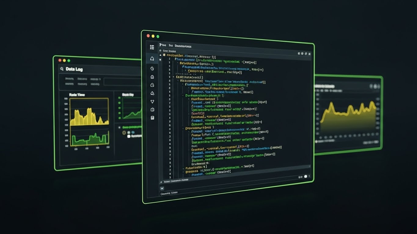
The Visual & Narrative Approach
The final gatekeeper in a B2B deal is often the technical lead. This style ignores the glossy metaphors and goes straight to the code. We see a sleek, high-contrast "Dark Mode" UI showcase. The background is "Deep Charcoal." A code editor window displays syntax-highlighted SQL queries in "Neon Green" and "Electric Blue." A side panel shows a real-time data log. The lighting is minimal and moody, focusing entirely on the precision of the syntax. This is a love letter to the developer.
Psychological Impact & KPI Focus
- Niche Psychology: Developers are skeptical of "black box" tools. They want to know they can look under the hood. This visual signals "Developer Friendly," "Extensible," and "Robust." It respects their preference for dark themes and direct code access.
- Operational Impact: It visualizes "SQL Customization" and "API Access." It proves that the platform is not just a toy for marketers, but a serious tool for data engineers.
Strategic Implementation & Trade-offs
- Best Use Case: Developer documentation portal, "Integrations" page, or technical whitepapers.
- Duration: Static or Typing Animation.
- Trade-off: It alienates non-technical users. Never use this image on the main homepage hero; keep it segmented for the technical audience who will appreciate the details.
Companies using similar video content -
Amplitude – Digital Analytics Platform – Showcasing a holistic suite of product insights.
Heap – Digital Insights Platform – Presenting a comprehensive view of user behavior.
21. The Line of Fiscal Clarity
BOFU | The Economic Buyer

The Visual & Narrative Approach
For the Economic Buyer (CFO), complexity is a risk. This style utilizes a sophisticated "Continuous Line" animation technique. On a textured "White Paper" background, a single, elegant black ink line draws itself across the screen. It forms the outline of a complex cityscape—representing the enterprise infrastructure—before seamlessly morphing into a sharp, rising financial graph. The motion is fluid and uninterrupted, devoid of distracting colors or clutter. It visualizes the direct path from "Operational Complexity" to "Financial Growth."
Psychological Impact & KPI Focus
- Niche Psychology: CFOs value minimalism and precision. They are often skeptical of "flashy" marketing. This stark, black-and-white aesthetic signals "No Fluff." It respects their intelligence and focus on the bottom line.
- Operational Impact: It targets "Total Cost of Ownership (TCO)" and "ROI." The continuous line implies a streamlined process with no breaks or wastage, visually reinforcing the narrative of efficiency and profit maximization.
Strategic Implementation & Trade-offs
- Best Use Case: Executive Summaries in proposal PDFs or final-stage presentation decks for the finance committee.
- Duration: 15-20 Seconds.
- Trade-off: It lacks emotional warmth. It is purely functional and intellectual. Do not use this for user engagement or cultural alignment; keep it strictly for the numbers.
Companies using similar video content -
MicroStrategy – Enterprise Analytics – Empowering executive vision with strategic insights.
SAP Analytics Cloud – Business Intelligence – Guiding leadership towards successful outcomes.
22. The Transparent Core
BOFU | Risk Mitigation

The Visual & Narrative Approach
Trust is built on transparency. This style uses a high-end 3D X-Ray effect to visualize the security architecture. We see a server rack rendered in "Translucent Medical White" plastic. The casing is clear, revealing the internal mechanisms. At the center, a glowing "Blue Crystal" lock mechanism pulses gently, protecting the core data. The environment is a sterile, bright laboratory white. This aesthetic steers away from the dark, "hacker-style" green-on-black tropes, instead presenting security as a matter of hygiene, clarity, and structural integrity.
Psychological Impact & KPI Focus
- Niche Psychology: For Risk Officers, darkness equals concealment. This bright, X-ray visual proves there is nothing to hide. It communicates "Auditability" and "Compliance."
- Operational Impact: It visualizes "Data Encryption" and "System Integrity." It addresses the KPI of "Risk Reduction," positioning the platform as a clean, secure environment for sensitive enterprise data.
Strategic Implementation & Trade-offs
- Best Use Case: Security Whitepapers, Compliance documentation, or the "Trust Center" portal.
- Duration: Loop or Slow Pan (10 Seconds).
- Trade-off: The "Medical/Sterile" look can feel clinical. Ensure the glowing blue elements add enough vibrancy to prevent it from looking like hospital equipment.
Companies using similar video content -
Elastic – Observability Platform – Providing developers with deep code-level control.
MongoDB – Atlas – Offering developers granular control over data.
23. The Micro-Moment of Action
ONBOARD | Self-Serve Onboarding

The Visual & Narrative Approach
The first click is the hardest. This style uses an extreme Macro Close-Up to glorify the moment of initiation. We focus intently on a single UI button labeled "START," rendered in a soft, inviting "Hot Pink" with a subtle gradient. A 3D-rendered mouse cursor hovers just millimeters above it, casting a realistic shadow and causing the button to emit a soft, anticipatory glow. The depth of field is razor-thin, blurring the white background completely. This visualizes the simplicity and satisfaction of getting started.
Psychological Impact & KPI Focus
- Niche Psychology: New users often feel "Dashboard Paralysis." By narrowing the focus to a single, clickable element, this visual reduces cognitive load to zero. It creates an irresistible affordance—a desire to click.
- Operational Impact: It targets "Time-to-First-Value" and "Activation Rate." It visually promises that the onboarding process is not a chore, but a simple, tactile interaction.
Strategic Implementation & Trade-offs
- Best Use Case: Welcome emails ("Your First Report is Ready") or in-app tooltips guiding the user’s first action.
- Duration: 3-5 Second Loop.
- Trade-off: It provides zero context. It is a micro-interaction designed to trigger a specific behavior (clicking), not to explain a concept.
Companies using similar video content -
IBM Cognos Analytics – Business Intelligence – Visualizing financial growth with clarity.
Oracle Analytics Cloud – Enterprise Analytics – Streamlining operations for economic certainty.
24. The Frictionless Flow
ONBOARD | Accelerating TTV

The Visual & Narrative Approach
To maintain momentum during onboarding, this style uses Abstract 2D Motion Graphics. We see a clear, horizontal glass tube against a cream background. Inside, a stream of "Electric Blue" liquid flows rapidly from left to right, effortlessly weaving around abstract geometric obstacles (dark blue circles and rectangles). The liquid adapts its shape to pass through without slowing down. This visual metaphor reinforces the concept of "Flow" and the platform's ability to navigate complex data environments without friction.
Psychological Impact & KPI Focus
- Niche Psychology: Post-purchase regret often sets in if implementation feels "stuck." This visual maintains the excitement of velocity. It reassures the user that progress is happening and that the system is fluid and adaptable.
- Operational Impact: It visualizes "Workflow Automation" and "Seamless Integration." It supports the narrative of fast "Time-to-Value" (TTV), keeping the user motivated during the setup phase.
Strategic Implementation & Trade-offs
- Best Use Case: "Processing" screens during data upload or email headers updating the user on implementation progress.
- Duration: Seamless Loop.
- Trade-off: It is highly abstract. Use it as a "waiting" animation or mood setter, rather than for educational content.
Companies using similar video content -
Immuta – Data Access Control – Ensuring transparent data security and compliance.
Okta – Identity Cloud – Providing crystalline security for identity management.
25. The Depth of Discovery
ONBOARD | Trial Activation
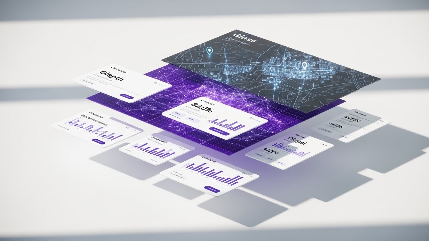
The Visual & Narrative Approach
To encourage users to explore deeper features during a trial, this style employs a 3D Parallax "Exploded View." A standard dashboard interface is deconstructed into floating layers. The back layer displays a "Dark Mode" geospatial map; the middle layer reveals a "Purple" connectivity grid; and the front layer holds pristine "White" data cards and widgets. The layers float in a bright white space, casting soft shadows on one another to emphasize depth. This visualizes the idea that there is "more than meets the eye" within the platform.
Psychological Impact & KPI Focus
- Niche Psychology: Trial users often stick to surface-level features. This visual piques curiosity by showing the "underlying" layers of value. It invites the user to dig deeper and unlock advanced capabilities.
- Operational Impact: It targets "Feature Adoption" and "Trial-to-Paid Conversion." It visually represents the "Full Stack" nature of the solution—from raw data mapping to polished front-end reporting.
Strategic Implementation & Trade-offs
- Best Use Case: Product tour landing pages or "Unlock Premium" prompts within the trial interface.
- Duration: 10-15 Seconds (Slow Rotation).
- Trade-off: It requires high-fidelity assets. If the UI layers aren't perfectly aligned or high-resolution, the effect breaks.
Companies using similar video content -
WalkMe – Digital Adoption Platform – Guiding users to frictionless first actions.
Pendo – Product Experience Platform – Simplifying onboarding with tactile interactions.
26. The Library of Order
RETAIN | Knowledge Base
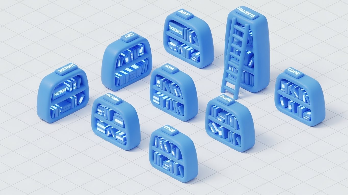
The Visual & Narrative Approach
Retention relies on user empowerment. This style transforms the "Help Center" into an inviting Isometric 3D "Miniature Library." Set on a clean white grid, we see rounded, "Claymorphism" style bookshelves in soft "Blue." They hold glowing books labeled with data topics (Code, History, Projects). A small ladder leans against a central stack. The lighting is global and soft, making the environment feel playful, manageable, and organized. It reframes "Support" from a frustration to a delightful resource.
Psychological Impact & KPI Focus
- Niche Psychology: Users hate reading dense documentation. This "Toy-Like" aesthetic reduces the intimidation factor of technical manuals. It makes learning feel approachable and bite-sized.
- Operational Impact: It targets "Self-Service Rate" and "Support Ticket Reduction." By making the Knowledge Base visually appealing, you encourage users to find answers themselves rather than calling support.
Strategic Implementation & Trade-offs
- Best Use Case: The header of the Help Center, "Academy" thumbnails, or "Did You Know?" email footers.
- Duration: Static or Micro-motion (book glowing).
- Trade-off: The "cute" factor must not undermine the authority of the content. Ensure the labels on the books are relevant technical terms to maintain context.
Companies using similar video content -
Apache Kafka – Distributed Streaming Platform – Visualizing unimpeded, high-velocity data streams.
Confluent – Kafka Platform – Ensuring frictionless data flow across the enterprise.
27. The Always-On Assistant
RETAIN | Reducing Support Overhead

The Visual & Narrative Approach
To visualize the presence of AI support without using a generic chatbot icon, this style mixes realism with holography. We see a photorealistic close-up of a dark wooden executive desk. Projected onto the surface is a vibrant "Cyan" and "Magenta" holographic avatar of a friendly robot, surrounded by floating data charts. The hologram emits light, illuminating the wood grain, grounding the digital assistant in the physical world. This represents the "AI Support Assistant" as a tangible, always-available team member.
Psychological Impact & KPI Focus
- Niche Psychology: Users often feel isolated when they encounter errors. The personification of the AI assistant provides a sense of companionship and immediate help. It signals, "You are never alone with the data."
- Operational Impact: It visualizes "AI-Driven Support" and "Instant Resolution." It reinforces the value of automated help systems in reducing downtime.
Strategic Implementation & Trade-offs
- Best Use Case: In-app chat widget icons, "Support" page headers, or release notes for new AI features.
- Duration: Loop (Hologram flicker/rotation).
- Trade-off: Avoid the "Uncanny Valley." The robot/avatar should be stylized and schematic, not a realistic human face.
Companies using similar video content -
Qlik – Sense – Revealing multi-dimensional insights through layered dashboards.
TIBCO Spotfire – Analytics Platform – Exploring data with layered, interactive visualizations.
28. The Resilient Network
RETAIN | Reducing Churn

The Visual & Narrative Approach
Retention is about proving that the platform is the backbone of the business. This style uses an Abstract 3D Visualization of a neural network. In a deep, dark void, a complex brain-like structure is formed by glowing "Cyan" and "Purple" particles. White tendrils connect these nodes to the wider ecosystem, forming a resilient, pulsing web. The visual emphasizes "Interconnectedness" and "Stability." It suggests that removing the platform would sever these vital neural pathways.
Psychological Impact & KPI Focus
- Niche Psychology: This triggers "Loss Aversion." By visualizing the data as a living, breathing nervous system, it implies that the platform is critical to the organization's life. It shifts the perception from "Tool" to "Organ."
- Operational Impact: It targets "Net Dollar Retention" (NDR) and "System Stickiness." It visualizes the complexity of the data relationships the platform manages, reinforcing the difficulty of switching providers.
Strategic Implementation & Trade-offs
- Best Use Case: Quarterly Business Review (QBR) presentations or "Year in Review" personalized videos for clients.
- Duration: 10-15 Seconds.
- Trade-off: It is very abstract. It works best when accompanied by data showing the volume of connections/transactions handled over the year.
Companies using similar video content -
Atlassian Jira – Service Management – Organizing knowledge for accessible self-help.
GitHub – Documentation – Structuring developer knowledge into an ordered library.
29. The Neural Frontier
EXPAND | Deep Feature Adoption

The Visual & Narrative Approach
To upsell advanced AI modules, we need to visualize intelligence. This style embraces a "Cyberpunk" aesthetic. We travel through a dark void illuminated only by the firing of "Neon Purple" and "Laser Red" synapses within a neural network. The camera moves aggressively through the connections, mimicking the speed of thought. This is "Dark Mode" dialed up to eleven—high contrast, high energy, and unmistakably futuristic. It represents the "Deep Learning" capabilities available in the premium tier.
Psychological Impact & KPI Focus
- Niche Psychology: This appeals to the "Innovator" persona who wants to be on the bleeding edge. It visualizes raw power and computational dominance. It makes the upgrade feel like installing a super-engine.
- Operational Impact: It targets "Upsell Revenue" and "AI Feature Adoption." It differentiates the standard reporting tools (clean/white) from the advanced predictive engines (dark/neon).
Strategic Implementation & Trade-offs
- Best Use Case: Product launch videos for new AI features, "Labs" section of the website, or developer blogs.
- Duration: 15-30 Seconds.
- Trade-off: It is aggressive. Use it only for advanced features. Using this style for basic reporting will feel mismatched and intimidating.
Companies using similar video content -
ThoughtSpot – AI-driven Analytics – Providing always-on AI assistance for insights.
Zendesk – Support Suite – Offering 24/7 AI-powered support assistance.
30. The Face of Authority
EXPAND | Driving Upsell/Cross-sell

The Visual & Narrative Approach
The final stage of expansion is partnership. This style utilizes a high-end, Generative AI Realistic Character to deliver thought leadership. We see a confident male presenter in a navy suit, standing in a virtual "Broadcast News" studio with soft-focus technology screens in the background. The lighting is cinematic and professional. He gestures open-handed, explaining a complex strategic concept. This humanizes the "Enterprise" tier, representing the expert consultancy and partnership that comes with the highest level of service.
Psychological Impact & KPI Focus
- Niche Psychology: At the enterprise level, buyers buy people, not just software. This style simulates the experience of having a dedicated consultant. It builds authority and trust, positioning the vendor as a "Strategic Partner" rather than just a software provider.
- Operational Impact: It targets "Cross-Sell Opportunities" and "Customer Lifetime Value" (CLTV). It is used to educate existing clients on broader industry trends that your additional products solve.
Strategic Implementation & Trade-offs
- Best Use Case: LinkedIn Thought Leadership videos, personalized ABM outreach for expansion deals, or "Executive Briefing" invitations.
- Duration: 30-60 Seconds (Scripted).
- Trade-off: The lip-sync and voice synthesis must be flawless. Any artifacting in the AI generation will destroy credibility immediately.
The Visual Operations Doctrine: A Strategic Knowledge Base
We have now defined the "What" and the "How" of your visual language across 30 distinct styles. However, a style guide is only as powerful as its strategic application. To transform these assets from "marketing content" into "business infrastructure," we must integrate them into the very fabric of your operations.
The following framework synthesizes the visual strategies into three core business pillars. This is your blueprint for execution, designed to align with the expertise of your strategic partners at Advids.
Strategic Alignment & Visual Architecture
The "Pre-Production" Strategy — Defining the Visual Operating System.
Before a single pixel is rendered, the visual architecture must be aligned with business goals. This phase ensures that every visual asset serves a specific cognitive function within the buyer's journey.
- The Cognitive Load Audit: Prior to production, conduct an audit of your current training materials. Identify "High-Friction" zones (e.g., SQL integration manuals) and map them to "Low-Cognitive" visual styles (e.g., Style 3: The Precision Refining Engine).
- Role-Based Visual Mapping: Differentiate your visual language by persona. Use "Mobile/High-Contrast" styles (Style 4, 5) for on-the-go Executives who need speed, and "Desktop/Data-Dense" styles (Style 20) for Analysts who need detail.
- The "Glanceability" Standard: For operational dashboards, design visuals that pass the "2-Second Test." If a user cannot understand the status (Red/Green/Gold) in under two seconds (as seen in Style 6), the visualization has failed.
- Brand Voice Consistency: Your visual language must be unified. You cannot use "Playful Claymorphism" (Style 26) in the Help Center and "Cyberpunk Neon" (Style 29) in the Product without a bridging narrative. Define your "Visual Lexicon" early.
- The Advids Strategic Audit: Leveraging a partner like Advids at this stage helps define the "Visual Bible"—a centralized repository of assets, motion behaviors, and metaphors—ensuring that every video, from Marketing to Support, feels like it came from the same brain.
- Standardization vs. Customization: For core platform features (Login, Dashboard), use standardized, scalable styles (Style 15). For high-value ABM accounts, invest in bespoke, character-driven narratives (Style 11).
- The Cross-Departmental Bridge: Use visuals to unify terminology. When Sales, Product, and CS all use the same "Bridge" metaphor (Style 2) to describe integration, organizational alignment improves.
- Legacy System Integration: Visualizing the invisible connection between "Old On-Prem" (Grey Islands) and "New Cloud" (Glass Bridges) is critical for convincing traditional enterprises to migrate.
- Accessibility by Design: Ensure all motion graphics (Style 24) are legible for color-blind users and those with visual impairments. High contrast (Dark Mode, Style 20) is not just an aesthetic choice; it is an accessibility requirement.
- The Mobile-First Mandate: 60% of BI content consumption happens on mobile devices. Every style in this guide, especially Styles 4 and 23, must be stress-tested for vertical (9:16) legibility.
Operational Adoption & Implementation
The "Deployment" Phase — Embedding Visuals into the Workflow.
Visuals should not live in a folder; they should live in the workflow. This segment details how to deploy these styles to reduce friction and drive adoption.
- Overcoming "Big Brother" Anxiety: When visualizing sensitive features (like user activity monitoring), use empathy-driven visuals (Style 11). Show the human benefit (efficiency/connection) rather than the surveillance aspect to reduce resistance.
- The Micro-Learning Shift: Replace the 50-page PDF manual with a library of 30-second loop videos (Style 7). Embed these directly into the software interface to provide help at the moment of need.
- Just-in-Time Support: Integrate "How-To" visuals (Style 26) into your ticketing system. When a user types "Integration Error," the system should auto-suggest the "Fluid Truth" animation (Style 1) to explain the fix visually.
- Gamification of Training: Use "Level Up" visuals (Gold Circles, Style 6) in your customer academy. Visualizing progress motivates users to complete certification courses, driving deeper product knowledge.
- Reducing Support Ticket Volume: There is a direct correlation between the quality of your visual documentation and your support costs. Proactive, high-clarity visuals (Style 15) answer questions before they become tickets.
- Remote Onboarding: Leverage 3D parallax styles (Style 25) to recreate the feeling of a "hands-on" demo for remote teams. This bridges the physical gap in a distributed workforce.
- Visual Standard Operating Procedures (SOPs): Transform text-based SOPs into visual process flows (Style 3). This ensures that complex procedures (like ETL pipelines) are executed consistently across the client's organization.
- Feedback Loops: Use interactive video elements (Style 17) to gather user feedback. A "Click to React" overlay on a new feature video provides instant qualitative data to your product team.
- Scalable Localization: Design your visual assets to be text-agnostic where possible. Abstract styles (Style 1) can be deployed globally without translation, whereas Kinetic Typography (Style 5) requires localized versions.
- Leadership Communication: Equip your champions (internal buyers) with high-end "Executive Vision" assets (Style 19). Give them the "Boardroom Ready" slides they need to sell the renewal to their own C-Suite.
Measuring Impact & Future-Proofing
The "ROI" Phase — Measuring Success and Scaling for Growth.
Finally, we must measure the impact of this visual strategy and prepare for the future. This is where "Content" becomes "Capital."
- Beyond "Views": Move beyond vanity metrics. Measure "Time-to-Competency" (how fast a user learns via video vs. text) and "Feature Adoption Rate" (did the video drive usage of the new tool?).
- The "Idle Time" Metric: Correlate better visualization with reduced "Time on Task." If your UI visuals (Style 7) are effective, users should be spending less time struggling with the tool and more time analyzing data.
- Compliance Velocity: Measure how quickly new regulations (e.g., GDPR, SOC2) are understood and adopted when communicated via visual storytelling (Style 22) versus standard memos.
- Retention and Churn: Track the "Health Scores" of accounts that consume your "Academy" content (Style 26). High engagement with educational visuals typically correlates with higher Lifetime Value (LTV).
- The AI Visual Frontier: Prepare your asset library for Generative AI. The "Structured Data" of your visual style guide allows you to train internal models to generate consistent assets automatically in the future.
- Scalability of Assets: Build a "Modular Asset Library." Backgrounds, icons, and character rigs should be separate components that can be reassembled into new videos, reducing the cost of future production.
- The Advids Partnership: As you scale, the volume of required visual assets will grow exponentially. Advids serves as your long-term production partner, ensuring that as you expand from 30 styles to 300, the quality and strategic alignment remain consistent.
- Benchmarking Success: Regularly audit your visuals against competitors. If they are still using static screenshots and you are using "Holographic UI" (Style 27), you maintain a perceived "Innovation Gap."
- The ROI of Safety: For data security, quantify the value of "Breaches Avoided." Effective security training videos (Style 13) contribute directly to risk reduction, a metric that resonates deeply with the Board.
- Final Call to Innovation: Treat video not as a marketing expense, but as digital infrastructure. In the Data Economy, the company that explains its complexity the clearest wins. Invest in your visual language as you would invest in your code.
Companies using similar video content -
Datastax – Astra DB – Visualizing a resilient, interconnected data ecosystem.
New Relic – Observability Platform – Ensuring ecosystem stability through continuous monitoring.
Author & Editor Bio


