
Introduction: Visualizing the Invisible Engine of Enterprise
In the world of Business Process Automation (BPA), the most powerful innovations often happen where no one can see them. They occur in the milliseconds of an API handshake, the silent efficiency of a database reconciliation, or the rapid execution of a rules engine. For the CTO or Operations Lead, this invisibility is a double-edged sword. You have built an engine of incredible power, yet explaining its value to non-technical stakeholders—or capturing the attention of a distracted B2B buyer—remains a formidable challenge. How do you visualize "efficiency"? How do you make "integration" look like a competitive advantage?
The answer lies in strategic visualization. Video has evolved from a marketing tactic to a core translation layer that bridges the physical/digital divide. It turns abstract code into tangible value. The opportunity is immense; the Business Process Automation (BPA) software market is projected to grow from $13 billion in 2024, signaling a massive appetite for tools that streamline operations. However, in this crowded landscape, clarity is the ultimate currency.
The stakes for effective communication are high. With the average ROI is 240% for BPA projects in their first year, the financial argument is solid, but only if the operational argument is understood. Your video content must do more than just "look good"; it must reduce cognitive load, dismantle skepticism, and prove that your platform is the stable, scalable foundation the enterprise needs.
This guide provides a "Gold Standard" framework for visualizing BPA. We have curated 30 distinct styles, analyzed through the lens of operational psychology and B2B marketing strategy. From kinetic typography that simulates processing speed to isometric animations that map logic flows, these examples are designed to help you command attention and communicate complexity with effortless precision.
1. Bold Kinetic Typography
TOFU | Brand Awareness
The Visual & Narrative Approach
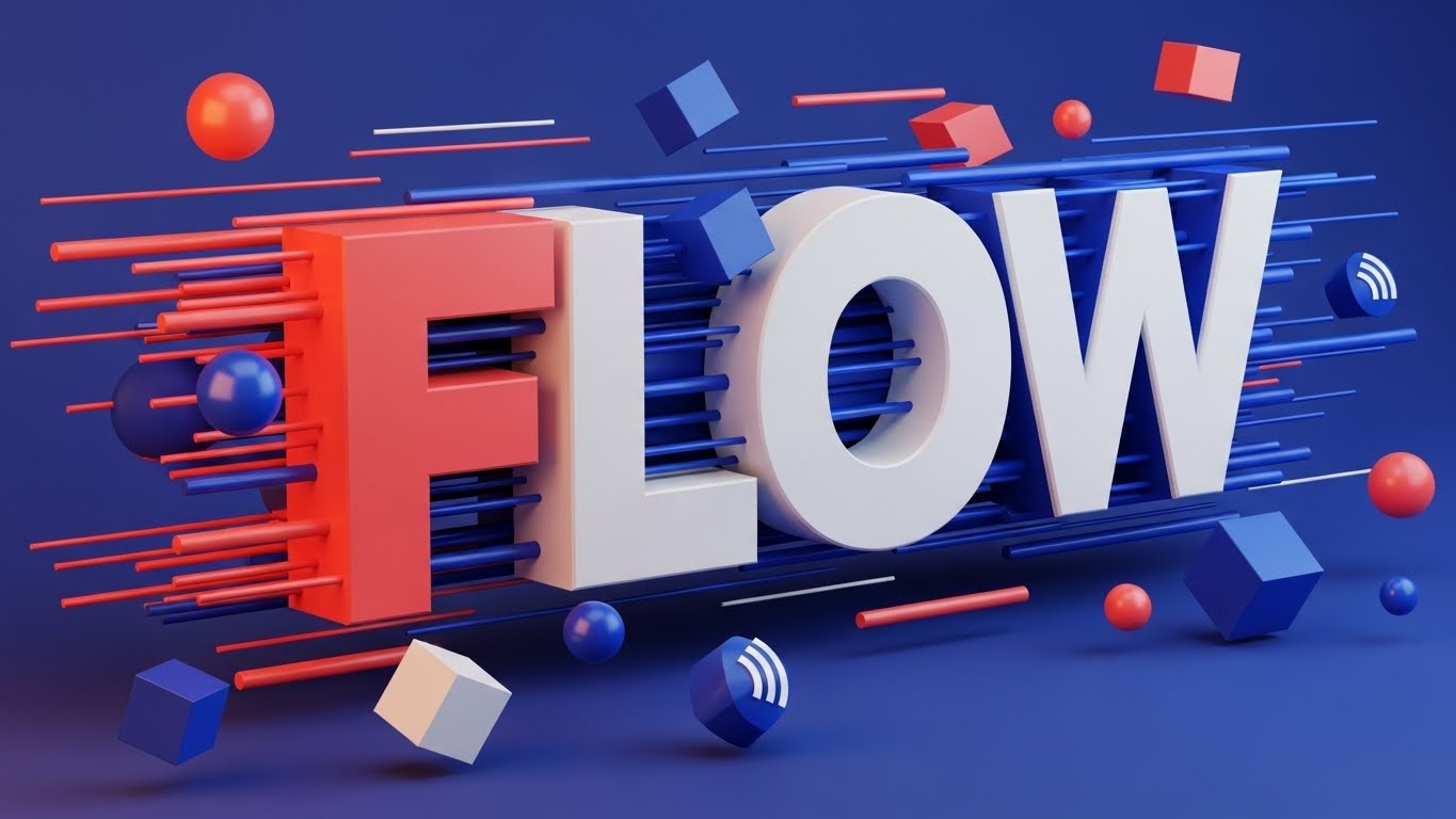
A vertical, high-energy composition designed for the rapid consumption habits of social media. The word "FLOW" is constructed from massive, 3D geometric blocks that appear to be rushing toward the viewer, breaking the fourth wall. The palette is a modern mix of Vivid Coral and Electric Blue against a deep background. Hard edges and long, sharp shadows create a sense of structural integrity, while floating spheres and cubes—representing data packets—whiz past the text. The lighting is high-contrast, emphasizing the depth and the sheer kinetic energy of the typography.
Psychological Impact & KPI Focus
For Top-of-Funnel (TOFU) awareness, your primary enemy is apathy. This style utilizes "Kinetic Typography" to bypass the need for complex storytelling and goes straight for a visceral feeling of speed. By turning the text itself into a moving, physical object, you trigger the viewer's sense of momentum. It subconsciously communicates that your software is fast, robust, and forward-moving. It visualizes the concept of "throughput" without showing a single line of code.
Strategic Implementation & Trade-offs
- Best Use Case: Instagram Stories, TikTok, or high-traffic event screens where audio is optional. It grabs attention in less than 3 seconds.
- Duration: 9-15 seconds.
- Trade-off: This style is purely emotive. It builds brand awareness (Framework 1.1) but cannot explain how the automation works. Use it to stop the scroll, then retarget with explanatory content.
Companies using similar video content -
UiPath – RPA Platform – Automates repetitive tasks with speed.
Automation Anywhere – Automation 360 – Delivers rapid process automation.
Microsoft Power Automate – Power Automate – Quickly builds automated workflows.
2. Minimalist Flat 2D Vector
TOFU | Market Education
The Visual & Narrative Approach
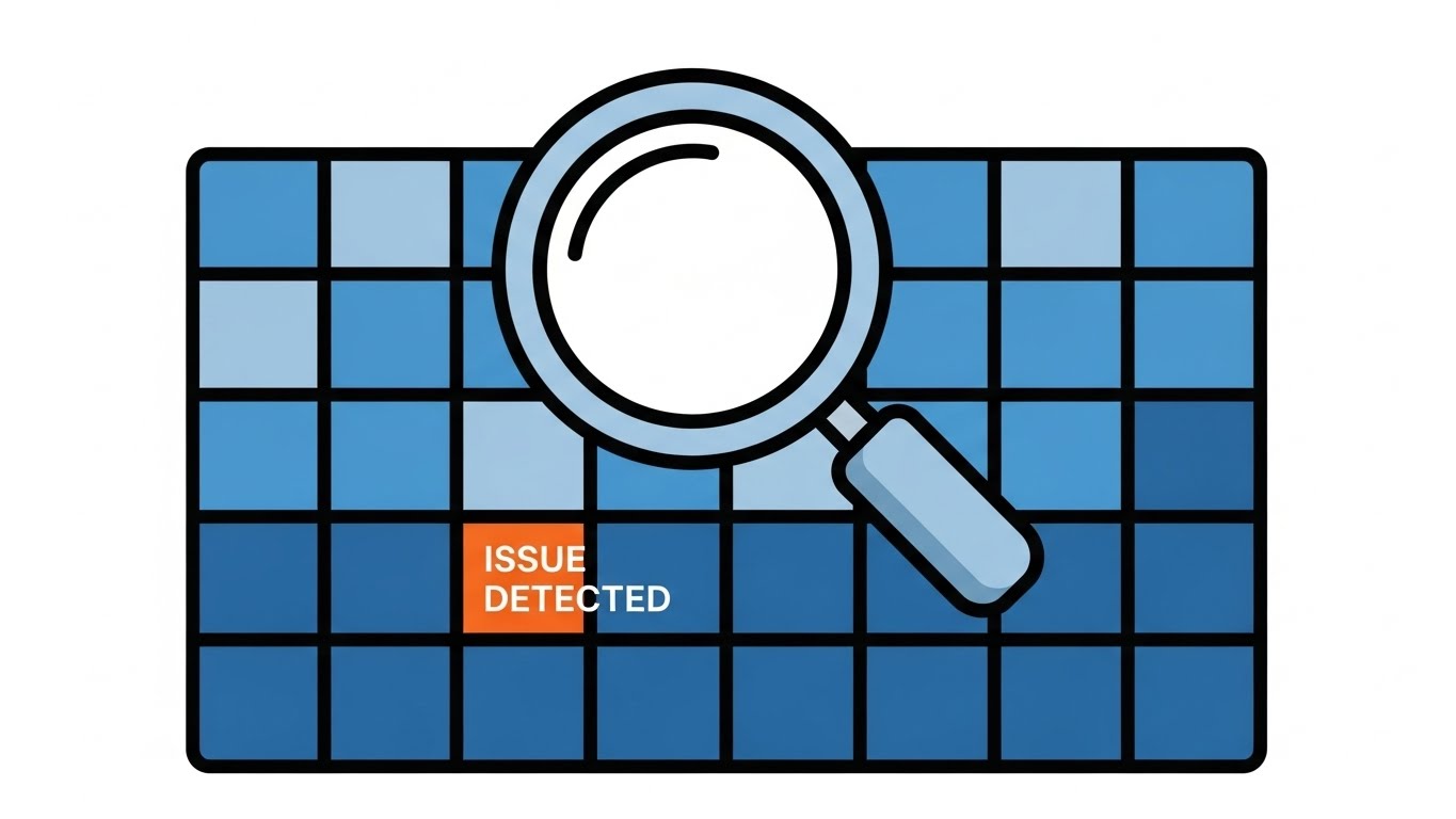
A pristine, 16:9 minimalist scene that champions clarity above all else. A structured grid of blue squares represents a database or workflow matrix. Hovering over this grid is a stylized magnifying glass, its lens focusing on a single "ISSUE DETECTED" block highlighted in urgent orange. The style is strictly flat—no gradients, no 3D distractions. The lines are clean and uniform. This symmetry visualizes the concept of "centralized control" and the software’s vigilant, automated scanning capabilities.
Psychological Impact & KPI Focus
This style addresses a core anxiety of the Operations Manager: "What if something breaks and I don't see it?" The "Minimalist Flat 2D" aesthetic reduces cognitive load, stripping away any visual noise that doesn't contribute to the message. It signals precision and accuracy. By visually isolating the "issue" within a perfect grid, you are promising that your software brings order to data and makes anomalies impossible to miss. It is the visual equivalent of a clean audit trail.
Strategic Implementation & Trade-offs
- Best Use Case: Blog headers, whitepaper illustrations, or "How It Works" sections on your website (Goal 1.3: Market Education).
- Duration: 5-10 seconds.
- Trade-off: It can feel "low-tech" if not paired with strong copy. It lacks the "wow" factor of 3D, but it beats 3D for explaining complex logic rules or error-handling protocols.
Companies using similar video content -
Celonis – Process Mining – Pinpoints process inefficiencies and errors.
SAP Signavio – Process Manager – Visualizes and optimizes business processes.
Kofax – TotalAgility – Streamlines document processing and error handling.
3. Abstract 2D Organic Motion + Glossy
TOFU | Shaping Brand Perception

The Visual & Narrative Approach
An elegant, mesmerizing display of fluid dynamics. Amorphous shapes in Glossy Purple and Teal morph and flow into one another against a premium Silver background. The texture appears liquid and slick, with specular highlights that suggest a friction-free surface. There are no hard angles here—only curves and waves that constantly evolve. This abstract motion graphics piece serves as a visual metaphor for "seamless software integration" and the adaptability of cloud-native platforms.
Psychological Impact & KPI Focus
Integration is often the biggest pain point in BPA; it is usually associated with "clunky" connections and broken APIs. This style (Goal 1.5: Shaping Brand Perception) counters that negative association by visualizing integration as effortless. The liquid motion implies that your software "fills the gaps" between systems naturally. It evokes a feeling of calm and adaptability, positioning your brand as the "glue" that holds the enterprise stack together without friction.
Strategic Implementation & Trade-offs
- Best Use Case: Website Hero backgrounds or loopable video assets for login screens. It sets a premium, high-tech tone immediately.
- Duration: 15-30 seconds (Loop).
- Trade-off: It is highly abstract. If the viewer is looking for specific dashboard features or tangible proof of capability, this style offers only a feeling, not a fact.
Companies using similar video content -
Workato – Integration & Automation Platform – Connects apps and automates workflows fluidly.
Boomi – Integration Platform – Seamlessly integrates data and applications.
MuleSoft – Anypoint Platform – Connects enterprise systems with ease.
4. 2D Line Art + Data Viz
TOFU | LinkedIn Organic

The Visual & Narrative Approach
A sophisticated, architectural view of digital infrastructure. Thin, continuous lines in Neon Lime weave a complex network graph against a professional Deep Navy background. The lines intersect at small White nodes, creating an isometric map that resembles a schematic or a circuit board. The composition is orderly and precise, conveying technical accuracy. It looks less like a cartoon and more like a blueprint, suggesting that the software is engineered, not just designed.
Psychological Impact & KPI Focus
For the technical buyer (CTO/CIO), "fluff" is a warning sign. They want to see the architecture. This "2D Line Art" style speaks their language. It signals structural integrity and connectivity. By using the visual language of data visualization (nodes, edges, networks), you align your brand with intelligence and oversight. It validates the complexity of their ecosystem while showing that your software can map and manage it.
Strategic Implementation & Trade-offs
- Best Use Case: LinkedIn Organic posts (Goal 3.4) or slide decks for technical sales demos. It establishes authority and technical competence.
- Duration: 10-20 seconds.
- Trade-off: It can feel cold or impersonal. It lacks the human element, so it is best used to illustrate "backend robustness" rather than "user benefits."
Companies using similar video content -
ServiceNow – ITSM – Maps and manages complex IT services.
TIBCO – Connected Intelligence Cloud – Visualizes real-time data and processes.
Red Hat Ansible Automation Platform – Ansible – Orchestrates IT infrastructure with precision.
5. Generative AI Cinematic Video
TOFU | Vertical Social

The Visual & Narrative Approach
A vertical, cinematic shot tailored for mobile consumption. We see a low-angle, heroic view of a diverse modern team walking confidently through a sun-drenched, glass-walled office corridor. The lighting is "Golden Hour," casting warm, aspirational beams. The focus is on a leader holding a tablet, symbolizing control and mobility. The motion blur on the edges suggests speed. This is high-end corporate chic, generated to look like a premium stock film but tailored to a specific narrative of "empowerment."
Psychological Impact & KPI Focus
BPA is often feared as a job killer. This style (Goal 3.5: Vertical Social) flips the narrative to "automation as an enabler." It visualizes the result of automation: a team that is confident, unburdened by menial tasks, and moving forward. It appeals to the aspirational identity of the buyer—they aren't buying software to fire people; they are buying it to empower their team to be "strategic leaders."
Strategic Implementation & Trade-offs
- Best Use Case: TikTok, Instagram Reels, or recruitment videos. It humanizes the brand.
- Duration: 9-15 seconds.
- Trade-off: It is generic "corporate" imagery. To make it effective, the voiceover or text overlay must be highly specific to the pain point (e.g., "Stop drowning in spreadsheets; start leading.").
Companies using similar video content -
Appian – Low-code Platform – Empowers teams to build applications faster.
Pegasystems – Infinity Platform – Drives customer engagement and workforce efficiency.
6. Isometric 2D Motion Design
TOFU | Skippable Pre-Roll Ad
The Visual & Narrative Approach
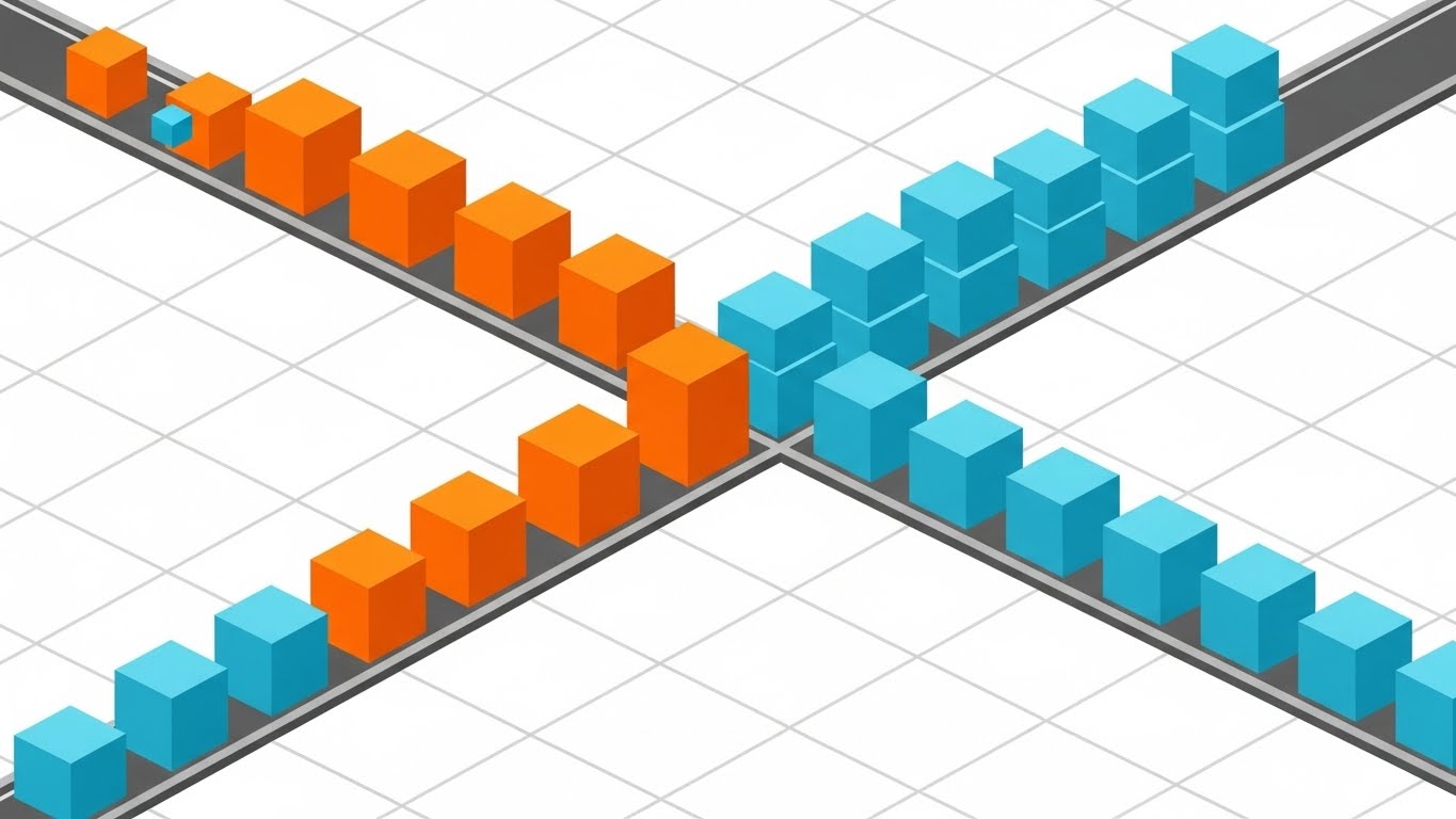
A satisfying loop of order and precision. Set on an infinite white grid, cubes in Bright Orange and Cyan slide effortlessly along grey tracks. They reach a junction and "sort" themselves into orderly stacks based on color. The style uses flat shading with distinct facets on the cubes, giving a clean, geometric look. This is a literal visualization of "automated sorting," "process routing," and "if/then" logic.
Psychological Impact & KPI Focus
This style triggers the "satisfaction" response associated with organization. For an Operations Manager dealing with chaotic workflows, seeing items sort themselves is deeply reassuring. It visualizes zero errors and optimized flow. The isometric perspective is standard in SaaS because it allows you to show depth and complexity without the rendering costs of full 3D. It communicates that your software handles the logic so the human doesn't have to.
Strategic Implementation & Trade-offs
- Best Use Case: YouTube Pre-Roll ads (Goal 4.1). The visual is satisfying to watch, increasing retention rates even in a skippable format.
- Duration: 15-30 seconds.
- Trade-off: It can look like a mobile game if the color palette isn't strictly B2B. Stick to your brand colors to maintain professionalism.
Companies using similar video content -
Camunda – Platform – Orchestrates complex business processes visually.
Bonitasoft – Bonita Platform – Designs and executes automated workflows.
ProcessMaker – BPM Suite – Models and automates business processes.
7. AI Generated Mixed Media Video
TOFU | Meta & General Social Ads
The Visual & Narrative Approach
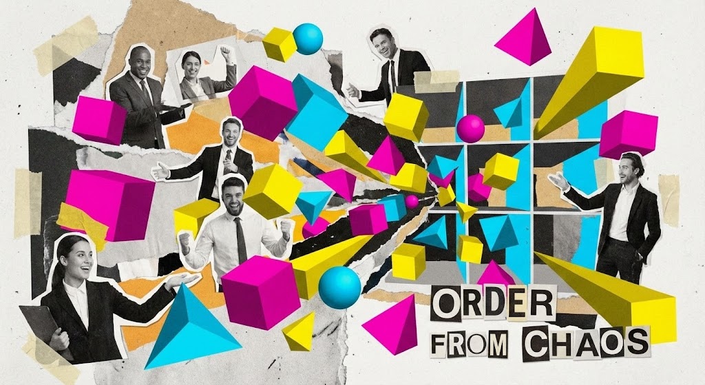
A dynamic, high-energy collage that explodes with creativity. Cut-out photographs of business professionals are mixed with ripped paper textures and vibrant 3D geometric shapes in Magenta, Yellow, and Cyan. The scene starts visually "chaotic"—elements flying loosely—but rapidly snaps together into a structured, organized grid. The text "ORDER FROM CHAOS" anchors the visual. The stop-motion style transitions give it a frantic but positive energy, symbolizing the rapid pace of change.
Psychological Impact & KPI Focus
This style is designed to disrupt the "boring B2B" feed. It acknowledges the messiness of digital transformation (the ripped paper, the disparate elements) but resolves it into a solution. It appeals to the creative side of the buyer and suggests that your platform is a modern, innovative tool for "builders" and "changers." It breaks the pattern of standard corporate vector art.
Strategic Implementation & Trade-offs
- Best Use Case: Meta (Facebook/Instagram) Ads (Goal 4.4). It looks native to the platform's creator economy aesthetic, preventing "ad blindness."
- Duration: 15-20 seconds.
- Trade-off: It is "noisy." It is not suitable for explaining detailed technical features. Use it to capture interest and drive clicks to a landing page.
Companies using similar video content -
IBM Cloud Pak for Automation – Cloud Pak – Transforms operations with AI and automation.
OpenText – Content Suite – Manages information for digital transformation.
8. Abstract 3D AI Visualization
TOFU | Connected TV

The Visual & Narrative Approach
A cinematic journey through a digital cosmos. Nodes in Glowing Violet and Deep Space Blue float in a dark void, connected by thin, pulsating White filaments. The camera slowly drifts through this "data constellation," giving the viewer a sense of immense scale. The particles cluster to form vaguely structural shapes before dispersing again. It visualizes the intangible concepts of "cloud computing," "big data," and "AI neural networks."
Psychological Impact & KPI Focus
This style elevates your product from a "tool" to an "ecosystem." It uses the visual language of sci-fi to suggest future-readiness. For the C-suite buyer, this visualizes the scale of their data potential. It implies that your software is capable of handling complexity that is beyond human comprehension. It builds authority and awe (Goal 4.6: Connected TV).
Strategic Implementation & Trade-offs
- Best Use Case: OTT/Streaming ads or background loops at trade show booths. It looks expensive and sophisticated.
- Duration: 30-60 seconds.
- Trade-off: It is completely abstract. It requires a strong voiceover to ground the visual in reality (e.g., "Navigating your data universe shouldn't be rocket science.").
Companies using similar video content -
DataRobot – AI Platform – Automates machine learning for big data.
Alteryx – Analytic Process Automation – Unifies data, analytics, and automation.
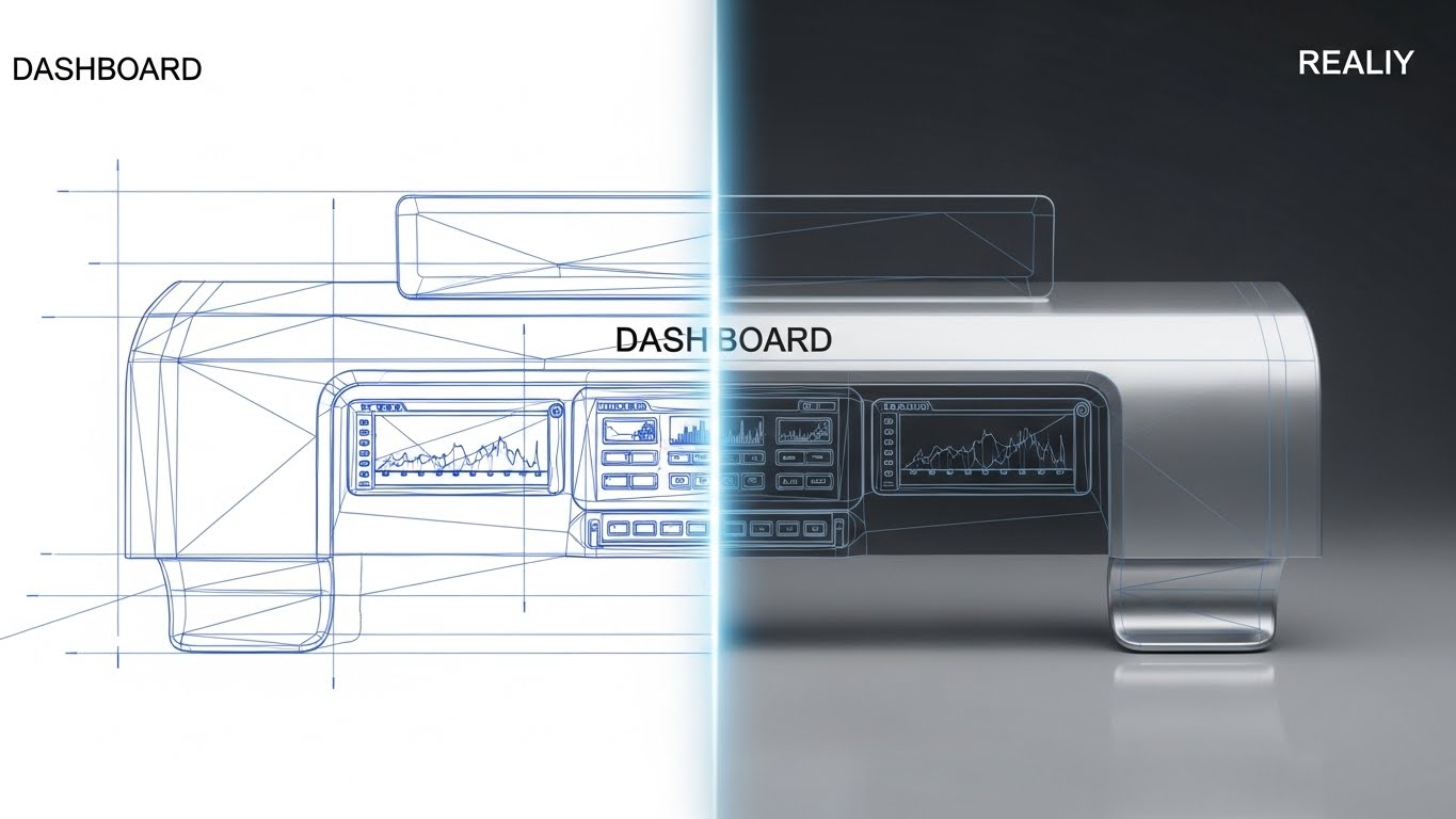
9. Wireframe to Reality Transition
MOFU | Product Differentiation
The Visual & Narrative Approach
A split-screen or sliding transition that tells a "before and after" story. The left side displays a technical, blueprint-style wireframe of a dashboard interface in Blueprint Blue lines. A glowing vertical scanning line moves across the image, revealing the right side: a fully rendered, photorealistic version in Chrome and White with realistic lighting. This visualizes the "speed of development" or the transition from "idea to deployment" that low-code platforms promise.
Psychological Impact & KPI Focus
This is a potent MOFU (Middle of Funnel) asset (Goal 1.7: Product Differentiation). It provides proof of capability. The wireframe demonstrates that there is a solid architectural foundation, while the photorealistic render promises a polished, high-quality user result. It visually answers the question: "How fast can we go from concept to live app?" The sliding transition serves as a metaphor for the velocity your software provides.
Strategic Implementation & Trade-offs
- Best Use Case: Landing Pages. It is a visual promise of the "result" the user will get.
- Duration: 10-15 seconds.
- Trade-off: You need high-quality assets of your actual UI to make the "Reality" part look good. If your UI is dated, this style will highlight it.
Companies using similar video content -
OutSystems – Low-code Platform – Rapidly develops and deploys enterprise applications.
Mendix – Low-code Platform – Builds and launches applications quickly.
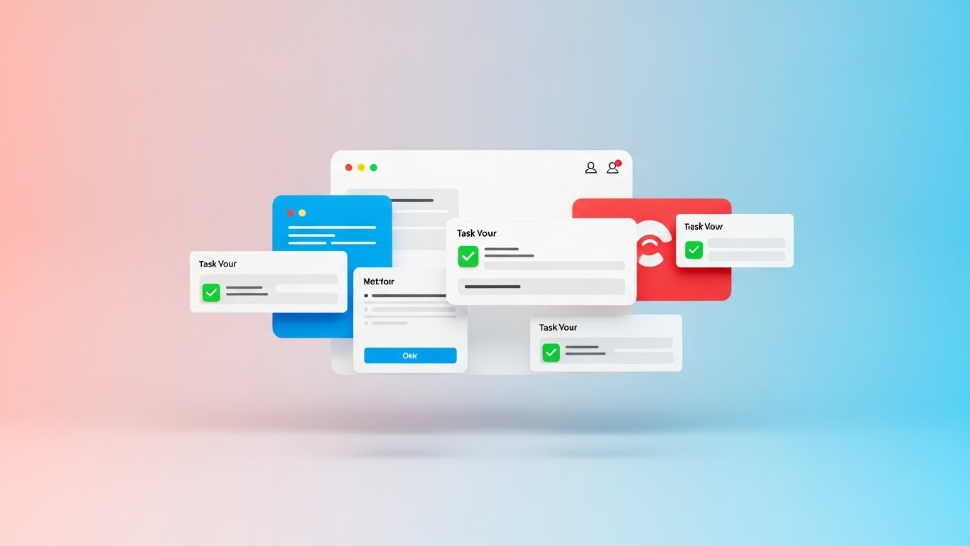
10. Clean UI Workflow (Light Mode)
MOFU | Feature Education
The Visual & Narrative Approach
A pristine, high-key presentation of the software interface. A floating, abstracted UI screen with soft rounded corners is set against a Pastel Pink and Sky Blue gradient. The focus is on simplified "task cards" that pop up. As they appear, bright green checkmarks animate onto them, signifying task completion. The lighting is soft and diffuse (studio style), eliminating harsh shadows. It looks approachable, easy, and friendly.
Psychological Impact & KPI Focus
Software adoption fails when users find the tool difficult to use. This style (Goal 1.8: Feature Education) combats the fear of "bloatware." By abstracting the UI to its cleanest form and using "Light Mode" aesthetics, you communicate simplicity and approachability. The green checkmarks trigger a dopamine response—the feeling of getting things done. It reassures the buyer that their team will actually like using this tool.
Strategic Implementation & Trade-offs
- Best Use Case: Website "Features" section. It simplifies complex workflows into digestible visual bites.
- Duration: 30-90 seconds.
- Trade-off: It abstracts the UI. You must balance this with screenshots of the actual interface elsewhere so users know exactly what they are buying.
Companies using similar video content -
Kissflow – Workflow – Simplifies workflow management with a clean UI.
Zoho Creator – Creator – Builds custom applications with an intuitive interface.
11. Aspirational Stock Montage**
MOFU | Building Trust

The Visual & Narrative Approach
Moving beyond the "Introduction" and "Awareness" phases, we enter the Middle of Funnel (MOFU), where trust is paramount. This style utilizes high-quality, aspirational stock imagery to visualize the human emotional outcome of automation. A diverse group of professionals gathers around a laptop in a sun-drenched, biophilic office. The lighting is key—natural sunlight floods the room, highlighting expressions of genuine relief and shared success. The palette shifts from "tech cool" to warm, organic tones of Fresh Green and Beige. It’s not about the code on the screen; it’s about the people pointing at it, smiling because the problem is solved.
Psychological Impact & KPI Focus
Technological change breeds anxiety. Staff worry about complexity, downtime, or job redundancy. This style (Goal 1.9: Building Trust) addresses those fears by visualizing the "Post-Implementation Utopia." It triggers mirror neurons; seeing relief and happiness in others makes the viewer anticipate the same feeling. It validates that your BPA software doesn't just process data—it improves work-life balance and team cohesion. It humanizes the ROI.
Strategic Implementation & Trade-offs
- Best Use Case: Email Nurture Campaigns or "Success Stories" pages. It builds an emotional bridge before the hard sell.
- Duration: 15-30 seconds.
- Trade-off: Stock footage can easily feel generic. To work, the curation must be impeccable—avoiding stiff handshakes and "thumbs up" in favor of candid moments of collaboration.
Companies using similar video content -
Nintex – Process Platform – Delivers successful process automation outcomes.
Smartsheet – Platform – Empowers teams to achieve project success.
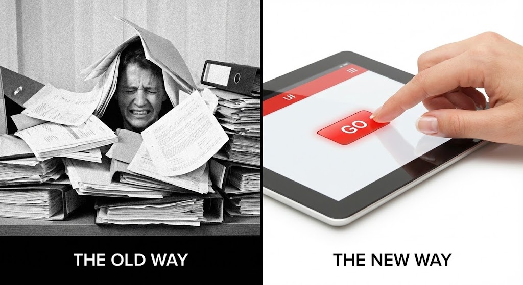
12. Split Screen: Optimized Reality and UI
MOFU | Competitive Displacement
The Visual & Narrative Approach
This is the visual definition of "Competitive Displacement." The composition uses a strict 1:1 split screen to force a comparison. The left side is a monochromatic, grainy nightmare: a stressed employee buried under a mountain of paper files, representing "The Old Way." The right side is a vision of modern efficiency: a hand calmly pressing a single "Go" button on a sleek, Stark White tablet interface, highlighted with a vibrant Red accent. The contrast is jarring and immediate. It visually quantifies the gap between manual chaos and automated order.
Psychological Impact & KPI Focus
The brain is wired to notice contrast. This style leverages "Cognitive Dissonance"—showing the viewer the pain they are currently tolerating (the left side) and offering immediate resolution (the right side). It is a powerful tool for overcoming inertia. It communicates that sticking with legacy systems is not just "slower," it is actively painful. The simplicity of the "Go" button on the right implies that the solution is accessible and requires minimal effort to implement (Goal 1.13).
Strategic Implementation & Trade-offs
- Best Use Case: LinkedIn Ads or Competitor Comparison pages. It is aggressive and effective for stopping the scroll.
- Duration: 6-15 seconds.
- Trade-off: It is binary and lacks nuance. It works best when the pain point is universal (e.g., "Too much paper") rather than specific technical nuances.
Companies using similar video content -
Blue Prism – Digital Workforce – Contrasts manual work with automated efficiency.
Kofax – Intelligent Automation – Shows transformation from paper to digital.
13. Rapid UI Feature Montage
MOFU | Driving Demo Requests
The Visual & Narrative Approach
A high-velocity visual experience designed to showcase the sheer depth of your platform. Abstracted UI panels in a cyberpunk palette of Vivid Purple, Hot Pink, and Cyan fly past the viewer, layered with motion blur to accentuate speed. The perspective zooms toward a central vanishing point, creating a tunnel effect. We don't stop to read the text on these panels; instead, we feel the volume of features passing by. It is a kinetic display of "robustness."
Psychological Impact & KPI Focus
When a lead asks for a demo (Goal 2.1), they are often vetting whether your solution is comprehensive enough for their enterprise needs. This style answers with a resounding "Yes." By bombarding the visual cortex with a density of high-fidelity screens, you subconsciously communicate that the platform is feature-rich and battle-tested. It replaces the boredom of a feature list with the excitement of a high-tech arsenal.
Strategic Implementation & Trade-offs
- Best Use Case: Display Ads or the opening sequence of a Demo Video. It builds hype and establishes the product as a "suite" rather than a "tool."
- Duration: 10-20 seconds.
- Trade-off: It is impressionistic. Do not use this to teach how a feature works; use it only to prove that the features exist.
Companies using similar video content -
Salesforce Flow – Flow – Showcases extensive automation capabilities.
HubSpot – Operations Hub – Displays a wide range of automation features.
14. 2D Character-Driven Story
MOFU | Driving Freemium/Trials

The Visual & Narrative Approach
A stylized, approachable illustration that lowers the barrier to entry. A young professional, drawn with modern proportions and textured shading (grain) in a trendy Teal and Orange palette, sits at a floating desk. The scene is clean, set in a Cream-colored void that removes all environmental distractions. The character presses a large, tactile "Start Trial" button, and a "spark" of magic emits from the action. The character’s expression is one of delight and ease, reinforcing that the software is friendly, not intimidating.
Psychological Impact & KPI Focus
For Freemium models (Goal 2.3), the biggest barrier is the fear of "setup friction"—the idea that starting a trial will be a hassle. This style dismantles that fear. The "Spark" visualizes instant gratification. The character’s relaxed posture suggests that onboarding is intuitive and requires no heavy lifting. It appeals to the user’s desire for a "low-risk, high-reward" experiment.
Strategic Implementation & Trade-offs
- Best Use Case: Instagram Ads or "Sign Up" landing pages. It creates a welcoming, low-pressure vibe.
- Duration: 15-30 seconds.
- Trade-off: It can appear "B2C" or casual. Ensure the voiceover maintains a professional tone to keep it grounded in a business context.
Companies using similar video content -
Zapier – Platform – Makes automation easy and accessible for users.
Make – Platform – Simplifies connecting apps and automating tasks.
15. Low-Poly 3D Modeling
MOFU | Website Visitor Re-engagement

The Visual & Narrative Approach
A charming yet structural overview of a connected business ecosystem. We see a miniature digital city rendered in Low-Poly 3D, where buildings are simple geometric facets in Forest Green and Earthy Brown. "Data trucks"—represented as simple blocks—navigate the roads in perfect synchronization. The lighting simulates bright daylight with hard shadows, giving the scene a toy-like tactile quality. It takes the complex reality of supply chains or data logistics and simplifies it into a manageable, working model.
Psychological Impact & KPI Focus
This style is perfect for Re-engagement (Goal 5.1). If a visitor left your site because they were overwhelmed by complexity, this visual invites them back with simplicity. It satisfies the "Builder" archetype in many operations leaders—the desire to see the whole system working in harmony. It implies that your software provides this "God’s eye view" of their business, turning a chaotic reality into an organized, manageable model.
Strategic Implementation & Trade-offs
- Best Use Case: Remarketing Ads or "Solutions" overview pages. It makes complex infrastructure look manageable.
- Duration: 15-45 seconds.
- Trade-off: The "toy-like" aesthetic might not resonate with industries requiring grit and realism (e.g., heavy construction). It works best for logistics, IT, and data flows.
Companies using similar video content -
Integrify – Workflow Management – Visualizes interconnected business processes.
Bizagi – Digital Process Automation – Models and manages entire operational ecosystems.
16. 2D Animation & UI Composition
MOFU | Competitive Comparison

The Visual & Narrative Approach
A creative blend of character animation and interface design. A 2D character, illustrated with bold Lavender and Charcoal outlines, is seen physically "high-fiving" a floating, semi-transparent UI window. The UI glows with a Soft Yellow warmth and displays a "Welcome to the Team" message. The background is a soft, abstract cloud pattern. This is a metaphorical scene: it treats the software not as a cold tool, but as a responsive, helpful member of the team.
Psychological Impact & KPI Focus
In the Competitive Comparison phase (Goal 5.5), features often look identical. Brand personality becomes the differentiator. This style positions your software as an partner rather than a vendor. The "high-five" visualizes the concept of "Human-in-the-Loop" automation—where the software supports the human, rather than replacing them. It creates a feeling of camaraderie and support, which is highly attractive to teams burnt out by difficult-to-use legacy tools.
Strategic Implementation & Trade-offs
- Best Use Case: Social Media Ads (LinkedIn/Instagram) or "About Us" videos. It sells the culture of the product.
- Duration: 10-20 seconds.
- Trade-off: It is metaphorical. It doesn't show the actual dashboard workflow, so it must be supported by content that proves technical capability.
Companies using similar video content -
Asana – Work Management – Fosters team collaboration with intuitive tools.
Monday.com – Work OS – Enhances team productivity and communication.
17. Dynamic Data Visualization
BOFU | ROI Justification

The Visual & Narrative Approach
Transitioning to the Bottom of Funnel (BOFU), we need to talk about money. This style treats data as a monument. We see a 3D bar graph composed of metallic pillars in Gold, Silver, and Bronze, rising from a reflective surface. The camera angle is a low "worm's eye" view, looking up at the soaring bars, making the growth trend look imposing and undeniable. Spotlights hit the peaks, creating flares of success. It is a visual celebration of ROI (Return on Investment).
Psychological Impact & KPI Focus
The CFO or Economic Buyer doesn't care about the UI color; they care about the result. This style (Goal 1.10: ROI Justification) speaks their language: growth, solidity, and wealth. By rendering the data as heavy, metallic objects, you subconsciously communicate that the financial gains are solid and real, not just projections on a spreadsheet. It anchors the software’s value in hard currency.
Strategic Implementation & Trade-offs
- Best Use Case: Sales Decks (Closing slide) or Investment visuals. It provides the visual "mic drop" on the financial argument.
- Duration: 5-10 seconds.
- Trade-off: It is purely symbolic of success. It requires accurate data context (voiceover or text) to explain what is growing (e.g., "300% Revenue Increase").
Companies using similar video content -
BlackLine – Financial Close Automation – Visualizes significant financial improvements.
HighRadius – Autonomous Finance Platform – Shows clear ROI in financial operations.
18. Isometric 3D Workflow
BOFU | Overcoming Objections
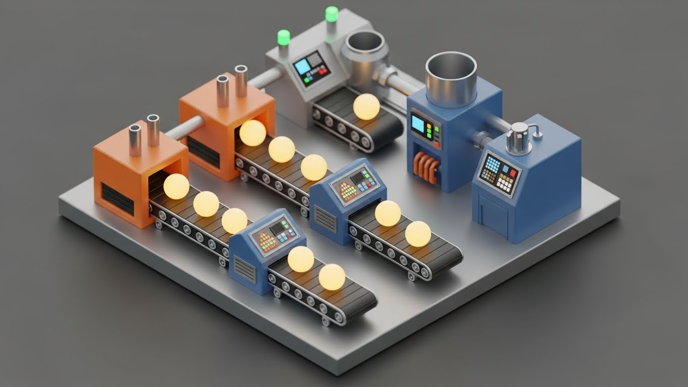
The Visual & Narrative Approach
A highly detailed, "dollhouse" view of the automation process. Set in a clean Industrial Grey environment, we see a miniature "data factory." Conveyor belts transport glowing yellow orbs (data) through processing stations (Blue and Orange machines). The depth of field blurs the background, focusing attention on the mechanism. The animation shows the orbs being sorted, processed, and packaged. It is a literal translation of abstract data processing into a physical manufacturing line.
Psychological Impact & KPI Focus
When a technical buyer raises objections about "how" the process works (Goal 1.11), words often fail. This style succeeds because it makes the invisible process tangible. It satisfies the engineer's need to see the logic. It demonstrates that the process is linear, controlled, and efficient. Seeing the "factory" run without a hitch builds confidence in the stability of the backend architecture.
Strategic Implementation & Trade-offs
- Best Use Case: Product Pages ("How It Works" deep dives) or technical webinars. It clarifies complexity without oversimplifying.
- Duration: 30-60 seconds.
- Trade-off: It requires a significant production effort to model the specific assets. It is less flexible than 2D if the workflow changes.
Companies using similar video content -
Oracle Process Cloud Service – Process Cloud – Demonstrates detailed process execution.
Flowable – Platform – Illustrates complex workflow logic and execution.
19. 3D X-Ray Visualization
BOFU | Risk Mitigation
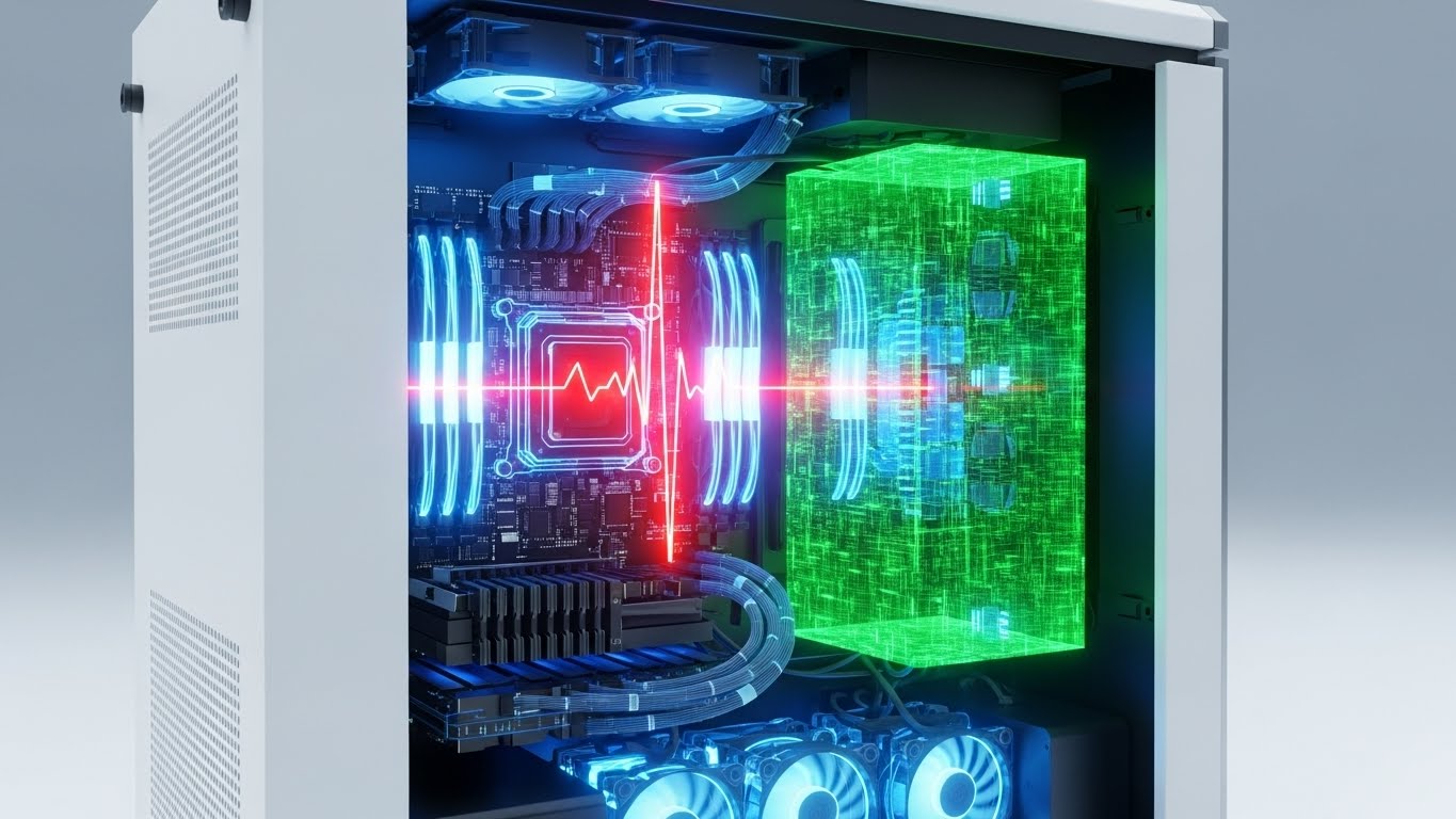
The Visual & Narrative Approach
A clinical, high-tech look inside the "black box." We see a photorealistic server rack or PC tower, but the outer casing is rendered as transparent glass. Inside, the components glow with an Internal White Light against a Translucent Blue structure. A "shield" shape forms around the core data block, pulsating with energy. This X-Ray view implies that nothing is hidden. It visualizes deep inspection, security protocols, and the robust internal architecture of the hardware/software integration.
Psychological Impact & KPI Focus
Security is the ultimate BOFU hurdle (Goal 1.12: Risk Mitigation). Buyers are terrified of vulnerabilities. This style uses the visual metaphor of "transparency" to build trust. It suggests that your system has nothing to hide and that its core is protected by an active shield. The sterile, clean aesthetic conveys hygiene and integrity—crucial attributes for enterprise-grade security software.
Strategic Implementation & Trade-offs
- Best Use Case: Whitepapers, Security Compliance pages, or Trust Centers. It visualizes "Safety."
- Duration: 10-15 seconds.
- Trade-off: It is very cold and clinical. It appeals to the rational, risk-averse side of the brain, not the emotional side.
Companies using similar video content -
Zscaler – Zero Trust Exchange – Visualizes internal security protocols.
CrowdStrike Falcon – Platform – Shows deep endpoint protection and transparency.
20. Photorealistic 3D Renders
BOFU | The Economic Buyer

The Visual & Narrative Approach
The ultimate visualization of clarity and precision. A perfect, clear glass prism sits on a white surface. A beam of white light enters it and is refracted into a perfectly aligned spectrum of color. The rendering uses ray-tracing technology to ensure physical accuracy of the light behavior. There is no chaos here—only the perfect transformation of raw input (light) into structured, beautiful output (spectrum).
Psychological Impact & KPI Focus
For the Economic Buyer (CFO/CEO) (Goal 7.1), the value proposition must be crystal clear. This style is a metaphor for what the software does to the business: it takes the chaotic "white noise" of enterprise data and refracts it into clear, actionable insights (the spectrum). It signals high-end quality, precision engineering, and absolute predictability. It is a visual promise of order.
Strategic Implementation & Trade-offs
- Best Use Case: Pitch Decks (The "Vision" Slide) or website hero backgrounds. It positions the brand as a premium, high-fidelity solution.
- Duration: 5-10 seconds (Loop).
- Trade-off: It is abstract art. It works best as a branding element to establish a feeling of "Premium Quality" before diving into the details.
Companies using similar video content -
SAP Process Automation – Process Automation – Presents a clear vision of optimized processes.
Adobe Acrobat Sign – Sign – Visualizes seamless, precise document workflows.
21. Dark Mode UI Showcase**
BOFU | The Technical Buyer
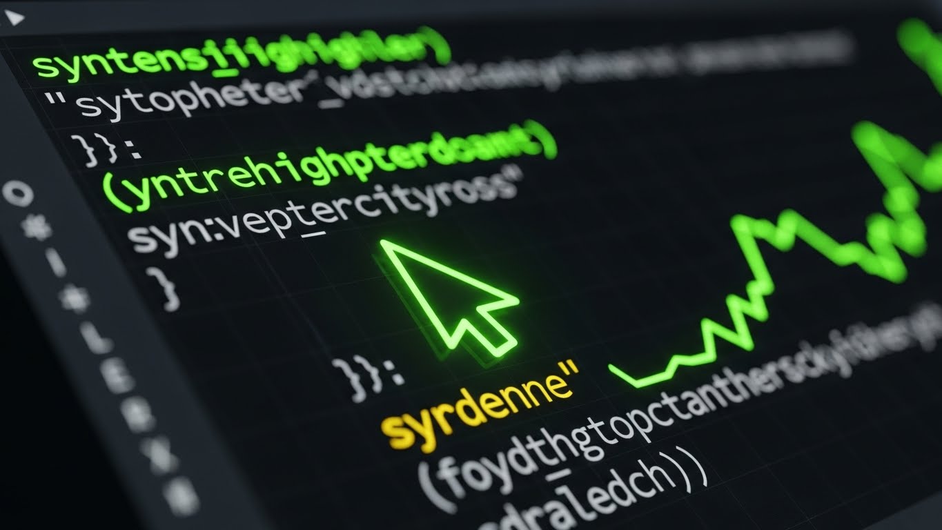
The Visual & Narrative Approach
This style abandons the bright, airy marketing aesthetic for the precise, focused world of the developer. A macro close-up reveals a UI in "Dark Mode"—deep OLED Blacks and Charcoal Greys dominate the screen. Against this void, syntax-highlighted code snippets in Neon Green, Cyan, and Magenta glow sharply. A command-line interface cursor blinks rhythmically. The depth of field is shallow, focusing the viewer’s eye intensely on the code logic. It captures the "flow state" environment that technical professionals prefer.
Psychological Impact & KPI Focus
In the Bottom of Funnel (BOFU), the Technical Buyer (IT Director or Lead Developer) is the gatekeeper (Goal 7.3). They are skeptical of "marketing fluff" and low-code tools that hide the backend. This style signals respect for their craft. It visually validates that your platform has a robust, code-accessible architecture. "Dark Mode" is a cultural signifier in the tech world; using it implies your software is built by developers, for developers, promising extensibility and low eye strain for power users.
Strategic Implementation & Trade-offs
- Best Use Case: API Documentation pages, "For Developers" landing pages, or technical deep-dive webinars.
- Duration: 10-20 seconds.
- Trade-off: It alienates non-technical buyers. A CEO might find it intimidating or "too complex." Use strictly for technical segmentation.
Companies using similar video content -
Jira Automation – Automation – Appeals to developers with code-centric automation.
Microsoft Azure Automation – Automation – Showcases robust cloud automation scripts.
22. Generative AI Realistic Character Video
BOFU | ROI Justification Hook

The Visual & Narrative Approach
A polished, broadcast-quality testimonial delivered by a Generative AI avatar that is indistinguishable from a human. A distinguished executive in their 50s sits in a high-end, sunlit boardroom. The lighting is cinematic, with soft rim lighting separating the subject from the blurred office background. They speak directly to the camera with calm confidence. This is not a cartoon; the skin texture, micro-expressions, and lip-sync are photorealistic. The narrative delivers a concise, high-impact ROI statement.
Psychological Impact & KPI Focus
Getting client testimonials is notoriously difficult; scheduling conflicts and legal approvals often stall production. This style (Goal 8.1: ROI Justification Hook) bypasses those hurdles. It allows you to script the perfect customer success story. Psychologically, humans trust faces. This visual provides the "Social Proof" trigger necessary to close a deal, projecting authority and satisfaction without the logistical nightmare of a film shoot. It visualizes the "peer recommendation" at scale.
Strategic Implementation & Trade-offs
- Best Use Case: Case Study pages or retargeting ads for "on-the-fence" buyers.
- Duration: 30-60 seconds.
- Trade-off: Transparency is key. You must label this as a "Dramatization" or "AI Presentation" to maintain ethical trust. It replaces the logistics of a shoot, not the truth of the data.
Companies using similar video content -
DocuSign – Agreement Cloud – Features realistic testimonials for trust.
Zendesk – Service – Presents executive endorsements for customer service automation.
23. Hyper-lapse Stock Footage with Data
Onboarding | Accelerating Time-to-Value

The Visual & Narrative Approach
A juxtaposition of frantic reality and digital calm. The background is a hyper-lapse of a city intersection at night—cars are streaks of red and white light, moving at breakneck speed. Superimposed over this chaos is a static, glowing Blue grid and a large, steady "Check Mark" icon. The data overlay remains perfectly stable while the world behind it rushes by. This visualizes the concept of "Real-Time Control" in a high-velocity environment.
Psychological Impact & KPI Focus
For Operations Managers in logistics or high-volume processing, the daily reality is chaos. They fear losing control. This style (Goal 1.15: Accelerating Time-to-Value) addresses that anxiety by showing that your software provides a stable layer over the chaos. The contrast forces the brain to focus on the Blue Check Mark—the symbol of successful execution. It promises that no matter how fast the business moves, the automation layer remains accurate and unshakeable.
Strategic Implementation & Trade-offs
- Best Use Case: Welcome Screens during onboarding or "High Volume" processing feature pages.
- Duration: 5-10 seconds (Loop).
- Trade-off: It creates a high-energy "mood" but doesn't explain features. It is a metaphorical asset, best used to set the tone before technical training.
Companies using similar video content -
AWS Step Functions – Step Functions – Visualizes rapid, controlled workflow execution.
Google Cloud Workflows – Workflows – Shows fast, reliable process orchestration.
24. Macro UI Micro-Interactions
Onboarding | Self-Serve Onboarding

The Visual & Narrative Approach
An extreme close-up—macro photography level—of a human finger interacting with a glass touch interface. We see the ridges of the fingerprint and the individual pixels of the screen. The focus is on a single, glowing Yellow button on a black background. As the finger touches it, we see a ripple of light or a subtle haptic color shift. The depth of field is razor-thin, blurring everything else out. This focuses the entire universe on a single, simple action: "The Click."
Psychological Impact & KPI Focus
Adoption friction often stems from the fear that the tool is "clunky" or unresponsive. This style (Goal 2.4: Self-Serve Onboarding) counters that by visualizing responsiveness. It triggers a sensory memory of tactile satisfaction. It communicates that the interface is sensitive, modern, and effortless. By highlighting the "Micro-Interaction," you signal that the developers cared about the smallest details, which subconsciously builds trust in the larger system.
Strategic Implementation & Trade-offs
- Best Use Case: In-app Tooltips or "New Feature" announcement snippets. It makes the software feel tangible and premium.
- Duration: 3-5 seconds.
- Trade-off: It is purely sensory. It does not convey data; it conveys quality.
Companies using similar video content -
Quickbase – Platform – Highlights intuitive interactions for app building.
Creatio – Platform – Emphasizes user-friendly, responsive UI elements.
25. Minimalist Flat + Clean UI Hybrid
Onboarding | Knowledge Base & FAQ
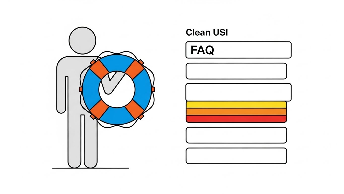
The Visual & Narrative Approach
A helpful, calming composition that blends vector art with interface elements. A simplified, grey vector character (no facial features to keep it neutral) holds a large, stylized "Lifebuoy" icon in Calming Blue. To the right, a simplified "Clean UI" list represents an FAQ or Help menu, with one item highlighted in Urgent Orange. The background is stark white. The motion is slow and gentle—the character offers the lifebuoy, and the menu scrolls smoothly.
Psychological Impact & KPI Focus
When a user visits a Knowledge Base (Goal 9.1), they are usually frustrated or confused. They are in a state of negative emotional arousal. This style is designed to de-escalate that stress. The "Minimalist Flat" style removes visual noise, while the "Lifebuoy" offers a universal symbol of safety and support. It visually reassures the user: "We have got you; the answer is right here." It positions your support system as accessible and human-centric, not a robotic labyrinth.
Strategic Implementation & Trade-offs
- Best Use Case: Help Center headers, 404 Error pages, or "Contact Support" videos.
- Duration: 5-10 seconds.
- Trade-off: It is not "exciting." It is functional. Do not use this for sales; use it strictly for customer care and retention.
Companies using similar video content -
Freshdesk – Omnichannel – Offers clear, accessible support resources.
Intercom – Platform – Provides intuitive help and support interfaces.
26. Lifestyle Stock with UI Overlay
Retention | Reducing Support Overhead

The Visual & Narrative Approach
A shift from the "office" to the "outcome." We see a cozy, over-the-shoulder shot of a person working in a home environment—soft lighting, a steaming coffee mug, a comfortable sweater. Floating in the air in front of their laptop are semi-transparent, white UI icons (Settings, Chat, Analytics) that glow softly. The person isn't frantically typing; they are relaxed. This style mixes high-quality photography with futuristic Augmented Reality (AR) graphics.
Psychological Impact & KPI Focus
Retention (Goal 1.18) is often driven by how the software impacts the user's quality of life. If the software is efficient, the user finishes on time. This style visualizes autonomy and flexibility. The floating UI suggests that the work is accessible anywhere, while the cozy atmosphere implies that the "heavy lifting" is done, leaving the user in a state of control. It appeals to the desire for a stress-free workday.
Strategic Implementation & Trade-offs
- Best Use Case: Email newsletters, retention campaigns, or "remote work" feature updates.
- Duration: 10-15 seconds.
- Trade-off: Ensure the stock photography feels authentic, not staged. The "AR" overlay must look tracked to the scene, or it will look cheap.
Companies using similar video content -
ClickUp – Work Management – Promotes flexible work with integrated tools.
Tray.io – Automation Platform – Enables efficient work from anywhere.
27. 3D Parallax UI Presentation
Retention | Reducing Churn
The Visual & Narrative Approach
A sophisticated method for displaying static screenshots. Multiple UI screens (Dashboards, Mobile Views, Analytics) are arranged in 3D space against a Deep Purple gradient background. As the "camera" moves, the screens move at different speeds (parallax effect), creating a rich sense of depth. The foreground screens are razor-sharp, while the background layers blur slightly. It turns flat 2D screenshots into an immersive 3D workspace.
Psychological Impact & KPI Focus
Flat screenshots are boring and often ignored. This style (Goal 1.19: Reducing Churn) makes the platform look "deep" and substantial. The parallax effect engages the spatial processing part of the brain, making the viewer feel like they are stepping into the software. It signals that this is not just a tool, but a comprehensive environment for work. It reinforces the value of the subscription by showing the sheer volume of connected features.
Strategic Implementation & Trade-offs
- Best Use Case: Login Screens (background), App Store preview videos, or Investor Decks.
- Duration: 15-30 seconds (Loop).
- Trade-off: It requires high-resolution assets. If your UI is cluttered, this style will make it look even messier. Use it to showcase your cleanest screens.
Companies using similar video content -
Hyland – Content Services – Showcases comprehensive content management features.
Laserfiche – ECM – Presents a deep, integrated view of document processes.
28. Futuristic Neon/Dark Mode
Expansion | Driving Deep Feature Adoption

The Visual & Narrative Approach
A purely abstract, high-octane visualization of "The Future." We fly through a dark, reflective corridor illuminated by Neon Pink and Electric Blue light strips. The geometry is sleek and angular. At the end of the tunnel is a pulsating, circular "portal" or energy core. There is no UI here, only the feeling of velocity and next-generation technology. It borrows the aesthetic of sci-fi and gaming.
Psychological Impact & KPI Focus
In the Expansion phase (Goal 1.17), you need to excite existing customers about what’s coming next (Upsell). You aren't selling what the software does now; you are selling the roadmap. This style triggers the excitement of novelty and innovation. It positions your brand as a pioneer. It tells the customer: "Stick with us, and you will have the coolest tech in the industry." It creates anticipation for Version 2.0 or a Premium Tier upgrade.
Strategic Implementation & Trade-offs
- Best Use Case: "Coming Soon" teasers, Product Launch intros, or major version update announcements.
- Duration: 10-15 seconds.
- Trade-off: It is all hype. You must follow this immediately with concrete details, or the viewer will feel tricked.
Companies using similar video content -
Nylas – API Platform – Teases future communication automation capabilities.
WSO2 – API Management – Highlights next-gen integration and API solutions.
29. 2D Graphics Over Live Action
Expansion | Driving Upsell/Cross-sell

The Visual & Narrative Approach
A playful mix of reality and imagination. We see a standard photo or video of a professional in an office. Superimposed around their head are sketchy, hand-drawn 2D vector animations in primary colors (Red, Blue, Yellow). Lightbulbs pop up, gears turn, and arrows point upward. These animations are not polished; they look like scribbles on a whiteboard, symbolizing the "spark" of human creativity.
Psychological Impact & KPI Focus
As you move to Cross-sell (Goal 1.20), you want to emphasize that your software amplifies human potential, not just replaces it. This style visualizes "Idea Generation" and "Value Add." The contrast between the rigid photo and the loose, fun sketches makes the technology feel additive. It suggests that using the software unlocks creativity and new ideas. It is a friendly, non-threatening way to suggest adding a new module or service.
Strategic Implementation & Trade-offs
- Best Use Case: In-App Pop-ups for new features, or social media posts celebrating client wins.
- Duration: 5-10 seconds.
- Trade-off: It is casual. Avoid using this for serious compliance or security features. Keep it focused on "Growth" and "Creativity" tools.
Companies using similar video content -
Gong.io – Revenue Intelligence – Adds visual insights to sales conversations.
Chorus.ai – Conversation Intelligence – Enhances live interactions with data overlays.
30. Holographic UI over 3D Render
Expansion | Driving Referrals

The Visual & Narrative Approach
A merging of the physical and the virtual to create a sense of reward. A realistic 3D rendering of a wooden meeting table sits in a dimly lit room. Projected onto the table is a glowing, translucent Hologram in Cyan and Transparent White. The hologram displays a stylized "Trophy" or "Reward Cup" rotating slowly. The blue light from the hologram realistically illuminates the wood grain of the table.
Psychological Impact & KPI Focus
Driving Referrals (Goal 1.21) requires making the advocate feel special. A flat email saying "Refer a Friend" is boring. A holographic trophy is a "Power Object." This style visualizes the status and premium reward associated with being a brand advocate. It creates a "gamified" feel—treating the referral program like an exclusive club. The holographic aesthetic implies that the reward is futuristic and high-tech, aligning with the brand's identity.
Strategic Implementation & Trade-offs
- Best Use Case: Referral Program landing pages, "Ambassador" email invites, or social media recognition posts.
- Duration: 5-10 seconds (Loop).
- Trade-off: It is purely symbolic. Ensure the actual reward (the text overlay) is clear, or the viewer will be confused about what the trophy represents.
The Visual Operations Doctrine: A Strategic Knowledge Base
We have explored 30 distinct visual styles, from the kinetic energy of "Bold Typography" to the developer-centric precision of "Dark Mode." But a library of styles is not a strategy. To truly leverage the power of visualization in the Business Process Automation (BPA) sector, you must transition from creating "content" to building a Visual Operating System.
This concluding section synthesizes the insights from all 30 examples into a cohesive, 3-part strategic framework. This is your blueprint for aligning visual assets with business outcomes, ensuring that every pixel serves a specific KPI.
Strategic Alignment & Visual Architecture
The "Pre-Production" Phase: Why and Who
Before a single frame is rendered, the visual architecture must be defined. This phase moves beyond aesthetics to audit the cognitive needs of your audience.
- The Cognitive Load Audit: Don't just design for "pretty." Audit your current training materials. If a PDF takes 20 minutes to read, replace it with a Style 6 (Isometric) animation that explains the logic in 30 seconds. Measure success by the reduction in "Time-to-Comprehension."
- Role-Based Visual Mapping: Different roles require different visual dialects. Use Style 1 (Kinetic Typography) for the distracted Executive scroller on mobile, but switch to Style 4 (Line Art Data Viz) for the CTO who needs to see the network topology on a desktop.
- The "Glanceability" Standard: In high-stress operations (e.g., logistics, trading), visuals must be understood in under 2 seconds. Adapt Style 2 (Minimalist Flat) for these scenarios—high contrast, zero clutter, immediate signal detection.
- Brand Voice Consistency: Your "Sales" voice (exciting, Style 13 Rapid Montage) often disconnects from your "Support" voice (boring text). Unify them. Use Style 25 (Hybrid Flat) to bring the brand personality into the help center, creating a seamless user experience.
- The Advids Strategic Audit: Building this architecture requires an outside eye. Partnering with a specialized agency like Advids allows you to audit your existing assets and define a "Visual Operating System" that scales across departments before production costs mount.
- Standardization vs. Customization: For core platform features, invest in high-fidelity Style 20 (Photorealistic) assets that can be reused for years. For ephemeral content (weekly updates), use lower-cost Style 5 (Gen AI) to maintain velocity without blowing the budget.
- The Cross-Departmental Bridge: Sales talks "ROI," Ops talks "Efficiency," Support talks "Tickets." Use Style 18 (Isometric Workflow) to create a shared visual model that all departments can point to, unifying the internal language.
- Legacy System Integration: One of the hardest things to sell is the connection between old hardware and new software. Use Style 9 (Wireframe to Reality) to visually demonstrate how your modern platform overlays and revitalizes legacy infrastructure.
- Accessibility as a Default: Visuals are the great equalizer. Use Style 16 (2D Animation) with clear visual cues (not just audio) to ensure your training is accessible to a global, multi-lingual workforce without expensive re-dubbing.
- The Mobile-First Mandate: 60% of B2B research happens on mobile. Ensure every style—especially complex data visualizations like Style 8—is legible on a vertical 9:16 screen. If it doesn't work on a phone, it doesn't work for the modern buyer.
Operational Adoption & Implementation
The "Deployment" Phase: How to Embed Visuals
A video that sits unwatched on a server is wasted capital. This segment focuses on embedding these styles into the "Critical Path" of your user's daily workflow.
- Overcoming "Big Brother" Anxiety: When introducing monitoring automation, employees feel watched. Use Style 11 (Aspirational Montage) and Style 5 (Cinematic AI) to frame the technology as a "support system" that removes menial work, rather than a surveillance tool.
- The Micro-Learning Shift: Kill the 60-minute webinar. Break training into 30-second "Micro-Learning" modules using Style 10 (Clean UI). Embed these directly into the software dashboard so users learn while they work.
- Just-in-Time Support: Integrate Style 24 (Macro Interaction) GIFs into your tooltips. When a user hovers over a complex feature, show them the "click" action instantly. This reduces "context switching" (leaving the app to find help).
- Gamification of Training: Use Style 30 (Holographic Trophy) visuals to reward users who complete certification modules. Visualizing the "achievement" increases completion rates for boring compliance training.
- Reducing Support Ticket Volume: There is a direct correlation between proactive visual guides and silence in the call center. Deploy Style 25 (Lifebuoy Hybrid) in your chat bot to answer common questions visually before a human agent is needed.
- Remote Onboarding: For distributed teams, you cannot do in-person seminars. Use Style 27 (3D Parallax) and Style 14 (Character Story) to create an immersive, welcoming onboarding experience that feels personal, even over Zoom.
- Visualizing SOPs (Standard Operating Procedures): Text-based SOPs are ignored. Transform them into Style 6 (Isometric) loops. A visual process flow is unambiguous and transcends language barriers, ensuring consistent execution.
- Feedback Loops: Don't just broadcast; listen. Use interactive video elements (overlaid on Style 26 Lifestyle) to ask users, "Was this helpful?" Real-time feedback helps you refine your visual strategy.
- Scalable Localization: If you expand globally, re-shooting video is expensive. Styles like Style 3 (Abstract Motion) and Style 4 (Line Art) rely on symbols, not text or faces. They are "Global Ready" out of the box, requiring no localization budget.
- Leadership Communication: When the CEO presents the 5-year strategy, static slides fail to inspire. Use Style 28 (Futuristic Neon) to visualize the "North Star." High-end visuals command attention and signal that the leadership has a clear, modern vision.
Measuring Impact & Future-Proofing
The "ROI" Phase: Proving Value and Evolving
Finally, we must close the loop. How do you prove that better pixels equal better profits? This segment defines the metrics of visual success.
- Beyond "Views": Vanity metrics are dead. Measure "Time-to-Competency" (how fast a user learns a feature after watching Style 10) and "Feature Adoption Rate" (did usage spike after the Style 13 promo?).
- The "Idle Time" Metric: In operations, seconds matter. Correlate the use of Style 23 (Hyper-lapse/Data) training with a reduction in software "idle time" (time spent figuring out what to do next).
- Compliance Velocity: When regulations change, how fast does the workforce adapt? Measure the speed of compliance verification after deploying a Style 2 (Minimalist Error Detection) update video vs. a text memo.
- Retention and LTV: High-quality UX visualization (Style 24) reduces frustration. Track the correlation between users who engage with your visual help center and their Long-Term Value (LTV).
- The AI Visual Frontier: Prepare for the next wave. Real-time, generative video guides will soon customize themselves to the user's specific data. Styles like Style 22 (Gen AI) are the training ground for this future.
- Scalability of Assets: Build a library, not a landfill. Organize your source files (3D models from Style 15, Vectors from Style 2) so they can be remixed for future campaigns. This lowers the "Cost Per Asset" over time.
- The Advids Partnership: Visual trends evolve rapidly. Maintaining an internal studio that can execute all 30 styles is rare. A long-term partnership with Advids ensures your visual language evolves with the market, scaling your production capacity without scaling headcount.
- Benchmarking Success: Your competitor is using stock photos. By adopting Style 19 (X-Ray) or Style 20 (Photorealistic), you create a "Quality Moat." Measure your brand perception against competitors to see if the "premium" visual uplift is working.
- The ROI of Safety: In BPA sectors involving physical logistics, safety is a cost center. Quantify the reduction in insurance claims or accidents after implementing high-clarity Style 2 (Hazard Detection) safety briefings.
- Final Call to Innovation: Treat video as infrastructure, not content. When you invest in a bridge, you expect it to carry traffic for decades. When you invest in these 30 visual styles, you are building the bridges that carry your customers from confusion to clarity, and from skepticism to trust.
Companies using similar video content -
Coupa – Business Spend Management – Visualizes rewards for procurement efficiency.
Ivalua – Source-to-Pay – Incentivizes users for successful sourcing and payment.
Author & Editor Bio


