
Introduction: Visualizing the Invisible Engine
The modern enterprise is an intricate machine, often running on an invisible engine of disconnected workflows, legacy systems, and silent data silos. For the "Orchestration Architect"—the COOs and Digital Transformation Leaders tasked with streamlining this complexity—the challenge is not just technical; it is cognitive. How do you convince stakeholders to modernize what they cannot see?
The gap between operational reality and digital potential is expensive. A 2024 study by CIO.com revealed that the average large enterprise lost $104 million to digital inefficiencies in a single year. These are not just lost hours; they are missed opportunities for innovation and hidden reservoirs of friction that slow down decision-making.
However, the inverse is equally powerful. When processes are clearly visualized and orchestrated, the impact is transformative. Market analysis suggests that optimized BPM strategies can enhance revenue by 40%, turning operational friction into a competitive flywheel.
This guide is not merely a collection of video styles; it is a strategic framework for bridging the physical-digital divide. By leveraging the right visualization techniques—from abstract kinetic typography to hyper-realistic 3D digital twins—you can lower the cognitive load for your buyers, articulate complex "Intelligent Orchestration" concepts, and position your platform as the visionary leader in a crowded market.
Below are the first 10 "Gold Standard" visualization styles, curated to address specific stages of the B2B buying funnel.
1. Bold Kinetic Typography (Visual)
TOFU | Brand Awareness

The Visual & Narrative Approach
This style abandons traditional imagery to focus purely on the rhythm and weight of the process itself. As seen in the example, massive, industrial block shapes in Volt Yellow and Slate Grey are arranged in a structured, rhythmic composition that forms the word "FLOW." These forms do not represent literal objects but rather the "heavy lifting" of enterprise data. The kinetic movement is key; the blocks glide and lock into place with a satisfying "click," suggesting a friction-free ecosystem. The use of a pure white background keeps the focus entirely on the motion, while the glossy surfaces of the 3D text imply a polished, premium solution.
Psychological Impact & KPI Focus
For Top-of-Funnel (TOFU) audiences, specifically those suffering from "process fatigue," this style offers immediate cognitive relief. It simplifies the complex reality of operations into a clean, energetic visual metaphor. The psychological hook here is Control. By showing chaotic elements (floating particles) organizing themselves into a solid structure ("FLOW"), you subconsciously signal that your platform brings order to chaos. This directly addresses the anxiety of operational fragmentation, positioning your brand as the architect of efficiency.
Strategic Implementation & Trade-offs
- Best Use Case: High-energy Brand Awareness campaigns on websites or event openers (15-30 seconds). It is perfect for communicating a single core value (e.g., Speed, Reliability, Integration) without getting bogged down in details.
- Strategic Trade-off: While excellent for capturing attention, this style is suboptimal for feature education. It conveys a feeling of efficiency but does not explain how the efficiency is achieved. Use it to open the door, not to close the deal.
Companies using similar video content -
VMware – Cloud Foundation – Abstract visualization of SDDC layers.
HashiCorp – Terraform – Fluid animations representing Infrastructure as Code.
IBM – Turbonomic – Organic data flow visualizing resource management.
2. Generative AI Cinematic Video
TOFU | Category Creation

The Visual & Narrative Approach
This style leverages the visionary power of AI generation to depict a "Category Creation" moment. The visual features a futuristic, sun-drenched corporate atrium—a cathedral of commerce. The central dramatic arc is the transformation of the physical to the digital: a swirling vortex of disorganized paper documents dissolves into a sleek, glowing stream of Teal light. This "digital stream" weaves through the architecture, symbolizing the unseen current of intelligent orchestration. The lighting is triumphant, with beams of sunlight piercing the glass, casting a hero’s light on the diverse professionals witnessing the transformation.
Psychological Impact & KPI Focus
This aesthetic targets the "Visionary Leader" persona—CXOs who are looking for a new paradigm rather than just a tool. It addresses the aspiration for modernization and the fear of obsolescence. The visual metaphor of "Paper to Light" validates the transition from legacy manual processes to intelligent automation. It reduces the skepticism associated with digital transformation by presenting it as a beautiful, inevitable evolution rather than a painful disruption.
Strategic Implementation & Trade-offs
- Best Use Case: YouTube "Manifesto" videos or Keynote intros (60-90 seconds). It is designed to establish emotional resonance and market authority.
- Strategic Trade-off: This style creates high emotional buy-in but lacks technical specificity. It sells the dream of automation. If used for a technical audience requiring API documentation or UI walkthroughs, it may be perceived as "marketing fluff."
Companies using similar video content -
ServiceNow – Now Platform – Visionary transformation of enterprise workflows.
Microsoft – Dynamics 365 – AI-driven future of business operations.
Salesforce – Einstein AI – Cinematic portrayal of intelligent automation.
3. Abstract 2D Motion Graphics
TOFU | Market Education
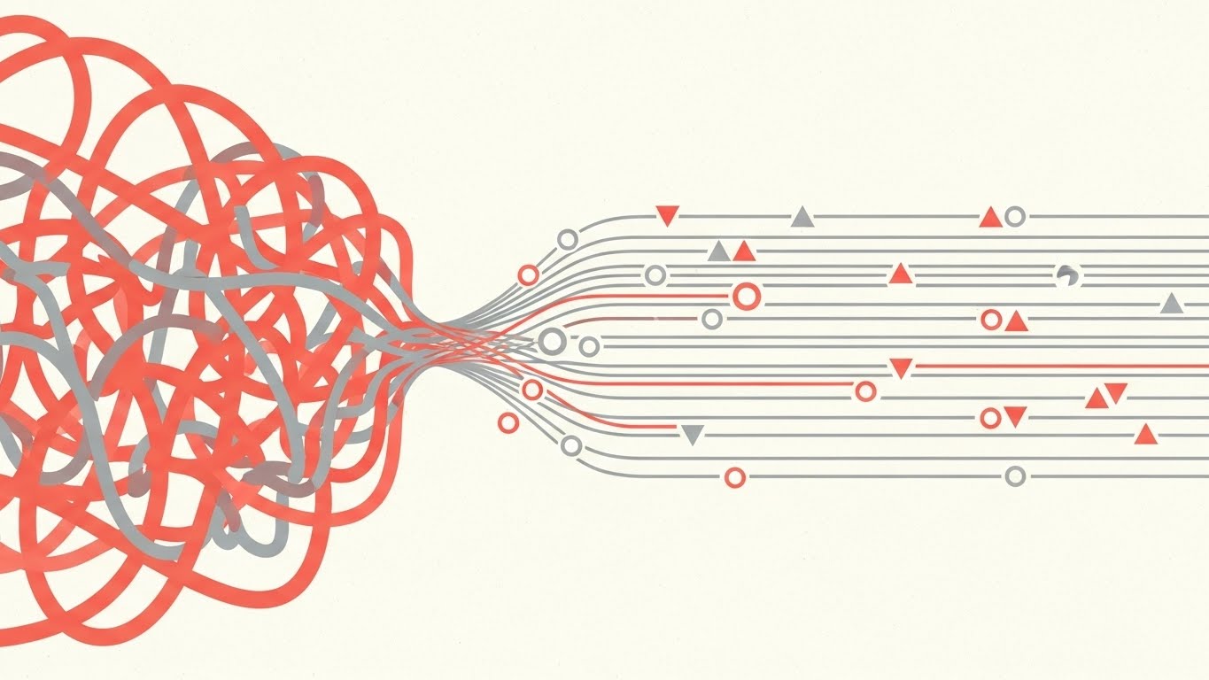
The Visual & Narrative Approach
Drawing from the precision of Bauhaus design, this style uses strict geometry to visualize the removal of friction. The composition is a split narrative: on the left, a chaotic tangle of Coral Pink lines represents the "before" state of unmanaged workflows—messy, overlapping, and inefficient. As the lines move right, they pass through an invisible filter and reorganize into a perfect, parallel grid of Soft Grey lines. Geometric shapes (triangles and circles) float along these tracks like data packets. The flat, textured off-white background gives it a sophisticated, editorial feel, avoiding the "tech startup" cliché of neon gradients.
Psychological Impact & KPI Focus
This style appeals to the "Logical Analyst." It visually proves the concept of Linearization—the idea that the software can untangle complex dependencies. The symmetry and precision satisfy the viewer's desire for order and predictability. It addresses the operational pain point of "bottlenecks" by visually demonstrating how a tangled input can become a streamlined output. It creates a sense of "Clean AI"—transparent, understandable, and under control.
Strategic Implementation & Trade-offs
- Best Use Case: LinkedIn feed posts and "Concept Explainer" videos (30-45 seconds). The 1:1 aspect ratio works perfectly for mobile feeds where vertical screen real estate is valuable.
- Strategic Trade-off: The abstraction is high. While it effectively communicates "organization," it is abstract regarding the actual user interface. It creates a conceptual understanding but does not train a user on the software.
Companies using similar video content -
Appian – BPM Suite – Geometric simplification of complex process logic.
UiPath – Automation Platform – Visualizing streamlined robotic process automation.
Camunda – Platform – Abstracting workflow orchestration and decision automation.
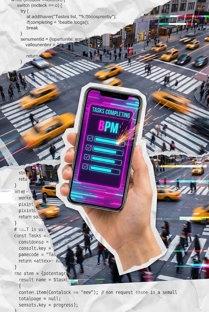
4. AI Generated Mixed Media Video
TOFU | Vertical Social Organic

The Visual & Narrative Approach
This style embraces the chaotic energy of modern work using a fast-paced vertical collage. It creates a "Digital Layer" over reality. A cutout hand holds a smartphone against a timelapse of a busy city intersection, grounding the software in the real world. The phone screen glows with a Vivid Magenta and Cyan BPM interface, where tasks are visibly "checking off" with animated sparks. The background texture—torn paper layered with coding syntax—suggests the merging of old-school bureaucracy with modern code. It is visceral, fast, and tactile.
Psychological Impact & KPI Focus
Targeting the "Mobile Workforce" and younger decision-makers, this style validates the "Anywhere Operations" model. It addresses the anxiety that enterprise software is slow and desktop-bound. By showing the interface overlaid on a busy city, it visually claims that your BPM tool works at the speed of life. The "sparks" provide immediate visual gratification (Dopamine hit), mimicking the satisfaction of completing a to-do list, which is a powerful psychological hook for productivity tools.
Strategic Implementation & Trade-offs
- Best Use Case: TikTok, Instagram Reels, or YouTube Shorts (15-60 seconds). It is designed for high-velocity consumption and stopping the scroll.
- Strategic Trade-off: This style is too informal for the Boardroom. It works for user advocacy and brand coolness but may lack the gravitas required for a six-figure enterprise contract presentation.
Companies using similar video content -
Asana – Work Management – Urban overlay demonstrating mobile task agility.
Monday.com – Work OS – Fast-paced collage for real-world team collaboration.
Smartsheet – Platform – Digital layer over reality for dynamic project management.
5. Abstract 2D Flat Vector Organic Modern
TOFU | Skippable Pre-Roll Ad

The Visual & Narrative Approach
This style utilizes fluid dynamics to metaphorically represent "Agility." A blob of Lime Green liquid is the protagonist, navigating a rigid maze of Silver geometric barriers. Unlike rigid objects that would crash, the liquid morphs, stretches, and reshapes itself to flow effortlessly through tight gaps. The lighting is soft and high-key, creating glossy highlights that make the liquid appear viscous and responsive. The pristine white background emphasizes the cleanliness of the solution.
Psychological Impact & KPI Focus
This speaks to the "Change Manager." The core anxiety it soothes is "Rigidity"—the fear that a new software will be too inflexible to handle exceptions. The liquid metaphor visually proves Adaptability. It reassures the viewer that the system can handle edge cases and non-standard processes without breaking. It positions the software as "Organic" and "Living," rather than static and hard-coded.
Strategic Implementation & Trade-offs
- Best Use Case: Skippable YouTube Pre-roll ads (6-15 seconds). The visual hook is immediate and satisfying to watch, increasing retention rates.
- Strategic Trade-off: While visually pleasing, it can be perceived as simplistic. It risks oversimplifying complex compliance issues. Ensure the voiceover grounds the visual agility in robust security terms.
Companies using similar video content -
MuleSoft – Anypoint Platform – Liquid morphing for seamless API integration.
Boomi – Integration Platform – Fluid dynamics signifying adaptable data flow.
TIBCO – Connect – Organic shapes representing flexible enterprise connectivity.
6. Abstract 3D AI Visualization
TOFU | Shaping Brand Perception

The Visual & Narrative Approach
This visualization adopts a "Medical/Lab" aesthetic to depict the neural network of a business. It avoids the dark, ominous "Matrix" look in favor of a clean, bright, and clinical style. Glowing nodes in Violet and Cyan act as data hubs, connected by fine fiber optic threads against a clean White background. The camera utilizes a macro depth of field, focusing sharply on a central node while distant connections blur. The lighting is bright and clinical, representing "Clean AI" and transparent intelligence without the dark/cyber tropes.
Psychological Impact & KPI Focus
This targets the "CTO/CIO" persona. It addresses the need for "Connectivity" and "Intelligence." The clinical white background signals hygiene, precision, and transparency—crucial for AI adoption where "Black Box" algorithms are a concern. It visualizes the KPI of Integration, showing how disparate data points are physically connected. It reframes the software from a "tool" to an "ecosystem."
Strategic Implementation & Trade-offs
- Best Use Case: Website Hero Backgrounds or "Our Technology" pages (Looping). It establishes a high-tech, credible atmosphere.
- Strategic Trade-off: It is highly theoretical. It does not show what the data is or how users interact with it. It builds brand perception but does not aid in user training or specific feature comprehension.
Companies using similar video content -
Databricks – Lakehouse Platform – Glowing nodes visualizing transparent data architecture.
Snowflake – Data Cloud – Clinical aesthetic for intelligent data connectivity.
Google Cloud – Vertex AI – Abstract neural networks for transparent intelligence.
7. Isometric 2D Motion Design
MOFU | Product/Solution Differentiation

The Visual & Narrative Approach
This is the "Architect's View." Set against a blueprint grid background, the scene depicts a "Process Factory" in a flat, vector-based isometric style. There are no gradients, only hard edges and clear Sky Blue tones. Raw shapes (cubes) enter a machine on the left and emerge as polished products (diamonds) on the right. It creates a literal "Input > Process > Output" mental model. The uniformity of the conveyor belt suggests standardization and reliability.
Psychological Impact & KPI Focus
This style is highly effective for the "MOFU (Middle of Funnel)" evaluator who needs to understand the structure of the solution. It reduces cognitive load by stripping away realistic textures and focusing purely on the logic of the workflow. It addresses the "Black Box" anxiety by showing exactly what happens inside the machine. It visually promises Standardization and Predictability, which are key desires for Operations Managers.
Strategic Implementation & Trade-offs
- Best Use Case: "How it Works" pages and Product differentiation sections (60-120 seconds). It is excellent for explaining the logical flow of data.
- Strategic Trade-off: It can feel impersonal or robotic. It removes the human element entirely. It is best used for backend process explanation rather than frontend user experience or collaborative benefits.
Companies using similar video content -
Pega – Infinity Platform – Blueprint factory demonstrating structural value differentiation.
Nintex – Process Platform – Isometric view of standardized workflow automation.
Bizagi – Studio – Flat vector factory for clear process modeling.
8. Isometric 3D Workflow
MOFU | Feature Education & Demonstration

The Visual & Narrative Approach
Upgrading the 2D factory to a photorealistic miniature model, this style adds weight and value to the process. The scene is a detailed digital factory floor with soft global lighting that simulates a high-end architectural model. Orange and Slate Grey data blocks travel on conveyor belts, being physically picked up and sorted by robotic arms rendered in a matte white finish. The shadows and reflections on the white floor give it a sense of physical presence. It makes the digital data feel like a tangible asset that is being managed with care.
Psychological Impact & KPI Focus
This style targets the "Procurement Team" and "Department Heads." By rendering data as physical blocks, it assigns value to every byte. The robotic precision visualizes Automation and Error Reduction. It reassures stakeholders that the automation is precise, careful, and deliberate—not a chaotic script running wild. It communicates "Premium Infrastructure" and high-value asset management.
Strategic Implementation & Trade-offs
- Best Use Case: Landing Page feature demos and Product Launch videos (45-90 seconds). It elevates the perceived value of the software.
- Strategic Trade-off: It is resource-intensive to produce. Changes to the workflow require re-rendering 3D scenes. It also risks being too metaphorical if the actual software interface is never shown—it needs to be paired with UI shots.
Companies using similar video content -
Siemens – Digital Twin – Photorealistic miniature factory for automated routing.
PTC – ThingWorx – Digital twin demonstrating precise IoT asset management.
Rockwell Automation – FactoryTalk – 3D workflow for industrial automation logic.
9. Wireframe to Reality Transition
MOFU | Competitive Displacement
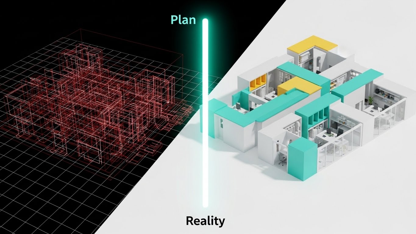
The Visual & Narrative Approach
This style is a direct "Before and After" comparison, visualized through a split-screen wipe. The left side shows the "Plan"—a complex wireframe blueprint in technical Red lines on a white grid, showing a complex, messy structure. The right half is a fully rendered, photorealistic modern office building interior in Mint and White, derived exactly from the wireframe lines. A glowing vertical bar sweeps across the image, visualizing the transition from "Plan" to "Reality." It visually narrates the journey from "Project Design" to "Operational Execution."
Psychological Impact & KPI Focus
This appeals to the "Project Manager" and "Implementation Lead." The core anxiety it addresses is the "Implementation Gap"—the fear that the final result won't match the plan. This visual proves Fidelity. It demonstrates that the software ensures the execution (Reality) matches the design (Wireframe) pixel-for-pixel. It is a powerful metaphor for "Compliance" and "Adherence to Spec."
Strategic Implementation & Trade-offs
- Best Use Case: LinkedIn case study summaries and "Competitive Displacement" assets (30 seconds). It visually argues that "Competitors give you plans; we give you reality."
- Strategic Trade-off: It is binary. It implies a perfect, finished state, which might overpromise in complex, iterative environments. It lacks the nuance of "continuous improvement" unless the wipe is shown sweeping back and forth to imply iteration.
Companies using similar video content -
Autodesk – Fusion 360 – Blueprint reveal proving rapid design implementation.
Dassault Systèmes – 3DEXPERIENCE – Transition from wireframe to engineered reality.
Bentley Systems – iTwin Platform – Digital twin from plan to operational execution.
10. Dynamic Data Visualization
MOFU | ABM Awareness

The Visual & Narrative Approach
This style is about scale. It features a "Data Wall"—a towering monolith of information viewed from a low angle, making the viewer look up at their data. The screen displays flowing charts and 3D bar graphs in Navy Blue and Gold against a White environment. The camera is positioned low, emphasizing scale and visibility. The style is clean and corporate, utilizing glossy plastic textures for the bars. This visual targets high-value accounts by showing enterprise-scale analytics.
Psychological Impact & KPI Focus
This targets "Enterprise Accounts" (ABM). The sheer scale of the wall implies that the software is capable of handling "Big Data." It speaks to the anxiety of "Data Silos" and fragmentation by showing everything in one massive, unified view. The psychological trigger is Omniscience—the promise that the executive will see everything, from the high-level trends to the granular details, in a single, impressive dashboard.
Strategic Implementation & Trade-offs
- Best Use Case: Programmatic ABM ads and Executive Dashboards demos (15-30 seconds). It signals "Enterprise Ready."
- Strategic Trade-off: It can appear intimidating. For a mid-market user, this "Tower of Power" might look expensive and overly complex. It is strictly a "Power User" or "Executive" visual play.
Companies using similar video content -
Tableau – Desktop – Data wall asserting enterprise scale analytics.
Qlik – Sense – Towering information monolith for unified data insights.
Alteryx – Analytics Cloud – Flowing charts for enterprise-ready data science.
11. Minimalist Flat 2D Vector
MOFU | Overcoming Objections

The Visual & Narrative Approach
In stark contrast to complex data visualizations, this style utilizes radical simplicity to act as a visual "palate cleanser." As defined by the strategic input, it features a flat 2D vector illustration with a soothing palette of Pastel Lavender and Charcoal. The central focus is a simplified shield icon that effortlessly deflects a jagged, chaotic arrow. The composition is perfectly symmetrical and centered, devoid of gradients or shadows. It communicates absolute stability through clean geometry, visually proving that the software is a stabilizer, not a disruptor.
Psychological Impact & KPI Focus
This style targets the "Risk-Averse Stakeholder" who fears that a new BPM implementation will add noise to an already loud system. It addresses the objection of Complexity. By stripping away visual clutter, you subconsciously signal that the solution is lightweight and manageable. The shield metaphor directly visualizes the KPI of Noise Reduction and Operational Stability, reassuring the viewer that the platform creates a protected, friction-free environment for their data.
Strategic Implementation & Trade-offs
- Best Use Case: "Security" or "Compliance" sections on the website, and FAQ videos addressing specific fears (e.g., "Is it secure?"). Its legibility at small sizes makes it perfect for mobile-first content.
- Strategic Trade-off: The lack of detail means it is conceptually limited. It conveys the feeling of safety but does not explain the mechanics of your encryption or firewall. It builds trust, not technical understanding.
Companies using similar video content -
Okta – Identity Cloud – Symmetrical shield visualizing effortless security.
CrowdStrike – Falcon Platform – Minimalist vector for complexity reduction in cybersecurity.
Zscaler – Zero Trust Exchange – Clean geometry for operational stability and protection.
12. Split Screen: Optimized Reality and UI
MOFU | LinkedIn Organic
The Visual & Narrative Approach
This style leverages the "Before and After" narrative but elevates it with a modern "Mixed Media Portal" technique. The frame is physically divided by a sharp vertical white line. The left side depicts a desaturated, chaotic photograph of a physical desk buried under paper files—the "Old Way." The right side reveals a pristine, minimalist workspace featuring only an iPad displaying the BPM app in glowing Digital Blue. The contrast is visceral: the messy reality vs. the optimized digital future.
Psychological Impact & KPI Focus
Designed for the "Overwhelmed Manager" scrolling LinkedIn, this visual offers immediate Cognitive Relief. It validates their current struggle (the mess) and provides an instant solution (the clean interface). It visualizes the KPIs of Paper Reduction and Digitization Velocity. The stark difference between the two sides acts as visual proof of the efficiency gains, making the intangible concept of "Digital Transformation" look like a tangible clean desk.
Strategic Implementation & Trade-offs
- Best Use Case: LinkedIn organic feed posts and carousel ads (Vertical 4:5). The high visual contrast is designed to stop the scroll on mobile devices.
- Strategic Trade-off: It is a binary simplification. Enterprise transformation is rarely this black and white. While effective for marketing hooks, it lacks the nuance required for deep-dive process re-engineering discussions.
Companies using similar video content -
Notion – Workspace – Layered reality contrasting chaos vs. control.
ClickUp – Project Management – Split screen showing messy desk to clean interface.
Evernote – Productivity App – Before/after for digital note-taking transformation.
13. Photorealistic 3D Renders
BOFU | The Economic Buyer
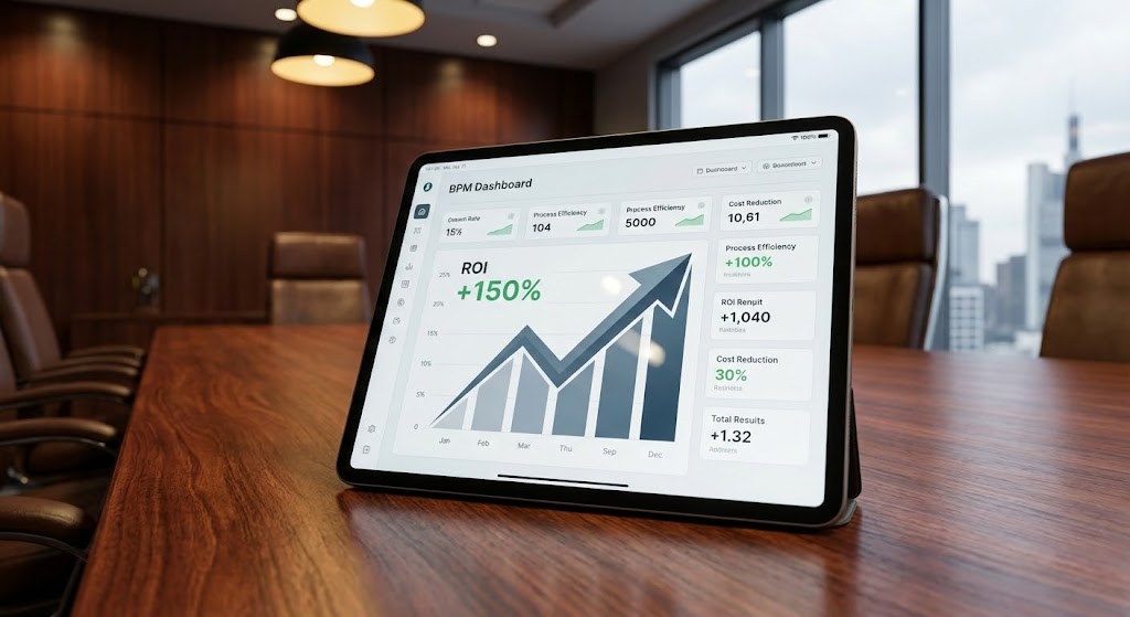
The Visual & Narrative Approach
As we approach the Bottom of the Funnel (BOFU), we must speak the language of the CFO. This style employs high-end photorealistic 3D rendering to place the software in a context of power. A mahogany executive boardroom table, bathed in Warm Tungsten and Steel Grey light, serves as the stage. The hero is a premium tablet displaying a crisp BPM dashboard explicitly showing an "ROI +150%" metric. The shallow depth of field blurs the background, focusing the decision-maker's eye strictly on the financial result.
Psychological Impact & KPI Focus
This targets the "Economic Buyer." It addresses the anxiety of Value. By rendering the environment with luxury textures (wood grain, leather, glass), the visual transfers the perceived quality of the setting to the software itself. It answers the question, "Is this enterprise-grade?" The prominent graph focuses the conversation on Profitability and Growth, moving away from features to financial outcomes.
Strategic Implementation & Trade-offs
- Best Use Case: Proposal decks, Executive Summary emails, and "Pricing" page headers. It signals premium status and serious business intent.
- Strategic Trade-off: It is static. It captures a moment of success but does not show the workflow required to achieve it. It is a "trophy shot" meant to validate the purchase, not to train the user.
Companies using similar video content -
SAP – S/4HANA – Executive tablet validating high-value ROI.
Oracle – Cloud ERP – Premium boardroom setting for financial outcomes.
Workday – Financial Management – Luxury textures for enterprise-grade profitability.
14. 3D X-Ray Visualization
BOFU | The Technical Buyer

The Visual & Narrative Approach
While the CFO looks at ROI, the CTO looks inside the box. This style uses "3D X-Ray Visualization" to demonstrate transparency. A computer server or processor is rendered with a transparent frosted glass casing. Inside, the core processor glows with a secure Cyan light, surrounded by organized White metallic rings. The background is a clinical, bright white studio. This visual metaphor implies that there are "no hidden risks" and that the internal architecture is organized, clean, and robust.
Psychological Impact & KPI Focus
This addresses the "Technical Buyer's" skepticism regarding Security and Stability. The "Glass Box" aesthetic alleviates the fear of "Black Box" proprietary code. It visually proves Architecture Robustness. By showing the internal components as glowing, organized geometry, you subconsciously signal that the system is engineered with precision. It validates the KPI of System Integrity.
Strategic Implementation & Trade-offs
- Best Use Case: "Security Architecture" whitepapers, technical documentation, and BOFU website sections. It builds trust with IT gatekeepers.
- Strategic Trade-off: It is highly abstract. This is a metaphor for code quality, not a literal representation of cloud infrastructure. It reassures the IT team of quality but offers zero value to the end-user concerned with interface usability.
Companies using similar video content -
Palo Alto Networks – Strata – Transparent chip revealing secure architecture.
Fortinet – FortiGate – X-ray view demonstrating robust internal security.
Cisco – SecureX – Glass box aesthetic for system integrity and transparency.
15. Hyper-lapse Stock Footage with Data
BOFU | ROI Justification
The Visual & Narrative Approach
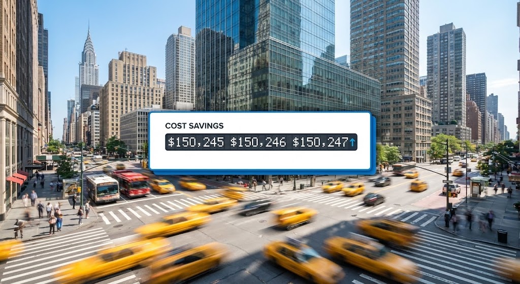
This style bridges the gap between the speed of business and the bottom line. It utilizes hyper-lapse stock footage of a bustling city street—traffic and people blurring in motion—to represent the frenetic pace of commerce. Superimposed over this chaos is a stable, pixel-perfect White UI card displaying a "Cost Savings" ticker. The numbers count up steadily (e.g., "$150,245..."), contrasting with the erratic movement of the background. It visually asserts that while the market is volatile, the returns from this software are constant.
Psychological Impact & KPI Focus
This appeals to the "Operations Director" who needs to justify the purchase to a board. It connects Operational Speed (the hyper-lapse) directly to Financial Gain (the ticker). The counting mechanism utilizes the psychology of "Accumulating Value," creating a sense of urgency and FOMO (Fear Of Missing Out). It visualizes the KPI of Real-Time Savings, implying that every second the software runs, money is saved.
Strategic Implementation & Trade-offs
- Best Use Case: LinkedIn Video Ads (Square 1:1) and ROI Calculator landing pages. The motion captures attention, while the specific data point holds it.
- Strategic Trade-off: It relies on generic stock footage. If the city scene doesn't feel relevant to the client's industry (e.g., using NYC taxis for a rural manufacturing client), it can feel disconnected.
Companies using similar video content -
Coupa – Business Spend Management – City ticker demonstrating real-world financial velocity.
Celonis – Process Mining – Hyper-lapse with data for real-time savings.
ServiceNow – ITSM – Bustling city with cost savings ticker.
16. Futuristic Neon/Dark Mode
BOFU | Risk Mitigation

The Visual & Narrative Approach
To visualize the concept of "Active Defense," this style adopts a "Cyberpunk/Dark Mode" aesthetic. We enter a dark, reflective server corridor where the rack lights pulse in Neon Green. A holographic "Laser Shield" barrier materializes, guarding the data. Unlike the clinical white of the X-Ray style, this is moody and aggressive. It borrows the visual language of high-tech defense systems to imply military-grade protection.
Psychological Impact & KPI Focus
This targets the "CISO" (Chief Information Security Officer). It taps into the primal fear of data breaches. The dark environment suggests a hostile external world, while the neon shields represent Vigilance. It visualizes Risk Mitigation and Threat Prevention. It reassures the buyer that the platform is a fortress, actively patrolling for threats even when they are asleep.
Strategic Implementation & Trade-offs
- Best Use Case: Cybersecurity blog headers, SOC2 compliance announcements, and technical deep-dive videos.
- Strategic Trade-off: It can appear ominous. If overused, it makes the software look "scary" or overly complex to a general business user who just wants a friendly productivity tool.
Companies using similar video content -
Splunk – Enterprise Security – Laser shield signifying active cyber defense.
SentinelOne – Singularity Platform – Neon-lit server corridor for threat prevention.
Darktrace – AI Cyber Defense – Cyberpunk aesthetic for vigilant risk mitigation.
17. Lifestyle Stock with UI Overlay
BOFU | Building Trust & Credibility

The Visual & Narrative Approach
Technology ultimately serves people. This style brings the human back into the frame using high-quality photography overlaid with "Holographic UI." We see a professional woman in a sunlit, modern workspace. She is focused and calm. A large, reassuring "APPROVE" button floats holographically in front of her laptop, glowing in Warm Beige and Navy. This style avoids the coldness of pure software screenshots and focuses on the feeling of using the tool: empowerment and ease.
Psychological Impact & KPI Focus
This appeals to "HR Directors" and "Department Leads" concerned with User Adoption. The core anxiety it addresses is "Burnout" or "Replacement." By showing a happy, productive human making the decision (clicking "Approve"), it promises a positive User Experience (UX). It visually argues that this tool enhances the employee's capabilities rather than replacing them.
Strategic Implementation & Trade-offs
- Best Use Case: "Careers" page, "About Us" videos, or Customer Testimonials. It builds emotional connection and brand warmth.
- Strategic Trade-off: It is soft on features. It sells the "vibe" of the company but doesn't show the actual workflow steps. It builds trust, not technical understanding.
Companies using similar video content -
DocuSign – eSignature – Holographic approval emphasizing human empowerment.
Adobe – Acrobat Sign – Professional woman with glowing approval button.
Zoom – Workplace – Sunlit workspace with holographic meeting controls.
18. Clean UI Workflow (Light Mode)
BOFU | The Functional Buyer
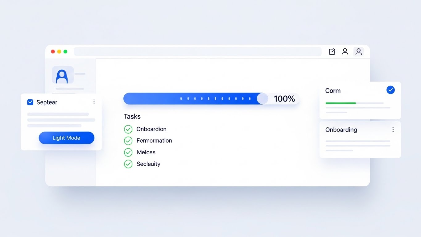
The Visual & Narrative Approach
When the contract is on the table, buyers want to see the reality. This style is the "Honest Broker." It features a pristine, "Clean UI" mockup in Light Mode, utilizing a palette of Crisp White and Royal Blue. The view is head-on and undistorted. We see a clear "Task Progress" bar at 100% and a "Drag and Drop" card interaction. There is no cinematic lighting or neon—just clean, usable design with soft shadows. It represents the software exactly as it looks on a good day: organized and legible.
Psychological Impact & KPI Focus
This targets the "Functional Buyer"—the person who will actually use the tool daily. It eliminates the fear of "Clunky Interfaces." The visual simplicity communicates Ease of Use and Efficiency. It serves as visual proof that the learning curve will be low, directly impacting the KPI of Time-to-Value. It says, "You don't need a manual to use this."
Strategic Implementation & Trade-offs
- Best Use Case: Sales Decks (the "Demo" slide), Pricing Pages, and Feature Walkthroughs. It is the definitive visual of the product itself.
- Strategic Trade-off: It lacks emotional punch. It is purely functional. It won't inspire a vision of the future, but it will close a deal based on practicality.
Companies using similar video content -
Jira – Software – Minimalist progress demonstrating functional clarity.
Trello – Workflow Management – Pristine UI for ease of use and efficiency.
Miro – Online Whiteboard – Clean, legible design for collaborative workflows.
19. 2D Animation & UI Composition
Onboarding | Reducing Implementation Friction
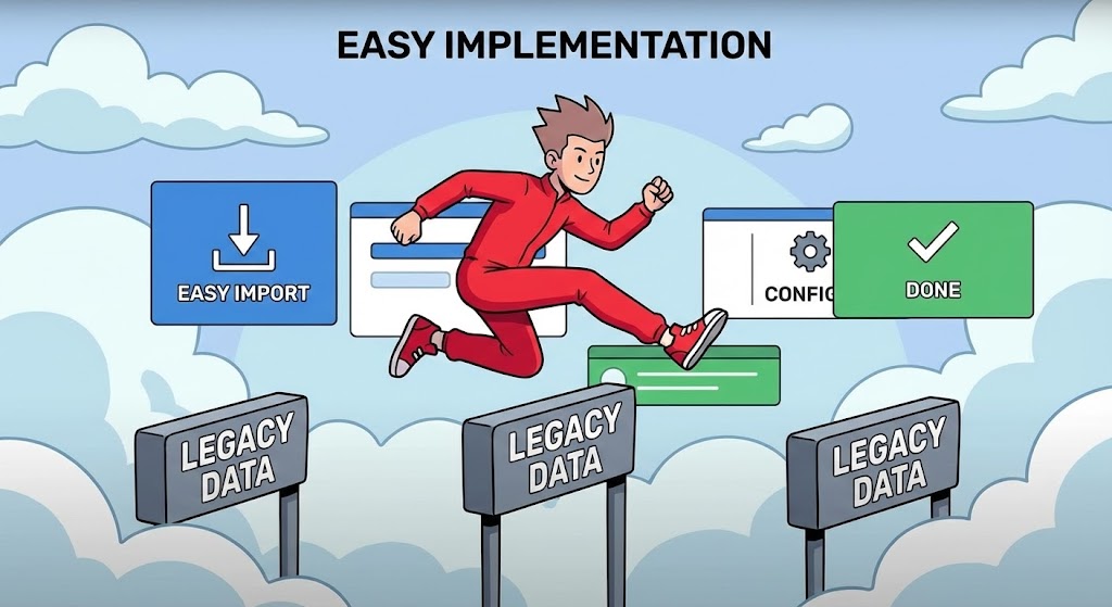
The Visual & Narrative Approach
The sale is won, but the implementation fear remains. This style uses "Stylized 2D Animation" to gamify the onboarding process. A character in Vivid Red is shown effortlessly jumping over hurdles labeled "Legacy Data," aided by floating UI panels that act as springboards. The aesthetic is friendly, using cel-shading and a stylized cloud background. It reframes the daunting task of data migration into an easy, almost fun, athletic achievement.
Psychological Impact & KPI Focus
This targets the "Implementation Team" and "Project Managers." It addresses the specific anxiety of Migration Pain. By turning the obstacles (Legacy Data) into simple hurdles that are easily cleared, it lowers the perceived effort. It visually promises Speed of Implementation and Agility, reassuring the team that the switch-over will be a sprint, not a marathon.
Strategic Implementation & Trade-offs
- Best Use Case: Onboarding Welcome Videos, "Getting Started" guides, or Kick-off meeting intros. It sets a positive, energetic tone for the project.
- Strategic Trade-off: It is too playful for the C-Suite. It works best for internal team motivation and training, not for boardroom financial justification.
Companies using similar video content -
WalkMe – Digital Adoption Platform – Gamified hurdles visualizing frictionless implementation.
Appcues – Product Adoption – Stylized animation for onboarding process.
Pendo – Product Experience – Character jumping over hurdles for data migration.
20. Generative AI Realistic Character video
Onboarding | Driving Demo Requests
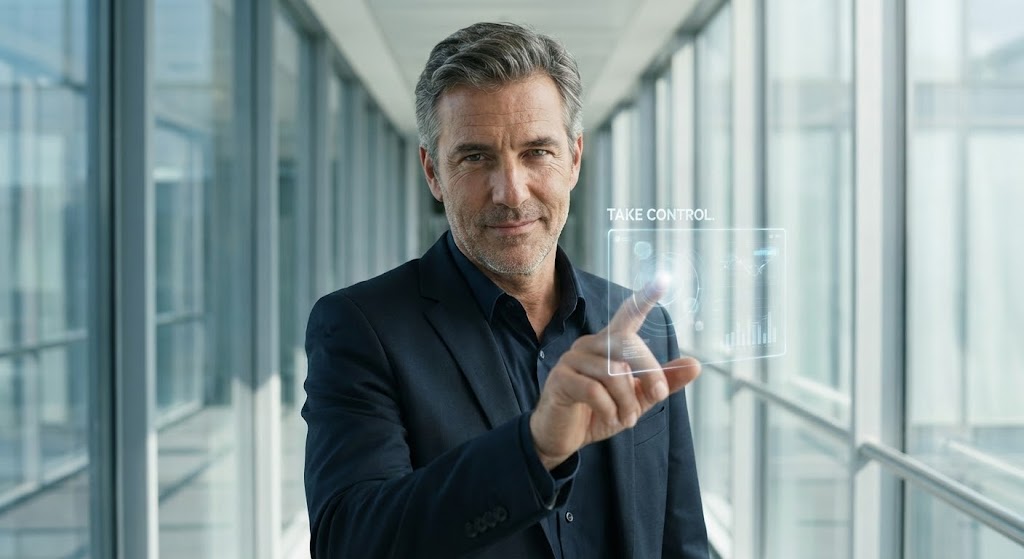
The Visual & Narrative Approach
Finally, we return to the user's identity. This style uses "Generative AI" to create a hyper-realistic avatar of the ideal user. A confident, middle-aged CIO stands in a high-tech glass corridor, making eye contact with the viewer. He interacts with a floating, transparent glass node. The lighting is flattering "Studio Day," and the skin texture is hyper-realistic. He is not stressed; he is in command. This is a mirror held up to the buyer, showing them who they become when they use the platform.
Psychological Impact & KPI Focus
This targets the buyer's Ego and Identity. It moves beyond features to Aspiration. It suggests that using this software is a hallmark of modern, sophisticated leadership. It reinforces the feeling of Control and Mastery. It acts as a final psychological hook, associating the software with personal professional success and the status of a "Visionary Leader."
Strategic Implementation & Trade-offs
- Best Use Case: LinkedIn Ads with a direct "Book a Demo" CTA, or personalized video messages. It creates a strong human connection.
- Strategic Trade-off: It risks the "Uncanny Valley". High-quality generation is essential; if the lip-sync or eye movement is off, it destroys trust. It requires premium execution to maintain authority.
Companies using similar video content -
Gartner – Research & Advisory – Confident leadership inviting visionary control.
Forrester – Research – Hyper-realistic avatar for thought leadership.
Deloitte – Digital Transformation – AI-generated executive for aspirational messaging.
21. 2D Line Art Animation
Onboarding | Self-Serve Onboarding
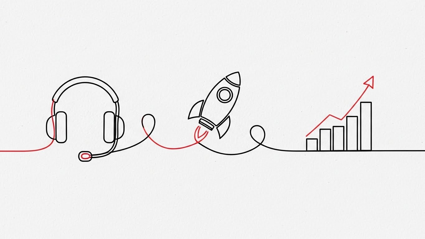
The Visual & Narrative Approach
This style embraces radical simplicity to counter the "overwhelm" often felt during software onboarding. It features an elegant, continuous line illustration in Monochrome Black on a textured paper background, accented by a single Red thread. The line enters from the left, smoothly looping to form a headset icon (support), morphing into a rocket ship (launch), and finally resolving into a rising graph (growth). The motion is unbroken and fluid, metaphorically representing a journey without stops, errors, or friction.
Psychological Impact & KPI Focus
For the "New User," the primary anxiety is incompetence—the fear of getting stuck. This style visually proves Continuity. The unbroken line subconsciously reassures the user that the process is connected, logical, and foolproof. It directly impacts the KPI of Time-to-Competency, suggesting that the path from "Sign-up" to "Success" is a single, uninterrupted motion.
Strategic Implementation & Trade-offs
- Best Use Case: In-app "Welcome" modals and "First Setup" wizard animations (Looping). It keeps the user calm and focused during configuration steps.
- Strategic Trade-off: It is low on detail. It cannot explain how to configure a setting; it only encourages the user to keep going. It is a navigational aid, not an instructional tool.
Companies using similar video content -
Zendesk – Support Suite – Continuous path visualizing frictionless onboarding journey.
Intercom – Customer Messaging – Elegant line art for smooth user support.
Freshdesk – Customer Service – Monochrome journey for time-to-competency.
22. Rapid UI Feature Montage
Onboarding | Accelerating Time-to-Value
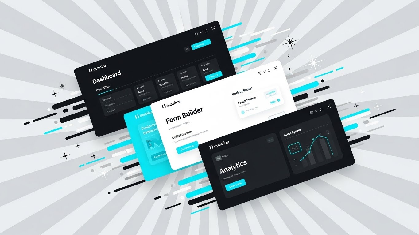
The Visual & Narrative Approach
Speed is the currency of the onboarding phase. This style uses a dynamic, diagonal collage composition to create a sense of velocity. Three distinct UI screens—Dashboard, Form Builder, and Analytics—are layered diagonally across the frame in Vivid Cyan and Silver. Motion blur effects on the edges and vector "speed lines" imply that the software moves as fast as the user thinks. The background is a radial gradient of light grey, pushing the UI elements forward. It is a high-energy visual that promises quick results.
Psychological Impact & KPI Focus
This targets the "Impatient User" who wants immediate ROI. It addresses the friction of "Setup Fatigue." By showing multiple high-value screens flying by, it visually instills the concept of Rapid Deployment. It impacts the Time-to-Value KPI, promising that the user will be viewing dashboards and analytics in minutes, not months.
Strategic Implementation & Trade-offs
- Best Use Case: "Get Started" email sequences and Feature Highlight reels (15-30 seconds). It builds excitement for the tools the user is about to unlock.
- Strategic Trade-off: It can be visually overwhelming. If the motion is too fast, the user cannot read the UI details. It is best for conveying the breadth of the platform, not the depth of a single feature.
Companies using similar video content -
HubSpot – CRM Platform – Dynamic collage suggesting accelerated value realization.
Salesforce – Sales Cloud – High-energy UI screens for rapid deployment.
Zoho – One – Multiple high-value screens flying by for quick results.
23. 2D Character-Driven Story
Onboarding | Trial/Freemium User Activation

The Visual & Narrative Approach
To gamify the onboarding process, this style introduces a relatable protagonist. A flat, vector-style illustration features a female character with glasses sitting at a desk, arms raised in genuine victory. On her monitor, a large "Success!" notification is clearly visible. A conceptual staircase made of floating Pastel blocks leads from her desk to a glowing chest in the sky. The mood is celebratory, utilizing bright, friendly colors to make the software feel approachable and rewarding.
Psychological Impact & KPI Focus
This appeals to the "Freemium User" who needs motivation to engage. It taps into the psychology of Gamification and reward. By visualizing the "Win State" (the chest and the celebration), you trigger a dopamine response associated with task completion. It directly targets Activation Rate and Feature Adoption, encouraging users to climb the "stairs" of your product's learning curve.
Strategic Implementation & Trade-offs
- Best Use Case: "Congratulations" screens after completing a tutorial, or "Re-engagement" emails for dormant users. It injects humanity and fun into the workflow.
- Strategic Trade-off: It can feel juvenile. Use with caution in highly regulated industries (e.g., Defense, Finance) where "fun" might be interpreted as "unserious."
Companies using similar video content -
Mailchimp – Marketing Platform – Celebratory moment triggering user success dopamine.
Canva – Design Platform – Gamified onboarding with character victory.
Duolingo – Language Learning – Character-driven story for user activation.
24. Macro UI Micro-Interactions
Retention | Knowledge Base & FAQ

The Visual & Narrative Approach
When a user is stuck, they don't need fluff; they need precision. This style uses an extreme macro close-up of the interface. We see a digital toggle switch in the "ON" position, glowing with a vibrant Macro Green light against a white background. The pixel-level texture of the screen is visible, grounding the digital tool in physical reality. A soft cursor hovers just over the switch. The shallow depth of field blurs the surrounding text, forcing the eye to focus entirely on the specific interaction.
Psychological Impact & KPI Focus
This targets the "Frustrated User" seeking support. It addresses the anxiety of Ambiguity. By showing the UI in such extreme detail, you provide absolute clarity on exactly what to click. It visualizes Precision and Resolvability. This style is a workhorse for the Support Ticket Reduction KPI, enabling users to self-solve issues through clear, unmistakable visual guides.
Strategic Implementation & Trade-offs
- Best Use Case: Knowledge Base articles, FAQ videos, and Tooltip gifs. It is the most effective way to teach specific, small actions.
- Strategic Trade-off: It lacks context. By zooming in so close, the user loses the sense of where this button sits on the page. These shots must be paired with wider "establishing shots" of the interface.
Companies using similar video content -
Atlassian – Confluence – Precision toggle demonstrating granular control.
GitHub – Actions – Macro close-up of interface for specific actions.
GitLab – DevOps Platform – Pixel-level texture for precise UI interaction.
25. 2D Graphics Over Live Action
Retention | Reducing Support Overhead

The Visual & Narrative Approach
This style bridges the user's physical reality with digital assistance. A POV shot shows a user's hands typing on a laptop. "Popping out" of the screen are friendly, hand-drawn 2D doodle icons—a life ring, a question mark, a chat bubble—in bright Primary Colors. These doodles interact with the real environment, casting shadows on the desk. It visually metaphorizes that "Help" is not just a page on the site, but a living presence that extends into the user's world.
Psychological Impact & KPI Focus
This appeals to the "Anxious User" who feels isolated when problems arise. It visualizes the concept of Ubiquity—that support is always available. It reduces the feeling of technological isolation. The psychological goal is Reassurance, directly impacting Customer Satisfaction (CSAT) scores. It tells the user, "We are right here with you."
Strategic Implementation & Trade-offs
- Best Use Case: "Customer Success" intro videos and "Support Portal" landing pages. It humanizes the support team.
- Strategic Trade-off: It is informal. The "doodle" aesthetic might clash with a strictly corporate brand identity. It works best for brands that want to appear accessible and friendly rather than distant and institutional.
Companies using similar video content -
Slack – Communication Platform – Augmented help visualizing ubiquitous support presence.
Microsoft – Teams – Hand-drawn doodles over live action for assistance.
Google – Workspace – Friendly icons popping out of screen for support.
26. Aspirational Stock Montage
Retention | Reducing Churn

The Visual & Narrative Approach
To retain a client for years, you must sell them a future, not just a feature. This style uses cinematic, low-angle stock photography looking up at a glass skyscraper against a clear blue sky. A Sunshine Yellow lens flare bursts from behind the building, symbolizing a bright future. Superimposed is a subtle, transparent wireframe of a globe network. It conveys scale, permanence, and limitless potential. It lifts the conversation from "bug fixes" to "global domination."
Psychological Impact & KPI Focus
This targets the "Executive Sponsor" during renewal periods. It addresses the fear of "Stagnation." The visual language of skyscrapers and global networks implies Growth and Stability. It reaffirms that the vendor is a major player capable of supporting the client's long-term expansion. The focus KPI is Lifetime Value (LTV) and Churn Reduction, positioning the software as a pillar of the client's future success.
Strategic Implementation & Trade-offs
- Best Use Case: Quarterly Business Review (QBR) presentations, Renewal Campaign emails, and "Vision" newsletters.
- Strategic Trade-off: It is generic. Without the specific software context, it could apply to any global corporation. It must be paired with specific success metrics (text overlays) to ground the aspiration in reality.
Companies using similar video content -
Accenture – Consulting Services – Global network asserting long-term stability.
Capgemini – Digital Transformation – Cinematic skyscraper for growth and potential.
Cognizant – Technology Solutions – Sunshine lens flare for a bright future.
27. 3D Parallax UI Presentation
Retention | Proactive Support

The Visual & Narrative Approach
This style deconstructs the interface to show the intelligence underneath. Using a 3D parallax effect, UI layers are separated in Z-space against a Soft Blue background. The layers appear as floating glass panes. The front layer, in sharp focus, is a "Proactive Alert" notification card with a modern glassmorphism texture. Between the layers, floating bubbles and notification icons rise slowly like champagne. It creates a sense of depth, implying that the software is deep, multi-layered, and rich with hidden value.
Psychological Impact & KPI Focus
This targets the "Power User" who thinks they have mastered the tool. It visually reveals Depth. The separation of layers suggests there is "more than meets the eye," encouraging the user to explore deeper features. It visualizes the Proactive nature of the system—that alerts and insights are bubbling up from the core engine. This drives Feature Utilization and prevents users from plateauing.
Strategic Implementation & Trade-offs
- Best Use Case: "New Feature" announcements (In-App Interstitials) and "Pro Tip" video series. It makes the UI look sophisticated and worth exploring.
- Strategic Trade-off: It creates a false sense of UI behavior. The actual software is flat, not 3D. Users must understand this is a stylistic representation of depth, not a literal interface guide.
Companies using similar video content -
Datadog – Monitoring & Security – Floating layers visualizing deep-dive intelligence.
New Relic – Observability Platform – UI layers separated in Z-space for insights.
Dynatrace – Software Intelligence – Proactive alert notification with depth.
28. Holographic UI over 3D Render
Expansion | Driving Upsell/Cross-sell
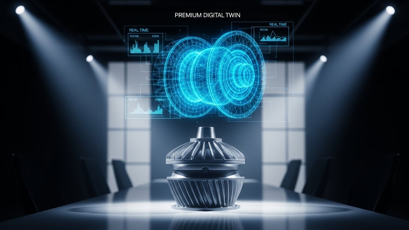
The Visual & Narrative Approach
To sell a premium tier, you must visualize premium value. This style places a realistic 3D render of a physical industrial product (e.g., a turbine) on a conference table. Hovering over it is a complex, Hologram Blue wireframe "Digital Twin," displaying real-time metrics that track the physical object perfectly. The background is a blurred, high-end conference room. This visual explicitly bridges the physical asset with the premium digital management layer.
Psychological Impact & KPI Focus
This targets the "Asset Manager" and "Operations Lead." It taps into the desire for Omniscience. The hologram represents the ability to see the invisible—internal temperatures, stress loads, and performance data—without touching the object. It visualizes the concept of High-Fidelity Control, justifying the cost of upgrading to premium "Digital Twin" or IoT capabilities. It directly supports Upsell Revenue.
Strategic Implementation & Trade-offs
- Best Use Case: Upsell Landing Pages, "Premium Tier" product demos, and Account Management presentations.
- Strategic Trade-off: It is production-heavy. It requires high-quality 3D assets of the physical objects relevant to the client. If the client makes cupcakes and you show a turbine, the metaphor fails.
Companies using similar video content -
GE Digital – Predix – Digital twin overlay visualizing premium asset management.
Honeywell – Forge – Hologram blue wireframe for high-fidelity control.
Schneider Electric – EcoStruxure – Physical asset with real-time metrics overlay.
29. Dark Mode UI Showcase
Expansion | Driving Referrals & Advocacy
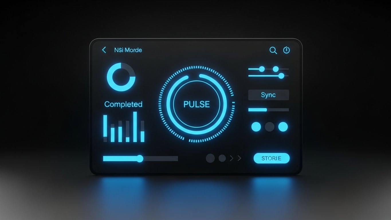
The Visual & Narrative Approach
Developers and technical users often prefer Dark Mode for its reduced eye strain and "coder" aesthetic. This style features a sleek, high-contrast UI showcase in Deep Violet, Black, and Neon Cyan text. The screen displays technical workflow diagrams and code snippets, angled slightly to show depth. The lighting highlights the "pulse" of the data. It looks less like a business tool and more like a command console.
Psychological Impact & KPI Focus
This targets the "Developer" and "IT Architect"—the technical influencers who can advocate for your expansion. It signals Technical Credibility. The "Dark Mode" aesthetic is a shibboleth for "We build for builders." It addresses the fear that the platform is just "low-code fluff" for business users. By validating the technical user's preference, you drive Advocacy and Developer API Usage.
Strategic Implementation & Trade-offs
- Best Use Case: API Documentation, Developer Portal videos, and "Technical Deep Dive" webinars.
- Strategic Trade-off: It can be alienating to business users. A CFO might find "Dark Mode" hard to read or too "hacker-like." Keep this strictly for technical audiences.
Companies using similar video content -
Red Hat – OpenShift – Neon code signaling developer-grade power.
Docker – Desktop – Sleek, high-contrast UI for technical workflows.
Kubernetes – Orchestration – Command console aesthetic for IT architects.
30. Low-Poly 3D Modeling
Expansion | Driving Deep Feature Adoption

The Visual & Narrative Approach
To explain complex algorithms without boring the audience, this style uses a stylized Low-Poly 3D landscape. Rendered in Emerald Green and White, the scene visualizes a pathfinding algorithm. A glowing line navigates through a terrain of geometric obstacles (cubes and pyramids). When blocked, the line automatically reroutes, finding a smooth path to the destination. The lighting is bright "daylight" style with hard shadows, emphasizing the clarity of the logic.
Psychological Impact & KPI Focus
This appeals to the "Logistics Planner" or "Process Optimizer." It visualizes Intelligence and Adaptability. The abstraction allows the viewer to focus on the logic of the routing rather than the details of a specific map. It proves that the system handles "Exceptions" automatically. This drives confidence in Automated Decision Making, a key factor in expanding usage to more complex, mission-critical workflows.
Strategic Implementation & Trade-offs
- Best Use Case: "Algorithm Explainer" videos, Webinars on automation, and "Advanced Features" training modules.
- Strategic Trade-off: It is highly abstract. It requires a voiceover to explain that the "Green Cube" represents a "Supply Chain Delay." Without narration, it is just pretty geometry.
The Strategic Knowledge Base: The Visual Operations Doctrine
Having a library of 30 visual styles is not a strategy; it is merely a palette. To transform these assets into a competitive moat, the "Orchestration Architect" must deploy them within a structured framework. This section synthesizes the visual tactics into a coherent Visual Operations Doctrine, divided into three strategic phases: Alignment, Injection, and Measurement.
Strategic Alignment & Visual Architecture (Pre-Production)
Before a single pixel is rendered, the visual strategy must be aligned with the operational reality of the enterprise. This phase moves beyond "branding" to define a "Visual Operating System" that reduces cognitive load across the organization.
- The Cognitive Load Audit: Do not just create videos; audit the complexity they replace. If a 50-page PDF manual is replaced by a 3-minute Abstract 2D Motion video (Style 3), the reduction in cognitive load is measurable. Map your current training materials against the 30 styles to identify "High-Friction Zones" where text is failing.
- Role-Based Visual Mapping: Different personas digest information differently. A field agent on a mobile device needs high-contrast Bold Kinetic Typography (Style 1) that is readable in sunlight. A Data Analyst at a desktop needs dense Dynamic Data Visualization (Style 10). Defining these rules prevents the mismatch of sending "marketing fluff" to a technical user or "dense charts" to a mobile worker.
- The "Glanceability" Standard: In high-stress environments (e.g., trading floors, support centers), information must be consumed in seconds. Establish a "Glanceability Standard" for all operational video content. If the core message of a Minimalist Flat 2D Vector (Style 11) cannot be understood in 3 seconds without audio, it fails the operational test.
- Brand Voice Consistency: Your visual language is your product's body language. If your brand is "Secure and Stable," lean into Futuristic Neon (Style 16) and Symmetrical Shield (Style 11). If your brand is "Agile and Friendly," lean into Liquid Morphing (Style 5) and 2D Character Stories (Style 23). Inconsistency breeds distrust.
- The Advids Strategic Audit: Partnering with a specialized agency like Advids allows for an external audit of your visual language. We help define this "Visual OS" before production begins, ensuring that every asset—from a GIF to a cinematic manifesto—shares a unified strategic DNA, preventing the "frankens-tein" effect of disjointed visual styles.
- Standardization vs. Customization: Establish a "Tiered Asset Strategy." Tier 1 (Core Brand) uses bespoke Photorealistic 3D Renders (Style 13). Tier 3 (Daily Support) utilizes scalable Macro UI (Style 24). This ensures budget is focused on high-impact assets while maintaining volume for support needs.
- The Cross-Departmental Bridge: Visuals are the only universal language in a siloed company. Use Isometric 3D Workflow (Style 8) to create a shared mental model between Sales (who sell the dream) and Ops (who build the reality). When both teams see the same "Digital Twin," misalignment disappears.
- Legacy System Integration: One of the hardest stories to tell is the connection between old hardware and new software. Use Wireframe to Reality (Style 9) to visually respect the legacy infrastructure while overlaying the modern digital capabilities, validating the "Hybrid" reality of most enterprises.
- Accessibility by Design: Motion graphics must be inclusive. Ensure that Kinetic Typography (Style 1) and others utilize high-contrast ratios and legible fonts to accommodate a diverse, multi-generational workforce. Visuals should aid understanding, not create barriers.
- The Mobile-First Mandate: 60% of B2B content is consumed on mobile devices. Ensure all 30 styles are optimized for vertical or square aspect ratios. A Mixed Media (Style 4) video must be legible on a 6-inch screen to drive adoption among the executive or field workforce.
Operational Injection & Implementation (Deployment)
The best video is useless if it sits in a hidden folder. This phase focuses on "injecting" visual assets directly into the workflow, transforming them from "marketing content" to "operational infrastructure."
- Just-in-Time Support Injection: Embed Macro UI Micro-Interactions (Style 24) directly into the software interface via tooltips. When a user hovers over a complex setting, a 5-second looping GIF should visually demonstrate the action. This preempts the support ticket before it is written.
- The Micro-Learning Shift: Dismantle the "Training Seminar." Replace hour-long sessions with a playlist of 60-second Rapid UI Feature Montage (Style 22) and Clean UI Workflow (Style 18) clips. This "TikTok-ification" of corporate training respects the user's time and increases retention.
- Overcoming "Big Brother" Anxiety: When deploying monitoring tools, fear is the enemy. Use Abstract 2D Flat Vector (Style 5) and 2D Character Stories (Style 23) to frame the technology as a "Helper" rather than a "Watcher." Soft, organic visuals disarm resistance more effectively than cold, technical explanations.
- Gamification of Training: Use 2D Animation & UI Composition (Style 19) to turn training into a game. Visualizing progress bars, badges, and "Level Ups" triggers the same dopamine loops as consumer apps, driving voluntary engagement with boring compliance materials.
- Reducing Support Ticket Volume: There is a direct correlation between the quality of your Clean UI Workflow (Style 18) videos and the volume of "How-to" tickets. Treat your video library as a "Deflection Shield" for your call center. Every view is a call that didn't happen.
- Remote Onboarding Velocity: For distributed teams, Generative AI Realistic Character (Style 20) videos can provide a "face-to-face" welcome at scale. This creates a human connection without the travel cost, ensuring every remote employee feels personally welcomed by leadership.
- Standard Operating Procedures (SOPs) 2.0: Text-based SOPs are where knowledge goes to die. Convert them into Isometric 3D Workflow (Style 8) animations. A visual process flow is unambiguous and transcends language barriers, crucial for global teams.
- Feedback Loops: Implementation is a conversation. Use interactive video elements (in styles like Split Screen Style 12) to ask, "Did this help?" Real-time feedback on your visual assets allows you to iterate on your training strategy as fast as you iterate on your software.
- Scalable Localization: Global enterprises need global assets. Styles like Abstract Vector (Style 5) and Low-Poly 3D (Style 30) rely on universal symbols rather than text, making them incredibly cost-effective to localize for international markets.
- Leadership Communication: When rolling out a major change, don't send a memo. Use a Generative AI Cinematic video (Style 2) or Live Action Mixed Media (Style 4) from the CEO to articulate the vision. High-production value signals importance and inspires confidence.
Measuring Impact & Future-Proofing (ROI)
Finally, we must move beyond "Vanity Metrics" (Views) to "Value Metrics" (ROI). This phase quantifies the impact of the Visual Operations Doctrine and prepares the organization for the next wave of AI-driven visualization.
- Beyond "Views" to "Competency": Stop counting views. Start measuring "Time-to-Competency." If a new user watches the 2D Line Art (Style 21) onboarding series, do they activate 30% faster? Connect video analytics directly to user behavior logs.
- The "Idle Time" Metric: In operations, seconds matter. Correlate the deployment of High-Contrast Kinetic Typography (Style 1) instructions with a reduction in "Idle Time" or "Navigation Time." Visual clarity translates directly to operational velocity.
- Compliance Velocity: When a new regulation hits (e.g., GDPR, ELD), how fast does the organization adapt? Measure the "Time to Compliance" for cohorts trained with Abstract 2D Motion (Style 3) versus text manuals. The delta is your ROI.
- Retention and LTV: Use Aspirational Stock Montage (Style 26) during QBRs and measure the renewal rates. High-quality visual communication signals "Premium Partner," making it harder for procurement to commoditize your solution.
- The AI Visual Frontier: The future is Generative. We are moving toward "Real-Time Visual Generation," where the Generative AI Cinematic (Style 2) video is customized on the fly for the specific client's industry. Preparing your asset library now ensures you are ready for this hyper-personalized future.
- Scalability of Assets: A video style guide is a living organism. By defining these 30 styles, you create a "Visual Lego Kit." As your feature set grows, you don't reinvent the wheel; you simply assemble new narratives using the established Clean UI (Style 18) or Isometric (Style 7) components.
- The Advids Partnership: This is where a long-term partner becomes essential. Advids does not just deliver a video; we manage the "Visual Lifecycle." We help you scale from Style 1 to Style 30, ensuring that as your platform evolves, your visual language remains consistent, modern, and high-performing.
- Benchmarking Success: Do not just compare against your past self. Compare your visual standard against the consumer apps your employees use (Instagram, Netflix). "Good enough for B2B" is no longer good enough; expectations are set by consumer tech.
- The ROI of Safety & Security: In digital operations, a breach is the equivalent of an accident. Quantify the "Cost of Breach" reduction achieved through better visual security training using Futuristic Neon (Style 16) or Symmetrical Shield (Style 11). The savings from one prevented incident pay for the entire visual production budget.
- Final Call to Innovation: Treat video not as "Marketing Content" but as "Operational Infrastructure." The companies that win the next decade will be those that reduce the friction between human cognition and digital complexity. Your Visual Style Guide is the blueprint for that bridge. Build it well.
Conclusion: The Orchestration of Vision
You now possess the blueprint. From the kinetic energy of Bold Typography to the logic of Low-Poly Optimization, these 30 styles represent the entire vocabulary of modern B2B communication.
But remember: a dictionary is not a poem, and a style guide is not a strategy. The "Orchestration Architect" does not just pick a style; they align the visual with the operational goal. They use Kinetic Typography to wake up a tired audience, Isometric Blueprints to calm a chaotic mind, and Holographic Digital Twins to sell a visionary future.
The gap between your complex technology and your user's understanding is the "Cognitive Gap." This guide is your bridge. By standardizing your visual language, partnering with experts to scale execution, and relentlessly measuring impact, you turn that bridge into a competitive highway.
The invisible engine of your enterprise is waiting to be seen. Visualize it.
Companies using similar video content -
Anaplan – Connected Planning – Smart routing visualizing algorithmic optimization.
Kinaxis – RapidResponse – Low-poly landscape for supply chain planning.
Blue Yonder – Supply Chain Planning – Geometric obstacles for intelligent pathfinding.
Author & Editor Bio


