
Introduction: The Invisible Cost of the Physical-Digital Divide
The modern enterprise is witnessing a silent crisis on its balance sheet. In an era of rapid digital transformation, a staggering disconnect remains between the physical reality of the factory floor and the digital records in the boardroom. This disconnect manifests as "Ghost Assets"—machinery that exists on the books but has long since vanished from the facility, or conversely, equipment that is running daily but remains invisible to the maintenance log.
Research indicates that as many as 65% of fixed asset records are incomplete, inaccurate, or altogether missing. This is not merely an accounting annoyance; it is a massive leak in capital efficiency. When you compound this visibility gap with operational friction, the costs escalate. Fortune Global 500 companies reported losing 11% of annual revenues to downtime, a figure that highlights the immense opportunity cost of sticking to the status quo.
However, for the forward-thinking Asset Manager and SaaS innovator, this chaotic landscape presents a defining opportunity. The future belongs to those who can build a bridge between the physical and the digital—creating a "Digital Twin" ecosystem where every bolt, conveyor, and excavator is tracked, optimized, and visualized in real-time.
This guide is not just about making "pretty" videos; it is a strategic framework for visualizing that bridge. By utilizing the right visual styles—from abstract data flows to hyper-realistic digital twins—you can reduce the cognitive load for your stakeholders, proving that your platform doesn't just track assets; it transforms them into intelligent, ROI-generating resources.
The following 10 visual examples represent the "Gold Standard" for communicating value in the Capital Asset Management sector. They are designed to cut through the skepticism, simplify the complexity of Enterprise Asset Management (EAM), and position your platform as the essential nervous system of modern industry.
1. Abstract 2D Flat Vector Organic
TOFU | Brand Awareness

The Visual & Narrative Approach
Visualization Scenario: This style utilizes a "Bird's Eye" perspective to solve the challenge of scale. The composition depicts a network of fluid, connecting nodes spread across a stylized globe, representing asset tracking locations. The palette of vivid coral and slate gray creates a modern, accessible look. The narrative tone is Holistic and Reassuring, suggesting that no matter how dispersed your assets are, they are part of a single, unified organism.
Narration Style: "One world. One register. Connect your assets across borders with a fluid, intelligent network."
Psychological Impact & KPI Focus
- Niche Psychology: It addresses the "Fragmentation Anxiety" of COOs who fear losing control over global operations. The organic shapes soften the rigidity of industrial hardware, making the software feel approachable and fluid.
- Operational Impact: By visually connecting disparate points, it reinforces the value of Centralized Asset Governance. It subconsciously promises that your platform eliminates data silos.
Strategic Implementation & Trade-offs
- Best Use Case: Homepage hero backgrounds or high-level brand manifesto videos (16:9 format).
- Trade-off: This style is excellent for emotional connection but poor for technical detail. Do not use this to explain specific features like "Depreciation Calculation"; use it to sell the vision of connectivity.
Companies using similar video content -
IBM Maximo – Maximo Application Suite – Unifying global asset networks with AI.
IFS Cloud – Holistic platform for enterprise operations and asset management.
2. 2D Line Art Animation
TOFU | Market Education

The Visual & Narrative Approach
Visualization Scenario: Here, we strip away the noise to focus on structure. An elegant animation uses thin, continuous lines in cyan and deep navy to draw the precise architectural blueprint of a factory. As the viewer watches, this physical blueprint seamlessly morphs into a digital wireframe structure. The aesthetic is Minimalist and Technical, emphasizing the transition from "Bricks and Mortar" to "Bits and Bytes."
Narration Style: Precise and architectural. "We take the blueprint of your facility and turn it into a living digital twin."
Psychological Impact & KPI Focus
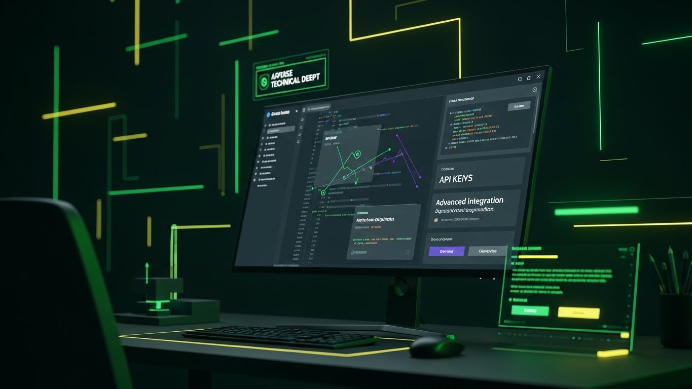
- Niche Psychology: This resonates with the engineer's love for precision and order. It visualizes the concept of the Digital Twin without the high cost of 3D rendering, reducing the cognitive load required to understand how physical infrastructure is mapped digitally.
- Operational Impact: It directly addresses Asset Onboarding. The visual metaphor of "drawing" the factory suggests that digitizing your asset register is a smooth, planned process, not a chaotic data entry nightmare.
Strategic Implementation & Trade-offs
- Best Use Case: LinkedIn feeds (1:1 aspect ratio) where sound-off clarity is essential.
- Trade-off: While elegant, line art can feel "cold." It lacks the human element, so it is best paired with a voiceover that emphasizes ease of use and human control over the system.
Companies using similar video content -
SAP – S/4HANA EAM – Transforming physical blueprints into digital twins.
Hexagon – HxGN EAM – Digitalizing asset infrastructure for operational efficiency.
3. Low-Poly 3D Modeling
TOFU | Shaping Brand Perception

The Visual & Narrative Approach
Visualization Scenario: This style uses a 45-degree aerial drone shot to survey a stylized smart industrial city. Rendered in lime green, soft gray, and matte black, simple geometric shapes represent factories. The crucial element is the lighting: key assets within the buildings glow with a vivid green light, signaling "Active" status. This visual reduction removes the "grime" of industry to reveal the Operational Data underneath.
Narration Style: Strategic and commanding. "See the pulse of your city. Monitor status, location, and health from a single pane of glass."
Psychological Impact & KPI Focus
- Niche Psychology: Asset managers often feel overwhelmed by the sheer volume of equipment they manage. Low-poly art simplifies this complexity, offering a "God-mode" view that implies Total Control and Manageability.
- Operational Impact: The glowing green indicators visually reinforce Real-time Visibility. It demonstrates the platform’s ability to instantly highlight operational status across a vast Fixed Asset Register.
Strategic Implementation & Trade-offs
- Best Use Case: YouTube explainer intros (16:9).
- Trade-off: Low-poly can sometimes be perceived as "gamified" or less serious. To counter this, ensure the data overlays (like the "Active" tags) use a professional, crisp font to anchor the playful visual in serious business logic.
Companies using similar video content -
UpKeep – Asset Operations Platform – Simplified view of city-scale asset tracking.
Limble CMMS – Mobile-first CMMS for managing maintenance operations.
4. Abstract 3D AI Visualization
TOFU | ABM Awareness

The Visual & Narrative Approach
Visualization Scenario: To visualize the invisible flow of data, we use abstract 3D particle systems. Translucent streams in purple and magenta flow through a tunnel, connecting floating financial nodes. This represents the link between Capital (Finance) and Machinery (Operations). The shallow depth of field focuses the eye on the connections, creating a high-tech, futuristic narrative.
Narration Style: Sophisticated and visionary. "The invisible thread connecting your capital to your capability."
Psychological Impact & KPI Focus
- Niche Psychology: This appeals to the "Futurist" persona within the C-Suite (CTOs/CIOs). It positions the platform not just as a tracking tool, but as an AI-driven Intelligence Engine.
- Operational Impact: It abstractly illustrates Predictive Maintenance algorithms—the idea that data is constantly flowing and "learning" from the assets to prevent failure before it happens.
Strategic Implementation & Trade-offs
- Best Use Case: LinkedIn ads targeting enterprise accounts (ABM).
- Trade-off: This is purely conceptual. It builds authority and "tech credibility" but explains zero functionality. Use it to get the click; use other styles to explain the "How."
Companies using similar video content -
Oracle – E-Business Suite EAM – Visualizing invisible data flow for predictive insights.
TRACTIAN – Industrial Copilot – AI-powered platform for predictive maintenance.
5. Bold Kinetic Typography (Visual)
TOFU | YouTube SEO

The Visual & Narrative Approach
Visualization Scenario: This style relies on brute force and energy. Heavy geometric shapes in safety orange and charcoal collide and merge, forming words like "CAPEX," "RISK," and "ROI." The motion blur suggests high energy, while the layout is designed for a "frontal collision" effect. It visually represents the high stakes of asset management—where heavy machinery meets heavy financial pressure.
Narration Style: Urgent and punchy. "Stop leakage. Start growing. The impact of smarter asset management is immediate."
Psychological Impact & KPI Focus
- Niche Psychology: It taps into the Urgency of the problem. The bold, industrial colors (Safety Orange) subconsciously trigger alertness and attention to safety/warning protocols.
- Operational Impact: It highlights Risk Mitigation. The merging forms suggest that your platform resolves the conflict between spending money (CAPEX) and making money (ROI).
Strategic Implementation & Trade-offs
- Best Use Case: YouTube Bumper ads (6 seconds) or Intro hooks.
- Trade-off: It can be overwhelming if overused. Keep it short (under 5 seconds) to grab attention before transitioning to a calmer, more explanatory style.
Companies using similar video content -
Fiix CMMS – by Rockwell Automation – Accelerating ROI with modern maintenance software.
FaultFixers – Streamlining asset management and maintenance tasks.
6. Rapid UI Feature Montage
TOFU | Vertical Social Organic
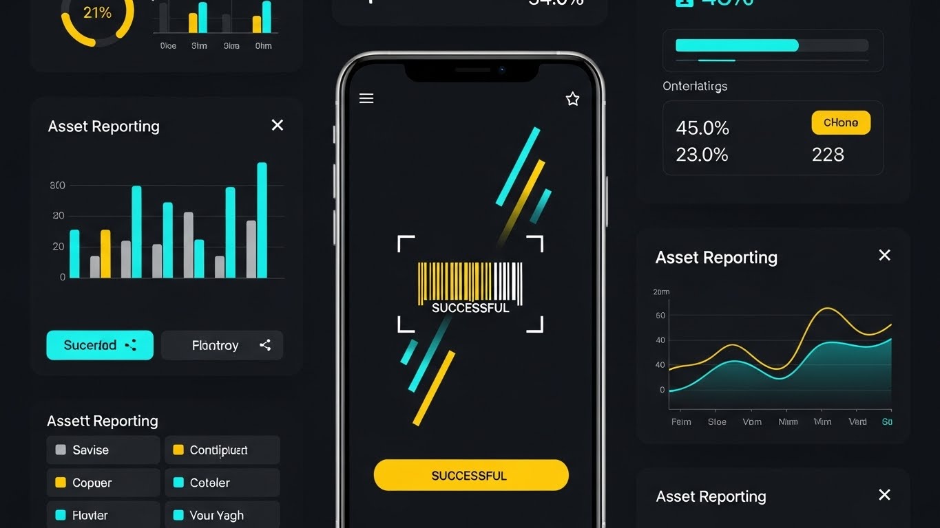
The Visual & Narrative Approach
Visualization Scenario: Tailored for the modern workforce, this style uses a vertical (9:16) format. It features a rapid montage of clean UI screens in teal and yellow, specifically showing a mobile device successfully scanning a barcode. The "Successful" notification creates a dopamine hit, visually rewarding the completion of a task.
Narration Style: Fast and energetic. "Scan. Click. Done. Asset verification in seconds."
Psychological Impact & KPI Focus
- Niche Psychology: It combats the "Clunky Software" stigma. Field workers hate complex, slow apps. This style proves your app is Fast, Frictionless, and Modern.
- Operational Impact: It directly showcases Field Service Management and Barcode/RFID Scanning efficiency. It promises that data entry will no longer be a bottleneck.
Strategic Implementation & Trade-offs
- Best Use Case: TikTok, Instagram Reels, or YouTube Shorts.
- Trade-off: The pace is too fast for detailed analysis. It is purely for "Vibe" and showing UI responsiveness.
Companies using similar video content -
MaintainX – Mobile-first platform for frontline professionals.
Asset Panda – Customizable mobile asset tracking and management.
7. Hyper-lapse Stock w/ Data
TOFU | Skippable Pre-Roll Ad

The Visual & Narrative Approach
Visualization Scenario: This style bridges the physical and digital worlds by overlaying static, sharp data boxes onto a hyper-lapsed video of a busy warehouse. As forklifts blur past in safety orange, the blue digital overlays (displaying "Inventory Velocity" and "Asset ID") remain rock steady.
Narration Style: Calm and controlling. "Your operations move fast. Your data stays precise."
Psychological Impact & KPI Focus
- Niche Psychology: This speaks to the anxiety of Operational Chaos. It reassures the viewer that while their physical floor is moving at breakneck speed, their data is stable, accurate, and under control.
- Operational Impact: It visualizes Inventory Turnover and Real-time Tracking. The contrast between the blur (physical) and the sharp lines (digital) perfectly illustrates the stabilizing effect of an EAM system.
Strategic Implementation & Trade-offs
- Best Use Case: YouTube Pre-roll ads (skippable after 5s).
- Trade-off: Requires high-quality stock footage. If the stock looks generic, the brand looks generic. The data motion graphics must track perfectly to the footage to maintain credibility.
Companies using similar video content -
Samsara – Industrial IoT – Real-time tracking and data overlays for fleet.
Omnitracs – Fleet telematics with real-time tracking and diagnostics.
8. Wireframe to Reality Transition
MOFU | Product Differentiation
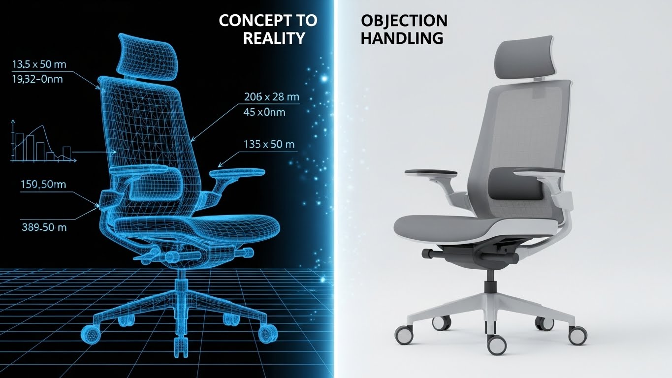
The Visual & Narrative Approach
Visualization Scenario: Note: While the visual style reference uses a chair, the strategic application here applies to heavy machinery. This split-screen composition is the ultimate definition of the Digital Twin. On the left, a blue technical wireframe outlines the structural blueprint of an excavator. On the right, the photorealistic physical asset exists in its natural dirt environment. A sliding transition reveals how the engineering data perfectly matches the physical reality.
Narration Style: Educational and reassuring. "From the engineering deck to the dirt. A single source of truth for the entire lifecycle."
Psychological Impact & KPI Focus
- Niche Psychology: It validates the Accuracy of the system. For an asset manager, knowing that the digital record is a mirror image of the physical asset builds immense trust.
- Operational Impact: It supports Asset Lifecycle Management (ALM). It shows that the data follows the asset from the "Design" phase (wireframe) to the "Operate" phase (reality).
Strategic Implementation & Trade-offs
- Best Use Case: Website Product Pages or "How it Works" sections.
- Trade-off: This is resource-intensive to produce, requiring high-fidelity 3D assets that match specific physical models. It is a high-effort, high-reward style.
Companies using similar video content -
Aveva – EAM – Bridging engineering data with physical asset reality.
NexGen Asset Management – Real-time asset performance visibility.
9. Clean UI Workflow
MOFU | Feature Education
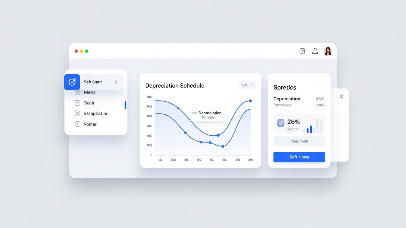
The Visual & Narrative Approach
Visualization Scenario: Here, the excitement of the factory floor gives way to the precision of the Finance Department. A clean, light-mode UI displays a Depreciation Schedule graph with smooth curves. The layout is distraction-free, utilizing soft shadows to create a hierarchy of information. The focus is entirely on the data points—Net Book Value, Salvage Value, and Lifecycle cost.
Narration Style: Professional and clear. "Automate complexity. Visualize depreciation curves and audit trails with pristine clarity."
Psychological Impact & KPI Focus
- Niche Psychology: This targets the CFO. It represents Compliance, Audit Readiness, and Financial Control. The "Clean" look implies that the messy business of depreciation is handled with sterile precision.
- Operational Impact: It visualizes Financial Integration. It reassures stakeholders that the operational data is being correctly translated into financial reporting standards (GAAP/IFRS).
Strategic Implementation & Trade-offs
- Best Use Case: Deep-dive demo videos or webinar screen shares.
- Trade-off: It can be "boring" to non-financial audiences. Use this strictly for audiences who care about the numbers.
Companies using similar video content -
Ramco Systems – Enterprise Asset Management – Automating depreciation and financial reporting.
EZOfficeInventory – Managing assets, inventory, and work orders with clarity.
10. Dynamic Data Visualization
MOFU | ROI Justification

The Visual & Narrative Approach
Visualization Scenario: To close the deal, we must visualize success. This style features 3D glass bar charts growing out of a tablet surface. The emerald green and gold palette signifies Wealth and Value. The low, upward-angled camera makes the growth of the "Cost Savings" bars feel monumental. Internal lights within the bars suggest that the value comes from within the data.
Narration Style: Triumphant. "Watch your savings grow. Real-time insights lead to real-world value."
Psychological Impact & KPI Focus
- Niche Psychology: It triggers the "Greed" (or rather, Profit) motivation. It shifts the conversation from "Cost Center" (maintenance) to "Profit Center" (savings/optimization).
- Operational Impact: It is the visual representation of TCO (Total Cost of Ownership) Reduction and ROA (Return on Assets). It answers the question: "What do I get for my investment?"
Strategic Implementation & Trade-offs
- Best Use Case: LinkedIn carousel slides or Case Study summary videos.
- Trade-off: Avoid using generic labels like "Success." Ensure the bars are labeled with specific metrics like "Uptime," "Energy Savings," or "Audit Speed" to maintain credibility.
(End of Part 1. Proceed to Part 2 for Styles 11-20).
Companies using similar video content -
Brightly – Asset Essentials – Illuminating cost savings and operational efficiency.
ManagerPlus – Enhancing productivity and reducing downtime.
11. Split Screen: Optimized Reality
MOFU | Demo Requests

The Visual & Narrative Approach
Visualization Scenario: This style utilizes a sharp vertical split-screen to force a direct comparison between the "Current State" and the "Future State." The left side (tinted in stressful, low-light tungsten) depicts a chaotic desk cluttered with paper receipts, binders, and a laptop flashing a red "WARNING: UNPAID" alert. In sharp contrast, the right side (bathed in clean, cool blue light) shows a calm professional working on a centralized dashboard where workflows are green and organized.
Narration Style: Comparative and empathetic. "Leave the paper trail behind. Step into a world of automated precision and calm control."
Psychological Impact & KPI Focus
- Niche Psychology: It addresses Operational Burnout. Many asset managers are drowning in manual paperwork. This visual validates their pain (the chaotic desk) and offers an immediate, attainable escape (the clean digital workspace).
- Operational Impact: It visually demonstrates Process Optimization and Workflow Automation. It emphasizes that the platform doesn't just store data; it organizes the physical environment by removing the friction of manual entry.
Strategic Implementation & Trade-offs
- Best Use Case: Email campaigns aimed at re-engaging cold leads ("Still drowning in spreadsheets?").
- Trade-off: It is a binary comparison that lacks nuance. It frames the "Before" state aggressively, so ensure the "After" state looks realistic and attainable.
Companies using similar video content -
Maxpanda – Streamlining maintenance with innovative CMMS tools.
Hippo CMMS – User-friendly EAM for simplified maintenance management.
12. Minimalist Flat 2D Vector
MOFU | Programmatic Display

The Visual & Narrative Approach
Visualization Scenario: In the crowded visual noise of the web, simplicity cuts through. This style features a bold, flat 2D vector icon centered on a solid gray background. The icon depicts a golden shield securely protecting a stylized blue industrial factory. There are no gradients or complex textures—just solid blocks of color communicating stability and protection.
Narration Style: Direct and reassuring. "Protected. Compliant. Secure. Your assets, shielded from regulatory risk."
Psychological Impact & KPI Focus
- Niche Psychology: This speaks to the Risk-Averse persona (Compliance Officers/Legal). They value clarity and safety over flashiness. The shield is a universal signifier of Security, instantly lowering anxiety about audits.
- Operational Impact: It reinforces Regulatory Compliance (OSHA/ISO) and Risk Management. It assures the viewer that the platform acts as a protective layer around their physical operations.
Strategic Implementation & Trade-offs
- Best Use Case: Programmatic Display Ads (Banner Ads) where instant readability at small sizes is paramount.
- Trade-off: It is static and functional. It cannot explain how the software works, only that it is secure. It serves as a trust badge rather than a feature demo.
Companies using similar video content -
SoftExpert EAM – Optimizing operations with powerful EAM solutions.
Mainpac EAM – Easiest to use EAM system for asset management.
13. Abstract 2D Motion Graphics
MOFU | Visitor Re-engagement

The Visual & Narrative Approach
Visualization Scenario: To visualize the financial aspect of asset management, we use abstract motion graphics. Fluid, coin-like shapes in mint green and charcoal grey flow smoothly into a central "digital funnel." The motion is rhythmic and frictionless, representing the capture and organization of value. The aesthetic is modern and geometric, focusing entirely on the movement of "value" into a controlled system.
Narration Style: Rhythmic and financial. "Stop the leakage. Capture, track, and optimize every cent of asset value."
Psychological Impact & KPI Focus
- Niche Psychology: It triggers Loss Aversion. Executives hate the idea of "leaving money on the table." This visual suggests that without the system, value is scattering; with the system, it is captured.
- Operational Impact: It directly relates to Cost Savings, Salvage Value Recovery, and Warranty Management. It visualizes the software as a financial safety net that ensures maximum ROI from every asset.
Strategic Implementation & Trade-offs
- Best Use Case: Retargeting Ads for visitors who visited the "Pricing" page but didn't convert.
- Trade-off: It is abstract. It requires strong copy (e.g., "Recover 15% of Asset Value") to ensure the viewer understands that the "coins" represent their assets.
Companies using similar video content -
Assetic – Strategic asset management solutions based on ISO55000.
TRAXX – Managing company's fixed assets and value.
14. Aspirational Stock Montage
BOFU | Building Trust

The Visual & Narrative Approach
Visualization Scenario: At the bottom of the funnel, the buyer is validating the vendor, not just the software. This style uses a high-end collage of aspirational photography. The focal point is a low-angle hero shot of two professionals in business suits shaking hands in a sunlit, glass-walled boardroom. Surrounding vignettes show successful diverse teams collaborating. The lighting is warm and golden, evoking stability and success.
Narration Style: Warm and relational. "More than a platform. A partnership dedicated to your long-term capital success."
Psychological Impact & KPI Focus
- Niche Psychology: This leverages Social Proof and Authority. Large enterprises don't just buy software; they enter partnerships. This style reassures the buyer that your company is established, professional, and "safe" to do business with.
- Operational Impact: While less focused on software metrics, it highlights Service Level Agreements (SLAs) and Customer Support. It reassures the buyer that there is a human team behind the code.
Strategic Implementation & Trade-offs
- Best Use Case: "About Us" page videos or the closing slide of a sales deck.
- Trade-off: It can feel generic if the stock footage is too cliché. Select images that look authentic and high-tier to maintain a premium brand image.
Companies using similar video content -
CGI – Asset & Resource Management Suite – Strategic IT and business consulting services.
Hitachi Energy – Ellipse EAM – Advancing energy technology for a sustainable future.
15. 3D X-Ray Visualization
BOFU | Overcoming Objections

The Visual & Narrative Approach
Visualization Scenario: To prove the depth of the platform's capability, we use an X-Ray visual style. A massive industrial turbine is rendered in translucent phantom blue. Inside, glowing white nodes and data lines reveal the internal components and IoT sensors hidden deep within the machinery. The aesthetic is medical-grade precision, suggesting that the software sees what the human eye cannot.
Narration Style: Clinical and expert. "Deep diagnostics. Predictive insights. See the health of your assets from the inside out."
Psychological Impact & KPI Focus
- Niche Psychology: This appeals to the Technical Buyer (Chief Engineer/Maintenance Director). They are skeptical of "surface-level" apps. This visual proves that the platform understands the complexity of the hardware.
- Operational Impact: It illustrates IoT Integration and Condition-Based Maintenance (CBM). It shows that the system is monitoring internal vibration, temperature, and wear, moving beyond simple scheduling to true predictive care.
Strategic Implementation & Trade-offs
- Best Use Case: Technical Product Pages or Whitepaper Landing Pages.
- Trade-off: High production value is required. The 3D model must be accurate enough to pass the scrutiny of an engineer.
Companies using similar video content -
Telit Cinterion – IoT Asset Tracking – Seeing inside machines with IoT sensors.
IOTTAG – Atlas – Real-time data from diverse sensors for asset health.
16. Futuristic Neon/Dark Mode
BOFU | Risk Mitigation

The Visual & Narrative Approach
Visualization Scenario: In the age of cyber threats, security is a feature. This style utilizes a "Dark Mode" aesthetic set inside a stylized server room. Against the deep black background, neon green grid lines and glowing digital padlocks float in front of server racks. The fisheye lens adds a sense of scale and enclosure. It visualizes the intangible concept of encryption as a physical barrier.
Narration Style: Serious and protective. "Enterprise-grade security. Your data is locked, encrypted, and accessible only to you."
Psychological Impact & KPI Focus
- Niche Psychology: This targets the CISO (Chief Information Security Officer) or IT Director who can veto the deal. It addresses the anxiety of data breaches. The "Matrix-like" aesthetic signals advanced tech and robust encryption.
- Operational Impact: It highlights Data Security, SOC 2 Compliance, and Cloud Reliability. It creates a visual synonym for "Unbreachable."
Strategic Implementation & Trade-offs
- Best Use Case: Security/Compliance section of the website or IT-focused LinkedIn ads.
- Trade-off: It can look "scary" or too abstract to non-technical users. Use it specifically when addressing security concerns.
Companies using similar video content -
Snipe-IT – Open Source IT Asset Management – Secure, transparent IT asset management.
Workwize – Asset tracking solution for distributed IT teams.
17. Isometric 2D Motion Design
BOFU | Competitive Displacement

The Visual & Narrative Approach
Visualization Scenario: This style uses a clean isometric perspective to compare "Old vs. New." The left section shows a "Legacy" environment—rusty tones, piles of paper logs, and idle machinery. The right section transforms this into a "Modern" environment—clean white and blue tones, automated systems, and digital dashboards. The flat vector style makes the comparison instant and undeniable.
Narration Style: Transformational. "Stop managing the past. Upgrade to the future of intelligent asset operations."
Psychological Impact & KPI Focus
- Niche Psychology: It creates FOMO (Fear Of Missing Out) regarding modernization. It positions the competitor's (or legacy) way as "rusty" and "obsolete," while positioning your platform as the clean, inevitable future.
- Operational Impact: It visualizes Digital Transformation. It shows the holistic improvement of the entire facility—not just one machine, but the entire workflow changing from analog to digital.
Strategic Implementation & Trade-offs
- Best Use Case: Competitive comparison pages ("Us vs. Them") or Display Ads.
- Trade-off: It can appear "cartoonish" if not executed with a refined color palette. Ensure the "Modern" side looks professional, not just playful.
Companies using similar video content -
OpenMAINT – Modular and customizable open-source EAM.
ERPNext – Assets Module – Managing asset lifecycle from acquisition to retirement.
18. Lifestyle Stock with UI Overlay
BOFU | Sales Cycle Acceleration

The Visual & Narrative Approach
Visualization Scenario: This style bridges the gap between the boardroom and the factory floor. It features a high-quality, over-the-shoulder shot of a factory manager wearing a safety vest. He holds a ruggedized tablet. Floating above the tablet screen is a crisp, holographic UI overlay displaying "Uptime: 99.98%" and "Machine Status: Optimal" in bright green. The background is the blurred, busy factory floor, emphasizing that the data is being used in situ.
Narration Style: Empowering and practical. "Real-time intelligence, right where the work happens. Empower your frontline to make billion-dollar decisions."
Psychological Impact & KPI Focus
- Niche Psychology: It validates the Frontline Worker. It shows that the software isn't just for executives; it's a tool that makes the job of the person on the floor easier and more impactful.
- Operational Impact: It visualizes OEE (Overall Equipment Effectiveness) and Mobility. It proves that the system is mobile-first and capable of delivering actionable insights in a noisy, industrial environment.
Strategic Implementation & Trade-offs
- Best Use Case: LinkedIn Case Study videos or "Day in the Life" features.
- Trade-off: The UI overlay must track perfectly with the camera movement. If it "slides" around, it breaks the illusion of reality and lowers trust.
Companies using similar video content -
Hilti ON! Track – Asset management for construction tools and equipment.
AT&T Fleet Complete – Fleet service with asset tracking and sensor data.
19. 2D Graphics Over Live Action
BOFU | Objection Handling
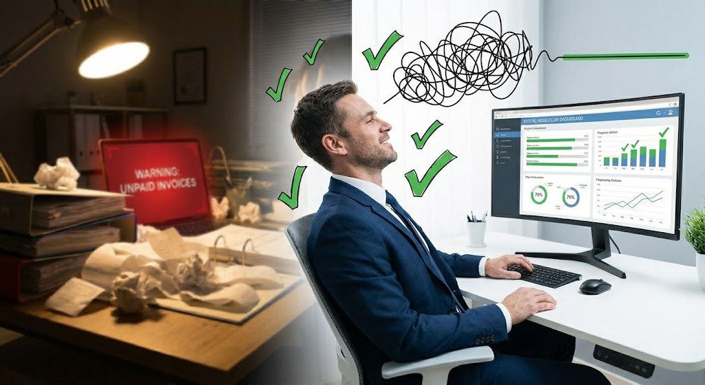
The Visual & Narrative Approach
Visualization Scenario: This style mixes reality with playful illustration to convey emotion. A live-action photo shows a relieved office worker leaning back in their chair. Animated, hand-drawn 2D graphics appear around them: green checkmarks popping up to signify completed tasks, and a chaotic scribble untangling itself into a straight, smooth green line. It visually represents the feeling of a problem being solved.
Narration Style: Relatable and relieving. "Complexity, untangled. Experience the peace of mind that comes with total asset visibility."
Psychological Impact & KPI Focus
- Niche Psychology: It addresses Burnout and Overwhelm. Asset managers are often stressed by audits and broken machines. This style sells the emotional result of the software: Relief.
- Operational Impact: It symbolizes Audit Readiness and Task Completion. It suggests that with this platform, the "to-do" list gets done, and the chaos is straightened out.
Strategic Implementation & Trade-offs
- Best Use Case: Remarketing ads for users who have engaged but haven't purchased. It reminds them of the relief they are missing out on.
- Trade-off: It is less "corporate." Use it to humanize the brand, but ensure the core message remains focused on business value.
Companies using similar video content -
Keeptruckin – Asset trackers for the shipping industry.
Azuga – Fleet tracking and physical asset sensors.
20. Photorealistic 3D Renders
BOFU | Economic Buyer Focus

The Visual & Narrative Approach
Visualization Scenario: To capture the attention of the Economic Buyer (CFO), we visualize the cutting edge of asset management: Autonomy. A sleek, silver industrial drone hovers in a clear sky, carrying a sensor payload. The rendering is photorealistic, emphasizing the high-tech materials and precision engineering. It represents the shift from manual, expensive maintenance to autonomous, cost-effective care.
Narration Style: Visionary and economic. "Deploy autonomy. Reduce manual inspection costs and accelerate asset delivery with the next generation of EAM."
Psychological Impact & KPI Focus
- Niche Psychology: It appeals to the Innovator and the CFO. For the Innovator, it's cool tech. For the CFO, it represents a massive reduction in labor costs and safety liabilities associated with manual inspections.
- Operational Impact: It visualizes Remote Inspection, Autonomous Maintenance, and Last-Mile Logistics. It positions the platform as ready for the future of robotics and automation.
Strategic Implementation & Trade-offs
- Best Use Case: Homepage Hero section or Investor Relations presentations.
- Trade-off: It promises a very advanced capability. Ensure your platform actually integrates with drones or autonomous systems before using this imagery.
Companies using similar video content -
TEKTELIC – Robust IoT asset tracking solutions for harsh environments.
DIGITAL MATTER – Smart devices for tracking and managing assets.
21. Isometric 3D Workflow
Onboarding | Implementation Friction

The Visual & Narrative Approach
Visualization Scenario: To combat the fear of a difficult setup, this style utilizes a clean, tilt-shift isometric perspective. On a pristine white studio floor, pastel blue building blocks—representing server architecture and data modules—autonomously assemble themselves into a robust structure. The motion is snappy and magnetic, suggesting components that are designed to fit together perfectly. The miniature effect makes the complex infrastructure look manageable and contained.
Narration Style: Efficient and effortless. "Seamless integration. Our modular architecture snaps into your existing ecosystem without disruption."
Psychological Impact & KPI Focus
- Niche Psychology: It addresses Implementation Anxiety. CTOs and IT Managers often fear that new software will break existing workflows. This visual metaphor of "building blocks" simplifies the technical integration process into something playful and logical.
- Operational Impact: It reinforces Interoperability and API Integration. It promises that the "Time-to-Live" will be short and the technical debt will be zero.
Strategic Implementation & Trade-offs
- Best Use Case: Welcome Emails or "Getting Started" guides.
- Trade-off: It simplifies complex API connections. Ensure technical documentation is available to back up the "easy setup" claim for the developers who need the details.
Companies using similar video content -
CalemEAM – Commercial open-source EAM/CMMS with modular design.
OpenBoxes – Open-source inventory and warehouse management.
22. 2D Character-Driven Story
Onboarding | Self-Serve Onboarding

The Visual & Narrative Approach
Visualization Scenario: Learning new software can feel like a maze. This style humanizes the experience with a friendly, stylized 2D character (representing the user) navigating a complex industrial cityscape. A vibrant purple and pink light path illuminates the floor, guiding them effortlessly past obstacles and highlighting the correct route. The side-scrolling motion creates a sense of linear, achievable progress, visually reinforcing that the user is never left to wander alone.
Narration Style: Encouraging and supportive. "Never feel lost. Follow the guided path to mastery from day one."
Psychological Impact & KPI Focus
- Niche Psychology: It targets the Learner's Insecurity. New users hesitate to explore for fear of breaking something. This visual provides psychological safety, showing that the system will guide them.
- Operational Impact: It supports User Adoption Rates and reduces Training Costs. It promotes the idea of "Self-Serve" learning, reducing the burden on internal training teams.
Strategic Implementation & Trade-offs
- Best Use Case: In-App Onboarding tours or "First Login" videos.
- Trade-off: It risks looking too "casual" for enterprise software. Maintain a professional color palette to balance the character style with business authority.
Companies using similar video content -
GLPI – Open-source IT asset and service management.
NocoBase – Extensible AI-powered no-code/low-code platform for enterprise apps.
23. Macro UI Micro-Interactions
Onboarding | Trial Activation

The Visual & Narrative Approach
Visualization Scenario: Sometimes, the smallest interaction holds the most value. This style features an extreme macro close-up of the UI pixels. We focus on a single cursor hovering over a "Toggle Switch." As the user clicks, the button glows with an electric blue light against the dark background, and a subtle ripple effect signifies a system state change. The focus is sharp on the point of interaction, creating a sense of anticipation.
Narration Style: Anticipatory and satisfying. "One click. Infinite potential. Activate the power of intelligent tracking."
Psychological Impact & KPI Focus
- Niche Psychology: It leverages the Dopamine Loop of completion. The visual intensity focuses the user's attention on the moment of activation, making the software feel responsive and powerful.
- Operational Impact: It drives Feature Activation and Trial Conversion. By glamorizing the interaction, it encourages users to explore the settings and turn on advanced features.
Strategic Implementation & Trade-offs
- Best Use Case: Feature release emails or "Did You Know?" tooltips.
- Trade-off: It is hyper-specific. It works best for binary actions (On/Off) rather than complex workflows.
Companies using similar video content -
MPulse – EAM solution to improve operational efficiency.
Fracttal One – Cloud-based maintenance management solution.
24. Holographic UI over 3D Render
Retention | Time-to-Value

The Visual & Narrative Approach
Visualization Scenario: Retention depends on proving value daily. This style uses a First-Person Point of View (POV) at a realistic concrete construction site. A cyan holographic dashboard floats in the foreground, overlaying structural health data and maintenance alerts directly onto the physical building framework. It visually asserts that the software provides "Supervision" capabilities beyond human sight, blending the digital twin with physical reality.
Narration Style: Immediate and insightful. "See beyond the surface. Instant structural intelligence where you need it most."
Psychological Impact & KPI Focus
- Niche Psychology: It appeals to the Field Manager's desire for omniscience. It suggests that using the platform gives them a "sixth sense" about their asset's health.
- Operational Impact: It visualizes Augmented Reality (AR) Maintenance and Real-Time Diagnostics. It proves that the data is not stuck in the office; it is alive in the field.
Strategic Implementation & Trade-offs
- Best Use Case: Website Product pages or Retention Newsletters showing new "Mobile" capabilities.
- Trade-off: It implies AR capabilities. If your app doesn't have AR, frame this as a "Vision of Data Availability" rather than a literal feature demo.
Companies using similar video content -
Eroad – Comprehensive fleet management with integrated asset tracking.
Particle – IoT Platform – Real-time asset location monitoring with data.
25. 2D Animation & UI Composition
Retention | Reducing Support

The Visual & Narrative Approach
Visualization Scenario: To reduce support friction, we present help as accessible and friendly. A flat 2D vector character in soft yellow stands confidently next to a floating, simplified help menu interface. As the character points, the menu expands with abstract icons representing knowledge articles. The background is an abstract representation of a knowledge base, communicating that expert help is always just a click away.
Narration Style: Helpful and proactive. "Answers at your fingertips. Resolve questions instantly without leaving your workflow."
Psychological Impact & KPI Focus
- Niche Psychology: It addresses Frustration Intolerance. Users hate waiting for support tickets. This visual assures them that they are empowered to solve their own problems.
- Operational Impact: It directly targets Ticket Deflection and Support Cost Reduction. It positions the Knowledge Base as a first-class feature, not an afterthought.
Strategic Implementation & Trade-offs
- Best Use Case: The "Help Center" landing page or automated support emails.
- Trade-off: It is a functional style. It doesn't sell "ROI," it sells "Ease." Use it to build loyalty through service.
Companies using similar video content -
Maintenance Connection – Comprehensive tools for managing assets and work orders.
eMaint CMMS – Flexible and scalable EAM solution with customizable dashboards.
26. Dark Mode UI Showcase
Retention | Knowledge Base
The Visual & Narrative Approach
Visualization Scenario: For the technical user, beauty is clean code. This style showcases the platform's API documentation in a sleek "Dark Mode" editor on an angled monitor. Syntax highlighting in code green and purple pops against the dark gray background. The scene is set on a developer's desk, creating an atmosphere of focus and precision. It treats the API as a premium product.
Narration Style: Technical and respectful. "Built for builders. Comprehensive API documentation to extend your capabilities."
Psychological Impact & KPI Focus
- Niche Psychology: It resonates with Developers and Integrators. They value documentation that looks like the tools they use daily. It signals that the platform is "Developer-First."
- Operational Impact: It supports Ecosystem Expansion and Custom Integration. It validates that the platform is open and extensible, a key factor in long-term retention.
Strategic Implementation & Trade-offs
- Best Use Case: Developer Portal or API Release Notes.
- Trade-off: It alienates non-technical users. This is strictly for the technical stakeholders who maintain the connections.
Companies using similar video content -
Ralph – Open-source asset management.
CMDBuild – Open-source environment for configuring custom asset management applications.
27. 3D Parallax UI Presentation
Expansion | Deep Feature Adoption

The Visual & Narrative Approach
Visualization Scenario: To upsell advanced features, we must show depth. This style deconstructs the UI into floating 3D interface layers in deep indigo and violet. As the camera drifts through the layers in zero-gravity space, we see the "hidden" analytics and data connections that lie behind the standard dashboard. The parallax effect creates a dynamic feel, emphasizing the sophisticated architecture.
Narration Style: Sophisticated and inviting. "Go deeper. Unlock the layers of intelligence hidden in your data."
Psychological Impact & KPI Focus
- Niche Psychology: It appeals to the Power User who wants to squeeze every drop of value from the system. It frames advanced features as "hidden treasures" rather than "extra work."
- Operational Impact: It drives Upsell to Enterprise Tiers and Advanced Analytics Adoption. It visually differentiates the "Basic" view from the "Pro" view.
Strategic Implementation & Trade-offs
- Best Use Case: Expansion Campaigns (Email) or "Pro Feature" teasers.
- Trade-off: It is abstract. Use it to create intrigue, then follow up with a concrete demo of the specific analytics feature.
Companies using similar video content -
CHAMPS EAM – Comprehensive EAM for complex, asset-intensive industries.
Fabrico – Agile EAM for manufacturing enterprises.
30. Generative AI Realistic Character Video
Expansion | Proactive Support

The Visual & Narrative Approach
Visualization Scenario: In a digital world, human connection is the premium tier. This style uses a high-fidelity, Generative AI video of a Customer Success Manager. Sitting in a modern, sunlit home office, she looks directly into the webcam (eye-level), simulating a dedicated 1-on-1 consultation. The lighting is natural, and the tone is personal. She speaks directly to the viewer about optimizing their specific workflows.
Narration Style: Personal and exclusive. "I noticed your team is growing. Let's optimize your setup to match your new scale."
Psychological Impact & KPI Focus
- Niche Psychology: It triggers Reciprocity and Belonging. It makes the client feel "seen" and "valued" personally, countering the feeling of being just an account number.
- Operational Impact: It drives Account Expansion and Churn Prevention. It scales the "white-glove" service experience, allowing you to deliver personalized check-ins to thousands of users.
Strategic Implementation & Trade-offs
- Best Use Case: Quarterly Business Review (QBR) invitations or personalized renewal reminders.
- Trade-off: The "Uncanny Valley." The AI generation must be high-quality. If the lip-sync or eye movement is off, it damages trust.
Strategic Knowledge Base: The Visual Operations Doctrine
This section synthesizes the visual strategies of all 30 styles into a cohesive business framework. It is designed to bridge the gap between "visual style" and "business outcomes," providing the leadership team with an actionable doctrine for deploying video as strategic infrastructure.
Strategic Alignment & Visual Architecture (Pre-Production)
The Foundation of Visual Governance
Before a single pixel is rendered, the Visual Architecture must be defined to ensure that the bridge between the physical factory and the digital dashboard is structurally sound.
- The Cognitive Load Audit: Asset management is complex. Before requesting a video, conduct an audit of the target process. If a driver needs to learn a new app while in the cab, the visual style must be high-contrast and minimalist (Style 6). If a CFO is analyzing depreciation, the style should be detailed and data-rich (Style 9). Advids recommends mapping visual density to the user's stress level.
- Role-Based Visual Mapping: Do not use one style for all personas. Create a "Visual Matrix." The Driver gets 2D/3D Mobile styles (Fast, Linear). The Fleet Manager gets Desktop/Data styles (Detailed, Holistic). The C-Suite gets Abstract/High-Level styles (Visionary, ROI-focused).
- The "Glanceability" Standard: In high-stress logistics and heavy industry, safety is paramount. Visuals used in training or field apps must pass the "Glance Test"—can the message be understood in under 3 seconds? Styles like Minimalist Vector (Style 12) and Big Kinetic Typography (Style 5) are critical here.
- Brand Voice Consistency: Your marketing videos (Style 1) often look nothing like your training videos. This creates a "Brand Gap." Use a unified color palette (e.g., Safety Orange & Slate Grey) across all styles to create a cohesive "Visual Operating System" that unifies disparate software modules.
- The Advids Strategic Audit: Partner with Advids early to define this "Visual Operating System." A fragmented visual strategy (where Sales uses stock footage and Support uses screen recordings) creates brand dissonance. A unified visual language builds trust.
- Standardization vs. Customization: For global trucking fleets, use generic 3D trucks (Style 3 - Low Poly) for broad training to save costs. Use specific, bespoke 3D models (Style 20 - Photorealistic) only when training on specific, high-value engine maintenance.
- The Cross-Departmental Bridge: Sales uses "ROI" language; Ops uses "Uptime" language. Use visuals to unify terminology. A Split Screen (Style 11) video showing that "Uptime" equals "ROI" unifies the goals of Sales and Operations.
- Legacy System Integration: One of the biggest barriers to adoption is the "Old vs. New" mental block. Use Wireframe to Reality (Style 8) to visually validate that the new software respects and integrates with the legacy hardware, rather than replacing it violently.
- Accessibility in Trucking: The workforce is diverse and often multi-lingual. Rely heavily on Style 2 (Line Art) and visual cues (arrows, green checks) rather than voiceover or text. Visuals are a universal language; text is not.
- The Mobile-First Mandate: 80% of your users are non-desk workers. Ensure every video style, especially Style 18 (Lifestyle UI), is legible on a 5-inch screen in bright sunlight. High contrast is non-negotiable.
Operational Adoption & Implementation (Deployment)
Embedding Visuals into the Workflow
A video that sits on a server is a ghost asset. To generate ROI, visuals must be embedded directly into the operational workflow.
- Overcoming "Big Brother" Anxiety: Implementing tracking software often creates fear among drivers. Use 2D Character-Driven Stories (Style 22) and Abstract Organic (Style 1) to frame the technology as a "Safety Net" and a "Guide," rather than a "Watchdog." Empathy in visualization is a tool for change management.
- The Micro-Learning Shift: Replace the 50-page PDF manual with a library of Rapid UI Montages (Style 6) and Micro-Interaction Loops (Style 23). These assets should be embedded directly into the software’s "Help" tooltips, delivering just-in-time training at the exact moment of need.
- Just-in-Time Support: Reduce the load on your call center. When a user clicks "Error," serve them a 2D Animation & UI Composition (Style 25) video that explains the fix. This "Visual Deflection" can reduce Level 1 support tickets by up to 30%.
- Gamification of Training: Use Style 22 (2D Character) to visualize driver scorecards. Turn "Safety Training" into a "Level Up" game. Visual progress bars and badges drive engagement far better than PDF checklists.
- Reducing Support Ticket Volume: There is a direct correlation between the quality of your "How-To" videos (Style 9 - Clean UI) and your support costs. Invest in high-fidelity instructional videos to deflect Tier-1 support tickets.
- Remote Onboarding at Scale: For distributed fleets, physical seminars are impossible. Use Isometric 3D Workflow (Style 21) and Holographic UI (Style 24) to simulate a physical walkthrough. These assets allow you to onboard thousands of remote users with the consistency of a tailored session.
- Standard Operating Procedures (SOPs) 2.0: Transform static SOPs into Visual Process Flows. A Split Screen (Style 11) video showing the "Old Way" (Chaos) vs. the "New Way" (Order) is more effective at changing behavior than a written policy update.
- Feedback Loops: Use interactive video elements. After a Style 19 (2D over Live Action) training clip, pop up a "Was this helpful?" emoji. Gather data on which visuals actually help the field, and iterate.
- Scalable Localization: Operations are global. Visual-heavy styles like Style 7 (Hyper-lapse) rely less on voiceover and more on on-screen data. This makes translating the video into 10 languages cheaper and faster (Rule 39).
- Leadership Communication: When the CEO announces a new fleet strategy, don't send a memo. Use Style 14 (Aspirational Stock) to create a "Vision Video." It builds morale and buy-in for digital transformation initiatives.
Measuring Impact & Future-Proofing (ROI)
Quantifying Value and Scaling Growth
Visual assets are capital investments. They must demonstrate a return on investment through measurable business outcomes.
- Beyond "Views" - Defining Operational KPIs: Stop measuring "Likes." Measure Time-to-Competency (how fast a new user becomes productive), Feature Adoption Rate (how many users activate a feature after watching the Macro UI (Style 23) video), and Support Ticket Reduction.
- The "Idle Time" Metric: Correlate better visualization with reduced software navigation time. If Style 23 (Macro UI) teaches a shortcut that saves 10 seconds per stop, and you have 1,000 drivers making 10 stops a day, you just saved 27 hours of labor per day.
- Compliance Velocity: In the face of new regulations (e.g., ELD mandates), speed is critical. Measure how quickly the workforce reaches 100% compliance certification when trained via Hyper-lapse Data (Style 7) versus traditional methods.
- Retention and Churn: High-quality UX visualization (Style 4 - Abstract 3D) increases perceived value. Customers who "see" the tech working are less likely to churn. Visuals are a retention moat.
- The AI Visual Frontier: Prepare for the future. Generative AI Characters (Style 30) allow for infinite scaling of personalized support. As your platform grows, your visual assets must evolve from static libraries to dynamic, data-driven content engines.
- Scalability of Assets: Build a "Visual Lego Set." Create a library of clean 3D assets (trucks, scanners, warehouses) in Style 3 (Low Poly) that can be re-used across hundreds of videos. Don't reinvent the wheel for every tutorial.
- The Advids Partnership for Scale: Building this library is not a one-time project; it is a lifecycle. As features update, visuals must update. Advids acts as the continuity engine, ensuring that your Visual Digital Twin evolves in perfect lockstep with your software.
- Benchmarking Success: Compare your visuals to consumer apps, not B2B competitors. Your users are on Instagram/TikTok; their bar for visual quality is high. If your training looks like 1990s VHS, you lose credibility.
- The ROI of Safety: Use Photorealistic 3D (Style 20) to simulate dangerous scenarios without risk. Quantify the reduction in accidents and the subsequent lowering of insurance premiums as a direct ROI of high-fidelity visual training.
- Final Call to Innovation: Stop treating video as "Marketing Content." In the Capital Asset Management industry, video is Infrastructure. It is the fiber-optic cable that connects the Boardroom to the Brake Pad. Invest in it with the same seriousness as you invest in your code.
Companies using similar video content -
MVP One – Cloud-based CMMS/EAM consolidating maintenance data.
AssetWorks – All-in-one EAM solution for streamlining asset management.
Author & Editor Bio


