
 /home/wwwroot/advids.co/design/index.php on line 425
Introduction: The Art of Visualizing Retail Intelligence
The modern retail shelf is no longer just a physical storage space; it is a dynamic, data-driven battleground. For Category Management SaaS leaders, the challenge is not building the technology—it is making that invisible intelligence visible. How do you visualize an algorithm that predicts out-of-stocks? How do you depict the "why" behind a SKU rationalization decision without sounding reductive?
The opportunity for visualization in this sector is immense. We are currently witnessing a separation between legacy retailers and digital-first adopters. Bridging this divide requires a visual language that speaks to both the strategic aspirations of the Head of Category Management and the operational realities of the Store Manager.
The Value of Visualization
The data supports this strategic shift. Retailers who successfully bridge the gap between digital strategy and physical execution—specifically through high planogram compliance—can realize a sales increase of 7.8%. This is not merely an efficiency gain; it is a fundamental competitive advantage. Furthermore, with the global Category Management Software market projected to reach USD 4.89 billion by 2032, the race to capture market share is accelerating. The winners will be those who can articulate their value proposition instantly and intuitively.
Why This Guide Matters
This guide is designed for the forward-looking SaaS marketer. It moves beyond generic "tech explainer" tropes to explore 30 specific visual styles tailored to the nuances of retail analytics. From bridging the physical/digital divide to reducing the cognitive load of complex datasets, these styles are engineered to convert skepticism into confidence and confusion into clarity.
1. Minimalist Flat 2D Vector
TOFU | Brand Awareness

The Visual & Narrative Approach
This style strips away the chaos of the retail environment to focus purely on structure and outcome. The visual metaphor is direct: the physical shelf (the problem) transforms seamlessly into a rising bar chart (the solution). By using hard edges and a frontal, symmetrical composition, the design eliminates visual noise, forcing the viewer to focus on the geometry of growth. The transition from "product shape" to "data column" is the narrative hook, symbolizing the software's ability to turn inventory into intelligence.
Psychological Impact & KPI Focus
Psychologically, this style addresses the Cognitive Load of the target persona. Category managers are often overwhelmed by messy data and cluttered store environments. The clean, white background and vivid coral highlights signal clarity, organization, and control. It visually promises that the software will "tidy up" their operational mess. The primary KPI communicated here is Revenue Growth, linking space planning directly to financial results.
Strategic Implementation & Trade-offs
- Best Use Case: Homepage hero banners or introductory explainer videos (15-20 seconds) where the goal is instant value communication.
- Strategic Trade-off: While excellent for clarity, this style lacks emotional depth. It is abstract and "cool," so it is less effective for demonstrating specific, granular features or evoking empathy for store staff.
Companies using similar video content -
DotActiv – DotActiv Software – Streamlined planogram and category management.
Shelf Logic – Shelf Logic Suite – Simple, intuitive shelf planning software.
Retail Smart – Retail Smart Software – Easy-to-use retail analytics and planning.
2. Abstract Organic Motion
TOFU | Category Creation

The Visual & Narrative Approach
This style utilizes viscous fluid dynamics to visualize the concept of "Category Creation." As seen in the image, glossy, liquid-like blobs in shades of purple and white merge and separate. This abstract motion perfectly captures the fluidity of modern consumer trends—where categories are no longer rigid boxes but evolving ecosystems. The narrative here is not about the "shelf," but about the market itself—malleable, living, and interconnected. The absence of text allows the motion itself to tell the story of adaptability.
Psychological Impact & KPI Focus
For a strategic audience (Directors, VPs), this style signals innovation and "future-readiness." It moves away from the tactical grid of a planogram to the strategic flow of market demand. The glossy textures and smooth interconnections reduce the anxiety of rigid, outdated systems, suggesting that the software is flexible enough to handle undefined market shifts. It focuses on the KPI of Agility and Innovation.
Strategic Implementation & Trade-offs
- Best Use Case: LinkedIn thought-leadership posts or background visuals for keynote presentations. Ideal for a 1:1 aspect ratio loop.
- Strategic Trade-off: It is highly conceptual. Without a strong voiceover or accompanying copy, the specific benefit (e.g., "Assortment Optimization") might be lost on a more tactical, operations-focused viewer.
Companies using similar video content -
Quantium – Retail Analytics – Fluidly merging data for market insights.
NielsenIQ – Discover – Abstract visualization of consumer trend evolution.
Predictive Insights – Retail Analytics – Organic data flow for market trends.
3. Isometric 2D Motion
TOFU | Market Education

The Visual & Narrative Approach
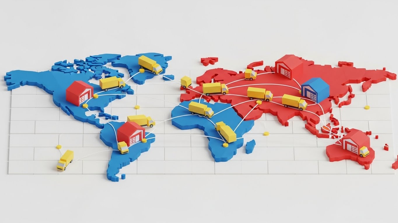
Isometric projection offers a "God's eye view" of the retail floor, providing a sense of total control. The visual language is architectural and blueprint-like, using a clean CMYK palette to emphasize precision. The narrative visualizes the invisible supply chain: small cubes (products) flowing automatically along conveyor belts onto shelves represents the seamless automation of the software. It transforms the chaotic back-room reality into a perfectly orchestrated logistical ballet.
Psychological Impact & KPI Focus
This style appeals to the operational need for Order and Process. It visualizes the "Digital Twin" of the store. By seeing the entire floor plan at once, the viewer feels a sense of omnipotence—the ability to see and control every SKU flow. It directly addresses the anxiety of "phantom inventory" or supply chain disconnects by showing unbroken lines of connection. It serves the KPI of Operational Efficiency.
Strategic Implementation & Trade-offs
- Best Use Case: "How it Works" sections on a website or educational YouTube content (30-60 seconds).
- Strategic Trade-off: The "blueprint" aesthetic can feel clinical. It creates a distance between the viewer and the shopper. It is excellent for operations (Logistics/Supply Chain) but less effective for Marketing personas who care about the shopper experience.
Companies using similar video content -
Manhattan Associates – Supply Chain Solutions – Orchestrating inventory and fulfillment processes.
Tecsys – Omni-Channel Fulfillment – Logical flow of products through distribution.
Infor – CloudSuite Retail – Architectural view of integrated retail operations.
5. Bold Kinetic Typography
TOFU | Vertical Social Organic

The Visual & Narrative Approach
Speed is the currency of modern retail. This style captures the energy of kinetic typography but replaces traditional letters with abstract geometric shapes to represent "Inventory." The electric purple and hot pink palette creates a high-contrast "strobe" effect that demands attention on vertical mobile screens. The diagonal motion trails imply forward momentum. The narrative is visceral: the shapes rush onto the screen and snap into place, mimicking the high-speed turnover of products on a shelf.
Psychological Impact & KPI Focus
This style is designed to disrupt the "scrolling trance" of TikTok or Instagram Reels. It taps into the psychological desire for Velocity and Modernity. It positions the SaaS brand as energetic, youthful, and aggressive—a stark contrast to the slow, legacy competitors. The visual pacing mimics the heartbeat of a high-volume retail environment, supporting the KPI of Inventory Turnover.
Strategic Implementation & Trade-offs
- Best Use Case: TikTok or Instagram Reels ads (10-15 seconds). Perfect for announcing new features or "flash" insights.
- Strategic Trade-off: It is extremely high-energy and can be fatiguing if overused. It lacks the detail required to explain complex features; it is purely an attention-capture mechanism.
6. 2D Character-Driven Story
TOFU | YouTube

The Visual & Narrative Approach
Technology is only as good as the human using it. This style introduces a protagonist—a retail manager—to anchor the software in reality. As shown in the visual, the character is depicted with a posture of ease and confidence, holding a tablet that displays a simplified planogram. The checkmark icon symbolizes success and compliance. The "Corporate Memphis" inspired aesthetic uses soft pastel blues and peaches to create a friendly, approachable atmosphere. The narrative focuses on empowerment: the software makes her job easier, not harder.
Psychological Impact & KPI Focus
This style builds Empathy and Trust. It addresses the fear that "AI will replace jobs" by showing AI assisting the human. For a buyer concerned about user adoption (e.g., "Will my store teams actually use this?"), this visual is reassuring. It humanizes the tech stack. The focus is on the KPI of Adoption Rate and User Satisfaction.
Strategic Implementation & Trade-offs
- Best Use Case: Case study videos or "Day in the Life" user scenarios (60-90 seconds).
- Strategic Trade-off: This style can feel "generic corporate" if not customized with specific retail props (e.g., accurate shelf stripping, handheld terminals). It risks blending in with other B2B SaaS marketing if the character design is too stock-standard.
Companies using similar video content -
Trax Retail – Retail Watch – High-speed shelf monitoring and compliance.
Pensa Systems – Autonomous Retail Inventory – Rapid detection of out-of-stocks.
Everseen – AI for Retail Operations – Fast identification of operational issues.
7. Hyper-lapse Stock Footage
TOFU | Skippable Pre-Roll Ad
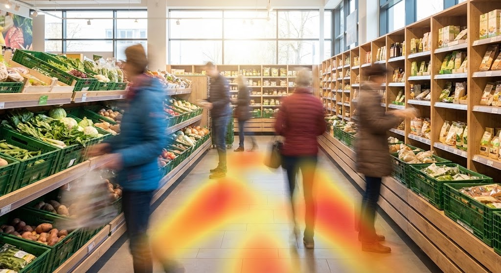
The Visual & Narrative Approach
This style grounds the viewer in the undeniable reality of the physical store. By using hyper-lapse photography, we see the "ghosting" effect of shoppers moving through the aisle, while the shelves remain sharp and static. The overlay of a warm-hued heat map (as seen on the floor) visualizes the data layer on top of the physical world. This is "Augmented Reality" for the strategic mind—showing where the traffic flows and where the "hot zones" are.
Psychological Impact & KPI Focus
The contrast between the blurred shoppers (chaos) and the sharp shelves (control) is the psychological hook. It visualizes the Passage of Time and Traffic Volume, two critical metrics for category management. It validates the software’s ability to track and analyze real-world behavior, offering "Proof of Life" that pure animation cannot. It sells the KPI of Shopper Engagement and Conversion Zone Analysis.
Strategic Implementation & Trade-offs
- Best Use Case: YouTube Pre-Roll ads (5 seconds to hook, 15 seconds total). The realism grabs attention immediately.
- Strategic Trade-off: Requires high-quality, rights-managed stock footage or custom shoots. Generic stock footage of "smiling shoppers" will kill credibility; the footage must look gritty and realistic (like a security feed or time-lapse).
Companies using similar video content -
Movista – Retail Execution Platform – Empowering field teams with mobile tools.
StayinFront – Retail Execution – Simplifying tasks for store associates.
GoSpotCheck (Skupos) – Retail Execution – Character-driven stories of task completion.
9. 3D X-Ray Visualization
MOFU | Product Differentiation

The Visual & Narrative Approach
To explain "SKU-level intelligence," we must look inside the product. This visual uses a 3D X-ray effect to reveal the hidden data attributes that power the algorithm. The visual metaphor displays the "engine" of the software itself—represented here by glowing gears and connected nodes within a translucent screen. This "glass box" effect symbolizes transparency. The neon green and blue connections visualize the complex relationships between price, weight, margin, and demand.
Psychological Impact & KPI Focus
This style appeals to the "Tech Skeptic" or the Data Scientist persona who wants to know how it works. It signals Depth and Sophistication. It says, "We don't just look at the box; we understand the attributes inside it." It reduces the fear of the "Black Box" algorithm by visually opening it up. The focus is on Data Granularity and Attribute Modeling.
Strategic Implementation & Trade-offs
- Best Use Case: Feature pages on the website or deep-dive product demo videos (2-3 minutes).
- Strategic Trade-off: High production cost. 3D rendering requires significant resources. It can also become too abstract if the "nodes" don't clearly label what they represent (e.g., "Price," "Origin," "Flavor Profile").
Companies using similar video content -
StoreDNA – Retail Analytics – Visualizing shopper flow and hot zones.
Sensormatic Solutions – ShopperTrak – Real-world traffic and conversion analysis.
Standard AI – Autonomous Retail – Capturing real-time store activity.
10. Rapid UI Montage
MOFU | Feature Education

The Visual & Narrative Approach
SaaS platforms often suffer from "Feature Bloat" in the customer's mind. This style solves that by arranging multiple interface screens in a dynamic, floating isometric grid. The bright orange and slate blue palette creates a vibrant, cohesive ecosystem. Instead of showing one boring screen recording, this montage conveys the breadth of the platform—Planograms, Assortment Lists, Analytics—all floating together. It is a visual metaphor for a "Unified Platform."
Psychological Impact & KPI Focus
This style reduces Cognitive Load by organizing complex UI into a clean, tiled structure. It suggests Multitasking and Integration. The viewer perceives the software as a comprehensive "Command Center" rather than a disparate set of tools. It addresses the desire for an "All-in-One" solution, directly impacting the perception of Platform Value and Workflow Efficiency.
Strategic Implementation & Trade-offs
- Best Use Case: Email newsletters (GIF format) or as a dynamic background for a "Features" section on a landing page.
- Strategic Trade-off: Because the screens are small and numerous, specific details (text/numbers) are illegible. This style sells the idea of the UI, not the specific functionality of a button. It is for impression, not instruction.
11. Split Screen: Optimized**
MOFU | Competitive Displacement
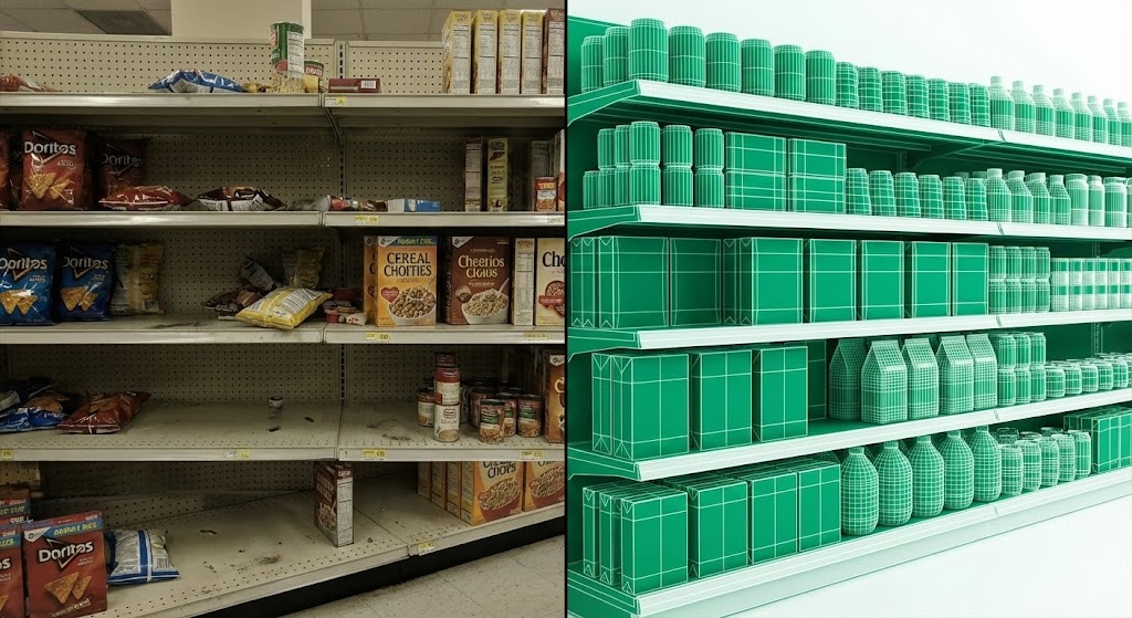
The Visual & Narrative Approach
This style leverages the powerful "Before and After" rhetorical device, elevated for the sophisticated SaaS buyer. As visually defined, the composition is split vertically. The left side exposes the painful reality of the "Status Quo"—a desaturated, slightly chaotic grocery shelf plagued by gaps and disarray. The right side reveals the "Optimized Future"—a vibrant, emerald green wireframe overlay where every SKU is perfectly aligned. The narrative is instantaneous: the software doesn't just manage the shelf; it cures the chaos. The wireframe overlay implies that this perfection is engineered and attainable.
Psychological Impact & KPI Focus
Psychologically, this appeals to the human desire for Restoration and Symmetry. For a Category Manager constantly fighting the entropy of physical stores, this visual provides immediate cognitive relief. It validates their struggle (the left) and offers a mathematical solution (the right). It directly targets the KPI of Planogram Compliance, stripping away the ambiguity of "better management" and visualizing it as a binary choice: Chaos or Control.
Strategic Implementation & Trade-offs
- Best Use Case: LinkedIn carousel ads or "Competitor Comparison" landing pages. The stark contrast effectively stops the scroll on mobile devices.
- Strategic Trade-off: It can feel aggressive. To maintain credibility, the "Before" image must look like a genuine, gritty retail fail rather than a cartoonish disaster.
Companies using similar video content -
Symphony RetailAI – AI-Powered Insights – Revealing hidden product attributes and relationships.
Blue Yonder – Category Management – Deep dive into SKU performance drivers.
Censuseco – Shelf Optimization AI – X-raying product data for optimal placement.
12. Abstract 3D AI Visualization
MOFU | ABM Awareness

The Visual & Narrative Approach
When selling to enterprise-level retailers, the scope is not a single shelf; it is the global network. This style uses a high-end particle simulation to visualize the software as the "central nervous system" of the supply chain. Glowing nodes in deep indigo and violet represent distribution centers and stores, connected by pulsing data lines on a clean white void background. The narrative shifts from "managing space" to "orchestrating flow," implying that the software creates a living network where data travels instantly from manufacturer to shelf.
Psychological Impact & KPI Focus
This style resonates with the Strategic Visionary persona (e.g., VP of Supply Chain). It alleviates the anxiety of fragmentation and silos. By seeing the world as a unified, glowing network, the viewer feels a sense of Omniscience. It promises that despite the complexity of thousands of stores, there is a singular logic holding it together. The key KPI communicated here is Supply Chain Visibility and Global Scalability.
Strategic Implementation & Trade-offs
- Best Use Case: Account-Based Marketing (ABM) display ads targeting specific enterprise IP addresses, or as the background for a "Platform Overview" white paper.
- Strategic Trade-off: It is highly abstract. Without strong accompanying copy (e.g., "Real-time visibility across 5,000 locations"), it can be mistaken for generic telecom or fintech imagery.
Companies using similar video content -
Oracle Retail – Retail Cloud Suite – Showcasing integrated modules for retail.
SAP – Retail Solutions – Dynamic display of various retail management UIs.
Aptos – Retail Planning – Integrated retail planning and execution.
13. Abstract 2D Motion
MOFU | Website Re-engagement

The Visual & Narrative Approach
Sometimes, the goal is not to explain, but to remind. This style utilizes a Bauhaus-inspired aesthetic with burnt orange, cream, and teal lines to visualize "Customer Pathways." The lines act as abstract representations of shoppers or inventory moving through a system, eventually converging at a central teal hub. The design is flat, clean, and sophisticated on a white canvas. The narrative is subtle: "All roads lead back to the center." It creates a visual metaphor for the software's ability to capture data and bring customers (or users) back into the ecosystem.
Psychological Impact & KPI Focus
This style lowers Cognitive Friction. Unlike high-intensity data visualizations, this art direction is soothing and orderly. It works subconsciously to reinforce brand presence without demanding heavy mental processing. For a prospect who has already visited the website, this visual serves as a gentle, professional nudge. It speaks to Retention and Process Flow, suggesting that the software simplifies the chaotic journey of the consumer.
Strategic Implementation & Trade-offs
- Best Use Case: Google Display Network (GDN) retargeting ads. Its simplicity ensures it remains legible even at small banner sizes (e.g., 300x250).
- Strategic Trade-off: It is low on information density. It cannot carry a complex value proposition. It relies entirely on brand color recognition and simple movement to keep the brand "top of mind."
Companies using similar video content -
DotActiv – Planogram Software – Transforming chaotic shelves into optimized layouts.
Trax Retail – Shelf Monitoring – Visualizing compliance improvements instantly.
15. Dynamic Data Visualization
MOFU | Demand Gen

The Visual & Narrative Approach
The central promise of Category Management SaaS is "insights." This style visualizes that buzzword literally. A simple white product box explodes, releasing a dynamic cloud of red and black 3D charts—bars, pies, and data shards. The narrative is Explosive Discovery: the physical product is merely a container for valuable data. By "breaking open" the box, the software reveals the hidden metrics (velocity, margin, attach rate) that are trapped inside static inventory. It transforms a passive object into active intelligence.
Psychological Impact & KPI Focus
This style appeals to the Analytical mind of the Category Analyst. It triggers the dopamine response associated with "finding the answer." The high-contrast palette and dynamic motion convey energy and urgency. It suggests that the user is currently sitting on a goldmine of unanalyzed data, and this tool is the pickaxe. The primary KPI is Data Utilization and Actionable Insights.
Strategic Implementation & Trade-offs
- Best Use Case: LinkedIn feed ads promoting a downloadable industry report or case study (e.g., "Unlock the Hidden Value in Your Planogram").
- Strategic Trade-off: The "explosion" can feel chaotic if over-animated. It requires a clean, white studio background to ensure the data shards (the hero elements) are clearly visible and don't look like clutter.
Companies using similar video content -
Kinaxis – RapidResponse – Global network visualization of supply chain.
E2open – Supply Chain Platform – Connecting nodes across the entire network.
One Network Enterprises – Business Network – Abstract 3D view of interconnected partners.
16. 2D Line Art Animation
MOFU | Thought Leadership
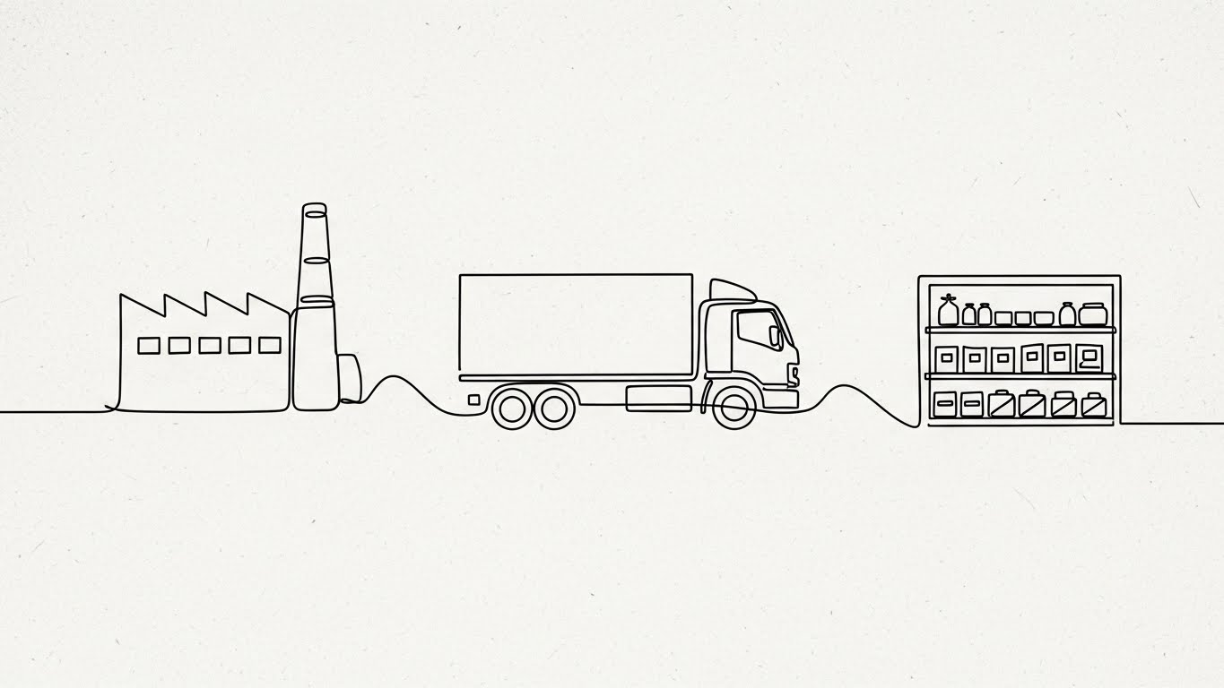
The Visual & Narrative Approach
Complexity breeds confusion; simplicity breeds confidence. This style uses a single, continuous ink-black line to draw the entire journey of a product—from the factory smokestack, to the truck, to the retail shelf. There are no breaks, no cuts, and no distractions. The narrative is one of Seamless Integration. It asserts that the software connects these disparate silos (Manufacturing, Logistics, Sales) into one fluid, unbroken story. The minimalist aesthetic signals sophistication and intellectual confidence.
Psychological Impact & KPI Focus
This style is designed for the Intellectual Buyer who values strategy over features. It reduces the "Mental Noise" of the industry. By simplifying the supply chain into one line, it implies that the software is easy to implement and unifies the organization. It addresses the pain point of "disconnected systems." The focus is on End-to-End Visibility and Workflow Integration.
Strategic Implementation & Trade-offs
- Best Use Case: Header images for white papers, blog posts, or "Philosophy" sections of the website. It sets a thoughtful, consultative tone.
- Strategic Trade-off: It lacks "Tech Dazzle." It does not look expensive or cutting-edge. It relies on the quality of the thought leadership content it accompanies to be effective.
Companies using similar video content -
Coupa – Business Spend Management – Guiding pathways for procurement processes.
SAP Ariba – Procurement Solutions – Abstract flow of sourcing and purchasing.
Zebra Technologies – Retail Solutions – Visualizing data flow in retail operations.
17. Lifestyle Stock with UI
BOFU | Building Trust

The Visual & Narrative Approach
At the Bottom of the Funnel, the buyer asks, "What does this actually look like for my team?" This style answers by blending high-quality photography with subtle UI overlays. We see a confident female executive in a modern warehouse, but the "magic" is the floating blue data panel next to her. The narrative is Augmentation, not replacement. The technology is depicted as a superpower that floats readily at her side, providing "Positive Trend" analysis. The warm lighting and professional attire ground the tech in a human, successful reality.
Psychological Impact & KPI Focus
This style builds Social Proof and Trust. It helps the buyer visualize their own team using the tool successfully. The "Tech Blue" overlay against the warm warehouse tones creates a harmonious balance between the physical and digital worlds. It reassures the buyer that the software fits naturally into their existing operations. The KPI focus is User Adoption and Team Empowerment.
Strategic Implementation & Trade-offs
- Best Use Case: "Solutions" pages, customer testimonials, or the "Team" section of a pitch deck.
- Strategic Trade-off: The risk of "Stock Photo Cheeziness" is high. The model must look like a real Operations Director, not a generic model. The UI overlay must look functional, not like a sci-fi movie prop.
18. Photorealistic 3D Renders
BOFU | ROI Justification

The Visual & Narrative Approach
When justifying the investment to a CFO, metaphors must become literal. This style replaces products with stacks of gold coins and emerald gems, rendered with photorealistic precision on a standard retail shelf. The lighting highlights the metallic sheen and the cut of the gems. The narrative is blunt and powerful: Space is Money. Every inch of the shelf represents potential revenue, and an empty space or poor placement is literally lost gold. It translates abstract "Category Management" into hard financial terms.
Psychological Impact & KPI Focus
This triggers the Loss Aversion and Greed (value maximization) centers of the brain. It removes the abstraction of "SKUs" and replaces it with "Currency." It forces the viewer to treat the shelf as a high-yield financial portfolio rather than just storage. It creates an immediate sense of urgency to optimize. The primary KPI is Revenue per Linear Foot and Margin Maximization.
Strategic Implementation & Trade-offs
- Best Use Case: ROI Calculator landing pages or the "Business Case" slide in a sales presentation.
- Strategic Trade-off: It is very literal. It works for financial discussions but lacks the nuance needed for explaining how the software works. It is a "Why Buy" visual, not a "How-To" visual.
Companies using similar video content -
SAS Retail & Consumer Goods – Retail Analytics – Explosive insights from sales data.
GfK – Market Intelligence – Unlocking hidden market trends.
Revionics (Aptos) – Price Optimization – Dynamic data visualization for pricing.
19. Wireframe to Reality
BOFU | Overcoming Objections
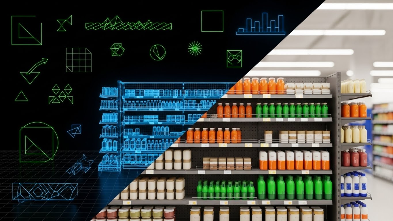
The Visual & Narrative Approach
One of the biggest objections in SaaS is "Implementation Risk"—the fear that the software plan won't match the physical reality. This style directly counters that by showing a transition: a technical blue wireframe shelf on the left fading seamlessly into a photorealistic, fully stocked gondola on the right. The narrative is Fidelity. It proves that the software's planning capabilities (the wireframe) translate 1:1 to the real store environment (the photo). It visualizes the bridge between the digital planogram and the physical shelf.
Psychological Impact & KPI Focus
This reinforces Competence and Reliability. It offers "What You See Is What You Get" assurance. For the Operations Manager, this visual signals accuracy and reliability. It promises that the time spent planning will not be wasted on unrealistic layouts that don't fit the store. The focus is on Execution Compliance and Planogram Accuracy.
Strategic Implementation & Trade-offs
- Best Use Case: "Implementation" or "Onboarding" email sequences. It reassures the prospect that the transition will be smooth.
- Strategic Trade-off: It requires high production value. The wireframe and the photo must align perfectly (pixel-perfect registration) or the effect is ruined and implies "disconnect" instead of "connection."
Companies using similar video content -
FourKites – Real-Time Visibility – Continuous line showing shipment journey.
project44 – Supply Chain Visibility – Unbroken flow of logistics data.
Centric Software – PLM for Retail – Seamless product lifecycle management.
20. Dark Mode UI Showcase
BOFU | Risk Mitigation

The Visual & Narrative Approach
In the final stages of a deal, the IT and Security teams get involved. They don't care about marketing; they care about safety. This style adopts the visual language of cybersecurity: a sleek, dark mode interface with neon blue data streams and prominent, glowing yellow padlock icons. The perspective is angled, like a command center screen. The narrative is Fortress. It communicates that the platform is enterprise-ready, encrypted, and secure. It shifts the conversation from "Sales Growth" to "Asset Protection."
Psychological Impact & KPI Focus
This addresses the primal fear of Vulnerability. In an era of data breaches, this style signals competence and seriousness. The dark mode aesthetic suggests "backend power" and sophisticated engineering. It provides the visual reassurance needed to get the "Technical Sign-off." The focus is on Data Security, Compliance, and Uptime.
Strategic Implementation & Trade-offs
- Best Use Case: Technical documentation, "Security" pages in the footer, or the final "Procurement Pack" sent to IT stakeholders.
- Strategic Trade-off: It is cold and technical. It should never be used for marketing to the Head of Sales or Category Management, as it feels distant from the shopper experience. It is strictly for the technical gatekeeper.
Companies using similar video content -
Blue Yonder – Luminate Platform – Executives using data panels in warehouses.
Relex Solutions – Unified Retail Planning – Managers interacting with planning UI.
21. 2D Graphics Over Live
BOFU | Demo Requests

The Visual & Narrative Approach
At the final stage of the funnel, the concept must become concrete. This style blends the human reality of business—a handshake—with the digital promise of the software. The live-action photography grounds the viewer in a professional, tangible reality, while the floating 2D vector icons (the checkmark, the contract, the rising graph) visualize the result of that partnership. The aesthetic uses a "Mixed Reality" approach, suggesting that the software overlay enhances the human relationship rather than replacing it.
Psychological Impact & KPI Focus
This style triggers Assurance and Finality. It appeals to the decision-maker who is ready to sign but needs that final subconscious nudge that "this is a good deal." The handshake symbolizes trust and commitment, while the rising graph icon reinforces the logical expectation of growth. It bridges the gap between the emotional decision to trust a vendor and the rational decision to buy a tool. The focus is on Conversion Rate and Deal Velocity.
Strategic Implementation & Trade-offs
- Best Use Case: "Thank You" pages after a demo request, or in the final slide of a sales deck. It visually seals the deal.
- Strategic Trade-off: It can feel generic if the stock photography is too staged. To work effectively, the "live" element should ideally feature real members of your sales team, or the 2D graphics must be branded specifically to your UI's iconography.
Companies using similar video content -
DotActiv – Space Planning – Visualizing shelf space as financial assets.
Shelf Logic – Profit Optimization – Rendering product placement as revenue.
22. Aspirational Stock
BOFU | The Economic Buyer

The Visual & Narrative Approach
When selling to the C-Suite, you are selling a vision of control. This style uses cinematic, high-production-value photography to depict the "Master of Industry." The silhouette of the executive overlooking a vast, automated warehouse bathed in golden hour sunlight conveys a narrative of Omniscience. It moves the conversation away from "managing shelves" to "commanding empires." The lens flares and steel-blue tones suggest a future that is bright, organized, and high-tech.
Psychological Impact & KPI Focus
This style appeals to the Ego and Ambition of the Economic Buyer (CEO/CFO). It validates their self-image as a visionary leader. It alleviates the anxiety of chaos by presenting the supply chain as a beautiful, orderly machine. It doesn't talk about features; it talks about Scale and Market Dominance. The KPI communicated is Strategic ROI and Operational Excellence.
Strategic Implementation & Trade-offs
- Best Use Case: The Hero section of the "About Us" page or the cover of an Annual Report. It establishes the vendor as an enterprise-grade partner.
- Strategic Trade-off: It is zero-information. It explains nothing about what the software does. It is purely for brand positioning and credibility. It fails completely if used for user education.
Companies using similar video content -
MockShop (Visual Retailing) – 3D Store Planning – From digital wireframe to physical store.
Nexgen Packaging – Retail Solutions – Ensuring planogram accuracy in execution.
23. Isometric 3D Workflow
Onboarding | Implementation

The Visual & Narrative Approach
Implementation is often the most stressful phase for a client. This style counters that anxiety with "Claymorphism"—a soft, tactile, toy-like 3D aesthetic. By depicting the setup process as a team of abstract figures assembling soft blocks, the narrative shifts from "hard engineering" to "playful assembly." It frames the onboarding process as collaborative, modular, and safe. The pastel palette and rounded corners visually remove the "sharp edges" of complex software integration.
Psychological Impact & KPI Focus
This style reduces Performance Anxiety. It tells the user, "You can't break this; it's easy to build." It fosters a sense of Approachability and Collaboration. Unlike the rigid blueprint styles used earlier in the funnel, this style is about the human experience of setting up the tool. The focus is on Time-to-Value (TTV) and Implementation Success Rate.
Strategic Implementation & Trade-offs
- Best Use Case: "Welcome Aboard" emails or the loading screens of the configuration wizard. It keeps the mood light during potentially frustrating technical setup.
- Strategic Trade-off: It can look "infantile." It must be balanced carefully. If the software is mission-critical (e.g., security compliance), this style might lack the necessary gravity.
Companies using similar video content -
Pricer – ESL Platform – Secure management of electronic shelf labels.
SES-imagotag – VUSION Platform – Dark mode for robust store operations.
24. 2D Animation & UI
Onboarding | Self-Serve Onboarding

The Visual & Narrative Approach
Modern SaaS users prefer self-serve over reading manuals. This style combines clean 2D character animation with stylized UI elements. The user character is shown actively engaging with a "Help/Guide" floating icon, with a dotted line indicating the path to the solution. The vibrant purple and yellow palette highlights the "Help" function as a feature, not a failure. The narrative is Empowerment: "The answer is one click away, and you are in control."
Psychological Impact & KPI Focus
This style builds Confidence and reduces Learned Helplessness. It visually reinforces the idea that the platform is intuitive and supportive. By showing a character successfully finding help, it models the desired behavior for the new user. It directly targets the KPI of Support Ticket Deflection and User Activation Rate.
Strategic Implementation & Trade-offs
- Best Use Case: In-app tooltips or "Getting Started" video walkthroughs embedded in the dashboard.
- Strategic Trade-off: It can become repetitive. If every tooltip uses the same character animation, users may start to ignore it (banner blindness). It works best for high-level navigation guidance.
Companies using similar video content -
Blue Yonder – Luminate Commerce – Augmented partnership for commercial success.
Relex Solutions – Retail Planning – Visualizing successful client agreements.
25. Macro UI Micro-Interactions
Onboarding | Accelerating TTV

The Visual & Narrative Approach
To prove "ease of use," you must show the moment of action. This style uses an extreme close-up (macro) view of the interface, focusing entirely on a single interaction—a mouse clicking an "Optimize" button. The shallow depth of field blurs everything else, forcing the viewer to focus on the ease of the trigger. The "inner glow" of the button visualizes the power contained in that single click. The narrative is Simplicity: "Complex math, handled with one click."
Psychological Impact & KPI Focus
This triggers the Dopamine response associated with task completion. It promises Instant Gratification. For a Category Manager used to spending hours on manual spreadsheets, this visual of a single "Optimize" button is incredibly seductive. It represents the ultimate promise of automation. The KPI focus is Feature Adoption and Task Completion Time.
Strategic Implementation & Trade-offs
- Best Use Case: Email newsletters announcing a new feature update, or GIF assets in help documentation.
- Strategic Trade-off: It lacks context. It shows the "click" but not the "result." It must be paired with text or other visuals that explain what is being optimized.
Companies using similar video content -
Oracle Retail – Enterprise Solutions – Visionary scale of retail operations.
SAP – Intelligent Enterprise – Mastering the global supply chain.
IBM – Retail Solutions – Commanding vast retail empires.
26. Gen AI Realistic Character
Retention | Reducing Churn

The Visual & Narrative Approach
Scalable retention requires a personal touch that doesn't cost human hours. This style uses high-fidelity Generative AI to create a realistic "Customer Success Manager" avatar. She is depicted in a warm, modern office, speaking directly to the camera. The lighting is soft and flattering. The narrative is Relationship: Even though this is software, there is a "human" face looking out for your success. It bridges the gap between a cold platform and a service relationship.
Psychological Impact & KPI Focus
This style creates a sense of Belonging and Support. It leverages the "Face Advantage"—humans are hardwired to trust and pay attention to faces. Using a consistent avatar for updates or check-ins creates a parasocial bond, making it harder for the client to churn. The focus is on Net Promoter Score (NPS) and Customer Retention.
Strategic Implementation & Trade-offs
- Best Use Case: Quarterly Business Review (QBR) invitations, product update videos, or personalized "Year in Review" videos sent to account admins.
- Strategic Trade-off: The "Uncanny Valley" risk. If the AI lip-sync or movement is slightly off, it can feel creepy rather than welcoming. Quality control on the generation model is critical.
Companies using similar video content -
DotActiv – Onboarding Process – Playful assembly of planogram components.
Shelf Logic – Setup Guide – Simplifying software integration steps.
27. Low-Poly 3D Modeling
Retention | Reducing Support
The Visual & Narrative Approach
When explaining complex logistical networks or support topics, realism can be too noisy. This style uses "Low-Poly" 3D—a geometric, simplified art style—to map out the world. Primary colors (Red, Blue, Yellow) clearly differentiate between stores, trucks, and warehouses. The narrative is Clarity through Simplification. It strips away the texture of the real world to show the underlying logic of the distribution network. It turns a complex supply chain problem into a solvable puzzle.
Psychological Impact & KPI Focus
This style reduces Cognitive Load during learning. It makes the subject matter feel manageable and "gamified." It is particularly effective for educating users on backend processes (like how the algorithm routes inventory) without overwhelming them with technical diagrams. The focus is on Knowledge Base Engagement and Self-Service Resolution.
Strategic Implementation & Trade-offs
- Best Use Case: Knowledge Base articles, "How It Works" deep dives, or internal training modules for new staff.
- Strategic Trade-off: It can look "cheap" if not lit correctly. The lighting must be premium (ambient occlusion, soft shadows) to ensure it looks like a deliberate design choice, not a legacy video game.
Companies using similar video content -
Movista – Help Center – Guided self-service for field teams.
StayinFront – Training Modules – Empowering users with animated guides.
Repsco – User Onboarding – Animated walkthroughs for new features.
28. Futuristic Neon/Dark
Expansion | Deep Feature Adoption

The Visual & Narrative Approach
To sell premium features or advanced modules, you need to sell the "Future." This style adopts a "Cyberpunk" or "Tron-like" aesthetic: dark mode backgrounds with neon pink and cyber-blue wireframes. Floating data glyphs hover above the shelves. The narrative is Evolution. It suggests that the standard platform is for today, but this feature is for tomorrow. It positions the upsell as an upgrade to a higher state of retail consciousness.
Psychological Impact & KPI Focus
This triggers the Fear of Missing Out (FOMO) and the desire for Innovation. It frames the advanced features as cutting-edge weaponry in the retail war. It appeals to the "Tech Enthusiast" in the buyer who wants the coolest, most advanced tools available. The focus is on Feature Upsell Rate and Average Revenue Per User (ARPU).
Strategic Implementation & Trade-offs
- Best Use Case: Launch emails for new "Pro" or "Enterprise" features (e.g., AI prediction modules), or as a background for a keynote product reveal.
- Strategic Trade-off: It is aggressive. It creates a high contrast with the likely day-to-day UI (which is probably white/grey). It should be reserved specifically for "Next Gen" features to maintain that distinction.
Companies using similar video content -
Blue Yonder – Luminate Control Tower – Focus on single-click optimization.
Relex Solutions – Forecasting Module – Instant gratification from a single action.
29. Holographic UI over 3D
Expansion | Driving Upsell

The Visual & Narrative Approach
Enterprise buyers need to see the "Big Picture." This style overlays a sleek, transparent "Glassmorphism" UI dashboard onto a realistic 3D city map. The dashboard blurs the city behind it, focusing attention on high-level metrics. The narrative is Omniscience. It shows that the software doesn't just manage a store; it monitors the entire region. The glass texture implies sophistication and modern tech stack.
Psychological Impact & KPI Focus
This triggers the feeling of Executive Power. It mimics the interface of a sci-fi command center, making the user feel like they are in the pilot's seat of a massive operation. It validates the high cost of the Enterprise tier by visualizing the scale of control it offers. The focus is on Enterprise Contract Value and Expansion Revenue.
Strategic Implementation & Trade-offs
- Best Use Case: Executive summary reports, Enterprise landing pages, or pitch decks for QBRs with large accounts.
- Strategic Trade-off: Legibility. The background (the city) must be dark enough or desaturated enough so that the white text on the glass UI is readable. Poor contrast kills this effect.
Companies using similar video content -
IBM – Watson Assistant – Humanizing customer support with AI.
Salesforce – Einstein AI – Personalized insights with AI avatars.
Microsoft – Dynamics 365 Copilot – AI-driven personalized assistance.
30. 3D Parallax UI
Expansion | Driving Referrals

The Visual & Narrative Approach
Finally, we visualize the community. This style uses 3D parallax to show multiple UI cards (user profiles, network nodes) floating in a white void, casting soft shadows on each other. The cards are stacked, implying depth and abundance. The narrative is The Network Effect. It suggests that the platform is not an isolated tool, but a thriving ecosystem of users, data, and connections. It invites the user to invite others.
Psychological Impact & KPI Focus
This builds Social Proof and Belonging. The clean, bright aesthetic suggests a transparent and open community. Seeing "other cards" implies that the user is part of a larger, successful group. It encourages advocacy. The focus is on Referral Rate and Community Engagement.
Strategic Implementation & Trade-offs
- Best Use Case: "Invite a Colleague" screens, community forum headers, or social media posts highlighting user success stories.
- Strategic Trade-off: It is abstract. It relies on the "feeling" of a network rather than showing specific functionality. It is an emotional closer, not a logical opener.
Strategic Knowledge Base: The Visual Operations Doctrine
To transform these 30 visual styles into a cohesive business advantage, we must move beyond "marketing assets" and establish a "Visual Operations Doctrine." This framework synthesizes the visual strategies into actionable business outcomes, structured across three critical segments.
Strategic Alignment & Visual Architecture
The "Pre-Production" Strategy: Defining the Visual Operating System
Before a single pixel is rendered, the Category Management leader must define the "Visual Operating System" for their organization. Inconsistency creates cognitive friction; a unified visual language creates fluency.
- The Cognitive Load Audit: Conduct an audit of your current training materials. If a Planogram guide takes more than 15 seconds to decipher, it is too complex. Replace text-heavy PDFs with Style 1 (Minimalist Flat) or Style 27 (Low-Poly 3D) to strip away noise and focus on execution.
- Role-Based Visual Mapping: Differentiate your visual strategy by persona. Use Style 5 (Bold Kinetic) for mobile-first Store Associates who need quick energy. Use Style 29 (Holographic UI) for desktop-based Directors who need deep, analytical density. One style does not fit all screens.
- The "Glanceability" Standard: In a busy retail environment, information must be consumed at a glance. Adopt the high-contrast principles of Style 11 (Split Screen) for all operational directives. If the "Before/After" isn't instantly clear, the visual fails the operational test.
- The Advids Strategic Audit: Partnering with visual strategists like Advids allows for an external audit of your visual assets. They can help define a cohesive "Visual Language" that bridges your Marketing (External) and Operations (Internal) teams, ensuring that the promise sold to the buyer is the reality seen by the user.
- Standardization vs. Customization: For core functionalities (login, basic navigation), use standardized stock-based visuals (Style 22) to save budget. Reserve bespoke, high-fidelity visualizations (Style 9) for your proprietary algorithms or unique differentiators.
- The Cross-Departmental Bridge: Use visuals to unify terminology. If Sales calls it "Assortment Optimization" and Ops calls it "Shelf Reset," confusion reigns. A shared visual dictionary, using consistent icons and motifs (Style 21), unifies the language.
- Legacy System Integration: Visualizing the connection between old on-premise hardware and new SaaS interfaces is critical. Use Style 19 (Wireframe to Reality) to visually demonstrate how the new digital plan maps to the old physical reality.
- Accessibility in Operations: Your workforce is diverse. Motion graphics (Style 25) transcend language barriers. Use visual cues (color, motion) rather than text to communicate compliance standards to a multi-lingual store workforce.
- The Mobile-First Mandate: 80% of your users are standing in an aisle, not sitting at a desk. Ensure all visual assets, especially Style 24 (2D Animation), are optimized for vertical, small-screen consumption on handheld terminals.
- Brand Voice Consistency: Your internal training videos should feel as premium as your external sales commercials. Maintaining the high production value of Style 2 (Abstract Organic) internally signals respect for the operational team and boosts morale.
Operational Adoption & Implementation
The "Deployment" Phase: Embedding Visuals into Workflow
The best software fails without adoption. This segment focuses on using visual content to grease the wheels of implementation and habit formation.
- Overcoming "Big Brother" Anxiety: Automated shelf scanning can feel intrusive to staff. Use Style 6 (2D Character Story) to frame the technology as a "Helper" that handles the boring counting tasks, empowering the human to focus on customer service.
- The Micro-Learning Shift: Store associates do not have time for hour-long seminars. Break complex training into 30-second "Micro-Learning" clips using Style 10 (Rapid UI Montage). Deliver these "Just-in-Time" to their mobile devices right when they need them.
- Just-in-Time Support: Embed Style 25 (Macro UI) GIFs directly into the software’s tooltips. When a user hovers over a complex button, show them the action instantly. This reduces the need to leave the app to find answers.
- Gamification of Compliance: Use the energetic visual language of Style 5 (Bold Kinetic) to visualize compliance scores. transform "Planogram Adherence" from a chore into a high-score chase, using bright bars and motion to reward success.
- Reducing Support Ticket Volume: There is a direct correlation between proactive visual guides and reduced call center volume. A library of Style 24 (Self-Serve) videos can deflect up to 40% of Tier 1 support queries.
- Remote Onboarding: For distributed retail chains, flying trainers to every store is impossible. Use Style 23 (Isometric 3D Workflow) to create virtual, scalable onboarding modules that feel personal and friendly without the travel cost.
- Visual Standard Operating Procedures (SOPs): Text-based SOPs are rarely read. Convert them into Style 16 (Line Art Animation) process flows. A continuous line animation proves the workflow is seamless and easy to follow.
- Feedback Loops: Use interactive video elements (Style 26) to ask for feedback. A "human" AI avatar asking "Did this help?" solicits more honest feedback than a sterile survey form.
- Scalable Localization: When deploying globally, separate the text layers from the visual layers in your Style 1 (Flat Vector) assets. This allows for rapid, low-cost translation of on-screen text for different regions without re-animating the core visual.
- Leadership Communication: When rolling out a major platform change, use Style 28 (Futuristic Neon) in executive presentations to signal that this is a strategic upgrade, not just a software patch. Visualizing the "Future State" rallies the troops.
Measuring Impact & Future-Proofing
The "ROI" Phase: Quantifying Success and Scaling
Visuals are an investment, not an expense. This segment outlines how to measure their return and prepare for the next wave of technology.
- Beyond "Views": Do not measure video success by "views." Measure it by Time-to-Competency. Did the group that watched the Style 23 onboarding video complete their first planogram faster than the group that read the manual?
- The "Idle Time" Metric: Correlate better visualization with reduced software navigation time. If Style 25 visuals help users find buttons faster, that saved time is directly calculable as operational savings across thousands of employees.
- Compliance Velocity: How fast does a new planogram get executed? Measure the speed of compliance when instructions are sent via Style 19 (Wireframe to Reality) visuals versus static photos. The delta is your ROI.
- Retention and LTV: High-quality UX visualization improves customer satisfaction. Track the retention rate of accounts that engage with your Style 26 (AI Character) updates versus those that don't.
- The AI Visual Frontier: Prepare your data infrastructure for Generative AI. The future is real-time, personalized video generation. The "Clean Data" visualized in Style 9 (X-Ray) is the fuel for these future engines.
- Scalability of Assets: Build a "Visual Component Library." By standardizing elements from Style 27 (Low Poly), you can rapidly build new training scenarios without starting from scratch.
- The Advids Partnership: As your platform evolves, your visual library must keep pace. A long-term partnership with Advids ensures that your visual assets remain "Living Documents," constantly updated to reflect new features and UI changes without the overhead of an internal studio.
- Benchmarking Success: "Good enough" visuals are a competitive risk. If your competitor uses Style 2 (Abstract Organic) to look innovative and you use static screenshots, you lose the perception war before the feature war.
- The ROI of Safety: In the backroom and warehouse, safety is paramount. Quantify the reduction in accidents or inventory damage after implementing Style 27 (Low Poly) safety process visualizations.
- Final Call to Innovation: Treat video not as "content," but as infrastructure. Just as you invest in servers for speed, invest in visuals for understanding. The winner in the Category Management space will not be the one with the most data, but the one who makes that data most visible, understandable, and actionable.
Companies using similar video content -
FourKites – Logistics Visibility – Playful simplification of supply chain networks.
project44 – Movement Platform – Clarifying complex freight routes.
Verusen – AI for Supply Chain – Simplifying complex inventory networks.
Author & Editor Bio


