
Introduction: Bridging the "Mud-to-Cloud" Gap
The cattle industry stands at a historic crossroads. We are witnessing the convergence of centuries-old tradition with cutting-edge digital infrastructure. For the progressive rancher or feedlot manager, the challenge is no longer just about genetics or grazing rotations; it is about data. The "Mud-to-Cloud" divide—the operational gap between the physical reality of the chute and the digital precision of the boardroom—is the single greatest friction point in modern livestock management.
Visualization is the bridge. It is not merely a marketing asset; it is a cognitive tool that translates complex datasets—Average Daily Gain (ADG), withdrawal periods, and pasture utilization—into immediate, actionable insights.
The industry is already moving. The global cattle management software market was estimated at USD 1.90 billion in 2024, signaling a massive shift away from pen-and-paper reliance. However, purchasing software is different from adopting it. To drive true integration, we must demonstrate tangible ROI. Recent data indicates that automated health tracking systems can lead to a 16% increase in efficiency—a metric that speaks directly to the bottom line.
This guide explores 30 specific visual strategies designed to dismantle skepticism and accelerate adoption. By aligning aesthetic choices with the unique psychology of the livestock professional, we transform software from a "cost" into a vital operational partner.
1. Minimalist Flat 2D Vector
TOFU | Brand Awareness
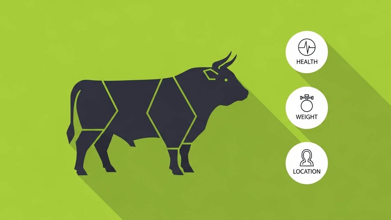
The Visual & Narrative Approach
This style utilizes a "2D vector illustration" technique to reduce complex biological data into a binary visual language. A stylized silhouette of a Black Angus bull is centered, composed of "geometric shapes in deep charcoal gray." This is not a portrait of a cow; it is a representation of a data asset. The background of "vivid lime green" acts as a high-contrast canvas, ensuring the three simple white circular icons for 'Health', 'Weight', and 'Location' pop immediately. The aesthetic is intentionally stripped of texture to focus purely on status.
Psychological Impact & KPI Focus
- Cognitive Load Reduction: In the chaotic environment of a chute-side operation, the user cannot parse complex gradients. The "hard edges" and "flat color blocks" allow the brain to process the animal's status (Active/Healthy) in milliseconds.
- Operational KPI: Directly supports Rapid Decision Making. It promises the user that accessing critical metrics is instantaneous and frictionless.
Strategic Implementation & Trade-offs
- Best Use Case: Top-of-Funnel (TOFU) social media ads (Instagram/LinkedIn) where scroll speed is high. The 1:1 ratio is optimized for mobile feeds.
- Trade-off: While excellent for clarity, this style lacks emotional resonance. It is "clinical," which builds trust in accuracy but fails to capture the "romance" of ranching.
Companies using similar video content -
CattleMax – Streamlined record keeping for rapid decision-making.
MyHerd – Simple, intuitive cattle inventory management.
Ranchr – Basic, easy-to-use ranch data for quick insights.
2. Abstract 2D flat vector organic
TOFU | Category Creation

The Visual & Narrative Approach
This visualization moves beyond literal representation, employing "abstract 2D flat vector organic" shapes to depict the intangible nature of cloud computing. "Fluid, liquid-like shapes in Mint Green and Silver" morph and flow across a clean white background, visually mimicking the movement of a herd without showing a single animal. The central form—a "cloud" icon merging with a stylized hoof print—uses a "glassmorphism effect" to add depth, symbolizing the modern, seamless nature of the tech.
Psychological Impact & KPI Focus
- Shaping Perception: This style is designed for Category Creation. It signals to the investor or enterprise buyer that this is not just a digitized notebook; it is a dynamic ecosystem.
- Operational KPI: Focuses on Interoperability. It reassures the user that the connection between the physical animal (hoof) and the database (cloud) is fluid and effortless.
Strategic Implementation & Trade-offs
- Best Use Case: Website hero backgrounds or "About Us" conceptual videos.
- Trade-off: The abstraction can be confusing for a pragmatic rancher looking for specific features. It works best for high-level branding, not for explaining functional workflows.
Companies using similar video content -
AgriWebb – AgriWebb Platform – Visualizing connected farm data ecosystems.
Connecterra – Ida – Fluid data flow for dairy intelligence and interoperability.
365FarmNet – Integrated farm data ecosystem for seamless operations.
3. 2D Line Art Animation
TOFU | Market Education

The Visual & Narrative Approach
This style relies on the elegance of a "continuous thin line" to tell a story of connection. The visual journey begins with a "rustic wooden pasture fence" drawn in "deep Navy Blue," which seamlessly morphs into a "digital cloud icon." This continuous stroke visualizes the data pipeline—from the fence line to the online server. "Accents of bright Cyan" at the connection points draw the eye to the critical moments of data transfer.
Psychological Impact & KPI Focus
- Process Clarity: By using a single line, the video forces the viewer to follow a linear narrative. This is highly effective for market education, explaining connectivity (IoT) without sensory overload.
- Operational KPI: Visualizes Traceability. It demonstrates the unbroken chain of custody for data, appealing to the "Builder" mindset of the ranch owner.
Strategic Implementation & Trade-offs
- Best Use Case: Blog headers or explainer videos detailing specific integrations (e.g., Smart Fencing).
- Trade-off: Line art can feel "quiet." It requires a strong voiceover or sound design to maintain engagement, as the visuals alone are subtle.
Companies using similar video content -
Ceres Tag – Tracing animal movement from tag to cloud.
eID Central – Visualizing electronic ID data flow for traceability.
GlobalVetLink – Connecting animal health certificates and data pipelines.
4. Generative AI cinematic video
TOFU | Shaping Brand Perception
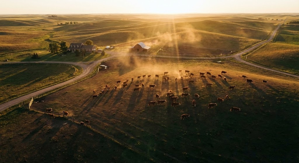
The Visual & Narrative Approach
This is pure aspiration. A "breathtaking wide drone shot" captures a "sprawling cattle ranch at sunrise," bathing the scene in "warm golden hour hues." A herd of "red Hereford cattle" grazing on "earth brown and deep green terrain" grounds the video in specific, recognizable reality. The "dust motes" dancing in the light add a layer of "8k, photorealistic" quality that feels like a high-budget documentary.
Psychological Impact & KPI Focus
- Emotional Resonance: Ranching is a lifestyle, not just a job. This imagery taps into the pride of stewardship. It validates the user's identity before pitching the product.
- Operational KPI: Builds Brand Affinity. It aligns the software with the values of land preservation and legacy, crucial for long-term customer retention.
Strategic Implementation & Trade-offs
- Best Use Case: Connected TV (CTV) spots or major event openers.
- Trade-off: High production cost (or high prompt engineering effort). It sets a very high expectation; if the actual software UI is clunky, the disconnect will be jarring.
Companies using similar video content -
Vytelle – Aspirational vision for genetic progress and stewardship.
Breedr – High-quality visuals for livestock trading and data.
FarmIQ – Showcasing holistic farm management and legacy.
5. Bold Kinetic Typography
TOFU | Vertical Social Organic

The Visual & Narrative Approach
In this style, text becomes the protagonist. "Massive, blocky geometric shapes" representing abstract text blocks dominate the screen in "Safety Orange and Deep Charcoal." The shapes are tilted at a "dynamic diagonal angle," creating a sense of upward momentum. "Subtle motion blur lines" suggest speed. There is no cow, no pasture, only the urgent concept of "Safety" rushing toward the viewer.
Psychological Impact & KPI Focus
- Urgency Creation: The "Safety Orange" triggers an immediate alert response, mimicking industrial safety signage. It is perfect for communicating critical updates or compliance deadlines.
- Operational KPI: Focuses on Risk Management and Speed of Operations. It visualizes the velocity at which the software helps the user react to market or health changes.
Strategic Implementation & Trade-offs
- Best Use Case: Vertical Social (TikTok/Reels/Shorts) for quick tips or feature hypes.
- Trade-off: It is aggressive. Overusing this style can fatigue the audience. It shouts, so it should be used only when you have something important to say.
Companies using similar video content -
Performance Livestock Analytics – Performance Beef – Highlighting urgent performance metrics and risk.
HerdX – Emphasizing rapid traceability and safety compliance.
Quantified Ag – Urgent alerts for animal health and operations.
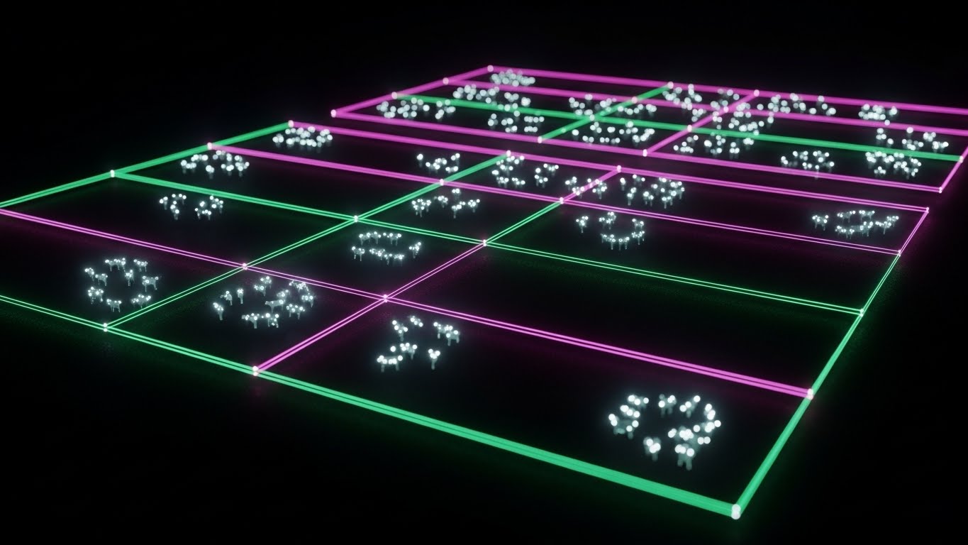
7. Isometric 2D Motion Design
MOFU | Demand Gen
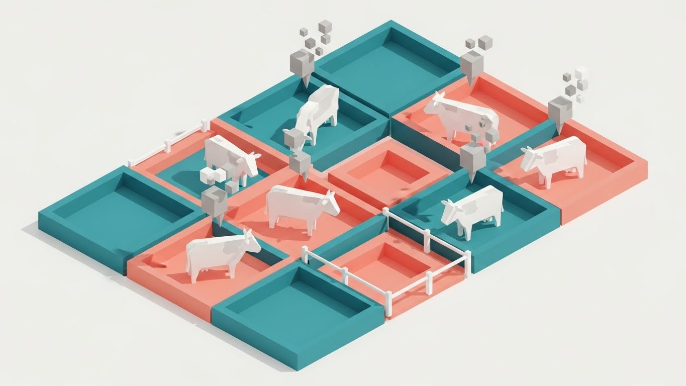
The Visual & Narrative Approach
This style offers a strategic overview. The "isometric 2D illustration" places the viewer above the operation, looking down at a "cattle grazing grid." The "Teal and Soft Coral" paddocks provide a modern, color-coded system for land management. "Abstract white cow icons" occupy specific squares, and "floating grey data bubbles" indicate movement. It gamifies the complex task of rotational grazing.
Psychological Impact & KPI Focus
- Sense of Control: The isometric perspective gives the viewer a "God's-eye view" of the entire ranch. It appeals to the logistical side of the ranch manager's brain, reducing the anxiety of managing vast acreage.
- Operational KPI: Directly supports Stocking Rate Optimization and Land Usage Efficiency. It visually demonstrates how the software maximizes yield per acre.
Strategic Implementation & Trade-offs
- Best Use Case: LinkedIn feeds, targeting managers who need to see "the system" at work.
- Trade-off: Isometric art can feel detached. It is excellent for showing where things are, but less effective at showing how to do a specific task (like injecting a vaccine).
8. Wireframe to Reality Transition
MOFU | Product Differentiation
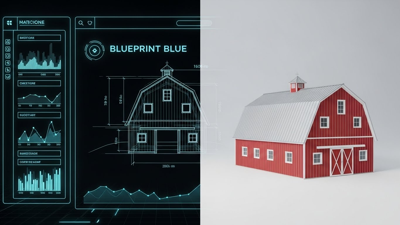
The Visual & Narrative Approach
This split-screen composition visualizes the value of planning. The left half displays a "Blueprint Blue and white wireframe" of a modern barn structure. A "sharp vertical line" sweeps across, revealing the "fully rendered, photorealistic version" on the right in "red siding and silver roof." It literally shows the transition from a digital plan to a physical asset.
Psychological Impact & KPI Focus
- Tangible ROI: This style directly addresses the "Mud-to-Cloud" skepticism by showing that digital planning (the wireframe) leads to physical results (the barn). It validates the invisible work of software management.
- Operational KPI: Focuses on Capital Expenditure (CapEx) Planning. It positions the software as a reliable "Digital Twin" for infrastructure investment.
Strategic Implementation & Trade-offs
- Best Use Case: Website landing pages for "Planning" or "Infrastructure" features.
- Trade-off: Requires high-quality assets for both the technical drawing and the 3D render. If the alignment isn't perfect, the illusion breaks.
Companies using similar video content -
Pasture.io – Visualizing pasture growth and grazing optimization.
AgriWebb – AgriWebb Platform – Isometric view of paddock management.
Smart Paddock – Virtual fencing and grazing optimization for control.
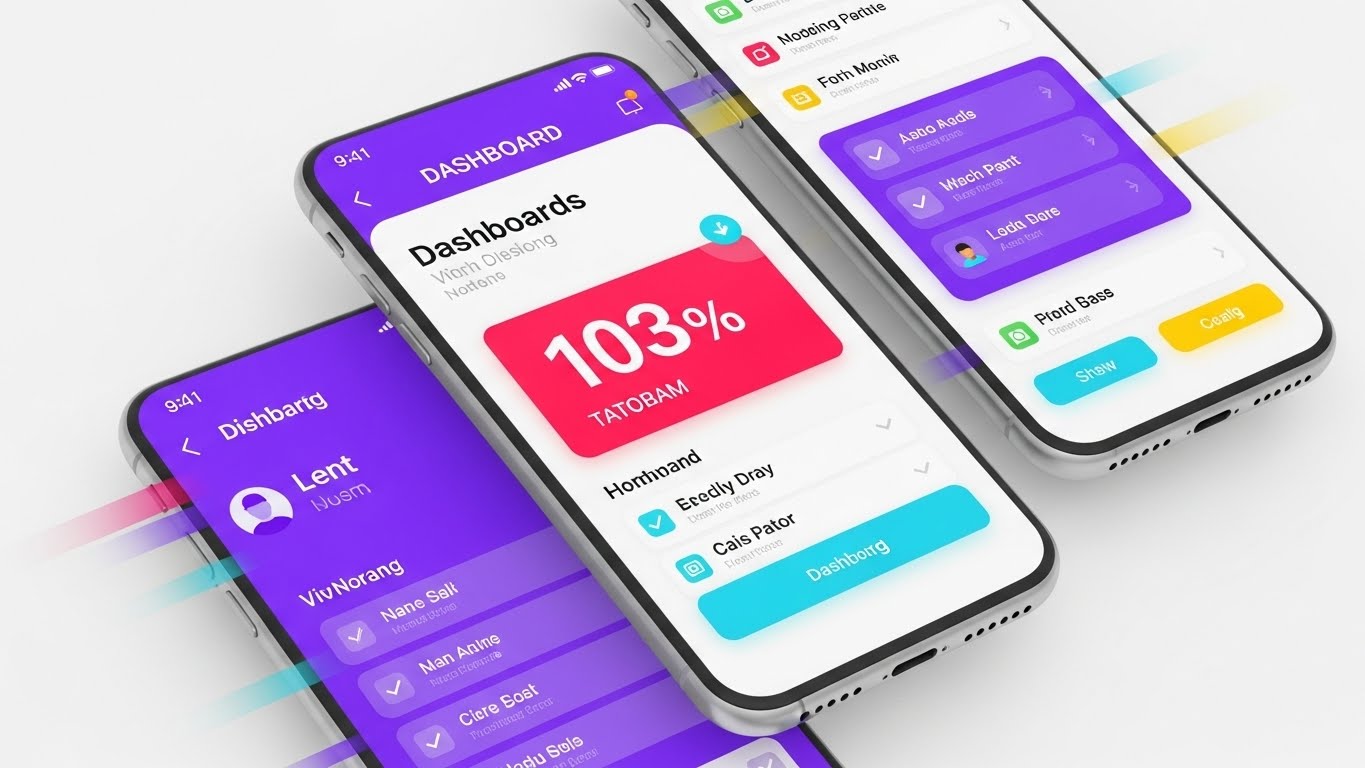
9. Clean UI Workflow (Light Mode)
MOFU | Feature Education
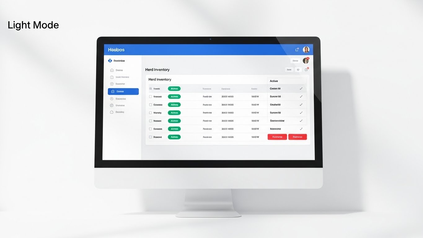
The Visual & Narrative Approach
This is a "high-key UI showcase." A "computer monitor frame" sits on a "clinical white background," displaying a "Herd Inventory" list. The focus is on the "Emerald Green 'Active' status badges," which stand out sharply against the "light grey text." The "symmetrical and balanced" layout with "soft, shadowless lighting" removes all environmental distractions, focusing the viewer purely on the interface's logic.
Psychological Impact & KPI Focus
- Cognitive Ease: The pristine environment suggests that using the software is a stress-free experience. It promises organization to a user who likely deals with a messy, unpredictable physical environment.
- Operational KPI: Supports Workflow Efficiency and Data Accuracy. The visual concordance of the green badges proves that the user can assess status in seconds.
Strategic Implementation & Trade-offs
- Best Use Case: Email onboarding sequences or "New Feature" release notes.
- Trade-off: It is sterile. It shows the tool, but not the benefit of the tool. It should be paired with lifestyle imagery (like Style 4) to remind the user why they are doing this data entry.
Companies using similar video content -
Lely – Lely Horizon – Planning and visualizing farm infrastructure.
GEA Farm Technologies – DairyPlan – Designing and implementing dairy systems.
BouMatic – Visualizing parlor and facility layouts for CapEx planning.
10. Split Screen: Optimized Reality
MOFU | Competitive Displacement
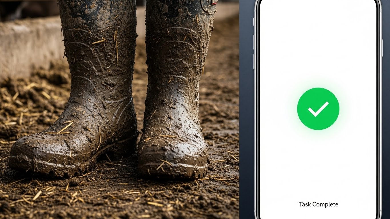
The Visual & Narrative Approach
This vertical split-screen is the visual manifesto of the industry's modernization. The left side features a "close-up photo of muddy rubber boots" in a feedlot—textured and gritty. The right side juxtaposes this with a "pristine, clean smartphone screen" showing a "Task Complete" checkmark in "bright green." The "sharp contrast" between the mud and the vector graphics tells the whole story.
Psychological Impact & KPI Focus
- Empathy & Validation: It acknowledges the user's reality (the mud) while offering a solution (the phone). It doesn't ask them to leave the feedlot; it brings the tool to them.
- Operational KPI: Focuses on Labor Efficiency and Task Compliance. The green checkmark provides a "dopamine hit" of completion, positioning the software as a relief mechanism.
Strategic Implementation & Trade-offs
- Best Use Case: Display ads or social remarketing.
- Trade-off: It is a binary comparison. It simplifies the nuance of the job, but for a quick impression, that simplification is its strength.
Companies using similar video content -
BoviSync – Clean UI for herd health and reproduction.
CattleMax – Demonstrating clear inventory lists and data accuracy.
Herdwatch – Simple, organized record keeping for workflow efficiency.
11. Isometric 3D Workflow**
MOFU | ABM Awareness
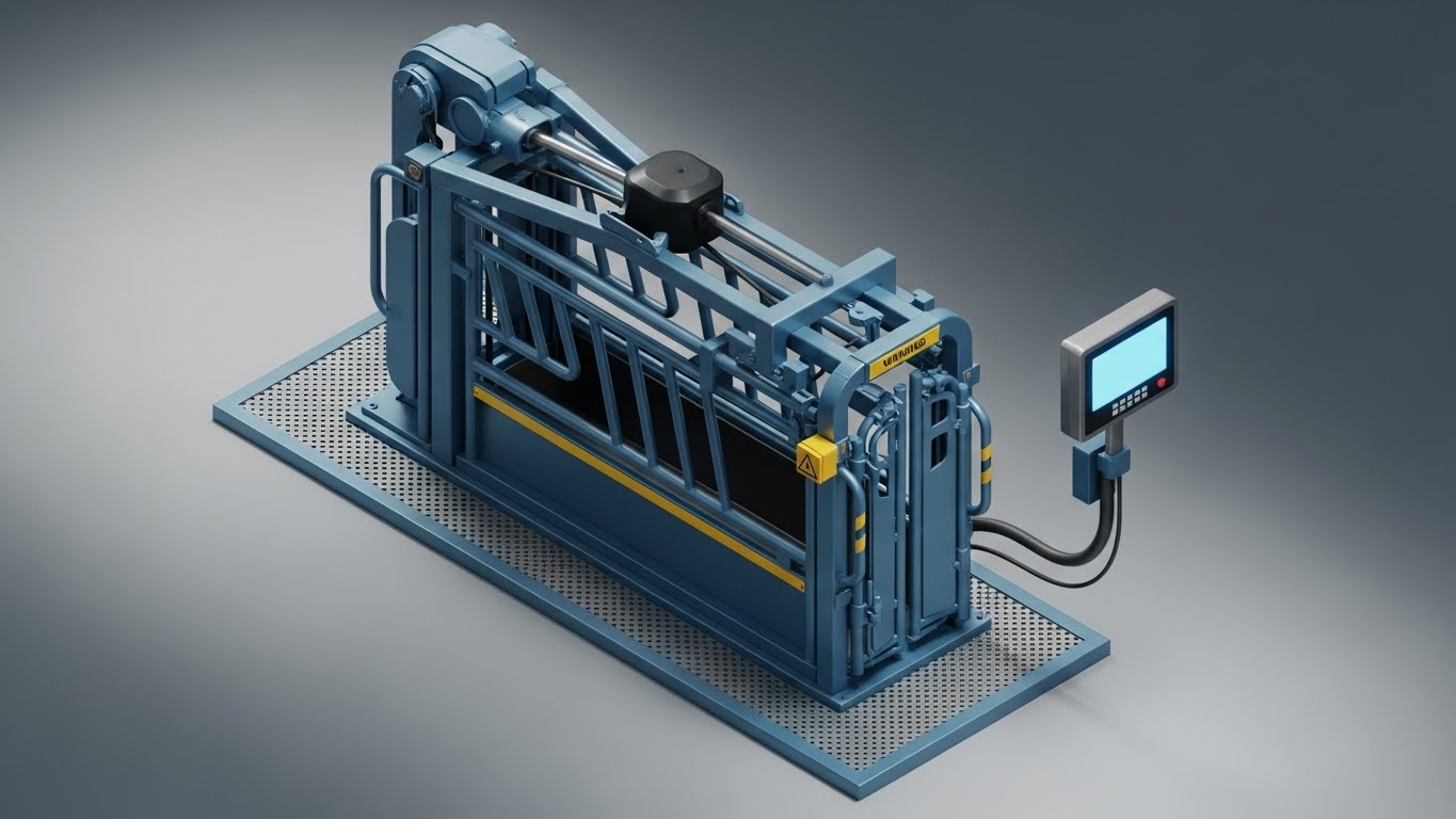
The Visual & Narrative Approach
This style speaks the language of heavy industry. A high-fidelity "isometric 3D render" centers on a hydraulic squeeze chute, the operational heart of any cattle facility. The equipment is rendered in "Industrial Steel Blue," conveying durability, with "Warning Yellow" accents highlighting safety zones. A "digital scale display" is attached, glowing with a blank blue screen, visually waiting for the data input. The "studio-quality lighting" and clean grey matte floor isolate the machinery, removing the mess of the barn to focus purely on the mechanics of processing.
Psychological Impact & KPI Focus
- Engineering Confidence: Ranch managers are often mechanics at heart. This precise, clean visualization appeals to the "Builder" mindset, validating that the software integrates seamlessly with their physical heavy iron.
- Operational KPI: Focuses on Processing Speed and Hardware Integration. It visually demonstrates that the software is a robust component of the chute-side workflow, not a fragile add-on.
Strategic Implementation & Trade-offs
- Best Use Case: LinkedIn Account-Based Marketing (ABM) campaigns targeting feedlot managers or technical buyers.
- Trade-off: It is very equipment-focused. If the user's chute looks different, they might feel a disconnect. It sells the "system," not the "animal."
Companies using similar video content -
AgriWebb – AgriWebb Platform – Showing field data entry and completion.
Livestocked – Mobile task management in the field for efficiency.
Ranch Manager (Software) – Bridging ranch work with digital records.
12. Low-Poly 3D Modeling
MOFU | Website Hero
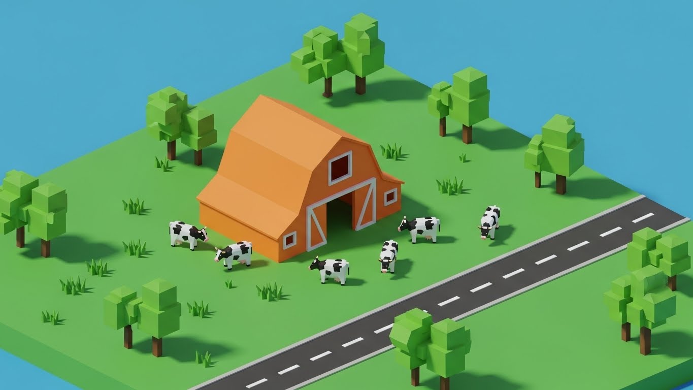
The Visual & Narrative Approach
This style utilizes a "low-poly 3D" aesthetic to transform a complex farm environment into an approachable, organized ecosystem. The scene is constructed of "faceted geometric shapes," featuring a "Vibrant Orange barn" and "blocky trees in bright Grass Green." The cattle are rendered as "simple white and black polygons," moving along a clean road. The lighting is "bright and sunny" with hard shadows, creating a cheerful, almost toy-like appearance that simplifies the visual chaos of real-world farming.
Psychological Impact & KPI Focus
- Anxiety Reduction: Modern ranch management involves thousands of variables. By "gamifying" the visual, this style subconsciously tells the user that managing this complexity can be as simple and organized as a simulation game.
- Operational KPI: Supports Holistic Farm Management. It provides a non-intimidating "bird's-eye view" of the entire operation, encouraging the adoption of full-suite platform features.
Strategic Implementation & Trade-offs
- Best Use Case: Website hero sections or onboarding welcome screens to establish a friendly, accessible user experience (UX).
- Trade-off: The aesthetic can be perceived as "casual." It must be paired with serious copy to ensure enterprise buyers don't mistake ease-of-use for a lack of capability.
Companies using similar video content -
Allflex Livestock Intelligence – SenseHub – Integrating with weighing and EID equipment.
Gallagher Animal Management – Gallagher Weighing & EID – Showcasing chute-side data capture.
Tru-Test – Tru-Test Data Link – Visualizing scale head integration and processing.
13. Rapid UI Feature Montage
MOFU | Skippable Pre-Roll Ad
The Visual & Narrative Approach
Speed is the primary currency here. A "cascaded layout" of three smartphone screens rushes into the frame, suggesting a rapid succession of tasks. The interface elements—buttons and list items—pop in "vibrant Purple and Light Blue," a modern SaaS palette that contrasts sharply with traditional agricultural earth tones. "Motion blur effects" on the edges visually reinforce the velocity of the software, implying that data entry happens as fast as the user can think.
Psychological Impact & KPI Focus
- Friction Elimination: The greatest barrier to software adoption is the fear of slow data entry. This visual style aggressively counters that objection by equating the software with velocity.
- Operational KPI: Directly targets Time-on-Task and Data Entry Efficiency. It promises the user that they will spend less time tapping screens and more time managing cattle.
Strategic Implementation & Trade-offs
- Best Use Case: YouTube Pre-Roll ads (skippable) or Instagram Stories where you have less than 5 seconds to capture attention.
- Trade-off: It moves too fast for detailed learning. It creates an impression of speed but does not teach the user how to use the feature.
Companies using similar video content -
FarmWizard – Simplified farm overview for anxiety reduction.
iRanch – Gamified approach to ranch management.
Stockman's Choice – Easy-to-understand farm layout for holistic management.
14. 2D Character-Driven Story
MOFU | Programmatic Display

The Visual & Narrative Approach
This style shifts focus from the rancher to the care provider. A "flat, stylized 2D illustration" features a young female veterinarian in "pastel blue scrubs" holding a digital tablet. She stands beside a calf rendered in "soft cream and brown shapes," set against a "solid Soft Pink background." The art style uses "exaggerated proportions and smooth curves," moving away from technical precision to convey friendliness, care, and approachability.
Psychological Impact & KPI Focus
- Trust & Empathy: Veterinary protocols are critical but often viewed as a compliance burden. This gentle aesthetic reframes health data as an act of care, building a bridge between the software and the Veterinary Client-Patient Relationship (VCPR).
- Operational KPI: Focuses on Health Protocol Compliance. It softens the edge of regulatory requirements, positioning the software as a tool for animal welfare rather than just an audit log.
Strategic Implementation & Trade-offs
- Best Use Case: Programmatic display ads on industry news sites or newsletters targeting veterinary professionals.
- Trade-off: It is soft. It works well for health and welfare modules but may lack the "grit" required to sell heavy inventory or financial management features.
Companies using similar video content -
Herdwatch – Rapid data entry for compliance and efficiency.
MyHerd – Quick navigation and task completion.
Ranchr – Fast record updates on mobile, eliminating friction.
15. Abstract 3D AI Visualization
MOFU | Thought Leadership
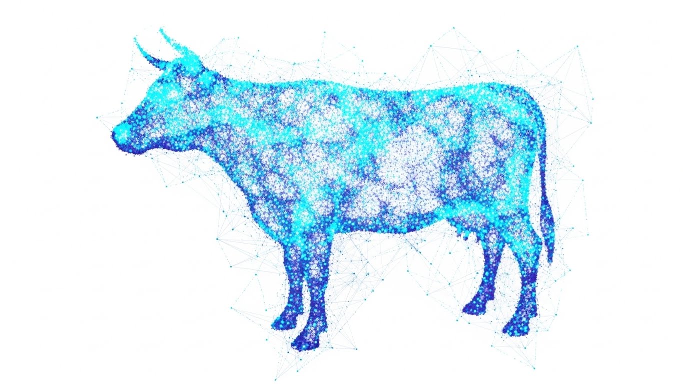
The Visual & Narrative Approach
This visualization represents the "Digital Twin" concept—the idea that every physical animal has a data counterpart. Thousands of "tiny glowing Cyan and Violet dots" swirl together to form the distinct silhouette of a cow against a "Clean White background." Thin connecting lines—a "plexus effect"—link the dots, symbolizing neural networks and the aggregation of millions of data points into a single cohesive insight.
Psychological Impact & KPI Focus
- Intellectual Authority: This scientific aesthetic elevates the brand above "digital record keeping" to "computational biology." It appeals to the forward-looking investor or the early-adopter producer who views their herd as a data asset.
- Operational KPI: Visualizes Predictive Analytics and Genetic Merit. It shows that the software sees the "whole picture," aggregating fragmented data into a complete animal profile.
Strategic Implementation & Trade-offs
- Best Use Case: Blog headers for "State of the Industry" reports, whitepapers, or investor presentations.
- Trade-off: It is highly abstract. It explains the concept of AI but offers no clue as to what the actual dashboard or user interface looks like.
Companies using similar video content -
VetBlue – Emphasizing veterinary care and data for trust.
GlobalVetLink – Storytelling around animal health and movement.
Moocall – Focusing on calving and animal well-being.
16. Futuristic Neon/Dark Mode
BOFU | Building Trust
The Visual & Narrative Approach
This style visualizes the concept of "always-on" monitoring. The background is a "Deep Space Black," creating a high-contrast canvas for a feedlot rendered in "cyberpunk Neon Green and Magenta laser lines." Glowing nodes represent individual cattle locations within the pens. The aesthetic is sleek and premium, borrowing from the visual language of high-end cybersecurity and fintech command centers.
Psychological Impact & KPI Focus
- Security & Vigilance: Dark mode implies a "Night Shift" capability—the idea that the software is working even when the rancher is sleeping. It builds trust in the system's reliability and surveillance capabilities.
- Operational KPI: Focuses on Asset Security and 24/7 Uptime. It reassures the enterprise buyer that their high-value inventory is under constant, precise digital watch.
Strategic Implementation & Trade-offs
- Best Use Case: "Security" or "Enterprise" feature pages on the website, or background loops for trade show booths.
- Trade-off: It can feel "cold" or "dystopian" if overused. It removes the organic nature of farming, so it should be used strictly to emphasize technology and monitoring.
Companies using similar video content -
CattleEye – CattleEye – AI-driven insights into cattle behavior.
Cainthus – AI for feed and health monitoring.
Vytelle – Visualizing genetic potential through data and AI.
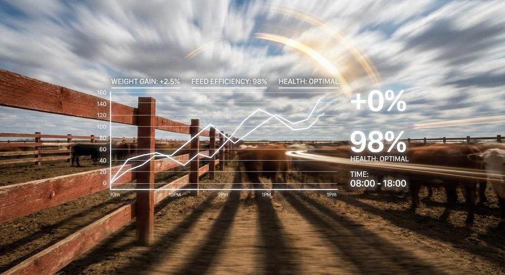
17. Dynamic Data Visualization
BOFU | ROI Justification

The Visual & Narrative Approach
This style translates abstract financial metrics back into physical commodities. A 3D infographic scene features "realistic hay bales" stacked to form an ascending bar chart. A stylized "Gold arrow" winds upwards around the bales, visualizing profit margin growth. The palette uses "Harvest Gold" and "Money Green" against a clean grey studio background. It literally builds the financial graph out of the materials the rancher handles every day.
Psychological Impact & KPI Focus
- Tangibility of Value: ROI can feel like a made-up marketing number. By constructing the graph out of hay (a major expense), the visual connects "Feed Efficiency" directly to "Profit." It respects the rancher's reality: you make money by managing feed better.
- Operational KPI: Directly supports Feed Conversion Ratio (FCR) and Profit per Head. It visualizes the direct correlation between input management (hay) and financial output (gold arrow).
Strategic Implementation & Trade-offs
- Best Use Case: Sales decks and "Pricing" pages where the cost of the software needs to be justified by the savings it generates.
- Trade-off: It is a metaphor. It doesn't show the software interface, so it must be accompanied by hard data or case study text to be fully effective.
Companies using similar video content -
smaXtec – 24/7 health monitoring with a sleek interface.
Nedap Livestock Management – Nedap CowControl – Continuous monitoring and alerts.
CowManager – Always-on monitoring for health and fertility.
18. 3D Parallax UI Presentation
BOFU | Overcoming Objections

The Visual & Narrative Approach
This style elevates the user interface into a premium, secure object. "Semi-transparent UI cards" utilize a "glassmorphism effect" with deep "Ocean Blue blurred backgrounds," floating at different depth planes. The content of the cards is focused on protection, displaying abstract "Data Security" lock icons and crisp white text lines. The "parallax depth" suggests complexity and robust architecture without overwhelming the viewer with code.
Psychological Impact & KPI Focus
- Enterprise Credibility: For large feedlots and corporate ranches, data sovereignty is a major objection. This sophisticated, layered aesthetic signals "Bank-Grade Security." It elevates the perception of the platform from a "farm app" to an "enterprise solution."
- Operational KPI: Focuses on Data Sovereignty and Cloud Security. It visually reassures the CTO or owner that their proprietary data is locked down and layered with protection.
Strategic Implementation & Trade-offs
- Best Use Case: The "Trust Center" or "Security" section of the website, or in proposals for large enterprise accounts.
- Trade-off: It is purely symbolic. It sells the feeling of security. It must be backed by actual compliance badges (SOC2, ISO) to be credible.
Companies using similar video content -
Performance Livestock Analytics – Performance Beef – Visualizing feed efficiency and profit.
Breedr – Showing growth and financial returns.
Stockbook – Financial and production data visualization for ROI.
19. 3D X-Ray Visualization
BOFU | Risk Mitigation
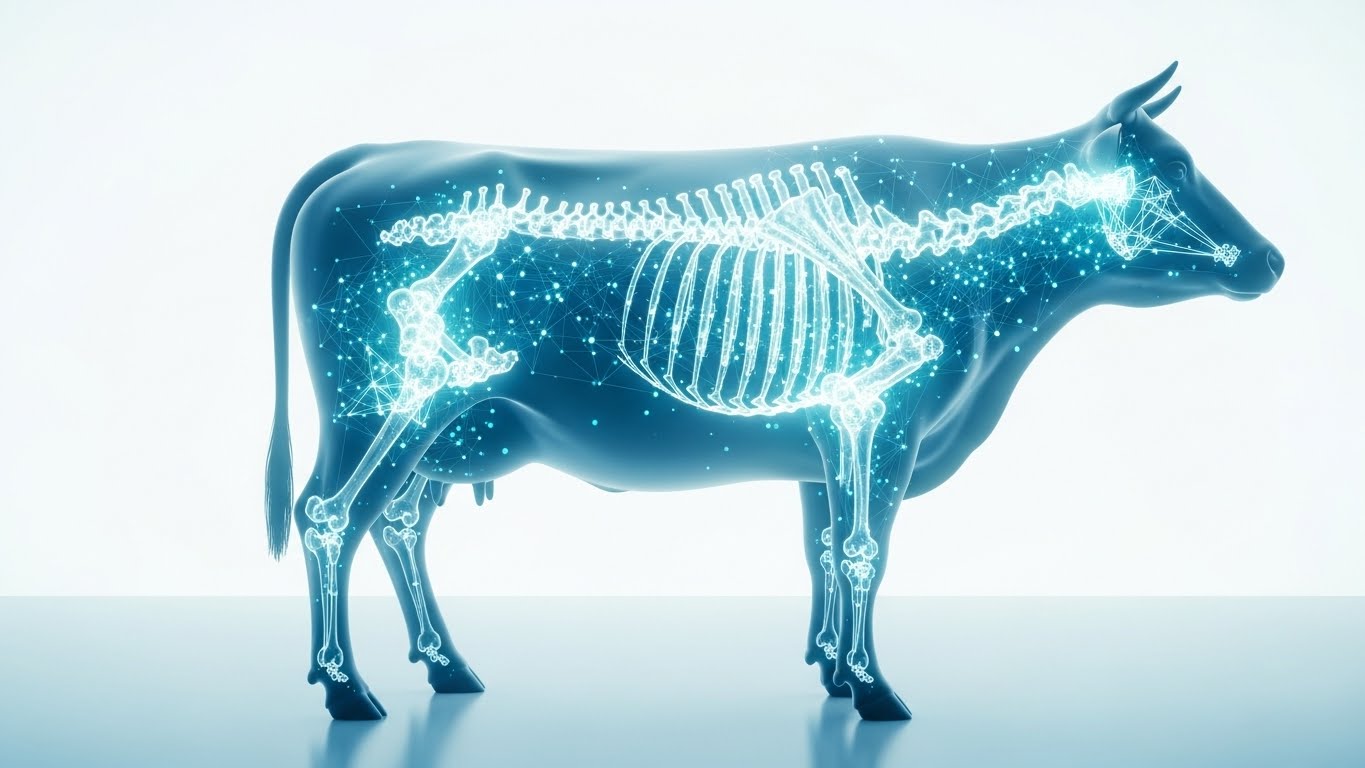
The Visual & Narrative Approach
This style promises a view into the invisible. A cow stands in profile, its outer skin rendered as "semi-transparent and ghostly blue." Inside, the skeletal structure is replaced by a "glowing structure of data nodes and connecting lines" in "Cyan and Bone White." It implies that the software allows the producer to see beyond the hide—revealing internal health status, genetic potential, and metabolic performance that the naked eye cannot detect.
Psychological Impact & KPI Focus
- Risk Mitigation: The biggest risks in cattle (sickness, poor genetics) are often invisible until it's too late. This visual alleviates that anxiety by promising "X-Ray vision" into the herd's performance, allowing for proactive rather than reactive management.
- Operational KPI: Supports Early Disease Detection and Genetic Selection. It visualizes the depth of data available for each individual animal.
Strategic Implementation & Trade-offs
- Best Use Case: Whitepapers on health technology or product pages for "Smart Tags" and bolus sensors.
- Trade-off: It is scientific and clinical. It appeals to the progressive manager focused on genetics but may feel "alien" to a traditionalist who relies on phenotype and visual appraisal.
Companies using similar video content -
BoviSync – Highlighting secure data management and credibility.
365FarmNet – Showcasing layered data protection.
FarmGate Solutions – Enterprise-level data security and architecture.
20. Lifestyle Stock with UI Overlay
BOFU | Driving Demo Requests
The Visual & Narrative Approach
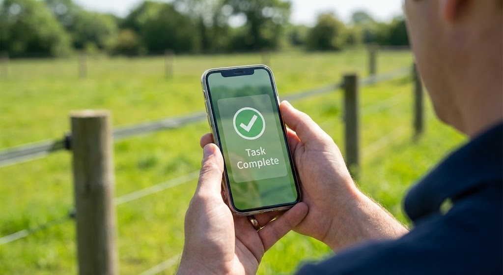
We conclude with the ultimate validation: successful execution in the field. An "over-the-shoulder POV shot" places the viewer in the boots of the user. A hand holds a smartphone against a "blurred green grass and grey fencing" background—an authentic pasture setting. The screen displays a crisp, high-contrast UI overlay showing a "Task Complete" checkmark in "Daylight White and Grass Green." It captures the exact moment of relief and accomplishment.
Psychological Impact & KPI Focus
- Operational Relief: The "Task Complete" screen triggers a micro-dopamine hit. It visually answers the question, "Will this actually work when I'm out there?" It bridges the gap between the promise of the software and the reality of the daily chore list.
- Operational KPI: Focuses on Field Usability and Task Compliance. It proves that the loop is closed—the digital task was assigned, and the physical action was verified.
Strategic Implementation & Trade-offs
- Best Use Case: Landing pages for "Request a Demo" or "Start Free Trial." It is the final nudge that says, "This is easy, and it works."
- Trade-off: Requires high-quality photography. If the hand or phone looks fake/stock, the trust evaporates. The lighting must match the screen brightness to feel authentic.
Companies using similar video content -
Vytelle – Visualizing genetic potential and internal traits.
smaXtec – Revealing internal health parameters for risk mitigation.
CowManager – Deep insights into cow physiology and performance.
21. Aspirational Stock Montage
BOFU | The Economic Buyer
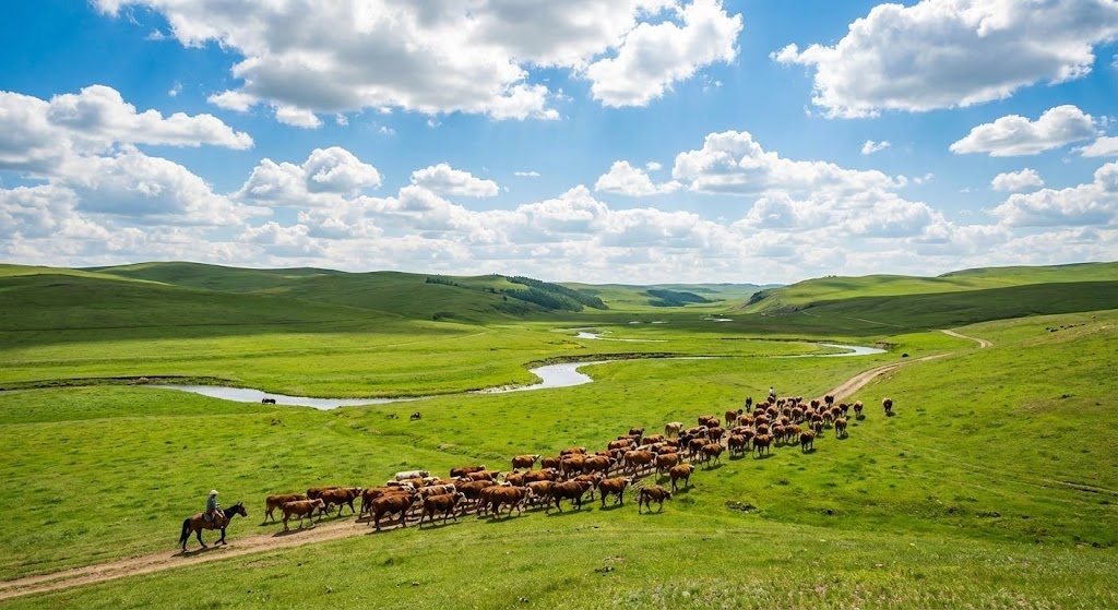
The Visual & Narrative Approach
This style targets the "Economic Buyer"—the ranch owner or investor whose primary concern is asset value. A "National Geographic-style photograph" captures a "pristine herd moving through a lush valley" under a "Sky Blue expanse." The composition is flawless, utilizing the "rule of thirds" to balance the land and the sky. It is high-resolution, vibrant, and intentionally idealized. It does not show the mud; it shows the dream of the perfect operation.
Psychological Impact & KPI Focus
- Legacy & Valuation: At the executive level, software isn't just a tool; it's an infrastructure investment that increases the valuation of the land and herd. This imagery validates the "Perfect State" that the software helps the owner achieve.
- Operational KPI: Focuses on Asset Valuation and Sustainability Goals. It aligns the software purchase with the long-term stewardship of the land.
Strategic Implementation & Trade-offs
- Best Use Case: Investor pitch decks, Annual Reports, or high-level "Vision" pages on the website.
- Trade-off: It is disconnected from daily operations. It sells the "Why," not the "How." If used for training, it will feel out of touch.
Companies using similar video content -
AgriWebb – AgriWebb Platform – Demonstrating in-field task completion.
Livestocked – Showing mobile app use in real ranch settings.
Herdwatch – Practical field data entry for operational relief.
22. Hyper-lapse Stock Footage
BOFU | The Functional Buyer
The Visual & Narrative Approach
This visual concept uses time manipulation to demonstrate stability. A "hyper-lapse effect" shows a feedlot environment where "clouds streak across the sky" and "shadows lengthen rapidly," indicating the passage of a full day. Superimposed over this fast-moving reality are "static, sharp white data lines" and graphs. The environment is chaotic and changing, but the data remains constant, anchored, and reliable.
Psychological Impact & KPI Focus
- Predictability: The greatest anxiety for a feedlot manager is the variable nature of weather and animal behavior. This style visually proves that while the environment is volatile, the system is stable.
- Operational KPI: Focuses on System Reliability and Predictive Modeling. It suggests that the software provides a constant baseline of truth regardless of external conditions.
Strategic Implementation & Trade-offs
- Best Use Case: YouTube background headers or "Reliability" feature pages.
- Trade-off: Requires high-quality source footage. Poorly stabilized hyper-lapse footage can look amateurish and induce motion sickness.
Companies using similar video content -
Vytelle – Aspirational vision for the future of cattle.
FarmIQ – Showcasing sustainable and profitable farming.
FBN (Farmers Business Network) – High-level vision for agricultural future.
23. 2D Animation & UI Composition
Onboard | Accelerating TTV

The Visual & Narrative Approach
Onboarding needs to feel rewarding. This style uses a "Pop-art Yellow and Cyan" palette to dramatize a simple action. A "stylized cartoon hand" presses a "Sync" button on a floating UI panel. A "visual ripple effect" emanates from the touch point, signifying connection. It transforms a mundane technical task—syncing data—into a tangible, satisfying event.
Psychological Impact & KPI Focus
- Dopamine Loop: By using bright colors and exaggerated motion for a simple button press, we create a "micro-reward." It encourages the user to perform the action again, building the habit of data synchronization.
- Operational KPI: Directly targets Time-to-Value (TTV) and User Habituation. It makes the critical first steps of using the app feel fun rather than laborious.
Strategic Implementation & Trade-offs
- Best Use Case: In-app welcome screens or "First Setup" wizard videos.
- Trade-off: The "cartoon" style may feel too juvenile for serious enterprise buyers if used in external marketing. It belongs strictly inside the app experience.
Companies using similar video content -
Connecterra – Ida – Visualizing stable data in a changing farm environment.
Cainthus – Demonstrating consistent monitoring over time.
Quantified Ag – Showing reliable data collection in feedlots.
24. Holographic UI over 3D Render
Onboard | Reducing Imp Friction
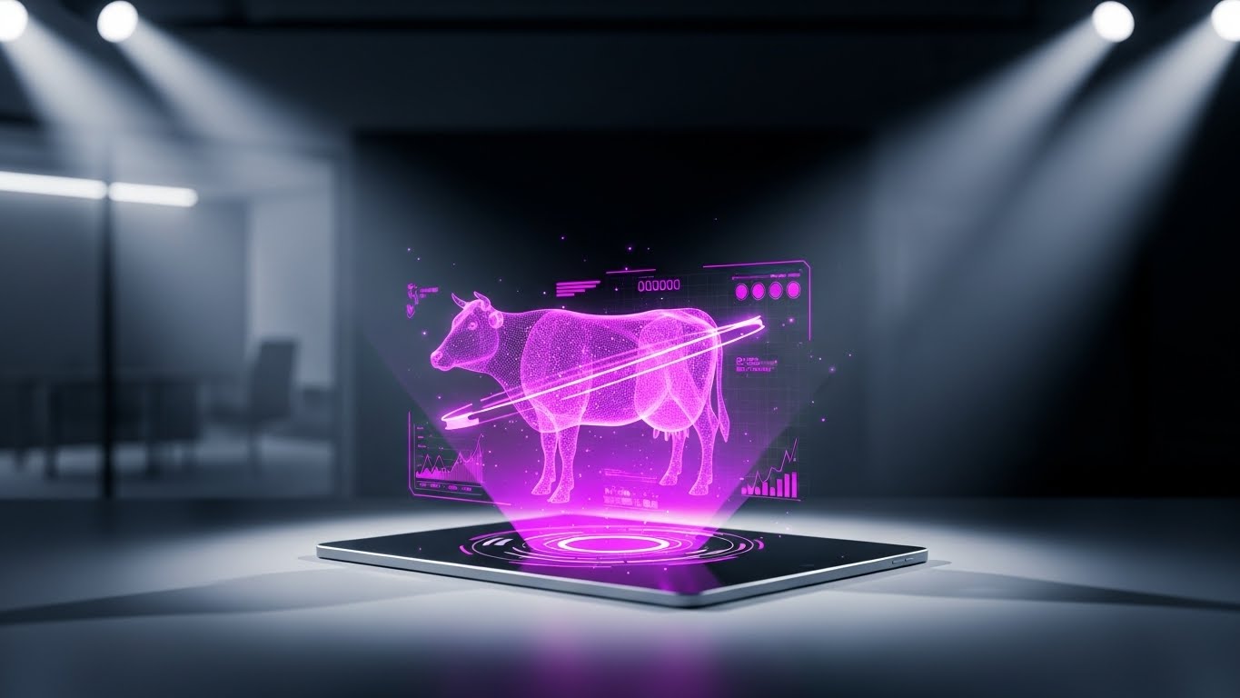
The Visual & Narrative Approach
This style brings the "Iron Man" aesthetic to livestock management. A sleek tablet sits on a table in a "bright, blurred modern office." It projects a "semi-transparent, rotating Hologram Blue 3D model" of a cow. "Volumetric light beams" connect the device to the projection. It visualizes the software not as a spreadsheet, but as a command center that brings the animal into the boardroom.
Psychological Impact & KPI Focus
- Status Elevation: It positions the user not just as a rancher, but as a "Bio-Data Architect." It reduces the friction of learning by promising a high-tech, futuristic payoff for mastering the interface.
- Operational KPI: Focuses on Remote Management. It visualizes the ability to inspect the herd deeply without physically being in the pasture.
Strategic Implementation & Trade-offs
- Best Use Case: "Welcome" emails or high-level introductory videos for new enterprise clients.
- Trade-off: It sets a very high visual standard. If the actual app interface is flat and standard, this holographic promise can lead to disappointment.
Companies using similar video content -
CattleMax – Simple, rewarding sync animations for onboarding.
MyHerd – Engaging onboarding for data entry.
Ranchr – Fun, intuitive first-time user experience.
25. Macro UI Micro-Interactions
Onboard | Self-Serve Onboarding

The Visual & Narrative Approach
When learning new software, users often feel overwhelmed by the number of buttons. This style solves that by using "extreme macro focus." The camera is tight on a single "Save" button in "Electric Blue," showing the subtle "inner glow" and the "pressed state." The background is blurred into oblivion. It isolates a single action, stripping away all noise to teach one specific micro-interaction.
Psychological Impact & KPI Focus
- Cognitive Focus: By removing peripheral distractions, this style forces the user to understand exactly where to click and what happens. It builds confidence through small, successful interactions.
- Operational KPI: Supports Self-Serve Adoption and Error Reduction. It is the visual equivalent of holding the user's hand and pointing their finger to the right spot.
Strategic Implementation & Trade-offs
- Best Use Case: Tooltips, "Coach marks" inside the app, or short GIF tutorials in the help center.
- Trade-off: It lacks context. You cannot tell what the "Save" button is for, only that it is being pressed. It must be part of a sequence.
Companies using similar video content -
HerdX – Projecting advanced traceability data.
CattleEye – CattleEye – Holographic visualization of AI insights.
Vence – Visualizing virtual fencing and animal location.
26. 2D Graphics Over Live Action
Onboard | Trial Activation
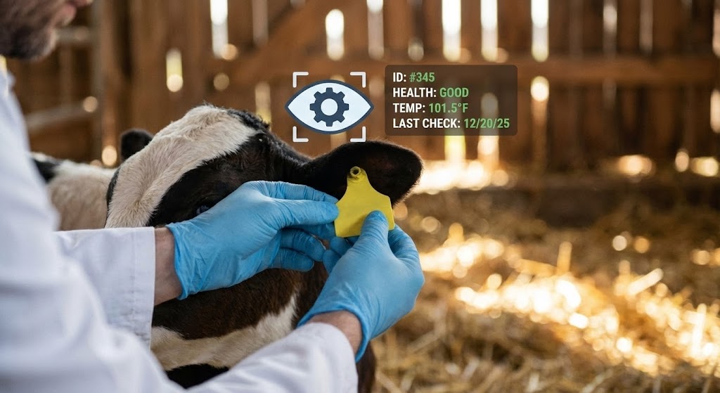
The Visual & Narrative Approach
This style creates an "Augmented Reality" feel. We see a high-quality photo of a "veterinarian's gloved hands" examining an ear tag. Floating in 3D space above the tag is a "crisp, flat vector data card" showing health stats in "White and Green." It visually explains how the software overlays digital intelligence onto the physical animal.
Psychological Impact & KPI Focus
- Contextual Learning: It shows the user exactly when to use the app (during an exam). It bridges the gap between the physical touch and the digital entry, reinforcing the workflow.
- Operational KPI: Focuses on Workflow Integration. It visually inserts the software into the existing veterinary protocol without disrupting it.
Strategic Implementation & Trade-offs
- Best Use Case: "How-To" video libraries or Trial Activation emails showing practical use cases.
- Trade-off: Requires perfect tracking in post-production. If the graphic "slips" off the ear tag, the illusion of connection is broken.
Companies using similar video content -
BoviSync – Detailed guides for specific data entry.
Herdwatch – Micro-interactions for compliance tasks.
Livestocked – Focused tutorials for key features.
27. Abstract 2D Motion Graphics
Retention | Reducing Churn

The Visual & Narrative Approach
Retention is about smooth experiences. This abstract style uses "fluid, liquid shapes" in "Lavender and Mint" that morph seamlessly from a "water droplet" into a "smooth line graph." The motion is continuous, organic, and calming. There are no hard edges or jarring cuts. It represents the fluidity of data flow and the ongoing, frictionless support the customer receives.
Psychological Impact & KPI Focus
- Calm & Reassurance: Churn often happens when users feel frustrated or "stuck." This soothing visual style subconsciously lowers blood pressure and reassures the user that the system is adaptive and fluid.
- Operational KPI: Focuses on Customer Satisfaction (CSAT) and Support Experience. It visualizes the "Service" aspect of SaaS.
Strategic Implementation & Trade-offs
- Best Use Case: Loading screens, "Success" messages, or background loops for "Customer Support" waiting rooms.
- Trade-off: It is purely atmospheric. It conveys a feeling, not information. It is a brand mood setter, not a teacher.
Companies using similar video content -
Allflex Livestock Intelligence – SenseHub – Overlaying data on ear tags.
Datamars Livestock – Showing data linked to physical tags.
Gallagher Animal Management – Gallagher EID – Visualizing data from ear tags.
28. Generative AI Realistic Character
Retention | Deep Feature Adoption
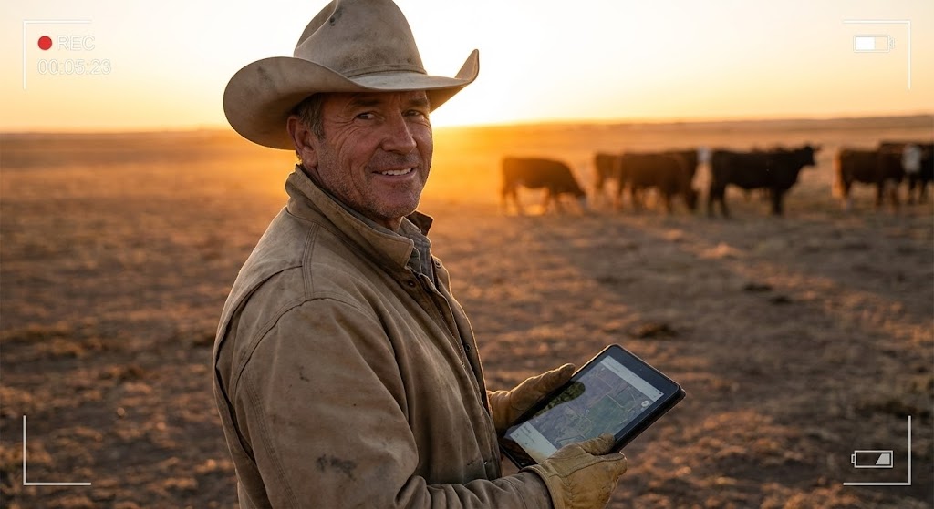
The Visual & Narrative Approach
To retain a customer, you must remind them of who they are. This style features a "heroic, low-angle shot" of a "weathered rancher" at sunset. The "warm orange light" illuminates a confident smile as he holds a tablet. The cattle are in the background, but he is the focus. It is a portrait of mastery. It tells the user, "This software makes you the master of your domain."
Psychological Impact & KPI Focus
- Identity Reinforcement: Farmers are proud of their resilience. This visual mirrors that pride back to them. It associates the software with their personal success and capability as a steward.
- Operational KPI: Focuses on Long-Term Retention and Brand Loyalty. It moves the relationship from transactional (buying a tool) to emotional (partnering in success).
Strategic Implementation & Trade-offs
- Best Use Case: "Year in Review" personalized videos or milestone achievement emails.
- Trade-off: The character must look authentic. If the clothing or hat style is wrong for the specific region (e.g., Texas vs. Alberta), it will alienate the user.
Companies using similar video content -
AgriWebb – AgriWebb Platform – Smooth data flow and support.
Connecterra – Ida – Fluid representation of continuous insights.
365FarmNet – Seamless integration and support.
29. Dark Mode UI Showcase
Expansion | Driving Upsell

The Visual & Narrative Approach
This style is distinct from the "Neon Security" of Style 16. This is "Developer Dark Mode." The background is "Obsidian Black," and the screens display "dense code snippets," "API integrations," and "JSON data structures" in "Code Green monospaced font." It is dense, complex, and highly organized. It visually signals that the platform is open, extensible, and developer-friendly.
Psychological Impact & KPI Focus
- Technical Authority: This aesthetic appeals to the CTO or IT manager of a large corporate feedlot. It says, "We are not just an app; we are a platform you can build upon."
- Operational KPI: Focuses on API Usage and Platform Extensibility. It justifies the upsell to "Enterprise" tiers by showing the backend power.
Strategic Implementation & Trade-offs
- Best Use Case: Developer documentation, API feature pages, or upsell emails targeting the IT department.
- Trade-off: It is unintelligible to the average rancher. It should only be shown to technical stakeholders.
Companies using similar video content -
Ranch Manager (Software) – Celebrating the rancher's mastery.
FarmIQ – Reinforcing the farmer's role as a steward.
FBN (Farmers Business Network) – Empowering farmers with data.
30. Photorealistic 3D Renders
Expansion | Proactive Support

The Visual & Narrative Approach
We end with the convergence of hardware and software. A "macro 3D render" focuses on a "Yellow plastic ear tag" resting on a "weathered fence post." The texture is hyper-real—scratches, mud specks, and the "faintly visible sensor chip" embedded inside. It treats the humble ear tag like a premium piece of consumer electronics.
Psychological Impact & KPI Focus
- Perceived Value: Electronic ID (EID) tags are expensive. This visual style elevates the tag from a piece of plastic to a high-value technology asset, justifying the hardware cost associated with the software subscription.
- Operational KPI: Focuses on Hardware Sales and Inventory Management. It validates the physical investment required to power the digital insights.
Strategic Implementation & Trade-offs
- Best Use Case: Online store for hardware accessories or blog posts about "Smart Tag" technology updates.
- Trade-off: It focuses entirely on the hardware. It must be clear that the value comes from the software that reads the tag, not just the tag itself.
STRATEGIC KNOWLEDGE BASE: The Visual Operations Doctrine
This section synthesizes the 30 visual styles into a cohesive business framework. It moves beyond "making videos" to "building a visual operating system" for your cattle management software.
Strategic Alignment & Visual Architecture
The "Pre-Production" Strategy. Defining the Who and Why of your visual language.
- The Cognitive Load Audit (Chute-Side vs. Office): Before designing, audit the user's environment. A pen rider checking health on a horse in bright sunlight needs Style 1 (High Contrast Vector). A nutritionist in a dim office needs Style 17 (Data Viz). Never force "office visuals" into the "pasture environment."
- Role-Based Visual Mapping: Differentiate your visual output. The Ranch Owner (Economic Buyer) responds to Style 21 (Aspirational Montage). The Feedlot Manager (Functional Buyer) responds to Style 11 (Isometric Workflow). Map your video assets to these specific personas to increase resonance.
- The "Glanceability" Standard: In cattle operations, eyes are on the animal 90% of the time. Visuals for mobile apps must be "glanceable"—understandable in under 2 seconds (see Style 9). If a visual requires 10 seconds of study, it is a safety hazard in a chute.
- Brand Voice Consistency: Your software likely has multiple modules (Health, Feed, Financials). Use a unified color palette (e.g., the "Code Green" in Style 29 and "Safety Orange" in Style 5) to create a visual thread that ties disparate features into a single ecosystem.
- The Advids Strategic Audit: Advids specializes in defining this "Visual Operating System" before a single frame is rendered. We analyze your feature set to determine which styles will reduce support tickets and which will drive sales, ensuring every pixel serves a business goal.
- Standardization vs. Customization: For generic workflows (login, sync), use standardized styles (Style 23) to reduce production costs. For high-value differentiators (proprietary genetic algorithms), invest in bespoke visualizations (Style 19) to create a "moat" around your IP.
- The Cross-Departmental Bridge: Use visuals to unify terminology. Sales calls it "AI Prediction," Ops calls it "The Sorting Tool." A shared visual metaphor (Style 15) bridges this gap, ensuring Sales isn't over-promising what Ops can't deliver.
- Legacy System Integration: Many ranches still use 20-year-old scale heads. Use Style 3 (Line Art) or Style 8 (Wireframe) to visually demonstrate how your modern cloud software connects with their "rusty" legacy hardware, respecting their existing investments.
- Accessibility in Labor Force: The cattle labor force is often multilingual. Motion graphics (Style 7) and icon-driven visuals (Style 1) transcend language barriers, allowing you to train Spanish, Portuguese, and English speakers with a single asset.
- The Mobile-First Mandate: 80% of user interaction happens on a phone, often with poor reception. All 30 styles must be legible on a 5-inch screen. Avoid complex gradients or tiny text that break down on mobile devices.
Operational Adoption & Implementation
The "Deployment" Phase. Embedding visuals into the daily workflow.
- Overcoming "Big Brother" Anxiety: Employee monitoring (GPS tracking, performance timing) is sensitive. Use Style 14 (Character Story) to frame these features as "Safety Tools" rather than "Surveillance," focusing on the benefits to the worker, not just the owner.
- The Micro-Learning Shift: Nobody reads the PDF manual in a truck cab. Replace 50-page guides with a library of 30-second clips using Style 13 (Rapid UI Montage). Delivers answers in the moment of need.
- Just-in-Time Support: Embed specific styles into the relevant app screens. When a user opens the "Calving" module, a 5-second Style 1 (Minimalist) loop should play automatically to remind them of the data entry protocol.
- Gamification of Training: Use Style 12 (Low-Poly) to create "Scorecards" for chute operators. Visualizing processing speed and accuracy can gamify the workday, turning mundane data entry into a competitive team sport.
- Reducing Support Ticket Volume: There is a direct correlation between proactive visual guides and reduced call center volume. If you visualize the "Sync" process clearly (Style 23), you eliminate the #1 support call: "Why isn't my data showing up?"
- Remote Onboarding: Ranches are geographically isolated. You can't fly a trainer to every site. Use Style 24 (Holographic UI) and screencasts to conduct "high-touch" onboarding remotely, simulating the feeling of an in-person demo.
- Standard Operating Procedures (SOPs): Transform text-based SOPs (e.g., "Vaccine Handling") into visual process flows (Style 11). Visuals are less likely to be misinterpreted than text, reducing costly errors in medication.
- Feedback Loops: Use interactive video elements. After a Style 20 (Lifestyle) tutorial plays, pop up a simple "Thumbs Up/Down" icon. This data helps you refine your training assets based on actual field utility.
- Scalable Localization: When expanding to global markets (Brazil, Australia), "mute" video strategies work best. Styles that rely on visual cues (Style 26) rather than voiceover require zero translation cost, making global scaling faster.
- Leadership Communication: Feedlot managers need to report to investors. Provide them with "Presentation Ready" assets (Style 17 Dynamic Data) that they can drop into their board decks. You help them look good, and they become your internal champions.
Measuring Impact & Future-Proofing
The "ROI" Phase. Quantifying success and preparing for the next decade.
- Beyond "Views": Don't measure video success by "views." Measure it by "Time-to-Competency" and "Feature Adoption Rate." Did watching the Style 9 video reduce the time it takes to enter a new calf record? That is the only metric that matters.
- The "Idle Time" Metric: Monitor how long a user sits on a screen before acting. High idle time means confusion. Targeted visual interventions (e.g., a Style 25 tooltip) should directly reduce this idle time.
- Compliance Velocity: How fast can you get a feedlot compliant with new traceability regulations? Using Style 5 (Kinetic Typography) for "Urgent Updates" ensures regulatory changes are understood and actioned immediately.
- Retention and Churn: High-quality UX visualization (Style 27) contributes to the "premium" feel of the product. Customers are less likely to churn from a platform that feels modern, fluid, and supportive.
- The AI Visual Frontier: Prepare for the future. As AI models improve, your visuals will need to show predictive data. Use Style 15 (Abstract AI) to start educating your market on the concept of "Digital Twins" and predictive modeling now, so they are ready to buy it later.
- Scalability of Assets: Build a component library. If you change your "Save" icon, you shouldn't have to re-shoot 50 videos. Using vector-based styles (Style 1, 2, 3) allows for global updates with minimal rendering time.
- The Advids Partnership: As your platform grows, your asset library will become unwieldy. Advids acts as your long-term library manager, ensuring that as features evolve, your visual documentation evolves in lockstep, preventing "Documentation Debt."
- Benchmarking Success: Compare your visuals to consumer apps, not other ag-software. Your users use Instagram and Netflix; their expectation for visual fidelity is high. "Good enough for farming" is a dangerous competitive risk.
- The ROI of Safety: Quantify the insurance cost reduction. Better visual safety training (Style 11) leads to fewer chute accidents. Track this "Safety ROI" and use it in your sales pitch to enterprise feedlots.
- Final Call to Innovation: Treat video as infrastructure, not marketing content. In the "Mud-to-Cloud" era, the screen is the primary interface between the human and the herd. The quality of your visualization is the quality of your product. Invest in it accordingly.
Companies using similar video content -
Performance Livestock Analytics – Performance Beef API – Showcasing backend integration.
Nedap Livestock Management – Nedap CowControl API – Developer-focused platform.
BoviSync – BoviSync API – Demonstrating platform extensibility.
Author & Editor Bio


