
Introduction: The Architecture of Partner Alignment
The partner ecosystem is no longer just a sales channel; it is the primary engine of the global technology economy. Recent industry analysis reveals that 73.1% of the total addressable IT market now flows to, through, and with partners. For vendors, the potential for scale is infinite. However, this massive opportunity is often throttled by a silent operational crisis: the "Utilization Wall."
Despite heavily investing in sophisticated Partner Relationship Management (PRM) and Through-Channel Marketing Automation (TCMA) platforms, vendors face a stark reality: only 12% of partners actually use brand-provided automation tools to their full potential. The majority of your partners are overwhelmed, not unmotivated. They operate in a high-velocity physical environment, often viewing your complex digital portals as administrative friction rather than revenue fuel.
The disconnect is not technological; it is cognitive. Partners need to see the value of your ecosystem instantly, without wading through dense documentation. This is where strategic visualization becomes your most powerful adoption tool. By translating complex automation workflows into clear, compelling visual narratives, you bridge the physical/digital divide, transforming passive resellers into active, engaged revenue generators.
This guide presents 30 expert-curated video styles designed to dismantle adoption barriers. From abstract motion graphics that simplify ecosystem complexity to clean UI visualizations that lower the barrier to entry, these examples serve as a blueprint for capturing partner mindshare and securing your place as the "Vendor of Choice."
1. Abstract 2D Motion Graphics
TOFU | Market Education
The Visual & Narrative Approach
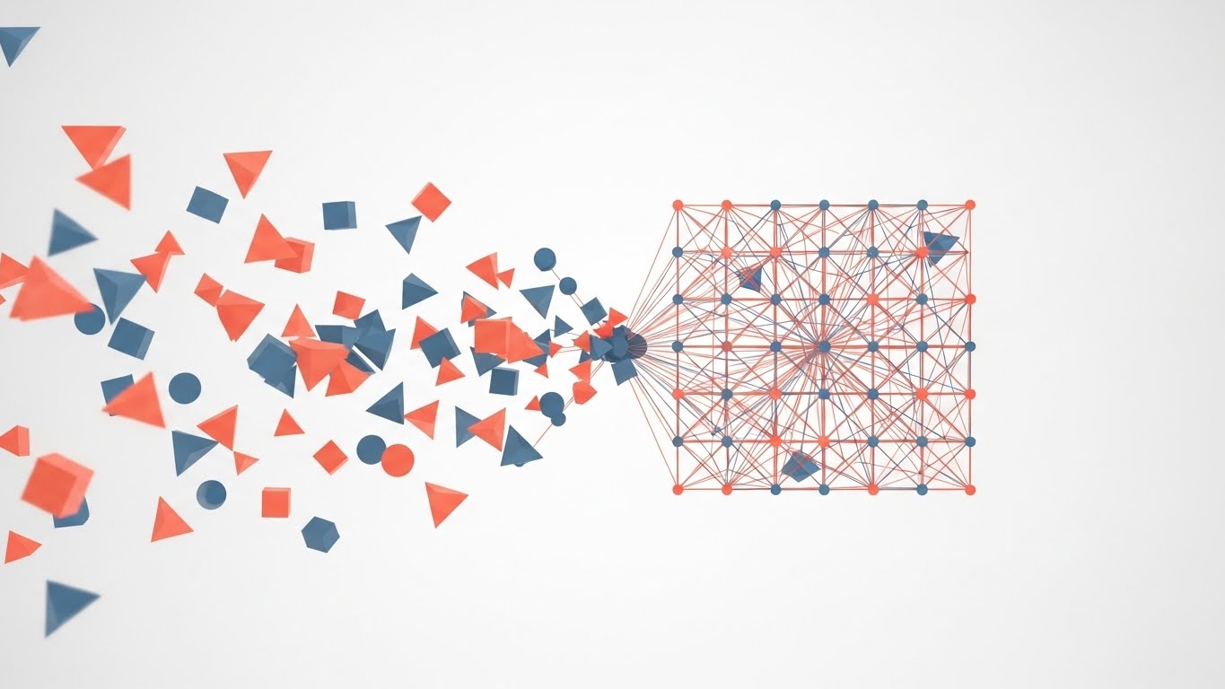
This style utilizes a sophisticated "Chaos-to-Order" visual narrative to address the primary anxiety of channel management: fragmentation. We begin with a matte white void populated by scattered, drifting geometric shapes in Vivid Coral and Slate Blue—representing a fragmented, unmanaged partner ecosystem. Through a fluid animation sequence, these disparate nodes snap magnetically into a precise, grid-like network structure. The motion is rhythmic and satisfying, symbolizing the "click" of successful alignment.
Psychological Impact & KPI Focus
- Cognitive Relief: The brain naturally seeks patterns. By visually resolving chaos into order, you provide an immediate sense of psychological relief to the viewer, validating their desire for governance.
- Operational Focus: Visualizes Network Synchronization and Centralized Control without using dry organizational charts.
Strategic Implementation & Trade-offs
- Best Use: High-level Website Hero backgrounds or Event Opener loops (TOFU).
- Duration: 15-20 Seconds (Loopable).
- Trade-off: Excellent for emotional hooks, but too abstract to explain specific technical features.
Companies using similar video content -
WorkSpan – Ecosystem Cloud – Visualizing interconnected partner networks and collaboration.
Crossbeam – Partner Ecosystem Platform – Abstractly showing data overlap and partner mapping.
PartnerStack – Partner Management Platform – Dynamic graphics representing partner program growth.
2. Abstract 3D AI Visualization
TOFU | Brand Awareness

The Visual & Narrative Approach
This style elevates the concept of the "Global Ecosystem" using high-end 3D rendering. A pristine white globe floats in a bright, ethereal space, covered in thousands of pinpricks of Electric Cyan light. Wisps of silver data particles flow in elegant arcs between continents, forming a glowing web of connectivity. This creates a visual metaphor for the invisible transfer of leads, MDF, and assets across borders. The lighting is high-key and clinical, emphasizing transparency and reach.
Psychological Impact & KPI Focus
- Aspiration: This perspective appeals to senior decision-makers who need to see the "Big Picture." It triggers a sense of omnipotence and confirms the vendor’s status as a global category leader.
- Operational Focus: Demonstrates Multi-Regional Scalability and Data Connectivity.
Strategic Implementation & Trade-offs
- Best Use: Connected TV (CTV) spots or Executive Keynote intros.
- Duration: 15-30 Seconds.
- Trade-off: High production value requires significant rendering resources. It establishes authority but can feel impersonal if overused.
Companies using similar video content -
Impartner – Partner Relationship Management – High-end 3D globe showing global partner reach.
Zift Solutions – Through-Channel Marketing Automation – Visualizing data flow across a global ecosystem.
SAP – PartnerEdge – Abstract 3D representing extensive global partner network.
3. Abstract 2D Flat Vector Organic
TOFU | Shaping Brand Perception

The Visual & Narrative Approach
Moving away from rigid grids, this style uses glossy, amorphous liquid shapes in Lime Green and Magenta. These shapes move with a biological fluidity, merging in the center of the frame to form a solid, unified structure. This is a powerful visual metaphor for Co-branding—the seamless blending of the Vendor’s brand power with the Partner’s local influence. The clinical white background ensures the glossy textures and vibrant colors pop, making the "fusion" the focal point.
Psychological Impact & KPI Focus
- Friction Removal: The organic motion softens the perception of "corporate control." It suggests that the platform is adaptive and flexible, reducing the "Brand Compliance Anxiety" partners often feel.
- Operational Focus: Visualizes Tech Stack Integration and Frictionless Collaboration.
Strategic Implementation & Trade-offs
- Best Use: Social Media Ads (Instagram/LinkedIn) where satisfying motion stops the scroll.
- Duration: 10-15 Seconds.
- Trade-off: The abstract nature requires a strong headline to anchor the meaning (e.g., "Merge your marketing with ours").
Companies using similar video content -
Allbound – Partner Portal – Fluid shapes representing seamless brand and content integration.
Mindmatrix – Channel Automation Platform – Organic motion for co-branding and marketing asset fusion.
Brandmuscle – Local Marketing Automation – Visualizing brand consistency and local adaptation.
4. Wireframe to Reality Transition
TOFU | Category Creation
The Visual & Narrative Approach
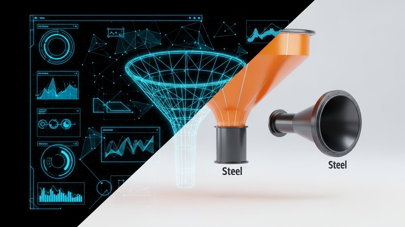
This split-screen composition creates a direct "Before and After" narrative. The left side displays a technical, blueprint-style wireframe of a marketing funnel in blueprint blue. As the eye moves right, the wireframe transitions seamlessly into a photorealistic, metallic industrial funnel rendered in Neon Orange and Steel. This visualizes the platform's ability to turn "Strategy" (Wireframe) into "Revenue" (Reality).
Psychological Impact & KPI Focus
- Tangibility Bias: Software is invisible, making it hard to value. Giving it a "steel" physical form makes the investment feel substantial and durable.
- Operational Focus: Tangibilizing the abstract concept of Through-Channel Marketing Automation (TCMA).
Strategic Implementation & Trade-offs
- Best Use: Pre-Roll Ads (YouTube) and Product Landing Pages.
- Duration: 15-30 Seconds.
- Trade-off: The industrial metaphor is strong but can feel "heavy." Ensure the rendering is high-quality to avoid looking like a manufacturing demo.
Companies using similar video content -
Channeltivity – PRM Software – Blueprint-to-reality for channel program setup and execution.
LogicBay – Partner Relationship Management – Visualizing strategy turning into tangible channel revenue.
TIE Kinetix – Partner Automation Platform – Demonstrating marketing plan execution into results.
5. Bold Kinetic Typography (Visual)
TOFU | Vertical Social Organic

The Visual & Narrative Approach
This style abandons traditional imagery for pure kinetic energy. Massive, blocky geometric shapes in Stark Black and Bumblebee Yellow collide, stack, and expand dynamically. The motion mimics the rhythm of rapid-fire typography/speech. It conveys urgency, speed, and the aggressive pace of modern social selling. The background is a vibrant, solid yellow to maximize retinal impact on mobile feeds.
Psychological Impact & KPI Focus
- Urgency: The fast cuts and high-contrast colors trigger an adrenaline response. It signals that the platform is fast, modern, and built for the "Attention Economy."
- Operational Focus: Positioning the brand as a Disruptor and Speed-to-Market leader.
Strategic Implementation & Trade-offs
- Best Use: TikTok, Instagram Reels, and YouTube Shorts (Vertical 9:16).
- Duration: 10-12 Seconds.
- Trade-off: It conveys "energy" but zero detailed information. It must be paired with a caption or audio track that delivers the specific message.
Companies using similar video content -
Partnerize – Partner Management Platform – High-speed text and graphics for rapid campaign launch.
Impact.com – Partnership Management Platform – Dynamic typography for fast-paced partnership growth.
Affise – Affiliate Marketing Platform – Kinetic visuals emphasizing quick performance and impact.
6. 2D Line Art Animation
TOFU | YouTube
The Visual & Narrative Approach
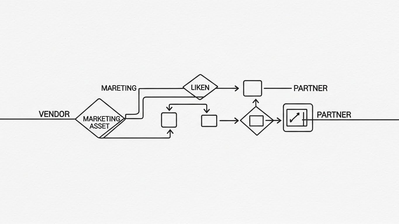
In contrast to high energy, this style offers sophisticated clarity. A single, continuous thin line in Charcoal Gray draws a complex flowchart on a textured paper background. The line weaves elegantly to form boxes, arrows, and diamonds, representing the journey of a marketing asset from Vendor to Partner to End-User. The continuous nature of the line symbolizes an "Unbroken Workflow."
Psychological Impact & KPI Focus
- Cognitive Ease: Complex channel processes (like MDF approval routing) can seem daunting. The single line simplifies this complexity into a logical, followable path.
- Operational Focus: Ideal for explaining Lead Routing Logic and Process Transparency.
Strategic Implementation & Trade-offs
- Best Use: "How it Works" website sections or YouTube Organic educational content.
- Duration: 45-60 Seconds.
- Trade-off: It relies entirely on the elegance of the motion. If the animation is jerky, it loses its authority.
Companies using similar video content -
Kiflo – Partner Portal Software – Continuous line art for clear lead routing and process flow.
PartnerPortal.io – Partner Portal – Explaining complex onboarding steps with elegant line animations.
OneChannel – Channel Management Software – Visualizing unbroken workflows for partner engagement.
7. Isometric 2D Motion Design
TOFU | Demand Gen
The Visual & Narrative Approach
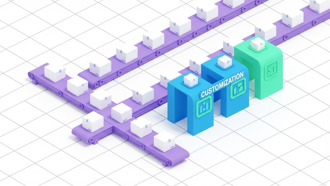
This style uses an isometric (45-degree angle) perspective to depict a "Digital Factory." Conveyor belts in Pastel Purple carry identical white boxes (generic assets). As they pass through a "Customization Station," they are stamped with Mint Green accents. This is the perfect visual metaphor for taking a master asset and automatically personalizing it for thousands of partners at scale.
Psychological Impact & KPI Focus
- Scale & Reliability: The factory metaphor suggests that marketing is a reliable, scalable production line. It reassures the viewer that the solution can handle the "Long Tail" of partners.
- Operational Focus: Visualizing White-labeling and Automated Personalization.
Strategic Implementation & Trade-offs
- Best Use: Display Ads and Blog headers.
- Duration: 15-20 Seconds (Loopable).
- Trade-off: Isometric art is common in SaaS. Use unique brand colors (like the Mint Green/Purple here) to avoid looking like stock footage.
Companies using similar video content -
Model N – Channel Management – Isometric factory for systematic asset customization and scale.
Vistex – Go-to-Market Solutions – Visualizing automated personalization of marketing materials.
E2open – Channel Shaping – Depicting a digital factory for scalable partner operations.
8. Rapid UI Feature Montage
MOFU | ABM Awareness
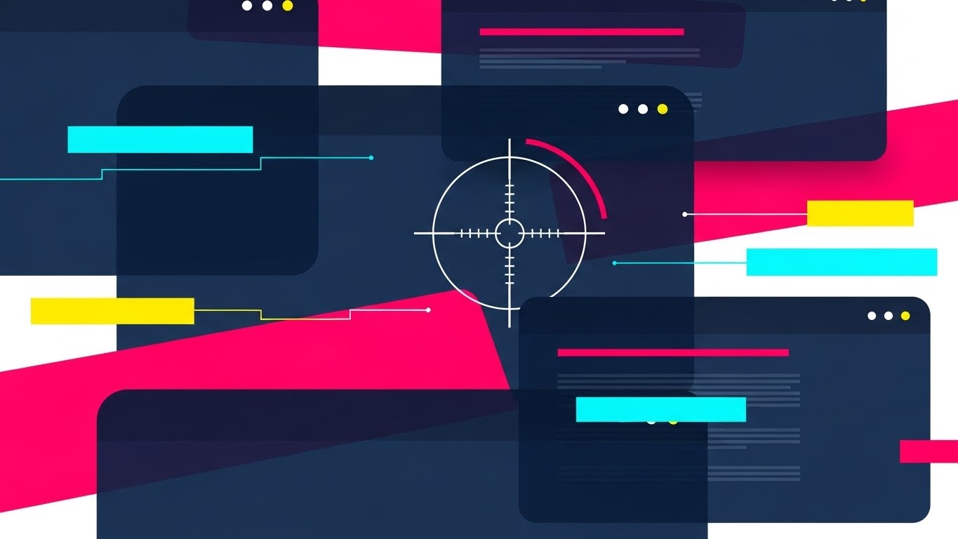
The Visual & Narrative Approach
This style simulates the speed of data processing. Layers of semi-transparent abstract UI screens in Navy Blue and Hot Pink shuffle rapidly in a 3D space. The focus is anchored by a sharp "Target Reticle" graphic that locks onto specific data points amidst the blur. This visualizes Account-Based Marketing (ABM)—finding the signal in the noise.
Psychological Impact & KPI Focus
- Precision: Partners are skeptical of lead quality. This visual demonstrates that the platform uses sophisticated filtering to identify high-value targets.
- Operational Focus: Validating Lead Quality and Targeting Intelligence.
Strategic Implementation & Trade-offs
- Best Use: LinkedIn Video Ads targeting Sales Directors.
- Duration: 15 Seconds.
- Trade-off: It is impressionistic. It implies the capability but doesn't show the actual "click path."
Companies using similar video content -
Salesforce – Partner Relationship Management – Rapid UI shifts for precision targeting in ABM.
HubSpot – Partner Program – Quick cuts of UI for data-driven lead quality and targeting.
Oracle – Partner Relationship Management – Montage of UI screens for advanced lead intelligence.
9. Minimalist Flat 2D Vector
MOFU | Product Differentiation
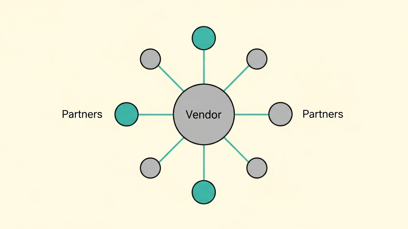
The Visual & Narrative Approach
Inspired by Bauhaus design, this style is purely geometric and symmetrical. A large central circle (Vendor) radiates perfectly straight lines to a ring of smaller outer circles (Partners). The palette is Soft Gray and Teal on a cream background. It is a static, stable representation of "Hub and Spoke" architecture.
Psychological Impact & KPI Focus
- Stability: This style communicates "Governance" and "Control." It reassures the Vendor that they remain the central source of truth in the network.
- Operational Focus: Visualizing Network Hierarchy and Compliance.
Strategic Implementation & Trade-offs
- Best Use: Product differentiation pages and whitepaper illustrations.
- Duration: Static or Slow Pulse (10 Seconds).
- Trade-off: It is not exciting. Use it to reassure stakeholders about architecture, not to drive hype.
Companies using similar video content -
Microsoft – Partner Center – Minimalist vector for centralized hub and governance structure.
Zoho CRM – Partner Portal – Simple geometric representation of network hierarchy and control.
SAP – PartnerEdge – Bauhaus-inspired design for stable, compliant partner architecture.
10. Clean UI Workflow (Light Mode)
MOFU | Feature Education
The Visual & Narrative Approach
This style brings the viewer closest to the product truth. It features a clean, light-mode UI representation where a stylized cursor hand hovers over a Sky Blue drag-and-drop interface. The cursor places a generic orange logo shape into a predefined placeholder box. The background is a soft, out-of-focus bright office bokeh. The focus is entirely on Ease of Use.
Psychological Impact & KPI Focus
- Usability Validation: The primary barrier to adoption is "Feature Fatigue." By showing a simple "Drag-and-Drop" action, you visually promise clarity and ease of management, effectively lowering the barrier to entry.
- Operational Focus: Overcoming technical anxiety and proving Actionable Simplicity.
Strategic Implementation & Trade-offs
- Best Use: Email Marketing (GIFs) and "New Feature" announcements.
- Duration: 15-20 Seconds.
- Trade-off: It simplifies the interface. Ensure the actual product onboarding delivers this level of clarity to avoid an expectation gap.
Companies using similar video content -
Impartner – Partner Relationship Management – Demonstrating intuitive drag-and-drop UI for ease of use.
Channeltivity – PRM Software – Clean light mode UI for simplified partner interaction.
Allbound – Partner Portal – Showcasing intuitive usability for content and campaign management.
11. Isometric 3D Workflow
MOFU | Feature Education

The Visual & Narrative Approach
This style creates a "miniature world" to explain the often-opaque ecosystem of Market Development Funds (MDF). We observe a pristine isometric 3D city rendered in Silver and White, connected by a network of elevated transparent glass tubes. Inside these tubes, glowing Gold Metallic blocks (representing credits or funds) travel smoothly from the central Vendor HQ to various Partner buildings. The lighting is studio-quality, making the "money" look tangible, precious, and—most importantly—tracked.
Psychological Impact & KPI Focus
- Financial Trust: MDF programs often feel like a "black hole" where claims disappear. By giving funds a physical form (gold blocks) and a visible path, you cognitively validate the Transparency and Fairness of your allocation logic.
- Operational Focus: Visualizing Fund Routing, Claim Visibility, and Budget Utilization.
Strategic Implementation & Trade-offs
- Best Use: "Partner Program Benefits" pages and MDF explainer videos.
- Duration: 30-45 Seconds.
- Trade-off: The "perfect world" aesthetic is charming but can feel abstract. Ensure the voiceover grounds it in specific features like "Automated Claim Routing."
Companies using similar video content -
Model N – Channel Incentives – Visualizing transparent MDF flow with tangible gold blocks.
Vistex – Channel Programs – Isometric 3D for clear fund allocation and claim visibility.
E2open – Channel Management – Depicting a miniature world of tracked financial incentives.
12. 3D X-Ray Visualization
MOFU | Building Trust

The Visual & Narrative Approach
Security and permission structures are critical but visually dull. This style makes them fascinating by using an "X-Ray" metaphor. We focus on a sleek, translucent glass lock mechanism floating in a clean, high-key lab setting. As the camera orbits, we see the complex internal gears and tumblers glowing in Red and Translucent Blue, interlocking perfectly. This visualizes the sophisticated "Permission Architecture" hidden behind the simple user interface.
Psychological Impact & KPI Focus
- Competence Assurance: Partners worry about data leakage and Deal Registration conflict. Seeing the "internal gears" provides assurance that the system is engineered, not just designed. It builds trust in the Data Sovereignty of the platform.
- Operational Focus: Visualizing Role-Based Access Control (RBAC) and Conflict Resolution Logic.
Strategic Implementation & Trade-offs
- Best Use: Security Compliance pages and Technical Deep-Dives.
- Duration: 15-20 Seconds.
- Trade-off: Highly technical look. It appeals to IT Directors and CTOs but may alienate creative marketing personas.
Companies using similar video content -
Cisco – Partner Program – X-ray view of robust security architecture and internal logic.
Palo Alto Networks – Ignite Partner Program – Visualizing sophisticated permission structures and data sovereignty.
CrowdStrike – Falcon Platform – Demonstrating internal security mechanisms and access control.
13. Futuristic Neon/Dark Mode
MOFU | Thought Leadership

The Visual & Narrative Approach
To position your platform as the future of the industry, this style adopts a "Cyberpunk" aesthetic. We see a low-angle view of towering digital skyscrapers in a dark, misty metropolis, outlined in Neon Purple and Cyber Blue. Streams of data light race vertically up the sides of the buildings, symbolizing the rapid ascent of your partners in their specific vertical markets. The mood is atmospheric and serious, suggesting dominance and scale.
Psychological Impact & KPI Focus
- Market Leadership: The sheer verticality of the skyscrapers triggers a sense of awe and stability. It signals that your platform is the "Infrastructure of the Future," designed for high-growth, modern enterprises.
- Operational Focus: Visualizing Vertical Market Scalability and High-Velocity Data Processing.
Strategic Implementation & Trade-offs
- Best Use: Connected TV (CTV) spots and Event background loops.
- Duration: 15-30 Seconds.
- Trade-off: The dark, moody aesthetic is powerful but can feel cold. Ensure the data streams are vibrant to signify life and activity.
Companies using similar video content -
Datto – Global Partner Program – Cyberpunk aesthetic for market leadership and future-ready scale.
ConnectWise – Partner Program – Neon-outlined skyscrapers for vertical dominance and data processing.
Sophos – Partner Program – Dark mode and neon for high-growth, modern enterprise solutions.
14. Lifestyle Stock with UI Overlay
MOFU | Driving Demo Requests

The Visual & Narrative Approach
Partners often fear that automation will replace their relationship. This style counteracts that by centering the human. We use high-quality footage of a professional woman (wearing a beige blazer) in a modern, sunlit workspace. An abstract, floating Electric Blue UI hologram hovers above her laptop, displaying positive trend graphs. She isn't struggling; she is focused and empowered. The hologram represents the "Augmented Intelligence" your software provides.
Psychological Impact & KPI Focus
- Relatability: Unlike abstract motion graphics, this shows the user. It helps the viewer visualize themselves (or their team) succeeding with the tool. It creates an emotional connection to the User Experience (UX).
- Operational Focus: Visualizing Partner Empowerment and Ease of Management.
Strategic Implementation & Trade-offs
- Best Use: Meta Ads (Facebook/Instagram) and Retargeting campaigns.
- Duration: 15-20 Seconds.
- Trade-off: Relies heavily on the casting and acting quality. If the stock footage looks staged, credibility drops.
Companies using similar video content -
Seismic – Sales Enablement – Lifestyle footage with UI overlay for human empowerment and augmented intelligence.
Highspot – Sales Enablement Platform – Showing users succeeding with an abstract UI hologram.
Showpad – Sales Enablement – Human-centric visuals for ease of management and partner success.
15. Low-Poly 3D Modeling
MOFU | Overcoming Objections

The Visual & Narrative Approach
This style addresses the "Complexity Gap"—the fear that integration will be too hard. We use a charming, simplified "Low-Poly" aesthetic in a Matte Pastel palette. A geometric bridge is being constructed piece-by-piece over a jagged ravine, connecting two floating islands (Vendor and Partner) against a bright sky blue background. The animation is step-by-step and satisfying, visualizing the "Onboarding Journey" as a constructive, manageable process.
Psychological Impact & KPI Focus
- Task Simplification: The simplified geometry suggests that the problem is solvable and structured. It reduces the perceived difficulty of integration, lowering the Cognitive Load associated with switching costs.
- Operational Focus: Visualizing Onboarding Roadmaps and Integration Support.
Strategic Implementation & Trade-offs
- Best Use: Remarketing Ads to users who abandoned the sign-up page.
- Duration: 15-30 Seconds.
- Trade-off: The "cute" aesthetic must be balanced with professional voiceover to avoid seeming childish.
Companies using similar video content -
Kiflo – Partner Portal Software – Low-poly bridge for visualizing onboarding and integration support.
PartnerPortal.io – Partner Portal – Simplified 3D for constructive partnership and task simplification.
Zomentum – Partner Sales Platform – Charming low-poly for overcoming integration complexity.
16. Dark Mode UI Showcase
MOFU | Competitive Displacement
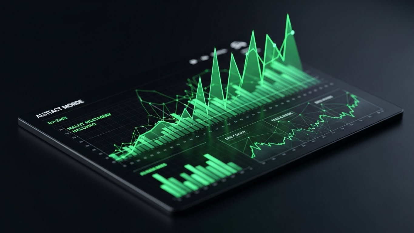
The Visual & Narrative Approach
When targeting partners using legacy competitor systems, you need to signal "Upgrade." This style uses a sleek, angled 3D view of a Dark Mode interface—the visual language of "Pro Tools." High-contrast Neon Green line graphs surge upward against the Deep Black background. The aesthetic is aggressive, precise, and performance-oriented. It screams "Speed" and "Modernity" without saying a word.
Psychological Impact & KPI Focus
- Status Signaling: Dark mode is associated with developer tools and high-end trading terminals. It frames your software as a "Power Tool" for serious revenue generators, distinct from the "toy-like" interfaces of older platforms.
- Operational Focus: Visualizing Real-Time Analytics and Performance Tracking.
Strategic Implementation & Trade-offs
- Best Use: LinkedIn Comparison Ads ("Us vs. Them") and Feature Highlight reels.
- Duration: 10-15 Seconds.
- Trade-off: Dark mode can be hard to read if not high-contrast. Ensure the key metrics (the green lines) are thick and luminous.
Companies using similar video content -
Zift Solutions – Through-Channel Marketing Automation – Sleek dark mode UI for aggressive performance analytics.
Mindmatrix – Channel Automation Platform – High-contrast dark UI for competitive real-time tracking.
Brandmuscle – Local Marketing Automation – Dark mode for modern, performance-oriented marketing tools.
17. Dynamic Data Visualization
BOFU | ROI Justification

The Visual & Narrative Approach
At the bottom of the funnel, ambiguity is the enemy. This style strips away all distraction, focusing purely on the result: Growth. We see crystalline, refractive Glass Bar Charts in Emerald Green rising rapidly from a reflective white surface into an infinite white void. The camera angle is low, looking up at the soaring metrics, giving the data a monumental feeling. The refractive glass suggests "Transparency"—there is nothing to hide in these numbers.
Psychological Impact & KPI Focus
- Greed & Validation: The rising green bars trigger the universal business desire for growth. The clarity of the glass reinforces the honesty of the data, validating the Return on Investment (ROI).
- Operational Focus: Visualizing Revenue Growth and Partner Profitability.
Strategic Implementation & Trade-offs
- Best Use: LinkedIn Data Carousels (Video Slides) and Proposal decks.
- Duration: 6-10 Seconds (Loopable).
- Trade-off: It is purely symbolic. It requires hard-hitting copy overlay (e.g., "300% Growth in Q1") to give the abstract bars meaning.
Companies using similar video content -
WorkSpan – Ecosystem Cloud – Crystalline bar charts for transparent ROI and revenue growth.
Crossbeam – Partner Ecosystem Platform – Dynamic data for crystal clear growth and partner profitability.
PartnerStack – Partner Management Platform – Visualizing soaring metrics for undeniable ROI justification.
18. Split Screen: Optimized Reality
BOFU | The Economic Buyer

The Visual & Narrative Approach
This style is designed specifically for the CFO or Economic Buyer. We use a horizontal split-screen composition. The left side features a high-end photo of a silver-haired C-suite executive smiling confidently in a modern office. The right side mirrors this emotion with data: a clean, vector area graph in Warm Beige and Cool Blue showing a steep upward trend. The lighting matches across both halves, creating a cohesive narrative that links "Platform Adoption" directly to "Financial Success."
Psychological Impact & KPI Focus
- Social Proof & Authority: The older, confident executive signals stability and experience. Connecting this human element directly to the financial graph creates a subconscious link between your software and Executive Governance.
- Operational Focus: Visualizing Fiscal Health and Strategic Alignment.
Strategic Implementation & Trade-offs
- Best Use: Email Signatures for Sales Reps and Account-Based Marketing (ABM) campaigns.
- Duration: 10-15 Seconds.
- Trade-off: It is conservative. It won't go viral, but it builds the gravitas needed to get the final signature.
Companies using similar video content -
Impartner – Partner Relationship Management – Executive confidence linked to financial success.
Salesforce – Partner Relationship Management – Split screen for strategic alignment and fiscal health.
Oracle – Partner Relationship Management – Connecting C-suite approval with upward trend graphs.
19. Photorealistic 3D Renders
BOFU | Risk Mitigation

The Visual & Narrative Approach
For enterprise deals, the final hurdle is often risk. This style visualizes the "Fortress" around their data. We see a photorealistic 3D render inside a high-tech digital bank vault. Rows of server racks are protected by a massive, circular steel vault door. The lighting is clinical with Steel Gray and Safety Orange accents. This is a literal representation of "Bank-Grade Security," assuring the client that their proprietary customer data is safe behind the thickest walls in the industry.
Psychological Impact & KPI Focus
- Safety Bias: Fear of data breaches is a primary blocker. This heavy, metallic visual acts as a "Security Blanket," physically demonstrating the strength of your Compliance and Security Protocols.
- Operational Focus: Visualizing GDPR/CCPA Compliance and Data Integrity.
Strategic Implementation & Trade-offs
- Best Use: Trust Center website sections and Security Whitepaper headers.
- Duration: 15 Seconds.
- Trade-off: It can feel cold. Use it specifically to address the "Security Objection," not for general marketing.
Companies using similar video content -
Microsoft – Azure Partner Program – Photorealistic vault for enterprise data sovereignty and security.
AWS – Partner Network – 3D render of a high-tech vault for bank-grade security and compliance.
Google Cloud – Partner Advantage – Visualizing robust data integrity and security protocols.
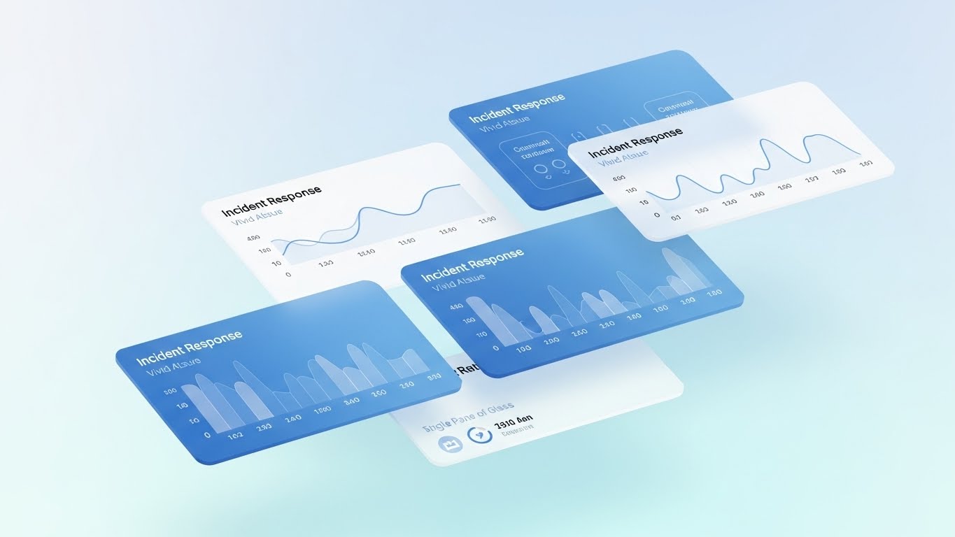
20. 3D Parallax UI Presentation
BOFU | Sales Cycle Acceleration

The Visual & Narrative Approach
The final push is about speed—getting to "Yes" faster. This style uses 3D parallax to create a sense of rapid forward momentum. We float multiple UI "cards" in a bright, Light Blue space. The camera pushes through layers of translucent screens, creating a sense of depth. As we pass each card, abstract checkmark animations in Violet trigger, symbolizing tasks completed. It conveys a "Frictionless Workflow" where administrative tasks are just a blur of green lights.
Psychological Impact & KPI Focus
- Completion Bias: The brain loves seeing tasks completed (checkmarks). This visual sequence triggers a dopamine response associated with "getting things done," promising the buyer that your platform accelerates Time-to-Revenue.
- Operational Focus: Visualizing Workflow Automation and Approval Velocity.
Strategic Implementation & Trade-offs
- Best Use: Retargeting Ads for "Stalled" opportunities and Sales Decks.
- Duration: 10-15 Seconds.
- Trade-off: It creates a high-speed expectation. Ensure your platform's actual load times can match this perception of velocity.
Companies using similar video content -
Impartner – Partner Relationship Management – Parallax UI for frictionless deal acceleration and velocity.
Zift Solutions – Through-Channel Marketing Automation – 3D UI cards for rapid workflow automation.
Allbound – Partner Portal – Visualizing completed tasks and approval velocity for sales cycles.
21. 2D Character-Driven Story
Onboarding | Self-Serve Onboarding
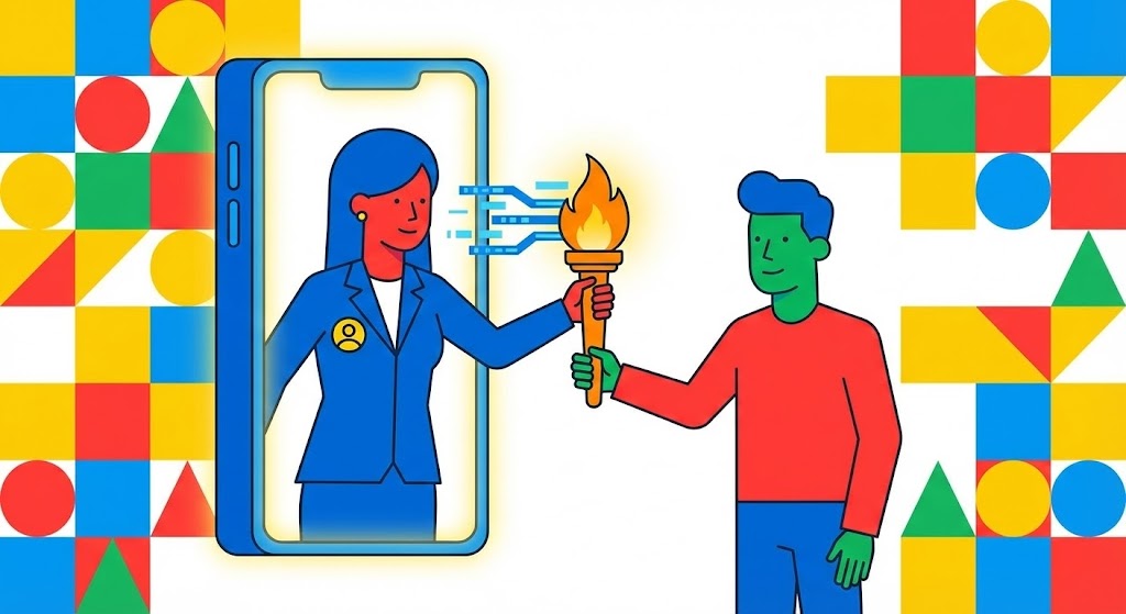
The Visual & Narrative Approach
Onboarding is the most fragile stage of the partner lifecycle. This style uses a friendly, flat 2D vector approach to humanize the process. We see a stylized female character (Vendor Rep) in a blue blazer passing a glowing "Digital Torch" through a giant smartphone screen to a male character (Partner). The background is a vibrant, geometric pattern of primary colors. The motion is smooth and elastic, emphasizing that the support doesn't end when the contract is signed—it simply changes form.
Psychological Impact & KPI Focus
- Relationship Reassurance: The "Torch Pass" metaphor visually alleviates the fear of abandonment. It signals that knowledge and power are being transferred, not just software access.
- Operational Focus: Improving Time-to-Value (TTV) and reducing Early Churn by framing onboarding as a supported partnership.
Strategic Implementation & Trade-offs
- Best Use: Welcome Emails and the first screen of the Partner Portal.
- Duration: 45-60 Seconds.
- Trade-off: Character animation can feel "childish" if not executed with corporate polish. Keep the design flat and modern to maintain B2B credibility.
Companies using similar video content -
Kiflo – Partner Portal Software – Character narrative for seamless onboarding and digital handover.
PartnerPortal.io – Partner Portal – Friendly 2D characters for relationship reassurance during onboarding.
Zomentum – Partner Sales Platform – Humanizing the onboarding process with a digital torch pass.
22. 2D Graphics Over Live Action
Onboarding | Reducing Friction
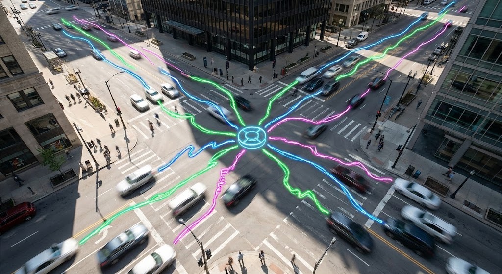
The Visual & Narrative Approach
This style bridges the gap between the real world and the digital layer. We use high-angle time-lapse footage of a busy city intersection—representing the chaotic reality of your partner's daily business. Overlaid on this footage are bright, hand-drawn Neon Doodle lines in Electric Green and Purple that connect cars and buildings to a central hub. The doodles snap onto the live footage, organizing the traffic flow. It visually demonstrates how your software imposes order on the real-world chaos they face every day.
Psychological Impact & KPI Focus
- Cognitive Structuring: By overlaying simple lines on complex footage, you trigger the "Order" bias. It proves that your software doesn't ignore their reality; it enhances it.
- Operational Focus: Visualizing Workflow Optimization and Process Governance.
Strategic Implementation & Trade-offs
- Best Use: "Getting Started" video libraries and YouTube Support channels.
- Duration: 30-60 Seconds.
- Trade-off: Requires high-quality stock footage. Poorly matched tracking (where lines don't stick to the video) breaks the illusion of stability.
Companies using similar video content -
ConnectWise – Partner Program – Live action city with overlaid graphics for ordering chaos.
Datto – Global Partner Program – Mixed media for visualizing workflow optimization and support.
Sophos – Partner Program – Hand-drawn lines over real-world footage for process governance.
23. 2D Animation & UI Composition
Onboarding | Time-to-Value
The Visual & Narrative Approach
To drive adoption, you must celebrate the first win. This style blends character animation with UI elements. A stylized user in a Vibrant Orange shirt stands next to a floating, oversized UI button marked with a rocketship icon. As they press it, the screen explodes with Blue confetti and checkmarks. This is a hyper-exaggerated visualization of launching a campaign. It creates a "Pavlovian" positive association with using the platform.
Psychological Impact & KPI Focus
- Dopamine Loop: The brain craves reward. By visually gamifying the completion of a task, you reinforce the habit of using the software.
- Operational Focus: Accelerating Feature Adoption and creating User Stickiness.
Strategic Implementation & Trade-offs
- Best Use: In-App pop-ups upon completing the first campaign or setup task.
- Duration: 5-10 Seconds (Loopable).
- Trade-off: It is purely motivational. Use it sparingly to reward milestones, not for general instruction.
Companies using similar video content -
PartnerStack – Partner Management Platform – UI celebration for gamified success and "Aha!" moments.
Impact.com – Partnership Management Platform – Animated confetti for feature adoption and user stickiness.
Partnerize – Partner Management Platform – Visually rewarding campaign launches with UI celebrations.
24. Macro UI Micro-Interactions
Retention | Knowledge Base

The Visual & Narrative Approach
When a user is stuck, they don't want fluff; they want clarity. This style uses a simulated "Macro Photography" aesthetic. We see an extreme close-up of a computer screen, where the pixel texture is visible. A cursor hovers over a glowing White Question Mark icon on a Clean Blue background. The shallow depth of field blurs everything else, forcing the eye to focus solely on the solution. It communicates that help is precise, accessible, and just one click away.
Psychological Impact & KPI Focus
- Anxiety Reduction: High-stress moments require low-noise visuals. The extreme focus eliminates distraction, lowering the user's cortisol levels and helping them focus on the fix.
- Operational Focus: Increasing Self-Serve Support usage and reducing Support Ticket Volume.
Strategic Implementation & Trade-offs
- Best Use: Embedded in the "Help" widget or Knowledge Base articles.
- Duration: 5-8 Seconds (Loopable GIF).
- Trade-off: It is extremely specific. You need a library of these micro-interactions for different features, which requires a scalable production workflow.
Companies using similar video content -
Impartner – Partner Relationship Management – Macro focus on UI for precision support and accessible answers.
Channeltivity – PRM Software – Extreme close-ups of help icons for anxiety reduction.
Allbound – Partner Portal – Visualizing precise, one-click support for knowledge base usage.
26. Hyper-lapse Stock Footage
Retention | Reducing Churn

The Visual & Narrative Approach
Retention is about momentum. This style uses a first-person hyper-lapse moving rapidly through a city. Streaks of light from traffic are color-graded to match the brand's Data Blue palette. Overlayed on this are smooth, curved glowing lines that connect passing buildings. The visual narrative is one of "Flow." There are no stops, no barriers, and no friction—visualizing the seamless experience of a long-term partnership.
Psychological Impact & KPI Focus
- Momentum Bias: The forward motion subconsciously suggests progress. It frames the relationship as a journey that is "going somewhere," discouraging the partner from jumping off the moving train (churning).
- Operational Focus: Reinforcing Long-Term Partnership and Ecosystem Health.
Strategic Implementation & Trade-offs
- Best Use: Social Media Retargeting (LinkedIn/Instagram) for current customers.
- Duration: 10-15 Seconds.
- Trade-off: High energy. Avoid using this for technical updates; it is a brand-building style meant to reinforce feeling, not facts.
Companies using similar video content -
WorkSpan – Ecosystem Cloud – Hyper-lapse journey for continuous momentum and retention.
Crossbeam – Partner Ecosystem Platform – Forward motion for unbroken partnership and ecosystem health.
PartnerStack – Partner Management Platform – High-energy visuals for long-term partner engagement.
27. Holographic UI over 3D Render
Expansion | Deep Feature Adoption
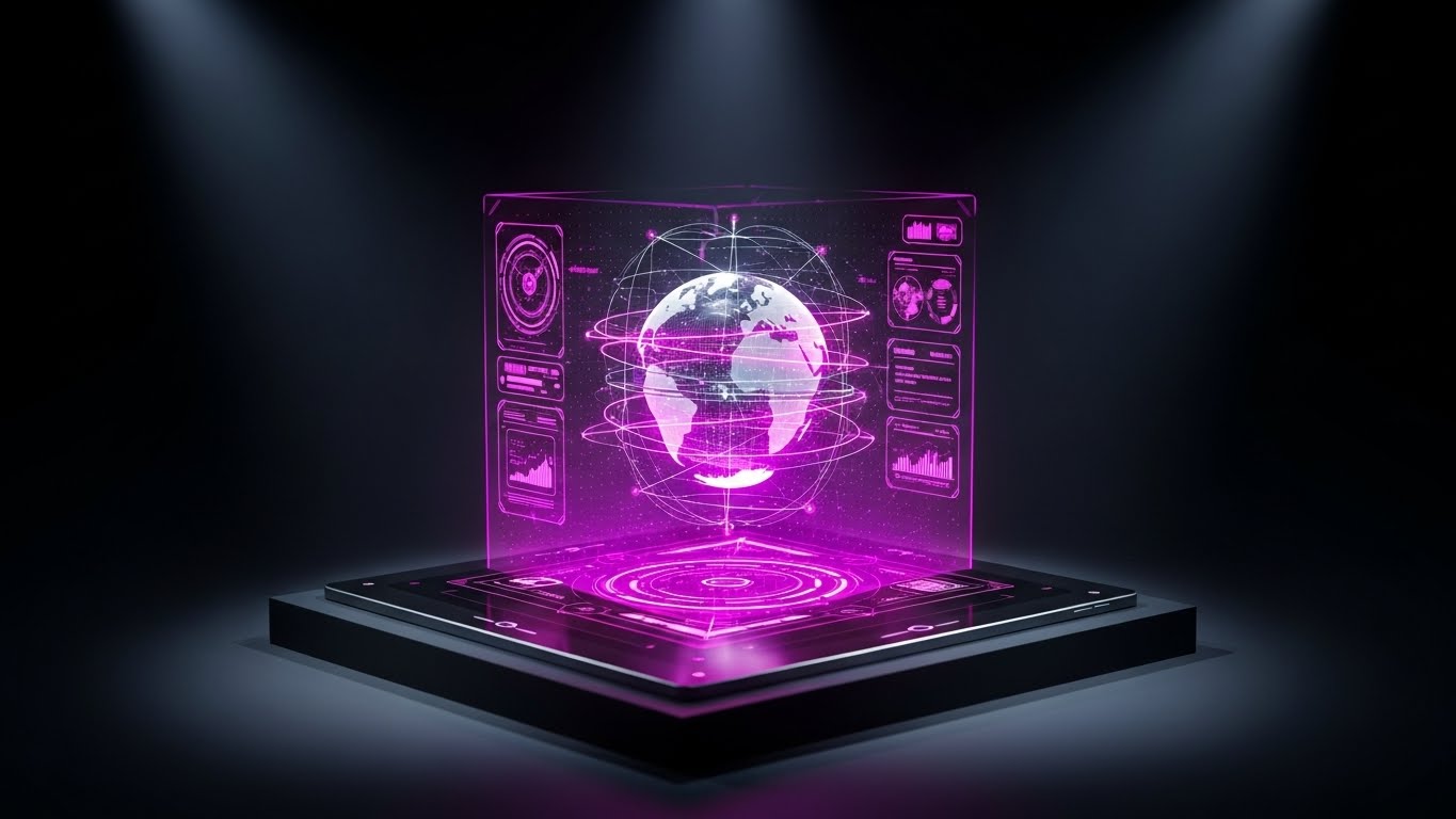
The Visual & Narrative Approach
To upsell partners to enterprise tiers, you must show them capabilities that look "expensive." This style features a realistic 3D render of a sleek tablet on a podium. Projecting upwards from the screen is a complex Holographic Blue and Magenta UI, displaying a rotating 3D globe with multi-tiered network layers. It looks like a command center. This visualizes the depth and power of the advanced features (like Multi-tier Distribution) that are unlocked at higher levels.
Psychological Impact & KPI Focus
- Perceived Value: The complexity of the hologram implies high value and sophistication. It justifies a higher price point by making the software look like a futuristic "Command & Control" system.
- Operational Focus: Driving Upsell/Cross-sell and demonstrating Global Scalability.
Strategic Implementation & Trade-offs
- Best Use: In-App "Locked Feature" teasers and Quarterly Business Review (QBR) decks.
- Duration: 10-15 Seconds.
- Trade-off: It can look intimidating. Ensure the copy emphasizes that this power is "easy to control."
Companies using similar video content -
Salesforce – Partner Relationship Management – Holographic UI for enterprise complexity and advanced capabilities.
Microsoft – Partner Center – 3D render with holographic display for multi-tier distribution.
Oracle – Partner Relationship Management – Visualizing global scalability and command center features.
28. Generative AI Cinematic Video
Expansion | Driving Upsell

The Visual & Narrative Approach
This style targets the decision-makers who approve budget increases. Using Generative AI, we create a cinematic, wide anamorphic shot of a high-end glass-walled boardroom. Silhouettes of executives stand looking out at a sprawling, bright city skyline bathed in Teal and Orange sunlight. In the reflection of the glass, a subtle digital overlay shows climbing growth metrics. It sells the "View from the Top"—the result of maximizing the partnership.
Psychological Impact & KPI Focus
- Aspiration: This appeals to the partner's ego and ambition. It positions your software not as a tool, but as the vehicle that gets them into that boardroom.
- Operational Focus: Visualizing Revenue Growth and Strategic Alignment.
Strategic Implementation & Trade-offs
- Best Use: YouTube Pre-roll for "Success Stories" and Executive Briefings.
- Duration: 15-20 Seconds.
- Trade-off: AI video can sometimes have uncanny artifacts. Ensure the silhouettes are clean and the focus is on the environment/atmosphere, not detailed faces.
Companies using similar video content -
Impartner – Partner Relationship Management – Cinematic boardroom view for strategic growth and upsell.
Zift Solutions – Through-Channel Marketing Automation – AI-generated executive scenes for revenue growth.
SAP – PartnerEdge – Wide anamorphic shots for aspirational strategic alignment.
29. Aspirational Stock Montage
Expansion | Referrals & Advocacy

The Visual & Narrative Approach
Advocacy is built on people, not pixels. This style shifts to a warm, sun-drenched photo montage. We see a diverse group of business professionals gathered outdoors in a corporate plaza, looking at a tablet and laughing. Lens flares and warm sunlight tones create an optimistic atmosphere. It visualizes the partner community as a thriving, happy ecosystem that others would want to join.
Psychological Impact & KPI Focus
- Social Proof: Seeing happy, successful peers creates a "Fear of Missing Out" (FOMO) and validates the decision to advocate for the brand. It humanizes the B2B relationship.
- Operational Focus: Driving Net Promoter Score (NPS) and Partner Referrals.
Strategic Implementation & Trade-offs
- Best Use: LinkedIn Community posts and "Partner of the Year" announcements.
- Duration: 15-30 Seconds.
- Trade-off: It can feel like generic stock. Use brand-specific color grading or overlay your UI on the tablet to ground it in your reality.
Companies using similar video content -
HubSpot – Partner Program – Aspirational community for human connection and advocacy.
Impact.com – Partnership Management Platform – Sun-drenched montage for social proof and FOMO.
Partnerize – Partner Management Platform – Visualizing a thriving, happy partner ecosystem.
30. Generative AI Realistic Character Video
Expansion | Proactive Support

The Visual & Narrative Approach
The future of support is human-centric AI. This style uses high-fidelity Generative AI to create a "Customer Success Manager" character. We see a medium close-up of a friendly professional with warm skin tones in a bright tech office. They gesture with an open hand towards a floating, semi-transparent interface element, explaining a new feature. The lighting is soft, flattering studio quality. It puts a "face" to the technology, making the support feel proactive and personal.
Psychological Impact & KPI Focus
- Trust: People trust faces more than text. A "virtual human" presence can make automated updates feel like personal advice, increasing engagement with new features.
- Operational Focus: Improving Customer Health Scores and Feature Awareness.
Strategic Implementation & Trade-offs
- Best Use: Personalized Email updates and "New Feature" walkthroughs.
- Duration: 30-45 Seconds.
- Trade-off: The "Uncanny Valley" is a risk. Use this for short, scripted updates where the friendly demeanor is more important than complex lip-syncing accuracy.
The Visual Operations Doctrine: A Strategic Knowledge Base
The 30 styles outlined above are not merely aesthetic choices; they are operational levers. To transform these visual assets into tangible business outcomes—Higher Adoption, Lower Churn, and Increased Efficiency—you must deploy them within a structured strategic framework.
Drawing on the collective expertise of the Advids team, we present a 3-Segment Knowledge Base designed to operationalize your visual strategy.
Strategic Alignment & Visual Architecture
The "Pre-Production" Phase: Defining the Visual Operating System
Before a single pixel is rendered, the visual architecture must be aligned with the cognitive reality of your partners.
- The Cognitive Load Audit: Do not just "make a video." First, audit the current text-based training materials. If a manual takes 20 minutes to read, the visual goal is not just "shorter"—it is "lower load." Measure the complexity of the workflow and choose a style (e.g., Style 10: Clean UI) that actively strips away visual noise.
- Role-Based Visual Mapping: A "One-Size-Fits-All" video strategy fails in B2B.
- For Executives (The Check-Signers): Deploy Style 2 (Abstract 3D) and Style 17 (Dynamic Data). They need to see Scale, Reach, and ROI.
- For Practitioners (The Users): Deploy Style 10 (Clean UI) and Style 24 (Macro UI). They need to see Buttons, Workflows, and Solutions.
- The "Glanceability" Standard: In high-velocity sales environments, partners do not have time to watch a 5-minute intro. Adoption videos must pass the "Glance Test": Can the viewer understand the primary benefit within the first 3 seconds without audio? Styles like Style 5 (Bold Typography) are engineered specifically for this constraint.
- The Advids Strategic Audit: We recommend a "Visual Gap Analysis" every 12 months. Compare your asset library against the "Utilization Wall." Where are partners getting stuck? If they fail at onboarding, you don't need more marketing hype; you need Style 15 (Low-Poly Bridge) to visualize the path. Advids specializes in identifying these friction points and mapping the correct visual remedy.
- Legacy System Integration: Many partners operate on older hardware. When visualizing your software, ensure the aesthetic doesn't look so futuristic that it feels incompatible with their reality. Use Style 22 (Live Action Overlay) to show how your modern tool layers on top of their existing physical world.
- Accessibility in Channel Markets: Partners are global. Avoid text-heavy motion graphics. Prioritize styles like Style 1 (Abstract Motion) or Style 6 (Line Art) that rely on visual logic rather than English text, drastically reducing localization costs.
- Brand Voice Consistency: Your "Support" voice (Style 24) should feel like a sibling to your "Sales" voice (Style 13). Disconnected visual styles create subconscious distrust.
- The Mobile-First Mandate: 60% of partner engagement happens on mobile devices. Ensure all styles are optimized for vertical (9:16) and square (1:1) framing, ensuring legibility on a smartphone screen.
- Standardization vs. Customization: For core platform features (Deal Reg, MDF), use standardized, high-polish assets. For vertical-specific pitches (e.g., Healthcare vs. Finance), use template-based styles like Style 18 (Split Screen) to swap imagery without rebuilding the video engine.
- The Cross-Departmental Bridge: Use these visuals to unify terminology. Sales, Marketing, and Product teams often use different language. A Style 6 (2D Line Art) acts as the "Rosetta Stone," forcing all departments to agree on a single visual representation of the workflow.
Operational Adoption & Implementation
The "Deployment" Phase: Embedding Visuals into the Workflow
A video hidden in a "Resources" folder is a wasted asset. Visuals must be injected directly into the user's workflow at the moment of need.
- Just-in-Time (JIT) Visual Injection: Stop forcing partners to leave the portal to learn how to use it. Embed Style 24 (Macro UI) loops directly into the tooltips of complex features. If a user hovers over "MDF Allocation," a 5-second loop should show them exactly what to click.
- The Micro-Learning Shift: Replace the 60-minute webinar with a playlist of ten 60-second clips. Modern attention spans in B2B are identical to B2C. Use Style 8 (Rapid UI) to give a high-level overview, then break down the details with Style 6 (2D Line Art) for specific modules.
- Overcoming "Big Brother" Anxiety: Monitoring and reporting tools often trigger anxiety. Never introduce these features with cold, hard data visuals. Use Style 14 (Lifestyle Overlay) to frame reporting as "Empowerment" and "Coaching," not surveillance. Show the human benefiting from the data.
- Gamification of Training: Onboarding is boring. Make it a game. Use Style 23 (UI Celebration) to visually reward the completion of boring administrative tasks like profile setup. The visual "confetti" triggers a small dopamine release that reinforces the behavior.
- Reducing Support Ticket Volume: There is a direct correlation between the quality of your Clean UI (Style 10) videos and the volume of "Level 1" support tickets. Invest in these styles to lower your support overhead.
- Remote Onboarding: You cannot fly to every partner's office. Use Style 21 (Character Stories) to simulate the warmth of an in-person welcome, creating a human connection through digital channels.
- Standard Operating Procedures (SOPs): Transform text-based SOPs into Style 7 (Isometric Factory) animations. When partners see the "Process Line," they understand that the rules are there for efficiency, not bureaucracy.
- Feedback Loops: Use interactive video elements. After a Style 26 (Hyper-lapse) feature announcement, include a one-click "I want this" button overlay to capture immediate partner intent.
- Scalable Localization: When generating Style 30 (AI Avatar) videos, plan for audio dubbing. AI lip-syncing technology now allows you to release the same update in English, Spanish, and German simultaneously.
- Leadership Communication: Don't just send text emails from the CRO. Use Style 28 (Cinematic Video) to deliver quarterly "State of the Channel" updates. High production value signals to partners that the channel is a strategic priority for the C-Suite.
Measuring Impact & Future-Proofing
The "ROI" Phase: Metrics and Evolution
Visual strategy is an investment. You must measure its return and prepare for its evolution.
- The "Time-to-Competency" Metric: Move beyond "Video Views." The true metric of success is "Time-to-Competency." Track a cohort of partners who watched the Style 21 (Onboarding) video vs. those who didn't. How much faster did the video group launch their first campaign? This delta is the ROI of your visual strategy.
- Support Ticket Deflection: specific visual styles (like Style 24) should be directly correlated to a reduction in Level 1 support tickets. If the "Password Reset" video is working, tickets for that issue should drop by 30-40%.
- The Advids Partnership & Asset Scalability: Software changes weekly. Your video library cannot be static. A "One-and-Done" production model is obsolete. You need a "Living Library" approach where UI screens in videos can be swapped out without re-shooting. Advids builds asset files with this modularity in mind, ensuring your visual documentation evolves in lockstep with your product releases.
- The AI Visual Frontier: Prepare for the next wave. Generative AI (Style 30) allows for real-time personalization of support videos. Imagine a partner receiving a video where the "Avatar" addresses them by name and shows their specific data. Start building the data infrastructure now to support this level of visual personalization.
- The ROI of Perception: Use Style 16 (Dark Mode) and Style 13 (Futuristic Neon) to benchmark "Brand Perception." Partners want to bet on a winner. If your visuals look more modern than your competitor's, you win the "Sentiment Share."
- Compliance Velocity: Track how quickly new mandates (e.g., GDPR updates) are adopted. Use Style 12 (Photorealistic Vault) for compliance announcements and measure the "Time to Attestation." Faster compliance reduces legal risk.
- Retention and LTV: Analyze the consumption habits of your top 10% of partners. You will likely find they consume more Style 13 and Style 28 content—materials that reinforce vision. Use this data to justify budget for high-end "Retention Assets."
- Scalability of Assets: Build a "Modular Visual System." If you change your logo, you shouldn't have to re-render 30 videos. Use templated Style 5 where branding can be swapped globally in minutes.
- Benchmarking Success: Compare your visual engagement against industry benchmarks. If your Style 20 (3D Parallax) sales videos have a 10% lower completion rate than the industry average, rewrite the script or shorten the motion.
- Final Call to Innovation: The "Utilization Wall" is not permanent. It is built of friction, confusion, and inertia. Strategic visualization is the wrecking ball. By treating video not as "content" but as "infrastructure," you transform your partner program from a passive channel into a synchronized, high-velocity revenue engine.
Companies using similar video content -
Impartner – Partner Relationship Management – AI character for proactive empathy and humanized support.
Channeltivity – PRM Software – Virtual CSM for personalized email updates and feature awareness.
Allbound – Partner Portal – High-fidelity AI character for proactive, human-centric support.
Author & Editor Bio


