
Introduction: Visualizing the Invisible Engine of Enterprise Velocity
The modern software factory is a miracle of abstraction. Yet, for the DevOps leaders and Platform Engineers orchestrating this complexity, the "black box" of deployment pipelines often obscures the value being delivered. We stand at a pivotal moment where the ability to visualize the flow of value is becoming as critical as the code itself. The industry is responding with unprecedented speed; elite performers now deploy 182x more frequently than their low-performing peers, creating a massive efficiency gap that must be communicated to stakeholders.
This efficiency drive is propelling the sector toward massive scale, with the continuous delivery market projected to reach $17.80 billion by 2034. However, capturing this market share requires more than just superior backend logic; it demands a communication strategy that bridges the Physical/Digital Divide. Your stakeholders—from C-Suite executives to junior developers—struggle to grasp the intricate dance of microservices, containerization, and distributed tracing when presented as lines of text or static diagrams. They need to see the infrastructure. By translating abstract logic into tangible, moving assets—turning code into physical containers and data streams into light—we reduce cognitive load and accelerate buy-in.
This guide provides a "Gold Standard" framework for visualizing your CI/CD platform. We move beyond generic stock footage, employing high-precision visual styles that resonate with the engineering mindset while remaining accessible to business decision-makers. From kinetic typography that captures the velocity of deployment to X-ray views that reveal the logic inside the box, these 30 examples represent the future of technical storytelling.
1. Bold Kinetic Typography + Abstract Motion
TOFU | Brand Awareness

The Visual & Narrative Approach
Visualization Scenario: Imagine a void of pure digital potential. Suddenly, massive, blocky alphanumeric characters spelling "BUILD" and "DEPLOY" rush toward the camera, behaving like physical monoliths with significant weight and glossy, plastic textures. As they pass, they leave trailing wake turbulence of motion blur, simulating the sheer velocity of high-frequency trading or hyperscale data transfer. The background is a clean, gradient void of Electric Blue and Hot Pink, stripping away all noise to focus solely on the feeling of speed.
Narration Style: Percussive, rhythmic, and non-verbal. The visual is the sound.
Psychological Impact & KPI Focus
- Niche Psychology: This style targets the "Need for Speed" inherent in DevOps psychology. It bypasses the logical brain and hits the visceral desire for velocity. By removing complex UI details, we reduce Cognitive Load, allowing the viewer to associate the brand purely with the concept of "acceleration."
- Operational Impact: Visualizes Throughput.
- KPI: Ad Recall Lift.
Strategic Implementation & Trade-offs
- Optimal Duration: 6-10 seconds (Vertical/Social).
- Trade-off: This style is purely emotional and atmospheric. It builds hype but explains nothing about the product's functionality. Use it to grab attention, not to educate.
Companies using similar video content -
Harness – Software Delivery Platform – Visualizing rapid deployment velocity and throughput.
GitLab – CI/CD – Capturing the speed of integrated build and deploy cycles.
CircleCI – CI/CD – Emphasizing fast pipeline execution and delivery.
2. Dynamic Data Visualization
TOFU | Market Education
The Visual & Narrative Approach
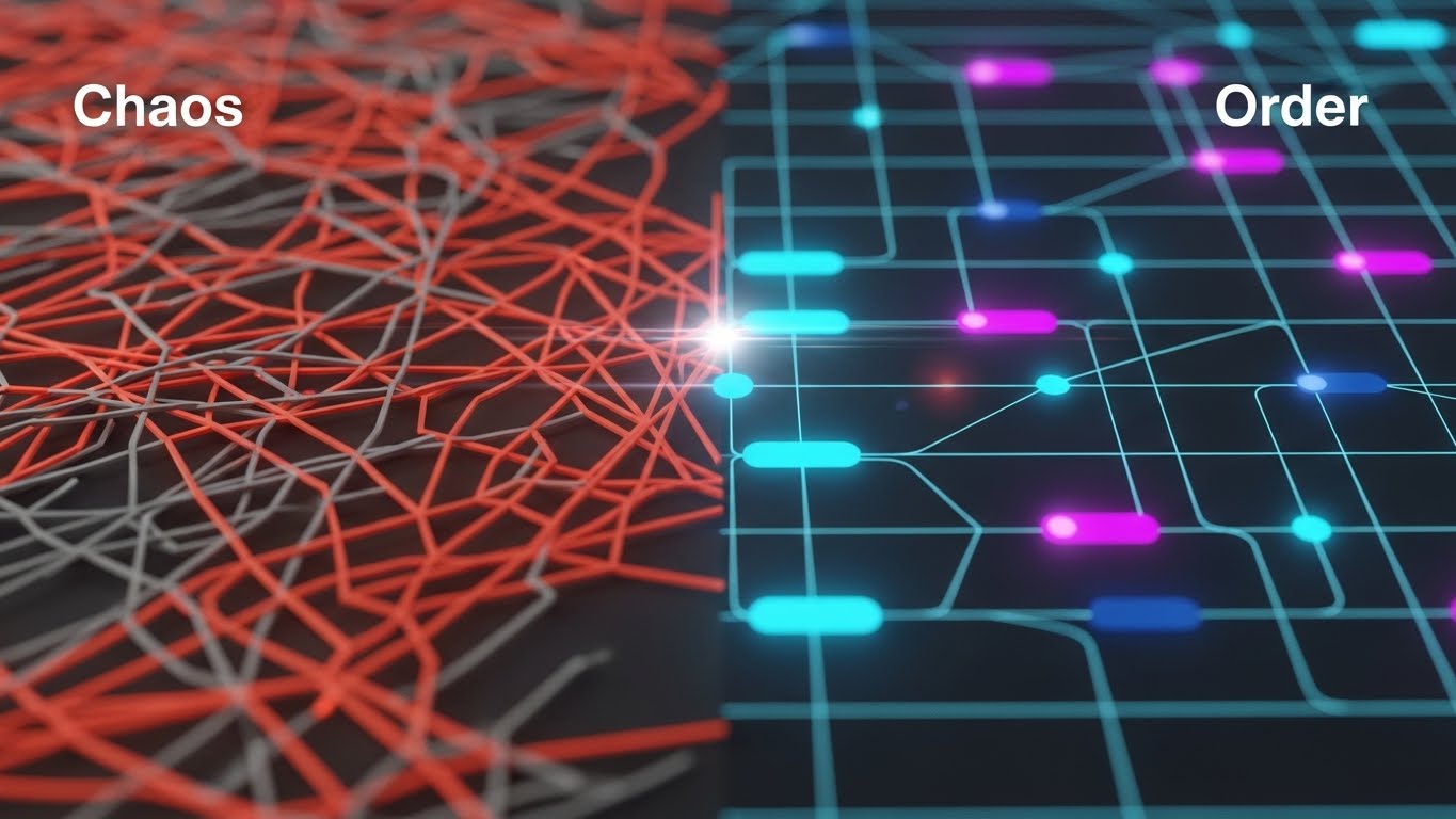
Visualization Scenario: The screen is split or transitions between two distinct states. On the left, we see "Chaos": a tangled, vibrating mess of jagged red and grey lines, representing the anxiety of spaghetti code and unmanaged dependencies. A glowing scanline sweeps across, transforming this disorder into the right side's "Order": a pristine, organized grid of glowing nodes and clean connections in Cyan and Deep Navy. The rendering is flat 2D with subtle depth layers, emphasizing clarity.
Narration Style: Authoritative and problem-solution oriented.
Psychological Impact & KPI Focus
- Niche Psychology: This style leverages the Contrast Principle. The human brain is wired to notice differences. By visually quantifying the pain (chaos) and the solution (order), you validate the viewer's frustration with their current legacy systems. The "Cyan Grid" serves as a visual metaphor for stability and predictability.
- Operational Impact: Visualizes Orchestration and Governance.
- KPI: Engagement Rate.
Strategic Implementation & Trade-offs
- Optimal Duration: 15-30 seconds.
- Trade-off: This style simplifies complex architectural problems into a binary "bad/good" narrative. While effective for education, ensure the "Order" side doesn't look too simplistic, or cynical engineers might dismiss it as "marketing fluff."
Companies using similar video content -
Digital.ai – DevOps Platform – Transforming chaotic workflows into ordered, governed processes.
Planview – Tasktop Viz – Visualizing value stream flow from disorder to clarity.
IBM – Turbonomic – Showing resource optimization bringing order to cloud chaos.
3. Abstract 3D AI Visualization
TOFU | YouTube SEO

The Visual & Narrative Approach
Visualization Scenario: We dive into a macroscopic view of a distributed tracing network. Thousands of tiny, glowing particle nodes float in a Silver and Glowing Turquoise void. They are not random; they connect via thin, luminous lines to form a complex, intelligent cloud that resembles a neural network. The camera uses a shallow depth of field (bokeh), focusing sharply on a single "cluster" of data to represent a specific microservice, while the background hums with digital starlight.
Narration Style: Ethereal, sophisticated, and forward-looking.
Psychological Impact & KPI Focus
- Niche Psychology: This visualizes "Intelligence" and "Scale." For a persona concerned with observability, this style provides comfort—it suggests that the platform sees everything, down to the smallest node. The ethereal aesthetic positions the tool as "Next-Gen" or "AI-Native."
- Operational Impact: Visualizes Distributed Tracing and Observability.
- KPI: Time on Page / Watch Time.
Strategic Implementation & Trade-offs
- Optimal Duration: 15-45 seconds (Background or Intro).
- Trade-off: High rendering costs. It is also abstract; it sets a mood of high-tech sophistication but explains nothing about the actual UI or workflow. Best used as a "visual texture" to support a voiceover about AI capabilities.
Companies using similar video content -
Dynatrace – AI-powered Observability – Representing intelligent network monitoring and tracing.
Datadog – APM – Visualizing distributed tracing across complex microservices.
New Relic – Full-Stack Observability – Showing an intelligent, interconnected system of applications.
4. Generative AI Cinematic Video
TOFU | Vertical Social

The Visual & Narrative Approach
Visualization Scenario: A first-person perspective moves rapidly down a futuristic, infinite server corridor. The environment is composed of pristine White and Silver metal, illuminated by bright, cool daylight LED strips that suggest a hospital-grade clean room. Cables running along the floor pulse with Laser Red light, visualizing fiber optic data streams. The camera moves with a "dolly zoom" effect, emphasizing the endless scale of the enterprise infrastructure.
Narration Style: Epic, grand, and trustworthy.
Psychological Impact & KPI Focus
- Niche Psychology: This style addresses the "Physical/Digital Divide." It gives a physical form (the server room) to the cloud, making the infrastructure feel tangible and robust. The "Clean Room" aesthetic triggers a psychological association with hygiene, precision, and error-free operations.
- Operational Impact: Visualizes Scalability and Robustness.
- KPI: Social Shares / Virality.
Strategic Implementation & Trade-offs
- Optimal Duration: 10-15 seconds (TikTok/Shorts).
- Trade-off: This is a mood piece. It creates a feeling of "Enterprise Grade" reliability but can feel generic if overused. It works best as a background for text overlays discussing "Scale" or "Security."
Companies using similar video content -
AWS – Cloud Infrastructure – Depicting infinite, scalable cloud server corridors.
Microsoft Azure – Azure Infrastructure – Visualizing robust, enterprise-grade data center scale.
Google Cloud – Cloud Infrastructure – Showcasing vast, futuristic global infrastructure.
5. Low-Poly 3D Modeling
TOFU | Skippable Ad

The Visual & Narrative Approach
Visualization Scenario: We adopt a charming, isometric high-angle view of a software "factory." Miniature geometric containers (cubes) travel along a conveyor belt, passing through scanner gates. The palette is inviting, using soft Pastel Blue, Soft Orange, and Matte White. The lighting is shadowless and soft. It looks like a toy set, simplifying the terrifying complexity of a build pipeline into a friendly, manageable process.
Narration Style: Approachable, simple, and instructional.
Psychological Impact & KPI Focus
- Niche Psychology: This style disarms skepticism. CI/CD pipelines are often viewed as scary monsters of complexity. By rendering them as "toys," you lower the Affective Filter (anxiety) of the viewer. It makes the platform seem approachable and easy to configure.
- Operational Impact: Visualizes Process Flow and Ease of Use.
- KPI: Click-Through Rate (CTR).
Strategic Implementation & Trade-offs
- Optimal Duration: 15-30 seconds.
- Trade-off: Can be perceived as "childish" if not executed with high-quality materials. It is excellent for "Ease of Use" messaging but may not resonate with an audience looking for "Military Grade" security features.
Companies using similar video content -
Buddy – CI/CD – Simplifying complex build pipelines into friendly, manageable steps.
Qovery – Deployment Platform – Making application deployment approachable and easy to use.
Bitrise – Mobile DevOps – Visualizing mobile CI/CD as a clear, toy-like factory process.
6. Isometric 2D + 3D Workflow
MOFU | Differentiation

The Visual & Narrative Approach
Visualization Scenario: A sharp, architectural illustration that combines flat 2D vector bases with 3D rendered elements. The scene depicts a "Microservices City" where hexagonal blocks stack neatly into clusters. The color palette is strictly professional: Bright Teal, Slate Grey, and White. There is no text; instead, we see distinct geometric zones connected by clean pipelines, visually explaining how the platform orchestrates different environments (Dev, Stage, Prod).
Narration Style: Precise, structural, and expert.
Psychological Impact & KPI Focus
- Niche Psychology: This style appeals to the "Architect" persona. It visualizes Topology. Engineers love diagrams; this is the "Gold Standard" version of a whiteboard session. It communicates structure, modularity, and integration without saying a word.
- Operational Impact: Visualizes Modularity and Architecture.
- KPI: Time on Site.
Strategic Implementation & Trade-offs
- Optimal Duration: 30-60 seconds.
- Trade-off: Requires precise planning of the "architecture" being depicted. If the diagram is technically inaccurate (e.g., wrong connection types), credibility is lost instantly. Accuracy is paramount here.
Companies using similar video content -
HashiCorp – Terraform – Illustrating modular infrastructure as code architecture.
Red Hat – OpenShift Platform Plus – Depicting a microservices city with clear orchestration zones.
Crossplane – Control Plane – Visualizing cloud resource topology and management.
7. 3D X-Ray Visualization
MOFU | Feature Education
The Visual & Narrative Approach
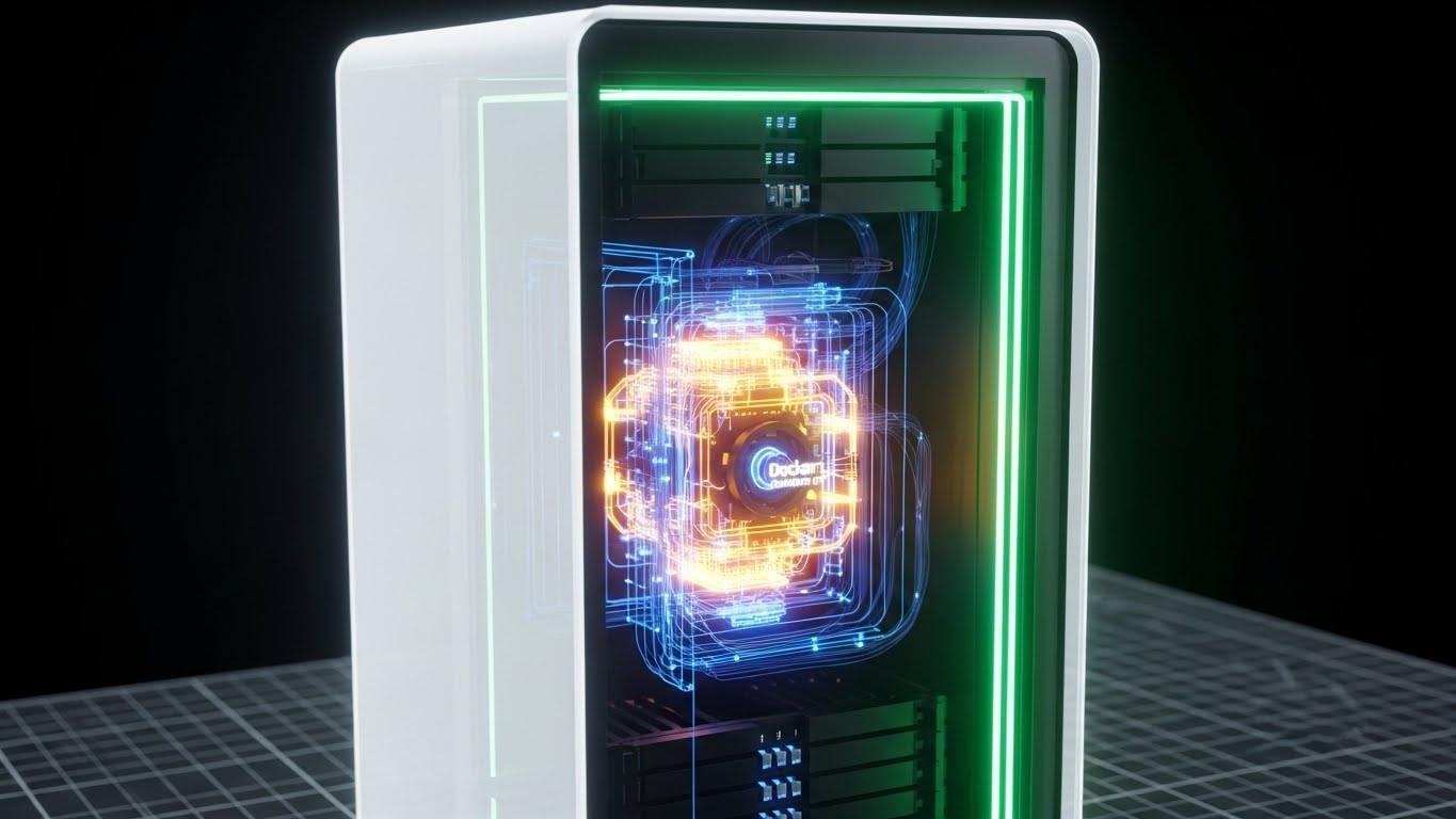
Visualization Scenario: We zoom in on a stylized server rack unit. The outer casing is rendered in semi-transparent White glass. As the camera pushes in, the casing reveals a glowing internal "engine"—the Docker logic or orchestration layer—pulsing in Amber and Blue. The background is a technical blueprint grid in light grey, reinforcing the engineering context.
Narration Style: Technical, deep, and analytical.
Psychological Impact & KPI Focus
- Niche Psychology: This caters to the "Curiosity Gap." Engineers always want to know "how it works under the hood." The X-ray effect satisfies this intellectual itch, suggesting transparency and depth. It visually proves that your solution isn't just a pretty UI wrapper.
- Operational Impact: Visualizes Container Logic and Resource Efficiency.
- KPI: Product Understanding / Feature Adoption.
Strategic Implementation & Trade-offs
- Optimal Duration: 15-20 seconds.
- Trade-off: This is visualization for the sake of "Cool Factor" and "Depth." It doesn't show the actual UI, so it must be paired with Style 19 (UI Montage) to connect the engine to the user experience.
Companies using similar video content -
Docker – Container Platform – Revealing the internal logic and efficiency of containers.
Kubernetes – Container Orchestration – Showing the inner workings of pod scheduling and resource allocation.
ScienceLogic – SL1 – Providing deep visibility into IT infrastructure components.
8. Rapid UI Feature Montage
MOFU | Demo Request
The Visual & Narrative Approach
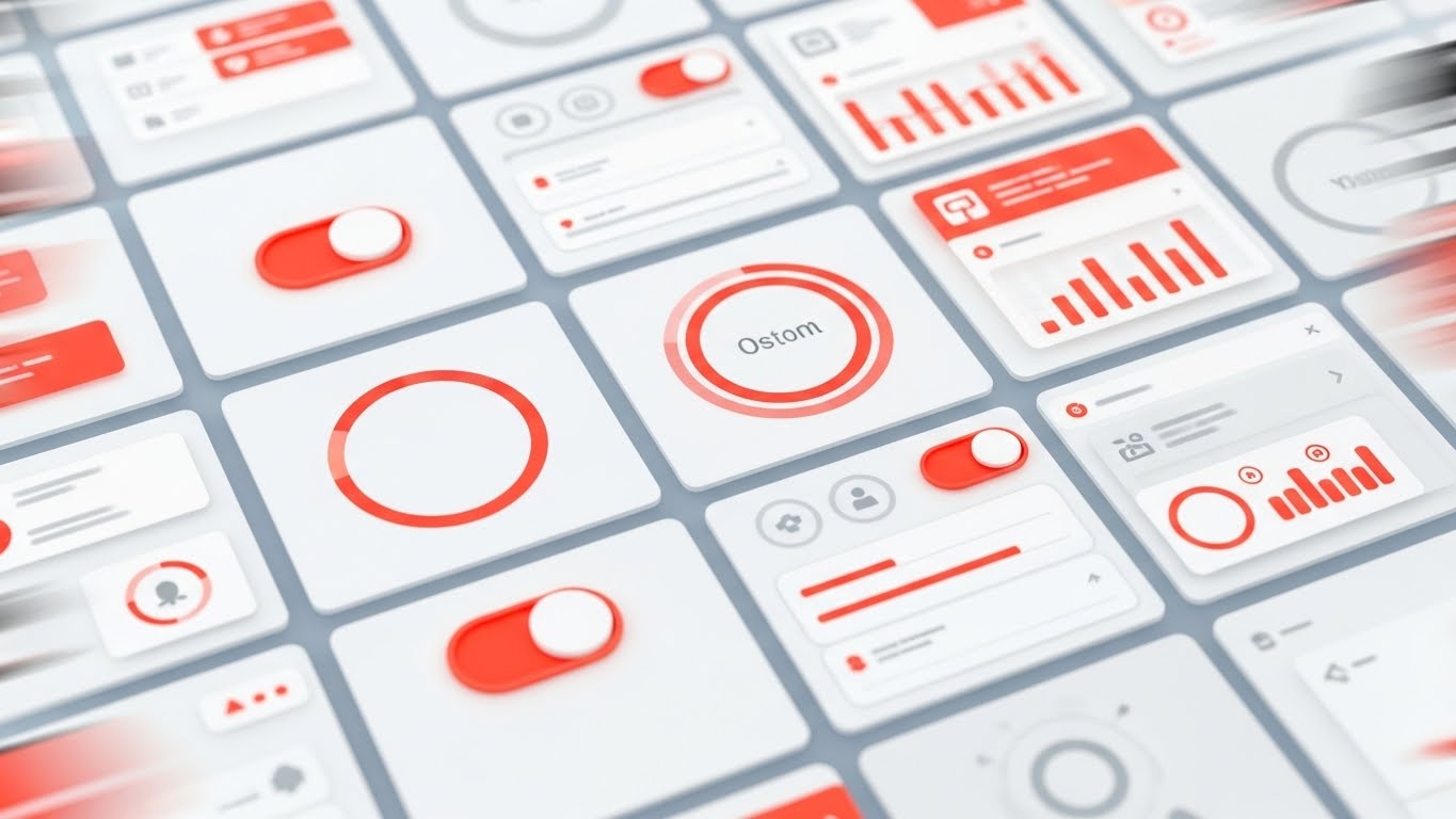
Visualization Scenario: A high-energy composition of high-fidelity UI screens. Abstracted dashboards fly in from the corners, overlapping and tiling. We see specific "Success" metrics represented by rising graphs and status indicators. Note: While the reference image creates energy with warm Orange accents, the strategic application for your brand should emphasize Emerald Green to signify "Health" and "Status OK". The camera movement is dynamic, suggesting that the platform offers speed and comprehensive visibility.
Narration Style: Fast, benefit-driven, and confident.
Psychological Impact & KPI Focus
- Niche Psychology: This style builds Social Proof and Value Density. By showing many screens rapidly, you subliminally communicate that the platform is feature-rich and robust. It overwhelms the viewer (in a positive way) with the sheer breadth of capabilities.
- Operational Impact: Visualizes UX Velocity and Single Pane of Glass.
- KPI: Conversion Rate (Demo Request).
Strategic Implementation & Trade-offs
- Optimal Duration: 10-20 seconds.
- Trade-off: Viewers cannot read the details. Do not use this to teach a specific feature. Use it to sell the breadth of the suite.
Companies using similar video content -
Azure DevOps – Azure Pipelines – Showcasing comprehensive CI/CD dashboards and metrics.
Octopus Deploy – Continuous Delivery – Highlighting extensive release orchestration and insights.
CloudBees – Software Delivery Platform – Presenting a breadth of integrated CI/CD features.
9. Abstract 2D Flat Vector Organic
MOFU | Re-engagement

The Visual & Narrative Approach
Visualization Scenario: Code integration (merging) is often painful. This style visualizes it as a seamless, fluid process. We use abstract 2D flat vectors with a glossy, organic finish. Two separate streams of fluid—one Coral, one Peach—flow towards each other and merge effortlessly into a single, strong Soft Cream stream. There is no splashing, no turbulence—just a smooth, satisfying combination.
Narration Style: Soothing, calm, and reassuring.
Psychological Impact & KPI Focus
- Niche Psychology: This style targets the emotional relief of Frictionless Collaboration. It is a visual metaphor for the "Git Merge" process without the conflict. The smooth, viscous motion is soothing and satisfying, subconsciously reassuring the viewer that the platform handles conflicts gracefully.
- Operational Impact: Visualizes Integration and Collaboration.
- KPI: Re-engagement Rate.
Strategic Implementation & Trade-offs
- Optimal Duration: 5-10 seconds (Loop).
- Trade-off: It is highly metaphorical. If the audience is strictly left-brained, they might find it too "artsy." Anchor it with a clear text overlay like "Seamless Merge Requests."
Companies using similar video content -
GitHub – GitHub Flow – Visualizing seamless code integration and pull request merges.
Atlassian – Bitbucket – Depicting frictionless code merging and collaboration streams.
GitLab – GitLab Flow – Showing fluid, conflict-free code integration processes.
10. Wireframe to Reality Transition
MOFU | Functional Buyer
The Visual & Narrative Approach
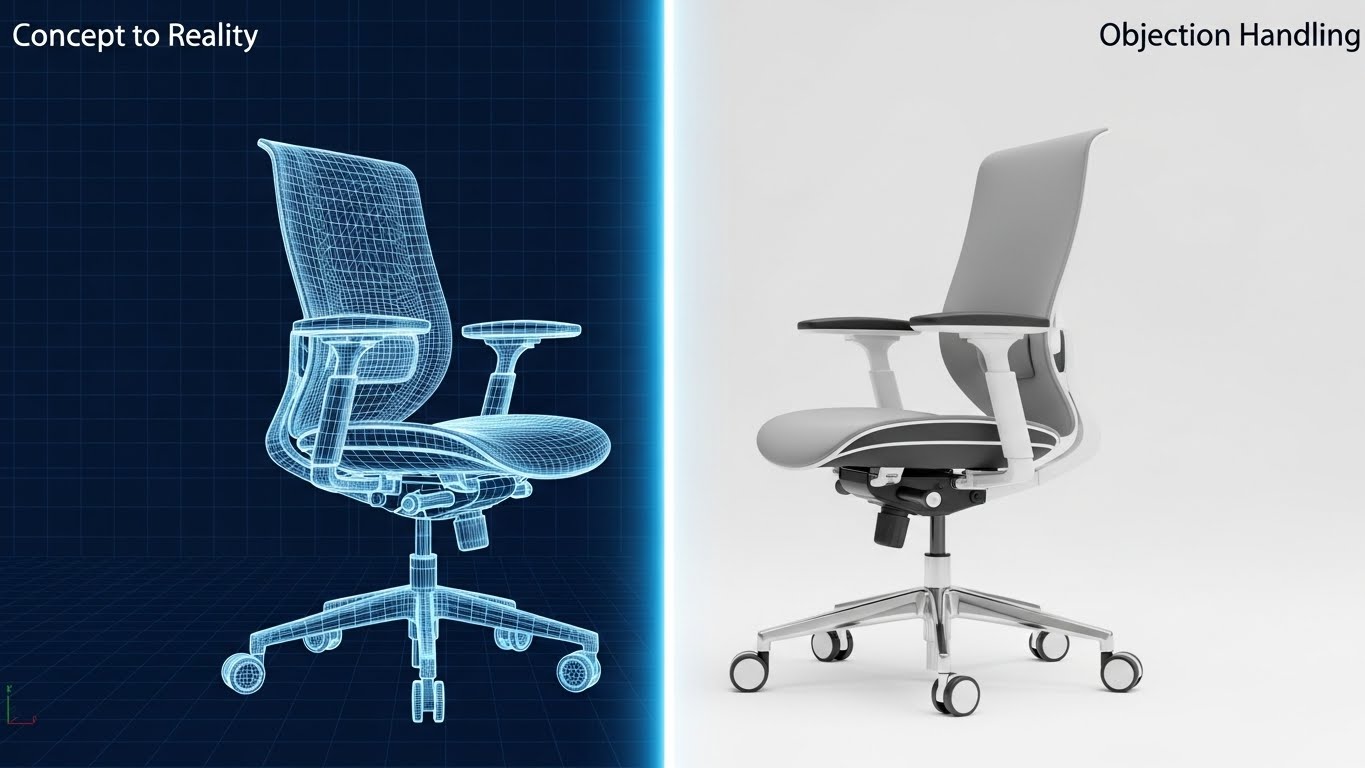
Visualization Scenario: This style perfectly illustrates "Infrastructure as Code" (IaC). The screen is split. The left half displays a technical wireframe blueprint (Blueprint Blue lines on white). As the object crosses a glowing digital scan beam to the right, it instantly transforms into a photorealistic, metallic 3D structure. Note: While the reference image uses a chair to demonstrate the fidelity of the transition, for CI/CD, this same technique is applied to server racks or container pods.
Narration Style: Definitive, precise, and engineering-focused.
Psychological Impact & KPI Focus
- Niche Psychology: This validates the Determinism & Precision of the platform. It proves that "What you code is what you get." The stark contrast between the schematic and the real object emphasizes the fidelity of the provisioning process.
- Operational Impact: Visualizes Provisioning Accuracy and Planning vs. Execution.
- KPI: Qualified Lead Generation.
Strategic Implementation & Trade-offs
- Optimal Duration: 15-30 seconds.
- Trade-off: The transition must be seamless. If the wireframe doesn't match the render perfectly, it implies "Config Drift" (a negative). Precision in execution is mandatory.
Companies using similar video content -
Pulumi – Infrastructure as Code – Demonstrating precise provisioning from code to cloud resources.
AWS – CloudFormation – Illustrating infrastructure deployment from template to reality.
OpenTofu – IaC – Showing declarative infrastructure transforming into tangible assets.
11. 2D Line Art Animation
MOFU | Overcoming Objections

The Visual & Narrative Approach
Visualization Scenario: We strip away the noise to focus on pure logic. Against a stark, confident Pure White background, a single, thin Black line animates in the center. Initially, it forms a tight, vibrating, chaotic knot, representing the frustration of "Dependency Hell" and circular references. Gracefully, the line begins to loosen and untangle itself. It moves with fluid, mathematical precision, straightening into a streamlined vector that accelerates forward.
Narration Style: Minimalist, sophisticated, and relieving. "Complexity, simplified."
Psychological Impact & KPI Focus
- Niche Psychology: This style targets Cognitive Ease. Senior Architects are often exhausted by the mental overhead of maintaining complex toolchains. This visual acts as a "palate cleanser," subliminally promising that your platform removes friction rather than adding to it. It validates the desire for elegant, parsimonious solutions.
- Operational Impact: Visualizes Simplification and Dependency Resolution.
- KPI: Time on Page / Bounce Rate Reduction.
Strategic Implementation & Trade-offs
- Optimal Duration: 6-10 seconds (Looping GIF or Hero element).
- Trade-off: It is abstract. It addresses the emotion of the objection (fear of complexity) but doesn't show the technical resolution. Use it to set the tone before diving into technical documentation.
Companies using similar video content -
Spacelift – IaC Management – Untangling complex infrastructure dependencies and workflows.
Code Climate – Velocity – Simplifying code complexity and identifying bottlenecks.
SonarQube – Code Quality – Visualizing the resolution of code quality issues.
12. Split Screen: Optimized Reality vs. UI
MOFU | Competitive Displacement
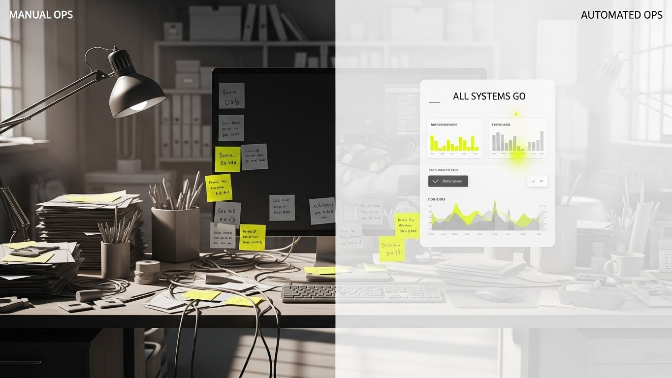
The Visual & Narrative Approach
Visualization Scenario: A split-screen composition divides the viewer's reality. The left side ("Manual Ops") creates visceral discomfort: a desaturated, cluttered desk buried under physical post-it notes, tangled wires, and a monitor showing a dark terminal with error logs. The right side ("Automated Ops") is a breath of fresh air: a pristine, floating UI dashboard with "All Systems Go" indicators glowing in Vivid Lime and clean white metrics. A "wipe" transition physically erases the clutter, replacing it with digital order.
Narration Style: Provocative, comparative, and solution-oriented.
Psychological Impact & KPI Focus
- Niche Psychology: This leverages Loss Aversion and Cognitive Dissonance. By placing the painful reality of manual toil directly next to the idealized solution, you create a psychological gap the viewer feels compelled to close. It validates their current stress while offering an immediate escape hatch.
- Operational Impact: Visualizes Operational Hygiene and Automation vs. Toil.
- KPI: Click-Through Rate (CTR) / Free Trial Sign-up.
Strategic Implementation & Trade-offs
- Optimal Duration: 15-30 seconds.
- Trade-off: It can feel aggressive. Ensure the "Manual" side isn't so exaggerated that it feels like a caricature; it must resemble the actual "late-night debugging" struggle to resonate authentically.
Companies using similar video content -
Harness – Software Delivery Platform – Contrasting manual toil with automated, efficient deployments.
ServiceNow – SPM – Showing the transformation from chaotic operations to streamlined service management.
Jellyfish – Engineering Management – Highlighting the shift from fragmented data to unified insights.
13. Aspirational Stock Montage
BOFU | Building Trust

The Visual & Narrative Approach
Visualization Scenario: We shift focus from the code to the people shipping it. A high-quality, cinematic shot shows a diverse engineering team gathered around a monitor in a sunlit, glass-walled modern office. They are high-fiving and smiling with genuine relief as a prominent "GREEN BUILD: SUCCESS" notification glows on the screen. The lighting is warm and natural, contrasting with the cold stereotypes of IT basements.
Narration Style: Authentic, human-centric, and culture-focused.
Psychological Impact & KPI Focus
- Niche Psychology: DevOps has a high burnout rate. This style sells Psychological Safety and Team Cohesion. It suggests that your platform doesn't just run scripts; it fosters a winning culture where deployments are cause for celebration, not anxiety. It appeals to the VP of Engineering who worries about retention.
- Operational Impact: Visualizes Team Morale and Release Reliability.
- KPI: Brand Sentiment / Talent Acquisition.
Strategic Implementation & Trade-offs
- Optimal Duration: 30-60 seconds.
- Trade-off: Stock footage can destroy trust if it looks "fake." The actors must look like real engineers, and the screen content must be specific to your platform to anchor the emotion in reality.
Companies using similar video content -
Atlassian – Jira Software – Fostering team collaboration and celebrating successful sprints.
GitLab – DevSecOps Platform – Promoting a culture of shared success and secure releases.
CircleCI – CI/CD – Emphasizing team morale and reliable, celebrated deployments.
14. Photorealistic 3D Renders
BOFU | ROI Justification

The Visual & Narrative Approach
Visualization Scenario: To satisfy the Economic Buyer (CFO), we turn abstract efficiency into physical assets. In a studio-lit environment with a professional Deep Green background, metallic cubes rendered in Platinum and Gold stack rapidly to form a steep, upward-trending growth chart. A glowing Cyan arrow weaves through the rising stacks. The materials look heavy and expensive, implying that the data being visualized represents hard currency and solid structural growth.
Narration Style: Financial, confident, and C-Suite appropriate.
Psychological Impact & KPI Focus
- Niche Psychology: This appeals to the Financial Mindset. It moves the conversation from "software costs" to "asset accumulation." By rendering metrics as precious metals, you subconsciously communicate stability, wealth, and enterprise-grade value.
- Operational Impact: Visualizes ROI, Cost Savings, and Resource Efficiency.
- KPI: Deal Velocity / Stakeholder Buy-in.
Strategic Implementation & Trade-offs
- Optimal Duration: Static Image or 10-second loop.
- Trade-off: It is purely metaphorical. It explains value, not function. It works best as a "punctuation mark" in a pricing presentation, not as a technical explainer.
Companies using similar video content -
CloudZero – Cloud Cost Management – Visualizing cost savings and ROI as accumulating assets.
Apptio – FinOps – Representing financial efficiency and value accumulation in cloud spend.
ValueOps – VSM – Showing the architectural growth of business value and financial impact.
15. Futuristic Neon/Dark Mode
BOFU | Risk Mitigation
The Visual & Narrative Approach
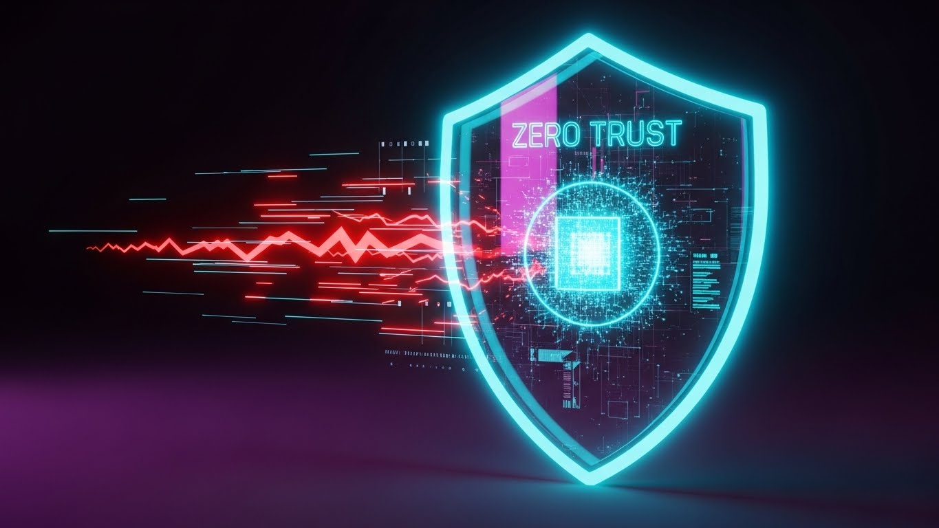
Visualization Scenario: Security is invisible until it fails. This style makes protection tangible. A glowing, translucent "Zero Trust" shield in Neon Cyan pulses around a central core of data. Jagged, red "threat" particles rush in from the surrounding Deep Purple darkness but are disintegrated upon contact with the shield. The visual effect is one of active, impenetrable defense.
Narration Style: Intense, protective, and robust.
Psychological Impact & KPI Focus
- Niche Psychology: This targets Security Anxiety and Loss Aversion. In an era of supply chain attacks, stakeholders need to feel safe. The "Force Field" metaphor is universally understood as a symbol of invulnerability. The "Dark Mode" aesthetic aligns with the preferences of SecOps teams.
- Operational Impact: Visualizes Threat Mitigation and DevSecOps Compliance.
- KPI: Trust Score / Security Page Conversion.
Strategic Implementation & Trade-offs
- Optimal Duration: 15-20 seconds.
- Trade-off: Can feel "game-like." Use it to sell the concept of robust defense, but pair it with hard compliance badges (SOC2, ISO 27001) to ground the visual in reality.
Companies using similar video content -
Checkmarx – One – Visualizing a "Zero Trust" shield protecting software supply chains.
Snyk – Developer Security – Depicting active defense against vulnerabilities in code.
Palo Alto Networks – Prisma Cloud – Showing robust cloud security and threat mitigation.
16. Hyper-lapse Stock Footage
BOFU | Sales Acceleration

The Visual & Narrative Approach
Visualization Scenario: A dizzying high-angle aerial shot of a massive cityscape during the day. The footage is sped up (hyper-lapse), turning the traffic into long streaks of Electric Blue and Data White light. This real-world energy is used to represent the global scale of your deployment network. It connects the digital speed of your pipeline to the physical reality of a 24/7 global economy.
Narration Style: Fast-paced, global, and energetic.
Psychological Impact & KPI Focus
- Niche Psychology: This visualizes Scale and Ubiquity. For enterprises deploying to multiple regions, this style reassures them that your platform can handle the load. It triggers the "Big City" association—complex, busy, and never sleeping.
- Operational Impact: Visualizes High Availability, Low Latency, and Global Reach.
- KPI: Ad Impressions / Brand Authority.
Strategic Implementation & Trade-offs
- Optimal Duration: 10-15 seconds (Vertical Format).
- Trade-off: Generic city footage is common. You must overlay specific text like "Deploy to 5 Regions in 5 Seconds" to anchor the visual to your specific technical value proposition.
Companies using similar video content -
Akamai – CDN – Representing global content delivery and low-latency network speed.
Cloudflare – Global Network – Visualizing worldwide traffic management and high availability.
Fastly – Edge Cloud – Showcasing rapid global deployments and distributed network reach.
17. Generative AI Realistic Character
BOFU | LinkedIn Video

The Visual & Narrative Approach
Visualization Scenario: A Gen-AI created video featuring a distinguished silver-haired CIO standing in a modern, open-plan office. He looks confidently at a floating holographic glass tablet displaying strategic metrics like DORA scores and budget projections. The lighting is cinematic with natural bokeh. He exudes control and foresight. This is a "mirror" for your target buyer—it represents the leader they aspire to be.
Narration Style: Thought-leadership, visionary, and peer-to-peer.
Psychological Impact & KPI Focus
- Niche Psychology: This leverages Identity Alignment. It appeals to the aspiration of the Executive Buyer to move from "firefighting" to "strategizing." This visual validates their role and shows your platform as the tool that empowers that strategic oversight.
- Operational Impact: Visualizes Strategic Control and Business Alignment.
- KPI: Lead Quality (C-Level).
Strategic Implementation & Trade-offs
- Optimal Duration: 15-30 seconds.
- Trade-off: AI characters can sometimes fall into the "Uncanny Valley." Ensure the lip-sync and facial movements are high-fidelity to maintain credibility and authority.
Companies using similar video content -
Planview – VSM – Featuring a visionary leader empowered by strategic insights.
Digital.ai – DevOps Platform – Showcasing executive control and foresight in software delivery.
IBM – Watson AIOps – Presenting a confident leader leveraging AI for operational oversight.
18. Holographic UI over 3D Render
BOFU | Objection Handling

The Visual & Narrative Approach
Visualization Scenario: A first-person POV shot. A realistic hand (suggesting a professional environment) reaches out to interact with a floating 3D holographic padlock icon. As the finger touches it, the lock pulses with a digital "Unlock" animation in Hologram Blue against a blurred, clean white background. This visualizes Identity Access Management (IAM). It makes the abstract concept of "permissions" feel tangible, immediate, and easy to control.
Narration Style: Tactile, precise, and empowering.
Psychological Impact & KPI Focus
- Niche Psychology: This addresses the need for Control. Security configurations are often hidden in config files. Visualizing them as a tactile "button" or "lock" gives the viewer a sense of agency. It makes security feel manageable rather than burdensome.
- Operational Impact: Visualizes Access Control and Ease of Administration.
- KPI: Retargeting Conversion Rate.
Strategic Implementation & Trade-offs
- Optimal Duration: 6-10 seconds.
- Trade-off: It simplifies a complex process into a single interaction. It is excellent for highlighting specific features (like SSO or MFA) but fails to show the broader workflow.
Companies using similar video content -
Okta – Identity Cloud – Visualizing tactile control over identity and access management.
HashiCorp – Vault – Depicting secure secrets management with interactive holographic elements.
Auth0 – Identity Platform – Showing intuitive control over user authentication and permissions.
20. Dark Mode UI Showcase
BOFU | Technical Buyer
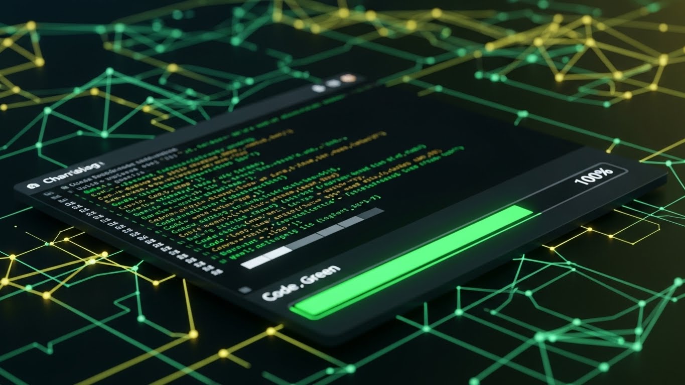
The Visual & Narrative Approach
Visualization Scenario: We end with the developer's home turf. A sleek, high-contrast Dark Mode UI screen rests on a digital surface. It displays a clean terminal window with scrolling logs in "Code Green" syntax highlighting. A progress bar hits "100%" with a satisfying glow. The background is a professional Charcoal/Black mesh. This is pure "Developer Experience" (DX)—clean, high-contrast, and easy on the eyes for late-night deployment sessions.
Narration Style: Technical, efficient, and "for developers, by developers."
Psychological Impact & KPI Focus
- Niche Psychology: This targets Tribal Belonging. Developers often reject tools that look too "corporate" or "marketing-heavy." Dark mode is a shibboleth—it signals that you understand their workflow and preferences. It validates the product as a serious engineering tool.
- Operational Impact: Visualizes Developer Experience (DX) and Log Visibility.
- KPI: Developer Sign-ups / Documentation Engagement.
Strategic Implementation & Trade-offs
- Optimal Duration: Static Image or 15-30 second walkthrough.
- Trade-off: It may look "scary" or unintuitive to non-technical business stakeholders. Keep this visual on pages targeted specifically at the engineering implementation team.
Companies using similar video content -
Datadog – Unified Monitoring – Showcasing a wide array of dashboards for comprehensive visibility.
Grafana Labs – Grafana Enterprise – Highlighting extensive monitoring and analytics capabilities.
Splunk – Observability Cloud – Presenting a broad suite of operational intelligence screens.
21. Minimalist Flat 2D Vector
Onboard | Accel TTV

The Visual & Narrative Approach
Visualization Scenario: The "Time to Value" (TTV) gap is the silent killer of SaaS adoption. We visualize the solution as pure, unadulterated velocity. A stylized, geometric rocket ship in Vibrant Orange and Jet Black launches vertically out of an open laptop screen. It leaves a trailing exhaust cloud of Sky Blue circles against a pristine Cloud White background. The style is flat, vector-based, and uses hard shadows to create a "sticker" aesthetic that feels modern and lightweight.
Narration Style: Energetic, brief, and congratulatory. "Liftoff in 3... 2... 1."
Psychological Impact & KPI Focus
- Niche Psychology: This targets the Dopamine Loop of the "Hello World" moment. Developers often dread the "configuration tax" of new tools. The "Rocket" metaphor, while classic, is used here to signify that the platform lifts the heavy infrastructure load, allowing them to fly immediately. It validates the "Quick Start" promise.
- Operational Impact: Visualizes Rapid Provisioning and Instant Environment Setup.
- KPI: Activation Rate / First Project Created.
Strategic Implementation & Trade-offs
- Optimal Duration: 3-5 seconds (GIF or Loop).
- Trade-off: It is symbolic, not technical. It confirms the feeling of speed but doesn't show the method of configuration. Use this in the "Welcome" email to maintain excitement, but pair it with a "Get Started" button.
Companies using similar video content -
JetBrains – IntelliJ IDEA – Displaying a sleek, high-contrast developer environment.
VS Code – Editor – Showcasing a clean terminal with syntax highlighting for developers.
PagerDuty – Operations Cloud – Presenting incident response dashboards optimized for low-light conditions.
22. 2D Graphics Over Live Action
Onboard | Reduce Friction
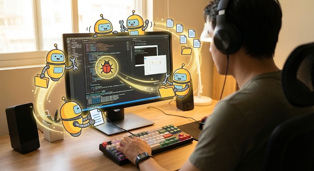
The Visual & Narrative Approach
Visualization Scenario: We see a live-action, over-the-shoulder shot of a developer working at a mechanical keyboard. The lighting is warm and authentic (not a sterile stock studio). Superimposed over their physical monitor are cute, stylized 2D "Helper Bots" in Cartoon Yellow and Black. These bots are animated to look like they are physically "cleaning" the code—sweeping away bugs, organizing file folders, and connecting wires. It bridges the physical reality of the user with the digital assistance of the platform.
Narration Style: Friendly, supportive, and partner-centric.
Psychological Impact & KPI Focus
- Niche Psychology: This style reduces Isolation. Coding can be a lonely, high-pressure activity. By personifying the platform as a "helper," you create a sense of partnership. It lowers the barrier to asking for help and frames the AI/Automation features as subservient assistants rather than replacements.
- Operational Impact: Visualizes Automated Linting, Bug Detection, and Refactoring Support.
- KPI: Feature Adoption (Automation Tools).
Strategic Implementation & Trade-offs
- Optimal Duration: 15-30 seconds.
- Trade-off: Requires high-quality live-action footage. If the stock footage looks too "corporate" (e.g., people in suits shaking hands), developers will tune out. It must look like a real dev environment (hoodies, stickers on laptops, dark IDE themes).
Companies using similar video content -
Vercel – Frontend Cloud – Visualizing instant deployments and zero-config project launches.
Netlify – Developer Platform – Depicting rapid site launches and continuous deployment.
Heroku – Platform as a Service – Showing quick application deployment with minimal setup.
23. Clean UI Workflow (Light)
Onboard | Self-Serve
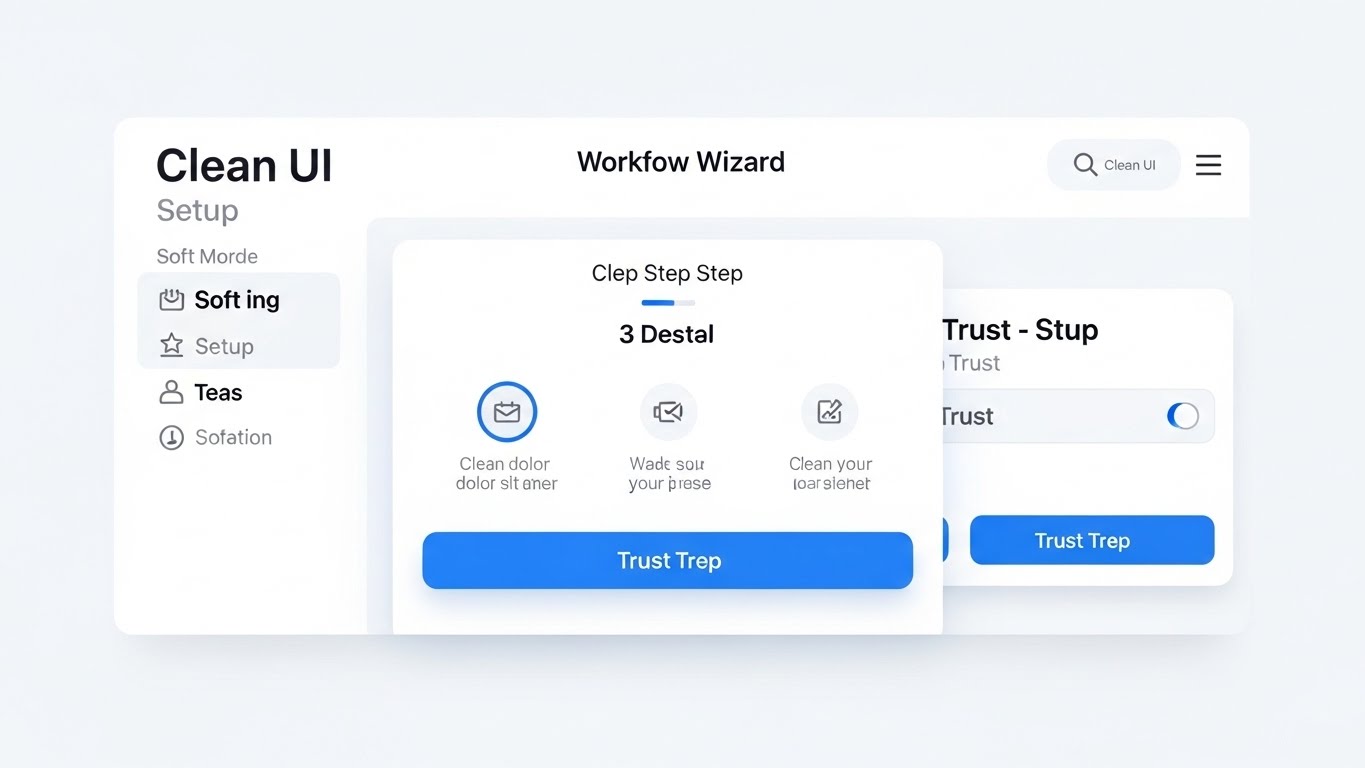
The Visual & Narrative Approach
Visualization Scenario: While Dark Mode is for coding, Light Mode conveys clarity for configuration. This style showcases a pristine, simplified "Wizard" interface. The background is a soft, matte White. Large, rounded buttons in Trust Blue guide the user through a 3-step setup process. Shadows are soft and diffused (neumorphism). The cursor moves smoothly, selecting options with a satisfying "click" animation that ripples. It makes complex YAML configuration look like a consumer app experience.
Narration Style: Clear, slow-paced, and instructional.
Psychological Impact & KPI Focus
- Niche Psychology: This lowers Cognitive Load. Initial setup is often the most stressful part of a new tool. The ample whitespace and "Step-by-Step" visualization reassure the user that they cannot make a mistake. It creates a psychological "safety net."
- Operational Impact: Visualizes Ease of Setup, Wizard-Driven Config, and User-Centric Design.
- KPI: Onboarding Completion Rate.
Strategic Implementation & Trade-offs
- Optimal Duration: 30-45 seconds.
- Trade-off: It simplifies the reality. If your actual UI is cluttered and complex, this video will create an "Expectation vs. Reality" gap. This style works best for idealized "Getting Started" flows.
Companies using similar video content -
GitHub – Copilot – Illustrating AI coding assistance directly within a developer's workflow.
Pieces.app – AI Assistant – Showing intelligent help bots organizing code and providing context.
Sourcegraph – Code AI – Depicting augmented code navigation and understanding.
24. 2D Character-Driven Story
Onboard | Trial Activation
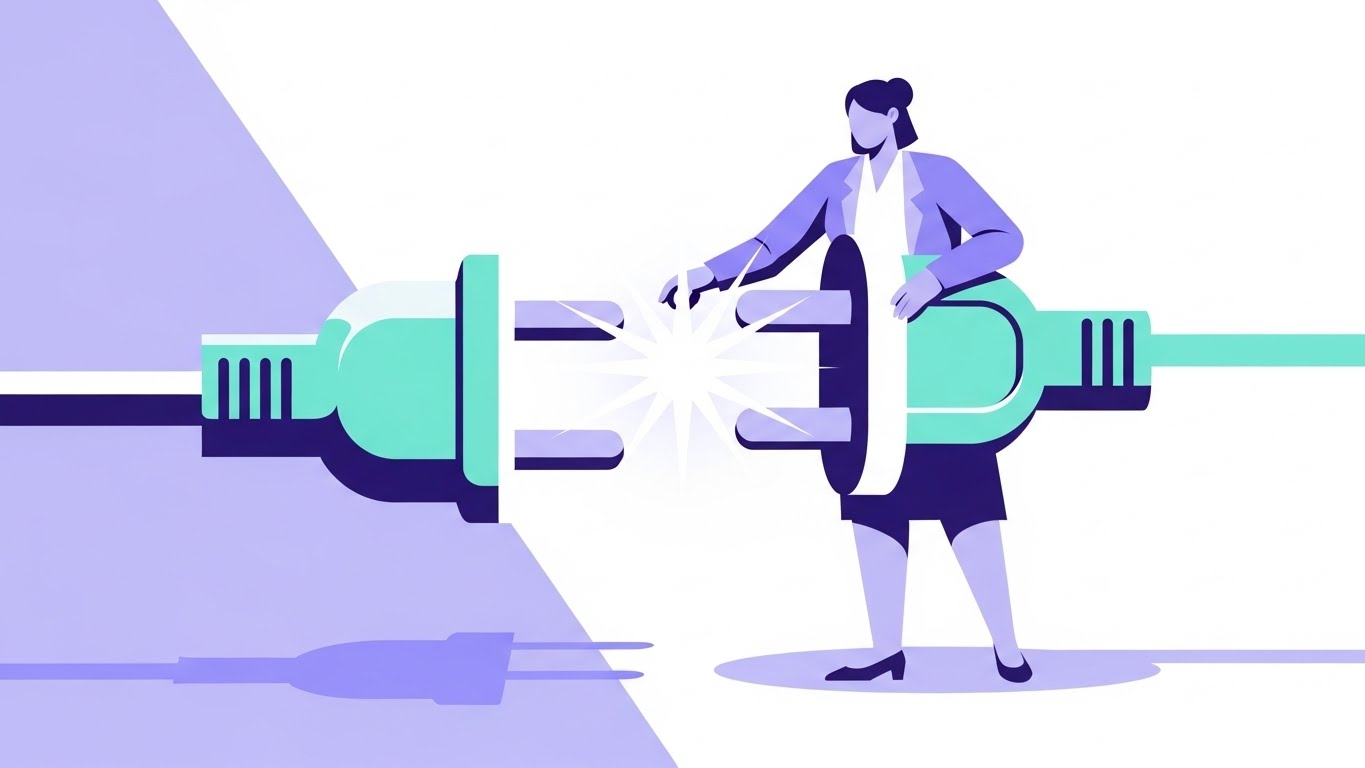
The Visual & Narrative Approach
Visualization Scenario: Integrations are the lifeblood of a pipeline. We visualize this with a stylized, professional female character (representing the Ops Lead) holding a massive, oversized plug. She effortlessly connects it to a matching socket held by the platform, creating a bright "Spark" of energy in Mint Green and Lavender. The background is a split tone of soft purple and white. It humanizes the technical act of API integration.
Narration Style: Relatable, story-driven, and result-oriented.
Psychological Impact & KPI Focus
- Niche Psychology: This targets the Fear of Incompatibility. Engineers worry that a new tool won't "play nice" with their existing stack (Jira, GitHub, AWS). This visual metaphor of a "Perfect Fit" alleviates that anxiety. It emphasizes that the platform is an ecosystem enabler, not a walled garden.
- Operational Impact: Visualizes Plugin Ecosystem, API Connectivity, and Interoperability.
- KPI: Integration Activation Rate.
Strategic Implementation & Trade-offs
- Optimal Duration: 15-30 seconds.
- Trade-off: Character animation can feel "childish" if the proportions are too cartoonish. Keep the characters professional (modern attire, confident posture) to maintain B2B credibility.
Companies using similar video content -
GitLab – Onboarding Wizard – Showcasing a simplified, step-by-step setup for new projects.
Azure DevOps – Project Setup – Guiding users through clear, intuitive configuration processes.
Coder – Cloud Development Environments – Presenting a clean UI for environment provisioning.
25. 3D Parallax UI Presentation
Retain | Deep Feature
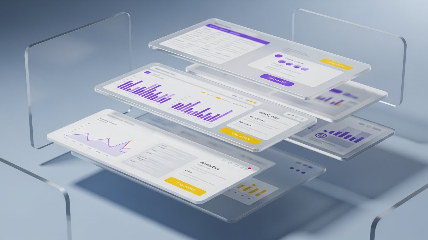
The Visual & Narrative Approach
Visualization Scenario: To show the robustness of the data model, we take a standard UI dashboard and "explode" it into 3D space. The interface layers separate, floating in mid-air against a Glassy Blue background. We see the "surface" metrics on the top layer, but the camera pans to reveal the deep analytics and log data on the layers beneath. It visually proves that the platform isn't just a pretty skin—it has depth.
Narration Style: Sophisticated, dimensional, and impressive.
Psychological Impact & KPI Focus
- Niche Psychology: This appeals to the Analytical Mind. Senior engineers and architects know that surface metrics can be misleading. By showing the "layers" of data, you visually demonstrate granular control and deep observability. It signals "Enterprise Grade" fidelity.
- Operational Impact: Visualizes Data Granularity, Drill-Down Capabilities, and Full-Stack Visibility.
- KPI: Feature Usage Depth / Time in App.
Strategic Implementation & Trade-offs
- Optimal Duration: 10-20 seconds.
- Trade-off: High production value is required. The UI assets must be high-resolution to withstand the close-up 3D pan. This is a "Hero" asset for your most complex features.
Companies using similar video content -
Zapier – Automation Platform – Humanizing API integrations and workflow connections.
MuleSoft – Anypoint Platform – Visualizing seamless connectivity between disparate systems.
Tray.io – General Automation Platform – Depicting effortless integration and workflow building.
26. 2D Animation & UI Composition
Retain | Reduce Support

The Visual & Narrative Approach
Visualization Scenario: A friendly, flat-design character (wearing a casual hoodie, representing a developer) stands next to a floating UI window. He smiles and points upward to a "Help/Docs" speech bubble that pops out from the interface. The palette is Friendly Orange and Blue. This visual is designed to be disarming and helpful, guiding the user to self-service resources rather than opening a ticket.
Narration Style: Encouraging, directive, and helpful. "Help is just a click away."
Psychological Impact & KPI Focus
- Niche Psychology: This addresses Frustration Tolerance. When a user gets stuck, they feel stupid or annoyed. The friendly character acts as a psychological buffer, normalizing the need for help. It reframes "reading the docs" from a chore into a quick, supported interaction.
- Operational Impact: Visualizes Contextual Help, Documentation Access, and Self-Service Support.
- KPI: Support Ticket Deflection Rate.
Strategic Implementation & Trade-offs
- Optimal Duration: 5-10 seconds (Loop).
- Trade-off: It must be placed strategically. If this pops up too often (like Clippy), it becomes annoying. Use it only when the user has been idle on a configuration screen for too long.
Companies using similar video content -
Honeycomb – Observability – Exploding data layers to reveal deep analytics and event details.
Lightstep – Distributed Tracing – Showing granular data drill-down across service dependencies.
SigNoz – Open-Source Observability – Presenting multi-layered telemetry data for full-stack visibility.
27. Macro UI Micro-Interactions
Retain | Reduce Churn
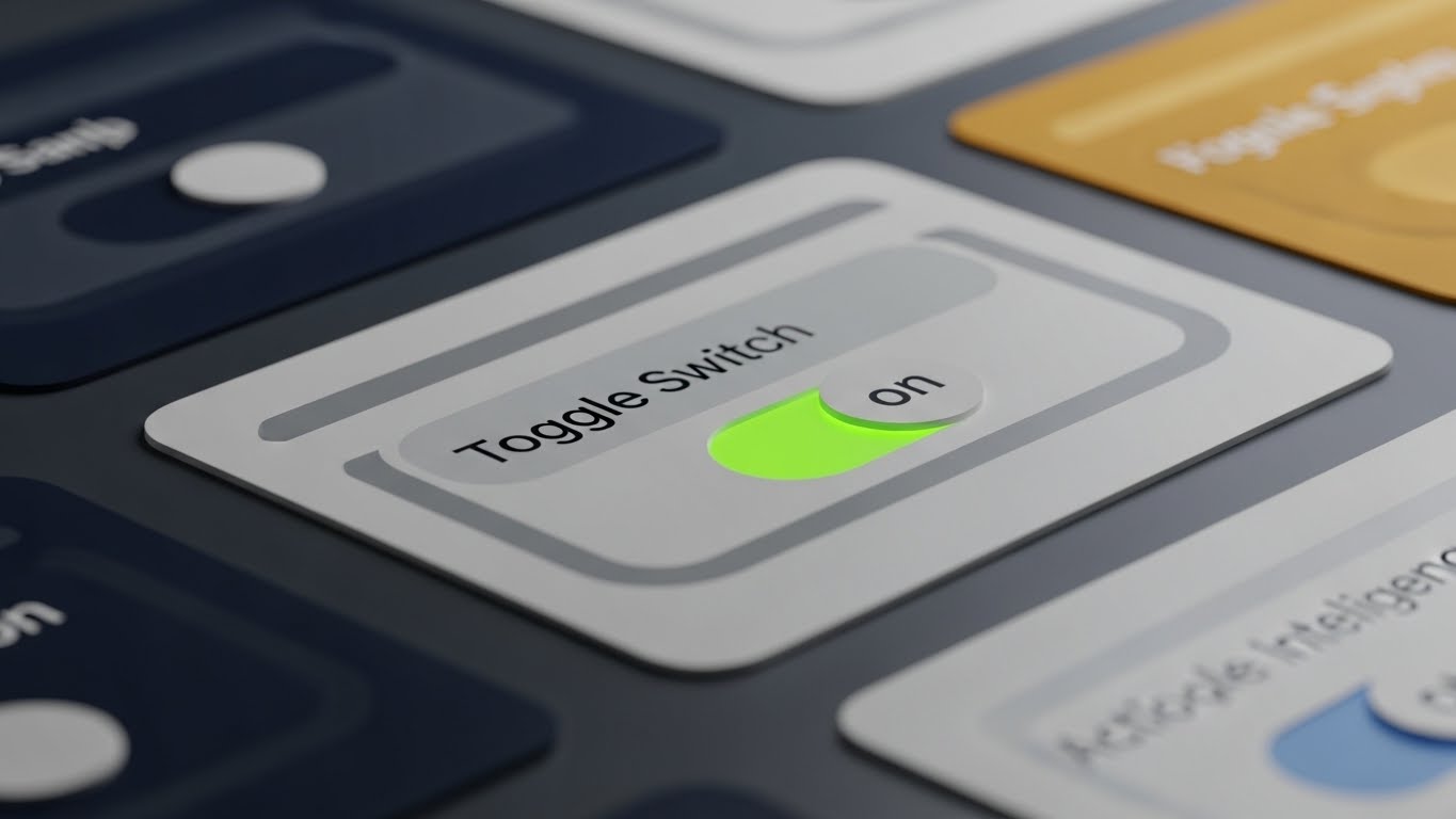
The Visual & Narrative Approach
Visualization Scenario: We focus on the tactile satisfaction of using the tool. An extreme close-up (macro) shot of a digital toggle switch. The texture is rendered like matte plastic. As it slides from "Off" to "On," it glows with a vivid, electric Green LED light. The movement is smooth and weighted. This visualizes a "Feature Flag" or a "Canary Deployment" being activated. It makes the abstract act of controlling traffic feel physical and satisfying.
Narration Style: Precise, satisfying, and "ASMR-like" in its focus on detail.
Psychological Impact & KPI Focus
- Niche Psychology: This leverages Haptic Perception (visually). Engineers love tools that "feel" good to use. High-quality micro-interactions signal attention to detail. If the buttons are this polished, the backend must be rock solid. It builds subconscious trust and "stickiness."
- Operational Impact: Visualizes Feature Flags, Kill Switches, and Instant Rollbacks.
- KPI: User Engagement / Session Frequency.
Strategic Implementation & Trade-offs
- Optimal Duration: 3-5 seconds (GIF).
- Trade-off: It is purely aesthetic. It conveys quality but no information. Use it to punctuate release notes (e.g., "New Feature Flags: Now Available").
Companies using similar video content -
Atlassian – Confluence – Guiding users to self-service documentation and help resources.
Zendesk – Support Suite – Illustrating contextual help and easy access to knowledge bases.
Intercom – Customer Messaging – Showing friendly in-app guidance and support prompts.
28. Lifestyle Stock with UI Overlay
Retain | Referrals

The Visual & Narrative Approach
Visualization Scenario: A candid, high-quality stock photo of two colleagues (diverse, professional) sitting side-by-side in a sunlit office. They are pointing at a laptop screen, smiling—not a fake "stock photo smile," but a look of genuine problem-solving or shared success. Overlaid on the screen area is a subtle, semi-transparent Blue UI grid representing your platform's dashboard.
Narration Style: Human, collaborative, and team-oriented.
Psychological Impact & KPI Focus
- Niche Psychology: This targets Social Proof and Tribalism. DevOps is a team sport. Visualizing successful collaboration subliminally suggests that "high-performing teams use this tool." It shifts the value prop from "personal productivity" to "team velocity."
- Operational Impact: Visualizes Collaboration and Peer Review.
- KPI: Referral Rate / Case Study Engagement.
Strategic Implementation & Trade-offs
- Optimal Duration: Static Image or 6-second motion loop.
- Trade-off: Authenticity is key. If the stock photo looks staged, it damages the brand. Use "candid" style photography where the subjects are focused on the work, not the camera.
Companies using similar video content -
LaunchDarkly – Feature Flags – Focusing on the satisfying control of toggling features on/off.
Split – Feature Experimentation – Highlighting precise control over release and rollback mechanisms.
Optimizely – Experimentation Platform – Emphasizing tactile control over A/B tests and feature rollouts.
29. Isometric 3D Workflow (Pure)
Expand | In-App Upsell

The Visual & Narrative Approach
Visualization Scenario: Your platform grows with the client. We visualize this as a sprawling Isometric City. The central district (the core product) is established in Blue and White. As the video progresses, new districts (Premium Features) pop up on the perimeter in Vibrant Orange—skyscrapers representing "Advanced Security," factories representing "Build Runners," and power plants representing "Analytics." It invites the user to expand their territory.
Narration Style: Grand, expansive, and growth-oriented.
Psychological Impact & KPI Focus
- Niche Psychology: This targets the Empire Builder mindset of the CIO. It visualizes "Scale" not as a burden, but as a thriving, organized metropolis. It frames the Upsell not as a cost, but as an expansion of their digital territory.
- Operational Impact: Visualizes Scalability, Modularity, and Ecosystem Growth.
- KPI: Expansion Revenue (Upsell/Cross-sell).
Strategic Implementation & Trade-offs
- Optimal Duration: 15-30 seconds.
- Trade-off: Complexity can be overwhelming. Use color coding (e.g., Orange for "New Premium Features") to distinguish the upsell elements from the core infrastructure.
Companies using similar video content -
Slack – Collaboration Hub – Showcasing teams collaborating effectively with integrated dashboards.
Microsoft – Teams – Depicting productive team interactions with overlaid project metrics.
Asana – Work Management – Visualizing collaborative workflows and shared project success.
30. Abstract Organic + Minimalist
Expand | Proactive Support

The Visual & Narrative Approach
Visualization Scenario: A hybrid of abstract organic shapes and minimalist design. Soft, morphing blobs in Soft Pink and Gradient Purple flow gently across a white background. They merge and transform, eventually taking the shape of a sleek Notification Bell icon. The motion is liquid and soothing, designed to grab attention without causing alarm.
Narration Style: Gentle, modern, and informing.
Psychological Impact & KPI Focus
- Niche Psychology: This targets Receptivity. System notifications are often associated with errors (Red alerts). By using organic, soft shapes and warm colors, you reframe the "Update" as a positive evolution rather than a critical warning. It opens the user's mind to receiving new information.
- Operational Impact: Visualizes Agility and Continuous Improvement.
- KPI: Feature Announcement Open Rate.
Strategic Implementation & Trade-offs
- Optimal Duration: 5-10 seconds.
- Trade-off: It is very abstract. It works best for soft announcements (newsletters, minor feature updates) rather than critical alerts. Do not use this style for downtime notifications.
The Visual Operations Doctrine: Strategic Knowledge Base
This section synthesizes the 30 visual styles into a cohesive business framework. It moves beyond "making videos" to establishing a Visual Operating System for your enterprise, ensuring every pixel drives adoption, velocity, and ROI.
Strategic Alignment & Visual Architecture
Pre-Production & Strategy – Defining the Visual Operating System.
- The Cognitive Load Audit: Before commissioning a video, audit the complexity of the process you are visualizing. If a pipeline config takes 50 steps, do not show 50 screens. Use Style 6 (Dynamic Data Viz) to summarize the logic rather than the labor.
- Role-Based Visual Mapping: Differentiate your visual assets by persona. Platform Engineers need Style 20 (Dark Mode UI) and Style 14 (X-Ray) to trust the specs. C-Suite Executives need Style 12 (Photorealistic ROI) to trust the value. Never send a generic asset to a segmented list.
- The "Glanceability" Standard: In a high-stress DevOps environment, information must be consumed instantly. Design your assets (especially Style 27 and Style 22) so the core message is understood in under 3 seconds—the time it takes to scroll past a LinkedIn post.
- Brand Voice Consistency: Your visual language must be unified. The "Blue" in your Isometric City (Style 29) must match the "Blue" in your Clean UI (Style 23). This subconscious consistency builds trust across disparate modules of your platform.
- The Advids Strategic Audit: Partner with Advids early in the process. We don't just animate; we define your "Visual Topology"—mapping which styles belong to which stage of the customer journey to maximize retention and comprehension.
- Standardization vs. Customization: Use standardized Style 1 (Kinetic Typography) for repetitive announcements (e.g., version updates). Reserve bespoke, high-effort Style 4 (Gen AI Cinematic) for Tier 1 product launches.
- The Cross-Departmental Bridge: Use these visuals to unify terminology. If Sales calls it "Orchestration" and Product calls it "Management," use Style 3 (Abstract AI) to create a shared visual metaphor that aligns both teams.
- Legacy System Integration: Visualizing the invisible link between on-prem mainframes and cloud microservices is critical. Use Style 2 (Split Screen) to visually bridge the gap between "Old Iron" and "New Cloud," validating the hybrid reality of enterprise clients.
- Accessibility in Engineering: Motion graphics are a universal language. Use Style 9 (Low-Poly) to explain complex concepts to global teams where English might be a second language, ensuring the technical doctrine is understood regardless of geography.
- The Mobile-First Mandate: Even DevOps engineers check status on their phones. Ensure all 30 styles—especially Style 16 (Hyper-lapse)—are optimized for vertical scrolling, ensuring your message reaches the "on-call" engineer.
Operational Adoption & Implementation
Deployment – Embedding Visuals into the Engineering Workflow.
- Overcoming "Black Box" Anxiety: Engineers fear what they can't see. Use Style 7 (3D X-Ray) not just for marketing, but in your documentation to "open the box" and show the internal logic of your scheduler or load balancer.
- The Micro-Learning Shift: Replace 50-page PDF manuals with a library of Style 19 (Rapid UI) videos. Embed these 30-second clips directly into the IDE or CLI help commands for "Just-in-Time" learning.
- Just-in-Time Support: Embed Style 26 (Anim + UI) directly into your error messages. Instead of a text error code, pop a modal with a 10-second loop showing exactly how to fix the config drift.
- Gamification of Onboarding: Use Style 21 (Minimalist Vector) to celebrate small wins. When a user completes their first successful build, trigger the "Rocket Launch" animation. This dopamine hit reinforces the behavior.
- Reducing Support Ticket Volume: There is a direct correlation between proactive visual guides and reduced ticket load. Deploy Style 11 (Line Art) in your knowledge base to untangle complex concepts (like dependency resolution) before the user gets frustrated enough to open a ticket.
- Remote Onboarding: For distributed engineering teams, physical whiteboarding is impossible. Use Style 6 (Isometric Workflow) to replace the whiteboard, providing a definitive, shareable reference for system architecture.
- Standard Operating Procedures (SOPs): Transform dry text-based SOPs for "Incident Response" into Style 27 (Split Screen) videos that show "What to do vs. What NOT to do" during an outage.
- Feedback Loops: Use interactive video elements (Style 28) to gather feedback. Ask developers to "click the bug" in a video to test their situational awareness, turning training into an active loop.
- Scalable Localization: When expanding to new regions, Style 1 (Kinetic Typography) allows for rapid translation. You only need to change the text layer, not the entire animation, making global rollout efficient.
- Leadership Communication: Empower your internal champions. Give them Style 17 (Gen AI Character) assets to present to their own Boards, making them look like visionary leaders while selling your platform's value for you.
Measuring Impact & Future-Proofing
ROI & Evolution – Quantifying Success and Scaling.
- Beyond "Views": Do not measure video success by views. Measure it by Time-to-Competency. Did the new engineer deploy to prod faster after watching the Style 23 (Clean UI) tutorial?
- The "Idle Time" Metric: Correlate better visualization with reduced software navigation time. If Style 27 (Micro-Interactions) is working, users should spend less time fumbling with settings and more time coding.
- Compliance Velocity: How fast can your team absorb a new security standard (like SOC2)? Use Style 13 (Futuristic Neon) to visualize the new security perimeter, and measure the drop in compliance violations.
- Retention and Churn: High-quality UX visualization reduces "Value Gap." Use Style 25 (3D Parallax) in Quarterly Business Reviews (QBRs) to remind clients of the depth of value they are paying for, directly impacting renewal rates.
- The AI Visual Frontier: Prepare for the future where the dashboard generates the video. Imagine a Style 4 (Gen AI) video generated on-the-fly to explain a specific crash loop to a developer.
- Scalability of Assets: Build a "Visual Component Library." If you have the 3D assets for Style 29 (Isometric City), you can re-arrange them to visualize any new feature without starting from scratch.
- The Advids Partnership: As your platform scales, your visual language must evolve. Advids acts as your long-term guardian of this library, ensuring that as you add features, your visual story remains coherent and high-fidelity.
- Benchmarking Success: "Good enough" visuals are a competitive risk. If your competitor uses Style 12 (Photorealistic) and you use generic screen recordings, you lose the perception war before the feature war.
- The ROI of Psychological Safety: Quantify the reduction in "Deployment Anxiety." Teams that understand the pipeline through Style 2 (Line Art) make fewer errors and deploy more frequently.
- Final Call to Innovation: Treat video as Infrastructure, not content. Just as you invest in your backend code, invest in your visual code. It is the interface through which the world understands your logic.
Companies using similar video content -
HashiCorp – Consul – Visualizing a sprawling service mesh city and ecosystem growth.
Ansible – Automation Platform – Depicting infrastructure scaling and modular automation.
VMware – Tanzu – Showing a growing, interconnected cloud-native application landscape.
Author & Editor Bio


