
Introduction: Scripting the Future of Cinema Operations
The narrative that "cinema is dying" has been decisively rewritten. Instead, the industry is undergoing its most significant structural evolution since the transition to digital projection. We are witnessing a renaissance defined not just by what plays on the screen, but by the intelligent infrastructure that powers the entire patron journey—from the first mobile swipe to the final kernel of popcorn.
For Operations Directors and Cinema Tech Leaders, the challenge is no longer about convincing audiences to return; it is about managing the complexity of their return. The modern cinema is a hybrid ecosystem where the physical lobby and the digital cloud must operate in perfect synchronization. The friction point has shifted: it is now the "Physical/Digital Divide"—the operational gap where online booking engines struggle to speak fluently with on-premise hardware.
The urgency to bridge this divide is driven by undeniable consumer behavior. Recent industry data reveals that 60% of cinema-goers prefer purchasing tickets via self-service kiosks or digital channels over traditional box offices. This statistic is a clarion call: your software is no longer a back-office utility; it is the front-line ambassador of your brand experience. If your visualization strategy treats your platform as a mere "tool" rather than the central nervous system of the cinema, you are underselling your value.
The market is responding aggressively to this need for integrated intelligence. The global cinema management software sector is projected to reach $800 million by 2029, fueled largely by the migration to cloud-native solutions that promise real-time scalability. This capital injection represents a massive opportunity for SaaS providers who can effectively communicate their value.
However, selling complex, invisible infrastructure requires more than technical specs. It requires a visual language that makes the intangible tangible. It demands a shift from showing "features" to showing "flow." This guide presents a strategic framework for that visual translation. We explore how to leverage motion, color, and metaphor to turn abstract code into a compelling narrative of operational excellence, ensuring your solution is perceived not as a cost center, but as the profit engine of the next generation of cinema.
1. Minimalist Flat 2D Vector
TOFU | Brand Awareness
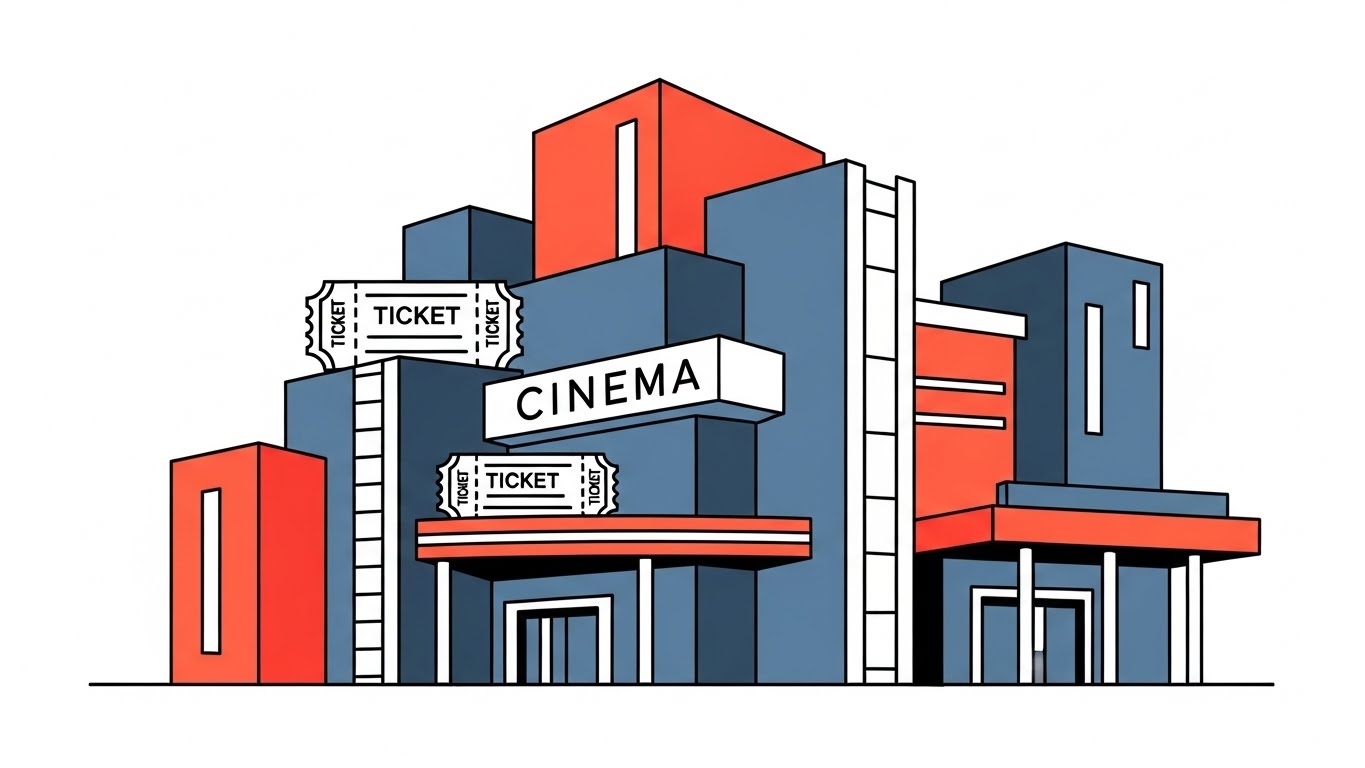
The Visual & Narrative Approach
This style utilizes a Minimalist Flat 2D Vector aesthetic to strip away the noise of complex technology, presenting the cinema environment in its most essential, geometric form. As seen in the example, the composition constructs a stylized cinema building using simple blocks of vivid coral, pure white, and slate blue. The architecture itself incorporates visual metaphors—ticket stubs and film strips are subtly built into the structure of the building. The clean, shadowless lighting and solid white background create a "zero-distraction" environment, ensuring the viewer focuses entirely on the structural integrity and modern approachability of the brand.
Psychological Impact & KPI Focus
For cinema operators overwhelmed by "feature bloat," this style offers a psychological breath of fresh air. It communicates clarity, ease of use, and organized thinking—crucial traits for a software partner. By simplifying the cinema into clean, geometric shapes, you visually promise that your software will simplify their operations. The "Physical/Digital Divide" is bridged here by showing the physical asset (the theater) composed of digital design elements, subtly suggesting that the building and the software are one and the same.
Strategic Implementation & Trade-offs
- Best Use Case: A 30-second "Manifesto" video on LinkedIn introducing your company’s philosophy of simplicity and modern design.
- Trade-offs: This style is excellent for broad thematic messaging but lacks the fidelity to show specific user interfaces or complex data workflows. It is a "mood setter," not a "feature explainer."
Companies using similar video content -
Veezi – Veezi – Simplifies cinema management with core features.
2. Abstract 2D Flat Vector Organic Modern Motion Graphics
TOFU | Market Education

The Visual & Narrative Approach
Moving beyond static structures, this style employs Abstract 2D Flat Vector Organic Motion Graphics to visualize the invisible flow of data. The image captures a stream of liquid shapes in glossy teal, electric lime, and deep magenta, morphing into icons of projectors and popcorn. This fluid movement is the core narrative device: it represents the "seamless integration" that every CTO craves. The glossy textures and reflections add a premium, modern feel, while the light grey digital void background ensures the colorful data stream remains the undisputed hero of the frame.
Psychological Impact & KPI Focus
Cognitively, "fluidity" equates to "efficiency." When a viewer sees shapes morphing effortlessly from a projector to a popcorn kernel, they subconsciously understand the connection between ticketing and concessions. This addresses the anxiety of "siloed systems" where data gets stuck. The vibrant palette triggers a sense of energy and innovation, positioning the platform as a dynamic, living entity rather than a static database. It visually answers the question: "Does your system connect the booth to the concession stand?"
Strategic Implementation & Trade-offs
- Best Use Case: A 60-second explainer video on "The Connected Cinema," illustrating how data travels through your ecosystem.
- Trade-offs: While visually arresting, abstract metaphors can sometimes be too vague for technical buyers who want to see the actual dashboard. Use this to sell the concept of integration, then follow up with UI shots.
Companies using similar video content -
Vista Entertainment Solutions – Vista Cloud – Visualizes seamless data flow across cinema operations.
3. Bold Kinetic Typography (Visual)
TOFU | Shaping Brand Perception
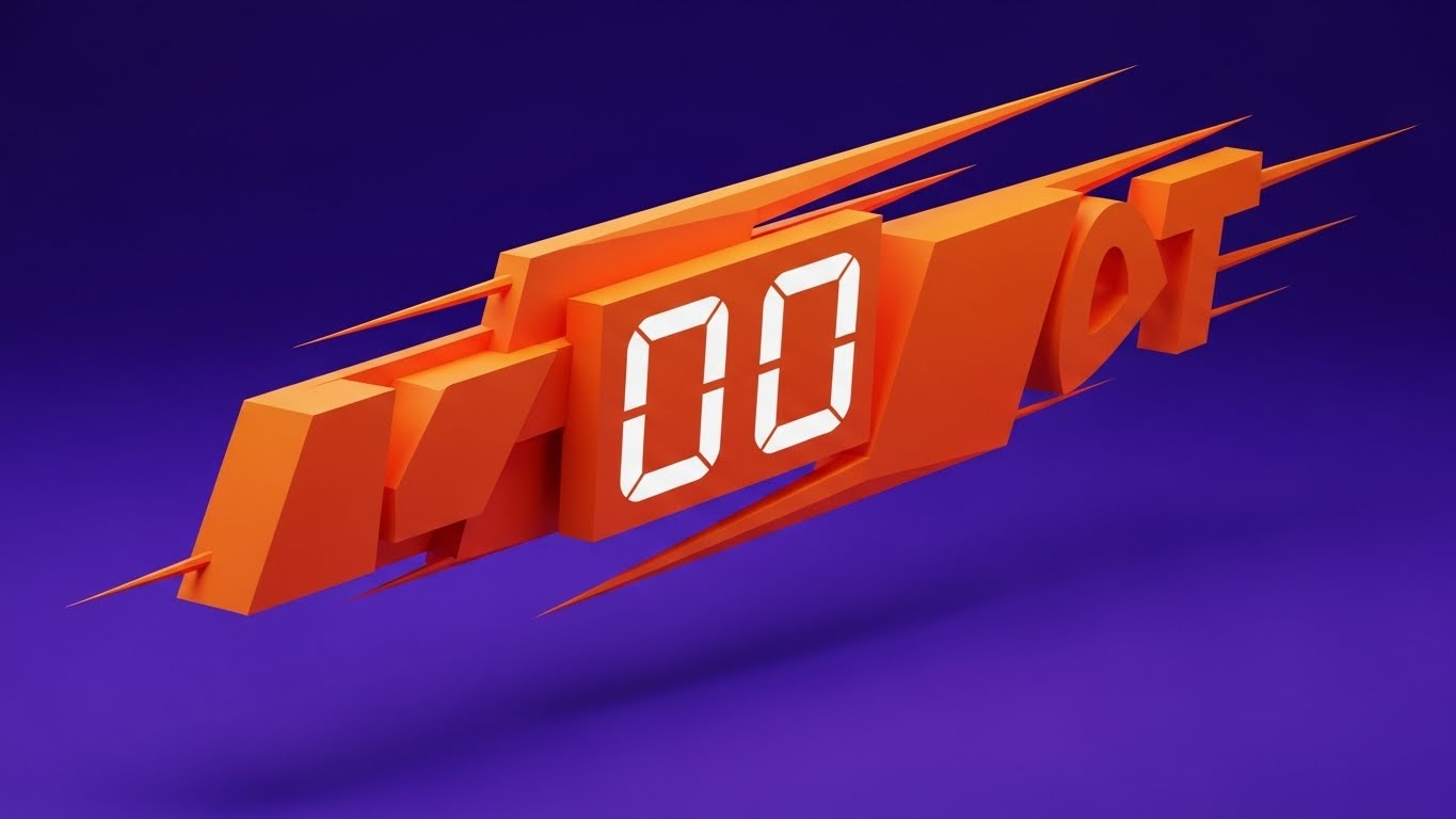
The Visual & Narrative Approach
This style leverages Bold Kinetic Typography to create a sense of urgency and momentum. The visual example features geometric blocks in electric orange and deep royal purple, arranged diagonally to suggest speed and forward motion. The abstraction of a "countdown clock" taps into the cinematic language of film leaders, instantly contextualizing the content. The hard shadows and high-contrast deep purple background make the orange elements vibrate, demanding immediate attention. This is not about reading text; it is about feeling the pulse of the industry.
Psychological Impact & KPI Focus
In the crowded feed of a busy executive, static images fail. This high-energy style disrupts the scroll pattern. The diagonal composition triggers a psychological response associated with "progress" and "action." It is particularly effective for addressing the "Fear of Missing Out" (FOMO) regarding digital transformation. The operational subtext is speed: faster processing, faster implementation, and faster ROI. It positions the brand as a catalyst for rapid change.
Strategic Implementation & Trade-offs
- Best Use Case: Short, punchy 15-second social ads announcing a new feature launch, a webinar, or a market-shifting partnership.
- Trade-offs: This style prioritizes impact over information depth. It is not suitable for complex storytelling or detailed explanations. It is the "hook," not the "meat."
Companies using similar video content -
Tapos – Tapos – Accelerates urgency for integrated cinema solutions.
4. Abstract 2D Motion Graphics
TOFU | Category Creation
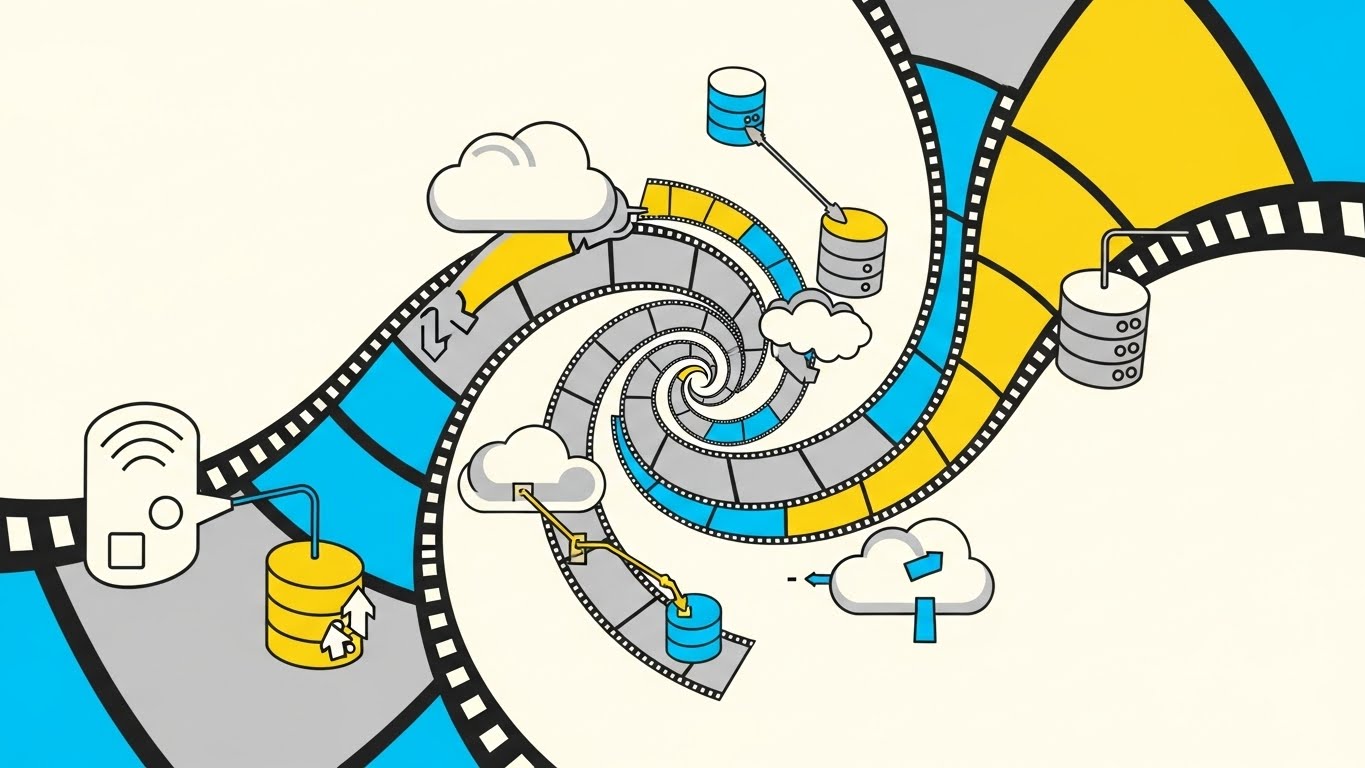
The Visual & Narrative Approach
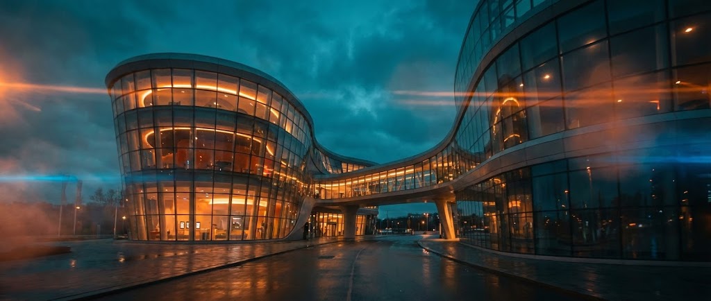
To visualize the migration to the cloud, this style uses Abstract 2D Motion Graphics with a focus on transformation. The image depicts a vortex of abstract film strips in bright cyan and sunny yellow, spiraling inward and evolving into cloud computing icons. This "vortex" composition serves as a powerful visual metaphor for the industry's shift—taking the legacy physical media (film strips) and uplifting it into the modern digital infrastructure (the cloud). The smooth easing curves and clean white background convey a controlled, safe, and elegant transition, devoid of chaos.
Psychological Impact & KPI Focus
Cloud migration is often viewed as risky and complex. This visualization reframes it as a natural, upward evolution. The use of "sunny yellow" and "bright cyan" is intentional; these are optimistic, safe colors that counter the fear of data loss. The narrative here is "Category Creation"—defining the new standard of Cloud Cinema Management. It reassures the stakeholder that the shift from physical to digital is not a disruption, but a streamlined elevation of their current assets.
Strategic Implementation & Trade-offs
- Best Use Case: The "Hero" background video on your website's homepage or the opening sequence of a keynote presentation.
- Trade-offs: Abstract metaphors require a strong voiceover to anchor them. Without context, a "swirling film strip" is just pretty art; with voiceover, it becomes a story of "Data Migration."
Companies using similar video content -
Comscore – Cinema ACE – Modernizes legacy theater management to cloud.
5. 2D Line Art Animation
TOFU | Building Trust & Credibility
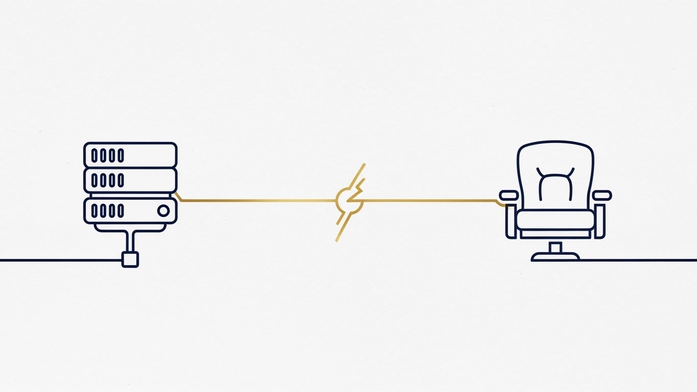
The Visual & Narrative Approach
Trust is binary: it exists or it doesn't. This 2D Line Art Animation style uses a continuous, unbreakable monoline stroke to visualize that binary stability. The illustration connects a server icon on the left to a theater seat on the right with a single, elegant line in navy blue and metallic gold. The absence of clutter, gradients, or background noise (using a simple white paper texture) forces the eye to follow the connection. The "metallic gold" accent specifically highlights the value of the data traveling along this secure path.
Psychological Impact & KPI Focus
For an Operations Director, "downtime" is the enemy. This continuous line subtly communicates "uptime" and "end-to-end connectivity." The precision of the thin strokes implies enterprise-grade accuracy—a system that doesn't make mistakes. By visually linking the "Server" (IT Anxiety) directly to the "Seat" (Revenue Source), you bridge the Physical/Digital divide in the most literal way possible. It visualizes the promise: "What happens in the server room directly secures revenue in the auditorium."
Strategic Implementation & Trade-offs
- Best Use Case: A "Security & Reliability" page on your website, or a video segment detailing your SLA (Service Level Agreement) and uptime guarantees.
- Trade-offs: This style is emotionally reserved. It builds respect and confidence, but not excitement. It is best used to validate technical claims rather than to generate hype.
Companies using similar video content -
GDC Technology – Theatre Management System (TMS) – Builds trust for secure digital cinema operations.
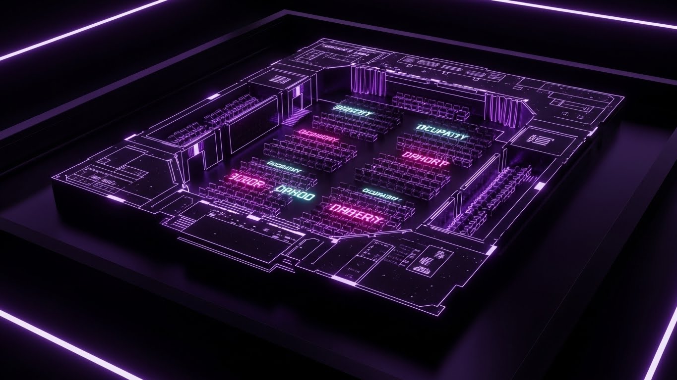
6. Isometric 2D Motion Design
TOFU | ABM Awareness

The Visual & Narrative Approach
Data analytics can be dry, but Isometric 2D Motion Design gives it dimension and structure. The visual scenario presents a theater auditorium as a precise data grid, with seats arranged in an orderly fashion on a pastel pink and mint green floor pattern. The "popped up" seats indicate occupancy or specific data points, while floating target crosshairs signify the precision of the software's targeting capabilities. The isometric perspective provides a "God's eye view," giving the viewer a sense of total control and oversight.
Psychological Impact & KPI Focus
This style appeals directly to the manager's desire for control and visibility. The grid structure implies that the chaos of a Friday night premiere can be tamed into manageable rows and columns of data. The pastel palette keeps the mood calm and professional, countering the stress of high-volume operations. It visually demonstrates "Account-Based Marketing" (ABM) principles—showing that you can target specific seats, specific behaviors, and specific revenue opportunities with surgical precision.
Strategic Implementation & Trade-offs
- Best Use Case: LinkedIn carousel ads or video ads targeting Cinema Marketing Directors, focusing on "Occupancy Optimization" or "Targeted Loyalty Campaigns."
- Trade-offs: Isometric art can feel rigid if not animated smoothly. It works best for structural and spatial concepts (seating, inventory) rather than emotional or abstract benefits.
Companies using similar video content -
Poszeo – Cinema POS System – Targets occupancy optimization with precise data grids.
7. Abstract 3D AI Visualization
MOFU | Product/Solution Differentiation

The Visual & Narrative Approach
To differentiate a solution as "Next-Gen," this style employs Abstract 3D AI Visualization. The image showcases a complex, glowing network of nodes in neon blue and silver, set against a dark tech void. The depth of field pulls focus to a central "hub" node, representing the centralized Head Office control, while the peripheral nodes represent distributed cinema locations. The particle effects simulate real-time data transfer, creating a high-tech, futuristic aesthetic that screams "cutting edge."
Psychological Impact & KPI Focus
This style targets the "Innovation" aspiration of the C-Suite. It suggests that the platform is powered by AI and advanced algorithms, differentiating it from legacy "database" competitors. The "dark mode" aesthetic aligns with the environments where developers and IT professionals work, signaling that this is a serious, developer-friendly tool. It visually proves the capability to manage a massive chain of theaters from a single, glowing point of truth, directly addressing the KPI of "Centralized Circuit Management."
Strategic Implementation & Trade-offs
- Best Use Case: The "Technology" or "AI Features" section of a sales deck or website. Use it to visualize complex algorithms or multi-site data synchronization.
- Trade-offs: It can appear cold or impersonal. It establishes technical dominance but needs to be paired with human-centric messaging to ensure the viewer remembers the people running the systems.
Companies using similar video content -
GDC Technology – Network Operations Center (NOC) – Unifies multi-location circuit data with glowing networks.
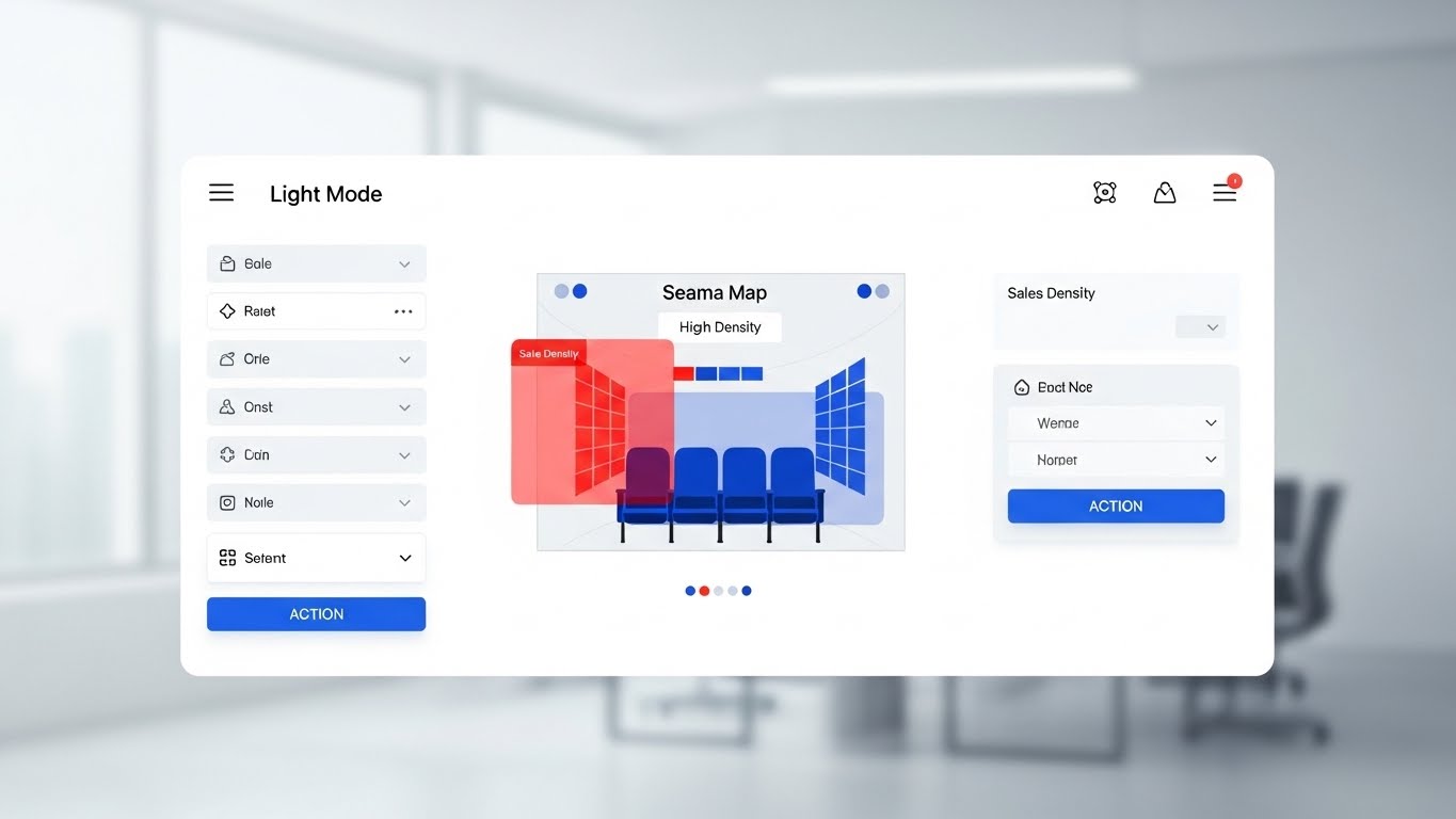
8. Clean UI Workflow (Light Mode)
MOFU | Feature Education & Demonstration
The Visual & Narrative Approach
When the buyer asks, "What does it look like?", this Clean UI Workflow style is the answer. It presents a simplified, high-fidelity mock-up of the dashboard in a bright "Light Mode." The focus is on a seat map with red heat-map overlays, instantly communicating "Sales Density" without needing complex spreadsheets. The background is a blurred, high-key office, placing the software in a professional, working context. The primary blue action buttons guide the eye, showing exactly where the user adds value.
Psychological Impact & KPI Focus
This style reduces "Cognitive Load." It proves that the software is intuitive and doesn't require a PhD to operate. By stripping away specific numbers and text, it focuses on the workflow logic—Scan, Analyze, Act. The "Light Mode" aesthetic connotes transparency and clarity. For a manager fearing a steep learning curve for their staff, this visual is a reassurance: "See? It’s just like the consumer apps they already use." It directly addresses the KPI of "Staff Training Efficiency."
Strategic Implementation & Trade-offs
- Best Use Case: Product demo videos, tutorials, and deep-dive webinars showing specific features like "Dynamic Pricing" or "Seat Utilization Tracking."
- Trade-offs: It is a representation, not a screen recording. It is cleaner than reality. Ensure you manage expectations that the actual live data might look slightly more complex.
Companies using similar video content -
Ready Theater Systems (RTS) – RTS Ticketing – Clarifies real-time sales density with heatmap dashboards.
9. Wireframe to Reality Transition
MOFU | Competitive Displacement
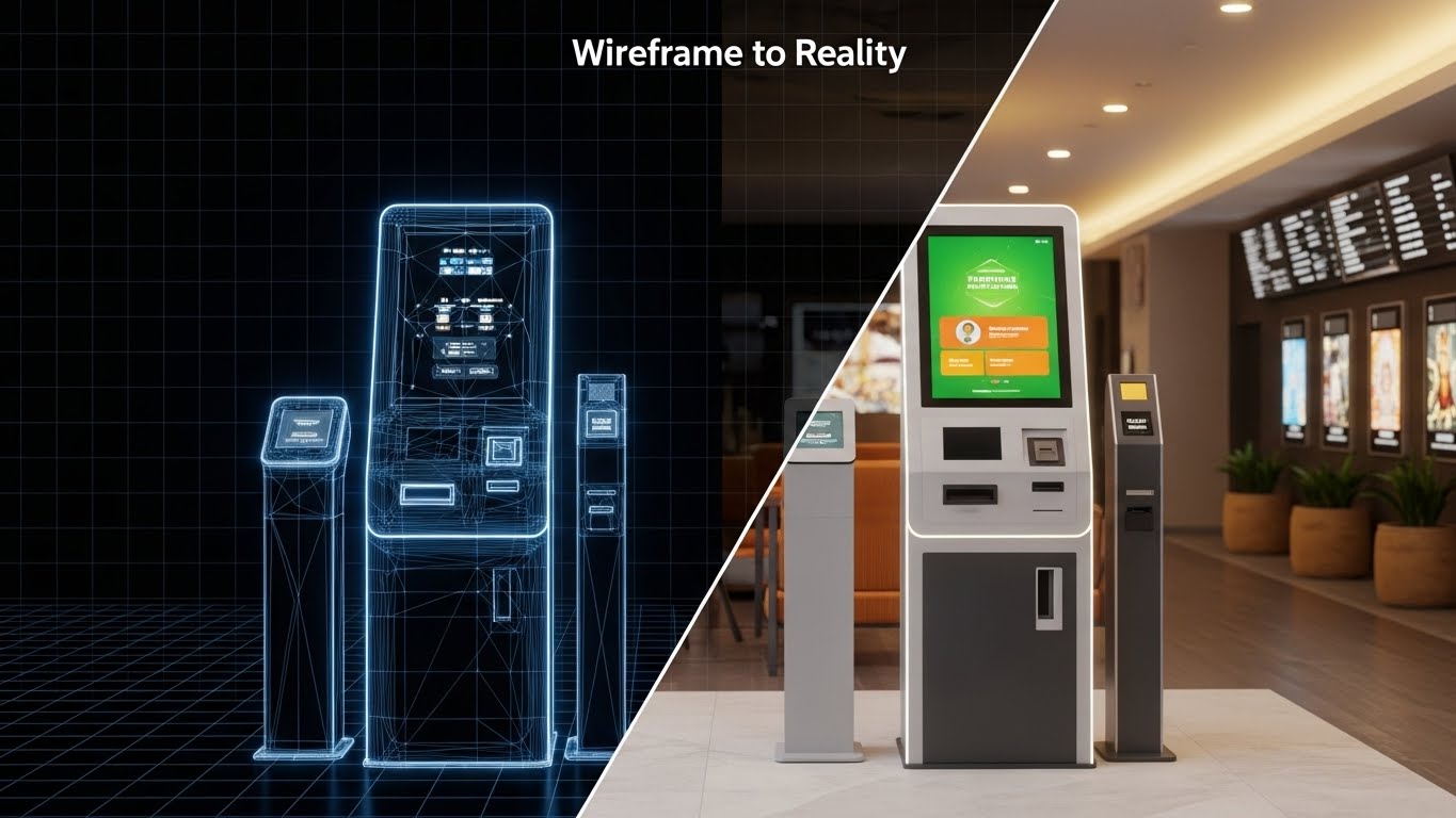
The Visual & Narrative Approach
This powerful Wireframe to Reality Transition style visually executes the promise of "Plan to Profit." The split-screen composition divides a self-service ticketing kiosk into two worlds: the left is a technical wireframe in blueprint blue, representing the engineering/software side; the right is a photorealistic, warm-lit render of the kiosk in a lobby, representing the customer experience. The sharp vertical line acts as the portal of transformation.
Psychological Impact & KPI Focus
This is the ultimate bridge for the "Physical/Digital Divide." It validates that the abstract code (wireframe) results in a tangible, beautiful physical asset (the lobby kiosk). It appeals to both the CTO (who cares about the blueprint) and the Operations Director (who cares about the lobby aesthetic). It effectively displaces competitors who only talk about software by showing the end result of the hardware-software synergy. It visualizes the ROI: "You buy the blueprint (software), you get the experience (reality)."
Strategic Implementation & Trade-offs
- Best Use Case: Case study videos or ads targeting decision-makers who are considering a hardware refresh alongside their software upgrade.
- Trade-offs: Requires high-quality 3D assets. If the "Reality" side looks fake, the promise of quality is broken.
Companies using similar video content -
Sensible Cinema Software – Sensible Cinema Box Office – Validates tangible kiosk ROI realization.
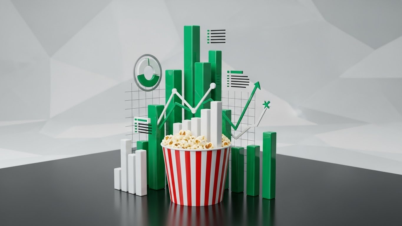
10. Dynamic Data Visualization
MOFU | Overcoming Objections
The Visual & Narrative Approach
To close the deal, you must talk money. This Dynamic Data Visualization style uses a clever visual metaphor to link concessions to revenue. Stylized emerald green bar charts and line graphs are shown rising physically out of a classic red-and-white striped popcorn bucket. The aesthetic is clean, infographic-style, using matte black and crisp white to make the green data bars pop. It transforms a boring "Revenue Report" into a story about "Popcorn Profitability."
Psychological Impact & KPI Focus
This style overcomes the objection: "Is this software worth the cost?" By visually anchoring the data charts inside the product (popcorn), it subconsciously links the software directly to the core revenue stream. It simplifies the complex correlation between ticket sales and concession attach rates. The use of "Emerald Green" (money) rising upwards triggers a positive financial association. It is a persuasive tool that speaks the language of the CFO: Growth, Attach Rate, and Profit.
Strategic Implementation & Trade-offs
- Best Use Case: The "ROI" slide in your pitch deck or a dedicated section in a proposal video addressing "Revenue Optimization."
- Trade-offs: It is a metaphor. It works for high-level financial arguments but cannot replace detailed financial reporting for due diligence.
Companies using similar video content -
POSitive Cinema – POSitive Cinema – Proves concession revenue expansion with growth buckets.
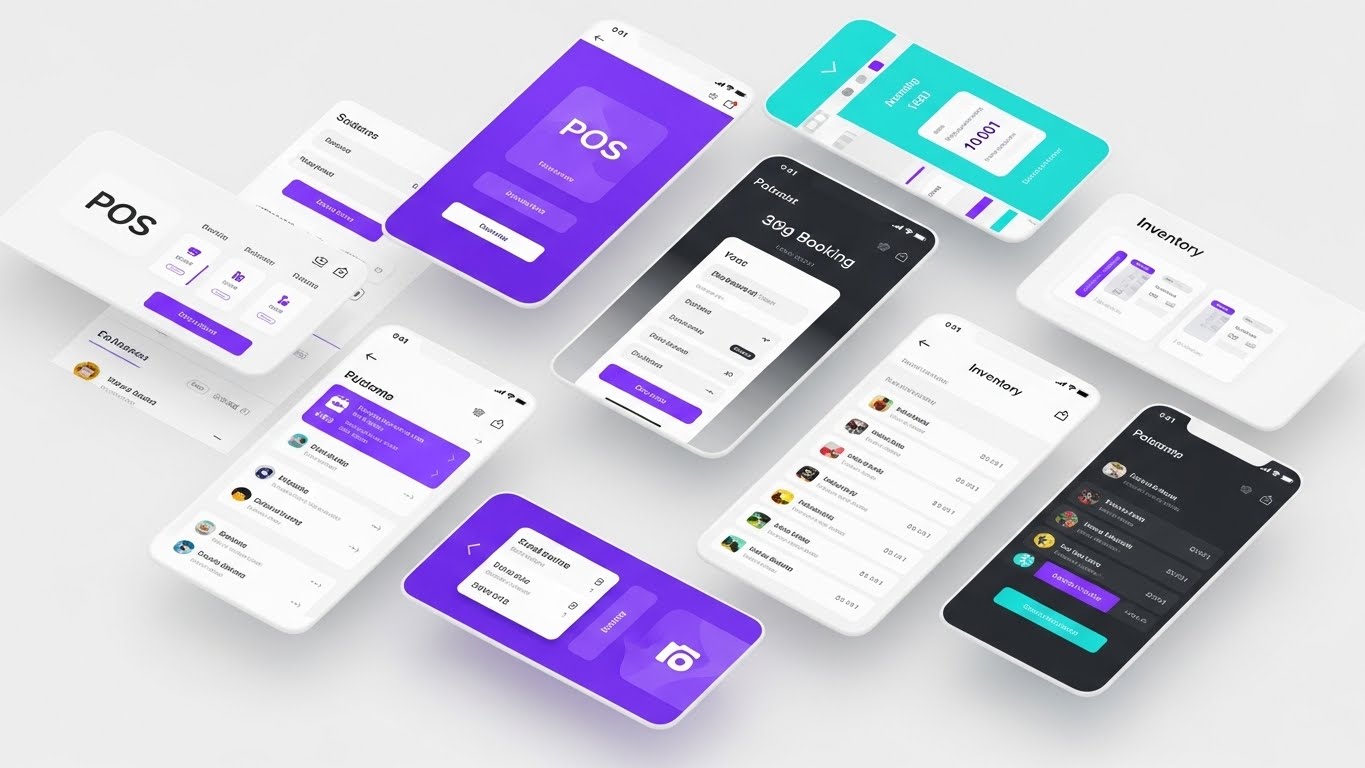
11. Rapid UI Feature Montage**
MOFU | Driving Demo Requests
The Visual & Narrative Approach
To address the critical question "Does this platform handle everything?", this style utilizes a Rapid UI Feature Montage. The composition abandons the single-screen focus, instead presenting a dynamic, floating array of tilted interface screens: POS terminals, mobile booking flows, and inventory lists. The screens are layered in a vibrant violet and cyan void, creating a sense of depth and volume. Motion blur effects on the edges imply high operational velocity, visually suggesting that the platform moves as fast as a peak-hour box office.
Psychological Impact & KPI Focus
This style targets the "Fear of Fragmentation"—the operator's anxiety that they will need five disparate tools to run one theater. By visually consolidating multiple interfaces into one cohesive, flying formation, you subconsciously reinforce the concept of a "Unified Ecosystem." It reduces the cognitive load associated with context switching. The operational KPI here is "Workflow Integration," promising a seamless experience where every tool—from ticketing to concessions—is part of the same digital DNA.
Strategic Implementation & Trade-offs
- Best Use Case: High-energy 15-second remarketing video ads on LinkedIn or YouTube, targeting users who visited your "Features" page but didn't convert.
- Trade-offs: This is a "breadth" play, not a "depth" play. The density of information means no single feature can be analyzed in detail. It creates an impression of capability, not an education on specific functionality.
Companies using similar video content -
JACRO – JACRO – Visualizes comprehensive platform breadth with floating ecosystem.
12. 2D Character-Driven Story
MOFU | Demand Gen & Lead Capture

The Visual & Narrative Approach
Software adoption succeeds or fails at the front line. This 2D Character-Driven Story style shifts the lens from the code to the user. The illustration features a friendly, professional female manager with warm skin tones and a teal shirt, holding a tablet with a confident smile. The background is a stylized, warm yellow abstract frame of a cinema box office. The flat shading and clean vector curves make the technology look approachable, removing the intimidation factor often associated with "Enterprise ERP" systems.
Psychological Impact & KPI Focus
General Managers often fear that new software will be too complex for part-time staff to master, leading to slowdowns. This style mitigates "Implementation Anxiety" by visualizing the result of the software: a happy, empowered employee. The warm, human-centric aesthetic fosters trust and empathy. It subtly communicates that the interface is intuitive enough to make the staff's job easier, directly addressing KPIs related to "Staff Training Time" and "Employee Satisfaction."
Strategic Implementation & Trade-offs
- Best Use Case: Facebook and Instagram ads focusing on "Ease of Use" or "Simplified Operations." It works best when the message is about empowering people, not just processing data.
- Trade-offs: It lacks the "Deep Tech" credibility of high-fidelity 3D. Avoid using this for technical IT audiences; use it for the Operations and HR stakeholders who prioritize team efficiency.
Companies using similar video content -
AudienceView – AudienceView Professional – Humanizes technical adoption anxiety for empowered staff.
13. Photorealistic 3D Renders
BOFU | ROI Justification

The Visual & Narrative Approach
When the conversation shifts to the CFO, metaphors must become tangible. This Photorealistic 3D Render style visualizes "Value Realization." The composition features a macro close-up of realistic gold coins stacked heavily upon a textured, torn movie ticket stub. The dramatic studio lighting and deep black background create a premium, serious atmosphere. The contrast between the disposable paper ticket and the permanent value of the gold serves as a powerful visual argument: your software extracts maximum value from every seat.
Psychological Impact & KPI Focus
This is a visual anchor for "ROI Justification." It reframes the software purchase from an "operational expense" to a "revenue generator." The hyper-realistic texture triggers a "Tangibility Bias," making the promised financial returns feel real and attainable. It directly addresses the skepticism regarding software pricing by visually linking the platform to the accumulation of wealth. It supports conversations around "Yield Management" and "Per-Capita Increase."
Strategic Implementation & Trade-offs
- Best Use Case: The "Financial Impact" or "Pricing" section of a sales deck. Use it as the background for a slide detailing specific revenue uplifts.
- Trade-offs: It is purely symbolic. Without hard numbers (charts/graphs) next to it, it can feel like empty marketing. It must be paired with data to be effective.
Companies using similar video content -
Paciolan – Paciolan – Materializes abstract financial returns with golden tickets.
14. 3D X-Ray Visualization
BOFU | Risk Mitigation
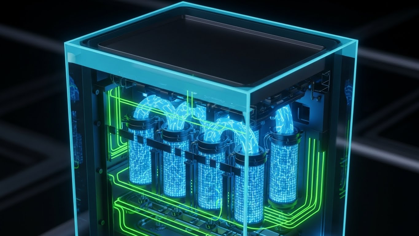
The Visual & Narrative Approach
To build trust with IT Directors, you must show what is hidden. This 3D X-Ray Visualization style uses a technical cutaway aesthetic to reveal the engineering quality within. The image depicts a cinema ticket printer or server unit with a transparent blue glass shell, exposing the glowing white skeleton structures of circuits, gears, and encryption modules inside. The background is a faint technical grid, reinforcing the precision and "engineered" nature of the solution.
Psychological Impact & KPI Focus
This style creates "Technical Authority." By showing the "guts" of the machine, you visually demonstrate transparency and robustness. The glowing internal components represent the active, living security protocols protecting the data. It alleviates the fear of system failure or security breaches ("Risk Mitigation"). It visually proves that the physical hardware and digital software are integrated at a structural level, addressing KPIs of "Data Integrity" and "Uptime Reliability."
Strategic Implementation & Trade-offs
- Best Use Case: The "Security," "Compliance," or "Hardware Specs" page of your website. It is also powerful in technical whitepapers or compliance documents.
- Trade-offs: It is cold, clinical, and highly technical. It will alienate marketing or creative buyers if used in isolation. It is strictly for the technical decision-maker.
Companies using similar video content -
GDC Technology – Central Management Software (CMS) – Reveals robust security architecture with transparency core.
16. Isometric 3D Workflow
BOFU | The Functional Buyer
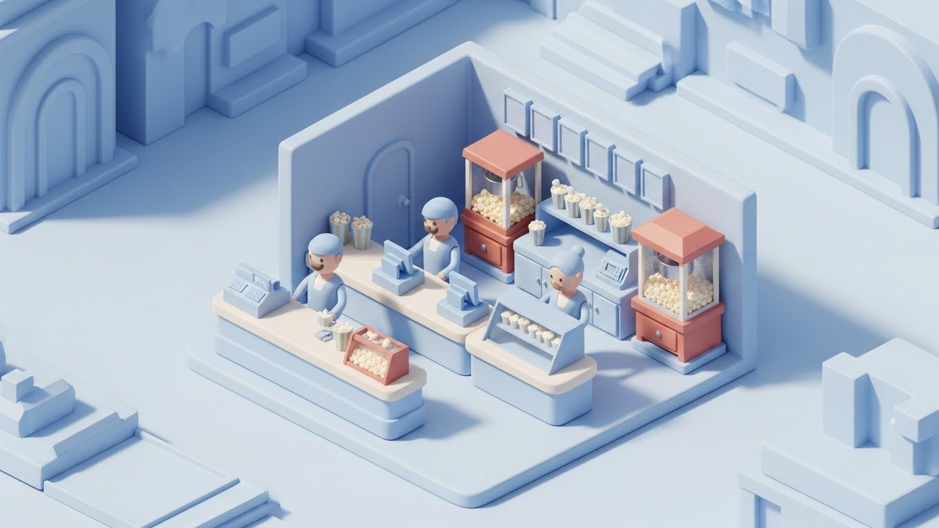
The Visual & Narrative Approach
Complex operations need to be broken down to be understood. This Isometric 3D Workflow style uses a "claymorphism" aesthetic—soft edges, matte finishes, and pastel tones—to present a friendly, miniature model of a concession stand. We see the entire ecosystem in one frame: POS registers, popcorn machines, and stylized staff avatars working in harmony. The softbox lighting and clean blue palette make the often-chaotic concession environment look organized, manageable, and almost serene.
Psychological Impact & KPI Focus
For the Functional Buyer (e.g., a Concessions Manager), the reality of a Friday night is messy and stressful. This stylized miniature offers a psychological counter-weight: "Operational Order." It allows the viewer to step back and see the workflow as a repeatable, optimizable system. It visually validates that the software fits perfectly into the physical layout of their workspace, reinforcing the bridge between the digital POS and the physical popcorn scoop.
Strategic Implementation & Trade-offs
- Best Use Case: "How it Works" website sections or implementation guides. It is perfect for showing the physical placement of hardware in relation to staff movement.
- Trade-offs: The "toy-like" aesthetic might feel too playful for some enterprise clients. Ensure the accompanying text is professional to maintain authority.
Companies using similar video content -
N/A – N/A – N/A.
17. Lifestyle Stock with UI Overlay
BOFU | Sales Cycle Acceleration

The Visual & Narrative Approach
To help the prospect visualize themselves using the product, this style blends reality with digital capability. Lifestyle Stock with UI Overlay features a high-quality photo of a male operations manager in a modern, glass-walled office, focused on a tablet. Floating in the air above the device is a crisp, glowing UI dashboard displaying concession inventory levels in bright orange and blue. The natural lighting and professional setting ground the tech in the real world.
Psychological Impact & KPI Focus
This style sells the "Status" of the modern executive. It appeals to the aspiration of being a data-driven leader who has total visibility from anywhere—the lobby, the office, or home. It bridges the divide by superimposing the digital truth (inventory data) directly onto the physical context (the manager in the office). It accelerates the sales cycle by helping the buyer mentally "try on" the role of a user, validating the KPI of "Real-time Visibility."
Strategic Implementation & Trade-offs
- Best Use Case: Remarketing display ads or case study headers. It works well to reinforce the "human benefit" after a prospect has seen technical demos.
- Trade-offs: It relies on stock photography, which can feel generic if not carefully selected. The UI overlay must look premium and perspectively correct to avoid looking "slapped on."
Companies using similar video content -
Omniterm – Omniterm Cinema Ticketing Software – Organizes chaotic concession logistics with miniatures.
18. Split Screen: Optimized Reality and UI
BOFU | Objection Handling & Friction Reduction
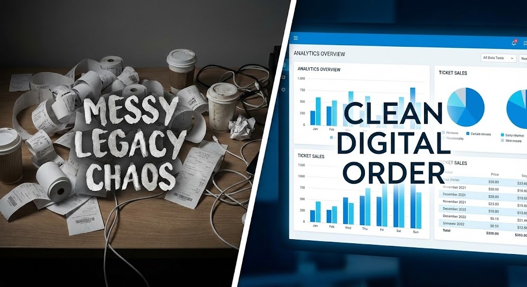
The Visual & Narrative Approach
Sometimes, you must highlight the pain to sell the cure. This Split Screen composition creates a stark binary choice. The left side reveals the "Old Way"—a desaturated, gritty photo of a desk buried under messy paper receipts and ticket rolls (Legacy Chaos). The right side showcases the "New Way"—a pristine, vivid blue digital interface displaying clean analytics graphs (Digital Order). A sharp white line divides the two worlds, forcing the viewer to choose a side.
Psychological Impact & KPI Focus
This is a classic "Before & After" technique, weaponized for B2B software. It leverages the "Pain/Relief" psychological trigger. The mess on the left agitates the viewer's frustration with manual reconciliation and paperwork. The clean UI on the right offers immediate visual relief. It directly handles the objection "We are fine with our current system" by visually proving that their current system is actually a chaotic liability. It focuses on the KPI of "Administrative Efficiency."
Strategic Implementation & Trade-offs
- Best Use Case: The "Problem/Solution" slide in a sales deck or a "Why Upgrade?" landing page. It is a polemic visual that challenges the status quo.
- Trade-offs: It is aggressive. Ensure the "Chaos" side isn't insulting to the prospect's current reality, but rather sympathetic to the struggle they face.
Companies using similar video content -
My Cloud Cinema – My Cloud Cinema – Projects real-time executive control with augmented management.
19. 2D Animation & UI Composition
Onboarding | Self-Serve Onboarding
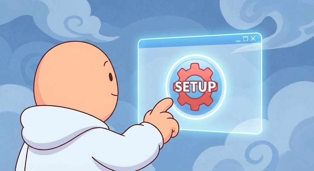
The Visual & Narrative Approach
Once the deal is signed, the fear shifts to "Implementation." This 2D Animation & UI Composition addresses that phase with a friendly, instructional aesthetic. A stylized, cartoon-like hand gently points toward a floating UI window featuring a prominent, inviting "Setup" gear icon. The palette is soft and airy, with cloud-like patterns in the background. The visual language is explicitly "Helpful" and "Step-by-Step," removing the intimidation factor from system configuration.
Psychological Impact & KPI Focus
Implementation is often where churn happens. This style reduces "Implementation Anxiety" by making the process look like a guided, manageable journey rather than a technical hurdle. The soft, rounded visuals suggest that the system is forgiving and user-friendly. It encourages "Self-Service" behavior, reducing the burden on your support team and directly improving the "Time to Value" KPI by getting the client set up faster.
Strategic Implementation & Trade-offs
- Best Use Case: Onboarding emails, "Welcome" videos inside the platform, or the support knowledge base.
- Trade-offs: It is too "soft" for the sales process. It lacks the commercial urgency needed to close a deal but is perfect for nurturing a new customer.
Companies using similar video content -
The Boxoffice Company – Software Platform – Contrasts legacy pain with digital relief.
20. Macro UI Micro-Interactions
Onboarding | Accelerating Time-to-Value
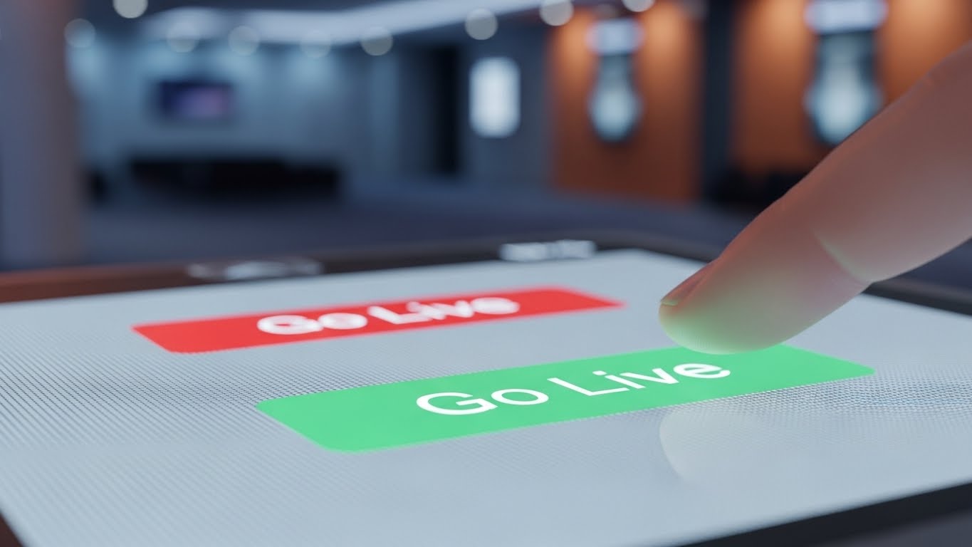
The Visual & Narrative Approach
The final step in the journey is activation. This Macro UI Micro-Interaction style zooms in to the molecular level of the user experience. We see an extreme close-up of a digital "Go Live" button, glowing in a vibrant, affirmative green. The texture of the pixels is visible, and a blurred finger is poised just millimeters from the screen, capturing the split-second before action. The background is a lens-blurred cinema lobby, placing the action in context.
Psychological Impact & KPI Focus
This visual captures the "Anticipation of Success." It focuses on the tactile satisfaction of the interface—the feeling of control. By freezing the moment before the click, it builds excitement for the launch. It is a powerful visual for driving action, specifically designed to trigger the "Go Live" behavior. It reinforces the bridge between the digital touch (the screen) and the physical result (the cinema opening for business).
Strategic Implementation & Trade-offs
- Best Use Case: The final email in an onboarding sequence ("You are ready to launch!"), or a feature announcement highlight.
- Trade-offs: It is extremely specific. It works best as a punctuation mark in a broader campaign, focusing on a single, critical call to action.
Companies using similar video content -
Booklux – Booklux – Simplifies implementation anxiety with guided setup.
21. Low-Poly 3D Modeling**
Onboarding | Reducing Implementation Friction

The Visual & Narrative Approach
Implementation is often the most daunting phase of the SaaS lifecycle. This Low-Poly 3D Modeling style transforms that anxiety into a playful, constructive experience. The visual depicts a stylized cinema building being assembled from floating, interlocking blocks in bright orange and sky blue. The building sits on a floating isometric island against a clean void. The facets of the low-poly geometry catch the light, creating a "toy-like" aesthetic that suggests the software is modular, snap-together, and easy to build.
Psychological Impact & KPI Focus
Psychologically, "Low Poly" art evokes a sense of simplicity and gamification. It reframes the complex task of "System Configuration" into "Building." It tells the Operations Director that setting up their circuit is as intuitive as playing with LEGOs. This directly targets the "Time-to-Live" KPI. By visualizing the setup process as a series of manageable, modular steps, you reduce the "Implementation Friction" that often leads to stalled deployments.
Strategic Implementation & Trade-offs
- Best Use Case: "Getting Started" wizard videos or implementation guides showing how to configure seat maps and screen layouts.
- Trade-offs: The playful aesthetic can feel "casual." It is excellent for reducing anxiety during setup but should not be used for high-stakes financial reporting visuals where precision is paramount.
Companies using similar video content -
Ticketor – Ticketor – Celebrates activation readiness with the go-live moment.
22. Futuristic Neon/Dark Mode
Onboarding | Trial/Freemium User Activation
The Visual & Narrative Approach
Cinema professionals work in the dark. This Futuristic Neon/Dark Mode style respects that native environment. The image features a "Heads Up Display" (HUD) aesthetic with thin, glowing neon lines in purple and "cyber pink" against a deep black background. It outlines the floor plan of a theater hall, with text elements glowing like an usher's baton. This "Dark Mode" visualization mirrors the actual working conditions of projectionists and theater managers, creating an immediate sense of belonging.
Psychological Impact & KPI Focus
This style drives "User Activation" by signaling that the software is "Purpose-Built." It isn't a generic spreadsheet; it is a specialized tool for the cinema industry. The high-contrast neon guides the eye to critical activation steps (like "Enable Projector" or "Open Sales"). It capitalizes on the "Cool Factor," making the trial user feel like they are piloting a spaceship rather than managing a database, thereby increasing the likelihood of completing the onboarding checklist.
Strategic Implementation & Trade-offs
- Best Use Case: The "Welcome" video inside the trial version of the software, or feature highlights for "Dark Mode" capabilities.
- Trade-offs: Legibility can be an issue with thin neon lines. Ensure that text is bold enough to be read on mobile devices.
Companies using similar video content -
Eventive – Eventive – Simplifies complex system configuration with modular architecture.
23. 3D Parallax UI Presentation
Retention | Driving Deep Feature Adoption

The Visual & Narrative Approach
To encourage existing customers to use advanced features, you must show them the "depth" they are missing. This 3D Parallax UI Presentation uses floating, semi-transparent glass panels to visualize layers of data. The composition shows loyalty member profiles hovering in 3D space, with gold and white accents. The depth of field and parallax effect imply that there is "more beneath the surface." It turns a flat customer list into a rich, multi-dimensional profile.
Psychological Impact & KPI Focus
The metaphor here is "Transparency" and "Depth." It suggests that your software offers deep insights into customer behavior—what movies they watch, what snacks they buy, and when they visit. It appeals to the Marketing Director's need for "Data Granularity." By making the data look precious (like glass and gold), you increase the perceived value of the "Loyalty Module," driving adoption of premium features and increasing "Net Dollar Retention."
Strategic Implementation & Trade-offs
- Best Use Case: Feature update emails promoting new analytics modules or "Deep Dive" webinars on customer segmentation.
- Trade-offs: High production value requires high render times. It is a "glamour shot" for the UI, ideal for marketing but less practical for step-by-step tutorials.
Companies using similar video content -
CINEsync – CINEsync – Gamifies immediate user control with luminous HUD.
24. 2D Graphics Over Live Action
Retention | Reducing Support Overhead
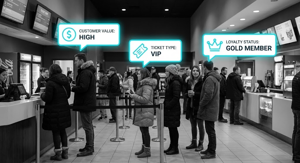
The Visual & Narrative Approach
Support issues happen in the real world, not just on the screen. This 2D Graphics Over Live Action style bridges that gap by overlaying bright, cyan vector vector icons and speech bubbles onto desaturated footage of a busy cinema lobby. We see "Loyalty Status" and "Ticket Type" floating above real customers' heads. This "Augmented Reality" view teaches the user to see the physical queue through the lens of your software's data, providing immediate context to the numbers on their screen.
Psychological Impact & KPI Focus
This style creates "Situational Fluency." It trains the eye of the manager to connect the digital alert ("VIP Member") with the physical human standing at the counter. It reduces "Support Ticket Volume" by answering the question "How do I use this in real life?" before it's even asked. The desaturation of the background ensures the data remains the focal point, reinforcing that the software provides the clarity needed to navigate the chaotic physical environment.
Strategic Implementation & Trade-offs
- Best Use Case: Training videos for front-line staff (POS operators, Ushers) or "Best Practices" content showing how to handle peak hours using your tools.
- Trade-offs: Requires shooting or licensing high-quality stock footage. If the live-action footage looks dated or generic, the software will feel dated by association.
Companies using similar video content -
Tessitura Network – Tessitura – Reveals depth of loyalty data with layered insights.
25. Aspirational Stock Montage
Retention | Reducing Churn
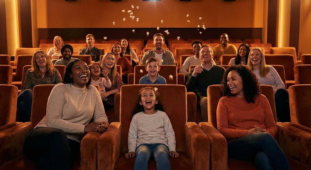
The Visual & Narrative Approach
Why do cinema operators work such long hours? For the magic of the movies. This Aspirational Stock Montage connects the software back to that core passion. The image captures a high-energy moment inside a luxury auditorium: a diverse audience laughing, popcorn mid-air, bathed in the warm, cinematic glow of the screen. It is emotional, human, and vibrant. It removes the software entirely to focus on the result of the software running perfectly.
Psychological Impact & KPI Focus
In the grind of operations, managers often forget the joy of the industry. This style combats "Vendor Fatigue" by associating your brand not with "bug fixes" and "invoices," but with "Joy" and "Cinema Magic." It triggers a positive emotional response that creates brand affinity, making it harder to churn. It reinforces the "Customer Success" narrative: "We handle the ops; you deliver the memories."
Strategic Implementation & Trade-offs
- Best Use Case: "Year in Review" emails, holiday greetings, or the opening/closing slides of a quarterly business review (QBR).
- Trade-offs: It is purely emotional. It conveys no technical information. Use it sparingly to build rapport, not to educate.
Companies using similar video content -
GDC Technology – TmsAware App – Contextualizes support in the physical lobby.
26. Holographic UI over 3D Render
Retention | Knowledge Base & FAQ Videos

The Visual & Narrative Approach
Hardware maintenance is a critical pain point. This Holographic UI over 3D Render style visualizes the integration between software diagnostics and physical hardware. The visual depicts a realistic 3D model of a digital cinema projector in a dark tech lab. Floating above it is a luminous, hologram-blue UI projecting "Help" menus and diagnostic schematics. The semi-transparent hologram implies that the software provides a "layer of intelligence" over the machine.
Psychological Impact & KPI Focus
This style builds confidence in "Self-Service Support." It visually tells the projectionist, "You don't need to call a technician; the software can show you what's wrong." By visualizing the diagnostic data as a hologram hovering over the equipment, it makes complex troubleshooting feel futuristic and manageable. This directly impacts the "First Contact Resolution" KPI, empowering users to fix hardware/software sync issues independently.
Strategic Implementation & Trade-offs
- Best Use Case: Technical troubleshooting guides, "How to Reboot" tutorials, or videos explaining VPF (Virtual Print Fee) logging.
- Trade-offs: Requires precise 3D modeling of cinema equipment. Inaccuracies in the hardware model can reduce credibility with technical staff.
Companies using similar video content -
Momentus Technologies – Momentus Technologies – Reinforces emotional value proposition with audience euphoria.
27. Generative AI Cinematic Video
Expansion | Driving Upsell/Cross-sell
The Visual & Narrative Approach
To sell Enterprise tiers, you must sell a vision of scale. This Generative AI Cinematic style creates a blockbuster-quality shot of a futuristic glass cinema complex at dusk. The sweeping organic architecture and warm internal glow suggest a thriving, massive entertainment empire. The "lens flare" and atmospheric haze add a premium production value that rivals the movies shown on the screens. It is a visual metaphor for "Growth" and "Dominance."
Psychological Impact & KPI Focus
This style appeals to the "Empire Building" instinct of the CEO. It visualizes where they want their circuit to be in five years. It is used to upsell "Enterprise Modules" like Multi-Territory Management or Global Circuit Analytics. By aligning your software with this grand architectural vision, you position your platform as the foundation for their expansion. It shifts the conversation from "Cost" to "Scale."
Strategic Implementation & Trade-offs
- Best Use Case: Background loops for the "Enterprise Solutions" page on your website, or the "Vision" section of a sales deck.
- Trade-offs: It creates a "concept art" vibe. It must be grounded with text explaining how the software supports this growth, or it risks looking like a movie trailer.
Companies using similar video content -
Broadsign – Broadsign Platform – Visualizes hardware intelligence with diagnostic digital twin.
28. Generative AI Realistic Character Video
Expansion | Establishing Thought Leadership
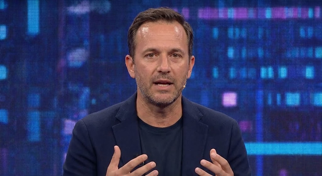
The Visual & Narrative Approach
People buy from people. This Realistic Character Video style brings the human element back into the B2B conversation. It features a hyper-realistic, AI-generated "Tech CEO" speaking on a "TED Talk" style stage. The professional spotlighting and blurred digital backdrop create an atmosphere of authority and innovation. He is not selling a feature; he is sharing a vision. This style is used to deliver high-level strategic content, industry predictions, and thought leadership that positions your brand as a consultant, not just a vendor.
Psychological Impact & KPI Focus
This style leverages "Authority Bias." Seeing a confident, articulate leader (even a virtual one) creates trust and credibility. It humanizes the brand, making it easier for C-Level executives to relate to your company. It is designed to drive "Share of Voice" and "Brand Advocacy," positioning your company as the intellectual leader of the cinema industry.
Strategic Implementation & Trade-offs
- Best Use Case: LinkedIn thought leadership posts, announcements of major partnerships, or "State of the Industry" updates.
- Trade-offs: The lip-sync and facial animation must be flawless. If it hits the "Uncanny Valley," it destroys trust. Use with caution and high quality control.
Companies using similar video content -
Comscore – Enterprise Web – Sells scale and future ambition with enterprise vision.
29. Hyper-lapse Stock Footage with Data
Expansion | Driving Referrals & Advocacy
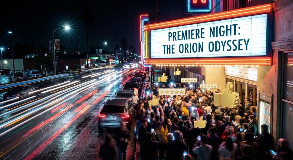
The Visual & Narrative Approach
Success in cinema is about buzz. This Hyper-lapse Stock Footage with Data style captures the kinetic energy of a premiere night. We see a time-lapse of a crowd streaming into a cinema, rendered as streaks of light, while the marquee remains sharp. Popping 3D gold "Like" and "5-Star" rating icons float above the crowd, visualizing the social buzz. It conveys a feeling of success, popularity, and high-velocity commerce.
Psychological Impact & KPI Focus
This style triggers "Social Proof" and "FOMO" (Fear Of Missing Out). It visually validates that your clients are successful, busy, and beloved by their customers. It encourages advocacy by showing the "Winner's Circle." Existing clients watching this feel validated in their choice; prospective clients want to join the club. The KPI focus is "Net Promoter Score" (NPS) and "Referral Generation."
Strategic Implementation & Trade-offs
- Best Use Case: Case study videos, "Customer Success" highlight reels, or ads encouraging users to leave reviews or refer a friend.
- Trade-offs: It can feel chaotic. Ensure the data icons (Likes/Stars) are distinct from the background noise so the message of "Customer Satisfaction" isn't lost in the blur.
Companies using similar video content -
PatronManager – PatronManager CRM – Humanizes digital transformation strategy with expert voice.
30. Dark Mode UI Showcase
Expansion | Proactive Support/Announcements
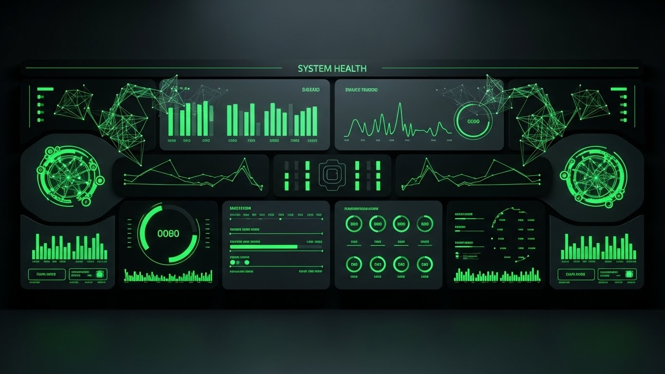
The Visual & Narrative Approach
The final assurance a client needs is stability. This Dark Mode UI Showcase presents a "System Health" dashboard in a sleek, professional dark palette with vibrant neon green accents. Pulse lines and status indicators glow against the charcoal background, conveying a sense of active, real-time monitoring. Unlike the "Futuristic Neon" (Style 22), this is disciplined and clinical. It says: "We are watching the system so you don't have to."
Psychological Impact & KPI Focus
This style targets "Peace of Mind." It visually demonstrates "Uptime" and "System Reliability." The green color psychology signals "All Systems Go," reducing anxiety for the Operations Director. It reinforces the value of your support contract and infrastructure. It is particularly effective for "Proactive Communication"—showing clients that your system is robust, monitored, and secure.
Strategic Implementation & Trade-offs
- Best Use Case: Service status pages, uptime reports, or update videos explaining security patches and infrastructure improvements.
- Trade-offs: It is very dry. It appeals strictly to the rational, risk-averse side of the buyer (IT/Ops). It is not for selling new features, but for retaining trust.
Strategic Knowledge Base: The Visual Operations Doctrine
To transform these 30 visual styles from a "gallery of assets" into a "business engine," we must apply a strategic framework. This doctrine synthesizes the visual language into three core operational segments, bridging the gap between pixel-perfect design and profit-driven cinema management.
Strategic Alignment & Visual Architecture
- The "Pre-Production" Phase – Defining the Visual Operating System*
Before a single frame is rendered, the visual strategy must be aligned with the operational reality of the cinema circuit. This is not about making things "pretty"; it is about reducing the Cognitive Load of your entire workforce.
- The Cognitive Load Audit: Cinema operations are high-velocity environments. A teenager at the concession stand has seconds to process information. Your visual strategy must be audited for "Glanceability." Styles like Minimalist Flat 2D Vector (Style 1) and Clean UI Workflow (Style 8) are not just aesthetic choices; they are operational necessities for high-turnover roles.
- Role-Based Visual Mapping: One size does not fit all. The visual language used for the Mobile App (Ushers/Scanners) should differ from the Desktop Dashboard (General Managers). Use Mobile-First/Vertical formats with Style 24 (2D Over Live Action) for floor staff who consume content on the go, and Desktop/Widescreen formats with Style 6 (Isometric Data) for Head Office staff who need data density.
- The "Glanceability" Standard: In a busy box office, staff cannot watch long tutorials. Adopt a "Glanceability" standard where the core message of any support video (e.g., Style 26 Holographic UI) must be understood within 3 seconds without audio.
- Unified Visual DNA: Ensure a consistent visual thread between Sales (External) and Support (Internal). If Sales uses Style 7 (Abstract 3D AI) to promise innovation, Support should use Style 14 (X-Ray) to validate that innovation. A unified visual language reduces buyer remorse and reinforces brand trust.
- The Advids Strategic Audit: Partnering with Advids allows for a "Visual Strategic Audit" before production begins. This ensures that the Low-Poly icon in your documentation matches the 3D Render in your sales deck, creating a unified brand voice that speaks fluently to both the Usher and the CEO.
- Standardization vs. Customization: For core features (Ticketing), use standardized Style 16 (Isometric Workflow) for universal processes (cleaning, safety). Use bespoke, branded visuals only for high-value differentiators (Loyalty Programs, proprietary hardware) to optimize budget.
- The Cross-Departmental Bridge: Use visuals to settle terminology disputes. A "Wireframe to Reality" (Style 9) video can align Sales (who sell the dream) and Ops (who build the reality) on exactly what "Kiosk Integration" looks like.
- Legacy System Integration: The biggest friction point is the mix of old hardware and new software. Use Style 14 (3D X-Ray) to visually bridge this gap, showing how your modern cloud platform connects with legacy projectors or turnstiles, calming the fears of IT Directors managing mixed estates.
- Accessibility in Theaters: Your workforce is diverse. Ensure motion graphics (Style 5 Line Art) rely on visual universal symbols rather than heavy text, accommodating multi-lingual staff in global circuits without expensive translation costs.
- The Mobile-First Mandate: With 60% of operations moving to tablets and handhelds, every visual style (especially Styles 11-20) must be legible on a 6-inch screen. If your Complex Dashboard video is unreadable on a phone, it is useless to the Floor Manager walking the halls.
Operational Adoption & Implementation
- The "Deployment" Phase – Embedding Visuals into the Workflow*
The best software fails if the staff refuses to use it. This segment focuses on using visual content to grease the wheels of adoption and change management.
- Overcoming "Big Brother" Anxiety: When rolling out staff monitoring or POS theft prevention tools, use Style 12 (Character-Driven) to frame the technology as "Supportive" rather than "Punitive." Empathy reduces resistance to new compliance tools.
- The Micro-Learning Shift: Forget the 50-page PDF manual. In the gig economy, staff training must be instant. Break down the Clean UI Workflow (Style 8) and Rapid UI Feature Montage (Style 11) into 30-second "Micro-Learning" clips. These can be consumed by staff on their own devices during downtime, drastically reducing the "Time-to-Competency."
- Just-in-Time Support: Embed Style 26 (Holographic UI) videos directly into the POS help menu. When a printer jams or a transaction fails, the staff member should see a visual solution in the moment, not have to search a knowledge base. This is "Visual Support as Infrastructure."
- Gamification of Training: Use Style 3 (Bold Kinetic Typography) to create high-energy "Level Up" videos for staff who complete training modules. Visualizing progress bars and rewards drives engagement.
- Reducing Support Ticket Volume: There is a direct correlation between the quality of "Self-Serve" visuals (Style 19 Guided Setup) and the reduction of Level 1 support tickets. Invest here to lower support costs.
- Remote Onboarding: For circuits expanding to new territories, use Style 16 (Isometric Workflow) to virtually train managers on lobby flow and hardware placement without flying a trainer to the site.
- Visual SOPs (Standard Operating Procedures): Transform text-based checklists into Style 1 (Minimalist Vector) flowcharts. Visual SOPs reduce ambiguity and ensure consistent execution across the circuit.
- Feedback Loops: Use Style 29 (Hyper-lapse + Data) in internal newsletters to show staff the positive impact of their work (e.g., "Customer Satisfaction Scores are up!"), reinforcing the value of the software.
- Scalable Localization: When generating assets for global chains, separate the text layers from the animation layers (Style 5 Line Art). This allows Advids to rapidly swap languages without re-rendering the core visual, saving 40% on production costs.
- Leadership Communication: Use Style 28 (Realistic Character) for CEO messages regarding circuit strategy. High-fidelity video commands more attention than a memo, ensuring the "Commander's Intent" is understood by every theater manager.
Measuring Impact & Future-Proofing
- The "ROI" Phase – Quantifying Success and Scaling Up*
Visuals are an investment. You must measure their return in terms of operational efficiency and revenue growth, not just "views."
- Beyond "Views" – Actionable KPIs: Stop measuring video views. Measure "Feature Adoption Rate" after a user watches the 3D Parallax UI (Style 23) video. Measure "Support Ticket Reduction" after deploying the Holographic UI (Style 26) clips. These are the metrics that prove the ROI of your visual strategy to the CFO.
- The "Idle Time" Metric: In operations, time is money. Correlate high-quality UI visualization (Style 20, Style 30) with a reduction in "Transaction Time" at the POS. If better visuals help staff find buttons 10% faster, that aggregates to thousands of dollars in saved labor hours across a circuit.
- Compliance Velocity: When PCI standards or MPAA ratings change, how fast can you update the field? Video assets allow for "Velocity of Information." A Kinetic Typography (Style 3) video can update the entire circuit on a new compliance rule in 24 hours, whereas updating physical manuals takes months.
- Retention and LTV: High-quality UX visualization (Style 20 Micro-Interactions) creates "Product Stickiness." Measure the "Stickiness" of features introduced via video vs. those introduced via email text.
- The AI Visual Frontier: The industry is moving toward generative video. Styles 27 and 28 demonstrate the potential of AI to create high-end content at scale. Preparing your visual asset library now means you will be ready to feed these AI models, allowing for real-time, personalized video content for every client.
- Scalability of Assets: Build a visual library, not just one-off videos. Assets created for Style 21 (Low Poly) can be reused in Style 16 (Isometric). This "Asset Recycling" reduces long-term costs.
- The Advids Partnership: Visual strategy is not a "Project"; it is a "Program." Partnering with Advids ensures your visual language evolves with your software updates, preventing the "Visual Debt" of outdated tutorials and ensuring that your visual communication scales as fast as your cloud infrastructure.
- Benchmarking Success: Compare your "Visual Maturity" against competitors. If they are still using screenshots and you are using Style 4 (Abstract Motion), you have a distinct brand advantage in the eyes of the C-Suite buyer.
- The ROI of Safety: For hardware maintenance, better visualization means fewer accidents. Quantify the reduction in equipment damage or staff injury claims attributed to clear Style 14 (X-Ray) safety guides.
- Final Call to Innovation: Treat video as Infrastructure. Just as you upgrade your projectors and servers, you must upgrade your visual communication. It is the lens through which the market sees your value. Execute this doctrine, and you do not just sell software; you define the future of cinema operations.
Companies using similar video content -
The Little Box Office – Little Box Office – Visualizes social proof and buzz with viral velocity.
Author & Editor Bio


