
Introduction: Scripting the Future of Cinema Operations
The global cinema industry is currently starring in its own sequel: a story of resilience, reinvention, and digital renaissance. We are no longer just selling tickets; we are curating immersive experiences that begin the moment a patron unlocks their phone. For SaaS platforms powering this ecosystem, the challenge is not functionality—it’s perception. How do you communicate the sophistication of backend inventory management or the speed of a cloud-native POS to an audience that simply wants the show to start?
The "physical/digital divide" is the central tension of modern cinema operations. Owners and operators are navigating a complex landscape where the romance of the big screen meets the cold hard reality of server uptime and conversion rates. The opportunity is immense—the USD 24.55 Billion global online ticketing market is a testament to the sector's hunger for digital innovation. However, the stakes of inaction are equally high. With 70% of users preferring mobile booking, the friction between a sleek app and a clunky physical lobby is the primary driver of customer loss.
This guide is your storyboard. It moves beyond generic "tech demos" to explore 30 specific visualization styles tailored to the Cinema SaaS funnel. From the emotional pull of high-end cinematic 3D to the ruthless clarity of minimalist vector art, we analyze how to bridge the gap between complex code and the operator's need for seamless efficiency. By adopting these visual strategies, you aren't just showing software; you are framing a vision of the friction-free, data-driven theater of the future.
1. The 'Blockbuster' Entrance (Brand Awareness)
TOFU | Brand Awareness
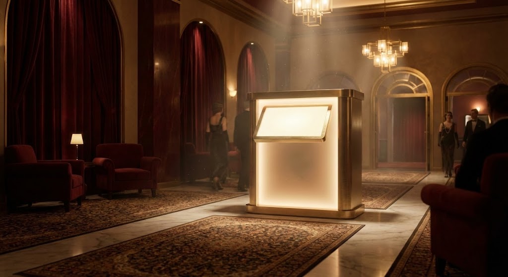
The Visual & Narrative Approach
This style borrows the visual language of the very industry it serves: the magic of Hollywood. The scene opens with a breathtaking, slow-motion establishing shot of a reimagined Art Deco lobby. Atmospheric lighting plays a crucial role; deep velvet reds and gold accents catch the light, while "dust motes" dance in the beams, creating a sense of history and anticipation. The camera tracks steadily toward a central, glowing digital kiosk, framing it not as a piece of hardware, but as the protagonist of the space. There is no voiceover, only a swelling, cinematic score that builds expectation.
Psychological Impact & KPI Focus
- Psychology: This style targets the "Aspiration" of the cinema owner. It bypasses technical skepticism and appeals directly to their pride in the venue's aesthetic. It positions the software/hardware as a jewel in the crown of the theater, rather than a utility.
- Operational Goal: It addresses 1.1 Brand Awareness by associating the SaaS brand with "Premium Experiences." It implicitly promises that this technology respects and elevates the physical environment of the cinema.
Strategic Implementation & Trade-offs
- Best For: YouTube Brand Channels and Hero sections of websites where the goal is emotional arrest.
- Duration: 30-60 seconds (Slow pacing is essential).
- Trade-off: This style prioritizes feeling over feature. It will not explain how the kiosk works, only that it belongs in a luxury setting. Use this to open doors, not to close deals.
Companies using similar video content -
Vista Cloud – Vista Cinema – Comprehensive cinema management platform.
CINEsync – Cinema POS – Streamlines operations, enhances customer experience.
INDY Cinema Group – Cloud Operating System – Manages ticketing, F&B, loyalty, marketing.
2. Visualizing the Invisible Asset (Market Education)
TOFU | Market Education
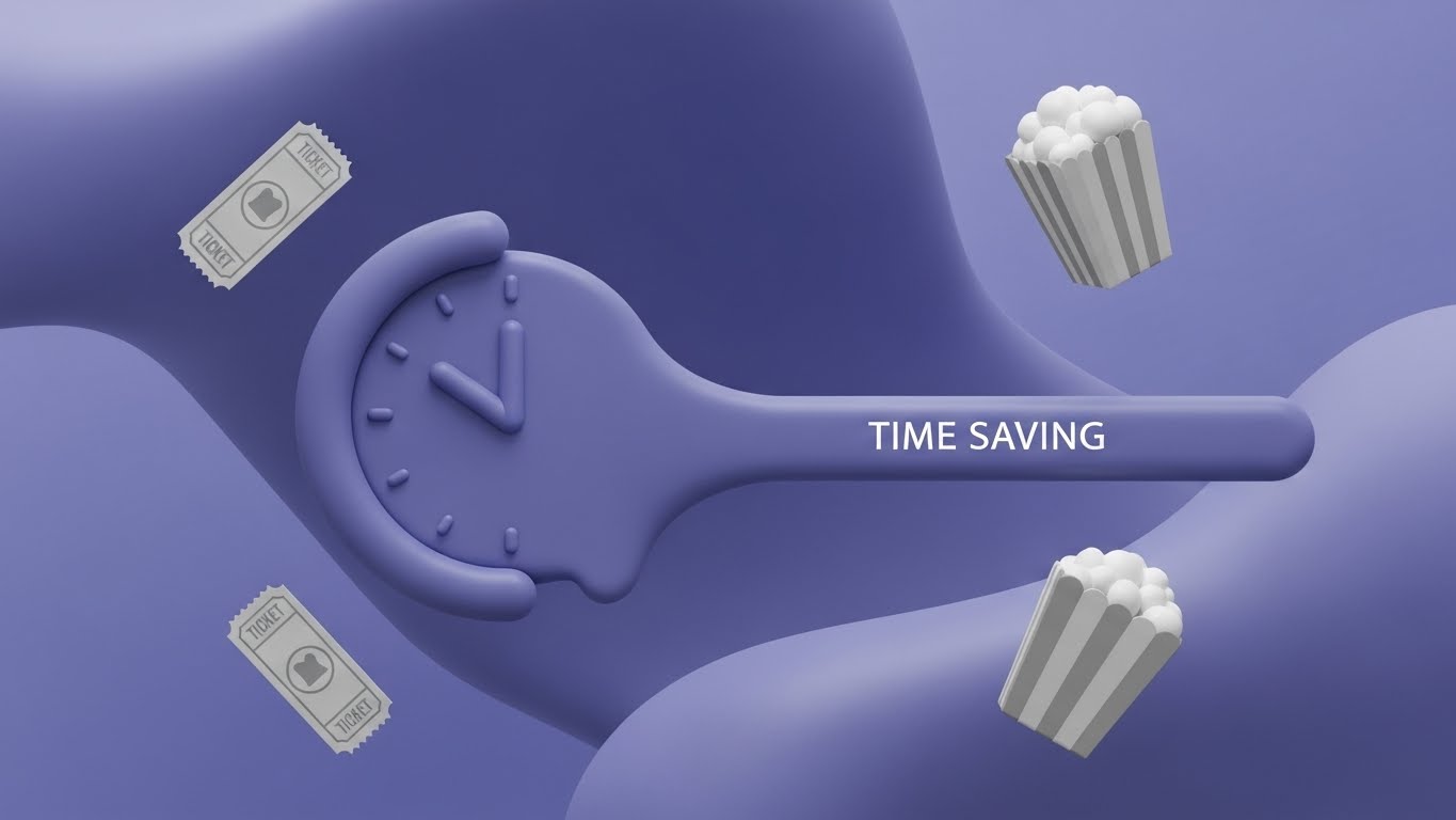
The Visual & Narrative Approach
Here, we strip away the physical world to visualize an abstract concept: Efficiency. Using a "flat-lay" composition on a vivid lime green and white background, the video uses visual metaphors to explain the value proposition. A stylized clock face "melts" into a streamlined, straight line, instantly communicating the reduction of wait times. Simplified geometric icons of tickets and popcorn buckets float in a frictionless space, devoid of gravity or clutter. The motion is smooth, glossy, and organic, suggesting a software ecosystem that "flows" without resistance.
Psychological Impact & KPI Focus
- Psychology: This appeals to the "Cognitive Ease" of the viewer. Operations managers are inundated with complex problems; this style offers a visual break—a promise that the solution is simple, clean, and modern.
- Operational Goal: Targeted at 1.3 Market Education, specifically the concept of "Throughput." It visualizes the removal of the queue, addressing the anxiety of bottlenecks without showing a stressful crowd.
Strategic Implementation & Trade-offs
- Best For: Blog headers and educational social snippets (Instagram/LinkedIn).
- Duration: 15-30 seconds (Loopable).
- Trade-off: The abstract nature means it lacks "evidence." It communicates the idea of speed but doesn't prove the software's capability. It is best used to explain concepts (e.g., "Cloud Integration") rather than specific features.
Companies using similar video content -
Veezi – Cinema Management Software – Cloud-based, efficient operations for independents.
Rocket Effect – Cloud Solutions – Offers faster, flexible, scalable cinema operations.
3. The Data Nervous System (Shaping Perception)
TOFU | Shaping Brand Perception
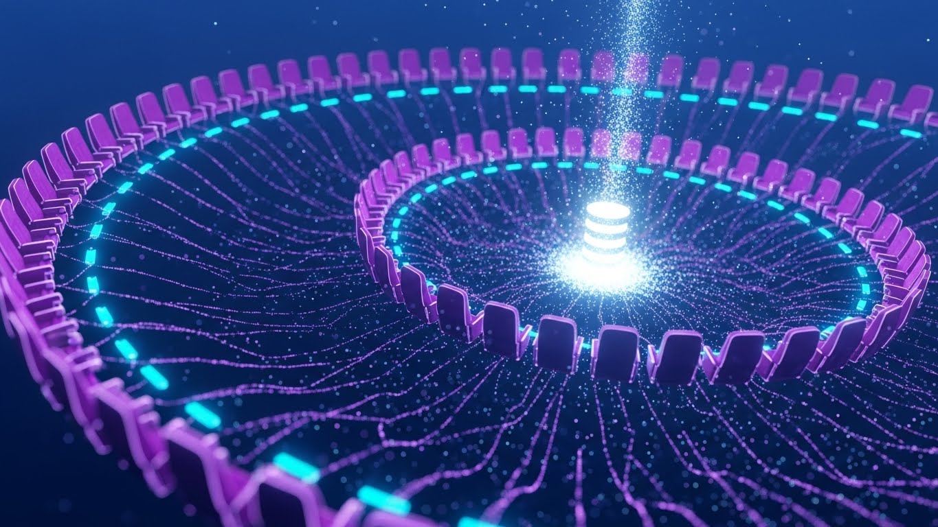
The Visual & Narrative Approach
This visualization reveals the hidden intelligence behind the screen. It features a complex, DNA-like spiraling structure composed of thousands of floating nodes, each shaped like a cinema seat. Rendered in electric purple and cyan against a deep tech blue, the image conveys "Big Data" sophistication. Glowing filaments connect every seat to a central pulsing core, symbolizing the centralized database that unifies ticketing, concessions, and projection. The camera glides through this infinite network, emphasizing scale and connectivity.
Psychological Impact & KPI Focus
- Psychology: This triggers the "Authority Bias." The high-tech, intricate aesthetic suggests that the platform is powerful, robust, and capable of handling millions of transactions. It reassures the CTO that the architecture is enterprise-grade.
- Operational Goal: 1.5 Shaping Brand Perception. It visualizes "Connectivity" and "Real-Time Synchronization," solving the fear of data silos where ticket sales don't talk to inventory systems.
Strategic Implementation & Trade-offs
- Best For: LinkedIn Backgrounds, Whitepaper covers, and Investor Decks.
- Duration: 10-15 seconds (Ambient motion).
- Trade-off: It can appear "cold" or overly complex to a non-technical owner. It is a status signal for tech capability, not a user interface demonstration.
Companies using similar video content -
GDC Technology – TMS, NOC, CMS – Centralized control for digital cinema operations.
Showtime Analytics – Data Solutions – Provides real-time insights into cinema performance.
X-Byte – Cinema Intelligence – AI-powered automated scheduling and business analysis.
4. The Gen Z Hype Cycle (Vertical Social)
TOFU | Vertical Social Organic
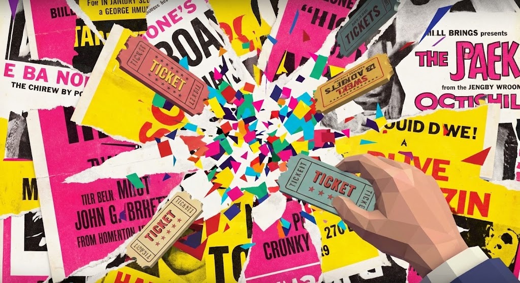
The Visual & Narrative Approach
Designed for the scroll-heavy environment of TikTok and Reels, this style is chaotic, loud, and trendy. It blends the nostalgia of "torn paper" vintage movie posters with sharp, hyper-modern 3D ticket stubs. The palette is aggressive—hot pinks and bright yellows. The animation is explosive; elements burst outward from the center. A 3D hand reaches in to grab a digital ticket, triggering a dopamine-inducing shower of geometric confetti. It mirrors the fast-paced editing of social content creators.
Psychological Impact & KPI Focus
- Psychology: This addresses the "FOMO" (Fear Of Missing Out) regarding younger demographics. It signals to the cinema operator that this software understands the modern, mobile-first consumer who lives on social media.
- Operational Goal: 3.5 Vertical Social Organic. It visualizes "Virality" and "Ease of Access." It’s not about the backend; it’s about the frontend cool factor that drives ticket sales among the 18-25 demographic.
Strategic Implementation & Trade-offs
- Best For: TikTok, Instagram Reels, and event promo teasers.
- Duration: 6-12 seconds (Micro-content).
- Trade-off: It lacks professional gravitas. It is entirely inappropriate for a boardroom presentation but perfect for showing that the brand has a pulse on pop culture.
Companies using similar video content -
The Boxoffice Company – Digital Tools – Boosts ticket sales, enhances online presence.
Movio – Movio Cinema – Automates personalized marketing campaigns for cinemas.
5. The Velocity of Transaction (Ad Recall)
TOFU | Skippable Pre-Roll Ad

The Visual & Narrative Approach
This style removes all imagery to focus purely on the concept of SPEED. Massive, blocky geometric shapes in brand colors (orange and navy) careen across a stark white background. The use of "motion blur" lines and high-contrast lighting emphasizes velocity. The shapes collide to form a solid structure, representing the stability of the platform despite the speed. There is no voiceover, just sound design of "whooshes" and "thuds" that synchronize with the text impacts. It is aggressive, loud, and impossible to ignore.
Psychological Impact & KPI Focus
- Psychology: It leverages "Kinetic Attention." The rapid movement forces the eye to follow, increasing ad retention rates. It speaks to the operator's need for fast transaction times during the Friday night rush.
- Operational Goal: 4.1 Skippable Pre-Roll Ad. The goal is immediate impact. It communicates "High Performance" and "Zero Latency" without needing a complex screenshot.
Strategic Implementation & Trade-offs
- Best For: YouTube 5-second bumpers and Pre-roll ads.
- Duration: 5-10 seconds.
- Trade-off: It provides zero information about features. It is a pure "Attention Hook" meant to drive a click, after which a more detailed video must take over.
Companies using similar video content -
Omniterm – Cinema Management Software – Centralized POS for fast transactions.
Ready Theater Systems (RTS) – POS Solutions – Maximizes profits, streamlines operations.
6. The Architectural Ecosystem (ABM Awareness)
TOFU | ABM Awareness
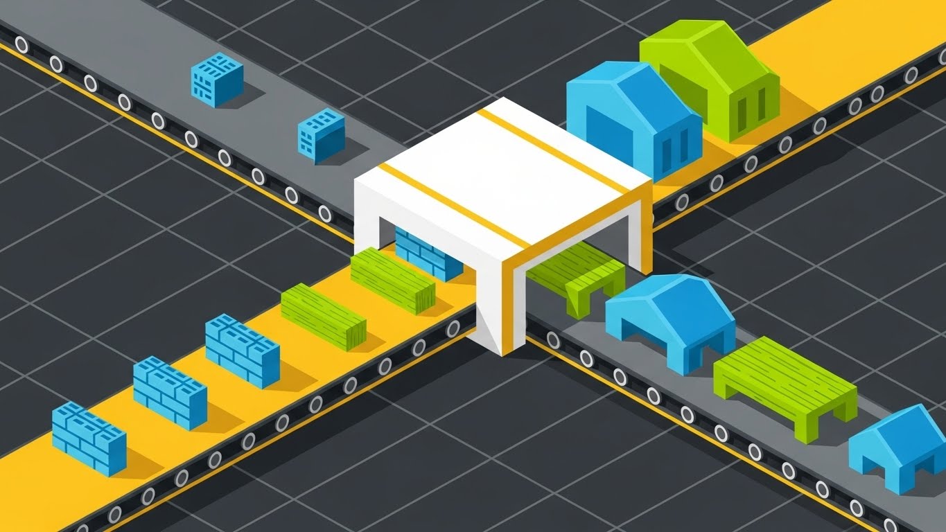
The Visual & Narrative Approach
Utilizing an isometric grid perspective, this style creates a "God's Eye View" of the cinema operation. While the visual metaphor might resemble a polished production line or factory, it perfectly represents the "Theater Complex Ecosystem." We see the flow of entities—customers or data packets—moving through a structured environment. The palette of teal and coral on dark grey keeps it modern and tech-focused. Dotted lines indicate the invisible logic: the path from booking to kiosk, to concession, to auditorium. It’s a blueprint come to life.
Psychological Impact & KPI Focus
- Psychology: This appeals to the "Systemizer" mindset of Operations Directors. It visualizes order, logic, and control. It reassures them that the chaos of a busy night can be managed through structured workflows.
- Operational Goal: 2.2 Account Based Marketing (ABM). It demonstrates "Full-Stack Integration." It shows that the software doesn't just solve one problem (like ticketing) but manages the entire building's flow.
Strategic Implementation & Trade-offs
- Best For: LinkedIn Feed Ads and Solution Overview pages.
- Duration: 30-45 seconds.
- Trade-off: Isometric art can feel impersonal or "generic SaaS." It needs specific labeling (e.g., "Box Office," "Concessions") to ensure it reads as a cinema and not just a generic factory.
Companies using similar video content -
POSitive Cinema – Cinema Management Software – Manages ticketing, concessions, digital signage.
Markus Cinema – Cinema Management Software – Automates bookings, scheduling, payments.
7. The Heroic Hardware (Connected TV)
TOFU | Connected TV
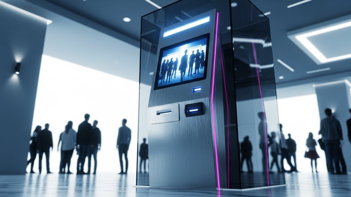
The Visual & Narrative Approach
This is product photography elevated to virtual art. We see a photorealistic 3D render of a self-service kiosk. The camera angle is low ("hero angle"), making the device look monumental. The materials—brushed aluminum, fingerprint-resistant glass—are rendered with extreme fidelity to convey build quality. Crucially, the screen reflects the blurred, happy faces of a diverse crowd, subtly integrating the human element without distracting from the hardware. The lighting mimics a sunlit, modern lobby, suggesting openness and cleanliness.
Psychological Impact & KPI Focus
- Psychology: This targets "Tangibility." In a SaaS world, hardware is the physical manifestation of the investment. A sleek, futuristic kiosk signals to the owner that their lobby will look modern and expensive.
- Operational Goal: 4.6 Connected TV (CTV). It builds "Product Desire." It visually argues that this kiosk is an upgrade to the facility itself, not just a ticket dispenser.
Strategic Implementation & Trade-offs
- Best For: CTV spots, Trade Show loops, and Hardware Product Pages.
- Duration: 15-30 seconds.
- Trade-off: High production cost. Also, if the physical hardware design changes, the video becomes obsolete. It focuses heavily on the device, potentially underselling the software capabilities inside it.
Companies using similar video content -
PARTTEAM & OEMKIOSKS – Self-Service Kiosks – Interactive kiosks for ticketing and F&B.
REDYREF – Ticketing Kiosk Solutions – Provides hardware and software for self-service ticketing.
Christie Digital Systems – Cinema Server – Dedicated digital cinema playback device.
8. The Empowered Manager (Feature Education)
MOFU | Feature Education

The Visual & Narrative Approach
Moving into the middle of the funnel, we introduce a protagonist: the Cinema Manager. Illustrated in a clean, non-cartoony 2D style, she exudes competence and calm. Wearing a professional blazer, she holds a tablet from which holographic UI elements—seat maps, sales graphs—pop out into the air. The background is a soft-focus theater hallway, keeping the context clear but non-distracting. The motion graphics emphasize the ease of interaction; she swipes, and the data responds instantly.
Psychological Impact & KPI Focus
- Psychology: This utilizes "Mirror Neurons." The target audience (managers) sees themselves in the character—calm, in control, and equipped with powerful tools. It counters the anxiety of being overwhelmed by data.
- Operational Goal: 1.8 Feature Education. It visualizes "Mobile Management." It demonstrates that the manager is no longer tethered to a back-office desk but can run the theater from the floor.
Strategic Implementation & Trade-offs
- Best For: "Features" website pages and Email Nurture sequences.
- Duration: 45-60 seconds.
- Trade-off: The character design must be relatable but professional. Too "cartoony," and it trivializes the job. The UI shown must be a simplified but accurate representation of the actual dashboard.
Companies using similar video content -
Veezi – Cinema Management Software – Offers easy-to-learn, intuitive interface for staff.
CINEsync – Cinema POS – Empowers managers with control over operations.
9. The Blueprint of Reality (Differentiation)
MOFU | Differentiation
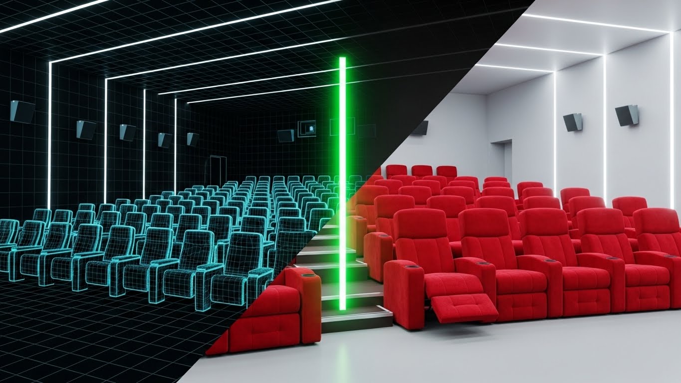
The Visual & Narrative Approach
This style visually proves the software's accuracy. A split-screen effect divides the image: the left side shows a technical, blueprint-blue wireframe grid of an auditorium. The right side shows the photorealistic reality—plush red seats. A glowing green "scan line" moves across the frame, transforming the wireframe into the real image. This transition symbolizes the connection between the digital inventory (the map in the system) and the physical asset (the seat in the room).
Psychological Impact & KPI Focus
- Psychology: This targets "Trust." It assures the buyer that "what you see on the screen is exactly what is in the room." It addresses the nightmare scenario of double-bookings or ghost inventory.
- Operational Goal: 1.7 Differentiation. It visualizes "Precision" and "Digital Twin Technology." It sets the software apart from competitors who might use generic seat maps.
Strategic Implementation & Trade-offs
- Best For: Sales Slide Decks and Technical Webinars.
- Duration: 10-20 seconds (Transition focus).
- Trade-off: It is very technical. It works best when accompanied by a sales engineer explaining the "inventory sync" capabilities. It is less effective as a standalone emotional piece.
Companies using similar video content -
Sony – TMS Lite – Manages digital projectors, schedules, show playlists.
GDC Technology – TMS-2000 – Provides centralized control over digital cinema operations.
10. The Efficiency Leap (Competitive Displacement)
MOFU | Competitive Displacement
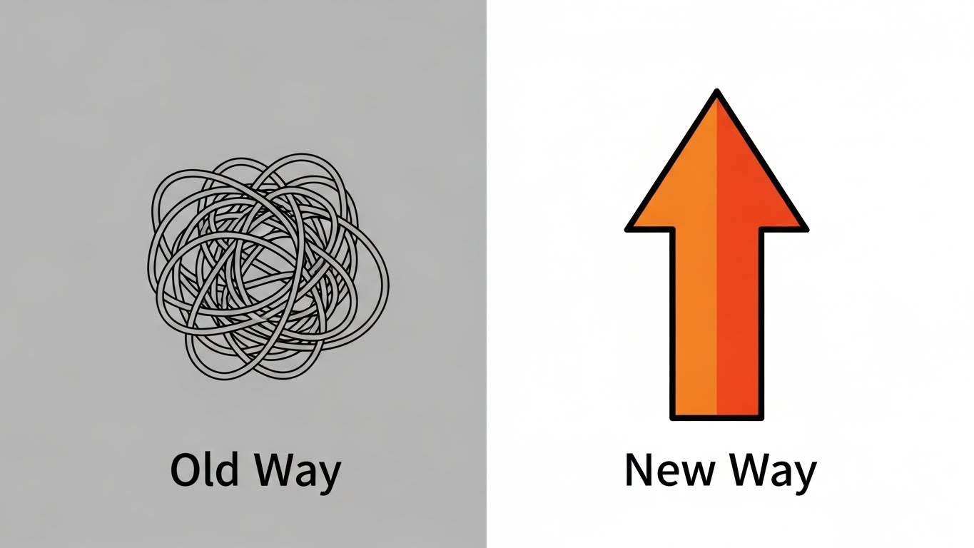
The Visual & Narrative Approach
Sometimes, the most powerful message is the simplest. This style uses extreme minimalism to compare the "Old Way" vs. the "New Way." The left side shows a tangled, grey, knot-like scribble, representing the confusion of legacy systems, queues, and manual errors. The right side features a bold, thick orange arrow pointing straight up and forward, representing the streamlined efficiency of the new SaaS platform. The background is split grey/white. There are no distractions—just a stark, undeniable comparison of chaos vs. order.
Psychological Impact & KPI Focus
- Psychology: This leverages "Cognitive Ease" and the "Contrast Principle." It validates the customer's pain (the knot) and offers an immediate release (the arrow). It creates a binary choice: do you want chaos or clarity?
- Operational Goal: 1.13 Competitive Displacement. It visualizes "Transformation." It creates a strong visual hook that argues the competitor's legacy solution is "messy" while yours is "direct."
Strategic Implementation & Trade-offs
- Best For: Comparison Pages ("Us vs. Them") and retargeting ads.
- Duration: 6-10 seconds (Static or slight animation).
- Trade-off: It is reductive. It doesn't explain why the old way is bad or how the new way works. It is a rhetorical device, not an educational one. It relies on the viewer already feeling the pain of the "knot."
Companies using similar video content -
TicketTool – Ticketing Software – Simplifies operations, improves customer experience.
Filmgrail – Loyalty Programs – Streamlines loyalty, boosts attendance and sales.
11. The Velocity of Value (Accelerating TTV)
MOFU | Accelerating TTV
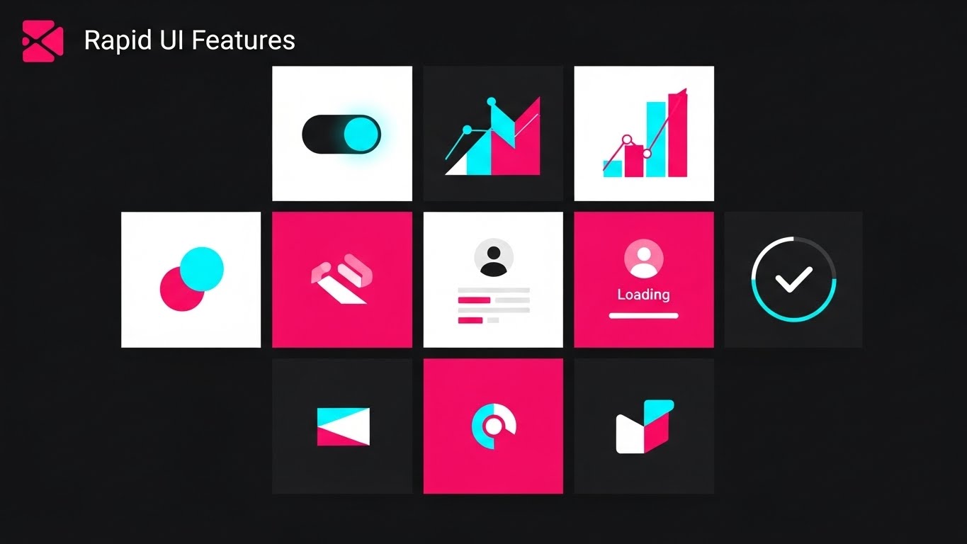
The Visual & Narrative Approach
Speed is the currency of the modern box office. This style utilizes a high-energy "Rapid UI Montage" to visualize the concept of "Rapid Deployment." We see a dynamic composition of abstract dashboard widgets—pie charts, toggle switches, and data tiles—floating in a deep 3D space. Abandoning the traditional "SaaS Blue," the palette is aggressive and modern: vibrant "Hot Pink" and "Cyan" accents pop against a jet-black background, creating a high-contrast, neon-tech aesthetic. Motion blur lines stream from the edges, creating a "tunnel effect" that draws the viewer’s eye forward, suggesting that setting up this software is not a marathon, but a sprint.
Psychological Impact & KPI Focus
- Psychology: This targets the "Impatience" and "Instant Gratification" biases of the buyer. Cinema operators often fear that switching POS systems involves weeks of downtime. This visual metaphor aggressively counters that fear by projecting readiness and agility.
- Operational Goal: 1.15 Accelerating Time-to-Value (TTV). It visually promises "Instant Onboarding." It communicates that the platform is modular and pre-configured, reducing the perceived barrier to entry for IT teams who dread long integration cycles.
Strategic Implementation & Trade-offs
- Best For: Product Launch Videos and "Getting Started" email sequences.
- Duration: 10-15 seconds (High tempo).
- Trade-off: The speed can be overwhelming. It is impressionistic, not instructional. Use it to sell the feeling of a fast setup, not to teach the actual configuration process.
Companies using similar video content -
Dtryx – CMS for Cinemas – Integrates screening, sales, inventory quickly.
Macrofix – Odoo Cinema ERP – Tailored ERP implementation for cinemas.
12. The Narrative of Partnership (Driving Demos)
MOFU | Driving Demo Requests

The Visual & Narrative Approach
Technology is bought by humans, not robots. This style introduces a relatable narrative using clean, flat 2D vector art. We see a dialogue between two characters: a consultative Sales Representative in a soft peach shirt and a Cinema Owner in a navy blazer. They stand in a stylized, bright office environment. The Owner looks delighted as a glowing "lightbulb" graphic appears, symbolizing the "Aha!" moment of solving a complex booking issue. The laptop screen between them displays a simplified, clean UI, acting as the collaborative bridge in their conversation.
Psychological Impact & KPI Focus
- Psychology: This leverages "Social Connection." It humanizes the B2B transaction, suggesting that buying this software comes with a relationship, not just a license key. It appeals to the owner's desire for support and partnership.
- Operational Goal: 2.1 Driving Demo Requests. By visualizing a successful, pleasant interaction, it lowers the social friction of booking a sales call. It promises a "Consultation," not a "Pitch."
Strategic Implementation & Trade-offs
- Best For: Email Signatures, "About Us" pages, and Demo Request landing pages.
- Duration: 30-45 seconds.
- Trade-off: It can feel "generic corporate" if not stylized correctly. The key is to ensure the characters have visual cues that resonate with the actual persona (e.g., casual professional attire), avoiding stiff "stock photo" vibes.
Companies using similar video content -
The Boxoffice Company – Digital Tools – Partners with cinemas to boost sales.
Ready Theater Systems (RTS) – POS Solutions – Trusted leader, offers comprehensive support.
13. Visualizing the Revenue Stream (ROI Justification)
MOFU | ROI Justification
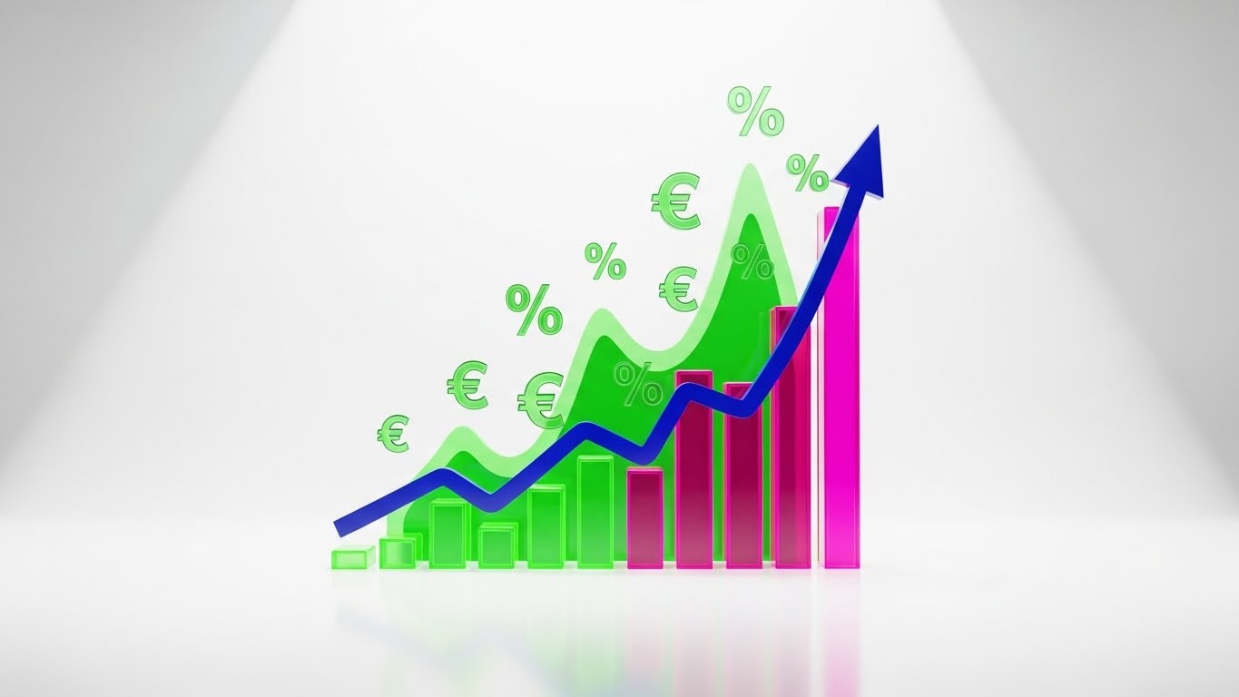
The Visual & Narrative Approach
Here, we make the intangible tangible: we visualize Profit. Set against a clean, clinical white background to emphasize clarity, glowing neon green and magenta 3D bar charts rise from a virtual floor. A deep blue curved line graph weaves through them, trending sharply upward to an arrow point, symbolizing the "Hockey Stick" growth every investor wants to see. Floating currency symbols (€, %) and percentage signs orbit the peaks. The "Glassmorphism" effect adds a layer of modern sophistication, suggesting that the data is pristine and transparent.
Psychological Impact & KPI Focus
- Psychology: This targets the "Greed" (in a business sense) and "Safety" drives. It reassures the CFO that the expenditure on this software yields a measurable, visible return. It transforms the software from a "Cost Center" to a "Profit Center."
- Operational Goal: 1.10 ROI Justification. It specifically supports the argument for higher ticket yield and increased concession-per-head revenue through better data utilization.
Strategic Implementation & Trade-offs
- Best For: Case Studies, Pricing Pages, and Investor Reports.
- Duration: 10-20 seconds.
- Trade-off: It is purely analytical. It lacks emotional warmth. It works best when paired with a case study statistic (e.g., "Increase revenue by 20%") to ground the abstract graphics in reality.
Companies using similar video content -
La Belle Data – SHOWTIMES INSIGHTS™ – Business intelligence for market understanding.
Showtime Analytics – Data Solutions – Helps understand, analyze, and grow cinema business.
14. The Intuitive Architect (Self-Serve Onboarding)
MOFU | Self-Serve Onboarding
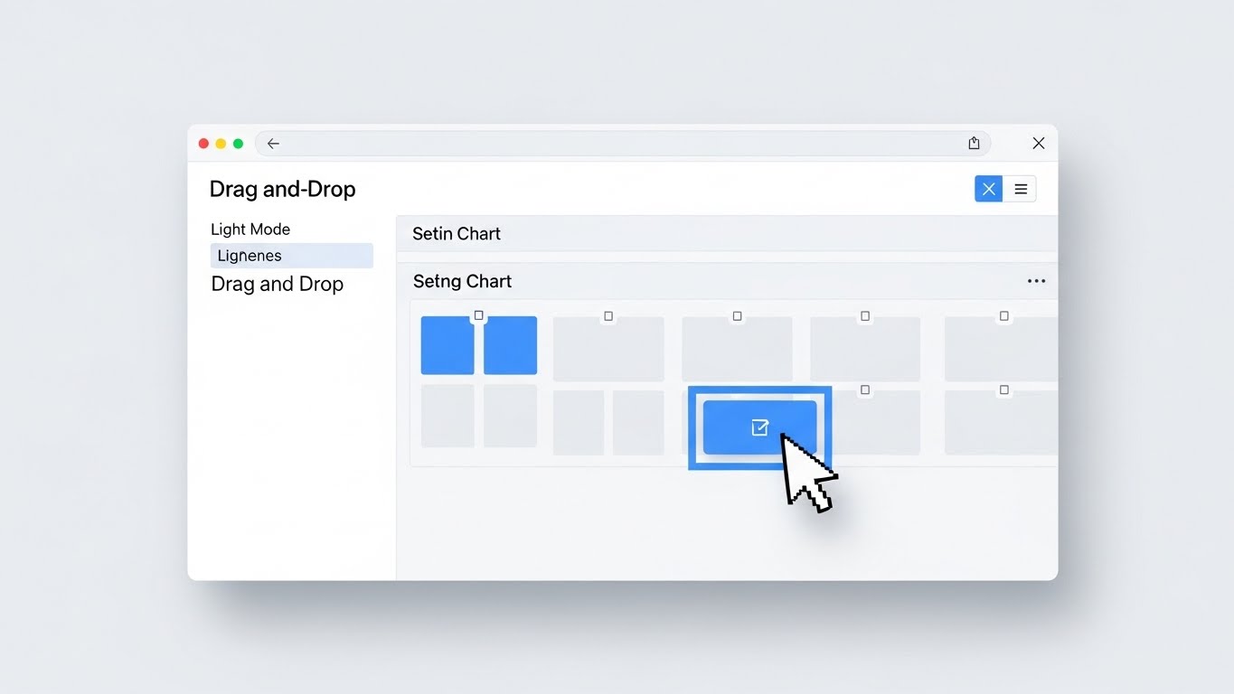
The Visual & Narrative Approach
Moving closer to the purchase decision, the buyer needs to see if the tool is actually usable. This style presents a high-fidelity mock-up of the "Seating Chart Editor" in a crisp Light Mode. The focus is on the "Drag-and-Drop" functionality—a realistic mouse cursor moves smoothly to select a seat block and reposition it. The aesthetic is airy: white backgrounds, soft grey panels, and interactive elements in sky blue. Soft, diffuse shadows give the interface a floating, tactile quality, making the digital task feel as simple as moving physical objects.
Psychological Impact & KPI Focus
- Psychology: This addresses "Complexity Bias" and the fear of training overhead. By showing a familiar, consumer-grade interaction pattern (drag-and-drop), it signals that "no coding is required." It empowers the non-technical manager.
- Operational Goal: 2.4 Self-Serve Onboarding. It visually demonstrates the "Ease of Administration," proving that changing a theater layout for a special event takes seconds, not a support ticket.
Strategic Implementation & Trade-offs
- Best For: Product Feature Pages ("Auditorium Management") and Help Center videos.
- Duration: 30-60 seconds.
- Trade-off: It is functional, not exciting. It won't go viral, but it is essential for the "Evaluation" phase where the buyer is comparing feature sets against competitors.
Companies using similar video content -
Veezi – Cinema Management Software – Features modular design, easy setup.
Ticketor – Online Ticketing System – Offers custom seating charts, flexible pricing.
15. Augmented Operations (The Functional Buyer)
MOFU | The Functional Buyer
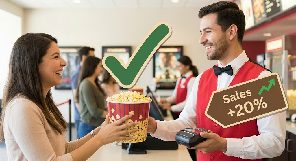
The Visual & Narrative Approach
To connect the software to the floor staff, we use a mixed-media approach. A high-quality, bright photograph captures a smiling usher handing a popcorn bucket to a customer—the "Moment of Truth." Overlaid on this realistic scene are vibrant 2D vector graphics: a green "Checkmark" floating over the popcorn and a tag reading "Sales +20%" pointing to the POS device. This technique augments reality to show the hidden data layer driving the interaction. It visually explains why the transaction is successful (e.g., a prompt on the screen reminded the usher to upsell).
Psychological Impact & KPI Focus
- Psychology: This targets the "Pragmatism" of the Operations Director. It bridges the gap between the boardroom strategy and the concession stand reality. It validates the role of the frontline staff, showing technology as an enabler, not a replacement.
- Operational Goal: 7.2 The Functional Buyer. It visualizes "Concession Upsell Efficiency" and "Order Accuracy." It proves the software directly impacts the per-capita spend.
Strategic Implementation & Trade-offs
- Best For: LinkedIn Posts targeting Operations Managers and Employee Training teasers.
- Duration: Static Image or 5-second motion graphic.
- Trade-off: Requires high-quality stock or custom photography. Poorly acting stock models can ruin the credibility. The graphics must look integrated, not just pasted on.
Companies using similar video content -
Restroworks – Cinema POS Software – Optimizes F&B sales and inventory.
DEEL Media – Carbon Platform – Manages concession boards, dynamic pricing.
16. The Culture of Growth (The Champion)
MOFU | The Champion

The Visual & Narrative Approach
Software adoption often fails due to internal resistance. This style visualizes the "Champion's" goal: a unified, happy team. We see a modern, sunlit office where a diverse group of young professionals gathers around a large wall monitor. They are smiling and pointing at a gold and silver line graph trending upward. The palette is corporate blue and cool grey, projecting stability. This isn't just about data; it's about the social aspect of success—the team celebrating a record-breaking opening weekend powered by the new platform.
Psychological Impact & KPI Focus
- Psychology: This targets "Social Proof" and "Belonging." It sells the vision of a modernized, data-literate company culture. It appeals to the leader who wants to be seen as an innovator who empowers their team.
- Operational Goal: 7.4 The Champion. It visualizes "Organizational Alignment." It suggests that this software breaks down silos between marketing and operations, getting everyone on the same page.
Strategic Implementation & Trade-offs
- Best For: Internal Pitch Decks (for Champions selling to C-Suite) and "Culture" pages.
- Duration: Static or slow-pan video.
- Trade-off: It is very "stock photo." It lacks specific product details. It sells the result of the software (a happy team), not the software itself.
Companies using similar video content -
Nostradamus – Workforce Scheduling – Provides efficient event management for teams.
Findmyshift – Staff Scheduling Software – Simplifies employee management.
17. The Voice of Authority (Building Trust)
BOFU | Building Trust
The Visual & Narrative Approach
At the bottom of the funnel, trust is the only metric that matters. This style uses high-end Generative AI to create a "Peer Testimonial." We see a close-up, interview-style shot of a distinguished man in his 50s—the archetype of a seasoned Cinema Chain CEO. He speaks with confidence, framed by "Rembrandt" lighting against a soft-focus background of plush red theater seats. The hyper-realistic texture of his skin and suit adds weight to his words. He represents the "Peer" that the buyer looks up to, validating the decision to switch platforms.
Psychological Impact & KPI Focus
- Psychology: This leverages "Authority Bias" and "Social Validation." Buyers are risk-averse; seeing a figure who looks like a successful version of themselves endorsing the product reduces the fear of making a wrong choice.
- Operational Goal: 1.9 Building Trust. It serves as a high-fidelity proxy for a case study, delivering a "Verdict" on the software's reliability and scalability.
Strategic Implementation & Trade-offs
- Best For: Testimonial sections on Homepages and final "Closing" sales emails.
- Duration: 30-60 seconds.
- Trade-off: Ethical transparency is key. If using AI avatars, ensure the script reflects real customer sentiment or is clearly labeled as a dramatization of a real case study to maintain credibility.
Companies using similar video content -
Vista Cloud – Vista Cinema – Trusted by 50% of the world's cinemas.
GDC Technology – TMS, NOC, CMS – Global leader in digital cinema solutions.
18. The Invisible Shield (Risk Mitigation)
BOFU | Risk Mitigation
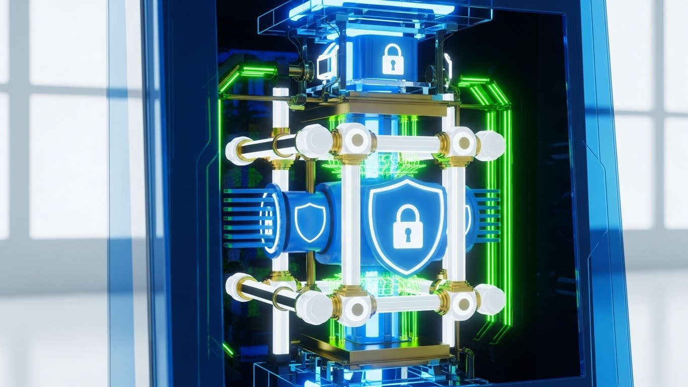
The Visual & Narrative Approach
Security is often invisible, which makes it hard to sell. This style makes it visible. We use a "3D X-Ray" effect to look inside a digital ticket kiosk. The outer shell is rendered in ghostly, translucent blue glass. Inside, revealed in stark clarity, is a glowing mechanical core of lock icons, shield shapes, and thick data beams in skeleton white and gold. The background is a sterile, bright laboratory white. This visual metaphor communicates that while the exterior is sleek, the interior is robust, engineered, and impenetrable.
Psychological Impact & KPI Focus
- Psychology: This targets "Loss Aversion" and the fear of data breaches. It reassures the IT Director that security is not an afterthought but the core architectural principle.
- Operational Goal: 1.12 Risk Mitigation. It visualizes "PCI Compliance" and "Data Encryption." It answers the critical question: "Is my customer data safe?" without using boring text checklists.
Strategic Implementation & Trade-offs
- Best For: Security/Compliance pages and Technical Whitepapers.
- Duration: 10-15 seconds.
- Trade-off: It is abstract. It represents security concepts rather than showing actual code. It is a confidence signal, not a technical audit.
Companies using similar video content -
Hikvision – Access Control Terminals – Offers advanced biometric authentication, security.
Tix – Event Ticket Management Software – Provides integrated access controls.
19. The Operational Contrast (Overcoming Objections)
BOFU | Overcoming Objections
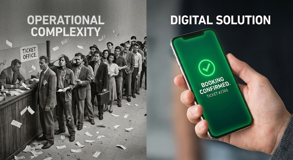
The Visual & Narrative Approach
This is the "Closer" visual. It forces a direct comparison between the problem and the solution. A sharp vertical line divides the screen. The left side is desaturated, grainy, and chaotic, depicting a long, stressful line at a manual ticket counter—the "Ghost of Operations Past." The right side is vibrant, high-resolution, and calm, featuring a close-up of a hand holding a smartphone with a glowing green "Booking Confirmed" screen. This binary visual forces the viewer to choose a side: do they want to remain in the grainy past or step into the vibrant future?
Psychological Impact & KPI Focus
- Psychology: This utilizes the "Contrast Principle." By placing the pain (chaos) directly next to the relief (mobile booking), the value of the solution is magnified. It triggers a desire to distance oneself from the "bad" image.
- Operational Goal: 1.11 Overcoming Objections. It addresses the inertia of "sticking with what we have." It visually proves that the status quo is actually a liability.
Strategic Implementation & Trade-offs
- Best For: Sales One-Pagers (PDFs) and Bottom-of-Funnel retargeting ads.
- Duration: Static Image.
- Trade-off: It is aggressive. It frames the non-digital approach as objectively "bad." Ensure the "Chaos" side doesn't look too much like the prospect's current lobby, or it might offend rather than convert.
Companies using similar video content -
Omniterm – Cinema Management Software – Streamlines operations, reduces queues.
TicketCRM – Cinema CRM – Automates routines, provides clear customer segments.
20. The Executive Command (The Economic Buyer)
BOFU | The Economic Buyer
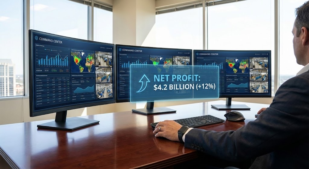
The Visual & Narrative Approach
The final decision often rests with the owner or CFO who cares about one thing: The Bottom Line. This style depicts the "Control Room" of the cinema empire. An over-the-shoulder shot shows an executive at a mahogany desk, bathed in sunlight. They view a triple-monitor setup displaying a comprehensive "Command Center" dashboard. A holographic UI overlay in corporate blue highlights the ultimate metric: "Net Profit" with a green upward arrow. The focus is sharp on the data and the confident hand on the mouse, symbolizing control over the business's destiny.
Psychological Impact & KPI Focus
- Psychology: This appeals to the "Mastery" and "Power" drives of senior leadership. It visualizes the feeling of being in total control of a complex operation. It shifts the conversation from "ticketing software" to "business intelligence."
- Operational Goal: 7.1 The Economic Buyer. It visualizes "Real-Time Analytics" and "Profitability." It confirms that this tool is an asset for growth, giving the executive the visibility they crave.
Strategic Implementation & Trade-offs
- Best For: ROI Calculator landing pages and Executive Summary decks.
- Duration: Static or subtle "Cinemagraph" motion.
- Trade-off: It can appear distant from the actual movie-going experience. It is strictly B2B. It speaks to the business of cinema, not the art of cinema.
Companies using similar video content -
Earn Spot – Cinema Management Software – Streamlines operations, financial reporting.
PurchaseControl – Supply Management Solutions – Optimizes procurement, reduces overspending.
21. The Developer's Sanctum (Technical Trust)
BOFU | The Technical Buyer
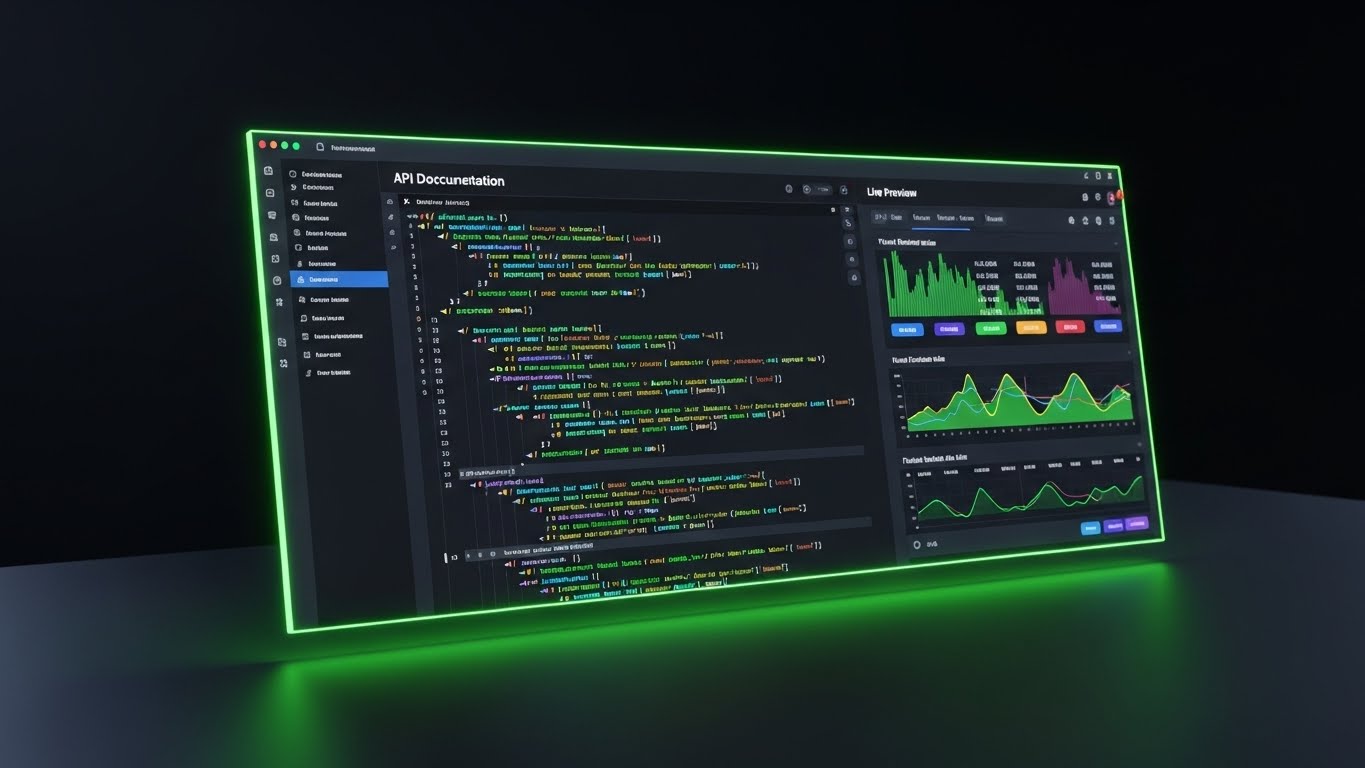
The Visual & Narrative Approach
For the technical buyer, code is art. This style romances the backend infrastructure. We see a sleek, angled close-up of the platform’s API documentation and code editor in "Dark Mode"—the preferred environment for developers. The background is a deep, sophisticated charcoal. Syntax highlighting pops in neon blue, purple, and green, signaling clean, modern architecture. To the right, a live preview window updates instantly with a stream of ticket sales data, visually connecting the code (cause) to the result (effect). The lighting is moody and premium, reflecting the screen's glow onto a matte desk surface.
Psychological Impact & KPI Focus
- Psychology: This targets "Professional Validation." CTOs and Lead Developers often judge a platform by its documentation and developer experience (DX). A polished, dark-mode interface signals that the platform is built by developers, for developers.
- Operational Goal: 7.3 The Technical Buyer. It visualizes "API Robustness" and "Ease of Integration." It reassures the technical team that this software will be a joy to work with, not a burden to maintain.
Strategic Implementation & Trade-offs
- Best For: Developer Documentation portals (Dev Docs) and Technical API pages.
- Duration: 15-30 seconds (Looping code-scroll).
- Trade-off: It is alienating to non-technical staff. A General Manager doesn't engage with JSON snippets. This asset must be strictly gated or placed in technical sections of the site.
Companies using similar video content -
Q-SYS – Digital Cinema Processors – Offers control software for sound systems, network monitoring.
Dolby – CineAsset Player – Provides software for DCP review, server integration.
22. The Supply Chain Symphony (Sales Cycle Acceleration)
BOFU | Sales Cycle Acceleration
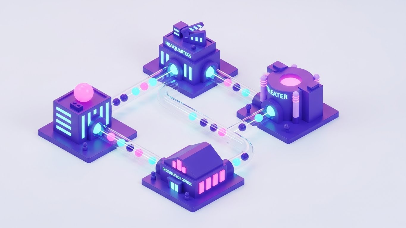
The Visual & Narrative Approach
Cinema is a logistics business. This style zooms out to show the entire content supply chain. In a pristine isometric 3D view, we see miniature, stylized buildings: a Distributor's HQ, a Digital Delivery Center, and the Cinema itself. They are connected by transparent, glossy tubes. Inside, glowing spheres (representing Digital Cinema Packages or Data) travel rapidly between them. The palette is vibrant—purple, pink, and cyan—set against a pure white background. It transforms the complex logistics of film booking and key delivery into a playful, clockwork ecosystem.
Psychological Impact & KPI Focus
- Psychology: This appeals to the "Holistic Thinker." It helps the buyer visualize the invisible connections between booking a film and playing it on screen. It satisfies the need for order and connectivity.
- Operational Goal: 14. Sales Cycle Acceleration. It visualizes "End-to-End Management." By showing the full lifecycle of a film asset, it argues that the platform handles everything, reducing the need for disparate tools.
Strategic Implementation & Trade-offs
- Best For: Sales Proposals and "How it Works" ecosystem diagrams.
- Duration: Static Illustration or 15-second loop.
- Trade-off: It simplifies reality. It represents complex network protocols as "balls in tubes." While effective for high-level understanding, it shouldn't replace detailed network topology diagrams for IT security audits.
Companies using similar video content -
GDC Technology – CMS-3000 – Centralized content transfer, program schedule.
Cinelytic – Predictive Forecasting – Offers film and talent analytics for distribution.
23. The Frictionless Start (Onboarding)
Onboarding | Self-Serve Onboarding
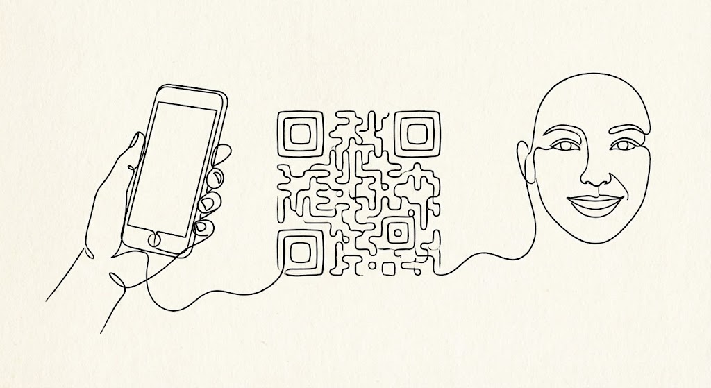
The Visual & Narrative Approach
The moment after purchase is when anxiety spikes ("Did I make the right choice?"). This style offers a calming, elegant reassurance. Using a single, continuous black ink line on a textured cream paper background, the animation flows effortlessly. The line draws a hand holding a smartphone, morphs smoothly into a scannable QR code, and finally resolves into a smiling face. There are no jarring cuts or loud colors. It is pure, fluid motion, symbolizing that the onboarding process will be just as unbroken and easy.
Psychological Impact & KPI Focus
- Psychology: This targets "Cognitive Ease" and "Warmth." The organic, hand-drawn feel contrasts with the coldness of typical tech vector art. It feels human, accessible, and gentle—perfect for welcoming new users.
- Operational Goal: 2.4 Self-Serve Onboarding. It visualizes "Simplicity." It tells the new user, "You don't need a manual; just follow the line." It encourages them to take the first step (e.g., scanning a setup code).
Strategic Implementation & Trade-offs
- Best For: "Welcome" Emails and First-Login splash screens.
- Duration: 5-10 seconds (Looping GIF).
- Trade-off: It is low-fidelity. It doesn't show the actual UI, so it cannot be used for training. Its only job is emotional reassurance during the setup phase.
Companies using similar video content -
My Cloud Cinema – Loyalty Programs – Enables easy setup and management.
AgentiveAIQ – AI Chatbots – Provides no-code platform for ticket sales assistants.
24. The Tactile Interface (Reducing Friction)
Onboarding | Reducing Friction
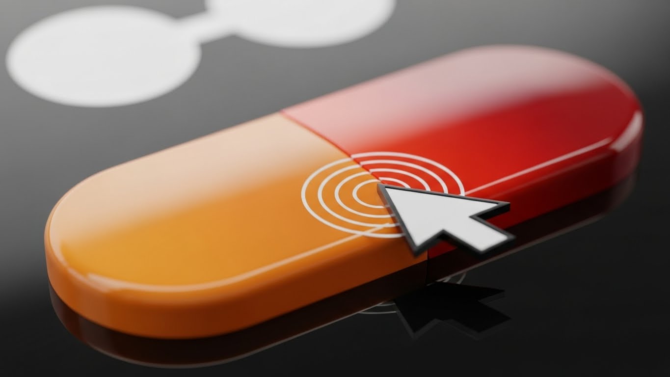
The Visual & Narrative Approach
Quality is often felt in the micro-moments. This style uses an extreme macro close-up to celebrate the "feel" of the software. We focus on a single UI element: a pill-shaped button with a gradient of sunset orange to red. A cursor clicks it, and we see a satisfying, high-fidelity "ripple" effect spread across the digital texture. The background is a soft, dreamy white bokeh. This isn't about data; it's about the tactile satisfaction of a responsive, well-designed tool. It elevates the software from a utility to a crafted product.
Psychological Impact & KPI Focus
- Psychology: This targets the "Aesthetic-Usability Effect." Users perceive attractive, responsive products as more usable. By highlighting the polish of a single click, you imply that the entire system is equally refined and bug-free.
- Operational Goal: 1.16 Reducing Friction. It visualizes "Responsiveness." It subliminally trains the user to expect immediate feedback from the system, reducing the frustration of "lag."
Strategic Implementation & Trade-offs
- Best For: Tooltip Videos, Feature Highlight reels, and App Store previews.
- Duration: 3-5 seconds.
- Trade-off: It is hyper-specific. You cannot build a narrative around it. It serves as "visual punctuation" to break up text-heavy feature lists.
Companies using similar video content -
Veezi – Cinema Management Software – Features intuitive, user-friendly interface.
CINEsync – Cinema POS – Offers sleek user interfaces, state-of-the-art product suite.
25. The Island of Answers (Retention)
Retention | Knowledge Base

The Visual & Narrative Approach
Support portals are usually boring lists of links. We reimagine the Help Center as a destination. Using a cheerful "Low-Poly" 3D style, we depict the support database as a floating island in a sky-blue void. On the island sits a cute, blocky cinema building and a massive, bouncing yellow question mark. Trees and clouds add a friendly, "video game" aesthetic. It transforms the act of seeking help from a chore into a playful exploration. The bright lighting and simple shapes make the problem-solving process feel manageable and non-threatening.
Psychological Impact & KPI Focus
- Psychology: This leverages "Gamification" and "Playfulness." When a user has a problem, they are stressed. This visual style disarms that stress, suggesting that finding a solution is as easy as playing a casual mobile game.
- Operational Goal: 9.1 Knowledge Base Engagement. It visualizes "Self-Service Support." It makes the help portal inviting, encouraging staff to find their own answers rather than calling the hotline.
Strategic Implementation & Trade-offs
- Best For: The Support Portal Homepage and "Error 404" pages.
- Duration: Static Image or gentle floating animation.
- Trade-off: It can feel too childish for serious technical outages. It is best for "How-To" guides, not "System Down" critical alerts where a serious tone is required.
Companies using similar video content -
Filmgrail – Loyalty Programs – Provides turnkey loyalty program creation, management.
The Boxoffice Company – Digital Tools – Offers support for online presence.
26. The Proof of Throughput (Reducing Churn)
Retention | Reducing Churn
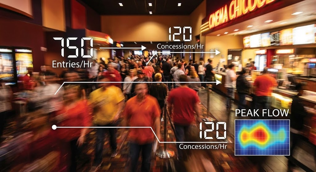
The Visual & Narrative Approach
During a Quarterly Business Review (QBR), you need to prove value. This style combines the energy of the real world with the precision of data. We use a still image capturing the essence of a hyper-lapse video: a cinema lobby blurred by the speed of a rushing Friday night crowd. Superimposed over this organic chaos are sharp, static, white data lines and counters (e.g., "750 Entries/Hr", "120 Concessions/Hr"). The contrast between the blurred humanity and the crisp data proves that the software successfully managed the storm.
Psychological Impact & KPI Focus
- Psychology: This targets "Validation." It reflects the operator's reality—the chaotic rush—and organizes it. It says, "We saw what you went through, and we tracked every second of it." It validates their hard work.
- Operational Goal: 1.19 Reducing Churn. It visualizes "System Stability" and "High-Volume Processing." It reminds the client that the software didn't crash during the biggest movie opening of the year.
Strategic Implementation & Trade-offs
- Best For: QBR Decks, Case Studies, and Year-In-Review emails.
- Duration: Static Image (or video if footage allows).
- Trade-off: Requires excellent footage. If the lobby looks empty or dirty in the background, it backfires. The "blur" is essential to mask details while conveying energy.
Companies using similar video content -
Vista Cloud – Vista Horizon – Provides real-time data, AI capabilities for operational efficiency.
Ready Theater Systems (RTS) – POS Solutions – Handles over a billion tickets sold.
27. The Integration Web (Re-engagement)
Retention | Re-engagement

The Visual & Narrative Approach
To re-engage a client who is under-utilizing the platform, you must show them the value of connection. This style uses a clean, abstract network graph. Orange and white nodes are connected by rigid blue lines against a deep blue background. The nodes pulse, sending signals to one another. It focuses on the "Constellation" effect—showing that the Ticketing module connects to the Loyalty module, which connects to Inventory. It visually argues that the whole is greater than the sum of its parts.
Psychological Impact & KPI Focus
- Psychology: This targets the "Completionist" drive. It highlights gaps in the user's current setup (e.g., unconnected nodes) and subtly urges them to "complete the circuit" by adopting more features.
- Operational Goal: 5.1 Re-engagement. It visualizes "Integration." It is used to show a dormant user that they are missing out on the synergy between different parts of the platform.
Strategic Implementation & Trade-offs
- Best For: Email Banners for feature adoption campaigns and "Did You Know?" dashboard widgets.
- Duration: Static or subtle pulsing animation.
- Trade-off: It is abstract. It doesn't show what the modules do, only that they connect. It needs strong copy to explain the benefit of connecting Node A to Node B.
Companies using similar video content -
Spektrix – Ticketing & CRM – Integrates ticketing, CRM, marketing.
AudienceView Professional – Ticketing & CRM – Complete platform for ticketing, marketing, fundraising.
28. The Vision of Expansion (Upsell)
Expansion | Upsell/Cross-sell
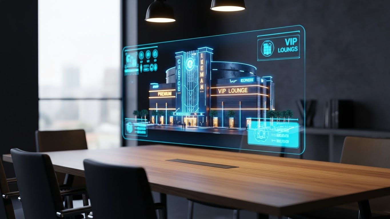
The Visual & Narrative Approach
When pitching a premium upgrade (like VIP seating or a new location), you need to sell the future. This style grounds that future in reality. We see a realistic 3D render of a wooden conference table in a sunlit office. Hovering above it is a futuristic, semi-transparent holographic projection of a multi-story cinema complex. The hologram glows in "Holographic Blue," but key growth areas (like a new VIP Lounge) are highlighted in gold. It places the technology literally on the decision-maker's table, making the expansion feel within reach.
Psychological Impact & KPI Focus
- Psychology: This targets "Ownership" and "Ambition." It makes the expansion plans look tangible and architectural. It appeals to the owner's desire to build and grow their physical empire.
- Operational Goal: 1.20 Upsell/Cross-sell. It visualizes "Scalability" and "Multi-Site Management." It suggests the software is sophisticated enough to handle complex, multi-level facility management.
Strategic Implementation & Trade-offs
- Best For: "New Feature" announcements (e.g., Reserved Seating upgrade) and Enterprise Pitch Decks.
- Duration: Static Image or slow rotation.
- Trade-off: It looks expensive. This can be good (premium feel) or bad (if the client is cost-sensitive). Use this style for high-ticket upgrades, not for small add-ons.
Companies using similar video content -
Momentus Technologies – Event & Venue Management – Offers global presence, comprehensive solutions.
ArtsVision – Cloud Management – Provides holistic approach to planning, production, operations.
29. The Depth of Intelligence (Deep Feature Adoption)
Expansion | Deep Feature Adoption
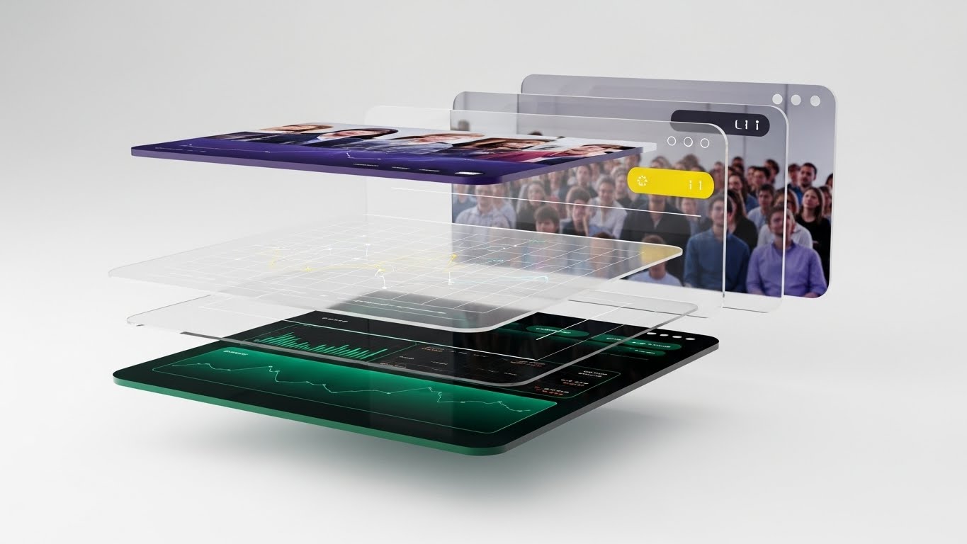
The Visual & Narrative Approach
To show that the platform is more than just a pretty face, we "explode" the interface. Using a 3D parallax effect, we deconstruct a dashboard into floating layers. The back layer is a blurred image of an audience (the context). The middle layer is a grid of translucent data points (the logic). The front layer is the sharp, high-contrast dashboard (the control). The camera views this from the side, revealing the depth between the layers. This visual metaphor communicates that the software has "depth"—it is powered by deep data and real-world connection.
Psychological Impact & KPI Focus
- Psychology: This targets "Curiosity" and "Competence." It suggests that there is more to the software than meets the eye, inviting the user to dig deeper. It validates the complexity of the data they are managing.
- Operational Goal: 1.17 Deep Feature Adoption. It visualizes "Data Granularity." It encourages power users to look past the top-level metrics and explore the deep analytics available in the "middle layers" of the system.
Strategic Implementation & Trade-offs
- Best For: Webinar backdrops and Advanced Training Course covers.
- Duration: Static Image or subtle parallax motion.
- Trade-off: It is abstract. It doesn't show a usable workflow. It is a conceptual piece designed to elevate the perceived sophistication of the analytics engine.
Companies using similar video content -
La Belle Data – SHOWTIMES INSIGHTS™ – Offers historical data, statistics, predictive analysis.
X-Byte – Cinema Intelligence – Provides film performance forecasting, data visualization.
30. The City of Cinema (Category Creation)
Expansion | Category Creation
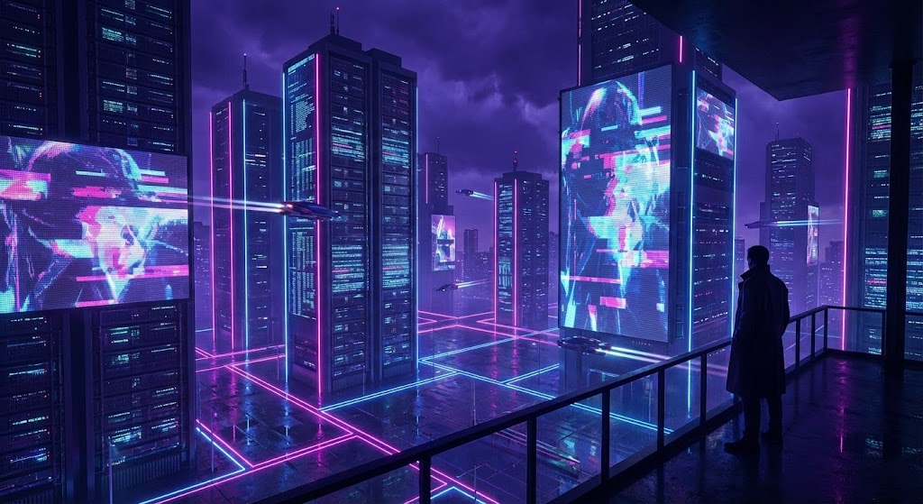
The Visual & Narrative Approach
The final style is about legacy. It frames the software provider not as a vendor, but as the architect of the industry's future. We see a futuristic, cyberpunk-inspired cityscape at night. But look closer: the skyscrapers are shaped like server racks and cinema screens. Neon lines in laser pink and electric blue form a grid on the ground, connecting these towers in a vast network. A silhouette of a person (the operator) stands on a balcony, looking out at this digital city. It suggests that the software is not just a tool, but the electricity powering the entire city of entertainment.
Psychological Impact & KPI Focus
- Psychology: This targets "Transcendence" and "Legacy." It lifts the conversation out of the day-to-day grind and places the cinema owner at the center of a technological revolution. It inspires them to be part of the future.
- Operational Goal: 1.2 Category Creation. It visualizes "The Connected Entertainment Ecosystem." It argues that the future of cinema is not just movies, but a fully connected, digital city of experiences.
Strategic Implementation & Trade-offs
- Best For: Vision Keynotes, Annual Reports, and "About Us" philosophy sections.
- Duration: Static Image or slow cinematic pan.
- Trade-off: It is pure "Vision." It has zero functional utility. Use it only when you have earned the right to dream with the client, typically after the deal is signed or during a major partnership renewal.
Strategic Knowledge Base: The Visual Operations Doctrine
To truly bridge the Physical/Digital divide, a cinema operator cannot simply "make a video." They must adopt a strategic visual framework that aligns with business outcomes. This doctrine synthesizes the 30 styles into three actionable operational segments.
Strategic Alignment & Visual Architecture (Pre-Production)
The "Why" and "Who" – Laying the Foundation for Visual Success.
- The Cognitive Load Audit: Cinema operations are high-stress environments. A "Visual Audit" must be conducted to assess current training materials. Does a 20-page PDF manual for the POS system create more friction than it solves? The goal is to identify high-complexity tasks and target them for visual simplification (e.g., replacing a text manual with Style 24: Macro UI videos).
- Role-Based Visual Mapping: Different personas consume information differently. The "Floor Staff" (Ushers/Concessions) operate on mobile devices and need simple, bold visuals (Style 5: Kinetic Type). The "HQ Manager" (General Manager) operates on desktop dashboards and needs dense, data-rich visuals (Style 22: Isometric Workflow). Mapping styles to devices is critical.
- The "Glanceability" Standard: In a dark, busy theater, staff cannot watch long videos. Visuals for operational support must pass the "Glanceability" test—can the information be absorbed in under 5 seconds? This dictates the use of high-contrast, minimalist styles like Style 10: Minimalist Vector for quick reference cards.
- Brand Voice Consistency: A cinema chain often uses multiple software modules (Ticketing, POS, Projection). A unified visual language is essential to prevent cognitive dissonance. Advids plays a crucial role here, establishing a "Visual Operating System" that ensures the iconography for "Ticket" looks the same in the training video as it does on the POS screen.
- Legacy System Integration: Many cinemas still use ancient hardware. Use Wireframe to Reality (Style 9) to visually bridge the gap. Show the modern software "wrapping" around the legacy hardware, visually explaining how the new tech respects the old investments.
- Accessibility in the Dark: Design motion graphics for the physical environment. Visuals viewed in a darkened auditorium need different contrast ratios (Dark Mode) than those viewed in a bright back office. Style 21 is not just an aesthetic choice; it’s an accessibility requirement for projectionists.
- The Advids Strategic Audit: Don't just make assets; build a library. Engage a strategic partner like Advids early to map your entire feature set against these 30 styles. Identify which features need "Trust" (Style 18) and which need "Speed" (Style 5) before production begins.
- Standardization vs. Customization: For core features (Ticketing), use standardized Clean UI (Style 14) to ensure consistency across the industry. For unique selling points (e.g., VIP Dining), use bespoke Holographic Renders (Style 28) to differentiate.
- The Cross-Departmental Bridge: Sales talks "Revenue," Ops talks "Throughput," IT talks "Uptime." Visuals are the translator. A Split Screen Contrast (Style 19) brings these three languages together in one image, showing how Uptime + Throughput = Revenue.
- The Mobile-First Mandate: 70% of your users (staff) are mobile. Every visual style from 1-30 must be legible on a 6-inch screen. If Complex 3D (Style 3) loses detail on a phone, simplify it to Abstract Vector (Style 2) for mobile delivery.
Operational Adoption & Implementation (Deployment)
The "How" – Embedding Visuals into the Daily Workflow.
- Overcoming "Big Brother" Anxiety: Staff often fear new POS systems are just surveillance tools. Use Empowered Manager (Style 8) visuals to show the software as a helper, not a watcher. Frame data collection as "Team Success" (Style 16), not "Performance Monitoring."
- The Micro-Learning Shift: High turnover is the reality of cinema staff. Replace the 50-page PDF manual with a playlist of 30-second Micro-Interaction (Style 24) loops. Deliver these via QR codes (Style 23) pasted directly on the POS registers for "Just-in-Time" learning.
- Just-in-Time Support: Embed Low-Poly Help (Style 25) visuals directly into the software's error messages. When a kiosk jams, show a 5-second loop of the fix, not a text error code.
- Gamification of Training: Use Dynamic Data (Style 13) visuals to show staff their own sales stats. Create leaderboards for "Upsells per Hour" using the visual language of video games. Turn the POS into a game staff want to win.
- Reducing Support Ticket Volume: There is a direct correlation between the quality of your Self-Serve Onboarding (Style 14) visuals and the silence of your support phone line. Invest heavily in "Pre-emptive Visualization"—showing the fix before the break happens.
- Remote Onboarding for Chains: For a 50-location chain, flying trainers to every site is impossible. Use Isometric Workflow (Style 22) and Screencasts to conduct "Virtual Grand Openings," ensuring every site manager sees the same standard of operation.
- Visualizing SOPs: Standard Operating Procedures are usually ignored. Transform text-based "Opening Checklists" into Line Art Animation (Style 23) flows. Make the boring routine look fluid and essential.
- Feedback Loops: Use interactive video elements. After a Feature Education (Style 8) video, ask for a "Thumbs Up/Down." Use this data to refine your visual strategy. If users skip the 3D intro, cut it.
- Scalable Localization: Cinema is global. Abstract Motion (Style 27) and icon-driven UI (Style 14) are universal languages. Lean on non-verbal visual storytelling to reduce localization costs, allowing you to scale to new regions without expensive re-renders.
- Leadership Communication: When rolling out a major platform update, email text is insufficient. Use The Voice of Authority (Style 17) or The City of Cinema (Style 30) for internal "Town Hall" updates. A high-production value video from leadership signals the importance of the change and aligns the entire organization behind the new vision.
Measuring Impact & Future-Proofing (ROI)
The "Value" – Metrics, Retention, and Growth.
- Beyond "Views" – Actionable KPIs: Do not measure success by YouTube views. Measure "Feature Adoption Rate." If you release a Holographic Guide (Style 28) for the new Reserved Seating module, does usage of that module spike? That is the only metric that matters.
- The "Idle Time" Metric: In a busy lobby, every second counts. Correlate the deployment of Style 24 (Micro-Interactions) and Style 2 (Abstract Efficiency) videos with a reduction in "Software Idle Time" (the time staff spends searching for buttons). Better visualization leads to faster muscle memory and higher throughput.
- Compliance Velocity: When GDPR or Age Rating laws change, how fast can you retrain 5,000 teens? A Kinetic Typography (Style 5) video can propagate a compliance update in 24 hours. Measure the speed of compliance adoption.
- Retention and Churn: Customers leave when they feel ignored or overwhelmed. Regular Hyper-lapse Data (Style 26) reports that visually prove the value you delivered last quarter are your strongest defense against churn.
- The AI Visual Frontier: The future is generative. Prepare for an era where Generative AI (Style 1) is generated in real-time for each specific client. Imagine a sales video that automatically pulls the prospect's actual cinema logo and seating chart into the 3D render.
- Scalability of Assets: Don't build "throwaway" videos. Build a "Modular Visual System." The background from Style 3 should be reusable in Style 29. Advids specializes in creating these modular asset libraries that grow with your product.
- The Advids Partnership: Visual strategy is not a one-time project; it is a continuous operational layer. Partnering with Advids ensures that as your software evolves, your visual language evolves with it, preventing the "drift" where marketing looks nothing like the product.
- Benchmarking Success: Compare your visual strategy to the consumer apps your staff use (TikTok, Instagram). If your training looks like Windows 95, you lose engagement. Your visual benchmark is not your competitor; it is the Gen Z Hype Cycle (Style 4).
- The ROI of Safety: In a crowded theater, safety is paramount. X-Ray Visuals (Style 18) aren't just for data security; they can visualize fire exits and crowd control flows. Quantify the reduction in insurance risk through better visual safety training.
- Final Call to Innovation: The screen is your business. Do not let the software powering the screen be the ugliest thing in the building. Treat your visual communication with the same reverence you treat the blockbuster movies you sell. Visual excellence is not marketing; it is operational integrity.
Companies using similar video content -
GDC Technology – TMS, NOC, CMS – Global leader, comprehensive digital cinema operation.
Barco – ICMP-X – Integrates media server functions with cinema processing.
Author & Editor Bio


