
Introduction: Bridging the Physical-Digital Divide
The insurance industry is navigating a profound inflection point. For decades, the "moment of truth"—when a policyholder files a claim—was defined by friction: paper forms, opaque timelines, and manual adjudication. Today, the operational mandate has shifted from reactive processing to proactive, data-driven resolution. For Claims Directors and Digital Transformation Leads, the objective is to orchestrate a "Touchless Claims" environment where automation handles the routine, and human expertise is empowered for the complex.
However, a critical challenge remains: the Physical/Digital Divide. Claims originate in the messy, chaotic world of accidents and storms, yet they must be resolved in a clean, structured digital environment. Bridging this gap requires more than just code; it requires a strategic visual narrative that translates "Real-World Chaos" into "Digital Order."
The financial stakes of this transformation are immense. Recent industry analysis indicates that comprehensive AI adoption can ensure processing times reduce by 50-70%, fundamentally altering the unit economics of a carrier. But speed alone is not the only metric. In a market where retention is the new growth, the experience of that speed matters. Research highlights that claims settled within one week score 30% higher in customer satisfaction.
Visualization is the strategic lever to communicate this value. It transforms "Black Box" algorithms into "Glass Box" transparency, helping stakeholders see the path from First Notice of Loss (FNOL) to final settlement. This guide provides 30 expert-curated visual styles designed to articulate the value of Claims Management Software. These examples are not just aesthetic choices; they are functional tools to reduce cognitive load, build trust, and drive adoption across the global insurance ecosystem.
1. Abstract 2D flat vector organic modern motion graphics with glossy textures
TOFU | Brand Awareness
The Visual & Narrative Approach
This style abandons the rigid, grid-based imagery often associated with legacy insurance systems for a fluid, organic aesthetic. The visual centers on a stylized, abstract shield shape—the universal symbol of indemnity—which doesn't sit statically but morphs into a fluid digital stream. utilizing a palette of Vivid Coral, Soft Teal, and Pure White. The motion is continuous and liquid, symbolizing the unhindered flow of data through an API-integrated ecosystem. The glossy textures and diffuse lighting evoke a sense of modern polish, suggesting a frictionless user experience.
Psychological Impact & KPI Focus
- Niche Psychology: Claims processing is often feared as a rigid, bureaucratic wall. This style uses organic motion to psychologically reframe the process as adaptable and living. It reduces Cognitive Load, reassuring the viewer that the backend process is effortless.
- Operational Impact: Ideally suited for Brand Awareness. It signals "Modernity" and "Agility," crucial for distinguishing a new SaaS platform from clunky legacy predecessors.
Strategic Implementation & Trade-offs
- Best Use Case: High-level brand videos, website hero backgrounds, and social media teasers where the goal is to evoke a feeling of modern efficiency.
- Duration: 15-30 Seconds.
- Strategic Trade-off: This abstract style is excellent for emotion but suboptimal for technical explanation. Do not use this to explain how the FNOL module works; use it to show how it feels to have it.
Companies using similar video content -
EIS – ClaimCore – Fluid automation for claims lifecycle.
OneShield – Claims – Seamless integration for insurance processes.
2. Bold Kinetic Typography (Visual)
TOFU | Market Education

The Visual & Narrative Approach
Speed is the currency of modern claims. This style uses heavy, geometric text blocks ("FAST", "CLAIM") that slam into the frame with diagonal motion, simulating the urgency of First Notice of Loss (FNOL). The palette is high-contrast Electric Blue, Canary Yellow, and Jet Black. A subtle motion blur effect trails the text, visually reinforcing the concept of velocity. It strips away all extraneous imagery to focus on a singular message: acceleration.
Psychological Impact & KPI Focus
- Niche Psychology: Operations Managers are constantly fighting cycle time delays. This style triggers an "Urgency Bias," assuring the viewer that the software is built for speed. It visualizes the adrenaline of a rapid response team.
- Operational Impact: Directly supports the Market Education KPI. It anchors the brand to "Speed" and "Efficiency" in the viewer's memory, making it the visual antidote to sluggish legacy systems.
Strategic Implementation & Trade-offs
- Best Use Case: YouTube Pre-Rolls and Social Media Teasers (Sound-Off). It grabs attention instantly in a crowded feed.
- Duration: 10-15 Seconds.
- Strategic Trade-off: It lacks empathy. It is aggressive and energetic, which is great for "Efficiency" messaging but inappropriate for sensitive claimant communications.
Companies using similar video content -
Duck Creek Technologies – Duck Creek Claims – Accelerating claims processing speed.
Newgen – Motor Insurance Claims Management Solution – Rapid, AI-powered motor claims.
3. Hyper-lapse Stock Footage with Data
TOFU | Accelerating Time-to-Value

The Visual & Narrative Approach
This style bridges the gap between the physical world and the digital dashboard. By overlaying precise vector data tags and speed lines (Neon Lime/Sky Blue) onto realistic hyper-lapse footage of a busy city intersection, we visualize the "Digital Twin" concept. The viewer sees the chaotic reality—traffic, movement, unpredictability—but sees it through the lens of the software: organized, tagged, and tracked.
Psychological Impact & KPI Focus
- Niche Psychology: It appeals to the "Omniscient Controller" archetype. Claims Directors want to feel they have a "God's Eye View" of their portfolio. This visual validates that desire, showing control over chaos.
- Operational Impact: Visualizes Time-to-Value (TTV). It demonstrates the immediate conversion of physical incidents into digital data points, reinforcing the value of telematics and IoT integration.
Strategic Implementation & Trade-offs
- Best Use Case: "How it Works" sections and Telematics Product Pages.
- Duration: 20-45 Seconds.
- Strategic Trade-off: Execution risk is high. The data graphics must be perfectly motion-tracked to the footage; otherwise, it looks like a cheap overlay and breaks the illusion of integrated tech.
Companies using similar video content -
Azuga – Telematics – Real-time vehicle data for claims.
Ravin AI – Ravin Inspect™ – AI damage assessment from claimant photos.
4. Minimalist Flat 2D Vector
TOFU | YouTube
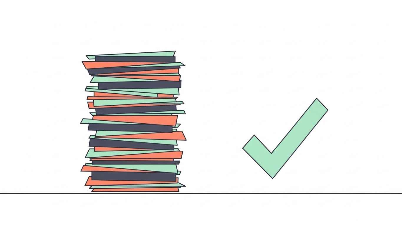
The Visual & Narrative Approach
The ultimate promise of claims software is organization. This style uses a top-down view of a metaphorical "clean desk." A chaotic, multi-colored stack of paper documents (Pastel Mint, Charcoal, Salmon) transitions smoothly into a single, perfect digital checkmark. The transitions are clean and shadowless. It is the visual definition of "decluttering," representing the shift from manual administrative burden to automated resolution.
Psychological Impact & KPI Focus
- Niche Psychology: Addresses "Cognitive Overload." For an adjuster drowning in paperwork, this visual offers a moment of relief. It leverages the Zeigarnik Effect (desire for completion) by showing the final resolved state.
- Operational Impact: Supports YouTube Organic Search. It simplifies the complex value proposition of "Digital Transformation" into a binary "Before/After" that is instantly understood.
Strategic Implementation & Trade-offs
- Best Use Case: Explainer Videos and "Problem/Solution" Intro sequences.
- Duration: 30-60 Seconds.
- Strategic Trade-off: It can feel generic if not branded correctly. It risks looking like a generic productivity tool rather than specialized claims software without specific voiceover context.
Companies using similar video content -
Claimable – Platform – Streamlining claims from chaos to resolution.
FlowForma – No-code Claims Management – Automating claims workflows efficiently.
6. Generative AI cinematic video
TOFU | Skippable Pre-Roll Ad
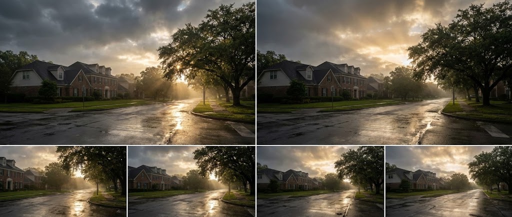
The Visual & Narrative Approach
This style shifts focus from the tool to the outcome. Using high-end generative AI, we see a photorealistic wide shot of a residential street after a storm. Dark "Storm Grey" clouds part to reveal "Sun Gold" light hitting wet pavement. There are no people, only the atmosphere of restoration. The camera pans slowly, evoking the feeling of relief and the return to normalcy that the insurance payout facilitates.
Psychological Impact & KPI Focus
- Niche Psychology: Insurance is an emotional business. This style targets "Empathy and Trust." It reminds stakeholders that the ultimate KPI is not just speed, but the restoration of a policyholder's life or business.
- Operational Impact: Highly effective for Skippable Pre-Roll Ads. The emotional resonance captures attention in the first 5 seconds, building brand affinity before the technical pitch begins.
Strategic Implementation & Trade-offs
- Best Use Case: Brand Awareness and "Mission" videos.
- Duration: 15-30 Seconds.
- Strategic Trade-off: It explains nothing about features. It is a mood-setter. If used alone, it may leave buyers asking, "But what does the software do?"
Companies using similar video content -
N/A – No companies mapped as style 5 is not defined.
7. Wireframe to Reality Transition
MOFU | Product/Solution Differentiation
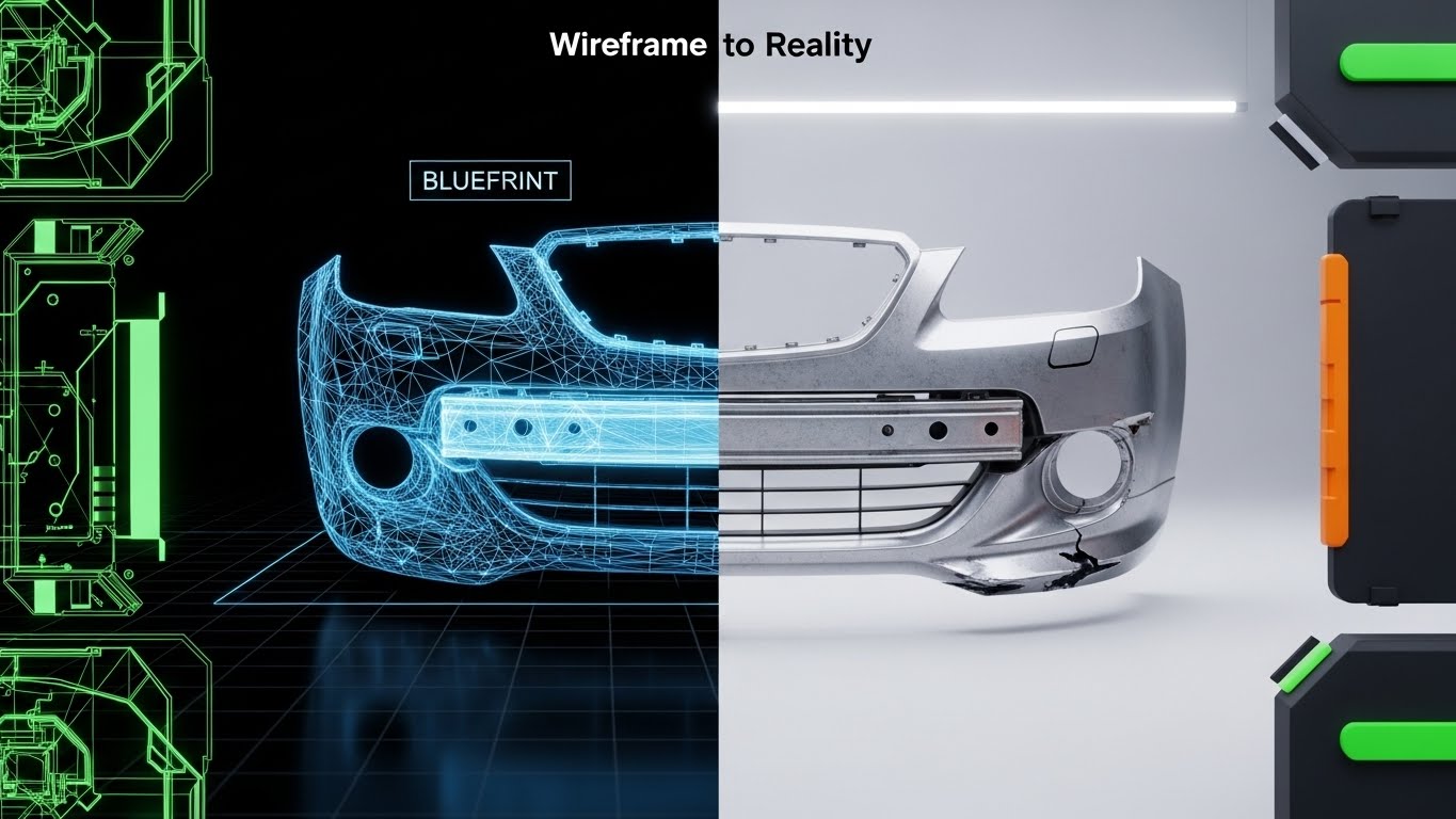
The Visual & Narrative Approach
Accuracy is paramount in damage assessment. This split-screen style divides the frame vertically. The left side displays a technical 3D wireframe blueprint of a car bumper in "Blueprint Blue." The right side reveals the photorealistic, metallic render of the damage. The split visualizes the "Digital Twin" concept—showing that the software understands the structural data (wireframe) behind the visual evidence (photo), ensuring precise estimation.
Psychological Impact & KPI Focus
- Niche Psychology: Skepticism regarding AI accuracy is high. This visual proves "Technical Depth." It reassures the technical buyer that the AI isn't just guessing; it's analyzing the geometry of the loss.
- Operational Impact: Drives Product Differentiation. It positions the platform as an engineering-grade tool rather than a simple workflow app, supporting higher price points.
Strategic Implementation & Trade-offs
- Best Use Case: Product Pages for AI Estimation or Remote Adjustment tools.
- Duration: 30-45 Seconds.
- Strategic Trade-off: Requires expensive 3D assets. The alignment between wireframe and render must be pixel-perfect to convey "Precision."
Companies using similar video content -
Lemonade Insurance – AI Claims – Restoring policyholder peace after loss.
Crescendo.ai – Customer Support Automation – Human-like support for claims.
8. Macro UI Micro-Interactions
MOFU | Feature Education & Demonstration

The Visual & Narrative Approach
This style focuses obsessively on the user interface (UI). A macro close-up shows the pixel texture of a "Submit Claim" button, glowing in "Pure Cyan" against "Deep Navy." We see the soft white light of a hover state. It abstracts the complexity of the dashboard to focus on the tactile feel of the interaction, suggesting that the software is modern, responsive, and satisfying to use.
Psychological Impact & KPI Focus
- Niche Psychology: Bad enterprise software is notoriously clunky. This visual combats "Usability Anxiety." It promises a consumer-grade experience (like an iPhone app) for the adjuster, implying ease of adoption.
- Operational Impact: Supports Feature Education. It highlights specific "One-Click" efficiencies, making the platform feel accessible and intuitive.
Strategic Implementation & Trade-offs
- Best Use Case: Feature highlight reels, "New Feature" email announcements, and onboarding tutorials.
- Duration: 5-10 Seconds.
- Strategic Trade-off: It provides zero context on the overall workflow. Use it to highlight "moments of delight," not to explain the entire claims journey.
Companies using similar video content -
Tractable – AI for Damage Assessment – Precision damage estimation from images.
Wisedocs – AI-powered Claims Documentation – Structured insights from medical records.
9. 2D Line Art Animation
MOFU | Overcoming Objections
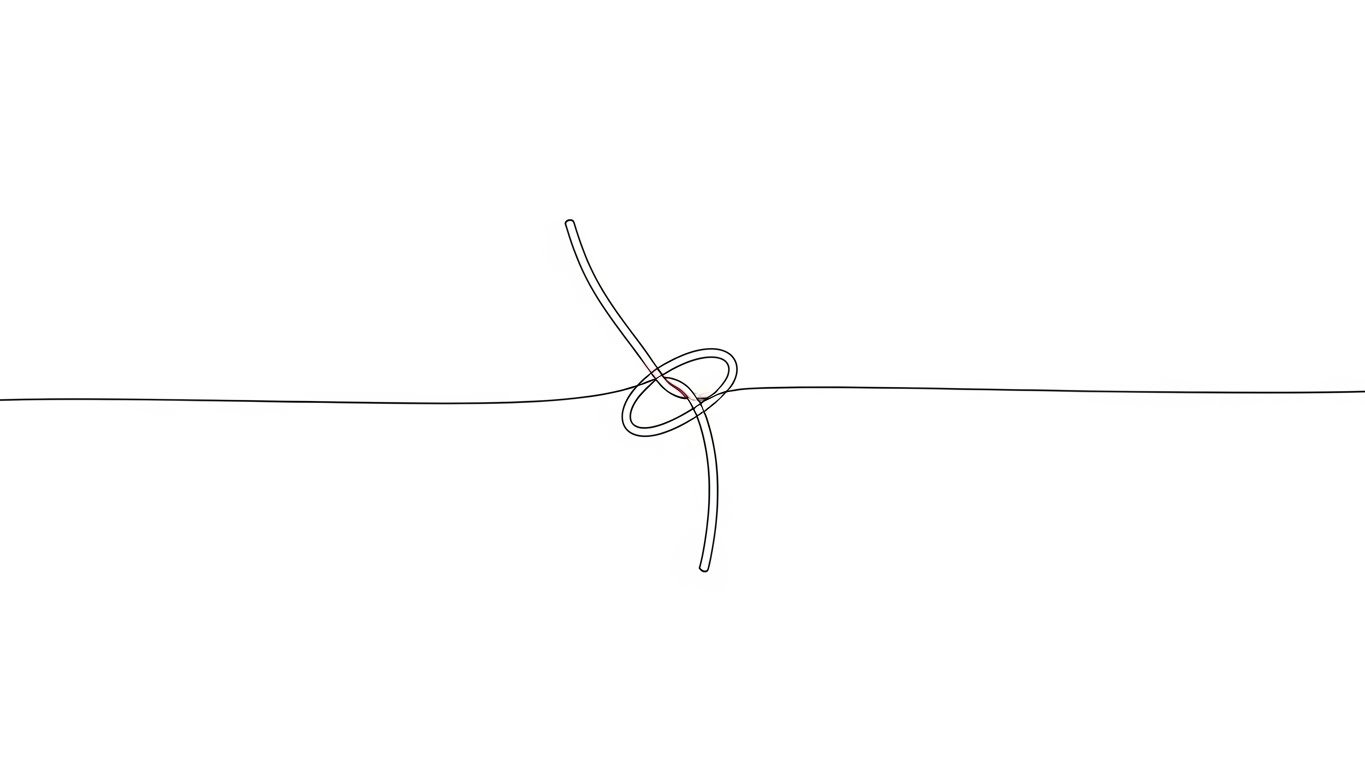
The Visual & Narrative Approach
An elegant, intellectual metaphor. A single, continuous "Ink Black" line on an "Infinite White" canvas forms a complex, tangled knot. Smoothly, the line pulls itself taut, untying the knot into a straight path. A "Red Accent" highlights the friction point being released. This visualizes the software’s ability to "untangle" complex, multi-party claims or subrogation issues through superior logic.
Psychological Impact & KPI Focus
- Niche Psychology: Claims professionals deal with "messy" files daily. This visual offers a "Cognitive Release." It symbolizes the resolution of complexity and the removal of bottlenecks.
- Operational Impact: Great for Overcoming Objections regarding implementation difficulty. It positions the software as a simplifier, not a complications adder.
Strategic Implementation & Trade-offs
- Best Use Case: "Solution" section of sales decks and whitepapers.
- Duration: 15-20 Seconds.
- Strategic Trade-off: Highly abstract. It requires a sophisticated audience and strong copy to connect the "knot" metaphor to specific business challenges (e.g., "Untangle Subrogation").
Companies using similar video content -
VCA – InsuredConnect – Tactile user confidence in claims app.
Snapsheet – Virtual Appraisals – Intuitive digital claims experience.
10. Split Screen: Optimized Reality and UI
MOFU | Competitive Displacement

The Visual & Narrative Approach
The definitive "Before and After" contrast. The left side shows the "Old World": a cluttered wooden desk, coffee stains, and messy papers (Wood Brown tones). The right side shows the "New World": a pristine, high-tech tablet dashboard in "Screen Glow White" and "Tech Blue." The contrast highlights the difference between legacy manual work and the optimized SaaS solution.
Psychological Impact & KPI Focus
- Niche Psychology: Leverages "Loss Aversion" and "Status Quo Bias." It frames the current manual process as "dirty" and "obsolete," making the modern dashboard the only logical aspirational choice.
- Operational Impact: Drives Competitive Displacement. It visually renders legacy competitors as outdated without saying a word, proving the ROI of modernization.
Strategic Implementation & Trade-offs
- Best Use Case: Landing Page Hero Images and "Why Switch" campaigns.
- Duration: 30-40 Seconds.
- Strategic Trade-off: Avoid making the "messy" side look too incompetent, as it might insult the prospect's current reality. Frame it as "The limitation of legacy tools," not "The failure of your team."
Companies using similar video content -
Shift Technology – Claims Fraud – Untangling complex fraud patterns.
CLARA Analytics – CLARAty.ai – Solving claims process friction with AI.
11. 2D Character-Driven Story
MOFU | Driving Demo Requests

The Visual & Narrative Approach
Technology is often viewed as a replacement for human adjusters, creating internal resistance. This style counters that narrative by visualizing a partnership. We use clean, 2D vector illustrations featuring a stylized professional character in a "Vibrant Purple" suit. She is not struggling with the software; she is high-fiving a floating "Bright Orange" interface. The background is clean and white to maintain focus on the interaction. The animation is bouncy and energetic, emphasizing that the software is a teammate, not a threat.
Psychological Impact & KPI Focus
- Niche Psychology: Addresses "Automation Anxiety." Claims staff worry about being made obsolete. This visual reinforces the concept of the "Augmented Adjuster"—where AI handles the drudgery, allowing the human to celebrate the "win" of a closed claim.
- Operational Impact: Drives Demo Requests by framing the software as an empowering tool that makes the daily work life of an adjuster more enjoyable and successful.
Strategic Implementation & Trade-offs
- Best Use Case: "Day in the Life" case study videos and landing page conversion sections.
- Duration: 60-90 Seconds.
- Strategic Trade-off: The stylized character design can feel "light." Ensure the script addresses serious business outcomes (reduced backlog, higher accuracy) so it doesn't appear trivial or childish to senior decision-makers.
Companies using similar video content -
Guidewire – ClaimCenter – Modernizing legacy claims operations.
Origami Risk – Workers' Compensation Claims Administration Solution – Integrated risk and claims management.
12. Abstract 2D Motion Graphics
MOFU | Website Visitor Re-engagement

The Visual & Narrative Approach
How do you visualize an API call or data ingestion? This style uses abstract motion graphics to represent the intangible flow of information. Thousands of "Electric Violet" and "Hot Pink" particles flow together to form a cohesive wave against a "Deep Navy" background. The dots connect via delicate lines of light, symbolizing the seamless integration of disparate data sources—police reports, weather data, and policy details—into a unified stream of intelligence.
Psychological Impact & KPI Focus
- Niche Psychology: IT Directors and CIOs look for "Connectivity." This visual satisfies the "System Thinking" bias, showing that the platform is not a silo but a living connector that brings order to fragmented data ecosystems.
- Operational Impact: ideal for Visitor Re-engagement. It is visually hypnotic and sophisticated, signaling "High-Tech" without requiring the viewer to read text. It reinforces the brand's position as a modern data architecture provider.
Strategic Implementation & Trade-offs
- Best Use Case: Website backgrounds, loading screens, and background loops for webinar waiting rooms.
- Duration: Infinite Loop or 10-15 Seconds.
- Strategic Trade-off: It is purely conceptual. It conveys "Advanced Tech" but explains zero features. It must be paired with clear copy that defines what the data integration actually achieves.
Companies using similar video content -
Avallon – Case Copilot – Human-AI high five for claims automation.
Eloquent AI – Autonomous AI Operators – Celebrating success with AI assistants.
13. Rapid UI Feature Montage
MOFU | The Functional Buyer
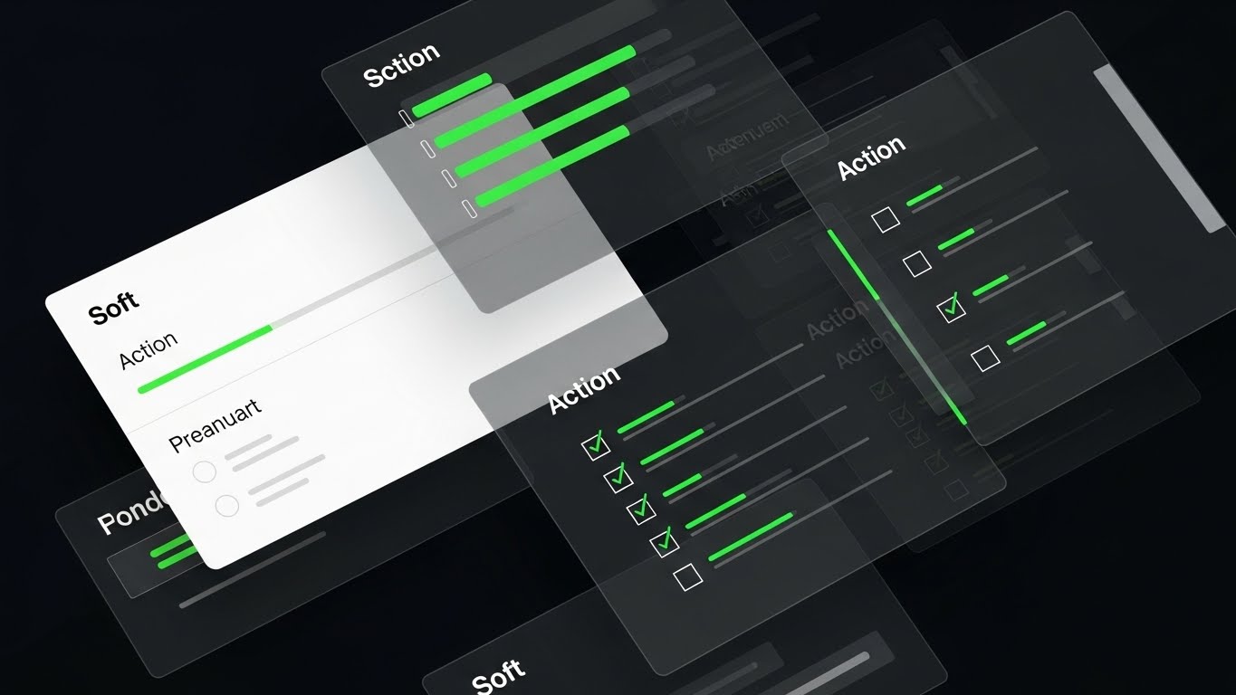
The Visual & Narrative Approach
For the functional buyer, efficiency is the only metric that matters. This style utilizes a Dutch-angle composition of multiple floating semi-transparent interface layers. We see "Action Green" progress bars rapidly filling and checkmarks appearing in sync with a rhythmic beat. The aesthetic is "Dark Mode" with glass-like transparency, focusing entirely on the speed of completion. It creates a visual cadence of "Task, Done. Task, Done."
Psychological Impact & KPI Focus
- Niche Psychology: Claims VPs are obsessed with Cycle Time Reduction. This visual triggers a dopamine response associated with completion. It visually proves that the software is designed to move claims off the desk, not keep them there.
- Operational Impact: Targets the Functional Buyer. It demonstrates "User Velocity," reassuring leadership that the new system will accelerate the team's throughput rather than bogging them down in new clicks.
Strategic Implementation & Trade-offs
- Best Use Case: LinkedIn Organic posts and Product Sizzle Reels.
- Duration: 15-30 Seconds.
- Strategic Trade-off: The pace is too fast for training. It creates an impression of speed but is too chaotic to teach a user how to use the features. Use it to sell the result of speed.
Companies using similar video content -
Indico Data – Decision Automation Platform – Intelligent data integration for claims.
KGiSL n-sure – Insurance Management System – Seamless data flow across insurance.
14. 2D Graphics Over Live Action
MOFU | The Champion

The Visual & Narrative Approach
To build an internal champion, you must show them thriving in their environment. This style combines high-quality live-action stock photography of a diverse modern office with overlaid 2D vector graphics. We see a smiling professional in a "Sunlight Yellow" jacket working on a laptop, surrounded by floating, glowing "Hologram Blue" checkmarks and "Approved" badges. The graphics track into the 3D space, suggesting that the software is an invisible layer of support that makes the human's job easier and more successful.
Psychological Impact & KPI Focus
- Niche Psychology: Focuses on "Social Proof" and "Success." It visualizes the feeling of a "good day at work" facilitated by the software. It appeals to the manager who wants a happy, productive team.
- Operational Impact: Supports the Internal Champion. It provides them with visual assets that show their colleagues (the end-users) looking happy and productive, which is crucial for Change Management.
Strategic Implementation & Trade-offs
- Best Use Case: Recruitment videos, "About Us" pages, and Customer Success stories.
- Duration: 30-60 Seconds.
- Strategic Trade-off: Can feel like generic corporate stock footage if the graphics aren't specific enough. The UI overlays must look like claims data (e.g., "Liability Accepted") rather than generic "Success" text to be relevant.
Companies using similar video content -
Pega – Claims for Insurance – High-velocity claims workflow.
Insurity – Claims Decisions – Accelerating claims processing with analytics.
15. 3D X-Ray Visualization
MOFU | Risk Mitigation Hook

The Visual & Narrative Approach
In property claims, the most expensive damage is often what you can't see. This style uses a 3D X-Ray render of a suburban home. The walls are "Translucent Bone White," revealing the internal complex network of piping and wiring glowing in "X-Ray Blue." Bright "Green Nodes" highlight specific data points or risk areas. This visual metaphor powerfully communicates the software’s ability to "look deeper" using historical data and AI to identify potential fraud or pre-existing damage.
Psychological Impact & KPI Focus
- Niche Psychology: Appeals to the "Risk Averse" nature of carriers. It satisfies the desire for omniscience—the ability to see through the surface to the truth of the risk. It alleviates the fear of overpayment due to hidden factors.
- Operational Impact: Strong Risk Mitigation Hook. It visualizes the value of AI analysis in fraud detection and subrogation potential, justifying the investment through "Loss Avoidance."
Strategic Implementation & Trade-offs
- Best Use Case: Landing pages for Fraud Detection or Property Intelligence modules.
- Duration: 20-30 Seconds.
- Strategic Trade-off: It is technical and cold. It speaks to the logic of the claim, not the human experiencing the loss. Avoid using this for claimant-facing content.
Companies using similar video content -
Aclaimant – Platform – Empowered workforce managing incidents.
360Globalnet – 360SiteView – Holographic approval for claims.
16. Photorealistic 3D Renders
BOFU | Establishing Thought Leadership

The Visual & Narrative Approach
When selling to Enterprise C-Suites, you must look like an Enterprise solution. This style uses photorealistic 3D rendering to depict a futuristic "Claims Command Center." We see a massive curved video wall displaying global data maps in "Corporate Blue" and "Matrix Green." The room is sleek, filled with glass and chrome, but empty of people, emphasizing the infrastructure and capability. It conveys that the platform is robust enough to handle millions of claims globally.
Psychological Impact & KPI Focus
- Niche Psychology: Targets "Status" and "Authority." CIOs want to buy systems that look like the future of their company. This visual validates their ambition to build a world-class operation.
- Operational Impact: Establishes Thought Leadership. It moves the conversation from "software features" to "strategic infrastructure," allowing for higher contract values and enterprise-wide licensing.
Strategic Implementation & Trade-offs
- Best Use Case: LinkedIn Articles, Annual Reports, and Keynote backgrounds.
- Duration: Static Image or Slow Pan (10-15 Seconds).
- Strategic Trade-off: It represents a fantasy. Most claims departments are standard offices, not Star Trek bridges. It works as an aspirational metaphor for control, not a literal representation of the user environment.
Companies using similar video content -
LexisNexis – Risk Solutions – Seeing unseen risks in claims data.
Gradient AI – Claims – Predictive analytics for risk mitigation.
17. Aspirational Stock Montage
BOFU | Building Trust & Credibility

The Visual & Narrative Approach
Ultimately, insurance is a promise to pay. This style strips away the UI and the tech to focus on the human outcome. We use a cinematic montage of a warm handshake between an adjuster and a family in front of their home. The lighting is "Golden Hour," enhancing the "Grass Green" and "Denim Blue" tones. It creates a feeling of warmth, relief, and gratitude. This visual reminds the buyer that the software's efficiency serves a noble purpose: helping people recover.
Psychological Impact & KPI Focus
- Niche Psychology: Builds "Moral Legitimacy." It connects the purchase decision to the core mission of insurance (protection). It reassures the buyer that efficiency won't come at the cost of empathy (Net Promoter Score).
- Operational Impact: Builds Trust & Credibility. It is essential for the "Final Review" stage where stakeholders ask, "Will this actually help our customers?"
Strategic Implementation & Trade-offs
- Best Use Case: "Our Mission" videos, Customer Testimonials, and final slide in Sales Decks.
- Duration: 60-120 Seconds.
- Strategic Trade-off: If used too early, it feels like fluff. It needs to be earned by first proving the technical capability (Styles 1-10) before pivoting to the emotional result.
Companies using similar video content -
Sapiens – Insurance Platform – Enterprise scale for global control.
Oracle – Digital Insurance Platform – Command center for strategic oversight.
18. Dynamic Data Visualization
BOFU | ROI Justification

The Visual & Narrative Approach
The CFO needs to see the numbers. This style abandons metaphor for direct financial visualization. 3D bar charts made of translucent "Emerald Green" glass rise aggressively against a clean background. Gold coins and percentage symbols float dynamically, emphasizing accumulation. The perspective is low and looking up, making the growth look monumental. This is the visual language of "Profitability" and "Reduced Loss Adjustment Expense (LAE)."
Psychological Impact & KPI Focus
- Niche Psychology: Targets "Financial Security." The visual language of rising bars and gold is universally understood as "Success." It reduces the perceived financial risk of the software investment.
- Operational Impact: Directly supports ROI Justification. It is the visual equivalent of a spreadsheet showing positive returns, used to tip the decision from "Maybe" to "Yes" during budget approval.
Strategic Implementation & Trade-offs
- Best Use Case: Proposal documents, Pricing pages, and CFO-facing presentation decks.
- Duration: 10-15 Seconds (Looping).
- Strategic Trade-off: It is very literal. It lacks emotional nuance. Use it strictly for the financial argument, not for explaining user experience or customer satisfaction.
Companies using similar video content -
Allstate – Claims – Restoring trust and human connection.
Zurich Insurance – Claims – Building credibility through secure processes.
19. Futuristic Neon/Dark Mode
BOFU | Risk Mitigation

The Visual & Narrative Approach
Security reviews are the final hurdle in B2B SaaS. This style uses a "Cyber-Security" aesthetic to visualize data protection. A digital vault room is rendered in "Matrix Green" binary code. In the center, a massive "Neon Red" padlock glows intensely. The aesthetic is dark, serious, and impenetrable. It visually communicates "Bank-Grade Security," assuring the InfoSec team that policyholder data (PII) is behind a fortress.
Psychological Impact & KPI Focus
- Niche Psychology: Addresses "Data Breach Anxiety." Insurance carriers hold sensitive data. This visual triggers a feeling of safety and containment. It aligns the brand with "Defense" and "Vigilance."
- Operational Impact: Critical for Risk Mitigation (Security). It functions as a visual seal of approval for the compliance and security audit phase of the sales cycle.
Strategic Implementation & Trade-offs
- Best Use Case: Security compliance pages, Trust Center portals, and InfoSec review decks.
- Duration: 10-20 Seconds.
- Strategic Trade-off: It can look "scary" or "ominous" if not balanced. The lock must look protective, not like a warning sign. Ensure the red color signals "Strength" rather than "Error."
Companies using similar video content -
Akur8 – AI for Pricing and Premium Optimization – Demonstrating ROI with financial data.
Lyric.ai – Payment Integrity Solutions – Growing bars for financial success.
20. Isometric 2D Motion Design
BOFU | Programmatic & ABM Display
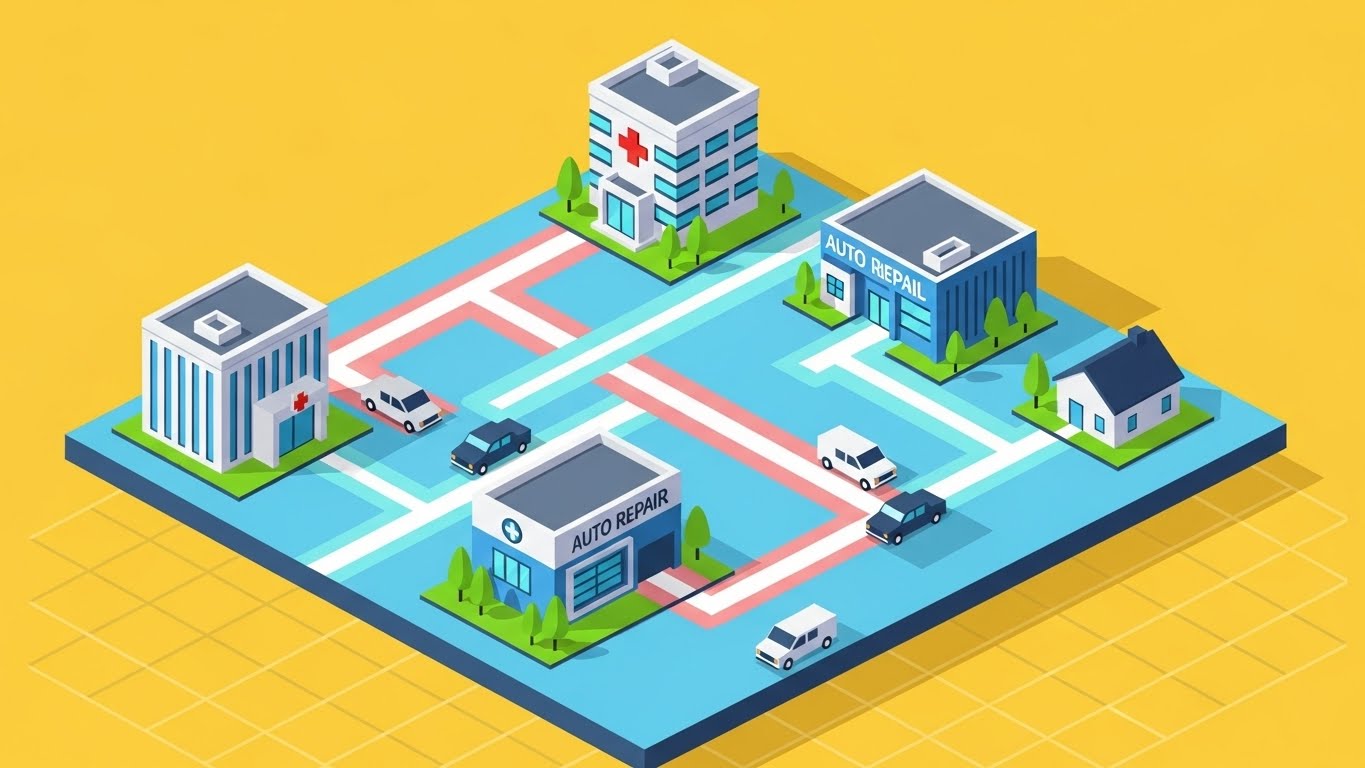
The Visual & Narrative Approach
Insurance isn't just one office; it's a network. This style uses a "SimCity-style" isometric grid to visualize the entire ecosystem. We see miniature, clean vector buildings: a hospital, an auto repair shop, and a residential home, all connected by "Pastel Blue" and "Pink" data paths on a "Yellow" ground. Vehicles move along the roads. It’s a bird's-eye view of the connected value chain, showing how the software coordinates the flow of information between medical providers, repair networks, and the carrier.
Psychological Impact & KPI Focus
- Niche Psychology: Appeals to the "Holistic Planner." It satisfies the need to see the "Big Picture." It reassures the buyer that the software handles the complexity of multi-party coordination (medical, auto, property) seamlessly.
- Operational Impact: Perfect for Programmatic & ABM Display. The clean, colorful geometry stands out on crowded web pages, and the "Map" concept is instantly recognizable as "Organization."
Strategic Implementation & Trade-offs
- Best Use Case: Retargeting Ads (Display), Partner Program pages, and Ecosystem integration slides.
- Duration: Static or Simple Loop.
- Strategic Trade-off: The "cartoonish" style can feel less enterprise-grade than the photorealistic styles. Use it to explain connections, not to demonstrate the power of the core engine.
Companies using similar video content -
Convin.ai – AI-Powered Fraud Detection – Digital vault for zero-trust protection.
Hypatos – AI Platform – Secure processing of transactional documents.
21. Lifestyle Stock with UI Overlay
BOFU | The Economic Buyer

The Visual & Narrative Approach
When addressing the Economic Buyer (CFO or CEO), the visual language must shift from "features" to "governance." This style utilizes high-end, cinematic stock photography featuring a silver-haired executive in a "Navy Suit," reviewing a tablet in a mahogany-paneled boardroom. The shot is over-the-shoulder, focusing on the screen which displays a glowing, abstract dashboard overlay in "Tablet Glow Blue." The UI elements are simplified to show high-level metrics—Loss Ratios, Reserve Accuracy, and LAE (Loss Adjustment Expense)—rather than granular claim details.
Psychological Impact & KPI Focus
- Niche Psychology: The C-Suite fears "Black Boxes." They need to feel that the software provides transparency and control over the company's financial health. This visual validates the "Executive Control" archetype, showing that the platform is a tool for high-level strategy, not just low-level processing.
- Operational Impact: Directly targets ROI Validation. It visualizes the software as a "Command Instrument" for financial leadership, reinforcing the decision to approve the budget based on Total Cost of Ownership (TCO) reduction.
Strategic Implementation & Trade-offs
- Best Use Case: Final Pitch Decks, Executive Summary Videos, and LinkedIn Thought Leadership.
- Duration: Static Image or 10-15 Seconds.
- Strategic Trade-off: It is aspirational, not functional. Do not use this to train adjusters, as the UI shown is a stylized abstraction of the actual dashboard.
Companies using similar video content -
Riskonnect – Claims Management – Connected ecosystem for risk and claims.
A1 Tracker – Enterprise Risk Management – Visualizing the full value chain.
22. Dark Mode UI Showcase
BOFU | The Technical Buyer

The Visual & Narrative Approach
The CIO cares about the "plumbing"—how the software talks to the existing stack. This style abandons the user interface entirely to feature the Developer Experience (DX). We see a sleek code editor interface in Dark Mode, with syntax highlighting in "Terminal Green" and "Code Grey." Abstract, glowing representations of API brackets ({ }) and JSON data structures float in 3D space, connecting to a "Wireframe Base." It visualizes the clean, documented code structure that enables seamless integration with legacy policy admin systems.
Psychological Impact & KPI Focus
- Niche Psychology: IT Directors dread "Spaghetti Code" and closed ecosystems. This visual signals "Modern Architecture." It assures the technical buyer that the platform is developer-friendly, extensible, and built on modern standards (RESTful API).
- Operational Impact: Supports Technical Due Diligence. It removes friction from the security and architecture review phase by visually proving the system's openness and Interoperability.
Strategic Implementation & Trade-offs
- Best Use Case: Developer Portals, API Documentation pages, and "Integration" section of the website.
- Duration: 15-20 Seconds.
- Strategic Trade-off: It is alienating to non-technical users. A Claims Manager will not understand the value of a JSON snippet. Use strictly for the IT/Engineering persona.
Companies using similar video content -
Majesco – Claims – Executive review and strategic oversight.
EasySend – Digital Claims Processing – Strategic oversight for digital transformation.
23. Isometric 3D Workflow
ONBD | Reducing Implementation Friction

The Visual & Narrative Approach
Implementation is the valley of death for SaaS. This style uses a charming isometric 3D metaphor to visualize the onboarding phase. Miniature clay-style figures in "Construction Yellow" vests are seen assembling a digital bridge connecting two floating islands (representing "Old System" and "New System"). The bridge is "Steel Grey" against a calm "Sky Blue" background. It creates a sense of collaborative, constructive progress, visualizing the vendor's implementation team working alongside the client.
Psychological Impact & KPI Focus
- Niche Psychology: Addresses "Implementation Fatigue." Carriers fear multi-year, failed IT projects. This visual makes the process look finite, manageable, and supported. It leverages the IKEA Effect—the appreciation of building something value-additive.
- Operational Impact: Reduces Implementation Friction. It sets the expectation of a partnership and a structured rollout process, rather than a chaotic "rip and replace."
Strategic Implementation & Trade-offs
- Best Use Case: Onboarding Welcome Emails, Kick-off Meeting slides, and Implementation Roadmaps.
- Duration: 20-30 Seconds.
- Strategic Trade-off: It is metaphorical. It doesn't show specific implementation steps (like data migration mapping), but rather the spirit of the collaboration.
Companies using similar video content -
UiPath – Back-Office Automation – API architecture for open integration.
V7 Go – AI for Insurance Underwriting & Claims Processing – Developer experience for AI integration.
24. 2D Animation & UI Composition
ONBD | Self-Serve Onboarding

The Visual & Narrative Approach
To encourage self-serve adoption, you must prove the system is intuitive. This style features a floating, stylized hand in "Soft Lavender" interacting with a large, semi-transparent touchscreen surface. The hand performs a confident swipe gesture, leaving a "Cursor Black" trail that transforms into a resolved action. The background is "Infinite White" to remove distractions. It mimics the familiar, fluid interactions of consumer apps (like Tinder or Instagram), suggesting that professional claims work can be just as simple.
Psychological Impact & KPI Focus
- Niche Psychology: Combats "Learned Helplessness." Many adjusters are used to needing IT support for every error. This visual empowers them, suggesting, "You can do this yourself."
- Operational Impact: Drives Self-Serve Adoption. By visualizing easy gestures, it encourages users to explore the platform without waiting for formal training, reducing the burden on the Customer Success team.
Strategic Implementation & Trade-offs
- Best Use Case: "Getting Started" wizards, Login screens, and Tooltip videos.
- Duration: 5-10 Seconds (Looping).
- Strategic Trade-off: It oversimplifies complex tasks. While great for navigation and basic approval workflows, it cannot capture the complexity of detailed coverage analysis.
Companies using similar video content -
Tyler Technologies – Workers' Compensation Claims Management – Building the bridge for seamless implementation.
Cloud Claims – Platform – Collaborative construction of claims workflows.
25. Clean UI Workflow (Light Mode)
ONBD | Trial/Freemium User Activation
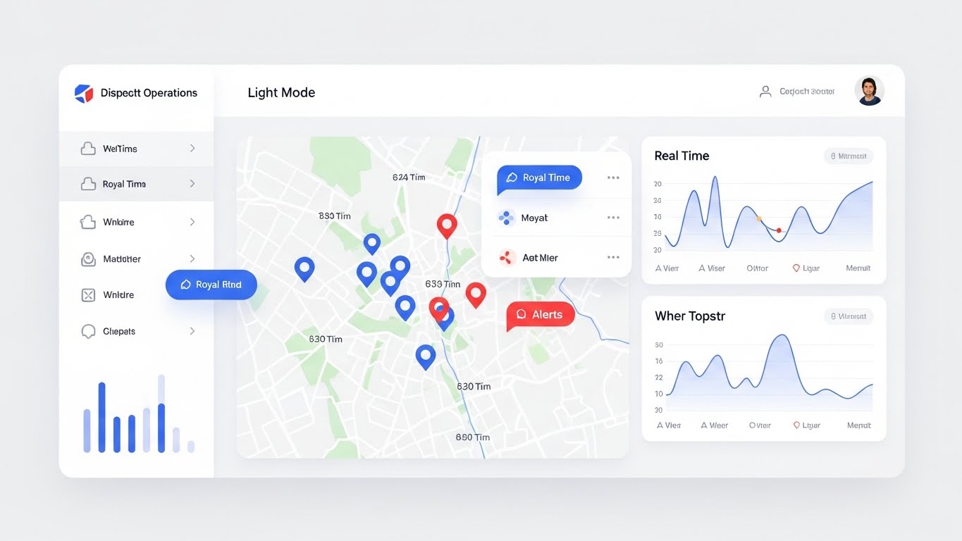
The Visual & Narrative Approach
The goal of onboarding is to get the user to a "working state." This style showcases a pristine Light Mode dashboard fully populated with live data. We see a clean map interface with "Royal Blue" and "Red" pins indicating active claims, flanked by clear line charts and "Real Time" metrics. Unlike an "empty state," this visual represents the destination—a fully operational, organized command center. It visualizes the clarity and control the user will possess once they complete their setup.
Psychological Impact & KPI Focus
- Niche Psychology: Leverages "Goal Visualization." Users are motivated by seeing the end result of their effort. Showing a populated, organized dashboard provides a visual target, encouraging them to input their data to achieve that same level of order.
- Operational Impact: Drives User Activation. It motivates the user to reach the next milestone (e.g., "Connect Data Source"), increasing the likelihood of conversion from pilot to contract.
Strategic Implementation & Trade-offs
- Best Use Case: "Welcome" emails, Product Tour headers, and Case Study results sections.
- Duration: Static Image or 5 Second Animation.
- Strategic Trade-off: It requires the UI to look impeccable. If the user's actual data is messy or sparse, the reality may not match this idealized "Success State" initially.
Companies using similar video content -
BriteCore – BriteClaims – Swipe to resolve for intuitive mastery.
SimplePractice – Practice Management – Stylized gestures for easy interaction.
26. Abstract 3D AI Visualization
RET | Reducing Support Overhead

The Visual & Narrative Approach
How do you visualize the AI resolving support tickets? This style uses a swirling vortex of particle nodes in "Glowing Fiber Optic Orange" and "Deep Space Blue." The chaotic, scattered nodes converge into a central point of order, turning "Green" upon unification. This represents the neural network of the support AI ingesting a user's problem (chaos) and automatically structuring it into a solution (order) without human intervention.
Psychological Impact & KPI Focus
- Niche Psychology: Users hate waiting on hold. This visual promises "Instantaneity." It suggests that the system is smart enough to understand and fix issues in real-time.
- Operational Impact: Reduces Support Overhead. By visualizing the capability of the AI chatbots or automated help desk, it encourages users to trust the automated tools rather than calling a rep.
Strategic Implementation & Trade-offs
- Best Use Case: Chatbot loading screens, "Help Center" search bars, and AI feature announcements.
- Duration: 10-15 Seconds (Looping).
- Strategic Trade-off: It creates high expectations for the AI. If the chatbot fails to answer correctly after such a high-tech intro, the user frustration will be amplified.
Companies using similar video content -
ClaimVantage – Suite – Real-time insight on a populated dashboard.
Recordables – TrackComp® – The "active" state of workers' comp claims.
27. Low-Poly 3D Modeling
RET | Knowledge Base & FAQ Videos

The Visual & Narrative Approach
Learning a complex system is a journey. This style uses a playful Low-Poly 3D landscape to visualize the learning path. A winding digital road traverses a terrain of faceted geometric shapes in "Low Poly Green," "Brown," and "Blue." Bright Waypoints and Milestone Flags mark the path. The lighting is bright and cheerful. It reframes the "Knowledge Base" not as a boring library of PDFs, but as an explorable map of mastery.
Psychological Impact & KPI Focus
- Niche Psychology: Addresses "Skill Gap Anxiety." It gamifies the learning process, making the acquisition of new software skills feel like leveling up in a game rather than studying for an exam.
- Operational Impact: Increases Knowledge Base Utilization. The inviting, game-like aesthetic reduces the intimidation factor of technical documentation.
Strategic Implementation & Trade-offs
- Best Use Case: LMS (Learning Management System) headers, Certification path overviews, and FAQ navigation.
- Duration: Static or Slow Flyover (20-30 Seconds).
- Strategic Trade-off: The aesthetic is "cute." Ensure it doesn't trivialize the content. It works best for navigation and structure, not for the detailed technical content itself.
Companies using similar video content -
Omnius – AI-powered Claims Automation – AI vortex for automated resolution.
Sprout.ai – Claims Automation – Converging nodes for instant support.
28. Generative AI Realistic Character video
RET | Proactive Support/Announcements

The Visual & Narrative Approach
Scale creates distance; this style bridges it. Using high-fidelity Generative AI, we present a medium close-up of a realistic, diverse Customer Success Manager. The character looks directly into the camera lens with a warm, engaging expression. The background is a blurred, modern tech office with bokeh lighting, suggesting a real workspace. The lighting is soft and cinematic. This avatar delivers personalized updates, release notes, or proactive tips, simulating a 1:1 human check-in at scale.
Psychological Impact & KPI Focus
- Niche Psychology: Users want to feel "seen." This visual satisfies the need for "Connection." Even if the user knows it's AI-generated, the human face triggers biological empathy and attention mechanisms that text cannot.
- Operational Impact: Drives Retention. It humanizes the SaaS platform, making it harder for the client to churn because they feel a (simulated) personal relationship with the brand.
Strategic Implementation & Trade-offs
- Best Use Case: Quarterly Product Updates, personalized "Year in Review" videos, and renewal reminders.
- Duration: 30-60 Seconds.
- Strategic Trade-off: The "Uncanny Valley" risk. The lip-sync and eye movement must be high quality. If the AI character glitches, it destroys trust instantly.
Companies using similar video content -
Figtree Systems – Workers' Compensation Software – Guided learning journey for claims.
Terra Insure – Claims Management – Low-poly roadmap for optimized resolutions.
29. Holographic UI over 3D Render
EXP | Driving Deep Feature Adoption

The Visual & Narrative Approach
To upsell advanced modules (like auto-adjudication), you must show depth. This style features a realistic 3D render of a car engine block in "Engine Metal Grey," presented in an exploded view. Overlaid on the mechanical parts is a futuristic, transparent UI in "Hologram Blue." The UI highlights specific components with laser-like precision lines, displaying cost data and part numbers. It visualizes the software's ability to go beyond the surface and handle complex, granular data.
Psychological Impact & KPI Focus
- Niche Psychology: Appeals to the "Specialist." Senior auto adjusters pride themselves on technical knowledge. This visual respects their expertise, showing that the software is accurate enough to handle the nuts and bolts of their trade.
- Operational Impact: Drives Deep Feature Adoption. It entices users to unlock advanced, data-heavy features by visualizing the richness of the insight they are missing in the basic version.
Strategic Implementation & Trade-offs
- Best Use Case: Feature Spotlights for specialized modules (Auto, Property, Workers' Comp medical).
- Duration: 15-20 Seconds.
- Strategic Trade-off: It is highly specific. An exploded engine means nothing to a Property Adjuster. You need different 3D assets (e.g., roof structures) for different verticals.
Companies using similar video content -
Progressive Insurance – AI-driven Chatbots – Virtual CS Manager for proactive care.
Curacel AI – AI-driven Insurance Solutions – Direct eye contact for personalized updates.
30. 3D Parallax UI Presentation
EXP | Driving Upsell/Cross-sell

The Visual & Narrative Approach
How do you visualize an "Upgrade"? This style uses 3D Parallax to arrange multiple glass-like UI screens floating in a void, separated by significant depth along the Z-axis. The focus is on the closest screen, which features a "Premium Badge" or Star icon in Gold. The background screens are blurred (bokeh), representing the standard features. The palette uses "Depth Blue," "Layered White," and "Shadow Grey." The camera moves slowly, emphasizing the "elevation" and "distinction" of the premium tier.
Psychological Impact & KPI Focus
- Niche Psychology: Targets "Status" and "Exclusivity." It frames the upsell not as a cost, but as an unlock—access to a higher tier of capability and clarity that stands out from the noise.
- Operational Impact: Drives Upsell/Cross-sell. It visually separates the "Basic" from the "Pro," making the Pro tier look tangible, desirable, and within reach.
Strategic Implementation & Trade-offs
- Best Use Case: "Upgrade to Pro" email campaigns, tiered pricing pages, and in-app upsell prompts.
- Duration: 10-15 Seconds.
- Strategic Trade-off: It’s abstract. It sells the concept of an upgrade, not the specific features. It works best when paired with a clear checklist of what the "Gold Star" actually includes.
Strategic Knowledge Base: The Visual Operations Doctrine
This section concludes the guide with a comprehensive framework. It transitions from "visual style" to "business doctrine," operationalizing the insights for Claims Directors and Transformation Leads.
Strategic Alignment & Visual Architecture
The "Pre-Production" Strategy: Why and Who
- The Cognitive Load Audit: Claims adjusters process hundreds of data points per hour. Before creating training videos, conduct an audit of the current "Cognitive Load." If the software UI is dense, the video style must be minimal (Style 4). If the concept is abstract (like API integration), the visual must be metaphorical (Style 9).
- Role-Based Visual Mapping: A "One-Style-Fits-All" approach fails in insurance.
- For Field Adjusters: Use Mobile-First, High-Contrast styles (Style 2) that are legible on tablets in bright sunlight.
- For Desk Reviewers: Use Data-Rich, Desktop styles (Style 13) that mimic their multi-monitor setup.
- The "Glanceability" Standard: In high-volume claims centers, speed is currency. Visual assets—especially dashboard tooltips and micro-learning clips—must pass the "Glanceability" test: Can the viewer understand the core message in under 3 seconds? Styles 8 (Macro UI) and 24 (Stylized Gestures) are engineered for this velocity.
- Brand Voice Consistency: A fragmented visual identity erodes trust. Ensure that the "cleanliness" of the marketing videos (TOFU) matches the actual UI experience shown in onboarding (ONBD). Disconnects here cause "Buyer’s Remorse."
- The Advids Strategic Audit: This is where a partner like Advids proves essential. We don't just animate; we help define this visual architecture, ensuring your library covers the entire persona spectrum—from the empathetic "Mission" videos for claimants to the "Dark Mode" technical deep-dives for CIOs.
- Legacy System Integration: Visualizing the invisible link between modern SaaS and legacy mainframes is critical for trust. Use "Connector" styles (Style 1, Style 22) to visually reassure older stakeholders that the new shiny tool plays nice with their 30-year-old database.
- Accessibility in a Global Workforce: Claims teams are increasingly distributed and diverse. Avoid text-heavy visuals. Lean on universal symbols (Style 25) and gesture-based animation (Style 24) to bypass language barriers and ensure compliance with accessibility standards.
- The Cross-Departmental Bridge: Sales talks about "Efficiency," while Ops talks about "LAE." Use visual metaphors (like the Untying Knot, Style 9) to unify these terminologies, creating a shared visual language that both departments understand.
- Standardization vs. Customization: For core platform features, use polished, standardized assets (Style 18). For specific vertical workflows (e.g., Marine vs. Auto), invest in bespoke 3D assets (Style 29) to prove deep domain expertise.
- The Mobile-First Mandate: 40% of claims interaction happens on mobile devices. Every visual style selected—from Style 1 to Style 30—must be audit-tested for legibility on a 6-inch screen. If it doesn't work on mobile, it doesn't work for the field team.
Operational Adoption & Implementation
The "Deployment" Phase: Embedding Visuals into Workflow
- Overcoming "Automation Anxiety": Adjusters fear AI will replace them. Use "Partnership" visuals (Style 11) early in the rollout. Show the human high-fiving the AI, not being erased by it. Frame the software as an "Iron Man Suit" for the adjuster, not a replacement robot.
- The Micro-Learning Shift: No one reads the 50-page PDF manual. Replace it with a library of 30-second "Micro-Interactions" (Style 8). Embed these clips directly into the software’s "Help" tooltips for Just-in-Time learning.
- Just-in-Time Support: When an adjuster is stuck on a fraud flag, they need immediate help. Embed AI Visualization loops (Style 26) in the loading screens of support chatbots to visually signal that "Help is processing," reducing abandonment rates.
- Gamification of Training: Use Low-Poly Journey Maps (Style 27) to visualize the training curriculum. Transforming a boring checklist into a visual "World Map" increases completion rates for mandatory compliance training.
- Reducing Support Ticket Volume: There is a direct correlation between the quality of Self-Serve Visuals (Style 24) and the volume of "Tier 1" support tickets. If the video clearly shows "How to Swipe to Approve," that is one less call to the help desk.
- Remote Onboarding: For distributed field teams who cannot attend HQ seminars, use Isometric Workflow animations (Style 23) to visualize how their remote data entry connects to the central office, fostering a sense of belonging and process clarity.
- Visualizing SOPs: Standard Operating Procedures are often text-heavy and ignored. Convert critical SOPs (e.g., "Catastrophe Response Protocol") into Kinetic Typography videos (Style 2) that create urgency and memory retention through motion.
- Feedback Loops: Use interactive video elements. After a "New Feature" video (Style 13), prompt a simple "Thumbs Up/Down" visual overlay. This data is invaluable for the Product team to gauge user sentiment.
- Scalable Localization: Global carriers operate in multiple languages. Design your Abstract Motion (Style 12) and UI Showcases (Style 25) to be text-agnostic. This allows you to swap out voiceovers or simple text overlays without re-rendering the core 3D assets.
- Leadership Communication: When shifting strategy (e.g., "Focus on Subrogation"), don't send a memo. Use a Cinematic/Lifestyle video (Style 21) from the CEO to signal the importance of the shift. High production value signals high strategic priority.
Measuring Impact & Future-Proofing
The "ROI" Phase: Metrics and Evolution
- Beyond "Views" - Actionable KPIs: Stop counting video views. Start measuring Time-to-Competency. Does the group that watched the "Clean UI Workflow" (Style 25) video process their first claim faster than the group that didn't? That is the ROI of visualization.
- The "Idle Time" Metric: Monitor the time users spend "idling" or hovering in the dashboard. High idle time means confusion. deployed Feature Spotlights (Style 29) should correlate with a measurable drop in idle time for those specific modules.
- Compliance Velocity: When new regulations hit (e.g., Fair Claims Practices), how fast does the team adapt? Measure the Adoption Rate of new protocols post-release of a Kinetic Typography explainer (Style 2) versus traditional email updates.
- Retention and LTV: High-quality Proactive Support videos (Style 28) directly impact Net Revenue Retention (NRR). Customers who feel "guided" are less likely to churn. Track the correlation between consumption of "Knowledge Base" content and renewal rates.
- The AI Visual Frontier: Generative AI is changing how we create content. Prepare your asset library for Real-Time Data Overlays (Style 3). Future videos won't just be static; they will pull live user data into the visual (e.g., "Your team closed 50 claims this week" displayed in the video).
- Scalability of Assets: Build a "Visual Lego Kit." Don't create one-off videos. Create reusable assets (3D models of cars, houses, UI components). This ensures that as your software evolves, your video library can be updated quickly without starting from scratch.
- The Advids Partnership: This is where long-term partnership matters. Advids helps you build and maintain this "Visual Lego Kit," ensuring that your visual language evolves in lockstep with your product roadmap, preventing your marketing assets from becoming obsolete.
- Benchmarking Success: "Good enough" is a risk. Compare your Visual Concordance against top-tier SaaS competitors. If they are using Photorealistic Renders (Style 16) and you are using generic cartoons, you are losing the "Perceived Quality" battle before the demo even starts.
- The ROI of Safety & Fraud: Quantify the impact of Risk Mitigation visuals (Style 15). If a video effectively teaches adjusters how to spot a specific type of fraud using the "X-Ray" metaphor, the financial savings from that fraud prevention is the direct ROI of the video.
- Final Call to Innovation: Treat video as Infrastructure, not content. In a "Touchless Claims" world, the visual interface is the experience. By investing in these 30 strategic styles, you are not just making videos; you are building the user interface of the future.
Companies using similar video content -
Five Sigma – Claims Management System – Granular precision for damage assessment.
Qantev – AI-driven Platform – Engine & data for health and life claims.
Author & Editor Bio


