
 /home/wwwroot/advids.co/design/index.php on line 425
Introduction: Bridging the Physical-Digital Divide
The era of managing climate risk via static spreadsheets is over. For Chief Risk Officers and Sustainability Leads, the challenge has shifted from simply accessing data to comprehending its colossal scale. We are witnessing a fundamental transformation in the industry, where the ability to visualize volatility is no longer a luxury—it is a prerequisite for resilience.
The urgency is quantifiable. The global climate risk management market is projected to rise from USD 8.72 billion in 2025, driven by a race to integrate disparate datasets into a coherent operational picture. This explosion in investment is a direct response to the staggering reality that extreme weather events have cost the global economy more than $2 trillion over the past decade. The message from the market is clear: the cost of opacity is now higher than the cost of innovation.
However, a "data dump" is not a strategy. The most sophisticated algorithms are useless if their outputs remain trapped in black-box models, unintelligible to the board members and underwriters who must act on them. This is where strategic visualization bridges the gap. It translates raw, chaotic physical hazards—floods, heatwaves, cyclones—into clear, digital financial metrics.
This guide explores high-fidelity visualization styles designed to reduce cognitive load and build trust. By moving beyond generic charts to immersive, data-driven narratives, we empower stakeholders to see not just the risk, but the resilience within the numbers.
1. Photorealistic 3D Renders (Style Code 12)
TOFU | Brand Awareness

The Visual & Narrative Approach
This style abandons the clinical look of traditional GIS mapping for a cinematic, high-gloss perspective. The visualization presents the Earth not as a static globe, but as a living, breathing data entity. By setting the planet against a starless void, we eliminate distraction, forcing the viewer’s eye to the "bioluminescent cyan and deep space blue data streams." These fiber-optic filaments do not just represent wind or currents; they symbolize the flow of capital and risk wrapping around the Atlantic hurricane corridor. The ray-traced reflections on the clouds add a layer of tangible reality, grounding the abstract data in the physical world.
Psychological Impact & KPI Focus
- Niche Psychology: For an underwriter or asset manager, risk is often abstract. This style triggers the "Overview Effect"—a cognitive shift that happens when seeing the Earth from space—creating a sense of awe and responsibility. It visually validates the global scope of the user's portfolio.
- Operational Impact: This high-fidelity rendering reduces the "abstraction penalty." It makes the invisible (climate risk models) visible and visceral, increasing stakeholder engagement time on landing pages (Time on Site).
Strategic Implementation & Trade-offs
- Best Use Case: Top-of-Funnel (TOFU) hero sections on websites or opening shots of a brand manifesto video (Duration: 10-15 seconds).
- Strategic Trade-off: The "Optimization Trade-off." Achieving this level of ray-traced realism requires significant rendering time and budget. It is ill-suited for real-time dashboards where speed is paramount, but essential for making a powerful first impression that screams "Market Leader."
Companies using similar video content -
Jupiter Intelligence – ClimateScore™ Global – Provides asset-level climate risk analytics globally.
First Street Foundation – First Street Data – Offers property-level climate risk data with high-resolution modeling.
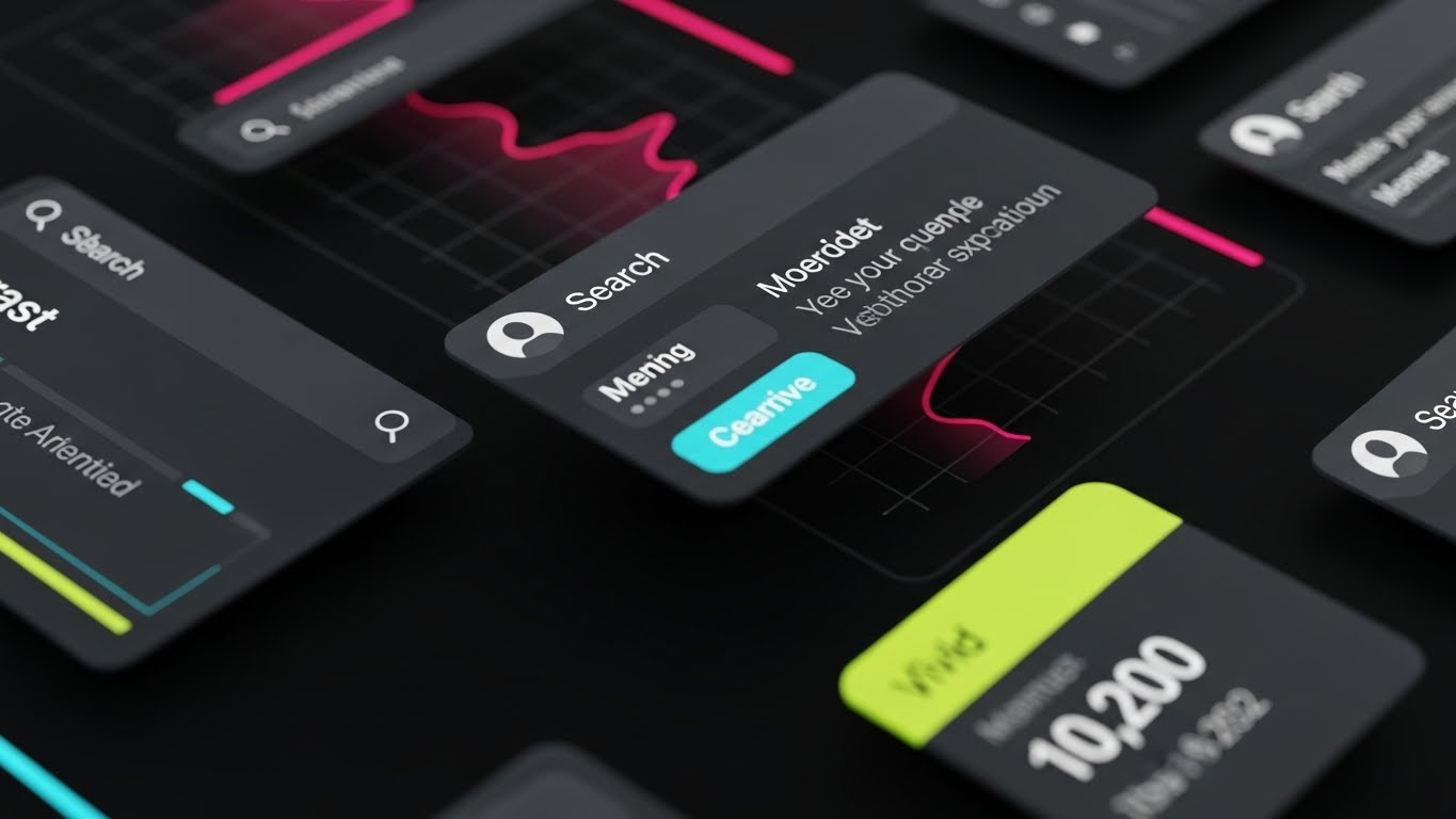
2. Abstract 3D AI Visualization (Style Code 11)
TOFU | Category Creation

The Visual & Narrative Approach
To explain the complexity of AI-driven risk modeling without overwhelming the viewer with math, we utilize abstract metaphor. This style features "translucent, glass-textured nodes" connected by silver filaments, forming a protective dome. The macro focus and shallow depth of field draw attention to the "central node," representing the platform's core processing engine. The matte slate and electric purple palette moves away from "eco-green" clichés, signaling a sophisticated, tech-forward approach to sustainability. The "subsurface scattering" lighting effect gives the nodes a solid, premium feel, implying that the data is substantial and trustworthy.
Psychological Impact & KPI Focus
- Niche Psychology: CROs are skeptical of "black box" AI. They fear what they can't see. This visualization serves as a "Glass Box" metaphor—translucent and structured. It reassures the viewer that the underlying algorithms are robust, interconnected, and resilient, not chaotic.
- Operational Impact: By associating the software with high-tech, crystallized structures, we subconsciously prime the viewer to perceive the platform as a "defensive shield" against market volatility, directly supporting the value proposition of risk mitigation.
Strategic Implementation & Trade-offs
- Best Use Case: Explainer videos focusing on "How It Works" or the proprietary AI technology (Duration: 15-20 seconds).
- Strategic Trade-off: The "Metaphor vs. Metric Trade-off." While excellent for category creation and branding, this abstract style does not convey specific data values. It builds trust in the system, not the specific number.
Companies using similar video content -
ClimateAi – ClimateLens™ – AI-powered climate intelligence for food and agriculture.
ResilienceAI – ResilienceAI Platform – AI-native climate intelligence for investors.
3. Isometric 2D Motion Design (Style Code 3)
TOFU | Market Education

The Visual & Narrative Approach
When the goal is to explain specific asset-level risks—like the exposure of a single city block to solar viability or flood zones—we strip away the cinematic gloss. This style uses a "clean, flat vector illustration" with zero gradients, relying on a vibrant coral and teal palette. The "orthographic" perspective is crucial; it eliminates perspective distortion, allowing for an honest, architectural view of the "miniature city block." The motion of tiles flipping from sun to rain cloud is a direct, simplified visual metaphor for "Scenario Analysis"—showing how quickly risk variables can change.
Psychological Impact & KPI Focus
- Niche Psychology: Complexity is the enemy of execution. For facility managers and urban planners, the world is messy. This style offers "Cognitive Ease." It organizes the chaos of the real world into a neat, manageable grid, suggesting that the software provides control and order.
- Operational Impact: This style excels at education and retention. It simplifies complex "Transition Risk" concepts (e.g., retrofitting buildings) into digestible visual bites, perfect for educational YouTube content where clarity trumps realism.
Strategic Implementation & Trade-offs
- Best Use Case: Educational modules, feature walkthroughs, and YouTube organic content explaining specific risk factors (Duration: 30-60 seconds).
- Strategic Trade-off: The "Depth Trade-off." The flat style lacks emotional weight. It is informative but not "epic." It works best for explaining mechanics, not consequences.
Companies using similar video content -
GREENPASS – GREENPASS SaaS Tool – Evaluates and optimizes climate-resilient urban planning.
ClimateCheck – ClimateCheck Platform – Identifies property-specific climate hazard risk.
6. Dynamic Data Visualization (Style Code 6)
TOFU | YouTube

The Visual & Narrative Approach
This style visualizes the sheer horsepower of the platform's analytical engine. Centered on an "abstract processing core," the visual uses particle systems to represent millions of data points (terabytes of climate data) being ingested in real-time. The shift from "magma orange" (raw, hot, chaotic data) to "cool blue" (structured, analyzed insight) tells a complete story of transformation in a single frame. The "rotational motion blur" and glowing trails effectively communicate speed and high-frequency processing, essential for differentiating a SaaS platform from a static report.
Psychological Impact & KPI Focus
- Niche Psychology: In financial services, speed is synonymous with advantage. The "magma" palette taps into the primal association with heat and urgency, while the transition to blue offers the psychological resolve of "cooling down" the risk. It proves the platform can handle the "Heat Map" of global volatility.
- Operational Impact: This visual style directly addresses the "Latency Anxiety" of users who deal with real-time markets. It visually validates the claim of "Real-Time Risk Assessment."
Strategic Implementation & Trade-offs
- Best Use Case: Product demo intros, background visuals for webinars, and performance-focused social cuts (Duration: 5-10 seconds).
- Strategic Trade-off: The "Density Trade-off." High-particle density can be visually noisy on smaller mobile screens. It requires 1080p+ playback to be appreciated, making it less ideal for compressed environments.
Companies using similar video content -
Correntics – Climate Risk Analytics Platform – Data-driven climate risk analytics for physical risk.
S&P Global Sustainable1 – Climanomics – Quantifies financial impact of climate risks.
7. Abstract 2D Flat Vector Organic (Style Code 7)
TOFU | Shaping Brand Perception

The Visual & Narrative Approach
Climate risk is often portrayed as jagged and harsh. This style counter-programs that narrative by using "fluid, organic shapes" and a "fresh mint and sky blue" palette. The "squiress" (rounded square) corners suggest a modern, friendly interface that is stable yet adaptable. The horizontal flow of the shapes creates a subconscious link to water currents and wind patterns, but in a way that feels managed and harmonious rather than destructive. The shadowless lighting removes all sense of threat, presenting the software as an approachable partner.
Psychological Impact & KPI Focus
- Niche Psychology: This appeals to the "Sustainability" side of the persona (CSOs) who are driving cultural change within their organizations. It reduces the intimidation factor of complex software, signaling "Ease of Use" and "User-Centric Design."
- Operational Impact: By lowering the visual "threat level," this style is effective for onboarding and customer success content, where the goal is to encourage adoption and reduce user friction.
Strategic Implementation & Trade-offs
- Best Use Case: Onboarding videos, customer success stories, and "About Us" brand pages (Duration: Continuous Loop).
- Strategic Trade-off: The "Authority Trade-off." This style can appear "soft" or overly playful to a hardcore quantitative analyst accustomed to Bloomberg Terminals. It must be balanced with data-heavy visuals elsewhere.
Companies using similar video content -
Sweep – Sweep Platform – Carbon and ESG data platform for streamlined reporting.
Greenly – Greenly Platform – Carbon accounting and decarbonization.
8. Split Screen: Optimized Reality (Style Code 27)
MOFU | Product Differentiation
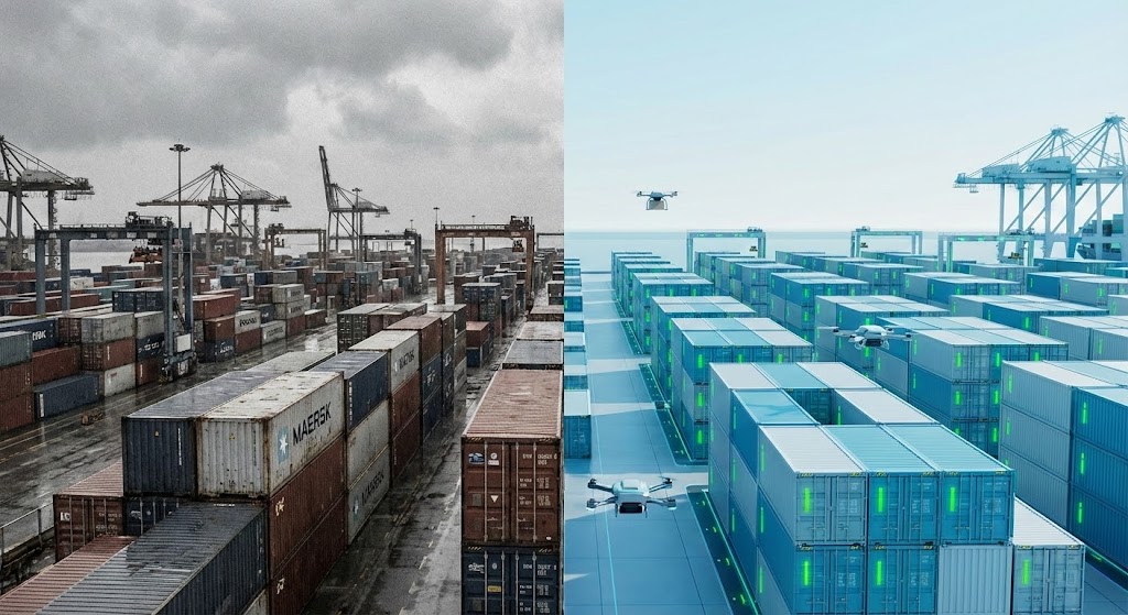
The Visual & Narrative Approach
This is the definitive "Before and After" visualization for the B2B buyer. The continuous horizon line is the critical element—it proves we are looking at the same reality, just viewed through a different lens. The left side (Gritty, desaturated, disorganized) represents the "Physical Risk" without data: chaotic and opaque. The right side (Azure, clean, gridded) represents the "Digital Twin": optimized, tracked, and green-lit. The "glowing green status indicators" are the visual payoff, signaling safety and efficiency.
Psychological Impact & KPI Focus
- Niche Psychology: Decision-makers fear chaos. This style leverages "Cognitive Fluency"—the brain prefers information that is easy to process. The right side of the screen offers a dopamine hit of order and resolution. It visually demonstrates the "Alpha" (excess return) generated by optimization.
- Operational Impact: This is a high-conversion visual. It explicitly answers the "Why Buy?" question by showing the tangible operational lift—transforming a stranded asset (chaos) into a productive one (order).
Strategic Implementation & Trade-offs
- Best Use Case: Middle-of-Funnel (MOFU) landing pages, case study videos, and sales deck openers (Duration: 15-30 seconds).
- Strategic Trade-off: The "Production Complexity Trade-off." Requires perfect matching of camera angles and focal lengths between the "real" footage and the "CGI" overlay to maintain the illusion of continuity.
Companies using similar video content -
RiskThinking.ai – Climate Digital Twin™ – Transforms chaotic climate data into actionable insights.
ClimateFirst Building Solutions – Climate Value at Risk (CVaR) – Quantifies financial risk for real estate.
9. Macro UI Micro-Interactions (Style Code 17)
MOFU | Feature Education

The Visual & Narrative Approach
Software is intangible. To make it feel valuable, we must zoom in. This extreme macro shot of a toggle switch focuses on the moment of decision. The "razor-sharp focus" on the switch, combined with the "neon lime" light spill, dramatizes the act of enabling "Predictive Mode." The deep black background ensures high contrast, making the green light appear to physically illuminate the dark interface. It turns a software feature into a tangible, tactile experience.
Psychological Impact & KPI Focus
- Niche Psychology: This speaks to the user's desire for agency. In a world of uncontrollable climate events, the ability to simply "toggle on" a predictive safeguard is empowering. It suggests that complex risk mitigation is just a switch away.
- Operational Impact: This style highlights "Feature Affordance." It trains the user on specific UI elements while elevating the perceived quality of the software design (UX/UI), implying that if the button looks this good, the code behind it must be solid.
Strategic Implementation & Trade-offs
- Best Use Case: Feature release announcements, "New in Version X.0" videos, and precise tutorial steps (Duration: 3-5 seconds per interaction).
- Strategic Trade-off: The "Context Trade-off." By zooming in so close, we lose the broader context of the dashboard. This style cannot stand alone; it must be part of a sequence that establishes the full screen first.
Companies using similar video content -
Persefoni – Persefoni Platform – AI-powered climate management and carbon accounting.
Novisto – Novisto ESG – Automates ESG data management and analytics workflows.
10. Lifestyle Stock with UI Overlay (Style Code 20)
MOFU | Thought Leadership

The Visual & Narrative Approach
This style places the technology in the hands of the decision-maker. We see a "professional woman" in a "glass-walled executive office," effectively mirroring the target audience's environment. The key is the "semi-transparent, holographic data visualizations" floating off the tablet. This technique—"Compositing"—visually bridges the gap between the physical world (the "blurred city skyline" in the background) and the digital insight. It shows the data in context, supporting the narrative that this software informs real-world executive decisions.
Psychological Impact & KPI Focus
- Niche Psychology: This is "Aspirational Mirroring." The CRO sees themselves in this image—competent, equipped with cutting-edge tools, and in command of the data. It moves the conversation from "software specs" to "career success."
- Operational Impact: This humanizes the B2B sales process. It validates the workflow: Data -> Tablet -> Executive Decision. It builds trust by showing the software in a realistic, high-value context.
Strategic Implementation & Trade-offs
- Best Use Case: LinkedIn organic posts, case study thumbnails, and webinar invitations (Duration: Static or subtle 5-second loop).
- Strategic Trade-off: The "Stock Fatigue Trade-off." If the base photography feels too generic or "staged," credibility is lost. The holographic overlay must be high-quality (tracked perfectly) to elevate the stock footage beyond a cliché.
[END OF PART 1]
Companies using similar video content -
LogicManager – Climate Change Risk Assessment Software – Integrates climate into enterprise risk management.
Adapt Ready – Adapt Ready Platform – Forecasts climate-related events and prepares for them.
11. Clean UI Workflow (Light Mode) (Style Code 15)
MOFU | The Functional Buyer
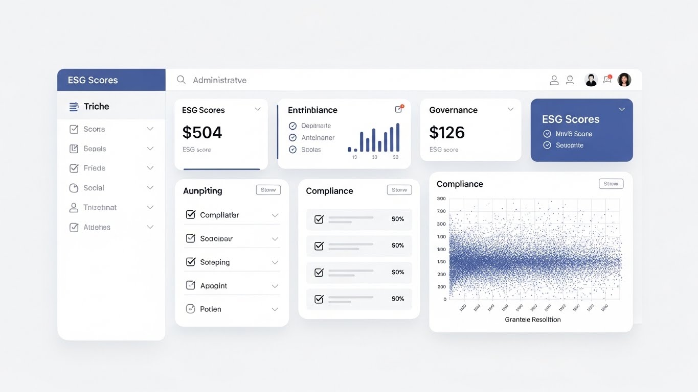
The Visual & Narrative Approach
When addressing the Functional Buyer—often the Sustainability Manager or Compliance Officer—clarity is the ultimate currency. This style utilizes a "pristine, light-mode UI design" to eliminate the intimidation factor of complex data. The "slate blue and graphite text" against the stark white background creates a clinical, trustworthy aesthetic. We see a "dashboard populated with ESG scores and compliance checklists," alongside a "dense but organized scatter plot." This scatter plot is crucial; it shows that while the system handles massive, granular resolution data, the interface renders it controllable and readable.
Psychological Impact & KPI Focus
- Niche Psychology: These users are often overwhelmed by "spreadsheet fatigue" and regulatory anxiety. They fear missing a detail that could lead to non-compliance. This ultra-clean visual triggers "Cognitive Fluency," reassuring them that the platform brings order to the chaos of ESG reporting.
- Operational Impact: This style directly impacts Demo Request Conversions. By showcasing a UI that looks easy to navigate, we lower the perceived "Time to Value" and training burden, making the software feel like a turnkey solution for TCFD or CSRD reporting.
Strategic Implementation & Trade-offs
- Best Use Case: Email marketing campaigns targeting mid-level managers and "Features" pages on the website (Duration: 30-45 seconds).
- Strategic Trade-off: The "Excitement Trade-off." This style is intentionally dry. It lacks the "wow" factor of a 3D globe but compensates with high functional relevance. It wins trust, not awards.
Companies using similar video content -
Workday – Workday Adaptive Planning – Cloud applications for finance, HR, and ESG reporting.
KeyESG – KeyESG Platform – All-in-one ESG management software.
12. 2D Line Art Animation (Style Code 2)
MOFU | Overcoming Objections

The Visual & Narrative Approach
Climate regulation (EU Taxonomy, SEC rules) is notoriously convoluted. To visualize the solution to this pain point, we use a minimalist metaphor. A "continuous ink-black line" forms a "complex, tangled knot" in the center of the frame—representing the current regulatory landscape. As the animation progresses, the knot elegantly unties itself, transforming into a "straight, golden path." The use of negative space focuses the viewer entirely on this transformation, stripping away all noise to highlight the elegance of the solution.
Psychological Impact & KPI Focus
- Niche Psychology: This speaks to the "Analysis Paralysis" many CROs feel when facing shifting mandates. The visual of the knot untying offers a psychological release—a promise that the software acts as a "Regulatory Sherpa," guiding them through the maze without friction.
- Operational Impact: This style is highly effective for reducing Sales Cycle Length. It quickly addresses and neutralizes the objection that "implementation will be too complex," positioning the platform as a simplifier rather than an additive complexity.
Strategic Implementation & Trade-offs
- Best Use Case: "Why Us" sections on landing pages and specific objection-handling segments in sales decks (Duration: 15-20 seconds).
- Strategic Trade-off: The "Detail Trade-off." By using a metaphor, we sacrifice technical specificity. This must be paired with actual UI shots (like Style 11) to validate that the "straight path" is real and not just marketing fluff.
Companies using similar video content -
AuditBoard – AuditBoard ESG – Centralizes ESG program management.
NAVEX One – NAVEX One Platform – Integrated risk and compliance management.
13. Isometric 3D Workflow (Style Code 10)
MOFU | Building Trust

The Visual & Narrative Approach
For financial institutions, data security is as critical as the climate model itself. This style uses a "clay-style isometric render" of a server room to visualize the physical infrastructure behind the cloud. The "soft global illumination" softens the tech, while the "glowing, holographic padlock symbol" hovering over the "server racks" serves as the focal point. The palette of "server green, metallic grey, and cyan" communicates institutional-grade robustness. It visually confirms that the client’s proprietary portfolio data is siloed, secure, and protected.
Psychological Impact & KPI Focus
- Niche Psychology: Risk Managers are paranoid about data leaks. This visual leverages the "Fortress Effect." Even though the software is SaaS (cloud-based), visualizing physical racks and a massive lock taps into the traditional desire for on-premise security, bridging the gap between legacy expectations and modern cloud architecture.
- Operational Impact: This style supports Vendor Risk Assessment stages. It provides a visual shorthand for "SOC 2 Compliance" and "Data Sovereignty," helping to speed up the procurement approval process from IT security teams.
Strategic Implementation & Trade-offs
- Best Use Case: Security compliance pages, "Trust Centers," and bottom-of-funnel (BOFU) retargeting ads (Duration: 10-15 seconds).
- Strategic Trade-off: The "Abstract vs. Real Trade-off." While comforting, it is a generic representation of security. It works best as a reinforcement of trust, not as a primary differentiator of the climate model itself.
Companies using similar video content -
Diligent – Diligent ESG – Comprehensive governance, risk, compliance, and ESG management.
IBM – Envizi ESG Suite – Consolidates enterprise ESG data for analysis and reporting.
14. Bold Kinetic Typography (Visual) (Style Code 4)
MOFU | LinkedIn Video Ads

The Visual & Narrative Approach
Sometimes, you need to communicate strength without words. This style uses "solid blocky shapes" in a "heavy impact red, bold black, and white" palette to visualize the robustness of the platform's modeling engine. We see "diagonal, dynamic angles" where massive blocks collide and "lock together like a vault door." The "motion blur" emphasizes the force of the connection. It’s a visceral representation of a stress test—showing that the platform’s foundational models are unshakeable, even under pressure.
Psychological Impact & KPI Focus
- Niche Psychology: In a market flooded with startups, buyers look for stability. This visual style mimics the branding of established investment banks and insurance giants. It projects "Institutional Weight," signaling that this is not a beta product, but a battle-tested enterprise solution.
- Operational Impact: This is a "Scroll Stopper" for LinkedIn Feeds. In a silent, auto-play environment, the heavy motion and high contrast grab attention immediately, driving higher Click-Through Rates (CTR) for thought leadership articles or whitepapers.
Strategic Implementation & Trade-offs
- Best Use Case: LinkedIn video ads (square 1:1 format) and transition stingers in longer webinar videos (Duration: 3-6 seconds).
- Strategic Trade-off: The "Nuance Trade-off." This style conveys power, but not intelligence. It is purely emotive and branding-focused, creating a feeling of solidity rather than explaining a feature.
Companies using similar video content -
Sphera – SpheraCloud – Integrated sustainability and operational risk platform.
Workiva – Workiva Platform – Unifies financial, ESG, and risk reporting.
15. 3D X-Ray Visualization (Style Code 14)
BOFU | Risk Mitigation

The Visual & Narrative Approach
To demonstrate the platform's ability to assess physical risk at the asset level (e.g., a specific REIT portfolio), we use an X-Ray view. The camera looks up at a "corporate skyscraper," rendered in "translucent blue and skeleton white." This transparency reveals the "internal steel beams," where "glowing hazard orange nodes" pulse to indicate structural vulnerabilities or exposure to specific hazards (like wind shear or seismic activity). The "sharp wireframe edges" communicate precision—we aren't just looking at the building; we are looking into its resilience.
Psychological Impact & KPI Focus
- Niche Psychology: For Real Estate Investment Trusts (REITs) and insurers, the fear is the "Hidden Liability." This style visually promises "Deep Due Diligence." It reassures the buyer that the model captures latent risks that a superficial assessment would miss, aligning with their fiduciary duty.
- Operational Impact: This style is instrumental in Case Studies. It visually proves the "Granularity" of the model, directly supporting premium pricing strategies by demonstrating that the software offers superior insight compared to coarse, regional-level competitors.
Strategic Implementation & Trade-offs
- Best Use Case: Product pages detailing "Physical Risk Modules" and technical deep-dive webinars (Duration: 20-30 seconds).
- Strategic Trade-off: The "Scope Trade-off." Focusing on a single building implies a micro-view. It must be contextualized within a portfolio view to ensure the viewer understands the platform can handle this level of detail at scale (thousands of assets).
Companies using similar video content -
Cotality – Climate Risk Analytics – Assesses physical risks and protects assets.
Climate X – Climate X Platform – Advanced climate risk analytics for financial impacts.
16. Minimalist Flat 2D Vector (Style Code 1)
BOFU | ROI Justification

The Visual & Narrative Approach
When discussing the ROI of climate adaptation, we want to link financial gain with natural resilience. This style uses a "simple flat vector illustration" with a palette of "growth green, soil brown, and sky blue." We see a bar chart viewed from the side, but the bars are stylized as "trees at different stages of growth," getting taller and fuller from left to right. This visual pun serves a dual purpose: it represents the literal growth of the asset's value through adaptation and the metaphorical growth of the portfolio's sustainability.
Psychological Impact & KPI Focus
- Niche Psychology: This appeals to the "Impact Investor" persona. It reframes climate risk management from a cost center (defense) to a value generator (offense). The organic imagery softens the hard financial data, aligning with the "Green Alpha" narrative—that sustainable portfolios outperform over the long term.
- Operational Impact: This is highly effective for ROI Calculators and pricing pages. It visually reinforces the "Value Proposition," helping to justify the subscription cost by visualizing the long-term upward trajectory of protected assets.
Strategic Implementation & Trade-offs
- Best Use Case: Pricing pages, ROI projection slides in sales decks, and sustainability reports (Duration: Static or 5-second loop).
- Strategic Trade-off: The "Seriousness Trade-off." If the illustration is too cartoonish, it risks trivializing the financial rigor. The geometry must remain clean and aligned to a grid to maintain B2B credibility.
Companies using similar video content -
Sami – Sami Platform – Measures, reduces, and reports carbon emissions.
Klimahelden – Digital Climate Manager – Manages and reduces corporate carbon footprint.
17. Generative AI Realistic Character (Style Code 30)
BOFU | The Economic Buyer
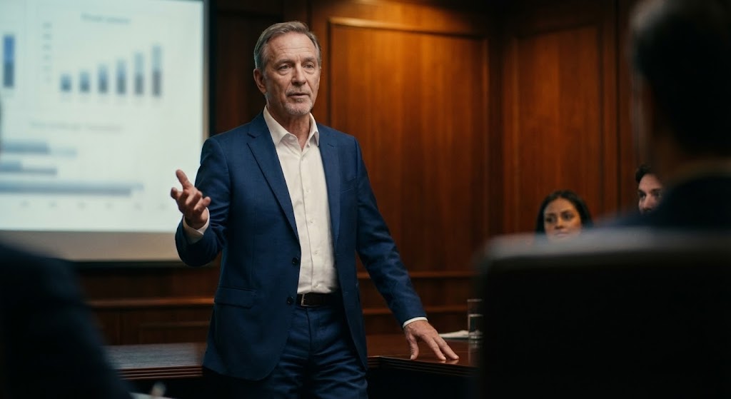
The Visual & Narrative Approach
To close the deal, we must mirror the ultimate decision-maker: the C-Suite executive. This style features a photorealistic "medium shot of a senior executive in a boardroom." The lighting is "cinematic with warm amber" tones, contrasting with the "navy blue suit" and "mahogany wood textures." The background presentation screen is blurred (shallow depth of field), focusing entirely on the character's "relaxed but authoritative posture." He is gesturing slightly—not panic-stricken by the climate data, but empowered by it. This is the look of a leader who has the right answers.
Psychological Impact & KPI Focus
- Niche Psychology: This utilizes "Identity Alignment." The Economic Buyer doesn't want to use software; they want to be this person—composed, informed, and in control. This visual validates their self-image as a prudent steward of capital navigating turbulent times.
- Operational Impact: This style is critical for Account-Based Marketing (ABM) campaigns targeting the C-Suite. It moves the conversation away from features and towards "Leadership Assurance," increasing the likelihood of executive sign-off.
Strategic Implementation & Trade-offs
- Best Use Case: "About Us" videos, leadership philosophy pages, and high-stakes pitch deck openers (Duration: 5-10 seconds).
- Strategic Trade-off: The "Uncanny Valley Trade-off." With Generative AI, hands and eyes must be perfect. Any artifacting here destroys credibility immediately. The prompt fidelity must be exceptionally high to pass as premium stock.
Companies using similar video content -
ERM – Climate Risk & Scenario Analysis – Consulting with digital tools for climate risk.
Quantiphi – AI-driven Climate Risk Solutions – Predicts, prices, and mitigates weather risks for insurance.
18. Wireframe to Reality Transition (Style Code 26)
BOFU | Competitive Displacement
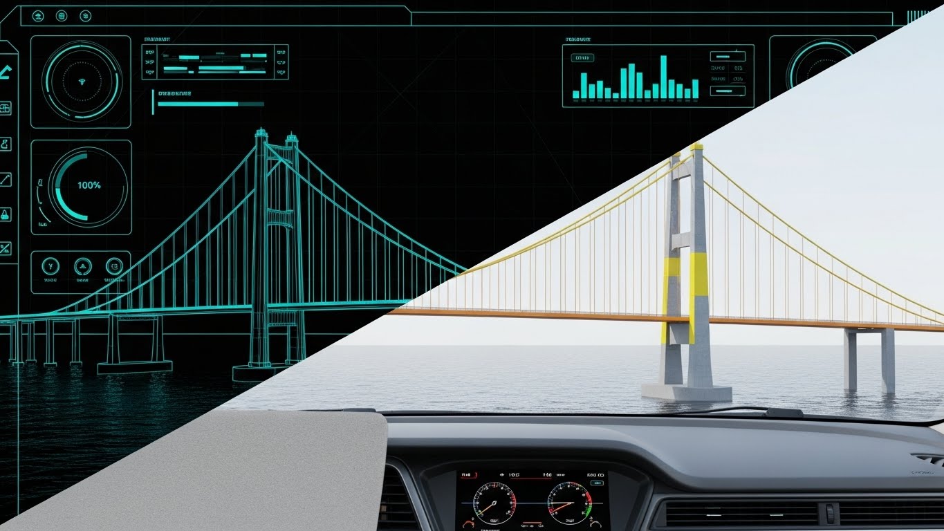
The Visual & Narrative Approach
This split-screen technique is a powerful tool for competitive displacement. We see a "suspension bridge spanning water." The left half is a "blueprint wireframe in blueprint blue," representing the theoretical risk models offered by competitors (or legacy methods). The right half transitions into a "fully rendered, photorealistic bridge in concrete grey," representing the actual physical asset managed by your platform. The "transition line" moves across, filling the wireframe with "concrete texture," visualizing the shift from theoretical guessing to validated, physical reality.
Psychological Impact & KPI Focus
- Niche Psychology: Buyers are skeptical of models that detach from reality. This visual serves as a "Reality Check." It suggests that while others offer lines on a map (wireframes), this platform understands the concrete, steel, and physical stress of the actual infrastructure. It builds "Engineering Trust."
- Operational Impact: This style is a weapon for Competitive Analysis collateral. It visually articulates the "Fidelity Gap" between your solution and lower-tier competitors, helping to justify a premium price point by highlighting superior asset-level data.
Strategic Implementation & Trade-offs
- Best Use Case: "Our Data vs. Theirs" comparison pages and technical whitepaper headers (Duration: 10-15 seconds).
- Strategic Trade-off: The "Production Sync Trade-off." The wireframe and the render must line up perfectly pixel-for-pixel. Any misalignment breaks the illusion of it being the same object evolving.
Companies using similar video content -
OS-Climate – Physical Risk & Resilience – Open-source data and software for climate risk.
Oasis Loss Modelling Framework – Oasis LMF – Open-source catastrophe modeling platform.
19. 2D Animation & UI Composition (Style Code 25)
BOFU | Objection Handling

The Visual & Narrative Approach
Adoption is often stalled by the fear of difficulty. To counter this, we use a "stylized 2D character" with "flat shading" in a "joyful yellow and soft grey" palette. The character is in a simple office setting, looking at a "floating UI element" (your software). A "bright yellow lightbulb icon" pops up, and their expression shifts to a smile. This is not about the data; it's about the user experience. It visualizes the "Aha!" moment where the complex risk data suddenly makes sense.
Psychological Impact & KPI Focus
- Niche Psychology: This targets the "End User" (analysts and associates) who will actually be in the tool daily. It promises "Low Friction." It reassures them that the software is designed for humans, not just machines, and will make their daily reporting tasks easier, not harder.
- Operational Impact: This style improves User Retention and onboarding. By associating the UI with positive emotions (smiling, lightbulbs) rather than stress, we subconsciously prime the user for a positive experience during the trial phase.
Strategic Implementation & Trade-offs
- Best Use Case: Onboarding tutorial intros, customer support portals, and "Success Stories" (Duration: 5-10 seconds).
- Strategic Trade-off: The "Tone Trade-off." This is the most casual style in the guide. It should never be used on the "Risk Modeling Science" page, as it lacks the gravitas required for deep analytics. It is strictly for the human side of the software.
Companies using similar video content -
Fairly Made – Fairly Made Platform – Traceability and impact measurement for fashion supply chains.
Emitwise – Emitwise Platform – Carbon accounting and supply chain emissions.
20. Aspirational Stock Montage (Style Code 21)
BOFU | Driving Demo Requests

The Visual & Narrative Approach
Ultimately, software is bought to enable teams to win. This style uses a "high-quality stock photography montage" in a "bright daylight" open-plan workspace. We see a "diverse team of professionals" high-fiving or pointing enthusiastically at a screen. The crucial element is the "blurred dashboard screen in the foreground" or a subtle UI overlay that they are reacting to. This connects the human celebration directly to the software's output. It visualizes the end state: a team that is aligned, informed, and successful because they used the platform.
Psychological Impact & KPI Focus
- Niche Psychology: This taps into "Social Proof" and the desire for organizational harmony. Climate risk is often a siloed, stressful topic. This visual suggests that the software breaks down silos, enabling the Risk, Sustainability, and Finance teams to collaborate seamlessly and celebrate shared wins.
- Operational Impact: This is the ideal "Call to Action" (CTA) visual. Placed next to a "Book a Demo" button, it subliminally promises that clicking the button leads to this positive, successful future. It increases conversion rates at the bottom of the funnel.
Strategic Implementation & Trade-offs
- Best Use Case: The final section of landing pages, directly near the CTA form, and in "Thank You" confirmation emails (Duration: Static image or slow motion video).
- Strategic Trade-off: The "Authenticity Trade-off." Stock photos can easily feel fake. The image must include the UI overlay (even if blurred) to tie it to the product, otherwise, it looks like a generic "business success" placeholder.
[END OF PART 2]
Companies using similar video content -
MSCI – MSCI ESG Research – Provides critical decision support tools for global investment.
Salesforce – Net Zero Cloud – Carbon accounting and sustainability management.
21. 2D Character-Driven Story (Style Code 5)
Onboarding | Self-Serve Onboarding

The Visual & Narrative Approach
Onboarding a new user onto a complex climate risk platform can be daunting. We mitigate this "Entry Anxiety" by using a "2D vector character in a storybook style." The character stands at a literal threshold—a large, open doorway revealing a "bright, abstract digital landscape." Holding a "stylized map," the character acts as a proxy for the user, symbolizing guidance and direction. The palette of "friendly orange and soft blue" intentionally contrasts with the alarming red often associated with risk, creating a welcoming, psychological safe space for learning.
Psychological Impact & KPI Focus
- Niche Psychology: New users, especially junior analysts, often experience "Imposter Syndrome" when facing enterprise-grade modeling tools. This style uses "Narrative Transport"—placing the user in a hero's journey—to lower the intimidation barrier. It frames the software not as a test to be passed, but as a world to be explored.
- Operational Impact: This style is a cornerstone of Self-Serve Onboarding. By making the initial "Welcome" video emotionally resonant, we increase the Activation Rate—the percentage of users who complete the initial setup without needing human intervention.
Strategic Implementation & Trade-offs
- Best Use Case: The first "Welcome" screen inside the platform and introductory email sequences (Duration: 60-90 seconds).
- Strategic Trade-off: The "Gravitas Trade-off." This style is too playful for the Boardroom. It is strictly for the user (Analyst), not the buyer (C-Suite). It builds comfort, not authority.
Companies using similar video content -
Microsoft – Sustainability Cloud – Manages environmental impact and carbon tracking.
SINAI Technologies – SINAI Platform – Carbon accounting and decarbonization scenarios.
22. Rapid UI Feature Montage (Style Code 19)
Onboarding | Reducing Friction
The Visual & Narrative Approach
Once the user is comfortable, we must demonstrate efficiency. This style uses a "montage composition" of rapid cuts through a "grid layout of UI fragments." We see "dropdown menus snapping open," "checkboxes being ticked," and "buttons changing states" in quick succession. The "motion blur lines" on the cursor movements exaggerate the speed. The palette is "interface grey and action green," focusing entirely on the mechanics of the workflow. It visualizes the platform as a high-velocity instrument for compliance.
Psychological Impact & KPI Focus
- Niche Psychology: "Click Fatigue" is a major pain point in regulatory reporting. Users fear software that is clunky or slow. This visual triggers the "Speed Heuristic"—if the video moves fast, the user assumes the software is optimized. It promises respect for the user's time.
- Operational Impact: This style supports Time-to-Value (TTV). By visually compressing a 10-minute task into a 10-second montage, we subconsciously train the user on the "Happy Path," encouraging them to attempt the configuration themselves.
Strategic Implementation & Trade-offs
- Best Use Case: Feature highlight reels on the "Solutions" page and "What's New" update videos (Duration: 15-30 seconds).
- Strategic Trade-off: The "Comprehension Trade-off." The pace is too fast for actual instruction. It creates awareness of a feature, but does not teach competence. It must be paired with slower tutorials.
Companies using similar video content -
Green Codes – Green Codes Software – Supports EHS initiatives and sustainability.
EnergyElephant – EnergyElephant Platform – Monitors and manages energy consumption for sustainability.
23. 2D Graphics Over Live Action (Style Code 23)
Onboarding | Accelerating TTV
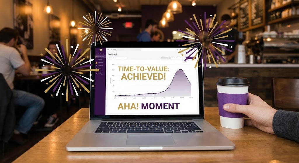
The Visual & Narrative Approach
To connect digital success with real-world feelings, we use "Mixed Reality." A POV shot shows a "casual coffee shop environment," grounding the work in the user's daily reality. The laptop screen displays a graph peaking, but the focus is on the "2D vector fireworks" exploding out from the screen edges. This superimposition visualizes the internal emotional state of the user—the relief and joy of finally completing a complex stress test. It breaks the fourth wall, suggesting the software's impact spills over into real life.
Psychological Impact & KPI Focus
- Niche Psychology: Risk management is often a thankless, invisible task. This style provides "Micro-Validation." It acknowledges the user's hard work and rewards it with a visual celebration, tapping into the dopamine loops that drive habit formation.
- Operational Impact: This style is highly effective for Customer Lifecycle Marketing. Sending this visual in a "Congratulations on your first report!" email reinforces positive behavior and deepens brand affinity.
Strategic Implementation & Trade-offs
- Best Use Case: Milestone emails, gamification reward screens, and "Year in Review" videos (Duration: 5-8 seconds).
- Strategic Trade-off: The "Tone Trade-off." It is celebratory and casual. It should never be used for "Risk Alert" notifications, where a serious tone is required.
Companies using similar video content -
Coolset – Coolset Platform – ESG reporting for compliance-first teams.
PlanA.Earth – Plan A Platform – Carbon management and decarbonization platform.
24. Clean UI Workflow (Dark Mode) (Style Code 16)
Retention | Driving Deep Adoption

The Visual & Narrative Approach
For the technical power user (Data Scientists, Quants), "Dark Mode" is a requirement for long sessions of deep work. This style showcases a "sleek dark mode UI" on an "angled, curved monitor." The "midnight blue background" allows the "neon purple syntax highlighting" and "cyan data streams" to pop with high contrast. It displays a "complex code editor" alongside a 3D model, visualizing the seamless integration of custom Python scripts with the platform's visual engine. This signals that the software is robust, open, and "Pro-Grade."
Psychological Impact & KPI Focus
- Niche Psychology: Technical buyers are skeptical of "black box" tools. They want to see the code. This style validates their expertise. It signals "Developer Ergonomics," reassuring them that the platform supports advanced customization and isn't just a "business user" toy.
- Operational Impact: This style drives Feature Depth Adoption. By showcasing the API and scripting environment, it encourages technical teams to embed the software into their core stack, increasing the "Stickiness" of the account.
Strategic Implementation & Trade-offs
- Best Use Case: Developer documentation, API portal headers, and "Advanced Features" webinars (Duration: 30-60 seconds).
- Strategic Trade-off: The "Accessibility Trade-off." This visual scares the non-technical Sustainability Manager. It looks "too hard." It must be segmented strictly for the technical audience.
Companies using similar video content -
Clarity AI – Clarity AI Platform – ESG data science for portfolio analytics.
NGFS – Climate Scenarios Portal – Data and tools for transition/physical risks.
25. Low-Poly 3D Modeling (Style Code 9)
Retention | Reducing Support Overhead

The Visual & Narrative Approach
When a user visits the Help Center, they are frustrated. They need clarity, not photorealism. This style uses "Low-Poly 3D"—geometric, faceted shapes—to reduce visual noise. We see a "stylized question mark" in pastel blue morphing seamlessly into a "glowing lightbulb." The "flat lighting" and simple geometry make the transformation look effortless. It is a visual metaphor for the Knowledge Base: taking a jagged, complex problem and turning it into a bright, simple solution.
Psychological Impact & KPI Focus
- Niche Psychology: Frustrated users have high cognitive load. This minimalist aesthetic acts as a "Cognitive Palate Cleanser." It lowers the user's blood pressure and suggests that the problem is manageable, solvable, and not a catastrophe.
- Operational Impact: This style is strategic for Support Ticket Deflection. Using engaging, simple loops as headers for FAQ articles encourages "Self-Service," reducing the volume of Level 1 tickets reaching the support team.
Strategic Implementation & Trade-offs
- Best Use Case: Knowledge Base thumbnails, "Did You Know?" tooltips, and 404 Error pages (Duration: 3-5 second loop).
- Strategic Trade-off: The "Precision Trade-off." Low-poly is abstract. It cannot show how to click a button. It serves as a concept header, which must be followed by a Style 19 (UI Montage) for the actual tutorial.
Companies using similar video content -
CLIMADA – CLIMADA-App – Open-source risk assessment model.
Meteomatics – Meteomatics Weather Model – Hyper-local weather data for climate risk.
26. Abstract 2D Motion Graphics (Style Code 8)
Retention | Proactive Support

The Visual & Narrative Approach
To communicate intangible qualities like "System Uptime" or "Continuous Integration," we use abstract motion. "Fluid gradients of teal and purple" move diagonally across the frame in "smooth bezier curves." There are no hard edges, only flow. The motion is rhythmic and soothing. This represents the invisible, steady state of the cloud platform—always on, always updating, and always flowing without interruption.
Psychological Impact & KPI Focus
- Niche Psychology: Downtime is the enemy. This visual triggers a "Serenity Response." It subliminally reassures the user that the infrastructure is stable and modern. It aligns the brand with the design language of reliable fintech giants (like Stripe), suggesting operational maturity.
- Operational Impact: This style is effective for Retention Communications. Used in "System Status" emails or "Maintenance" notifications, it transforms a potentially negative message into a brand-building moment of calm assurance.
Strategic Implementation & Trade-offs
- Best Use Case: Backgrounds for login screens, loading states, and email footers (Duration: Continuous Loop).
- Strategic Trade-off: The "Meaning Trade-off." It is purely decorative. If used for critical alerts, it fails. It sets the mood, not the message.
Companies using similar video content -
EcoAct – Climate Risks Tool (ECLR) – Analyzes vulnerability to climate hazards.
EY – Climate Analytics Platform (EY CAP) – Evaluates physical and transition risks.
27. Holographic UI over 3D Render (Style Code 24)
Retention | Reducing Churn

The Visual & Narrative Approach
To retain clients, we must remind them of the physical value we protect. This style overlays a "semi-transparent, hologram blue digital schematic" onto a "realistic 3D render of a wind turbine blade" (or other asset). The "additive transparency" is key—we see the physical texture of the blade through the data. This visualizes the "Digital Twin" concept: the software (hologram) is inextricably linked to the asset's health, displaying "Predictive Maintenance" schedules that prevent failure.
Psychological Impact & KPI Focus
- Niche Psychology: Asset managers fear "Stranded Assets"—investments that lose value due to damage. This visual provides "X-Ray Vision." It reassures the stakeholder that the software is actively watching over their billion-dollar portfolio, spotting risks invisible to the naked eye.
- Operational Impact: This style is a Churn Buster. It is perfect for Quarterly Business Reviews (QBRs) to demonstrate the "ROI of Prevention"—visualizing the failures that didn't happen because the software caught them early.
Strategic Implementation & Trade-offs
- Best Use Case: Renewal pitch decks, case studies, and "New Feature" announcements for physical risk modules (Duration: 15-20 seconds).
- Strategic Trade-off: The "Asset Specificity Trade-off." The underlying 3D asset must match the client's portfolio (e.g., Real Estate vs. Energy). Using a wind turbine for a REIT client creates a disconnect.
Companies using similar video content -
Intensel – Intensel Platform – Climate risk intelligence for asset managers.
CarbonChain – CarbonChain Platform – Tracks supply chain emissions with detailed analytics.
28. Futuristic Neon/Dark Mode (Style Code 13)
Expansion | Driving Upsell

The Visual & Narrative Approach
When pitching an upsell to a "Global Enterprise" tier, we need to show scale. This style uses a "cyberpunk magenta and electric blue" palette to visualize a "networked globe." We see data lines "thickening and spreading" to new regions, representing the expansion of risk coverage. The "neon rim lighting" gives it a premium, high-tech feel. This isn't just a map; it's a visualization of the client's "Risk Intelligence Network" growing in power and reach.
Psychological Impact & KPI Focus
- Niche Psychology: Global executives are driven by "Empire Building." They want to eliminate blind spots. This style feeds their desire for total coverage. It positions the upsell not as "more cost," but as "more power" and "more visibility."
- Operational Impact: This style drives Expansion Revenue. It is the visual backdrop for discussions about "Multi-Jurisdictional Compliance" and "Global Licensing," making the higher price point feel justified by the sheer scale of the visualization.
Strategic Implementation & Trade-offs
- Best Use Case: Enterprise pricing pages, trade show booth backdrops, and executive pitch decks (Duration: 10-15 seconds).
- Strategic Trade-off: The "Realism Trade-off." It is highly stylized and abstract. It sells the vision of the enterprise tier, not the features.
Companies using similar video content -
BeZero Carbon – BeZero Carbon Ratings – Provides carbon credit ratings and risk assessment.
IBM – Environmental Intelligence Suite – Integrates weather data and climate risk analytics.
29. Hyper-lapse Stock Footage (Style Code 22)
Expansion | Driving Referrals

The Visual & Narrative Approach
Referrals are about people. To visualize the "Network Effect," we use "hyper-lapse photography" of a "busy metropolitan intersection at twilight." The "light trails" symbolize the fast pace of the market. Superimposed are "thin, glowing network lines" connecting the moving individuals. This visualizes the "Community of Practice"—showing that by using this platform, the user joins a dynamic, interconnected network of forward-thinking risk professionals.
Psychological Impact & KPI Focus
- Niche Psychology: Professionals want to belong to the "Winning Team." This visual leverages "Social Proof" at a macro level. It suggests that the industry is moving fast, and everyone who matters is connected through this ecosystem.
- Operational Impact: This style supports Referral Programs. It elevates a simple "Invite a Colleague" request into an invitation to join a movement, increasing the likelihood of peer-to-peer sharing.
Strategic Implementation & Trade-offs
- Best Use Case: Referral landing pages, community newsletter headers, and event promo videos (Duration: 5-8 seconds).
- Strategic Trade-off: The "Generic Stock Trade-off." Hyper-lapse is common. The overlay of the specific brand-colored network lines is mandatory to brand it and prevent it from looking like a generic telecom ad.
Companies using similar video content -
Watershed – Watershed Platform – Enterprise sustainability platform for carbon impact.
30. 3D Parallax UI Presentation (Style Code 18)
Expansion | In-App Upsell

The Visual & Narrative Approach
To sell a premium feature inside the app, we use "3D Parallax." We see floating UI windows suspended in a "depth blue void." The perspective is tilted. The "top-most layer" (the Premium Feature) "glows brighter" and casts a "drop shadow" on the layers below. This creates a literal hierarchy. It visually demonstrates that the upgrade is an elevation of their current capability—literally taking their analysis to a higher level.
Psychological Impact & KPI Focus
- Niche Psychology: The brain equates "Height" and "Depth" with value. By placing the premium feature physically above the others in Z-space, we leverage "Spatial Priming." The user instinctively understands that the top layer is the most desirable.
- Operational Impact: This is the highest-converting visual for In-App Paywalls. When a user tries to click a locked feature, showing this glowing, elevated layer makes the purchase decision feel like unlocking a physical expansion pack.
Strategic Implementation & Trade-offs
- Best Use Case: Pricing pages, "Feature Locked" modals, and "Pro vs. Basic" comparison videos (Duration: Loop or hover-triggered).
- Strategic Trade-off: The "Legibility Trade-off." The tilted angle distorts text. It is for headlines and button recognition only, not for reading fine print.
Strategic Knowledge Base: The Visual Operations Doctrine
Synthesis of Visual Strategy for Climate Risk Intelligence
The 30 styles detailed above are not merely aesthetic choices; they represent a "Visual Operating System" for the modern Climate Risk Enterprise. To transition from viewing these styles to operationalizing them, we present a 3-Segment Strategic Framework. This doctrine bridges the gap between creative production and business resilience.
Strategic Alignment & Visual Architecture
Goal: Defining the "Visual Operating System" before a single frame is rendered.
- The Cognitive Load Audit: Before commissioning any video, audit your current user training. Identify "High Friction" zones where text-based manuals are failing. Map these to Simplification Styles (e.g., Style 25 Low Poly) to reduce the cognitive burden on analysts.
- Role-Based Visual Mapping: Do not show the same visuals to a CSO and a Quant. Map Style 1 (Photorealistic 3D) to C-Suite landing pages to signal authority. Map Style 16 (Dark Mode UI) to technical documentation to signal precision.
- The "Glanceability" Standard: In climate risk, data density is high. Adhere to a "Glanceability" standard—can the viewer understand the trend (Risk Up/Risk Down) in under 3 seconds? Use Style 8 (Split Screen) to force this binary clarity.
- Brand Voice Consistency: Your "Physical Risk" visuals (Style 12 Photorealism) must aesthetically align with your "Transition Risk" visuals (Style 7 Abstract). Use a unified color palette (e.g., "Data Blue" and "Risk Orange") across all 30 styles.
- The Advids Strategic Audit: Partnering with Advids at this stage ensures that your visual language is scalable. An external audit helps define a "Visual Design System" that can grow from 10 assets to 1,000 without losing brand coherence.
- Standardization vs. Customization: Use Style 22 (Hyper-lapse) for broad, top-of-funnel emotion. Reserve custom, high-budget Style 17 (Generative Character) for high-stakes pitches. This optimizes the budget for maximum impact.
- The Cross-Departmental Bridge: Use Style 18 (Wireframe to Reality) to unify terminology between Sales (who sell the dream) and Product (who build the reality). Visualizing the connection ensures both teams tell the same story.
- Legacy System Integration: Many clients are migrating from spreadsheets. Use Style 8 (Split Screen) to visually validate this transition, showing the "Old World" (Excel) transforming into the "New World" (SaaS) without mocking the past.
- Accessibility in Analytics: Ensure that color-coded risk maps (Heat Maps) in your videos utilize color-blind friendly palettes. Motion graphics must be legible on mobile devices (Style 14 Kinetic Typography) for executives reviewing portfolios on the go.
- The Mobile-First Mandate: C-Suite decision-makers often view initial pitch decks on mobile. Ensure that complex styles like Style 6 (Dynamic Data) are optimized for small screens, using lower particle density to prevent visual noise.
Operational Adoption & Implementation
Goal: Embedding visuals into the workflow to drive user habituation.
- Overcoming "Black Box" Anxiety: Use Style 2 (Abstract 3D AI) to visualize the "Explainability" of your AI. By showing the nodes and connections (Glass Box), you reduce the fear of the unknown, critical for Model Risk Management compliance.
- The Micro-Learning Shift: Replace 50-page PDF user manuals with a library of Style 19 (Rapid UI) clips. These 30-second "Micro-Learning" assets increase information retention and reduce "Time-to-Competency."
- Just-in-Time Support: Embed Style 25 (Low Poly) videos directly into the dashboard's "Help" tooltips. When a user hovers over a complex feature, a 5-second loop should visually explain the concept immediately.
- Gamification of Compliance: Use Style 23 (Celebration Graphics) to visually reward users for completing tedious tasks like "Data Upload" or "ESG Disclosure." This positive reinforcement loop increases data completeness rates.
- Reducing Support Ticket Volume: There is a direct correlation between the quality of your Style 9 (Macro UI) tutorials and the volume of "How do I..." support tickets. Investing in high-fidelity tutorial videos is a deflection strategy.
- Remote Onboarding: For global teams, physical training seminars are impossible. Use Style 21 (Character Story) to create a welcoming, "human" onboarding experience that scales infinitely across time zones.
- Standard Operating Procedures (SOPs): Transform text-based TCFD reporting protocols into Style 13 (Isometric Workflow) flows. Visualizing the sequence of reporting steps reduces errors and ensures regulatory alignment.
- Feedback Loops: Use interactive video elements at the end of Style 11 (Clean UI) demos to gather user feedback. "Did this help?" buttons provide data on which visual styles are most effective.
- Scalable Localization: Climate risk is global. When creating Style 4 (Kinetic Typography) assets, design the text layers to be easily swappable for French, German, or Japanese versions without re-rendering the complex background animation.
- Leadership Communication: Empower your internal champions (CSOs) with Style 1 (Photorealistic 3D) visuals for their board presentations. Give them the "High-Gloss" assets they need to sell the success of the program to their own CEO.
Measuring Impact & Future-Proofing
Goal: Quantifying the ROI of visual strategy and preparing for the next wave of tech.
- Beyond "Views": Do not measure video success by "Views." Measure it by "Feature Adoption Rate" (did they use the feature after watching Style 19?) and "Time on Site" (did Style 1 keep them engaged?).
- The "Idle Time" Metric: Monitor the "Idle Time" inside the app. If users are pausing frequently, they are confused. Deploy Style 9 (Macro UI) tooltips to those specific friction points to smooth the workflow.
- Compliance Velocity: Measure how fast your client base adopts new regulations (e.g., CSRD) after you release a Style 12 (Line Art) explainer video. High velocity proves the educational value of your visual content.
- Retention and Churn: Correlate Style 27 (Asset Protection) viewing data with renewal rates. Clients who engage with "Value Realization" content are statistically less likely to churn.
- The AI Visual Frontier: Prepare your visual asset library for Generative AI. Ensure your Style 30 (Generative Character) prompts are stored and version-controlled, allowing you to rapidly generate localized avatars for new markets.
- Scalability of Assets: Build a "Modular Asset Library." The globe from Style 28 should be reusable in Style 1. Advids specializes in creating these modular "Lego kits" of visual assets, ensuring you don't pay for the same 3D model twice.
- The Advids Partnership: As your platform evolves, your visuals must keep pace. Treat Advids not as a vendor, but as a long-term strategic partner who maintains the "Visual Source Code" of your brand, ensuring continuity through version updates.
- Benchmarking Success: Regularly audit competitor visuals using Style 18 (Comparison). If their visuals look more "Physical" (Style 1) than yours, you risk losing the "Accuracy" perception. Maintain visual parity or superiority.
- The ROI of Safety: In the context of Climate Risk, "Safety" means "Financial Resilience." Quantify the value of the risks identified by the platform and visualize this "Saved Value" using Style 16 (Growth Charts) in your renewal discussions.
- Final Call to Innovation: Treat video not as "Marketing Content," but as "Visual Infrastructure." Just as you invest in backend code to make the software fast, invest in visual code (Styles 1-30) to make the software understood. In the era of climate volatility, clarity is your most valuable asset.
[END OF GUIDE]
Companies using similar video content -
Workiva – Workiva Platform – Unifies financial, ESG, and risk reporting.
Author & Editor Bio


