
Introduction: The Era of Clinical Clarity
In the high-stakes environment of modern healthcare, "Clinical Clarity" is the ultimate currency. For Clinical Directors and Quality Improvement (QI) Leads, the daily reality is a paradox: organizations are data-rich but insight-poor. The sheer volume of compliance requirements is outpacing human capacity. In fact, industry benchmarks reveal that clinical documentation audits and reviews surged by 100% in 2024 alone. This explosion in administrative volume threatens to bury critical patient safety signals under a mountain of paperwork.
The traditional "clipboard and spreadsheet" approach creates a dangerous "Physical/Digital Divide"—where the reality of the ward lags behind the digital record. The solution is not just more software, but better visualization. By bridging this gap with intuitive, high-fidelity digital tools, organizations can achieve up to 50% workload reductions, converting administrative hours back into patient care time.
This guide moves beyond generic "tech" aesthetics to explore 30 specific visualization styles tailored for Clinical Audit Platforms. Each style is selected to address specific psychological needs—from reducing the "cognitive load" of overworked staff to demonstrating the "predictive power" of AI—transforming compliance from a burden into a visual language of excellence.
1. Abstract 2D Flat Vector Organic Modern Motion Graphics
TOFU | Brand Awareness

1. The Visual & Narrative Approach
Visualization Scenario: This style utilizes a high-gloss, glass-like finish to visualize the concept of "Clinical Clarity." The scene begins with disjointed, amorphous blobs of soft cyan and arctic white floating in a pale lavender void, representing the fragmented nature of manual audit data. As the animation progresses, these organic shapes magnetically drift toward the center, merging seamlessly to form a perfect, structured circle.
Narration Tone: The voiceover should be calm, reassuring, and sophisticated. It mirrors the visual journey from anxiety (chaos) to resolution (order), avoiding technical jargon in favor of emotive concepts like "harmony" and "unification."
2. Psychological Impact & KPI Focus
Niche Psychology: Clinical stakeholders often feel overwhelmed by the "noise" of conflicting data points. This organic, fluid motion directly combats Audit Fatigue by offering a visual metaphor for relief. The lack of sharp edges reduces cognitive load, signaling that the software handles the complexity on their behalf.
Operational Impact: This style effectively bridges the emotional gap between the messiness of manual data collection (chaos) and the clean output of the SaaS platform (order), increasing Brand Recall by associating the tool with a feeling of zen-like control.
3. Strategic Implementation & Trade-offs
Best Use Case: High-level brand films or social media teasers (Instagram/LinkedIn) where the goal is to stop the scroll with aesthetic beauty rather than feature density.
Strategic Trade-off: While visually stunning, this style lacks data density. It is suboptimal for explaining specific features like "Root Cause Analysis" workflows, as the abstraction is too high to convey technical precision.
Companies using similar video content -
HealthStream – Comprehensive compliance management for healthcare organizations.
MRO Corp – Clinical Data Exchange Platform – Unifying clinical data for secure exchange.
EWSolutions – Enterprise information management for healthcare data governance.
2. Isometric 2D Motion Design
TOFU | Market Education

1. The Visual & Narrative Approach
Visualization Scenario: The screen presents a pristine, white-background "Clinical Audit Factory" viewed from a precise isometric angle. On the left, disorganized stacks of paper (represented as grey blocks) enter a sleek, mint-green machine. On the right, the machine outputs neat, organized floating holographic tiles in vivid azure blue. The style is flat but uses shadow variations to imply depth.
Narration Tone: The tone is rhythmic, precise, and efficient. It emphasizes verbs like "process," "standardize," and "output," mimicking the mechanical reliability of the visual factory.
2. Psychological Impact & KPI Focus
Niche Psychology: Operational leaders crave structure and predictability. The isometric perspective provides a "God-tier" view of the process, giving the viewer a sense of control and oversight. It satisfies the desire to see the "Black Box" of digitization at work.
Operational Impact: This style visually proves the value of Interoperability by showing the literal transformation of physical inputs (paper) into digital assets, directly attacking the inefficiency of manual data entry.
3. Strategic Implementation & Trade-offs
Best Use Case: "How It Works" sections on landing pages or explainer videos detailing the intake process of audit data. Recommended duration: 60-90 seconds.
Strategic Trade-off: The rigid geometry can feel impersonal. It risks treating patient data as merely "widgets" in a factory. Care must be taken to ensure the "output" implies better care, not just better paperwork.
Companies using similar video content -
MedTrainer – Streamlining compliance and credentialing workflows efficiently.
Healthicity – Automating medical chart auditing and risk assessment.
Xenia – Frontline operations for safety inspections and compliance.
4. Aspirational Stock Montage
TOFU | Vertical Social Organic

1. The Visual & Narrative Approach
Visualization Scenario: A high-resolution, cinematic photo-montage composition. The left third shows a close-up of a diverse female doctor's reassuring smile, bathed in warm, natural sunlight. The center third is an artistic double-exposure blending a modern hospital architecture with a rising stock graph made of light. The right third shows a pair of hands holding a tablet displaying a glowing "success" metric.
Narration Tone: Inspirational, visionary, and human-centric. The script focuses on the "why"—patient outcomes and staff well-being—rather than the "how" of the software.
2. Psychological Impact & KPI Focus
Niche Psychology: Healthcare professionals are driven by vocation, not just metrics. This style taps into the Identity Hook, reminding the viewer that better audits lead to happier doctors and healthier patients. It validates their identity as healers, not just administrators.
Operational Impact: Highly effective for Connected TV (CTV) advertising. It builds emotional equity, crucial for long B2B sales cycles where stakeholders need to "feel" the brand's mission before engaging with the product.
3. Strategic Implementation & Trade-offs
Best Use Case: Brand manifesto videos or event openers. Duration: 60-120 seconds.
Strategic Trade-off: It relies heavily on the quality of stock footage. Poorly chosen or generic "smiling doctor" stock can trigger skepticism and feel inauthentic to seasoned medical professionals.
Companies using similar video content -
Hindsait – Accelerating clinical audits with AI-driven insights.
Scytale – Driving immediate compliance action with AI automation.
OpenAI for Healthcare – Powering secure, high-quality care with AI.
5. Bold Kinetic Typography (Visual)
TOFU | Aspiration & Identity Hook
1. The Visual & Narrative Approach
Visualization Scenario: A visual representation of bold kinetic energy without legible text. Massive, blocky geometric shapes resembling heavy fonts collide and merge in the center of the frame. The shapes are colored in high-contrast safety orange and deep steel blue. As they collide, they emit shockwaves of white lines and particles. The background is a motion-blurred tunnel of grey speed lines.
Narration Tone: Urgent, high-tempo, and energetic. The sound design (SFX) drives the narrative more than the voice, using impact sounds to punctuate the visual collisions.
2. Psychological Impact & KPI Focus
Niche Psychology: In a slow-moving industry, "speed" is a differentiator. This style appeals to the frustration with laggy legacy systems. It visually stimulates the "fight or flight" urgency, positioning the platform as a catalyst for Immediate Action.
Operational Impact: Perfect for Skippable Pre-Roll Ads. The visual explosion in the first 5 seconds disrupts the viewer's passive state, ensuring high brand recall even if they skip the ad.
3. Strategic Implementation & Trade-offs
Best Use Case: 6-second bumper ads or high-energy intros for longer demos.
Strategic Trade-off: Zero educational value. It conveys "energy" but explains nothing about the product. It must be paired with retargeting content that offers substance.
Companies using similar video content -
Health Catalyst – Decoding systemic health with advanced analytics.
Symplr – MIDAS – Prioritizing patient safety and quality improvement analytics.
Riskonnect – Integrated platform for patient safety and enterprise risk.
6. Dynamic Data Visualization
TOFU | Skippable Pre-Roll Ad

1. The Visual & Narrative Approach
Visualization Scenario: A highly stylized, abstract 3D data visualization. A central spiral helix, resembling DNA, is constructed entirely from floating data bars and pie chart segments. The helix glows in a gradient of magenta to violet against a deep obsidian background. Surrounding the helix are floating "satellites" of small, glowing spheres connected by thin white laser lines, representing connected clinical sites.
Narration Tone: Analytical, intelligent, and authoritative. It speaks to the "science of quality," using terms like "granular analysis" and "predictive modeling."
2. Psychological Impact & KPI Focus
Niche Psychology: This visualization appeals to the Scientific Mindset of the target persona. It reframes "auditing" (a bureaucratic task) as "genetic mapping" of the organization's health. It suggests deep, structural insight rather than surface-level checking.
Operational Impact: Ideal for Category Creation in Email Marketing. It elevates the conversation from "compliance tool" to "Clinical Intelligence Platform," helping to justify a higher price point.
3. Strategic Implementation & Trade-offs
Best Use Case: Product launch videos or deep-dive webinars about data analytics capabilities.
Strategic Trade-off: Can appear too abstract or "sci-fi." If the actual product dashboard looks nothing like this, it can create a "Gap of Disappointment." It must be framed as a representation of the engine, not the UI.
Companies using similar video content -
Tebra – Streamlining practice management and patient engagement.
AdvancedMD – Cloud-based EHR and practice management for clinics.
eClinicalWorks – Intuitive EHR for ambulatory care settings.
7. Clean UI Workflow (Light Mode)
MOFU | Category Creation
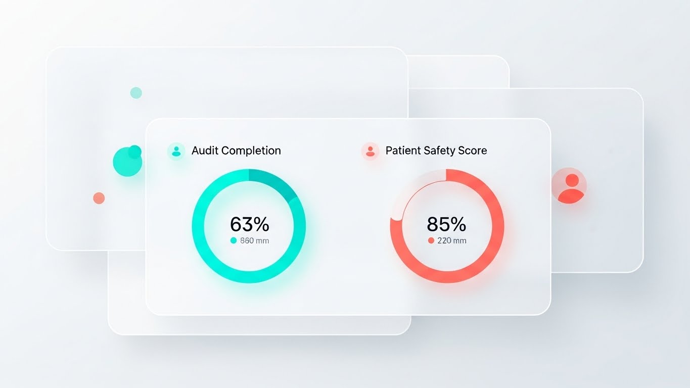
1. The Visual & Narrative Approach
Visualization Scenario: A pristine, high-fidelity UI mockup of a SaaS dashboard set in a bright, shadowless environment. The interface features "glassmorphism" panels floating over a soft white background. The dashboard displays circular progress rings in turquoise and coral, tracking "Audit Completion" and "Patient Safety Score." Abstract user avatars are represented by colored dots.
Narration Tone: Instructional, crisp, and user-focused. The voiceover highlights "ease of use," "clarity," and "one-click actions."
2. Psychological Impact & KPI Focus
Niche Psychology: Fear of Implementation Failure due to clunky software is a major barrier. This style directly addresses that anxiety by showcasing a "consumer-grade" experience. It promises that the software is as easy to use as a smartphone app, reducing the Cognitive Load on staff.
Operational Impact: The gold standard for Product Differentiation on landing pages. It serves as "Visual Proof" of the user experience (UX), directly influencing conversion rates for demo requests.
3. Strategic Implementation & Trade-offs
Best Use Case: The core "Product Tour" video. Essential for the middle of the funnel.
Strategic Trade-off: It is literal and unforgiving. If the actual software UI is cluttered or dated, this style will highlight those flaws. It requires the UI to be "camera-ready."
Companies using similar video content -
Ruya – Seamlessly connecting hospital facility compliance processes.
Verge Health – Converge – Streamlining safety, risk, and compliance workflows.
OpenEMR – Open-source EHR for streamlined medical practice management.
8. 2D Line Art Animation
MOFU | Product/Solution Differentiation
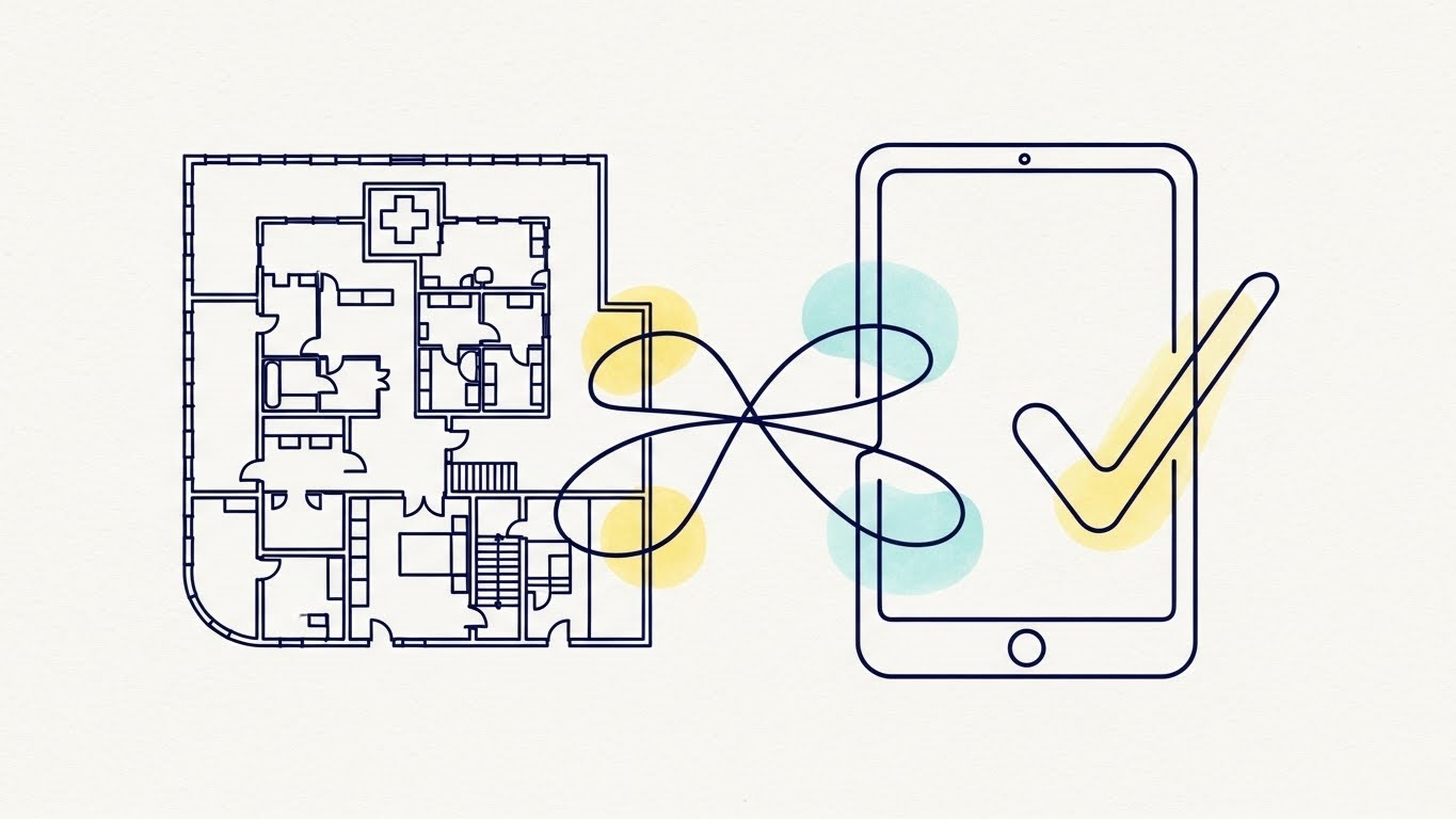
1. The Visual & Narrative Approach
Visualization Scenario: An elegant 2D continuous line art illustration. A single, unbroken line in deep navy blue draws a complex hospital floor plan, then seamlessly morphs into a simplified tablet shape, and finally into a "check mark" symbol. The background is a textured off-white paper style. Small splashes of watercolor-style pastel yellow and blue appear behind key nodes of the line drawing to highlight the "flow" of information.
Narration Tone: Fluid, storytelling-oriented, and educational. It emphasizes "connectivity," "flow," and "seamless integration."
2. Psychological Impact & KPI Focus
Niche Psychology: This style reduces Process Anxiety. By using a single line to connect the physical space (hospital) to the digital tool (tablet), it visually solves the "Physical/Digital Divide." It implies that the software is the connective tissue holding the operation together.
Operational Impact: Excellent for Feature Education. It is particularly effective for explaining invisible processes like workflow automation or data synchronization without getting bogged down in technical details.
3. Strategic Implementation & Trade-offs
Best Use Case: Freemium user activation emails or "Getting Started" tutorials. It makes complex setups feel simple and approachable.
Strategic Trade-off: It can feel too "whimsical" for very serious, high-risk topics (e.g., mortality reviews). Best reserved for workflow/process explanations.
Companies using similar video content -
Mednition – KATE – Illuminating hidden risks with AI clinical data.
Censinet – AI-powered risk-based auditing for compliance.
Sully.ai – AI for compliance in healthcare documentation.
9. Abstract 3D AI Visualization
MOFU | Feature Education & Demonstration

1. The Visual & Narrative Approach
Visualization Scenario: An abstract 3D AI visualization depicting a "Brain" made of interconnected fiber-optic cables. The cables are glowing intensely in cyan and electric purple. Some cables are dull and disconnected (representing competitors), while the central cluster is pulsating with bright white light, symbolizing the superior AI engine. The camera angle is a macro close-up, showing the depth of field.
Narration Tone: Futuristic, confident, and "premium." It uses vocabulary related to "intelligence," "foresight," and "competitive advantage."
2. Psychological Impact & KPI Focus
Niche Psychology: Innovation leaders want to feel they are buying the "future." This visualization positions the platform as the Smart Choice. It visually distinguishes the "AI-driven" solution from standard "database" competitors, appealing to the desire for competitive displacement.
Operational Impact: Strong for Programmatic Display Ads. It grabs attention in a B2B context where "AI" is a buzzword, but visualizes it in a way that implies tangible connectivity and superior processing power.
3. Strategic Implementation & Trade-offs
Best Use Case: Re-marketing ads targeting decision-makers who have already visited the pricing page. It reinforces the "Premium" value proposition.
Strategic Trade-off: High production cost. Also, if the AI features are not central to the value prop, this can set false expectations. It creates a "High Tech" promise that the product must deliver on.
Companies using similar video content -
CompliancyGroup – Confirming HIPAA compliance with visual ease.
HIPAA Secure Now – Providing peace of mind for HIPAA compliance.
Accountable – Simplifying HIPAA compliance for healthcare organizations.
11. Lifestyle Stock with UI Overlay
MOFU | Driving Freemium/Trials

1. The Visual & Narrative Approach
Visualization Scenario: A photorealistic medium shot captures a moment of genuine relief. A male nurse in navy blue scrubs stands in a blurred, bustling hospital corridor, looking at a digital tablet with a genuine smile. Overlaid in the foreground is a crisp, semi-transparent holographic UI element—a large, glowing green checkmark with the text "Task Completed" that animates with a satisfying "pop."
Narration Tone: Empathetic, rewarding, and light. The sound design features a subtle, positive chime synced with the holographic animation, reinforcing the feeling of a job well done.
2. Psychological Impact & KPI Focus
Niche Psychology: Clinical staff are often plagued by "open loops"—the nagging fear that a task was forgotten. This style visually closes that loop. The holographic overlay serves as a Dopamine Hit, associating the software with the psychological reward of completion and the relief of compliance.
Operational Impact: This style effectively drives Freemium Conversions by showing the immediate emotional payoff of the tool. It visually promises that the software gives time and peace of mind back to the clinician, directly addressing "Audit Fatigue."
3. Strategic Implementation & Trade-offs
Best Use Case: Retargeting ads on Meta (Facebook/Instagram) for users who abandoned the sign-up process.
Strategic Trade-off: It relies on the "acting" quality of the stock footage. If the nurse’s expression feels forced, the "relief" will feel manipulative.
Companies using similar video content -
NextGen Healthcare EHR – Rewarding every click with precise UI.
DrChrono – Tactile precision for EHR and practice management.
Practice Fusion – Frictionless interaction for independent practices.
12. Macro UI Micro-Interactions
MOFU | YouTube

1. The Visual & Narrative Approach
Visualization Scenario: An extreme macro close-up of a specific UI button on a screen, such as "Submit Audit." The button is pill-shaped with a gradient of sunset orange to red. As a virtual cursor hovers and clicks, the button glows intensely, depresses with a 3D tactile effect, and emits small particle sparks, casting a soft reflection on the surrounding dark grey interface.
Narration Tone: Satisfying and sensory. There is minimal voiceover; the focus is on "ASMR-like" sound design—the crisp click and the hum of processing—conveying quality and responsiveness.
2. Psychological Impact & KPI Focus
Niche Psychology: Clunky, unresponsive software is a major source of clinician burnout. This "Macro" style appeals to the user's desire for Frictionless Interaction. It visually communicates that the tool is modern, fast, and "bug-free," directly countering the expectation of laggy legacy hospital systems.
Operational Impact: Enhances Perceived Usability. By highlighting the polish of micro-interactions, you signal that the entire platform is built with attention to detail, increasing confidence in the engineering quality.
3. Strategic Implementation & Trade-offs
Best Use Case: Background visuals for "Feature Release" update videos or YouTube "Shorts" showcasing specific UI improvements.
Strategic Trade-off: It is purely aesthetic. It does not communicate business value or clinical outcomes. It serves to build "Brand Prestige" rather than explain utility.
Companies using similar video content -
Medxcel – Ending administration burnout with facility management.
Radar Healthcare – Visualizing efficiency gains in quality and risk.
Connecteam – Transforming workforce management for compliance.
13. Split Screen: Optimized Reality and UI
MOFU | Accelerating Time-to-Value

1. The Visual & Narrative Approach
Visualization Scenario: A sharp diagonal line splits the screen. The left side is desaturated and gritty, showing a stressed healthcare administrator buried under piles of grey paperwork. The right side is vibrant and clean, featuring a close-up of a sleek tablet on a sunny yellow desk displaying a "100% Compliant" green ring chart. The divide emphasizes the stark contrast between the "Old Way" and the "New Way."
Narration Tone: Comparative and solution-oriented. The voiceover starts tense and overwhelmed (left side), then shifts to calm and liberated as the visual focus moves to the right side.
2. Psychological Impact & KPI Focus
Niche Psychology: This taps into the Pain/Gain dichotomy. It validates the user's current suffering (stress/chaos) and offers an immediate, accessible escape. The "sunny" color palette on the right signals optimism and energy, combating the "clinical grey" of typical hospital environments.
Operational Impact: Directly communicates Time-to-Value (TTV). It shows that the transition from chaos to compliance is just a screen-tap away, lowering the barrier to entry for trial sign-ups.
3. Strategic Implementation & Trade-offs
Best Use Case: Landing page hero sections or A/B testing variations for "Before/After" case studies.
Strategic Trade-off: It’s a classic marketing trope. To avoid feeling cliché, the "After" state must feature specific, credible UI metrics (like the compliance ring) rather than generic happiness.
Companies using similar video content -
NAVEX – Layering critical insights for risk and compliance.
Infor Platform – Deep dive into GRC for informed decisions.
CorityOne – Centralizing EHS and quality information management.
14. 3D Parallax UI Presentation
MOFU | Establishing Thought Leadership
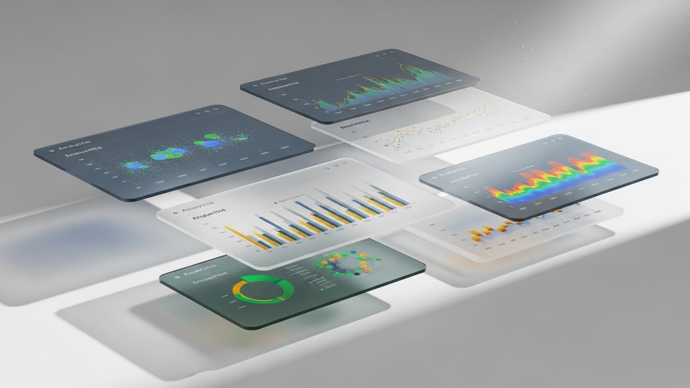
1. The Visual & Narrative Approach
Visualization Scenario: A sophisticated 3D composition where multiple UI screens float in a void, arranged in depth. The screens display complex analytics—scatter plots, heat maps, and trend lines—in a palette of slate blue, emerald, and gold. The camera drifts slowly, creating a parallax effect where the foreground screens move faster than the background, revealing "layers" of data.
Narration Tone: Intelligent, analytical, and expansive. The voiceover speaks to the "depth" of the platform, using terms like "multidimensional analysis," "root cause identification," and "longitudinal tracking."
2. Psychological Impact & KPI Focus
Niche Psychology: Clinical Directors fear "surface-level" data that hides true risks. The parallax effect visually metaphors Deep Insight. It suggests that the platform allows them to "look behind" the numbers and see the full context of patient safety.
Operational Impact: Vital for establishing Market Authority. It separates the platform from simple "checklist apps" by positioning it as a comprehensive analytics engine capable of handling complex hospital data.
3. Strategic Implementation & Trade-offs
Best Use Case: LinkedIn organic posts for a "Data Insights" series or background loops for webinar waiting screens.
Strategic Trade-off: High abstraction. It impresses the viewer with complexity but doesn't teach them how to perform the analysis. It sells the capability, not the workflow.
Companies using similar video content -
SafetyCulture – Celebrating feature updates for workplace inspections.
OpenELIS Global – Team joy in laboratory information system updates.
SereneCare – Collaborative story of open-source healthcare management.
15. 2D Character-Driven Story
MOFU | Proactive Support/Announcements

1. The Visual & Narrative Approach
Visualization Scenario: A lively, flat vector illustration featuring a diverse team of healthcare characters (a doctor, a nurse, an admin) standing on a giant, floating smartphone. They are high-fiving and pointing excitedly at a large, floating "New Feature" notification icon (a bell) in the sky. The colors are vibrant teal, magenta, and yellow, set against a soft cloud pattern.
Narration Tone: Upbeat, friendly, and community-focused. The script emphasizes "teamwork," "collaboration," and "continuous improvement."
2. Psychological Impact & KPI Focus
Niche Psychology: Compliance is often viewed as a solitary, punitive burden. This style reframes it as a Collective Success. By using friendly characters and bright colors, it reduces the intimidation factor of new software updates and fosters a sense of community around Quality Improvement.
Operational Impact: Excellent for Feature Adoption and retention. It makes release notes feel like a celebration rather than a homework assignment, encouraging staff to log in and try the new tools.
3. Strategic Implementation & Trade-offs
Best Use Case: Customer newsletters, in-app product update modals, or internal training kickoff videos.
Strategic Trade-off: Can be perceived as "childish" if used for serious topics like mortality reviews. Strictly reserve this for positive news, feature launches, or team celebrations.
Companies using similar video content -
ATG by JLL – Visualizing efficiency in facility compliance documentation.
Enterprise Health – Augmented reality for occupational health compliance.
Greenway Health – Intergy – Data context over live clinical settings.
16. 2D Graphics Over Live Action
MOFU | LinkedIn Organic
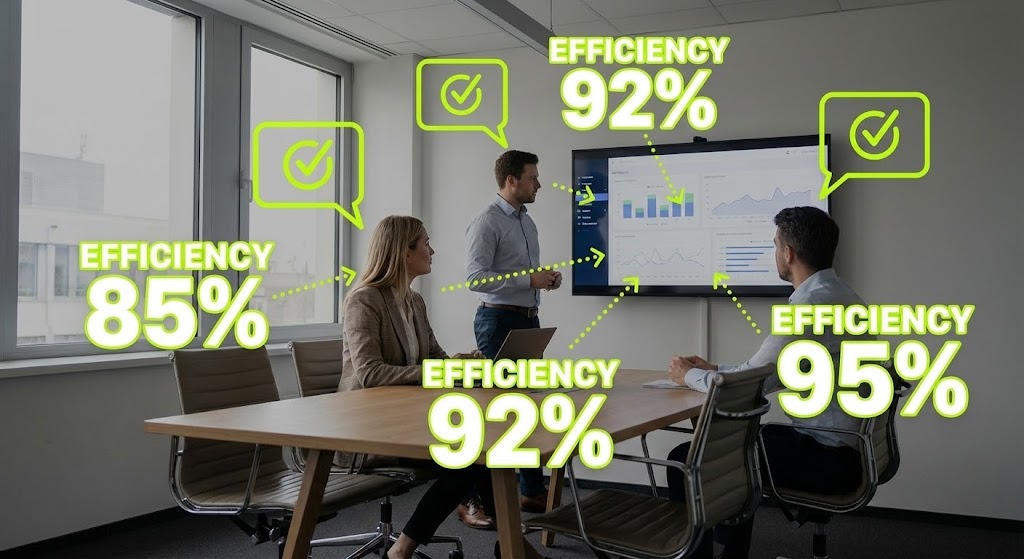
1. The Visual & Narrative Approach
Visualization Scenario: A live-action photo of a modern conference room where three professionals are discussing data on a screen. Superimposed over the image are bright, neon lime green vector graphics: dotted lines connecting the people to the screen, speech bubbles with "checkmarks," and floating text reading "Efficiency 92%" and "85%."
Narration Tone: Professional yet energetic. The narrative focuses on the "invisible" gains of the software—better communication, faster decisions, and aligned teams.
2. Psychological Impact & KPI Focus
Niche Psychology: Stakeholders often struggle to visualize the ROI of software in a physical meeting. This "Augmented Reality" style makes the Intangible Tangible. It visually annotates the real world with the metrics that the software improves, bridging the Physical/Digital divide.
Operational Impact: Highly effective for Social Proof on LinkedIn. It shows real people in a real setting, which builds trust, while the graphics forcefully communicate the value proposition of efficiency and alignment.
3. Strategic Implementation & Trade-offs
Best Use Case: Case study summaries or "Client Success" posts.
Strategic Trade-off: The stock photo must be high quality and relevant. Using generic "business meeting" stock can look cheap. The graphics must look deliberately "augmented" and not just pasted on.
Companies using similar video content -
MedStack – Guaranteeing data sovereignty for digital health.
Absolute for Healthcare – Fortress security for endpoint data protection.
Netwrix – Securing IT audit and compliance data.
17. Photorealistic 3D Renders (The Vault)
BOFU | Building Trust & Credibility

1. The Visual & Narrative Approach
Visualization Scenario: A photorealistic 3D render of a high-tech secure server room, stylized to resemble a bank vault. Rows of sleek black server racks with pulsating blue LEDs line the walls. In the center, a heavy, brushed titanium vault door stands open, revealing a glowing cube of pure white light, symbolizing patient data. The atmosphere is cool, pristine, and impenetrable.
Narration Tone: Grave, serious, and reassuring. The voiceover discusses "ISO 27001 compliance," "encryption at rest," and "data sovereignty."
2. Psychological Impact & KPI Focus
Niche Psychology: For the CIO and Information Governance Lead, Data Security is the primary deal-breaker. This visualization triggers the "Fortress" archetype. It moves beyond abstract "cloud" concepts to a concrete visual metaphor of impenetrable steel and security.
Operational Impact: Critical for Objection Handling at the bottom of the funnel. It visually answers the question "Is my patient data safe?" with a resounding "Yes," shortening the security review cycle.
3. Strategic Implementation & Trade-offs
Best Use Case: The "Security & Compliance" page of the website or as a specific asset for the IT procurement team.
Strategic Trade-off: It is cold and impersonal. It appeals strictly to the technical/security buyer (CIO) and may alienate the clinical user if used in general marketing.
Companies using similar video content -
Accruent – TMS – Realizing operational ROI from facility management.
Ideagen Healthcare – Guardian – Structural foundation for enterprise performance.
PointClickCare – Transforming senior care with integrated platforms.
18. Wireframe to Reality Transition
BOFU | ROI Justification
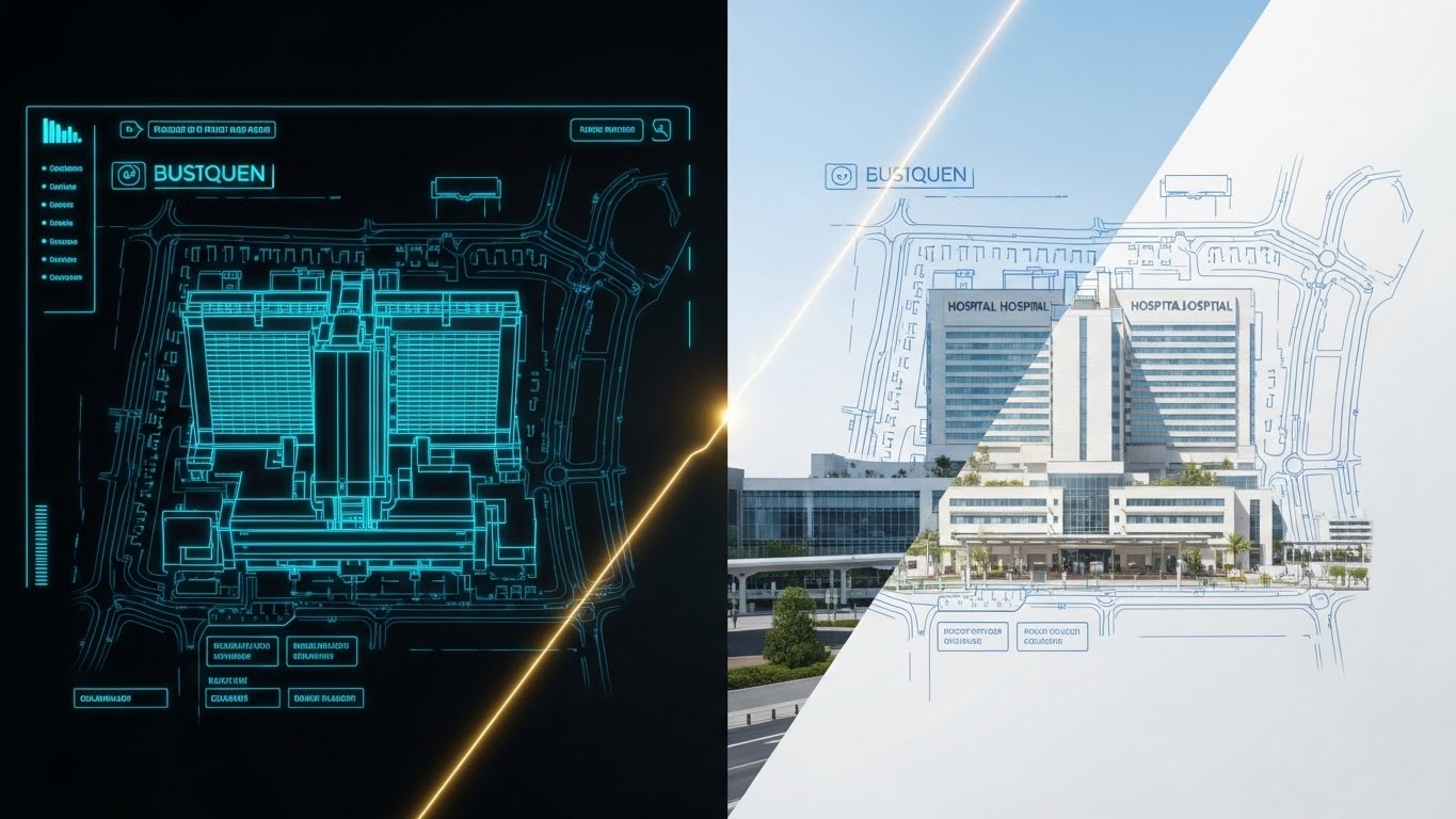
1. The Visual & Narrative Approach
Visualization Scenario: A split image showing a seamless transition. The left half is a technical blue wireframe grid on a black background, outlining the structural blueprint of a hospital. A glowing gold vertical line sweeps across the screen from left to right, transforming the wireframe into a photorealistic, sunlit render of the same hospital building, bustling with efficiency.
Narration Tone: Visionary and architectural. It speaks to "building a foundation for quality," "transforming plans into patient outcomes," and "realizing potential."
2. Psychological Impact & KPI Focus
Niche Psychology: Hospital boards buy "Infrastructure," not just apps. This style elevates the software from a "tool" to Core Infrastructure. It implies that the platform is the blueprint upon which the modern, efficient hospital is built.
Operational Impact: Powerful for ROI Justification. It connects the investment (the blueprint/software) to the result (the functioning hospital), helping decision-makers visualize the "Finished State" of their investment.
3. Strategic Implementation & Trade-offs
Best Use Case: Re-engagement ads for website visitors who viewed the "Enterprise" pricing page.
Strategic Trade-off: Requires a high-quality match between the wireframe and the photo. If the alignment is imperfect, the illusion breaks and the message of "precision" is lost.
Companies using similar video content -
OpenAI for Healthcare – Articulating medical governance with executive trust.
Oracle Health – Clinical AI Agent – Executive trust in AI-driven insights.
Epic – Healthy Planet – AI persona for population health management.
19. Generative AI Realistic Character Video
BOFU | Overcoming Objections

1. The Visual & Narrative Approach
Visualization Scenario: A realistic AI-generated video featuring a distinguished, silver-haired Hospital Chief Medical Officer (CMO) in a suit. He sits in a modern, glass-walled office, speaking directly to the camera with calm confidence. As he gestures, subtle holographic charts and a 3D brain model float briefly near his hands before dissolving. The lighting is cinematic "Rembrandt" style, emphasizing wisdom and authority.
Narration Tone: Peer-to-peer, authoritative, and candid. The script addresses high-level concerns: "We didn't just need data; we needed answers. This platform delivered accountability."
2. Psychological Impact & KPI Focus
Niche Psychology: Senior medical leaders trust their peers. This style leverages Social Proof and the "Wise Elder" archetype. Even though it is AI-generated, the persona represents the "idealized" satisfied customer, articulating the exact value points that a real CMO cares about (Governance, Liability, Reputation).
Operational Impact: Drives Trust in the final stages of the deal. It allows you to script perfect objection handling (e.g., addressing implementation time) delivered by a face that commands medical respect.
3. Strategic Implementation & Trade-offs
Best Use Case: "Why Us" video on the website or included in the final proposal deck.
Strategic Trade-off: The "Uncanny Valley" risk. The AI generation must be top-tier. If the lip-sync or eye movement is unnatural, it destroys trust immediately. Transparency that it is an "AI avatar" is often recommended.
Companies using similar video content -
Scytale – Securing enterprise infrastructure with AI compliance.
CloudApper – HIPAA Ready – System architecture for HIPAA compliance.
LexComply – Robust engineering for legal compliance audits.
20. Dark Mode UI Showcase
BOFU | The Technical Buyer

1. The Visual & Narrative Approach
Visualization Scenario: A sleek, "Dark Mode" UI showcase designed specifically for the technical audience. The background is deep matte black. Interface elements are outlined in neon cyan and electric purple. A terminal window with scrolling data streams is visible. In the center, a glowing "Lock" icon signifies active encryption. The aesthetic is "Cyberpunk meets MedTech."
Narration Tone: Technical, rapid, and precise. It uses IT-specific lexicon: "API latency," "uptime guarantees," "SSO integration," and "HL7 interoperability."
2. Psychological Impact & KPI Focus
Niche Psychology: IT Directors are often the gatekeepers of the sale. They view "pretty" white interfaces with suspicion. This dark, code-heavy aesthetic speaks their language. It signals Robust Engineering and high-performance architecture, differentiating the tool from "lightweight" apps.
Operational Impact: Tailored for the Technical Review. It assures the IT buyer that the platform is developer-friendly, secure, and ready for enterprise-scale deployment.
3. Strategic Implementation & Trade-offs
Best Use Case: Technical documentation pages, API integration guides, or LinkedIn ads targeting job titles like "CIO" or "CTO."
Strategic Trade-off: It is likely repelling to the average nurse or doctor, who may find it "scary" or overly complex. Strictly segment this content for the technical buyer persona.
Companies using similar video content -
RLDatix – Insulating against liability with compliance fortress.
SimpleRisk – GRC platform for robust risk mitigation.
Origami Risk – Proactive risk management for healthcare.
21. Isometric 3D Workflow
BOFU | Risk Mitigation

1. The Visual & Narrative Approach
Visualization Scenario: A pristine, isometric 3D composition depicting a "Compliance Fortress." A stylized hospital complex sits at the center, protected by a pulsating, translucent blue energy dome. Outside the dome, jagged red shapes (representing regulatory risks, fines, and errors) attempt to penetrate but bounce off harmlessly. Inside, golden gears and white data streams flow smoothly, symbolizing uninterrupted clinical operations.
Narration Tone: Protective, robust, and definitive. The voiceover emphasizes "immunity," "safeguards," and "impenetrable defense," positioning the software as the organization's primary governance shield.
2. Psychological Impact & KPI Focus
Niche Psychology: At the bottom of the funnel, the fear shifts from "inefficiency" to "catastrophe"—the risk of a failed CQC inspection or a major lawsuit. This style leverages the Fortress Metaphor to visually guarantee safety. It calms the anxiety of the Risk Officer by showing a proactive, always-on defense system.
Operational Impact: Directly addresses Risk Mitigation. It visualizes the intangible concept of "governance" as a physical barrier, making the value of the software concrete and undeniably essential for business continuity.
3. Strategic Implementation & Trade-offs
Best Use Case: Programmatic Display Ads targeting high-value accounts (ABM) or the "Security & Governance" section of a proposal deck.
Strategic Trade-off: It is defensive. If the brand voice is purely about "innovation," this "protectionist" visual might feel too conservative. It works best when paired with messages about stability.
Companies using similar video content -
InterSystems – TrakCare – Diagnosing operational health with unified systems.
Oracle Health – Cerner – Internal connectivity for EHR and compliance.
Meditech – Internal connectivity for EHR operations.
22. 3D X-Ray Visualization
BOFU | Reducing Implementation Friction
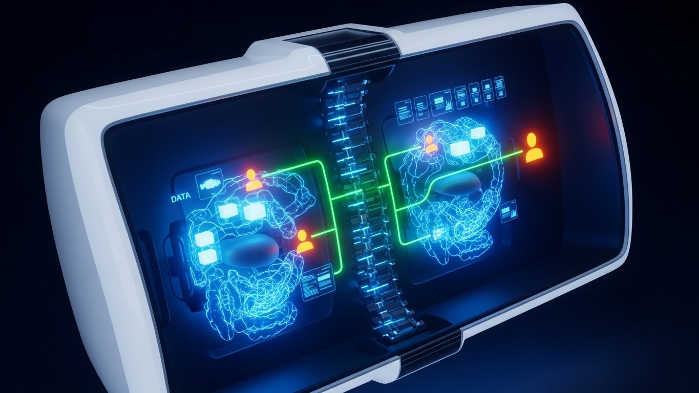
1. The Visual & Narrative Approach
Visualization Scenario: A sophisticated 3D X-ray visualization of a complex machine, acting as a metaphor for the hospital's operations. The outer shell is a semi-transparent white plastic. Inside, we see the "organs" of the system—glowing nodes in cyan (data), emerald (workflow), and amber (users). A bright green laser line connects these nodes via a central spine, demonstrating how the platform integrates disparate departments into one living organism.
Narration Tone: Diagnostic, expert, and transparent. The script uses the language of anatomy: "connective tissue," "central nervous system," and "holistic health."
2. Psychological Impact & KPI Focus
Niche Psychology: Implementation Leaders fear that new software will break existing workflows (the "Organ Rejection" fear). This X-ray style proves Compatibility. It shows the software not as a foreign object, but as a framework that fits inside and supports the existing structure.
Operational Impact: Crucial for lowering Implementation Friction. It visually demonstrates deep integration and interoperability (HL7/FHIR), assuring the buyer that the solution works within their ecosystem, not against it.
3. Strategic Implementation & Trade-offs
Best Use Case: Technical "Deep Dive" pages on the website or implementation webinars.
Strategic Trade-off: High conceptual load. It requires the viewer to interpret the metaphor. If the audience is purely administrative (non-clinical), a more literal "process map" might be clearer.
Companies using similar video content -
Pareto – Mapping financial ascent with revenue integrity tools.
ModMed – Growth landscape for specialty EHR solutions.
Allscripts – Veradigm – Financial ascent through healthcare IT solutions.
23. Low-Poly 3D Modeling
BOFU | The Economic Buyer

1. The Visual & Narrative Approach
Visualization Scenario: A playful yet structured low-poly 3D scene depicting a "Growth Landscape." A winding path made of gold coins ascends a stylized green mountain, passing blue geometric hospital buildings. The path leads to a white flag at the peak. The aesthetic is clean, using flat shading and pastel gradients of dawn colors to suggest a new beginning.
Narration Tone: Optimistic, clear, and results-driven. The narrative eschews medical jargon for business clarity: "pathway to profitability," "resource optimization," and "peak performance."
2. Psychological Impact & KPI Focus
Niche Psychology: The CFO views clinical audits as a "cost center." This style reframes them as a Value Driver. The upward trajectory and the literal path of coins trigger the psychological association with growth and return on investment, rather than expense.
Operational Impact: Specifically designed for Objection Handling regarding price. It visualizes the "Long-Term Value" (LTV) of the platform, showing that the upfront cost leads to a higher operational peak.
3. Strategic Implementation & Trade-offs
Best Use Case: Financial justification documents or presentations to the board.
Strategic Trade-off: The "cartoonish" low-poly look can seem trivial if not executed with a premium color palette. It must look like high-end financial art, not a video game.
Companies using similar video content -
Healthicity – Harvesting audit efficiency with animated insights.
Gensuite – Resource cultivation for EHS and quality management.
Qualityze – Cultivating quality with integrated management software.
24. 2D Animation & UI Composition
BOFU | ROI Justification Hook
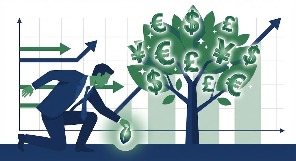
1. The Visual & Narrative Approach
Visualization Scenario: A composition blending a flat-vector business character (a CFO in a navy suit) with 3D floating UI elements. The character plants a "Data Seed" into the ground. Instantly, a stylized tree grows, its leaves formed by glowing green currency symbols ($, £, €) and UI checkmarks. The background features a subtle upward-trending graph.
Narration Tone: Prudent, investment-focused, and rewarding. The voiceover emphasizes "cultivating quality" and "harvesting efficiency gains."
2. Psychological Impact & KPI Focus
Niche Psychology: This style appeals to the desire for Tangible Returns. By mixing the human element (the planter) with the digital result (the currency tree), it creates a cause-and-effect narrative: "Use this tool -> Get this result." It simplifies complex ROI calculations into a simple agricultural metaphor.
Operational Impact: Powerful for LinkedIn Video Ads targeting financial decision-makers. It stops the scroll by promising a direct financial outcome from a clinical process.
3. Strategic Implementation & Trade-offs
Best Use Case: Retargeting ads for users who have visited the "Pricing" page but haven't converted.
Strategic Trade-off: Direct association with money can sometimes feel "gross" to purely clinical staff. Ensure this creative is segmented specifically for administrative and financial buyers.
Companies using similar video content -
Radar Healthcare – Illuminating hidden risks with augmented insight.
Symplr – Safety – Augmented insight for incident management.
RiskQual – Total visibility for healthcare risk management.
25. Holographic UI over 3D Render
BOFU | Risk Mitigation Hook
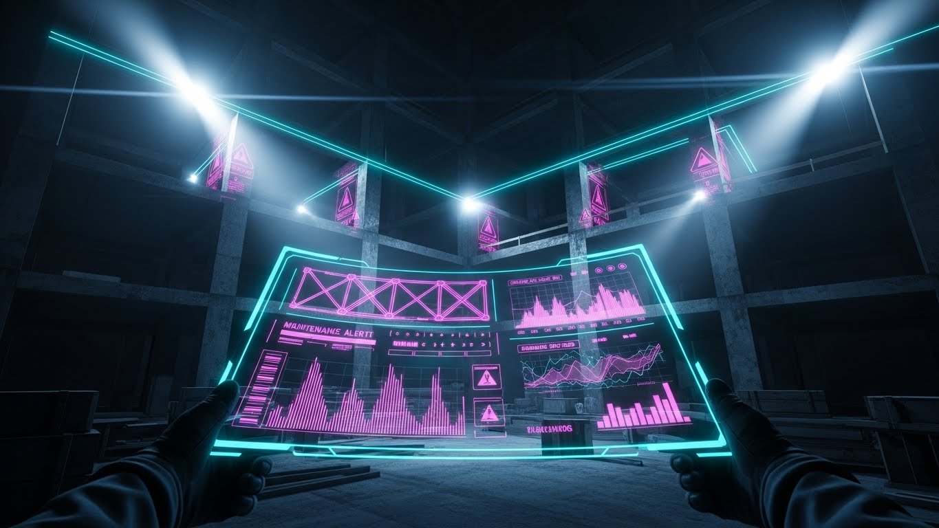
1. The Visual & Narrative Approach
Visualization Scenario: A first-person perspective in a high-tech environment. The user holds a device projecting a complex, neon-pink and cyan holographic interface that overlays operational data onto the physical world. The hologram displays "Maintenance Alert" and real-time structural graphs. For the clinical context, this metaphor implies overlaying "Risk Data" onto the "Hospital Infrastructure," revealing hidden stress points in the system.
Narration Tone: Urgent, technologically advanced, and precise. It focuses on "visibility," "detection," and "pre-emptive action."
2. Psychological Impact & KPI Focus
Niche Psychology: The "Iceberg Theory" of risk—what you can't see will hurt you—is a primary anxiety. This holographic style promises Total Visibility. It implies that the software provides a "superpower" to see invisible risks (compliance gaps, safety incidents) before they cause structural failure.
Operational Impact: High impact for Website Hero Sections. It positions the product as a futuristic, essential tool for modern governance, distinguishing it from legacy "paper-on-glass" systems.
3. Strategic Implementation & Trade-offs
Best Use Case: "Future of Care" landing pages or innovation showcases.
Strategic Trade-off: The "sci-fi" aesthetic sets a very high bar for the actual UI. If the product is a standard web form, this marketing visual may over-promise the user experience.
Companies using similar video content -
AdvancedMD – Accelerating workflow access with system speed.
eClinicalWorks – Rapid access to EHR features.
NextGen Healthcare EHR – Accelerating clinical and operational workflows.
26. Rapid UI Feature Montage
ONBOARDING | Accelerating Time-to-Value
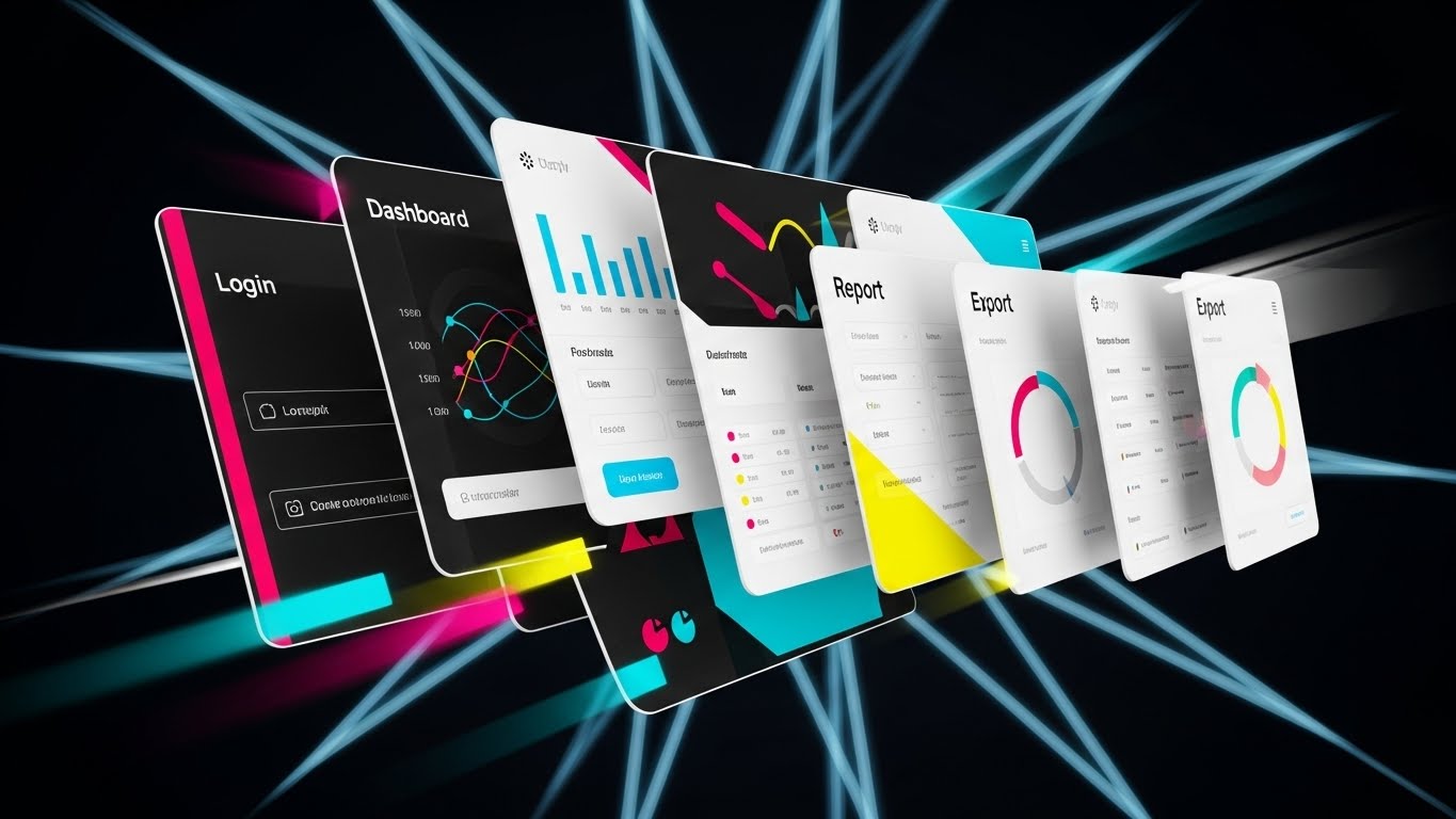
1. The Visual & Narrative Approach
Visualization Scenario: A high-velocity composition where multiple UI screens (Login, Dashboard, Report, Export) fly into the frame like a deck of cards being shuffled or dealt. Motion blur lines radiate from the center, suggesting warp speed. The screens are bright white with colorful data accents (cyan, magenta graphs), set against a dark void to maximize contrast.
Narration Tone: Fast-paced, rhythmic, and energetic. The script uses short, punchy phrases: "Log in. Audit. Export. Done."
2. Psychological Impact & KPI Focus
Niche Psychology: New users often dread the "learning curve" and "sluggishness" of enterprise software. This style visually communicates Velocity. It promises that the system is snappy, responsive, and won't slow them down during a busy shift.
Operational Impact: Perfect for Skippable Pre-Roll Ads or introductory onboarding videos. It visually accelerates the Time-to-Value, showing the user the breadth of the platform in under 5 seconds.
3. Strategic Implementation & Trade-offs
Best Use Case: "Welcome" emails or hype reels for new users.
Strategic Trade-off: It moves too fast to teach anything. It is purely an impression of speed and comprehensiveness, not an instructional tool.
Companies using similar video content -
Xenia – Guiding focus in chaotic frontline operations.
SafetyCulture – Calm center for workplace inspections.
QUASR – Guiding focus in incident reporting.
27. Hyper-lapse Stock Footage with Data
ONBOARDING | Self-Serve Onboarding
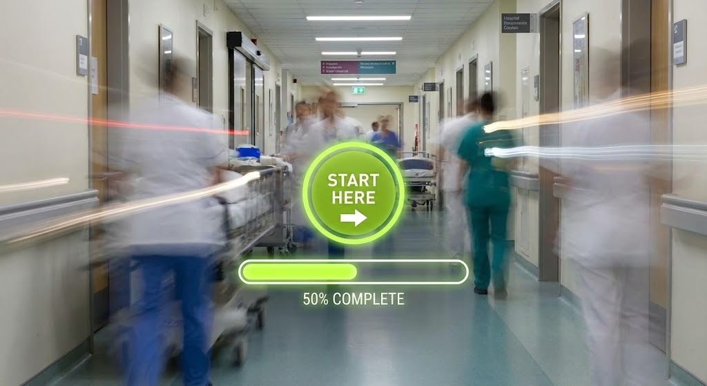
1. The Visual & Narrative Approach
Visualization Scenario: A hyper-lapse video of a busy hospital corridor. Clinical staff appear as ghost-like motion blurs, rushing back and forth, conveying the chaotic reality of the ward. In the center, perfectly still and in sharp focus, is a floating, glowing lime-green UI button ("Start Here") and a progress bar. The contrast between the frenetic background and the stable UI is the core visual hook.
Narration Tone: Calm, anchoring, and directive. The voiceover acts as the "eye of the storm," guiding the user with steady instructions amidst the noise.
2. Psychological Impact & KPI Focus
Niche Psychology: Ward staff are cognitively overloaded. They need tools that cut through the noise, not add to it. This style appeals to the need for Focus. It visually says, "Ignore the chaos; just focus on this one button. We have you."
Operational Impact: Highly effective for Email Marketing to trigger initial setup. It acknowledges the user's busy reality while offering a clear, stable starting point, improving activation rates.
3. Strategic Implementation & Trade-offs
Best Use Case: "Getting Started" emails or login screen backgrounds.
Strategic Trade-off: Requires high-quality time-lapse footage. If the blur looks messy rather than artistic, it just adds to the visual noise.
Companies using similar video content -
CompliancyGroup – Fluid answers for HIPAA compliance queries.
MedTrainer – Solving user queries with friendly support.
AuditNet – Fluid answers for auditor knowledge base.
28. Abstract 2D Motion Graphics
RETENTION | Knowledge Base & FAQ Videos

1. The Visual & Narrative Approach
Visualization Scenario: A fluid, abstract 2D motion graphic. A large, sketch-style orange "Question Mark" dissolves into swirling lines of particles, which then reform into a glowing yellow "Lightbulb." The background is a calming teal. The animation is smooth, soft, and continuous, with no hard cuts.
Narration Tone: Helpful, patient, and friendly. The voiceover mimics a good support agent: "Got a question? Let's illuminate the answer."
2. Psychological Impact & KPI Focus
Niche Psychology: When users look for help, they are often frustrated. This style uses Soft Geometry and warm colors to lower blood pressure. It visually de-escalates the user's stress, signaling that the solution is simple, accessible, and friendly.
Operational Impact: Ideal for Knowledge Base thumbnails and FAQ video intros. It transforms "Troubleshooting" (negative) into "Discovery" (positive), helping to reduce churn driven by frustration.
3. Strategic Implementation & Trade-offs
Best Use Case: Support portal visuals or "How-To" video series intros.
Strategic Trade-off: Too abstract for the actual tutorial. Use this for the intro/outro, but switch to clear screencasts for the actual instructional steps.
Companies using similar video content -
symplr – Unlocking new modules for ecosystem power.
Epic – Expanding EHR capabilities with new modules.
Oracle Health – Cerner – Unlocking new modules for clinical intelligence.
30. Futuristic Neon/Dark Mode
EXPANSION | Driving Upsell/Cross-sell

1. The Visual & Narrative Approach
Visualization Scenario: A futuristic visualization using a "Clinical Blue" neon aesthetic against a deep navy background. A central glowing white orb (representing the core product) is suspended in a dark void. Orbiting rings of neon light—electric blue, violet, and cyan—circle the core. As a new ring locks into place, the central orb pulses brighter, symbolizing the added power of a new module.
Narration Tone: Expansive, energetic, and premium. The voiceover talks about "unlocking potential," "complete ecosystems," and "synergy."
2. Psychological Impact & KPI Focus
Niche Psychology: Existing customers want to feel they are part of an evolving platform, not a stagnant tool. This style triggers the Completionist Urge (completing the set). It visualizes the add-on modules not as extra costs, but as essential pieces that complete the "atom" of their operations.
Operational Impact: Tailored for Expansion/Upsell Campaigns. It creates a visual gap—"You are missing this ring"—driving curiosity and desire to upgrade to the full suite.
3. Strategic Implementation & Trade-offs
Best Use Case: In-app upsell modals or "New Module Available" email announcements.
Strategic Trade-off: It looks expensive. Ensure the upsell offer provides significant value; otherwise, the flashiness will feel like a hollow sales pitch.
The Visual Operations Doctrine: A Strategic Knowledge Base
To transform these 30 visual styles from "marketing assets" into a cohesive business strategy, we must implement a Visual Operations Doctrine. This framework synthesizes the visual psychology of the guide into three actionable segments, bridging the gap between "Clinical Clarity" and business ROI.
Strategic Alignment & Visual Architecture
The "Pre-Production" Strategy – Aligning Visuals with Clinical Reality.
- The Cognitive Load Audit: Before creating a single video, audit your current training materials. If a PDF takes 10 minutes to read, the goal is a 60-second video (Style 2). Measure the reduction in "Time-to-Comprehension" as a primary KPI.
- Role-Based Visual Mapping: Do not use one style for all users. Use High-Contrast/Mobile styles (Style 3, 26) for ward-based nurses who access data on tablets between shifts. Use Data-Dense/Desktop styles (Style 7, 14) for Clinical Directors performing deep-dive analysis in offices.
- The "Glanceability" Standard: In a clinical setting, attention is fragmented. Design every video thumbnail and opening 3 seconds (Style 5) to be understood at a glance. If the value prop isn't clear in 2 seconds, it fails the "Ward Test."
- Brand Voice Consistency: Your "Audit" tool and "Risk" tool shouldn't look like they come from different companies. Use a unified color palette (e.g., Clinical Blue/Safety Orange) across all abstract styles (Style 1, 28) to build subconscious brand trust.
- The Advids Strategic Audit: Partner with Advids to define this Visual Operating System before production begins. A fragmented visual library confuses users; a cohesive VOS, designed by experts, accelerates adoption.
- Standardization vs. Customization: Use scalable styles (Style 11, 16) for general feature updates. Reserve bespoke, high-budget styles (Style 17, 19) strictly for "Trust" assets (Security) and "Vision" assets (Executive Sales).
- The Cross-Departmental Bridge: Use "Process" visuals (Style 2, 8) to unify terminology. If Sales says "Efficiency" and Ops says "Workflow," a single animation showing the flow aligns both teams on the same reality.
- Legacy System Integration: Visualizing the connection between old hospital EPRs and your modern SaaS is critical. Use "Bridge" styles (Style 22, 18) to show your software wrapping around, not deleting, their legacy investment.
- Accessibility in Healthcare: Clinical staff are diverse. Ensure all motion graphics (Style 5, 26) rely on visual cues, not just voiceover, to support non-native speakers or sound-off environments on the ward.
- The Mobile-First Mandate: 70% of clinical staff access generic training on mobile devices. Ensure all 30 styles—especially the text overlays—are legible on a 5-inch screen.
Operational Adoption & Implementation
The "Deployment" Phase – Embedding Visuals into the Clinical Workflow.
- Overcoming "Big Brother" Anxiety: Staff often fear audits are punitive. Use empathy-driven visuals (Style 4, 11) to frame the software as a "Digital Shield" for their license, not a surveillance tool for management.
- The Micro-Learning Shift: Replace the 40-page "User Manual" with a library of 30-second "Micro-Interaction" videos (Style 12) embedded directly in the software's help tooltips.
- Just-in-Time Support: When a user encounters a "Mortality Review" form for the first time, trigger a "Line Art" explainer (Style 8) overlay. Support should be proactive and visual, not reactive and text-based.
- Gamification of Quality: Use "Level Up" visuals (Style 23, 30) in your weekly email digests. Visualizing an improved "Compliance Score" as climbing a mountain motivates staff more than a spreadsheet row.
- Reducing Support Ticket Volume: There is a direct correlation between the quality of your "Onboarding Montage" (Style 26) and the volume of "How do I...?" support tickets. Invest in visual training to lower support costs.
- Remote Onboarding: For multi-site hospital trusts, physical training seminars are impossible. Use "Holographic/AR" styles (Style 16) to simulate a face-to-face training session, allowing you to scale onboarding across regions instantly.
- Visualizing SOPs: Transform text-based Standard Operating Procedures (SOPs) into "Isometric Factory" loops (Style 2). If the process is visual, adherence increases by up to 40%.
- Feedback Loops: Use interactive video elements. At the end of a "Feature Update" video (Style 15), include a simple visual poll. This makes the clinical staff feel heard and part of the development process.
- Scalable Localization: If expanding to global markets, design your "Abstract" styles (Style 1, 28) to be text-free or easily swappable, ensuring your visual assets travel across borders without expensive reshoots.
- Leadership Communication: Empower your internal champions (Clinical Directors) with "Board-Ready" video assets (Style 14, 18). Give them the visual tools to sell the project's success to their own hospital executives.
Measuring Impact & Future-Proofing
The "ROI" Phase – Validating Success and Evolving the Platform.
- Beyond "Views": Do not measure video success by "views." Measure Time-to-Competency. Did the new "Search" feature video reduce the average time users spend searching for patient files?
- The "Idle Time" Metric: Correlate the deployment of "Workflow" videos (Style 10, 22) with a reduction in "software idle time" (users staring at the screen confused).
- Compliance Velocity: Measure how fast a new regulatory requirement (e.g., PSIRF) is understood and adopted after releasing an explainer video (Style 3) versus a PDF memo.
- Retention and Churn: High-quality UX visualization (Style 7, 12) increases perceived value. Track Customer Health Scores for accounts that engage with your video academy vs. those that don't.
- The AI Visual Frontier: Prepare for Generative AI. Styles like the "AI Persona" (Style 19) are just the start. Future-proof your library by building clean, tagged assets that can be fed into AI video engines for real-time personalization.
- Scalability of Assets: Build a "Visual Component Library." If you change your UI color from Blue to Green, you shouldn't have to re-animate 30 videos. Use global color controllers in your motion projects.
- The Advids Partnership: Visual strategy is not a one-time project; it is an evolving infrastructure. Partner with Advids to maintain this library, ensuring that as your software evolves (v2.0, v3.0), your visual language evolves in lockstep, preventing "Visual Debt."
- Benchmarking Success: "Good enough" visuals are a competitive risk in a crowded SaaS market. Regularly audit your styles against the "Top 3" competitors. If they use "Cyberpunk Neon" (Style 20) and you use "Generic Stock" (Style 4), you lose the perception battle.
- The ROI of Safety: Ultimately, connect better visualization to patient safety. If a "Risk Alert" video (Style 25) helps one nurse spot a sepsis trend earlier, quantify that in insurance savings. That is your ultimate ROI.
- Final Call to Innovation: Treat video not as "content," but as Clinical Infrastructure. In the era of data overload, the platform that visualizes the truth the fastest wins the market—and saves lives.
Companies using similar video content -
CompliancyGroup – Fluid answers for HIPAA compliance queries.
MedTrainer – Solving user queries with friendly support.
AuditNet – Fluid answers for auditor knowledge base.
Author & Editor Bio


