
Introduction: Bridging the Gap Between Care and Code
The modern clinical environment is a paradox. While medical knowledge has expanded exponentially, the operational machinery supporting it—documentation, coding, and data entry—has become a suffocating weight. We are at a critical juncture where technology must cease being a burden and start being a bridge.
For Clinical Documentation Improvement (CDI) and SaaS platforms, the challenge is not just "selling software." It is selling a vision of reclaimed time. The statistics paint a stark picture of the current reality: physicians across specialties now spend an average of 5.8 hours on EHR tasks for every eight hours of scheduled patient time. This "pajama time"—hours spent documenting after the clinic closes—is the primary driver of burnout and the enemy of sustainable healthcare.
However, the tide is turning. Innovative platforms are leveraging Ambient Intelligence and Generative AI to make documentation invisible. In fact, 79% of organizations have recently reported adopting ambient speech technology to support clinical documentation, signaling a massive market shift from manual input to automated listening.
To communicate this shift effectively, your video strategy cannot rely on screen recordings of spreadsheets. It requires a visual language that translates "invisible processing" into tangible value. This guide presents 10 "Gold Standard" visual styles designed to articulate the transformation from clinical chaos to digital clarity, ensuring your message resonates with the burnt-out CMIO and the innovation-hungry CIO alike.
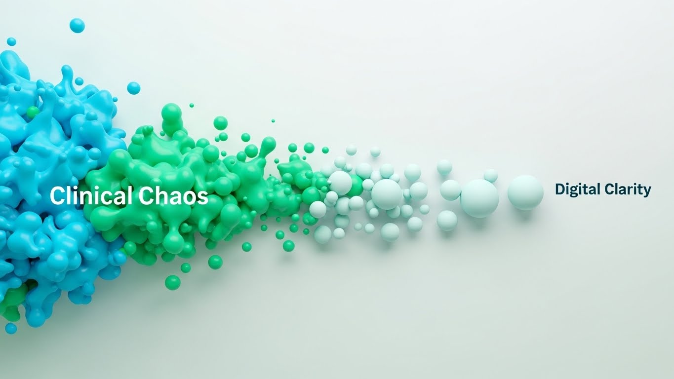
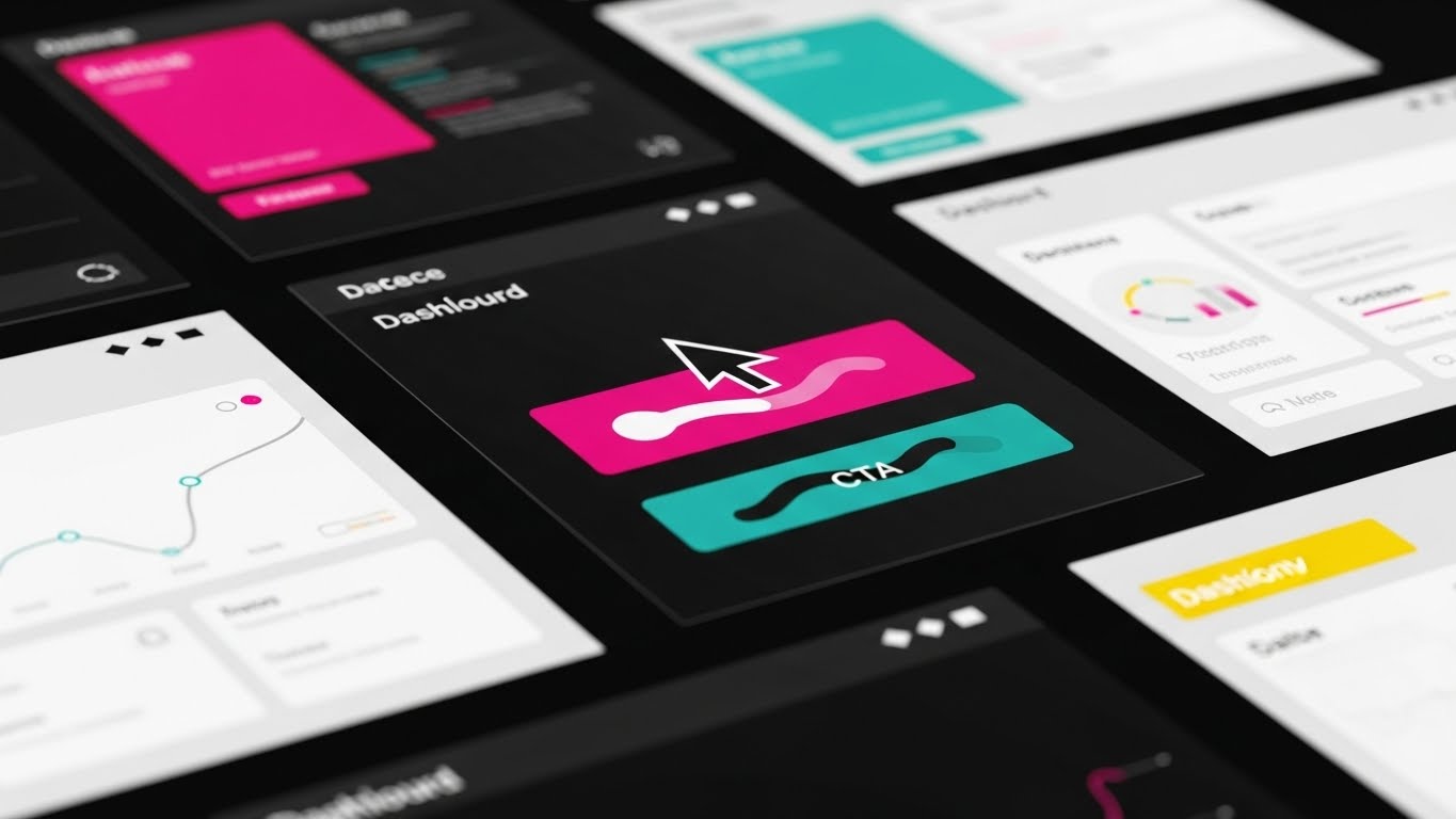
1. Abstract 2D flat vector organic
TOFU | Brand Awareness
The Visual & Narrative Approach
Visualization Scenario:
This style utilizes a powerful visual metaphor to represent the core promise of modern CDI: organization. The composition begins on the left with jagged, chaotic liquid-like shapes in bright aqua and mint—representing unstructured patient conversations and scattered data. As these shapes flow toward the right, they pass through an invisible filter, morphing into smooth, perfectly aligned spherical nodes. The narrative is one of effortless transformation, visualizing the "cleaning" of data without a single line of code.
Narration Style & Tone:
The narrative requires no voiceover to be understood. The visual flow itself tells the story of "Processing Fluency." The tone is therapeutic and calming, promising a reduction in cognitive load.
Psychological Impact & KPI Focus
- Niche Psychology: Clinicians are inundated with complex, rigid data. This organic, liquid aesthetic triggers a sense of "Cognitive Ease," signaling that the software adapts to the human workflow rather than forcing the human to adapt to the machine.
- Operational Impact: Visualizes Data Normalization. It demonstrates the platform’s ability to ingest messy, real-world inputs and output clean, standardized records.
Strategic Implementation & Trade-offs
- Best Use: High-level brand anthems and social media loops (Instagram/LinkedIn) where sound might be off.
- Duration: Short loops (6-15 seconds).
- Trade-off: This style is excellent for feeling but poor for feature education. Do not use this to explain how the NLP engine works; use it only to show the result of the engine.
Companies using similar video content -
Iodine Software – AI-Powered CDI – Transforms clinical documentation workflows.
Abridge – AI Platform – Generative AI for clinical conversations.
Ambience Healthcare – AI Platform – Captures encounters, organizes notes in real time.
2. Bold Kinetic Typography (Visual)
TOFU | Market Education

The Visual & Narrative Approach
Visualization Scenario:
This style ditches traditional imagery for pure energy. Massive, blocky geometric shapes—implying heavy data packets—move with aggressive speed diagonally across the screen. The palette of vibrant coral and deep slate grey commands attention. The narrative visualizes the "collision" of old workflows (crashing piles of paper shapes) with the new, high-speed rail of structured data. It’s loud, fast, and implies robust processing power.
Narration Style & Tone:
The narration is punchy, using short, action-oriented verbs: "Sort. Structure. Speed. Done."
Psychological Impact & KPI Focus
- Niche Psychology: Appeals to the "Efficiency-First" mindset of administrators and CFOs. The sheer speed of the animation combats the perception of "sluggish" hospital IT, projecting power and agility.
- Operational Impact: Visualizes Processing Velocity and Backlog Reduction. It answers the question, "Can this handle our volume?" with a resounding visual "Yes."
Strategic Implementation & Trade-offs
- Best Use: Hype reels, event openers, and YouTube pre-roll ads.
- Duration: 15-30 seconds.
- Trade-off: The high energy can be overwhelming. Avoid using this style for sensitive clinical topics (e.g., patient safety) where a calmer, more measured tone is required.
Companies using similar video content -
Suki – AI Scribe – AI-powered voice assistant for clinical notes.
Practice EHR – AI Scribe – Transcribes doctor-patient conversations into notes.
ScribeEMR – ScribeRyte AI – Generative AI for EHR-ready documentation.
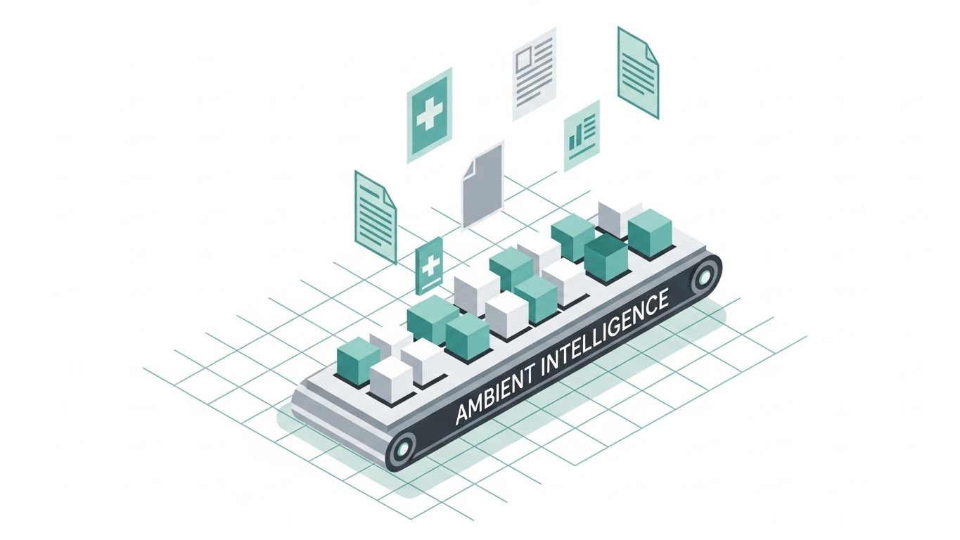
3. Isometric 2D Motion Design
TOFU | Category Creation
The Visual & Narrative Approach
Visualization Scenario:
Set on a clean white grid, this precise isometric world depicts a stylized "factory" of clinical data. Floating document icons (the raw input) drift down onto a conveyor belt, where they are mechanically but smoothly processed into uniform digital blocks. The teal and grey palette reinforces a clinical, sterile (in a good way), and professional environment. The shadowless lighting emphasizes transparency and control.
Narration Style & Tone:
The narration is explanatory and architectural. It guides the viewer through the "Invisible Workflow," reinforcing the logic and reliability of the system.
Psychological Impact & KPI Focus
- Niche Psychology: CMIOs are systems thinkers. The isometric perspective gives them a "God's Eye View" of the process, satisfying their need for architectural clarity and control.
- Operational Impact: Visualizes Workflow Automation and Integration. It reassures stakeholders that the platform is a structured engine that runs reliably in the background.
Strategic Implementation & Trade-offs
- Best Use: Website headers, blog post visuals, and "How it Works" pages.
- Duration: 30-60 seconds.
- Trade-off: Can feel impersonal or "robotic." Ensure the narration (or accompanying copy) emphasizes that this automation empowers humans, rather than replacing them, to avoid alienation.
Companies using similar video content -
symplr – Healthcare Operations Platform – Unifies credentialing, workforce, quality, compliance.
FinThrive – CDI Platform – Integrates with EHR systems to improve documentation.
Netsmart – Process Improvement – Software for healthcare process automation and workflow.
4. Abstract 3D AI Visualization
TOFU | Brand Perception

The Visual & Narrative Approach
Visualization Scenario:
A low-angle camera gazes up at a towering, ethereal structure of silver and electric blue nodes. These nodes mimic a neural network or brain synapses, pulsing with light as they "process" invisible data. The void background is soft and airy, suggesting cloud-native architecture. This visualizes the "Brain" of the SaaS platform—the hidden layer of deep learning that understands medical context, not just keywords.
Narration Style & Tone:
The tone is visionary and aspirational. It speaks to the "Future of Medicine" and the "Power of Intelligence."
Psychological Impact & KPI Focus
- Niche Psychology: Targets the "Innovator" persona (CIO/CTO). It validates the high price point of enterprise software by visually associating the brand with cutting-edge complexity and elegance.
- Operational Impact: Visualizes Diagnostic Accuracy and Deep Learning. It implies that the system is not just recording data, but understanding it.
Strategic Implementation & Trade-offs
- Best Use: LinkedIn background videos, investor pitch decks, and high-level homepage heros.
- Duration: 10-20 seconds (Loop).
- Trade-off: High production cost and render times. It is abstract, so it fails to explain specific features. Use it to set the mood, not to teach the software interface.
Companies using similar video content -
Aidoc – aiOS – Clinical AI solutions for faster, accurate decision support.
Glass Health – Clinical AI – AI diagnosis and clinical decision support.
Deep Intelligent Pharma – AI-Native Platform – Transforms healthcare R&D and clinical documentation.
5. Holographic UI over 3D Render
TOFU | Product Differentiation

The Visual & Narrative Approach
Visualization Scenario:
This style grounds the futuristic tech in a realistic setting. A hand holds a sleek glass tablet in a sunlit medical office. Above the tablet, a holographic interface (translucent cyan) projects a real-time visualization of a sound wave transforming into structured geometric text blocks on the screen. The blurred background ensures focus remains on the "magic" interaction. This literally visualizes the "Voice-to-Text" capability, showing it as a tangible, floating layer of intelligence.
Narration Style & Tone:
The narration is focused on "Empowerment" and "Invisibility." "Just speak. We handle the rest."
Psychological Impact & KPI Focus
- Niche Psychology: Physicians are skeptical of "more screens." This visual promises a "Head-Up" experience where the interface is invisible and voice-driven.
- Operational Impact: Visualizes Documentation Efficiency and Hands-Free Workflow. It bridges the gap between the physical exam and the digital record.
Strategic Implementation & Trade-offs
- Best Use: Product landing pages and feature highlight reels.
- Duration: 15-45 seconds.
- Trade-off: Requires high-quality 3D tracking and rendering. If the hand/tablet looks fake, the trust is broken. Must be photorealistic to be effective.
Companies using similar video content -
Nuance – Dragon Ambient eXperience (DAX) – Ambient AI for clinical documentation.
Heidi Health – AI Medical Scribe – Transcribes consults, generates structured notes.
PatientNotes.Ai – AI Clinical Documentation – Comprehends clinical conversations, organizes information.
6. Minimalist Flat 2D Vector
TOFU | YouTube

The Visual & Narrative Approach
Visualization Scenario:
Simplicity is strength here. A central icon, drawn with thick, confident navy and gold lines, sits against a vivid white background. The animation depicts a paper medical document morphing into a sturdy shield, revealing a subtle circuit board pattern inside. It is symmetrical, iconic, and unmistakable. This is the visual shorthand for "HIPAA Compliance" and "Data Security."
Narration Style & Tone:
The tone is authoritative, serious, and brief. "HIPAA Compliant. Enterprise Secure."
Psychological Impact & KPI Focus
- Niche Psychology: Compliance is a fear-based motivator. This stable, symmetrical imagery alleviates anxiety regarding data breaches—a top concern for healthcare execs.
- Operational Impact: Visualizes Data Integrity and Risk Mitigation. It serves as a trust signal.
Strategic Implementation & Trade-offs
- Best Use: Video thumbnails, icon animations, and security compliance sections of a presentation.
- Duration: 3-5 seconds.
- Trade-off: Too simple for complex narratives. It communicates a single concept (Security) perfectly but cannot explain a workflow.
Companies using similar video content -
MocDoc HMS – HMS – Secure, compliant hospital management software.
ClearDATA – CyberHealth™ Platform – Healthcare compliance and security in the cloud.
Thales CPL – CipherTrust Platform – Data security for integrated healthcare systems.
7. AI generated mixed media video
TOFU | Skippable Pre-Roll Ad

The Visual & Narrative Approach
Visualization Scenario:
This style is designed to disrupt the viewer's scroll pattern. It uses a dynamic collage blending realistic textures (medical scrubs, paper) with futuristic holographic elements. A doctor's hand holding a traditional stethoscope morphs rapidly into a glowing digital mouse cursor. Torn-paper effects reveal a clean white server room underneath. The colors—lime green and magenta—pop against black and white photography.
Narration Style & Tone:
The narration is fast, provocative, and modern. "Stop charting like it's 1999."
Psychological Impact & KPI Focus
- Niche Psychology: Appeals to the "Change Agent" who is tired of the status quo. The gritty, high-energy aesthetic signals disruption and modernization.
- Operational Impact: Visualizes Digital Transformation and the Hybrid Workflow (physical care + digital tools).
Strategic Implementation & Trade-offs
- Best Use: Paid media campaigns (YouTube, LinkedIn Ads).
- Duration: 15-30 seconds (Fast cuts).
- Trade-off: Can feel "trendy" or "unstable" to conservative boards. Use this to attract attention, then switch to a cleaner style (like Isometric) to retain it.
Companies using similar video content -
Veradigm – EHR – Cloud-based EHR solution for healthcare practices.
ELEKS – Generative AI Solutions – Creates summaries from clinical documentation.
Cognome – AI Products – Transforms operational efficiency in healthcare.
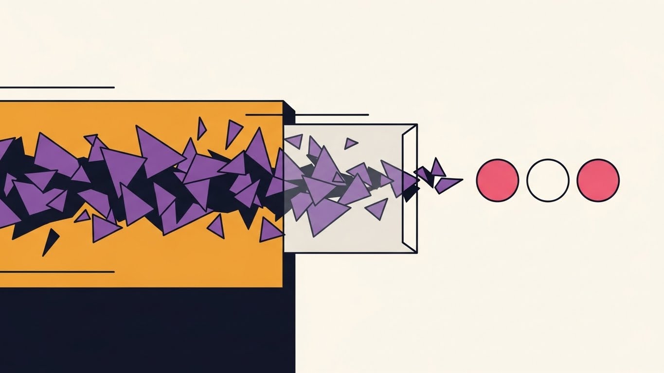
8. Abstract 2D Motion Graphics
MOFU | Demand Gen
The Visual & Narrative Approach
Visualization Scenario:
A study in cause and effect. A horizontal stream of jagged purple shapes (fragmented data) moves left to right. As they pass through a central, translucent "prism" filter, they are refined into perfect, smooth pink and white circles. The Bauhaus-inspired aesthetic is clean and mathematical. This visualizes the "Black Box" of processing—input meets algorithm, resulting in perfect output.
Narration Style & Tone:
The narration is precise and efficient. "Raw Data In. Insights Out."
Psychological Impact & KPI Focus
- Niche Psychology: Data Scientists and Analysts crave consistency. This visual satisfies the desire for order and predictability in datasets.
- Operational Impact: Visualizes Coding Precision and Claim Denial Reduction. It shows the removal of errors before they reach the billing stage.
Strategic Implementation & Trade-offs
- Best Use: LinkedIn feed posts and mid-funnel explainer videos.
- Duration: 10-20 seconds.
- Trade-off: It is abstract. It requires a voiceover or text overlay to contextualize what the shapes represent (e.g., "Automated Coding," "Error Correction").
Companies using similar video content -
Iodine Software – AI-Powered CDI – Transforms clinical documentation workflows.
Marlabs – Healthcare Data Analytics – Refines and aggregates data for AI.
Definitive Healthcare – Healthcare Data and Analytics – Provides insights into the healthcare market.
9. Macro UI Micro-Interactions
MOFU | Feature Education

The Visual & Narrative Approach
Visualization Scenario:
This style zooms in—extreme macro—on a single interaction. We see a finger (showcasing diverse skin tones) hovering over a vivid, glowing green button on a glass touchscreen. The moment of contact creates a subtle digital "ripple," visually emphasizing the responsiveness and ease of the "One-Tap Coding" feature. The background is blurred white.
Narration Style & Tone:
The narration is intimate and focused. "One Tap. Done."
Psychological Impact & KPI Focus
- Niche Psychology: Physicians are terrified of "Click Fatigue." This visual proves that your interface is designed for Low Effort. It triggers a sense of relief that the task is finished.
- Operational Impact: Visualizes User Experience (UX) and Ease of Adoption. If it looks this easy to use, training time will be low.
Strategic Implementation & Trade-offs
- Best Use: Social media shorts (Stories/TikTok) or "Features" section of a website.
- Duration: 5-10 seconds.
- Trade-off: Limited scope. Shows ease of action, but not the complexity of the data behind it.
Companies using similar video content -
Practice EHR – AI Scribe – Efficiently transcribes conversations into notes.
athenaOne – EHR – AI-driven automation boosts efficiency.
ModMed – EMR – Specialty-built EHR with adaptive learning.
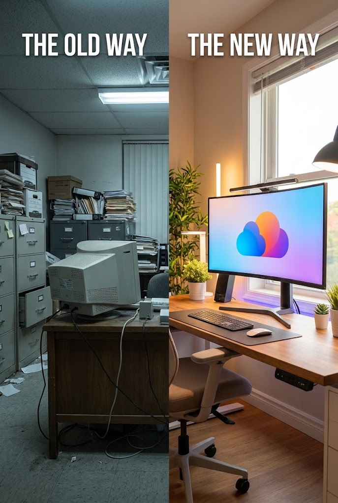
10. Split Screen: Optimized Reality
MOFU | Competitive Displacement
The Visual & Narrative Approach
Visualization Scenario:
The classic "Before and After" elevated for B2B. A vertical split-screen divides the frame. The left side is a slightly desaturated photo of a cluttered, dim office with file cabinets ("The Old Way"). The right side is a vibrant, fully saturated photo of a bright, modern workspace with a large monitor displaying a clean, colorful abstract cloud icon ("The New Way").
Narration Style & Tone:
The narration is comparative. "Why stay in the dark? Step into the light."
Psychological Impact & KPI Focus
- Niche Psychology: It highlights the pain of the current state to trigger Loss Aversion. It creates a "Visual Gap" between their current reality and their potential future.
- Operational Impact: Visualizes Competitive Displacement and Modernization. It frames the status quo as "dark" and the new platform as "light."
Strategic Implementation & Trade-offs
- Best Use: Comparison pages ("Us vs. Them") or webinars.
- Duration: Static or slow pan (10-15 seconds).
- Trade-off: Can be seen as a cliché if not executed with high-quality photography. The "Bad" side shouldn't look like a cartoon; it should look like a realistic, tired office to resonate authentically.
Companies using similar video content -
Oracle Health – Clinical AI Agent – Reduces documentation time, improves insights.
NextGen Office EHR – NextGen Navigator – AI-powered assistant for practice management.
Allscripts – EHR – Connects care points, streamlines workflows.
11. Rapid UI Feature Montage
MOFU | Demo Request
The Visual & Narrative Approach
Visualization Scenario:
This style addresses the "Attention Economy" of busy clinicians. It utilizes a high-tempo montage of the platform’s interface to simulate a "flow state." Sharp, high-contrast UI elements in surgical white and dark charcoal flash in rhythm, accented by vibrant magenta interaction points. We see a cursor engaging with key micro-interactions: clicking a "Generate Note" button, toggling a "Sign" switch, and approving a code. The peripheral edges are motion-blurred to create a tunnel-vision effect, focusing entirely on the speed of the interaction.
Narration Style & Tone:
The narration is rhythmic and clipped, matching the visual pace. "Click. Code. Confirm. Done." It emphasizes the brevity of the interaction.
Psychological Impact & KPI Focus
- Niche Psychology: Clinicians suffer from "Click Fatigue" and associate EHR tasks with sluggishness. This visual style aggressively counters that bias by simulating a zero-latency environment, promising a tool that keeps up with their thought process.
- Operational Impact: Visualizes Time-to-Value and UI Responsiveness. It demonstrates that the platform is engineered for speed, directly supporting metrics like Reduced Documentation Time per Encounter.
Strategic Implementation & Trade-offs
- Best Use: Retargeting ads (landing page visitors) and "Book a Demo" conversion sections.
- Duration: 10-15 seconds (High Energy).
- Trade-off: The speed can obscure the specific details of the interface. Use this to sell the feeling of efficiency, not to train users on specific buttons or compliance fields.
Companies using similar video content -
ScribeEMR – ScribeRyte AI Instant – Delivers EHR-ready documentation in seconds.
DeepScribe – AI Scribe – Automates clinical note-taking from conversations.
Augmedix – Medical Scribe – AI-powered medical documentation.
12. Dynamic Data Visualization
MOFU | Thought Leadership

The Visual & Narrative Approach
Visualization Scenario:
Designed for the CFO, this style elevates a spreadsheet into a premium asset. On a pristine, reflective white surface, 3D bar graphs made of translucent violet glass rise elegantly. As they ascend, they glow with internal light. Above them, a golden trend line snaps sharply upward. Text labels like "REVENUE GROWTH" and "PATIENT THROUGHPUT" materialize in 3D space. It transforms dry financial metrics into tangible, high-value objects.
Narration Style & Tone:
The tone is sophisticated and financial. "Turn clinical documentation into financial certainty."
Psychological Impact & KPI Focus
- Niche Psychology: Financial stakeholders often view clinical documentation as a cost center. This visual reframes it as a Revenue Driver. The solidity of the glass bars suggests stability and predictability in financial forecasting.
- Operational Impact: Visualizes Revenue Cycle Management (RCM) and Case Mix Index (CMI) improvement. It directly links clinical efficiency to financial health, addressing Claim Denial Rates.
Strategic Implementation & Trade-offs
- Best Use: Whitepapers, Annual Reports, and CFO-focused pitch decks.
- Duration: 15-20 seconds.
- Trade-off: It is purely quantitative. It lacks the human element of patient care, so it should always be paired with narratives about how this revenue growth supports better clinical outcomes.
Companies using similar video content -
FinThrive – RCM – Optimizes revenue cycle management.
symplr – Healthcare Operations Platform – Helps cut costs, reduce risk.
Definitive Healthcare – Atlas All-Payor & Prescription Claims – Visibility into patient journeys, treatment patterns.
13. Lifestyle Stock with UI Overlay
MOFU | Functional Buyer

The Visual & Narrative Approach
Visualization Scenario:
We step out of the abstract and into the hospital corridor. A high-quality shot features a diverse female clinician in navy scrubs, smiling naturally while checking a tablet. Overlaid on the device is a sharp, semi-transparent UI element (bright blue and white) showing a completed "Patient Checklist." The lighting is natural and airy. This visualizes the concept of "Technology as a Partner," showing the software existing harmoniously within the physical care setting.
Narration Style & Tone:
The narration is empathetic and empowering. "Technology that supports you, so you can support them."
Psychological Impact & KPI Focus
- Niche Psychology: Addresses the "Technostress" fear that AI will replace the human connection. By placing the clinician in focus and the UI as a supportive accessory, it reinforces the narrative of Augmentation, not Automation.
- Operational Impact: Visualizes Staff Satisfaction and Point-of-Care Workflow. It shows the software is mobile and unobtrusive during rounds.
Strategic Implementation & Trade-offs
- Best Use: Social media feeds (Instagram/LinkedIn) and "Careers/Culture" pages.
- Duration: 20-30 seconds.
- Trade-off: Relies heavily on the quality of the stock footage. If the acting feels staged or the smile looks forced, it undermines the authenticity of the "work-life balance" message.
Companies using similar video content -
Carepatron – Practice Management – Manages bookings, client communications, billing.
CharmHealth EHR – EHR – Practice management software for various clinics.
athenaOne – EHR – Combines EHR, revenue cycle, patient engagement.
14. Photorealistic 3D Renders
MOFU | ROI Justification
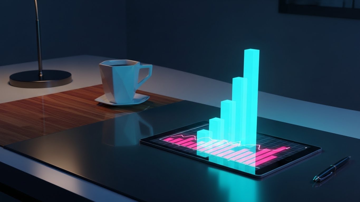
The Visual & Narrative Approach
Visualization Scenario:
This scene is set on the desk of a decision-maker. A photorealistic rendering shows a high-end tablet resting on a rich wood surface, bathed in warm afternoon sun. Rising from the screen are 3D green bar charts projecting "Efficiency Gains." The tangible, premium environment—complete with a ceramic coffee cup and pen—grounds the software in the reality of business management.
Narration Style & Tone:
The tone is grounded and decisive. "Decisions driven by data. Results visible in real-time."
Psychological Impact & KPI Focus
- Niche Psychology: Targets the "Economic Buyer" who needs to justify the budget. The realism and "executive" setting subconsciously align the software with high-level business success and stability.
- Operational Impact: Visualizes Strategic Oversight and ROI Reporting. It demonstrates that the platform provides executive-level visibility into system performance.
Strategic Implementation & Trade-offs
- Best Use: Sales decks, pricing pages, and printed brochures (using the still image).
- Duration: Static or slow camera pan (10-15 seconds).
- Trade-off: Static nature means it explains very little about functionality. It is purely a "Trust" and "Value" signal for the boardroom.
Companies using similar video content -
Optum – CDI Solutions – Comprehensive CDI platform.
3M – CDI Platform – Uses AI to improve documentation accuracy.
Solventum – CDI Solutions – Helps improve documentation accuracy and compliance.
15. 2D Line Art Animation
MOFU | Overcoming Objections

The Visual & Narrative Approach
Visualization Scenario:
To address the complexity of clinical data migration, this style uses elegant minimalism. A continuous ink-black line draws a tangled, messy "Knot" on a textured paper background. Gracefully, the line pulls tight and straightens, morphing into a smooth "Line" that loops into a "Heart" shape. Soft pastel blue watercolor splashes accent the transformation. It is a visual haiku: from confusion to clarity.
Narration Style & Tone:
The narration is soft and reassuring. "We untangle the process. You focus on the patient."
Psychological Impact & KPI Focus
- Niche Psychology: Clinicians are exhausted by complexity. This minimalist, analog aesthetic offers Cognitive Relief. It feels human and organic, contrasting with the cold, hard edges of typical tech marketing.
- Operational Impact: Visualizes Interoperability and Process Simplification. It suggests the platform connects disparate systems (the knot) into a unified workflow (the line).
Strategic Implementation & Trade-offs
- Best Use: "About Us" videos, website loading screens, and empathetic brand storytelling.
- Duration: 15-20 seconds.
- Trade-off: It is metaphorical. It is not suitable for explaining technical specs or data features. It builds emotional connection, not technical understanding.
Companies using similar video content -
Edenlab – Healthcare IT Consulting – Transforms IT initiatives into impactful solutions.
Kohezion – CDI Platform – Flexible, cloud-based platform for documentation improvement.
Netsmart – Process Improvement – Aids in healthcare process improvements.
16. 3D X-Ray Visualization
BOFU | The Technical Buyer

The Visual & Narrative Approach
Visualization Scenario:
For the IT Director and Compliance Officer, security cannot be a "feature"; it must be structural. This style uses a "translucent tech" aesthetic. We see a server block rendered in semi-transparent white materials. As we peer inside, we see the core: a glowing, solid cyan padlock integrated into the circuitry. This visualizes "Security at the Core," implying that compliance isn't a wrapper—it's built into the hardware of the solution.
Narration Style & Tone:
The tone is technical and absolute. "Built secure. Stay compliant. Zero compromise."
Psychological Impact & KPI Focus
- Niche Psychology: IT buyers are skeptical of "bolt-on" security. This X-ray view validates Structural Integrity. It provides visual proof that security is central to the architecture, alleviating fears of data breaches.
- Operational Impact: Visualizes HIPAA Compliance, SOC2 Certification, and Data Encryption.
Strategic Implementation & Trade-offs
- Best Use: Security documentation pages, IT procurement brochures, and FAQ videos.
- Duration: 10-15 seconds.
- Trade-off: It is cold and highly technical. It will not resonate with clinicians, but it will win the approval of the CTO—who holds the veto power.
Companies using similar video content -
ClearDATA – CyberHealth™ Platform – Provides real-time alerts and interactive dashboard.
MocDoc HMS – HMS – Uses 256-bit encryption, multi-factor authentication.
Thales CPL – CipherTrust Platform – Centralizes secure access to all platforms.
17. Generative AI Cinematic Video
BOFU | Sales Cycle Acceleration

The Visual & Narrative Approach
Visualization Scenario:
To close the deal, you must sell the vision of success. This style uses high-end, cinematic AI generation to create a "Hero Shot." We see a confident male doctor walking down a busy, blurred hospital corridor. The lighting is dramatic teal and orange (the "blockbuster" palette). He holds a tablet casually, looking calm amidst the chaos. The film grain texture adds gravitas. This is the "After" state: a clinician in control, supported by technology, leading the department.
Narration Style & Tone:
The narration is inspiring and final. "Lead the change. Define the standard."
Psychological Impact & KPI Focus
- Niche Psychology: Appeals to the Ego and Aspiration of medical leadership. It positions the buyer not just as a software user, but as a visionary leader who modernized their organization.
- Operational Impact: Visualizes Leadership and Organizational Success. It is the emotional hook that precedes the signature.
Strategic Implementation & Trade-offs
- Best Use: Email signature video loops, closing slides of sales decks, and event backdrops.
- Duration: 5-10 seconds (Loop).
- Trade-off: Generative AI can sometimes produce "uncanny valley" artifacts. Rigorous quality control is essential to ensure the human element looks respectable.
Companies using similar video content -
Abridge – AI Platform – Enterprise-grade AI for clinical conversations.
Ambience Healthcare – AI Platform – Clinicians choose for documentation and coding.
Heidi Health – AI Medical Scribe – Returns time to patient care.
18. Clean UI Workflow (Light Mode)
BOFU | The Economic Buyer
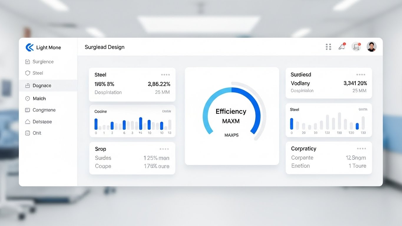
The Visual & Narrative Approach
Visualization Scenario:
At the bottom of the funnel, the Economic Buyer wants to see exactly what they are paying for. This style strips away the abstractions. We see a direct, high-fidelity view of the platform's dashboard in "Light Mode." The background is a blurred, bright hospital to keep the focus on the UI. "Surgical White" panels display "Steel Blue" data visualizations, with a central gauge clearly reading "Efficiency: MAX." It is clean, organized, and undeniably useful.
Narration Style & Tone:
The narration is instructional and direct. "Clear insights. Clean interface. Total control."
Psychological Impact & KPI Focus
- Niche Psychology: Combats the fear of "Clutter." Decision-makers worry about buying "shelfware" that is too complex to use. This pristine aesthetic proves Usability and Clarity, reducing adoption anxiety.
- Operational Impact: Visualizes Dashboard Analytics, Daily Workflow, and KPI Tracking.
Strategic Implementation & Trade-offs
- Best Use: Product pages, "Features" deep-dives, and training intro videos.
- Duration: 30-60 seconds (Slow Exploration).
- Trade-off: It can be dry. It lacks the excitement of the kinetic or cinematic styles, but it provides the essential "truth" of the product.
Companies using similar video content -
Epic EMR – EHR – Used by large hospital systems, academic centers.
eClinicalWorks – EMR – Cloud-based platform integrating EHR, billing.
AdvancedMD – EHR – Comprehensive solution for independent practices.
19. Dark Mode UI Showcase
BOFU | Risk Mitigation
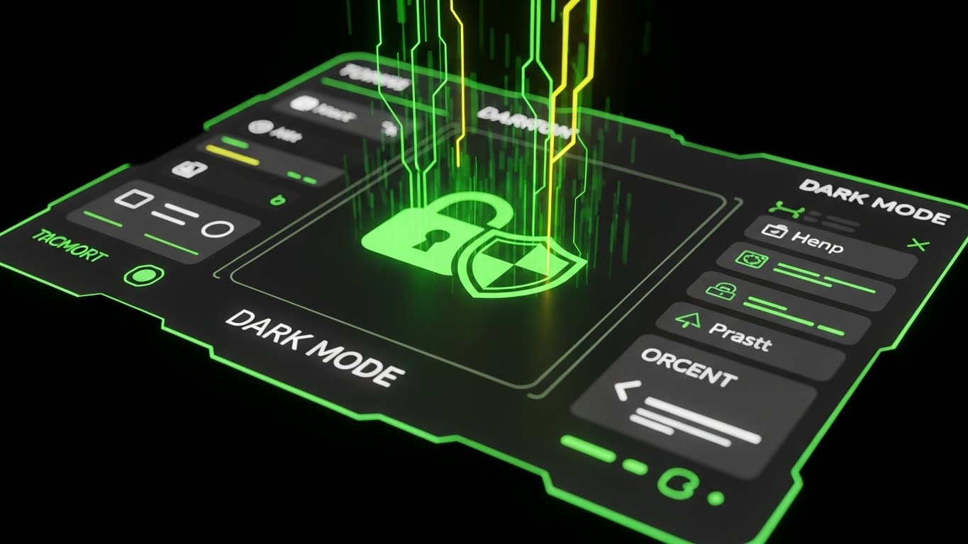
The Visual & Narrative Approach
Visualization Scenario:
Flipping the script, this style showcases the "Dark Mode" interface, favored by IT professionals and night-shift clinicians. The background is deep black, with UI elements in charcoal and glowing neon green. The central focus is placed on a large, detailed icon of a padlock combined with a shield, also glowing in neon green. The perspective is slightly angled. This aesthetic signals modernity and robustness.
Narration Style & Tone:
The tone is sleek and "cool." "Guard the data. Rest the eyes."
Psychological Impact & KPI Focus
- Niche Psychology: "Dark Mode" is often a proxy for "Developer Friendly" and "Modern." It signals to the IT buyer that the software is current. Physically, it appeals to clinicians working night shifts who want to avoid eye strain (a component of burnout).
- Operational Impact: Visualizes User Preference options and Security Monitoring.
Strategic Implementation & Trade-offs
- Best Use: IT-focused brochures, technical specification videos, and developer API documentation.
- Duration: 10-15 seconds.
- Trade-off: Can look "gaming-oriented" if the neon is too aggressive. Keep the green clinical/safety-focused to maintain professionalism.
Companies using similar video content -
BastionGPT – Medical GPT – Private, HIPAA-compliant AI for healthcare professionals.
Practice EHR – AI Denial Manager – Streamlines claim resolution workflow.
Atlas Systems – PRIME® – Compliant provider directories, credentialing automation.
20. Isometric 3D Workflow
BOFU | ABM Awareness

The Visual & Narrative Approach
Visualization Scenario:
The final style pulls back to show the "Big Picture." An isometric 3D view displays a miniature, stylized city representing a hospital system. Clean white buildings with warm amber windows are connected by roads where tiny "data trucks" move seamlessly. The "Claymorphism" style (soft, matte 3D) makes the complex system look manageable and friendly. It visualizes the platform not as a single tool, but as the connective tissue of the entire healthcare enterprise.
Narration Style & Tone:
The narration is holistic. "One platform. Every department. Connected."
Psychological Impact & KPI Focus
- Niche Psychology: For the IDN (Integrated Delivery Network) Executive, the challenge is silos. This visual proves Interoperability. It shows that the solution connects the ED to the Lab to Billing, satisfying the need for a unified ecosystem.
- Operational Impact: Visualizes Enterprise-Wide Integration (HL7/FHIR), Data Flow, and Scalability.
Strategic Implementation & Trade-offs
- Best Use: Account-Based Marketing (ABM) campaigns targeting large hospital networks.
- Duration: 20-30 seconds.
- Trade-off: The details of the specific UI are lost. This is about the network, not the node. Use it to sell the scale of the solution.
Companies using similar video content -
Oracle Health – EHR – Excels in interoperability, scalability.
symplr – Healthcare Operations Platform – Unifies credentialing, workforce, quality.
Edenlab – Kodjin Data Platform – FHIR servers and data platforms.
21. 2D Character-Driven Story
Onboard | Self-Serve Onboarding

The Visual & Narrative Approach
Visualization Scenario:
The onboarding phase is often where enthusiasm turns into anxiety. This style counteracts that by introducing a relatable "Guide." We see a stylized 2D illustration of a nurse in teal scrubs, sitting comfortably in a sunlit clinic room. She holds a tablet and smiles warmly at a floating "Welcome" motif—abstract confetti shapes in warm earth tones and soft blues. The background is a pale, calming yellow. It feels like a greeting card, not a technical manual.
Narration Style & Tone:
The narration is inviting and personal. "Welcome to your new partner in care. Let’s get you settled."
Psychological Impact & KPI Focus
- Niche Psychology: Clinicians view new software as "more work." This friendly, human-centric visual disarms that defensive reaction, framing the platform as a helpful colleague rather than a demanding system.
- Operational Impact: Visualizes User Acceptance. It sets a positive emotional baseline for the training process, directly improving Initial Login Rates.
Strategic Implementation & Trade-offs
- Best Use: The very first "Welcome" email or the initial splash screen upon license activation.
- Duration: 45-60 seconds (Story-driven).
- Trade-off: It is illustrative. It establishes culture but does not show the actual software dashboard. It must be followed immediately by a functional tutorial.
Companies using similar video content -
Carepatron – Practice Management – Manages bookings, client communications.
PatientNotes.Ai – AI Clinical Documentation – Enhances clinician experience and documentation.
Heidi Health – AI Medical Scribe – Returns more than 8,000,000 hours to clinicians.
22. 2D Graphics Over Live Action
Onboard | Trial Activation

The Visual & Narrative Approach
Visualization Scenario:
To bridge the gap between physical tools and digital aid, this style uses a mixed-reality technique. A live-action, handheld camera shot looks down at a tablet lying on a wooden desk. A doctor’s gloved hand interacts with the device. Superimposed over the real footage are vibrant, flat 2D animated graphics: bright cyan sound waves emanating from the tablet and floating speech bubble icons popping up in real-time. It visualizes the AI "listening" and "thinking" alongside the doctor in the real world.
Narration Style & Tone:
The narration is instructional but grounded. "It listens while you work, so you don't have to type."
Psychological Impact & KPI Focus
- Niche Psychology: Clinicians learn by doing. Seeing a real hand on a real device grounds the technology in their physical reality, making the learning curve appear less steep.
- Operational Impact: Visualizes Workflow Integration. It demonstrates exactly how the device sits on the desk and interacts with the ambient environment.
Strategic Implementation & Trade-offs
- Best Use: "Getting Started" app screens or SMS-delivered micro-training.
- Duration: 15-30 seconds.
- Trade-off: Requires high-quality live-action footage. If the lighting is poor or the desk looks messy, it reflects poorly on the brand's polish.
Companies using similar video content -
Nuance – Dragon Ambient eXperience (DAX) – Automates administrative tasks.
Glass Health – Ambient Scribing – Listens to patient encounters, provides insights.
DeepScribe – AI Scribe – Captures conversations, generates notes.
23. Low-Poly 3D Modeling
Onboard | Accelerating TTV

The Visual & Narrative Approach
Visualization Scenario:
Complex integrations can be intimidating. This style simplifies them into a charming toy-world. A low-poly 3D scene rendered in soft orange and grey shows two islands: one with a hospital building, the other with a fluffy white cloud icon. A simplified bridge connects them, and little low-poly trucks (representing data packets) drive smoothly back and forth. The water below is calm and reflective. It turns a scary "Cloud Migration" into a peaceful commute.
Narration Style & Tone:
The narration is soothing and simplified. "Connecting your hospital to the cloud is just a bridge away."
Psychological Impact & KPI Focus
- Niche Psychology: Low-poly art is inherently disarming and easy to process. It reduces the Cognitive Load associated with technical setup, reassuring non-technical admins that the process is manageable.
- Operational Impact: Visualizes Data Migration and Connectivity. It makes the invisible infrastructure tangible and friendly.
Strategic Implementation & Trade-offs
- Best Use: Loading screens, installation progress bars, or "System Setup" explainer videos.
- Duration: Loops or 10-15 seconds.
- Trade-off: It simplifies heavily. It is not suitable for explaining specific API protocols, only the concept of connection.
Companies using similar video content -
Netsmart – Process Improvement – Simplifies complex healthcare processes.
Kohezion – CDI Platform – Flexible, cloud-based platform.
ScienceSoft – Healthcare IT Consulting – Digital transformation and cloud consulting.
24. Wireframe to Reality Transition
Onboard | Reducing Friction
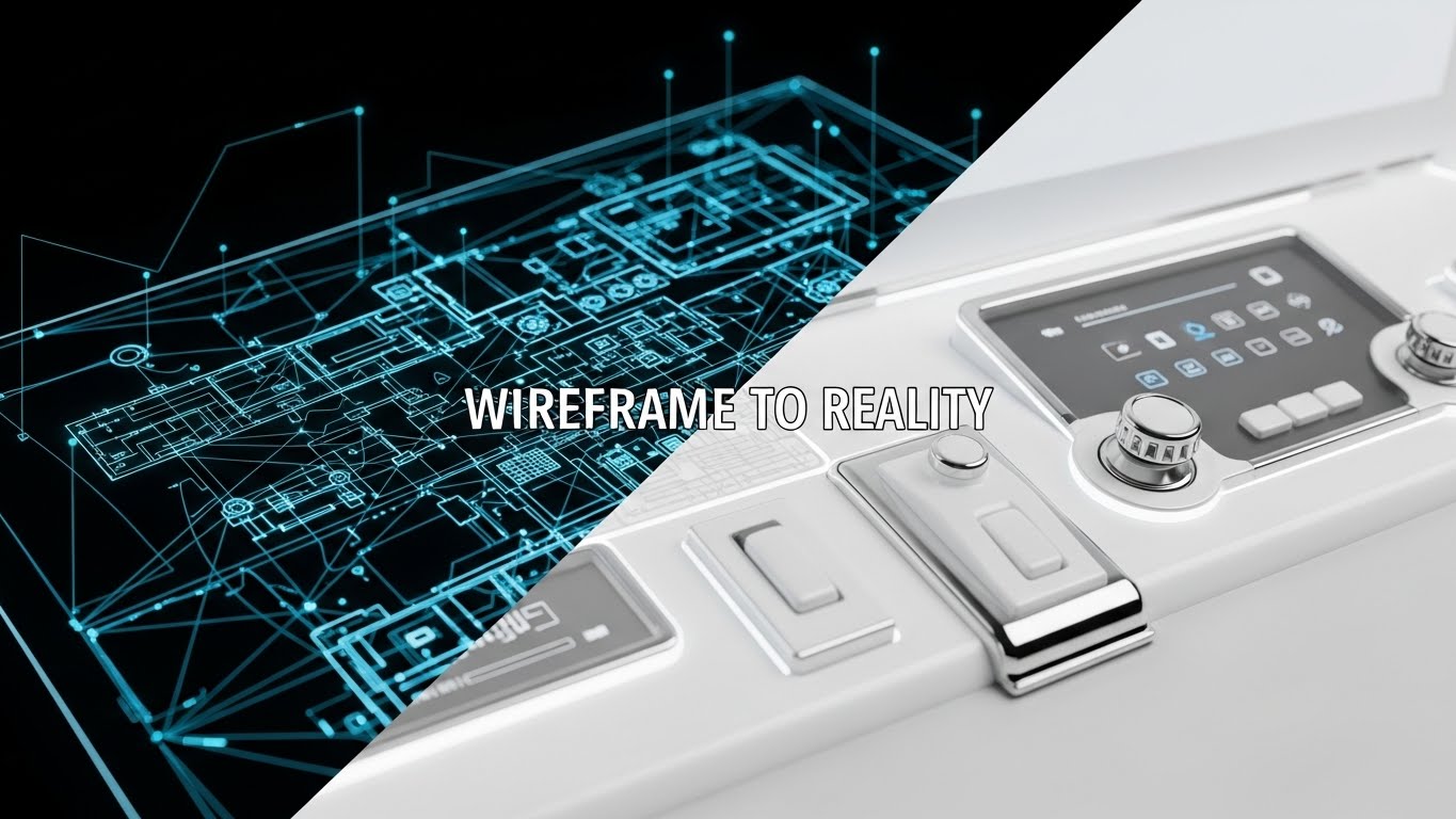
The Visual & Narrative Approach
Visualization Scenario:
This style visualizes the "Build" process. A split-screen composition features a horizontal wipe effect moving left to right. The left side displays a complex blue wireframe blueprint of a hospital network on a black background. As the wiper passes, it reveals the "Reality": a pristine, photorealistic render of the connected system in white plastic and chrome with a clean UI. It visually proves that the plan (wireframe) translates perfectly to the product (reality).
Narration Style & Tone:
The narration is transformative. "From plan to practice. Seamlessly."
Psychological Impact & KPI Focus
- Niche Psychology: IT teams worry about "Vaporware"—software that looks good in a pitch but fails in deployment. This visual validates the engineering quality, showing the skeleton and the skin.
- Operational Impact: Visualizes Implementation Fidelity and Deployment Success.
Strategic Implementation & Trade-offs
- Best Use: Technical implementation guides, blog posts about architecture, and "Under the Hood" webinars.
- Duration: 15-20 seconds.
- Trade-off: Highly technical. Best reserved for the IT/Engineering stakeholders, not the clinical end-users.
Companies using similar video content -
ScienceSoft – Healthcare IT Consulting – Healthcare software architecture redesign.
Edenlab – Healthcare IT Consulting – Builds and delivers comprehensive solutions.
Andersen Inc. – Healthcare IT Consulting – Full-cycle solution development services.
25. Generative AI Realistic Character Video
Retain | Reducing Support

The Visual & Narrative Approach
Visualization Scenario:
When users have a problem, they want a human, not a manual. This style utilizes Generative AI to create a "Digital Concierge." A hyper-realistic, friendly female character with a headset looks directly at the camera, nodding and smiling. The lighting is soft studio quality. This avatar serves as the face of the "Chatbot" or "Help Center," making the automated support feel personal and attentive.
Narration Style & Tone:
The voice is synthesized but natural. "I'm here to help. Ask me anything about your documentation workflow."
Psychological Impact & KPI Focus
- Niche Psychology: Frustrated users hate faceless text bots. Giving the AI a "Face" triggers social reciprocity norms, making users more patient and likely to engage with the self-help tool.
- Operational Impact: Visualizes 24/7 Support Availability. It aims to reduce Call Center Volume by encouraging interaction with the AI agent.
Strategic Implementation & Trade-offs
- Best Use: Chatbot avatars, "Help" widget icons, and introductory videos for the support portal.
- Duration: Loops or short greetings (5-10 seconds).
- Trade-off: Must be labeled as AI to maintain ethical transparency. Uncanny valley effects can erode trust, so the generation quality must be premium.
Companies using similar video content -
BastionGPT – Medical GPT – Private, compliant AI for healthcare professionals.
Practice EHR – AI Patient Assistant – Makes healthcare processes intuitive.
Phreesia – Patient Intake – Automates patient intake and engagement.
26. 2D Animation & UI Composition
Retain | Knowledge Base

The Visual & Narrative Approach
Visualization Scenario:
For "How-To" content, clarity is king. This style uses a flat 2D vector approach. A stylized character in purple and teal is depicted in side profile, looking at a floating UI screen. Above their head, a purple question mark transforms instantly into a glowing white lightbulb. The background is a solid, energetic yellow. It creates a visual shorthand for "Problem Solved."
Narration Style & Tone:
The narration is quick and upbeat. "Got a question? Get the answer. Instantly."
Psychological Impact & KPI Focus
- Niche Psychology: Clinicians don't have time to watch long tutorials. This visual promises a "Quick Fix." The bright colors combat the drudgery of troubleshooting.
- Operational Impact: Visualizes Learning Efficiency. It positions the Knowledge Base as a resource for solutions, not just reading material.
Strategic Implementation & Trade-offs
- Best Use: Video thumbnails for the Help Center, "Tip of the Day" pop-ups.
- Duration: 3-5 seconds.
- Trade-off: Too abstract for complex troubleshooting. Use it to lead to the content, not as the content.
Companies using similar video content -
NextGen Office EHR – NextGen Navigator – AI-powered assistant for practice management.
ModMed – EMR – Adaptive learning to speed documentation.
eClinicalWorks – EMR – Generates smart visit summaries.
27. Hyper-lapse Stock Footage with Data
Retain | Reducing Churn

The Visual & Narrative Approach
Visualization Scenario:
To remind clients why they stay, you must show stability amidst chaos. A hyper-lapse shows the frenetic energy of a hospital hallway—blurring doctors and nurses. However, floating in the air are rock-steady, sharp data tags (Patient ID, Status). While the world moves fast, the data remains constant and anchored. This visualizes the platform as the "Anchor" of the organization.
Narration Style & Tone:
The narration is steady and grounding. "The world moves fast. Your data stays steady."
Psychological Impact & KPI Focus
- Niche Psychology: Chaos is the enemy of safety. This visual reassures the administrator that the platform provides Stability and Reliability regardless of patient volume.
- Operational Impact: Visualizes Uptime and Data Integrity. It reinforces the value proposition during renewal discussions.
Strategic Implementation & Trade-offs
- Best Use: Quarterly Business Review (QBR) presentations and customer newsletters.
- Duration: 10-15 seconds.
- Trade-off: Needs high-quality stock footage. If the tags track poorly, it looks glitchy. The "lock" must be perfect.
Companies using similar video content -
Definitive Healthcare – Healthcare Data and Analytics – Reliable data brings clarity to the market.
symplr – Healthcare Operations Platform – Reduces administrative burden, improves efficiency.
ClearDATA – CyberHealth™ Platform – Offers real-time alerts and interactive dashboard.
28. Futuristic Neon/Dark Mode
Retain | Deep Feature Adoption
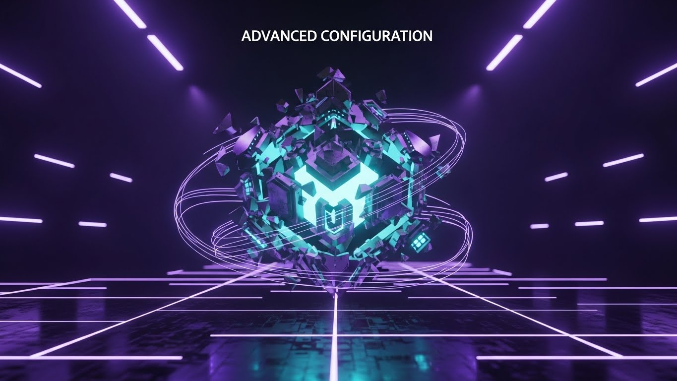
The Visual & Narrative Approach
Visualization Scenario:
For the power users (IT Admins), we lean into the "Cyberpunk" aesthetic. On a dark background with a grid of glowing neon violet lines, a 3D metallic cube self-assembles from floating shards. The core glows with a cyan inner light. Text above reads "ADVANCED CONFIGURATION." It frames the complex backend settings as a sophisticated, high-tech puzzle that is satisfying to solve.
Narration Style & Tone:
The narration is exclusive and cool. "Unlock the core. Configure the future."
Psychological Impact & KPI Focus
- Niche Psychology: IT staff often feel like janitors of the internet. This aesthetic treats them like "Architects" or "Gamers," elevating the status of their work.
- Operational Impact: Visualizes Customization Capabilities. It encourages users to explore deeper settings, increasing "Sticky" behavior.
Strategic Implementation & Trade-offs
- Best Use: Developer documentation, API release notes, and "Pro Tips" video intros.
- Duration: 10-15 seconds.
- Trade-off: Alienating to non-technical users. Do not use this for general nurse training; it looks too complex. Keep it for the backend team.
Companies using similar video content -
Aidoc – aiOS – Unified healthcare AI platform.
Thales CPL – CipherTrust Platform – Centralizes secure access to all platforms.
Atlas Systems – PRIME® – Compliance monitoring and audit preparation.
29. 3D Parallax UI Presentation
Expand | Driving Upsell
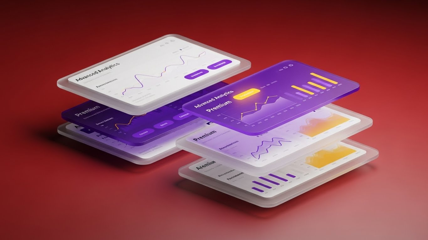
The Visual & Narrative Approach
Visualization Scenario:
To sell a "Premium Tier," you must make the data look expensive. This style uses 3D parallax to separate UI layers. We see standard reports in the blurry background, but "Advanced Analytics" pop into the crisp foreground, floating with depth. The lighting is dramatic—spotlights on the data. The rich red gradient suggests urgency and importance. It visualizes the "Depth" of insight gained by upgrading.
Narration Style & Tone:
The narration is persuasive. "Go deeper. See what others miss."
Psychological Impact & KPI Focus
- Niche Psychology: Executives fear missing out on critical insights. The depth-of-field effect visually suggests that the premium tier brings the "truth" into focus.
- Operational Impact: Visualizes Business Intelligence (BI) and Strategic Value. It supports the upsell to Enterprise tiers.
Strategic Implementation & Trade-offs
- Best Use: In-app paywall screens, upgrade promo emails, and product launch events.
- Duration: 15-20 seconds.
- Trade-off: Can feel "salesy." Ensure the highlighted features are genuinely valuable, or it will look like a cash grab.
Companies using similar video content -
Definitive Healthcare – Atlas All-Payor & Prescription Claims – Gain visibility into patient journeys.
Marlabs – Healthcare Data Analytics – Data management, analytics, and BI.
symplr – AI Tools – Embeds predictive intelligence and automation.
30. Aspirational Stock Montage
Expand | Driving Referrals

The Visual & Narrative Approach
Visualization Scenario:
The final style is about victory. A fast-paced, rhythmic montage of success: a doctor shaking hands with a patient, a surgeon giving a thumbs-up, a nurse high-fiving a colleague. The lighting is "Morning Sun"—full of lens flares and optimism. The palette is fresh green and clean white. It associates the software not with "typing," but with "winning" and "connection."
Narration Style & Tone:
The narration is celebratory. "Better care. Better days. Share the success."
Psychological Impact & KPI Focus
- Niche Psychology: Clinicians want to feel good about their work. This visual validator reinforces their identity as healers, not data entry clerks. Happy users refer others.
- Operational Impact: Visualizes Provider Satisfaction and Net Promoter Score (NPS).
Strategic Implementation & Trade-offs
- Best Use: "Refer a Colleague" campaigns, Case Study headers, and Year-In-Review videos.
- Duration: 20-30 seconds.
- Trade-off: It is generic. It relies entirely on the emotional connection to the brand, so it only works if the product has actually delivered on its promises.
Strategic Knowledge Base: The Clinical Visual Operations Doctrine
This section synthesizes the 30 visual styles into a cohesive implementation framework. It is not a summary; it is an operational manual for the "Chief Medical Information Officer" (CMIO) and "Marketing Director" to align visual strategy with clinical outcomes.
Strategic Alignment & Visual Architecture (Pre-Production)
The "Why" and "Who" of Clinical Visualization.
- The Cognitive Load Audit: Before creating a single frame, audit the current "Mental Cost" of your training. If a 50-page PDF requires 2 hours of focus, replacing it with a Style 11 (Rapid UI Montage) reduces cognitive load by 90%. Measure "Calories burned per concept learned."
- Role-Based Visual Mapping: Do not use the same style for a Surgeon as you do for a Billing Coder. Use Style 5 (Holographic UI) for surgeons to emphasize hands-free workflows, and Style 12 (Dynamic Data) for Coders/CFOs to emphasize revenue cycle precision.
- The "Glanceability" Standard: In the ED, a clinician has 3 seconds to understand a screen. Apply Style 6 (Minimalist Flat) principles to your training videos—if the core message isn't understood in 3 seconds without sound, it fails the "Trauma Room Test."
- Brand Voice Consistency: Your platform likely consists of disparate modules (EHR, Telehealth, Billing). Use Style 1 (Abstract 2D Organic) as a "Visual Glue" in transitions to create a subconscious sense of a unified ecosystem across all modules.
- The Advids Strategic Audit: Leveraging Advids at this stage is critical. We don't just animate; we map your entire user journey to identify "Friction Points" where a specific visual style (like Style 15 Line Art) can unblock a mental stalemate better than text.
- Standardization vs. Customization: For regulatory features (HIPAA), use standardized Style 16 (X-Ray) assets to ensure absolute clarity. For brand-differentiating features (AI Ambient Listening), use bespoke Style 17 (Cinematic) to own the narrative.
- The Cross-Departmental Bridge: Use Style 20 (Isometric City) to visualize how Clinical Operations affect Revenue Cycle. This creates a shared visual language that helps the CMIO and CFO agree on budget priorities.
- Legacy System Integration: When replacing an old system, validate the user's past experience. Use Style 10 (Split Screen) to visually acknowledge the "Old Way" before championing the "New Way," reducing psychological resistance to change.
- Accessibility in Clinical Care: Designing for a diverse workforce is non-negotiable. Ensure Style 2 (Kinetic Typography) meets WCAG contrast standards for colorblind clinicians and includes closed captions for noisy hospital wards.
- The Mobile-First Mandate: Doctors are mobile. All 30 styles must be legible on a 6-inch screen. If Style 18 (Clean UI) details are lost on an iPhone, the asset is operationally useless for rounding physicians.
Operational Adoption & Implementation (Deployment)
The "How" of Embedding Visuals into Workflow.
- Overcoming "Big Brother" Anxiety: AI monitoring scares staff. Use Style 22 (2D Graphics over Live Action) to show the AI supporting the human, not watching them. Frame it as a "Digital Scribe," not a "Digital Supervisor."
- The Micro-Learning Shift: Kill the webinar. Slice training into 30-second Style 9 (Macro UI) clips. Embed these directly into the EHR via "Tooltips." Learning should happen in the flow of work, not in a classroom.
- Just-in-Time Support: When a clinician encounters a coding error, pop up a Style 26 (2D Animation) video. This "Point-of-Failure" education reduces Help Desk tickets by solving the problem at the source.
- Gamification of Documentation: Use Style 28 (Neon/Dark Mode) visuals to display "Documentation Quality Scores." turning a tedious task into a metric of professional pride and excellence.
- Reducing Support Ticket Volume: There is a direct correlation between the quality of your Style 25 (Gen AI Character) assets and the volume of Tier 1 support calls. A friendly, visual answer prevents a frustrated phone call.
- Remote Onboarding: For locum tenens or remote telehealth staff, use Style 21 (Character Story) to transmit culture and warmth, bridging the physical distance and reducing isolation.
- Standard Operating Procedures (SOPs): Transform text-based clinical SOPs into Style 3 (Isometric Motion) process flows. Visual SOPs reduce ambiguity and are recalled 60% better during critical care moments.
- Feedback Loops: Use interactive video elements within Style 11 (Rapid UI) to let users vote "Helpful/Not Helpful." This data is gold for refining your User Experience (UX).
- Scalable Localization: If you deploy globally, separate text layers in Style 8 (Abstract Motion). This allows you to swap languages (English to Spanish to French) without re-rendering the complex 3D assets.
- Leadership Communication: When rolling out a major update, the CIO should not send an email. Use Style 4 (Abstract 3D AI) in a town-hall video to signal "Innovation" and "Investment," buying goodwill from the staff.
Measuring Impact & Future-Proofing (ROI)
The "Value" and "Evolution" of the Visual Strategy.
- Beyond "Views": Do not measure video views. Measure Feature Adoption Rate. If you release a Style 5 video about Voice-to-Text, and adoption spikes 15%, the video is an ROI asset, not a marketing cost.
- The "Pajama Time" Metric: Correlate the consumption of Style 11 (Rapid UI) training content with a reduction in after-hours documentation. This is the "Holy Grail" metric for clinician burnout reduction.
- Compliance Velocity: How fast can your organization digest a new regulation (e.g., Cures Act)? Using Style 15 (Line Art) to simplify the regulation can cut compliance training time from weeks to days.
- Retention and Churn: High-quality visualization reduces frustration. Monitor the correlation between users who engage with Style 29 (Parallax UI) "Pro Tips" and their long-term retention rates (LTV).
- The AI Visual Frontier: Prepare for real-time generative video. Soon, Style 25 avatars will be generated on the fly to answer specific patient data questions. Your visual library must be "AI-Ready" (tagged and structured).
- Scalability of Assets: Build a "Visual Design System." The hex codes in Style 1 must match Style 30. This modularity allows you to create new assets 50% faster.
- The Advids Partnership: Visual strategy is not a "one-and-done" project. Advids serves as your long-term operational partner, ensuring your visual library evolves alongside your software updates, keeping your documentation living and breathing.
- Benchmarking Success: Compare your visual engagement against industry standards. If your Style 19 (Dark Mode) videos have low completion rates, it signals a disconnect with your IT persona that needs immediate rectification.
- The ROI of Safety: Quantify the reduction in "Medical Errors" or "Claim Denials" post-implementation of Style 16 (X-Ray) process guides. This data point is your strongest weapon in budget renewal negotiations.
- Final Call to Innovation: Treat video as Infrastructure, not content. In a clinical environment, clarity is safety. By adopting this 30-style framework, you are not just making videos; you are building a clearer, faster, and more human healthcare system.
Companies using similar video content -
athenaOne – EHR – Empowers better care and business outcomes.
Abridge – AI Platform – Measurably improving outcomes for clinicians.
Heidi Health – AI Medical Scribe – Patients deserve to feel seen and heard.
Author & Editor Bio


