
Introduction: Visualizing the Architecture of Trust
The cloud compliance landscape is currently navigating a profound structural shift. We have moved beyond the era of static "tick-box" auditing into an age of Continuous Assurance, where security is not just a protocol but a dynamic, living ecosystem. For industry leaders, the challenge is no longer just achieving compliance; it is articulating that achievement to stakeholders who cannot see the invisible digital infrastructure protecting their assets.
We stand at the precipice of a massive surge in market demand. The global cloud compliance market is projected to expand significantly, reaching an estimated USD 90.67 billion by 2030. This growth represents a thriving ecosystem where opportunity abounds, but complexity remains the primary barrier to adoption. C-Suite executives often struggle to conceptualize the intricate web of APIs, encryption protocols, and governance frameworks that constitute modern security.
This is where strategic video visualization bridges the physical-digital divide. By translating abstract regulatory frameworks into tangible visual assets—shields, fortresses, and organized data streams—we lower the cognitive load for buyers and accelerate the sales cycle. The ROI of this clarity is measurable; organizations that effectively operationalize and communicate their proactive stance through automation incur USD 1.76 million less in data breach costs, a narrative that resonates deeply with fiscally responsible leadership.
This guide serves as your visual lexicon for the Cloud Compliance industry. It provides a curated selection of "Gold Standard" visualization styles, each mapped to specific funnel stages and psychological triggers. From the "Order from Chaos" of abstract motion graphics to the architectural precision of line art, these examples are designed to transform your compliance platform from a complex necessity into a visible, premium asset.
1. Abstract 2D Motion Graphics
TOFU | Brand Awareness

The Visual & Narrative Approach
Visualization Scenario: This style utilizes a sophisticated "Order from Chaos" visual metaphor, perfectly suited for introducing the core value of compliance: stability. The visualization begins with a scattered, chaotic array of geometric shapes—representing unregulated data packets or potential vulnerabilities—which then magnetically flow together to form a cohesive, impenetrable shield structure. The aesthetic is strictly flat and vector-based, utilizing a high-key "Arctic White" background that allows the "Electric Blue" and "Soft Silver" elements to pop with clinical clarity.
Narration Tone: Precise, rhythmic, and reassuring.
Psychological Impact & KPI Focus
Niche Psychology: The target persona (CISOs and Compliance Managers) constantly battles the anxiety of fragmentation—"Shadow IT" and sprawling, unmonitored data.
Operational Impact: This visual directly addresses that anxiety by demonstrating unification. It satisfies the cognitive desire for closure and organization (Gestalt principles), visually proving that the software can tame the complexity of the cloud environment. The primary KPI impact here is Brand Recall, as the simple visual metaphor sticks in the viewer's memory far better than technical jargon.
Strategic Implementation & Trade-offs
Best Use Case: High-level explainer videos on the Homepage or detailed feature headers.
Duration: Short form (15-30 seconds).
Trade-offs: This style is excellent for conceptual simplification but lacks the technical granularity needed for deep-dive product demos. It captures attention but requires follow-up content to explain how the shield is built.
Transition: While abstract motion builds initial trust, the next challenge is educating the market on the sheer weight and reality of the regulatory burden they face.
Companies using similar video content -
Wiz – Cloud Security Platform – Unifies cloud security posture.
Orca Security – Cloud Security Platform – Provides holistic visibility and security.
Lacework – Cloud Security Platform – Visualizes security data flow.
2. Bold Kinetic Typography (Visual)
TOFU | Market Education

The Visual & Narrative Approach
Visualization Scenario: This style transforms text into physical objects with mass and weight, visualizing the "burden" of compliance. The scene features massive, blocky 3D text characters spelling "Regulations" physically colliding with or resting upon a supportive "Foundation" block. The use of "Vivid Coral" for the heavy burden and "Stark White" for the supporting foundation creates an immediate visual hierarchy. The composition is dynamic and diagonal, conveying high energy and impact. Sharp, hard shadows are cast by the blocks against a bright white studio background.
Narration Tone: Impactful, heavy, and authoritative.
Psychological Impact & KPI Focus
Niche Psychology: Compliance officers feel the "weight" of regulations (GDPR, SOC2, HIPAA) as a crushing, daily pressure.
Operational Impact: By physicalizing this abstract pressure, the video validates the viewer's pain point immediately. It signals empathy—"We understand the load you are carrying." The "Foundation" block subtly positions the software as the robust infrastructure capable of bearing that load without cracking. This style drives Engagement Rates on social platforms by stopping the scroll with impactful motion.
Strategic Implementation & Trade-offs
Best Use Case: Market education teasers, social media ads, and "Problem/Solution" intro sequences.
Duration: Very short (6-15 seconds).
Trade-offs: While visually arresting, this style is text-heavy. It works best for broad statements ("Compliance is Heavy") rather than nuanced technical explanations. It sacrifices detail for emotional impact.
Transition: Once the weight of the problem is established, the narrative must shift to the sophisticated, intelligent mechanism required to solve it.
Companies using similar video content -
Drata – Compliance Automation Platform – Automates compliance for various regulations.
Vanta – Compliance Automation – Simplifies SOC 2, ISO 27001, HIPAA compliance.
Secureframe – Compliance Automation – Streamlines security and compliance.
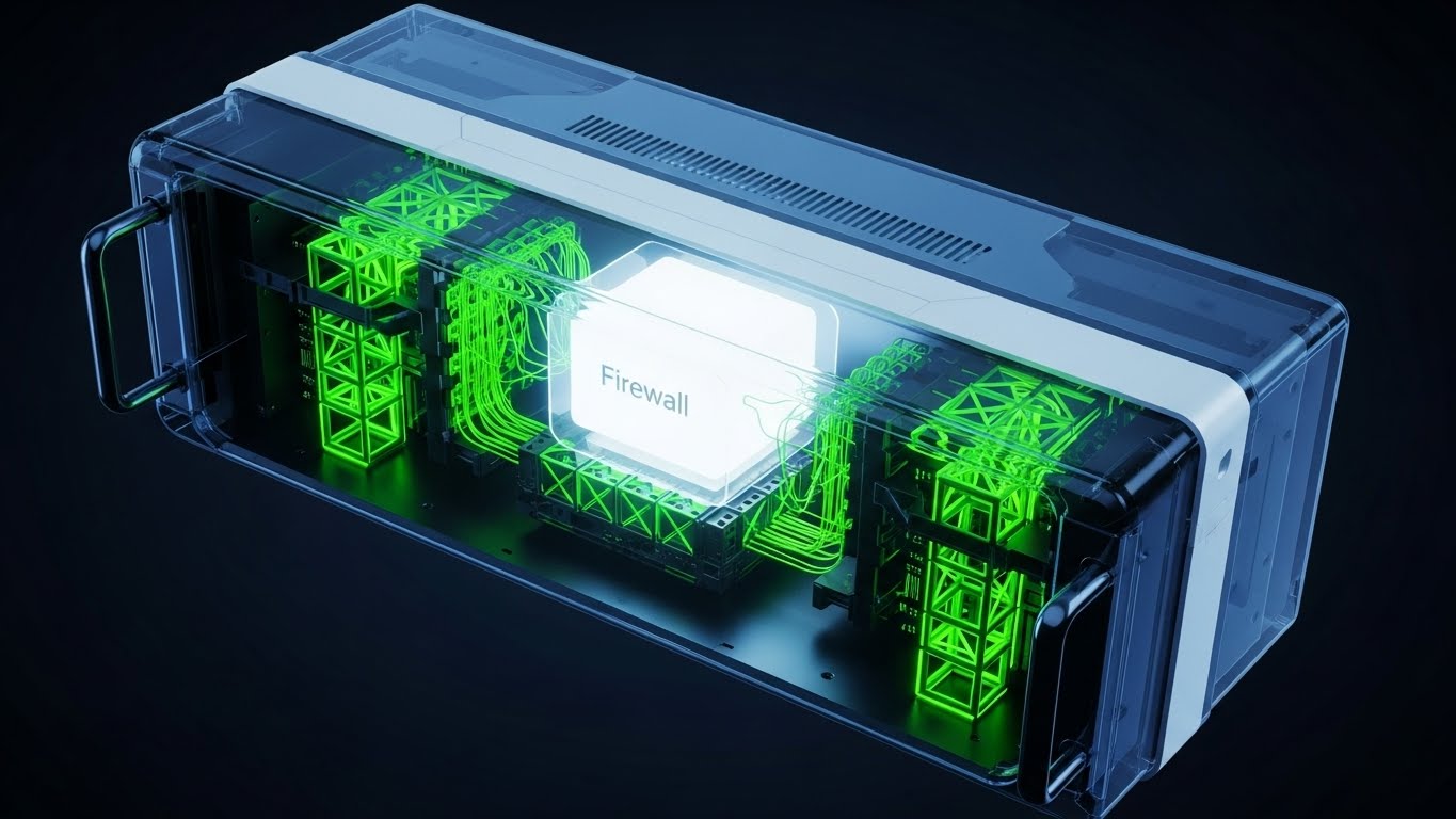
3. Abstract 3D AI Visualization
TOFU | Shaping Brand Perception

The Visual & Narrative Approach
Visualization Scenario: This style leverages the visual language of the "Neural Network" to depict AI-driven security. It features a complex, glowing network of translucent glass nodes and filaments connecting in a digital void. The "Cyan" and "Magenta" lighting within the nodes implies active data processing and intelligence. The camera uses a shallow depth of field, focusing on a central cluster of connections while the background fades into a soft, high-key bokeh.
Narration Tone: Sophisticated, futuristic, and intelligent.
Psychological Impact & KPI Focus
Niche Psychology: The modern CISO fears static security; they want "Continuous Monitoring" and "AI-driven" threat detection.
Operational Impact: This style visually translates the buzzwords "AI" and "Machine Learning" into a credible visual format. It suggests that the system is autonomous, working in the background (the "invisible" advantage). The premium, glass-like textures elevate the brand perception, signaling a high-tech, next-generation solution. Key KPIs include Brand Sentiment and Click-Through Rate (CTR).
Strategic Implementation & Trade-offs
Best Use Case: Social Ads (Instagram/LinkedIn), background loops for website hero sections.
Duration: Loopable (10-20 seconds).
Trade-offs: This is highly abstract. It creates a "feeling" of intelligence but doesn't show the user interface (UI). It must be paired with concrete screenshots or messaging to avoid looking like "vaporware."
Transition: From abstract intelligence, we move to architectural precision, appealing to the technical stakeholders who need to see the "blueprints" of security.
Companies using similar video content -
Palo Alto Networks – Prisma Cloud – AI-powered cloud native security.
CrowdStrike – Falcon Cloud Security – AI-driven cloud workload protection.
Zscaler – Cloud Security Platform – AI-powered zero trust exchange.
4. 2D Line Art Animation
TOFU | ABM Awareness
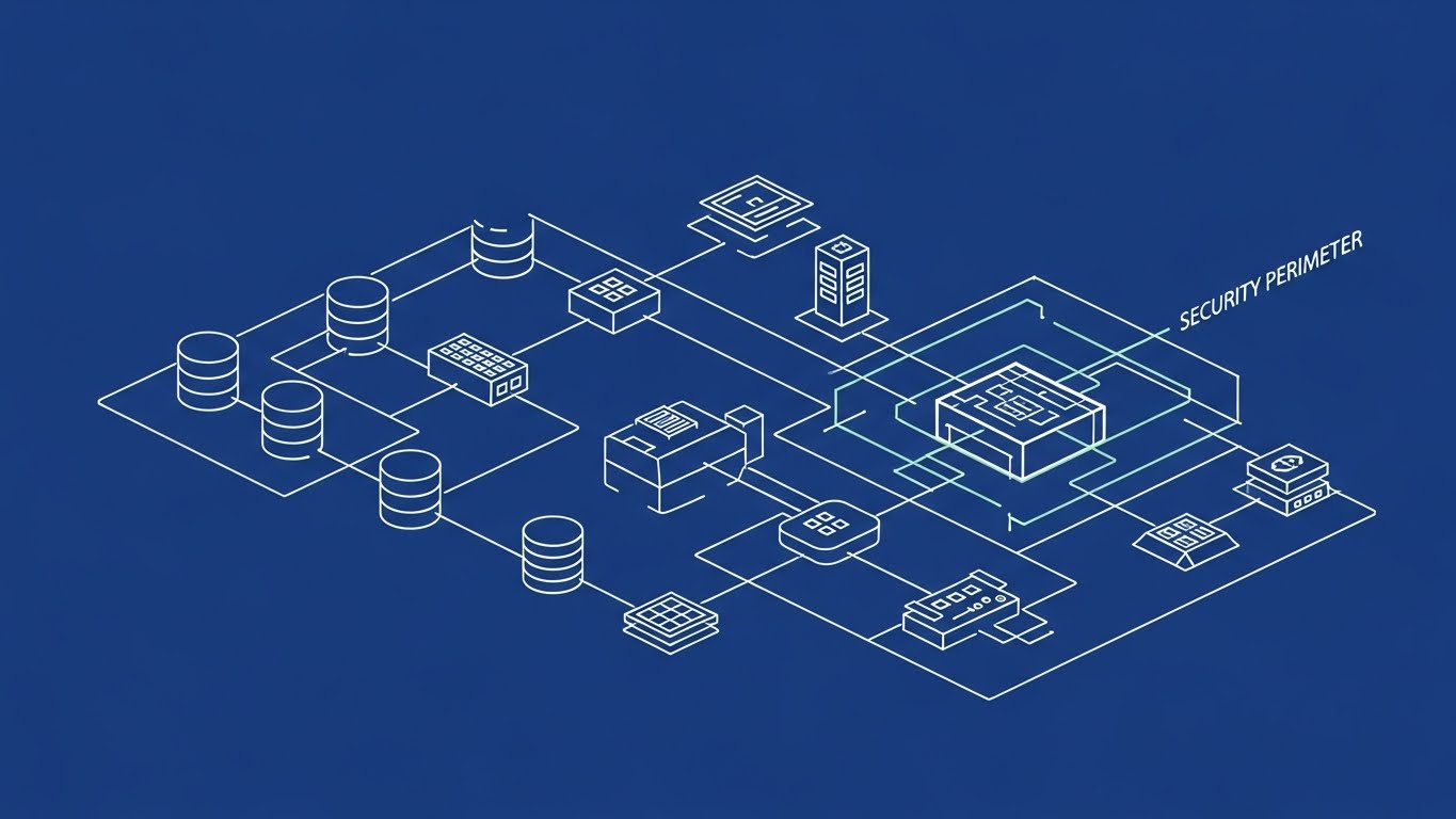
The Visual & Narrative Approach
Visualization Scenario: This style adopts the aesthetic of an "Architectural Blueprint," appealing to the engineer's love for structure and precision. It utilizes continuous, thin "Chalk White" lines on a "Royal Blue" background to draw an orthographic view of a cloud server architecture. The animation is deliberate—lines draw themselves to connect databases to firewalls. As the animation progresses, specific lines thicken to form a "Security Perimeter," effectively visualizing the concept of containment and boundary protection without text.
Narration Tone: Educational, calm, and expert.
Psychological Impact & KPI Focus
Niche Psychology: CTOs and System Architects value precision, logic, and "clean" code. They are skeptical of fluff.
Operational Impact: This style strips away marketing gloss to reveal the "bones" of the infrastructure. It builds trust by speaking the visual language of engineering diagrams (Visio, Lucidchart). It demonstrates that the vendor understands the structure of the cloud, not just the concept. This style is highly effective for Watch Time and Educational Value.
Strategic Implementation & Trade-offs
Best Use Case: "How it Works" videos, technical deep-dives, and documentation support.
Duration: Medium length (60-90 seconds).
Trade-offs: It can feel "dry" or academic to a non-technical CEO. It is excellent for the technical champion in the buying committee but less exciting for the financial buyer.
Transition: While blueprints appeal to the mind, we sometimes need to appeal to the senses by revealing the immense physical scale of the data being protected.
Companies using similar video content -
AWS Security Hub – Security Posture Management – Aggregates security findings.
Google Cloud Security Command Center – Security Management – Centralized security and risk management.
Microsoft Defender for Cloud – Cloud Security Posture Management – Strengthens cloud security posture.
5. Generative AI Cinematic Video
TOFU | YouTube

The Visual & Narrative Approach
Visualization Scenario: This style uses Generative AI to create a breathtaking, cinematic view of the physical reality behind the cloud. It features a low-angle shot inside a massive, futuristic data center hall. The racks of servers stretch infinitely upwards, illuminated by pulsing "Teal" and "Amber" status lights. The lighting is dramatic, with deep shadows against a sterile white environment. A smooth, simulated dolly zoom effect creates a sense of scale and awe.
Narration Tone: Epic, resonant, and inspiring.
Psychological Impact & KPI Focus
Niche Psychology: There is a subconscious disconnect between the "Cloud" (air/fluff) and "Data Security" (vaults/locks).
Operational Impact: This style bridges that gap by visualizing the cloud as a fortress. It triggers a feeling of sublimity—the awe of infinite scale—which confers a sense of power and robustness to the compliance platform. It suggests, "We protect this vastness." This is optimized for Viral Reach on vertical platforms like TikTok or Reels.
Strategic Implementation & Trade-offs
Best Use Case: Brand manifesto videos, event openers, and vertical social content.
Duration: Short (15-30 seconds).
Trade-offs: It is purely atmospheric. It conveys "Security" and "Scale" but communicates zero functional information. It sets the mood, not the method.
Transition: The scale of the cloud can be intimidating. To counter this, we can pivot to a style that simplifies and "gamifies" the infrastructure.
Companies using similar video content -
IBM Cloud – Enterprise Cloud Platform – Visualizes vast cloud infrastructure.
Oracle Cloud Infrastructure (OCI) – Enterprise Cloud Services – Showcases global data centers.
Dell Technologies – Cloud Solutions – Highlights large-scale hybrid cloud environments.
6. Low-Poly 3D Modeling
TOFU | Vertical Social Organic
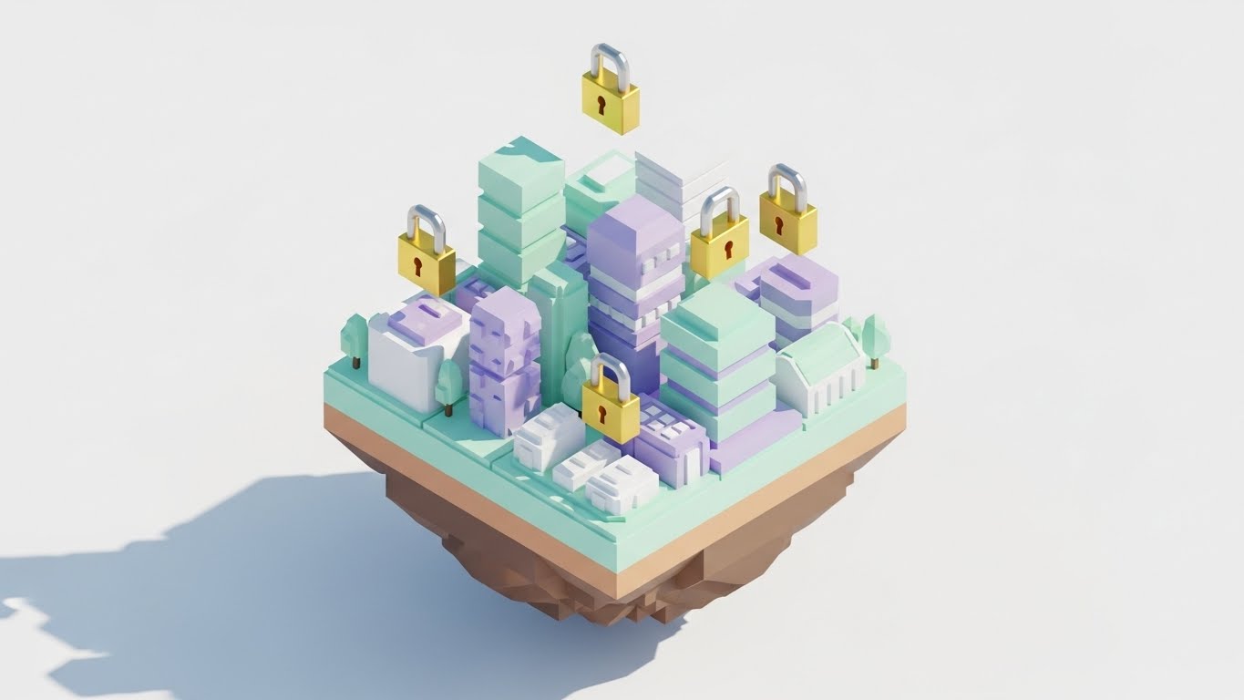
The Visual & Narrative Approach
Visualization Scenario: A charming Low-Poly 3D scene featuring a floating isometric island housing a stylized miniature data city. The palette is soft and approachable, using "Pastel Mint," "Soft Lavender," and White. The buildings are simple geometric shapes with faceted surfaces catching soft ambient light. Gold "Padlock" icons float gently above key buildings, bobbing up and down. The overall mood is friendly and simplified, making complex infrastructure look manageable.
Narration Tone: Approachable, friendly, and simple.
Psychological Impact & KPI Focus
Niche Psychology: Complexity fatigue is real. Compliance officers are often overwhelmed by the sheer scope of their duties.
Operational Impact: This style uses the "Cute" factor (Kindchenschema) to lower defenses and reduce anxiety. It frames compliance not as a terrifying battle, but as a manageable "city builder" game. It signals ease of use and a user-friendly interface. This effectively reduces Bounce Rate on landing pages.
Strategic Implementation & Trade-offs
Best Use Case: Pre-roll YouTube ads, onboarding videos, and "Ease of Use" feature highlights.
Duration: Short to Medium (30-60 seconds).
Trade-offs: It risks looking "unserious" to enterprise-level buyers (e.g., banking/defense) if not balanced with professional messaging. It is better for SMB/Mid-Market targeting.
Transition: For the audience that craves speed and performance over simplicity, we switch to a high-octane, developer-centric aesthetic.
Companies using similar video content -
LogicMonitor – Cloud Monitoring Platform – Simplifies complex IT infrastructure monitoring.
Datadog – Cloud Monitoring & Security – Visualizes cloud environments as a city.
Splunk – Cloud Security Platform – Gamifies security operations and data analysis.
7. Futuristic Neon/Dark Mode
TOFU | Skippable Pre-Roll Ad

The Visual & Narrative Approach
Visualization Scenario: A high-octane Futuristic Neon dark mode visualization of a data highway. The palette uses "Neon Purple" and "Laser Grid Pink" against a Pitch Black background. The composition is a one-point perspective rushing down an infinite tunnel of glowing lines. Data streams flow like high-speed traffic, organized into distinct lanes. The floor is reflective, mirroring the neon lights above.
Narration Tone: Fast-paced, high-energy, and technical.
Psychological Impact & KPI Focus
Niche Psychology: The "Gamer/Coder" demographic identifies with this aesthetic; it feels like the native environment of a command terminal or a sci-fi interface.
Operational Impact: It communicates "High Performance" and "Real-Time Latency." It suggests that the platform is fast enough to keep up with modern DevOps pipelines. It validates the self-image of the security pro as a "Cyber Guardian." This style is highly effective for CTV Ads and Trade Show Booths.
Strategic Implementation & Trade-offs
Best Use Case: High-energy product trailers, recruitment videos, and developer-focused marketing.
Duration: Short (15-30 seconds).
Trade-offs: It can be alienating to non-technical stakeholders (HR, Legal, Finance) who might find it too aggressive or "hacker-like." It appeals to the user, not necessarily the check-writer.
Transition: As we move further down the funnel, we leave the abstract and aggressive styles to focus on the smooth, frictionless integration of the platform.
Companies using similar video content -
Snyk – Developer Security Platform – Fast-paced security for developers.
Aqua Security – Cloud Native Security – High-speed container and cloud security.
Sysdig – Cloud Native Intelligence – Real-time cloud security and monitoring.
8. Abstract 2D Flat Vector Organic
TOFU | Connected TV

The Visual & Narrative Approach
Visualization Scenario: Moving into the Middle of the Funnel (MOFU), this style shifts from "awareness" to "concept." It features fluid, glossy shapes in "Glossy Emerald" and "Pearl White" that behave like liquid mercury or molten glass. The shapes morph, merge, and separate with seamless fluidity, eventually forming a perfect, unified circle. The background is a clean, off-white laboratory setting.
Narration Tone: Smooth, fluid, and premium.
Psychological Impact & KPI Focus
Niche Psychology: The desire for "Flow." Compliance work is often stop-start and friction-filled.
Operational Impact: This visualization promises a friction-free experience. The organic motion suggests that the software adapts to the user, rather than forcing the user to adapt to rigid structures. It conveys "Premium" and "Polished," positioning the tool as a modern SaaS platform. It supports Time on Site and Conversion.
Strategic Implementation & Trade-offs
Best Use Case: "Why Us" web pages, partner integration visualizations, and re-targeting ads.
Duration: Loopable or Short (15-45 seconds).
Trade-offs: Like other abstract styles, it relies on metaphor. It is powerful for "Category Creation" (defining a new way of working) but needs concrete text support to explain exactly what is being unified.
Transition: Finally, to differentiate the product in a crowded market, we need to show the specific, mechanical efficiency of the workflow.
Companies using similar video content -
HashiCorp – Terraform – Fluidly manages infrastructure as code.
ServiceNow – GRC – Seamlessly integrates risk and compliance.
Veritas – Information Governance – Manages data lifecycle and compliance.
9. Isometric 2D Motion Design
MOFU | Category Creation
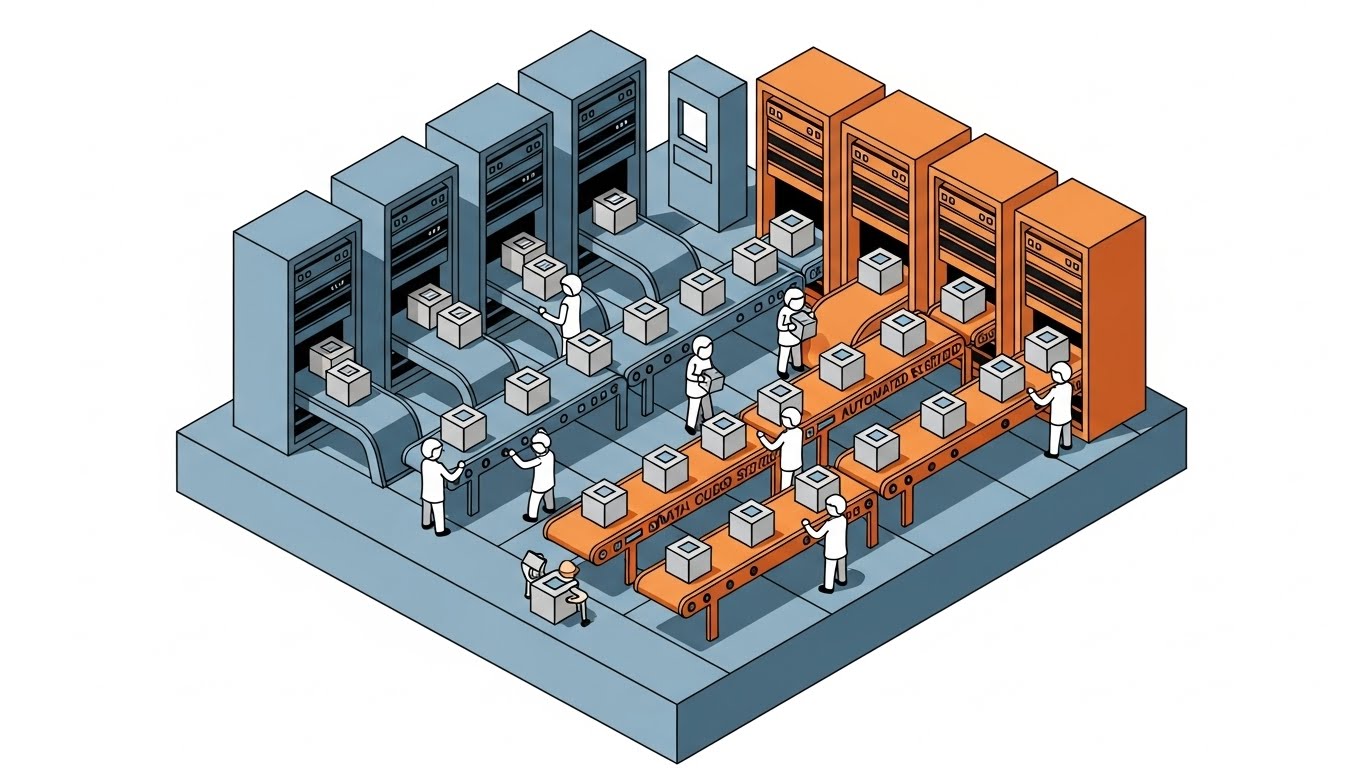
The Visual & Narrative Approach
Visualization Scenario: An isometric 2D vector illustration of a cloud compliance workflow. The palette features "Slate Blue," "Signal Orange," and "Soft Gray." The scene shows a cross-section of a server facility where tiny, abstract white figures are efficiently organizing "Data Cubes" onto conveyor belts. The Orange elements highlight the "Automated" sections, distinct from the Blue "Storage" sections. The composition is strictly aligned to the isometric grid.
Narration Tone: Process-oriented, efficient, and logical.
Psychological Impact & KPI Focus
Niche Psychology: The "Process Improver." Operations managers love to see how the sausage is made—provided the process looks efficient.
Operational Impact: This style demystifies the "Black Box" of compliance automation. By showing inputs (chaos) and outputs (compliance), it provides a visual proof of value. It answers the question, "What does this tool actually DO?" without showing boring dashboard screenshots. It drives Consideration and helps in Competitive Differentiation.
Strategic Implementation & Trade-offs
Best Use Case: Product demo intros, "Automation vs. Manual" comparison videos, and webinar visuals.
Duration: Medium (45-60 seconds).
Trade-offs: It requires careful planning to ensure the metaphor (conveyor belts) aligns with the actual technical process (API calls/evidence collection) so it doesn't feel like a false analogy.
Companies using similar video content -
AuditBoard – GRC Platform – Streamlines audit and compliance workflows.
Hyperproof – Compliance Operations Platform – Organizes compliance evidence and tasks.
Sprinto – Compliance Automation – Automates evidence collection and reporting.
11. Wireframe to Reality Transition
MOFU | Feature Education
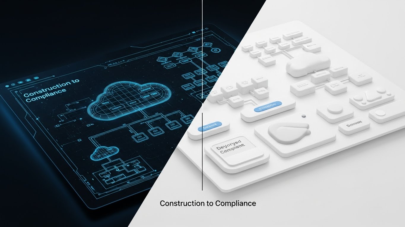
The Visual & Narrative Approach
Visualization Scenario: This style utilizes a powerful "Before and After" split-screen technique. The left side features a "Blueprint Blue" wireframe diagram of a cloud infrastructure—skeletal and theoretical. A vertical scanning line moves across the screen to the right, instantly transforming the wireframe into a solid, photorealistic "White" 3D render. This visualizes the transition from "Construction" (planning/diagrams) to "Compliance" (deployed, secure reality).
Narration Tone: Transformative, confident, and action-oriented.
Psychological Impact & KPI Focus
Niche Psychology: Many prospects are stuck in "Analysis Paralysis," trapped in endless architecture reviews. They fear the gap between the perfect diagram and the messy reality.
Operational Impact: This visual validates their planning work (the wireframe) while urgently pushing them toward execution (the render). It positions the software as the catalyst that turns static plans into secure, active infrastructure. It is a powerful tool for Competitive Displacement, implying that competitors offer only plans, while you offer reality.
Strategic Implementation & Trade-offs
Best Use Case: LinkedIn carousel ads, "Migration" campaign videos, and sales deck openers.
Duration: Short (10-20 seconds).
Trade-offs: It creates a binary comparison which can be risky if the viewer’s current reality is complex. It requires the "After" state to look significantly more premium than the "Before" state to be effective.
Transition: Once the infrastructure is deployed, the narrative must shift to the speed and efficiency of managing it day-to-day.
Companies using similar video content -
Tenable – Tenable.io – Transforms vulnerability data into actionable security.
Qualys – Cloud Platform – Bridges vulnerability assessment to remediation.
Rapid7 – InsightVM – Moves from vulnerability detection to real-world security.
12. Rapid UI Feature Montage
MOFU | Competitive Displacement
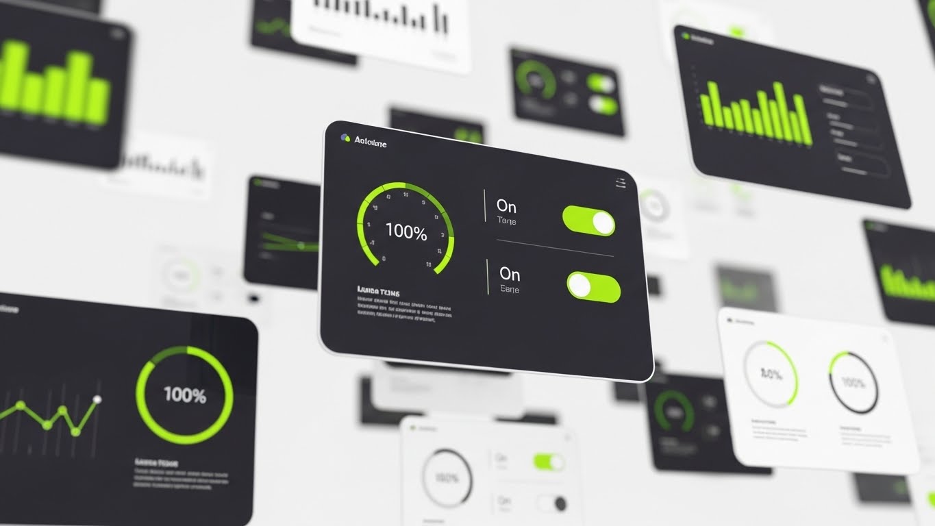
The Visual & Narrative Approach
Visualization Scenario: A high-energy montage designed to overwhelm the viewer with value. Abstracted UI screens fly past the camera in a 3D space, utilizing a palette of "Bright Lime," "Dark Charcoal," and White. Motion blur emphasizes velocity. The camera locks onto central widgets showing positive states—gauges hitting "100%," toggles flipping to "On," and green trend lines spiking. The background is a kinetic white blur, ensuring the data pops.
Narration Tone: Fast, energetic, and exciting.
Psychological Impact & KPI Focus
Niche Psychology: The "Feature Hunter." In the evaluation phase, buyers often want to see the breadth of capabilities quickly. They are afraid of buying a "one-trick pony."
Operational Impact: This style creates an impression of comprehensiveness and speed. It suggests that the platform is robust enough to handle any use case and fast enough to not slow down the team. It triggers a "Fear of Missing Out" (FOMO) regarding features, directly driving Demo Requests by promising a rich, feature-laden environment.
Strategic Implementation & Trade-offs
Best Use Case: Email marketing GIFs, event hype reels, and mid-roll video ads.
Duration: Fast-paced (15-30 seconds).
Trade-offs: It moves too fast for educational retention. It creates an impression of value but doesn't teach the user how to use the tool. It is a hype tool, not a teaching tool.
Transition: While speed is exciting for the user, the executive buyer requires a sense of stability, control, and professional calm.
Companies using similar video content -
Zscaler – ZIA/ZPA – Rapidly showcases various security features.
Netskope – Security Cloud – Demonstrates quick policy enforcement and data protection.
Forcepoint – ONE Platform – Highlights integrated security capabilities at high speed.
13. Photorealistic 3D Renders
MOFU | Driving Demo Requests

The Visual & Narrative Approach
Visualization Scenario: This style strips away the abstract sci-fi elements to ground the product in a high-end corporate reality. It features a photorealistic render of a modern executive office during "Golden Hour," with warm sunlight flooding across a wooden desk. A tablet stands prominently, displaying a simple, assured "Secure" shield icon. The city skyline is blurred in the background. The aesthetic is quiet, premium, and expensive.
Narration Tone: Calm, assured, and premium.
Psychological Impact & KPI Focus
Niche Psychology: The C-Suite values stability above all else. They want to feel that their governance is under control so they can focus on business growth.
Operational Impact: This visual serves as a "Trust Signal." It associates the software not with a dark server room, but with the corner office. It subtly suggests that this tool is a strategic asset for leadership, not just a utility for IT. It performs exceptionally well on LinkedIn, where the professional aesthetic matches the platform's context.
Strategic Implementation & Trade-offs
Best Use Case: Organic social posts, executive summary slides, and account-based marketing (ABM) headers.
Duration: Static Image or subtle cinemagraph (infinite loop).
Trade-offs: It offers zero functional information. It is purely brand positioning. If used too early, it can feel like generic stock photography; it requires a strong brand overlay to own the image.
Transition: Now that we have established executive trust, we must satisfy the functional buyer who needs to see the actual interface in a clear, distraction-free environment.
Companies using similar video content -
RSA Archer – GRC Platform – Positions GRC as a strategic executive tool.
MetricStream – GRC Platform – Conveys enterprise-grade governance and risk management.
LogicManager – Enterprise Risk Management – Evokes executive confidence in risk oversight.
14. Clean UI Workflow (Light Mode)
MOFU | LinkedIn Organic
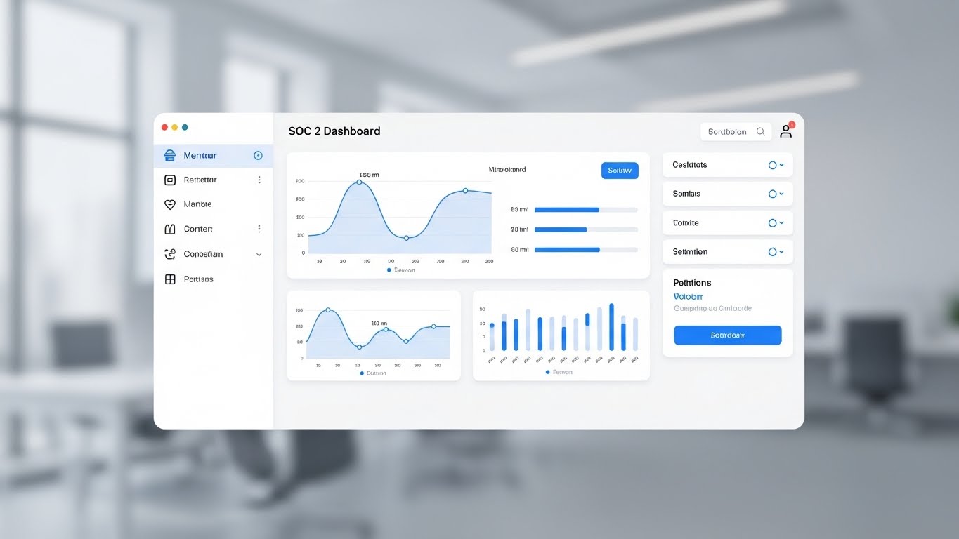
The Visual & Narrative Approach
Visualization Scenario: A pristine, Light Mode UI showcase designed for absolute clarity. The interface floats on a blurred, high-key office background. The palette uses "Sky Blue," "White," and "Light Gray" to create a sense of airiness. The specific screen displayed is a "SOC 2 Dashboard" featuring clean line graphs and clear progress bars. The view is symmetrical and balanced, stripping away all "marketing fluff" to show the tool as it truly is—clean and organized.
Narration Tone: Helpful, clear, and instructive.
Psychological Impact & KPI Focus
Niche Psychology: The Functional Buyer (Compliance Manager) fears clunky, legacy software with steep learning curves. They crave a Modern SaaS experience.
Operational Impact: This style reduces the Perceived Effort of adoption. It visually promises that the tool is intuitive and "Apple-like" in its usability. By showing a familiar, clean interface, it lowers the barrier to entry and is critical for Sales Deck Conversion, proving the product is ready for immediate deployment.
Strategic Implementation & Trade-offs
Best Use Case: Product walkthroughs, documentation, and main pricing page visuals.
Duration: Medium (30-60 seconds).
Trade-offs: Light mode can sometimes feel less "Enterprise-grade" or "Cyber-tough" than dark mode. It appeals more to the administrative user than the hardcore security engineer.
Transition: Conversely, the security engineers and threat hunters often prefer an environment that feels native to their command-line world.
Companies using similar video content -
Drata – Compliance Automation Platform – Clean, intuitive compliance dashboards.
Vanta – Compliance Automation – User-friendly interface for compliance management.
Mimecast – Email Security & Compliance – Provides clear compliance dashboards.
15. Dark Mode UI Showcase
MOFU | The Functional Buyer
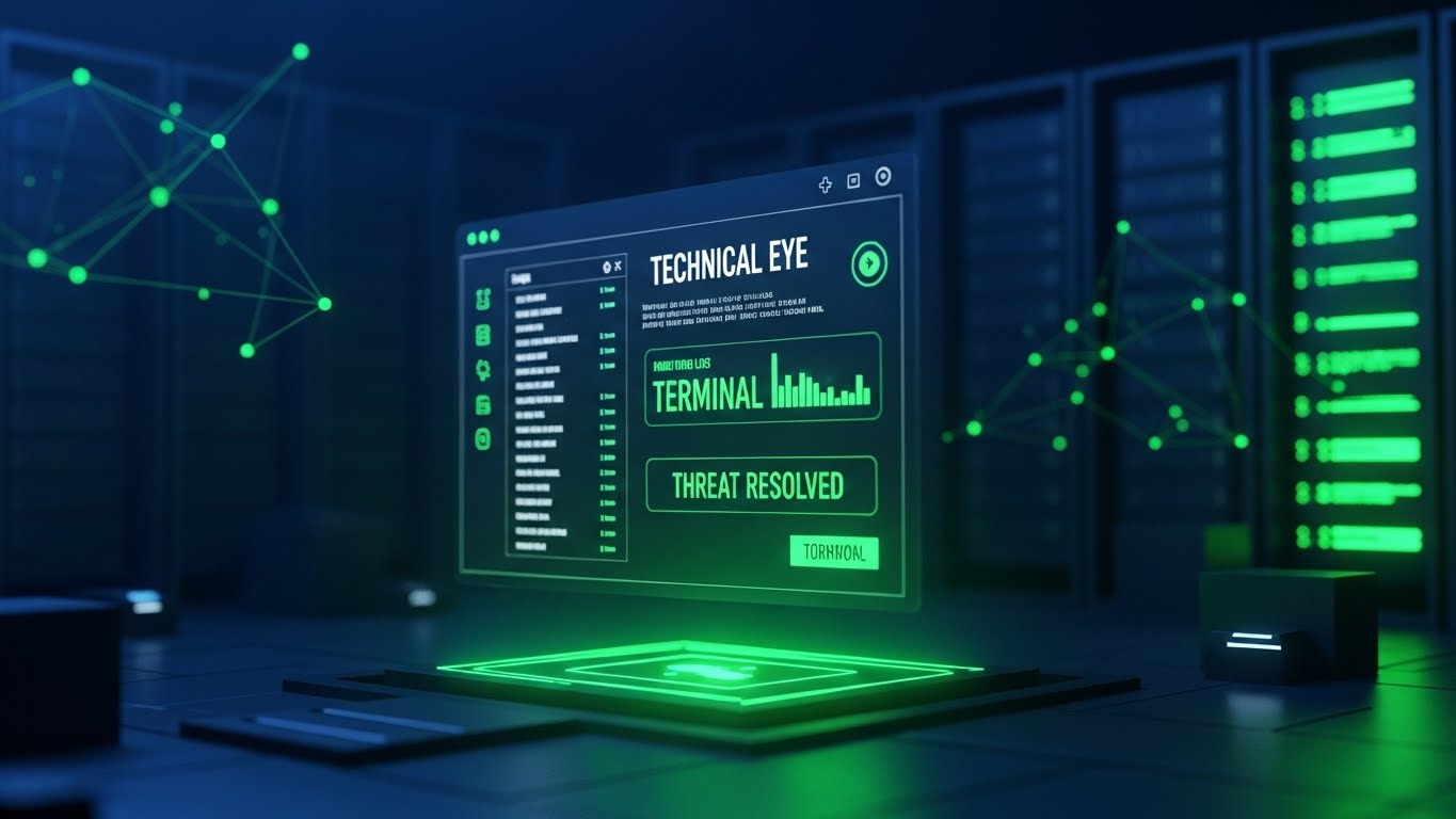
The Visual & Narrative Approach
Visualization Scenario: A sophisticated Dark Mode presentation tailored for the technical eye. The background is a dark, abstract server environment ("Midnight Blue"). The floating UI screen glows with "Terminal Green" accents, displaying scrolling logs, command-line inputs, and a definitive "Threat Resolved" notification. The contrast is high, making the data pop against the void.
Narration Tone: Serious, vigilant, and powerful.
Psychological Impact & KPI Focus
Niche Psychology: The Technical Buyer (SecOps) equates "Dark Mode" with "Pro Mode." Bright white screens cause eye strain during long shifts; dark interfaces signal a tool built for professionals.
Operational Impact: This style validates the user's identity as a specialized operator. It communicates Power and Depth, suggesting the tool allows for deep-dive investigations and isn't just a surface-level reporting dashboard. It effectively increases Time on Page for technical documentation and feature deep-dives.
Strategic Implementation & Trade-offs
Best Use Case: Developer docs, "Security" feature pages, and technical webinars.
Duration: Medium (30-60 seconds).
Trade-offs: It can look intimidating to non-technical stakeholders (e.g., Legal or HR) who may find the "Matrix-like" aesthetic too complex or aggressive.
Transition: As we approach the Bottom of the Funnel (BOFU), we need to humanize the technology and provide a voice of authority to close the deal.
Companies using similar video content -
CrowdStrike – Falcon Platform – Dark mode UI for security analysts.
SentinelOne – Singularity Platform – Technical interface for endpoint and cloud security.
Elastic – Security SIEM – Dark mode for security operations and threat hunting.
16. Generative AI Realistic Character Video
MOFU | The Technical Buyer

The Visual & Narrative Approach
Visualization Scenario: A high-fidelity, photorealistic video of a CISO persona speaking directly to the camera. She stands in a modern, open-plan tech office with a "Cinema Blue" bokeh background. Her attire is smart-casual, and her lighting is professional "Rembrandt" style. She gestures confidently, explaining a complex compliance nuance. This is not a cartoon; it is a hyper-realistic AI avatar designed to act as a relatable peer.
Narration Tone: Empathetic, expert, and conversational.
Psychological Impact & KPI Focus
Niche Psychology: People buy from people. In the final stages of the decision, buyers look for reassurance and thought leadership, not just software features.
Operational Impact: This style builds Trust and Authority. It puts a face to the brand, making the advice feel personal and expert-driven. It is highly effective for explaining "The Why" behind compliance strategies, increasing Brand Affinity and establishing the vendor as a consultative partner rather than just a software supplier.
Strategic Implementation & Trade-offs
Best Use Case: "Academy" educational videos, welcome sequences, and YouTube thought leadership.
Duration: Long form (1-3 minutes).
Trade-offs: The "Uncanny Valley" risk is real. The AI generation must be of the highest quality; otherwise, it becomes distracting. It requires excellent scriptwriting to sound natural.
Transition: Trust is established, but the final barrier is often the perceived cost and effort of implementation. We must visualize the financial efficiency of the solution.
Companies using similar video content -
Securiti.ai – Data Command Center – AI-driven data governance with expert persona.
BigID – Data Security & Privacy – Thought leadership on data intelligence.
SailPoint – Identity Governance – Expert insights on identity security.
17. Dynamic Data Visualization
BOFU | Thought Leadership

The Visual & Narrative Approach
Visualization Scenario: This style utilizes abstract data visualization to represent the ease of data ingestion. Streams of particles in "Data Stream Green" and "Translucent White" flow like a river into a central, organized hub. The background is a clean, bright White. The particles move in smooth, Bezier curves, representing data logs being ingested and normalized. The central hub pulses gently, symbolizing the platform's capacity to handle volume without choking.
Narration Tone: Fluid, rhythmic, and continuous.
Psychological Impact & KPI Focus
Niche Psychology: The "Implementation Dip" is a major fear—the idea that new software will slow things down before helping.
Operational Impact: This visual argues the opposite. By visualizing data flow as smooth and frictionless, it reframes implementation from a "Cost Center" to a "Value Driver." It speaks the language of the CIO, focusing on Time-to-Value and Throughput. It is designed to overcome final objections regarding resource allocation.
Strategic Implementation & Trade-offs
Best Use Case: ROI calculators, proposal decks, and "Business Case" justification slides.
Duration: Short Loop (10-20 seconds).
Trade-offs: As a pure data abstraction, it lacks human connection. It appeals to the logical brain but may bore the emotional buyer. It works best as a supporting visual for financial arguments.
Transition: To further cement this trust for global enterprises, we must show that the platform’s scope is truly worldwide and future-proof.
Companies using similar video content -
Rubrik – Data Security & Compliance – Visualizes data flow and protection.
Cohesity – Data Management & Security – Shows efficient data ingestion and management.
Global Relay – Compliance Archiving – Visualizes archived data for compliance.
18. Holographic UI over 3D Render
BOFU | Reducing Implementation

The Visual & Narrative Approach
Visualization Scenario: A fusion of reality and sci-fi, this style features a realistic white boardroom table where a futuristic "Holographic UI" is projected into the air. The hologram, rendered in "Holographic Blue," displays a spinning globe with "Compliance Node" connections lighting up across continents. Scan lines and glow edges give it a cutting-edge feel. This visualizes the concept of global governance and total oversight from the boardroom.
Narration Tone: Visionary, global, and secure.
Psychological Impact & KPI Focus
Niche Psychology: Enterprise leaders fear "Blind Spots" in their global operations. They need to feel they have a "God's Eye View" of their compliance posture.
Operational Impact: This visual satisfies the desire for Omniscience. It positions the platform as a command center for global operations. It creates a sense of Future-Readiness, implying the technology is ahead of the curve. This is powerful for Case Studies involving multinational corporations.
Strategic Implementation & Trade-offs
Best Use Case: Enterprise case studies, keynote presentation openers, and "Global Reach" web pages.
Duration: Static or Cinemagraph.
Trade-offs: It is highly stylized and not a representation of the actual UI. It sells the concept of control, not the tool itself. It must be clearly framed as a visualization of capability.
Transition: Finally, to close the deal, nothing is more effective than a stark, undeniable comparison of the "Old Way" versus the "New Way."
Companies using similar video content -
Palo Alto Networks – Cortex XSOAR – Visualizes global security orchestration.
Check Point – CloudGuard – Holographic view of multi-cloud security posture.
Fortinet – FortiCloud – Global network and security oversight.
19. Split Screen: Optimized Reality and UI
BOFU | Building Trust & Credibility
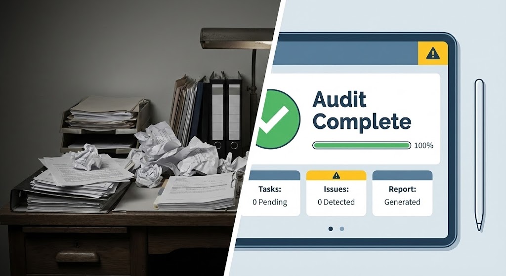
The Visual & Narrative Approach
Visualization Scenario: The ultimate "Proof" visual. A sharp white line divides the screen. The left side ("The Old Way") is a desaturated, slightly chaotic photo of a desk covered in messy paper stacks and sticky notes—symbolizing manual audits. The right side ("The New Way") is a clean, vibrant vector UI in "Steel Blue" and "Warning Yellow" showing an automated "Audit Complete" dashboard. The lighting on the right is brighter and more inviting.
Narration Tone: Decisive, contrasting, and validating.
Psychological Impact & KPI Focus
Niche Psychology: We are wired to seek order from chaos. The visual contrast triggers an immediate preference for the clean, organized solution.
Operational Impact: This style provides instant ROI Justification. It visually quantifies the "Cost of Inaction" (the mess) against the "Value of Automation" (the UI). It removes ambiguity, forcing the viewer to choose between stress and ease. It is the most effective style for Closing Decks and final decision meetings.
Strategic Implementation & Trade-offs
Best Use Case: "Before/After" slides, sales closing decks, and competitor comparison pages.
Duration: Static Image.
Trade-offs: It can feel slightly "salesy" or reductive if not executed with high quality. The "Before" state must be realistic enough to be recognized, not a caricature.
Companies using similar video content -
Drata – Compliance Automation Platform – Contrasts manual vs. automated compliance.
Vanta – Compliance Automation – Shows the transformation from chaos to order.
Hyperproof – Compliance Operations Platform – Highlights efficiency gains over manual processes.
21. Minimalist Flat 2D Vector
BOFU | Overcoming Objections

The Visual & Narrative Approach
Visualization Scenario: Addressing the specific objection of "complexity," this style utilizes a minimalist flat 2D vector aesthetic. The palette is restricted to "Muted Teal" and "Paper White," emphasizing cleanliness. The central element is a simple clipboard where standard checkmarks act as the primary motion element. As the animation plays, these checkmarks morph smoothly into small "Shields." The composition is perfectly symmetrical and uses negative space to let the geometry breathe, devoid of gradients or shadows.
Narration Tone: Direct, honest, and clarifying.
Psychological Impact & KPI Focus
Niche Psychology: Late-stage prospects often hesitate because they fear the solution will be "Bloatware"—too complex for their team to manage.
Operational Impact: This visual counters that objection by stripping away noise. It utilizes the "Less is More" heuristic, visually proving that the platform turns a complex burden (checking boxes) into a secure asset (shields) with zero friction. It is highly effective for FAQ Pages and objection-handling sequences, directly improving Conversion Rates from "Interested" to "Closed."
Strategic Implementation & Trade-offs
Best Use Case: FAQ video responses, "Ease of Setup" guides, and objection handling emails.
Duration: Short (10-15 seconds).
Trade-offs: The extreme simplicity can backfire if used to represent advanced, enterprise-grade features. It implies "Easy," not "Powerful," so it must be used to handle objections, not to sell the core engine.
Transition: While simplicity wins the argument on usability, the Risk Officer still needs to see that the system can detect deep, hidden vulnerabilities.
Companies using similar video content -
Sprinto – Compliance Automation – Simplifies compliance checklists.
Scytale – Compliance Automation – Minimalist approach to audit readiness.
A-LIGN – Compliance Services – Streamlines audit processes with clear steps.
22. 3D X-Ray Visualization
BOFU | Risk Mitigation
The Visual & Narrative Approach
Visualization Scenario: To visualize the concept of "Deep Observability," this style uses a 3D X-Ray effect. A server rack is rendered with a "Translucent Glass" outer casing, revealing the internal components glowing in "X-Ray Blue" and "Skeleton White." Deep within the hardware, a solid, bright "Core" pulses, representing the secured data. The background is a clinical, sterile clean-room environment. The camera pans slowly, emphasizing that nothing is hidden from the platform’s view.
Narration Tone: Clinical, transparent, and thorough.
Psychological Impact & KPI Focus
Niche Psychology: The "Fear of the Unknown" drives the Risk Officer. They are terrified of vulnerabilities lurking deep within the stack that standard tools miss.
Operational Impact: This style functions as a visual metaphor for Total Transparency. It reassures the buyer that the software sees through the layers, detecting risks at the kernel or hardware level. It is a powerful asset for Whitepapers and technical appendices, driving Trust Scores among security architects.
Strategic Implementation & Trade-offs
Best Use Case: Technical whitepapers, security architecture deep-dives, and "Zero Trust" feature explanations.
Duration: Medium Loop (15-30 seconds).
Trade-offs: It is a cold, clinical aesthetic. It speaks to the machine, not the human. It establishes technical competence but does not build emotional warmth.
Transition: Having satisfied the technical need for transparency, we must address the human element: the team that has to use this software every day.
Companies using similar video content -
Aqua Security – Cloud Native Security – Deep visibility into containers and serverless.
Sysdig – Cloud Native Intelligence – X-ray view of cloud workloads.
Trend Micro – Cloud One – Deep security for hybrid cloud environments.
23. 2D Character-Driven Story
BOFU | Objection Handling

The Visual & Narrative Approach
Visualization Scenario: This style pivots to the human experience of compliance. It features a stylized 2D character illustration using flat color blocks in "Vibrant Orange" and "Purple." A diverse team member is shown high-fiving a floating, abstract "Report" icon. The characters have elegant, exaggerated proportions, avoiding a childish look. The background is a minimal white office suggestion. The motion is bouncy and celebratory, framing "Reporting"—usually a chore—as a moment of team success.
Narration Tone: Celebratory, human, and relieving.
Psychological Impact & KPI Focus
Niche Psychology: Compliance is often viewed as a "Thankless Task" by the staff who have to do the work. The buyer fears their team will hate the new tool.
Operational Impact: This visual handles the "Cultural Objection." It markets the experience of the user, showing that the software makes work easier and even enjoyable. It suggests the tool empowers the team rather than policing them. This is critical for Retargeting Ads aimed at end-users, influencing the Net Promoter Score (NPS) potential.
Strategic Implementation & Trade-offs
Best Use Case: "Day in the Life" videos, user testimonials, and retargeting sequences.
Duration: Short (15-30 seconds).
Trade-offs: If the style is too cartoonish, it trivializes the serious nature of compliance. It must strike a balance between "Friendly" and "Professional" to avoid alienating the C-Suite.
Transition: To lock in the budget, we must pivot from the end-user's joy to the CFO's bottom line.
Companies using similar video content -
Drata – Compliance Automation Platform – Celebrates audit success.
Vanta – Compliance Automation – Shows team achieving compliance goals.
Secureframe – Compliance Automation – Highlights positive team outcomes from compliance.
24. Lifestyle Stock with UI Overlay
BOFU | The Economic Buyer

The Visual & Narrative Approach
Visualization Scenario: Targeted at the Economic Buyer (CFO), this style blends high-quality lifestyle photography with sleek vector graphics. It features a CFO figure standing at a window overlooking a city skyline—a classic trope of vision and leadership. Floating in the air before them is a clean UI graph rendered in "Translucent White" with "Gold" accents, showing "Efficiency" trending up and "Risk" trending down. The visual connects the human decision-maker with the data-driven result.
Narration Tone: Visionary, prudent, and strategic.
Psychological Impact & KPI Focus
Niche Psychology: The CFO does not care about API calls; they care about Risk-Adjusted Return. They view security as an insurance policy.
Operational Impact: This visual speaks the language of Value. It frames the software as a strategic lens that allows leadership to see the future of their business clearly. It validates the purchase as a business enabler, not a cost center. This is the "Gold Standard" for LinkedIn Ads targeting finance executives.
Strategic Implementation & Trade-offs
Best Use Case: LinkedIn sponsored content, CFO-focused landing pages, and pitch deck "Financial Impact" slides.
Duration: Static Image or subtle motion (UI animating).
Trade-offs: It is a high-level metaphor. It explains why to buy, but not what you are buying. It relies heavily on the quality of the stock photography to avoid looking generic.
Transition: The deal is signed. Now, the critical phase begins: Onboarding. We must visually demonstrate that getting started is effortless.
Companies using similar video content -
OneTrust – GRC & Privacy Platform – Connects privacy and security to business strategy.
ServiceNow – GRC – Strategic view of risk and compliance for executives.
MetricStream – GRC Platform – Visualizes financial impact of governance.
25. 3D Parallax UI Presentation
Onboard | Self-Serve Onboarding
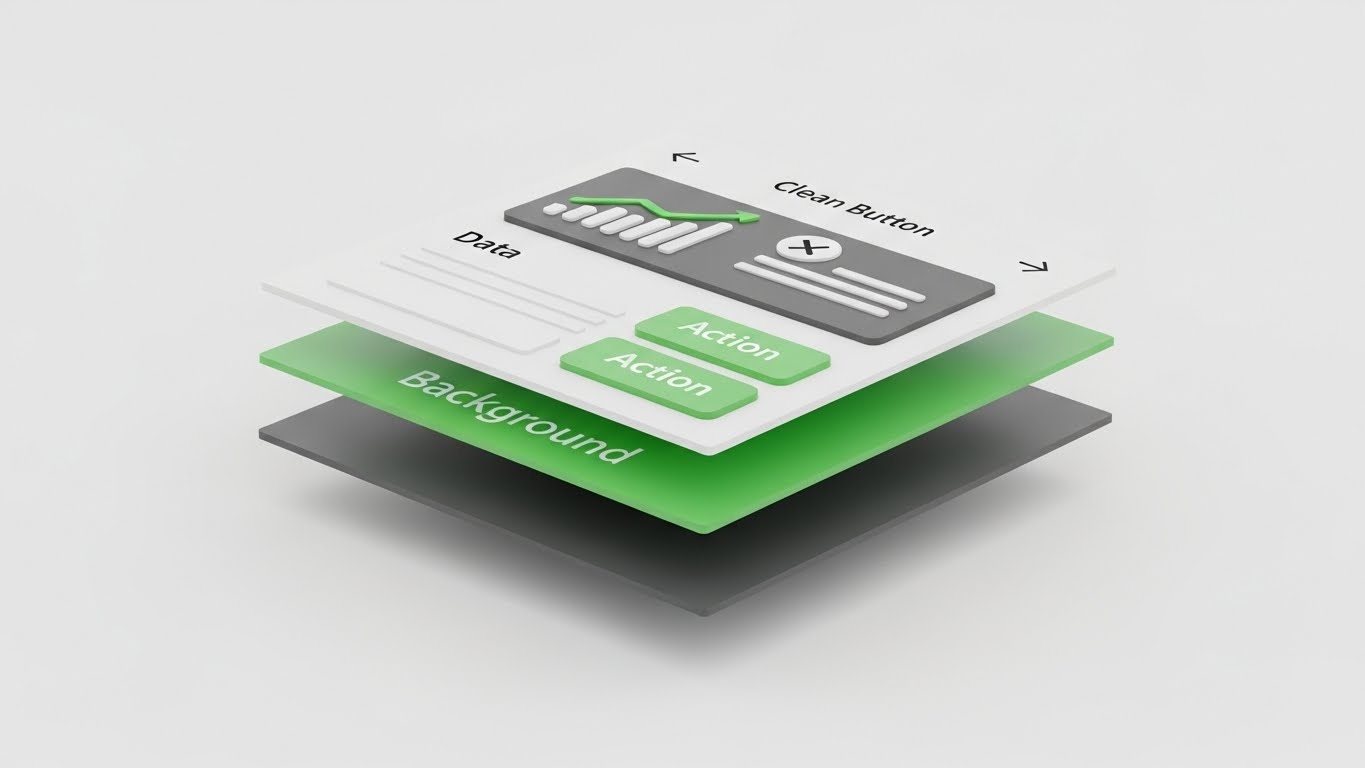
The Visual & Narrative Approach
Visualization Scenario: During onboarding, users need to understand the platform's architecture quickly. This style uses a 3D Parallax effect where the UI screen is "exploded" into separate layers in Z-space. The "Background" layer, "Data Layer," and "Action Buttons" (in "Action Green") float at different depths. As the camera tilts, the parallax movement reveals the hierarchy and logic of the interface. The background is a clean white, ensuring the UI focus is absolute.
Narration Tone: Educational, spatial, and logical.
Psychological Impact & KPI Focus
Niche Psychology: New users often feel "Dashboard Fatigue"—overwhelmed by flat, dense screens.
Operational Impact: By adding depth, this visual helps the brain categorize information. It teaches the user the mental model of the software (e.g., "Settings are behind Data"). It makes the learning curve feel like a physical exploration, significantly improving Time-to-Competency and adoption of self-serve features.
Strategic Implementation & Trade-offs
Best Use Case: In-App welcome sequences, "Tour of the Platform" videos, and feature release notes.
Duration: Medium (30-45 seconds).
Trade-offs: It requires high-fidelity assets. If the UI changes, the video is instantly outdated and hard to edit. It is an investment in "Evergreen" onboarding content.
Transition: Users understand the layout. Now they need to feel the speed of value delivery.
Companies using similar video content -
Datadog – Cloud Monitoring & Security – Exploded view of monitoring dashboards.
LogicMonitor – Cloud Monitoring Platform – Reveals layers of infrastructure data.
Splunk – Cloud Security Platform – Shows depth of security analytics UI.
26. Hyper-lapse Stock Footage with Data
Onboard | Accelerating Time-to-Value
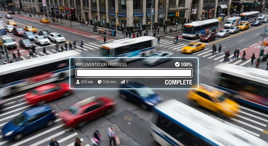
The Visual & Narrative Approach
Visualization Scenario: This style contrasts the chaos of the world with the stability of the platform. It uses hyper-lapse footage of a busy city intersection where cars and people are blurred streaks of motion. Superimposed in the center is a sharp, static, "Bright White" UI progress bar hitting "100% Complete." The visual message is clear: while the world rushes by, your compliance implementation is stable, fast, and finished.
Narration Tone: Efficient, rapid, and constant.
Psychological Impact & KPI Focus
Niche Psychology: "Shelfware" is the enemy. Stakeholders fear that software will sit unimplemented for months.
Operational Impact: This visual provides a dopamine hit of Completion. It visualizes the concept of "Fast Time-to-Value." It reassures the client that the chaos of their environment won't stop the deployment. It is highly effective in Onboarding Emails to encourage users to complete their setup tasks.
Strategic Implementation & Trade-offs
Best Use Case: "Setup Complete" emails, implementation timeline videos, and quarterly business reviews (QBRs).
Duration: Short Loop (6-10 seconds).
Trade-offs: It is a mood piece. It doesn't teach how to implement, it just celebrates the speed of implementation. It is a motivation tool, not an instruction tool.
Transition: Once implemented, the long-term relationship depends on how easily users can resolve their own small issues.
Companies using similar video content -
Drata – Compliance Automation Platform – Fast implementation of compliance.
Vanta – Compliance Automation – Quick setup and continuous monitoring.
Secureframe – Compliance Automation – Rapid path to compliance certification.
27. Macro UI Micro-Interactions
Retention | Knowledge Base
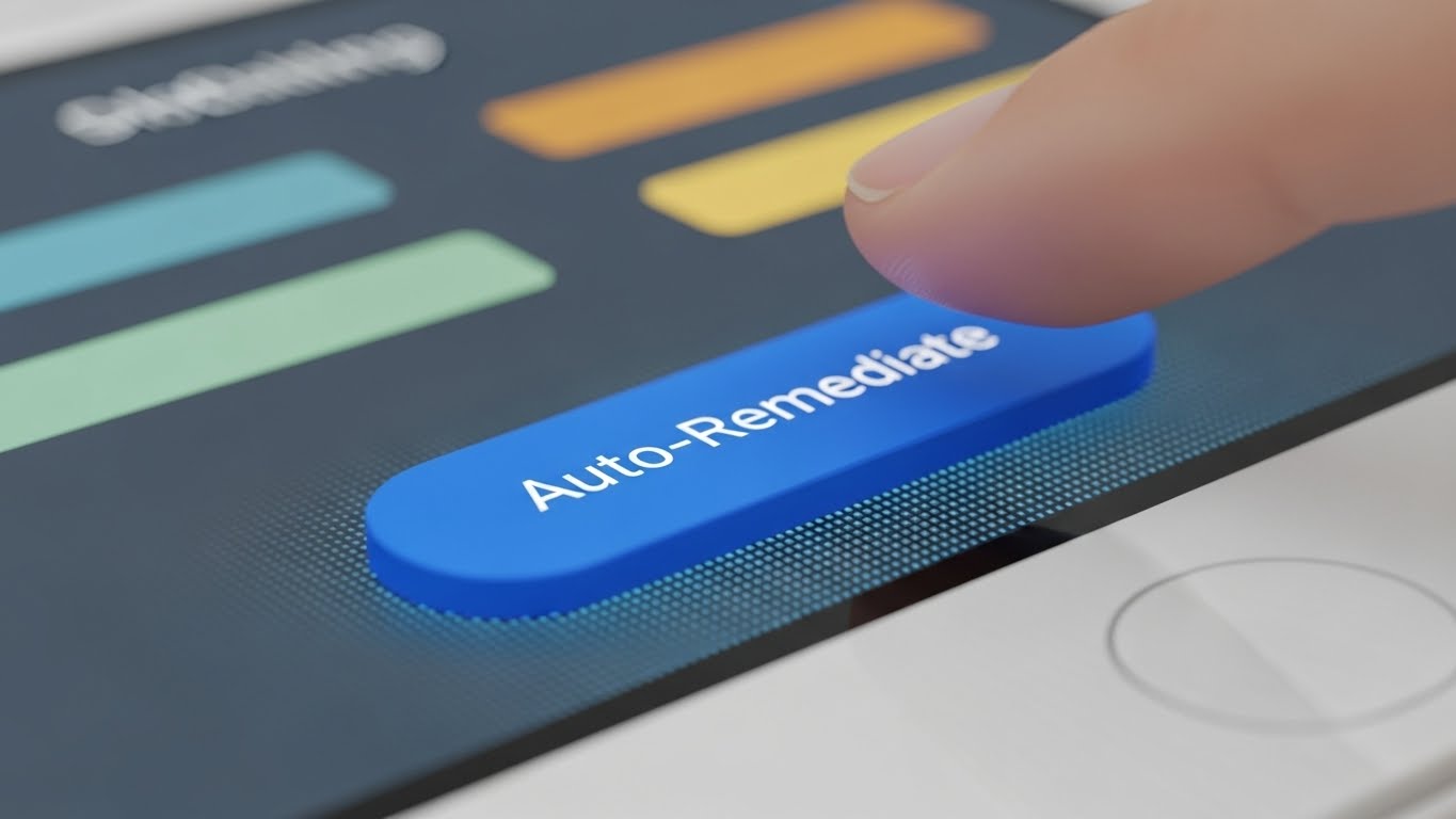
The Visual & Narrative Approach
Visualization Scenario: A hyper-focused, Macro POV shot of a specific UI interaction. The camera focuses on a single "Electric Blue" pill-shaped button reading "Auto-Remediate." You can see the sub-pixel texture of the screen. A blurred finger enters the frame, hovering just before the press. The lighting highlights the tactile "readiness" of the action. It makes the digital action feel physical and consequential.
Narration Tone: Intimate, focused, and precise.
Psychological Impact & KPI Focus
Niche Psychology: Uncertainty leads to support tickets. Users hesitate to click "Remediate" because they aren't sure if it's the right move.
Operational Impact: This style builds Micro-Confidence. By showing the action in extreme detail, it removes ambiguity. It says, "This is exactly what you are looking for, and this is exactly what happens." It is the most effective style for Knowledge Base articles, directly reducing Support Ticket Volume.
Strategic Implementation & Trade-offs
Best Use Case: Help Center articles, tooltips, and "New Feature" spotlight GIFs.
Duration: Very Short (3-5 seconds).
Trade-offs: It is hyper-specific. You cannot use this for broad overviews. It is strictly for tactical instruction on specific features.
Transition: Individual features are great, but retention comes from the user feeling like they are building something of lasting value.
Companies using similar video content -
Drata – Compliance Automation Platform – Focus on specific automation actions.
Vanta – Compliance Automation – Highlights key user interactions for compliance.
Secureframe – Compliance Automation – Demonstrates precise control over compliance tasks.
28. 2D Animation & UI Composition
Retention | Reducing Churn

The Visual & Narrative Approach
Visualization Scenario: To keep users engaged long-term, this style blends character animation with UI elements. A character sits at a desk, playfully juggling floating "Compliance Blocks" (colored "Cyan," "Magenta," "Yellow"). The blocks magnetically snap together to form a solid wall. The style is cel-shaded and premium. It visualizes compliance not as a burden, but as a creative act of building protection.
Narration Tone: Playful, consistent, and rewarding.
Psychological Impact & KPI Focus
Niche Psychology: Churn happens when users feel the work is never-ending drudgery.
Operational Impact: This style leverages Gamification psychology. It frames the daily tasks as "leveling up" the company's defense. It creates a positive association with the routine work of compliance. This helps maintain Daily Active Users (DAU) and prevents the "set it and forget it" mentality that leads to churn.
Strategic Implementation & Trade-offs
Best Use Case: "Year in Review" videos, milestone celebration emails, and in-app gamification rewards.
Duration: Short (15-30 seconds).
Trade-offs: It risks being too lighthearted for a critical security failure alert. It should be used for maintenance and success messaging, not incident messaging.
Transition: A happy, engaged team is the perfect foundation for expanding the platform's footprint across the enterprise.
Companies using similar video content -
Drata – Compliance Automation Platform – Building compliance programs.
Vanta – Compliance Automation – Modular approach to continuous compliance.
Secureframe – Compliance Automation – Gamified progress in compliance journey.
29. Aspirational Stock Montage
Expansion | Driving Upsell

The Visual & Narrative Approach
Visualization Scenario: Expansion requires organizational buy-in. This style uses an aspirational stock montage of a diverse team in a glass boardroom, looking up at an off-camera screen. Their expressions show inspiration and consensus. The lighting is "Warm Sunlight" mixed with "Corporate Blue." The low camera angle gives them a "Heroic" stature. It visualizes the moment of agreement when a department decides to adopt the tool globally.
Narration Tone: Inspiring, inclusive, and expansive.
Psychological Impact & KPI Focus
Niche Psychology: The internal champion needs to sell the vision to other departments. They need visual proof that "everyone is doing it."
Operational Impact: This visual validates Social Consensus. It shows that the platform isn't just a tool for the basement IT team, but a strategic asset for the boardroom. It supports the Upsell conversation by projecting a future where the whole company is aligned and secure.
Strategic Implementation & Trade-offs
Best Use Case: Sales decks for account expansion, "Enterprise" landing pages, and quarterly reviews.
Duration: Static Image or Slow Zoom.
Trade-offs: It is generic. It relies entirely on the context (the text overlay or the speaker) to give it meaning. It sets the stage but doesn't deliver the script.
Transition: The ultimate goal of any SaaS platform is to turn customers into advocates who share their success with the world.
Companies using similar video content -
Wiz – Cloud Security Platform – Inspiring team collaboration for cloud security.
Orca Security – Cloud Security Platform – Enterprise-wide adoption of cloud security.
Lacework – Cloud Security Platform – Team achieving comprehensive cloud security.
30. 2D Graphics Over Live Action
Expansion | Driving Referrals

The Visual & Narrative Approach
Visualization Scenario: This style captures the authentic joy of advocacy. It features a high-quality live-action shot of a user smiling at their laptop in a casual workspace. Popping out of the screen are flat 2D vector graphics—"Hearts," "Thumbs Up," and "Share Arrows" in "Vector Pop Pink" and "Cyan." The contrast between the realistic photo and the playful graphics visualizes the digital sentiment of a referral—the "Love" for the product spilling over into the real world.
Narration Tone: Grateful, enthusiastic, and social.
Psychological Impact & KPI Focus
Niche Psychology: Advocacy is emotional. People refer products because they feel smart and helpful for sharing them.
Operational Impact: This visual cues the Referral Behavior. It links the act of using the software with positive social feedback. It is the visual equivalent of a "High Five." This is highly effective for Referral Program landing pages and social media shout-outs, directly driving Customer Acquisition Cost (CAC) down.
Strategic Implementation & Trade-offs
Best Use Case: Referral program emails, social media success stories, and community newsletters.
Duration: Short Loop (5-10 seconds).
Trade-offs: It is informal. It works for peer-to-peer marketing but might feel out of place in a formal contract negotiation with a procurement officer.
The Visual Operations Doctrine: A Strategic Knowledge Base
The following three segments synthesize the insights from all 30 visual styles into a cohesive operational framework. This is not just about "making pretty videos"; it is about deploying a Visual Operating System that aligns strategy, accelerates adoption, and proves ROI in the Cloud Compliance sector.
Strategic Alignment & Visual Architecture
The "Pre-Production" Strategy. Defining the Why and Who.
- The Cognitive Load Audit: Before commissioning a single pixel, audit your current training materials. If a compliance concept takes 500 words to explain, it is a candidate for Abstract 2D Motion (Style 1). Measure the "Time to Comprehension" reduction.
- Role-Based Visual Mapping: Do not use the same visual for the CISO and the DevOps Engineer. The CISO needs Photorealistic Stability (Style 14); the Engineer needs Dark Mode Precision (Style 16). Map every style to a specific job title in your CRM.
- The "Glanceability" Standard: In a security crisis, clarity is speed. Design "Crisis Response" visuals (like dashboard alerts) using Minimalist Flat 2D (Style 21). If it can't be understood in 2 seconds, it fails the operational test.
- Brand Voice Consistency: Your marketing videos and your product UI must feel like siblings. Use Clean UI Light (Style 15) in marketing to accurately set expectations for the actual product experience.
- The Advids Strategic Audit: Visual chaos dilutes brand trust. Partner with Advids to conduct a comprehensive audit of your existing visual assets, ensuring your "Visual Operating System" is consistent from the Homepage to the Helpdesk.
- Standardization vs. Customization: For core "Platform Truths" (e.g., your encryption architecture), invest in high-end 3D X-Ray (Style 22). For ephemeral content (e.g., weekly updates), use lighter 2D Line Art (Style 5).
- The Cross-Departmental Bridge: Use visuals to unify terminology. A Kinetic Typography (Style 2) video defining "Continuous Assurance" ensures Sales, Ops, and Support all speak the same dialect.
- Legacy System Integration: Visualizing the migration from on-prem to cloud is critical. Use Wireframe to Reality (Style 12) to visually demonstrate the bridge between the old world and the new, reducing the fear of "migration data loss."
- Accessibility in Global Teams: Security threats are global. Ensure your Abstract 3D AI (Style 3) and motion graphics rely on universal visual metaphors (shields, locks, flows) rather than text, minimizing translation costs for global teams.
- The Responsive/Remote-First Mandate: Your buyers are approving contracts on mobile phones. Ensure all styles—especially complex ones like Isometric Data Factories (Style 10)—are legible on a vertical mobile screen.
Operational Adoption & Implementation
The "Deployment" Phase. Embedding visuals into the workflow.
- Overcoming "Big Brother" Anxiety: Compliance tools can feel invasive. Use 2D Character Stories (Style 23) to humanize the oversight, framing it as "Protection for the Employee" rather than "Surveillance by the Employer."
- The Micro-Learning Shift: Replace the 50-page PDF manual with a library of 30-second Macro UI (Style 27) clips. Position these directly inside the software dashboard for "Just-in-Time" learning.
- Just-in-Time Support: Embed Rapid UI Feature Montages (Style 13) in your "Empty States." When a user opens a blank dashboard, show them a high-energy video of what it will look like to motivate setup.
- Gamification of Compliance: Use 2D Animation (Style 28) to visualize "Compliance Scores" and "Audit Readiness" as a game. Visualizing progress bars and trophies drives engagement with the boring parts of the job.
- Reducing Support Ticket Volume: There is a direct correlation between the quality of your Clean UI Walkthroughs (Style 15) and the volume of "How-To" tickets. Treat video production as a cost-saving mechanism for your Support Center.
- Remote Onboarding: You cannot fly trainers to every client site. Use 3D Parallax UI (Style 25) to create an immersive, self-serve onboarding experience that feels as premium as an in-person seminar.
- Visualizing SOPs: Incident Response Plans are often dusty binders. Digitize them into 2D Line Art (Style 5) animations that can be broadcast instantly to the SOC team during a breach.
- Feedback Loops: Use 2D Graphics Over Live Action (Style 30) in your product feedback surveys to thank users visually, encouraging higher response rates and deeper community engagement.
- Scalable Localization: Global compliance means global languages. When expanding to new regions (e.g., EMEA, APAC), use Abstract 2D Motion (Style 1) which relies on geometry rather than culturally specific imagery, ensuring your compliance message translates across borders.
- Leadership Communication: Empower your champion. Give them Photorealistic 3D (Style 14) slides to present to their Board. If you make your user look smart in the boardroom, they will never churn.
Measuring Impact & Future-Proofing
The "ROI" Phase. Measuring success and looking ahead.
- Beyond "Views": Do not measure video success by "Views." Measure it by Time-to-Competency. Did the Hyper-lapse (Style 26) video reduce the average setup time from 3 days to 3 hours? That is the metric.
- The "Search Time" Metric: In compliance, time is enemy #1. Measure how much time visual indexing (using Wireframe Styles) saves auditors when searching for evidence.
- Compliance Velocity: How fast can your client adopt a new regulation (e.g., The AI Act)? Use Bold Kinetic Typography (Style 2) teasers to alert them to changes, measuring the speed of adoption post-alert.
- Retention and LTV: High-quality UX visualization directly impacts Lifetime Value (LTV). Customers who engage with Macro UI (Style 27) help content are statistically less likely to churn.
- The AI Visual Frontier: Prepare for the future. Abstract 3D AI (Style 3) is not just a style; it is the interface of the future. Begin experimenting with generative video to provide real-time, personalized threat visualizations.
- Scalability of Assets: Build a "Visual Lego Kit." Create a library of reusable assets (shields, nodes, servers) in Low-Poly 3D (Style 7) so you can spin up new feature videos in hours, not weeks.
- The Advids Partnership: Building this library is a massive undertaking. Engage Advids as your long-term production partner to build, maintain, and evolve this asset library, ensuring your visual language scales with your code.
- Benchmarking Success: Your visuals are a competitive moat. If your competitor uses static screenshots and you use Isometric Motion (Style 10), you win the "Perceived Innovation" battle before the demo even starts.
- The ROI of Safety: Quantify the unquantifiable. Use Split Screen (Style 20) visuals in your QBRs to show the "Breaches Prevented" vs "Potential Cost," visually proving the ROI of the subscription.
- Final Call to Innovation: Treat video as Infrastructure, not content. In the Cloud Compliance era, the vendor who best visualizes the invisible architecture of trust is the vendor who wins the market.
End of Part 3 (Final)
Companies using similar video content -
Drata – Compliance Automation Platform – User satisfaction and referrals.
Vanta – Compliance Automation – Positive user experience leading to advocacy.
Secureframe – Compliance Automation – Happy customers sharing their success.
Author & Editor Bio


