
Introduction: Bridging the Gap Between Code and Cut
The modern manufacturing landscape is defined by a single pursuit: the perfect part, produced on the first run. The era of trial-and-error machining is over, replaced by the "Digital Factory" where errors are caught in bytes before they destroy expensive billets. However, communicating the intricate value of CNC simulation software—software that prevents catastrophic crashes and optimizes invisible tool paths—remains a significant challenge for marketers and product leaders.
The stakes could not be higher. In an industry operating on razor-thin margins, the cost of the status quo is staggering. Recent data reveals that unplanned downtime costs the world’s largest manufacturers approximately 11% of their annual turnover. This financial hemorrhage isn't just about broken machines; it's about the opportunity cost of inefficiency. Conversely, the market is responding with aggression. A resounding 86% of manufacturing leaders now view digital twins in manufacturing not as a luxury, but as a critical operational standard.
This guide serves as your strategic blueprint for visualizing that value. For the SaaS platforms and software providers powering this revolution, video is not merely a marketing asset; it is a translation tool. It bridges the divide between the abstract complexity of G-Code and the tangible reality of the shop floor. By leveraging the right visual styles, you can reduce cognitive load, build immediate trust with skeptical engineers, and position your solution as the essential safeguard of the Industry 4.0 era.
Here are the first 10 visual strategies (Styles 1-10) to transform your CNC simulation narrative.
1. Igniting Industrial Awe (The Cinematic Standard)
TOFU | Brand Awareness

1. The Visual & Narrative Approach
This style leverages the raw power of manufacturing to create an emotional connection. The scenario depicts a dramatic, high-speed visualization of a 5-axis milling machine carving a complex turbine blade from a block of pure, glowing Sapphire Blue light. Illuminated by volumetric Golden lighting against an atmospheric industrial grey background, the "material removal" is visualized as flying sparks of "digital dust." The camera creates a slow, majestic orbit, using motion blur and lens flares to convey the intense speed and precision of the cut.
2. Psychological Impact & KPI Focus
At the Top of the Funnel (TOFU), the goal is Brand Awareness (1.1). Engineers often view their work as an art form; this style validates that self-perception. By elevating the machining process to a cinematic level, you trigger a dopamine response associated with precision and power. It bypasses the logical brain ("How does this feature work?") and speaks to the aspirational brain ("I want my shop to run like that").
3. Strategic Implementation & Trade-offs
- Best Use Case: Social Ads (LinkedIn/Instagram) where stopping the scroll is the primary metric.
- Duration: 15-20 Seconds (High impact loop).
- Trade-off: This style is "Hyper-real." It sacrifices technical accuracy (e.g., actual chip load physics) for visual drama. It captures attention but explains very little about the software's specific interface.
Companies using similar video content -
Siemens – NX CAM – Dramatizing high-speed, multi-axis machining precision.
Dassault Systèmes – 3DEXPERIENCE – Showcasing complex product manufacturing with cinematic flair.
2. Visualizing the Digital Twin Ecosystem
TOFU | Category Creation

1. The Visual & Narrative Approach
To sell the concept of connectivity, we move away from literal metal and into the abstract. This visualization features a mesmerizing network of neon cyan nodes and translucent glass connections, collectively forming the silhouette of a complex engine block. Set against a lustrous Silver and Grey gradient, the nodes pulse with light to represent live "Digital Twin" data transfer. A macro zoom highlights specific connection points, utilizing particle systems to suggest infinite complexity managed by your software.
2. Psychological Impact & KPI Focus
This style targets Category Creation (1.2). The modern shop floor is a data environment. This visual reduces the Cognitive Load of understanding "IoT integration" or "Cloud Connectivity." By abstracting the machine into clean data nodes, you reassure the viewer that your platform brings order to the chaos of Big Data. It positions your brand as the "Central Nervous System" of the factory.
3. Strategic Implementation & Trade-offs
- Best Use Case: YouTube Pre-roll or Website Hero Backgrounds.
- Duration: 15-30 Seconds.
- Trade-off: Highly effective for C-Suite executives (CTOs) who care about data architecture, but potentially alienating to floor operators who want to see actual tool paths.
Companies using similar video content -
PTC – ThingWorx – Connecting industrial IoT data for comprehensive digital twins.
GE Digital – Predix – Visualizing industrial asset connectivity and data flow.
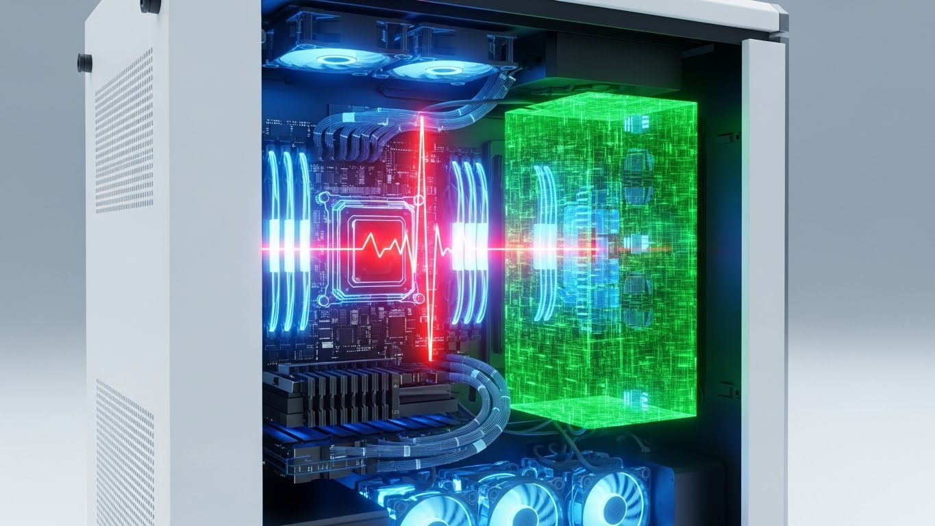
4. The Dark Mode Aesthetic (User Interface Focus)
TOFU | Shaping Brand Perception
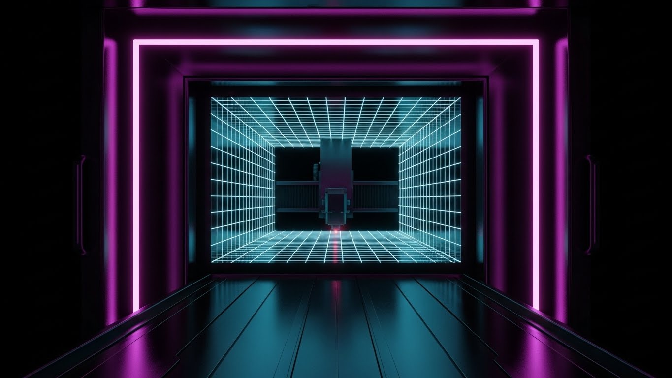
1. The Visual & Narrative Approach
Software interfaces are moving toward "Dark Mode" to reduce eye strain, and this style capitalizes on that trend to signal modernity. The visual depicts a "Tron-like" internal chamber of a CNC machine where edges are defined by glowing Cyber Magenta neon lines against a Midnight Black void. A laser cutter travels down a tunnel of infinite grids, representing "Path Optimization." The one-point perspective draws the eye to the center, while glossy, reflective surfaces enhance the high-tech vibe.
2. Psychological Impact & KPI Focus
This approach is critical for Shaping Brand Perception (1.5). It signals that your software is modern, sleek, and fast—distancing it from the "clunky" legacy software of the 1990s. The high contrast (Black/Magenta) implies extreme precision and clarity, subconscious cues that suggest your software makes errors impossible to miss.
3. Strategic Implementation & Trade-offs
- Best Use Case: Instagram/LinkedIn Stories.
- Duration: 10-15 Seconds (Vertical 4:5 aspect ratio).
- Trade-off: This is a stylized representation. If your actual software UI looks dated or grey, this marketing visual might create a "promise gap" when the user finally sees the real product.
Companies using similar video content -
Autodesk – Fusion 360 – Integrated CAD/CAM/CAE for product development.
Solid Edge – Simulation – Comprehensive 3D design and simulation capabilities.
5. Metaphorical Motion Graphics
TOFU | Demand Gen & Lead Capture

1. The Visual & Narrative Approach
Sometimes, literal machinery is too rigid to explain abstract benefits like "Workflow" or "Lead Capture." This style uses an abstract 2D flat vector design with glossy textures, featuring swirling liquid shapes in Liquid Mercury Silver and Teal. The shapes funnel downwards, metaphorically representing coolant flow or data collection. The soft overhead softbox lighting creates smooth highlights, offering a fluid, organic composition that contrasts sharply with the rigid lines of typical industrial marketing.
2. Psychological Impact & KPI Focus
Designed for Demand Gen & Lead Capture (1.6), this style uses "Pattern Interrupt." In a LinkedIn feed dominated by grey steel and sparks, a smooth, liquid abstract visual stands out. It conveys concepts of "ease," "flow," and "seamless integration"—soothing the anxiety of a complex software implementation.
3. Strategic Implementation & Trade-offs
- Best Use Case: Display Ads / Retargeting Banners.
- Duration: 6-10 Seconds (Looping GIF format).
- Trade-off: It is purely metaphorical. It relies on strong accompanying copy to connect the visual "flow" to a specific business benefit (e.g., "Streamline your G-Code workflow").
Companies using similar video content -
Mastercam – Mill – Highlighting toolpath optimization clarity in a sleek UI.
GibbsCAM – Milling – Showcasing precise G-code and machining operations.
6. The "Trust Bridge" (Wireframe to Reality)
TOFU | Product/Solution Differentiation
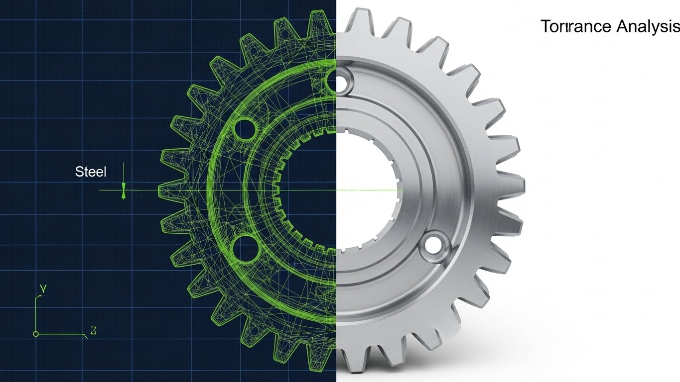
1. The Visual & Narrative Approach
This is the quintessential visual proof for simulation software. A split-screen composition vertically divides the image. The left side displays a technical wireframe blueprint of a gear in Steel Grey and Electric Lime lines on a dark blue grid. The right side seamlessly transitions into the finished, photorealistic stainless steel part, gleaming under studio lighting. The alignment is pixel-perfect, visually demonstrating "Tolerance Analysis" and the bridge between digital planning and physical reality.
2. Psychological Impact & KPI Focus
This style drives Product Differentiation (1.7). The core fear of the machinist is that the simulation won't match reality. This visual serves as "Evidence." It visually proves that "What You See Is What You Cut" (WYSIWYC), directly addressing the anxiety of scraping a part due to simulation inaccuracy.
3. Strategic Implementation & Trade-offs
- Best Use Case: LinkedIn Organic / Product Landing Pages.
- Duration: Static or Slow Slider (Interactive).
- Trade-off: Requires high-fidelity assets. If the "Real" side looks fake or low-quality, the entire argument of precision collapses.
Companies using similar video content -
C3 AI – Process Optimization – Abstracting complex AI-driven workflow improvements.
DataRobot – AI Platform – Visualizing seamless machine learning model deployment.
7. The Kinetic Typographic Disruptor
TOFU | LinkedIn Organic
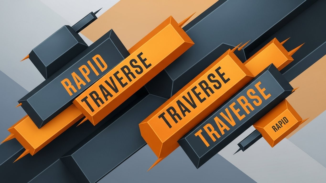
1. The Visual & Narrative Approach
When you need to convey speed and urgency without rendering complex machinery, typography becomes the visual hero. This design features bold, heavy geometric shapes and text blocks in Vivid Orange and Slate Grey. Arranged in a diagonal motion, the blocks suggest rapid movement or "Rapid Traverse." The edges are razor-sharp, mimicking cut metal, set against a subtle abstract color field.
2. Psychological Impact & KPI Focus
Ideal for LinkedIn Organic (3.4) reach, this style leverages the "Reading as Seeing" effect. The diagonal orientation creates a sense of dynamic instability and forward momentum. It conveys "Industrial Strength" and "Speed" purely through form and color, making it excellent for announcing new features, updates, or flash sales where the message is more important than the visual context.
3. Strategic Implementation & Trade-offs
- Best Use Case: Social Media Feeds (Muted auto-play).
- Duration: 10-15 Seconds.
- Trade-off: It lacks technical substance. It captures attention but fails to educate the viewer on how the speed is achieved. Best used as a teaser.
Companies using similar video content -
CGTech – Vericut – Proving simulation accuracy against real-world machining.
Ansys – Discovery – Bridging design concepts to physical performance validation.
8. The Virtual Prototype (Photorealism)
TOFU | Connected TV / OTT
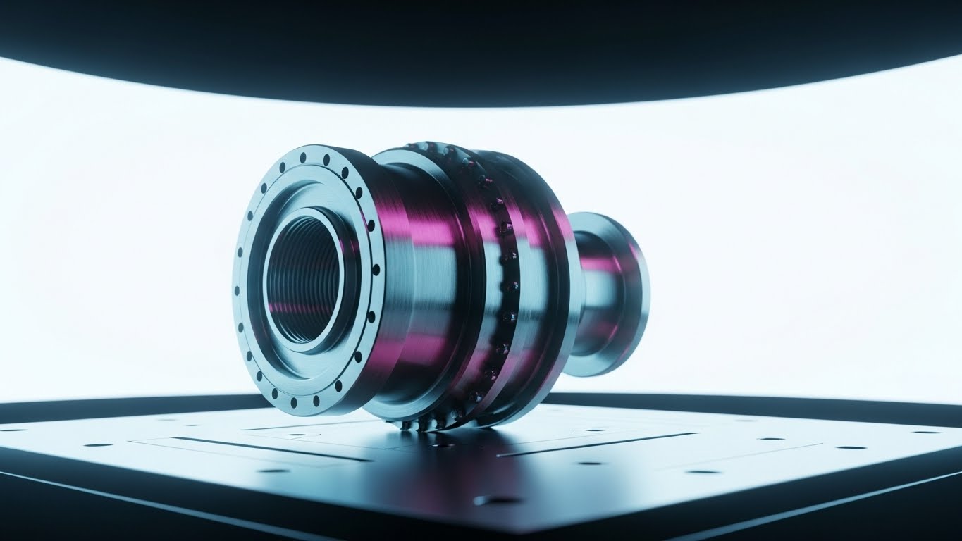
1. The Visual & Narrative Approach
Here, the simulation output is indistinguishable from a photograph. This visualization presents a stunning, 8k render of a complex aerospace component resting on a pristine, white inspection table. Using high-key studio lighting with soft shadows, the material reads clearly as brushed Aerospace Silver titanium, revealing microscopic surface finish details. The pure white infinity curve background eliminates distractions, focusing entirely on the quality of the machining.
2. Psychological Impact & KPI Focus
This style supports Connected TV (CTV) / OTT (4.6) advertising. It builds massive Trust. In high-stakes industries (Aerospace/Medical), the surface finish is a key quality indicator. By showing a "perfect" virtual part, you implicitly promise that your software can deliver this level of quality in the real world. It appeals to the perfectionist nature of the engineer.
3. Strategic Implementation & Trade-offs
- Best Use Case: High-definition video channels, Trade Show loops.
- Duration: 30-60 Seconds (Slow pans).
- Trade-off: Extremely resource-intensive to produce. It requires top-tier rendering engines and texture artists.
Companies using similar video content -
MachineMetrics – Machine Monitoring – Communicating rapid operational insights and speed.
JITbase – Machine Monitoring – Highlighting real-time production data and efficiency.
9. The X-Ray Insight (Technical Education)
MOFU | Feature Education
1. The Visual & Narrative Approach
To explain internal features like bearing loads or thermal expansion, we must look inside the machine. This style uses a transparent "ghosted glass" casing for a CNC spindle, revealing internal bearings and drive shafts rendered in X-Ray Green and Skeleton White. A heat map gradient (blue to red) is subtly overlaid to visualize "Thermal Analysis" and potential overheating zones. The view is a clinical, technical cross-section set against a clean grey background.
2. Psychological Impact & KPI Focus
This is the gold standard for Feature Education (1.8) in the Middle of the Funnel (MOFU). Engineers are naturally curious about mechanics. This style satisfies that curiosity while visualizing an invisible problem (heat). It positions your software as a sophisticated diagnostic tool that sees what the human eye cannot.
3. Strategic Implementation & Trade-offs
- Best Use Case: Technical Blog Posts, Whitepapers, Webinar segments.
- Duration: 45-90 Seconds.
- Trade-off: It can feel "dry" or overly clinical to non-technical stakeholders (e.g., Finance/Purchasing).
Companies using similar video content -
SolidWorks – Visualize – Showcasing photorealistic virtual product prototypes.
Open Mind Technologies – hyperMILL – Presenting high-quality virtual machining results.
10. The Isometric Shop Floor (Managerial View)
MOFU | Building Trust & Credibility
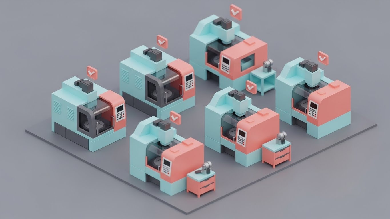
1. The Visual & Narrative Approach
For a high-level overview of factory operations, realism can be clutter. This style utilizes a charming low-poly 3D aesthetic to illustrate a manufacturing floor. Tiny, stylized CNC machines in Pastel Blue and Soft Coral work in harmony on a matte grey floor, with small floating checkmarks appearing above them. The isometric "Sim City" view employs soft global lighting, conveying a sense of total "Shop Floor Control" and ease of management.
2. Psychological Impact & KPI Focus
This style builds Trust & Credibility (1.9) by reducing anxiety. Shop floor management is stressful and chaotic. This visual style reframes that chaos into a manageable, gamified, and orderly system. It tells the Operations Manager, "With our software, managing 50 machines is as easy as a game."
3. Strategic Implementation & Trade-offs
- Best Use Case: Email Marketing, Onboarding Videos.
- Duration: 30-45 Seconds.
- Trade-off: The "cartoonish" look must be balanced carefully. If it looks too childish, it may trivialize the serious nature of manufacturing operations.
Companies using similar video content -
Altair – SimSolid – Revealing internal structural analysis and thermal dynamics.
Ombrulla – AI Predictive Maintenance – Visualizing hidden machine health insights.
11. The Compliance Shield (Minimalist Flat 2D Vector)
MOFU | Overcoming Objections

1. The Visual & Narrative Approach
When addressing the rigid requirements of data security, visual clutter is the enemy. This style utilizes a stark, "Swiss Design" aesthetic to communicate absolute stability. A thick-lined, white vector illustration of a padlock is seamlessly fused into the center of a mechanical gear, set against a deep, trustworthy Navy Blue background. There are no distractions—no gradients, no shadows. It is pure geometry, conveying a binary message: your proprietary data is locked down.
2. Psychological Impact & KPI Focus
This style is a critical tool for Overcoming Objections (1.11). One of the primary barriers to cloud-based CNC simulation is the fear of IP theft. This visual uses the psychology of symmetry and minimalism to signal "air-tight" security. It reduces the Cognitive Load of reading a complex ISO certification document, replacing it with a single, unshakeable symbol of safety that reassures the risk-averse IT Director.
3. Strategic Implementation & Trade-offs
- Best Use Case: PDF Downloadable Guides (Security Whitepapers), Trust Center pages.
- Duration: Static Image or subtle micro-animation (lock clicking shut).
- Trade-off: It is emotionally cold. It builds trust in security, but it does not inspire excitement about performance. It is a defensive asset, essential for hygiene but not for hype.
Companies using similar video content -
Critical Manufacturing – MES – Simplifying complex factory floor control and operations.
Plex Systems – MES – Providing a clear overview of manufacturing operations.
12. The Augmented Guardian (Holographic UI over 3D Render)
MOFU | Risk Mitigation

1. The Visual & Narrative Approach
To sell "safety," you must visualize the danger without causing panic. This style uses a First-Person (POV) perspective, placing the viewer inside the shop. A realistic 3D render of a CNC lathe is blurred in the background, drawing focus to a crisp, floating Holographic Blue and Safety Yellow UI panel in the foreground. The interface displays a "Limit Switch Alert" with a schematic of the machine, simulating an Augmented Reality (AR) view that predicts a collision before it happens.
2. Psychological Impact & KPI Focus
This targets Risk Mitigation (1.12). For the floor manager, the nightmare is a machine crash. This visual validates the "Guardian Angel" effect of your software. By using the HUD (Heads-Up Display) aesthetic, it implies that your software gives the operator "superpowers" to see problems before they become expensive disasters. It speaks directly to the anxiety of human error and equipment damage.
3. Strategic Implementation & Trade-offs
- Best Use Case: Product Landing Pages (Feature focus: Collision Detection), Webinar Demos.
- Duration: 10-15 Seconds (Looping the alert sequence).
- Trade-off: It leans heavily on a "Future Tech" vibe. If your actual software doesn't have AR capabilities, you must clarify that this is a visualization of the alert system, not the literal UI, to avoid misleading the prospect.
Companies using similar video content -
SAP – Digital Manufacturing – Visualizing data security and regulatory compliance.
Oracle – Manufacturing Cloud – Communicating robust data protection and integrity.
13. The Workflow Metamorphosis (Split Screen: Optimized Reality and UI)
MOFU | Competitive Displacement
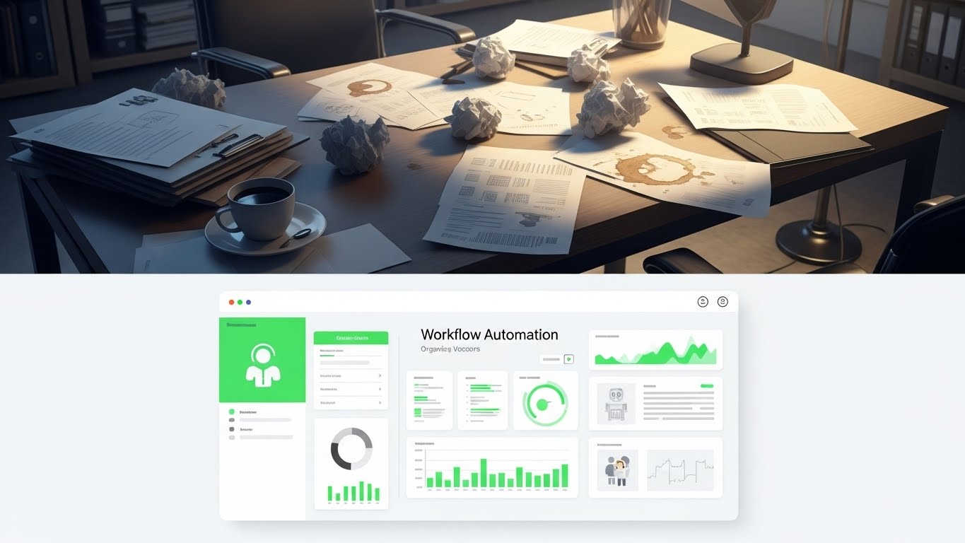
1. The Visual & Narrative Approach
Competitive displacement requires a stark contrast between "The Old Way" and "The New Way." This split-screen composition creates a visceral comparison. The top half reveals a desaturated, cluttered desk filled with crumpled papers, coffee stains, and manual calculation notes—the chaos of legacy workflows. The bottom half presents the antidote: a pristine, vivid Green and White digital dashboard that perfectly aligns with the chaos above, organizing it into clean graphs. The visual metaphor is instant: from messy manual friction to automated digital flow.
2. Psychological Impact & KPI Focus
This style drives Competitive Displacement (1.13). It forces the viewer to confront the pain of their current situation (the messy desk) and offers immediate relief (the clean UI). It leverages the "Before/After" psychology used in fitness marketing but applied to industrial workflow. It visually promises Workflow Automation and a reduction in administrative stress.
3. Strategic Implementation & Trade-offs
- Best Use Case: "Versus" Comparison Pages, Sales Decks, Competitor Landing Pages.
- Duration: Static Image or Interactive Slider.
- Trade-off: It can appear aggressive. It implies the prospect's current method is "messy." It requires a delicate balance of empathy to ensure the prospect feels understood, not insulted.
Companies using similar video content -
Squint – Manufacturing Intelligence Platform – Visualizing AR-driven operational guidance and alerts.
FANUC America – MT-LINKi – Showcasing predictive maintenance alerts and machine health.
14. The Digital Floor Plan (Isometric 2D Motion Design)
MOFU | ABM Awareness
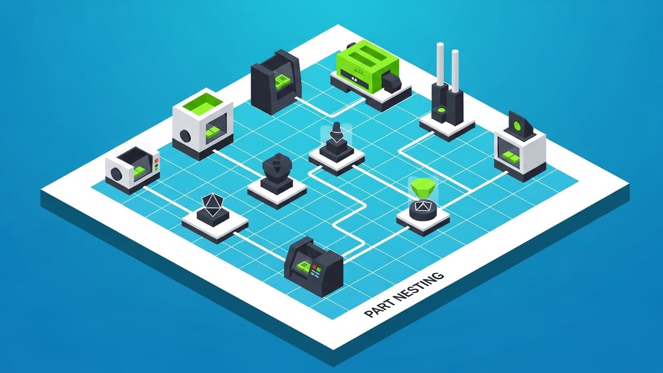
1. The Visual & Narrative Approach
When pitching to Enterprise accounts, you need to show scale. This style uses a clean, 2.5D isometric illustration of a factory floor on a Tech Blue grid. Simplified machines in Green and Black are connected by flowing white data lines, visualizing the concept of "Part Nesting" across multiple workstations. The uniform, shadowless lighting creates a sense of clinical efficiency and total system integration.
2. Psychological Impact & KPI Focus
Designed for ABM Awareness (2.2), this style appeals to the Director of Operations. It moves the conversation from "machine performance" to "floor efficiency." By visualizing the factory as a circuit board, it argues that your software optimizes not just one tool, but the entire production flow. It reduces the complexity of logistics into a manageable, pleasing geometric puzzle.
3. Strategic Implementation & Trade-offs
- Best Use Case: LinkedIn Ads targeting Enterprise Accounts (OEMs).
- Duration: 15-30 Seconds.
- Trade-off: It is abstract. It explains connectivity well but fails to show surface finish or cut quality. It is a strategic visual, not a technical one.
Companies using similar video content -
JobBOSS² – Shop Management – Contrasting old manual processes with streamlined digital workflows.
MRPeasy – MRP Software – Transforming chaotic production planning into organized digital flow.
15. The ROI Escalator (Dynamic Data Visualization)
MOFU | Objection Handling & Friction Reduction
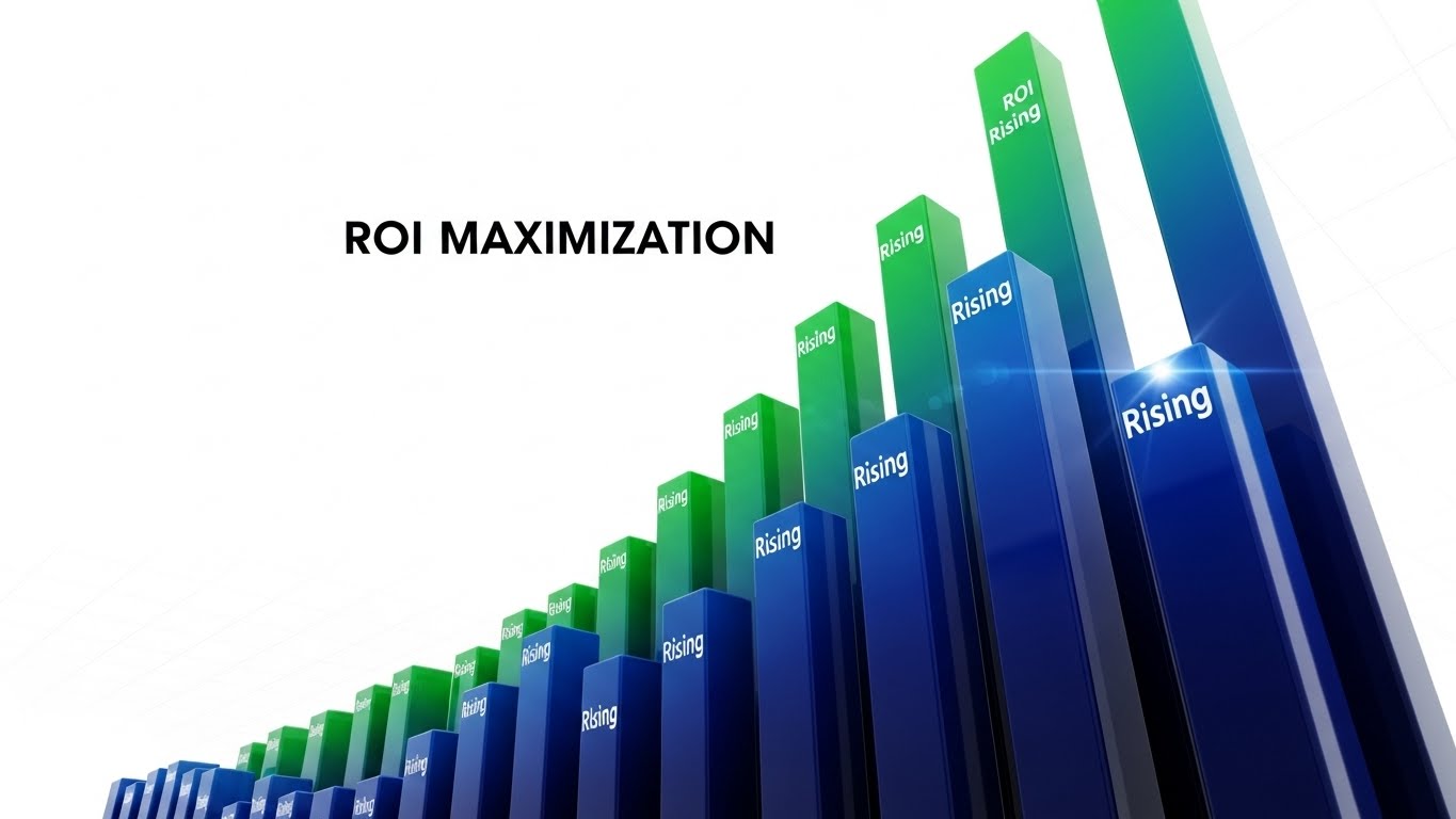
1. The Visual & Narrative Approach
At the MOFU stage, the CFO gets involved, and they care about one thing: Return on Investment. This style strips away the machinery and focuses purely on the metrics. We see a dynamic, low-angle shot of 3D bar charts rising aggressively upwards into a Stark White void. The bars utilize a "Rising Green" gradient to signify profit and efficiency. The composition is towering and monumental, visualizing "ROI Maximization" as an unstoppable force.
2. Psychological Impact & KPI Focus
This addresses Objection Handling (5.2) regarding price. It reframes the software purchase from a "Cost" to an "Investment." The upward trajectory triggers a positive confirmation bias associated with growth and dominance. It provides the Internal Champion with the visual evidence needed to justify the budget to finance teams.
3. Strategic Implementation & Trade-offs
- Best Use Case: Retargeting Ads, Proposal Decks, BOFU emails.
- Duration: 6-10 Seconds (Looping).
- Trade-off: It is generic if not paired with specific numbers. The visual needs overlay text (e.g., "Reduce Scrap by 20%") to anchor the abstract bars to a tangible business outcome.
Companies using similar video content -
iBase-t – Solumina MES – Visualizing efficient production flow across the factory.
Tulip Interfaces – Frontline Operations Platform – Illustrating connected workstations and data lines.
16. The Capital Engine (Abstract 2D Motion Graphics)
MOFU | The Economic Buyer

1. The Visual & Narrative Approach
Communicating "Cost Reduction" to a non-technical CEO requires a metaphor. This style uses sophisticated, corporate motion graphics. Gold Leaf yellow circles (representing capital/coin) fluidly morph and merge into Matte Black gear shapes (representing operational efficiency). The background is a rich, corporate Navy Blue. The rotational symmetry and smooth easing create a sense of premium, effortless transformation of money into value.
2. Psychological Impact & KPI Focus
This target is The Economic Buyer (7.1). It bypasses technical jargon completely. The visual language is that of a high-end financial consulting firm, not a dusty machine shop. It elevates the brand perception, signaling that your software is a strategic financial lever for the business, driving Capital Efficiency and operational elegance.
3. Strategic Implementation & Trade-offs
- Best Use Case: Executive Summary Videos, Quarterly Business Review (QBR) presentations.
- Duration: 15-20 Seconds.
- Trade-off: It effectively ignores the product. It is purely a brand/value proposition play. It should never be used to explain features to an operator.
Companies using similar video content -
Infor – CloudSuite Industrial – Dynamic visualization of rising efficiency and profit metrics.
Acumatica – Manufacturing Edition – Showcasing financial growth and maximized return on investment.
17. The Kinetic Pulse (Hyper-lapse Stock Footage with Data)
MOFU | The Functional Buyer
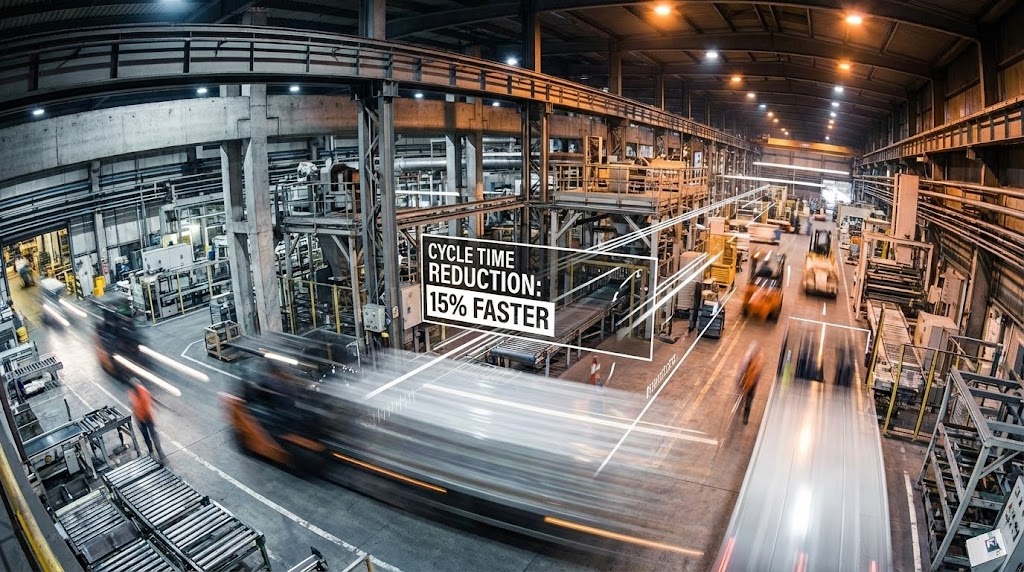
1. The Visual & Narrative Approach
To prove you understand the pace of modern manufacturing, we combine reality with data. This style uses a hyper-lapse (time-lapse in motion) of a bustling factory floor. The physical world (forklifts, people) is rendered as blurred streaks of Industrial Steel and motion, capturing the kinetic energy. Overlaid on this chaos are sharp, static White data lines and text boxes calling out "Cycle Time Reduction: 15% Faster."
2. Psychological Impact & KPI Focus
This appeals to The Functional Buyer (7.2)—the VP of Manufacturing. They know the shop floor is chaotic; they don't want a sanitized cartoon. This style builds authority by showing the "Real World" but overlaying it with the "Control" your software provides. It visually demonstrates that your digital tool can tame and measure physical speed.
3. Strategic Implementation & Trade-offs
- Best Use Case: Video Ads, Case Study Intros, Website Hero Backgrounds.
- Duration: 15-30 Seconds.
- Trade-off: Requires high-quality stock footage. Poorly lit or low-res footage will make the software overlay look like a cheap gimmick. The contrast between "Blurry Reality" and "Sharp Data" is the key to success.
Companies using similar video content -
Microsoft – Azure IoT for Manufacturing – Transforming capital into operational efficiency.
AWS – Industrial Solutions – Abstractly representing investment leading to value.
18. The Developer's Canvas (Dark Mode UI Showcase)
MOFU | The Technical Buyer
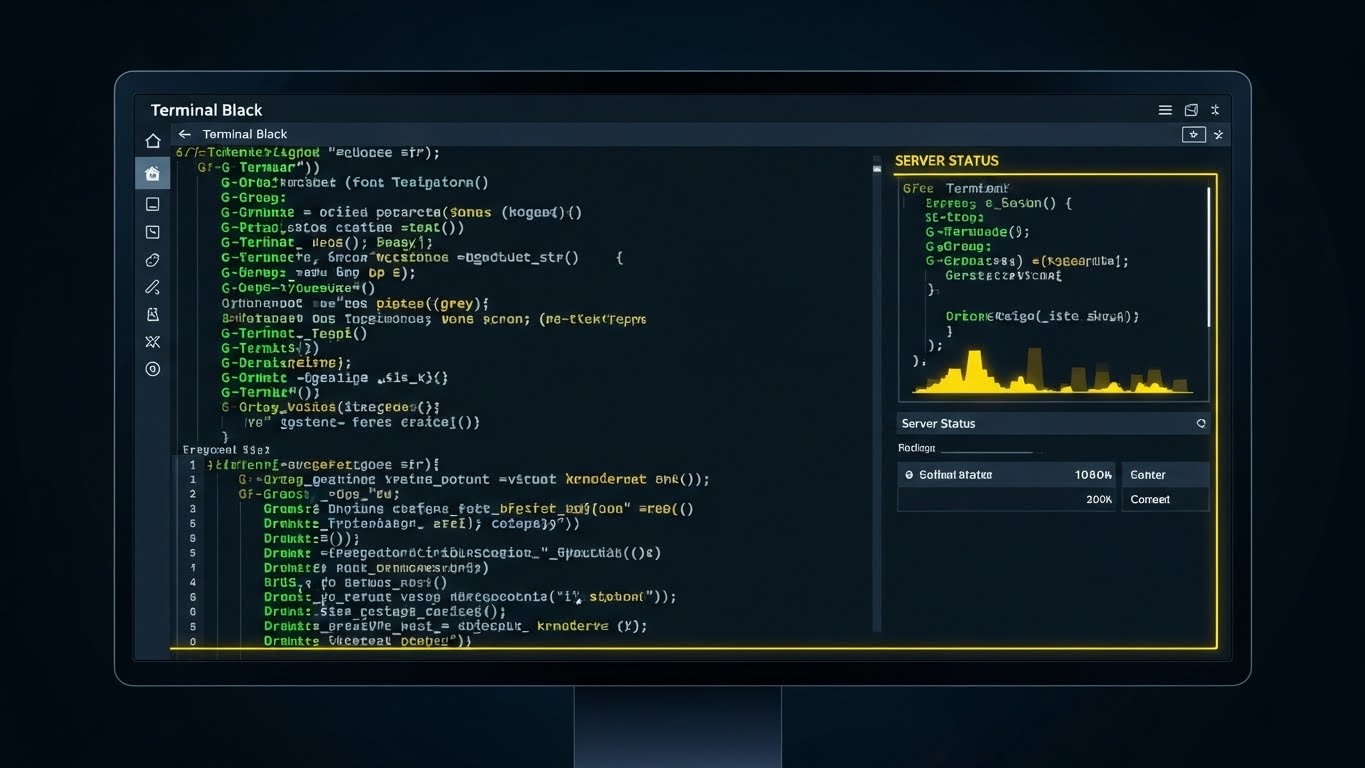
1. The Visual & Narrative Approach
For the IT Director or the Lead Programmer, the code is the product. This style unapologetically showcases the raw interface. We see a close-up of the software in "Dark Mode" (Terminal Black background), featuring syntax-highlighted G-Code in Terminal Green and Grey. A "Server Status" panel is visible. The shot includes a monitor bezel to ground it in reality, presenting the tool exactly as the user will see it during a late-night shift.
2. Psychological Impact & KPI Focus
This targets The Technical Buyer (7.3). It signals "Developer Experience." Flashy 3D renders often annoy this persona; they want to see the syntax highlighting, the line numbers, and the debug tools. This visual validates that the software is robust, professional, and built for serious coding. It eliminates the fear of "Black Box" solutions.
3. Strategic Implementation & Trade-offs
- Best Use Case: Technical Specification Pages, Documentation, API pages.
- Duration: Static or Screen Capture Video.
- Trade-off: It is boring to everyone except the person who signs off on the technical implementation. Keep it hidden from the marketing homepage, but prominent in the technical docs.
Companies using similar video content -
Scytec – DataXchange – Proving cycle time reduction with real-time data overlays.
Fabrico – OEE & CMMS – Visualizing factory activity with overlaid performance metrics.
19. The Internal Champion (Generative AI Realistic Character)
MOFU | The Champion

1. The Visual & Narrative Approach
Software is ultimately bought by people. This style reintroduces the human element. It features a photorealistic, Gen-AI created character: a confident female engineer with a tablet, smiling in a bright, modern office. The tablet displays a clear "Efficiency Up" chart. The lighting is natural and flattering, moving away from the "gritty" industrial look to a "Professional Success" aesthetic.
2. Psychological Impact & KPI Focus
This is for The Champion (7.4). It visualizes the emotional benefit of the purchase: professional recognition. It suggests that buying this software will make the engineer look good to their bosses. It promotes diversity and modernity, positioning the brand as forward-thinking. It creates a relatable protagonist for the case study.
3. Strategic Implementation & Trade-offs
- Best Use Case: Case Study Headers, Testimonial Videos.
- Duration: Static or subtle motion (breathing/smiling).
- Trade-off: The "Uncanny Valley." AI characters must be generated with extreme care. If the eyes or hands look wrong, trust creates a nosedive. It must look indistinguishable from a high-end stock photo.
Companies using similar video content -
CAMWorks – CAM Software – Validating G-Code and programming environment for technical users.
Hexagon Manufacturing Intelligence – MSC Apex – Showcasing advanced simulation setup and syntax.
20. The Strategic Alliance (2D Graphics Over Live Action)
BOFU | Sales Cycle Acceleration

1. The Visual & Narrative Approach
At the Bottom of the Funnel (BOFU), the focus is on the agreement. This style overlays a high-quality photo of a boardroom handshake with stylized 2D Vector Blue icons (checkmarks, signed documents). The photo is slightly desaturated to make the "Digital Agreement" graphics pop. It visualizes the concept of "Strategic Alignment" and the successful conclusion of the sales cycle.
2. Psychological Impact & KPI Focus
This drives Sales Cycle Acceleration (1.14). It subliminally primes the prospect for the "Yes." It moves the visualization away from "How does it work?" to "We have a deal." It reinforces the partnership aspect of the B2B relationship, suggesting that signing the contract is the beginning of success, not just a transaction.
3. Strategic Implementation & Trade-offs
- Best Use Case: Proposal Emails, "Thank You" Pages, Closing Slide of a Pitch Deck.
- Duration: Static.
- Trade-off: It is a cliché. It works best as a subtle reinforcement in direct sales communications, rather than a public-facing marketing asset.
Companies using similar video content -
Autodesk – Inventor – Empowering engineers with advanced design and simulation tools.
Shapr3D – 3D CAD – Visualizing user success and professional achievement.
21. Isometric 3D Workflow (Infrastructure Focus)
BOFU | Reducing Implementation Friction
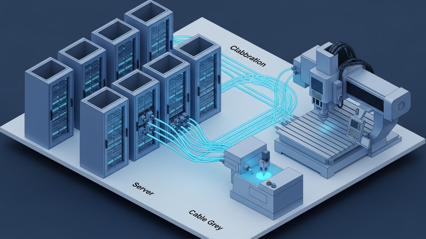
1. The Visual & Narrative Approach
Implementation anxiety is a major barrier at the Bottom of the Funnel (BOFU). This style dismantles that fear with a clean, orderly isometric 3D cutaway. We see a stylized server room in Server Blue and Cable Grey, connected via glowing data cables to a CNC machine on the shop floor. The cutaway reveals the orderly interior of the server rack, showing organized, humming drives. It looks like a high-end architectural model—precise, planned, and solid.
2. Psychological Impact & KPI Focus
This targets Reducing Implementation Friction (1.16). It appeals to the IT Director and the Operations Manager who fear "integration hell." The visual symmetry and lack of clutter subconsciously signal that the setup process is organized and logical. It visualizes "Cloud Collaboration" not as a nebulous concept, but as a structured, physical connection.
3. Strategic Implementation & Trade-offs
- Best Use Case: Technical Documentation, Onboarding "Welcome" Emails, Implementation Guides.
- Duration: Static Image or Slow Pan (10-15 seconds).
- Trade-off: It is highly stylized. It represents the concept of architecture, not the literal wiring diagram. It builds confidence in the process, but doesn't replace a technical schematic.
Companies using similar video content -
Rockwell Automation – FactoryTalk – Visualizing successful partnerships and strategic alignment.
IBM – Watson IoT for Manufacturing – Reinforcing collaborative agreements and digital transformation.
22. Rapid UI Feature Montage (The "Abundance" Sell)
BOFU | Driving Demo Requests
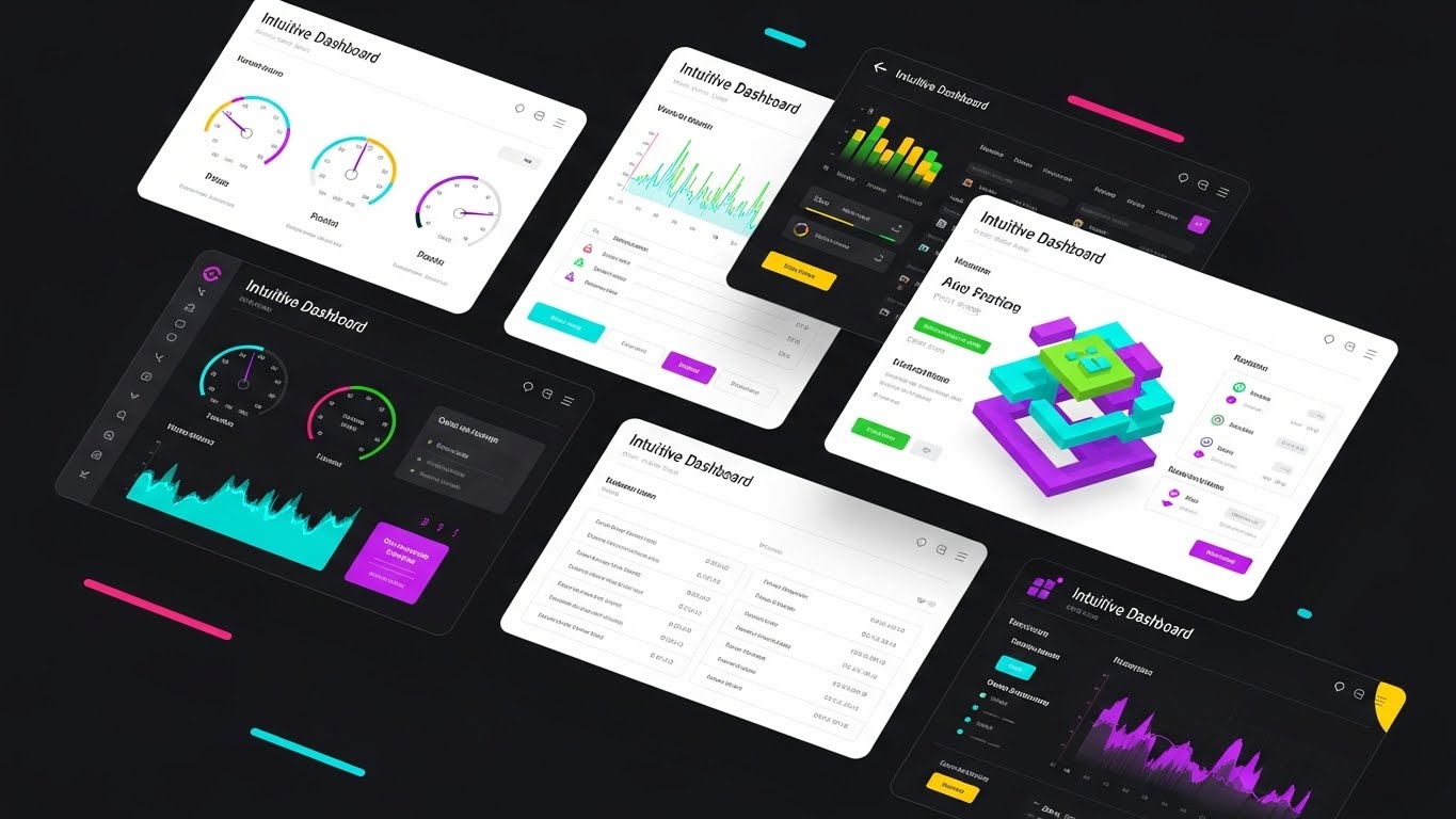
1. The Visual & Narrative Approach
To convey the sheer depth of your platform, a single screen isn't enough. This style features a dynamic collage composition where multiple UI screens—showing "Intuitive Dashboard" widgets, toolpath lists, and 3D simulation views—overlap and float in a 3D space. The palette pops with Vibrant UI Colors (Cyan, Green, Purple) against a clean White background with soft drop shadows. The screens gently drift or shuffle, suggesting a boundless library of capabilities.
2. Psychological Impact & KPI Focus
This is designed for Driving Demo Requests (2.1). It triggers the "Kid in a Candy Store" effect. By showing a density of high-value features simultaneously, you create a perception of immense value and robustness. It tells the prospect, "Whatever you need, we have a module for that."
3. Strategic Implementation & Trade-offs
- Best Use Case: Landing Page Hero Sections, Sales Deck "Platform Overview" slides.
- Duration: 15-20 Seconds (Motion Graphics).
- Trade-off: It can be overwhelming. The goal is an impression of power, not detailed reading. Don't expect the viewer to read the text on the flying screens; they are there to signal quantity and quality.
Companies using similar video content -
Google Cloud – AI in Manufacturing – Visualizing cloud infrastructure and data collaboration.
Rootstock Software – Cloud ERP – Reducing implementation friction with clear system architecture.
23. Lifestyle Stock with UI Overlay (The "Freedom" Hook)
BOFU | ROI Justification Hook

1. The Visual & Narrative Approach
SaaS moves manufacturing management out of the dark factory and into the world. This style features a high-quality lifestyle shot of a production manager in a sunlit coffee shop, looking relaxed and happy while working on a laptop. A semi-transparent, futuristic Tech Blue UI overlay floats in front of the screen, displaying a "Remote Monitoring" status of 'All Systems Go.' The warm sunlight contrasts beautifully with the cool, crisp data.
2. Psychological Impact & KPI Focus
This targets ROI Justification (8.1) by selling the personal ROI. It appeals to the overworked manager who dreams of leaving the shop floor on time. It visualizes the promise of "Remote Monitoring"—the ability to control the factory from anywhere. It connects your software to the emotional benefit of work-life balance.
3. Strategic Implementation & Trade-offs
- Best Use Case: Facebook/Instagram Retargeting Ads.
- Duration: Static or Cinemagraph (coffee steam moving).
- Trade-off: It risks looking like a generic stock photo. The UI overlay must be clearly recognizable as your software interface to ground the aspiration in reality.
Companies using similar video content -
Dassault Systèmes – 3DEXPERIENCE – Showcasing a vast array of platform capabilities.
Siemens – Opcenter – Presenting a dense, feature-rich manufacturing execution system.
24. 2D Animation & UI Composition (Gamified Risk)
BOFU | Risk Mitigation Hook
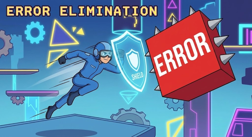
1. The Visual & Narrative Approach
To discuss "Errors" without being depressing, we use gamification. This style features a flat, cell-shaded character in a blue jumpsuit dynamically dodging a large, aggressive Red block labeled "Error." The character is protected by a glowing Shield Blue UI element representing your software. The background is a stylized, abstract obstacle course. It transforms the stress of collision avoidance into an energetic, conquerable challenge.
2. Psychological Impact & KPI Focus
This drives Risk Mitigation (8.2). It reframes "Crash Protection" from a fear-based conversation to an empowerment-based one. The "Game" aesthetic appeals to the problem-solving nature of engineers, positioning your software as the power-up that helps them win the day.
3. Strategic Implementation & Trade-offs
- Best Use Case: LinkedIn Ads, Social Media "shorts."
- Duration: 6-10 Seconds (Looping).
- Trade-off: It is playful. It works well for social engagement but might be too casual for a serious boardroom presentation on safety compliance. Use it to catch attention, not to close the Enterprise deal.
Companies using similar video content -
Amper – Machine Monitoring – Justifying ROI through remote operational freedom.
MachineMetrics – Machine Monitoring – Connecting work-life balance with remote factory oversight.
25. 3D Parallax UI Presentation (Onboarding Scale)
Onboard | Website & Landing Pages

1. The Visual & Narrative Approach
When welcoming a new user, you want to show them the future. This style arranges UI screens in a Glassy White void, tilted at angles to create a deep corridor. Using a 3D parallax effect, the camera moves through the screens. Shallow depth of field blurs the distant panels, focusing sharply on the frontmost screen showing "Scalable Architecture." The lighting creates premium, soft white reflections, suggesting a pristine, infinite workspace.
2. Psychological Impact & KPI Focus
This supports Website & Landing Page (3.1) engagement during onboarding. It visualizes "Growth." The receding screens imply that the software has depth and can handle an infinite number of projects. It reassures the new user that they have entered a sophisticated, future-proof ecosystem.
3. Strategic Implementation & Trade-offs
- Best Use Case: Website Hero Backgrounds, Onboarding Video Intros.
- Duration: 10-20 Seconds (Continuous slow forward motion).
- Trade-off: It is abstract. It sets a mood of sophistication but doesn't teach specific workflows. It is a brand-building asset, not an instructional one.
Companies using similar video content -
RenAn – CNC Simulator – Gamifying safety and collision avoidance in training.
Falkonry – Operational AI – Visualizing risk mitigation through predictive insights.
26. 2D Line Art Animation (Knowledge Base Simplicity)
Onboard | Knowledge Base & FAQ Videos

1. The Visual & Narrative Approach
Complex support topics require visual calm. This style uses a continuous single-line drawing in Ink Black on a textured Paper White background. The line elegantly forms a question mark, which then seamlessly morphs into a gear icon. The motion is fluid and hypnotic. It strips away all noise—color, shading, texture—to focus purely on the concept of "Answer" and "Function."
2. Psychological Impact & KPI Focus
Designed for Knowledge Base & FAQ Videos (9.1), this style reduces Cognitive Load. When a user is frustrated and looking for help, they don't want flashy 3D renders. They want clarity. The continuous line metaphorically suggests a smooth, unbroken path from "Problem" to "Solution."
3. Strategic Implementation & Trade-offs
- Best Use Case: Help Center Headers, "Loading" animations in the support portal.
- Duration: 3-5 Seconds (Looping).
- Trade-off: It is minimalist. It cannot explain how to fix a crash, but it creates the perfect low-stress environment to present the text or video answer.
Companies using similar video content -
3D Cloud – Enterprise 3D Platform – Visualizing scalable architecture and infinite depth.
Rescale – HPC Platform – Showcasing scalable simulation and computing environments.
27. Clean UI Workflow (The "Success" State)
Retention | Reducing Churn
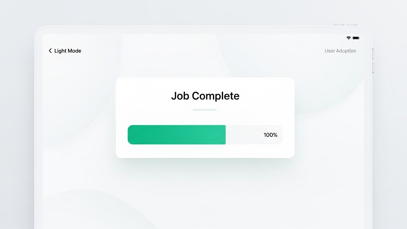
1. The Visual & Narrative Approach
Retention is driven by the feeling of success. This style presents a frontal, straight-on view of the UI in "Light Mode." The design is airy, using Success Green and Pure White. The screen highlights a specific moment: a "Job Complete" notification with a progress bar filling to 100%. Framed by a sleek, modern tablet device, the lighting is bright and shadowless, emphasizing clarity and the satisfaction of a job well done.
2. Psychological Impact & KPI Focus
This targets Reducing Churn (1.19). User adoption relies on positive reinforcement. By visualizing the "Happy Path"—the moment of completion—you remind the user of the daily value the software provides. It triggers a small dopamine response associated with finishing a task.
3. Strategic Implementation & Trade-offs
- Best Use Case: In-App "Congratulations" screens, Case Study results section.
- Duration: Static or simple progress bar animation.
- Trade-off: It shows the result, not the work. It validates the user's effort but doesn't help them with the complex setup required to get there.
Companies using similar video content -
Cogniac Corporation – Visual AI – Enhancing knowledge base retention with elegant simplicity.
Loopr AI – Quality Control Platform – Simplifying complex visual inspection concepts.
28. 2D Character-Driven Story (Humanizing Support)
Retention | Proactive Support/Announcements

1. The Visual & Narrative Approach
Technical support can feel robotic. This style re-introduces warmth. It features a friendly 2D vector character—a support agent with purple hair and a yellow shirt—waving hello. Next to them is a floating chat bubble icon containing a wrench. The background is a soft, abstract pattern of pastel shapes. The style is flat, accessible, and inclusive, designed to look welcoming rather than technical.
2. Psychological Impact & KPI Focus
This supports Proactive Support (9.2). It reduces the hesitation to ask for help. By personifying the help desk as a friendly, diverse character, you remove the intimidation factor of "submitting a ticket." It signals that there are real, helpful humans behind the software.
3. Strategic Implementation & Trade-offs
- Best Use Case: Customer Newsletters, Support Portal Landing Page, "Chat with Us" widgets.
- Duration: Static or subtle wave animation.
- Trade-off: It can feel "Consumer" rather than "Industrial." Ensure the character is dressed professionally (e.g., branded polo shirt) to maintain B2B credibility.
Companies using similar video content -
MaintainX – CMMS – Reducing churn by highlighting successful maintenance operations.
Fabrico – OEE & CMMS – Visualizing job completion and positive operational outcomes.
29. Aspirational Stock Montage (The "Expansion" Vision)
Expansion | Driving Upsell/Cross-sell

1. The Visual & Narrative Approach
To sell "Expansion" and "Enterprise Licenses," you must visualize scale. This style features the silhouette of a business executive standing in a high-rise office, overlooking a city skyline at sunset. The sky is painted in Sunset Orange and Purple. Crucially, the reflection in the window subtly reveals a digital map of the world with connecting nodes, implying "Global Scalability."
2. Psychological Impact & KPI Focus
This targets Driving Upsell/Cross-sell (1.20). It speaks to the ambition of the C-Suite. It moves the conversation from "machining parts" to "dominating markets." It visualizes the software not as a tool for the shop floor, but as a strategic asset for global business growth.
3. Strategic Implementation & Trade-offs
- Best Use Case: Account Based Marketing (ABM) Emails, Executive Quarterly Business Reviews (QBRs).
- Duration: Static.
- Trade-off: It is highly generic. It relies entirely on the context (the email copy or presentation script) to connect this "Success" imagery to the specific software features.
Companies using similar video content -
CereXio – MES – Humanizing proactive support and system guidance.
Critical Manufacturing – MES – Presenting friendly, accessible support for complex systems.
30. Macro UI Micro-Interactions (Advocacy & Detail)
Expansion | Driving Referrals & Advocacy

1. The Visual & Narrative Approach
The difference between good and great software is in the details. This style uses an extreme macro close-up. We see a "Share" button in Button Blue. A finger (rendered with realistic skin texture) is just about to press it. The background is a creamy, blurry bokeh, focusing all attention on the interaction. It captures the tactile "click" of a well-designed interface.
2. Psychological Impact & KPI Focus
This drives Referrals & Advocacy (1.21). It visualizes the ease of sharing success. By making the "Share" button the hero, you subliminally prime the user to take that action. It conveys that the software is not just a tool for work, but a platform for community and collaboration.
3. Strategic Implementation & Trade-offs
- Best Use Case: Social Media "Feature Highlight" posts, "Refer a Friend" email campaigns.
- Duration: 3-5 Seconds (The press and the button state change).
- Trade-off: It is extremely specific. It highlights design quality, not functional utility. It builds love for the product's feel, which is essential for turning users into advocates.
STRATEGIC KNOWLEDGE BASE: The Visual Operations Doctrine
Synthesizing Visuals into Business Outcomes
Having established the 30 visual styles, we must now integrate them into a cohesive operational framework. This is not about "making pretty videos"; it is about constructing a Visual Operating System for your manufacturing clients.
The following three segments outline the 30-Point Strategic Framework for deploying these styles to drive ROI, adoption, and growth.
STRATEGIC ALIGNMENT & VISUAL ARCHITECTURE
- The "Pre-Production" Strategy. Defining the Visual Operating System.*
- The Cognitive Load Audit: Before creating a single video, audit your current training materials. If a PDF manual requires 10 minutes to explain a toolpath optimization, replace it with a Style 9 (X-Ray Insight) video. The goal is measurable reduction in cognitive effort.
- Role-Based Visual Mapping: Do not show the same visuals to everyone. Use Style 18 (Developer’s Canvas) for Programmers who trust G-Code, but use Style 10 (Isometric Shop Floor) for Operations Managers who need to see the "Big Picture" flow.
- The "Glanceability" Standard: In a high-stress CNC environment, information must be digested in milliseconds. Design UI visualizations (Style 4, 12) that can be understood at a glance from 5 feet away on an HMI screen.
- Brand Voice Consistency: Your marketing videos (Style 1) and your in-software tutorials (Style 27) must share a visual DNA. Disconnects here cause "Brand Trust Leakage."
- The Advids Strategic Audit: Partner with Advids early to define this visual language. An external audit prevents internal bias ("We love this feature") and focuses on user clarity ("They don't understand this feature").
- Standardization vs. Customization: For core features (e.g., "Collision Detection"), use standardized, high-polish assets (Style 6 Trust Bridge). For niche, customer-specific workflows, use scalable templates like Style 26 (Line Art) that can be produced quickly.
- The Cross-Departmental Bridge: Use visuals to unify terminology. A "Crash" in Sales might mean a lost deal; in Ops, it’s a damaged spindle. Visuals like Style 13 (Workflow Metamorphosis) create a shared reality for Sales, Ops, and Support.
- Legacy System Integration: Visualizing the connection between old on-prem hardware and new SaaS interfaces is critical. Use Style 21 (Isometric 3D Workflow) to physically visualize this invisible digital bridge.
- Accessibility in Manufacturing: Design motion graphics for a diverse, multi-lingual workforce. Visuals like Style 24 (Gamified UI) transcend language barriers, explaining "Safety" through universal symbols rather than text.
- The Mobile-First Mandate: Shop floor managers are mobile. Ensure all 30 styles, especially Style 12 (Augmented Guardian) and Style 23 (Lifestyle), are optimized for vertical viewing on mobile devices.
OPERATIONAL ADOPTION & IMPLEMENTATION
- The "Deployment" Phase. Embedding visuals into the workflow.*
- Overcoming "Big Brother" Anxiety: When introducing monitoring software, use empathy-driven visuals. Use Style 19 (Internal Champion) and Style 28 (Proactive Ally) to show the software empowering the machinist, not just monitoring them for the boss.
- The Micro-Learning Shift: Replace hour-long onboarding seminars with a library of 30-second clips. Reference Style 30 (Micro-Interactions) to teach features one button at a time.
- Just-in-Time Support: Embed specific visual styles directly into the software's "Help" menu. When a user hovers over a complex setting, a Style 9 (X-Ray) GIF should appear to explain the physics instantly.
- Gamification of Training: Use Style 24 (Gamified Risk) to create internal leaderboards for "Safest Operator" or "Most Efficient Setup." Visualizing scores boosts engagement and safety compliance.
- Reducing Support Ticket Volume: There is a direct correlation between proactive visual guides and reduced call center load. A library of Style 26 (Line Art) videos answering FAQs can deflect up to 40% of Level 1 tickets.
- Remote Onboarding: Leverage Style 8 (Virtual Prototype) and screencasts to train distributed teams. You no longer need to fly trainers to every factory; the "Digital Twin" video does the heavy lifting.
- Visual SOPs (Standard Operating Procedures): Transform text-based SOP binders into visual process flows using Style 5 (Metaphorical Motion). Workers are 3x more likely to follow a visual process than a written one.
- Feedback Loops: Use interactive video elements. After a Style 27 (Success State) tutorial, ask for a "Thumbs Up/Down" to measure the effectiveness of the training asset itself.
- Scalable Localization: When expanding globally, visuals are your best translator. Style 29 (Global Vision) and UI animations require zero translation, making them cost-effective for global rollouts.
- Leadership Communication: When the CTO presents to the Board, they need Style 15 (ROI Escalator) and Style 16 (Capital Engine). Equip your internal champions with these high-end assets to defend the budget.
MEASURING IMPACT & FUTURE-PROOFING
- The "ROI" Phase. Measuring success and looking ahead.*
- Beyond "Views": Do not measure video success by "Views." Measure "Time-to-Competency" (how fast a new user runs their first simulation) and "Feature Adoption Rate" (did the video cause them to use the new tool?).
- The "Idle Time" Metric: Correlate better visualization with reduced software navigation time. If Style 2 (Digital Twin) clarifies the interface, the machinist spends less time clicking and more time cutting.
- Compliance Velocity: Measure how quickly a new ISO standard or safety regulation is understood. Visuals like Style 11 (Compliance Shield) can speed up compliance sign-offs significantly.
- Retention and Churn: High-quality UX visualization directly impacts Customer Lifetime Value (LTV). Users who "feel" the quality of the software through Style 25 (Parallax UI) are less likely to churn.
- The AI Visual Frontier: Prepare for the future where Generative AI creates Style 1 (Cinematic Standard) videos on the fly based on specific user data. The "Static" video library will soon become a "Dynamic" one.
- Scalability of Assets: Build a library that grows. Don't make "throwaway" ads. Build distinct assets like Style 22 (UI Montage) that can be updated with new screenshots as the software version updates.
- The Advids Partnership: Visual strategy is not a one-time project; it is an evolving infrastructure. Advids acts as the long-term partner, managing the evolution of your asset library. As your feature set grows, we ensure your visual narrative scales without losing consistency.
- Benchmarking Success: "Good enough" visuals are a competitive risk. If your competitor uses Style 8 (Photorealism) and you use blurry screenshots, you lose the "Trust" battle before the demo even starts.
- The ROI of Safety: Quantify the insurance cost reduction. If Style 12 (Augmented Guardian) training reduces machine crashes by 10%, that is a direct financial ROI that pays for the entire video marketing budget.
- Final Call to Innovation: Treat video not as "Marketing Content" but as "Industrial Infrastructure." In the Industry 4.0 era, the visual explanation of the technology is as important as the technology itself. By mastering these 30 styles, you turn your software from a "Black Box" into a transparent, trusted, and indispensable partner.
PHASE 8: GLOBAL RULES AND INPUTS
39 Global Rules for Cohesive, High-Engagement Guide Language:
- Maintain an unwaveringly positive, optimistic, and empathetic perspective.
- Focus exclusively on strategic benefits and opportunities.
- Strictly prohibit negative phrasing, criticizing the reader's current efforts, or aggressive/combative hooks.
- Use specialized terminology (Phase 2A) correctly and naturally.
- Avoid creating false urgency; focus on long-term strategic advantage.
- Connect visualization styles directly to business KPIs and operational efficiency.
- Address the psychological factors (Rule 36) of technology adoption and decision-making.
- Use active voice and strong, precise verbs.
- Prohibit jargon unless it is essential industry LSI (Phase 2A).
- Ensure cohesion between all sections.
- Statistics Mandate: No external links are permitted in Part 3.
- Maintain a smooth, logical flow between paragraphs and styles.
- Ensure the Advids persona is consistent throughout.
- Maintain a high level of professionalism and polish.
- Use nuanced language; avoid hyperbole.
- Adhere to estimated word counts for sections.
- Reference images clearly and strategically (Rule 38).
- Ensure seamless integration of frameworks (4A-4E and Phase 5).
- Ensure all content is actionable and practical.
- Duration Justification: Ensure video durations are realistic.
- Speak directly to the Target Persona (CNC/Manufacturing SaaS Execs).
- Dynamic Structure: Ensure headers and sub-headers are unique.
- Differentiate clearly between similar styles.
- Emphasize visualization as a strategic tool, not just content.
- Focus on the psychology of visual learning and information processing.
- Adhere to all formatting mandates.
- Prohibit clichés and overused marketing phrases.
- Use vivid descriptions for visualization scenarios.
- Simplify complex technical concepts without losing accuracy.
- Ensure the guide functions as a cohesive whole across all three parts.
- Metadata Primacy: Ensure the analysis aligns with the definitions in the Style Mapping Table.
- Provide contextual analysis for why a style works (Trade-offs).
- Style Name Adherence: Adhere strictly to the names provided.
- Micro-Caption Generation Rule: (Style Name): (1-2 word visual descriptor) + (3-5 word strategic benefit).
- Caption Placement Rule: Center-aligned directly below the image placeholder.
- Niche Psychology Rule: Address anxieties of machinists/operators.
- Operational Impact Rule: Focus on bridging the physical/digital divide.
- Visual Concordance Rule: Ensure the analysis explicitly references the visual elements.
- Global Relevance Rule: Mandate globally relevant terminology (no region-specific laws).
Companies using similar video content -
Augury – Machine Health – Driving upsell/cross-sell with a vision of global operational excellence.
Fero Labs – Process Optimization – Visualizing strategic growth and market dominance.
Author & Editor Bio


