
Introduction: Visualizing the Invisible Backbone of Enterprise
In the modern digital economy, code is not just text; it is the invisible infrastructure upon which every major enterprise relies. Yet, for years, the "Lead DevOps Architect" and the "Engineering Manager" have struggled with a singular, costly paradox: while the impact of software is physical and financial, the process of building it remains abstract and opaque. We are often asked to trust what we cannot see.
The cost of this invisibility is staggering. According to a recent industry report, the poor software quality cost in the U.S. economy has grown to upwards of $2.41 trillion annually. This figure represents not just "bugs," but the cumulative weight of technical debt, delayed deployments, and the friction that grinds developer velocity to a halt.
However, a strategic shift is underway. The most forward-thinking platforms are no longer just "managing" code; they are visualizing its health, its flow, and its future. By moving from static text-based reviews to dynamic, visual-first workflows, the industry is bridging the physical/digital divide. The market is responding aggressively, with the global code review and analysis tools sector projecting a CAGR of 27.4% through 2030.
This guide is designed for the visionaries—the leaders ready to transform "Code Review" from a bottleneck into a strategic advantage. We have curated 30 distinct visual styles that do more than just look good; they solve specific cognitive challenges, reduce the mental load on reviewers, and articulate the value of clean code to stakeholders who may never write a single line of Python.
From the heroic "War Room" celebrations of successful deployments to the precise, Bauhaus-inspired geometry of refactoring, these examples demonstrate how to make the invisible, visible.
1. Cinematic Video: The "Deployment Victory"
TOFU | Brand Awareness

The Visual & Narrative Approach
This style leverages the emotional weight of high-end cinema to elevate the routine task of deployment into a heroic narrative. The scene centers on the "War Room," a familiar environment for any DevOps lead, but elevates it with dramatic anamorphic lens flares and warm, amber lighting. The critical visual mechanism here is the holographic display: we see the tangible transformation of code from a "fractured red state" (danger, bugs, debt) into a "seamless, glowing green network" (stability, success). This visual metaphor instantly communicates the transition from chaos to order without a single line of dialogue.
Psychological Impact & KPI Focus
Psychologically, this style targets Brand Awareness (1.1) by validating the emotional labor of engineering teams. It taps into the desire for recognition and the collective relief of a successful launch. By associating the software with this moment of triumph, the viewer subconsciously links the platform with "psychological safety" and "reliability." It directly addresses the anxiety of "Deployment Failure" by visualizing the ultimate KPI: a successful, green-light release.
Strategic Implementation & Trade-offs
- Best Use Case: Top-of-Funnel (TOFU) Social Ads (LinkedIn/Instagram) where stopping the scroll is the priority.
- Duration: 30–60 Seconds. It needs time to build the "heroic" atmosphere.
- Trade-off: High production value means higher cost. It is less effective for explaining how the software works (features) and more effective for explaining why it matters (outcomes).
Companies using similar video content -
Harness – Software Delivery Platform – Orchestrates complex deployments with visual pipelines.
GitLab – DevOps Platform – End-to-end platform for software development lifecycle.
2. Abstract 3D AI Visualization: The "Infinite Network"
TOFU | Market Education

The Visual & Narrative Approach
Here, we strip away the human element to focus purely on the scale and complexity of the digital ecosystem. The "Macro Zoom Journey" takes the viewer inside the machine, visualizing "Continuous Integration" not as a checklist, but as a fluid, friction-free stream of cyan and magenta light. The "glass-textured nodes" represent microservices or code modules, emphasizing transparency and interconnectivity. The high-key lighting avoids the cliché "dark mode hacker" aesthetic, instead presenting the code environment as a clean, illuminated, and infinite digital void.
Psychological Impact & KPI Focus
This style addresses the cognitive load of Market Education (1.3). For an architect managing thousands of repositories, the sheer scale is daunting. This visualization provides a mental model of "Total Observability." It calms the anxiety of "spaghetti code" by presenting complexity as beautiful, organized, and flow-based. The glowing particle streams visually prove that data and logic are moving without bottlenecks.
Strategic Implementation & Trade-offs
- Best Use Case: YouTube explainer intros or background visuals for keynote presentations.
- Duration: 15–30 Seconds. Long enough to establish the "world," short enough to retain attention.
- Trade-off: It is highly abstract. It risks being seen as "vaporware" if not immediately followed by concrete UI shots. It builds awe, not trust.
Companies using similar video content -
Datadog – APM & Observability – Visualizes application performance and infrastructure health.
Dynatrace – Software Intelligence Platform – AI-powered observability for complex cloud environments.
3. Mixed Media Video: The "Flight of the Pull Request"
TOFU | Shaping Brand Perception

The Visual & Narrative Approach
This style breaks the "SaaS Blue" monotony by blending the physical with the digital. The background of architectural blueprints grounds the concept in engineering reality, while the stop-motion origami birds introduce a sense of play and transformation. The metaphor is clear: a "Pull Request" is not just a file transfer; it is a message taking flight. The "cobalt blue trails" visualize the digital audit trail left behind by the code, while the "whip-pan" camera movements match the high-velocity nature of modern CI/CD pipelines.
Psychological Impact & KPI Focus
Targeting Shaping Brand Perception (1.5), this style appeals to the "Creative Engineer." It frames coding as a craft rather than an assembly line. The use of paper textures triggers a tactile response, making the digital process feel more "real" and less alienating. It combats the feeling of "cog-in-the-machine" by celebrating the artistry of the code contribution process.
Strategic Implementation & Trade-offs
- Best Use Case: Vertical Social Ads (Stories/Reels) where creative visual hooks perform best.
- Duration: 10–15 Seconds. Fast-paced and loopable.
- Trade-off: The "artsy" aesthetic might alienate ultra-conservative enterprise buyers who prefer traditional corporate layouts. It signals "Innovation" rather than "Enterprise Stability."
Companies using similar video content -
GitHub – GitHub Flow – Visualizes collaborative code review and pull request processes.
LinearB – Engineering Intelligence – Transforms engineering data into actionable insights.
4. Realistic Character Video: The "Confident Lead"
TOFU | Skippable Pre-Roll Ad

The Visual & Narrative Approach
Trust is a human emotion, not a technical metric. This style focuses entirely on the reaction to the software. The "medium close-up" of the lead developer places the viewer in her shoes. We don't need to read the code on her tablet; the "thumbs up icon" and the "soft coral/mint green" palette instantly communicate that the system is healthy. The blurred greenery and soft lighting suggest a stress-free, sustainable work environment—the direct opposite of the "crunch time" stereotype.
Psychological Impact & KPI Focus
This is a Skippable Pre-Roll Ad (4.1) weapon. It addresses the skepticism of "Will this tool actually make my life easier?" The visual proof is the relief on the subject's face. It validates the user's desire for "Developer Experience" (DevEx)—a key buzzword in 2024/25. It sells the result of the software: peace of mind and confidence in the codebase.
Strategic Implementation & Trade-offs
- Best Use Case: YouTube Pre-roll or Testimonial headers on landing pages.
- Duration: 15–30 Seconds.
- Trade-off: Reliance on stock footage can feel generic if not graded/styled perfectly. It requires high-quality casting to ensure the "developer" looks authentic, not corporate.
Companies using similar video content -
Pluralsight Flow – Engineering Metrics – Provides insights into developer productivity and well-being.
Uplevel – Engineering Effectiveness Platform – Boosts team productivity and reduces burnout.
5. Abstract 2D Flat Vector: The "Bauhaus Refactor"
TOFU | Category Creation
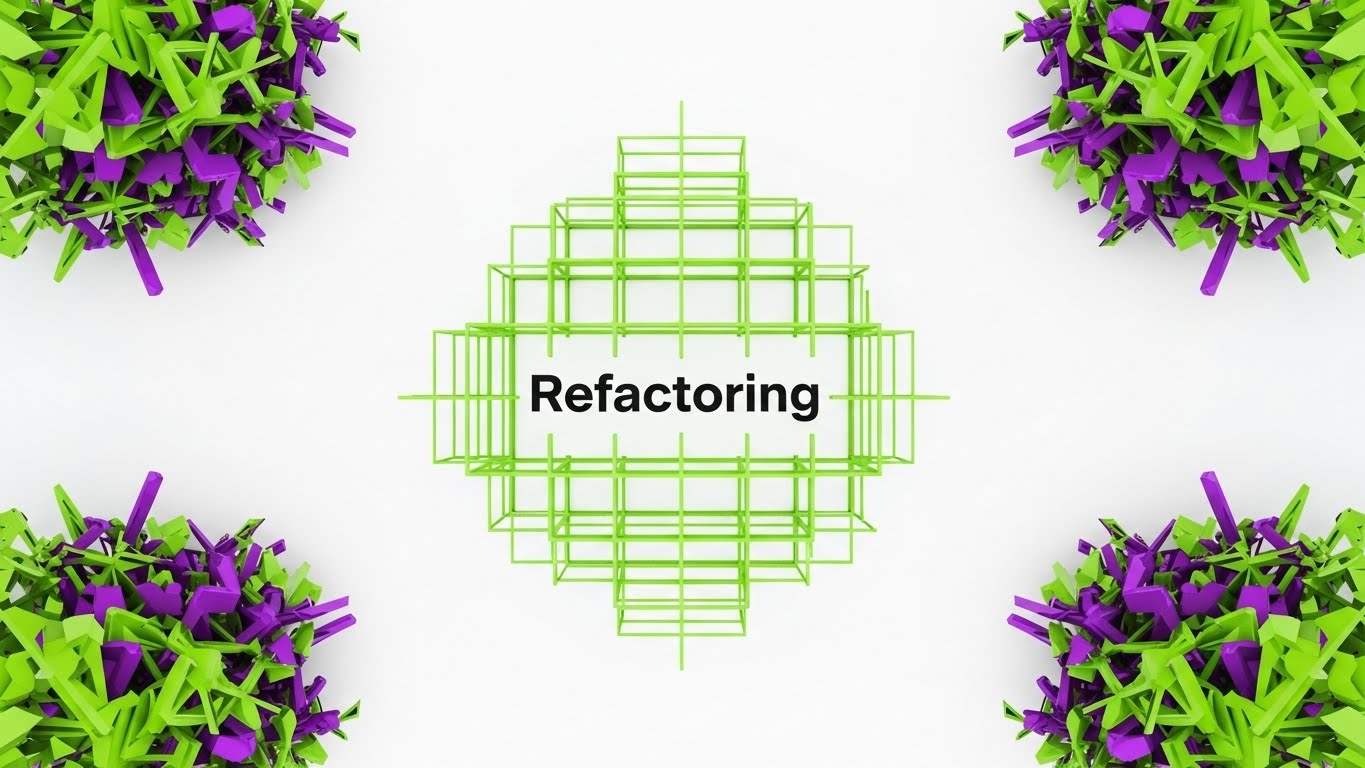
The Visual & Narrative Approach
Code refactoring is about structure, logic, and cleaning up chaos. This style mirrors that process through Bauhaus-inspired geometry. We start with "chaotic, jagged shapes" (Technical Debt) in electric purple and lime green—colors that signal alert or dissonance. As they converge, they "snap" into a "perfect, harmonious grid" (Clean Architecture). The absence of shadows or gradients emphasizes the clarity and binary nature of good code: it either fits, or it doesn't.
Psychological Impact & KPI Focus
This style drives Category Creation (1.2) by visualizing the abstract concept of "Refactoring." It appeals to the logical side of the developer's brain, satisfying the need for order. The "snap" animation provides a dopamine hit similar to resolving a merge conflict. It visually argues that the software turns entropy into order, a core desire for any Engineering Manager.
Strategic Implementation & Trade-offs
- Best Use Case: LinkedIn organic posts or "Feature Spotlight" blog headers.
- Duration: 6–10 Seconds (GIF/Loop).
- Trade-off: It is very stylized. If the audience isn't design-savvy, it might feel too abstract. It lacks "human" connection, focusing entirely on the process.
Companies using similar video content -
SonarQube – Code Quality & Security – Analyzes code for bugs, vulnerabilities, and technical debt.
CodeClimate – Automated Code Review – Improves code quality and maintainability with automated analysis.
6. Bold Kinetic Typography: The "Velocity Block"
TOFU | Vertical Social Organic
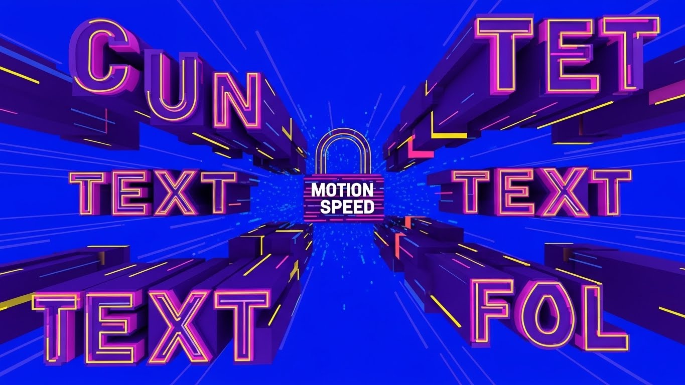
The Visual & Narrative Approach
Speed is the currency of the "Velocity Block." This style uses "chunky geometric shapes" to represent blocks of code or commits. They zoom towards the camera, placing the viewer in the path of progress. The "Electric Blue" background and "speed lines" create a sense of forward momentum. When the shapes "lock together with a heavy impact," it visualizes the robustness of the integration—fast, but solid. It demands attention through high contrast and aggressive motion.
Psychological Impact & KPI Focus
Designed for Vertical Social Organic (3.5) (TikTok/Reels), this style fights the viewer's short attention span. It communicates "Speed" and "Impact" instantly. It appeals to the "10x Developer" persona who values shipping fast. The "heavy impact" sound design (implied visual weight) reassures the viewer that speed doesn't mean fragility; the code "locks" securely.
Strategic Implementation & Trade-offs
- Best Use Case: TikTok, Instagram Reels, or energetic conference openers.
- Duration: 5–10 Seconds.
- Trade-off: It can be overwhelming. The aggressive motion is not suitable for detailed technical explanations. It is purely for hype and energy.
Companies using similar video content -
CircleCI – CI/CD Platform – Automates software builds, tests, and deployments rapidly.
Jenkins – Automation Server – Orchestrates continuous integration and delivery pipelines.
7. Wireframe to Reality Transition: The "Architecture Slider"
MOFU | Product Differentiation
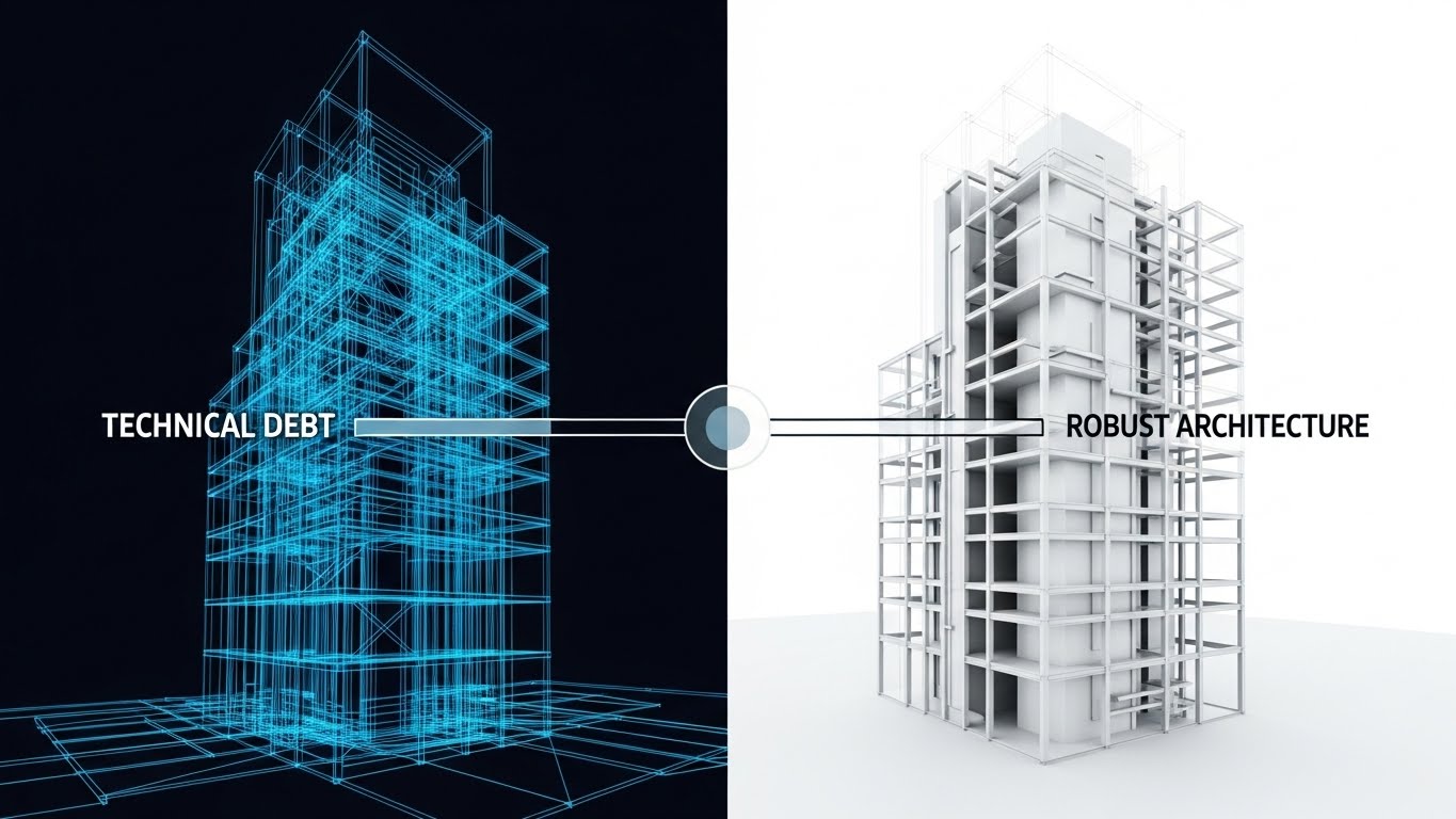
The Visual & Narrative Approach
The "Before and After" is a classic marketing trope because it works. This style elevates it using an architectural metaphor. The "chaotic wireframe" on the left represents the fragile, unseen state of a codebase full of technical debt. The "slider effect" acts as the software's intervention. As it passes, it reveals the "solid, pristine 3D matte render" on the right. This solid building represents the "Robust Architecture" that the software enables. The shift from "glowing blue lines" (impermanent) to "silver and white" (permanent) is the key visual journey.
Psychological Impact & KPI Focus
This is a Product Differentiation (1.7) play. It visually anchors the concept of "Technical Debt"—often a nebulous term—into something structural and dangerous if left unchecked. It reassures the "Architect" persona that the software doesn't just patch holes; it solidifies the foundation. It validates the investment in code quality tools as an investment in structural integrity.
Strategic Implementation & Trade-offs
- Best Use Case: Website Hero sections or "Why Us" landing pages.
- Duration: Interactive (Scroll-based) or 10 Seconds video loop.
- Trade-off: It is a metaphor. If the user wants to see the actual UI dashboard, this distracts. It must be paired with actual screenshots to be fully effective.
Companies using similar video content -
CAST Highlight – Software Intelligence – Assesses software health, risk, and technical debt.
CodeScene – Codebase Visualization – Maps code evolution and identifies architectural decay.
8. Lifestyle Stock with UI Overlay: The "Trust Shield"
MOFU | Building Trust

The Visual & Narrative Approach
B2B software is ultimately about human relationships and agreements. This style creates a visual bridge between the physical act of business (the handshake) and the digital verification of that trust (the UI). The "Trust Score shield" overlaid in the negative space acts as the digital guarantor of the physical deal. The "navy blue and gold" palette signals premium, enterprise-grade security. The lens flare and shallow focus keep the vibe optimistic and professional.
Psychological Impact & KPI Focus
This targets Building Trust (1.9) in the Middle-of-Funnel (MOFU). It connects the software to the business outcome: a closed deal or a signed partnership. It addresses the "Executive" persona who cares less about lines of code and more about risk mitigation. The "100%" metric on the shield is a subtle promise of compliance and security, easing the anxiety of vendor risk assessments.
Strategic Implementation & Trade-offs
- Best Use Case: LinkedIn Sponsored Content or Case Study headers.
- Duration: Static Image or 5 Second Cinemagraph.
- Trade-off: It can feel "stocky" if the handshake looks staged. The UI overlay must look premium (3D matte) to elevate the stock footage.
Companies using similar video content -
Snyk – Developer Security Platform – Finds and fixes vulnerabilities in code and dependencies.
Veracode – Application Security Testing – Secures applications across the entire software lifecycle.
9. Rapid UI Feature Montage: The "Clean Sweep"
MOFU | Feature Education
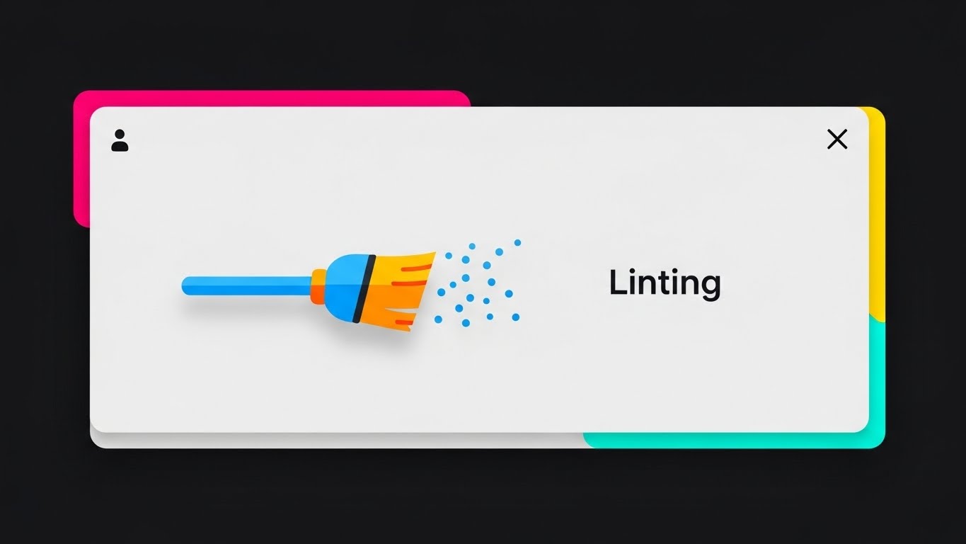
The Visual & Narrative Approach
Sometimes, you just need to show the feature. This style uses "Flat UI" with "material design shadows" to focus entirely on utility. The "broom icon" sweeping away "particle dust" is a direct, instantly understood metaphor for "Linting" (automated code cleanup). By removing text and focusing on the iconographic action, the visual transcends language barriers and focuses on the feeling of the feature: cleaning. The "sky blue and orange" provide a friendly, non-threatening contrast to the grey interface.
Psychological Impact & KPI Focus
This supports Feature Education (1.8). It lowers the cognitive load by simplifying a complex background process (static analysis) into a simple household chore (sweeping). It satisfies the "Developer's" desire for cleanliness and order. The "particle dust" clearing away gives a sense of immediate gratification—a visual "job well done."
Strategic Implementation & Trade-offs
- Best Use Case: YouTube feature deep-dives or "What's New" release notes.
- Duration: 3–5 Seconds per cut (Fast paced montage).
- Trade-off: It simplifies the tech significantly. Hardcore engineers might find the "broom" metaphor too juvenile if not balanced with actual code snippets later.
Companies using similar video content -
DeepSource – Static Code Analyzer – Automates code reviews and detects issues proactively.
Codacy – Automated Code Review – Monitors code quality and security for developers.
10. Split Screen: Optimized Reality and UI: The "Automation Divide"
MOFU | Competitive Displacement
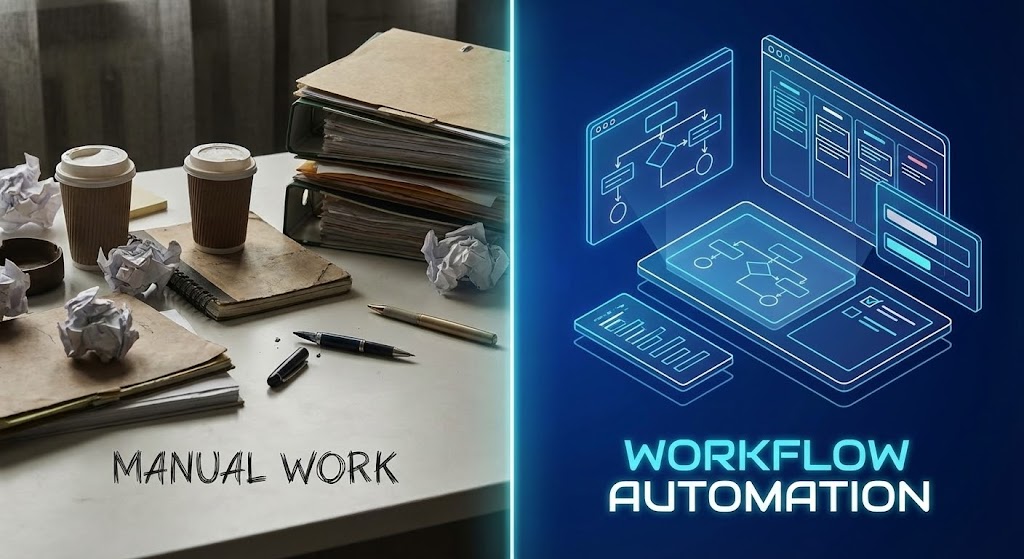
The Visual & Narrative Approach
The contrast here is the story. The vertical divider separates the "Old World" (Manual Work) from the "New World" (Workflow Automation). The left side is tactile, messy, and stressful—"muted earth tones" and "paper clutter." The right side is ethereal, organized, and efficient—"neon blue accents" and a "floating holographic workspace." This binary opposition forces the viewer to choose a side. It visualizes the intangible benefit of "automation" as a tangible shift in environment.
Psychological Impact & KPI Focus
This targets Competitive Displacement (1.13). It subtly frames the competitor's manual or legacy process as "messy" and "outdated." It appeals to the aspiration of the "Modern Engineer" who wants to live in the neon-blue future, not the paper-cluttered past. It validates the pain of manual workflows (the clutter) and offers the solution (the hologram).
Strategic Implementation & Trade-offs
- Best Use Case: Display Ads (Google Display Network) or Retargeting banners.
- Duration: Static or simple slider animation.
- Trade-off: It relies on a strong caricature of "manual work." If the target audience doesn't identify with the "messy desk" (e.g., they already work digitally but inefficiently), the metaphor might miss.
Companies using similar video content -
Puppet – Automation Platform – Automates infrastructure and application delivery.
Ansible – Automation Engine – Simplifies IT automation, configuration management, and deployment.
11. Clean UI Workflow (Light Mode): The "Frictionless Gateway"**
MOFU | Driving Freemium/Trials
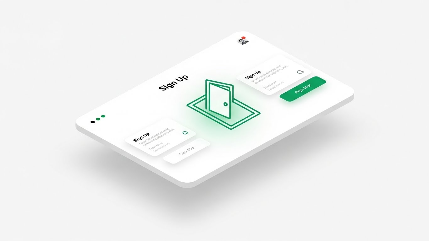
The Visual & Narrative Approach
This style creates a visual antidote to "Setup Fatigue." Utilizing a pristine Neumorphic aesthetic—characterized by soft, extruded shapes and gentle light grey shadows—we present the onboarding process as tangible and inviting. The central metaphor is an "Open Door" icon emitting a soft emerald light, floating on a clean white interface. By stripping away complex forms and placing the UI in an infinite white studio space, the visual suggests that entering the platform is as effortless as walking through an open door.
Psychological Impact & KPI Focus
This targets Driving Freemium/Trials (2.3). Psychologically, it leverages the "Aesthetic-Usability Effect," where attractive, clean designs are perceived as easier to use. It calms the anxiety of the "Overwhelmed Manager" who fears a week-long configuration process. It visually promises "Plug and Play" simplicity, directly impacting the visitor-to-signup conversion rate.
Strategic Implementation & Trade-offs
- Best Use Case: "Get Started" landing pages or Retargeting Ads for users who bounced at the signup form.
- Duration: 6–10 Seconds (Micro-loop).
- Trade-off: The "Soft" aesthetic is optimized for onboarding but lacks the data density required for technical deep-dives. It sells the start of the journey, not the depth of the analysis.
Companies using similar video content -
Mend.io – Software Supply Chain Security – Manages open source security and license compliance.
FOSSA – Open Source Management – Automates open source license compliance and security.
12. 2D Graphics Over Live Action: The "Augmented Reviewer"
MOFU | The Functional Buyer

The Visual & Narrative Approach
Code review is inherently a human process assisted by machines. This style bridges the physical/digital divide by overlaying "Tech Blue" vector icons onto a warm, authentic photograph of an engineering team. We see the "Invisible Workflow" manifest as floating speech bubbles, connection nodes, and "Approved" stamps hovering above the team’s heads. It transforms a static meeting photo into a dynamic visualization of consensus, showing the software as the connective tissue between people.
Psychological Impact & KPI Focus
This serves The Functional Buyer (VP/Director) (7.2). It validates the manager's priority: Team Alignment. The "Approved" stamps provide embedded social proof, suggesting that the software facilitates faster agreement and reduces friction between developers. It reframes the tool from a "code checker" to a "collaboration layer."
Strategic Implementation & Trade-offs
- Best Use Case: LinkedIn Sponsored Content or "Culture/Careers" website sections.
- Duration: Static Image or Parallax Motion.
- Trade-off: It relies heavily on the authenticity of the stock photo. If the team looks too "staged," the credibility of the "augmented" narrative suffers.
Companies using similar video content -
Atlassian – Jira/Bitbucket – Facilitates team collaboration and code management.
Swarmia – Developer Collaboration – Improves team alignment and focus on critical work.
13. Dynamic Data Visualization: The "ROI Breakthrough"
BOFU | ROI Justification

The Visual & Narrative Approach
When addressing the CFO, subtlety is ineffective. This style visualizes financial impact with kinetic force. We see towering 3D bar charts in High-Gloss Gold and Royal Blue—colors signaling wealth and corporate stability—rising with such momentum that they physically shatter a glass ceiling labeled "Costs." The ray-traced reflections on the marble surface add a layer of premium polish. This violent but triumphant interaction visually articulates the concept of "breaking through" efficiency limits.
Psychological Impact & KPI Focus
This is a pure ROI Justification (1.10) asset. It addresses the "Cost Objection" by reframing the software as a revenue enabler. The shattering glass provides a cathartic release, symbolizing the destruction of technical debt and wasted time. It appeals to the "Economic Buyer's" desire for growth and aggressive efficiency.
Strategic Implementation & Trade-offs
- Best Use Case: Pitch Decks (The "Value" Slide) or Quarterly Business Review (QBR) intros.
- Duration: 5–10 Seconds (Impact Loop).
- Trade-off: It is aggressive. It works for the financial stakeholder but may feel too "salesy" for a technical audience that prefers feature specifications over financial metaphors.
Companies using similar video content -
Jellyfish – Engineering Management Platform – Connects engineering work to business value.
Allstacks – Value Stream Management – Provides unified visibility into software delivery.
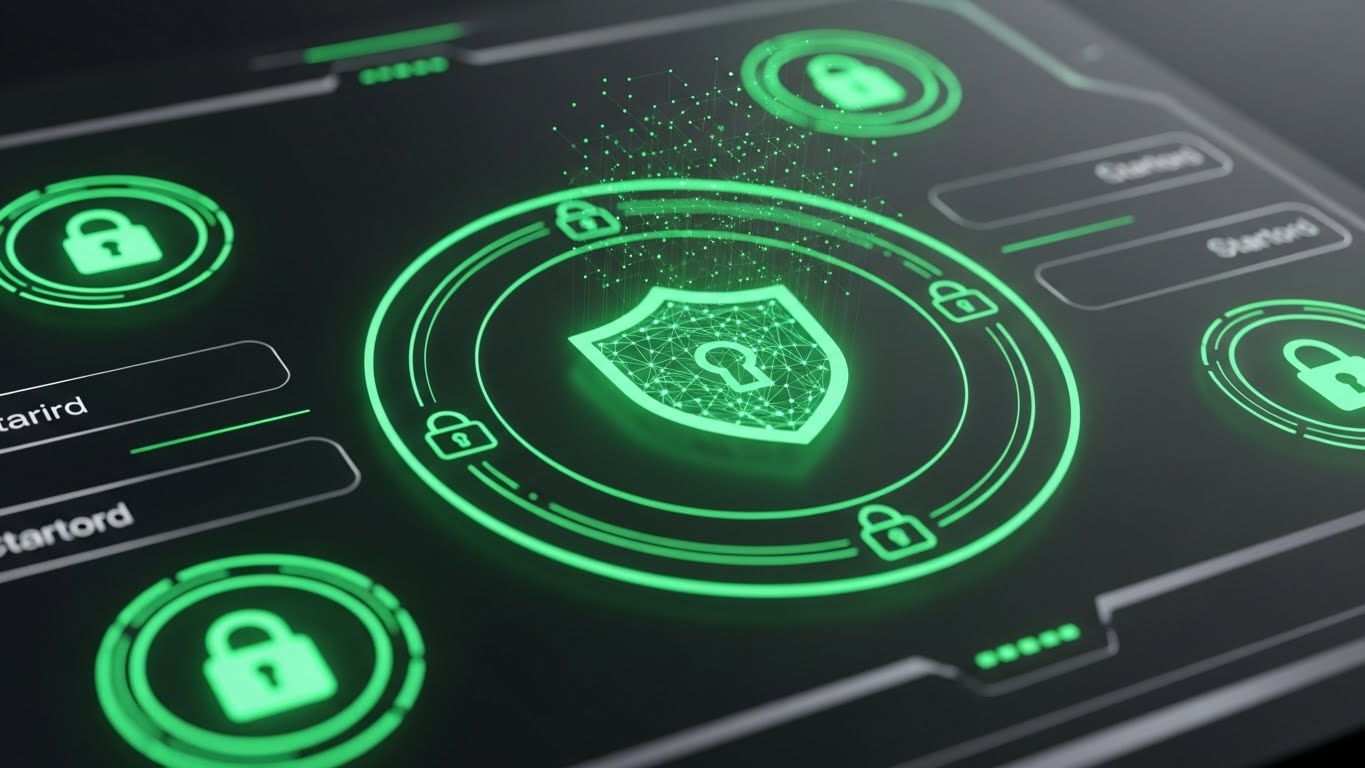
14. 3D X-Ray Visualization: The "Core Defense"
BOFU | Risk Mitigation

The Visual & Narrative Approach
Security vulnerabilities are often hidden deep within the dependency tree. This style uses an X-Ray Shader to strip away the surface of a sleek server rack, revealing the internal reality. The focal point is a "glowing, shielded core" shaped like a padlock, pulsating in alert red (threat detection) and safe blue (neutralization). The "scientific lab" background reinforces the precision of the scan. It demonstrates that the protection is architectural, not superficial.
Psychological Impact & KPI Focus
Targeting Risk Mitigation (1.12), this style speaks to the "Paranoid CISO." It calms the anxiety of the "Black Box" by offering total transparency. It visually proves that the software inspects the "guts" of the code (binaries, dependencies) where human reviewers cannot see, building trust in the platform's compliance capabilities.
Strategic Implementation & Trade-offs
- Best Use Case: Security/Compliance pages or Whitepaper headers.
- Duration: 10–15 Seconds.
- Trade-off: It is highly technical and somewhat ominous. It is essential for the security audit phase but less inspiring for creative developers.
Companies using similar video content -
Checkmarx – Application Security Platform – Identifies and remediates software vulnerabilities.
Fortify – Application Security Testing – Delivers comprehensive static and dynamic analysis.
15. Aspirational Stock Montage: The "Synapse Network"
BOFU | Overcoming Objections

The Visual & Narrative Approach
In a distributed world, the fear of "Silos" is a major blocker. This style visualizes the antidote. Using high-key, sun-drenched footage of a happy open-plan office, we overlay abstract digital lines in sunlight yellow and sky blue. These lines arc between the professionals, visualizing the "Invisible Conversation" and knowledge transfer enabled by the platform. It creates a picture of a "Hive Mind" where collaboration is fluid and automatic.
Psychological Impact & KPI Focus
This targets Overcoming Objections (1.11) related to culture. It appeals to the Engineering Director who worries about junior devs being left behind. The visual suggests that the tool facilitates mentorship and "osmotic communication," even if the team is hybrid. It sells the feeling of a synchronized, high-functioning team.
Strategic Implementation & Trade-offs
- Best Use Case: Email Nurture Campaigns (Welcome Series) or HR/Recruiting videos.
- Duration: Static or Slow Pan Video.
- Trade-off: Generic stock footage is a risk. The quality of the "digital overlay" is the only thing differentiating this from a standard corporate ad; it must look premium and integrated.
Companies using similar video content -
Microsoft Azure DevOps – DevOps Services – Connects teams for planning, coding, and deploying.
Google Cloud Build – CI/CD Service – Executes builds on Google Cloud infrastructure.
16. Holographic UI over 3D Render: The "Future of Work"
BOFU | Driving Demo Requests

The Visual & Narrative Approach
To sell a digital product, you must sometimes make it feel physical. This style projects the software interface as a complex Sci-Fi Hologram rising from a sleek physical keyboard. The interface is detailed with silver and bright blue data widgets, but the hero element is a large, touchable "DEMO" button. By placing the CTA in a futuristic, 3D space, it frames the act of requesting a demo not as a form-fill, but as an interaction with advanced technology.
Psychological Impact & KPI Focus
Designed for Driving Demo Requests (2.1), this style leverages "Gadget Lust." It creates a sense of exclusivity and advanced capability. It appeals to the "Early Adopter" persona, promising a hands-on experience that feels years ahead of the competition. It lowers the friction of the "Ask" by making the button itself an object of desire.
Strategic Implementation & Trade-offs
- Best Use Case: LinkedIn Retargeting Ads (BOFU) or High-Intent Landing Pages.
- Duration: 6–10 Seconds.
- Trade-off: It creates very high expectations. If the actual product UI is dated or flat, the disconnect between the ad and the reality can lead to disappointment.
Companies using similar video content -
Wiz – Cloud Security Platform – Visualizes cloud infrastructure and identifies risks.
Lacework – Cloud Security Platform – Automates cloud security and compliance.
17. Dark Mode UI Showcase: The "Pro Habitat"
BOFU | The Technical Buyer
The Visual & Narrative Approach
Serious developers live in Dark Mode. This style validates that preference by presenting the UI in a sophisticated deep charcoal. Unlike generic screenshots, this focuses on "Micro-interactions": we see toggle buttons glowing as they are activated, and abstract code blocks that are sharp and legible. The pastel pink and white accents provide a modern, high-contrast aesthetic that mimics a configured IDE (Integrated Development Environment).
Psychological Impact & KPI Focus
This targets The Technical Buyer (7.3). It signals "We speak your language." It reduces the "Implementation Friction" by showing a UI that feels native to the developer's existing workflow. The focus on specific interactions (toggles) suggests responsiveness and control, satisfying the user's need for a tool that feels precise and professional.
Strategic Implementation & Trade-offs
- Best Use Case: "Features" page, Developer Documentation, or Product Release Notes.
- Duration: Static Image or Micro-interaction GIF.
- Trade-off: It creates a "Club" atmosphere. Non-technical stakeholders might find it too dark or "techy," but for the actual user, it builds immediate rapport.
Companies using similar video content -
JetBrains – IntelliJ IDEA – Provides a powerful environment for Java development.
VS Code – Code Editor – Highly customizable and extensible code editor.
18. 2D Line Art Animation: The "Untangler"
BOFU | Objection Handling
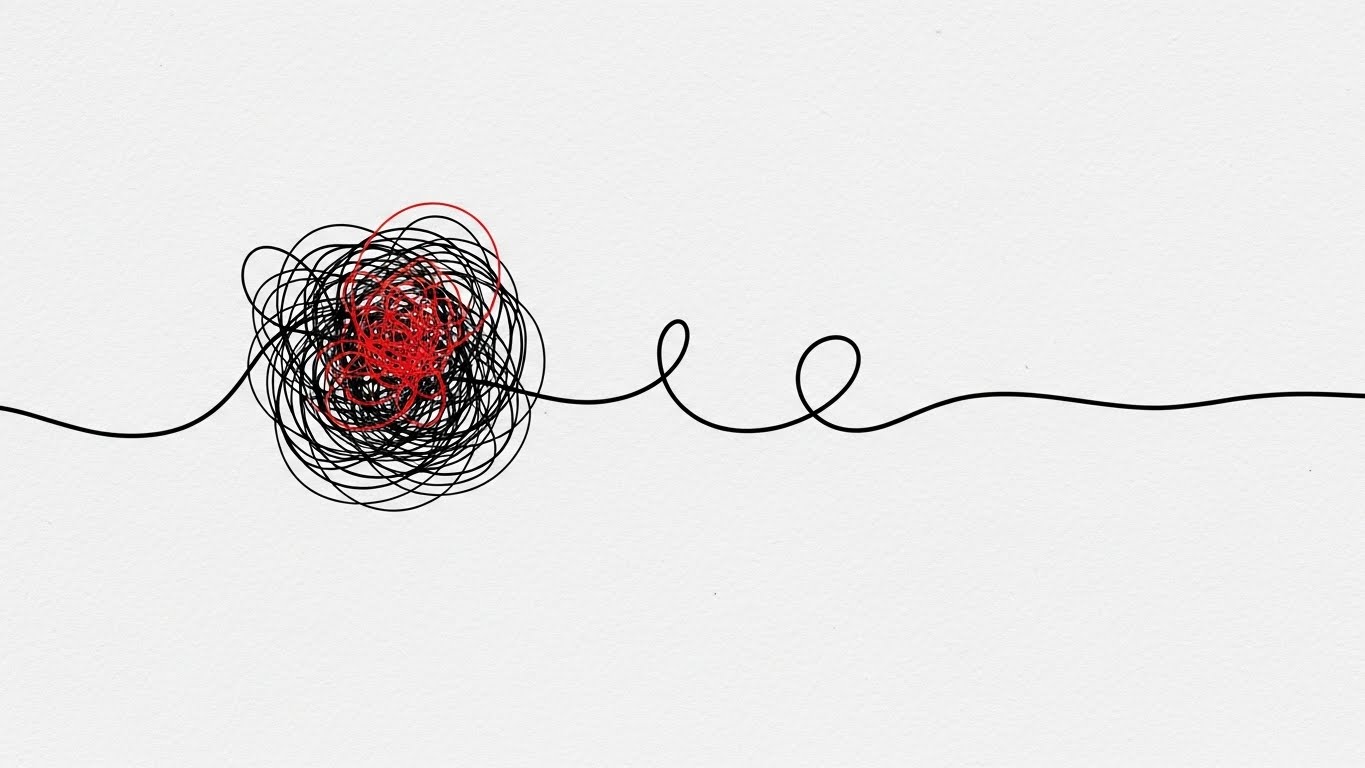
The Visual & Narrative Approach
Sometimes, the most powerful story is the simplest. This style uses a single continuous black line on a textured paper-white background. The line forms a "tangled, chaotic knot" with a red accent (The Problem/Spaghetti Code), which then gracefully unwinds and straightens into a smooth, efficient line (The Solution). It is a minimalist visual metaphor for "Refactoring" or "Technical Debt Reduction."
Psychological Impact & KPI Focus
This addresses Objection Handling (5.2) regarding complexity. Prospects often fear that untangling their legacy code is impossible. This animation creates a satisfying sense of relief (Katharsis). It visualizes the promise: "We take your mess and make it linear." It appeals to the innate human desire for order and simplicity, reducing the cognitive load of the buying decision.
Strategic Implementation & Trade-offs
- Best Use Case: Retargeting Ads (Meta/Instagram) or Loading Screens within the app.
- Duration: 5–8 Seconds (Looping).
- Trade-off: It is abstract. It doesn't show the product interface. It must be used to sell the concept of simplification, not the feature set itself.
Companies using similar video content -
Stepsize – Technical Debt Management – Helps teams track and prioritize technical debt.
Refactor.ai – Automated Refactoring – Simplifies complex code refactoring processes.
19. Low-Poly 3D Modeling: The "Value Discovery"
BOFU | Cart/Signup Abandonment

The Visual & Narrative Approach
To re-engage users who have abandoned a signup, we need warmth, not sales pressure. This Low-Poly style features a playful pastel purple character standing next to an open treasure chest. Inside, glowing orbs of orange and teal represent the "Value" or "Insights" the user left behind. The isometric stage and spotlight create a focused, theatrical moment. It frames the software not as a tool, but as a reward waiting to be claimed.
Psychological Impact & KPI Focus
Targeting Cart/Signup Abandonment (5.4), this style leverages "Loss Aversion" but wraps it in a positive, gamified aesthetic. It suggests, "Look what you're missing out on," without being accusatory. The playful tone disarms the viewer and lowers defensive barriers, encouraging them to return to the signup process just to see "what's in the box."
Strategic Implementation & Trade-offs
- Best Use Case: Abandoned Cart Emails, Re-engagement Display Ads.
- Duration: Static Image.
- Trade-off: It creates a "consumer" vibe. It may be too cutesy for a rigid Enterprise client, but is highly effective for individual developer seats or smaller teams (PLG motion).
Companies using similar video content -
GitKraken – Git Client – Visualizes Git workflows with an intuitive interface.
Tower – Git Client – Makes Git easier and more powerful for developers.
20. Isometric 3D Workflow: The "Code Factory"
BOFU | Reducing Implementation Friction

The Visual & Narrative Approach
This style takes the abstract concept of a "CI/CD Pipeline" and makes it physical. Using a "soft matte clay" aesthetic in industrial grey, safety yellow, and blue, we see a miniature factory floor. A conveyor belt moves perfect white cubes (Code Commits) through processing gates without stopping. The process is smooth, rhythmic, and jam-free. The toy-like clarity makes the complex infrastructure look manageable and modular.
Psychological Impact & KPI Focus
This targets Reducing Implementation Friction (1.16). Engineering Managers often fear that a new tool will disrupt their existing pipeline. This visual argues the opposite: it fits perfectly. It organizes the chaos. By visualizing the workflow as a well-oiled machine, it promises "Operational Excellence" and "Throughput." It creates a mental model of the software as a standardized, reliable industrial component.
Strategic Implementation & Trade-offs
- Best Use Case: "Integrations" or "How it Works" website sections; Onboarding documentation.
- Duration: 10–20 Seconds (Looping machinery).
- Trade-off: It simplifies the messiness of real-world DevOps. It presents an idealized state, which is great for selling the vision, but technical buyers will eventually need to see the actual configuration details.
Companies using similar video content -
JFrog – DevOps Platform – Manages and distributes software releases efficiently.
Harness – Software Delivery Platform – Automates and optimizes software delivery pipelines.
21. 2D Animation & UI Composition: The "Friendly Guide"**
Onboarding | Self-Serve Onboarding

The Visual & Narrative Approach
The "Empty State" of a new dashboard is often the highest friction point in the user journey. This style combats that anxiety by introducing a "Companion Character." Rendered in a warm turquoise and peach palette with a Cel-shaded aesthetic, the character actively interacts with the UI, pointing to a floating winking helper bot icon. The background is a subtle, abstract geometric pattern in white and soft grey, ensuring the focus remains on the guidance. It reframes the setup process from a technical chore into a supported collaboration.
Psychological Impact & KPI Focus
This targets Self-Serve Onboarding (2.4). Psychologically, it leverages "Anthropomorphism"—assigning human traits to the software to build trust. It reduces the "Imposter Syndrome" junior developers might feel when facing a complex tool. The friendly visual cues encourage exploration and directly impact Time-to-First-Commit, reducing the drop-off rate during the initial configuration phase.
Strategic Implementation & Trade-offs
- Best Use Case: In-App "Welcome" modals or "First Run" wizard videos.
- Duration: 30–45 Seconds (Instructional).
- Trade-off: The "cartoon" aesthetic leans towards a consumer (B2C) vibe. It must be balanced with high-utility scripting to ensure it doesn't feel patronizing to experienced engineers.
Companies using similar video content -
Postman – API Platform – Simplifies API development, testing, and documentation.
Swagger (SmartBear) – API Tools – Helps design, build, and document RESTful APIs.
22. Hyper-lapse Stock Footage with Data: The "Velocity Stream"
Onboarding | Accelerating Time-to-Value

The Visual & Narrative Approach
For the enterprise buyer, "Scale" and "Speed" are the primary metrics. This style visualizes the engineering organization as a bustling metropolis. Using aerial hyper-lapse footage of a city highway at night, we overlay motion-tracked neon amber and white vector lines onto the traffic. This transforms the cars into data packets or pull requests, flowing smoothly through a massive infrastructure. It visualizes "High Throughput" and "Zero Latency"—a system that thrives on volume.
Psychological Impact & KPI Focus
This addresses Accelerating Time-to-Value (1.15). It appeals to the "CTO" or "VP of Engineering" who views their department as a logistics network. The visual of unblocked, high-speed traffic validates their goal of "Developer Velocity." It subconsciously reassures the stakeholder that the platform can handle the load of thousands of concurrent reviews without becoming a bottleneck.
Strategic Implementation & Trade-offs
- Best Use Case: Email Nurture Campaigns (Post-Signup) or Conference Booth Backgrounds.
- Duration: 10–15 Seconds (Loop).
- Trade-off: It is a high-level metaphor. It builds excitement about capacity but explains nothing about configuration. It works best as an emotional primer.
Companies using similar video content -
Honeycomb – Observability Platform – Provides insights into complex production systems.
Lightstep (ServiceNow) – Observability Platform – Accelerates root cause analysis for distributed systems.
23. Isometric 2D Motion Design: The "Integration Snap"
Onboarding | Trial User Activation

The Visual & Narrative Approach
Integration is often the biggest hurdle to activation. This style uses Isometric Geometry to visualize the "Setup" as a satisfying game. We see flat, 2D puzzle pieces in lavender, mint, and soft yellow floating above a grid. As they descend, they "click" perfectly into place to form a cohesive square. The animation is smooth and rhythmic, devoid of shadows or clutter. It visualizes the concept of "Plug-and-Play"—demonstrating that the software slots perfectly into the existing tech stack (Jira, GitHub, Slack) without friction.
Psychological Impact & KPI Focus
Targeting Trial User Activation (5.3), this style triggers the "Completion Bias" cognitive loop. The user wants to see the puzzle finished. It creates a sense of "Cognitive Ease," reassuring the user that connecting their repository is a modular, low-risk action. This directly improves the Integration Rate during the trial period.
Strategic Implementation & Trade-offs
- Best Use Case: In-App "Connect Your Repo" screens or Integration Directory headers.
- Duration: 5–8 Seconds (Loop).
- Trade-off: It simplifies the reality. Real-world integrations often involve API keys and permissions. This style sells the concept of ease, not the technical steps.
Companies using similar video content -
Kong – API Gateway – Manages and secures APIs across hybrid and multi-cloud.
Apigee (Google Cloud) – API Management – Develops and manages APIs with enterprise-grade security.
24. Minimalist Flat 2D Vector: The "Knowledge Grid"
Retention | Knowledge Base & FAQ Videos
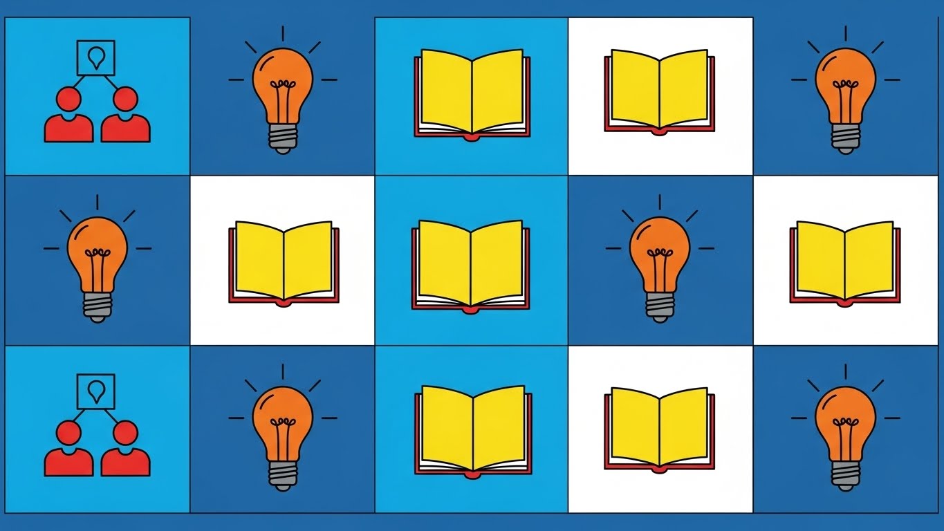
The Visual & Narrative Approach
When a user is stuck, they crave clarity, not cinematic flair. This style utilizes a rigorous Swiss Grid System with monochromatic blue vector icons. The icons—lightbulbs for concepts, open books for documentation—use negative space to remain legible at any size. The layout is orderly, symmetrical, and calm. It presents the "Knowledge Base" not as a dusty library, but as a highly organized control panel where answers are accessible and logical.
Psychological Impact & KPI Focus
This supports Knowledge Base & FAQ Videos (9.1). It targets the emotion of "Frustration." By presenting a clean, uncluttered visual field, it lowers the user's cognitive load. It reinforces the perception that the product is mature and well-documented. This helps in Ticket Deflection, encouraging users to solve problems themselves rather than emailing support.
Strategic Implementation & Trade-offs
- Best Use Case: Help Center Headers, Category Thumbnails, or Empty Search States.
- Duration: Static Image or Micro-Interaction (Hover).
- Trade-off: It is purely functional. It lacks "Wow Factor" and should be reserved for support/retention channels, not sales/marketing.
Companies using similar video content -
Confluence (Atlassian) – Team Workspace – Organizes team knowledge and collaboration.
ReadMe – Developer Hubs – Creates interactive developer hubs and API documentation.
25. 2D Character-Driven Story: The "Zen Developer"
Retention | Reducing Support Overhead

The Visual & Narrative Approach
Support isn't just about fixing bugs; it's about emotional regulation. This style uses the "Corporate Memphis" flat art aesthetic to visualize the result of a resolved issue. We see a developer in a warm beige and forest green office, leaning back with a steaming coffee. The exaggerated limbs and soft shapes suggest relaxation. The character is not frantically typing; they are observing. It frames the "After State" of the user experience as calm, controlled, and sustainable.
Psychological Impact & KPI Focus
Targeting Reducing Support Overhead (1.18), this style serves as an "Empathy Anchor." When used in support communications (e.g., "Ticket Received"), it subtly de-escalates the user's stress. It suggests that the platform handles the heavy lifting, allowing the developer to reclaim their peace of mind. It builds affinity and patience.
Strategic Implementation & Trade-offs
- Best Use Case: Support Auto-responders, "Success" Confirmation Screens, or Customer Newsletters.
- Duration: Static Image or subtle "Steam" animation.
- Trade-off: The "Corporate Memphis" style is ubiquitous in Big Tech. To avoid looking generic, specific brand elements (like the UI on the monitor) must be incorporated into the illustration.
Companies using similar video content -
PagerDuty – Incident Management – Resolves critical incidents quickly and efficiently.
Opsgenie (Atlassian) – Incident Management – Centralizes alerts and streamlines incident response.
26. Abstract 2D Motion Graphics: The "Retention Morph"
Retention | Reducing Churn

The Visual & Narrative Approach
How do you visualize the abstract concept of "Churn"? This style uses Liquid Motion. We start with a volatile, viscous shape in "Alert Red" (representing Risk/Churn). It flows and morphs, stretching unpredictably. Then, smoothly, it solidifies into a stable, perfect square in "Brand Blue" (Retention). The transition is satisfying and hypnotic. It visualizes the platform's ability to take a chaotic codebase or team process and stabilize it into something permanent.
Psychological Impact & KPI Focus
Designed for Reducing Churn (1.19), this appeals to the "Customer Success" stakeholder. It visualizes their primary goal: Stabilization. The metaphor of "Liquid to Solid" provides a visual shorthand for NRR (Net Revenue Retention). It communicates that the tool is the catalyst for turning risk into reliability.
Strategic Implementation & Trade-offs
- Best Use Case: Quarterly Business Reviews (QBRs), Re-engagement Ads, or Investor Decks.
- Duration: 6–10 Seconds (Loop).
- Trade-off: It is highly interpretative. Without the labels "Churn" and "Retention," the meaning is lost. It requires strong copy anchorage to be effective.
Companies using similar video content -
Amplitude – Product Analytics – Helps teams build better products and drive growth.
Grafana Labs – Observability Platform – Visualizes metrics, logs, and traces from any source.
27. 3D Parallax UI Presentation: The "Deep Dive"
Expansion | Driving Deep Feature Adoption

The Visual & Narrative Approach
Basic users see the dashboard; power users see the architecture. This style uses an exploded 3D view to separate the UI into floating layers of glass. Using a parallax camera move, we drift past the surface layer to reveal the "Deep Features" (Analytics, Security, Compliance) glowing in silver and electric blue underneath. It visualizes the depth and complexity of the tool, proving that the value extends far beyond the homepage.
Psychological Impact & KPI Focus
Targeting Driving Deep Feature Adoption (1.17), this appeals to the "Curious Engineer." It triggers a desire to explore. By visually suggesting that there is "more than meets the eye," it encourages users to click deeper into settings and advanced modules. This increases User Stickiness and the barrier to exit.
Strategic Implementation & Trade-offs
- Best Use Case: "New Feature" Announcements, Product Tour Videos, or "Advanced" Website Sections.
- Duration: 10–15 Seconds.
- Trade-off: It demands high-fidelity assets. If the actual UI is cluttered or dated, this idealized 3D version creates a gap between expectation and reality.
Companies using similar video content -
Palo Alto Networks – Prisma Cloud – Secures applications across the entire cloud native stack.
GitHub Copilot – AI Pair Programmer – Provides AI-powered code suggestions directly in the editor.
28. Photorealistic 3D Renders: The "Executive Suite"
Expansion | Driving Upsell/Cross-sell

The Visual & Narrative Approach
To sell the "Enterprise Tier," you must sell status. This style abandons the vector aesthetic for High-End Photorealism. We see a luxury desk environment: polished marble, a gold trophy, balanced scales, and a premium laptop displaying the "Enterprise Unlocked" badge. The lighting is cinematic and warm. This isn't about code; it's about "Success," "Balance," and "Governance." It associates the software upgrade with executive achievement.
Psychological Impact & KPI Focus
This serves Driving Upsell/Cross-sell (1.20). It targets the "Aspirational Self" of the buyer. Even in B2B, status matters. This visual frames the "Enterprise Plan" not as a cost, but as a badge of maturity for the organization. It leverages "Authority Bias," suggesting that industry leaders operate in environments like this.
Strategic Implementation & Trade-offs
- Best Use Case: Pricing Pages (Enterprise Column), Executive Pitch Decks, or Account-Based Marketing (ABM) mailers.
- Duration: Static Image.
- Trade-off: It creates distance from the developer. It works for the buyer (VP/C-Level) but may feel pretentious to the user (Developer).
Companies using similar video content -
Docker – Container Platform – Builds, shares, and runs applications with containers.
29. Macro UI Micro-Interactions: The "Pro Switch"
Expansion | In-App Upsell
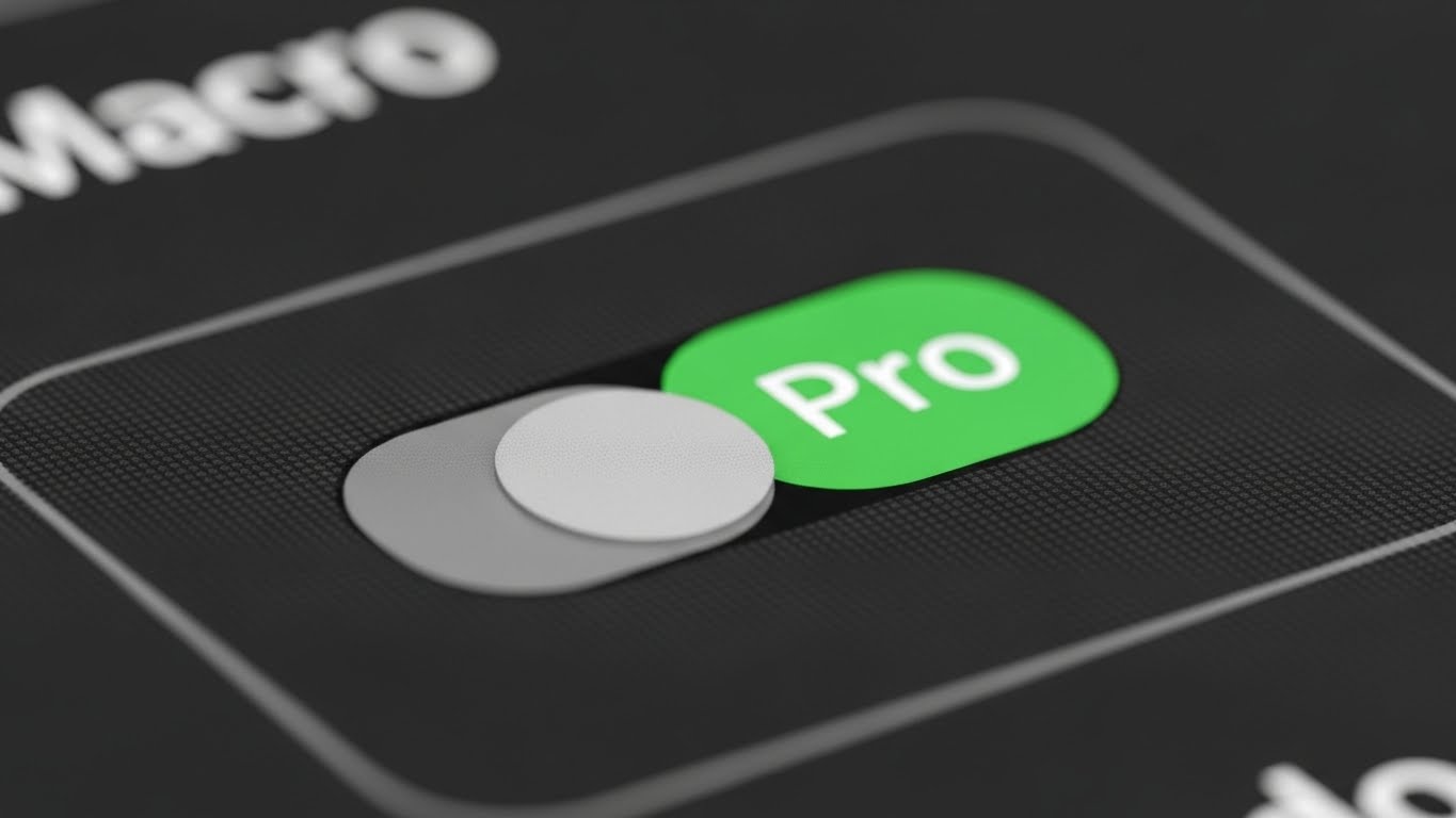
The Visual & Narrative Approach
The decision to upgrade often happens in a micro-moment. This style zooms in—way in. We use a Macro Lens effect to focus on a single toggle switch on the interface. The texture of the pixels is visible. The switch is captured mid-flip, turning from "Grey" to a vibrant, glowing Green labeled "Pro." The shallow depth of field blurs everything else, forcing the viewer to focus entirely on the action of upgrading. It makes the digital act feel physical and decisive.
Psychological Impact & KPI Focus
Targeting In-App Upsell (2.5), this style leverages the "Tactile Response." It creates a sensory craving to "flip the switch." It focuses on the Ease of Upgrade—it’s just one click away. It reduces the friction of the buying decision by making the action feel small, simple, and immediately rewarding.
Strategic Implementation & Trade-offs
- Best Use Case: In-App Paywalls, Hover States on locked features, or "Upgrade" tooltips.
- Duration: 3–5 Seconds (Loop).
- Trade-off: It is hyper-specific. It only works if you have a clear binary feature (On/Off) to showcase. It doesn't explain what the feature does, only the act of enabling it.
Companies using similar video content -
Tabnine – AI Code Completion – Accelerates development with AI code completion.
30. Futuristic Neon/Dark Mode: The "Viral Network"
Expansion | Driving Referrals & Advocacy

The Visual & Narrative Approach
Software adoption is a network effect. This style visualizes the "Viral Loop" using a Cyberpunk/Dark Mode aesthetic. On a dark grid, we see neon cyber-cyan nodes (users) connecting rapidly via glowing green energy beams (referrals). The network grows exponentially, forming a complex, thriving mesh. It frames "Referrals" not as a marketing request, but as joining a powerful, expanding grid of intelligence.
Psychological Impact & KPI Focus
This drives Referrals & Advocacy (1.21). It appeals to the developer's desire to be a "Node of Influence." It gamifies the referral process by visualizing it as building a network. The high-tech aesthetic validates the user's taste—sharing this tool makes them look cool and "in the know" to their peers.
Strategic Implementation & Trade-offs
- Best Use Case: "Invite Your Team" screens, Referral Program landing pages, or Community Hub headers.
- Duration: 6–10 Seconds (Loop).
- Trade-off: The "Matrix" aesthetic is very specific. It resonates deeply with backend engineers and gamers but might feel too aggressive for design-focused frontend teams.
Strategic Knowledge Base: The Visual Operations Doctrine
This section synthesizes the 30 visual styles into a cohesive strategic framework. It moves beyond "content creation" to establish a Visual Operating System for Code Review Software.
Strategic Alignment & Visual Architecture
The "Pre-Production" Phase: Defining the Visual Language of Engineering.
- The Cognitive Load Audit: Before creating a single asset, audit the "Mental Weight" of your current features. If a concept like "Rebasing" takes 500 words to explain, it requires Style 5 (Abstract Vector). If it’s a high-level architecture flow, it requires Style 2 (Abstract 3D). Match visual complexity to the problem complexity.
- Role-Based Visual Mapping: Differentiate your visuals by persona. The Developer (Mobile/Simple) needs Style 21 (Friendly Guide) for quick onboarding. The Architect (Desktop/Data) needs Style 22 (Hyper-lapse) to visualize scale and throughput. One style does not fit all.
- The "Glanceability" Standard: In a high-velocity CI/CD environment, attention is scarce. Visuals for alerts or status checks must pass the "Glance Test." A viewer must understand the status (Pass/Fail) in under 1.5 seconds. Style 29 (Macro UI) is the standard here—unambiguous binary states.
- Brand Voice Consistency: Your visual language is your accent. If your brand is "Enterprise Security," lean into Style 8 (Trust Shield). If your brand is "Developer Playground," lean into Style 3 (Mixed Media). Disconnect between marketing visuals and product UI breeds distrust.
- The Advids Strategic Audit: This is where Advids adds value. We audit your existing asset library to identify "Visual Debt"—inconsistent, outdated, or off-brand visuals that confuse users. We ensure your "Visual Operating System" is coherent from the first ad to the final renewal email.
- Standardization vs. Customization: Use standardized "Stock" elements (Style 22) for generic concepts like "Speed" or "Cloud." Reserve bespoke, high-cost animation (Style 1) for your core differentiators. This optimizes the budget for impact.
- The Cross-Departmental Bridge: Sales talks "ROI," Engineering talks "Latency." Use Style 12 (Augmented Reviewer) to bridge this. Show the team and the data in one frame to unify the terminology and align the "War Room" with the "Board Room."
- Legacy System Integration: Visualizing the connection between "Monolithic Mainframes" and "Cloud Microservices" is difficult. Use Style 10 (Split Screen) or Style 7 (Wireframe Slider) to visually acknowledge the legacy reality while selling the future modernization.
- Accessibility in Global Teams: Code is global. Visuals must rely on iconography (Style 24) rather than on-screen text to ensure the message lands for non-native English speakers without expensive localization/dubbing costs.
- The Mobile-First Mandate: Engineering Managers approve Pull Requests on the go. Ensure all "Alert" and "Status" styles (Style 29) are legible on a vertical 9:16 screen. If the "Approve" button isn't clear on a phone, you are blocking the pipeline.
Operational Adoption & Implementation
The "Deployment" Phase: Embedding Visuals into the DevOps Workflow.
- Overcoming "Big Brother" Anxiety: Developers fear metrics tools are for surveillance. Use Style 15 (Aspirational Network) to frame analytics as "Team Health" and "Support," not "Individual Tracking." Visual empathy is critical to adoption.
- The Micro-Learning Shift: Replace the 50-page PDF manual with a playlist of 30-second Style 9 (Clean Sweep) clips. Developers learn "Just-in-Time." Embed these clips directly into the IDE tooltip or PR comment box.
- Just-in-Time Support: Reduce "How-to" tickets by placing Style 23 (Integration Snap) videos directly in the API setup dashboard. Visualizing the "Key Handshake" prevents the frustration that leads to support calls.
- Gamification of Quality: Use Style 1 (Cinematic Victory) to celebrate "Clean Code" milestones. Visualizing a "Zero Bug" week as a heroic event (rather than just 'doing your job') boosts morale and drives behavioral change.
- Reducing Support Ticket Volume: There is a direct correlation between the quality of your "Getting Started" visuals (Style 21) and the volume of "How do I...?" support tickets. Invest in proactive visual guides to save OpEx later.
- Remote Onboarding: In a distributed world, you cannot look over a junior's shoulder. Use Style 12 (Augmented Reviewer) to simulate that "over-the-shoulder" mentorship digitally, creating a sense of shared culture.
- Standard Operating Procedures (SOPs): Transform rigid text-based SOPs into Style 20 (Isometric Factory) animations. Processes that look like "machines" are easier to follow and internalize than processes that look like "legal documents."
- Feedback Loops: Use interactive video elements (Style 16 Holographic) to ask for feedback within the video itself. "Did this explanation help?" Visual feedback mechanisms have higher engagement rates than text surveys.
- Scalable Localization: By separating text layers from the animation in styles like Style 6 (Kinetic Typography), you can render versions in Japanese, German, and Spanish at a fraction of the cost, supporting global engineering centers.
- Leadership Communication: When the VP of Engineering presents to the Board, give them Style 13 (ROI Breakthrough). Equip your champions with high-end, data-driven visuals that make the "Technical Debt" conversation financial and urgent.
Measuring Impact & Future-Proofing
The "ROI" Phase: Quantifying the Value of Visualization.
- Beyond "Views" to "Competency": Stop measuring "Video Views." Measure "Time-to-Competency." Did the Style 21 (Friendly Guide) video reduce the average "Time-to-First-Commit"? Link visuals to Engineering KPIs.
- The "Idle Time" Metric: Poor documentation creates "Idle Time" (Context Switching) where devs are stuck. Correlate the deployment of Style 24 (Knowledge Grid) visuals with a reduction in "Time spent on Documentation Pages."
- Compliance Velocity: How fast can a team understand a new SOC2 requirement? A 2-minute Style 14 (Core Defense) video can replace a 2-hour seminar. Measure the "Time to Compliance" adoption.
- Retention and LTV: Churn often happens because users don't see value. Use Style 27 (Deep Feature Reveal) in QBRs to show customers the "hidden value" they are paying for. Visualizing the "Depth" of the tool defends the price point.
- The AI Visual Frontier: As AI begins to write code, the visual strategy must shift to verifying AI. Future styles will need to visualize "Trust Scores" and "AI Logic Paths." Preparing your visual language for this abstract future is critical.
- Scalability of Assets: Build a "Visual Component Library" (icons, server racks, character rigs). This allows you to assemble new Style 19 (Value Discovery) videos in hours, not weeks, as your feature set grows.
- The Advids Partnership: Building a library of 30+ distinct visual styles is not a one-time project; it is an operational pipeline. Advids serves as the long-term partner for this scalability, ensuring that as your software iterates, your visuals evolve without breaking brand consistency.
- Benchmarking Success: "Good enough" visuals are a competitive risk. If your competitor uses Style 3 (Mixed Media) and you use static screenshots, you lose the "Attention Economy." Monitor the visual standard of your category.
- The ROI of Safety: In code, "Safety" means no critical breaches. Visualizing the "Safety Net" (Style 14) helps justify the insurance cost of the premium tier. Quantify the value of the "Breach that didn't happen."
- Final Call to Innovation: Treat your visual assets as Infrastructure. Just as you wouldn't let your server rack rust, do not let your visual communication stagnate. In the invisible world of code, the company with the clearest, most compelling vision—literally and metaphorically—wins the market.
Companies using similar video content -
Kubernetes – Container Orchestration – Automates deployment, scaling, and management of containerized applications.
Author & Editor Bio


