
 /home/wwwroot/advids.co/design/index.php on line 425
Introduction: Visualizing the Infinite Canvas
The headquarters of the modern enterprise is no longer a building; it is a digital address. For Product Managers, CTOs, and Creative Directors, the challenge has shifted from managing physical logistics to orchestrating digital friction. The "hybrid disconnect"—that palpable loss of energy when moving from a war room to a video call—is the single greatest operational hurdle facing distributed teams today.
We are witnessing a massive migration to visual-first workflows. With 99% of Fortune 100 companies now utilizing platforms like Miro, the question is no longer if you need collaborative software, but how you drive its adoption and mastery. The opportunity cost of remaining text-based is staggering. When teams successfully bridge the physical/digital divide with effective communication tools, they can increase their productivity by as much as 25%.
However, selling a "blank canvas" is difficult. It triggers "infinite canvas paralysis"—the anxiety of starting from scratch. To drive demand and feature adoption, your video strategy must do more than record a screen; it must visualize the feeling of frictionless collaboration. It must translate the tactile satisfaction of a sticky note and the electricity of a brainstorming session into a digital format.
This guide presents a curated taxonomy of video styles designed to solve these specific communication challenges. From the high-energy abstraction of kinetic typography to the granular clarity of isometric UI, these styles are engineered to reduce cognitive load and accelerate the "Aha!" moment for your users.
1. Igniting Momentum with Bold Kinetic Typography
TOFU | Brand Awareness

(Bold Kinetic): Abstract Momentum
Visualizing rapid delivery of ideas.
The Visual & Narrative Approach
This style eschews standard text for a visceral representation of speed and impact. The visual features bold, chunky geometric blocks—specifically arrow-like forms in Electric Cyan and Yellow—colliding and fusing to form a cohesive vehicle (resembling a delivery truck). This metaphor effectively translates the abstract concept of "project delivery" into a tangible, moving object. The clean, minimal light grey background ensures that the high-energy palette pops, creating a sense of urgency without visual clutter.
Psychological Impact & KPI Focus
Psychologically, this style leverages Motion Cues to grab attention in a crowded social feed. By abstracting the typography into geometric forms, we bypass the language processing centers of the brain and appeal directly to the visual cortex, triggering an immediate sense of "forward motion."
- Primary KPI: Ad Recall Lift. The stark, high-contrast visuals are designed to imprint the feeling of momentum associated with the brand.
Strategic Implementation & Trade-offs
- Best Use Case: High-tempo social ads (Instagram/LinkedIn) where sound-off viewing is common. The visual impact carries the message without a voiceover.
- Trade-off: This style excels at mood but fails at explanation. It creates excitement but does not educate the user on specific features or UI mechanics.
Companies using similar video content -
ClickUp – Project Management – Visualizing rapid task completion and workflow acceleration.
Wrike – Project Management – Showcasing fast project delivery and team velocity.
Asana – Project Management – Conveying quick task execution and project momentum.
3. Bridging Structure & Flow with Abstract Organic
TOFU | Market Education

(Abstract Organic): Fluid Structure
Creativity flowing through rigid workflows.
The Visual & Narrative Approach
This aesthetic visualizes the core value proposition of collaborative software: the marriage of freeform creativity with structured management. We see a fluid stream of liquid-like shapes in Soft Coral and Turquoise weaving effortlessly through a rigid, cream-colored grid structure. The organic shapes wrap around and through the grid lines, visualizing "fluid creativity meeting structured workflow." The glossy, plastic-like texture of the tubes adds a tactile quality, making the "ideas" feel substantial, while the grid represents the necessary constraints of agile workflows or calendars.
Psychological Impact & KPI Focus
This style addresses the "Process vs. Creativity" anxiety. The smooth integration of the organic shapes into the grid provides Cognitive Relief, reassuring the viewer that structure won't kill their creativity. It utilizes the Dual Coding Theory—combining the visual of flow with the structure of the grid—to help users understand how the platform manages chaos.
- Primary KPI: Time-on-Page. Used as a blog header, it encourages the reader to settle in and absorb complex educational content.
Strategic Implementation & Trade-offs
- Best Use Case: Blog headers, white paper covers, or background loops for webinar waiting screens.
- Trade-off: It is purely metaphorical. While beautiful, it risks being too abstract for technical audiences who prefer literal representations of the software interface.
Companies using similar video content -
Lucidspark – Visual Collaboration – Dynamic shapes representing idea generation and connection.
Boardmix – AI-powered Whiteboard – Abstract visuals for AI-assisted brainstorming and organization.
4. Mapping Connectivity with Abstract Motion Graphics
TOFU | Shaping Brand Perception

(Abstract Motion): Connected Nodes
Visualizing team alignment and network effects.
The Visual & Narrative Approach
Here, we visualize the "network effect" of team collaboration. A central white node acts as a hub, connecting via thin blue lines to peripheral nodes in Burnt Orange. The composition creates a constellation-like network, symbolizing the alignment of disparate team members around a single source of truth. The movement is rapid and snapping, suggesting instant synchronization and real-time data updates. The background is a subtle, pale grey geometric pattern that adds depth without distraction.
Psychological Impact & KPI Focus
This style targets the fear of "siloed information." The visual connectivity reinforces the psychological concept of Gestalt Completeness—the whole is greater than the sum of its parts. It visually proves that the platform unifies fragmented workflows.
- Primary KPI: Brand Sentiment. It positions the tool not just as a whiteboard, but as the central nervous system of the enterprise.
Strategic Implementation & Trade-offs
- Best Use Case: LinkedIn feeds and corporate presentations where the goal is to demonstrate organizational alignment rather than specific feature sets.
- Trade-off: Similar to Style 1, it lacks specific UI detail. It sells the concept of connection, not the method of connection.
Companies using similar video content -
Mural – Visual Collaboration – Fluid ideation within structured templates.
Conceptboard – Visual Collaboration – Organic idea flow within structured digital boards.
Creately – Visual Collaboration – Mapping processes with fluid diagrams and structured templates.
5. Humanizing Tech with 2D Character-Driven Story
TOFU | Vertical Social Organic

(2D Narrative): Idea Exchange
Humanizing the digital collaboration process.
The Visual & Narrative Approach
To combat the "coldness" of SaaS, this style introduces stylized human characters. Two creative professionals stand on opposite sides of a giant smartphone screen, tossing glowing geometric shapes (representing ideas) back and forth through the screen. The characters have exaggerated, fluid limbs, emphasizing the ease and flexibility of remote work. The palette uses Vibrant Turquoise and Tangerine to keep the mood playful and optimistic.
Psychological Impact & KPI Focus
This style relies on Mirror Neurons. Seeing characters interact positively helps the viewer simulate that social connection in their own mind, countering the anxiety of remote isolation. It reframes the software as a "social space" rather than a "work tool."
- Primary KPI: Share Rate (Virality). Relatable, human-centric content is far more likely to be shared by employees advocating for better tools.
Strategic Implementation & Trade-offs
- Best Use Case: TikTok and Instagram Reels. The vertical format and character focus fit the native content style of these platforms perfectly.
- Trade-off: It can feel "unprofessional" to enterprise buyers if not executed with high polish. It is better suited for user advocacy than C-suite procurement.
Companies using similar video content -
Nextcloud – Content Collaboration – Visualizing interconnected files and communication.
Mattermost – Team Collaboration – Abstract network of team communication and integration.
Zulip – Group Chat – Dynamic connections showing message flow and topic-based communication.
6. Inspiring Awe with Generative AI Cinematic Video
TOFU | Skippable Pre-Roll Ad

(Cinematic Video): Visionary Data
Inspiring awe for enterprise-scale insights.
The Visual & Narrative Approach
This style aims for the "Epic." An anamorphic wide shot captures a diverse creative team silhouetted against a massive, wall-sized digital whiteboard at dusk. The screen emits a warm amber glow, displaying a galaxy of connecting data nodes that look more like art than a spreadsheet. The cinematic lens flares and moody lighting elevate the scene from a standard office meeting to a visionary moment of discovery.
Psychological Impact & KPI Focus
This leverages Aspiration. It sells the feeling of being a "visionary leader." By depicting the team in awe of their own data, it suggests that the software unlocks insights so profound they are almost magical. It shifts the conversation from "efficiency" to "enlightenment."
- Primary KPI: View-Through Rate (VTR). The high production value and dramatic lighting hook the viewer instantly, preventing the "Skip Ad" click.
Strategic Implementation & Trade-offs
- Best Use Case: YouTube Pre-roll ads targeting C-level executives. It establishes premium brand positioning.
- Trade-off: High production complexity. It requires careful prompting or filming to ensure the "screen content" looks sophisticated, not chaotic.
Companies using similar video content -
Figma – Design Collaboration – Characters illustrating collaborative design and idea sharing.
Whimsical – Visual Workspace – Playful characters demonstrating easy brainstorming and diagramming.
7. Accelerating Demand with Rapid UI Feature Montage
MOFU | Demand Gen
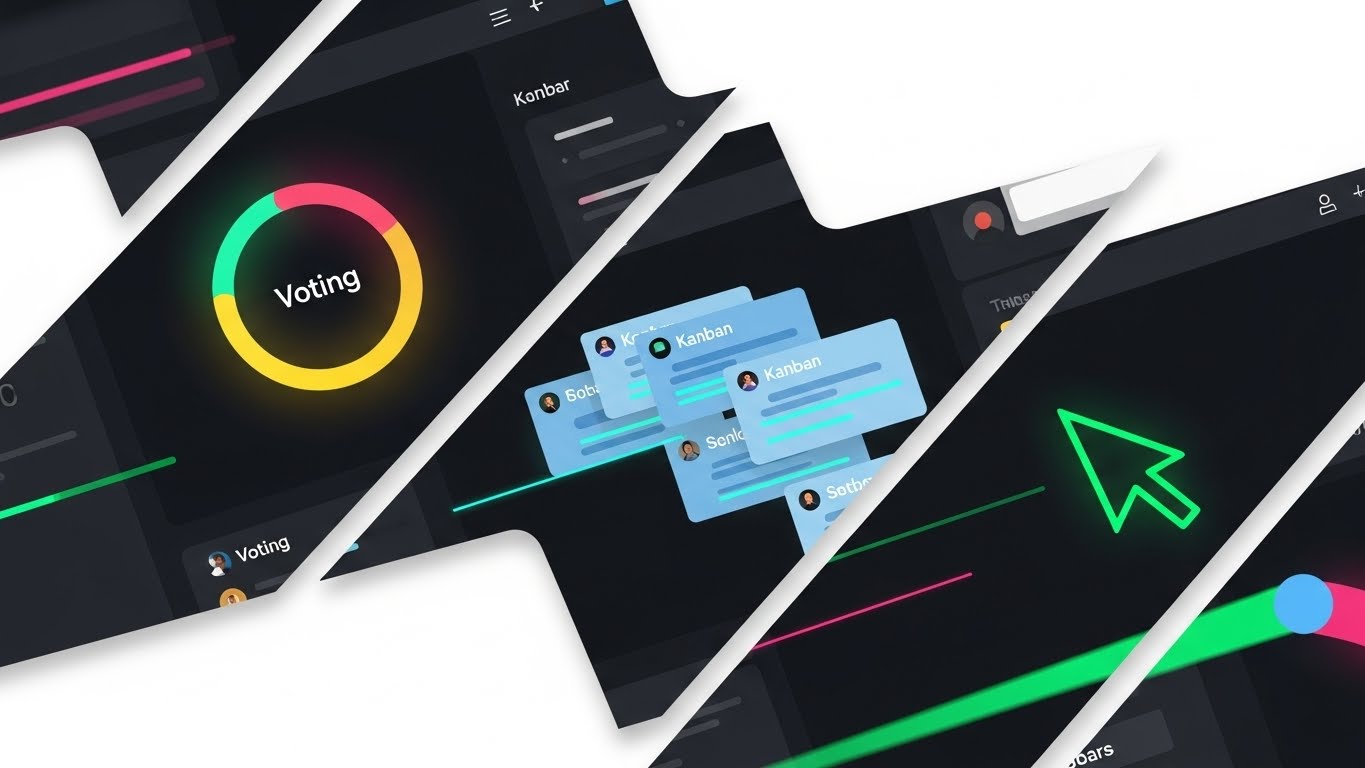
(Rapid UI): Feature Velocity
Showcasing speed and tool versatility.
The Visual & Narrative Approach
This is a high-octane "sizzle reel" of the product's interface. Diagonal slices of the UI—featuring dark mode aesthetics—are layered rapidly. We see specific, recognizable elements: a circular voting timer in bright colors, stacks of blue Kanban cards, and a neon green cursor trail cutting across the screen. Motion blur on the edges of the slices exaggerates the speed of the workflow.
Psychological Impact & KPI Focus
This style targets Cognitive Fluency. By showing familiar UI patterns (cards, cursors, timers) moving quickly, it signals that the tool is intuitive and fast. It answers the question, "Is this tool clunky?" with a visual "No, it flies."
- Primary KPI: Click-Through Rate (CTR). The density of features promises deep functionality, enticing the user to click for a demo.
Strategic Implementation & Trade-offs
- Best Use Case: Display Ads and Retargeting campaigns. It reminds users of the specific features (voting, Kanban) they may have viewed on the pricing page.
- Trade-off: It can be overwhelming if too fast. It requires precise timing to ensure the viewer can register what each slice represents before it disappears.
Companies using similar video content -
Miro – AI Innovation Workspace – Cinematic views of AI-powered insights and collaborative breakthroughs.
Motiff – AI UI Design Tool – Awe-inspiring visuals of AI generating design systems and layouts.
8. Simplifying Complexity with Isometric 2D Motion Design
MOFU | Product Differentiation

(Isometric Design): Platform Depth
Structuring complex systems simply.
The Visual & Narrative Approach
Isometric perspective is used here to imply depth and robustness. The image shows a platform resembling a city circuit board, with distinct zones for "sticky notes," "flowcharts," and "voting." The verticality of the elements (blue buildings/servers) on the dark grid suggests an enterprise-grade infrastructure underpinning the visual collaboration. It looks like a "control center."
Psychological Impact & KPI Focus
The organized, grid-based layout appeals to the Systemizing Mechanism of the brain. It appeals to IT decision-makers and Ops leads who need to know that the "fun" whiteboard has a serious, scalable architecture underneath.
- Primary KPI: Conversion to Trial. It provides the assurance of robustness needed to move a user from interest to testing.
Strategic Implementation & Trade-offs
- Best Use Case: Landing Pages and Feature breakdown sections. It allows for a holistic view of the ecosystem in a single frame.
- Trade-off: It can feel distant. The isometric view creates a "God's eye view" which is great for overview but less immersive than a first-person UI view.
Companies using similar video content -
Monday.com – Project Management – Rapid showcase of customizable boards, widgets, and visual tracking.
Trello – Project Management – Quick cuts of Kanban boards, cards, and workflow automation.
9. Clarifying Workflow with Clean UI (Light Mode)
MOFU | Feature Education
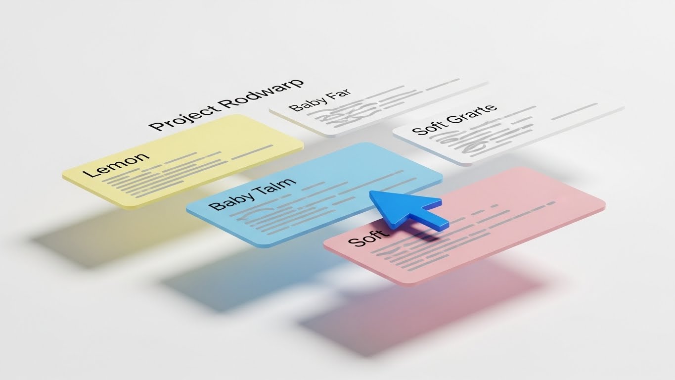
(Clean UI): Frictionless Flow
Highlighting ease of use and clarity.
The Visual & Narrative Approach
This is the "Gold Standard" for educational content. We see a pristine, high-fidelity mockup of a project roadmap floating in a white void. The UI cards are rendered in soft pastels (Lemon, Baby Blue, Pink) with a bright Cobalt Blue cursor clearly demonstrating an action (dragging a card). The soft drop shadows add just enough depth to separate the elements from the background, creating an "airy" feel.
Psychological Impact & KPI Focus
This style reduces Extraneous Cognitive Load. By removing all background distractions and focusing solely on the UI interaction, it makes the learning process effortless. It signals "Zero Friction" to the user.
- Primary KPI: Feature Adoption Rate. Used in onboarding, these visuals teach users exactly how to perform tasks without confusion.
Strategic Implementation & Trade-offs
- Best Use Case: Product Pages, Help Centers, and Onboarding Flows.
- Trade-off: It lacks emotional "punch." It is purely functional and clean, so it relies on the user already being interested in learning the tool.
Companies using similar video content -
Lucidchart – Diagramming Software – Isometric views of complex systems and flowcharts.
Sketchboard – Software Design – Isometric representation of software architecture and design elements.
10. Displacing Competitors with Split Screen: Optimized Reality
MOFU | Competitive Displacement

(Split Screen): Chaos vs. Order
Demonstrating the clear value of digitalization.
The Visual & Narrative Approach
A classic "Before & After" technique reimagined for B2B. The left side captures the "Old Way": a gritty, desaturated photo of a messy physical desk with tangled wires and scattered paper notes (tungsten lighting). A sharp vertical line divides it from the right side: a glowing, pristine 3D render of the digital interface (studio white lighting). The contrast is stark—chaos vs. clarity, physical vs. digital.
Psychological Impact & KPI Focus
This leverages the Contrast Principle. We judge value by comparison. By placing the "pain" (messy desk) directly next to the "solution" (clean UI), the value of the software becomes self-evident without a single word of copy.
- Primary KPI: Competitive Win Rate. It visually argues that the competitor is the "messy past" and this tool is the "organized future."
Strategic Implementation & Trade-offs
- Best Use Case: Comparison Pages ("Us vs. Them") and bottom-of-funnel sales decks.
- Trade-off: It can be seen as aggressive. It must be executed carefully to ensure the "Old Way" looks relatable, not insulting to the user's current process.
Companies using similar video content -
Asana – Project Management – Clean UI demonstrating task management and workflow clarity.
Microsoft Whiteboard – Digital Whiteboard – Clear, intuitive UI for frictionless real-time collaboration.
11. Deepening Adoption with 3D Parallax UI Presentation
MOFU | Deep Feature Adoption

(3D Parallax): Layered Depth
Deepening feature comprehension through spatial hierarchy.
The Visual & Narrative Approach
To visualize the depth of the platform without overwhelming the user, this style utilizes Glassmorphism and Z-axis layering. We see a stack of translucent, glass-like UI screens floating in a serene, sky-blue void. The panels are separated in depth, creating a 3D workspace. The frontmost screen displays a crisp white flowchart, while rear screens show faint data grids and dashboard metrics. Abstract "cloud" spheres drift gently between the layers, softening the technical aesthetic and emphasizing the cloud-native architecture.
Psychological Impact & KPI Focus
This style leverages Spatial Indexing. By distributing UI elements across a Z-axis, we help the user's brain organize information hierarchically (e.g., "Active work is in front, Data is behind"). It combats "interface fatigue" by making the tool feel spacious and breathable rather than flat and cluttered.
- Primary KPI: Time-on-Page. The immersive, slow-motion parallax effect encourages users to pause and explore the feature set, increasing engagement time.
Strategic Implementation & Trade-offs
- Best Use Case: Feature breakdown pages and "How It Works" sections where demonstrating the relationship between different tools (like whiteboard vs. database) is crucial.
- Trade-off: It is stylized reality. While aesthetically pleasing, it does not represent the literal flat 2D experience of the browser, so it should be balanced with actual screenshots.
Companies using similar video content -
Workamajig – Project Management – Split screen showing old manual processes vs. integrated digital workflows.
Smartsheet – Work Management – Contrasting traditional spreadsheets with dynamic, collaborative sheets.
12. Energizing Collaboration with 2D Graphics Over Live Action
MOFU | Driving Demo Requests

(Mixed Media): Augmented Reality
Energizing the hybrid meeting experience.
The Visual & Narrative Approach
This style bridges the physical/digital divide by overlaying vibrant 2D animations onto high-quality live-action photography. We see a professional team in a modern glass-walled office. A woman points to a physical whiteboard, but the "ideas" are rendered as glowing Neon Pink and Electric Blue vector graphics—arrows, swirls, and "Like" thumbs-up icons—floating in the air. This visualizes the invisible "spark" of collaboration that occurs when using the software.
Psychological Impact & KPI Focus
This targets the Hybrid Disconnect. It visually reassures the viewer that the software doesn't replace their in-person energy; it augments it. The playful, hand-drawn aesthetic of the neon graphics signals creativity and spontaneity, countering the perception of enterprise software as "sterile" or "boring."
- Primary KPI: Demo Request Rate. It creates a "Fear Of Missing Out" (FOMO) regarding the energy of the meeting, prompting leaders to request a trial.
Strategic Implementation & Trade-offs
- Best Use Case: LinkedIn Video Ads and "Culture" pages. It performs exceptionally well in social feeds where human faces stop the scroll.
- Trade-off: It requires high-quality custom photography. Stock photos can feel generic if the lighting doesn't match the overlaid graphics perfectly.
Companies using similar video content -
Adobe XD – UI/UX Design – Layered 3D parallax for showcasing complex prototyping and interactions.
UXPin Merge – Design Technology – Visualizing synced design and development layers with depth.
13. Lowering Barriers with Fourth-Wall Breaking Animation
MOFU | Driving Freemium

(2D Animation): Frictionless Entry
Reducing entry friction for new users.
The Visual & Narrative Approach
To combat the inertia of signing up, this style uses meta-humor and direct address. A stylized 2D vector character (purple skin, yellow shirt) physically steps out of a flat computer monitor frame, breaking the fourth wall. The character holds a massive, glowing Green "Start" button, offering it directly to the viewer. Floating UI widgets—chat bubbles and checklists—orbit them playfully. The background is a clean, neutral grey desk surface, keeping the focus entirely on the "Call to Action."
Psychological Impact & KPI Focus
This utilizes Affective Design—using friendly, non-threatening visuals to lower anxiety. The "step out" visual metaphor suggests that the software is accessible and ready to meet the user where they are. It frames the signup process not as a form to fill, but as a button to press.
- Primary KPI: Sign-Up Rate (Conversion). It is designed exclusively to lower the psychological barrier to entry for freemium users.
Strategic Implementation & Trade-offs
- Best Use Case: Retargeting Display Ads and "Thank You" pages.
- Trade-off: It can feel too "B2C" or juvenile for enterprise buyers. It is strictly a user-acquisition play, not an executive-convincing play.
Companies using similar video content -
Workvivo – Employee Experience – Live action with overlaid graphics for vibrant internal communication.
LumApps – Digital Workplace – Mixed media showing augmented reality in hybrid work environments.
14. Establishing Premium Trust with Photorealistic 3D
BOFU | Building Trust

(Photorealism): Premium Fidelity
Grounding digital tools in premium reality.
The Visual & Narrative Approach
When asking for enterprise budgets, the product must look expensive. This style uses hyper-realistic 3D rendering to give the software physical weight. We see a close-up of a premium aluminum tablet lying on a wooden executive desk, bathed in natural window light. The screen displays a complex, colorful mind-map interface in sharp "Retina" resolution. A ceramic coffee cup and silver pen sit nearby, grounding the digital tool in a tactile reality.
Psychological Impact & KPI Focus
This appeals to Perceived Value. High-fidelity rendering signals "high-fidelity software." By associating the software with premium hardware (aluminum, wood), we subconsciously transfer the qualities of durability and craftsmanship to the SaaS platform.
- Primary KPI: Brand Trust / Pricing Tolerance. It justifies a premium price point by presenting the product as a high-end tool for professionals.
Strategic Implementation & Trade-offs
- Best Use Case: Website Home Page hero sections and Investor Decks.
- Trade-off: It is static. It does not show motion or workflow well. It is purely about establishing a "Premium Aura."
Companies using similar video content -
Excalidraw – Online Whiteboard – Playful animation encouraging frictionless drawing and collaboration.
Ziteboard – Online Whiteboard – Friendly animation for easy, free brainstorming and tutoring.
15. Proving Value with Material ROI Visualization
BOFU | ROI Justification

(Dynamic Data): Tangible Growth
Visualizing financial return as tangible wealth.
The Visual & Narrative Approach
ROI is abstract; this style makes it solid. We visualize a rising bar graph constructed not from pixels, but from solid, metallic Gold blocks. They rise from a clean white grid foundation, reflecting studio lighting. Floating Silver percentage symbols hover near the peaks. The text "ROI" is rendered in chrome. The materiality of the gold and metal subconsciously signals "hard currency" and "solid returns" rather than speculative data.
Psychological Impact & KPI Focus
This targets Loss Aversion and the desire for certainty. In the BOFU stage, buyers fear making a bad investment. Visualizing data as heavy, precious metals triggers a sense of financial security and tangible gain. It moves the conversation from "cost" to "investment."
- Primary KPI: Deal Velocity. It provides the visual ammunition internal champions need to justify the purchase to their finance departments.
Strategic Implementation & Trade-offs
- Best Use Case: Investor Decks, Sales Proposals, and "Why Us" pages.
- Trade-off: It is purely metaphorical. It does not explain how the ROI is achieved, only that it is substantial.
Companies using similar video content -
Bluescape – Digital Workspace – Photorealistic rendering of secure, high-fidelity visual collaboration.
UbiKey – Collaborative Hardware/Software – Premium 3D visuals of tactile tables and multi-user software.
16. Validating Security with X-Ray Transparency
BOFU | Risk Mitigation

(3D X-Ray): Transparent Security
Demystifying enterprise protection layers.
The Visual & Narrative Approach
Security is the biggest hurdle for Enterprise adoption. This style uses an X-Ray aesthetic to show "what's inside." A translucent, frosted glass cube reveals a glowing, solid "Steel Blue" core structure—the data kernel. Surrounding the cube are floating, transparent shield layers in Neon Green, representing encryption and firewalls. The clinical, sterile white background with bright rim lighting conveys cleanliness, transparency, and impenetrability.
Psychological Impact & KPI Focus
This leverages Cognitive Closure. Security is often a "black box" that induces anxiety. By visually opening the box and showing the structured, shielded core, we provide the viewer with a sense of understanding and safety. It signals "Zero Trust" architecture without using jargon.
- Primary KPI: Security Review Pass Rate. It visually reassures CISOs and IT Directors that the architecture is robust.
Strategic Implementation & Trade-offs
- Best Use Case: Security/Compliance pages and IT-focused sales collateral.
- Trade-off: It is cold. It lacks the human element and should strictly be used when addressing technical or compliance objections.
Companies using similar video content -
HubSpot Marketing – Marketing Platform – Visualizing campaign ROI as tangible growth and success.
Airtable – Data Collaboration – Dynamic data presented as solid, valuable insights for growth.
17. Engaging Developers with Dark Mode Abstraction
BOFU | Implementation Friction

(Futuristic Neon): Developer Precision
Visualizing the API backbone and connectivity.
The Visual & Narrative Approach
To appeal to the developers who must integrate the software, we switch to Dark Mode. A central glowing node (the API core) pulsates in Neon Green against a Deep Black background. Thin, laser-like lines in Electric Blue connect the core to various floating geometric ports in the distance. The aesthetic is "Tron-like"—precise, mathematical, and clean. It visualizes the "Headless" capabilities and seamless integration.
Psychological Impact & KPI Focus
This targets Tribal Signaling. Dark mode and neon syntax highlighting are the native visual language of developers. Using this aesthetic signals that the platform is "developer-friendly" and "built by engineers, for engineers," reducing the fear of technical debt.
- Primary KPI: API Documentation Engagement. It invites the technical stakeholder to explore the SDKs and integrations.
Strategic Implementation & Trade-offs
- Best Use Case: Developer Portals, API Documentation, and Technical Implementation Guides.
- Trade-off: It isolates non-technical users. A creative director might find this "too techy" and intimidating.
Companies using similar video content -
Collaboard – Online Whiteboard – X-ray visualization of secure, GDPR-compliant data protection layers.
Nextcloud – Content Collaboration – Transparent security layers for on-premises data sovereignty.
18. Mirroring the C-Suite with Generative Personas
BOFU | The Economic Buyer

(Generative Persona): Executive Authority
Mirroring the economic decision maker.
The Visual & Narrative Approach
When closing a deal, people buy from people they respect. This style uses high-end AI generation (or casting) to depict the "Economic Buyer." A distinguished executive (silver hair, tailored suit) stands in a high-floor office at dusk, with a blurred city skyline in the background. He looks confidently at an off-screen holographic display, nodding in approval. The lighting is dramatic "Rembrandt" style. It conveys quiet power, competence, and decision-making authority.
Psychological Impact & KPI Focus
This relies on Authority Bias and Social Proof. By depicting a "peer" (another executive) validating the data, it subconsciously signals to the prospect that "this is a tool for leaders like you." It frames the software as a strategic asset for the C-Suite.
- Primary KPI: Sales Cycle Duration. It helps the internal champion present the tool as an executive-ready solution, speeding up final sign-off.
Strategic Implementation & Trade-offs
- Best Use Case: Account-Based Marketing (ABM) campaigns targeting C-Level executives.
- Trade-off: It must be hyper-realistic. If the AI character falls into the "Uncanny Valley," it damages trust immediately.
Companies using similar video content -
Apidog – API Lifecycle Platform – Dark mode abstraction for precise API design and testing.
Storybook – UI Development Environment – Neon visuals for component development and integration.
19. Selling the Vision with Aspirational Montages
BOFU | The Technical Buyer

(Aspirational Stock): Global Scale
Visualizing limitless network expansion.
The Visual & Narrative Approach
This style sells the "Why." We see a cinematic photo of a diverse team standing on a rooftop terrace at Golden Hour, pointing towards the horizon. Overlaid in the sky is a subtle, white wireframe mesh of a global network, connecting continents. The warm lighting and expansive composition convey optimism, global scale, and future-proof technology. It moves beyond "features" to "mission."
Psychological Impact & KPI Focus
This targets Self-Actualization. It connects the mundane act of buying software to the higher purpose of global connection and organizational growth. It appeals to the Technical Buyer's desire to build a scalable, world-class infrastructure.
- Primary KPI: Brand Sentiment / Net Promoter Score (NPS). It associates the brand with success, growth, and global vision.
Strategic Implementation & Trade-offs
- Best Use Case: Corporate Brochures, "About Us" videos, and Keynote openers.
- Trade-off: It is generic. "People pointing at horizons" is a stock trope. It requires the subtle wireframe overlay to ground it specifically in connectivity software.
Companies using similar video content -
Unily – Digital Employee Experience – Executive persona validating strategic digital transformation.
Simpplr – Employee Experience – Generative persona reflecting C-suite approval of internal communication.
20. Validating Remote Work with Holographic Lifestyle
BOFU | Sales Cycle Accel

(Lifestyle Overlay): Remote Freedom
Validating the remote flexibility promise.
The Visual & Narrative Approach
The final objection is often "Will my team actually use this?" This style proves usability anywhere. A professional woman sits in a sunlit, cozy coffee shop with her laptop. Overlaid in the air in front of her screen is a semi-transparent, glowing Orange and White UI wireframe showing a "Success" checklist and project completion metrics. The natural sunlight blends with the digital glow, creating a harmonious picture of "Work from Anywhere."
Psychological Impact & KPI Focus
This validates the Lifestyle Aspirations of the modern workforce. It visually proves that the software enables freedom and flexibility without sacrificing productivity. It alleviates the fear of "micromanagement" by focusing on output (the checklist) rather than presence.
- Primary KPI: User Adoption Rate. It sells the lifestyle benefit of the software to the end-users who will actually log in every day.
Strategic Implementation & Trade-offs
- Best Use Case: LinkedIn feeds, Recruitment videos, and "Day in the Life" content.
- Trade-off: It must balance the "relaxed" vibe with "productivity." The checklist overlay is crucial to show that work is actually getting done.
Companies using similar video content -
Google Workspace – Collaboration Suite – Aspirational montage of global teams connecting and growing.
Microsoft 365 – Productivity Suite – Visionary scenes of global collaboration and future-proof technology.
21. Empowering Power Users with Dark Mode UI Showcase
BOFU | Competitive Switcher
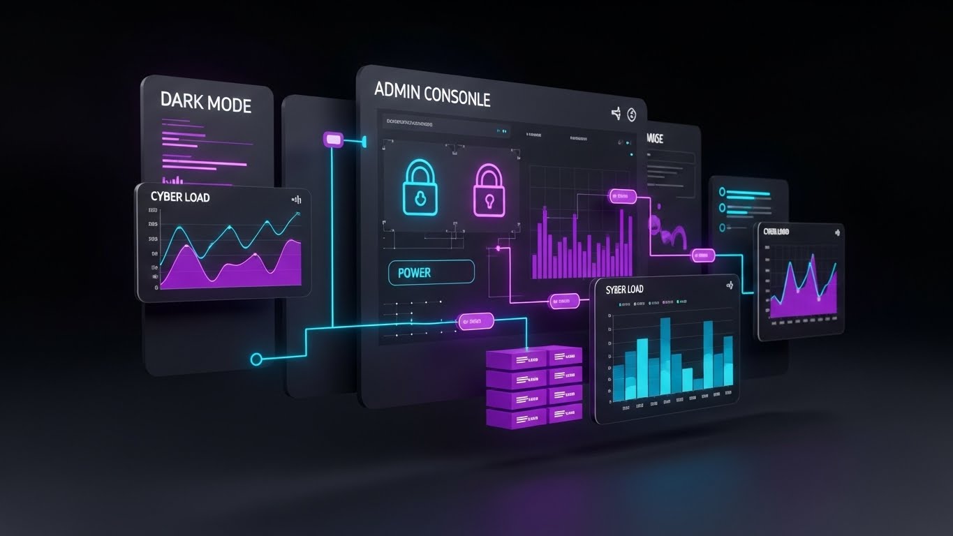
(Dark Mode UI): Cyber-Minimalism
Signaling professional-grade control and power.
The Visual & Narrative Approach
To attract the "Power User" and IT Administrator who lives in the terminal, this style deploys a sleek Cyber-minimalist aesthetic. We present a floating Admin Console dashboard in deep Matte Charcoal. The UI elements—graphs, lock icons, and server load metrics—are illuminated in Neon Purple and Cyber Blue. The visuals do not try to be "friendly"; they try to be "powerful." The high contrast ensures data legibility, while the dark palette reduces eye strain, mimicking the native environment of high-level technical work.
Psychological Impact & KPI Focus
This targets Signaling Theory. In the software world, "Dark Mode" is often a proxy for "Pro Mode." By showcasing this aesthetic, we signal that the platform is not just a toy for brainstorming, but a serious tool for data governance and administration. It appeals to the buyer's identity as a sophisticated technical leader.
- Primary KPI: Technical Evaluation Score. It is designed to impress the technical gatekeepers during the procurement vetting process.
Strategic Implementation & Trade-offs
- Best Use Case: Technical Specification sheets, Admin Portal walkthroughs, and "Switch to Us" comparison pages.
- Trade-off: It can feel intimidating to casual users. This style should be gated for audiences who specifically care about backend control and security.
Companies using similar video content -
Kadence – Hybrid Workplace – Holographic overlay showing flexible work and productivity metrics.
Deskbird – Desk Booking Software – Lifestyle visuals validating remote freedom and office flexibility.
22. Accelerating Onboarding with Wireframe to Reality Transition
Onboard | Accel Time-to-Value
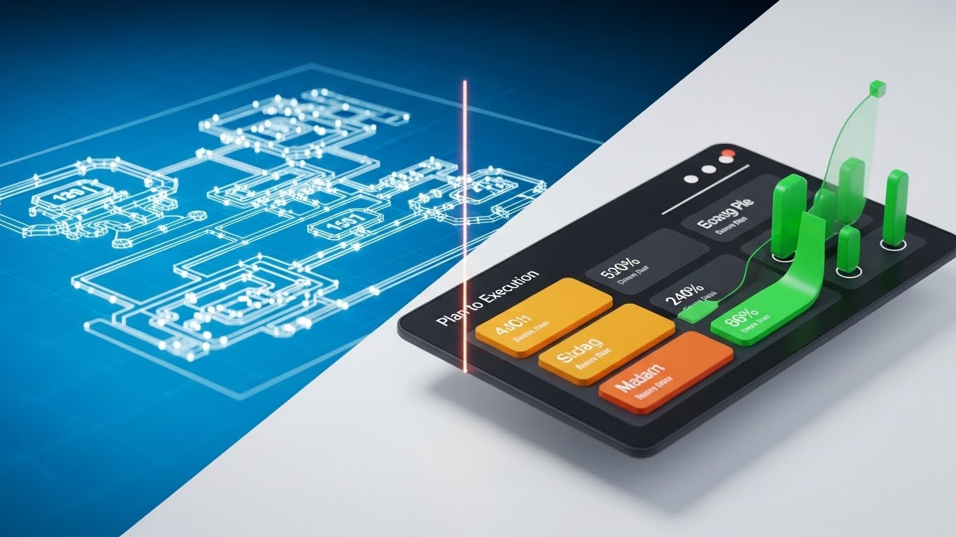
(Wireframe to Reality): Instant Manifestation
Visualizing the speed of "Plan to Execution."
The Visual & Narrative Approach
This style visualizes the primary promise of the software: turning abstract plans into concrete reality. The screen is split. The left side displays a "Blueprint" wireframe of a complex workflow diagram, rendered in white lines on Vivid Blue. A glowing vertical laser line scans across the image from left to right. As it passes, the wireframe instantly transforms into a fully rendered, colorful 3D dashboard interface on a clean white background. It creates a satisfying "Before and After" loop that implies instant creation.
Psychological Impact & KPI Focus
This leverages Process Gratification. It condenses the often tedious process of building a workflow into a single, fluid moment of transformation. It triggers a dopamine hit associated with "completion," encouraging the user to believe that setting up their workspace will be fast and rewarding.
- Primary KPI: Activation Rate. It visually promises that the "setup tax" (the effort to start) is low, encouraging new users to build their first board.
Strategic Implementation & Trade-offs
- Best Use Case: Welcome Emails and "Getting Started" wizard screens.
- Trade-off: It simplifies the actual work. It represents the outcome of the work, not the effort, so it must be paired with tutorials that show the actual steps.
Companies using similar video content -
ClickUp – Project Management – Dark mode admin console for powerful task and workflow control.
Jira – Issue Tracking Software – Cyber-minimalist UI for technical project management and issue tracking.
23. Gratifying Interaction with Macro UI Micro-Interactions
Onboard | Self-Serve Onboarding
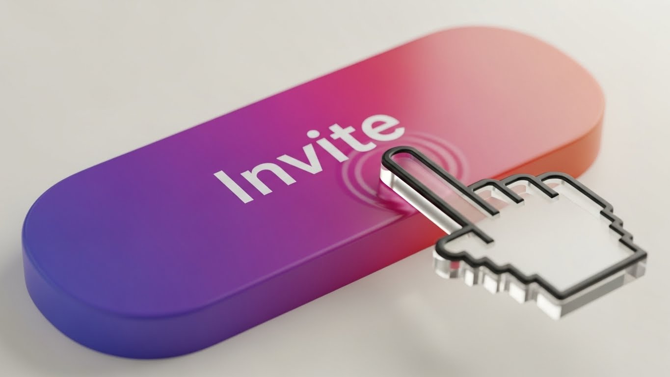
(Macro Interaction): Tactile Response
Highlighting the joy of user interaction.
The Visual & Narrative Approach
To combat user churn during onboarding, this style zooms in—extreme macro. We see a close-up of a single "Invite Team" button. The button features a lush Violet-to-Pink gradient. A translucent, glass-like cursor hovers and presses down, creating a soft, realistic ripple effect and a subtle depression of the button. The background is a creamy, out-of-focus bokeh. The focus is entirely on the feel of the click.
Psychological Impact & KPI Focus
This targets Haptic Visual Cues. Even without physical touch, seeing a responsive, "squishy" button triggers a sense of tactile satisfaction (sensory transference). It makes the UI feel responsive and high-quality, subconsciously encouraging the user to click and interact more.
- Primary KPI: Feature Utilization (First Action). It makes the specific action (e.g., Inviting a User) look so satisfying that the user wants to try it.
Strategic Implementation & Trade-offs
- Best Use Case: In-app Tooltips and Feature Spotlights.
- Trade-off: It is hyper-specific. It promotes one action very well but provides no context for the broader workflow.
Companies using similar video content -
Miro – AI Innovation Workspace – Wireframe to reality for quick board creation and project setup.
Figma – Design Collaboration – Transition from wireframe concepts to polished UI designs.
24. Reducing Friction with Isometric 3D Workflow
Onboard | Trial Activation
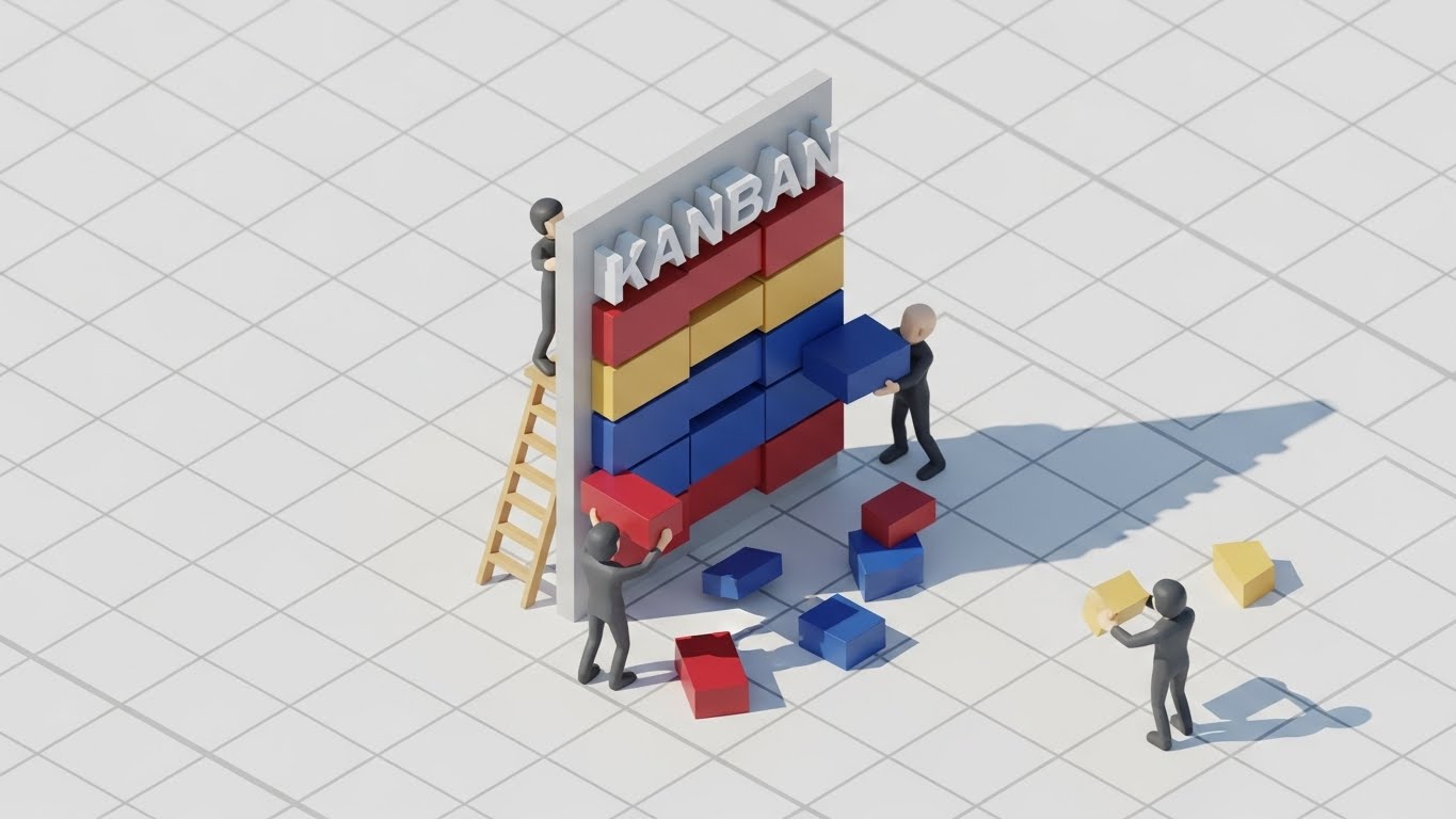
(Isometric 3D): Playful Construction
Making complex workflows feel like play.
The Visual & Narrative Approach
Agile workflows can feel like "work." This style reframes them as "play." We see a miniature isometric world where tiny, low-poly clay figures are building a giant "Kanban" board using colorful blocks (Red, Blue, Yellow). The lighting mimics bright, cheerful sunlight. The aesthetic is reminiscent of high-end toys or Lego instructions. It metaphorically shows that "building a project board is as easy as stacking blocks."
Psychological Impact & KPI Focus
This utilizes Gamification Psychology. By rendering the work elements as toys, we lower the Affective Filter (anxiety/boredom). It invites the user to "play" with the software rather than "work" in it, which is crucial for early trial engagement.
- Primary KPI: User Retention (Day 1). It sets a positive, low-stress emotional tone for the first session.
Strategic Implementation & Trade-offs
- Best Use Case: Empty States (when a user has no data yet) and "Create New Board" screens.
- Trade-off: It can feel juvenile. It is excellent for onboarding but should be swapped for more professional visualizations (like Style 9 or 21) once the user is established.
Companies using similar video content -
Canva – Design Platform – Macro interactions highlighting intuitive drag-and-drop and button responsiveness.
Moqups – Visual Collaboration – Zoomed-in micro-interactions for wireframing and prototyping elements.
25. Re-Engaging Users with Hyper-lapse Stock Footage
Retention | Visitor Re-engagement
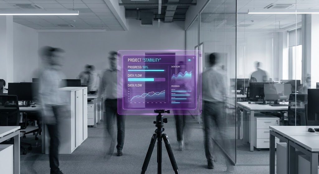
(Hyper-lapse Overlay): Stability in Chaos
Visualizing the platform as the anchor of truth.
The Visual & Narrative Approach
To remind users why they need the software, we visualize the chaos of the modern office. A still image simulates a hyper-lapse: a modern open-plan office is filled with motion-blurred "ghosts" of people rushing around. In the center, perfectly sharp and static, is a floating purple UI board displaying "Project Stability" metrics. The visual contrast—blurred reality vs. sharp digital truth—is the core message.
Psychological Impact & KPI Focus
This targets Cognitive Ease. The brain naturally seeks stability in chaos. The image positions the software as the "Eye of the Storm," the only place where information is still, organized, and accessible amidst the frantic pace of business.
- Primary KPI: Churn Reduction. It reinforces the value of the platform as the organizational "Source of Truth."
Strategic Implementation & Trade-offs
- Best Use Case: Retargeting Ads for dormant users and "We Miss You" email headers.
- Trade-off: It is atmospheric. It doesn't show new features; it relies on the emotional resonance of "feeling overwhelmed" to drive the user back.
Companies using similar video content -
Stormboard – Brainstorming Software – Isometric 3D for playful construction of ideas and sticky notes.
Tactic – Hybrid Workplace – Gamified isometric visuals for managing office space and resources.
26. Reducing Support Costs with Holographic UI over 3D Render
Retention | Reducing Support

(Holographic Render): Accessible Intelligence
Visualizing help as an always-on layer.
The Visual & Narrative Approach
Support shouldn't feel like a burden. Here, we see a 3D render of a clean white desk. Floating above it is a semi-transparent, holographic Cyan "Help" icon (a question mark inside a chat bubble). The hologram casts a soft, futuristic blue glow onto the white desk surface. The aesthetic is sophisticated, light, and accessible. It suggests that help is spectral and non-intrusive, appearing only when needed.
Psychological Impact & KPI Focus
This leverages Perceived Availability. By visualizing the "Help" function as a glowing, ethereal presence that "hovers" over the workspace, it signals that guidance is omnipresent and effortless to access—not buried in a footer link.
- Primary KPI: Support Ticket Deflection. By making the self-serve help tools look sophisticated and capable, users are more likely to try them before emailing a human.
Strategic Implementation & Trade-offs
- Best Use Case: Help Center headers and AI-feature announcements.
- Trade-off: It is abstract. It must be paired with clear text commands to ensure users know how to access this "holographic" help.
Companies using similar video content -
Slack – Team Messaging – Hyper-lapse of busy communication, highlighting Slack as the stable hub.
Microsoft Teams – Communication Platform – Visualizing chaotic meetings, with Teams as the organized solution.
27. Untangling Complexity with 2D Line Art Animation
Retention | Reducing Churn
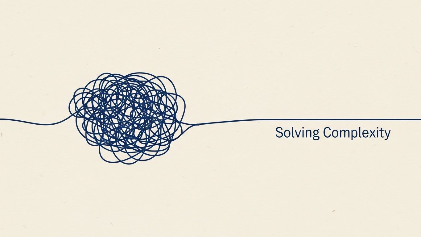
(2D Line Art): Elegant Resolution
Visualizing the simplification of complex problems.
The Visual & Narrative Approach
Sometimes, less is more. This style uses a sophisticated continuous line illustration in Navy Blue on a Cream paper texture. The line begins as a chaotic, tangled knot (representing a complex problem) and gracefully loops out, untangling itself into a straight, smooth path labeled "Solving Complexity." The motion is slow, elegant, and hypnotic.
Psychological Impact & KPI Focus
This targets Cognitive Relief. The visual act of untangling a knot provides a visceral sense of relief and satisfaction. It reminds long-term users of the core value: clarity. It serves as a gentle, non-intrusive reminder of why they pay for the subscription.
- Primary KPI: Net Promoter Score (NPS). It reinforces the "Peace of Mind" brand attribute, which drives high customer satisfaction scores.
Strategic Implementation & Trade-offs
- Best Use Case: Subscription Renewal emails and milestone celebration screens (e.g., "Year in Review").
- Trade-off: It is purely brand-focused. It communicates feeling, not function.
Companies using similar video content -
Zendesk – Customer Service Software – Holographic UI for always-on, intelligent self-service support.
Intercom – Conversational Relationship Platform – Visualizing AI-powered chat and help as an accessible layer.
28. Visualizing Growth with Minimalist Flat 2D Vector
Expand | Knowledge Base
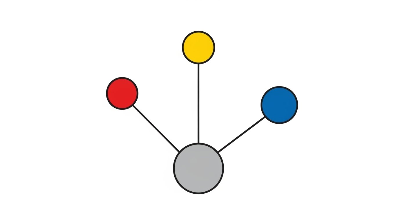
(Minimalist Flat 2D): Network Effects
Visualizing the exponential growth of knowledge.
The Visual & Narrative Approach
To visualize the scaling of information, we use minimalist geometry. A single grey central circle spawns three colorful circles (Red, Blue, Yellow), which in turn spawn smaller nodes. The background is pure White. The absence of gradients and shadows flattens the image into a pure information diagram. It visualizes the concept that "one idea leads to many."
Psychological Impact & KPI Focus
This appeals to the Growth Mindset. It visualizes the "Network Effect" of the software—that the more the team uses it, the more valuable the database becomes. It encourages users to document more information, promising that it will grow into a structured ecosystem.
- Primary KPI: Pages Created / Content Contribution. It motivates users to contribute to the company wiki or knowledge base.
Strategic Implementation & Trade-offs
- Best Use Case: Empty State for "New Wiki" or "New Knowledge Base" sections.
- Trade-off: It is very dry. It works best for users who are already motivated to organize information and just need a visual prompt.
Companies using similar video content -
Lucidchart – Diagramming Software – Line art animating complex processes into clear, elegant flows.
Cacoo – Online Diagramming – 2D line art simplifying complex network diagrams and flowcharts.
29. Driving Upsell with Abstract 3D AI Visualization
Expand | Driving Upsell

(Abstract 3D AI): Neural Intelligence
Visualizing the premium value of AI integration.
The Visual & Narrative Approach
To sell premium AI features, we need to visualize "intelligence." We see a 3D sphere composed of glowing Silver and Cyan nodes connected by filaments of light. The nodes pulsate gently, mimicking a neural network or a brain. The background is a high-key, ethereal grey. It looks expensive, clean, and advanced—far removed from the "messy" human work of the earlier styles.
Psychological Impact & KPI Focus
This targets Perceived Innovation. It signals that the Premium Tier offers access to a "higher intelligence" that can organize and synthesize data automatically. It justifies the price jump by visualizing the technology as cutting-edge.
- Primary KPI: Upsell Conversion Rate (Free to Paid / Pro to Enterprise). It is the visual anchor for "AI Credits" or "Smart Features."
Strategic Implementation & Trade-offs
- Best Use Case: In-app Paywalls and "Feature Unlock" modals.
- Trade-off: It sets high expectations. If the AI feature is just a simple text generator, this "Brain" visual might overpromise.
Companies using similar video content -
Notion – All-in-One Workspace – Flat 2D vector visualizing interconnected knowledge and growth.
Confluence – Team Collaboration Software – Minimalist vector graphics for expanding knowledge bases.
30. Encouraging Advocacy with Low-Poly 3D Modeling
Expand | Driving Referrals

(Low-Poly Hands): Value Exchange
Visualizing the community and sharing economy.
The Visual & Narrative Approach
Referrals are about sharing value. This style uses playful, stylized low-poly hands (one Pastel Pink, one Pastel Blue) passing a glowing, golden gem between them. The background is a soft-focus geometric landscape in Mint Green. The "low-poly" style feels communal and indie-friendly, stripping away the corporate "suit" vibe to focus on peer-to-peer connection.
Psychological Impact & KPI Focus
This targets Social Reciprocity. Visualizing the act of "giving a gem" reframes the referral not as "getting a discount" but as "giving a gift" to a colleague. It taps into the user's desire to be helpful to their network.
- Primary KPI: Viral Coefficient (K-Factor). It increases the likelihood of users sharing the tool with external partners or friends.
Strategic Implementation & Trade-offs
- Best Use Case: "Invite a Friend" modals and "Share Board" confirmation screens.
- Trade-off: It is whimsical. It may not fit strictly within the "Enterprise Admin" visual language, so it is best kept for end-user facing touchpoints.
STRATEGIC KNOWLEDGE BASE: The Visual Operations Doctrine
To transform these 30 visual styles from a "collection of assets" into a cohesive business driver, we must operationalize them. A style guide is useless if it remains a PDF on a server; it must be an active "Visual Operating System" that drives adoption, efficiency, and ROI.
The following three segments synthesize the visual strategies above into actionable frameworks for the Collaborative Whiteboard & SaaS domain.
Strategic Alignment & Visual Architecture
The "Pre-Production" Strategy – Defining Why and Who.
- The Cognitive Load Audit: Before commissioning video content, audit your current user training. If a concept takes three paragraphs of text to explain, it requires a Visual Style (e.g., Style 9 or Style 27). If it takes one sentence, text suffices.
- Role-Based Visual Mapping: Differentiate your visual strategy by persona. Use Kinetic/High-Energy (Styles 1, 7) for Creators who need inspiration, but switch to Dark Mode/Structure (Styles 21, 8) for Admins who need control and data density.
- The "Glanceability" Standard: In a collaborative session, users don't watch videos; they glance at them. All loops (Styles 2, 3, 23) must communicate their meaning within 1.5 seconds—the time it takes a user to hover over a tool icon.
- Brand Voice Consistency: Ensure that the "Fun" styles (Style 24, 30) and the "Serious" styles (Style 14, 16) share a common DNA (e.g., a specific hex code for "Action" or a consistent corner radius on UI elements).
- The Advids Strategic Audit: Partnering with an agency like Advids helps define this "Visual Operating System" early. We ensure that your library of 30 styles is not a random assortment, but a modular kit that can be mixed and matched without breaking brand integrity.
- Standardization vs. Customization: Use standardized styles (Style 9, 21) for core UI features that change rarely. Use high-concept styles (Style 6, 12) for marketing campaigns that refresh quarterly.
- The Cross-Departmental Bridge: Use these visuals to unify terminology. If Sales calls it a "Node" and Engineering calls it a "Vertex," use Style 4 (Connected Nodes) to visually establish the common term across the company.
- Legacy System Integration: When replacing old tools, use Style 10 (Split Screen) to visually acknowledge the "Old Way" (Excel/Email) before introducing the "New Way." This validates the user's past experience before asking them to change.
- Accessibility in Motion: Ensure that all motion graphics (especially Kinetic Typography, Style 1) comply with WCAG standards for contrast and flashing rates. A collaborative tool must be accessible to all neurotypes.
- The Mobile-First Mandate: Even if your tool is desktop-first, your buyers are on mobile. Styles 1, 5, and 12 must be optimized for vertical consumption on LinkedIn and social feeds to capture the decision-maker during their commute.
Operational Adoption & Implementation
The "Deployment" Phase – How to embed visuals into the workflow.
- Overcoming "Blank Canvas" Anxiety: The biggest churn risk is the empty board. Deploy Style 24 (Isometric Construction) or Style 3 (Abstract Organic) on empty states to subconsciously signal that "creation is easy" and "messiness is okay."
- The Micro-Learning Shift: Replace the 50-page PDF manual with a library of Style 9 (Clean UI) loops. These 6-second clips should play inside the hover-state of the tool they explain.
- Just-in-Time Support: Embed Style 26 (Holographic Help) visuals in your chatbot. When a user asks "How to export?", the bot should reply with a GIF, not a paragraph.
- Gamification of Training: Use Style 22 (Wireframe to Reality) to visually reward users for completing onboarding steps. Make the completion of a tutorial feel like a magical transformation.
- Reducing Support Ticket Volume: There is a direct correlation between the quality of Style 11 (Parallax UI) explainers and a reduction in "How does this work?" tickets. Invest heavily here to save OPEX later.
- Remote Onboarding: For distributed teams, use Style 5 (2D Characters) to replace the "Human HR Orientation." It provides a friendly, consistent welcome that scales to thousands of new hires without burning out staff.
- Visualizing SOPs: Transform text-based Standard Operating Procedures into Style 2 (Motion Graphic) flows. A visual flow is processed 60,000x faster than text, crucial for agile teams.
- Feedback Loops: Use Style 30 (Value Exchange) visuals when asking for feedback. Users are more likely to give a "Gem" (feedback) if the request looks like a community interaction rather than a corporate survey.
- Scalable Localization: By relying on abstract visuals (Style 16, 29) and UI simulations (Style 9) rather than voiceovers, you reduce the cost of translating your help center for global markets (Rule 39).
- Leadership Communication: When the CTO presents the tool to the Board, provide them with Style 6 (Cinematic) and Style 15 (Gold ROI) assets. Empower your internal champion to look like a visionary.
Measuring Impact & Future-Proofing
The "ROI" Phase – Measuring success and looking ahead.
- Beyond "Views": Vanity metrics (views) are irrelevant. Measure Time-to-Competency. Does watching the Style 22 video reduce the time it takes a new user to build their first roadmap?
- The "Idle Time" Metric: Monitor "Idle Time" inside the app. Better visualization (Style 23, 27) should reduce the time users spend hovering in confusion.
- Compliance Velocity: For Enterprise clients, measure how quickly new security protocols are adopted after releasing a Style 16 (X-Ray Security) explainer.
- Retention and Churn: Correlate user exposure to Style 25 (Hyper-lapse) campaigns with login frequency. Does reminding them of the "Chaos vs. Order" value prop bring them back?
- The AI Visual Frontier: Prepare for Generative UI. Soon, users will generate boards via text prompts. Your visual style must evolve to show Style 29 (AI Sphere) "thinking" and "creating" in real-time.
- Scalability of Assets: Build a "Visual Component Library." The hand from Style 5 should be reusable in Style 30. This reduces production costs over time.
- The Advids Partnership: As your feature set grows, your visual language risks fragmentation. Advids acts as the curator, ensuring that Style 31 (next year's feature) feels like it belongs with Style 1. We scale the "Visual Doctrine" as you scale the code.
- Benchmarking Success: Do not compare your visuals to other B2B tools. Compare them to B2C apps (Instagram/Spotify). Your users expect consumer-grade fluidity (Style 12, 13) even in enterprise tools.
- The ROI of "Aha!": The most valuable metric is the speed of the "Aha!" moment. Styles 1-30 are all engineered to shorten the distance between "Confusion" and "Clarity."
- Final Call to Innovation: Treat video not as "marketing content" but as Infrastructure. Just as you wouldn't launch without a backend database, do not launch without a Visual Operating System. It is the interface through which the world understands your value.
Companies using similar video content -
Miro – AI Innovation Workspace – Abstract 3D AI for premium smart features and intelligence.
Boardmix – AI-powered Whiteboard – Visualizing AI assistant capabilities as advanced neural intelligence.
Author & Editor Bio


