
Introduction: The Visualization of Ethical Recovery
The debt collection industry is undergoing its most significant transformation in decades. We are moving away from the era of aggressive phone calls and fragmented spreadsheets into a new age of "Ethical Recovery"—driven by data, defined by empathy, and powered by sophisticated technology. For SaaS platforms in this space, the challenge is no longer just about recovering funds; it is about recovering trust.
The modern "Recovery Architect"—the CTOs and COOs driving this shift—face a complex reality. They must navigate a labyrinth of regulations while managing massive datasets generated by skip tracing and behavioral analytics. The bridge between the physical legacy of paper files and the digital future of API-driven engagement is often invisible to the buyer. This is where strategic visualization becomes your most powerful asset.
The opportunity for technological adoption is undeniable. The global AI for debt collection market is projected to grow explosively, reaching USD 15.9 Billion by 2034, signaling a massive shift toward automated, intelligent systems. However, investing in these tools requires justification. Agencies need to see the ROI, not just in efficiency, but in results. Research indicates that modern predictive analytics can lead to a 25% improvement in recovery rates, a metric that speaks directly to the bottom line.
This guide is designed to help you visualize that value. By moving beyond generic stock footage and embracing precise, metaphor-driven visual styles, you can reduce the cognitive load for your buyers. You can turn "Compliance" from a scary legal term into a visual shield of safety. You can transform "Data Enrichment" from a technical buzzword into a beautiful, organized network.
The following 30 visual examples are not just aesthetic choices; they are strategic tools designed to articulate the sophisticated mechanisms of your software, build trust with skeptical stakeholders, and position your platform as the future of revenue recovery.
1. Bold Kinetic Typography (Visual)
TOFU | Brand Awareness

The Architecture of Recovery
The Visual & Narrative Approach
This style utilizes the raw power of text as a physical object. The words "RECOVER REVENUE" are not merely written; they are constructed. Heavy, interlocking geometric blocks in vivid Cobalt Blue, Yellow, and Matte White fall and snap together with a satisfying, engineered thud. The background is a clean, shadowless studio white. The motion is percussive, implying that your software builds a solid, unbreakable foundation for your client's business.
Narration Style: Deep, authoritative, and rhythmic. "Stability. Structure. Success."
Building Trust Through Stability
Psychological Impact & KPI Focus
For an industry plagued by volatility and regulatory fear, this style projects stability and certainty. The heavy typography reduces the "abstractness" of software, making the recovery process feel tangible. It directly addresses the anxiety of "shaky" compliance by visualizing the concept of a "solid platform." It visually anchors the brand promise of Revenue Cycle Management, ensuring the viewer remembers the core benefit even if they watch without sound.
Strategic Implementation & Trade-offs
Use Case: Ideal for Social Ads (Instagram/LinkedIn) to stop the scroll. The bold, readable text works perfectly on muted mobile screens.
Strategic Trade-off: Excellent for Brand Awareness but poor for explaining How the software works. It captures attention but offers zero feature education.
Companies using similar video content -
TrueAccord – Digital-first debt collection platform.
InDebted – Ethical digital debt recovery solutions.
2. Abstract 3D AI Visualization
TOFU | Category Creation

Visualizing the Invisible Network
The Visual & Narrative Approach
We enter a pristine, sterile white void. Thousands of translucent, silver and cyan nodes are floating chaotically. A pulse of light travels through thin, glowing filaments, connecting the nodes. Slowly, the camera pushes in as the nodes organize themselves into a perfect, rotating sphere. The chaos of the outer edges is filtered out, leaving only the structured, glowing core.
Narration Style: A futuristic, smooth, and intelligent voice. "In a world of noise, we find the signal. Pure. Precise. Verified."
The Psychology of Clean Data
Psychological Impact & KPI Focus
Agencies often deal with "dirty data"—wrong numbers and dead-end leads. This visual sanitizes that messy reality, presenting the agency’s process as "medical-grade" Data Purification. It appeals to the desire for compliance safety and high-tech efficiency. It visualizes Skip Tracing and Data Scrubbing without showing boring spreadsheets. It frames the software as a "Category Creator" that turns raw data into actionable intelligence.
Strategic Implementation & Trade-offs
Use Case: YouTube Brand Films and Homepage Hero Backgrounds. It sets a high-tech tone immediately.
Strategic Trade-off: High "Wow Factor" but can feel impersonal. It risks looking like generic "Big Tech" if not anchored quickly by industry-specific voiceover.
Companies using similar video content -
Prodigal – Prodigal AI – AI for collections, agent assist.
Qualia – AI for credit risk and collections.
3. Abstract 2D Motion Graphics
TOFU | Market Education
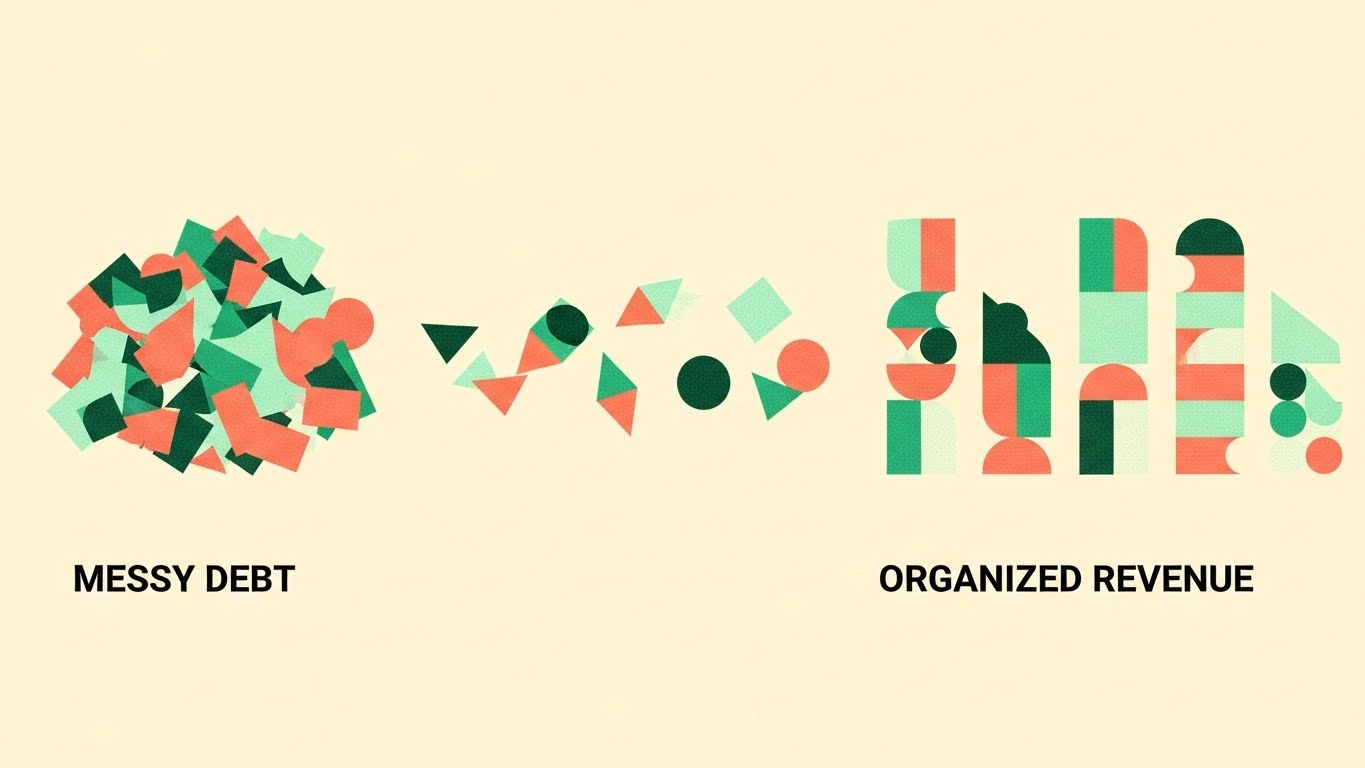
The Art of Simplification
The Visual & Narrative Approach
On a "Pale Cream" background, a chaotic pile of geometric shapes (triangles, circles, squares) in "Mint Green" and "Coral" sits on the left side. An invisible force—representing the software's algorithm—breezily slides the shapes to the right. As they move, they self-sort: triangles stack with triangles, circles with circles. The chaotic pile transforms into neat, vertical columns of "Organized Revenue."
Narration Style: Upbeat, light, and explanatory. Sound design carries the "satisfying sort" feeling (clicks, pops, slides).
Reducing Cognitive Load
Psychological Impact & KPI Focus
This taps into the "Marie Kondo" effect—the deep psychological satisfaction of organizing a mess. For an Operations Manager drowning in unworked files, this promises Operational Zen. It simplifies the concept of Portfolio Segmentation and Workflow Automation. It shows "Messy Input" "Clean Output" in the most cognitively efficient way possible.
Strategic Implementation & Trade-offs
Use Case: Display Ads and Blog Headers. The flat vector style loads fast and scales well on any device.
Strategic Trade-off: It is very abstract. It doesn't show the UI, so it relies on the viewer understanding the metaphor. Not suitable for detailed feature demos.
Companies using similar video content -
Collect-AI – AI-driven debt collection platform.
Katabat – Digital collections and recovery platform.
4. Generative AI Cinematic Video
TOFU | Skippable Pre-Roll Ad
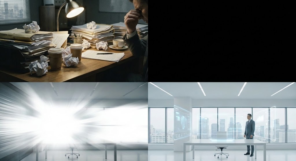
The Transformation Narrative
The Visual & Narrative Approach
The shot begins with a close-up of a stressed, dimly lit desk overflowed with yellowing paper files—the "Physical" burden. Suddenly, a wave of bright, white digital light sweeps across the room, vaporizing the paper piles. The room dissolves and reforms into a sun-drenched, modern minimalist office with floating holographic screens. The claustrophobia is replaced by breathability and light.
Narration Style: Inspiring and dramatic. "Leave the paper chase behind. Step into the light of digital resolution."
Empathy for the Grind
Psychological Impact & KPI Focus
This addresses "Legacy Tech Fatigue." It validates the user's struggle (the messy desk) and offers a visionary escape (the hologram office). It positions the software as a Transformation Agent that bridges the physical/digital divide. It visualizes the transition from Manual Processes to Cloud-Based Automation. It sells the feeling of being modernized.
Strategic Implementation & Trade-offs
Use Case: YouTube Pre-Roll Ads. The dramatic visual hook in the first 5 seconds prevents skipping.
Strategic Trade-off: Generative AI can sometimes produce visual artifacts. The transition must be seamless to avoid distracting the viewer.
Companies using similar video content -
Symend – Behavioral engagement for collections.
RevSpring – Payment and communication solutions.
5. AI Generated Mixed Media Video
TOFU | Vertical Social Organic

The Treasure Hunt
The Visual & Narrative Approach
A vertical video format. The screen is covered in textured white paper stamped "AGED DEBT." A stop-motion hand tears away the paper to reveal solid, gleaming gold bars underneath. The tearing motion is jerky and tactile, creating a high-energy visual hook.
Narration Style: Fast-paced, punchy, and energetic. "Stop writing off potential. Start uncovering value."
Triggering the Reward System
Psychological Impact & KPI Focus
Collections is a "found money" business. This style triggers the Treasure Hunt dopamine response. It reframes "bad debt" as "hidden gold," changing the emotional context from burden to opportunity. It creates a direct visual correlation between Deep Skip Tracing features and Revenue Generation. It answers the "Why should I bother with old accounts?" objection.
Strategic Implementation & Trade-offs
Use Case: TikTok and LinkedIn Shorts. The mixed media style feels native to social platforms and disrupts the polished corporate feed.
Strategic Trade-off: The "rough" aesthetic might feel too informal for conservative banking clients. Best used for B2B agency marketing.
Companies using similar video content -
LexisNexis Risk Solutions – Accurint – Skip tracing and data solutions.
IDI – Data fusion and skip tracing services.
6. Isometric 2D Motion Design
TOFU | Shaping Brand Perception

The Compliance Factory
The Visual & Narrative Approach
A flat isometric illustration of a "Compliance Factory." A clean conveyor belt in Slate Blue carries grey cubes (accounts). They pass through "Scanner Gates" and turn Vivid Green. The style is precise, vector-based, and engineered. There are no gradients, just clean flat colors.
Narration Style: Technical, calm, and reassuring. "Automated compliance. Every account. Every time."
Visualizing Regulatory Safety
Psychological Impact & KPI Focus
This is pure "Compliance Assurance" for Risk Officers. It visualizes Process Control. It alleviates the fear of human error by showing a system that physically cannot make a mistake. It perfectly explains Workflow Logic and Reg F Adherence. It shows that compliance is baked into the architecture, not an afterthought.
Strategic Implementation & Trade-offs
Use Case: Feature Blogs and Product Pages. It allows for complex logic to be understood at a glance.
Strategic Trade-off: Can be "dry" and unemotional. It appeals to the logical brain, not the heart.
Companies using similar video content -
Ontario Systems – Artiva – Core collection platform.
FICO – PowerCurve – Decision management for collections.
7. Abstract 2D Organic Motion Graphics
TOFU | Demand Gen

The Flow of Capital
The Visual & Narrative Approach
Fluid, blob-like shapes in Electric Blue and Purple morph and merge together against a clean white background. The shapes have a glossy, liquid finish, resembling droplets of water merging into a stream. The movement is smooth and continuous.
Narration Style: Soft, soothing, and sophisticated. "Fluidity in finance. Streamlined recovery."
The Psychology of Ease
Psychological Impact & KPI Focus
Debt collection is high-stress. This style utilizes ASMR-like visuals to induce a state of calm. It subconsciously promises that the software will remove friction and make the cash flow "liquid" again. It visualizes Omni-channel Consolidation. Just as the drops merge, the software merges SMS, Email, and Voice channels into a single stream of communication.
Strategic Implementation & Trade-offs
Use Case: Social Media Awareness. It stands out because it doesn't look like typical B2B software marketing.
Strategic Trade-off: Very abstract. Without a clear caption (e.g., "Unified Workflow"), the business meaning might be lost.
Companies using similar video content -
PDCflow – Payment and communication solutions.
PayNearMe – Digital cash payment network.
8. Low-Poly 3D Modeling
MOFU | Product Differentiation

The Gamified Map
The Visual & Narrative Approach
A low-poly 3D render of a stylized city map. The buildings are soft pastel Blue and Pink. Bright red "Map Pins" pop up rhythmically across the map—pop, pop, pop—representing successful location hits. The lighting is soft ambient occlusion, giving the scene a gentle, toy-like appearance.
Narration Style: Friendly and approachable. "Pinpoint accuracy. Wherever they are, we find the path."
Approachability in a Tough Industry
Psychological Impact & KPI Focus
Skip tracing can feel invasive. This toy-like aesthetic softens the concept, making it feel Approachable and Friendly rather than predatory. It helps in Brand Perception. It visualizes Geo-Location Features and Right Party Contact (RPC) rates. It makes the complex technology of location tracking feel simple and accessible.
Strategic Implementation & Trade-offs
Use Case: Website Product Tours. It makes the "scary" tech feel safe and user-friendly.
Strategic Trade-off: If it looks too childish, it might undermine the seriousness of financial recovery. Needs to maintain a professional polish.
Companies using similar video content -
LocateSmarter – Skip tracing and data solutions.
Tracers – Public records data for investigations.
9. 2D Line Art Animation
MOFU | Feature Education

The Line of Truth
The Visual & Narrative Approach
An elegant continuous line art animation. A single Navy Blue line on a textured white paper background draws the outline of a shield, which then morphs into a document with a checkmark. The style is sophisticated and minimal.
Narration Style: Minimalist and crisp. "Protected. Compliant. Done."
Precision and Authority
Psychological Impact & KPI Focus
This appeals to the Purist persona. It communicates sophistication and a "no-nonsense" approach. The continuous line suggests an unbroken chain of custody and Data Security. It is perfect for illustrating Audit Trails and Compliance Logging. The "unbroken line" is a powerful metaphor for an unbroken compliance record.
Strategic Implementation & Trade-offs
Use Case: Email Signatures and Whitepaper Embeds. The file size is small, and it communicates "Professionalism" instantly.
Strategic Trade-off: Low visual excitement. It is a functional style, not an emotional one.
Companies using similar video content -
DebtNext – Debt sale and recovery management.
Quantrax – Automated collection systems.
10. Isometric 3D Workflow
MOFU | Feature Education

The Detective's Desktop
The Visual & Narrative Approach
A photorealistic isometric 3D miniature scene. A detailed map rests on a white infinity floor. Glowing yellow strings connect miniature 3D people pins to bank building pins, visualizing the "Skip Tracing" connection web. The depth of field is tilt-shifted, blurring the edges to focus on the connections.
Narration Style: Observational and detailed. "See the connections others miss. The hidden web of recovery."
Visualizing the Investigation
Psychological Impact & KPI Focus
This validates the Detective aspect of the job. Agencies pride themselves on finding connections. This style treats their work as a high-stakes investigation, adding Prestige to the workflow. It visualizes Asset Investigation and Propensity to Pay Scoring. It shows the depth of the data analysis.
Strategic Implementation & Trade-offs
Use Case: Landing Pages for "Advanced Analytics" features. It rewards viewers who pause to look at the details.
Strategic Trade-off: High production cost. The details must be perfect; if the "strings" look messy, the metaphor fails.
Companies using similar video content -
TransUnion – TLOxp – Investigative data for collections.
Experian – Data and analytics for collections.
11. Wireframe to Reality Transition
MOFU | Competitive Displacement
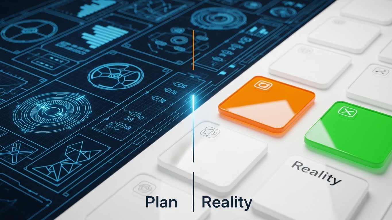
Visualizing the Upgrade Path
The Visual & Narrative Approach
This style utilizes a sharp split-screen composition to dramatize the "Migration Journey." The left side reveals a technical wireframe blueprint of a dashboard in "Blueprint Blue" on a white grid, representing the planning phase or the legacy state. As a vertical scanning line sweeps across the screen from left to right, the wireframe instantly transforms into the "Reality": a glossy, fully rendered High-Key UI with premium glass textures and vibrant "Orange" and "Green" action buttons.
Narration Style: Confident, transitional, and assuring. "From concept to capability. We turn your modernization plans into operational reality."
De-risking the "Big Switch"
Psychological Impact & KPI Focus
For CTOs and Operations Directors, replacing a legacy collection system (often a text-based AS400) is terrifying due to fears of data loss and downtime. This visual effectively De-risks Implementation. It proves that the vendor has a structured, blueprint-driven process for migration. It appeals to the Architect persona who needs to see that the software isn't just "vaporware," but a structured reality that matches their internal roadmaps.
Strategic Implementation & Trade-offs
Use Case: LinkedIn Comparison Posts and Migration Webinars. It visually proves the "Before/After" value proposition without needing sensitive client data.
Strategic Trade-off: It is highly technical. It works best for an audience that understands software development lifecycles; it may bore a non-technical collections floor manager who just wants to see the dialer work.
Companies using similar video content -
Latitude by CGI – Debt management and recovery.
DAKCS Software Systems – Debt collection software.
12. Lifestyle Stock with UI Overlay
MOFU | Building Trust

Humanizing the Collection Floor
The Visual & Narrative Approach
We see a high-quality lifestyle photograph of a professional woman in a crisp white blazer, seated in a sunlit, glass-walled office. She smiles genuinely at an off-camera screen, disrupting the "boiler room" stereotype. Floating in the air beside her is a clean, white and green vector UI overlay displaying a "Compliance Verified" shield badge. The lighting is natural and airy, seamlessly blending the warmth of the human element with digital trust.
Narration Style: Empathetic, warm, and professional. "Empower your agents. Protect your brand. The perfect balance of empathy and enforcement."
Reframing the Agent Experience
Psychological Impact & KPI Focus
The industry suffers from high agent attrition and a reputation for aggression. This style combats that image, visualizing Ethical Recovery. It subconsciously tells the viewer: "This software makes your agents' lives easier and happier." It links Agent Retention and Brand Protection directly to the software interface, suggesting that the tool itself is what enables this calm, professional environment.
Strategic Implementation & Trade-offs
Use Case: Website "About Us" Sections and Recruitment Videos. It builds immediate emotional trust.
Strategic Trade-off: Relying on stock footage can feel generic if the UI overlay isn't perfectly tracked and branded. It requires high-end compositing to look premium and integrated.
Companies using similar video content -
TCN – Cloud contact center for collections.
LiveVox – Cloud contact center for collections.
13. Clean UI Workflow (Light Mode)
MOFU | Driving Demo Requests
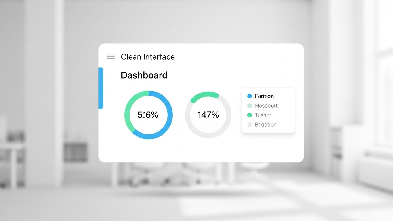
The Zen of Productivity
The Visual & Narrative Approach
This is a pristine, "Light Mode" UI presentation designed to look like a breath of fresh air. A floating, white dashboard card displays circular progress bars in soothing "Sky Blue" and "Mint Green," showing clearly legible metrics like "56%" and "147%." The background is a soft, out-of-focus white office environment, providing context without clutter. Soft drop shadows create separation between the UI layers, focusing the eye entirely on the clarity of the data.
Narration Style: Clarity-focused and brisk. "Zero clutter. Zero distraction. Just the data your agents need to resolve the next account."
Reducing Cognitive Friction
Psychological Impact & KPI Focus
Collection agents stare at screens for 8 hours a day. Cluttered interfaces lead to fatigue and errors. This visual sells Usability and Reduced Cognitive Load. It promises a friction-free workflow where Call Wrap-Up Times are minimized because the interface is intuitive. It appeals to Operations Managers looking to increase efficiency metrics without burning out their staff.
Strategic Implementation & Trade-offs
Use Case: Retargeting Ads for users who visited the pricing page. It serves as a gentle reminder of how easy the tool is to use.
Strategic Trade-off: It lacks "drama." It validates the product's usability but doesn't create urgency. It functions best as a validation tool for warm leads, not an attention hook for cold ones.
Companies using similar video content -
CollectMax (by JST) – Debt collection software.
Advantage Software – Collect! – Debt collection software.
14. Minimalist Flat 2D Vector
MOFU | Objection Handling
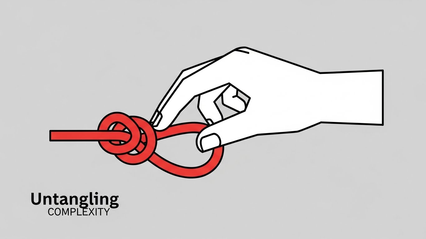
Visualizing the Solution
The Visual & Narrative Approach
A minimalist flat 2D vector illustration captures the essence of problem-solving. A complex, tangled "Red" knot—representing a difficult compliance issue or a messy portfolio—is being effortlessly untied by a stylized white hand. The background is a solid, neutral "Light Grey." The shapes are simple and geometric, communicating the message of "Untangling Complexity" with ease and grace.
Narration Style: Educational and direct. "Complex regulations? Consider them solved. We untangle the red tape so you don't have to."
The "Easy Button" for Debt
Psychological Impact & KPI Focus
This appeals to the Simplifier persona. Decision-makers often delay buying software because they fear the complexity of the problem. This style metaphorically promises that the software is the solution, not another complication. It effectively visualizes Dispute Resolution and Workflow Logic without getting bogged down in technical details. It says: "We handle the mess."
Strategic Implementation & Trade-offs
Use Case: Blog Headers for technical articles (e.g., "Navigating Reg F"). It makes dense topics feel approachable.
Strategic Trade-off: It is highly metaphorical. If the audience is looking for specific feature sets, this abstract approach might feel too light.
Companies using similar video content -
Esker – AI-driven process automation for AR.
HighRadius – Autonomous finance platform for AR.
15. Dark Mode UI Showcase
MOFU | Risk Mitigation

The Digital Vault
The Visual & Narrative Approach
We switch to a sleek, aggressive "Dark Mode" UI showcase. The interface is "Jet Black" with modern Neomorphic elements. Glowing "Neon Green" padlock icons and binary data streams are prominent, symbolizing Military-Grade Encryption. The background is a dark abstract mesh pattern. This is a deliberate contrast to the "Light Mode" styles, designed to emphasize the "Security Vault" aspect of the platform.
Narration Style: Serious, low-pitched, and protective. "Your data is your currency. We keep it under the industry's strongest lock and key."
Addressing the CISO's Fear
Psychological Impact & KPI Focus
Data breaches are the extinction event for collection agencies. This style speaks directly to the Risk Officer (CISO). It visualizes SOC 2 Type II Compliance and PII Protection. The dark aesthetic taps into the cultural visual language of cybersecurity, subconsciously signaling robustness and impenetrability. It shifts the conversation from "Does it work?" to "Is it safe?"
Strategic Implementation & Trade-offs
Use Case: Security Page on the website and IT Due Diligence Decks. It instantly answers the question: "Is it secure?"
Strategic Trade-off: Can appear "intimidating" or overly technical to a non-technical buyer. It should be used specifically for security-focused messaging.
Companies using similar video content -
ACI Worldwide – Enterprise payment solutions.
SAS – Analytics and decision management.
16. Dynamic Data Visualization
BOFU | ROI Justification

The Liquidity Engine
The Visual & Narrative Approach
A dynamic 3D data visualization features a series of bar charts made of crystal clear glass rising from a reflective white floor. Instead of solid colors, the bars are filled with a viscous "Emerald Green" liquid that rises in real-time. The camera angle is low, looking up at these "towers" of revenue. Caustic light patterns reflect on the floor, suggesting the movement of water—or in this case, cash flow.
Narration Style: Enthusiastic and growth-oriented. "Watch your recovery rates rise. Real-time liquidity, visualized."
Visualizing the "Found Money"
Psychological Impact & KPI Focus
This creates a powerful association between the software and Financial Liquidity. The rising liquid triggers the psychological reward system—it looks like a bank account filling up. It is the perfect visualization for Recovery Rate Improvement and Cash Collections. It moves the conversation from "Cost of Software" to "Volume of Recovery," justifying the ROI.
Strategic Implementation & Trade-offs
Use Case: Investor Decks and Quarterly Business Review (QBR) presentations. It visualizes success in a way that static Excel charts never can.
Strategic Trade-off: It focuses purely on the result, not the method. It assumes the viewer already trusts the process and just wants to see the outcome.
Companies using similar video content -
FICO – Debt Manager – Collections platform.
Moody's Analytics – Risk and finance solutions.
17. Photorealistic 3D Renders
BOFU | The Economic Buyer

The CFO's Perspective
The Visual & Narrative Approach
A photorealistic 3D close-up of a mahogany executive desk in a dimly lit, premium office. A high-end tablet displays a crisp financial growth report with a sharp, upward-trending green line. Beside it sits a silver pen and a porcelain coffee cup. The depth of field is shallow, focusing sharply on the "Total Recovered" metric on the screen. The lighting is warm, premium, and sophisticated.
Narration Style: Sophisticated, quiet, and conclusive. "The numbers speak for themselves. Precision reporting for the decisive leader."
Prestige and Profitability
Psychological Impact & KPI Focus
This targets the Economic Buyer (CFO). It removes the "tech" and focuses on the "business." It associates the software with Executive Decision Making and Profitability. It visualizes the end-state of the software: a clear, undeniable report that justifies the investment. It speaks the language of EBITDA and Net Recovery, bypassing technical jargon.
Strategic Implementation & Trade-offs
Use Case: Pricing Pages and Final Proposal Documents. It subliminally elevates the brand to a "Premium Partner" status.
Strategic Trade-off: It is static. It conveys a mood rather than a feature. It is a closing tool, not an educational one.
Companies using similar video content -
BlackLine – Financial close and AR automation.
YayPay (Quadient) – AI-powered AR automation.
18. Futuristic Neon/Dark Mode
BOFU | The Technical Buyer

The Engine Room
The Visual & Narrative Approach
We dive into the backend with a futuristic 3D abstract scene. In a dark server room environment, glowing "Deep Purple" and "Electric Blue" fiber optic cables plug into a central, pulsating "API" node. The floor is reflective black glass. The energy pulses from the cables into the box, visualizing the Deep Backend Integration capabilities of the platform.
Narration Style: High-tech, fast, and powerful. "Plug in. Power up. Seamless API integration with your existing ecosystem."
Validating the Tech Stack
Psychological Impact & KPI Focus
This validates the platform for the IT Director who worries about integration headaches. It visualizes the concept of "Plug-and-Play." It makes the invisible transfer of data feel powerful and electric. It supports claims of Real-time Data Sync, Omni-channel Integration, and Low Latency. It assures the tech team that this is a modern, robust engine.
Strategic Implementation & Trade-offs
Use Case: Technical Documentation Headers and Integration Feature Pages. It gives a "cool factor" to otherwise dry technical specs.
Strategic Trade-off: Can alienate non-technical buyers who find "server room" imagery cold or confusing. Use strictly for the technical audience.
Companies using similar video content -
VersaPay – AR automation and integrated payments.
Repay – Integrated payment processing.
19. Split Screen: Optimized Reality and UI
BOFU | Sales Cycle Acceleration

Closing the Loop
The Visual & Narrative Approach
A split-screen composition bridges the physical and digital. The left side shows a warm, photorealistic close-up of a firm handshake between two professionals in suits. The right side shows a clean, white UI screen with a large "Contract Signed" success notification in vivid Green. A subtle digital line connects the handshake to the checkmark, visually syncing the human agreement with the digital execution.
Narration Style: Conclusive and celebratory. "Signed. Sealed. Systematized. Accelerate your time to revenue."
The Speed of Agreement
Psychological Impact & KPI Focus
This is the ultimate "Deal Closer." It visualizes the Speed to Revenue. It connects the physical act of closing a deal (or collecting a debt) with the instant digital record. It addresses the friction of "paperwork" by showing that the digital side happens instantly. It is excellent for visualizing Payment Portal Efficiency and e-Signature Integration.
Strategic Implementation & Trade-offs
Use Case: Email Signatures for Sales Teams and Bottom of Email Nurture Sequences. It reinforces the goal: getting to "Yes."
Strategic Trade-off: It is very specific to the moment of "closing." It doesn't explain how you got there, only that you did.
Companies using similar video content -
Paymentus – Electronic bill presentment and payment.
InvoiceCloud – Online bill payment and engagement.
20. 3D Parallax UI Presentation
BOFU | ABM Awareness
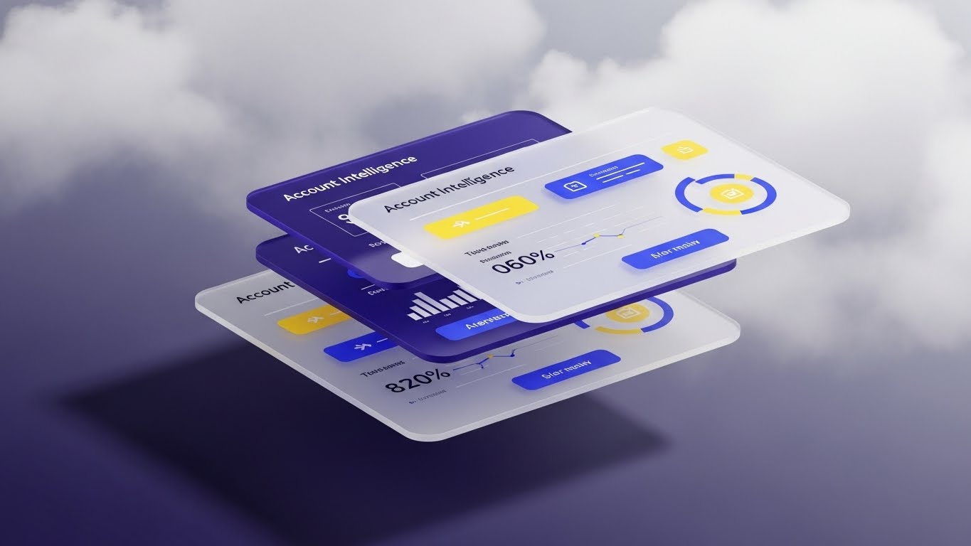
The Holistic View
The Visual & Narrative Approach
A sophisticated 3D parallax UI composition. Three semi-transparent white UI screens float in a stack, separated by depth. The content on the screens displays detailed "Account Intelligence" data in "Royal Blue" and "Yellow." The background is a soft abstract cloud texture. As the camera pans, the screens cast soft shadows on each other, creating a sense of hierarchy and depth, revealing that the top screen is just the surface of the data available.
Narration Style: Comprehensive and grand. "Depth of data. Depth of insight. See the full story of every account."
Visualizing Account Intelligence
Psychological Impact & KPI Focus
This appeals to the desire for Mastery and Control. It shows that the platform isn't flat; it has layers of intelligence. It is perfect for Account-Based Marketing (ABM) where you are selling a "Solution Suite" rather than a single tool. It visualizes Deep Skip Tracing, Behavioral Scoring, and Historical Data Analysis all at once. It says: "We go deeper than the competition."
Strategic Implementation & Trade-offs
Use Case: LinkedIn Ads targeting Enterprise Accounts. The premium look signals that this is an enterprise-grade solution, not a tool for small agencies.
Strategic Trade-off: It is complex. It requires the viewer to pay attention to the layers. It is a "lean-in" experience, not a "lean-back" one.
Companies using similar video content -
Experian – PowerCurve – Decision management.
TransUnion – Data and analytics.
21. 2D Character-Driven Story
Onboarding | Self-Serve Onboarding

The Agent's Ally
The Visual & Narrative Approach
This style embraces the modern "Corporate Memphis" aesthetic—clean, flat, vector-based characters with exaggerated, friendly proportions. We see a stylized collection agent sitting at a desk, enthusiastically high-fiving a floating digital screen that displays an "All Systems Go" chart. The palette uses vibrant "Orange" and "Teal" to create energy. The background is a simplified, decluttered office space.
Narration Style: Cheerful, encouraging, and simple. "Welcome aboard. Your new workspace is ready to work for you."
Removing the Fear of Change
Psychological Impact & KPI Focus
New software often triggers "Change Anxiety" among staff who fear a steep learning curve. This friendly, character-driven approach humanizes the technology. It visually reinforces Ease of Use and Agent Empowerment. It transforms the onboarding process from a technical chore into a celebrated milestone. It is particularly effective for driving Self-Serve Adoption, encouraging users to explore the platform without waiting for IT support.
Strategic Implementation & Trade-offs
Use Case: In-App Welcome Screens and First-Login Walkthroughs. It sets a positive, can-do tone from the very first interaction.
Strategic Trade-off: The illustrative style is very specific. It must be updated if the UI undergoes a major redesign to ensure the screen elements remain recognizable.
Companies using similar video content -
Alvaria – Contact center WFM/QM.
Genesys – Cloud contact center solutions.
22. Rapid UI Feature Montage
Onboarding | Accelerating Time-to-Value

The Velocity of Setup
The Visual & Narrative Approach
A high-energy, kinetic motion graphic. Individual UI components—a "Dialer" widget in Red, a "Calendar" in Yellow, and a "Map" in Blue—fly in from the edges of the screen. They snap together with magnetic precision to form a cohesive, powerful dashboard. The background is a dark void with blurred motion lines, emphasizing speed. The sound design features satisfying clicks and whoosh effects.
Narration Style: Fast, rhythmic, and punchy. "Connect. Configure. Collect. Build your perfect workflow in seconds."
Visualizing Instant Capability
Psychological Impact & KPI Focus
In the collection industry, downtime equals lost revenue. This visual addresses the fear of a long, drawn-out implementation phase. It visually demonstrates Modular Configuration and Rapid Deployment. It proves to the Operations Manager that this system can be tailored to their specific "dunning strategy" instantly. It sells the concept of Agility—the ability to pivot strategies as fast as the market changes.
Strategic Implementation & Trade-offs
Use Case: Onboarding Emails and "Getting Started" Videos. It energizes the user to start configuring their dashboard immediately.
Strategic Trade-off: It moves very fast. It is not suitable for teaching how to configure the widgets, only that they can be configured quickly.
Companies using similar video content -
Five9 – Cloud contact center solutions.
Calabrio – Workforce engagement management.
23. 2D Graphics Over Live Action
Onboarding | Reducing Implementation Friction

The Human-Tech Hybrid
The Visual & Narrative Approach
A candid, live-action shot of a diverse team of recovery specialists collaborating around a laptop in a casual, coffee-shop style breakout area. As they point at the screen, bright, hand-drawn 2D animations appear in the air above them—"Rocket Ships" launching, "Checkmarks" popping, and "Stars" twinkling. The style is loose, organic, and fun, contrasting with the realistic footage.
Narration Style: Collaborative and warm. "Technology that fits your team. Not the other way around."
Bridging Culture and Code
Psychological Impact & KPI Focus
Modern agencies are moving toward remote and hybrid work models. This style validates the Human Element of debt collection. It shows that the software doesn't replace the team; it enhances their connection. It visually supports Collaborative Workflows and Team Performance Tracking. It makes the implementation of new software feel like a cultural upgrade, not just a technical one.
Strategic Implementation & Trade-offs
Use Case: Implementation Kick-off Videos and Change Management Communications. It helps get buy-in from the staff by showing the "fun" side of the tool.
Strategic Trade-off: Live action production is more expensive and harder to update than pure animation. It captures a specific moment in time.
Companies using similar video content -
TCN – Cloud contact center for collections.
LiveVox – Cloud contact center for collections.
24. Macro UI Micro-Interactions
Retention | Knowledge Base/FAQ

The Touch of Assistance
The Visual & Narrative Approach
An extreme macro close-up, rendering the UI as a tactile, physical object. We focus on a single, pill-shaped "Help" button glowing in "Indigo Blue." A cursor hovers, and the button reacts with a subtle, inviting pulse or glow before the click. The depth of field is razor-thin, blurring everything else into a soft white bokeh. The interaction looks satisfying and effortless.
Narration Style: Soft, helpful, and guiding. "Stuck? The answer is just one click away. Instant answers for uninterrupted recovery."
Empowering the Agent
Psychological Impact & KPI Focus
Collection agents often feel isolated when dealing with difficult calls. This visual reassures them that support is always immediate and accessible. It promotes Self-Reliance and reduces Support Ticket Volume. By making the "Help" function look inviting rather than bureaucratic, it encourages agents to solve problems independently, maintaining their flow and Call Efficiency.
Strategic Implementation & Trade-offs
Use Case: Help Center Headers and Support Portal Loading Screens. It reframes "seeking help" as a positive, easy interaction.
Strategic Trade-off: It is very abstract. It sets a mood of helpfulness but doesn't convey specific information.
Companies using similar video content -
CollectOne (by CDS Software) – Debt collection software.
CollectTech – Debt collection software.
25. Holographic UI over 3D Render
Retention | Driving Deep Feature Adoption

The Innovation Projector
The Visual & Narrative Approach
A sleek, photorealistic 3D render of a smartphone or tablet lying on a clean white surface. Suddenly, a beam of "Holographic Blue" light projects upward from the screen, forming a rotating 3D icon of a new feature (e.g., a lightning bolt for "Instant Pay" or a brain for "AI Scoring"). The hologram rotates smoothly, showcasing the "future" springing from the device.
Narration Style: Futuristic and exciting. "Upgrade your perspective. The next generation of intelligence is already in your hand."
Selling the Roadmap
Psychological Impact & KPI Focus
SaaS retention depends on customers feeling they are on the cutting edge. This style visualizes Continuous Innovation. It tells the client that the platform is alive and evolving. It is perfect for announcing New Feature Rollouts or Beta Programs. It triggers the "Shiny Object" desire, driving adoption of advanced tools like Predictive Behavioral Analytics.
Strategic Implementation & Trade-offs
Use Case: In-App Feature Announcements and Product Update Emails. It grabs attention immediately and signals high value.
Strategic Trade-off: It promises a "sci-fi" level of tech. The actual feature needs to be substantial to match the hype of the visual.
Companies using similar video content -
Prodigal – AI for collections.
Qualia – AI for credit risk.
26. Generative AI Realistic Character Video
Retention | Reducing Churn

The Face of Success
The Visual & Narrative Approach
A Generative AI-created video featuring a "Customer Success Manager" (CSM). She is professional, friendly, and sits in a blurred, high-end glass office. She maintains eye contact with the viewer, offering a reassuring smile and open gestures. The lighting is flattering studio quality. The realism allows for scalable, personalized communication without the cost of filming a real human for every update.
Narration Style: Personal, direct, and empathetic. "We noticed you've hit a milestone. Let's look at what's next for your portfolio."
Scalable Intimacy
Psychological Impact & KPI Focus
Churn often happens when clients feel neglected. This style creates a Pseudo-Personal Connection. It mimics the experience of a high-touch account review for lower-tier clients. It reinforces Partnership and Proactive Support. By using AI, you can generate hundreds of these videos tailored to specific client segments, driving Net Retention Revenue (NRR) through personalized engagement.
Strategic Implementation & Trade-offs
Use Case: Quarterly Check-in Emails and Milestone Celebration Messages. It bridges the gap between automated emails and live calls.
Strategic Trade-off: AI avatars can sometimes fall into the "Uncanny Valley." The quality must be top-tier to avoid feeling robotic, which would damage trust.
Companies using similar video content -
Symend – Behavioral engagement for collections.
TrueAccord – Digital-first debt collection platform.
27. 2D Animation & UI Composition
Retention | Reducing Support Overhead

The Community of Solvers
The Visual & Narrative Approach
A vibrant composition of stylized 2D hands (representing diverse users and support staff) interacting with floating UI cards. One hand slides a card labeled "Issue" into a slot, and another hand instantly pulls it out as a green card labeled "SOLVED." The background is a playful "Pastel Blue" with pop-art dots. The motion is snappy and cooperative.
Narration Style: Energetic and reassuring. "Together, we solve it faster. Community-driven support for a seamless experience."
Visualizing Active Support
Psychological Impact & KPI Focus
This creates a visual metaphor for Active Resolution. It alleviates the frustration of "submitting a ticket into a black hole." It visualizes the Support Ecosystem, implying that the user is part of a responsive network. It is effective for promoting Community Forums or Peer-to-Peer Knowledge Sharing, shifting the burden away from the central helpdesk.
Strategic Implementation & Trade-offs
Use Case: Social Media (LinkedIn/Twitter) and Community Portal Banners. It portrays the brand as helpful and engaged.
Strategic Trade-off: The "cartoon" style is casual. It works well for "Community" messaging but less well for "Critical Incident" reporting.
Companies using similar video content -
CollectRight – Debt collection software.
CollectSmart – Debt collection software.
28. Hyper-lapse Stock Footage with Data
Expansion | Website Visitor Re-engagement

The City That Never Sleeps
The Visual & Narrative Approach
A stunning hyper-lapse video of a major metropolis at night. Car headlights stream through the avenues in long streaks of red and white light. Superimposed over the city is a rigid, white wireframe grid that undulates slightly, representing "Data Coverage" or "Network Reach." The contrast between the organic, frantic motion of the city and the stable, encompassing grid is visually arresting.
Narration Style: Epic and global. "While the world moves, we are watching. 24/7 monitoring. Unmatched coverage."
The Ubiquity of Data
Psychological Impact & KPI Focus
For an agency expanding into new territories or larger portfolios, "Coverage" is the key selling point. This visual implies Omni-presence. It suggests that the software works tirelessly, even when the agents are asleep. It effectively visualizes Global Reach, Continuous Skip Tracing, and Always-On Compliance Monitoring. It answers the question: "Can you handle our scale?"
Strategic Implementation & Trade-offs
Use Case: Retargeting Ads and Lobby Screens. It projects size and stability, reminding the viewer of the vendor's scale.
Strategic Trade-off: It is a high-level brand play. It doesn't explain what the software does, only where it operates (everywhere).
Companies using similar video content -
TransUnion – Data and analytics.
Experian – Data and analytics.
29. 3D X-Ray Visualization
Expansion | Driving Upsell
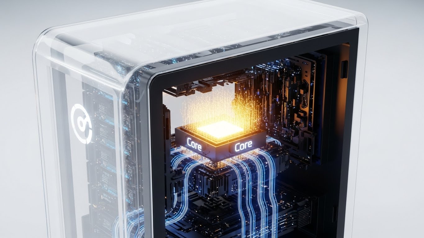
Unlock the Engine
The Visual & Narrative Approach
We see a high-tech server tower or "black box" representing the standard software tier. The outer casing turns into transparent white glass (X-Ray view), revealing a pulsating "Gold" core module deep inside. This core spins and emits light rays that illuminate the rest of the machine. The background is a clean, white laboratory setting.
Narration Style: Exclusive and revealing. "There is more power within. Unlock the core. Unleash the premium tier."
The Hidden Value Proposition
Psychological Impact & KPI Focus
This taps into the "Fear of Missing Out" (FOMO) on performance. It visualizes the Premium Upgrade not as an "add-on," but as unlocking the true potential of the system. It is a powerful metaphor for Tiered Pricing—showing the client that they already have the engine, they just need to turn the key to access Advanced AI Scoring or Unlimited Data Enrichment.
Strategic Implementation & Trade-offs
Use Case: Upgrade Pages and Admin Dashboard Banners. It visualizes the "Pro" version as a tangible, glowing asset.
Strategic Trade-off: It relies on the "Black Box" metaphor. It assumes the user understands that "Hardware/Core" equals "Software Power."
Companies using similar video content -
FICO – PowerCurve – Decision management.
SAS – Analytics and decision management.
30. Aspirational Stock Montage
Expansion | Driving Referrals
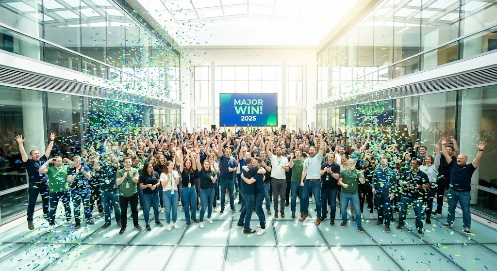
The Championship Moment
The Visual & Narrative Approach
A wide-angle, cinematic shot of a large, diverse team in a modern glass atrium. They are cheering, clapping, and throwing hands in the air. Digitally added confetti in the brand's primary colors (Blue and Green) rains down. A large screen in the background (digitally replaced) displays "MAJOR WIN! 2025." The lighting is high-key and euphoric.
Narration Style: Celebratory and communal. "Your wins are our wins. Join the network of top-performing agencies."
Social Proof at Scale
Psychological Impact & KPI Focus
Ultimately, buyers want to be on the winning team. This visual leverages Social Proof and Tribal Belonging. It moves beyond the software features to the result of using the software: Success. It is designed to drive Referrals and Case Study Participation. It positions the vendor not just as a software provider, but as a Growth Partner that celebrates client victories.
Strategic Implementation & Trade-offs
Use Case: Newsletters, Year-End Recaps, and Referral Program Emails. It leaves the viewer with a positive, triumphant feeling.
Strategic Trade-off: It can feel like stock photography if not customized with the brand's specific colors and perhaps a screen replacement showing a realistic metric.
The Knowledge Base Strategic Framework
Introduction: The Visual Operations Doctrine
You have reviewed 30 distinct visual styles. Each one serves a specific tactical purpose in the debt collection funnel—from "Kinetic Typography" that builds brand awareness to "X-Ray Visualizations" that drive upsells. However, a library of assets is not a strategy. To truly transform your agency's market position, you must weave these visuals into the very fabric of your operations.
This section synthesizes the insights from all 30 styles into a cohesive Visual Operations Doctrine. This is your blueprint for moving from "using video" to "operating visually."
Strategic Alignment & Visual Architecture
Pre-Production Strategy | Goal: Defining the "Why" and "Who"
Before a single pixel is rendered, the "Recovery Architect" must audit the landscape. In an industry defined by high stress and strict regulation, your visual strategy must be an infrastructure project, not just a marketing campaign.
- The Cognitive Load Audit: Collection agents process hundreds of accounts daily. Before creating training content, audit your current materials. If a concept takes 3 paragraphs to explain (e.g., Reg F call caps), it is a candidate for a "Visual Simplification" style (see Style 3: Abstract 2D Motion).
- Role-Based Visual Mapping: Do not use the same visual language for everyone. The Driver (Agent) needs simplicity and clarity (Mobile-optimized, bold text). The Fleet Manager (Director/VP) needs depth and data (Dashboard fly-throughs, detailed 3D). Map your 30 styles to these specific personas to ensure relevance.
- The "Glanceability" Standard: In a busy call center, information must be absorbed in seconds. Adopt a "Glanceability" standard for all internal visuals. If a video thumbnail or dashboard overlay (see Style 13: Clean UI Workflow) cannot be understood in 2 seconds, it fails the test.
- Brand Voice Consistency: Your marketing promises "Ethical Recovery" (Style 12), but does your training material look like a sterile legal document? Use visuals to unify your brand voice. Ensure the "warmth" of your external marketing bleeds into your internal software interface and training videos.
- The Advids Strategic Audit: This is where a partner like Advids becomes essential. We don't just produce video; we help you define this "Visual Operating System" before production begins, ensuring every asset aligns with your compliance framework and brand ethos.
- Standardization vs. Customization: Know when to scale. Use "Stock/Template" styles (Style 28) for generic concepts like "Global Coverage." Invest in bespoke, high-end 3D (Style 10) only for your unique differentiators, like your proprietary "Skip Tracing Algorithm."
- The Cross-Departmental Bridge: Sales sells "AI," but Support explains "Algorithms." Use the same visual metaphors (e.g., the "Sorting Shapes" of Style 3) across both departments. This unifies terminology and prevents the "Expectation vs. Reality" gap for new clients.
- Legacy System Integration: Visualizing the invisible bridge is critical. If you are replacing a "Green Screen" AS400 system, use styles like Style 11 (Wireframe to Reality) to visually demonstrate the migration path, reducing the anxiety of data loss during the transition.
- Accessibility in Recovery: Your workforce is diverse. Design motion graphics (Style 9) that rely on visual logic rather than voiceover alone. This ensures your training is effective for multi-lingual agents or those working in loud call center environments without headphones.
- The Mobile-First Mandate: Agents and Field Investigators are often on mobile devices. Ensure all 30 styles are legible on a 6-inch screen. Bold typography (Style 1) and clear contrast are not aesthetic choices; they are operational requirements for a mobile workforce.
Operational Adoption & Implementation
Deployment Strategy | Goal: Embedding Visuals into Workflow
A video that sits in a hidden folder is worthless. This segment focuses on "Deployment"—how to inject these visual styles directly into the daily grind of the collection floor to boost efficiency and compliance.
- Overcoming "Big Brother" Anxiety: Implementing AI monitoring can terrify agents. Use empathy-driven visuals (Style 12) to frame these tools as "Co-pilots" rather than "Spies." Show the software protecting the agent from compliance errors, not just judging their performance.
- The Micro-Learning Shift: Kill the 50-page PDF manual. Replace it with a library of 30-second clips (using Style 22 "Rapid UI"). Index these clips by specific task (e.g., "How to mark a dispute") so agents can consume them between calls without disrupting their flow.
- Just-in-Time Support: Embed specific visual styles directly into your SaaS interface. When an agent hovers over a complex compliance flag, a 5-second loop of Style 6 (Isometric Motion) should appear to explain the rule visually. This is "Just-in-Time" training.
- Gamification of Training: Visualizing progress drives engagement. Use "Level Up" animations (Style 23) to show agents their progress on compliance certifications or recovery targets. Visual scorecards are far more motivating than spreadsheet numbers.
- Reducing Support Ticket Volume: There is a direct correlation between proactive visual guides and reduced helpdesk load. By placing "Self-Help" visuals (Style 24) on the login screen, you empower users to solve password resets and basic config issues themselves.
- Remote Onboarding: For distributed teams, the "office walk-around" is impossible. Use Style 4 (Gen AI Cinematic) and screencasts to create a virtual induction. Show them the "digital office" to build culture and belonging from Day 1.
- Visualizing SOPs: Standard Operating Procedures are often ignored text blocks. Transform your "dunning letters" flow into a Style 10 (Isometric 3D) map. When agents can see the flow of the account, they are less likely to skip a step.
- Feedback Loops: Use interactive video elements. At the end of a "New Feature" video (Style 25), include a one-click reaction button. This data tells product teams which features are exciting the user base and which are confusing them.
- Scalable Localization: If you operate globally, separate text from video. Use styles like Style 3 (Abstract 2D) where text is an overlay, not baked in. This allows you to swap languages for your LATAM or APAC teams without re-animating the entire asset.
- Leadership Communication: When the CEO announces a strategic shift (e.g., "We are moving to digital-first"), don't send a text email. Use a high-end Style 17 (Photorealistic 3D) video to visualize the growth trajectory. It signals confidence and stability to the entire organization.
Measuring Impact & Future-Proofing
ROI & Evolution | Goal: Validating the Investment
Strategy requires measurement. You must move beyond vanity metrics like "Views" and start measuring "Impact." This final segment aligns your visual strategy with the hard financial realities of the debt collection business.
- Beyond "Views" - Actionable KPIs: A view count tells you nothing about adoption. Measure "Time-to-Competency"—does a new agent utilizing the Style 21 (Onboarding) video hit their quota faster than one who didn't? Measure "Feature Adoption Rate" after releasing a Style 25 highlight reel.
- The "Idle Time" Metric: In SaaS, "Idle Time" (time spent figuring out what to do) is a killer. Correlate the deployment of Style 13 (Clean UI) tutorials with a reduction in average idle time per session. This is a direct efficiency gain you can prove to the CFO.
- Compliance Velocity: How fast can your agency adapt to a new rule like Reg F? Measure the time gap between a regulation change and full team certification. Visual learning (Style 9) dramatically shortens this gap, reducing legal exposure risk.
- Retention and Churn (LTV): High-quality UX visualization (Style 26) keeps clients engaged. Track the churn rate of clients who engage with your "Quarterly Review" videos vs. those who don't. The data will likely show that visual engagement protects Lifetime Value (LTV).
- The AI Visual Frontier: Prepare for the next wave. Generative Video (Style 5) and Real-time Data Overlays are coming. Start building a data infrastructure that can feed these tools. The future is dynamic video that creates itself based on the specific debtor's portfolio.
- Scalability of Assets: Build a library, not a landfill. Organize your source files (After Effects, Blender) so they can be updated. A "Year in Review" video (Style 30) should be a template that can be updated with new data in minutes next year.
- The Advids Partnership: Visual strategy is not a one-time project; it is an evolving ecosystem. Partnering with Advids ensures your visual library evolves with your software, preventing your marketing from looking outdated as your tech advances.
- Benchmarking Success: "Good enough" is a competitive risk. If your competitor is using Style 2 (3D AI Visualization) to demonstrate their tech, and you are using screen grabs, you lose the "Innovation" argument before the demo starts. Regularly benchmark your visuals against the top SaaS players, not just other agencies.
- The ROI of Safety: Quantify the "Cost of Non-Compliance." If a "Line Art Compliance" video (Style 9) prevents one lawsuit, the ROI is infinite. Position your visuals as an insurance policy.
- Final Call to Innovation: Treat video as infrastructure. It is not "content" to be consumed and forgotten; it is the interface through which your market understands your value. Invest in it with the same rigor you invest in your code. The future of recovery is not just efficient; it is visual.
Companies using similar video content -
Ontario Systems – Artiva – Core collection platform.
Latitude by CGI – Debt management and recovery.
Author & Editor Bio


