
 /home/wwwroot/advids.co/design/index.php on line 425
Introduction: Bridging the Physical-Digital Divide
The commercial construction industry stands at a pivotal threshold. We are moving beyond the era of disjointed spreadsheets and paper-laden field offices into a future defined by seamless integration, predictive insights, and digital cohesion. However, for SaaS platforms in this domain, the challenge is not just building the best feature set; it is articulating that value to a market that is historically cautious yet hungry for efficiency.
The disconnect between physical site operations and digital project management remains a primary friction point. Our opportunity lies in using advanced video visualization not merely as a marketing tactic, but as a strategic bridge. By visualizing complex data flows, compliance structures, and operational efficiencies, we reduce the cognitive load on stakeholders—from the General Contractor (GC) to the CFO—allowing them to instantly grasp the ROI of digital transformation.
The cost of the status quo is measurable and significant. Recent industry studies indicate that poor data strategies and disconnected information could cost the global construction industry $1.85 trillion annually. This staggering figure highlights the urgent need for tools that don't just exist, but actively clarify and resolve operational friction. Conversely, the upside is equally compelling: construction companies that embrace digital transformation see a 15% average increase in productivity.
By adopting the visual styles detailed in this guide, we position your platform not just as a tool, but as the essential architecture for the next generation of construction profitability. These styles are engineered to resonate with the specific psychological drivers of your audience, turning abstract software capabilities into tangible, high-value assets.
1. Minimalist Flat 2D Vector
TOFU | Brand Awareness

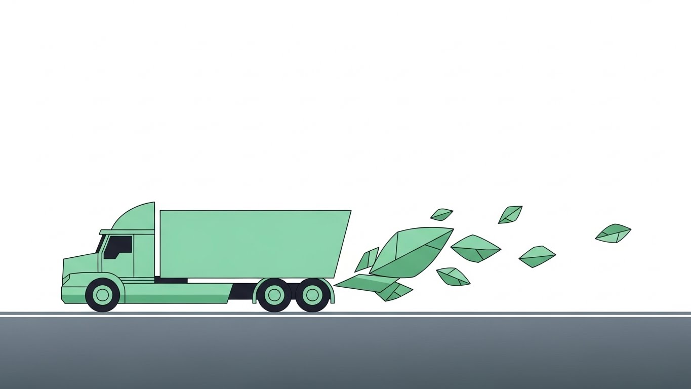
The Visual & Narrative Approach
This style employs a "less is more" philosophy to cut through the visual clutter of the construction industry. The scene depicts a stylized, geometric semi-truck profile in Mint Green driving on a sleek Slate Grey road. The background is a clean Pure White void, removing all environmental distractions. As the truck moves, it leaves a trail of abstract leaves instead of exhaust. The composition is centered and balanced.
Psychological Impact & KPI Focus
- Cognitive Load Reduction: Construction professionals are bombarded with complex schematics and noisy environments. The pristine "white void" offers a visual respite that commands attention.
- Efficiency Signaling: By stripping away textures and gradients, we signal clarity and precision—key psychological drivers for Operations Managers seeking to declutter their logistics processes. The abstract "leaf trail" subtly positions the platform as a modern, eco-conscious solution.
Strategic Implementation & Trade-offs
- Best Use: High-level brand awareness campaigns and website hero sections where the goal is to associate the brand with "Simplicity."
- Trade-off: This style lacks the technical granularity required for deep feature education. Avoid using it for complex interface walkthroughs.
- Duration: 6-10 seconds (Looping).
Companies using similar video content -
Samsara – Connected operations platform for fleet and site.
Geotab – Telematics and fleet management solutions.
2. 2D Line Art Animation
TOFU | Market Education

The Visual & Narrative Approach
Elegance meets engineering in this continuous line art style. Using thin, sophisticated Navy Blue lines on a White background, the animation flows horizontally. A chaotic scribble—representing "exhaust" or unstructured data—smoothly untangles itself into a neat, straight line that eventually shapes into a crisp checklist icon. The motion is fluid and uninterrupted, suggesting a seamless process.
Psychological Impact & KPI Focus
- Authority & Trust: Line art mimics the visual language of architectural blueprints and engineering schematics, establishing immediate technical authority.
- Resolution: The visual metaphor of "scribble to straight line" triggers a strong Cognitive Ease response; it visually promises that the software will untangle the user's messy workflows. This directly addresses the anxiety of "data silos."
Strategic Implementation & Trade-offs
- Best Use: Email marketing headers and "About Us" process sections. The clean background integrates perfectly with email bodies.
- Trade-off: The lack of solid colors can feel "light" on mobile screens. Ensure line weight is sufficient for visibility.
- Duration: 10-15 seconds.
Companies using similar video content -
Fieldwire – Field management software for construction teams.
SiteDocs – Safety management software for compliance.
3. Abstract 2D flat vector organic
TOFU | Shaping Brand Perception

The Visual & Narrative Approach
Moving away from rigid structures, this style uses organic modern motion graphics to humanize the technology. A central spherical shape is constructed from interconnecting fluids in Emerald Green, Lime, and Soft Cream, textured to resemble liquid glass. The shape morphs and settles, resembling a protective shield or a clean water droplet, set against a calming Pale Green background.
Psychological Impact & KPI Focus
- Adaptability: In an industry dominated by rigid steel and concrete, organic shapes signal adaptability and fluidity.
- Transparency: The "liquid glass" texture implies transparency—a critical value proposition for SaaS platforms promising supply chain visibility. It appeals to the aspirational identity of the "Modern Builder."
Strategic Implementation & Trade-offs
- Best Use: Social media brand building (Instagram/LinkedIn) to disrupt the feed with "satisfying" motion.
- Trade-off: It is highly abstract. Effectively conveys "feeling" but fails to convey "function." Must be paired with strong, benefit-driven copy.
- Duration: 5-8 seconds (Looping).
Companies using similar video content -
Procore – Construction management software for projects.
Kahua – Project management and collaboration platform.
5. Bold Kinetic Typography (Visual)
TOFU | Vertical Social Organic

The Visual & Narrative Approach
Designed specifically for vertical consumption, this style treats text as a physical construction material. Heavy, 3D block shapes in Safety Orange, Black, and White lock together like steel beams. They are arranged diagonally, suggesting the structure of the word "COMPLIANCE" without being legible. The background is an industrial abstract grey.
Psychological Impact & KPI Focus
- Visual Hierarchy: The "Safety Orange" triggers an immediate association with the job site and caution/importance.
- Structural Integrity: The "locking" motion subconsciously reinforces the concept of security and strength. It addresses the user's anxiety about risk and liability by visually asserting that this platform is "solid."
Strategic Implementation & Trade-offs
- Best Use: High-energy social media ads aiming to stop the scroll.
- Trade-off: Legibility is secondary to impact. Do not use this for conveying complex messages or detailed statistics.
- Duration: 3-5 seconds (Fast-paced).
Companies using similar video content -
Trimble Connect – Collaboration platform for construction projects.
E2open – Supply chain management for global operations.
6. Dynamic Data Visualization
TOFU | Category Creation

The Visual & Narrative Approach
This style elevates boring charts into "Category Creation" assets. Using a "Glassmorphism" aesthetic, translucent bars glow in Neon Blue and Magenta within a dark tech-void. As they rise to represent fuel savings, floating data particles surround them. The look is high-tech, sleek, and premium.
Psychological Impact & KPI Focus
- Premium Positioning: By using "dark mode" aesthetics and neon glows, we frame the construction data as strategic intelligence rather than administrative clutter.
- Value Perception: It appeals to the CTO/Executive persona who wants to feel they are commanding a sophisticated, futuristic operation.
Strategic Implementation & Trade-offs
- Best Use: LinkedIn thought leadership posts, investor decks, and "Results" sections of case studies.
- Trade-off: Can look "too futuristic" if not grounded. Ensure the data labels (e.g., "Fuel Saving") are clear.
- Duration: 8-12 seconds.
Companies using similar video content -
Zonar – Fleet management and compliance solutions.
Veriforce – Workforce compliance and safety management.
7. Abstract 2D Motion Graphics
TOFU | Meta & General Social Ads

The Visual & Narrative Approach
This style focuses on energy and transformation. Fluid, morphing shapes in Purple, Pink, and Teal transition from amorphous "exhaust clouds" into organized grid patterns and checkmarks. The background is a deep violet, providing high contrast. The motion is continuous and loopable.
Psychological Impact & KPI Focus
- Pattern Recognition: The brain enjoys watching chaos organize itself. By morphing the "bad" (exhaust) into the "good" (grids/checks), we visually condition the viewer to associate the brand with resolution.
- Disruption: The vibrant palette disrupts the standard "earth tone" color scheme of construction content, signaling innovation.
Strategic Implementation & Trade-offs
- Best Use: Instagram/Facebook feed ads and retargeting backgrounds.
- Trade-off: Like other abstract styles, it builds "Vibe" but not "Understanding."
- Duration: 6-10 seconds (Looping).
Companies using similar video content -
Uptake – Industrial AI and predictive analytics platform.
Senseye – Predictive Maintenance – AI-powered machine health monitoring.
8. Low-Poly 3D Modeling
TOFU | Driving Freemium/Trials
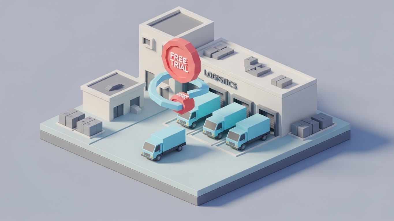
The Visual & Narrative Approach
A playful, inviting aesthetic designed to drive Freemium trials. The scene is a low-poly 3D diorama of a miniature logistics hub. Tiny pastel blue trucks are parked at a loading bay. A floating, rotating token in Coral Pink hovers above them, representing a "Free Trial." The lighting is bright and soft.
Psychological Impact & KPI Focus
- Friction Reduction: Complex enterprise software can feel daunting. By rendering the environment as a miniature, low-poly world, we make the scenario feel manageable and low-risk.
- Gamification: It triggers a sense of "play," encouraging the user to click "Try" without the fear of a steep learning curve.
Strategic Implementation & Trade-offs
- Best Use: Retargeting ads for users who visited the pricing page but didn't convert.
- Trade-off: If overused, it can trivialize the seriousness of the software. Ensure the "toy" look is polished.
- Duration: 6-8 seconds (Looping).
Companies using similar video content -
Autodesk Construction Cloud – Integrated construction management platform.
WakeCap – Equipment tracking and site intelligence.
9. Split Screen: Optimized Reality and UI
MOFU | Product Differentiation
The Visual & Narrative Approach
A powerful comparative technique. The screen is divided vertically. The left side shows a desaturated, grainy photo of a disorganized desk with paper piles (The "Before"). The right side is a crisp, bright render of a clean UI dashboard in Vivid Green and White (The "After").
Psychological Impact & KPI Focus
- Contrast Principle: The grainy, messy left side triggers the pain of the current reality—stress and inefficiency. The right side offers an immediate dopamine hit of relief and organization.
- Tangible Proof: It visually answers the skeptical question: "Is this better than my current system?" with a resounding "Yes."
Strategic Implementation & Trade-offs
- Best Use: Landing pages (above the fold) and sales deck "Problem/Solution" slides.
- Trade-off: The "messy" side must look realistic to resonate.
- Duration: Static or 5-second reveal slider.
Companies using similar video content -
Hilti ON!Track – Asset management for tools and equipment.
Tenna – Equipment management and telematics solutions.
10. Isometric 2D Motion Design
MOFU | Feature Education

The Visual & Narrative Approach
An isometric 2D vector illustration of a smart city grid. Clean Blueprint Blue lines define the roads. White trucks move along the paths, leaving glowing green trails. The background is a solid deep blue. The style is architectural and precise.
Psychological Impact & KPI Focus
- God’s Eye View: This perspective instills a sense of control and total visibility—exactly what a Project Manager craves.
- Traceability: The glowing trails visually represent the intangible algorithms of route optimization, making the "invisible" tech visible and understandable.
Strategic Implementation & Trade-offs
- Best Use: Deep-dive product explainer videos and "Features" pages.
- Trade-off: Can become cluttered. Keep the focus on the specific feature (e.g., routing) rather than showing the entire city in detail.
- Duration: 15-20 seconds.
Companies using similar video content -
e-Builder – Construction program management software.
InEight – Project controls and capital projects management.
11. Photorealistic 3D Renders
MOFU | ROI Justification

The Visual & Narrative Approach
This style abandons abstraction for hyper-realism to ground the financial argument. The scene features a close-up, macro shot of a heavy-duty construction truck tire resting on a reflective, high-end studio floor. The rubber texture is palpable, emphasizing the physical reality of the asset. Directly beside it, a neat stack of gold coins accumulates, mirroring the tire's tread height. The lighting is soft and premium, framing maintenance not as a cost center, but as a savings generator.
Psychological Impact & KPI Focus
- Tangibility of Savings: For the CFO or Fleet Director, "savings" can feel abstract. By visually equating physical wear-and-tear (the tire) with hard currency (gold coins), we create a direct neural association between preventative maintenance and profit retention.
- Premium Association: The studio lighting elevates the perception of the "dirty" job of maintenance, positioning your software as a high-value asset management tool rather than a mere utility.
Strategic Implementation & Trade-offs
- Best Use: Investor decks and "ROI" slides in sales presentations where you need to justify the software license cost against hard asset savings.
- Trade-off: High production cost. It creates a powerful impression of value but does not explain the process of how savings are achieved.
- Duration: Static Image or 5-second cinematic pan.
Companies using similar video content -
Teletrac Navman – Fleet management and telematics solutions.
Motive – Fleet Management – ELD, dashcams, and fleet management.
12. 3D X-Ray Visualization
MOFU | Risk Mitigation

The Visual & Narrative Approach
To sell predictive capabilities, we must show what the human eye cannot see. This style utilizes a "Ghost White" glass texture to render a heavy-duty engine block transparent. Inside this spectral shell, specific emission sensors and filters glow in a vibrant, alarming Orange. This "X-Ray" view isolates the critical components that your software monitors, cutting through the mechanical complexity to focus on the data source.
Psychological Impact & KPI Focus
- Control over the Unknown: Equipment downtime is a primary anxiety for Project Managers. X-Ray visualization provides a sense of Supernatural Oversight, reassuring the user that your platform sees failures before they happen.
- Technical Competence: This detailed, anatomical view establishes deep technical authority, proving you understand the machinery, not just the code.
Strategic Implementation & Trade-offs
- Best Use: Whitepapers, technical deep-dive pages, and feature spotlights on "Predictive Maintenance" or "Telematics."
- Trade-off: Can be too technical for a general audience. Use specifically for Equipment Managers and Maintenance Leads.
- Duration: 10-15 seconds (Looping rotation).
Companies using similar video content -
Caterpillar VisionLink – Equipment monitoring and asset management.
HeavyJob – HCSS – Field tracking and job costing.
14. Isometric 3D Workflow
MOFU | ABM Awareness
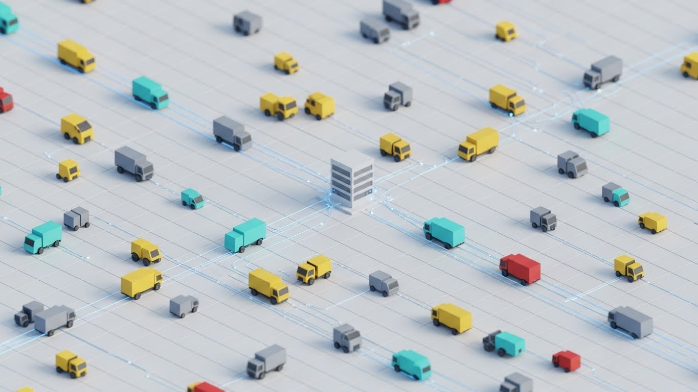
The Visual & Narrative Approach
This style uses a "Clay Render" aesthetic with matte white ceramic textures to simplify the chaos of a construction supply yard. The scene shows a bustling logistics hub in miniature. Tiny trucks and material handlers are physically connected to a central server block by thin, glowing blue wires. The soft ambient lighting creates a clean, laboratory-like atmosphere, suggesting that your software turns a messy yard into a pristine, controlled environment.
Psychological Impact & KPI Focus
- Systemic Clarity: Construction supply chains are often viewed as chaotic webs. The isometric angle offers a "God-View," giving the viewer a feeling of total structural control.
- Connectivity: The physical blue wires metaphorically demonstrate integration—showing how the software physically binds disjointed assets (trucks, inventory, gates) into a single, cohesive system.
Strategic Implementation & Trade-offs
- Best Use: Account-Based Marketing (ABM) display ads targeting Logistics Directors at large General Contractors.
- Trade-off: The "toy-like" aesthetic must be balanced with professional copy to ensure it isn't seen as trivial.
- Duration: 6-10 seconds (Looping).
Companies using similar video content -
Augury – Machine health and predictive maintenance.
DoosanCONNECT – Telematics for Doosan equipment.
15. Clean UI Workflow (Light Mode)
MOFU | The Functional Buyer
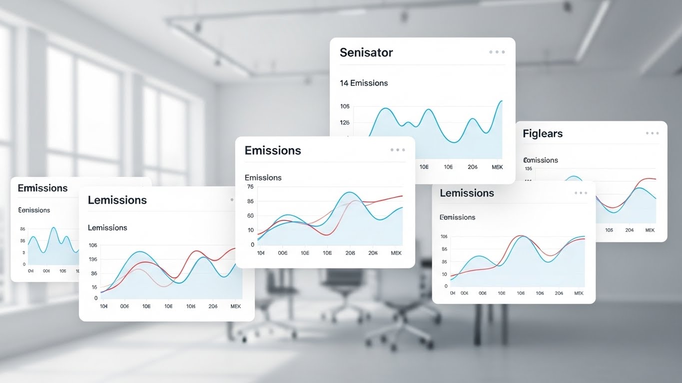
The Visual & Narrative Approach
Targeting the functional user, this style showcases the actual interface in a pristine, idealized context. Floating UI cards with rounded corners display simplified ESG (Environmental, Social, and Governance) and emissions graphs in professional Light Grey, White, and Corporate Blue. The background is a blurred, bright modern office, explicitly placing the software in the hands of the decision-maker. The focus is on the readability of the data.
Psychological Impact & KPI Focus
- Cognitive Ease: The "Functional Buyer" (e.g., Project Manager or Sustainability Officer) fears complex, clunky software. This clean, airy aesthetic promises a frictionless user experience.
- Compliance Confidence: The clear, upward-trending graphs and "Verified" aesthetics subconsciously signal that regulatory compliance (Scope 1 & 3 emissions) is under control and audit-ready.
Strategic Implementation & Trade-offs
- Best Use: Email nurturing sequences and "Features" pages where clarity is paramount.
- Trade-off: It is less "exciting" than motion graphics. It relies entirely on the strength of the UI design itself.
- Duration: Static or slow scroll (GIF).
Companies using similar video content -
Honeywell Intelligrated – Supply chain automation and logistics.
Manhattan Associates – Supply chain commerce solutions.
16. Dark Mode UI Showcase
MOFU | Programmatic Display

The Visual & Narrative Approach
To emphasize security and constant monitoring, this style utilizes a sleek "Dark Mode" aesthetic. Against a Deep Grey background, interface elements like maps and asset tracks glow in Neon Amber and Cyan. The map widgets show glowing dots representing a fleet or equipment dispersed across a region at night. The high contrast mimics a "Command Center" or "War Room" environment.
Psychological Impact & KPI Focus
- Vigilance: Dark mode immediately signals 24/7 activity and security. It appeals to the anxiety of asset theft and unauthorized usage during off-hours.
- Premium Tech: The "Cyberpunk" or "Sci-Fi" aesthetic frames the platform as a cutting-edge, high-tech solution, differentiating it from legacy, spreadsheet-based competitors.
Strategic Implementation & Trade-offs
- Best Use: Programmatic display ads and retargeting, especially those served during evening hours or on tech-focused domains.
- Trade-off: Can feel "dark" or "heavy" if used on a predominantly white, clean website.
- Duration: 5-8 seconds (Looping).
Companies using similar video content -
SiteSense – Intelliwave – Material tracking and logistics.
Command Alkon – Heavy materials automation and logistics.
17. Lifestyle Stock with UI Overlay
MOFU | LinkedIn Organic

The Visual & Narrative Approach
This style bridges the physical-digital divide by compositing UI elements into the real world. A high-quality photo shows a warehouse manager or site foreman in a high-vis vest, focused on a clipboard or tablet. Floating in the air next to him—in perspective—is a crisp, vector UI badge reading "Compliance Status: Verified" in Green. The shallow depth of field keeps the focus on the human element while the UI validates the action.
Psychological Impact & KPI Focus
- Adoption Validation: One of the biggest hurdles in construction tech is field adoption. Showing a real worker seamlessly interacting with the data signals that the tool is field-friendly and practical.
- Instant Gratification: The bright green "Verified" badge triggers a dopamine response associated with task completion and safety assurance.
Strategic Implementation & Trade-offs
- Best Use: LinkedIn organic posts and case study headers to humanize the technology.
- Trade-off: Stock photography can look generic. Ensure the "worker" looks authentic to the construction industry (correct PPE, grit).
- Duration: Static Image.
Companies using similar video content -
Sage 300 Construction and Real Estate – Accounting and management software.
18. Realistic Character Video
BOFU | The Economic Buyer

The Visual & Narrative Approach
At the bottom of the funnel, the Economic Buyer (CEO/CFO) needs to see themselves in the solution. This style features a cinematic, medium portrait of a confident Executive in a modern glass boardroom. He is holding a tablet, reviewing data, and smiling slightly—a look of "quiet confidence." The "Rembrandt" lighting and blurred city skyline background convey authority, stability, and success.
Psychological Impact & KPI Focus
- Social Proof & Mirroring: Executives respond to peers. This visual allows the target persona to mirror the success depicted. It suggests, "This is what control looks like."
- Decision Fatigue Reduction: The calm, confident demeanor of the subject counters the stress and chaos typically associated with construction financial management.
Strategic Implementation & Trade-offs
- Best Use: Personalized video messages (e.g., Loom/Vidyard covers) from sales reps to C-Level prospects, or the "Executive Summary" section of a proposal.
- Trade-off: Highly dependent on casting. The actor must look like a credible Construction Executive, not a generic model.
- Duration: 5-10 seconds (Subtle motion).
Companies using similar video content -
Lytx – Dashcams and telematics for fleet safety.
Verizon Connect – Fleet management and GPS tracking.
19. Aspirational Stock Montage
BOFU | Building Trust & Credibility
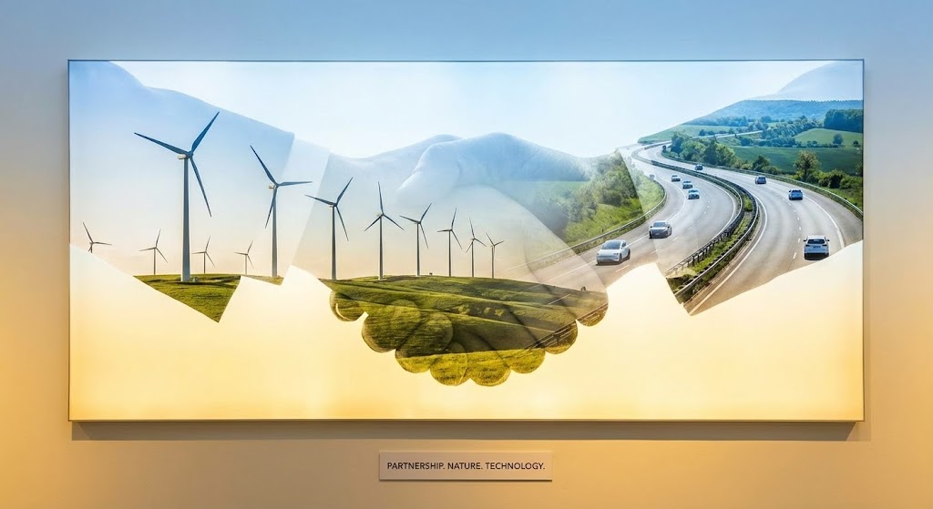
The Visual & Narrative Approach
This style moves beyond software features to sell the company's ethos. It utilizes a double-exposure technique where the silhouette of a firm handshake is filled with imagery of a wind farm, a clean highway, and green landscapes. The background transitions through a gradient of Sunlit Gold and Sky Blue. It fuses the concepts of human partnership with technological progress and sustainability (ESG).
Psychological Impact & KPI Focus
- Trust Building: In the high-stakes world of commercial construction, people buy from partners, not just vendors. This visual metaphor reinforces integrity, collaboration, and shared values.
- Future-Proofing: The inclusion of renewable energy imagery subtly positions the platform (and its users) as forward-thinking leaders in Green Building and sustainable logistics.
Strategic Implementation & Trade-offs
- Best Use: The "About Us" page, "Partnership" section, or the closing slide of a high-ticket sales deck.
- Trade-off: Too abstract for explaining features. Use only for brand value signaling.
- Duration: Static or slow parallax.
Companies using similar video content -
SmartBarrel – Time tracking and site management.
OpenSpace – 360° photo documentation and site progress.
20. Rapid UI Feature Montage
BOFU | Sales Cycle Acceleration
The Visual & Narrative Approach
Designed to trigger the final decision, this style overwhelms the viewer with value. Multiple UI screens—representing Map View, Financial Reports, Driver Settings, and Inventory—fly towards the camera with dynamic motion blur. The composition uses a "Dutch angle" (canted tilt) to create energy and speed. The dominant colors are the brand's primary Blue and Green, reinforcing brand identity.
Psychological Impact & KPI Focus
- Value Density: By showing a sheer volume of features in rapid succession, we visually argue for the comprehensiveness of the solution. It counters the objection that the platform might be "too niche" or "limited."
- Momentum: The "flying forward" motion creates a sense of inevitability and progress, psychologically pushing the prospect toward the "Sign Contract" phase.
Strategic Implementation & Trade-offs
- Best Use: Retargeting ads for prospects who have viewed the pricing page. The message is: "Look at everything you get."
- Trade-off: Individual details are lost. Do not use this to teach how a feature works, only that it exists.
- Duration: 3-5 seconds (Fast-paced).
Companies using similar video content -
CMiC – Construction software for enterprise.
21. Holographic UI over 3D Render
BOFU | Driving Demo Requests

The Visual & Narrative Approach
This style bridges the gap between the boardroom and the future. A high-fidelity 3D render depicts a sleek, modern conference table in a dimly lit office. Projected onto the surface is a glowing, semi-transparent "Holographic" UI in Cyan and Magenta. It displays a rotating wireframe of a semi-truck alongside floating data charts. The aesthetic is sophisticated, cutting-edge, and undeniably powerful.
Psychological Impact & KPI Focus
- Perceived Innovation: By presenting the data as a hologram, we subconsciously frame the software as a Next-Gen solution. It triggers a desire in the Executive Buyer to possess "the future" of fleet management.
- Tangible Intelligence: The physical setting (the table) grounds the abstract data, suggesting that this software is the centerpiece of high-level strategic discussions. It elevates the product from a "tool" to a "command center."
Strategic Implementation & Trade-offs
- Best Use: High-value landing pages (Book a Demo) or the opening of an investor pitch deck.
- Trade-off: High production effort. It sets a very high expectation for the actual UI; ensure your product's design language is modern enough to not disappoint after this intro.
- Duration: 8-12 seconds (Looping rotation).
Companies using similar video content -
EcoVadis – ESG risk and performance ratings.
OneTrust – GRC and ESG platform.
22. Wireframe to Reality Transition
BOFU | Objection Handling
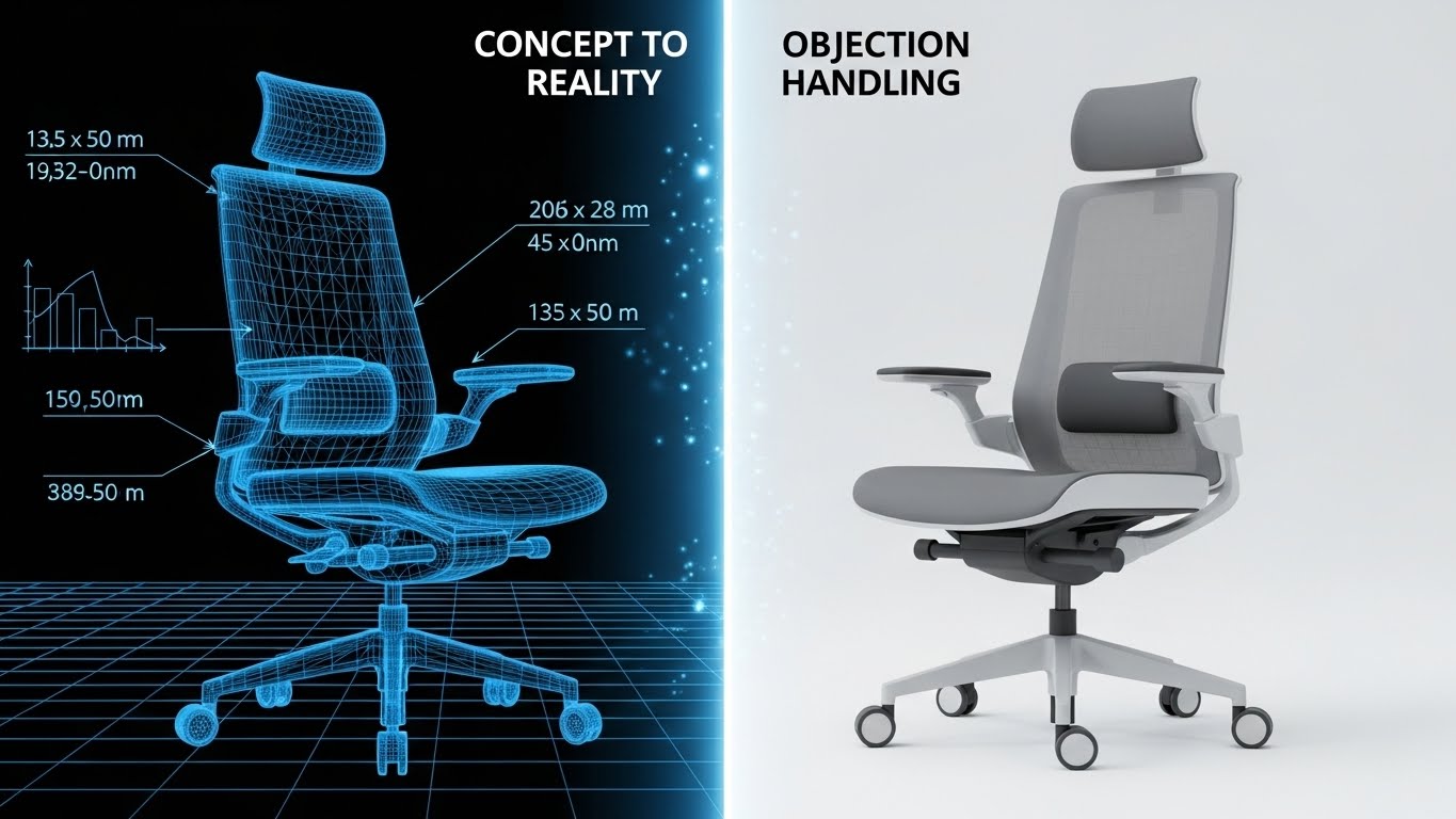
The Visual & Narrative Approach
This style is a visual metaphor for "delivering on promises." The composition is split or transitional. The left side (or start of the animation) shows a technical, blue wireframe blueprint of a construction vehicle or office chair (representing assets). As the eye scans right, the wireframe smoothly fills in with texture and light, becoming a fully rendered, photorealistic object. The background transitions from grid paper to a realistic environment.
Psychological Impact & KPI Focus
- Risk Reduction: BOFU prospects often fear that a software solution is "vaporware." This visual arc—from concept to reality—subconsciously reassures them that the platform is production-ready and robust.
- Process Validation: It visually demonstrates the journey from "Plan" to "Execution," mirroring the exact value proposition of construction project management software.
Strategic Implementation & Trade-offs
- Best Use: "Objection Handling" email sequences or bottom-of-funnel case studies showing the "Planned vs. Actual" feature set.
- Trade-off: Requires high-quality 3D assets that perfectly match the wireframe. Misalignment breaks the illusion.
- Duration: 5-8 seconds (Wipe transition).
Companies using similar video content -
Oracle Aconex – Project collaboration and document management.
Trimble Viewpoint – Construction ERP and project management.
23. 2D Graphics Over Live Action
BOFU | Competitive Comparison
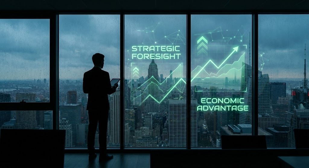
The Visual & Narrative Approach
To convey a competitive edge, this style adopts a "Heads-Up Display" (HUD) aesthetic. A cinematic silhouette of a professional overlooks a city skyline through a large window. Overlaid on the glass reflection are sleek, animated 2D line graphs and data points trending upwards in Vivid Green. The look suggests that the user possesses superior vision and data access compared to the market.
Psychological Impact & KPI Focus
- Strategic Dominance: The "Overlooking the City" trope is a classic power signal. Overlaying data reinforces the idea that the user has Omniscient Oversight of their operations.
- Economic Advantage: The upward-trending graphs overlaid on the real world connect the software directly to market performance and economic gain.
Strategic Implementation & Trade-offs
- Best Use: Competitive battlecards (PDFs) or "Why Us" sections of sales proposals.
- Trade-off: The live-action footage must be high quality (4K). Low-res footage will make the graphics look pasted on and cheap.
- Duration: Static Image or subtle cinemagraph.
Companies using similar video content -
Bentley Systems – Infrastructure engineering software.
AVEVA – Engineering and industrial software.
24. Abstract 3D AI Visualization
Onboarding | Self-Serve Onboarding

The Visual & Narrative Approach
When users first onboard, "AI" can feel like a black box. This style visualizes the intelligence. In a clean, dark void, glowing Violet and Cyber Blue nodes are connected by thin, pulsing lines, forming a complex 3D neural network or web. The camera slowly drifts through the connections. It represents the system "thinking," processing fleet data, and establishing the baseline for predictive insights.
Psychological Impact & KPI Focus
- Trust in Automation: By visualizing the "Brain" of the software, we reduce the fear of the unknown. It signals that the system is active, intelligent, and working in the background so the user doesn't have to.
- Sophistication: It reassures the user they have purchased a premium, high-tech solution, validating their investment immediately upon login.
Strategic Implementation & Trade-offs
- Best Use: App loading screens ("Initializing AI..."), "Welcome" emails, or the setup wizard during data synchronization.
- Trade-off: It is purely metaphorical. It does not teach the user how to use the AI, only that it exists.
- Duration: Loop (Indefinite).
Companies using similar video content -
Siemens PLM Software – Product lifecycle management.
RIB Software – Schneider Electric – Construction management software.
25. Hyper-lapse Stock Footage with Data
Onboarding | Accelerating Time-to-Value

The Visual & Narrative Approach
Speed is the priority during onboarding. This style uses hyper-lapse footage of a highway at night, where car lights streak into long red and white trails. Superimposed over this high-energy footage are sharp, stable Blue data lines that connect the moving vehicles. The contrast between the blurred motion of reality and the crisp stability of the data lines creates a compelling visual hierarchy.
Psychological Impact & KPI Focus
- Velocity: The hyper-lapse visualizes speed and efficiency. It tells the new user, "We move as fast as your fleet does."
- Connectivity: The data lines connecting the chaotic traffic reinforce the concept of Order from Chaos, promising the user that the software will tame their logistical complexity.
Strategic Implementation & Trade-offs
- Best Use: "Getting Started" videos or feature intros related to Real-Time Tracking.
- Trade-off: Stock footage is common. The "Data Overlay" must be custom and branded to prevent the video from looking generic.
- Duration: 5-10 seconds.
Companies using similar video content -
EquipmentWatch – Equipment data and insights.
AssetWorks – Fleet management software.
26. 2D Animation & UI Composition
Onboarding | Reducing Implementation Friction
The Visual & Narrative Approach
To combat the "implementation slump," this style simplifies technical tasks. A flat, friendly 2D vector illustration shows a stylized character (perhaps a hand or a simple avatar) physically plugging a cable into a floating UI block representing a "Server" or "API." The lines are bold, and the palette uses calming Flat Blue and White. The motion is smooth and satisfying—a literal "snap" into place.
Psychological Impact & KPI Focus
- Cognitive Ease: Integration is often the most stressful part of onboarding. This simplified visual metaphor frames the process as "Plug and Play," significantly lowering the user's anxiety.
- Instructional Clarity: By removing extraneous detail, the user focuses entirely on the core action (connection), improving information retention.
Strategic Implementation & Trade-offs
- Best Use: Integration guides, API documentation headers, and "Setup" progress bars.
- Trade-off: Too simple for technical architects. Use this for the Business User/Admin, not the Developer documentation.
- Duration: 6-10 seconds.
Companies using similar video content -
AspenTech – Asset optimization software.
Blue Yonder – Digital supply chain and commerce.
27. 3D Parallax UI Presentation
Retention | Reducing Churn
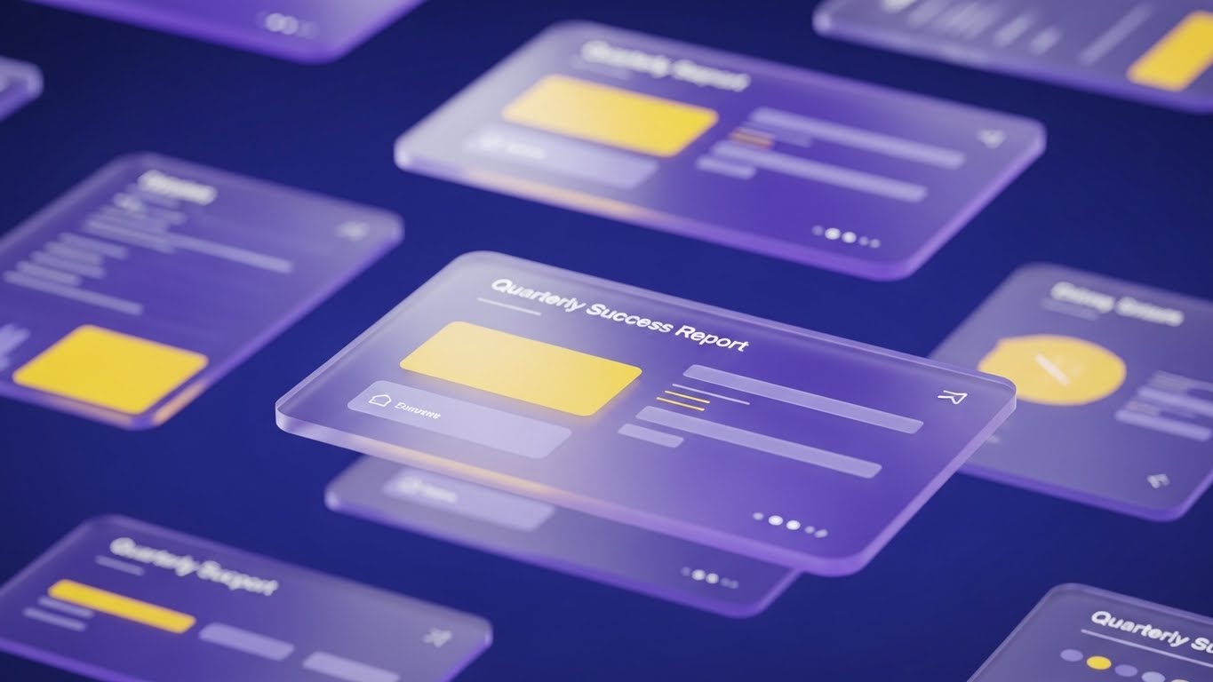
The Visual & Narrative Approach
To keep users engaged, we need to make their data look beautiful. This style uses a 3D parallax effect where UI screens float in layers. The foreground screen is sharp and detailed, showing a "Quarterly Success Report" with positive metrics. Background layers are blurred and translucent, creating depth. The aesthetic is "Glassmorphism" with a deep abstract blue background.
Psychological Impact & KPI Focus
- Value Reinforcement: By presenting the user's own data (reports) as a work of art, we subliminally reinforce the value of the subscription. It makes the monthly report feel like a premium deliverable.
- Depth & Perspective: The layered effect suggests depth of data—implying that the platform holds more insights than just what is on the surface, encouraging exploration.
Strategic Implementation & Trade-offs
- Best Use: Customer Success newsletters ("Your Month in Review") and Quarterly Business Review (QBR) presentations.
- Trade-off: Text legibility can be tricky with parallax. Ensure the primary metrics are on the static, sharpest layer.
- Duration: Slow, subtle hover motion.
Companies using similar video content -
SAP Ariba – Procurement and supply chain solutions.
28. 2D Character-Driven Story
Retention | Knowledge Base

The Visual & Narrative Approach
When things go wrong, users need empathy. This style utilizes a friendly, flat 2D character illustration—a "Support Guide" (e.g., a female character in a teal shirt). She stands next to a large, floating search bar UI element, pointing to it helpfully or offering a "thumbs up." The background is a soft, warm Yellow abstract pattern to counteract frustration.
Psychological Impact & KPI Focus
- Empathy & Support: The presence of a smiling human character (even an illustrated one) triggers a social response, reducing the frustration associated with troubleshooting.
- Guidance: The character's gaze and pointing finger direct the user's attention, acting as a visual cue to the solution (the search bar), improving Self-Serve Resolution rates.
Strategic Implementation & Trade-offs
- Best Use: Help Center headers, "404 Error" pages, and "Contact Support" interfaces.
- Trade-off: Can feel childish if the character style is too cartoony. Keep the proportions realistic and the attire professional.
- Duration: Static or simple blink/wave animation.
Companies using similar video content -
KPA – EHS and workforce compliance.
29. Futuristic Neon/Dark Mode
Expansion | Driving Upsell/Cross-sell
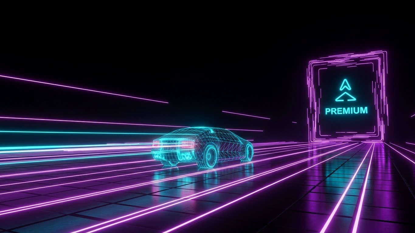
The Visual & Narrative Approach
To sell a higher tier, you must visually differentiate it. This style adopts a "Cyberpunk" or "Tron-like" aesthetic. A digital city grid floor glows in Neon Purple and Cyan against a deep black background. A wireframe truck accelerates towards a glowing portal labeled with an abstract "Premium" icon (e.g., a diamond or double arrow). It screams "Upgrade."
Psychological Impact & KPI Focus
- Exclusivity: The dramatic shift in color palette (Neon on Black) marks this feature as special and exclusive. It utilizes the "Dark Mode" association with pro-level tools.
- Desire for Advancement: The forward motion into the "portal" taps into the user's desire for progress and unlocking new potential (features).
Strategic Implementation & Trade-offs
- Best Use: In-app paywalls, "Locked Feature" tooltips, and announcements for new Enterprise modules.
- Trade-off: Use sparingly. If the whole app looks like this, it becomes exhausting. Save it for the "Upsell" moments.
- Duration: 5-8 seconds (Looping).
Companies using similar video content -
ISN – Contractor management and compliance.
30. Macro UI Micro-Interactions
Expansion | Driving Referrals & Advocacy

The Visual & Narrative Approach
Sometimes, the smallest action matters most. This style uses extreme macro photography (or photorealistic 3D) to focus on a single finger pressing a "Share" or "Refer" button on a high-res screen. The pixels are faintly visible, emphasizing the screen's texture. The button glows Vivid Green upon touch. The background is blurred, forcing total focus on the action.
Psychological Impact & KPI Focus
- Behavioral Priming: By showing the exact physical action we want the user to take (pressing the button), we trigger Mirror Neurons. The user subconsciously feels the satisfaction of the click.
- Simplicity: It visualizes that the request (referring a colleague) is a low-effort, single-touch action, removing mental barriers to advocacy.
Strategic Implementation & Trade-offs
- Best Use: Referral program emails, "Share Report" prompts, and footer CTAs.
- Trade-off: Must be high resolution. Pixelation ruins the "Macro" aesthetic.
- Duration: 2-3 seconds (Click animation).
Strategic Knowledge Base: The Visual Operations Doctrine
To truly transform your commercial construction SaaS from a "tool" into an "operating system," you must move beyond ad-hoc video creation. You need a Visual Operations Doctrine. The following strategic frameworks synthesize the 30 styles detailed above into actionable business intelligence.
These are not just design tips; they are the architectural blueprints for a visual strategy that drives ROI, adoption, and market leadership.
Strategic Alignment & Visual Architecture
The "Pre-Production" Strategy. Why are we visualizing, and for whom?
- The Cognitive Load Audit: Before commissioning any video, audit the complexity of the workflow you are trying to explain. If a process takes 500 words to explain in text, use Style 2 (2D Line Art) or Style 15 (Clean UI Workflow). The goal is not decoration; it is the measurable reduction of cognitive friction for the user.
- Role-Based Visual Mapping: Differentiate your visual language by persona. Drivers and field workers on mobile devices require high-contrast, large-element styles like Style 5 (Bold Kinetic Typography) for readability in sunlight. Conversely, Fleet Managers in the office prefer data-dense styles like Style 6 (Dynamic Data Visualization).
- The "Glanceability" Standard: In the logistics industry, attention is scarce. Enforce a "Glanceability Standard" for all motion graphics. A viewer must understand the core message of any video (e.g., "Compliance Verified") within 1.5 seconds, utilizing clear iconography and color coding (Green/Red).
- Brand Voice Consistency: Your visual voice must be as consistent as your code. Establish a "Visual Language System" where specific colors always mean specific things (e.g., Neon Amber always equals "Alert/Risk" as seen in Style 16). This reduces the learning curve across different software modules.
- The Advids Strategic Audit: Partnering with a specialized agency like Advids allows for a comprehensive audit of your current asset library. We define the "Visual Operating System" before production begins, ensuring that every asset, from TOFU ads to BOFU tutorials, adheres to a unified strategic purpose.
- Standardization vs. Customization: For universal concepts like "Cloud Storage," use cost-effective Style 8 (Low-Poly 3D). However, for your core differentiator—like a proprietary routing algorithm—invest in bespoke Style 10 (Isometric 2D Motion) to own the visual narrative.
- The Cross-Departmental Bridge: Use visuals to unify terminology. If Sales calls it "Total Visibility" and Support calls it "Map View," confusion ensues. A single visual style (e.g., Style 14 Isometric Workflow) used by both teams creates a shared mental model for the customer.
- Legacy System Integration: Many prospects fear losing their old data. Use Style 7 (Abstract Motion) to visualize the "morphing" or seamless flow of data from legacy on-prem systems into your modern SaaS cloud, visually soothing the anxiety of migration.
- Accessibility in Trucking: The construction workforce is diverse and often multi-lingual. Rely heavily on Style 26 (2D Animation) and non-verbal visual storytelling. Icons and animations transcend language barriers better than text overlays.
- The Mobile-First Mandate: Ensure all 30 styles are optimized for vertical and square aspect ratios. The modern construction workflow happens on a tablet in the cab, not just a monitor in the trailer. Visuals must be legible on a 6-inch screen.
Operational Adoption & Implementation
The "Deployment" Phase. How to embed visuals into the workflow to drive usage.
- Overcoming "Big Brother" Anxiety: Driver monitoring features often face resistance. Use Style 3 (Abstract Organic) or Style 19 (Aspirational Stock) to frame these features as "Safety Partners" rather than "Surveillance Tools." Emphasize protection, not policing.
- The Micro-Learning Shift: Replace 50-page PDF manuals with a library of 30-second clips using Style 15 (Clean UI Workflow). "Micro-learning" fits the erratic schedule of a construction site, allowing users to learn a specific task (e.g., "Upload Manifest") in the moment of need.
- Just-in-Time Support: Embed specific visual styles directly into the helpdesk or cab tablet software. When a driver triggers an error, a Style 28 (Character Story) animation should pop up to guide them, reducing frustration and support calls.
- Gamification of Training: Use Style 8 (Low-Poly 3D) to visualize driver scorecards and safety bonuses. Turning performance data into a "game" visual increases engagement and motivates self-correction among drivers.
- Reducing Support Ticket Volume: There is a direct correlation between proactive visual guides and reduced call center load. By deploying Style 24 (AI Visualization) during setup, you preemptively answer questions about "how it works," deflecting tickets before they are created.
- Remote Onboarding: For distributed fleets, physical seminars are impossible. Leverage Style 18 (Realistic Character) and Style 25 (Hyper-lapse) to create immersive, "human" onboarding experiences that feel personal, even when delivered remotely.
- Standard Operating Procedures (SOPs): Transform text-based SOPs into visual process flows using Style 2 (2D Line Art). A visual checklist is processed 60,000 times faster by the brain than text, ensuring critical safety steps are not skipped.
- Feedback Loops: Use interactive video elements (e.g., "Click the Hazard") within your training modules. This turns passive viewing into active participation, increasing retention rates for safety protocols.
- Scalable Localization: Strategies for translating visual assets for global fleets. When expanding globally, separate the text layers from the animation layers in your source files. This allows for rapid replacement of text labels (e.g., English to Spanish) without re-rendering the complex 3D assets of Style 12 (X-Ray).
- Leadership Communication: When communicating fleet strategy to stakeholders, move beyond spreadsheets. Use Style 11 (Photorealistic 3D) to visualize the "Future State" of the fleet. High-fidelity visuals signal high-confidence leadership.
Measuring Impact & Future-Proofing
The "ROI" Phase. Measuring success and building a visual asset library that grows with you.
- Beyond "Views": Stop measuring video success by "views." Define actionable KPIs such as "Time-to-Competency" (how fast a new user masters a feature) and "Feature Adoption Rate" (percentage of users who try a feature after watching the video).
- The "Idle Time" Metric: Correlate better visualization with reduced software navigation time. If a clear Style 10 (Isometric Map) helps a dispatcher route a truck 2 minutes faster, multiply that by 1,000 trucks. That is your ROI.
- Compliance Velocity: Measure how fast new regulations (e.g., ELD mandates) are understood and adopted across the fleet when introduced via video versus text memos. Visuals should increase the "Velocity of Compliance."
- Retention and Churn: High-quality UX visualization directly impacts Customer Lifetime Value (LTV). Regular exposure to premium visuals like Style 27 (Parallax UI) reinforces the perception of value, making it harder for customers to switch to a "cheaper-looking" competitor.
- The AI Visual Frontier: Prepare for the next wave of Generative AI. By establishing a strong style guide now, you will be ready to use AI tools to auto-generate personalized training videos for specific driver behaviors in the future.
- Scalability of Assets: Build a library, not a graveyard. Create "Master Assets" (e.g., a 3D truck model) that can be reused across Style 11, Style 12, and Style 22. This reduces the marginal cost of every new video.
- The Advids Partnership: Scalability requires a long-term partner. Advids acts as the custodian of your visual assets, ensuring that as your software evolves, your visual library evolves with it—updating UIs, expanding 3D worlds, and maintaining brand consistency without starting from scratch.
- Benchmarking Success: In SaaS, "good enough" visuals are a competitive risk. Regularly audit your competitors' visual output. If they are using flat 2D and you are using Style 21 (Holographic 3D), you win the perception war before the sales call even begins.
- The ROI of Safety: Quantify the unquantifiable. Use accident reduction data post-training to calculate insurance cost savings. Attribute these savings to the effectiveness of the visual safety training program.
- Final Call to Innovation: Treat video as infrastructure, not content. In the Commercial Construction SaaS market, the platform that best communicates its value is the most valuable platform. By adopting these 30 styles and strategic frameworks, you are building a visual engine that drives growth, safety, and profitability.
Companies using similar video content -
Explorer Software – Construction accounting and project management.
Author & Editor Bio


