
Introduction: Visualizing the Digital Backbone of Risk
The commercial insurance industry is standing on the edge of a massive structural shift. We are moving from the era of "paper fortresses" and retroactive claims to a future defined by real-time risk assessment, "Digital Twins," and predictive AI. For software platforms driving this change, the challenge is not just technical—it is communicational. How do you visualize the invisible algorithms protecting billions in assets? How do you explain the speed of an API to a market accustomed to spreadsheets?
The opportunity for clarity is lucrative. The global commercial insurance software market is projected to surge to over USD 25 Billion by 2032, driven by a race to modernize. Yet, the friction of the "Physical/Digital Divide" remains high. Recent operational studies indicate that without modern tools, skilled underwriters can waste 40% of their day manually entering information and navigating legacy disconnects.
This guide is your strategic blueprint to bridging that gap. We have analyzed and curated 30 distinct visual styles designed to translate complex InsurTech capabilities into immediate, intuitive value. From the abstract reassurance of "organic protection" to the granular precision of a "high-fidelity workbench," these styles are engineered to reduce cognitive load and accelerate the buyer's journey.
Let’s explore the visual language of modern insurance.
1. The 'Soft Landing' Transformation
TOFU | Brand Awareness

The Visual & Narrative Approach
This style abandons the rigid, aggressive imagery often associated with cybersecurity and risk. The scenario envisions a "protective shield" composed of soft, fluid shapes in teal and apricot that gently morphs into a digital cloud. This transition visualizes the concept of coverage evolution—shifting from static defense to dynamic, cloud-based protection. The narrative tone is calm, reassuring, and sophisticated, avoiding technical jargon in favor of concepts like "fluidity" and "adaptability."
Psychological Impact & KPI Focus
Psychologically, the use of organic shapes and soft palettes lowers the viewer's defensive barriers. It signals that the software is user-friendly and approachable, addressing the anxiety often felt by non-technical users when adopting new platforms.
- KPI Focus: Brand Awareness (Recall) and Sentiment Analysis. By creating a distinct, "sticker-like" aesthetic, the brand differentiates itself from competitors using standard stock photography.
Strategic Implementation & Trade-offs
- Best Use Case: Social Ads (Instagram/LinkedIn) where capturing attention without sound is critical.
- Duration: 15-20 Seconds.
- Trade-off: While excellent for brand sentiment, this abstract style is suboptimal for technical demos. It builds feeling, not function. Use it to open doors, not to close deals.
Companies using similar video content -
Socotra – Policy Core Platform – Cloud-native, API-first insurance infrastructure.
Boost Insurance – Insurance as a Service – API-driven insurance infrastructure.
Bindable – Platform for Embedded Insurance – Flexible platform for embedded insurance.
2. The Blueprint of Realization
TOFU | Market Education
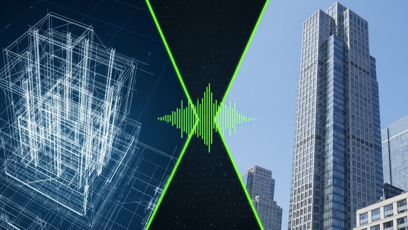
The Visual & Narrative Approach
This style is the definitive visual metaphor for "Digital Transformation." The screen is split: the left side shows a white-line wireframe blueprint of a building on a dark blue background, representing the foundational data/legacy view. A glowing lime green "scan line" sweeps across to the right, instantly rendering the wireframe into a photorealistic, sunlit glass skyscraper. This visualizes the platform's ability to turn raw, static data into a vivid, actionable reality.
Psychological Impact & KPI Focus
This visual triggers the cognitive bias of salience—making the benefit of the software immediate and tangible. It validates the "modernization" anxiety of the target persona by showing a clear path from the old world (blueprint) to the new world (reality).
- KPI Focus: Market Education (Comprehension Rate). It simplifies the complex value proposition of "Digital Twins" or "Property Intelligence" into a single, digestible moment.
Strategic Implementation & Trade-offs
- Best Use Case: LinkedIn Feed or Website Hero Section. It establishes the core "What We Do" proposition instantly.
- Duration: 30-45 Seconds.
- Trade-off: High production value is required for the photorealistic side. If the rendering looks cheap, the promise of "quality" is broken. It requires a balance of 2D motion graphics and high-fidelity 3D assets.
Companies using similar video content -
Matterport – Digital Twins for Real Estate – Creates 3D digital twins from scans.
OpenSpace – 360° Photo Documentation – Transforms jobsite photos into progress models.
Verisk – 3D Property Models – Generates detailed 3D property models from data.
3. The Neural Canopy
TOFU | Shaping Brand Perception

The Visual & Narrative Approach
AI is often an invisible concept. This style gives it form. We see a deep space environment where glowing nodes in violet and neon magenta connect via pulsing light beams. These nodes form a "protective canopy" over a stylized digital city grid. The pulsing lights represent data processing and real-time risk analysis. The camera moves slowly through the network, utilizing depth of field to create a sense of vast scale and complexity.
Psychological Impact & KPI Focus
This aesthetic appeals to the "Futurist" aspiration of the CTO or Head of Innovation. It signals sophistication, power, and cutting-edge capability. The deep blacks and neon lights evoke a "command center" feeling, positioning the viewer as a powerful overseer of risk.
- KPI Focus: Brand Perception (Innovation Score). It creates an aura of high-tech dominance, essential for platforms competing on AI/ML capabilities.
Strategic Implementation & Trade-offs
- Best Use Case: Website Hero Background or Event Booth Backdrop. It sets the tone for "Advanced Technology" before a single word is read.
- Duration: 10-15 Seconds (Looping Background).
- Trade-off: This is purely atmospheric. It explains nothing about how the software works. It must be paired with clear, benefit-driven copy to avoid being seen as "vaporware."
Companies using similar video content -
Planck – AI Underwriting Platform – Visualizes complex AI risk assessment.
Cytora – Targeting & Pricing – AI-driven risk selection and pricing.
CyberCube – Brokermatch – AI for cyber risk analytics and modeling.
4. Geometric Kinetic Momentum
TOFU | Vertical Social Organic

The Visual & Narrative Approach
Designed for the vertical scroll, this style abandons imagery for pure motion and text. Chunky, geometric blocks in yellow, black, and white crash and slide diagonally across an electric blue background. The motion is rapid and percussive. While the text is minimal or abstract, the feeling is one of speed, urgency, and disruption. It mimics the fast-paced nature of modern quote-to-bind workflows.
Psychological Impact & KPI Focus
This style leverages sensory arousal. The high-contrast colors and rapid movement force the brain to pay attention, disrupting the "banner blindness" common on social platforms. It creates a subconscious association between the brand and "speed/efficiency."
- KPI Focus: Social Engagement (Stop-Ratio). The primary goal is to halt the user's scroll within the first 3 seconds.
Strategic Implementation & Trade-offs
- Best Use Case: Vertical Social Organic or Paid Ads. Perfect for announcing new features, partnerships, or flash updates.
- Duration: 6-10 Seconds (TikTok/Reels/Shorts).
- Trade-off: There is zero room for nuance. This is a "shout," not a conversation. It is unsuitable for explaining complex coverage details or compliance features.
Companies using similar video content -
Hyperscience – Intelligent Document Processing – Accelerates data extraction and processing.
Shift Technology – Force – Rapid AI-driven fraud detection.
Tractable – AI for Accident & Disaster Recovery – Speeds up claims assessment with AI.
5. The Isometric Ecosystem
TOFU | Category Creation

The Visual & Narrative Approach
This style adopts a friendly, "SimCity-like" aesthetic to make the insurance ecosystem approachable. We view an isometric grid where low-poly buildings in pastel blues and pinks pop up from the ground, accompanied by small trees and vehicles. It visualizes "Category Creation"—showing how different insured assets (retail, office, fleet) coexist within a single managed platform. The lighting is soft and global, removing any harsh shadows.
Psychological Impact & KPI Focus
The "Low-Poly" look reduces cognitive load significantly. By stripping away photorealistic detail, the viewer focuses purely on the relationships between the objects (e.g., how the fleet connects to the warehouse). It triggers a sense of "building" and "growth," aligning with the business goals of expansion-minded executives.
- KPI Focus: Category Creation (Concept Adoption). It is excellent for explaining multi-line coverage or platform ecosystems.
Strategic Implementation & Trade-offs
- Best Use Case: Blog Headers or Explainer Videos. It visually organizes complex portfolios into a tidy, manageable world.
- Duration: 45-60 Seconds.
- Trade-off: Can be perceived as "too playful" or "juvenile" for very conservative enterprise clients (e.g., Reinsurance). Ensure the color palette remains professional, avoiding overly saturated primary colors.
Companies using similar video content -
Majesco – P&C Core Suite – Manages diverse P&C insurance lines.
OneShield – Enterprise – Comprehensive core system for various lines.
EIS – Core Insurance Suite – Unified platform for policy, billing, claims.
6. The High-Speed Data Fan
MOFU | Product Differentiation
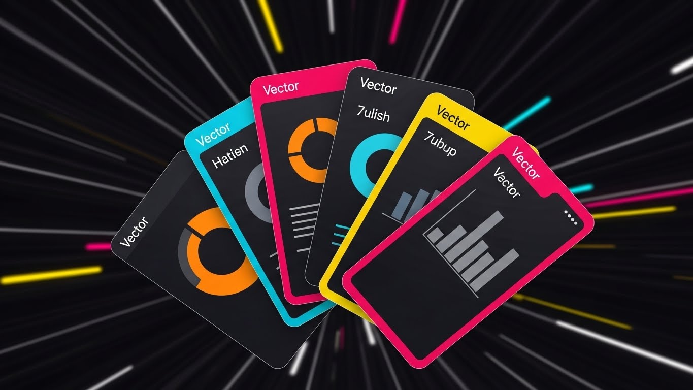
The Visual & Narrative Approach
Here, we focus on the "Engine" of the software. Floating UI cards—simplified to show donut charts (orange) and bar graphs (grey)—fan out dynamically against a dark background of blurred light streaks (the motion tunnel). The camera pushes forward, suggesting the viewer is traveling with the data. This montage technique implies that the platform processes vast amounts of information (claims, quotes, risks) effortlessly and at high velocity.
Psychological Impact & KPI Focus
This appeals to the "Efficiency" driver. The motion blur and "tunnel vision" effect simulate flow state and speed, countering the persona's pain point of slow, clunky legacy systems. It visually promises a "frictionless" experience.
- KPI Focus: Product Differentiation (Perceived Speed). It separates your platform from "slower" competitors visually.
Strategic Implementation & Trade-offs
- Best Use Case: Hype reels or Intro sequences for longer demos. It builds excitement before the detailed walkthrough.
- Duration: 15 Seconds (YouTube Pre-roll).
- Trade-off: The UI elements are simplified for speed. Do not use this to train users on specific buttons or workflows; it moves too fast for educational retention.
Companies using similar video content -
Guidewire – ClaimCenter – Showcases rapid claims processing and analytics.
Duck Creek Technologies – Policy – Demonstrates fast policy configuration and quoting.
Sapiens – IDITSuite – Highlights quick data processing across modules.
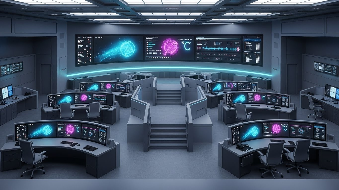
7. The Pristine Workbench
MOFU | Feature Education
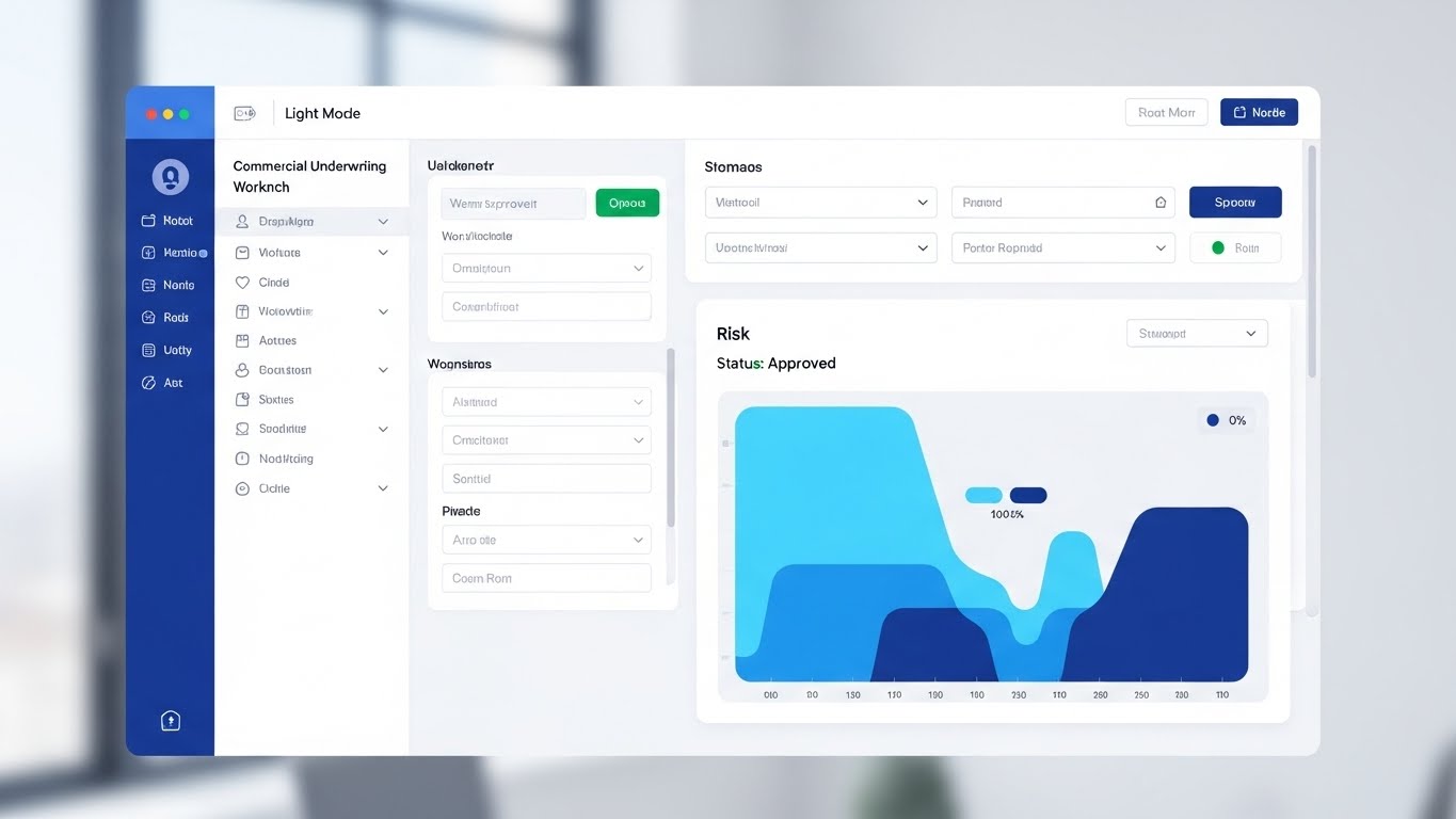
The Visual & Narrative Approach
This is the "Proof" shot. We see a crystal-clear, high-fidelity mockup of the underwriting workbench in "Light Mode." The layout is organized, featuring a risk heat map (sky blue/navy) and a reassuring "Status: Approved" indicator in emerald green. The background is a blurred, bright office with natural light, suggesting a real-world context without distraction. Natural light reflections on the screen surface add a layer of premium polish.
Psychological Impact & KPI Focus
This style addresses the "Usability" skepticism. By showing a static or slowly moving, realistic interface, you demonstrate respect for the user's daily experience. The "Light Mode" and "Approved" status signal a positive, productive workflow, reducing the anticipated stress of complex software.
- KPI Focus: Feature Education (Time-on-Page). When placed on a product page, it encourages visitors to study the details, increasing dwell time.
Strategic Implementation & Trade-offs
- Best Use Case: Product Pages or Deep-Dive Demos. This is where the actual selling happens.
- Duration: 60-90 Seconds.
- Trade-off: It must be pixel-perfect and accurate. If the UI changes in the next update, this asset becomes obsolete instantly. It requires strict version control.
Companies using similar video content -
Insurity – SuretySuite – Presents a clear, organized underwriting interface.
Vertafore – AMS360 – Demonstrates a structured agency management workbench.
Applied Systems – Epic – Showcases a detailed, user-friendly agency platform.
8. The Conversion Cursor
MOFU | Driving Freemium/Trials

The Visual & Narrative Approach
Radical simplicity is the goal here. The view is a straight-on shot of a laptop screen. The only element that matters is a large, inviting mint green button against a charcoal background. A stylized hand cursor hovers and clicks. The background is a pale grey void. This visual removes all noise, focusing the viewer entirely on the "Call to Action" (CTA)—whether it's "Get a Quote," "Bind Policy," or "Start Trial."
Psychological Impact & KPI Focus
This utilizes the Von Restorff Effect (isolation effect)—the isolated button becomes the only object of interest. It subconsciously trains the user on the desired behavior (clicking) and reinforces the ease of starting.
- KPI Focus: Driving Freemium/Trials (CTR). It is a direct visual command to take action.
Strategic Implementation & Trade-offs
- Best Use Case: Display Ads (Retargeting) or Email Signatures. It serves as a visual reminder to complete a task.
- Duration: 6-10 Seconds (GIF/Loop).
- Trade-off: It is devoid of context. It cannot stand alone; it must be supported by surrounding text that explains what the button actually does.
Companies using similar video content -
Slice Labs – Insurance Cloud Services – Simplifies on-demand policy activation.
Trov – Mobility Insurance Platform – Streamlined policy purchase and management.
9. The Geometric Radar
MOFU | Visualizing Intangible Concepts

The Visual & Narrative Approach
How do you show "Risk Assessment"? This style uses abstract geometry. Concentric circles and waves in deep purple and fluorescent green emanate from a central point, simulating a radar or sonar scan. The clean vector lines intersect and map out invisible coordinates. It’s a mathematical, rhythmic visualization that suggests the software is actively "scanning" the horizon for threats or opportunities.
Psychological Impact & KPI Focus
This appeals to the desire for "Omniscience" and "Control." The precision of the vectors and the radar metaphor imply that nothing escapes the software’s detection. It builds confidence in the platform's analytical rigor without needing to show a spreadsheet.
- KPI Focus: Visualizing Intangible Concepts (Comprehension). It translates "backend algorithm" into "active monitoring."
Strategic Implementation & Trade-offs
- Best Use Case: Explainer Videos (middle section). It is the perfect visual bed for a voiceover explaining "Proprietary Algorithms" or "Continuous Monitoring."
- Duration: 30-60 Seconds.
- Trade-off: Can feel cold or overly clinical. It lacks a human element. Best used as a segment within a larger narrative, not the entire story.
Companies using similar video content -
Athenium Analytics – Gauge – Visualizes catastrophe modeling and risk assessment.
RMS – Risk Management Solutions – Abstract visualization of cat modeling.
10. The Logistics Control Tower
MOFU | Demand Gen
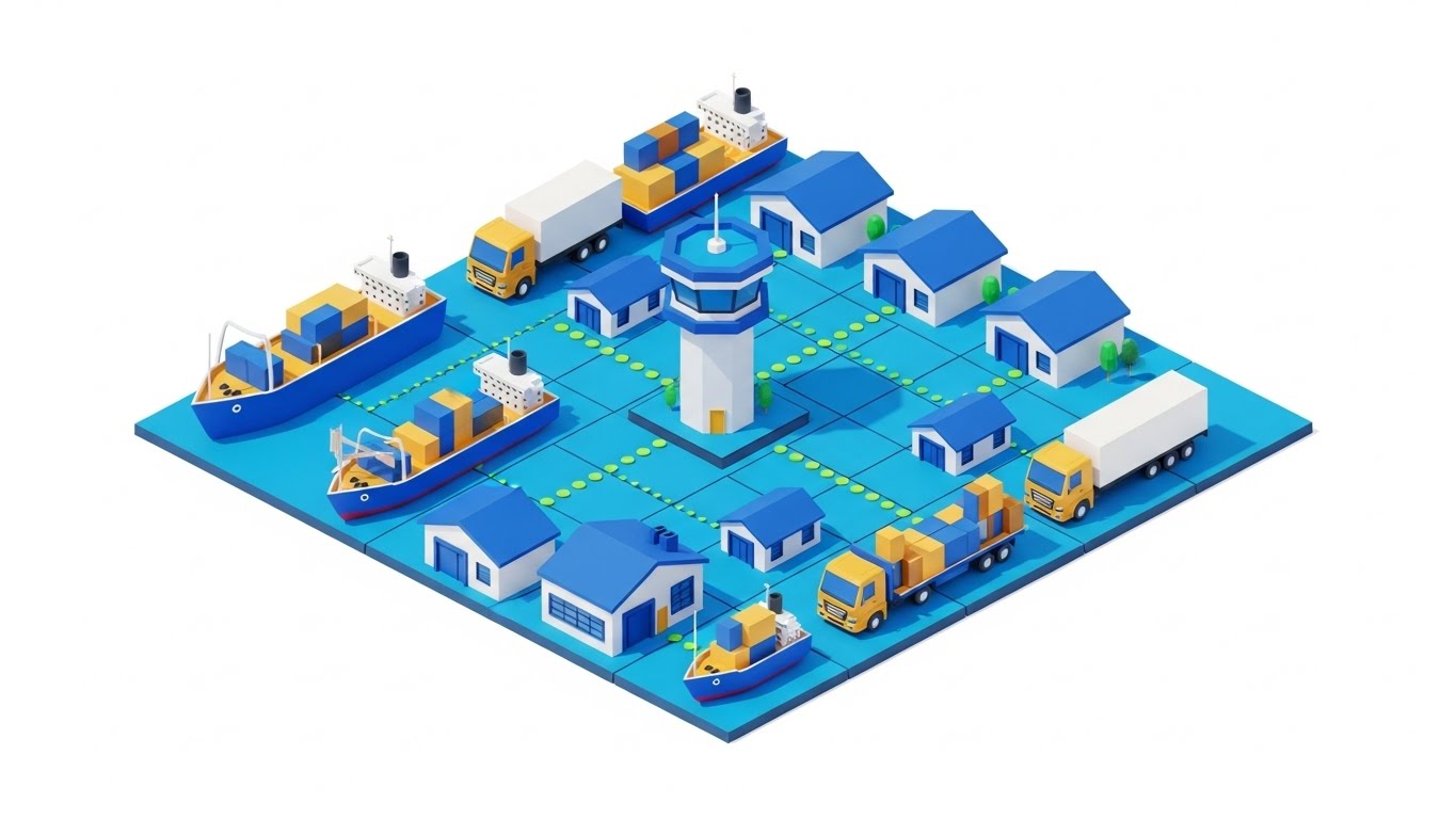
The Visual & Narrative Approach
For marine, cargo, or fleet insurance, this style is essential. We see an isometric grid populated by miniature cargo ships, trucks, and warehouses in royal blue with gold accents. Dotted lines connect the vehicles to a central "Control Tower," symbolizing fleet tracking and insurance coverage. The style is flat, clean, and precise.
Psychological Impact & KPI Focus
This visual satisfies the "Order from Chaos" desire. Supply chains are messy; this visual makes them look organized and manageable. It reinforces the value of telematics and IoT integration in a way that feels profitable rather than intrusive.
- KPI Focus: Demand Gen (MQLs). It speaks directly to logistics leaders and fleet managers looking for control.
Strategic Implementation & Trade-offs
- Best Use Case: LinkedIn Ads targeting Logistics/Supply Chain Managers.
- Duration: 20-30 Seconds.
- Trade-off: Specificity is high. This visual does not work for Professional Liability or Cyber insurance. It is niche-specific asset creation.
Companies using similar video content -
Samsara – Fleet Management Platform – Visualizes connected fleet operations.
Geotab – Fleet Management – Illustrates real-time vehicle tracking and data.
Verizon Connect – Fleet Management – Shows comprehensive fleet visibility.
12. The Integration Harmony
MOFU | Overcoming Objections

The Visual & Narrative Approach
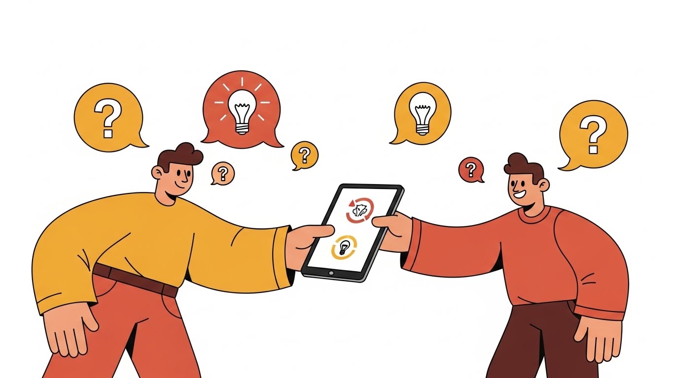
Integration anxiety is a primary barrier to sale. This style uses a friendly, flat-illustration aesthetic to dismantle that fear. We see a professional character (representing the Implementation Lead) standing confident beside a floating UI panel. On the screen, simplified "puzzle pieces" in soft pastels (representing your API modules) snap perfectly into an existing structure. The character gestures invitingly, and the pieces click with a satisfying, soft motion, symbolizing the seamless fit of the new platform.
Psychological Impact & KPI Focus
The puzzle metaphor appeals to the brain's desire for closure and fit. It simplifies the terrifying complexity of API handshakes into a child-like, solvable task. It reframes "Integration" from a technical hurdle into a logical, harmonious step.
- KPI Focus: Overcoming Objections (Implementation Confidence). It answers the question, "Will this break my current systems?" with a resounding visual "No."
Strategic Implementation & Trade-offs
- Best Use Case: "Integrations" page on the website or the "Onboarding" section of a pitch deck.
- Duration: 45-60 Seconds.
- Trade-off: The abstraction level is high. While comforting to business stakeholders, it does not prove technical capability to an IT architect. It is a relationship-building asset.
Companies using similar video content -
OpenLegacy – API Integration – Visualizes connecting legacy systems with new APIs.
Appian – Low-code for Insurance – Shows how modules snap together for workflow.
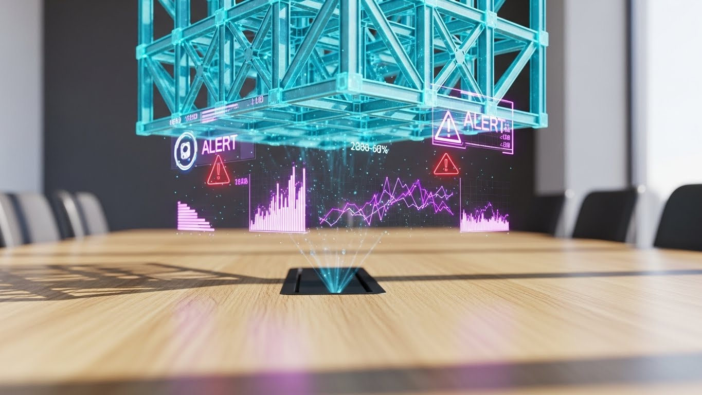
13. The Tangible Risk Reality
MOFU | Building Trust
The Visual & Narrative Approach
For lines like Construction All Risk (CAR) or Property, abstract graphics aren't enough. This style grounds the software in the physical world. The scene creates a stunningly photorealistic 3D render of a high-rise construction site at dawn, highlighting the steel framework and golden sunlight. In the foreground, a digital tablet rests on a concrete slab, displaying a high-fidelity architectural rendering app. This links the digital tool directly to the physical asset being insured.
Psychological Impact & KPI Focus
This builds Domain Authority. It signals to the Risk Engineer and Field Underwriter that you understand their environment ("mud and steel"). It removes the abstraction of SaaS and proves the software works on-site, not just in the cloud.
- KPI Focus: Building Trust (Conversion Rate). It validates the software's applicability to field operations.
Strategic Implementation & Trade-offs
- Best Use Case: Case Studies, Whitepapers, or Hero backgrounds for Property/Engineering lines.
- Duration: Static Image or Slow Pan (10-15 Seconds).
- Trade-off: Production cost is high. The rendering must be indistinguishable from a photo; otherwise, it falls into the "Uncanny Valley" and looks cheap.
Companies using similar video content -
Procore – Construction Management Software – Links digital tools to physical construction sites.
Autodesk Construction Cloud – BIM 360 – Visualizes construction projects with digital tools.
HeadLight – Construction Progress Tracking – Connects field visuals to digital project management.
14. The Portfolio Command
MOFU | ABM Awareness
The Visual & Narrative Approach
This style speaks the language of the C-Suite. Set in a premium mahogany boardroom, a glowing cyan holographic city map projects above the table. Specific buildings are highlighted with vertical data columns, representing aggregated risk exposure. The depth of field focuses intensely on the hologram while blurring the luxury background leather chairs. It visualizes "Oversight" and "Governance."
Psychological Impact & KPI Focus
This triggers a sense of Omnipotence. It appeals to the executive's desire to see the "Big Picture" without getting bogged down in spreadsheets. It sells the feeling of control over vast, complex portfolios (Accumulation Risk).
- KPI Focus: Account Based Marketing (ABM) Awareness. It is designed to capture the imagination of the Economic Buyer (CFO/CRO).
Strategic Implementation & Trade-offs
- Best Use Case: ABM Email Headers, Executive Summaries, or Event Keynotes.
- Duration: 10-15 Seconds (Loop).
- Trade-off: It implies a level of "Sci-Fi" capability. Ensure your analytics dashboard can actually deliver the insights promised by the hologram, even if the UI is 2D.
Companies using similar video content -
Riskonnect – Integrated Risk Management – Visualizes enterprise-wide risk portfolio.
Palantir – Foundry for Insurance – Aggregates vast data for executive insights.
LogicManager – ERM Software – Provides a holistic view of enterprise risk.
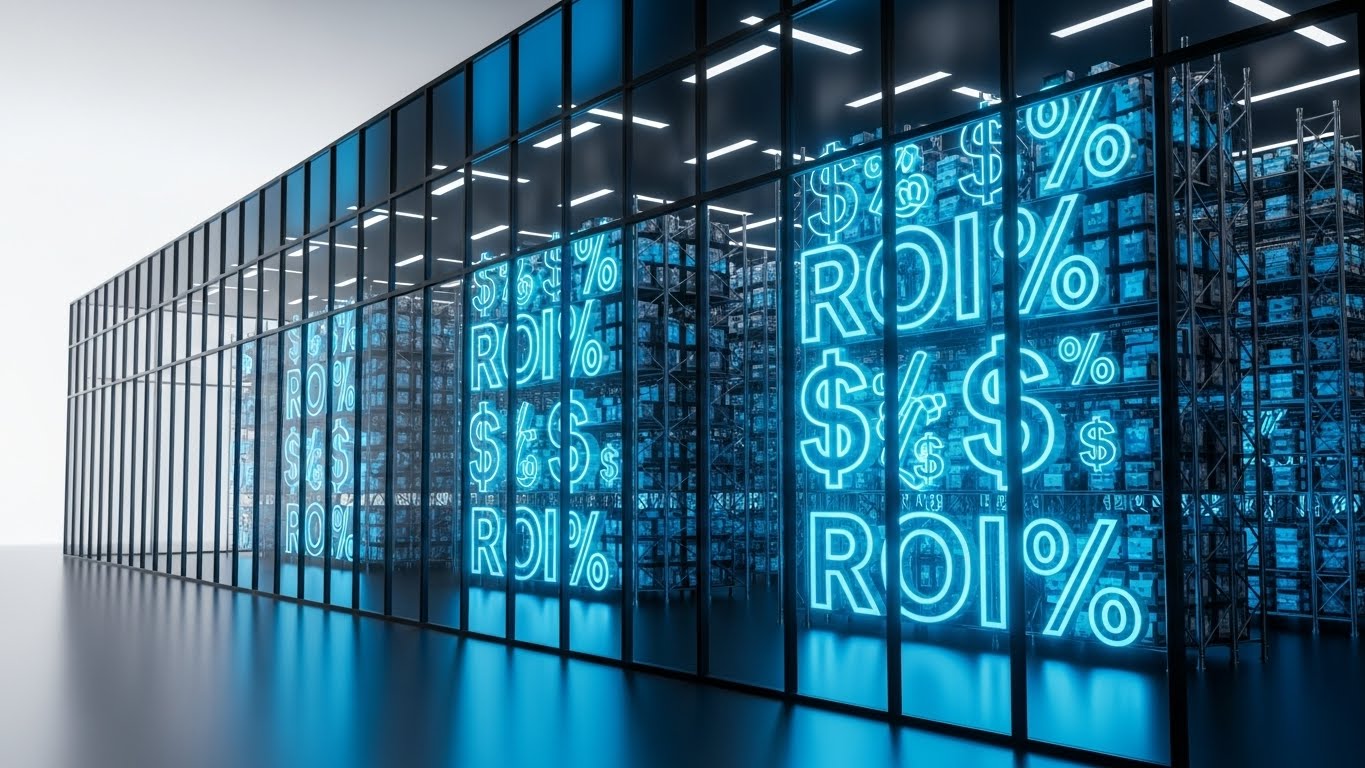
15. The Profit Vector
BOFU | ROI Justification

The Visual & Narrative Approach
When the conversation turns to price, you must visualize value. This style strips away the interface to focus purely on the result. A 3D line chart rises steeply from left to right, glowing in bright red against a stark black background. Floating currency icons (€/$) and percentage symbols orbit the peak. The steep angle of the line communicates rapid growth—whether that’s Written Premium, Underwriting Profit, or Claims Efficiency.
Psychological Impact & KPI Focus
This utilizes Salience of the metric. By isolating the data trend, it forces the viewer to focus on the outcome: financial gain. The red color (often associated with urgency) here represents heat, activity, and financial power.
- KPI Focus: ROI Justification (Deal Closing). It provides the visual evidence needed for the "Business Case" deck.
Strategic Implementation & Trade-offs
- Best Use Case: Pitch Decks (The "Impact" Slide) or Bottom-of-Funnel (BOFU) brochures.
- Duration: Static or simple build animation (5 Seconds).
- Trade-off: It is generic. It creates energy but explains no features. It must be paired with hard numbers (e.g., "Reduce Loss Ratio by 5%") to be effective.
Companies using similar video content -
SAS – Risk Management for Insurance – Visualizes financial impact and growth.
Moody's Analytics – Risk & Finance Solutions – Dynamic charts for financial performance.
Domo – for Insurance – Dashboards showing key financial metrics and growth.
16. The Augmented Executive
BOFU | The Economic Buyer
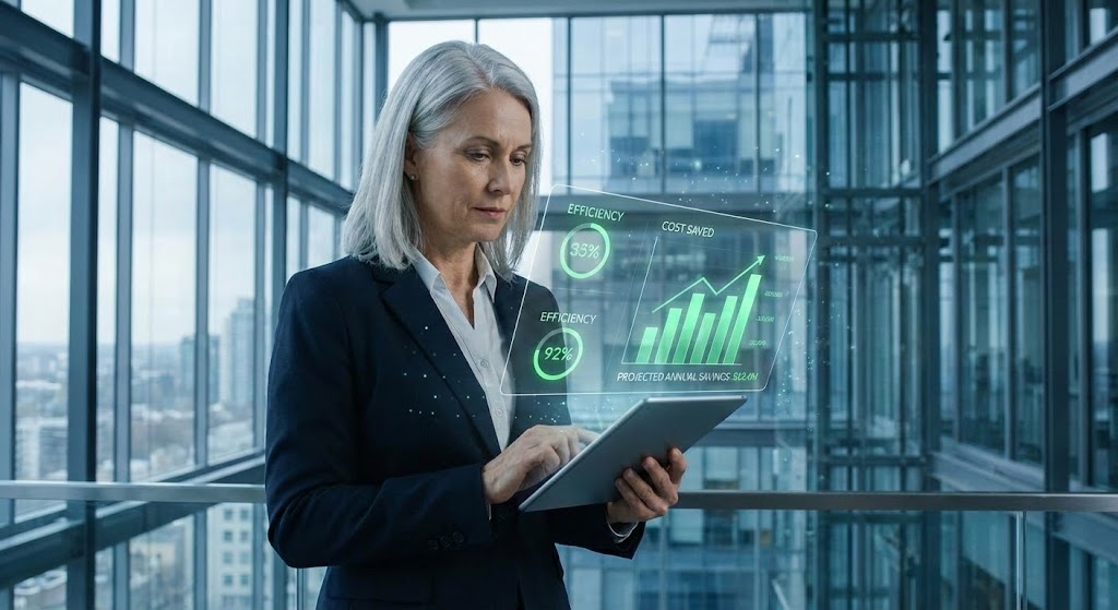
The Visual & Narrative Approach
Software is ultimately used by people. This style combines high-quality corporate photography with sleek, futuristic UI overlays. We see a silver-haired executive (CFO persona) in a modern glass office, looking intently at a tablet. Overlaid in the air is a clean Augmented Reality interface showing green efficiency metrics and "Cost Saved" bar charts. This visual humanizes the data, showing that the software augments their intelligence rather than replacing it.
Psychological Impact & KPI Focus
This appeals to Social Proof and Aspirational Identity. The viewer sees a competent, successful leader using the tool and projects themselves into that role. It reassures the buyer that the technology empowers their leadership status.
- KPI Focus: Economic Buyer Engagement. It creates an emotional connection with the decision-maker who values their own expertise.
Strategic Implementation & Trade-offs
- Best Use Case: Brochures, Annual Reports, or "About Us" videos.
- Duration: Static or subtle parallax.
- Trade-off: The stock photo quality is the single point of failure. If the model looks unnatural or the office background looks fake, the brand credibility takes a hit.
Companies using similar video content -
Salesforce – Financial Services Cloud for Insurance – Depicts leaders using CRM for insights.
Guidewire – InsuranceNow – Shows executives making data-driven decisions.
17. The Transparent Core
BOFU | Risk Mitigation
The Visual & Narrative Approach
For Cyber Insurance or cloud-native platforms, "Security" is the product. How do you show it? This style uses a 3D X-Ray effect. We see a computer server rack, but the outer casing is transparent glass. Inside, instead of wires, we see intricate, glowing lock mechanisms and tumblers in bone white and electric blue. This visual metaphor explains "Security at the Core." It suggests that protection is built into the architecture, not just a wrapper.
Psychological Impact & KPI Focus
This alleviates Security Anxiety. IT Directors and Compliance Officers are naturally skeptical of cloud platforms. The X-Ray visual suggests transparency—that you have nothing to hide and your core is solid.
- KPI Focus: Risk Mitigation (Technical Validation). It is designed to satisfy the rigorous scrutiny of the InfoSec questionnaire phase.
Strategic Implementation & Trade-offs
- Best Use Case: Technical Whitepapers, Security Compliance pages, or Cyber Risk product demos.
- Duration: 15-20 Seconds.
- Trade-off: It is cold and technical. It will alienate a non-technical user (e.g., a broker) who cares about workflow, not server architecture.
Companies using similar video content -
Kovrr – Cyber Risk Quantification – Visualizes internal cyber security architecture.
Relativity – RelativityOne – Highlights data security and e-discovery architecture.
18. The Developer's Canvas
BOFU | The Technical Buyer
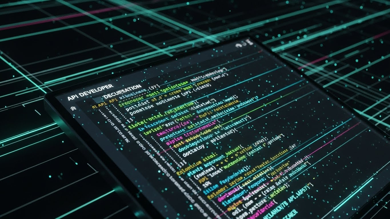
The Visual & Narrative Approach
Modern insurance is API-first. This style abandons the GUI entirely to celebrate the code. We see a "Dark Mode" editor where syntax-highlighted code (neon green, pink, blue) cascades down the screen. It resembles a developer’s IDE but stylized with glow effects to look like a "Matrix" of pure logic. This tells the developer story: clean documentation, robust SDKs, and a powerful headless engine waiting to be deployed.
Psychological Impact & KPI Focus
This targets the Exclusivity bias of the technical buyer. It speaks their secret language. By showing code, you signal that you are a "Developer-First" company, not just a sales-led organization.
- KPI Focus: Technical Buyer (CTO/Lead Dev) conversion. It encourages them to explore the API docs.
Strategic Implementation & Trade-offs
- Best Use Case: Developer Portal, API Documentation headers, or Technical Blog posts.
- Duration: 10-30 Seconds (Looping code scroll).
- Trade-off: It scares away the business user. To a non-coder, this looks like complexity and work. Keep it strictly in the technical domain.
Companies using similar video content -
Socotra – Policy Core Platform – API-first, developer-centric platform.
Boost Insurance – Insurance as a Service – Emphasizes developer tools and APIs.
19. The Policy Factory
BOFU | Reducing Implementation Friction

The Visual & Narrative Approach
"Straight-Through Processing" (STP) is a buzzword; this style makes it a machine. We see a pristine, matte white isometric factory floor. Distinct cube blocks (representing software modules) are being connected by robotic arms. Vibrant orange pipes highlight the flow of data between systems. This creates a mental model of the software as a "Policy Factory," churning out bound policies with industrial efficiency and modular flexibility.
Psychological Impact & KPI Focus
This utilizes the Metaphor of Mechanism. It transforms the abstract concept of "workflow automation" into a tangible, mechanical process. It assures the Operations Director that the system is predictable, scalable, and efficient.
- KPI Focus: Reducing Implementation Friction. It visually explains how the different modules will fit into their existing ecosystem.
Strategic Implementation & Trade-offs
- Best Use Case: Integration Pages, Process Diagrams, or "How it Works" videos.
- Duration: 30-60 Seconds.
- Trade-off: It can feel impersonal. Insurance is also about relationships. This style treats policies like widgets, which works for high-volume lines (Personal Auto/SME) but not for high-touch lines (Specialty).
Companies using similar video content -
Genpact – Cora SeQuence – Visualizes automated workflow and process.
Pega – Pega Platform for Insurance – Illustrates automated policy processing.
DXC Technology – SaaS for Insurance – Shows modular core system components.
20. The Cinematic Fleet
BOFU | Sales Cycle Acceleration

The Visual & Narrative Approach
For Commercial Auto and Fleet insurance, you need to sell the movement. This style uses Generative AI to create a high-budget cinematic shot without the production crew. We see a pristine commercial semi-truck driving into a dramatic sunset, golden light flaring into the camera. Subtle, integrated digital data streams (speed, cargo weight) float near the wheels. It elevates the humble truck into a "Hero Asset," blending the romance of the open road with the precision of modern telematics.
Psychological Impact & KPI Focus
This leverages Awe and Elevation. It lifts the conversation from "tracking drivers" (surveillance) to "empowering fleets" (heroism). It aligns the insurance brand with the future of mobility and logistics.
- KPI Focus: Sales Cycle Acceleration. It provides the emotional "hook" that makes the prospect want to be part of this futuristic vision.
Strategic Implementation & Trade-offs
- Best Use Case: Sales Hype Reels, Trade Show Loops, or YouTube Ads.
- Duration: 15-30 Seconds.
- Trade-off: Generative AI can sometimes produce artifacts (glitchy wheels or text). Quality control is essential to ensure the "Hero Shot" doesn't turn into a hallucination.
Companies using similar video content -
Lytx – DriveCam – Elevates fleet safety and performance.
Netradyne – Driveri – Focuses on AI-powered fleet safety.
21. The Onboarding Pathfinder
Onboard | Self-Serve Onboarding
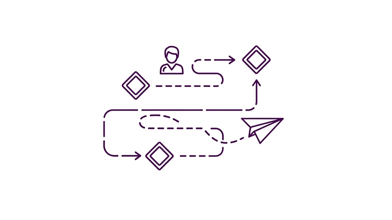
The Visual & Narrative Approach
Onboarding a complex insurance platform can feel overwhelming. This style simplifies the journey into a clean, elegant linear path. We see a continuous, thin purple line drawing a roadmap on a white background. Diamond checkpoints represent key milestones (Setup, Integration, First Quote). A simple "paper airplane" icon glides along the path, symbolizing the user’s progress. The motion is smooth and continuous, suggesting a guided, frictionless experience.
Psychological Impact & KPI Focus
This triggers the Goal Gradient Effect—users are more motivated to complete a task if they can visualize the finish line. The minimalist line art strips away distraction, focusing the user entirely on "Progress" and "Completion." It reassures the user that the process is finite and manageable.
- KPI Focus: Self-Serve Onboarding (Completion Rate). It effectively keeps users moving through setup wizards without needing human intervention.
Strategic Implementation & Trade-offs
- Best Use Case: Help Center "Getting Started" guides or in-app "Welcome" modals.
- Duration: 30-45 Seconds.
- Trade-off: It is low-fidelity. It explains the process, not the product. It must be accompanied by actual screen recordings (Style 7) for technical steps.
Companies using similar video content -
Insly – MGA/Broker Platform – Simplifies onboarding for new users.
Novidea – Agency Management Platform – Guides users through setup.
22. The Activation Switch
Onboard | Trial/Freemium User Activation
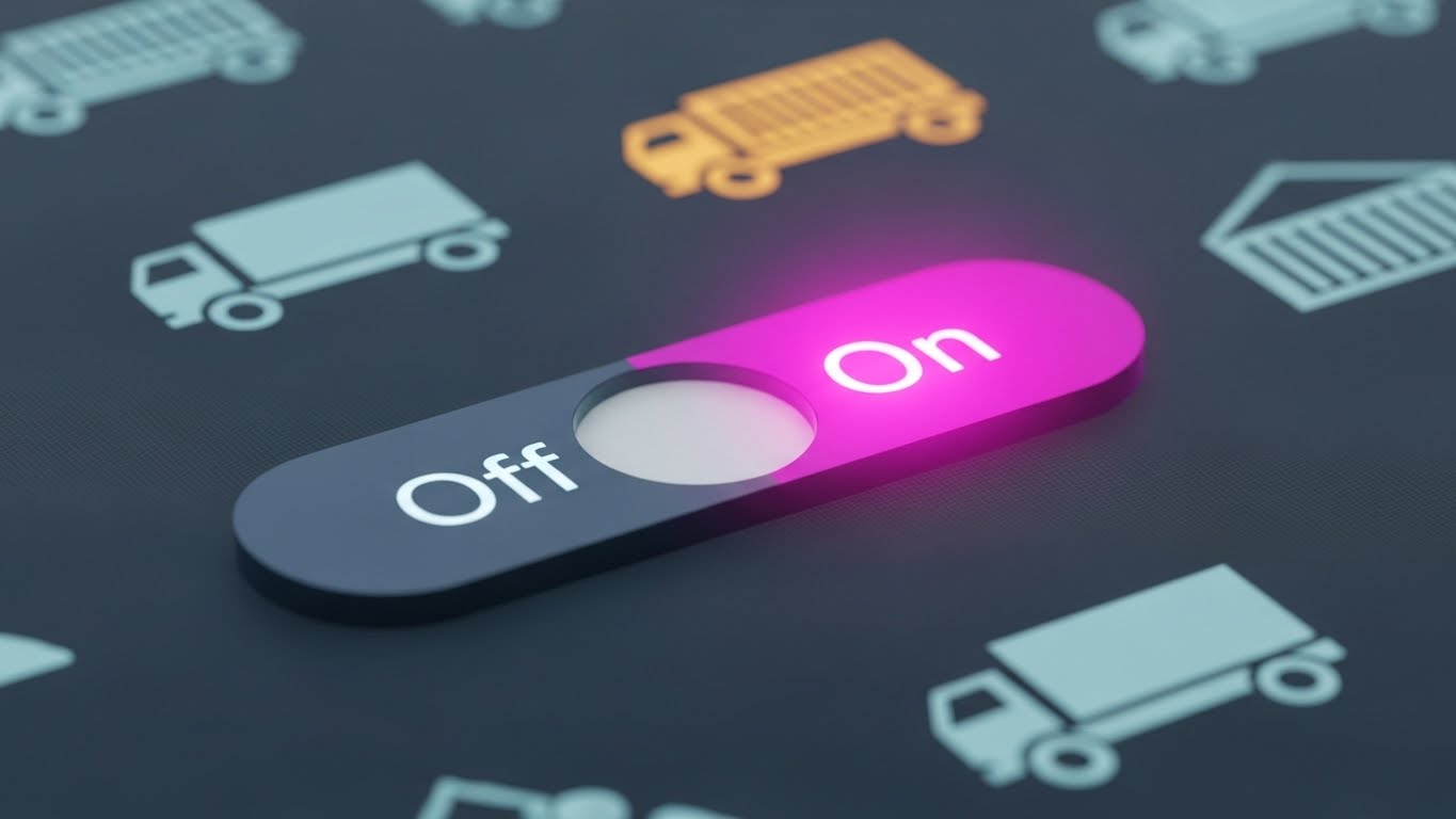
The Visual & Narrative Approach
Sometimes, the most powerful moment is the smallest. This style uses an extreme macro close-up of a single UI element: a toggle switch turning from grey to vibrant magenta. We see the subtle texture of the pixels and a soft glow emanating from the "On" side. The animation focuses purely on the moment of activation, dramatizing the ease of enabling a powerful feature (e.g., "Auto-Bind" or "AI Analysis").
Psychological Impact & KPI Focus
This leverages Sensory Feedback logic. By making the digital action look tactile and responsive, it creates a "dopamine hit" of satisfaction. It signals to the user that the platform is responsive, modern, and ready to work at the touch of a button.
- KPI Focus: Feature Adoption (Activation Rate). It creates a desire to "click the button" inside the trial or freemium version.
Strategic Implementation & Trade-offs
- Best Use Case: App Store Preview Images or "New Feature" tooltips inside the software.
- Duration: 3-5 Seconds (Looping GIF).
- Trade-off: It lacks context. It shows action but not consequence. It works best as a visual punctuator in a larger update email.
Companies using similar video content -
Zesty.ai – Z-FIRE – Highlights activation of AI risk models.
Betterview – Property Intelligence Platform – Focuses on activating property insights.
23. The Time-to-Value Lapse
Onboard | Accelerating Time-to-Value
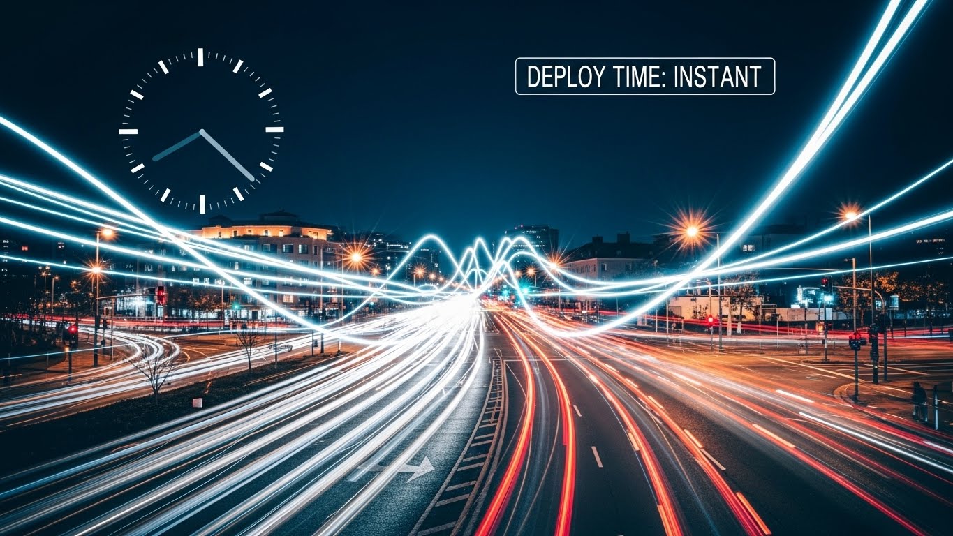
The Visual & Narrative Approach
For enterprise buyers, "Time is Money." This style visualizes speed. We see a hyper-lapse of a busy city intersection at night, with car headlights creating long, fluid streaks of light (cyan and red). Overlaid on the sky is a static, clean digital clock face and a data tag reading "DEPLOY TIME: INSTANT." The contrast between the frenetic, fast-moving background and the stable, clear metric emphasizes that while the world moves fast, your software keeps up.
Psychological Impact & KPI Focus
This appeals to the Efficiency driver. It visually counters the "Implementation Fatigue" often associated with legacy software overhauls that take months. It promises immediate relevance and agility in a high-speed market.
- KPI Focus: Time-to-Value (Perception). It is a powerful asset for the "Why Us" section of a landing page.
Strategic Implementation & Trade-offs
- Best Use Case: Landing Page Hero Backgrounds or Webinar Intro Countdowns.
- Duration: 10-15 Seconds (Loop).
- Trade-off: It is metaphorical. It doesn't prove how deployment is instant (e.g., API vs. On-Prem). It sets the expectation, which the sales engineer must then validate.
Companies using similar video content -
Socotra – Policy Core Platform – Emphasizes rapid deployment and time-to-market.
Bindable – Platform for Embedded Insurance – Focuses on fast integration and value.
24. The Resolution Story
Retention | Reducing Support Overhead
The Visual & Narrative Approach
When users are stuck, they want empathy, not just data. This style uses warm, stylized 2D vector characters (ochre and terracotta tones) to depict a supportive interaction. We see one character handing a tablet to another, surrounded by floating "solution" icons (lightbulbs, checkmarks). The characters have friendly, exaggerated proportions that feel accessible and non-threatening. It visualizes the concept of "Help is Here."
Psychological Impact & KPI Focus
This builds Relatability and Trust. Software support can be frustrating; this visual style lowers the emotional temperature. It assures the user that the support ecosystem is human-centric and that their problems will be solved by a "partner," not a bot.
- KPI Focus: Reducing Support Overhead (Ticket Deflection). Used in help portals, it encourages users to engage with self-help materials by making them look friendly.
Strategic Implementation & Trade-offs
- Best Use Case: Support Portal Headers or "Customer Success" Team Introduction videos.
- Duration: 45-60 Seconds.
- Trade-off: It can feel "soft." Avoid using this style for high-stakes topics like "Security Breaches" or "Compliance Failures," where a more serious tone is required.
Companies using similar video content -
Applied Systems – Client Services – Depicts friendly, accessible support.
Vertafore – Customer Support – Humanizes support interactions.
25. The Depth of Feature
Retention | Reducing Churn
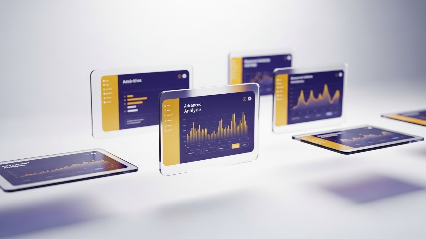
The Visual & Narrative Approach
To keep existing customers excited, you must show them the "depth" of the tool they already bought. This style uses 3D parallax to break the UI apart. Multiple semi-transparent screens float at different depths in a white void. The front screen shows a high-level dashboard, while rear screens reveal deep analytical graphs in navy and gold. As the camera tilts, we see the separation, implying that there is "more than meets the eye."
Psychological Impact & KPI Focus
This triggers Curiosity and Perceived Value. It visually demonstrates that the software is multi-layered and robust. It combats the "shallow usage" problem where customers only use 10% of the features.
- KPI Focus: Reducing Churn (Feature Expansion). It entices current users to explore the "Pro" or "Advanced" modules they are ignoring.
Strategic Implementation & Trade-offs
- Best Use Case: "Feature Update" Emails or Quarterly Business Review (QBR) presentations.
- Duration: 15-20 Seconds.
- Trade-off: It is abstract. It creates a "wow" factor but doesn't teach the workflow. Use it to announce a feature, not to explain it.
Companies using similar video content -
CoreLogic – Claims Management Solutions – Shows multi-layered claims data.
Qlik – for Insurance – Visualizes deep analytical capabilities.
26. The Deep Adoption Hero
Retention | Driving Deep Feature Adoption

The Visual & Narrative Approach
Case studies often feel dry. This style brings the "Super User" to life. Using high-end Generative AI, we visualize a professional underwriter in a sunlit, modern office. She interacts confidently with a holographic projection of a global risk map hovering above her desk. She is smiling, engaged, and in control. This isn't just a testimonial; it's a visualization of who the customer becomes when they master the platform.
Psychological Impact & KPI Focus
This leverages Aspirational Identity. It shows the target audience the "best version" of themselves—efficient, futuristic, and empowered. It validates the decision to adopt the software deeply into their daily workflow.
- KPI Focus: Driving Deep Feature Adoption (Upsell). It positions the "Enterprise Tier" features as the tools of the elite professional.
Strategic Implementation & Trade-offs
- Best Use Case: Customer Success Stories or "Academy" Certification Course promos.
- Duration: 15-30 Seconds.
- Trade-off: Generative AI consistency. Ensure the hands and eyes are rendered perfectly; otherwise, the "aspirational" feeling turns into "uncanny valley" discomfort.
Companies using similar video content -
Guidewire – PolicyCenter – Visualizes expert underwriters mastering the platform.
Insurity – Policy Decisions – Depicts skilled users confidently managing complex policies.
27. The Upsell Twin
Expansion | Driving Upsell/Cross-sell

The Visual & Narrative Approach
This is the ultimate "Before and After" without the negativity. The screen is split vertically. The left shows a raw, earthy photo of a physical warehouse with stacked pallets. The right side mirrors the exact same geometry but renders it as a neon blue "Digital Twin" wireframe on a black background. A white scan line moves down, syncing the two worlds. It visually proves that every physical asset represents a digital data opportunity.
Psychological Impact & KPI Focus
This utilizes Comparative Cognition. It makes the abstract concept of "Digitization" concrete by showing the direct 1:1 relationship between the insured asset and the software model. It bridges the gap between the "real world" client and the "digital" insurer.
- KPI Focus: Driving Upsell/Cross-sell (Expansion). It effectively sells add-on modules like "IoT Integration" or "Property Intelligence."
Strategic Implementation & Trade-offs
- Best Use Case: Email Campaigns for Upselling or "Product Module" pages.
- Duration: 10-15 Seconds (Loop).
- Trade-off: Requires matching assets. You need a high-quality photo and a 3D artist (or AI) to create the matching wireframe. Misalignment ruins the effect.
Companies using similar video content -
Cape Analytics – Property Intelligence – Compares physical property to digital risk data.
Zesty.ai – Z-FIRE – Shows physical property risk alongside digital assessment.
28. The Proactive Notification
Expansion | Proactive Support/Announcements

The Visual & Narrative Approach
Mobile usage is about context. This style overlays crisp, flat vector icons (cyan bell, magenta shield, yellow star) onto live-action footage of a hand holding a smartphone against a blurred city backdrop. The icons "pop" out of the screen, visualizing push notifications or real-time alerts. It demonstrates that the software lives in the user's pocket and proactively communicates, rather than waiting to be checked.
Psychological Impact & KPI Focus
This appeals to the desire for Connectivity and Alertness. It positions the software as an active assistant rather than a passive database. For field agents or fleet managers, this visualizes "Peace of Mind."
- KPI Focus: Mobile App Engagement (MAU). It drives downloads and daily active usage.
Strategic Implementation & Trade-offs
- Best Use Case: Social Stories (Instagram/LinkedIn) or "New Mobile Feature" announcements.
- Duration: 6-10 Seconds (Vertical Format).
- Trade-off: Screen readability. Because the phone is small in the frame, the UI on the screen is less important than the floating icons. Focus on the concept of notification, not the text of the alert.
Companies using similar video content -
Cambridge Mobile Telematics – DriveWell – Visualizes real-time driving feedback and alerts.
Arity – Mobility Data & Analytics – Shows mobile alerts for driving behavior.
29. The Community Mosaic
Expansion | Driving Referrals & Advocacy

The Visual & Narrative Approach
In B2B, nobody wants to be the only one taking a risk. This style uses a dynamic montage of diverse professionals in high-key, sunny office environments. They are collaborating, high-fiving, and succeeding. A subtle, white geometric network overlay connects the different scenes, symbolizing that they are all part of the same "User Community." It visualizes the ecosystem of brokers, carriers, and MGAs using the platform.
Psychological Impact & KPI Focus
This builds Social Proof and Belonging. It signals that "everyone is winning with this platform." It shifts the narrative from "buying software" to "joining a winning network."
- KPI Focus: Driving Referrals & Advocacy (NPS). It creates the vibe of a thriving community that users want to invite peers into.
Strategic Implementation & Trade-offs
- Best Use Case: Community Portal Landing Pages, Event Promo Videos, or "Thank You" pages.
- Duration: 30-60 Seconds.
- Trade-off: It is generic. It builds brand vibe but sells no specific feature. It is purely a relationship-building asset.
Companies using similar video content -
BrokerTech Ventures – Ecosystem – Showcases a collaborative insurtech network.
Applied Systems – Community – Fosters a network of brokers and carriers.
30. The Competitive Switch
Expansion | Competitive Comparison/Switcher
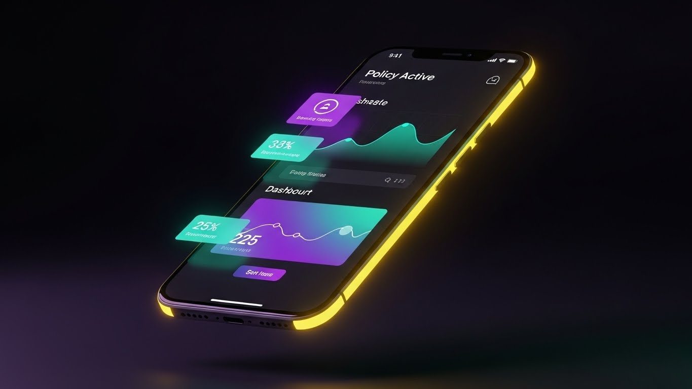
The Visual & Narrative Approach
"Dark Mode" is a shorthand for "Modern." This style features a sleek smartphone floating in a dark void. The screen displays the software's dashboard in Dark Mode—deep midnight purples with glowing neon teal data points. Rim lighting highlights the phone's curves. The aesthetic is premium, cool, and starkly different from the "white and grey" spreadsheets of legacy competitors.
Psychological Impact & KPI Focus
This triggers the Aesthetic-Usability Effect—users perceive attractive products as more usable. It frames the competitor's legacy systems as "old and glaring" and your platform as "sleek and restful." It appeals to the user who stares at screens for 10 hours a day.
- KPI Focus: Competitive Switcher Campaigns (Retargeting). It visually dates the competition without saying a word.
Strategic Implementation & Trade-offs
- Best Use Case: Retargeting Ads (Facebook/LinkedIn) for users who visited pricing pages.
- Duration: 6-10 Seconds.
- Trade-off: It implies a specific UI capability. If your software doesn't actually have a Dark Mode, do not use this. It will create immediate disappointment upon login.
Strategic Knowledge Base: The Visual Operations Doctrine
We have explored 30 distinct visual styles, ranging from abstract metaphors to high-fidelity simulations. However, a library of assets is not a strategy. To drive true commercial insurance transformation, these visuals must be woven into the operational fabric of the business.
This concluding section synthesizes the visual tactics into a 3-Segment Strategic Framework. This is your blueprint for moving from "Marketing Video" to "Visual Infrastructure."
Strategic Alignment & Visual Architecture
The "Pre-Production" Strategy. Why and Who.
- The Cognitive Load Audit: Before briefing a single video, audit the "Cognitive Load" of your current training materials. If a PDF manual takes 20 minutes to read, replace it with a Style 19 (Policy Factory) animation that takes 45 seconds. Measure the delta in comprehension time.
- Role-Based Visual Mapping: Do not use the same visuals for everyone. A Fleet Manager needs Style 10 (Logistics Control Tower) to feel "in command." A Driver needs Style 28 (Proactive Notification) to feel "supported." Map styles to personas, not just products.
- The "Glanceability" Standard: In logistics and insurance, users are often under time pressure. Design every visual asset (especially Style 23 and Style 30) to be understood in under 3 seconds. If the viewer has to pause to read the text, the visual has failed.
- Brand Voice Consistency: Your marketing visuals (abstract, emotive) must aesthetically link to your product visuals (precise, UI-focused). Use a consistent accent color (e.g., the "Teal" in Style 1 and Style 30) to create a subconscious thread that ties the "Promise" to the "Product."
- The Advids Strategic Audit: This is where a partner like Advids becomes essential. We don't just animate; we help define this "Visual Operating System" before production begins, ensuring your library is built for reuse and scale, not just one-off campaigns.
- Standardization vs. Customization: For high-volume markets (SME/Auto), use standardized "Stock-Hybrid" styles (Style 29) to keep costs low. For high-ticket accounts (Reinsurance/Construction), invest in bespoke Style 13 (Tangible Risk) renders that mirror the specific client's portfolio.
- The Cross-Departmental Bridge: Use these visuals to unify terminology. If Sales calls it "The Risk Shield" and Ops calls it "Module B," use Style 1 (Soft Landing) to visually anchor the term "Fluid Shield" across both departments.
- Legacy System Integration: Visualizing the connection between old on-prem hardware and new SaaS interfaces is critical. Use Style 2 (Blueprint) to validate the client's past investment while selling them the future. Never mock the legacy; visualize it being upgraded.
- Accessibility in Design: Commercial insurance is global. Ensure text-heavy styles (Style 4) rely on iconography and color coding so they remain effective even when the viewer’s primary language is different from the voiceover.
- The Mobile-First Mandate: 60% of insurance emails are opened on mobile. Every style from 1-30 must be legible on a vertical 9:16 screen. Style 8 (Conversion Cursor) is specifically engineered for this "thumb-stopping" requirement.
Operational Adoption & Implementation
The "Deployment" Phase. How to embed visuals into the workflow.
- Overcoming "Big Brother" Anxiety: In fleet and employee monitoring, resistance is high. Use Style 20 (Cinematic Fleet) and Style 16 (Augmented Executive) to frame data collection as "Empowerment" and "Safety," never as surveillance. Visual tone dictates adoption sentiment.
- The Micro-Learning Shift: Destroy the "Training Seminar." Break your 2-hour onboarding session into twenty 1-minute clips using Style 7 (Pristine Workbench) and Style 21 (Onboarding Pathfinder). Serve these clips contextually inside the app.
- Just-in-Time Support: Embed Style 24 (Resolution Story) videos directly into your support ticketing system. When a user types "Error," pop up a friendly video solution before they submit the ticket.
- Gamification of Training: Use Style 6 (High-Speed Data Fan) visuals to create "Leaderboards" and "Achievement Unlocked" moments in your training academy. Visualizing progress increases certification completion rates.
- Reducing Support Ticket Volume: There is a direct correlation between the quality of your "Error State" visuals and support costs. If an error message is text, they call support. If it's a Style 2 (Blueprint) animation showing how to fix it, they self-serve.
- Remote Onboarding: For distributed underwriting teams, you cannot rely on in-person shadowing. Use Style 25 (3D Parallax) to simulate the depth of the software, creating a "virtual shadow" experience that feels immersive.
- Visualizing Standard Operating Procedures (SOPs): Text-based SOPs are ignored. Transform your "Claim Approval Workflow" document into a Style 19 (Policy Factory) loop. It ensures strict adherence to compliance processes because the "correct path" is visually undeniable.
- Feedback Loops: Use interactive video elements (Style 22 aesthetics) to gather user feedback. A "Thumbs Up/Down" micro-interaction is more likely to be clicked than a survey link is to be opened.
- Scalable Localization: When expanding to new regions (e.g., LATAM or APAC), use Style 11 (Paperless Ingestion) and Style 30 (Dark Mode) which rely on UI and abstract imagery rather than culturally specific live-action footage. This drastically reduces localization costs.
- Leadership Communication: When the CTO presents the roadmap to the Board, do not use bullet points. Use Style 14 (Portfolio Command). It speaks the visual language of "Vision" and "Control" that executives respect, securing budget for further innovation.
Measuring Impact & Future-Proofing
The "ROI" Phase. Measuring success and looking ahead.
- Beyond "Views": Stop measuring video success by "Views." Measure "Time-to-Competency" (how fast a new underwriter binds their first policy) and "Feature Adoption Rate" (how many users clicked the button after seeing Style 22).
- The "Idle Time" Metric: Inefficient software causes "stare and scroll" time. Correlate the deployment of clear Style 7 (Workbench) tutorials with a reduction in "Idle Time" inside the application. This is your productivity ROI.
- Compliance Velocity: When a new regulation drops (e.g., a new ELD mandate), measure how quickly the fleet reaches 100% compliance after watching a Style 17 (X-Ray) explainer versus reading a PDF. The delta is your "Compliance Velocity."
- Retention and Churn (LTV): High-quality UX visualization (Style 25) directly impacts Net Dollar Retention. Customers who "see" the value deeply are less likely to churn. Track the LTV of cohorts exposed to these visual assets vs. those who weren't.
- The AI Visual Frontier: Prepare for the next wave where Generative AI (Style 26) allows for real-time personalization. Imagine a welcome video that visually morphs to show the client's actual logo and actual fleet data dynamically.
- Scalability of Assets: Build a library, not a graveyard. Ensure your Style 9 (Geometric Radar) and Style 3 (Control Tower) backgrounds are rendered in layers. When the UI changes next year, you only need to swap the screen layer, not re-animate the entire scene.
- The Advids Partnership: This is where long-term partnership with Advids yields compound interest. We maintain your source files and asset libraries, allowing for rapid iteration. As your platform evolves, your visual language evolves with it, without starting from scratch.
- Benchmarking Success: "Good enough" visuals are a competitive risk. If your competitor uses Style 30 (Dark Mode) aesthetics and you use static screenshots, you look like a legacy risk. Regularly audit your visual standard against the top 10 SaaS players, not just insurance peers.
- The ROI of Safety: For commercial auto, the ultimate KPI is the Loss Ratio. Quantify the reduction in accident claims for fleets that utilize Style 28 (Proactive Notification) safety training videos. This links marketing spend directly to underwriting profit.
- Final Call to Innovation: Treat video as infrastructure, not content. In a digital-first insurance market, your visual interface is your handshake, your promise, and your proof. Invest in it with the same rigor you apply to your code.
End of Guide
This concludes the "Video Style Guide for Commercial Insurance Software." By applying these 30 styles and the 3-Segment Strategic Framework, you are equipped to turn complex insurance capabilities into a compelling, high-growth visual narrative.
Companies using similar video content -
EIS – Core Insurance Suite – Presents a modern, intuitive interface.
Duck Creek Technologies – Policy – Showcases a contemporary, user-friendly design.
Author & Editor Bio


