
Introduction: Bridging the Gap Between Insight and Execution
The modern competitive landscape is no longer defined by the ability to gather data, but by the capacity to synthesize it. For Strategy VPs and Product Marketing Leads, the challenge has shifted from information scarcity to a "Cognitive Load Crisis." In a world where market signals are continuous and chaotic, the static PDF report is a relic that often fails to bridge the physical reality of market shifts with the digital speed of decision-making.
The opportunity for growth is monumental. The global Competitive Intelligence Tool Market is projected to reach USD 16.82 Billion by 2035, signaling a massive shift towards automated insight. Yet, a "Physical/Digital Divide" persists. Marketing and strategy teams currently spend an average of 14.5 hours per week managing and collecting data manually. This creates a massive "Execution Gap" where analysis is sacrificed for assembly, and strategic foresight is lost in the weeds of administrative drudgery.
When complex competitive landscapes are rendered into intuitive, high-impact video formats, they bypass the skepticism inherent in text-heavy analysis and accelerate the "Speed to Insight." This guide explores 30 specific visualization styles designed to turn market monitoring into market mastery, ensuring that strategic signals are not just seen, but felt and acted upon.
1. The God-Mode Perspective
TOFU | Brand Awareness

The Visual & Narrative Approach
This style utilizes a 2D isometric projection to create a "God’s-eye view" of a digital ecosystem. The visual metaphor constructs a sprawling city where data blocks and server towers represent market segments and competitor strongholds. Narrative motion is deliberate and observant; the camera pans slowly across the grid, highlighting stylized radar dishes that rotate to scan the horizon. The cyan and white palette evokes a sense of clean, clinical precision, devoid of the "noise" of the real world.
Psychological Impact & KPI Focus
- Niche Psychology: Isometric views reduce cognitive load by presenting three-dimensional depth without the distortion of perspective, allowing the viewer to see the "whole board" at once. For a Head of Strategy, this style instills a feeling of control and comprehensive coverage.
- Operational Impact: It directly impacts the Signal-to-Noise Ratio KPI by visually organizing chaotic market data into a structured, manageable grid. It positions the platform as the central infrastructure for market monitoring.
Strategic Implementation & Trade-offs
- Best Use Case: TOFU explainer videos on a website's "How It Works" page. It perfectly illustrates the concept of "Market Monitoring."
- Duration: 45-60 seconds.
- Trade-off: The rigid geometric structure is excellent for showing stability and scope but may lack the emotional urgency needed for high-pressure sales alerts.
Companies using similar video content -
Crayon – Competitive Intelligence Platform – Provides a holistic view of competitor strategies.
Klue – Competitive Enablement Platform – Organizes fragmented market data into actionable insights.
2. Crystallizing the Category
TOFU | Category Creation

The Visual & Narrative Approach
Here, the visual narrative is one of transformation. The animation begins with jagged, chaotic shapes—representing fragmented market data—violently clashing in a digital ether. Through fluid motion morphing, these shapes coalesce into a perfect, glowing sphere. The palette of electric purple and neon orange creates a futuristic, high-energy contrast against the deep indigo void. There is no text, only the visual story of confusion becoming clarity.
Psychological Impact & KPI Focus
- Niche Psychology: This style leverages the "Gestalt" principle of closure, satisfying the brain's desire to resolve chaos into order. It appeals to the "Visionary" aspect of the target persona, validating their role in defining new categories.
- Operational Impact: The primary goal is Category Creation; it visualizes the intangible value of "insight" which cannot be captured in a spreadsheet. It builds brand authority by associating the software with the genesis of new ideas.
Strategic Implementation & Trade-offs
- Best Use Case: LinkedIn social feeds (Square 1:1 format) to disrupt the scroll.
- Duration: 15-30 seconds.
- Trade-off: The abstract nature requires a strong accompanying voiceover or headline to anchor the meaning, otherwise, it risks being interpreted as purely decorative art.
Companies using similar video content -
Signal AI – External Intelligence Platform – Transforms chaotic external data into clear strategic signals.
NetBase Quid – Consumer & Market Intelligence – Unifies disparate data to define market narratives.
3. The Stream of Truth
TOFU | Market Education

The Visual & Narrative Approach
This visualization treats data as a living, flowing entity. A "river" of charts—comprised of teal and coral ribbons—flows continuously from left to right, simulating the passage of time. Simplified bar charts rise and fall like waves on this current, set against a subtle graph-paper grid. The matte finish and flat vector style strip away distraction, focusing entirely on the movement of the trend lines.
Psychological Impact & KPI Focus
- Niche Psychology: The horizontal flow triggers a sense of progression and forward momentum (the "Western" reading direction of past-to-future). It addresses the anxiety of "missing out" by implying a 24/7 stream of intelligence.
- Operational Impact: This style is critical for Market Education, demonstrating that competitive intelligence is a process, not a one-time event. It reinforces the KPI of Update Frequency and real-time monitoring.
Strategic Implementation & Trade-offs
- Best Use Case: YouTube educational content or webinar backdrops (16:9).
- Duration: 2-3 minutes (background loop).
- Trade-off: While excellent for showing trends, it is less effective for showing specific, granular data points or individual "Battlecard" details due to its continuous motion.
Companies using similar video content -
Meltwater – Media Intelligence Platform – Visualizes continuous media and social data streams.
Talkwalker – Consumer Intelligence Platform – Shows real-time trends and flowing market insights.
4. The Unblinking Eye
TOFU | Shaping Brand Perception
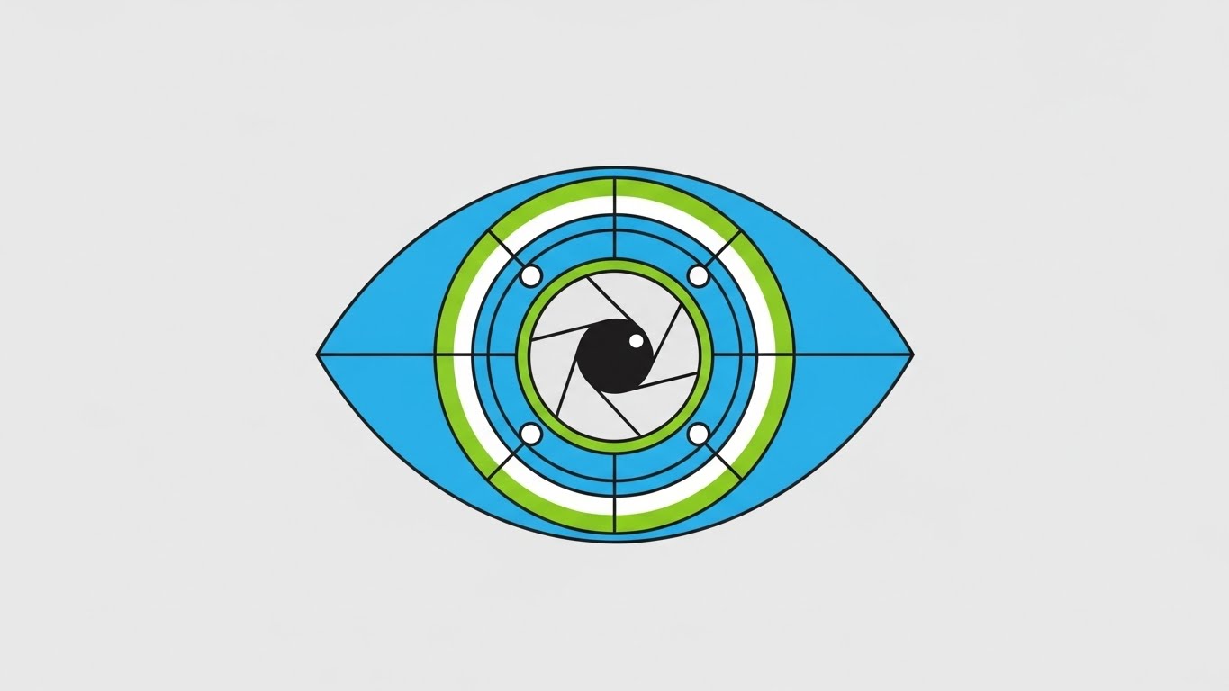
The Visual & Narrative Approach
Symmetry and simplicity define this approach. A stylized geometric eye, constructed from concentric circles and data arcs, dominates the frame. The pupil is rendered as a camera aperture, mechanically adjusting to focus. The color blocking is absolute—sky blue and lime green against solid grey—with no gradients or shadows. The narrative is static but powerful: "We are watching."
Psychological Impact & KPI Focus
- Niche Psychology: The direct "gaze" of the eye creates a subconscious sense of accountability and vigilance. For the viewer, it establishes the software as an omnipresent observer.
- Operational Impact: This style serves the goal of Shaping Brand Perception as a tool of deep insight and unblinking focus. It minimizes "Cognitive Friction," allowing the viewer to grasp the concept of "monitoring" in milliseconds.
Strategic Implementation & Trade-offs
- Best Use Case: Social Ads (Instagram Stories/TikTok 9:16).
- Duration: 6-10 seconds.
- Trade-off: The minimalism can feel cold or impersonal. It lacks the "human touch" and is best used for brand awareness rather than deep relationship building.
Companies using similar video content -
Brandwatch – Consumer Intelligence – Offers focused monitoring of brand perception.
Mention – Media Monitoring Tool – Provides vigilant tracking of online mentions.
5. Velocity as a Feature
TOFU | Skippable Pre-Roll Ad

The Visual & Narrative Approach
This style mimics the aggressive energy of breaking news. Solid blocky shapes in bright yellow and jet black careen diagonally across the screen, simulating the weight and motion of heavy text without using legible words. Motion lines and blur effects convey high velocity. The visual rhythm is staccato and urgent, designed to mimic the feeling of receiving a critical "Competitor Price Drop" alert.
Psychological Impact & KPI Focus
- Niche Psychology: The high-contrast yellow-on-black color scheme leverages "Aposematism"—nature’s warning coloration—to trigger immediate attention. It speaks to the anxiety of being "scooped" or slow to react.
- Operational Impact: This is a pure Skippable Pre-Roll play, designed to hook the viewer instantly by visualizing the adrenaline of Strategic Agility.
Strategic Implementation & Trade-offs
- Best Use Case: YouTube Pre-Roll Ads (First 5 seconds are critical).
- Duration: 15 seconds.
- Trade-off: High energy can be exhausting if overused. It is not suitable for deep-dive tutorials where the viewer needs a calm pace to learn.
Companies using similar video content -
SpyFu – Competitor Keyword Tool – Delivers rapid insights on competitor ad changes.
Adthena – Search Intelligence Platform – Highlights urgent shifts in paid search landscape.
6. The Efficiency Bridge
MOFU | Product Differentiation

The Visual & Narrative Approach
The classic "Before and After" trope is elevated here through a stark visual dichotomy. The left side (Reality) is a photorealistic depiction of a chaotic, dimly lit desk cluttered with paper research. The right side (UI) is a pristine, vector-based interface in navy and tangerine, glowing with clinical brightness. The narrative tension exists at the border: the messy reality transitions into digital order.
Psychological Impact & KPI Focus
- Niche Psychology: It validates the user's pain (the messy desk) while offering a desirable future state. It visually proves the value of Product Differentiation by juxtaposing the "Old Way" vs. the "New Way."
- Operational Impact: Highly effective for Landing Pages where the goal is conversion. It visually demonstrates the value proposition without a single word of voiceover, effectively communicating "time saved."
Strategic Implementation & Trade-offs
- Best Use Case: Landing page headers or sales enablement decks.
- Duration: 30-45 seconds.
- Trade-off: Requires two distinct art styles to be executed perfectly side-by-side. If the transition isn't sharp, the comparison loses its punch.
Companies using similar video content -
Similarweb – Digital Intelligence Platform – Contrasts manual research with automated digital insights.
Semrush – Online Visibility Management – Shows efficiency gains from integrated SEO/SEM tools.
7. The Executive Cockpit
MOFU | Feature Education
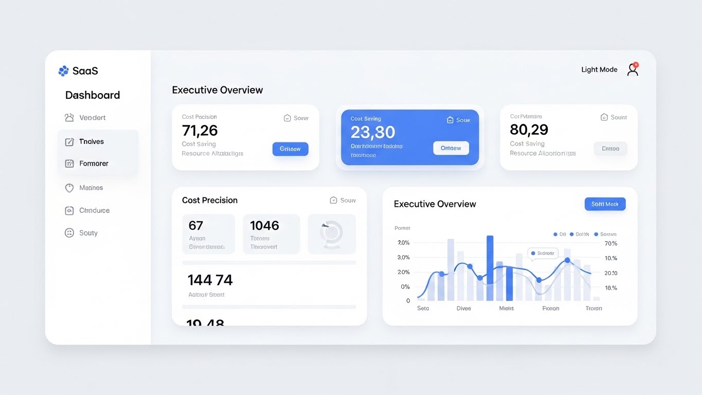
The Visual & Narrative Approach
This is the "Hero Shot" of the software. We see a high-fidelity, abstract UI mockup. The "cards" are simplified to show only the most critical trend lines and comparison charts. The slight upward tilt gives the dashboard a monumental feel, suggesting that this is the command center for important decisions. The soft bokeh background keeps the focus strictly on the data.
Psychological Impact & KPI Focus
- Niche Psychology: Executives don't want to see the gears turning; they want to see the output. This style creates a "halo effect" of simplicity and ease, addressing the fear of "Feature Bloat."
- Operational Impact: Essential for Feature Education. It demonstrates usability and reduces the perceived learning curve for new users, showing that the platform is powerful yet accessible.
Strategic Implementation & Trade-offs
- Best Use Case: Product pages or feature announcement videos.
- Duration: 45-90 Seconds.
- Trade-off: It must look like the actual product but cleaner. If it over-promises on UI polish compared to the real software, it can lead to disappointment during the demo.
Companies using similar video content -
ZoomInfo – Go-to-Market Platform – Presents simplified executive-level market dashboards.
Apollo.io – Sales Intelligence Platform – Offers clean UI for sales and market insights.
8. Blueprint to Reality
MOFU | Competitive Displacement
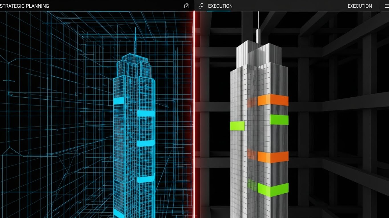
The Visual & Narrative Approach
A powerful visual metaphor for Competitive Displacement. The transition from a blue wireframe to a glossy 3D skyscraper represents the journey from "Strategy" (planning) to "Execution" (market dominance). The glowing laser line emphasizes the transformative power of the software. It visually argues that your intelligence is the blueprint for their success.
Psychological Impact & KPI Focus
- Niche Psychology: Strategists often struggle to prove that their plans lead to tangible results. This visual connects the abstract (wireframe) to the concrete (building), validating their role as "Builders" of the business.
- Operational Impact: Perfect for LinkedIn ads targeting senior decision-makers. It implies solidity, growth, and high value—reinforcing the idea that strategy is the foundation of revenue.
Strategic Implementation & Trade-offs
- Best Use Case: Case study summaries or "Result-oriented" ads.
- Duration: 15-20 Seconds (Looping).
- Trade-off: It is metaphorical. You must ensure the copy clearly links the "building" to "market share" or "revenue," otherwise, it's just a pretty architecture video.
Companies using similar video content -
Palantir – Foundry Platform – Transforms raw data blueprints into operational reality.
Alteryx – Analytic Process Automation – Visualizes data preparation leading to strategic outcomes.
9. The Dark Vault
MOFU | Risk Mitigation

The Visual & Narrative Approach
Dark mode isn't just a UI preference; here, it signals security and ops-level seriousness. The glowing neon green shield and lock icons pop against the charcoal background, reminiscent of a secure server room or a tactical ops center. This style is specifically tuned for the user's need to protect their proprietary intelligence.
Psychological Impact & KPI Focus
- Niche Psychology: In competitive intelligence, secrecy is paramount. This aesthetic triggers the "Security Heuristic"—dark colors and neon accents subconsciously signal encryption and advanced tech.
- Operational Impact: Differentiates the product as "Enterprise-Grade." It is particularly effective for Risk Mitigation messaging in regulated industries, positioning the tool as a safe harbor for sensitive data.
Strategic Implementation & Trade-offs
- Best Use Case: Security compliance pages or IT-focused sales collateral.
- Duration: 30-60 Seconds.
- Trade-off: Can feel "cold" or "intimidating" if used for general marketing. Keep this specific to security and technical features.
Companies using similar video content -
S&P Global Market Intelligence – Capital IQ Pro – Showcases secure financial data and risk analysis.
LSEG – Workspace – Emphasizes secure, enterprise-grade financial intelligence.
10. The Human Signal
MOFU | ABM Awareness

The Visual & Narrative Approach
This style brings the human element back into the loop. We see a professional using the tool in a natural, bright office environment. The holographic overlay projects the data into her world, rather than sucking her into a screen. This visualizes Account-Based Marketing (ABM) awareness by showing exactly who uses the tool and how it empowers them.
Psychological Impact & KPI Focus
- Niche Psychology: Adoption is a huge hurdle. Seeing a calm, professional human successfully interacting with the data removes the fear of complexity. It promotes "Social Proof."
- Operational Impact: Great for Display Ads. It helps the viewer project themselves into the scenario: "That could be me making smart decisions."
Strategic Implementation & Trade-offs
- Best Use Case: Retargeting ads or "About Us" videos.
- Duration: 15-30 Seconds.
- Trade-off: Stock footage can feel generic. The UI overlay must be high-quality and clearly branded to prevent it from looking like a generic "business technology" clip.
Companies using similar video content -
HubSpot – Marketing Hub – Shows professionals interacting seamlessly with marketing data.
Salesforce – Sales Cloud – Visualizes sales teams empowered by CRM insights.
11. The Battlecard Blitz
MOFU | Competitive Comparison
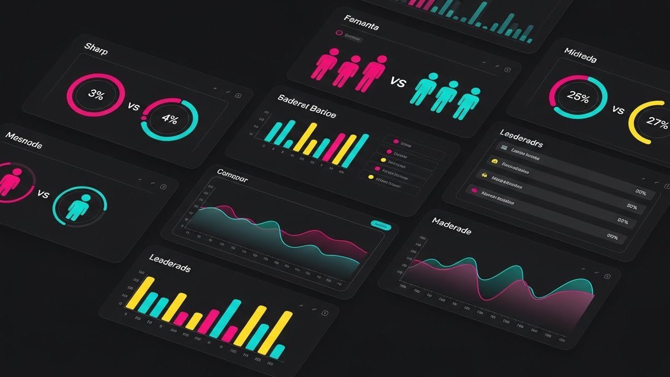
The Visual & Narrative Approach
This style abandons subtlety for speed and directness. A dynamic grid of dark-mode interface cards flies into view, canted at a slight angle to suggest forward momentum. The palette is aggressive—neon magenta, cyan, and yellow—popping against a charcoal void. We see specific "VS" modules where simplified competitor metrics are pitted against each other. The focus is on the circular percentage charts and bar graphs that clearly denote a winner. It visualizes the software not just as a tool, but as a weapon for dominance.
Psychological Impact & KPI Focus
- Niche Psychology: It triggers the "Social Comparison Bias." By explicitly framing data as a "Head-to-Head" contest, it taps into the competitive drive of Sales Leaders who need to arm their teams with winning battlecards.
- Operational Impact: This style directly supports Competitive Win Rates. It visualizes the specific feature of "Benchmarking" in a way that feels instantaneous and decisive, reducing the cognitive effort needed to see who is ahead.
Strategic Implementation & Trade-offs
- Best Use Case: Retargeting Ads on LinkedIn or Meta (9:16 vertical format) to nurture leads who have visited pricing pages.
- Duration: 10-15 Seconds (Fast-paced).
- Trade-off: It is information-dense. If the cuts are too fast, the viewer may miss the specific metrics. It prioritizes the feeling of superiority over the granular details of the data.
Companies using similar video content -
Gong.io – Revenue Intelligence Platform – Provides rapid competitive insights for sales calls.
Highspot – Sales Enablement Platform – Accelerates benchmarking speed for sales teams.
12. The Augmented Analyst
MOFU | Demo Requests

The Visual & Narrative Approach
This style bridges the gap between the tool and the user. We see a high-resolution, live-action shot of a professional in a bright, airy workspace, smiling at their laptop. Floating around them are flat, illustrative 2D vector icons—charts, play buttons, and search lenses—rendered in a friendly brand blue. These elements don't obscure the user; they orbit them, suggesting that the software is an extension of their capabilities, not a replacement.
Psychological Impact & KPI Focus
- Niche Psychology: It combats the fear of AI replacement. Instead of showing automation removing the human, it shows automation supporting the human. It appeals to the "End User" persona who wants to feel superhuman, not redundant.
- Operational Impact: Highly effective for Demo Requests. It visualizes the "Ease of Use" and the positive emotional state of using the platform, reducing the perceived friction of learning a new tool.
Strategic Implementation & Trade-offs
- Best Use Case: Website "Why Us" pages or Demo Request landing pages (16:9).
- Duration: 30-45 Seconds.
- Trade-off: Requires high-quality talent and lighting. If the stock footage looks too generic, it can dilute the brand's premium feel.
Companies using similar video content -
DataRobot – AI Platform – Visualizes AI augmenting human data scientists.
Qlik – Sense – Shows interactive data visualizations enhancing human analysis.
13. The Revenue Refinery
BOFU | ROI Justification

The Visual & Narrative Approach
When speaking to the CFO or the Economic Buyer, you need to visualize value. This isometric 3D clay-render illustrates a literal "Value Factory." Raw, grey data cubes enter a stylized machine on conveyor belts and emerge as gleaming gold coins. The matte finish and soft global lighting give it a premium, tactile feel. It strips away the complexity of how the algorithms work and focuses entirely on the result: Data In, Value Out.
Psychological Impact & KPI Focus
- Niche Psychology: Executives operate on the logic of Return on Investment (ROI). This visual metaphor serves as "Cognitive Ease" for the financial argument, validating the software purchase as a revenue generator rather than a cost center.
- Operational Impact: Specifically targets ROI Justification. It provides a visual shorthand for the efficiency and capitalization of market data.
Strategic Implementation & Trade-offs
- Best Use Case: BOFU Sales Presentations or Pricing Pages.
- Duration: 30 Seconds.
- Trade-off: It is purely metaphorical. It does not show the UI or features, so it must be paired with content that explains the "How."
Companies using similar video content -
Domo – Business Cloud – Illustrates data flowing into a value-generating system.
Sisense – Fusion Platform – Visualizes data transformation into business outcomes.
14. The Velocity Vector
BOFU | Sales Cycle Acceleration

The Visual & Narrative Approach
Speed is the currency of sales. This style uses a "Corporate Memphis-lite" aesthetic with fluid limbs and dynamic posing to show a professional sprinting along a timeline. The palette of burnt orange and navy creates urgency. As she runs, she passes floating UI widgets that turn into "checkmarks" and "upward arrows," visualizing the rapid completion of tasks that usually take days. The background speed lines reinforce the momentum.
Psychological Impact & KPI Focus
- Niche Psychology: It taps into the desire for Sales Cycle Acceleration. Sales leaders are constantly trying to remove friction; this visual validates the software as a "friction remover."
- Operational Impact: Demonstrates Efficiency Gains. It visually argues that possessing competitive intelligence allows the team to move faster than the market.
Strategic Implementation & Trade-offs
- Best Use Case: Email Marketing (GIF or short loop) to re-engage stalled prospects.
- Duration: 10-15 Seconds (Looping).
- Trade-off: The stylized characters can feel "playful." Ensure the context remains professional to avoid trivializing the enterprise value.
Companies using similar video content -
Glimpse – Trend Intelligence – Shows rapid movement through emerging market trends.
BrandMentions – Brand Monitoring – Visualizes quick insights for faster brand response.
15. The War Room Consensus
BOFU | The Champion

The Visual & Narrative Approach
Buying decisions for CI software are rarely made alone. This cinematic shot visualizes the "Champion's" goal: a unified team. We see a diverse group of professionals standing around a glass conference table, bathed in natural light and a subtle blue lens flare. They look off-camera at a shared screen with expressions of triumph and alignment. It captures the moment the strategy "clicks" for everyone.
Psychological Impact & KPI Focus
- Niche Psychology: Validates the "Champion" (your internal advocate). It shows them the social reward of their purchase: a happy, aligned, and successful team. It leverages Social Proof and aspirational identity.
- Operational Impact: Supports Stakeholder Buy-in. It shifts the conversation from "software features" to "organizational success," helping to close the deal with the wider buying committee.
Strategic Implementation & Trade-offs
- Best Use Case: Embedded in Sales Decks (PDFs) or "Success Stories" sections.
- Duration: 30-45 Seconds.
- Trade-off: It relies entirely on the quality of the actors. Poor acting can make this feel like a cheesy pharmaceutical ad. Authenticity is key.
Companies using similar video content -
Sprinklr – Unified-CXM Platform – Depicts teams achieving consensus with customer insights.
Onclusive – Media Intelligence – Shows PR and marketing teams aligned on media strategy.
16. The Grandmaster's View
BOFU | The Economic Buyer

The Visual & Narrative Approach
For the highest level of decision-maker, strategy is a game of chess. This style uses a hyper-realistic 3D render of a glass and chrome chess set on a reflective black surface. The "King" piece is highlighted by a laser-red rim light, symbolizing the competitive threat or the decisive move. The aesthetic is luxurious, serious, and intellectually demanding, stripping away UI entirely to focus on the concept of "Strategy."
Psychological Impact & KPI Focus
- Niche Psychology: It appeals to the Ego and Identity of the C-Suite (CEO/CSO). They view themselves as grandmasters; this visual mirrors that self-perception, positioning the software as the tool of masters.
- Operational Impact: Cements Brand Prestige. It signals that this is not just a productivity tool, but a high-level strategic asset for market dominance.
Strategic Implementation & Trade-offs
- Best Use Case: Website Hero sections or Executive Briefing invitations.
- Duration: 15-30 Seconds.
- Trade-off: It is abstract. It sets a mood but explains nothing about the product. Use it to open doors, not to train users.
Companies using similar video content -
Bloomberg Terminal – Financial Data – Evokes high-stakes financial strategy.
FactSet – Research & Analytics – Positions itself as a tool for top-tier financial strategists.
17. The Frictionless Thread
BOFU | Reducing Friction
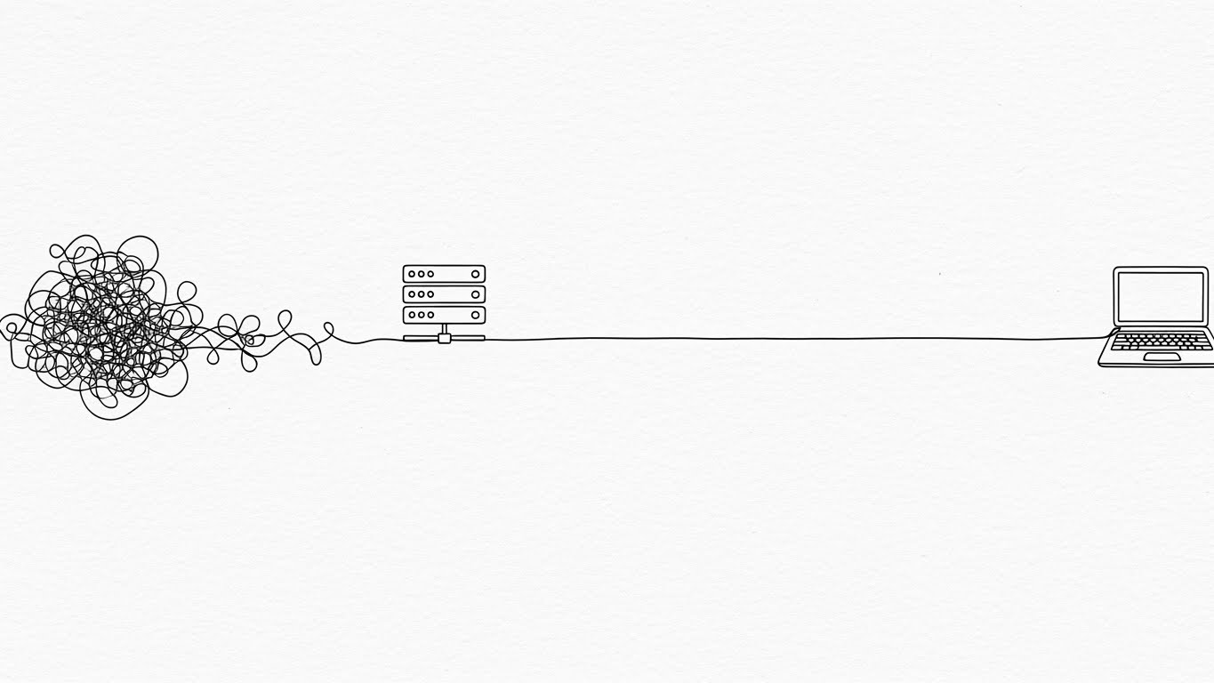
The Visual & Narrative Approach
Sometimes, less is more. This style uses a continuous single black line on a textured white paper background to tell a story of clarification. The line begins as a chaotic, tangled knot (representing market noise) and smoothly untangles itself to form a straight connection between a server icon and a laptop. It is elegant, minimal, and deeply satisfying to watch.
Psychological Impact & KPI Focus
- Niche Psychology: It directly addresses Cognitive Load. The visual relief of seeing the knot untie triggers a relaxation response, subconsciously promising that the software will make the user's life simpler, not harder.
- Operational Impact: Perfect for Reducing Friction messaging in support documentation or technical whitepapers. It communicates "Integration" and "Data Cleaning" without needing complex diagrams.
Strategic Implementation & Trade-offs
- Best Use Case: Support documentation, technical implementation guides, or "Philosophy" pages.
- Duration: 15-20 Seconds.
- Trade-off: Its simplicity may be mistaken for a lack of feature depth. It works best when explaining specific concepts, not the whole platform.
Companies using similar video content -
Tableau – Desktop – Simplifies complex data connections into clear visualizations.
Power BI – Desktop – Illustrates seamless data flow and report creation.
18. The Narrative Architect
BOFU | LinkedIn Organic
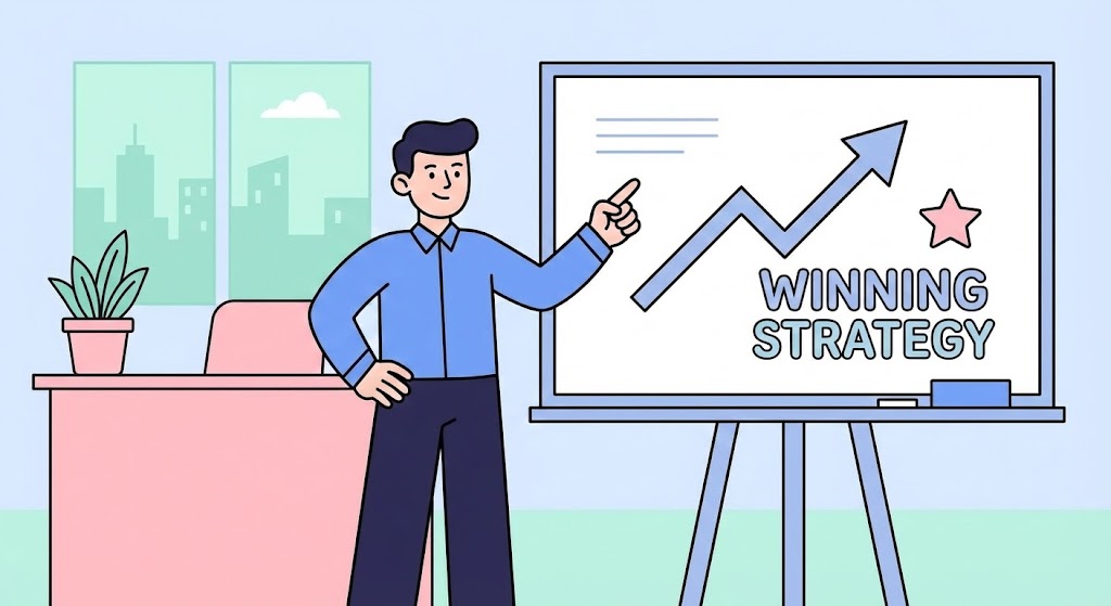
The Visual & Narrative Approach
LinkedIn thrives on personal narrative. This style uses flat, friendly vector characters to tell a relatable story. A confident male character stands before a whiteboard, pointing to a "Winning Strategy" diagram with an upward trend line. The pastel palette (blue, pink, mint) is approachable and modern. It mimics the "expert teaching a class" format that performs well on social platforms, framing the software user as a thought leader.
Psychological Impact & KPI Focus
- Niche Psychology: It appeals to the Career Aspiration of the user. It suggests that using this intelligence will help them present better strategies and get promoted.
- Operational Impact: Drives LinkedIn Engagement. The character-driven approach encourages storytelling ("Here's how I solved X"), which increases shareability and organic reach.
Strategic Implementation & Trade-offs
- Best Use Case: LinkedIn Organic posts (Square 1:1) or Case Study snippets.
- Duration: 30-45 Seconds.
- Trade-off: The "cartoon" style must be kept professional. If it becomes too childish, it loses credibility with enterprise buyers.
Companies using similar video content -
Moz – Pro – Uses character-driven stories to explain SEO strategies.
Ahrefs – SEO Toolset – Explains complex SEO workflows through relatable narratives.
19. The Trigger Moment
Onboarding | Self-Serve Onboarding

The Visual & Narrative Approach
This style zooms in—way in. It creates a tactile connection with the digital product by focusing on a single interaction: a finger pressing a "Push Button" on a glass surface. The shallow depth of field blurs the surroundings, focusing all attention on the moment of action (activation). The transition from a static state to a vivid, glowing green is visceral and satisfying.
Psychological Impact & KPI Focus
- Niche Psychology: It overcomes the Inertia of Inaction. By making the act of "starting" look easy and physically satisfying, it nudges the user toward the first step of onboarding.
- Operational Impact: Critical for Self-Serve Onboarding and App introductory screens. It signals that the platform is ready and waiting for their command.
Strategic Implementation & Trade-offs
- Best Use Case: Mobile App Onboarding screens or Feature Release emails.
- Duration: 5-10 Seconds.
- Trade-off: It is hyper-specific. It sells the "feeling" of the UI, not the utility of the data.
Companies using similar video content -
data.ai – Intelligence Platform – Focuses on key interactions for app market insights.
Sensor Tower – Store Intelligence – Highlights critical actions for app performance monitoring.
20. The Grid of Creation
Onboarding | User Activation

The Visual & Narrative Approach
To close the loop on adoption, we return to the vision of power. This style utilizes a retro-futurist grid stretching into an infinite horizon, glowing with neon cyan and laser pink. A central beam of light strikes the grid, igniting a network of connections. It symbolizes the "Big Bang" of turning on the platform—the moment the lights go on and the market becomes visible.
Psychological Impact & KPI Focus
- Niche Psychology: It taps into the excitement of New Technology. The "Tron-like" aesthetic appeals to the inner tech-enthusiast, framing the software setup not as a chore, but as powering up a sophisticated weapon.
- Operational Impact: Best for User Activation emails (Welcome Series). It creates a sense of occasion and importance around the initial login, reducing early churn.
Strategic Implementation & Trade-offs
- Best Use Case: "Welcome to [Platform]" Emails or Event Opener videos.
- Duration: 10-15 Seconds.
- Trade-off: It is purely stylistic. Overuse can make the brand feel "retro" rather than modern if not balanced with clean UI shots.
Companies using similar video content -
Crunchbase – Pro – Visualizes the vast network of companies and funding.
PitchBook – Platform – Shows the expansive landscape of private market data.
21. The Velocity of Value
Onboarding | Time-to-Value

The Visual & Narrative Approach
This style captures the pulse of the market in overdrive. Using a long-exposure hyper-lapse technique, we see a cityscape at night where traffic transforms into streaks of red and white light, symbolizing the continuous flow of market data. Overlaid on this kinetic background are sharp, static white UI widgets displaying "Velocity" and "Traffic Flow" metrics. The contrast between the organic blur of the city and the crisp precision of the data emphasizes that while the market is chaotic, your intelligence is stable and precise.
Psychological Impact & KPI Focus
- Niche Psychology: It addresses the "Need for Speed." Competitive intelligence is perishable; data from last month is useless. This visual reassures the user that the platform operates at the speed of the real world.
- Operational Impact: Directly supports Time-to-Value. It visually demonstrates that the software captures high-volume data streams and converts them into instant, readable metrics without lag.
Strategic Implementation & Trade-offs
- Best Use Case: Onboarding Welcome Screens or "High Performance" feature updates.
- Duration: 10-15 Seconds.
- Trade-off: The background motion is intense. The overlay data must be bold and minimal to ensure legibility against the busy street scene.
Companies using similar video content -
Adverity – Marketing Data Integration – Shows rapid data flow from diverse marketing channels.
22. The Illuminated Library
Retention | Knowledge Base

The Visual & Narrative Approach
Education is the pillar of retention. This style combines flat vector art with isometric depth to create a welcoming learning environment. A stylized open book serves as the centerpiece, emitting a warm, golden "knowledge" light. Surrounding it, floating question marks gently pop and transform into bright lightbulbs. The palette of pale purple and gold is calming, designed to lower the anxiety often associated with learning complex software.
Psychological Impact & KPI Focus
- Niche Psychology: It leverages the "Discovery Heuristic." The transformation of question marks into lightbulbs provides a visual dopamine hit, symbolizing the "Aha!" moment of solving a problem.
- Operational Impact: Critical for the Knowledge Base. It reframes "Troubleshooting" (negative) as "Discovery" (positive), encouraging users to self-serve rather than submit support tickets.
Strategic Implementation & Trade-offs
- Best Use Case: Help Center headers or "Pro-Tip" video thumbnails.
- Duration: 15-20 Seconds (Looping).
- Trade-off: The "cute" aesthetic must be balanced. It works for educational content but may lack the gravitas needed for C-Suite strategy presentations.
Companies using similar video content -
Statista – Platform – Represents a vast, easily accessible library of market data.
23. The Engine of Insight
Retention | Deep Feature Adoption

The Visual & Narrative Approach
To sell advanced features, you must show the power under the hood. This style utilizes a "cutaway" or X-ray effect on a dashboard interface. The outer UI layer is rendered as translucent blue glass, revealing a complex, powerful engine of gears and glowing data pipes (red and green) working furiously beneath. It visually metaphorizes the platform not just as a screen, but as a robust machine processing millions of calculations.
Psychological Impact & KPI Focus
- Niche Psychology: It appeals to the "Technical Buyer" and the power user who wants to know how the magic happens. It validates the complexity and robustness of the backend algorithms.
- Operational Impact: Supports Deep Feature Adoption. By visualizing the internal complexity, it justifies the premium pricing and encourages users to trust the automated insights.
Strategic Implementation & Trade-offs
- Best Use Case: Feature Deep-Dive emails or "Advanced Settings" tutorials.
- Duration: 30-45 Seconds.
- Trade-off: It is technically demanding to produce. The internal "gears" must look sophisticated, not steampunk or antiquated.
Companies using similar video content -
AlphaSense – Market Intelligence Platform – Reveals the powerful AI behind financial insights.
24. The Neural Constellation
Retention | Reducing Support

The Visual & Narrative Approach
Artificial Intelligence is often invisible. This style gives it form. We see a neural network visualized as a constellation of glowing violet and electric blue nodes, connected by firing synapses. The organic, swirling motion suggests a living, thinking entity rather than a static database. Set against a deep space void, it positions the AI as a vast, all-encompassing intelligence that connects disparate dots.
Psychological Impact & KPI Focus
- Niche Psychology: It builds Trust in AI. Users are often skeptical of "black box" algorithms. This beautiful, interconnected visualization suggests sophistication, logic, and harmony in the data processing.
- Operational Impact: Key for Reducing Support. It visualizes the "Automated Assistant" or chatbot, implying that the system is smart enough to answer queries without human intervention.
Strategic Implementation & Trade-offs
- Best Use Case: Chatbot avatar animations or AI Feature launch videos.
- Duration: 10-60 Seconds (Looping background).
- Trade-off: Highly abstract. It sets a mood of "high-tech" but explains no specific functionality. It is a branding play, not an instructional one.
Companies using similar video content -
YouScan – Social Media Listening – Visualizes AI processing vast social data networks.
25. The Fortress of Retention
Retention | Reducing Churn

The Visual & Narrative Approach
Stability is the antidote to churn. This style uses "Low-Poly" 3D art to construct a solid, impregnable fortress atop a green hill. The faceted geometry gives it a carved, permanent look. The lighting mimics bright sunlight, casting sharp, defined shadows that emphasize depth and solidity. This is a visual metaphor for the "Moat" that competitive intelligence builds around a business.
Psychological Impact & KPI Focus
- Niche Psychology: It triggers the "Safety Bias." In a volatile market, the customer wants to feel protected. The fortress represents the defensibility of their market position when they use the software.
- Operational Impact: Targeted at Churn Reduction. It subtly reminds the user that the software is their defense system; removing it leaves their castle unguarded.
Strategic Implementation & Trade-offs
- Best Use Case: Customer Success renewal emails or "Year in Review" videos.
- Duration: 15-20 Seconds.
- Trade-off: The low-poly style can look "video game-like." It must be rendered with high-quality lighting to ensure it feels like a premium illustration, not a toy.
Companies using similar video content -
IBISWorld – Industry Reports – Positions industry insights as a foundation for business stability.
26. The Executive Nudge
Expansion | Re-engagement

The Visual & Narrative Approach
Getting an executive's attention requires elegance. This style places a futuristic, glowing blue holographic notification bell above a photorealistic mahogany desk. The contrast between the traditional symbol of executive power (the desk) and the futuristic data notification (the hologram) implies that this intelligence is worthy of the C-Suite. It is a "gentle tap on the shoulder" rather than a shouting alarm.
Psychological Impact & KPI Focus
- Niche Psychology: It respects the user's status. It frames the software as an unobtrusive aide-de-camp that delivers value right to their desk without cluttering their physical space.
- Operational Impact: Perfect for Re-engagement campaigns. It visualizes the value of "staying tuned in" without using aggressive "Log Back In!" messaging.
Strategic Implementation & Trade-offs
- Best Use Case: Display Retargeting Ads or In-App "Missed You" notifications.
- Duration: 6-10 Seconds.
- Trade-off: The 3D render must be hyper-realistic. If the desk looks fake, the premium atmosphere is lost.
Companies using similar video content -
Gartner – Research & Advisory – Delivers high-level, unobtrusive strategic insights.
27. The Convergence of Growth
Expansion | YouTube Organic

The Visual & Narrative Approach
Expansion often involves merging teams, data, or companies. This style uses glossy, pearlescent spheres in iridescent rainbow colors that gently collide and merge into larger, unified forms. The surface reflections are high-fidelity, creating a premium, "tech-fluid" look. It represents the synthesis of disparate market signals into a unified, holistic strategy.
Psychological Impact & KPI Focus
- Niche Psychology: It taps into the desire for Harmony and Order. M&A and expansion are messy; this visual promises a smooth, fluid integration of new data sources.
- Operational Impact: Best for YouTube Organic content discussing "Market Trends" or "Consolidation." It provides a satisfying, mesmerizing visual track that retains viewer attention during long spoken narratives.
Strategic Implementation & Trade-offs
- Best Use Case: Background visuals for Podcast snippets or Webinar intros.
- Duration: 30-60 Seconds (Looping).
- Trade-off: It is purely decorative/metaphorical. It serves to keep the eye engaged while the ear absorbs the complex information.
Companies using similar video content -
Supermetrics – Data Connectors – Visualizes the seamless merging of various data sources.
28. The Visionary Horizon
Expansion | Thought Leadership

The Visual & Narrative Approach
To lead the market, you must see further than others. This style employs high-end Generative AI to create a cinematic wide shot of a silhouette standing before a massive window, overlooking a futuristic city pulsating with data streams. The mood is contemplative and epic, using teal and orange color grading to evoke a blockbuster film aesthetic. The slow camera push-in suggests focus and the dawn of a new era.
Psychological Impact & KPI Focus
- Niche Psychology: It appeals to the Visionary Identity of the Strategy VP. It mirrors how they want to see themselves: solitary, forward-looking, and in command of the future.
- Operational Impact: Critical for Thought Leadership. It elevates the brand from a "software vendor" to a "strategic partner" who understands the macro future of the industry.
Strategic Implementation & Trade-offs
- Best Use Case: Keynote openers, Manifesto videos, or high-level YouTube content.
- Duration: 15-30 Seconds.
- Trade-off: Consistency is key. GenAI can sometimes produce artifacts; quality control is essential to ensure the "future city" looks coherent and professional.
Companies using similar video content -
CB Insights – Platform – Presents a forward-looking view of emerging tech and markets.
30. The Trusted Peer
Expansion | Referrals

The Visual & Narrative Approach
People buy from people. This style uses an ultra-realistic AI-generated character to deliver a direct-to-camera testimonial or referral request. The lighting is warm and cinematic (85mm lens look), and the background is a credible, blurred executive office. The character's expression is genuine and confident, simulating a high-end video call or a personal recommendation.
Psychological Impact & KPI Focus
- Niche Psychology: It leverages Social Proof and the "Mirror Neuron" effect. Seeing a peer (who looks like a successful professional) speak positively about the tool builds immediate trust and reduces skepticism.
- Operational Impact: Highly effective for Referral Programs. It personalizes the ask, making it feel like a peer-to-peer conversation rather than a corporate email blast.
Strategic Implementation & Trade-offs
- Best Use Case: Social Ads for case studies or "Refer a Friend" landing pages.
- Duration: 15-45 Seconds.
- Trade-off: The "Uncanny Valley." The lip-sync and facial micro-expressions must be flawless. If it looks robotic, it will damage trust instantly.
The Visual Operations Doctrine: 3-Segment Strategic Framework
Having defined the what (the 30 styles), we must now define the how. A style guide is useless if it sits in a folder. This framework synthesizes the visual strategies into a "Visual Operations Doctrine" to bridge the gap between design and business outcomes.
Strategic Alignment & Visual Architecture
The "Pre-Production" Strategy – Why and Who.
- The Cognitive Load Audit: Before creating any asset, conduct an audit of existing training materials. If a PDF takes 20 minutes to read, can a Style 1 (God-Mode) video convey the same in 60 seconds? Measure success by "Time Saved," not just aesthetics.
- Role-Based Visual Mapping: Differentiate your visual language. Use High-Velocity styles (Style 21, Style 5) for Mobile/Field Sales who need quick alerts. Use Deep Dive styles (Style 7, Style 23) for Desktop/Analysts who need granularity. One size does not fit all.
- The "Glanceability" Standard: In high-stress competitive environments, clarity is king. Adopt a "3-Second Rule" for all sales enablement assets. If the insight (e.g., "Competitor Price Drop") isn't understood within 3 seconds (as seen in Style 5), the asset has failed.
- Brand Voice Consistency: Ensure that your visual vocabulary is consistent across disparate modules. If "Risk" is red in the dashboard, it must be red in the explainer video. Visual dissonance creates user confusion.
- The Advids Strategic Audit: Partner with visual strategists (like Advids) before production begins to define this "Visual Operating System." A fragmented visual strategy leads to a fragmented brand perception.
- Standardization vs. Customization: Use standardized "Template Styles" (Style 11, Style 14) for recurring content like Weekly Updates to lower production costs. Reserve bespoke, high-end visualization (Style 28, Style 16) for "Hero" moments like product launches.
- The Cross-Departmental Bridge: Use visuals to unify terminology. A "Win/Loss" chart (Style 3) should look the same in a Sales Deck as it does in a Board Report. This creates a shared visual language between Sales, Ops, and Strategy.
- Legacy System Integration: Visualizing the invisible connection between legacy data lakes and new SaaS interfaces (Style 27) helps IT stakeholders understand the integration path, reducing technical friction during the sales process.
- Accessibility in Motion: Design motion graphics with accessibility in mind. Ensure high contrast (Style 5) and readable typography for diverse workforces. Visuals should be inclusive, not exclusive.
- The Mobile-First Mandate: Strategy happens on the road. Adapt all 30 styles for mobile consumption (9:16 vertical formats). A dashboard that looks good on a 4K monitor but fails on an iPhone is a failed asset for a traveling executive.
Operational Adoption & Implementation
The "Deployment" Phase – Embedding Visuals into Workflow.
- Overcoming "Big Brother" Anxiety: When rolling out monitoring tools, use empathy-driven visuals (Style 10, Style 18) to explain value to the end-user. Show how the tool empowers them, rather than just monitoring them, to reduce internal resistance.
- The Micro-Learning Shift: Replace 50-page PDF manuals with a library of 30-second "Micro-Visuals" (Style 19, Style 17). Embed these directly into the software's "Tooltip" or "Help" sections for Just-in-Time learning.
- Just-in-Time Support: Embed specific visual styles (Style 22) into the helpdesk or chatbot. When a user asks "How do I filter?", the bot should serve a GIF (Style 7), not a text paragraph.
- Gamification of Training: Use dynamic, high-energy styles (Style 5, Style 11) to visualize "Leaderboards" or "Usage Scores." Visualizing progress boosts engagement and encourages teams to complete their certification.
- Reducing Support Ticket Volume: There is a direct correlation between proactive visual guides and reduced call center load. A Style 23 video explaining a complex feature can prevent hundreds of "How does this work?" tickets.
- Remote Onboarding: Leverage 3D and Screencasts (Style 6, Style 12) to train distributed teams. High-fidelity visuals act as a proxy for the "over-the-shoulder" training that is no longer possible in remote work.
- Standard Operating Procedures (SOPs): Transform text-based SOPs into visual process flows (Style 13). A visual "Factory" metaphor is far more memorable than a numbered list, ensuring compliance with best practices.
- Feedback Loops: Use interactive video elements. After a Style 11 Battlecard video, prompt the user with a simple "Did this help?" button. Use this data to refine the visual strategy iteratively.
- Scalable Localization: Design visual assets with separate text layers. This allows for rapid translation of Style 14 videos for global teams without re-animating the core visual.
- Leadership Communication: Use high-end, cinematic styles (Style 16, Style 28) for internal "Town Halls" or Quarterly Reviews. Visual polish signals confidence and competence to the wider organization.
Measuring Impact & Future-Proofing
The "ROI" Phase – Measuring Success and Looking Ahead.
- Beyond "Views": Stop measuring "Video Views." Start measuring Time-to-Competency. If a video reduces the time it takes a new analyst to file their first report by 20%, that is a hard ROI metric.
- The "Idle Time" Metric: Correlate better visualization with reduced software navigation time. If Style 1 allows a user to grasp the market state in 5 seconds vs. 5 minutes, calculate the annualized "Man-Hours Saved."
- Compliance Velocity: In regulated industries, measure how fast new compliance rules are understood via video vs. text. Higher velocity means lower risk.
- Retention and Churn: Monitor the correlation between consumption of "Advanced Feature" videos (Style 23) and customer retention. Educated customers (who understand the "X-Ray" value) churn less.
- The AI Visual Frontier: Prepare for the next wave: Generative Video. Soon, dashboards will generate their own daily summary videos (Style 30) automatically. Build your data structure now to support this future.
- Scalability of Assets: Build a "Visual Component Library." Don't create 30 separate videos; create a library of assets (icons, animations, 3D models) that can be remixed. This reduces the marginal cost of the next video to near zero.
- The Advids Partnership: Scale is the enemy of quality unless managed. Partnering with Advids ensures that as your library grows to hundreds of assets, the quality control and strategic alignment remain intact, preventing "Asset Rot."
- Benchmarking Success: "Good enough" visuals are a competitive risk. If your competitor uses Style 28 (Cinematic Vision) and you use static screenshots, you lose the perception battle before the demo even starts.
- The ROI of Safety: In an operational context, quantify the reduction in "Strategic Errors" (missed threats). Better visualization (Style 4 - The Unblinking Eye) leads to fewer missed signals.
- Final Call to Innovation: Treat video not as "Marketing Content," but as Digital Infrastructure. Just as you invest in servers and code, invest in the visual layer that translates that code for the human brain. The future of Competitive Intelligence belongs to those who can make the invisible, visible.
Companies using similar video content -
Datorama – Marketing Cloud Intelligence – Transforms raw marketing data into actionable insights.
Author & Editor Bio


