
Introduction: The Visualization of Trust in a Regulated World
The narrative surrounding compliance is undergoing a radical shift. For decades, regulatory adherence was viewed as a necessary friction—a cost center defined by checklists, audits, and the constant, low-level anxiety of "what if." Today, however, the landscape has changed. Forward-thinking Chief Compliance Officers (CCOs) and Risk Managers are no longer just gatekeepers; they are strategic enablers who use data to drive operational resilience and business velocity.
The market reflects this urgency. The global compliance management software market is estimated at USD 36.22 billion in 2025, driven by a massive adoption of automated, cloud-native solutions. This surge isn't just about efficiency; it's about survival. In a complex global economy, the cost of obscurity is prohibitive. Research indicates that the cost of non-compliance is 2.71 times more than the cost of maintaining compliance, when factoring in fines, business disruption, and productivity loss.
Yet, a critical gap remains: the "Physical/Digital Divide." Compliance data often lives in abstract code and spreadsheets, while the actual risks—warehouse safety, data center access, cross-border shipments—happen in the physical world. For software vendors, the marketing challenge is to visualize this bridge. How do you make an "immutable audit trail" look tangible? How do you visualize "peace of mind"?
This guide explores 30 expert-curated visual styles designed to solve these specific communication challenges. By leveraging these visual frameworks—from minimalist vectors that clarify complex networks to cinematic metaphors that build executive trust—you can reduce cognitive load, dismantle skepticism, and position your platform as the "Gold Standard" of modern governance.
1. The Trust Anchor (Minimalist Flat 2D Vector)
TOFU | Brand Awareness
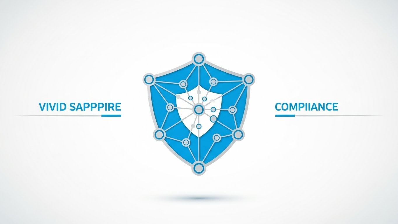
The Visual & Narrative Approach
Visualization Scenario: This style utilizes a "Clean Room" aesthetic, stripping away all unnecessary visual noise to focus entirely on structural integrity. The centerpiece is a shield icon, but it is not a solid block; it is constructed from interconnected geometric nodes. This subtly communicates that modern security is a distributed network, not a single wall. The palette of Vivid Sapphire Blue and Bright White creates a clinical, precise atmosphere.
Narration Style: The tone is calm, authoritative, and assured. It acts as the "Voice of Reason," positioning the platform as the foundational layer of truth that holds the entire organization together.
Psychological Impact & KPI Focus
Niche Psychology: Compliance officers often suffer from "Alert Fatigue" and fragmented systems. They crave simplicity. This style reduces Cognitive Load, allowing the viewer to process the core concept (Unified Security) without distraction. It subliminally promises that your software will bring order to their chaos.
Operational Impact: It bridges the gap between abstract "policy" and concrete "network protection," driving Brand Awareness by establishing a high-recall visual symbol of trust.
Strategic Implementation & Trade-offs
- Recommended Duration: 15-20 Seconds (LinkedIn Organic).
- Trade-off: Depth vs. Clarity. While excellent for brand awareness, this style is too abstract to explain complex API integrations. Use it to open the door, not to close the technical deal.
Companies using similar video content -
MetricStream – Enterprise GRC Solution – Unified risk and compliance architecture.
Archer – Integrated Risk Management – Foundational GRC platform.
2. The Chaos Organizer (Abstract Organic Vector)
TOFU | Market Education

The Visual & Narrative Approach
Visualization Scenario: This style visualizes the "Compliance Journey"—the transition from the chaos of unregulated data to the peace of an organized system. We see fluid, amorphous shapes in Mint Green and Pale Teal morphing seamlessly into a structured, organized grid. The motion is liquid-like, suggesting that implementing your software is a frictionless process. The glossy textures imply a premium, modern solution.
Narration Style: The narration should be empathetic, acknowledging the pain of disorder (unstructured data) before celebrating the relief of structure (compliance).
Psychological Impact & KPI Focus
Niche Psychology: It directly addresses the anxiety of "Unknown Unknowns" hiding in unstructured data. The visual metamorphosis from blob to block triggers a sense of relief and "Cognitive Closure."
Operational Impact: It visually narrates Market Education, specifically the concept of "Data Normalization"—taking messy inputs and standardizing them for audit readiness.
Strategic Implementation & Trade-offs
- Recommended Duration: 20-30 Seconds (Website Hero).
- Trade-off: Concept vs. Detail. It sells the feeling of being compliant (peace of mind) rather than the mechanics. It is an emotional hook.
Companies using similar video content -
LogicGate – Risk Cloud – Transforms disorganized compliance into agile processes.
Baserow – No-code GRC Database – Organizes and adapts GRC systems.
3. The Velocity Engine (Bold Kinetic Typography)
TOFU | Shaping Brand Perception

The Visual & Narrative Approach
Visualization Scenario: This is the visual language of speed. Large, chunky geometric blocks in Electric Blue and Warm Coral slam and slide into place, building words and phrases on screen. The motion blur effects convey high energy and rapid processing. This isn't a passive viewing experience; it is designed to make the viewer feel the velocity of your platform.
Narration Style: Punchy, rhythmic, and percussive. It uses short, staccato keywords that match the "snap-into-place" animation (e.g., "Connect. Verify. Secure.").
Psychological Impact & KPI Focus
Niche Psychology: In a market often perceived as slow and bureaucratic, this style signals "Agility." It appeals to the "Innovator" segment of your persona who wants to disrupt legacy processes and prove Operational Efficiency.
Operational Impact: The interlocking blocks serve as a perfect metaphor for Shaping Brand Perception regarding interoperability. It visually proves that your modules fit together instantly.
Strategic Implementation & Trade-offs
- Recommended Duration: 10-15 Seconds (Instagram Stories).
- Trade-off: Impact vs. Nuance. This style shouts; it doesn't converse. It is ineffective for nuanced regulatory explanations.
Companies using similar video content -
Sprinto – Compliance Automation Platform – Rapidly automates security and compliance.
VComply – Cloud-based GRC Platform – Streamlines and automates compliance processes.
4. The Visionary Horizon (Generative AI Cinematic Video)
TOFU | Vertical Social Organic

The Visual & Narrative Approach
Visualization Scenario: A breathtaking, photorealistic time-lapse of a modern glass skyscraper reflecting the sunrise and orderly city traffic. This isn't just a building; it's a monument to stability. The shift from dawn to bright daylight symbolizes the "shedding of light" on shadow IT. The focus on the reflection emphasizes Transparency.
Narration Style: Grand and visionary. It speaks to the C-Suite about "Global Responsibility," "Legacy," and "Resilience," elevating the conversation above software features.
Psychological Impact & KPI Focus
Niche Psychology: This appeals to the C-Suite's desire for Prestige. It positions compliance not as a chore, but as a pillar of corporate integrity. It signals that your software is "Enterprise-Grade."
Operational Impact: Used as a Skippable Pre-Roll Ad, the high production value creates immediate trust. It elevates the brand to the level of global consultancy firms.
Strategic Implementation & Trade-offs
- Recommended Duration: 15-30 Seconds (YouTube).
- Trade-off: Atmosphere vs. Specificity. It tells the viewer nothing about what the software actually does. It relies entirely on brand association.
Companies using similar video content -
IBM OpenPages – AI-driven GRC Platform – Provides comprehensive risk and compliance.
Predict360 (360factors) – Risk & Compliance Intelligence – Automates workflows and enhances reporting.
5. The Operational Blueprint (Isometric 2D Motion Design)
TOFU | Skippable Pre-Roll Ad
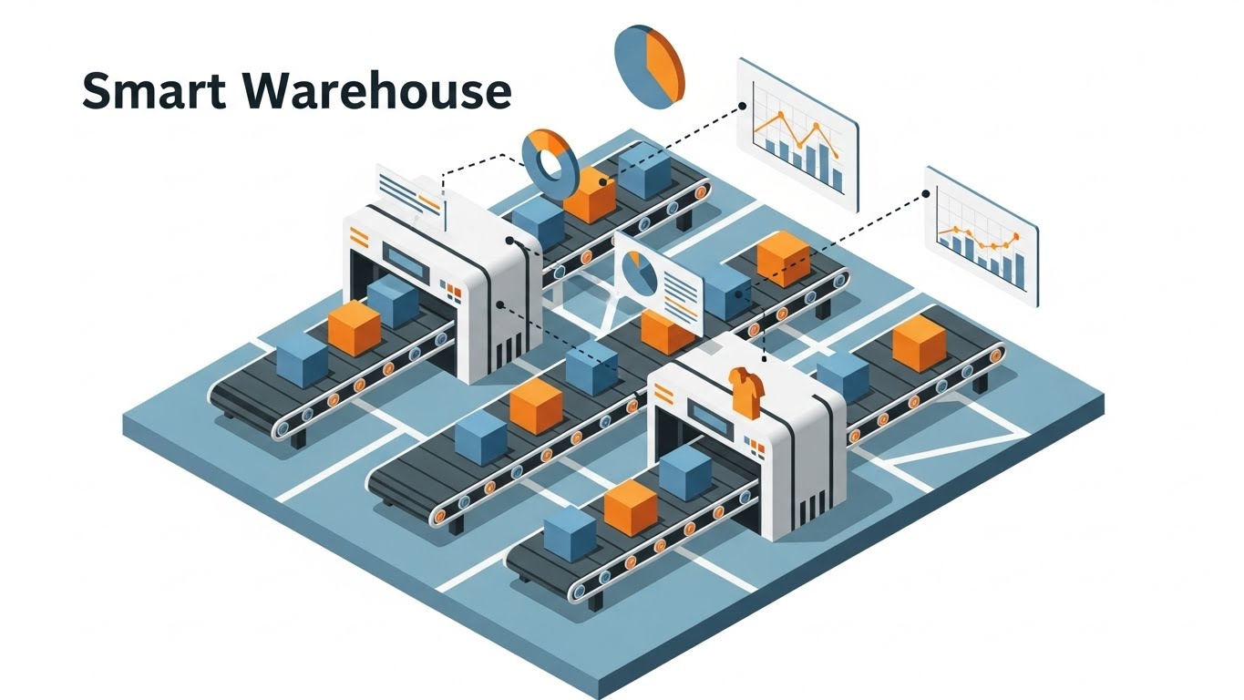
The Visual & Narrative Approach
Visualization Scenario: This style brings the "blueprint" to life. We see an isometric view of a digital office floor plan, where Deep Navy Blue and Gold lines visualize the invisible flows of data between departments. Glowing white data lines travel through specific zones, visualizing Automated Workflows. It simulates a "God's Eye View" of the operation.
Narration Style: Technical and precise. It explains how the software creates a "Digital Twin" of the operational environment to ensure comprehensive coverage.
Psychological Impact & KPI Focus
Niche Psychology: This satisfies the human desire for spatial understanding. By seeing the "whole" system at once, the viewer feels a sense of control. It removes the "black box" fear by showing exactly where the software sits.
Operational Impact: It drives Category Creation by positioning the software as the central nervous system of the enterprise.
Strategic Implementation & Trade-offs
- Recommended Duration: 60-90 Seconds (YouTube Explainer).
- Trade-off: Clarity vs. Clutter. Isometric animations can easily become overwhelming if too many details are added.
Companies using similar video content -
SAI360 – Integrated GRC System – Visualizes comprehensive risk and compliance.
GBTEC – BIC GRC – Tailored GRC for energy providers.
6. The Growth Trajectory (Dynamic Data Visualization)
TOFU | Category Creation

The Visual & Narrative Approach
Visualization Scenario: Abstract data becomes a hero character. We see sleek, rising bar charts and curves in Vibrant Lime Green cutting through a Silver-Grey background. The focus is not on specific numbers, but on the trajectory—the upward momentum of risk reduction and efficiency gains.
Narration Style: Result-oriented. It focuses on "ROI," "Optimization," and "Performance Metrics."
Psychological Impact & KPI Focus
Niche Psychology: This speaks the language of the CFO. It reframes compliance from a "cost center" to a "value driver." The vibrant green color triggers a subconscious association with "Profit" and "Success."
Operational Impact: It visualizes Demand Gen by promising measurable results. It suggests that your reporting tools are dynamic and interactive.
Strategic Implementation & Trade-offs
- Recommended Duration: 15-20 Seconds (LinkedIn Ads).
- Trade-off: Excitement vs. Accuracy. By stylizing the charts, you gain visual impact but lose analytical rigor. It’s a "teaser" for the data capability.
Companies using similar video content -
Workiva – Financial Reporting Platform – Streamlines financial reporting and compliance.
Centraleyes – Cyber Risk Platform – Real-time monitoring of risks and compliance.
7. The Frictionless Interface (Clean UI Workflow - Light Mode)
MOFU | Demand Gen & Lead Capture
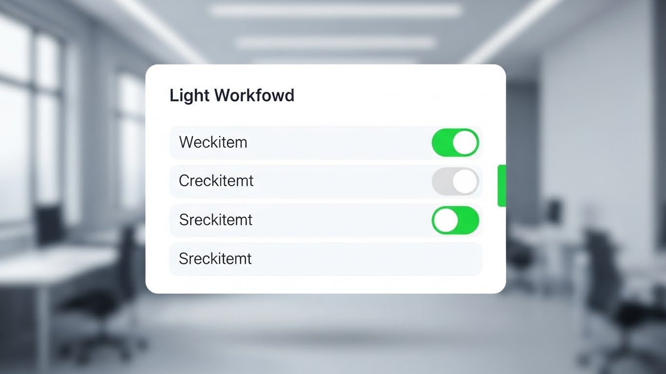
The Visual & Narrative Approach
Visualization Scenario: Radical honesty. This style puts the actual software interface front and center. We see a stylized, simplified version of the UI featuring a checklist. The animation focuses on the micro-interaction: a toggle switch flipping from soft grey to Vivid Green. The background is blurred to keep attention on the UI.
Narration Style: Helpful and instructional. It walks the user through a specific workflow (e.g., "Approve a Policy in 3 Clicks"), emphasizing Ease of Use.
Psychological Impact & KPI Focus
Niche Psychology: This targets the End User who fears "shelfware." It proves the platform is intuitive, reducing the anxiety of a steep learning curve.
Operational Impact: It highlights Feature Education. It shows that the "administrative burden" is low.
Strategic Implementation & Trade-offs
- Recommended Duration: 30-45 Seconds (Email Nurture).
- Trade-off: Realism vs. Longevity. Using a "stylized" UI extends the shelf life but requires more design work than a simple screen recording.
Companies using similar video content -
Drata – Compliance Automation Platform – Simplifies SOC 2 and ISO 27001 compliance.
Scytale – Compliance Automation Platform – All-in-one compliance hub.
8. The Reality Bridge (Wireframe to Reality Transition)
MOFU | Feature Education
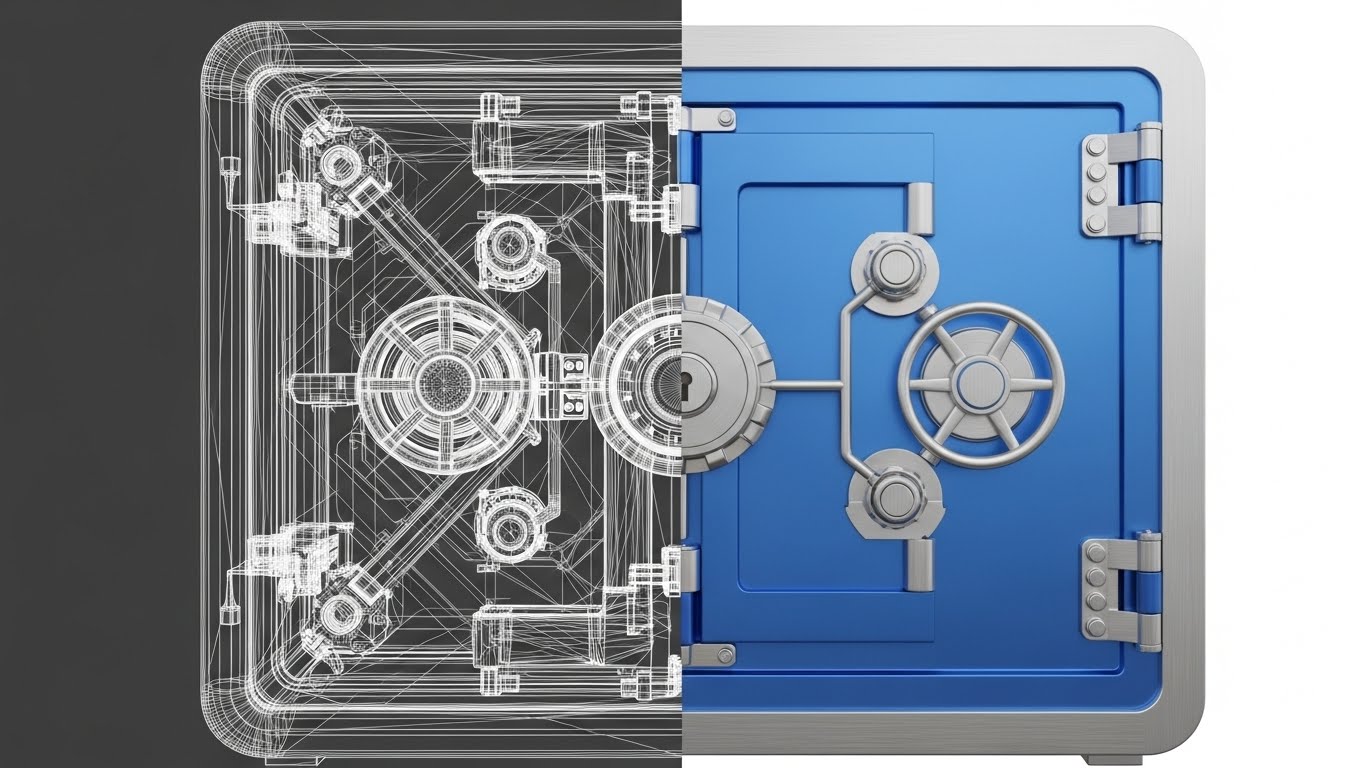
The Visual & Narrative Approach
Visualization Scenario: A powerful "Before and After" technique. The screen is split: the left half shows a complex wireframe blueprint of a digital vault. The right half shows the fully rendered, smooth 3D version of the same vault in Vivid Blue. The transition line sweeps across, turning lines into solid steel.
Narration Style: Comparative and confident. It focuses on "Implementation," "Deployment," and "Realizing Value."
Psychological Impact & KPI Focus
Niche Psychology: This alleviates the fear of Implementation Failure. It visually proves that your company has the engineering depth to turn theoretical requirements (wireframes) into robust security (reality).
Operational Impact: It serves as a visual metaphor for Competitive Displacement. "Your current solution is just a sketch; ours is the vault."
Strategic Implementation & Trade-offs
- Recommended Duration: 20-30 Seconds (LinkedIn Retargeting).
- Trade-off: Concept vs. Product. It’s a metaphorical style. It sells competence, not features.
Companies using similar video content -
Carbide – InfoSec & Privacy Management – Elevates security programs from concept to reality.
StandardFusion – GRC Platform – Transforms compliance requirements into robust systems.
9. The Infrastructure Twin (Isometric 3D Workflow)
MOFU | Competitive Displacement

The Visual & Narrative Approach
Visualization Scenario: We zoom into a miniaturized, "toy-like" but highly detailed 3D server room. Cyan and Light Grey server racks are adorned with small gold padlocks, visualizing the concept of Data Sovereignty and localized hosting. The lighting is soft ambient occlusion.
Narration Style: Detail-oriented. It discusses "hosting options," "on-premise vs. cloud," and "regional compliance."
Psychological Impact & KPI Focus
Niche Psychology: This appeals to the IT Security Lead. It treats their domain with respect. It visualizes "security" not as a scary firewall, but as a robust, valuable asset. The miniature effect makes complex infrastructure feel manageable.
Operational Impact: It differentiates your Product/Solution by focusing on the backend infrastructure, a key differentiator for enterprise clients.
Strategic Implementation & Trade-offs
- Recommended Duration: 45-60 Seconds (Website Product Page).
- Trade-off: Budget. High-quality 3D isometric rendering is resource-intensive.
Companies using similar video content -
Prisma Cloud (Palo Alto Networks) – Cloud Security Platform – Protects cloud-native applications.
Orca Security – Cloud Security Platform – Agentless scanning for cloud vulnerabilities.
11. The Digital Handshake (2D Line Art Animation)
MOFU | Driving Demo Requests

The Visual & Narrative Approach
Visualization Scenario: This style utilizes the elegance of a single, continuous line to visualize the concept of "Ease." A thin Black ink line traverses a textured White paper background, fluidly sketching two hands clasping in a handshake. Without lifting, the line morphs seamlessly into a digital document, sketches a signature, and transforms into a wax seal. The animation is unbroken, symbolizing a process devoid of red tape.
Narration Style: Sophisticated, warm, and inviting. It emphasizes "Seamless onboarding," "Partnership," and "The simplicity of saying yes."
Psychological Impact & KPI Focus
Niche Psychology: Compliance procurement is often associated with friction—long contracts and complex integration. This style utilizes Cognitive Fluency to counter that perception. It subliminally persuades the viewer that working with you is a smooth, connected experience.
Operational Impact: It drives Demo Requests by lowering the psychological barrier to entry. It frames the start of the engagement not as a "project," but as a simple handshake.
Strategic Implementation & Trade-offs
- Recommended Duration: 10-15 Seconds (Email Signature GIF / Outbound Outreach).
- Trade-off: Elegance vs. Information. It conveys a feeling of simplicity but conveys zero technical information about the contract or onboarding process.
Companies using similar video content -
OneTrust – Data Privacy & GRC – Manages consent and compliance automation.
Compliance Chain – Supply Chain Management – Verifies third-party certifications seamlessly.
12. The Asset Shield (Low-Poly 3D Modeling)
MOFU | ROI Justification

The Visual & Narrative Approach
Visualization Scenario: Security is often viewed as a "grudge purchase." This style reframes it as value retention. We see hundreds of low-poly gold coins stacking rapidly to construct a robust, geometric protective shield. The facets of the coins reflect light sharply against a clean, infinite white void. The visual metaphor is direct: your capital is the shield.
Narration Style: Rational and financial. The script speaks the language of the CFO, focusing on "Cost Avoidance," "Risk-Adjusted Returns," and "Protecting the Bottom Line."
Psychological Impact & KPI Focus
Niche Psychology: This speaks to the Economic Buyer who needs to justify the budget. By visualizing the shield as made of money, you trigger a subconscious association between compliance and profit preservation, combating the "cost center" stigma.
Operational Impact: It supports ROI Justification. It visually proves that the software pays for itself by preventing the loss of the assets it protects.
Strategic Implementation & Trade-offs
- Recommended Duration: 15-20 Seconds (Display Ads / Retargeting).
- Trade-off: Symbolism vs. Realism. It is a strong metaphor for value but abstract. It works best when paired with hard data overlays (e.g., "Prevent $2M in fines").
Companies using similar video content -
NAVEX Global – NAVEX One – Protects assets through integrated compliance.
UL Solutions – WERCSmart – Manages product and supply chain compliance.
13. The Velocity Grid (Rapid UI Feature Montage)
MOFU | The Functional Buyer
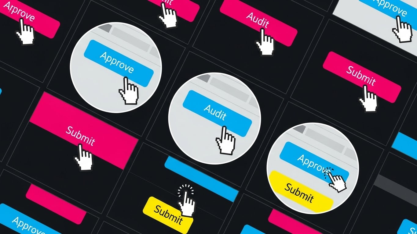
The Visual & Narrative Approach
Visualization Scenario: A high-energy visualization of throughput. The screen is composed of a grid of circular vignettes, each showing a zoomed-in cursor interacting with UI buttons: "Approve," "Audit," "Submit." The buttons flash in Bright Blue and Primary White on a Pale Grey background in a rhythmic, percussion-synced sequence. It simulates the feeling of clearing a massive queue in seconds.
Narration Style: Fast-paced and energetic. The voiceover emphasizes "Speed," "Batch Processing," and "Operational Velocity."
Psychological Impact & KPI Focus
Niche Psychology: The Functional Buyer (Compliance Manager) fears drudgery and repetitive strain. This style triggers a dopamine response associated with "Completion." It promises a future where the backlog is cleared effortlessly.
Operational Impact: It targets Feature Education regarding automation. It proves that the platform is engineered for enterprise-scale volume, not just small-team tasks.
Strategic Implementation & Trade-offs
- Recommended Duration: 10-15 Seconds (YouTube Pre-roll / Social Shorts).
- Trade-off: Pacing vs. Detail. The rapid cuts make it impossible to read fine print. It sells the sensation of speed, not the details of the workflow.
Companies using similar video content -
AuditBoard – Connected Risk Platform – Streamlines audit and compliance reporting.
Jatheon Cloud – Archiving & Compliance – Manages digital communication compliance.
14. The Transparent Core (3D X-Ray Visualization)
MOFU | Establishing Thought Leadership

The Visual & Narrative Approach
Visualization Scenario: To claim "depth," you must show it. A standard digital file folder, rendered in translucent, glass-like Blue material, rotates in a clean white space. An "X-Ray" effect reveals the internal structure: a glowing neon green circuit board or data core. This illustrates that a simple "document" in your system is actually a fortress of encryption and metadata.
Narration Style: Deeply technical and reassuring. It discusses "Granular Metadata," "Encryption at Rest," and "Forensic Audit Trails."
Psychological Impact & KPI Focus
Niche Psychology: This appeals to the Security Architect or CTO. They are skeptical of "surface-level" solutions. This visual validates that your software has "Deep Tech" credibility and handles data with structural rigor.
Operational Impact: It establishes Thought Leadership by visually distinguishing your platform from basic document repositories. It visualizes the "Invisible Tech" that justifies the license fee.
Strategic Implementation & Trade-offs
- Recommended Duration: 20-30 Seconds (LinkedIn Technical Feed).
- Trade-off: Abstract vs. Applied. It visualizes the concept of security, not the specific settings screen. It builds trust but doesn't teach configuration.
Companies using similar video content -
Lacework – Cloud Security Platform – Provides deep visibility into cloud compliance.
ADMiner – Active Directory Auditing – Offers thorough overview of vulnerabilities.
15. The Adoption Champion (2D Character-Driven Story)
MOFU | Overcoming Objections

The Visual & Narrative Approach
Visualization Scenario: Technology is nothing without user acceptance. This style features a polished 2D vector character—a professional woman in a teal blazer—holding a tablet. She smiles confidently as a large, satisfying Green Checkmark animates on the screen. The background features soft, abstract geometric shapes, creating a modern, stress-free office atmosphere.
Narration Style: Empathetic and story-driven. It focuses on "User Experience," "Empowerment," and "No-Training-Required Simplicity."
Psychological Impact & KPI Focus
Niche Psychology: One of the biggest objections is "Shelfware"—the fear that employees will find the tool too hard to use. This style utilizes Social Proof (simulated) to show that users are happy, competent, and successful.
Operational Impact: It is a key tool for Overcoming Objections related to change management. It promises that the "People" part of the "People, Process, Technology" triad is taken care of.
Strategic Implementation & Trade-offs
- Recommended Duration: 30-45 Seconds (Website Case Study Section).
- Trade-off: Relatability vs. Authority. Cartoon-style characters can feel "light." Ensure the styling remains professional to avoid looking like a consumer app.
Companies using similar video content -
Hyperproof – Compliance Automation Platform – Simplifies audit readiness for teams.
iAuditor (SafetyCulture) – Inspection Checklist App – Fosters team collaboration for safety.
16. The Cloud Anchor (2D Animation & UI Composition)
MOFU | ABM Awareness

The Visual & Narrative Approach
Visualization Scenario: A literal representation of "staying on top of things." A stylized character in professional attire stands perfectly balanced on a floating, isometric UI panel. This panel hovers securely above an abstract cloud platform against a Sky Blue background. The character commands the view, symbolizing stability and control amidst the shifting cloud environment.
Narration Style: Steady and assuring. It speaks to "Cloud Governance," "Stability," and "Remote Oversight."
Psychological Impact & KPI Focus
Niche Psychology: Compliance managers often feel like they are balancing on shaky ground, especially with cloud migration. This visual satisfies the desire for Stability. It restores the locus of control to the user.
Operational Impact: Highly effective for ABM Awareness campaigns targeting Cloud Architects and IT Directors, visually confirming that your platform provides a solid foundation.
Strategic Implementation & Trade-offs
- Recommended Duration: 15-20 Seconds (Targeted Display Ads).
- Trade-off: Metaphor vs. Mechanics. It establishes a feeling of control but doesn't show the specific dashboard widgets used to achieve it.
Companies using similar video content -
Wiz – CNAPP – Provides comprehensive multi-cloud compliance.
Microsoft Purview – Compliance Manager – Manages compliance across Microsoft 365/Azure.
17. The Clarity Monument (Photorealistic 3D Renders)
BOFU | Sales Cycle Acceleration
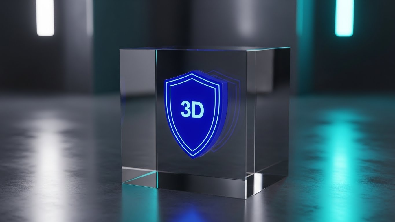
The Visual & Narrative Approach
Visualization Scenario: The "Trophy Shot." A flawlessly rendered crystal glass cube sits on a reflective surface. Suspended inside the glass is a 3D laser-etched shield emblem glowing with a deep Royal Blue light. Caustic reflections and studio lighting make the object look expensive, heavy, and permanent—like a high-end deal toy or award.
Narration Style: Premium and minimalist. It uses words like "The Gold Standard," "Immutable," "Crystal Clear," and "Permanent."
Psychological Impact & KPI Focus
Niche Psychology: At the bottom of the funnel, the buyer wants to make a Premium Choice. This aesthetic triggers the "Luxury Effect." It signals that this software is an asset of enduring value, differentiating it from "cheap" utility tools.
Operational Impact: It aids Sales Cycle Acceleration by adding a layer of perceived prestige. It visually justifies a premium price point.
Strategic Implementation & Trade-offs
- Recommended Duration: 10-15 Seconds (Website Header / Pricing Page).
- Trade-off: Aesthetics vs. Utility. It conveys zero functional information. It is purely a branding signal of quality and trust.
Companies using similar video content -
Thomson Reuters Regulatory Intelligence – Real-time Regulatory Updates – Provides clear global financial regulations.
GlobalSuite – GRC Platform – Offers integrated risk and compliance.
18. The Cultural Bridge (Aspirational Stock Montage)
BOFU | Building Trust & Credibility

The Visual & Narrative Approach
Visualization Scenario: The "Human Proof." A high-quality montage shows a diverse group of professionals gathered around a conference table in a sunlit, modern office. They are looking at a screen (off-camera) with natural expressions of relief and agreement. The warm lighting contrasts with the "cold" blue of earlier tech visuals, emphasizing humanity.
Narration Style: Warm and inclusive. It talks about "Culture of Compliance," "Team Alignment," and "Breaking Down Silos."
Psychological Impact & KPI Focus
Niche Psychology: The C-Suite worries about "cultural rejection." This visual provides Social Proof of a successful deployment—a team that is united, not divided, by the compliance tool.
Operational Impact: It builds Trust & Credibility with the Economic Buyer (CEO/COO) who prioritizes organizational health. It visualizes the "after" state of a stress-free workplace.
Strategic Implementation & Trade-offs
- Recommended Duration: 30-60 Seconds ("About Us" / Culture Page).
- Trade-off: Authenticity vs. Genericness. Stock footage can easily look like a cliché. It must be carefully color-graded to match your brand palette.
Companies using similar video content -
Resolver – Security, Risk & Compliance – Fosters collaboration for incident management.
SYNERGi GRC Platform – GRC Platform – Tracks cyber risks and compliance.
19. The Safety Matrix (Abstract 3D AI Visualization)
BOFU | Risk Mitigation

The Visual & Narrative Approach
Visualization Scenario: Visualizing the "Safety Net." An abstract 3D network of glowing Turquoise nodes connects via beams of light to form a curved, protective net structure against a Pure White background. The camera tracks along the net, showing tight connections and zero gaps. Particle effects float gently, suggesting an active, living ecosystem.
Narration Style: Reassuring and absolute. It emphasizes "Comprehensive Coverage," "No Gaps," and "Zero-Trust Architecture."
Psychological Impact & KPI Focus
Niche Psychology: The Risk Manager's nightmare is the "Unknown Unknown." This style visualizes Risk Mitigation as a continuous, gap-free fabric. It provides Cognitive Closure, assuring the viewer that the system is watching everything, everywhere.
Operational Impact: It reinforces the concept of a "Unified Platform," visually proving that all data points are connected and protected.
Strategic Implementation & Trade-offs
- Recommended Duration: 15-20 Seconds (Feature Background Loop).
- Trade-off: Abstract vs. Concrete. It is a mood setter. It validates the presence of safety but doesn't explain the method of detection.
Companies using similar video content -
AssurePlus – AI-powered GRC – Controls security, environmental, and operational risks.
GRC Toolbox – GRC Platform – Ensures comprehensive control management.
20. The Visionary Horizon (Lifestyle Stock with UI Overlay)
BOFU | The Economic Buyer

The Visual & Narrative Approach
Visualization Scenario: The ultimate executive view. A CEO stands in a high-rise office at sunset, looking out at the city skyline. Floating in the air before them is a sleek, semi-transparent holographic UI displaying a "Risk Heat Map" with stable, green metrics. The blend of Warm Sunset tones (success) and Cool Blue data (control) creates a powerful "Visionary" aesthetic.
Narration Style: Strategic and commanding. It speaks to "Foresight," "Global Visibility," and "Steering the Ship."
Psychological Impact & KPI Focus
Niche Psychology: This targets the Economic Buyer (CEO/Board). They don't want to see audit logs; they want to see the "Big Picture." This visualizes Strategic Oversight—compliance not as a chore, but as a lens for strategic decision-making.
Operational Impact: It supports the final sale by aligning the software with the executive's self-image as a forward-looking leader with total visibility.
Strategic Implementation & Trade-offs
- Recommended Duration: 20-30 Seconds (LinkedIn Retargeting for C-Suite).
- Trade-off: Aspiration vs. Reality. It is a "Future State" visualization. Ensure the actual product dashboard can deliver the high-level insights promised by the hologram.
Companies using similar video content -
Google Security Command Center – Centralized Security & Compliance – Provides strategic oversight for GCP.
DECISION FOCUS – GRC Platform – Supports strategic decision-making.
21. The Developer’s Canvas (Dark Mode UI Showcase)
BOFU | The Technical Buyer
The Visual & Narrative Approach
Visualization Scenario: This style utilizes a specific aesthetic to appeal directly to the "builders" and "architects." The visual is a sleek, angled close-up of a code editor interface against a deep matte black background (Dark Mode). Syntax highlighting illuminates the code in electric Neon Green and Bright Blue, focusing specifically on a block labeled "Encryption Protocol: Active." It creates a high-contrast, "cyber-noir" atmosphere that feels native to a Security Operations Center (SOC).
Narration Style: Taciturn, technical, and precise. It speaks directly to the engineer, using terms like "API endpoints," "SDK availability," and "Hardened architecture."
Psychological Impact & KPI Focus
Niche Psychology: The Technical Buyer (CTO/DevOps Lead) often views marketing-heavy compliance tools as "bloatware." This style disarms that skepticism by speaking their visual language. It signals that the platform is developer-friendly, code-centric, and robust under the hood.
Operational Impact: It supports the Technical Vetting phase. By showcasing clean code and dark mode (a developer preference), it subliminally suggests the software is built by engineers, for engineers.
Strategic Implementation & Trade-offs
- Recommended Duration: 45-60 Seconds (Documentation Portal / GitHub Readme).
- Trade-off: Niche Appeal vs. Broad Understanding. Business stakeholders may find this intimidating or unintelligible. Keep it strictly for technical channels.
Companies using similar video content -
Sonatype – Open Source Compliance – Manages license and SBOM compliance.
Lynis – Security Auditing Tool – Hardens systems and tests compliance.
22. The Boardroom Lock (Holographic UI over 3D Render)
BOFU | Objection Handling

The Visual & Narrative Approach
Visualization Scenario: This style bridges the gap between traditional business and modern security. We see a photorealistic 3D render of a rich, mahogany boardroom table—symbolizing the "Old Guard" and traditional governance. Floating directly above it is a futuristic, translucent Blue holographic padlock. The lock snaps shut with a digital "thud," emitting a soft glow that illuminates the wood grain.
Narration Style: Gravitas-filled and assuring. It addresses the Board of Directors, translating "Cybersecurity" into "Corporate Governance" and "Asset Protection."
Psychological Impact & KPI Focus
Niche Psychology: Board members often view security as abstract. This visual anchors the concept of "Digital Safety" into their physical reality (the boardroom). It creates a subconscious link that the software protects the company itself, not just the servers.
Operational Impact: A powerful tool for Objection Handling regarding budget. It elevates the purchase decision from an "IT expense" to a "Board-level necessity."
Strategic Implementation & Trade-offs
- Recommended Duration: 15-20 Seconds (Sales Deck Opening Slide).
- Trade-off: Symbolism vs. Features. It is purely metaphorical. It builds confidence but explains nothing about how the lock actually works.
Companies using similar video content -
Smart Global Governance – GRC Platform – Secures corporate governance.
Essential ERM – GRC Platform – Manages enterprise risk effectively.
23. The Constant Grid (Hyper-lapse Stock Footage with Data)
Onboarding | Reducing Implementation Friction

The Visual & Narrative Approach
Visualization Scenario: A visual representation of "Order amidst Chaos." The background is a hyper-lapse video of a busy open-plan office, where people are blurred streaks of motion, emphasizing speed and activity. Superimposed over this is a sharp, static, bright white digital grid that remains perfectly stable. Nodes on the grid pulse slowly, tracking the activity without being disturbed by it.
Narration Style: Calm and stabilizing. The voiceover emphasizes that while the business moves fast, the compliance framework remains a "Steady constant."
Psychological Impact & KPI Focus
Niche Psychology: Implementation teams fear disruption. They worry that installing new software will slow down operations. This visual proves the opposite: the software is an unobtrusive layer of stability that allows the hustle to continue.
Operational Impact: It targets Reducing Implementation Friction by visualizing the software as a background utility, not a roadblock.
Strategic Implementation & Trade-offs
- Recommended Duration: 20-30 Seconds (Kick-off Meeting Video).
- Trade-off: Atmosphere vs. UI Training. It sets the mood for the project but doesn't teach users how to log in.
Companies using similar video content -
Resilinc – Supply Chain Compliance – Provides constant oversight amidst activity.
Open-Audit – Network Inventory & Audit – Monitors network changes constantly.
24. The Passive Audit (Split Screen: Optimized Reality and UI)
Onboarding | Self-Serve Onboarding
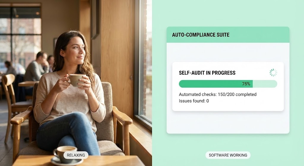
The Visual & Narrative Approach
Visualization Scenario: The "Set it and Forget it" promise visualized. The screen is split vertically. On the left, a high-quality lifestyle shot shows a professional relaxing with a coffee in a sunlit café. On the right, a clean, Mint Green and White software interface runs a "Self-Audit" progress bar, rapidly ticking through checklist items: "Automated checks: 150/200 completed."
Narration Style: Relaxed and inviting. "You focus on the coffee; we'll handle the compliance. Automated self-audits mean you get your time back."
Psychological Impact & KPI Focus
Niche Psychology: The end-user views compliance as a "Time Thief." This style validates their desire for work-life balance. It frames the software not as a tool they must work on, but as a tool that works for them.
Operational Impact: It drives Self-Serve Onboarding by showing that the initial setup is automated and requires minimal active input.
Strategic Implementation & Trade-offs
- Recommended Duration: 15-20 Seconds (Welcome Email Sequence).
- Trade-off: Simplicity vs. Nuance. It implies total automation, which may need to be managed if manual inputs are actually required later.
Companies using similar video content -
OpenGRC – Open Source Cyber GRC – Automates self-audits for small businesses.
GovReady-Q – Open Source GRC – Enables self-service compliance assessments.
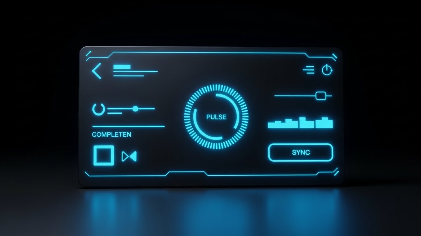
25. The Depth of Process (3D Parallax UI Presentation)
Onboarding | Accelerating Time-to-Value

The Visual & Narrative Approach
Visualization Scenario: Making the workflow feel tangible. UI screens ("Upload," "Report," "Sync") hover in mid-air, arranged in a deep 3D space. The camera glides through them like a drone. As we pass the front screen (in sharp focus), the rear screens (slightly blurred) come into view. The palette is clean White and Soft Blue with subtle drop shadows to emphasize depth.
Narration Style: Instructional yet cinematic. It explains the "Sequence of Success," guiding the user through the mental model of the platform.
Psychological Impact & KPI Focus
Niche Psychology: Users can get lost in flat menus. This spatial arrangement helps them build a Mental Map of the software. It makes the relationship between "Input" and "Output" physically obvious.
Operational Impact: It aids in Accelerating Time-to-Value by intuitively teaching the workflow hierarchy before the user even clicks a button.
Strategic Implementation & Trade-offs
- Recommended Duration: 30-45 Seconds (LMS / Training Module Intro).
- Trade-off: Style vs. Readability. The parallax angle makes text harder to read. Use it for concept overview, not detailed reading.
Companies using similar video content -
LogicManager – Enterprise Risk Management – Visualizes risk and compliance workflows.
SimpleRisk – Open Source Risk Management – Provides intuitive risk management workflows.
26. The Resolution Loop (Futuristic Neon/Dark Mode)
Retention | Reducing Support Overhead

The Visual & Narrative Approach
Visualization Scenario: The transformation of confusion into clarity. In a dark tech void, a glowing Neon Cyan question mark rotates. As laser-like grid lines scan across it, the question mark morphs seamlessly into a bold Checkmark. The animation is smooth and liquid, symbolizing the fluidity of finding answers in your knowledge base.
Narration Style: Helpful and prompt. "Stuck? Our AI-driven support turns questions into answers instantly."
Psychological Impact & KPI Focus
Niche Psychology: Nothing causes churn like frustration. This visual reassures the user that "Help" is not a ticket queue, but an instant transformation. It visualizes the Resolution Velocity.
Operational Impact: Placed in the Knowledge Base, it targets Reducing Support Overhead by encouraging users to trust the automated help tools rather than calling support.
Strategic Implementation & Trade-offs
- Recommended Duration: 6-10 Seconds (Looping GIF in Chatbot Header).
- Trade-off: Abstract vs. Concrete. It reassures the user emotionally but doesn't show how to contact support.
Companies using similar video content -
CISO Assistant – Security Officer Tool – Provides quick answers for security officers.
Zazoon – Compliance Automation – Streamlines reporting and issue resolution.
27. The Update Flow (Abstract 2D Motion Graphics)
Retention | Reducing Churn

The Visual & Narrative Approach
Visualization Scenario: Software updates are often painful (downtime, broken features). This style visualizes them as a gentle evolution. Soft, pastel gradients of Blue and Purple flow like liquid lava lamps on a cream background. The shapes merge and separate effortlessly, symbolizing the continuous, non-disruptive integration of new features.
Narration Style: Soft and appreciative. "Always evolving, never interrupting. Experience the seamless flow of continuous compliance."
Psychological Impact & KPI Focus
Niche Psychology: It addresses the "Update Anxiety" common in enterprise software. It frames the platform as a Living Organism that improves naturally, rather than a machine that needs repair.
Operational Impact: A key tool for Reducing Churn during renewal discussions. It visually justifies the subscription model by showing value as a constant flow rather than a static purchase.
Strategic Implementation & Trade-offs
- Recommended Duration: 15-20 Seconds (Product Update Email Header).
- Trade-off: Vibe vs. Content. It creates a pleasant feeling but communicates zero information about the actual features being updated.
Companies using similar video content -
Lawrbit – Regulatory Change Management – Provides real-time regulatory updates.
CUBE RegPlatform – Regulatory Change Management – Monitors regulatory changes continuously.
28. The Tactile Trigger (Macro UI Micro-Interactions)
Expansion | Driving Deep Feature Adoption

The Visual & Narrative Approach
Visualization Scenario: The fetishization of the click. We see an extreme macro close-up of a single UI element: a Vivid Green button with a stylized "Audit" icon. We can see the subtle texture of the pixels and the soft bloom of light. As the button is "pressed," it depresses slightly and glows brighter. It makes the digital action feel physical and satisfying.
Narration Style: Enthusiastic and specific. "One click. Total visibility. Experience the power of the new Audit Engine."
Psychological Impact & KPI Focus
Niche Psychology: Users ignore features they don't "feel." By zooming in, you create a sense of Importance and Desire. It triggers a tactile curiosity—the user wants to click that button.
Operational Impact: It drives Deep Feature Adoption for specific, underutilized modules. It acts as a visual "spotlight" on a new capability.
Strategic Implementation & Trade-offs
- Recommended Duration: 10-15 Seconds (In-App Tooltip Video).
- Trade-off: Context vs. Focus. The extreme close-up removes all context. The user sees the button but not where it lives on the dashboard.
Companies using similar video content -
Thoropass – Compliance Automation Platform – Streamlines compliance and audit processes.
29. The Augmented Consultant (Generative AI Realistic Character)
Expansion | Driving Upsell/Cross-sell

The Visual & Narrative Approach
Visualization Scenario: The future of professional services. A hyper-realistic AI-generated character—a consultant in a sharp grey suit—stands in a blurred modern office. She gestures, and a semi-transparent, holographic graph (Premium Analytics) materializes in the air beside her. The lighting interacts realistically with the hologram, selling the idea that this premium feature is a "real" asset.
Narration Style: Consultative and premium. "Unlock the next tier of insight. Our Premium Analytics module gives you the foresight of a dedicated analyst team."
Psychological Impact & KPI Focus
Niche Psychology: Upselling requires perceived value. This style associates the "Premium Feature" with "Human Intelligence." It frames the upsell not as buying more code, but as hiring a Virtual Expert.
Operational Impact: It drives Upsell/Cross-sell by visualizing the higher-tier plan as a sophisticated, executive-level upgrade.
Strategic Implementation & Trade-offs
- Recommended Duration: 20-30 Seconds (Upsell Landing Page).
- Trade-off: Uncanny Valley. Generative AI characters must be high quality. If they look robotic, it damages the "human connection" trust.
Companies using similar video content -
ComplyAdvantage – AML/KYC Platform – AI-powered financial crime prevention.
30. The Advocacy Spark (2D Graphics Over Live Action)
Expansion | Driving Referrals & Advocacy

The Visual & Narrative Approach
Visualization Scenario: Celebrating the human connection. A high-quality photo shows two diverse colleagues sharing a genuine, high-energy high-five. Superimposed over their hands are stylized, animated 2D "sparks" and "stars" in Gold and White. The animation emphasizes the moment of connection, visualizing the "spark" of a successful referral or partnership.
Narration Style: Celebratory and communal. "Compliance is better together. Refer a partner and spark a new standard of governance."
Psychological Impact & KPI Focus
Niche Psychology: Advocacy is emotional, not logical. This style captures the Joy of Success. It moves the brand from "Corporate Software" to "Team Success Partner."
Operational Impact: It supports Referral Programs. It visually rewards the act of sharing, making the user feel like a hero for introducing the platform to others.
Strategic Implementation & Trade-offs
- Recommended Duration: 10-15 Seconds (Social Media / Referral Email).
- Trade-off: Fun vs. Professionalism. It is lighthearted. Ensure it doesn't veer into being too casual for a compliance audience.
Strategic Knowledge Base: The Visual Operations Doctrine
To transform these 30 visual styles from "marketing assets" into a cohesive "Visual Operating System" for compliance, we must look beyond the aesthetics. The following three segments provide the strategic framework for deploying these visuals to drive tangible business outcomes: reducing risk, accelerating adoption, and proving ROI.
Strategic Alignment & Visual Architecture
The "Pre-Production" Strategy – Designing for Clarity and Governance.
- The Cognitive Load Audit: Before creating a single video, audit your current training materials (PDFs, slide decks). Identify high-friction points where "Wall of Text" fatigue occurs. Map the "Trust Anchor" (Style 1) and "Chaos Organizer" (Style 2) specifically to these high-load areas to dismantle complexity.
- Role-Based Visual Mapping: Do not show the same visuals to a CCO and a Data Entry Clerk. Use "Visionary Horizon" (Style 4) styles for the C-Suite to sell strategy, and "Frictionless Interface" (Style 7) for end-users to sell ease-of-use. Visual relevance dictates engagement.
- The "Glanceability" Standard: In high-stakes compliance environments, information must be understood instantly. Adopt a "Glanceability" standard for all visuals—if the core risk or status cannot be understood in 3 seconds (Style 12), the visual is too complex.
- Brand Voice Consistency: Your visual language must be as consistent as your legal language. Establish a "Visual Style Guide" that dictates how "Risk," "Safety," and "Compliance" are represented across all 30 styles. This ensures that a "Shield" icon means the same thing in a Sales Deck as it does in a Training Video.
- The Advids Strategic Audit: Partnering with an expert team like Advids allows for a comprehensive audit of your visual touchpoints. We help define this "Visual Operating System" before production begins, ensuring every asset aligns with your broader governance goals.
- Standardization vs. Customization: For core regulatory concepts (e.g., GDPR, HIPAA), use standardized, polished metaphors (Style 14). For unique proprietary workflows, invest in bespoke UI visualizations (Style 5) to claim differentiation.
- The Cross-Departmental Bridge: Use these visuals to unify terminology. If Sales calls it "The Vault" and Ops calls it "The Archive," confusion ensues. A shared visual style (Style 9) creates a shared internal language.
- Legacy System Integration: Visualizing the invisible link between legacy on-premise hardware and modern SaaS is critical. Use "Reality Bridge" styles (Style 8) to visually demonstrate that the new software wraps around and protects the old infrastructure, rather than demanding its removal.
- Accessibility by Design: Compliance is global. Ensure your Motion Graphics (Style 3) and Typography are designed for accessibility (WCAG standards) and can be easily localized for multi-lingual workforces without re-animating the core assets.
- The Mobile-First Mandate: Your "Operational Blueprint" (Style 5) looks great on a desktop, but your remote auditors are on tablets. Ensure all styles—especially "Adoption Champion" (Style 15)—are optimized for mobile consumption to support the field workforce.
Operational Adoption & Implementation
The "Deployment" Phase – Embedding Visuals into the Workflow.
- Overcoming "Big Brother" Anxiety: Automated compliance often feels like surveillance. Use empathy-driven visuals (Style 18) and "Privacy-First" aesthetics (Style 12) to frame the software as a "Safety Net" for the employee, not a "Spy Camera" for the boss.
- The Micro-Learning Shift: Replace the 40-page user manual with a library of 30-second "Frictionless Interface" (Style 7) clips. Link these directly within the software tooltip (Contextual Help) to provide "Just-in-Time" learning, reducing the cognitive gap between "not knowing" and "doing."
- Just-in-Time Support: Embed "Solution Morph" (Style 26) videos into your chatbot or helpdesk. When a user types "reset password," they should see a 10-second visual loop, not read a paragraph. This drastically reduces Time-to-Resolution.
- Gamification of Training: Compliance training is notoriously boring. Use "Velocity Engine" (Style 3) and "Growth Trajectory" (Style 6) aesthetics to visualize training progress as a scorecard or achievement. Visualizing progress motivates completion.
- Reducing Support Ticket Volume: There is a direct correlation between proactive visual guides and reduced call center load. By deploying "Precision Zoom" (Style 28) videos for complex features, you preemptively solve the "How do I click this?" tickets.
- Remote Onboarding: For distributed teams, the "Digital Handshake" (Style 11) and "Virtual Consultant" (Style 29) provide a human touch without a physical seminar. This allows you to scale onboarding globally while maintaining a consistent "Welcome" experience.
- Visualizing SOPs: Transform text-based Standard Operating Procedures (SOPs) into "Operational Blueprint" (Style 5) animations. A visual flow of data is far harder to misinterpret than a written list of instructions, reducing operational error rates.
- Feedback Loops: Use interactive video elements (Style 24) to gather feedback. If a user drops off during a "Learning Path" (Style 25) video, you know exactly which step of the process is confusing them.
- Scalable Localization: When expanding to new regions, swap out the text layers in your "Velocity Engine" (Style 3) videos while keeping the animation intact. This allows for rapid, cost-effective localization of your entire compliance curriculum.
- Leadership Communication: When the CCO reports to the Board, they should not use spreadsheets. Equip them with "Visionary Horizon" (Style 20) and "Safety Matrix" (Style 19) visuals to communicate the state of compliance with executive-level clarity and impact.
Measuring Impact & Future-Proofing
The "ROI" Phase – Measuring Success and Looking Ahead.
- Beyond "Views": Do not measure video success by "Views." Measure it by Time-to-Competency. Did the "Frictionless Interface" video (Style 7) reduce the time it takes a new user to file their first report? That is the metric that proves ROI.
- The "Idle Time" Metric: Correlate better visualization with reduced software navigation time. If users are completing tasks faster after watching the "Velocity Grid" (Style 13), you have quantifiable proof of efficiency gains.
- Compliance Velocity: Measure how fast new regulations are understood. When a new law drops, release a "Chaos Organizer" (Style 2) video explaining it. Measure the time gap between video release and organizational compliance.
- Retention and Churn: High-quality UX visualization (Style 27) reduces churn. Clients who understand the "Liquid Updates" of your platform feel that they are on a cutting-edge journey, increasing Lifetime Value (LTV).
- The AI Visual Frontier: Prepare for the future where "Virtual Consultant" (Style 29) avatars are generated in real-time, pulling live data from your platform to give personalized compliance briefings to every user.
- Scalability of Assets: Build a visual library, not just a video. If you create a "Trust Anchor" (Style 1) 3D asset, ensure it is high-resolution enough to be used in print, web, and video. This "Create Once, Publish Everywhere" approach maximizes asset ROI.
- The Advids Partnership: As your platform evolves, so must your visuals. Advids serves as your long-term partner, managing your source files and asset library to ensure that when you launch Version 2.0, your entire video library can be updated to match the new UI without starting from scratch.
- Benchmarking Success: "Good enough" visuals are a competitive risk. If your competitor uses "Cinematic AI" (Style 4) and you use screen recordings, you lose the "Trust" battle before the demo even starts. Regularly benchmark your visual standard against the top 1% of SaaS players.
- The ROI of Safety: Quantify the "Cost of Non-Compliance" avoided. Use the "Asset Shield" (Style 12) metaphor in your annual reports to visually demonstrate the millions of dollars in potential fines your software has actively deflected.
- Final Call to Innovation: Treat video as Infrastructure, not content. In a world of complex regulations and remote workforces, your visual language is the fiber-optic cable that connects policy to practice. Invest in it, refine it, and use it to build the Gold Standard of modern governance.
Companies using similar video content -
HITGuard – GRC Platform – Supports healthcare compliance.
Author & Editor Bio


