
Introduction: Bridging the Physical/Digital Divide
For the modern Chief Compliance Officer (CCO), the operational landscape has shifted from static maintenance to dynamic strategy. We are navigating an era of unprecedented regulatory velocity, where the gap between a new mandate and organizational adherence can mean the difference between market leadership and reputational risk. The challenge is no longer just managing data; it is seeing it.
The core challenge facing modern enterprises is the "Physical/Digital Divide." Compliance risks—whether data breaches or financial penalties—are visceral and costly, yet the systems designed to manage them are often perceived as abstract, invisible administrative burdens. Strategic visualization acts as the critical bridge, translating invisible digital processes into visible, actionable business assets.
The stakes have never been higher. Recent industry data reveals that global non-compliance fines reached approximately USD 14 billion in 2024, underscoring the vital need for robust, easily understood compliance frameworks. However, the market is responding with innovation. The global RegTech market size is projected to reach USD 70.64 billion by 2030, signaling a massive shift toward technology-driven governance.
This guide is designed to equip your team with a diverse visual vocabulary. We have curated 30 distinct motion design styles, each selected to solve a specific communication challenge within the compliance funnel—from building initial brand awareness to detailing complex UI micro-interactions.
Let’s explore how to visualize the future of compliance.
1. The Brand Shaper
TOFU | Brand Awareness
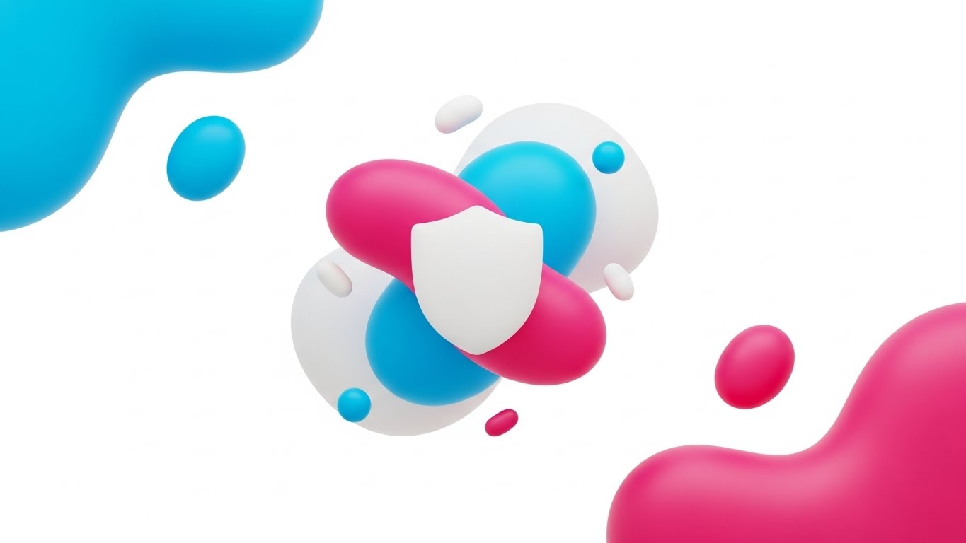
The Visual & Narrative Approach
This style leverages Abstract 2D flat vector graphics to create a sense of effortless protection. The visualization features glossy, fluid organic shapes in Vivid Cyan, Magenta, and Pure White, floating in a digital void. These disparate elements—representing fragmented data streams—drift toward the center, coalescing seamlessly to form a stylized, smooth shield emblem. The narrative tone is calm and ultra-modern, using soft, plastic-like textures to convey a friction-free experience.
Psychological Impact & KPI Focus
Psychologically, the use of fluid, organic shapes counters the rigid, intimidating perception often associated with compliance. It reduces Cognitive Load by simplifying the concept of "protection" into a single, cohesive motion. For Brand Awareness, this aesthetic signals that the platform is adaptable and user-friendly, directly addressing the anxiety of complex integration.
Strategic Implementation & Trade-offs
- Best Use Case: Website Headers and Brand Introduction videos where the goal is emotional connection.
- Duration: 6-10 seconds.
- Trade-off: While excellent for setting a mood, this abstract style lacks the detail required for granular technical education.
Companies using similar video content -
OneTrust – Privacy & Trust Platform – Abstract visualization of data privacy.
Vanta – Automated Security & Compliance – Fluid shapes simplifying compliance automation.
Drata – Automated Compliance Platform – Modern, abstract visuals for effortless compliance.
Secureframe – Automated Compliance – Clean, abstract designs for security posture.
2. The Clarity Engine
TOFU | Market Education
The Visual & Narrative Approach
This style utilizes a sophisticated 2D Line Art aesthetic to articulate the transformation of chaos into order. A single, continuous Navy Blue line flows across a Stark White background, first outlining a chaotic, messy document. Seamlessly, this line morphs into a perfect, symmetrical checkmark, accented by Electric Lime Green highlights. The narration is precise and direct.
Psychological Impact & KPI Focus
The continuous line serves as a powerful visual metaphor for an unbroken Audit Trail. It appeals to the Compliance Officer's desire for linearity and predictability. By witnessing the direct metamorphosis from "mess" to "verified," the viewer experiences a cognitive release—a feeling of "problem solved." This drives Market Education by visually proving that the software simplifies processes.
Strategic Implementation & Trade-offs
- Best Use Case: YouTube explainer intros focusing on workflow simplification.
- Duration: 15-30 seconds.
- Trade-off: The extreme minimalism is effective for clarity but lacks emotional depth for high-stakes storytelling.
Companies using similar video content -
LogicGate – Risk Cloud – Linear flow for GRC workflow automation.
ProcessUnity – Third-Party Risk Management – Continuous lines for streamlined risk processes.
Workiva – Connected Reporting & Compliance – Clear lines for data flow and reporting.
GRC-Maestro – GRC Software – Simple line art for process clarity.
3. The Tech Visionary
TOFU | Shaping Brand Perception

The Visual & Narrative Approach
Capturing the essence of a "Compliance Brain," this style presents a futuristic cerebral structure. Glowing network nodes in Deep Violet and Neon Blue connect via luminous filaments against a Bright White Digital Ether. The camera focuses on the intricate connections with a shallow depth of field, emphasizing the complexity and sophistication of the system.
Psychological Impact & KPI Focus
This style leverages the "High-Tech" heuristic, signaling superior intelligence. It addresses the anxiety about outdated legacy systems by representing a living, breathing AI Network. For Brand Perception, it validates the premium nature of the software, visually answering the question, "Is this powerful enough?" with a resounding "Yes."
Strategic Implementation & Trade-offs
- Best Use Case: LinkedIn thought leadership posts and "Vision" pages.
- Duration: 10-20 seconds.
- Trade-off: Creates a premium perception but can appear as "vaporware" if not paired with concrete product demos.
Companies using similar video content -
IBM – OpenPages with Watson – Neural networks for AI-driven GRC insights.
MetricStream – Connected GRC – Abstract 3D for intelligent GRC solutions.
Splunk – Enterprise Security – Network nodes for advanced security analytics.
RSA Archer – Integrated Risk Management – Complex network visuals for risk intelligence.
4. The Attention Breaker
TOFU | Skippable Pre-Roll Ad

The Visual & Narrative Approach
Designed to stop the scroll, this style uses heavy block shapes to physicalize the concept of a barrier. Large geometric blocks in Jet Black and Safety Yellow slam together from opposite sides of the screen to form a solid wall. Motion blur effects emphasize the speed and force of the impact against a Pure White background.
Psychological Impact & KPI Focus
This style utilizes the Startle Reflex to grab attention immediately, making it ideal for Pre-Roll Ads. The physical collision of the blocks satisfies the need for tangible security measures—it feels strong. It communicates "blocking threats" without needing complex hacking scenarios.
Strategic Implementation & Trade-offs
- Best Use Case: YouTube Pre-roll ads (first 5 seconds).
- Duration: 5-6 seconds.
- Trade-off: The aggressive energy is perfect for disruption but fatiguing in long-form content.
Companies using similar video content -
Palo Alto Networks – Prisma Cloud – Impactful blocks for cloud threat prevention.
CrowdStrike – Falcon Platform – Kinetic typography for endpoint security.
Fortinet – FortiCompliance – Aggressive energy for robust security measures.
Check Point – CloudGuard – Slamming blocks for cloud security barriers.
5. The Instant Controller
TOFU | Vertical Social Organic

The Visual & Narrative Approach
This style tells a story of containment. A chaotic swarm of Signal Orange particles bursts onto the screen, representing unmanaged risk. In a split second, these particles snap into a perfectly organized, rigid grid structure in Cool Grey. The motion is crisp and decisive.
Psychological Impact & KPI Focus
The "Snap" effect triggers a sense of immediate gratification and Control. It visually demonstrates the software's ability to impose order on chaos. For LinkedIn Organic, this visual serves as a satisfying loop that retains attention, reinforcing the concept of Operational Resilience.
Strategic Implementation & Trade-offs
- Best Use Case: LinkedIn feed posts and feature highlights.
- Duration: 10-15 seconds.
- Trade-off: Great for showing "order from chaos," but too abstract to explain how the ordering happens.
Companies using similar video content -
ServiceNow – GRC – Particle grids for instant operational control.
Riskonnect – Integrated Risk Management – Snapping particles for risk containment.
Alyne – GRC Platform – Decisive motion for immediate compliance insights.
Fusion Risk Management – Risk Management Platform – Order from chaos for business resilience.
6. The Trust Anchor
TOFU | LinkedIn Organic

The Visual & Narrative Approach
"Photorealistic 3D" gives tangible weight to digital security. A heavy Gold padlock hangs in a pristine infinity studio, actively deflecting a swarm of jagged, translucent glass shards (risks) which shatter upon impact. Softbox lighting highlights the material strength of the lock.
Psychological Impact & KPI Focus
This style appeals to the Tangibility Bias—we trust what we can see. By rendering the padlock with high fidelity, the software borrows the perceived durability of physical steel. It is a powerful Risk Mitigation Hook, reassuring stakeholders that the digital protection is robust.
Strategic Implementation & Trade-offs
- Best Use Case: Social Ads and website hero sections where trust-building is paramount.
- Duration: 6-12 seconds.
- Trade-off: High production costs make this less agile for quick updates.
Companies using similar video content -
Archer – Integrated Risk Management – Photorealistic padlock for robust security.
Diligent – GRC & ESG Solutions – Tangible security for governance and risk.
Microsoft – Purview – High-fidelity visuals for data governance trust.
SAI Global – Intertek Alchemy – Material strength for compliance assurance.
7. The Process Architect
TOFU | Risk Mitigation Hook
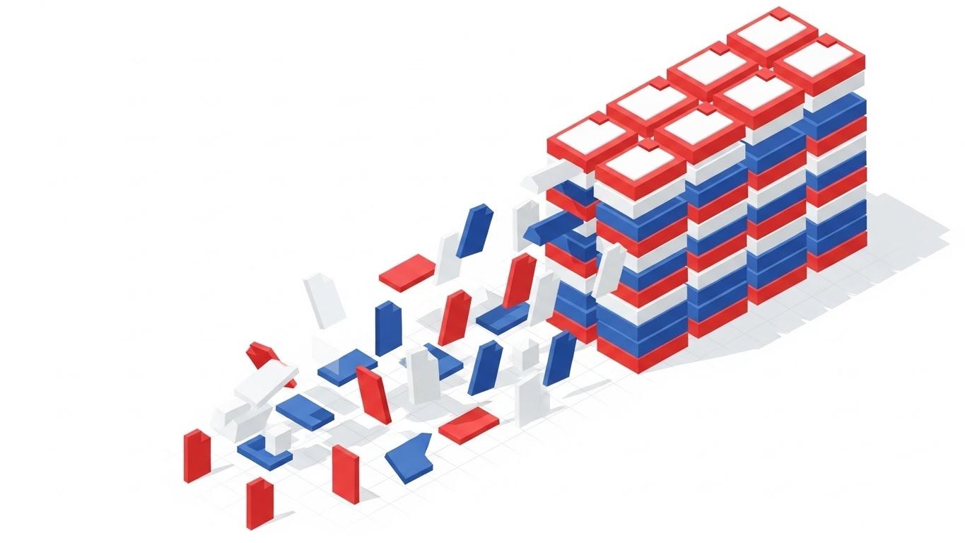
The Visual & Narrative Approach
Isometric 2D Motion offers a bird's-eye view of organization. Red, Blue, and White files are initially scattered, then magnetically pulled into neat, organized stacks on the right. The background is a white void with a faint grid.
Psychological Impact & KPI Focus
The isometric perspective implies omniscience and Total Control. Seeing the files "magnetically" sort themselves visualizes the benefit of automation efficiently. This supports Category Creation by defining the "Before" (chaos) and "After" (order) of the new software category.
Strategic Implementation & Trade-offs
- Best Use Case: Blog headers and "How it Works" pages.
- Duration: 15-30 seconds.
- Trade-off: Can feel slightly impersonal if not executed with a professional color palette.
Companies using similar video content -
StandardFusion – Compliance Management – Isometric stacking for policy organization.
Quantivate – GRC Software – Automated sorting for efficient risk management.
Hyperproof – Compliance Operations – Magnetic organization for evidence collection.
Camms – GRC & Risk Management – Organized stacking for streamlined processes.
8. The Engineering Proof
TOFU | Category Creation
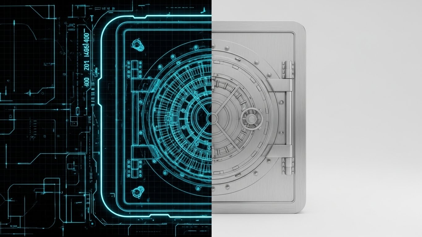
The Visual & Narrative Approach
This style uses a split-screen to demonstrate precision. The left side is a Blueprint Blue wireframe of a bank vault door. A wipe transition reveals the right side: a photorealistic, Brushed Silver steel vault door.
Psychological Impact & KPI Focus
This style bridges the gap between intent and execution. It validates the software's architecture by showing the "blueprint" behind the surface. For Product Differentiation, it signals that the software is "built securely from the ground up," appealing to technical buyers (CTOs).
Strategic Implementation & Trade-offs
- Best Use Case: Landing Pages and "Security Architecture" deep dives.
- Duration: 10-15 seconds.
- Trade-off: Less effective for general audiences who may not appreciate the "blueprint" aesthetic.
Companies using similar video content -
Cisco – Secure Compliance – Wireframe transition for security architecture.
Qualys – Vulnerability Management & Compliance – Blueprint reality for engineering rigor.
Tenable – Nessus – Proving foundational security with wireframe visuals.
Rapid7 – InsightVM – Blueprint to reality for vulnerability management.
9. The User Empowerer
MOFU | Product Differentiation

The Visual & Narrative Approach
Macro UI zooms in to the extreme details. The shot focuses on a toggle switch flipping to "On," glowing in Vivid Mint Green against a blurred charcoal interface. The focus emphasizes the texture and decisive action.
Psychological Impact & KPI Focus
By magnifying a small interaction, this style emphasizes Ease of Use. It suggests that achieving compliance is as simple as flipping a switch. For Feature Education, it removes the intimidation of complex dashboards, reassuring the user that the interface is modern and responsive.
Strategic Implementation & Trade-offs
- Best Use Case: Email newsletters and feature updates.
- Duration: 3-5 seconds.
- Trade-off: Strictly functional; cannot tell a broader story on its own.
[END OF PART 1]
Companies using similar video content -
Sprinto – Automated Compliance – Macro UI for simple compliance actions.
Drata – Automated Compliance Platform – Toggle interaction for intuitive interface.
Secureframe – Automated Compliance – Magnified UI for ease of use.
Scytale – Automated Compliance – Focus on simple toggle interactions.
11. The Integrity Validator
MOFU | Building Trust

The Visual & Narrative Approach
This style creates a "Digital Artifact" to represent intangible security. A tablet rests on a wooden surface, displaying complex code, while a Luminous Purple and Gold Hologram of a "Security Certification" seal hovers magically above it. The seal rotates slowly, emitting a soft light that reflects realistically on the tablet's glass surface. The motion is smooth and ethereal, suggesting a layer of protection that transcends the screen.
Psychological Impact & KPI Focus
This visualization triggers the Authority Heuristic. In a digital world where security claims are often invisible, the holographic seal acts as a "Badge of Honor." It physicalizes the concept of Certified Compliance (e.g., ISO 27001 or SOC 2). By giving the certification 3D weight and light, it reassures the viewer that the security is active and ever-present, directly influencing the Trust Score and reducing vendor risk concerns.
Strategic Implementation & Trade-offs
- Best Use Case: "Trust Center" web pages and the closing frames of sales demos.
- Duration: 6-10 seconds (Loopable).
- Trade-off: Excellent for signaling "We are secure," but does not explain how the security works.
12. The Reality Shifter
MOFU | Competitive Displacement

The Visual & Narrative Approach
This style utilizes a stark Split-Screen composition to force a comparison. The left side features a desaturated, sepia-toned photograph of a chaotic desk overflowing with crumpled papers and binders. A sharp vertical line separates it from the right side: a pristine, vibrant Dark Mode Interface on a tablet, displaying clean green growth charts. The contrast is immediate—the visual definition of "Before" vs. "After."
Psychological Impact & KPI Focus
This approach leverages Binary Opposition to simplify the value proposition. It validates the prospect's pain (the messy desk/manual compliance) while simultaneously offering the cure (digital clarity). It effectively targets Competitive Displacement by visually labeling legacy methods as "obsolete" and the software as "modern." It speaks directly to the desire for Operational Order.
Strategic Implementation & Trade-offs
- Best Use Case: Social Media Ads (LinkedIn/Meta) targeting users of legacy systems.
- Duration: 10-15 seconds.
- Trade-off: Highly effective for problem/solution awareness, but lacks the nuance for complex feature differentiation.
Companies using similar video content -
Ostendio – MyVCM Trust Platform – Holographic seal for certified compliance.
Hyperproof – Compliance Operations – Luminous seal for proving security posture.
Vanta – Automated Security & Compliance – Digital artifact for security certifications.
CUBE RegTech – Regulatory Intelligence – Holographic overlay for regulatory validation.
13. The Audit Machine
MOFU | ABM Awareness
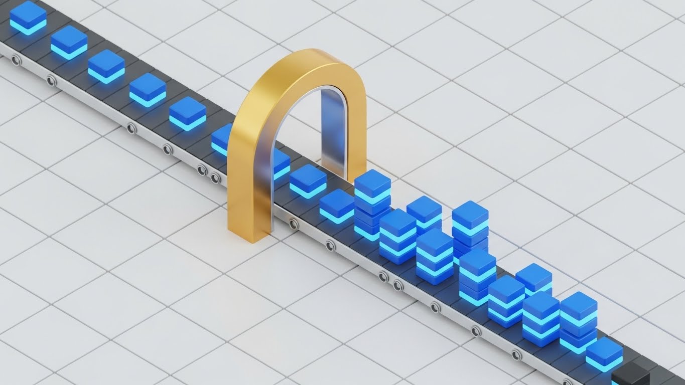
The Visual & Narrative Approach
Isometric 3D transforms abstract data processing into a satisfying mechanical workflow. Bright Blue data blocks travel along a sleek grey conveyor belt in a pristine factory setting. They pass through a Golden Arch Scanner, which instantly validates them, changing their texture or emitting a "verified" glow. The camera holds a steady, isometric angle, allowing the viewer to watch the continuous, rhythmic processing of information.
Psychological Impact & KPI Focus
This style satisfies the brain’s craving for Pattern and Rhythm. It visualizes Continuous Compliance—the idea that every data point is automatically checked without human intervention. The mechanical nature of the conveyor belt suggests reliability and tireless throughput, directly addressing KPIs related to Audit Readiness and processing volume. It assures the viewer: "The system never sleeps."
Strategic Implementation & Trade-offs
- Best Use Case: Web banners and "Platform Architecture" overview videos.
- Duration: 10-20 seconds (Loopable).
- Trade-off: The "factory" metaphor is powerful for processing but risks making the service feel commoditized if not styled elegantly.
Companies using similar video content -
LogicManager – ERM Software – Split screen for before/after risk management.
AuditBoard – Connected Risk Platform – Binary contrast for operational clarity.
Reciprocity – ZenGRC – Visualizing shift from chaos to order.
RiskOptics – Reciprocity ZenGRC – Stark contrast for clear risk solutions.
14. The Core Defender
MOFU | Sales Cycle Acceleration

The Visual & Narrative Approach
Using a 3D X-Ray aesthetic, this style invites the viewer to look inside the technology. We see a server unit with a semi-transparent, white glass casing. Deep within the hardware, a glowing Cyan and Neon Green padlock mechanism is visible, actively locking and unlocking in sync with data flow. The aesthetic is "Medical Grade"—clean, sterile, and precise, utilizing transparency to suggest there are no hidden vulnerabilities.
Psychological Impact & KPI Focus
Transparency builds trust. By using X-Ray visuals, the brand signals Radical Candor and architectural integrity. It combats the "Black Box" anxiety that technical buyers (CISOs) often feel. This style visually proves that security is not just a wrapper, but is embedded at the core level, accelerating the Technical Review phase of the sales cycle.
Strategic Implementation & Trade-offs
- Best Use Case: Whitepapers and deep-dive technical webinars.
- Duration: 8-12 seconds.
- Trade-off: The sterile, hardware-focused look may feel cold to non-technical operational buyers.
Companies using similar video content -
ComplianceQuest – EQMS & GRC – Isometric 3D for automated quality processes.
MetricStream – Audit Management – Linear processing for continuous compliance.
SAP – GRC Process Control – Mechanical workflow for automated controls.
HighBond – by Diligent – Automated rigor for audit management.
15. The Frictionless Builder
MOFU | Reducing Friction
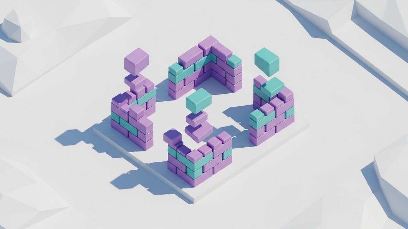
The Visual & Narrative Approach
Low-Poly 3D simplifies the complexity of infrastructure scaling. On a clean white plane, playful blocks in Pastel Purple and Teal fly in from the sky to self-assemble into a fortress wall. The motion is snappy and magnetic. As new "threats" (abstract shapes) appear, new walls instantly build themselves to counter the threat. The aesthetic is gamified and approachable.
Psychological Impact & KPI Focus
This style lowers Implementation Anxiety. By abstracting complex infrastructure into playful blocks, it makes the concept of "scaling security" feel effortless and automatic. It visually demonstrates Dynamic Scalability—the software grows as you grow. This is critical for Reducing Friction during the consideration phase, assuring buyers that the tool won't become a bottleneck.
Strategic Implementation & Trade-offs
- Best Use Case: Display Ads and "Onboarding" explainer videos.
- Duration: 10-15 seconds.
- Trade-off: The playful "game-like" aesthetic must be balanced carefully to avoid appearing childish to enterprise buyers.
Companies using similar video content -
Cisco – Secure Compliance – 3D X-Ray for deep network security.
Palo Alto Networks – Cloud Security – Internal transparency for cloud protection.
Tripwire – File Integrity Monitoring – X-Ray visuals for system integrity.
Forcepoint – DLP & Security – Deep security validation with X-ray aesthetic.
16. The Code Commander
MOFU | The Technical Buyer

The Visual & Narrative Approach
This style creates an environment of intense focus using a Dark Mode UI aesthetic. The background is a deep Gunmetal Grey, allowing fine data lines in Electric Blue and Cyan to pop with neon intensity. The camera pans across complex financial charts and code syntax, highlighting the precision of the analytics. It feels like the cockpit of a stealth aircraft—quiet, dark, and incredibly powerful.
Psychological Impact & KPI Focus
Dark mode is the native language of developers and analysts. It signals Professionalism and deep technical capability. This style appeals directly to the Technical Buyer who values data density and precision over marketing fluff. It visualizes Advanced Analytics capabilities, suggesting that the software can find needles in haystacks.
Strategic Implementation & Trade-offs
- Best Use Case: Technical whitepapers, developer documentation, and "Advanced Features" pages.
- Duration: 15-20 seconds.
- Trade-off: Can be intimidating to non-technical users who prefer "light and airy" interfaces.
Companies using similar video content -
HashiCorp – Terraform – Low-poly modeling for infrastructure as code.
Cloudflare – Compliance Solutions – Automated construction for scalable security.
Zscaler – Zero Trust Exchange – Playful blocks for effortless security scaling.
ManageEngine – Log360 – Simplified scalability for compliance infrastructure.
17. The Value Projector
BOFU | ROI Justification

The Visual & Narrative Approach
To visualize the financial upside of compliance, this style uses Dynamic 3D Data Visualization. Crystalline bars in Metallic Gold and Emerald Green rise rapidly from a reflective floor against a pristine white background. The camera tilts upward, chasing the growth of the bars, creating a sense of vertiginous height and momentum. The materials look expensive—glass and gold—associating the data with wealth.
Psychological Impact & KPI Focus
This style activates the Reward System. It translates the "cost" of compliance into the "asset" of growth. By using upward motion and premium materials, it anchors the concept of ROI (Return on Investment). It is a visual argument for the CFO, showing that compliance is not a cost center, but a foundation for sustainable growth.
Strategic Implementation & Trade-offs
- Best Use Case: Investor decks, Quarterly Business Review (QBR) presentations, and BOFU sales meetings.
- Duration: 5-8 seconds.
- Trade-off: Purely symbolic; it requires accompanying text or voiceover to explain what data is growing (e.g., "Risk Reduction").
Companies using similar video content -
SteelEye – Compliance Platform – Dark Mode UI for financial analytics.
Splunk – Enterprise Security – Precision syntax for security operations.
Exabeam – Security Operations Platform – Developer fluency for advanced threat detection.
Sumo Logic – Cloud SIEM – Dark mode for deep data analysis.
18. The Everyday Enabler
BOFU | The Economic Buyer

The Visual & Narrative Approach
This style bridges the gap between software and reality using High-End Stock Footage with UI Overlays. We see a professional woman in a beige blazer standing in a sunlit modern office, looking at a tablet. A sleek, Holographic Blue UI layer floats slightly above the device screen, displaying a "Compliance Verified" badge. The camera tracks slightly to give parallax depth to the hologram.
Psychological Impact & KPI Focus
This style leverages Social Proof and contextual relevance. It answers the question, "What does it look like to use this?" By placing the tech in a human hand in a real office, it validates User Experience (UX) and mobility. It reassures the Economic Buyer that the software integrates seamlessly into the daily lives of their workforce, minimizing disruption.
Strategic Implementation & Trade-offs
- Best Use Case: Website "Solutions" pages and Case Study videos.
- Duration: Static Image or subtle Cinemagraph.
- Trade-off: Relies heavily on the quality of the stock footage; generic acting can hurt brand perception.
Companies using similar video content -
Workiva – Connected Reporting & Compliance – Dynamic data for financial ROI.
Diligent – ESG Solutions – Rising structures for governance value.
Quantivate – GRC Software – Materializing financial returns from risk reduction.
ClauseMatch – Policy Management – Visualizing ROI for policy compliance.
19. The Peace Architect
BOFU | Objection Handling

The Visual & Narrative Approach
2D Character Animation is used here to tell an empathetic story. A stylized vector character sits in a cozy, earth-toned home office, looking relaxed. A glowing Blue Shield creates a protective semi-circle around them as they work. The animation style is fluid and modern (Corporate Memphis style), focusing on the emotion of relief rather than technical detail.
Psychological Impact & KPI Focus
This style targets the Emotional Brain. Compliance officers often suffer from high stress; this visual promises peace of mind. It serves as powerful Objection Handling, visually countering the fear that the new software will add to their workload. It says, "We protect you so you can relax," fostering a positive emotional connection with the brand.
Strategic Implementation & Trade-offs
- Best Use Case: Email nurture sequences and "Customer Success" stories.
- Duration: 10-15 seconds.
- Trade-off: The illustrative style is softer and less "corporate," which is great for empathy but less effective for hard technical proof.
Companies using similar video content -
OneTrust – Privacy & Trust Platform – Lifestyle overlay for daily privacy management.
Microsoft – Purview – Contextual usage for integrated compliance.
ServiceNow – GRC – Humanizing compliance in daily workflows.
MCO – MyComplianceOffice – Contextual usage for financial compliance.
20. The Peer Mirror
BOFU | Driving Demo Requests

The Visual & Narrative Approach
This style utilizes Generative AI Realistic Video to present a "Virtual Peer." We see a close-up portrait of a confident, middle-aged CCO (Chief Compliance Officer) in a navy suit, looking directly into the lens with a slight, reassuring smile. The lighting is cinematic studio quality, and the background is a soft-focus professional office. The character nods slightly, offering non-verbal affirmation.
Psychological Impact & KPI Focus
Humans are wired to trust faces. This style leverages Mirror Neurons, allowing the viewer to see themselves in the "successful user." It anchors Credibility and authority. In the bottom-of-funnel phase, where the decision is often emotional, seeing a confident, calm peer (even a simulated one) subconsciously validates the decision to purchase, driving Demo Requests.
Strategic Implementation & Trade-offs
- Best Use Case: Social Media remarketing ads and webinar invitations.
- Duration: 5-10 seconds.
- Trade-off: Must be labeled or used ethically to ensure the audience understands it is a representation, though the quality builds high brand polish.
Companies using similar video content -
Drata – Automated Compliance Platform – 2D narrative for reducing compliance stress.
Vanta – Automated Security & Compliance – Protected workflows for peace of mind.
Secureframe – Automated Compliance – Diffusing anxiety with empathetic visuals.
LogicGate – Risk Cloud – Character animation for simplified risk management.
21. The Onboarding Anchor
Onboarding | Self-Serve Onboarding
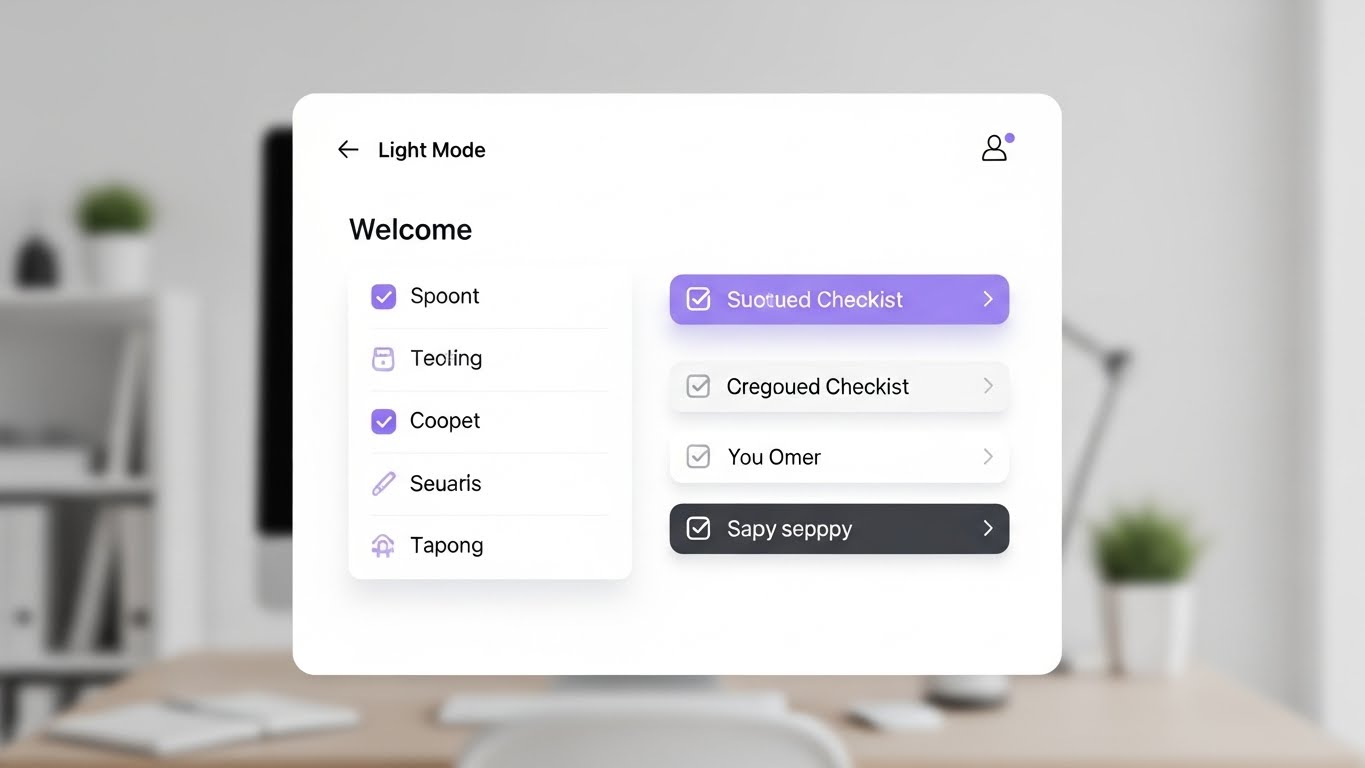
The Visual & Narrative Approach
This style embraces a Clean UI (Light Mode) aesthetic to strip away the anxiety of "Day 1" configuration. The visual centers on a pristine, front-facing "Welcome" checklist card. As items are completed, they transition from a subtle grey to a soft Lavender, accompanied by a satisfying "tick" animation and a vertical slide to the next task. The background is a blurred, tidy workspace, grounding the digital task in a physical reality of organized work.
Psychological Impact & KPI Focus
Onboarding is the most fragile stage of the customer lifecycle. This style leverages the Zeigarnik Effect—the psychological desire to complete unfinished tasks. By visualizing the process as a finite, game-like progression, it drastically reduces Implementation Anxiety. It reassures the user that setup is manageable and nearly complete, directly accelerating Time-to-Value (TTV).
Strategic Implementation & Trade-offs
- Best Use Case: In-app "Welcome" modals and initial setup wizards.
- Duration: 30-45 seconds (Step-by-step).
- Trade-off: The simplified view is perfect for initial setup but may need to be supplemented with more detailed visuals for complex power-user configurations.
Companies using similar video content -
Archer – Integrated Risk Management – Generative realism for CCO credibility.
Diligent – GRC & ESG Solutions – Idealized persona for executive validation.
MetricStream – Connected GRC – Anchoring peer credibility for GRC leaders.
ComplySci – Compliance Platform – Realistic persona for financial compliance trust.
22. The Value Accelerator
Onboarding | Accelerating TTV
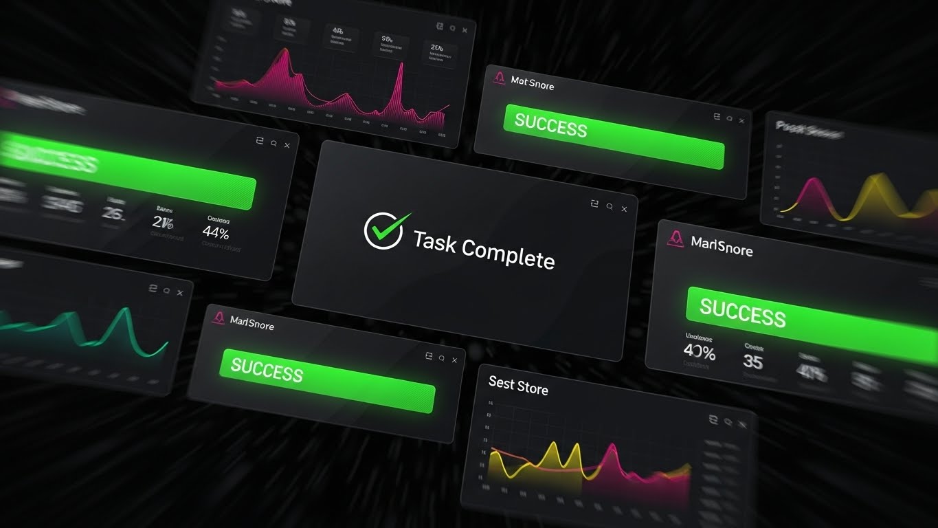
The Visual & Narrative Approach
Designed to generate momentum, this Rapid UI Feature Montage uses speed to convey power. Layers of dark-mode UI screens rush toward the viewer. As they pass, bright Green "Success" banners and "Task Complete" checkmarks flash rhythmically. Motion blur on the edges creates a tunnel-vision effect, focusing the eye strictly on the positive outcomes rather than the granular data entry.
Psychological Impact & KPI Focus
This style targets the Dopamine Reward System. It answers the new user's most pressing question: "How fast will I see results?" By compressing hours of potential work into seconds of visual success, it validates the purchase decision immediately. It is a powerful tool for Trial Activation, showing the user the "finish line" to encourage them to start running.
Strategic Implementation & Trade-offs
- Best Use Case: "Getting Started" email sequences and social retargeting for trial users.
- Duration: 10-15 seconds.
- Trade-off: High energy, but low educational value. It motivates action but doesn't teach the mechanics of how to achieve it.
Companies using similar video content -
Sprinto – Automated Compliance – Clean UI workflow for guided setup.
Drata – Automated Compliance Platform – Sequential progress for reduced anxiety.
Vanta – Automated Security & Compliance – Checklist for accelerated time-to-value.
Ostendio – MyVCM Trust Platform – Clear workflow for self-serve onboarding.
23. The Friendly Guide
Onboarding | Trial Activation

The Visual & Narrative Approach
This style blends 2D Flat Vector Characters with 3D glossy UI elements to create a supportive "Digital Concierge." A stylized character in brand colors (e.g., Purple and Yellow) stands next to a floating, 3D "Help Bubble." The character gestures towards specific UI elements, effectively breaking the fourth wall to point out key features. The aesthetic is soft, rounded, and devoid of sharp edges.
Psychological Impact & KPI Focus
New software can feel isolating. This style utilizes Anthropomorphism to create a sense of social presence. It signals that help is accessible and friendly, not technical and cold. This directly impacts Support Ticket Volume by encouraging users to engage with self-serve help tools (represented by the UI bubble) rather than fearing them.
Strategic Implementation & Trade-offs
- Best Use Case: Help Center landing pages and "How to get help" videos.
- Duration: 20-30 seconds.
- Trade-off: The illustrative style creates warmth but must be kept professional to maintain enterprise credibility in highly regulated sectors.
Companies using similar video content -
Secureframe – Automated Compliance – Rapid UI montage for compliance velocity.
Hyperproof – Compliance Operations – Success banners for quick wins.
LogicGate – Risk Cloud – Visualizing velocity for program acceleration.
Scytale – Automated Compliance – Fast UI for trial activation.
24. The Knowledge Architect
Retention | Knowledge Base

The Visual & Narrative Approach
Minimalist Flat 2D Vector art focuses entirely on information transfer. An open book icon sits centrally, with geometric shapes (circles and squares) rising from it like "data steam," organizing into neat columns. The palette is restricted to Matte Black, White, and Teal, removing all decorative distractions. The motion is slow, deliberate, and educational.
Psychological Impact & KPI Focus
When a user is frustrated and seeking answers, they do not want flash; they want clarity. This style reduces Cognitive Load to near zero. It signals "Here is the answer, plain and simple." This "Instructional Design" aesthetic is critical for Knowledge Retention, ensuring users feel smart and capable rather than overwhelmed by the platform's complexity.
Strategic Implementation & Trade-offs
- Best Use Case: Knowledge Base article headers and FAQ video thumbnails.
- Duration: 30-60 seconds (Instructional).
- Trade-off: Extremely functional. It builds competence but lacks the emotional excitement needed for marketing materials.
Companies using similar video content -
StandardFusion – Compliance Management – 2D animation for humanized support.
Onspring – GRC Software – Character overlay for friendly guidance.
ComplianceQuest – EQMS & GRC – Digital concierge for user assistance.
Reciprocity – ZenGRC – Friendly guide for GRC platform adoption.
25. The Future Vision
Retention | Reducing Support

The Visual & Narrative Approach
To visualize the ultimate goal of the partnership, this style employs a "High-Key" Futuristic Aesthetic. Crystalline skyscrapers rendered in White, Silver, and Prismatic Light rise into a bright, boundless sky. Beams of pure light connect the structures, symbolizing seamless data integration. It represents the "Future State" of the enterprise once the software is fully integrated.
Psychological Impact & KPI Focus
This style sells the dream of Operational Nirvana. It reassures the client that the current friction of implementation is temporary and that the destination is a state of order and beauty. This visual helps in Reducing Support Anxiety by reminding stakeholders of the bigger picture—a self-sustaining, efficient ecosystem.
Strategic Implementation & Trade-offs
- Best Use Case: Quarterly Business Review (QBR) intros and "Product Roadmap" emails.
- Duration: 10-20 seconds.
- Trade-off: Abstract and high-concept; it inspires confidence but does not educate on specific feature mechanics.
Companies using similar video content -
Workiva – Connected Reporting & Compliance – Minimalist 2D for self-help clarity.
Microsoft – Purview – Iconographic clarity for knowledge base.
SAP – GRC – Flat 2D for instructional design.
IBM – OpenPages – Minimalist icons for knowledge retention.
26. The Partner Proof
Retention | Reducing Churn

The Visual & Narrative Approach
This style integrates 2D Vector Graphics over Live Action Footage. We see a high-quality photo or video of two professionals shaking hands in a boardroom. Overlaying this human connection are floating, animated 2D icons—shields, checkmarks, and data nodes in Corporate Blue—that lock into place around the handshake. The mix of real photography and digital graphics symbolizes the merger of human trust and digital verification.
Psychological Impact & KPI Focus
This style creates a strong emotional anchor for Churn Reduction. It reminds the client that behind the software is a human partnership. The digital overlays visually represent the "value add" that the software brings to the human relationship. It reinforces the idea that the vendor is an integral part of the client's success, making the thought of switching vendors feel like breaking a trusted bond.
Strategic Implementation & Trade-offs
- Best Use Case: "Year in Review" videos and LinkedIn renewal campaigns.
- Duration: 6-10 seconds.
- Trade-off: Relies heavily on the cultural fit of the stock footage; it must match the client's specific industry demographic to resonate.
Companies using similar video content -
IBM – OpenPages – Futuristic neon for enterprise scale.
ServiceNow – GRC – Crystalline structures for operational nirvana.
Oracle – GRC Cloud – Prismatic light for future-proof compliance.
Protecht Group – ERM Software – Visualizing enterprise scale and integration.
27. The Stability Monitor
Retention | Proactive Support

The Visual & Narrative Approach
This style contrasts speed with stability using Hyper-lapse Footage. The background video shows a fast-moving modern office environment—people blurring by, sunlight shifting rapidly across the floor. In sharp contrast, a White Data Overlay (graphs and status bars) remains perfectly static and stable in the foreground. The data updates calmly and rhythmically, unaffected by the chaos behind it.
Psychological Impact & KPI Focus
This visual metaphor powerfully demonstrates System Reliability. It says, "No matter how fast your business moves, our compliance engine remains rock solid." It appeals to the operations manager's need for stability. This style supports Proactive Support messaging, implying that the system is constantly monitoring and maintaining order amidst the daily rush.
Strategic Implementation & Trade-offs
- Best Use Case: System status pages and "Uptime Guarantee" marketing collateral.
- Duration: 5-10 seconds (Loopable).
- Trade-off: The background motion can be distracting if the data overlay isn't bold enough to command focus.
Companies using similar video content -
Riskonnect – Integrated Risk Management – Graphics over live action for partnership.
Diligent – GRC & ESG Solutions – Augmented reality for validated agreements.
Resolver – Risk & Security Management – Digital overlays for human connection.
StarCompliance – Compliance Platform – Validating agreements with visual proof.
28. The Ecosystem Connector
Expansion | Driving Deep Feature Adoption

The Visual & Narrative Approach
To visualize the abstract concept of API integration, this style uses Abstract 3D Motion. A central, glowing "Core" sphere sends out tendrils of light to connect with smaller, orbiting satellite nodes in different colors (representing other software tools like CRM, ERP, and HRIS). When connected, the satellites light up in unison. The background is a deep, premium Navy Void.
Psychological Impact & KPI Focus
This style triggers the Network Effect bias—the value of the system increases as it connects to more things. It visualizes the software not as a standalone tool, but as the "Central Nervous System" of the enterprise. This is a powerful visual for Expansion and Cross-Selling, showing how the platform integrates with the client's existing tech stack to create a unified ecosystem.
Strategic Implementation & Trade-offs
- Best Use Case: "Integrations" marketplace pages and webinar backdrops.
- Duration: 10-15 seconds.
- Trade-off: Very conceptual; requires voiceover to explain which tools are connecting.
Companies using similar video content -
Splunk – Enterprise Security – Hyper-lapse overlay for constant vigilance.
Qualys – Vulnerability Management & Compliance – Static data for system reliability.
Tenable – Vulnerability Management – Proving stability amidst chaos.
SolarWinds – Security Event Manager – Static data for continuous monitoring.
29. The Depth Revealer
Expansion | Driving Upsell
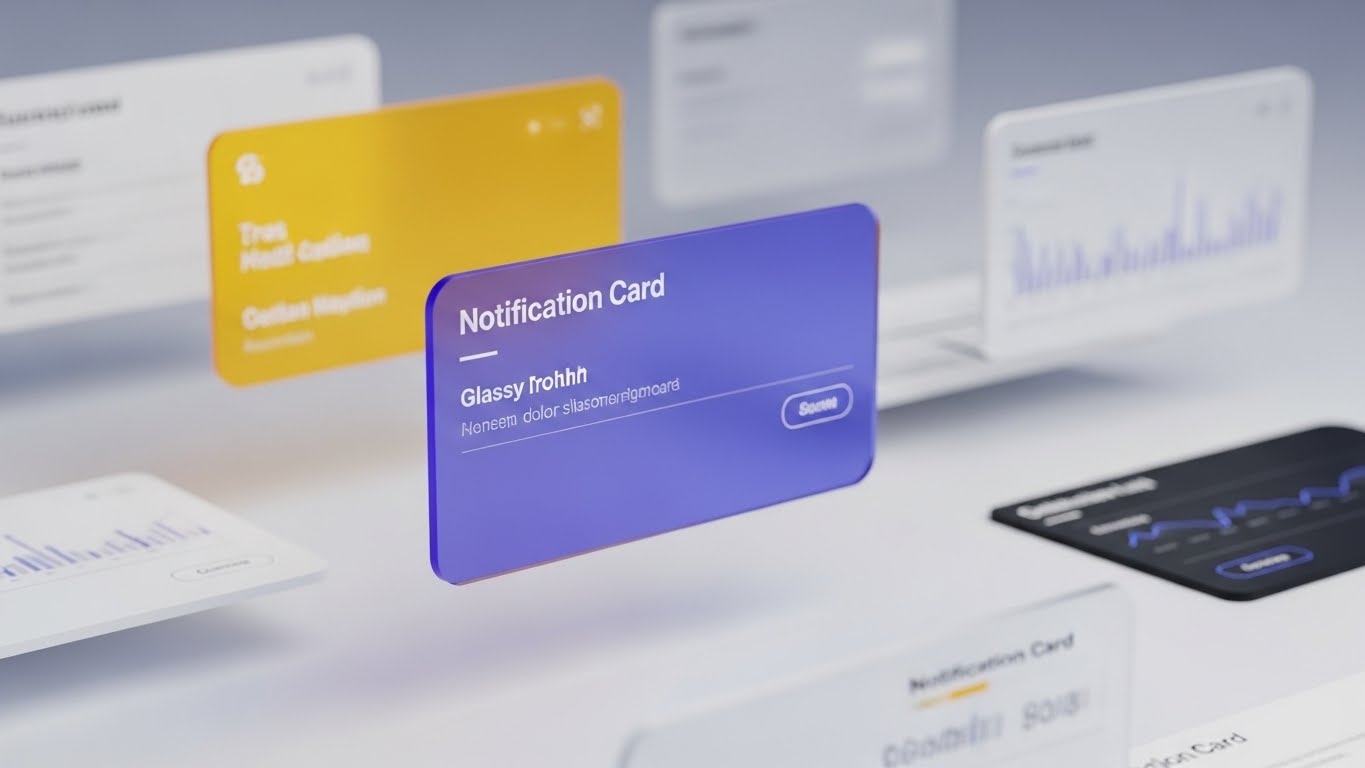
The Visual & Narrative Approach
3D Parallax UI is used to show depth and expansion. The visual features multiple UI screens floating in layered space. The camera tracks sideways, creating a parallax effect where the foreground "Notification Card" in Glassy Blue moves faster than the blurred background charts. This depth of field suggests that there are layers to the platform that the user has yet to explore.
Psychological Impact & KPI Focus
The visual depth serves as a metaphor for Feature Depth. It piques curiosity about what lies "behind" the current view, subtly priming the user for Upsell. It suggests that the platform is not just a single surface tool but a deep ecosystem of capabilities (e.g., advanced analytics or premium modules) waiting to be unlocked.
Strategic Implementation & Trade-offs
- Best Use Case: "Enterprise Tier" landing pages and feature comparison videos.
- Duration: 6-10 seconds.
- Trade-off: Requires high-quality UI assets; low-resolution screenshots will break the immersion.
Companies using similar video content -
ServiceNow – GRC – Abstract 3D motion for API reach.
OneTrust – Privacy & Trust Platform – Interconnected nodes for platform integration.
LogicGate – Risk Cloud – Visualizing ecosystem connections.
SailPoint – Identity Governance – Interconnected nodes for identity ecosystem.
30. The Culture Catalyst
Expansion | Driving Referrals

The Visual & Narrative Approach
The final style focuses purely on the human outcome using Aspirational Stock Footage. We see a wide shot of a diverse team in a sunlit office, celebrating a win—high-fiving, smiling, and looking at a wall projection of a "Success" metric. The lighting is warm and golden. There is no heavy UI overlay; the focus is entirely on the joy of compliance.
Psychological Impact & KPI Focus
Ultimately, software is bought to make people's lives better. This style targets Net Promoter Score (NPS) and Referrals. It associates the software not with "checking boxes" but with "winning together." It answers the emotional question, "How will this make my team feel?" By showing a happy, unburdened team, it validates the decision to potential advocates who can refer the software to peers.
Strategic Implementation & Trade-offs
- Best Use Case: Case study conclusions, "Thank You" pages, and referral program invitations.
- Duration: Static Image or Slow Motion Video.
- Trade-off: It is a generic "happiness" visual; it works best when paired with a specific testimonial to ground it in reality.
Strategic Knowledge Base: The Visual Operations Doctrine
To transform these 30 visual styles from "marketing assets" into a cohesive Visual Operating System for your enterprise, we must move beyond aesthetics. This section outlines the strategic framework for deploying these visuals to drive adoption, compliance, and growth.
Strategic Alignment & Visual Architecture
The "Pre-Production" Strategy – Why and Who.
- The Cognitive Load Audit: Before creating assets, audit your current training materials. If a regulation takes 500 words to explain, can a Style 2 (Clarity Engine) animation reduce it to 15 seconds? The goal is measurable reduction in cognitive effort.
- Role-Based Visual Mapping: Differentiate your visual strategy. A CCO needs Style 17 (Value Projector) to see ROI trends, while an Audit Manager needs Style 16 (Code Commander) for data density. One size does not fit all.
- The "Glanceability" Standard: In high-stress compliance environments, information must be understood in milliseconds. Adopt a "glanceability" standard for all UI-related visuals—if it takes more than 3 seconds to decode (like Style 4), it fails.
- Brand Voice Consistency: Your compliance software is a single entity. Ensure that the "Fun" Style 23 and the "Serious" Style 8 share a unified color palette and font DNA to stitch them into a coherent "Visual Operating System."
- The Advids Strategic Audit: Partner with Advids to define this Visual Operating System before production begins. We analyze your specific regulatory burden to recommend the exact mix of styles that will yield the highest operational efficiency.
- Standardization vs. Customization: For core regulatory features (e.g., GDPR), use standardized, polished assets (Style 13). For bespoke client workflows, use adaptable templates (Style 21) that can be updated cheaply.
- The Cross-Departmental Bridge: Use these visuals to unify terminology. When Sales, Ops, and Support all use the same "Visual Metaphor" (e.g., the Shield from Style 1) to describe security, it creates a cohesive internal culture.
- Legacy System Integration: Visualizing the connection between legacy on-prem hardware and your new SaaS interface is critical. Use Style 2 to show the flow of data from "Old" to "New" to reduce migration anxiety.
- Accessibility in Compliance: Designing for a diverse workforce is non-negotiable. Ensure all motion graphics meet WCAG standards for contrast and photosensitivity to protect all users.
- The Mobile-First Mandate: Compliance happens everywhere. Ensure complex styles like Style 14 (Core Defender) are optimized for mobile screens, ensuring clarity even on a CCO’s smartphone during travel.
Operational Adoption & Implementation
The "Deployment" Phase – How to embed visuals into the workflow.
- Overcoming "Big Brother" Anxiety: Compliance tools can feel invasive. Use empathy-driven visuals (Style 19) to explain monitoring features, framing them as "Protection" for the employee rather than "Surveillance" by the firm.
- The Micro-Learning Shift: Replace 50-page PDF manuals with a library of 30-second clips (referencing Style 9 and 24). Embed these directly into the software workflow for "contextual learning."
- Just-in-Time Support: Don't bury videos in a portal. Trigger Style 23 (Friendly Guide) automatically when a user hovers over a complex feature for more than 5 seconds.
- Gamification of Training: Visualizing completion scores and "compliance streaks" using Style 22 (Value Accelerator) can boost engagement with mandatory training modules.
- Reducing Support Ticket Volume: There is a direct correlation between proactive visual guides and reduced call center load. Deploy Style 21 to preempt the top 5 most common "How-to" support tickets.
- Remote Onboarding: Leverage Style 1 and Style 30 to culturally onboard remote staff who may never visit HQ, making them feel part of the security culture.
- Visualizing SOPs: Transform text-based Standard Operating Procedures (SOPs) into visual process flows (Style 2). A visual flow is less open to interpretation errors than a text document.
- Feedback Loops: Use interactive video elements. After a Style 25 video, prompt the user with a "Does this make sense?" button to gather qualitative data on your communication strategy.
- Scalable Localization: Regulations are global. Design your visuals (Style 24) with "text-free" zones so that captions can be easily swapped for different languages without re-rendering the animation.
- Leadership Communication: CCOs must report to the Board. Equip them with high-end styles (Style 17 and Style 27) to visually demonstrate "Risk Reduction" and "System Stability" during board meetings.
Measuring Impact & Future-Proofing
The "ROI" Phase – Measuring success and looking ahead.
- Beyond "Views": Move beyond vanity metrics. Measure Time-to-Competency—how much faster does a user master the audit workflow after watching a Style 13 video compared to reading the manual?
- The "Idle Time" Metric: Correlate better visualization with reduced software navigation time. If users spend less time "figuring out" the UI (Style 15), that is measurable operational efficiency.
- Compliance Velocity: Measure how fast new regulations (e.g., a new SEC mandate) are understood across the org. Video dissemination (Style 4) is invariably faster than reading memos.
- Retention and Churn: High-quality UX visualization (Style 26) directly impacts Customer Lifetime Value (LTV). Clients who "see" the value constantly are less likely to churn.
- The AI Visual Frontier: Prepare for the future where Generative AI creates real-time, personalized compliance summaries. Your visual style guide today lays the foundation for that AI training data.
- Scalability of Assets: Build a library, not just one-off videos. By using consistent Style Codes, you create a "LEGO kit" of visual assets that can be reassembled for new features.
- The Advids Partnership: Advids is your long-term partner for asset scalability. As your software evolves, we ensure your visual language evolves with it, preventing your help center from becoming outdated.
- Benchmarking Success: "Good enough" visuals are a competitive risk. If your competitor uses Style 12 (Trust Anchor) and you use static text, you lose the trust war before the demo even begins.
- The ROI of Safety: Quantify risk reduction. Better visual training (Style 19) leads to fewer compliance breaches, which translates directly to saved potential fines and insurance costs.
- Final Call to Innovation: Treat video as infrastructure, not content. In the era of the Physical/Digital Divide, your visual strategy is the bridge that carries your customers to success. Invest in it, refine it, and let it drive your growth.
[END OF GUIDE]
Companies using similar video content -
MetricStream – Connected GRC – 3D parallax UI for hidden value.
IBM – OpenPages – Layered interface for feature depth.
Workiva – Connected Reporting & Compliance – Unveiling advanced analytics.
RSA Archer – Integrated Risk Management – Layered UI for module expansion.
Author & Editor Bio


