
 /home/wwwroot/advids.co/design/index.php on line 425
Introduction: Bridging the Physical-Digital Divide
The construction industry is navigating its most significant pivot in decades: the transition from analog intuition to digital precision. For VDC Directors and Field Operation Managers, the challenge is no longer just capturing data—it is translating that complex data into immediate, actionable field intelligence. The "Pragmatic Innovator" isn't looking for another flashy gadget; they are seeking a concrete solution to the physical-digital divide that plagues modern job sites.
The opportunity for software vendors lies in visualization. Effective video content does not merely display features; it simulates the relief of a problem solved. It bridges the gap between the chaotic reality of a mud-filled job site and the pristine accuracy of a BIM model. However, the cost of failing to communicate this value is steep. Industry data indicates that poor project data and miscommunication is responsible for 52% of all rework, draining billions from bottom lines annually. This is not just an operational inefficiency; it is a communication failure that superior visual storytelling can resolve.
By adopting a strategic, visually distinct approach to content, platforms can move beyond "market noise" and position themselves as essential infrastructure. The return on this innovation is measurable. Recent findings suggest that digital maturity correlates directly with profitability, with a 1.14% increase in expected revenue associated with each additional technology adopted.
This guide provides a "Gold Standard" framework for 30 distinct video styles, categorized to align with specific funnel stages and psychological triggers. It serves as a blueprint for transforming technical capabilities into compelling visual narratives that drive adoption, trust, and market dominance.
1. The Kinetic Foundation
TOFU | Brand Awareness

1. The Visual & Narrative Approach
Scenario: The screen opens with a visceral sense of weight. Massive, 3D extruded block shapes—textured like raw concrete with protruding rebar accents—slam into place with audible impact. The camera tracks aggressively around these forms, using a palette of Vivid Safety Orange and Deep Asphalt Grey to convey hazard awareness and industrial strength.
Narration: The audio design takes precedence over voiceover, utilizing heavy, rhythmic percussion (pile drivers, steel clanking) to drive the kinetic motion. If voiceover is used, it is sparse, punchy, and deep—emphasizing words like "STABILITY," "PRECISION," and "CONTROL."
2. Psychological Impact & KPI Focus
Niche Psychology: This style speaks directly to the subconscious desire for solidity. Construction professionals respect durability. By abstracting the software's value into heavy, physical forms, the video bypasses skepticism about "fragile software" and anchors the brand in the physical reality of the job site.
Operational Impact: The high-contrast visualization reduces cognitive load by removing complex details, focusing entirely on the feeling of Brand Awareness. It signals that this platform is built for the "heavy lifting" of construction data management.
3. Strategic Implementation & Trade-offs
Use Case: Ideal for Meta & Social Ads (Instagram/Facebook) where stopping the scroll is the only metric that matters.
Duration: 10–15 Seconds (Looping).
Trade-off: Impact vs. Information. This style excels at brand recall but fails to explain how the software works. It creates presence, not understanding.
Companies using similar video content -
Trimble – Tekla Structures – Structural BIM software for fabrication and precision.
Autodesk – Revit – Foundational BIM authoring for robust 3D models.
2. The Frictionless Sphere
TOFU | Category Creation

1. The Visual & Narrative Approach
Scenario: A serene, gravity-free environment where stylized geometric forms—representing prism poles and survey points—float and self-organize. The palette features Electric Blue, Glossy White, and Metallic Silver, creating a "clean room" aesthetic. The animation is fluid; elements morph and slide into alignment without friction, symbolizing the seamless flow of data.
Narration: The tone is sophisticated and forward-looking. A soft, intelligent voiceover explains the philosophy of the new category (e.g., "The era of manual error is over"), supported by an ambient, high-tech synthesizer soundtrack.
2. Psychological Impact & KPI Focus
Niche Psychology: VDC Managers are overwhelmed by the chaos of coordination. This style offers a visual "antidote" to that chaos—a promise of order and frictionless integration. It appeals to the aspiration of a perfectly managed, digital-first job site.
Operational Impact: By removing the "grit" of construction, this style focuses purely on the workflow logic. It helps viewers visualize the process improvement (Category Creation) without getting bogged down in technical UI specifics.
3. Strategic Implementation & Trade-offs
Use Case: LinkedIn Organic posts aimed at thought leadership and defining new market categories.
Duration: 30–45 Seconds.
Trade-off: Idealism vs. Realism. While inspiring, some field crews may view this aesthetic as "too clean" or disconnected from the dirty reality of their daily work.
Companies using similar video content -
Graphisoft – Archicad – Architectural BIM authoring for seamless design workflows.
Autodesk Construction Cloud – Integrated platform connecting construction workflows effortlessly.
3. The Digital Bridge
TOFU | Market Education
1. The Visual & Narrative Approach
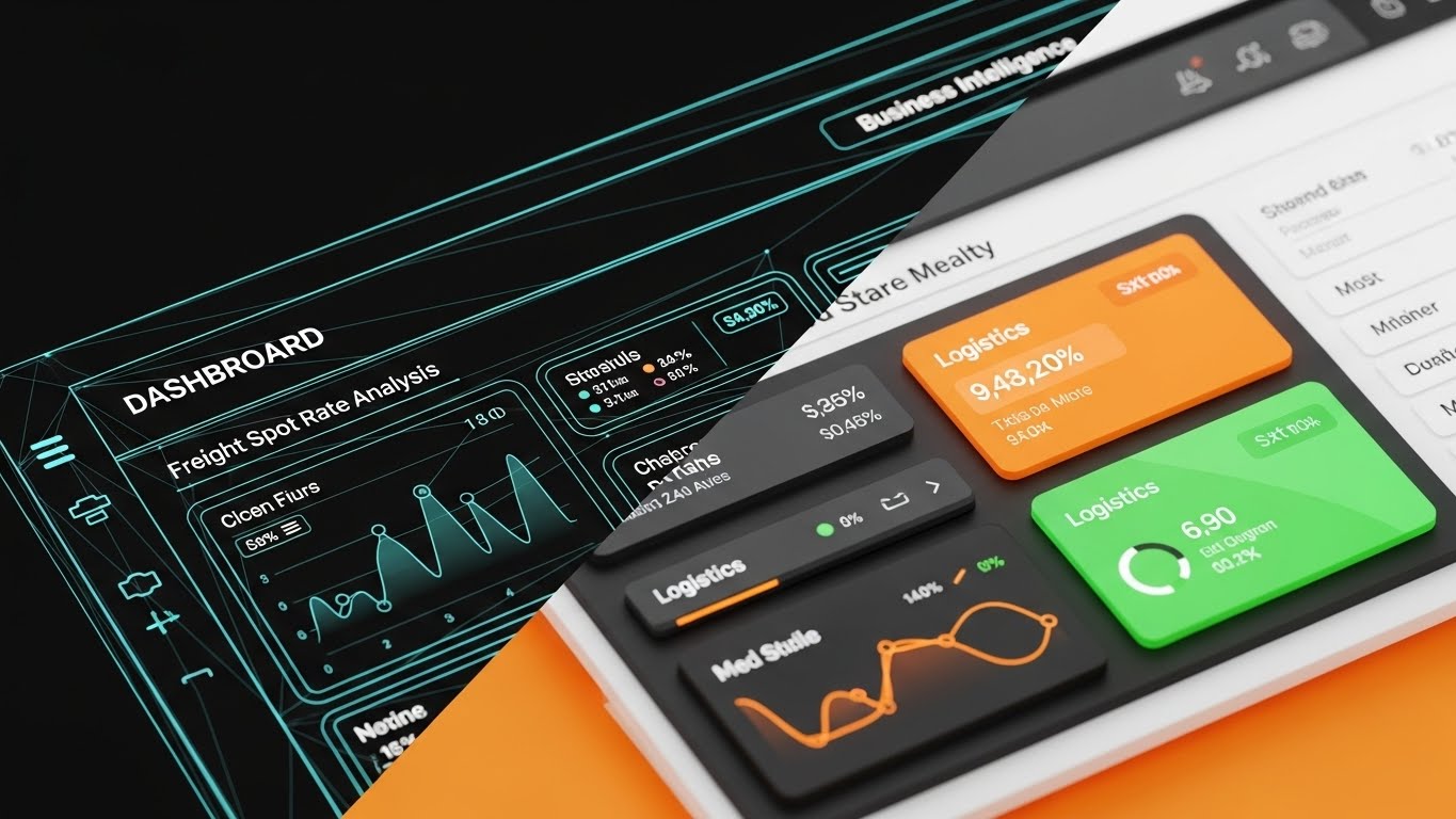
Scenario: A split-screen composition serves as the visual anchor. The left half shows a glowing Cyan wireframe grid representing the "Digital Twin." The right half transitions to a photorealistic view of the physical reality (or high-fidelity data dashboard), demonstrating the result. A sharp vertical diagonal line sweeps across the screen, seamlessly morphing the abstract data into the "finished" state.
Narration: The narrative focuses on "Verification." The voiceover acts as a guide, explaining how the complex grid on the left translates instantly to the constructed reality on the right. "What you design is exactly what you build."
2. Psychological Impact & KPI Focus
Niche Psychology: The "Pragmatic Innovator" fears the loss of fidelity between the office and the field. This style provides visual proof of integrity. It validates the software's core promise: accurate translation of data.
Operational Impact: This visualization directly addresses Market Education. It simplifies the abstract concept of "BIM-to-Field" by showing the immediate correlation, reducing the anxiety surrounding data loss during export/import processes.
3. Strategic Implementation & Trade-offs
Use Case: YouTube Explainer videos where the viewer is seeking to understand the "What" and "How."
Duration: 60–90 Seconds.
Trade-off: Complexity vs. Speed. Producing high-quality photorealistic renders for the "Reality" side is resource-intensive but necessary to maintain credibility.
Companies using similar video content -
Autodesk Construction Cloud – Autodesk Build – Connects design models to field execution.
Cupix – Digital Twins & 3D Visualizations – Verifies digital truth with real-world scans.
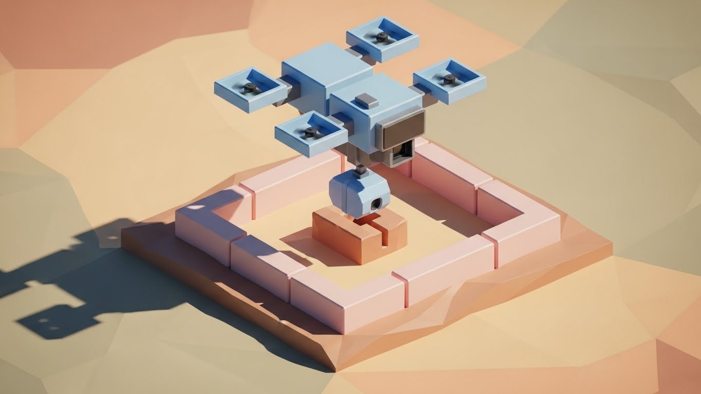
4. The Digital Twin Interface
TOFU | Shaping Brand Perception
1. The Visual & Narrative Approach
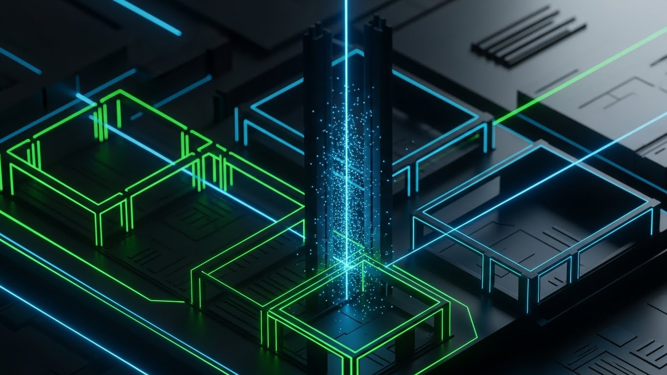
Scenario: A futuristic, dark-mode visualization of a construction site at night. The scene features a high-angle isometric view of a building footprint. The structural elements are outlined in glowing Neon Green and Electric Blue laser lines against a Deep Black background. Luminous laser scan points hit a vertical column, creating a particle effect.
Narration: The audio is sleek and cinematic, reminiscent of a sci-fi interface. Sound effects (digital chirps, scanning hums) synchronize with the visual lasers to reinforce the perception of high-speed computation.
2. Psychological Impact & KPI Focus
Niche Psychology: This style taps into the "Cool Factor" of technology, but more importantly, it signals advanced capability. Dark mode interfaces are associated with pro-grade software (developer tools, CAD). It shapes brand perception as a cutting-edge, premium solution.
Operational Impact: By stripping away textures and environmental distractions, the viewer focuses solely on the geometry and precision. It effectively visualizes invisible concepts like LiDAR scanning or tolerance checks.
3. Strategic Implementation & Trade-offs
Use Case: Connected TV (CTV) or high-level brand introductory videos.
Duration: 15–30 Seconds.
Trade-off: Style vs. UI Accuracy. This is a stylized representation. If the actual software UI is light and spreadsheet-heavy, this style might set unrealistic aesthetic expectations.
Companies using similar video content -
Bentley Systems – iTwin Platform – Infrastructure digital twin solution for insights.
Esri – ArcGIS CityEngine – Procedural 3D city modeling for high-tech perception.
5. The Orchestrated Site
TOFU | Product Differentiation

1. The Visual & Narrative Approach
Scenario: A clean, 45-degree isometric projection of a bustling job site. The palette uses soft Pastel Blue, Warm Yellow, and Clean White. The scene depicts miniature, stylized workers moving pre-fabricated wall panels into place, guided by clear, dashed floor markings. The rendering is flat and shadowless, resembling a high-quality instructional diagram.
Narration: The narration is educational and structured. It breaks down complex logistics into steps: "Step 1: Layout. Step 2: Install." The tone is helpful and clarity-focused, aiming to demystify the process.
2. Psychological Impact & KPI Focus
Niche Psychology: For operations managers, a construction site is often a headache of logistics. This style organizes that headache into a neat, manageable system. It promises that the software will bring this level of order and cleanliness to their projects.
Operational Impact: Excellent for Product Differentiation on a Landing Page. It visually explains "how it works" in a way that generic stock footage cannot, making the workflow appear simple and repeatable.
3. Strategic Implementation & Trade-offs
Use Case: Website Feature pages or Product Tour videos.
Duration: 45–60 Seconds.
Trade-off: Abstraction vs. Detail. It simplifies the process significantly. It is not suitable for showing specific UI button clicks or detailed technical settings.
Companies using similar video content -
monday.com – Construction Project Management – Simplifies complex project workflows.
Outbuild – Construction Scheduling and Planning Software – Organizes project logistics efficiently.
7. The Velocity Grid
TOFU | Skippable Pre-Roll Ad

1. The Visual & Narrative Approach
Scenario: Abstract motion graphics featuring fast-moving geometric shapes. A palette of Laser Red, Midnight Blue, and Pure White. The visual depicts sharp, angular lines behaving like laser beams, darting across the screen and intersecting to form a perfect grid web. The motion blur indicates high speed.
Narration: Fast-paced and rhythmic. The voiceover might be limited to rapid-fire value propositions: "Scan. Process. Layout. Done." The sound design features "whoosh" and "snap" effects to punctuate the speed.
2. Psychological Impact & KPI Focus
Niche Psychology: Speed is a currency on the job site. This style triggers the desire for efficiency. It visually answers the question, "Will this slow my team down?" with a resounding "No."
Operational Impact: Designed specifically for Skippable Pre-Roll Ads. The constant movement retains attention in the first 5 seconds, while the abstract nature allows it to represent various "speed" features (scanning, processing, or syncing) without needing specific footage.
3. Strategic Implementation & Trade-offs
Use Case: YouTube Pre-roll ads (Bumper ads).
Duration: 6 Seconds (Strict).
Trade-off: Retention vs. Depth. This is purely an attention-grabber. It lacks the capacity to explain why or how the speed is achieved.
Companies using similar video content -
8. The Internal Logic
MOFU | Feature Education
1. The Visual & Narrative Approach
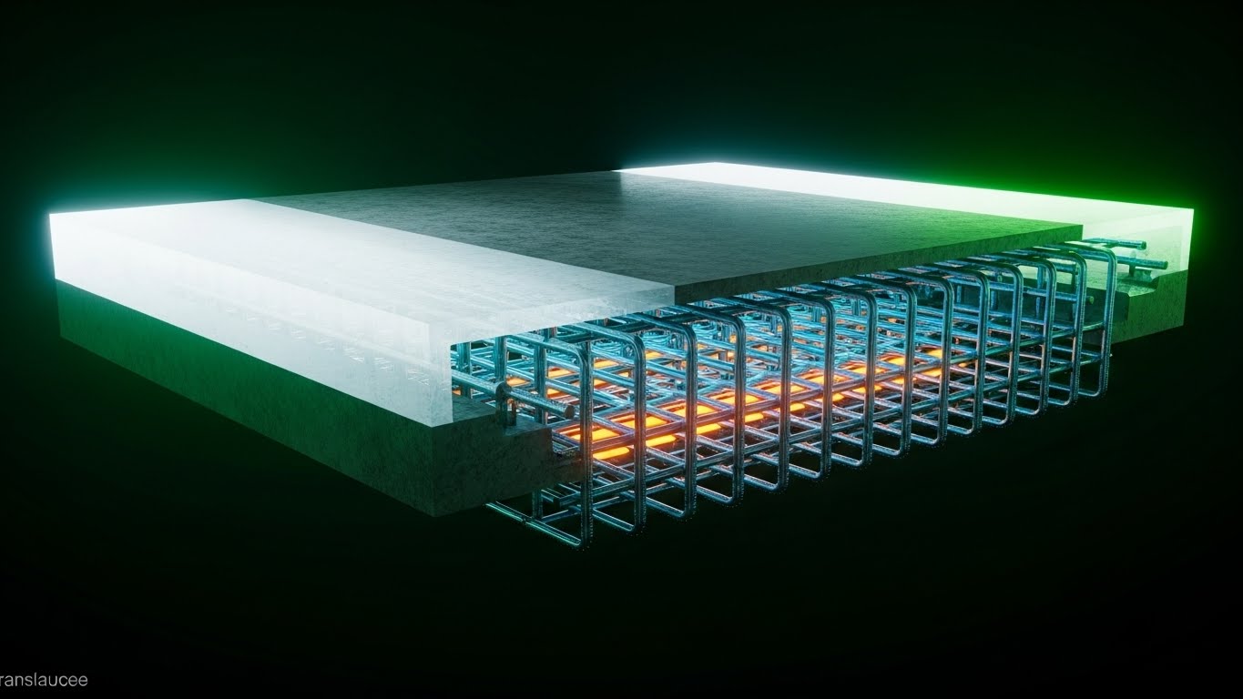
Scenario: A 3D X-ray visualization of a heavy concrete slab. The outer surface is semi-transparent Translucent White, revealing a complex, perfectly aligned internal grid of steel rebar rendered in Steel Blue and Safety Orange. The perspective is a cutaway cross-section. The lighting appears to come from within the object, making the internal structure glow.
Narration: The tone shifts to "Forensic Expert." The voiceover explains the hidden risks of construction—what you can't see—and how the software reveals them before the pour. "See inside the slab before you commit."
2. Psychological Impact & KPI Focus
Niche Psychology: Risk aversion is a primary driver for GCs. This style visualizes risk mitigation. It reassures the stakeholder that the software provides "superman vision," preventing costly strikes or clashes that happen beneath the surface.
Operational Impact: Highly effective for Feature Education (MOFU). It demonstrates the technical capability of collision detection or rebar mapping in a way that 2D drawings simply cannot.
3. Strategic Implementation & Trade-offs
Use Case: Website/LP feature deep-dives.
Duration: 30–60 Seconds.
Trade-off: Technical Accuracy vs. Visual Appeal. The rebar layout must be technically plausible; otherwise, experienced engineers will dismiss the visualization as "fake."
Companies using similar video content -
Raken – Field Reporting & Project Management – Enables rapid data capture and reporting.
Busy Busy – Time Tracking & Job Costing – Captures time and costs quickly.
9. The Trusted Professional
MOFU | Building Trust

1. The Visual & Narrative Approach
Scenario: A medium shot of a professional male surveyor with deep skin tones, wearing a hard hat and high-visibility vest. He is standing on a dusty, active construction site during the day. He holds a rugged tablet and looks at the screen with a focused, confident expression. The background features blurred construction machinery and scaffolding (bokeh).
Narration: The narration is a testimonial or an internal monologue: "I used to worry about the layout. Now, I just trust the green checkmark." It feels personal, authentic, and peer-to-peer.
2. Psychological Impact & KPI Focus
Niche Psychology: Trust is transferred through people, not just interfaces. Seeing a confident, professional peer using the tool reduces the fear of incompetence. It signals, "Professionals like me use this."
Operational Impact: This style targets Building Trust in the MOFU stage. It humanizes the technology, moving the conversation from "features" to "user experience" and "job satisfaction."
3. Strategic Implementation & Trade-offs
Use Case: LinkedIn Video Ads.
Duration: 15–30 Seconds.
Trade-off: Authenticity vs. Uncanny Valley. The Gen AI generation must be flawless. Any glitch in the hands or eyes will immediately destroy trust and distract the viewer.
Companies using similar video content -
Revizto – BIM Collaboration & Clash Detection – Reveals hidden conflicts in models.
PlanRadar – Quality Control & Defect Management – Visualizes issues before they become risks.
10. The Success Signal
MOFU | Overcoming Objections

1. The Visual & Narrative Approach
Scenario: A high-quality lifestyle photograph taken from an over-the-shoulder perspective. A construction worker in a plaid shirt and gloves is holding a tablet. The screen displays a bright, clean UI with a large "Success" checkmark icon in Green and White. The background shows a sun-drenched job site with authentic clutter—lumber, buckets, and dirt—blurred slightly to keep focus on the device.
Narration: "Done right the first time." The audio is light, featuring the sounds of a site packing up for the day—zippers, engines turning off, relaxed chatter. It evokes the feeling of a job well done.
2. Psychological Impact & KPI Focus
Niche Psychology: The ultimate goal for any field worker is to finish the day without errors and go home. This style sells that emotional payoff. It’s not about the struggle of work; it’s about the relief of completion.
Operational Impact: Used for Overcoming Objections in Email Marketing. It subtly combats the objection that "tech is hard to use" by showing a clear, simple success state in a relaxed setting.
3. Strategic Implementation & Trade-offs
Use Case: Email Marketing nurture sequences.
Duration: Static Image or 5-Second Looping GIF.
Trade-off: Generic vs. Specific. Stock photography can feel generic. The UI overlay must be custom and highly relevant to anchor the stock image to the specific software brand.
Companies using similar video content -
SafetyCulture – iAuditor – Safety & Quality Inspections – Empowers field professionals confidently.
Novade – Quality Management Software – Builds trust through consistent project quality.
11. The Holographic Insight
MOFU | Risk Mitigation
1. The Visual & Narrative Approach
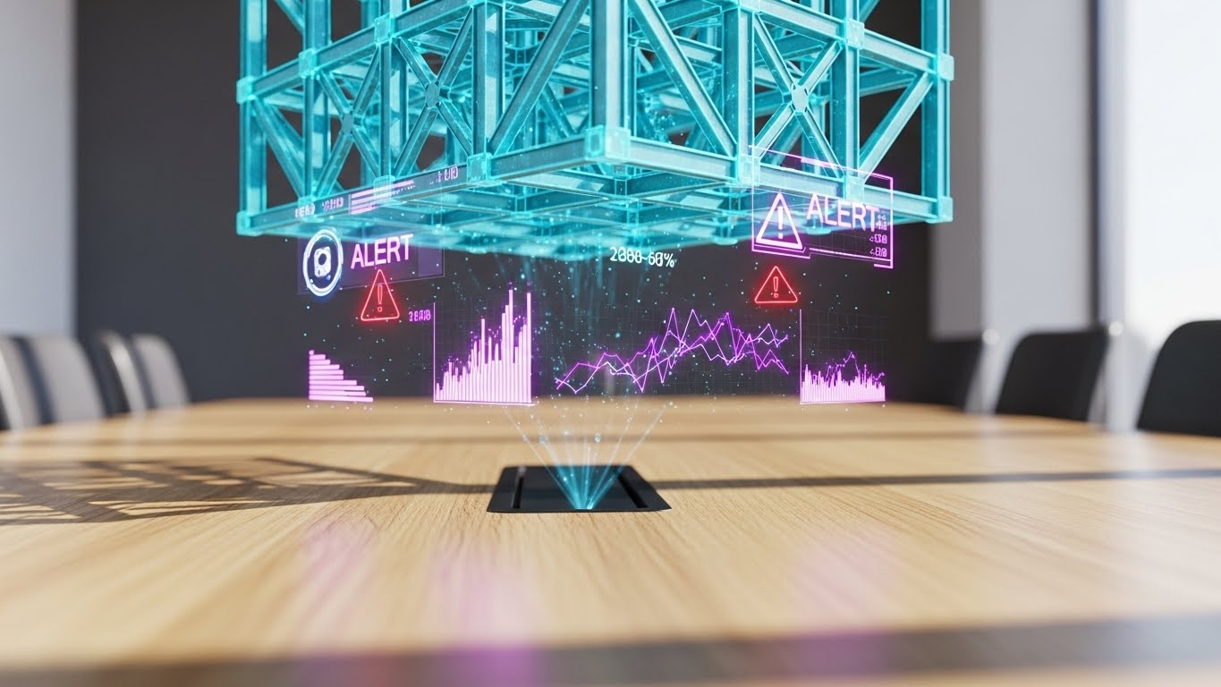
Scenario: The setting is a high-end, sunlit conference room with a light oak table, grounding the technology in a decision-making environment. Hovering just above the surface is a futuristic, semi-transparent Cyan 3D hologram of a building’s structural steel cage. The projection is crisp and stable. Specific connection nodes flash with Red "ALERT" warning icons and floating data points, highlighting a clash before it reaches the field.
Narration: The tone is consultative and preventative. "The cheapest mistake is the one you find here, not out there." The sound design features a subtle, high-tech hum that intensifies when the "Alert" icons appear, followed by a resolving chime as the clash is fixed digitally.
2. Psychological Impact & KPI Focus
Niche Psychology: VDC Directors live in constant fear of "unforeseen conditions"—conflicts that halt production. This style visualizes foresight. It transforms the software from a simple drawing tool into a "safety net" that protects the project schedule and budget.
Operational Impact: Targeted at Risk Mitigation, this visual demonstrates the software’s capability to overlay models and identify discrepancies in a controlled environment, preventing costly RFI (Request for Information) battles on site.
3. Strategic Implementation & Trade-offs
Use Case: Website Feature Pages (Clash Detection) or detailed "Use Case" sections on Landing Pages.
Duration: 15–20 Seconds.
Trade-off: Perception vs. Reality. While visually stunning, this "Iron Man" style interface creates a high expectation of UX. It sells the feeling of insight, effectively bridging the gap between office planning and field reality.
Companies using similar video content -
Buildertrend – Residential Construction Project Management – Streamlines projects for successful completion.
Jobber – Scheduling & Quoting for Contractors – Ensures successful job completion.
12. The Operational Contrast
MOFU | Competitive Displacement

1. The Visual & Narrative Approach
Scenario: A stark split-screen composition creates an immediate "Old vs. New" comparison. The left side is desaturated and gritty, showing a gloved hand struggling with a crumpled, muddy paper blueprint in the wind. The right side is vibrant and saturated, featuring a clean hand holding a rugged tablet displaying a high-contrast digital layout interface in Vivid Green. A sharp diagonal line divides the two worlds.
Narration: "Stop fighting the elements. Start mastering the layout." The audio on the left is muffled wind and frustration (paper flapping); the right is crisp, clear digital chimes. It offers a sensory comparison of struggle versus ease.
2. Psychological Impact & KPI Focus
Niche Psychology: This plays on the field engineer's daily frustration. It doesn't just sell software; it sells dignity. It positions the legacy method (paper) as the enemy of efficiency, leveraging the psychological trigger of "moving away from pain."
Operational Impact: Highly effective for Competitive Displacement. It forces the viewer to acknowledge the inefficiency of their current paper-based processes without explicitly attacking them—the visual contrast does the arguing.
3. Strategic Implementation & Trade-offs
Use Case: Programmatic Display Ads or Retargeting Ads for users who have visited the pricing page.
Duration: 10–15 Seconds (Looping).
Trade-off: Subtlety vs. Clarity. This is an aggressive tactic. It risks alienating traditionalists who take pride in their paper skills, so the tone must remain respectful of the worker, blaming the tool instead.
Companies using similar video content -
Bentley Systems – Synchro – 4D BIM Scheduling – Mitigates pre-construction risks with simulations.
RedTeam Flex – Safety & Project Management – Highlights potential project risks proactively.
13. The Interface Velocity
MOFU | Sales Cycle Acceleration
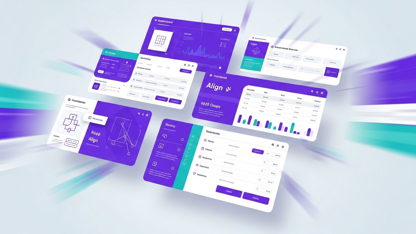
1. The Visual & Narrative Approach
Scenario: A high-energy motion graphic composition suggesting a rapid montage of UI screens. Multiple interface layers—rendered in a brand-aligned Vivid Purple and Teal palette—fly into the frame from the Z-axis. They stack and arrange themselves in mid-air against a clean light-grey background. The camera zooms rapidly into specific features like the "Align" button and coordinate lists, using motion blur to convey speed.
Narration: Fast-paced and rhythmic. "Import. Align. Stake. Report." The voiceover syncs perfectly with the visual zooms, creating a sense of momentum. It suggests that the software keeps up with the fastest thinkers on the job site.
2. Psychological Impact & KPI Focus
Niche Psychology: The "Pragmatic Innovator" worries about the learning curve. "Will my team actually use this?" This style answers with Velocity. By showing the UI responding instantly and intuitively, it reduces the fear of complex implementation and "feature fatigue."
Operational Impact: Designed for Sales Cycle Acceleration. It packs a full product tour’s worth of screens into a high-energy clip, giving stakeholders a "sizzle reel" they can share with decision-makers to prove the software's depth and speed.
3. Strategic Implementation & Trade-offs
Use Case: YouTube Bumper Ads or Event Booth background loops.
Duration: 15 Seconds.
Trade-off: Comprehension vs. Impression. Viewers won't learn how to use the features. They will only learn that the features exist and are fast. It builds excitement, not competence.
Companies using similar video content -
Bluebeam Revu – Document Management & Collaboration – Replaces paper workflows with digital.
FieldPulse – Field Service Management Software – Streamlines operations, replacing manual processes.
14. The Precision Minimalist
MOFU | Driving Demo Requests

1. The Visual & Narrative Approach
Scenario: An elegant, continuous black ink line draws itself across a textured Stark White paper background. The line meticulously forms the complex geometry of a robotic Total Station on a tripod. The drawing style is architectural and exact, stripping away all environmental noise to focus on the instrument itself. The composition is perfectly centered and symmetrical.
Narration: Soft, sophisticated, and understated. "Precision isn't complicated. It's connected." The sound design features the scratching of a pen and the mechanical whir of a servo motor, blending the analog design heritage with digital execution.
2. Psychological Impact & KPI Focus
Niche Psychology: Surveyors and Layout Chiefs view themselves as craftsmen. This style respects that artistry. It strips away the marketing noise and focuses on the tool itself, appealing to the professional who values elegance and accuracy over flashiness.
Operational Impact: This style drives Demo Requests by appealing to the intellectual side of the buyer. It signals a premium, engineering-first brand experience that stands out against noisy, feature-heavy competitor ads.
3. Strategic Implementation & Trade-offs
Use Case: Website headers, "Our Story" sections, or high-end Direct Mail QR code destinations.
Duration: 10–15 Seconds.
Trade-off: Emotion vs. Function. It is purely emotional branding. It conveys zero functional information about the software's UI capabilities.
Companies using similar video content -
Smartsheet – Field & Office Workflow Management – Accelerates project workflows and collaboration.
Plaky – Construction Scheduling – Accelerates task management and project scheduling.
15. The Data Skyscraper
MOFU | The Functional Buyer

1. The Visual & Narrative Approach
Scenario: A cinematic night shot looking up at a rising skyscraper. The physical building blurs with the time-lapse movement of clouds and cranes (Steel Grey/Blue). Superimposed on this reality are sharp, static, rising vertical data streams and digital floor indicators in bright Orange ("=10:0", "=110:0"). The data "rains" down from the cloud, anchoring firmly to the physical structure.
Narration: "The city never stops. Neither does your data." The voiceover addresses the scale of modern construction, positioning the software as the anchor that holds complex projects together amidst the chaos of the schedule.
2. Psychological Impact & KPI Focus
Niche Psychology: Field Operation Managers worry about "drift"—the discrepancy between the model and the build, especially in vertical construction. This visualization reassures them that the data is inextricably linked to the physical asset. It visualizes Stability in Chaos.
Operational Impact: Targets the Functional Buyer who needs to ensure that progress tracking is automated. It demonstrates that as the building grows, the data grows with it, implying automated progress reporting and verification.
3. Strategic Implementation & Trade-offs
Use Case: Social Media Ads (LinkedIn/Instagram) targeting Field Superintendents.
Duration: 15–20 Seconds (Vertical format ideal).
Trade-off: Scale vs. Detail. It captures the grandeur of a high-rise project but is less effective for showing detailed interior workflows or specific MEP coordination.
Companies using similar video content -
McNeel & Associates – Rhino 3D – VDC Design Software – Focuses on elegant, accurate geometry.
Vectorworks – BIM Design & Documentation – Articulates elegant simplicity in design.
16. The Augmented Foreman
MOFU | The Champion

1. The Visual & Narrative Approach
Scenario: A wide, photorealistic shot of a construction foreman walking confidently across a concrete slab in the bright midday sun. As he moves, stylized flat vector icons—Green checkmarks, White location pins, and path indicators—pop up in 3D space around him, tracking his movement. The graphics are simple and helpful, creating a "Mixed Reality" aesthetic that visualizes his situational awareness.
Narration: "Walk the site with confidence. Verify as you go." The narrative shifts focus from the technology to the human. It highlights how the software turns a standard foreman into a "super-user" of data.
2. Psychological Impact & KPI Focus
Niche Psychology: Field crews often resist software they feel is "watching" them. This style flips the script: the software is aiding them. It positions the technology as a superpower for the "Champion"—the user who will advocate for the software internally.
Operational Impact: Effectively targets Internal Buy-in. By visualizing the seamless integration of tech into the daily walk-through, it reduces the perceived friction of adoption and humanizes the ROI.
3. Strategic Implementation & Trade-offs
Use Case: LinkedIn Organic posts and Customer Success Stories.
Duration: 30–45 Seconds.
Trade-off: Realism vs. Effect. The tracking of the 2D elements must be perfect. If the icons "slide" or detach from the background, the illusion of accuracy is broken.
Companies using similar video content -
Oracle – Primavera Cloud – Manages large-scale vertical construction data effectively.
ConstructionOnline – Job Costing & Project Management – Visualizes project scale and financial stability.
17. The Material ROI
BOFU | ROI Justification
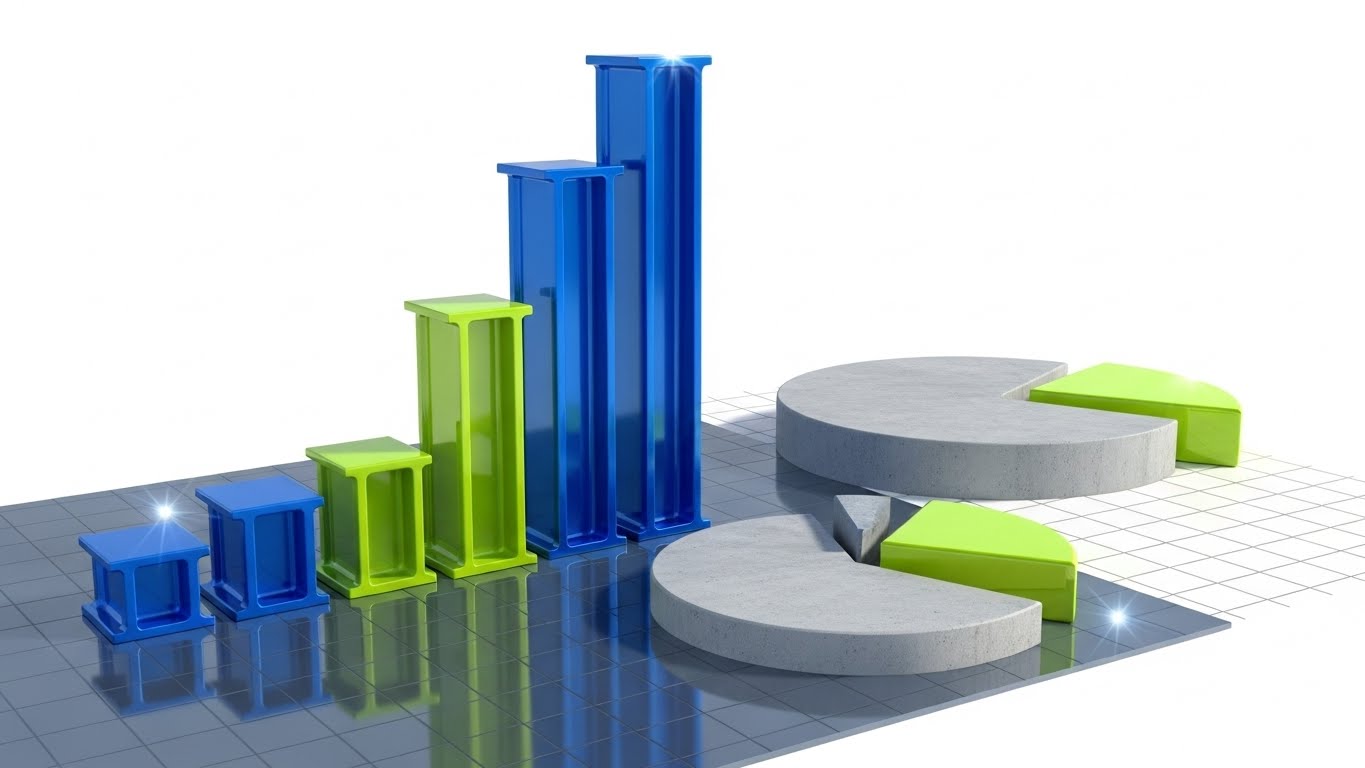
1. The Visual & Narrative Approach
Scenario: An abstract data visualization where the financial charts are constructed from actual building materials. Rising bar graphs are represented by extruded steel I-beams in Blue and Green. Pie charts are sections of poured concrete. The background is a clean technical grid. As the "revenue" beam rises, it gleams with a metallic sheen, symbolizing the solidity of the savings.
Narration: "Built on solid numbers." The tone is financial and executive. It speaks the language of the CFO—reduction in waste, optimization of materials, and hard dollar savings.
2. Psychological Impact & KPI Focus
Niche Psychology: The "Economic Buyer" (CFO/Owner) doesn't care about the point cloud; they care about the bottom line. This style translates abstract software metrics into physical value. It makes the ROI feel heavy, real, and undeniable.
Operational Impact: Specifically designed for ROI Justification in the BOFU stage. It helps the internal champion present the business case to leadership by visually equating software efficiency to physical assets.
3. Strategic Implementation & Trade-offs
Use Case: Presentation Decks (Sales demos) or Proposal Videos.
Duration: Static Image or 10-Second Loop.
Trade-off: Metaphor vs. Hard Data. It sets the mood for financial discussion but requires actual numbers (overlays) to be persuasive.
Companies using similar video content -
Fieldwire – Jobsite Management – Empowers field leads with real-time data.
Finalcad – Quality Control & Field Management – Augments field teams with digital tools.
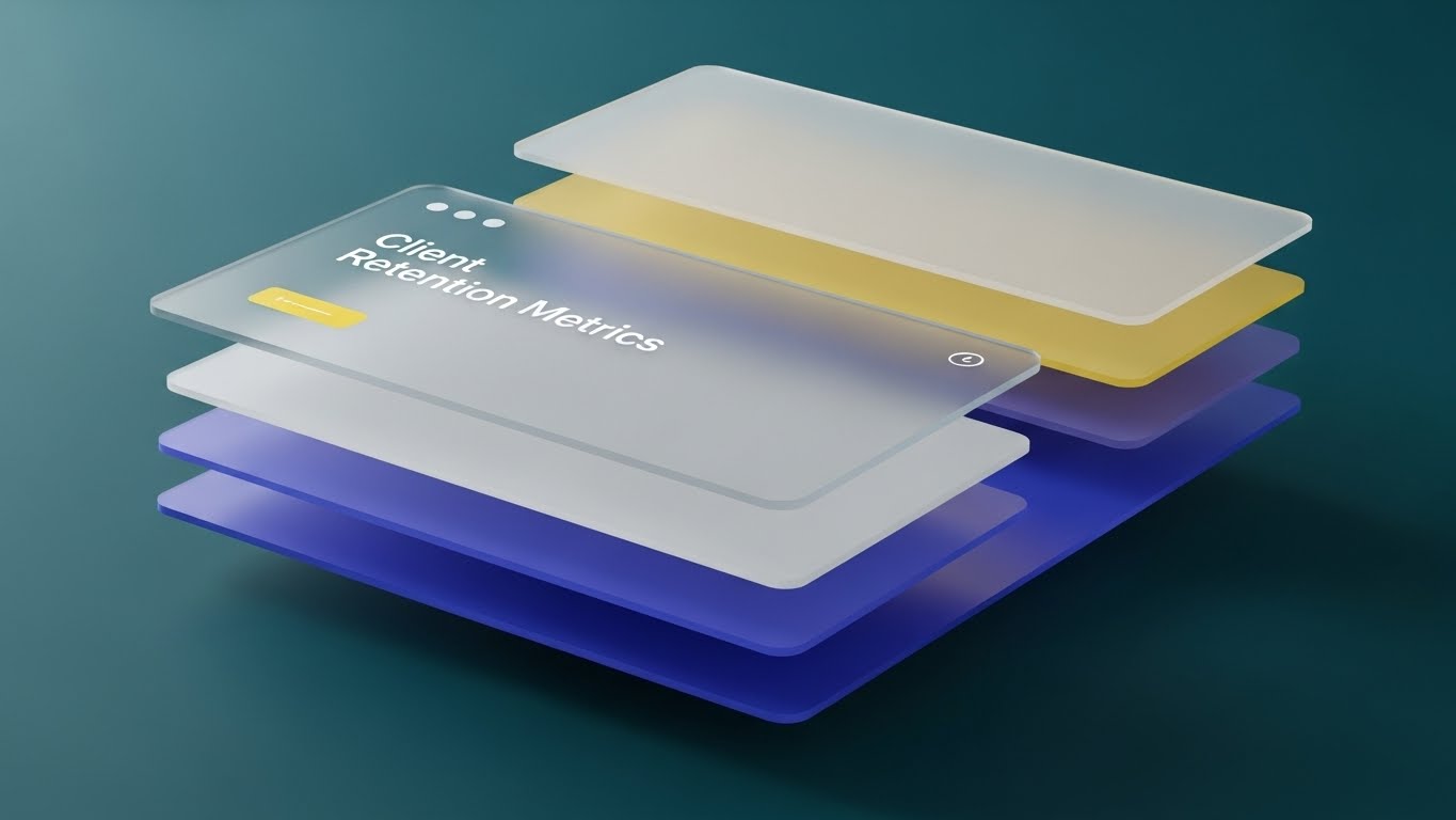
18. The Data Fortress
BOFU | The Economic Buyer

1. The Visual & Narrative Approach
Scenario: A studio-lit, photorealistic 3D composition. A gold and silver metallic shield stands guard in front of a glowing, translucent Blue cube labeled "CORE DATA." The shield reflects the environment, suggesting high polish and strength. The cube represents the project’s single source of truth, protected from corruption or loss.
Narration: "Your data is your most valuable asset. Protect it." The voice is grave and assuring, emphasizing security, liability, and insurance.
2. Psychological Impact & KPI Focus
Niche Psychology: The Economic Buyer (Owner/Developer) is driven by risk aversion—fear of litigation, data corruption, and rework costs. This visual serves as a Trust Signal. It moves the conversation from "efficiency" to "security," positioning the software as an insurance policy for project data.
Operational Impact: Visualizes the abstract concept of Data Integrity. It reassures the buyer that their intellectual property (the BIM model) is safe, secure, and unalterable.
3. Strategic Implementation & Trade-offs
Use Case: Enterprise Security Whitepapers or Contract Finalization decks.
Duration: Static Image or 5-Second breathing loop.
Trade-off: Symbolism vs. Feature. It doesn't show how the data is secured (e.g., encryption), only that it is secure. It is a brand promise, not a technical demonstration.
Companies using similar video content -
Kojo – Materials Management Software – Optimizes material procurement for financial savings.
Beck Technology – DESTINI Estimator – Construction Estimating Software – Models tangible financial outcomes.
19. The Neural Network
BOFU | The Technical Buyer

1. The Visual & Narrative Approach
Scenario: A clean, white digital space featuring a complex network of Orange spheres (nodes). These nodes are interconnected by flowing streams of Blue and Silver light, representing API calls and cloud synchronization. The camera rotates slowly around this "neural network," showing the density and robustness of the connections.
Narration: "One Model. One Truth. Zero Confusion." The tone is technical and structural. It explains the architecture of the software—cloud syncing, API integrations, and version control.
2. Psychological Impact & KPI Focus
Niche Psychology: The "Technical Buyer" (IT Director/CTO) fears data silos. They need to know that the office model matches the field reality. This style visualizes Integration. It calms the anxiety of fragmented data by showing a unified, elegant system that plays nice with the existing ecosystem.
Operational Impact: Validates the Technical Architecture. It visually demonstrates the concept of a "Single Source of Truth" distributed across multiple endpoints without breaking.
3. Strategic Implementation & Trade-offs
Use Case: Technical Whitepaper headers or Integration pages.
Duration: 30–60 Seconds.
Trade-off: Abstract vs. Concrete. It is highly abstract. Field users may find it irrelevant ("What does this button do?"), so it must be reserved for technical/executive audiences.
Companies using similar video content -
CMiC – ERP for Construction – Secures project data and financials comprehensively.
Jonas Construction Software – ERP for Complex Projects – Protects enterprise-level project data.
20. The Closed Deal
BOFU | ROI Justification Hook

1. The Visual & Narrative Approach
Scenario: A cinematic, high-production-value close-up of a firm handshake between two men wearing construction gloves. The lighting is "Golden Hour"—Teal and Orange—casting a warm glow on the scene. The background is a blurred (bokeh) construction superstructure. Anamorphic lens flares add a movie-like quality. The focus is entirely on the grip and the texture of the materials.
Narration: "Trust is built on precision." A deep, resonant voiceover closes the narrative. It connects the technical accuracy of the software to the human trust between a General Contractor and their Client.
2. Psychological Impact & KPI Focus
Niche Psychology: Ultimately, construction is a relationship business. Technology is just a means to an end; the end is a trusted relationship. This style triggers the Emotional Validation of a job well done. It reminds the viewer why they want accuracy: to keep their promises.
Operational Impact: Serves as the ROI Justification Hook. It subliminally argues that the cost of the software is negligible compared to the value of the reputation it protects.
3. Strategic Implementation & Trade-offs
Use Case: The final scene of a long-form demo video or a LinkedIn Video Ad retargeting warm leads.
Duration: 5–10 Seconds.
Trade-off: Cliché Risk. The "handshake" is a stock footage cliché. It must be executed with high-end, cinematic lighting and texture (via Gen AI or premium stock) to feel epic rather than cheesy.
Companies using similar video content -
AWS – IoT TwinMaker – Digital Twin Service – Unifies project data from various sources.
Ansys – Ansys Digital Twin – Simulation-based Digital Twin – Integrates complex simulation data.
21. The Aspirational Horizon
BOFU | Risk Mitigation Hook

1. The Visual & Narrative Approach
Scenario: A high-key, cinematic shot taken from a low angle, looking up at a diverse team of construction professionals (Field Engineers, Superintendents, Project Managers) standing on the top deck of a finished skyscraper. The sky is a brilliant, cloudless Azure Blue. Their hard hats are pristine White. They point outward toward a sprawling city skyline, their body language relaxed and authoritative.
Narration: "The view is better when the foundation is perfect." The voiceover is inspirational, shifting from the technical details of the software to the ultimate result of the project: a safe, successful build that shapes the skyline.
2. Psychological Impact & KPI Focus
Niche Psychology: At the end of the sales cycle, the buyer (often an Executive) needs emotional validation. They want to feel that purchasing this software is a "winning move" that leads to safety, prestige, and project success. This style sells the feeling of being a market leader.
Operational Impact: Targets Risk Mitigation by associating the brand with the "finished, safe project." It subtly implies that using this software eliminates the disasters (rework, litigation) that prevent teams from reaching this moment of triumph.
3. Strategic Implementation & Trade-offs
Use Case: The "Hero" section of the main Website or the final slide of an Investor Deck.
Duration: Static Image or Slow-Motion Video (10 Seconds).
Trade-off: Inspiration vs. Specificity. This is pure branding. It tells the user nothing about the product features, but it is essential for establishing the emotional capability of the brand.
Companies using similar video content -
Procore – Construction Management Platform – Builds trust through successful project delivery.
JobNimbus – CRM & Project Management – Fosters trusted client relationships.
22. The Low-Barrier Entry
BOFU | Driving Freemium/Trials

1. The Visual & Narrative Approach
Scenario: A flat, modern 2D vector illustration in the "Corporate Memphis" style. A stylized female field engineer with exaggerated, joyful proportions kneels next to a wooden crate labeled "Free Trial." The palette is vibrant Primary Red, Blue, and Yellow. She effortlessly lifts a glowing tablet out of the crate, symbolizing accessibility. The background is a simplified, non-threatening construction site.
Narration: "No credit card. No heavy lifting. Just start." The tone is playful, inviting, and devoid of pressure. It emphasizes the "lightness" of getting started.
2. Psychological Impact & KPI Focus
Niche Psychology: Junior engineers and small GCs are often intimidated by "Enterprise Software" is too heavy, expensive, or complex for them. This style disarms that fear. The playful aesthetic signals that the software is accessible, friendly, and easy to try.
Operational Impact: Specifically designed to drive Freemium Sign-ups. It reduces the psychological friction of clicking the "Start Trial" button by visually promising a fun, low-risk experience.
3. Strategic Implementation & Trade-offs
Use Case: Email Marketing campaigns targeting Small to Mid-sized Businesses (SMBs).
Duration: 15–30 Seconds.
Trade-off: Approachability vs. Authority. The playful style may be perceived as "unprofessional" by massive enterprise clients who expect rigid engineering aesthetics. It must be targeted carefully.
Companies using similar video content -
ComplianceQuest – Safety, Compliance & Risk Management – Leads to safe, successful projects.
Projul – Comprehensive Construction Management – Inspires successful project outcomes.
23. The Isometric Connection
Onboarding | Accelerating Time-to-Value

1. The Visual & Narrative Approach
Scenario: A charming, isometric 3D clay render (diorama style) against a soft Studio Grey background. On the left is a miniature office desk; on the right, a miniature construction site. A visible, glowing wire connects them. A Soft Pastel Green data packet travels along the wire from the desk to the site. The lighting is soft and global, creating a toy-like, manageable feel.
Narration: "From your desk to their hands in seconds." The narrator acts as a helpful guide, explaining the file transfer process as if it were a simple physical action, demystifying the cloud sync process.
2. Psychological Impact & KPI Focus
Niche Psychology: New users often feel anxiety about the "black box" of cloud syncing. "Where does my file go?" This style makes the invisible visible. It provides a mental model of the connection, making the user feel in control of the data flow.
Operational Impact: Targets Time-to-Value. By simplifying the concept of "Model Export," it encourages users to attempt their first sync immediately, reducing the drop-off rate during onboarding.
3. Strategic Implementation & Trade-offs
Use Case: In-App "First Run" pop-up videos or Onboarding emails.
Duration: 15–20 Seconds.
Trade-off: Abstraction vs. Technical Detail. It doesn't show the actual upload dialog box or API settings. It is a conceptual primer, not a technical tutorial.
Companies using similar video content -
Contractor Foreman – All-in-one for Small/Medium GCs – Accessible and easy to start.
24. The Self-Serve Guide
Onboarding | Self-Serve Onboarding
1. The Visual & Narrative Approach
Scenario: A front-facing view of the software’s interface in Light Mode. The design is minimal, utilizing Mint Green and White with soft drop shadows to create depth. The cursor hovers over a central "Play" button (or "Start Layout"). The background is a blurred abstract pattern in matching pastel tones, keeping the focus strictly on the happy path.
Narration: "Click here to begin your first layout." The voice is calm, slow, and instructional. It isolates a single action, stripping away all other UI distractions.
2. Psychological Impact & KPI Focus
Niche Psychology: Complexity causes paralysis. When a user first opens the app, they are looking for a "safe" place to click. This style provides that focal point. It uses White Space and Soft Lighting to reduce anxiety and signal that the interface is harmless and intuitive.
Operational Impact: Critical for Self-Serve Onboarding. It reduces the burden on the Customer Success team by visually guiding the user through the "Aha!" moment without human intervention.
3. Strategic Implementation & Trade-offs
Use Case: In-App Tooltips or "Welcome" modal windows.
Duration: 5–10 Seconds (Looping).
Trade-off: Idealism vs. Reality. Real projects have messy file names and complex layer lists. This view is idealized; users may be confused if their actual screen looks more cluttered.
Companies using similar video content -
Trimble – Trimble Connect – Common Data Environment – Simplifies data transfer from desk to field.
25. The Import Slide
Onboarding | Reducing Friction

1. The Visual & Narrative Approach
Scenario: A minimalist flat 2D vector icon animation. A Salmon-colored document icon slides smoothly from the left into a Navy Blue tablet icon on the right. The background is solid Seamless White. There are no outlines, only solid geometric blocks. The motion is eased perfectly—slow start, fast slide, soft stop—conveying a satisfying "click" fit.
Narration: "Drag. Drop. Done." The audio is purely sound design—a satisfying "swoosh" and a "click" sound that signifies a secure connection.
2. Psychological Impact & KPI Focus
Niche Psychology: Friction is the enemy of adoption. Users dread the "Import Error." This visual uses Kinetic Satisfaction to promise a frictionless experience. It implies that the software is compatible, accepting, and ready for their data.
Operational Impact: Focused on Reducing Friction in the Support Portal. When a user searches "How to import," this simple visual answers the question instantly, reinforcing the "Drag and Drop" capability.
3. Strategic Implementation & Trade-offs
Use Case: Help Center articles or "Empty State" screens in the software.
Duration: 3 Seconds (Looping GIF).
Trade-off: Symbolism vs. Instruction. It is purely symbolic. It does not show where on the screen to drag the file, so it must be paired with text instructions.
Companies using similar video content -
BrickControl – Cloud-based Construction Management – Intuitive UI for self-sufficiency.
26. The Tactile Toggle
Retention | Knowledge Base

1. The Visual & Narrative Approach
Scenario: A macro photography close-up of a rugged tablet screen. The depth of field is extremely shallow, focusing sharply on a specific UI toggle switch and the tip of a gloved finger about to press it. You can see the texture of the glove and the sub-pixels of the screen. The background is dark, highlighting the glowing UI elements.
Narration: "Control every detail." The sound design magnifies the "tactile" nature of the touch—a subtle digital hum and a crisp engagement sound.
2. Psychological Impact & KPI Focus
Niche Psychology: Expert users (Field Chiefs) pride themselves on knowing the tool inside and out. This style appeals to that mastery. It fetishizes the interface, making the interaction feel premium, responsive, and precise. It creates a desire to "touch" the software.
Operational Impact: Used in the Knowledge Base for deep-dive tutorials. It signals that the content will cover the nuanced, granular settings that power users care about, driving Feature Depth.
3. Strategic Implementation & Trade-offs
Use Case: Advanced Tutorial Video thumbnails or "Pro Tips" email headers.
Duration: Static Image or Slow Zoom Video.
Trade-off: Context vs. Focus. By zooming in so close, the user loses the context of where this button is located in the broader menu system.
Companies using similar video content -
Fluix – Mobile Field Reporting & Workflow Automation – Visualizes easy document input.
27. The Data Depth
Retention | Deep Feature Adoption
1. The Visual & Narrative Approach
Scenario: A 3D parallax composition where the UI screen is exploded into floating layers. The bottom layer is the map; the middle is the grid; the top is a semi-transparent Heat Map in Red and Orange. The camera moves sideways, revealing the physical separation between these data layers against a Translucent Glass background.
Narration: "See beyond the surface." The voiceover explains the power of overlaying multiple data sets (e.g., "Layer your heatmap over the structural grid").
2. Psychological Impact & KPI Focus
Niche Psychology: Retention depends on the user realizing the software is more than just a digital ruler. This style visualizes Depth. It shows the user that there is "more to find," encouraging them to explore advanced features like heat maps or clash layers.
Operational Impact: Targets Deep Feature Adoption. It visually explains the concept of "Data Layering," which can be hard to grasp in a 2D view, thereby increasing the "stickiness" of the product.
3. Strategic Implementation & Trade-offs
Use Case: "What's New" release videos or Feature Spotlight emails.
Duration: 10–15 Seconds.
Trade-off: Visual Noise vs. Clarity. If too many layers are shown, it becomes chaotic. The composition must remain disciplined to show the relationship between the data sets clearly.
Companies using similar video content -
HCSS – Safety Management & Material Tracking – Granular control over field operations.
28. The Always-On Link
Retention | Reducing Churn

1. The Visual & Narrative Approach
Scenario: A vertical 2D animation with cel-shading (comic book style). A stylized tablet on the ground emits a signal wave up to a satellite orbiting in a purple sky. Clouds are stylized white puffs. The camera tilts up, following the signal. The palette uses vibrant, geometric colors.
Narration: "You are never out of range." The narration emphasizes connectivity, support, and the cloud backbone that ensures data is never lost, even in remote locations.
2. Psychological Impact & KPI Focus
Niche Psychology: Field crews in remote locations fear isolation—being cut off from the office or support. This style reassures them. It visualizes an unbreakable link. It comforts the user with the knowledge that the "eye in the sky" (the server/support) is watching over their data.
Operational Impact: Focused on Reducing Churn. By highlighting the robustness of the sync and support infrastructure, it reminds the customer of the "invisible value" they are paying for—reliability.
3. Strategic Implementation & Trade-offs
Use Case: Social Media Retargeting (Instagram Stories) for existing users.
Duration: 15 Seconds (Vertical).
Trade-off: Playfulness vs. Seriousness. The cel-shaded style is very stylized. It risks making the satellite technology look "cartoonish" rather than military-grade, which matters to some enterprise buyers.
Companies using similar video content -
Evercam – Construction Site Monitoring & BIM Data – Visualizes multiple data layers.
29. The Expansion Scanner
Expansion | Driving Upsell
1. The Visual & Narrative Approach
Scenario: A low-poly 3D render of a construction site foundation. The ground is made of faceted triangles in earth tones (Brown, Tan). A blocky, low-poly drone (Blue) flies over the site, casting a "scan beam" that turns the brown triangles into Green "verified" polygons. The style evokes a video game aesthetic (simulation). The lighting is bright and directional with hard shadows.
Narration: "Level up your layout. Add aerial intelligence." The language is gamified ("Level up"), appealing to the user's desire to upgrade their toolkit and capabilities.
2. Psychological Impact & KPI Focus
Niche Psychology: "Gamification" works well with the younger generation of surveyors. This style borrows the visual language of simulation games (SimCity, Minecraft). It frames the upsell (drone integration) as a "Level Up" capability, making the advanced tech feel accessible and fun.
Operational Impact: Targets Driving Upsell. It simplifies the complex concept of photogrammetry into a simple visual metaphor: "Fly over, turn green, job done." This clarity helps sell complex add-on modules.
3. Strategic Implementation & Trade-offs
Use Case: In-App banners promoting the "Pro" or "Enterprise" tier.
Duration: 10–15 Seconds.
Trade-off: Game Aesthetic vs. Accuracy. Low-poly is inherently inaccurate. It cannot be used to sell accuracy, only the concept of scanning.
Companies using similar video content -
Cintoo Cloud – Point Cloud & Reality Capture – Ensures continuous data connectivity.
30. The Exclusive Network
Expansion | Driving Referrals
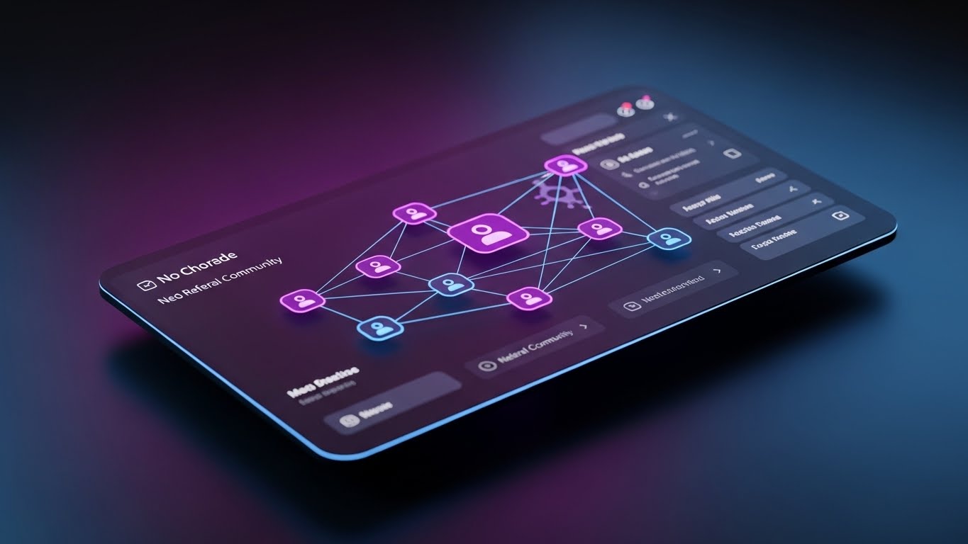
1. The Visual & Narrative Approach
Scenario: A sleek Dark Mode UI dashboard shown in perspective. The palette is Dark Charcoal, Neon Purple, and Electric Blue. The screen displays a network graph of connected nodes, representing a user referral community. The background is a dark, smooth gradient. The UI elements glow against the dark background, looking premium, exclusive, and "Pro."
Narration: "Join the network of modern builders." The tone is exclusive. It frames the referral not as a "favor," but as an invitation to a high-performance club.
2. Psychological Impact & KPI Focus
Niche Psychology: VDC Directors and top-tier Superintendents see themselves as an elite group of "modernizers" in a traditional industry. This style appeals to that Ego. Dark mode signals "developer-grade" or "expert" tools.
Operational Impact: Drives Referrals. It visually positions the referral program as a professional network expansion rather than a sales pitch, increasing the likelihood of peer-to-peer sharing.
3. Strategic Implementation & Trade-offs
Use Case: Email Marketing for the "Referral Program" launch.
Duration: Static Image or 5-Second breathing glow loop.
Trade-off: Mood vs. Readability. Dark mode is cool, but can be hard to read in bright sunlight. This marketing asset sells the cool factor, not the daylight usability.
The Visual Operations Doctrine: A Strategic Synthesis
The 30 styles outlined above are not merely aesthetic choices; they represent a "Visual Operating System" for the modern construction technology firm. To transition from "content creation" to "strategic infrastructure," organizations must adopt a holistic framework that aligns these visuals with business outcomes.
The following knowledge segments synthesize the insights from all 30 styles into actionable business strategies, designed to bridge the gap between technical capability and market dominance.
Strategic Alignment & Visual Architecture
The "Pre-Production" Strategy: Defining the Visual OS
Before a single frame is rendered, the visual architecture must be aligned with the cognitive reality of the construction site. The "Pragmatic Innovator" does not consume content in a vacuum; they consume it amidst the chaos of logistics, weather, and deadlines.
- The Cognitive Load Audit: Construction professionals suffer from decision fatigue. Before commissioning any video, assess the complexity of the current SOP. If a layout task takes 10 steps in the manual, the video must reduce it to 3 visual beats (e.g., Style 5). Visuals must subtract complexity, not just record it.
- Role-Based Visual Mapping: Do not use a "one-size-fits-all" visual strategy. Field Crews require mobile-first, high-contrast visuals (Style 1) viewable in bright sunlight. VDC Directors require desktop-optimized, data-dense visualizations (Style 18) that visualize complexity and control.
- The "Glanceability" Standard: In high-stress logistics environments, comprehension must be instantaneous. We apply a "3-Second Rule" to all TOFU and Onboarding assets. If the value proposition isn't clear in 3 seconds (without audio), the visual architecture has failed.
- Brand Voice Consistency: A fragmented visual identity suggests a fragmented product. Whether using Low-Poly (Style 29) for upsells or Photorealism (Style 9) for trust, the color palette and typographic hierarchy must remain rigid to create a unified brand universe.
- The Advids Strategic Audit: This is where an external partner becomes critical. An internal team often lacks the distance to see their own product's complexity. Advids performs a "Visual Audit" to define this operating system before production begins, ensuring that every asset builds toward a cumulative brand equity rather than existing as an isolated marketing tactic.
- Standardization vs. Customization: For generic workflows (e.g., "File Import"), use standardized, abstract styles (Style 25) to reduce production costs. For niche, high-value workflows (e.g., "Drone Scanning"), invest in bespoke, high-fidelity visualizations (Style 29) to signal premium capability.
- The Cross-Departmental Bridge: Use visuals to unify terminology. Sales calls it "features," Ops calls it "workflows." Use visuals like The Digital Bridge (Style 3) to unify terminology. When Sales shows the bridge, Ops understands the workflow, aligning expectations before the contract is signed.
- Legacy System Integration: The industry is filled with old hardware. Use The Seamless Transfer (Style 23) to visually respect the legacy hardware (Total Stations) while highlighting the modern software connection. Don't erase the past; connect to it.
- Accessibility in the Field: Design motion graphics for a diverse, multi-lingual workforce. Rely on kinetic typography (Style 1) and visual cues (Green Checks/Red Xs) rather than voiceover alone. Visuals are a universal language on a polyglot job site.
- The Mobile-First Mandate: 80% of field personnel will view these assets on a mobile device. All 30 styles must be "safe-zoned" for vertical consumption, ensuring that text overlays and key visual elements are not obscured by UI controls.
Operational Adoption & Implementation
The "Deployment" Phase: Embedding Visuals into the Workflow
The best video is useless if it sits unseen in a marketing folder. This segment focuses on operationalizing the visual assets to drive adoption and reduce friction in the field.
- Overcoming "Big Brother" Anxiety: Field crews often fear that digitization is synonymous with surveillance. We must use empathy-driven visuals (Style 16: The Augmented Foreman) to reframe the narrative. The visuals must show the technology empowering the worker, not tracking them.
- The Micro-Learning Shift: The era of the PDF manual is over. We replace 50-page documents with a library of 30-second "Micro-Drills" (Styles 13, 24). These assets are indexed and embedded directly into the software's "Help" tooltips, providing answers at the exact moment of need.
- Just-in-Time Support: Support ticket volume can be decimated by embedding specific visual styles (Style 25) into the error messages themselves. When a user fails an upload, a looping GIF should immediately show them the correct action, turning frustration into education.
- Gamification of Training: Drivers and field engineers respond to progress. We can use The Success Signal (Style 10) and The Low-Poly (Style 29) visuals within the user dashboard to reward "Power Users." Visualizing their "Skill Tree" or "Usage Streak" encourages deeper adoption through positive reinforcement.
- Reducing Support Ticket Volume: There is a direct financial correlation between the quality of "Self-Serve" visuals (Style 24) and the cost of customer support. High-quality, silent, looping visuals act as a first line of defense, resolving Tier 1 queries without human intervention.
- Remote Onboarding: In a distributed construction market, physical training seminars are costly and unscalable. We leverage The Isometric Connection (Style 23) to conduct "Virtual Onboarding." These assets simulate the physical context, allowing users to build mental models of the site without leaving their office.
- SOP Transformation: Transform text-based Standard Operating Procedures (SOPs) into visual process flows (Style 5). A visual animation of "How to stake a point" is less ambiguous and more legally defensible than a written description.
- Feedback Loops: Use interactive video elements. At the end of a Style 14 tutorial, ask "Did this help?" The data collected allows you to refine the visual strategy continuously.
- Scalable Localization: Construction is global. By relying on visual narratives (Style 1, 7, 25) rather than voiceovers/text, you drastically reduce the cost of localizing your assets for Spanish, French, or Japanese speaking crews.
- Leadership Communication: When pitching to the C-Suite, the visual language must shift from "How-to" to "Financial Impact." Styles like The Material ROI (Style 17) and The Data Fortress (Style 18) are reserved for Executive Business Reviews (EBRs), transforming usage data into narratives about risk and revenue.
Measuring Impact & Future-Proofing
The "ROI" Phase: Quantifying Success and Evolving the System
Finally, we must treat video not as "creative content" but as "infrastructure." This requires rigorous measurement and a plan for long-term evolution.
- Beyond "Views": Do not measure video success by YouTube views. Define actionable KPIs: "Time-to-Competency" (how fast a new user completes a layout), "Feature Adoption Rate" (clicks on a new tool after watching Style 27), and "Support Ticket Deflection."
- The "Idle Time" Metric: Correlate better visualization with reduced software navigation time. If a Style 13 video reduces the time a user spends searching for a button by 10%, that is quantifiable productivity gained across the entire fleet.
- Compliance Velocity: How fast can the field adopt a new feature? Use Style 11 to explain why a feature matters (e.g., safety), and measure the uptake rate post-viewing.
- Retention and Churn (LTV): High-quality UX visualization (Style 28) directly impacts Lifetime Value (LTV). It signals to the customer that the product is premium and constantly evolving. "Perceived Innovation" is a key driver of retention.
- The AI Visual Frontier: Prepare for the next wave: Generative AI video. Start experimenting with Style 9 (Gen AI Realistic) to create bespoke scenarios for every client pitch without the cost of a film crew.
- Scalability of Assets: Build a library that grows with the feature set. Use modular animation files where the "Screen Content" is a replaceable dynamic layer, allowing for rapid versioning without re-shooting.
- The Advids Partnership: As the library grows to hundreds of assets, internal teams will bottleneck. A long-term partner like Advids ensures asset scalability, maintaining the "Visual Operating System" integrity while the product evolves.
- Benchmarking Success: "Good enough" visuals are a competitive risk. If your competitor uses Style 12 (Photorealistic 3D) and you use screen recordings, you lose the perception battle before the demo starts. Regularly benchmark against the "Gold Standard" styles in this guide.
- The ROI of Safety: Quantify insurance cost reduction through better visual safety training (Style 11). If visual clash detection prevents one major field accident or rework, the ROI of the video strategy is immediate and massive.
- Final Call to Innovation: Treat video as infrastructure, not content. In a digital-first construction industry, the visual layer is the interface between the human and the data. Invest in it with the same rigor you invest in the code itself.
Companies using similar video content -
Dusty Robotics – FieldPrinter – Robotic Layout & Digital Twin – Advanced capture and layout.
Author & Editor Bio


