
Introduction: Bridging the Physical-Digital Divide
The construction industry is currently navigating a tectonic shift. We are moving from an era defined by clipboard friction and fragmented spreadsheets to a future of "Connected Jobsite" intelligence. However, for many Operations Directors and Project Executives, this transition creates a new layer of anxiety: data overload. They are drowning in information but starving for insight.
The challenge for software platforms in this space is clarity. You aren't just selling features; you are selling the ability to see through the chaos. This is a financial imperative. Industry research indicates that 14% of all rework in construction is caused specifically by bad data—information that is siloed, inaccurate, or inaccessible to the field (Autodesk/FMI). This "blind spot" is where profit margins evaporate.
Video visualization is your most powerful tool to bridge this gap. By translating abstract concepts—like "ERP Integration" or "Automated RFIs"—into visceral, tangible visual metaphors, you reduce the cognitive load for your buyers. You move the conversation from "How does this work?" to "I can see how this saves me money."
The market is responding aggressively to solutions that offer this clarity, with the Construction Technology sector growing rapidly to reach USD 5.66 billion in 2025 (Mordor Intelligence). To capture this growth, your visual language must be as robust as the structures your clients build.
This guide provides a curated selection of visual styles designed to resonate with the specific psychology of the construction sector. From "Digital Twin" abstractions that promise total oversight to "Kinetic Concrete" that signals security, these examples are engineered to position your platform as the essential digital backbone of the modern project.
1. The "Digital Twin" Network
TOFU | Brand Awareness

The Visual & Narrative Approach
This style abandons the gritty reality of the ground level for a sleek, "God’s Eye" perspective. We see a dark, topographical map representing the physical terrain, populated by glowing neon cyan nodes that represent dispersed job sites. Luminous electric blue data streams pulse upward from these nodes, connecting to a unified digital grid above. The aesthetic is futuristic and precise, utilizing particle effects to symbolize the living, breathing network of a "Digital Twin."
Psychological Impact & KPI Focus
- Niche Psychology: Construction executives often fear their sites are "black boxes" where data goes to die. This visual triggers a sense of Omniscience. It reassures the viewer that the software provides total visibility across a scattered portfolio.
- Operational Impact: It visually solves the problem of Data Silos. By connecting the nodes with pulsing light, it promises a unified ecosystem where information flows freely from the field to the boardroom.
Strategic Implementation & Trade-offs
- Best For: Homepage Hero backgrounds and "Vision" videos. It establishes your brand as a high-tech category leader.
- Trade-off: This style is high-concept. It is excellent for selling the vision (Category Creation) but suboptimal for training users on specific features. Use it to inspire, not to instruct.
Companies using similar video content -
Matterport – Digital Twin Platform – Creates 3D digital twins of physical spaces.
OpenSpace – 360° Photo Documentation – Captures jobsite progress for digital twins.
Bentley Systems – iTwin Platform – Enables digital twin creation and management.
2. From Chaos to Order
TOFU | Category Creation

The Visual & Narrative Approach
This style speaks directly to the daily frustration of the Project Manager: entropy. It utilizes a flat-lay composition starting with a chaotic, disorganized pile of white blueprint vector lines, compasses, and scattered architectural symbols. Through a smooth, magnetic animation, these elements snap together to form a rigid, perfect square grid structure. The color palette transitions from a confused grey to a sharp, authoritative "Blueprint Blue" and pure White.
Psychological Impact & KPI Focus
- Niche Psychology: Every PM craves Structure. This visual provides a "dopamine hit" of resolution. It validates their desire to tame the messiness of the job site and imposes logic on the chaos.
- Operational Impact: It effectively metaphorizes Standardization. It shows that the software doesn't just store documents; it actively organizes them, turning raw input into actionable, structured data.
Strategic Implementation & Trade-offs
- Best For: Social Media Ads (LinkedIn/Instagram) where you have 3 seconds to stop the scroll. The "Satisfying Cleanup" trope is a powerful hook.
- Trade-off: It is abstract. You must overlay strong copy (e.g., "Automate Your Submittals") to ensure the viewer understands what is being organized.
Companies using similar video content -
Procore – Project Management – Organizes project data, documents, and workflows.
Fieldwire – Field Management – Streamlines task management and field communication.
Bluebeam – Revu – Organizes PDF markups and project documents.
3. The Empowered Manager
TOFU | Market Education

The Visual & Narrative Approach
Technology marketing often forgets the human user. This style puts them center stage. We see a mid-shot of a confident female Project Manager in a white hard hat and safety vest, standing on a high-rise rooftop. She holds a tablet with a stylus, looking out at the city skyline with a satisfied, inspired expression. The lighting is "Golden Hour" natural daylight, and the background features blurred steel structures, keeping the focus intensely on her expression of control.
Psychological Impact & KPI Focus
- Niche Psychology: It addresses Adoption Fatigue. Field staff often fear new tech will be a burden. This visual proves the opposite: it shows a user who is calm, in control, and empowered by the tool.
- Operational Impact: It humanizes the software, shifting the conversation from "features" to "professional identity." It suggests that using this platform makes you a better, more capable leader.
Strategic Implementation & Trade-offs
- Best For: YouTube Brand Awareness spots and Recruitment/Culture videos. It builds emotional trust.
- Trade-off: Authenticity is key. If the GenAI character looks "uncanny" or the PPE (Personal Protective Equipment) is incorrect, it will alienate industry pros. The details must be perfect.
Companies using similar video content -
Raken – Daily Reporting App – Empowers field teams with easy reporting.
Connecteam – Employee Management App – Connects and empowers non-desk employees.
Buildertrend – Construction Management – Provides control for residential builders.
4. Concrete Consistency
TOFU | Shaping Brand Perception

The Visual & Narrative Approach
This style uses the visceral language of the industry—weight and impact—to communicate digital reliability. Heavy, concrete-textured 3D blocks slam down from above to form a solid, impenetrable wall. The blocks impact with visual weight, kicking up dust. The palette is monochrome Greyscale, with a single accent of "Construction Yellow" on the final block (a padlock or keystone) that locks everything into place.
Psychological Impact & KPI Focus
- Niche Psychology: Construction professionals trust things that are solid. They are skeptical of "vaporware." This visual borrows the credibility of concrete to prove the Stability of your software.
- Operational Impact: Ideally suited for Security and Compliance messaging. It metaphorically demonstrates that your data protection is as robust as the building itself.
Strategic Implementation & Trade-offs
- Best For: LinkedIn organic posts. The heavy, rhythmic motion stands out in a text-heavy feed and works well without sound.
- Trade-off: It is aggressive. Use it for "Hard" features (Security, Audit Trails) rather than "Soft" features (Collaboration, Chat).
Companies using similar video content -
Oracle Construction and Engineering – Primavera Cloud – Ensures robust project data security.
CMiC – Construction ERP – Provides secure, integrated financial and project data.
Sage – Construction & Real Estate – Offers secure financial and operational management.
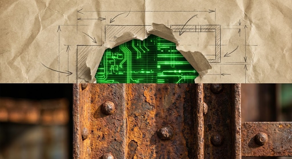
5. The Analog-Digital Bridge
TOFU | LinkedIn Organic

The Visual & Narrative Approach
This style acknowledges the dual reality of construction. It uses a dynamic split-screen or "tear-away" collage effect. The bottom/outer layer shows gritty, real-world textures: rusted steel beams, weathered rivets, and dirty concrete. A tear in this paper-like texture reveals a sleek, glowing digital screen (Electric Green) underneath. It visually demonstrates the "Phygital" transformation—the digital intelligence running beneath the physical surface.
Psychological Impact & KPI Focus
- Niche Psychology: It validates the user's environment (grit/dirt) while offering an aspirational upgrade (clean tech). It doesn't ignore the rust; it modernizes it.
- Operational Impact: Perfect for Digital Transformation narratives. It shows that the software is compatible with the messy reality of the job site, bridging the gap between old iron and new code.
Strategic Implementation & Trade-offs
- Best For: Vertical social content (TikTok, Shorts). The collage aesthetic is trendy and engaging for younger demographics entering the workforce.
- Trade-off: The "grunge" look might feel less corporate to conservative enterprise buyers. Use it to signal innovation and adaptability.
Companies using similar video content -
Rhumbix – Field Data Collection – Bridges physical work with digital insights.
Hilti – ON!Track – Digitizes tool and asset management on site.
PlanGrid – Field Collaboration – Digitizes blueprints for field use.
6. Frictionless Workflow
TOFU | Vertical Social

The Visual & Narrative Approach
To visualize invisible processes like "Workflows" or "Approvals," we use fluid dynamics. Thick, viscous streams of "Liquid Chrome" and "Safety Orange" paint flow smoothly through a network of transparent glass pipes. There is no turbulence, no clogging—just smooth, continuous movement. The macro shot focuses on the specular highlights, creating a satisfying, hypnotic visual.
Psychological Impact & KPI Focus
- Niche Psychology: The enemy of profit is the Bottleneck. This visual provides a therapeutic antidote: pure, unhindered progress. It subconsciously persuades the viewer that your software removes friction.
- Operational Impact: It visualizes Process Efficiency and Resource Allocation. It suggests that with your platform, approvals and RFIs flow instantly from point A to point B.
Strategic Implementation & Trade-offs
- Best For: Pre-roll ads (skippable). The satisfying motion hooks the viewer visually in the first 5 seconds, preventing the skip.
- Trade-off: It is abstract. You must clearly label the "fluids" (e.g., "Cash Flow," "Materials," "Data") for the metaphor to land.
Companies using similar video content -
Kahua – Project Management – Automates and streamlines construction workflows.
InEight – Project Controls – Optimizes project planning and execution workflows.
e-Builder – Construction Program Management – Manages capital project workflows efficiently.
7. Stabilizing the Site Chaos
TOFU | Skippable Ad
The Visual & Narrative Approach
Strategic Note: The analysis below adheres to the 'Hyper-lapse' definition provided in the Style Mapping Table, distinguishing it from the 'Mixed Media' style seen in the placeholder image.
This style contrasts the frantic pace of construction with the stability of digital oversight. We see a hyper-lapse (fast-forward) of a busy job site—excavators spinning, workers blurring like ants. Superimposed over this chaos are sharp, static white vector icons (padlocks, wifi signals, checkmarks) that remain perfectly pinned to their locations.
Psychological Impact & KPI Focus
- Niche Psychology: It addresses the fear of Loss of Control. It reassures the PM that even when the site is moving at breakneck speed, the data points remain fixed, accurate, and under control.
- Operational Impact: Visualizes Real-Time Monitoring. It demonstrates that the software’s tracking capabilities are robust enough to keep up with the physical reality of the build.
Strategic Implementation & Trade-offs
- Best For: Non-skippable 15-second ads. It quickly establishes context (the site) and value (stability) without needing complex narration.
- Trade-off: Requires high-quality footage. If the background footage is shaky, the "stable icon" effect will fail.
Companies using similar video content -
StructionSite – 360° Progress Capture – Stabilizes site chaos with visual documentation.
EarthCam – Construction Cameras – Provides real-time, stable jobsite monitoring.
Holobuilder – 360° Jobsite Capture – Documents site progress for stability.
8. The Toy Box View
TOFU | Non-Skippable Ads
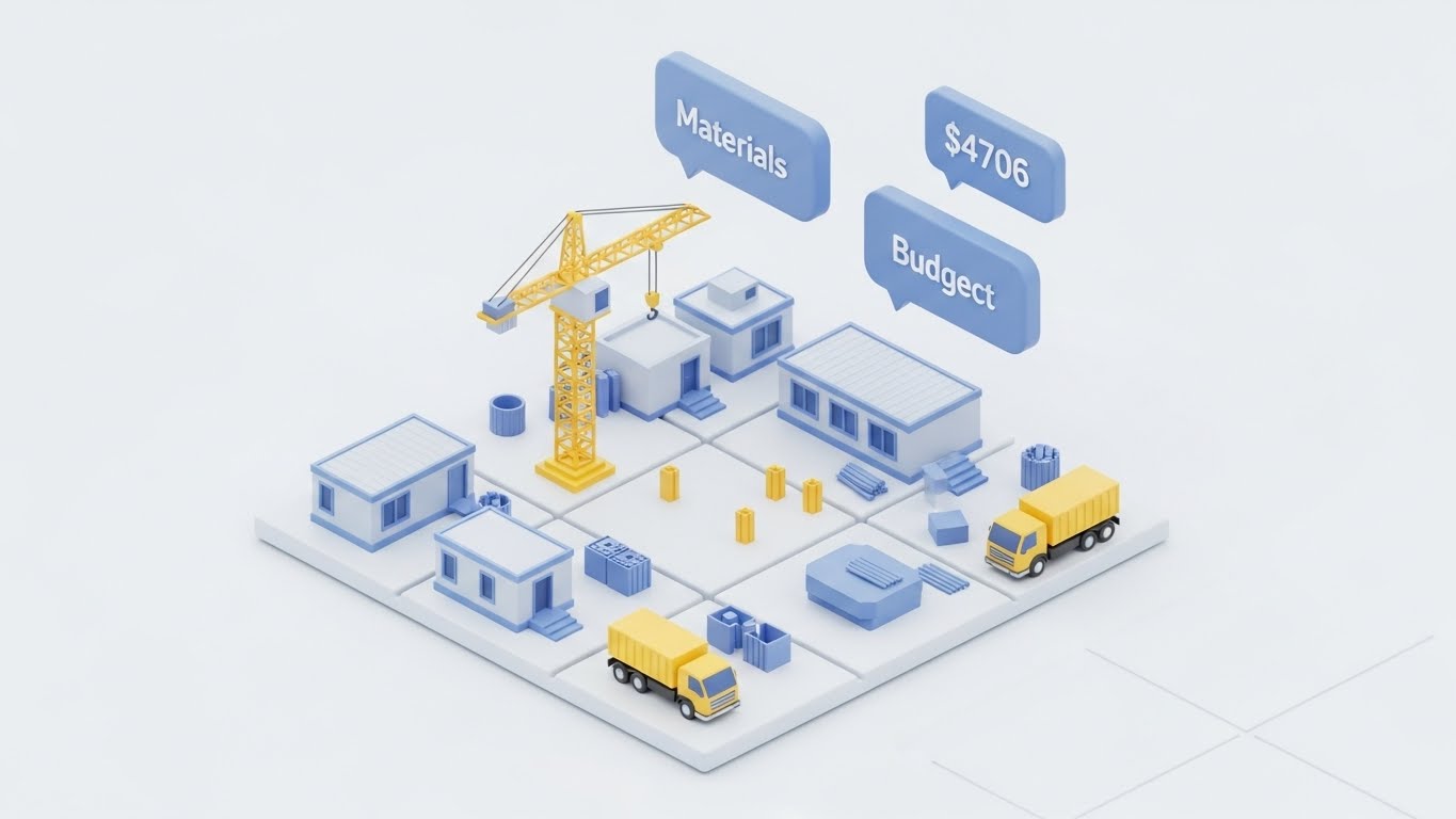
The Visual & Narrative Approach
This style shrinks the intimidating scale of a mega-project down to a manageable, "toy box" size. We see a pristine, 3D isometric diorama of a site on a clean white grid. Tiny modular units, yellow cranes, and trucks move in a simplified loop. Floating above the site are matte pastel blue data bubbles showing "Materials" and "Budget" stats. The lighting is soft (Ambient Occlusion), making the complex logistics look clean and organized.
Psychological Impact & KPI Focus
- Niche Psychology: It reduces Cognitive Load. It frames the project as a manageable puzzle rather than an overwhelming beast. It appeals to the "Gamification" of work.
- Operational Impact: Excellent for explaining Logistics and Supply Chain features. It simplifies spatial relationships, showing how material delivery impacts the site layout without visual noise.
Strategic Implementation & Trade-offs
- Best For: Website "How It Works" sections and Explainer videos. It is non-threatening and highly educational.
- Trade-off: It can look "cute." Ensure the data points shown are serious (real dollar amounts) to maintain professional credibility.
Companies using similar video content -
ALICE Technologies – Construction Simulation – Simplifies complex logistics with AI.
VisiLean – Lean Construction Management – Visualizes and optimizes project flow.
Touchplan – Lean Construction Planning – Simplifies planning with visual collaboration.
9. Seeing the Unseen
MOFU | Product Differentiation

The Visual & Narrative Approach
This style is about transparency. We look at a thick concrete wall, but it is rendered as semi-transparent frosted glass. Inside, we clearly see a glowing network of orange rebar and blue plumbing pipes. A digital scanner line sweeps across the wall, highlighting specific intersection points (clashes) with bright white pulses. The background is dark to make the internal elements pop.
Psychological Impact & KPI Focus
- Niche Psychology: It plays on the fear of Latent Defects—the hidden problems that cause rework. This visual promises "X-Ray Vision," giving the user a sense of superpower and foresight.
- Operational Impact: The definitive visual for Clash Detection and BIM Integration. It demonstrates the software's ability to identify risks before they become physical expenses.
Strategic Implementation & Trade-offs
- Best For: Feature-specific emails and deep-dive product demos. It validates the technical sophistication of the platform.
- Trade-off: Technical accuracy is paramount. The rebar layout must look realistic to an engineer, or the credibility is lost.
Companies using similar video content -
Autodesk – Navisworks – Detects clashes and hidden risks in models.
Verity – BIM/Reality Capture QA/QC – Reveals hidden deviations from design.
Trimble – Synchro – Visualizes construction sequencing and clashes.
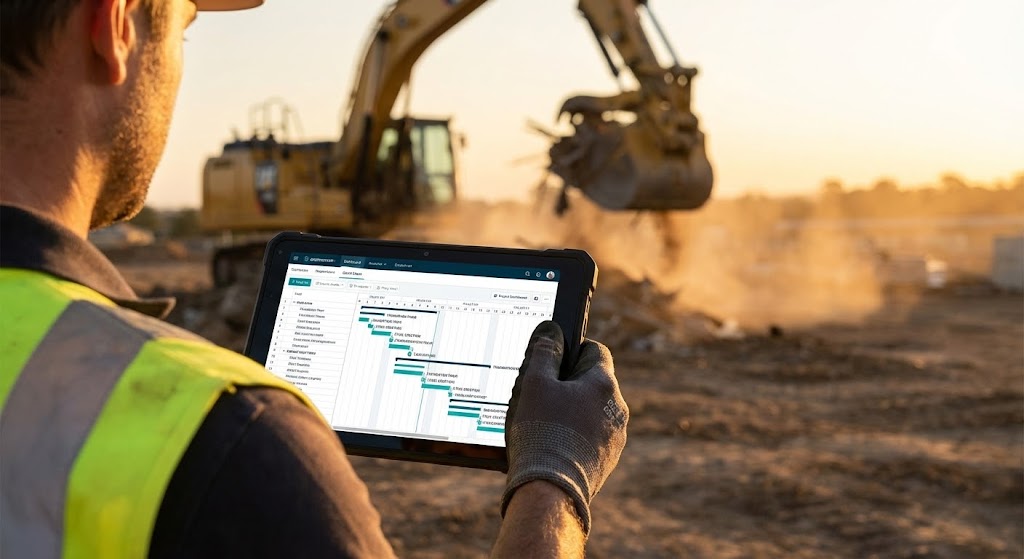
11. The Connected Superintendent**
MOFU | Building Trust

The Visual & Narrative Approach
This style brings the software out of the boardroom and into the dirt. We utilize an over-the-shoulder Point-of-View (POV) shot of a Site Superintendent clad in a high-vis vest. He holds a ruggedized tablet against the backdrop of an active excavation site bathed in "Golden Hour" light. The screen is not a generic blur; it displays a crisp, simulated dashboard with a recognizable Gantt chart and task list. The contrast between the dusty, earth-toned background and the clean, organized Teal/White interface is deliberate and striking.
Psychological Impact & KPI Focus
- Niche Psychology: Field teams often reject software they perceive as "fragile" or "office-made." This visual builds Operational Trust. It signals that the tool is battle-tested, legible in sunlight, and designed for the person wearing the gloves.
- Operational Impact: It visualizes Mobility and Real-Time Access. It proves that critical path data is available at the point of work, not locked in a trailer 500 yards away.
Strategic Implementation & Trade-offs
- Best For: Website "Solutions" pages (specifically for Field Management) and Case Study headers. It bridges the gap between the buyer (Exec) and the user (Superintendent).
- Trade-off: The UI must be realistic. If the screen shows nonsense data, seasoned pros will spot it immediately. Use "Simulated UI" that reflects actual construction workflows.
Companies using similar video content -
SmartPM – Project Controls & Analytics – Provides deep insights into project performance.
Doxel – AI Progress Monitoring – Delivers real-time project performance insights.
Buildots – AI Progress Monitoring – Transforms site data into actionable insights.
12. The Stark Contrast
MOFU | Competitive Displacement
The Visual & Narrative Approach
This style is the visual definition of "Competitive Displacement." It employs a hard split-screen composition. The left side depicts the "Old Way": a chaotic desk cluttered with coffee-stained blueprints, a frantic calculator, and tangled wires, graded in desaturated, brownish tones. The right side unveils the "New Way": a pristine, minimalist surface with a single iPad Pro displaying your clean, organized app interface, graded in bright, saturated Cool Blue and White.
Psychological Impact & KPI Focus
- Niche Psychology: It triggers the Pain of Inefficiency. Every project manager recognizes the stress of the cluttered desk. The visual offers an immediate psychological release—a promise that buying your software buys them peace of mind.
- Operational Impact: It powerfully communicates Digitization and Organization. It shows that your platform doesn't just add to their work; it replaces the physical mess, effectively visualizing the elimination of manual error.
Strategic Implementation & Trade-offs
- Best For: Meta Ads (Facebook/Instagram) and Remarketing campaigns. The binary comparison is instantly understood without audio.
- Trade-off: Avoid making the "Old Way" look too comical. It needs to look like a frustrating reality, not a cartoon, to resonate with the viewer's actual experience.
Companies using similar video content -
Procore – Field Productivity – Connects superintendents with critical project data.
Raken – Field Management – Keeps superintendents connected and informed.
Fieldwire – Field Management – Empowers superintendents with mobile tools.
13. The Code Behind the Concrete
MOFU | Sales Acceleration

The Visual & Narrative Approach
Here, we pivot to the language of the engineer: precision. In a deep charcoal void, a wireframe grid of a commercial building begins to form. The structural lines glow in Neon Lime Green. Laser-straight vertical scanners move up and down, filling the wireframe with semi-transparent holographic polygons. The aesthetic is mathematical, datacentric, and undeniably "Dark Mode," referencing the CAD and BIM environments engineers are comfortable with.
Psychological Impact & KPI Focus
- Niche Psychology: This appeals to the Technical Buyer (CTO/BIM Manager). It reassures them that underneath the friendly interface lies a robust, calculation-heavy engine. It signals accuracy.
- Operational Impact: Ideal for visualizing BIM Integration and Automated Estimates. It suggests that the software builds the project digitally with the same rigor used physically.
Strategic Implementation & Trade-offs
- Best For: LinkedIn Video Ads targeting VDC (Virtual Design and Construction) Managers. It stands out sharply in a feed dominated by white papers and job site photos.
- Trade-off: It can feel cold or "Cyberpunk." It is excellent for selling efficiency and tech specs, but less effective for selling culture or team collaboration.
Companies using similar video content -
CoConstruct – Residential Construction Software – Replaces chaotic manual processes with order.
Quickbase – Low-Code Platform – Transforms messy data into organized applications.
Buildxact – Estimating & Project Management – Upgrades from manual to digital workflows.
14. The Zero-Training Interface
MOFU | Demo Requests
The Visual & Narrative Approach
Fear of complexity is the number one killer of software adoption. This style is the antidote. We present the UI in a direct, head-on "Light Mode" aesthetic against a surgical white background. The focus is on "Card-Style" layout elements with soft drop shadows, spacious padding, and vivid Teal progress rings. Text is replaced by abstract lines to keep the focus on the structure of the information—showing how easy it is to read and navigate.
Psychological Impact & KPI Focus
- Niche Psychology: It reduces Cognitive Load. By stripping away the noise, you visually promise a "low learning curve." The viewer looks at this and thinks, "My team could actually figure this out."
- Operational Impact: It validates Usability and User Experience (UX). It positions the platform not as a complex database, but as a modern, consumer-grade app that simplifies the workday.
Strategic Implementation & Trade-offs
- Best For: Pricing pages and "Request a Demo" landing pages. It removes the friction of "will this be hard to use?" right before the conversion point.
- Trade-off: It is static. To make it engaging, ensure the motion (cards sliding in, progress bars filling) is smooth and "buttery" (60fps).
Companies using similar video content -
Bentley Systems – STAAD.Pro – Provides precise structural analysis and design.
Trimble – Tekla Structures – Delivers accurate, constructible BIM models.
Graphisoft – Archicad – Offers robust BIM authoring for architects.
15. Intelligent Iron
MOFU | ABM Awareness
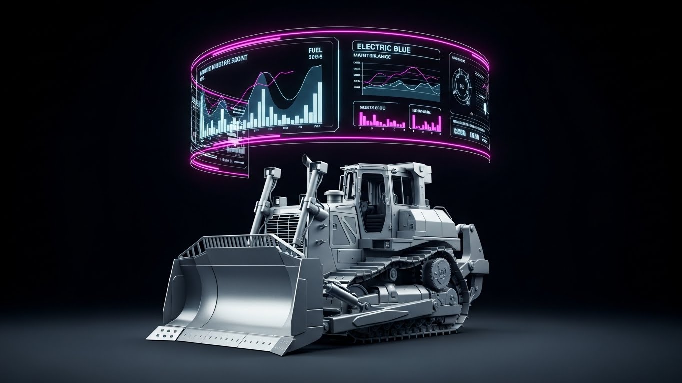
The Visual & Narrative Approach
For companies managing heavy fleets, the asset is the business. This style combines a photorealistic 3D render of a heavy yellow bulldozer (isolated on studio grey) with a futuristic layer of intelligence. A curved, transparent holographic interface hovers above the machine, glowing with "Electric Blue" data points that map fuel levels, hydraulic pressure, and maintenance schedules. It looks like an Iron Man HUD (Heads-Up Display) for industrial equipment.
Psychological Impact & KPI Focus
- Niche Psychology: It targets the Fear of Downtime. A broken machine burns money. This visual metaphorically arms the Equipment Manager with "X-Ray foresight," allowing them to see problems before they occur.
- Operational Impact: The definitive style for Predictive Maintenance and Telematics. It visualizes the invisible data stream that protects the physical asset.
Strategic Implementation & Trade-offs
- Best For: Programmatic display ads and Account-Based Marketing (ABM) campaigns targeting Equipment Directors. It screams "High Tech" and "Value Protection."
- Trade-off: The 3D model of the machine must be flawless. If the bulldozer looks like a toy, the "high-tech" message collapses.
Companies using similar video content -
Fieldwire – Field Management – Offers an intuitive, easy-to-use interface.
Connecteam – Employee Management App – Designed for quick adoption by all users.
Bluebeam – Revu – Provides a clean, clear interface for document markup.
16. Point-of-Work Intelligence
MOFU | Functional Buyer

The Visual & Narrative Approach
This style layers digital helpfulness over human effort. We use a high-quality photo of a smiling construction foreman in a hard hat. Floating in 3D space around him are flat, bold 2D vector icons: a green shield (Safety), a white document (Plans), and a clock (Schedule). Unlike the "Holographic" style, these graphics are simple, colorful, and "Flat Design." They pop against the realistic photography, symbolizing specific tasks or approvals being completed effortlessly.
Psychological Impact & KPI Focus
- Niche Psychology: It addresses the Functional Buyer (Safety Manager, QA Lead). It visualizes the abstract concept of "compliance" as a simple, checked box. It makes the intangible tasks of management feel tangible and completed.
- Operational Impact: Perfect for showcasing Workflow Automation and Safety Compliance. It shows that the software supports the human worker rather than replacing them.
Strategic Implementation & Trade-offs
- Best For: LinkedIn carousel posts and "Features" pages. It allows you to isolate specific benefits (Safety, Quality, Schedule) in a human context.
- Trade-off: Ensure the icons align with industry standards (e.g., Green for safety/go, not red).
Companies using similar video content -
EquipmentShare – Telematics & Asset Management – Visualizes equipment health and usage.
Tenna – Equipment Management – Provides diagnostic overlays for asset health.
Trackunit – Fleet Management – Offers intelligent diagnostics for heavy machinery.
17. Data Fortification
MOFU | Technical Buyer
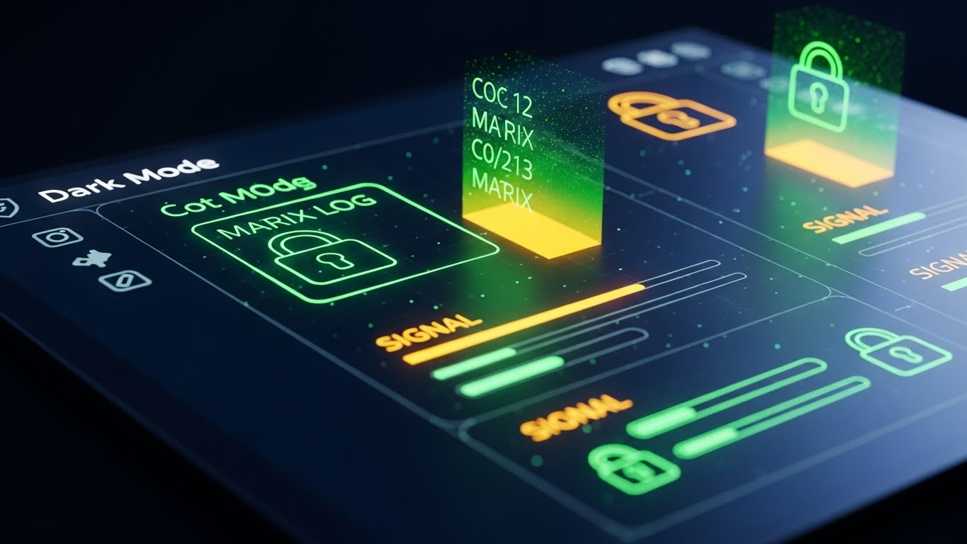
The Visual & Narrative Approach
When selling to Enterprise IT, "pretty" doesn't sell; "secure" does. This style features a close-up, tilted macro shot of a screen in "Dark Mode." The background is a secure Midnight Blue. The elements on screen are not standard buttons, but "Matrix Green" code logs, Signal Orange server status bars, and glowing padlock icons. A subtle pixel texture on the screen surface adds realism. It looks like a command center.
Psychological Impact & KPI Focus
- Niche Psychology: It alleviates Security Anxiety. Construction data is increasingly targeted by ransomware. This visual borrows the aesthetic of cybersecurity to signal that your platform is a fortress.
- Operational Impact: Specifically designed for Data Security, Audit Trails, and Backend Reliability. It tells the IT Director, "We take this as seriously as you do."
Strategic Implementation & Trade-offs
- Best For: The "Security" or "Enterprise" section of your website. It validates the platform's robustness to the technical gatekeeper.
- Trade-off: It is intimidating to the average user. Do not use this to sell "ease of use." Use it strictly for technical reassurance.
Companies using similar video content -
SafetyCulture – iAuditor – Provides intelligent checklists for field inspections.
PlanRadar – Documentation & Defect Management – Annotates jobsites with real-time data.
Smartvid.io – AI Safety Monitoring – Overlays AI insights for safety compliance.
18. The Architecture of Profit
BOFU | ROI Justification

The Visual & Narrative Approach
At the Bottom of the Funnel (BOFU), the conversation is about money. This style literalizes financial growth using construction materials. We see a bar chart where the "bars" are vertical steel construction beams rising from a concrete foundation. As they ascend, the texture transforms from raw, rusty steel to polished, gleaming Gold Chrome. The "worm's eye view" camera angle makes the profit growth look towering and monumental against a clean blue sky.
Psychological Impact & KPI Focus
- Niche Psychology: It appeals to the Financial Executive (CFO). It moves beyond "saving time" to "building value." The transformation to gold subconsciously links the project progress directly to financial realization.
- Operational Impact: The ultimate visual for ROI, Budget Management, and Margin Protection. It shows that the software turns raw materials (steel) into financial success (gold).
Strategic Implementation & Trade-offs
- Best For: LinkedIn ads targeting C-Suite and Investor Decks. It is a "power shot" that communicates value without needing words.
- Trade-off: It is highly conceptual. It works best when paired with a hard stat, e.g., "Improve Margins by 15%."
Companies using similar video content -
Avetta – Supply Chain Risk Management – Fortifies data security for contractor compliance.
Veriforce – Workforce Compliance – Secures critical workforce data and records.
VinciWorks – Compliance Training – Protects data through robust training platforms.
19. The Fidelity Transition
BOFU | Risk Mitigation
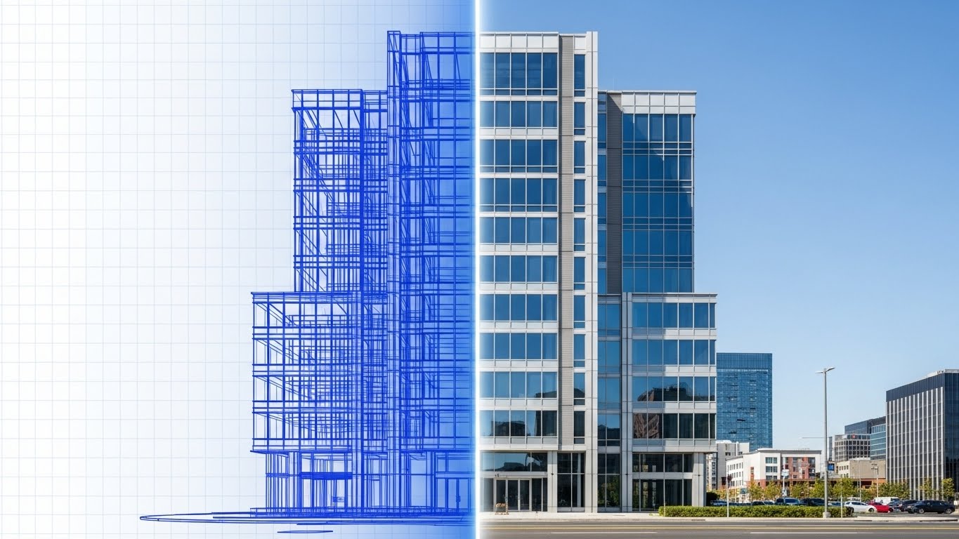
The Visual & Narrative Approach
The greatest risk in construction is the gap between the plan and the reality. This style heals that gap. We see a seamless transition image of a commercial building. The left half is a blue technical wireframe blueprint, representing the data/plan. A glowing vertical scanning line moves across the image, transforming the wireframe into a photorealistic, sun-lit glass and steel structure. This demonstrates the perfect alignment between the digital model and the physical reality.
Psychological Impact & KPI Focus
- Niche Psychology: It mitigates Execution Risk. It reassures the client that the software ensures fidelity—that the "As-Built" will match the "As-Designed."
- Operational Impact: Visualizes BIM-to-Field Accuracy and Quality Control. It demonstrates that the digital thread remains unbroken from the first drawing to the final handover.
Strategic Implementation & Trade-offs
- Best For: Remarketing ads to leads who have visited the site but haven't converted. It reinforces reliability and the successful end-state.
- Trade-off: The alignment must be perfect. If the wireframe doesn't match the photo exactly, it suggests disjointed data—the opposite of the intended message.
Companies using similar video content -
CMiC – Construction ERP – Builds financial growth through integrated management.
Sage – Construction & Real Estate – Architects profit with comprehensive financial tools.
HCSS – Heavy Civil Construction Software – Drives profit through efficient project controls.
20. The Unbroken Thread
BOFU | Reducing Friction
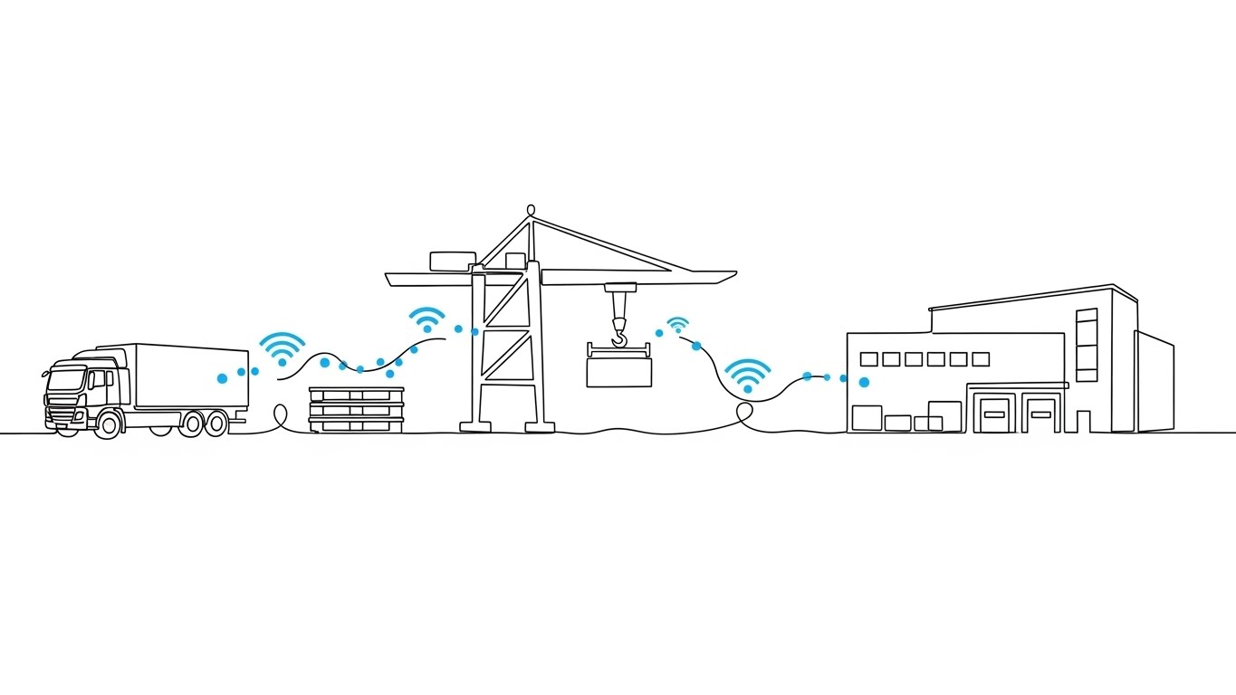
The Visual & Narrative Approach
Sometimes, the most complex systems are best explained with the simplest visuals. This style uses an elegant, continuous single-line drawing. A thin, precise black line travels across a white canvas, morphing to draw the outline of a supply chain journey: a truck, a pallet, a crane, and finally a building. The line never breaks. Small data dots travel along this line, symbolizing the uninterrupted flow of information through the project lifecycle.
Psychological Impact & KPI Focus
- Niche Psychology: It appeals to the desire for Harmony. Construction is fragmented; this visual promises unity. It suggests a frictionless, seamless experience where data flows without interruption.
- Operational Impact: Ideal for visualizing Supply Chain Integration and Lifecycle Management. It simplifies the complexity of logistics into a single, manageable narrative.
Strategic Implementation & Trade-offs
- Best For: Website footers and "Thank You" pages. It leaves the viewer with a final impression of elegance, simplicity, and connectivity.
- Trade-off: It is low-fidelity. It implies "ease," not "power." Use it to support the narrative of simplicity, not to demonstrate technical features.
Companies using similar video content -
Doxel – AI Progress Monitoring – Ensures fidelity from plan to reality.
Buildots – AI Progress Monitoring – Aligns digital models with physical progress.
AI Clearing – Infrastructure Progress Monitoring – Verifies design fidelity on large projects.
21. The Relieved Operator**
BOFU | Objection Handling
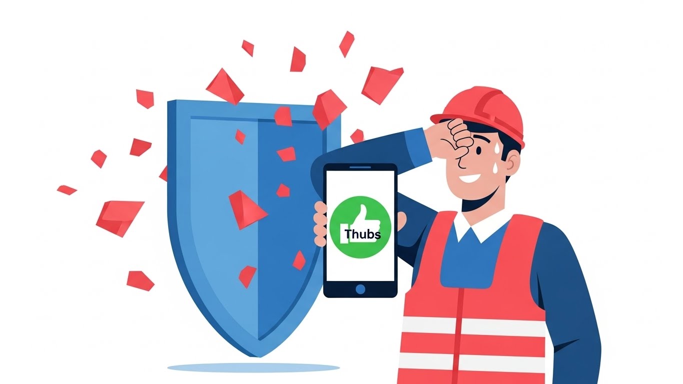
The Visual & Narrative Approach
At the bottom of the funnel, the objections aren't about features; they are about friction. This style uses a stylized, approachable 2D vector character to address emotional resistance. We see a construction manager wiping sweat from his brow, smiling as he holds a smartphone displaying a massive green "Thumbs Up" icon. Behind him, a clean blue shield deflects a chaotic storm of red shapes (representing delays, paperwork, and errors). The aesthetic is clean, flat, and reassuring.
Psychological Impact & KPI Focus
- Niche Psychology: It directly targets Change Management Anxiety. Field teams often worry that new software will just be "one more thing to do." This visual validates their stress (the sweat) and immediately offers the resolution (the shield and the thumbs up).
- Operational Impact: It visualizes Ease of Adoption. It simplifies the narrative: "The chaos stops here." It frames the software not as a burden, but as a protective barrier that makes the job easier.
Strategic Implementation & Trade-offs
- Best For: Social Ads targeting field personnel and "Why Us" pages. It works effectively to lower the emotional barrier to entry.
- Trade-off: The "cartoon" style lacks technical authority. Do not use this to sell complex engineering features; use it to sell usability and relief.
Companies using similar video content -
Kojo – Material Procurement – Creates a continuous flow in the supply chain.
SiteSense – Material Tracking – Visualizes uninterrupted material flow.
Command Alkon – Heavy Materials Software – Manages continuous flow of bulk materials.
22. The Boardroom Vision
BOFU | Economic Buyer

The Visual & Narrative Approach
This style speaks the language of the Economic Buyer. We are transported to a high-end executive boardroom at dusk. The focus is on a sleek tablet resting on a mahogany table, displaying a sophisticated, upward-trending financial graph in electric blue and magenta. Through the glass walls, we see a blurred city skyline dotted with construction cranes. The lighting is cinematic and expensive, utilizing "bokeh" effects to create a sense of premium value.
Psychological Impact & KPI Focus
- Niche Psychology: It appeals to Status and Vision. The CFO or CEO doesn't want to see dirt; they want to see the result of their decision. This visual aligns your software with the high-level strategic success of the firm.
- Operational Impact: It visualizes Financial Oversight and Portfolio Growth. It removes the noise of the job site to focus purely on the metrics that matter in the boardroom: growth and data visibility.
Strategic Implementation & Trade-offs
- Best For: Website headers for "Enterprise" plans and Investor Decks. It signals that your platform is a serious, enterprise-grade solution.
- Trade-off: It feels detached from the field. If overused, it can make the brand seem "out of touch" with the reality of construction work.
Companies using similar video content -
Busybusy – Time Tracking – Relieves stress with easy time and cost tracking.
ClockShark – Time Tracking – Simplifies time tracking, reducing operator anxiety.
Workyard – Time Tracking & Scheduling – Offers relief through streamlined workforce management.
23. The Profit Lift
BOFU | ROI Hook

The Visual & Narrative Approach
Subtlety is the enemy of conversion at the ROI stage. This style literalizes the concept of "making money." In a clean, isometric 2D environment, a yellow construction crane lifts a stylized green bag marked with a dollar sign. It places the bag onto a neat stack of identical bags on a foundation slab. The motion is rhythmic and mechanical, creating a hypnotic loop of value accumulation. The background is a neutral grey to keep the focus on the "Gold" and "Green."
Psychological Impact & KPI Focus
- Niche Psychology: It triggers the Greed/Growth motivation. By replacing building materials with money bags, it communicates that your software turns construction activity into profit.
- Operational Impact: The definitive visual for Cost Savings and Margin Protection. It implies that every movement on site, when tracked by your software, contributes directly to the bank.
Strategic Implementation & Trade-offs
- Best For: Skippable pre-roll ads (YouTube) and Remarketing banners. The message is understood in less than 1 second: "We build wealth."
- Trade-off: It is blunt. It works best as a "hook" to get attention, but needs to be followed up with substance (case studies) to prove how the money is saved.
Companies using similar video content -
Autodesk Construction Cloud – Executive Insights – Provides high-level portfolio visibility.
Bentley Systems – ProjectWise – Delivers executive clarity on infrastructure projects.
Oracle Construction and Engineering – Aconex – Offers strategic oversight for large projects.
24. The Digital Fortress
BOFU | Risk Mitigation Hook

The Visual & Narrative Approach
Construction projects are besieged by risks—weather, legal disputes, and compliance failures. This style uses "Low-Poly" art to create a charming yet clear metaphor for protection. A miniature construction site sits on a floating island, encased in a glowing, translucent blue energy shield. Outside, jagged red "glitch" shapes (representing risks) attack the shield but bounce off harmlessly. The palette is bright and approachable (Mint, Coral, Sky Blue).
Psychological Impact & KPI Focus
- Niche Psychology: It assuages the Fear of Liability. It presents the software as an insurance policy. The "Game Art" style makes the concept of risk management feel less terrifying and more manageable.
- Operational Impact: Perfect for visualizing Compliance, Insurance, and Dispute Resolution. It shows that inside the software ecosystem, the project is safe from external chaos.
Strategic Implementation & Trade-offs
- Best For: Social Media Ads targeting Project Executives. It stands out because it looks different from the usual "gritty" construction imagery.
- Trade-off: The "Low-Poly" look can appear juvenile. Ensure the copy reinforces the serious nature of the protection (e.g., "Bank-Grade Security for Your Jobsite").
Companies using similar video content -
Buildxact – Estimating & Project Management – Lifts profit margins for residential builders.
Electriq – AI Construction Planning – Generates value through optimized schedules.
Versatile – AI & IoT for Construction – Lifts productivity and profit on site.
25. The Velocity of Value
ONBOARD | Self-Serve Onboarding
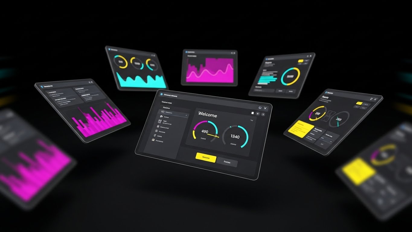
The Visual & Narrative Approach
Once a user converts, the goal shifts to activation. This style is about speed. We see a dynamic composition of multiple dark-mode UI screens floating in a void, arranged in a fan shape. The camera focuses on the center screen displaying a "Welcome" dashboard with vibrant data visualization (Purple, Pink, Yellow). Motion blur on the edges suggests high-speed processing. It feels like the cockpit of a spaceship.
Psychological Impact & KPI Focus
- Niche Psychology: It combats Buyer's Remorse. It reassures the new user that they have purchased a powerful, high-performance engine. It generates excitement about "firing up" the system.
- Operational Impact: It visualizes Platform Depth and Processing Speed. It shows that the software is ready to handle massive amounts of data immediately upon login.
Strategic Implementation & Trade-offs
- Best For: Welcome emails and "Getting Started" videos. It builds momentum for the onboarding process.
- Trade-off: It can be overwhelming. Don't use this for tutorials; use it to hype the capability of the tool before diving into the specific clicks.
Companies using similar video content -
SafetyCulture – iAuditor – Shields projects from safety and quality risks.
VinciWorks – Compliance Training – Fortifies projects against legal and compliance risks.
Avetta – Supply Chain Risk Management – Protects against external supply chain risks.
26. Instant Enlightenment
ONBOARD | Knowledge Base

The Visual & Narrative Approach
When a user is stuck, they don't want flash; they want clarity. This style is hyper-minimalist. On a solid "Construction Yellow" background, a large white question mark hangs from a crane hook. As it lowers, it seamlessly morphs into a glowing lightbulb. The geometry is pure—circles and lines—with no distracting textures. It is the visual equivalent of a clear, concise answer.
Psychological Impact & KPI Focus
- Niche Psychology: It reduces Frustration. It visually promises that confusion is temporary and that the solution is just one click away. It positions your support resources as "illuminating."
- Operational Impact: Ideal for Knowledge Base thumbnails and Support Portal headers. It signals that the "Help" section is not a dead end, but a place of transformation.
Strategic Implementation & Trade-offs
- Best For: Support pages and "Tip of the Day" in-app popups. It is universally understood across all languages.
- Trade-off: It is too simple for marketing. It lacks the "wow" factor needed to sell, but has the clarity needed to support.
Companies using similar video content -
Fieldwire – Field Management – Accelerates time-to-value with rapid task setup.
Connecteam – Employee Management App – Delivers quick value through fast communication.
Raken – Daily Reporting App – Speeds up reporting, accelerating insights.
27. The Deep Dive
ONBOARD | User Activation
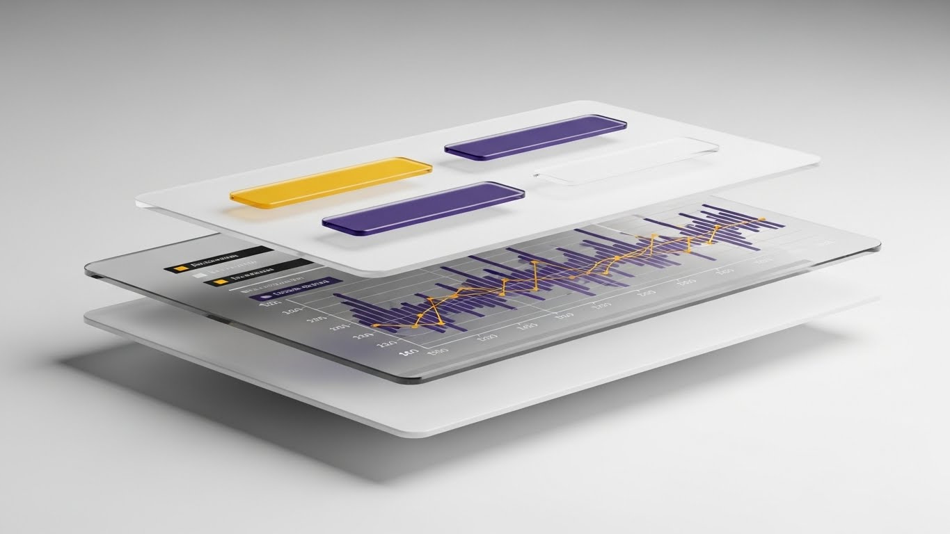
The Visual & Narrative Approach
To help users understand how the software works, we deconstruct it. This style uses a 3D parallax effect to separate the UI into floating layers of glass. We see the background card, the data graph, and the foreground buttons separated in Z-space. Soft shadows fall from the buttons onto the graph below. This "exploded view" reveals the hierarchy of the interface, teaching the user the relationship between data inputs and visual outputs.
Psychological Impact & KPI Focus
- Niche Psychology: It appeals to the Engineer's Mindset. Construction pros understand exploded axonometric drawings. This style applies that same logic to software, making the digital tool feel like a constructed object.
- Operational Impact: Excellent for Feature Deep Dives and Advanced Training. It helps users build a mental model of the software’s architecture.
Strategic Implementation & Trade-offs
- Best For: "Pro Tips" videos and specialized feature walkthroughs inside the app.
- Trade-off: It requires high-end animation assets. It is resource-intensive to produce but highly effective for explaining complex interactions.
Companies using similar video content -
Procore – Help Center – Provides instant answers and support.
Bluebeam – Revu – Offers clear guidance for document collaboration.
Fieldwire – Knowledge Base – Illuminates solutions for common questions.
28. The Partnered Workflow
RETENT | Reducing Churn

The Visual & Narrative Approach
Retention is driven by successful adoption in the field. This style captures the "Ideal State" of your customer. We see a close-up, over-the-shoulder shot of a field worker wearing high-vis gear. He holds a ruggedized tablet displaying your Gantt chart interface. In the warm, golden-hour background, an excavator is actively working, kicking up dust. The juxtaposition of the dirty work and the clean data creates a powerful image of harmony between the office and the field.
Psychological Impact & KPI Focus
- Niche Psychology: It validates the User's Success. It mirrors the client's self-image back to them—efficient, modern, and in control of their site. It reinforces the decision to keep renewing the subscription.
- Operational Impact: It visualizes Operational Continuity. It shows the software as an embedded, essential part of the daily workflow, not an optional add-on.
Strategic Implementation & Trade-offs
- Best For: Customer Success newsletters, "Year in Review" emails, and Case Study headers.
- Trade-off: Authenticity is critical. The PPE (Personal Protective Equipment) and the machinery must be accurate to the region and sector.
Companies using similar video content -
Autodesk – Revit – Allows deep exploration of BIM model architecture.
Trimble – Tekla Structures – Facilitates detailed understanding of structural models.
Graphisoft – Archicad – Enables users to deconstruct and understand building models.
29. The Seamless Upgrade
EXPAND | Upsell/Cross-sell

The Visual & Narrative Approach
Upselling existing clients requires a "soft sell." This style uses a playful, hybrid composition. A 3D, cartoon-styled hand reaches out to press a glossy, floating button labeled "Upgrade" (with an upward arrow). When pressed, the button emits festive particle effects—stars and confetti—against a vibrant purple and yellow halftone background. It treats the act of spending more money as a moment of celebration and unlocking potential.
Psychological Impact & KPI Focus
- Niche Psychology: It triggers Reward Sensitivity. It reframes the upsell not as a "cost" but as a "level up." It leverages the psychology of gamification to make the upgrade feel like an achievement.
- Operational Impact: Perfect for visualizing New Modules or Premium Tiers. It suggests that the new features are just a satisfying button-press away.
Strategic Implementation & Trade-offs
- Best For: Remarketing ads to existing users and in-app "New Feature Unlocked" notifications.
- Trade-off: It is playful. Ensure it doesn't trivialize the cost if the upgrade price is significant.
Companies using similar video content -
Procore – Project Management – Fosters successful field operations and collaboration.
Raken – Field Management – Supports seamless daily workflows for field teams.
Fieldwire – Field Management – Integrates smoothly into daily construction operations.
30. The Power Switch
EXPAND | Referrals & Advocacy

The Visual & Narrative Approach
Great software is defined by the details. This style focuses on an extreme macro close-up of a single micro-interaction: a finger touching a digital toggle switch. The switch flips from grey to a glowing "Active Blue/Green." The depth of field is razor-thin, blurring the background to focus intensely on the moment of activation. We see the subtle pixel texture, emphasizing the high fidelity of the tool.
Psychological Impact & KPI Focus
- Niche Psychology: It triggers a sense of Empowerment. The simple act of flipping a switch is universally associated with power and control. It suggests that your users have the power to turn on efficiency at will.
- Operational Impact: It visualizes Ease of Use and Responsiveness. It subconsciously tells the viewer, "It really is this simple to take control."
Strategic Implementation & Trade-offs
- Best For: Referral landing pages and "Feature Highlight" reels. It serves as a visual punctuation mark—a definitive "Yes" to the user's needs.
- Trade-off: It is abstract. It works best when paired with audio or text that explains what is being turned on (e.g., "Turn on Automated Reporting").
Strategic Knowledge Base: The Visual Operations Doctrine
The 30 styles above are not merely artistic choices; they are business tools. To extract maximum ROI from this visual guide, construction technology leaders must integrate these assets into a cohesive "Visual Operations Doctrine." This framework synthesizes the visual strategies into actionable business outcomes, divided into three critical segments.
Strategic Alignment & Visual Architecture
- The "Pre-Production" Strategy – Why we visualize and Who we visualize for.*
- The Cognitive Load Audit: Before commissioning any video, audit your current training materials. If a PDF manual takes 20 minutes to read, the goal of the visual style (e.g., Style 26 "Instant Enlightenment") must be to convey that same data in under 60 seconds.
- Role-Based Visual Mapping: Do not use the same visual language for a BIM Manager as you do for a Site Superintendent. Use "Dark Mode/Data" styles (Style 17) for the office and "High-Vis/Daylight" styles (Style 11) for the field.
- The "Glanceability" Standard: Construction sites are high-stress environments. Visuals designed for mobile field apps must pass the "Glanceability" test—can the user understand the message (e.g., Style 21 "The Relieved Operator") in less than 3 seconds while standing in direct sunlight?
- Brand Voice Consistency: Your visual language acts as the glue between disparate software modules. Ensure that the "Liquid Chrome" flow (Style 6) used in marketing is consistent with the loading animations in the actual product to create a unified brand experience.
- The Advids Strategic Audit: Partner with specialized agencies like Advids early in this phase. We help define this "Visual Operating System," ensuring your library of assets is scalable and consistent rather than a collection of random videos.
- Standardization vs. Customization: For universal concepts like "Safety," use standardized styles (Style 24). For proprietary features like your specific "Gantt Chart Algorithm," invest in bespoke visualization (Style 27) to defend your IP.
- The Cross-Departmental Bridge: Use these visuals to unify terminology. If Sales calls it "The Dashboard" but Support calls it "The Grid," use a definitive visual (Style 2) to anchor the terminology across the company.
- Legacy System Integration: Many clients are transitioning from paper or on-premise servers. Use "Analog-Digital Bridge" visuals (Style 5) to respectfully acknowledge their past while selling them the future, rather than dismissing their legacy processes as "obsolete."
- Accessibility in the Field: Design motion graphics with high contrast and clear iconography (Style 7) to accommodate diverse workforces, including older workers or those with color vision deficiencies.
- The Mobile-First Mandate: 80% of your users are non-desk workers. Ensure every visual style, from 3D renders to 2D animations, is legible on a 5-inch screen. If Style 13's fine lines vanish on mobile, it fails the mandate.
Operational Adoption & Implementation
- The "Deployment" Phase – How to embed visuals into the workflow.*
- Overcoming "Big Brother" Anxiety: When introducing tracking features, use empathy-driven visuals (Style 3 "The Empowered Manager") to frame the technology as support for the worker, not surveillance by the office.
- The Micro-Learning Shift: Replace hour-long webinars with a library of 30-second clips using "Rapid UI" styles (Style 25). Field workers learn in bursts; your content must match their rhythm.
- Just-in-Time Support: Embed specific visual styles directly into the app's "Help" tooltips. A user struggling with a submittal should see a Style 26 animation instantly, resolving the friction point without a support ticket.
- Gamification of Training: Use "Upgrade Path" visuals (Style 29) to reward users for completing training modules. Visualizing progress as an achievement boosts engagement and completion rates.
- Reducing Support Ticket Volume: There is a direct correlation between the quality of your "How-To" visuals and your support costs. Investing in high-fidelity "Deep Dive" videos (Style 27) pays for itself by deflecting Level 1 support calls.
- Remote Onboarding: For distributed project teams, physical seminars are impossible. Use "Digital Twin" styles (Style 1) to conduct virtual site walkthroughs and onboarding sessions that feel immersive and premium.
- Visualizing SOPs: Transform text-heavy Standard Operating Procedures (SOPs) into "Frictionless Workflow" loops (Style 6). A visual loop of a procurement process is memorized faster than a 10-step bulleted list.
- Feedback Loops: Use interactive video elements. After a "Safety" video (Style 16), have a clickable "I Acknowledge" button to digitally log compliance.
- Scalable Localization: Construction is global. Create visual assets that rely on iconography (Style 16) and motion rather than on-screen text. This allows you to deploy the same video across regions without expensive re-editing.
- Leadership Communication: When rolling out a new platform strategy, Project Executives should use "Boardroom Vision" styles (Style 22) to communicate the change. High-fidelity visuals signal to the company that the initiative is a priority.
Measuring Impact & Future-Proofing
- The "ROI" Phase – Measuring success and looking ahead.*
- Beyond "Views": Stop measuring video success by "views." Measure it by "Time-to-Competency" and "Feature Adoption Rate." Did watching the "Clash Detection" video (Style 9) reduce the average time to resolve a clash?
- The "Idle Time" Metric: Correlate better visualization with reduced software navigation time. If users spend less time "figuring out" the UI because of clear "White Space" visuals (Style 14), that is a quantifiable productivity gain.
- Compliance Velocity: Measure how fast new regulations (e.g., safety updates) are understood across the fleet. "Protected Ecosystem" (Style 24) videos often result in faster sign-offs than text memos.
- Retention and Churn: High-quality "Partnership Promise" (Style 28) content reinforces the value of the subscription, directly impacting Customer Lifetime Value (LTV).
- The AI Visual Frontier: Prepare for Generative AI. Soon, you will be able to generate "Digital Twin" (Style 1) videos on the fly from project data. Build your asset library now to feed these future engines.
- Scalability of Assets: Build a library, not a graveyard. Ensure your 3D assets (cranes, trucks, buildings) are rigorous enough to be re-used in future videos. This reduces the cost-per-minute of production over time.
- The Advids Partnership: Scalability requires a long-term partner. Working with Advids ensures that as your software evolves, your visual language evolves with it, maintaining a "Single Source of Truth" for your brand's visual identity.
- Benchmarking Success: "Good enough" visuals are a competitive risk. If your competitor uses "Photorealistic 3D" (Style 22) and you use "Basic Screencasts," you lose the perceived value war before the demo even starts.
- The ROI of Safety: Quantify the reduction in insurance costs achieved through better visual safety training. A "Low-Poly Risk" video (Style 24) that prevents one accident pays for the entire marketing budget.
- Final Call to Innovation: Treat video as Infrastructure, not content. In the "Connected Jobsite," the visual layer is the interface through which users understand reality. Invest in it with the same rigor you invest in your code.
Companies using similar video content -
Autodesk – Construction Cloud – Offers seamless upgrades to new modules.
Procore – Platform Add-ons – Provides easy expansion of platform capabilities.
Trimble – Construction One – Enables smooth upgrades across integrated solutions.
Author & Editor Bio


