
Introduction: The Visibility Gap in Modern Consulting
The consulting industry is currently navigating a paradox of connectivity. Recent market intelligence reveals that 91% of organizations have adopted CRM software to manage their operations. The digital infrastructure is technically "in place." Yet, for many Managing Partners and Operations Directors, profitability continues to leak through the cracks of administrative inefficiency.
The challenge is no longer about access to tools; it is about adoption and integration. Despite the ubiquity of software, industry data indicates that 31% of employees' time is still consumed by non-billable, low-value administrative tasks. This is the "Visibility Gap." We have the data, but we lack the visual bridge to connect that data seamlessly to the daily habits of high-performing consultants.
For SaaS platforms serving this sector, the mandate is clear: you cannot simply market "better features." You must visualize a "better workday." The video styles outlined in this guide are not merely aesthetic choices; they are strategic assets designed to reduce cognitive load, demonstrate tangible efficiency, and prove to skeptical partners that your platform turns "admin time" back into "billable time."
1. Minimalist Flat 2D Vector
TOFU | Brand Awareness

The Visual & Narrative Approach
This style utilizes a stark "Electric Indigo" and crisp White palette to tackle the concept of "Operational Control." We see a stylized, abstract consultant figure effortlessly juggling geometric shapes—squares, circles, and triangles. These aren't just random objects; they represent the heavy lifting of consulting: "Billing," "Strategy," and "Client Comms." The motion is smooth and hypnotic, avoiding chaotic speed in favor of a sense of perfect, calculated balance.
Psychological Impact & KPI Focus
- Niche Psychology: The "Overwhelmed Partner" is often bombarded with complex dashboards. This style offers visual relief. The symmetry and balance trigger a psychological sense of calm and order.
- Operational Impact: It visualizes Capacity Planning without using a spreadsheet. It promises that the chaos of multitasking can be tamed into a predictable rhythm.
Strategic Implementation & Trade-offs
- Best Use Case: Facebook Feed ads (1:1) where attention spans are < 3 seconds.
- Trade-off: Excellent for stopping the scroll, but too abstract to explain specific features. It sells the feeling of control, not the function.
Companies using similar video content -
Projectworks – Streamlined PSA for project intelligence.
Asana – Clear timelines for simplified task management.
2. Bold Kinetic Typography (Visual)
TOFU | Market Education

The Visual & Narrative Approach
Here, language becomes architecture. Thick, blocky geometric shapes in Vibrant Coral and Slate Grey—representing unstructured data and scattered emails—tumble chaotically down the screen. Suddenly, they encounter an invisible magnetic field (your platform's logic) and snap together with a satisfying click to form a solid, unshakeable tower. The aesthetic draws from Swiss Design: objective, legible, and authoritative.
Psychological Impact & KPI Focus
- Niche Psychology: It addresses the fear of "fragility" in a growing firm. The "snap" action provides a visceral sense of security. It visualizes the Pipeline Integrity that partners crave.
- Operational Impact: Metaphorically represents the Quote-to-Cash cycle—taking disparate inputs and turning them into a solid revenue structure.
Strategic Implementation & Trade-offs
- Best Use Case: Instagram Reels (9:16). The vertical rhythm aligns with fast-paced consumption.
- Trade-off: High energy but low emotional connection. It builds authority ("We are solid") but doesn't necessarily build empathy.
Companies using similar video content -
Pipedrive – Visual sales pipeline for deal stability.
Accelo – Quote-to-cash automation for revenue structure.
3. Abstract 2D flat vector organic modern motion graphics
TOFU | Shaping Brand Perception

The Visual & Narrative Approach
Consulting is a "people business," and this style visualizes the human network. Fluid, amoeba-like shapes in Mint Green and Soft Gray drift across the screen. They extend soft tendrils that connect with distinct circular nodes. Upon contact, these nodes glow warmly, symbolizing a successful connection or a closed deal. The glossy textures and top-down studio lighting give the abstract shapes a premium, tactile quality.
Psychological Impact & KPI Focus
- Niche Psychology: Rigid squares can feel robotic. Organic shapes resonate with the human element of Relationship Capital. It feels adaptive rather than restrictive.
- Operational Impact: Visualizes Siloed Data becoming an integrated ecosystem. It shows the software adapting to the consultant, not the other way around.
Strategic Implementation & Trade-offs
- Best Use Case: Website Hero Background (16:9). It creates an immersive brand atmosphere.
- Trade-off: Non-narrative. It sets a mood but explains nothing. Must be paired with strong value proposition copy.
Companies using similar video content -
HubSpot – Integrated CRM for connected client ecosystems.
4Degrees – Relationship intelligence for human networks.
4. Cinematic Video
TOFU | Skippable Pre-Roll Ad

The Visual & Narrative Approach
This style shifts to high-end realism. A breathtaking aerial drone shot captures a modern glass city skyline at sunrise ("Golden Hour"). Overlaying this real-world footage are subtle, integrated streams of Cinematic Teal data lines flowing between skyscrapers. These lines represent the invisible digital infrastructure that powers the firms inside those towers. The text overlay is minimal and elegant, reinforcing the scale of operations.
Psychological Impact & KPI Focus
- Niche Psychology: Appeals to the Ego and Ambition of the target persona. It positions the software as "Enterprise Infrastructure," not just a tool.
- Operational Impact: Visualizes Global Scalability. For firms with distributed teams, it reassures them that the platform can handle complex, cross-border operations.
Strategic Implementation & Trade-offs
- Best Use Case: YouTube Pre-Roll (16:9). The first 5 seconds establish immense credibility to prevent skipping.
- Trade-off: High production cost. Requires stock footage licensing and high-end compositing.
Companies using similar video content -
Certinia PS Cloud – Enterprise PSA for global scalability.
Microsoft Dynamics 365 – Business applications for enterprise scale.
5. Abstract 2D Motion Graphics (Bauhaus)
TOFU | Vertical Social Organic

The Visual & Narrative Approach
Drawing from the Bauhaus movement, this style uses Amber and Deep Purple geometric patterns on a textured off-white paper grain background. Circles, squares, and lines move in a fast-paced, rhythmic montage—spinning, scaling, and slotting into place with mechanical precision. The motion is synchronized to a beat, visualizing the speed and accuracy of automated workflows (e.g., "Click -> Invoice Sent -> Payment Recorded").
Psychological Impact & KPI Focus
- Niche Psychology: Efficiency is the currency of the consulting world. This style triggers the satisfaction of Process Optimization. The "snap-fit" precision appeals to the operational side of the consultant's brain that craves order and speed.
- Operational Impact: Directly links to Efficiency KPIs. It shows that while the consultant sleeps, the machine is working—organizing, filing, and processing.
Strategic Implementation & Trade-offs
- Best Use Case: TikTok (9:16). Audio-visual synchronization drives engagement here.
- Trade-off: Can feel "cold" if not paired with warm audio. It is pure process visualization.
Companies using similar video content -
UiPath Agentic Automation – Robotic process automation for speed.
Zapier – Workflow automation for mechanical precision.
6. 2D Character-Driven Story (Hybrid)
TOFU | Category Creation

The Visual & Narrative Approach
This style merges abstract geometry with a relatable human element. A stylized female consultant in a professional Magenta blazer stands in profile. She swipes a finger through the air, trailing a stream of glowing Cyan data particles that form a floating pipeline chart. The art style is cel-shaded with sharp shadows to create a modern, "tech-noir" illustrative look.
Psychological Impact & KPI Focus
- Niche Psychology: It validates the consultant's self-image as the driver of value. The software is the superpower, but the human is the hero.
- Operational Impact: Visualizes User Adoption. It shows the interface as intuitive and gesture-based, suggesting a short "Time to Value" for new hires.
Strategic Implementation & Trade-offs
- Best Use Case: LinkedIn Organic (4:5). Storytelling performs better than hard selling in this feed.
- Trade-off: Character animation is resource-intensive. If the design doesn't resonate with the audience's demographic, it can feel exclusionary.
Companies using similar video content -
Productive.io – All-in-one platform for human-centric adoption.
Wrike – Collaborative work management for intuitive interaction.
7. Isometric 2D Motion Design
MOFU | Product/Solution Differentiation

The Visual & Narrative Approach
Set on a precise isometric grid, this visual offers a "God-view" of the consultant's ecosystem. A miniature cutaway of an office shows a desk and laptop. Floating above are isometric icons representing the "Tech Stack": email, calendar, and currency. They are stacked neatly in a vertical server-rack formation, connected by data bridges. Note: While defined as Blue/Gold, this execution utilizes a sleek Grey and Orange palette to maximize contrast.
Psychological Impact & KPI Focus
- Niche Psychology: The isometric perspective implies Total Visibility. It appeals to the "Architect" persona who wants to see how the whole system fits together.
- Operational Impact: Perfect for visualizing Integrations. It shows how the CRM sits at the center, connecting disparate tools.
Strategic Implementation & Trade-offs
- Best Use Case: LinkedIn Ads (1:1). The detailed structure invites scrutiny and clicks.
- Trade-off: Can look generic if "stock" assets are used. Must be custom-branded to feel proprietary.
Companies using similar video content -
Boomi Enterprise Platform – Integration and automation for tech stacks.
Jitterbit iPaaS – API integration for total system visibility.
8. 2D Animation & UI Composition
MOFU | Feature Education & Demonstration

The Visual & Narrative Approach
A composition of 2D stylized characters interacting with floating UI elements. A male consultant (Pastel Pink/Navy tones) looks intently at a large, semi-transparent holographic document floating in front of him. He gives a "thumbs up," and the document glows green to signify "Approved." The background is a clean, solid color to keep focus on the interaction.
Psychological Impact & KPI Focus
- Niche Psychology: It validates the desire for Speed of Approval. It replaces the anxiety of "waiting for email replies" with a visual of instant confirmation.
- Operational Impact: Visualizes Deal Health and workflow velocity. It shows administrative tasks being resolved with a single gesture.
Strategic Implementation & Trade-offs
- Best Use Case: Product Page (16:9). Feature-specific explainer videos.
- Trade-off: It is very literal. It lacks the "wow" factor of abstract styles but is highly effective for educating interested users.
Companies using similar video content -
PandaDoc – Proposals and e-signatures for frictionless approvals.
Salesmate CRM – Multi-channel communication for quick decisions.
9. Clean UI Workflow (Light Mode)
MOFU | Driving Demo Requests
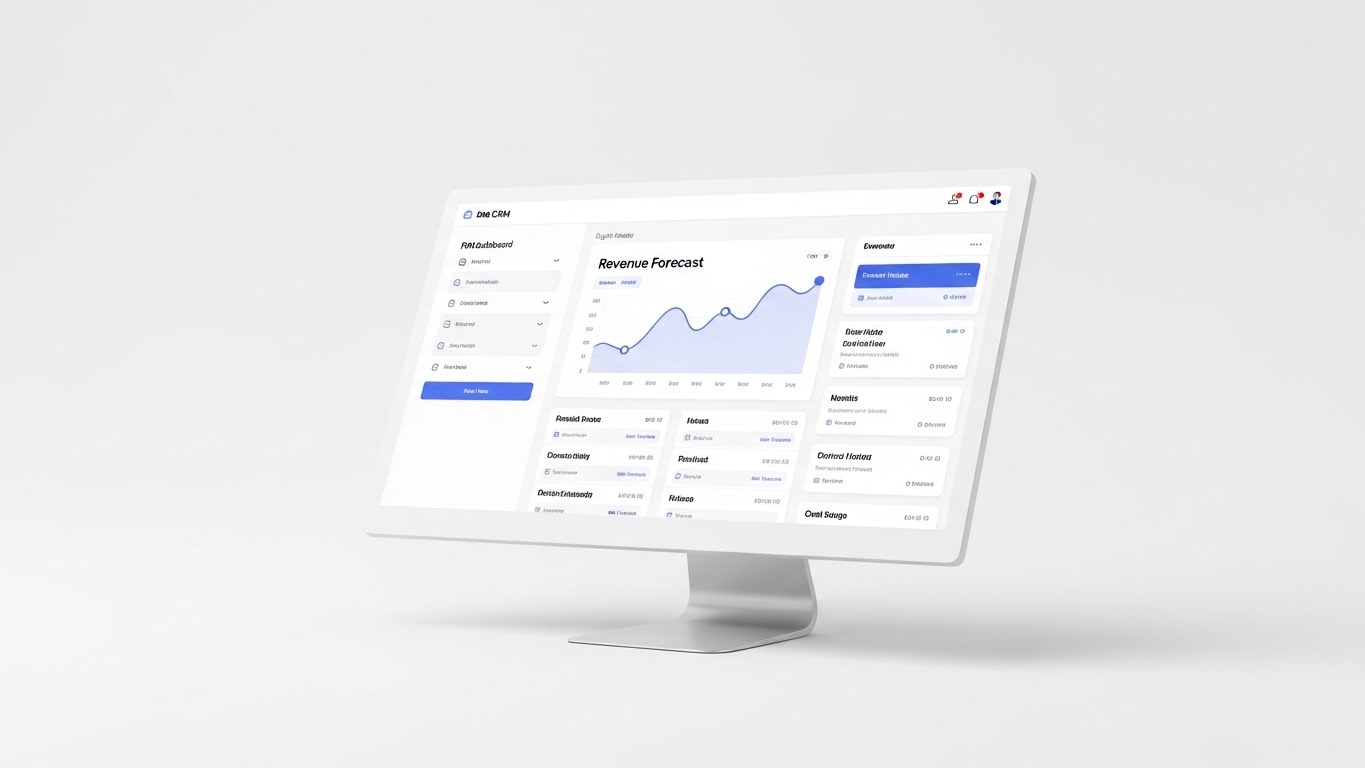
The Visual & Narrative Approach
A clean UI workflow showcase in Light Mode. The palette is Pure White with Silver and soft Blue accents. The image displays a high-fidelity mockup of a CRM dashboard on a floating monitor. The screen prominently shows a "Revenue Forecast" widget with a rising graph line. Soft, diffused shadows give the monitor depth against a white void.
Psychological Impact & KPI Focus
- Niche Psychology: Appeals to the Analytical Brain. It provides Visual Confirmation that the product is clean, modern, and readable.
- Operational Impact: Directly addresses Revenue Forecasting accuracy. It promises that "Pipeline Opacity" can be cured with a clean dashboard.
Strategic Implementation & Trade-offs
- Best Use Case: Landing Page (16:9). The primary video for "Book a Demo" conversion.
- Trade-off: It risks being boring if the UI isn't visually stunning. It relies on the actual product interface quality.
Companies using similar video content -
Scoro – Live dashboards for clear revenue forecasting.
Zoho CRM – Comprehensive client management with clean UI.
10. Rapid UI Feature Montage
MOFU | Driving Freemium/Trials
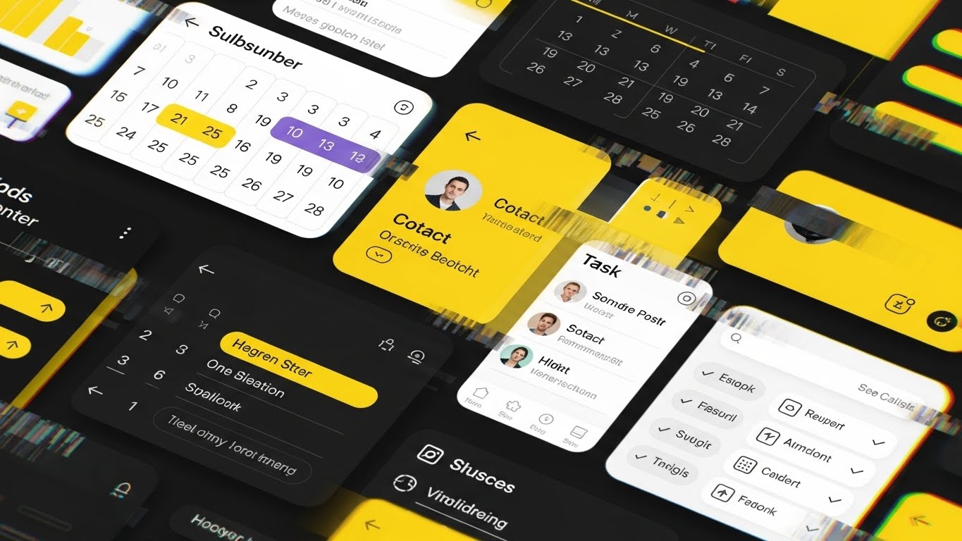
The Visual & Narrative Approach
A rapid UI feature montage designed to suggest speed. High-Visibility Yellow and Black color scheme. The composition features fragmented diagonal slices of UI screens—a calendar view, a contact card, a task list—arranged in a dynamic, diagonal collage. A digital "glitch" effect separates the slices, adding energy.
Psychological Impact & KPI Focus
- Niche Psychology: Targets the Feature Hunter mindset. It creates a sense of Urgency and Abundance ("Look how much power you get").
- Operational Impact: Visualizes Feature Density. It argues against "point solution" fatigue by showing an all-in-one platform.
Strategic Implementation & Trade-offs
- Best Use Case: Instagram Stories (9:16) or Retargeting Ads.
- Trade-off: High cognitive load. Viewers won't retain specific details, only the impression of "power." Not suitable for tutorials.
Companies using similar video content -
Monday.com – Adaptable dashboards for feature density.
Smartsheet – Project visibility for maximum feature showcase.
11. Futuristic Neon/Dark Mode (Hybrid)
MOFU | Competitive Displacement
The Visual & Narrative Approach
This style creates a sharp divergence from "legacy" software aesthetics by embracing a high-tech, futuristic hybrid look. Against a deep void background, a central glowing node in Electric Cyan and Magenta pulses rhythmically. From this core, laser-like data connections shoot outward to smaller satellite nodes, creating a vibrant network web. The aesthetic is sleek, glossy, and undeniably modern, utilizing high-contrast neon against dark mode elements to suggest speed and advanced processing power.
Psychological Impact & KPI Focus
- Niche Psychology: Aimed at the Tech-Forward Firm looking to modernize. It triggers the "Fear of Missing Out" (FOMO) regarding next-gen tech. It subtly labels competitors as "outdated" by presenting your platform as the future standard.
- Operational Impact: Visualizes Integration Supremacy. It argues that your CRM is not just a database, but the central nervous system (the glowing node) that powers the entire consultancy, connecting disparate tools into a unified, high-speed grid.
Strategic Implementation & Trade-offs
- Best Use Case: Display Ads (1.91:1) targeting users of legacy competitor platforms.
- Trade-off: Excellent for differentiation, but can appear "too sci-fi" for very traditional, conservative firms. It prioritizes the perception of innovation over approachability.
Companies using similar video content -
SnapLogic Platform – GenAI-led integration for future tech.
Informatica Intelligent Data Management Cloud – Data management for innovation.
12. Wireframe to Reality Transition
MOFU | Website Visitor Re-engagement
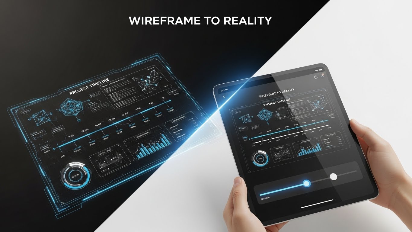
The Visual & Narrative Approach
This split-screen design offers a compelling "Before and After" narrative within a single frame. The left half displays a technical, Blueprint Blue wireframe of a project timeline—schematic, planned, and theoretical. A glowing slider bar moves across the screen, revealing the right half: a photorealistic, full-color render of that same timeline on a tablet held by a human hand. It seamlessly transitions from "Plan" to "Execution."
Psychological Impact & KPI Focus
- Niche Psychology: Addresses the "Vaporware Anxiety" common in software buying. It reassures the skeptical buyer that the promise (the wireframe) translates perfectly into reality (the device). It grounds the software in the physical world.
- Operational Impact: Visualizes Project Realization. It demonstrates that the complex planning done in the software directly correlates to tangible, handheld control over project delivery.
Strategic Implementation & Trade-offs
- Best Use Case: Facebook Carousel Ads (1:1). The interactive "slider" concept works well with swipe gestures.
- Trade-off: Requires high-fidelity assets for both the wireframe and the final UI to make the transition look seamless and magical.
Companies using similar video content -
CMap – Operations and intelligence platform for project certainty.
Accelo – Project realization from plan to execution.
13. Macro UI Micro-Interactions
MOFU | The Functional Buyer

The Visual & Narrative Approach
This style zooms in—literally. It features an extreme close-up (macro shot) of a cursor hovering over a beautifully rendered, pill-shaped button split into Teal (left) and Red (right) segments. The depth of field is shallow, blurring the surrounding data rows to force absolute focus on the interaction. As the cursor clicks the "Play" label, the button depresses satisfyingly, visualizing the tactile "feel" of the software.
Psychological Impact & KPI Focus
- Niche Psychology: The Functional Buyer (e.g., Ops Director) cares about the daily grind. They fear clunky, resistant interfaces. This style promises Frictionless Usability. It suggests that every click is designed, responsive, and satisfying.
- Operational Impact: Highlights User Experience (UX) Quality. It implies that if the micro-interactions are this polished, the macro-workflows (like complex billing) are equally refined and error-free.
Strategic Implementation & Trade-offs
- Best Use Case: Email Headers (3:1). A subtle, looping GIF in an email signature or header reinforces quality without distracting from the text.
- Trade-off: It is purely aesthetic. It does not explain what the button does, only how good it feels to use it.
Companies using similar video content -
Capsule CRM – Simplicity for frictionless usability.
HoneyBook – Clientflow management for tactile focus.
14. 3D Parallax UI Presentation
MOFU | The Champion
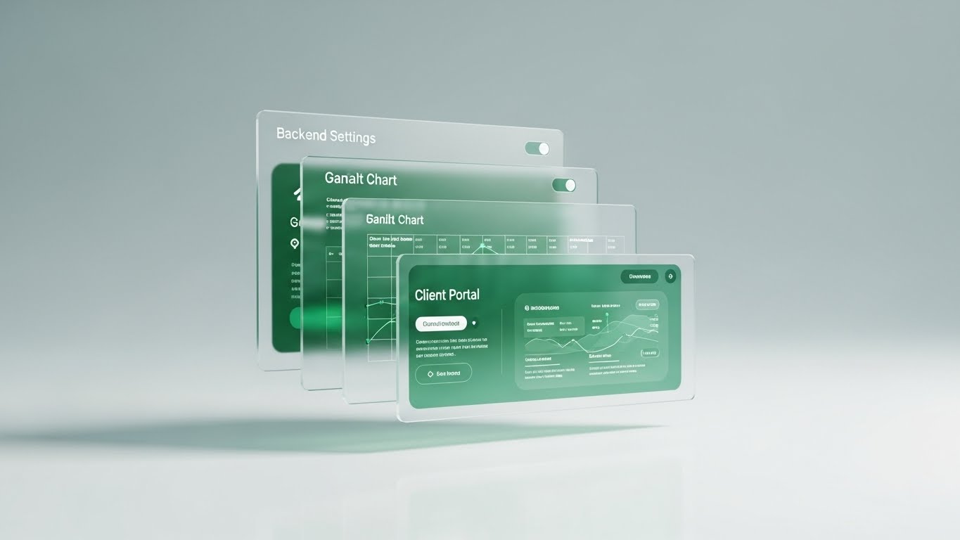
The Visual & Narrative Approach
To visualize the depth of an enterprise platform, this style uses 3D parallax layering. Multiple translucent, frosted-glass UI screens float in a stack above a reflective white surface. The camera looks up slightly at the towering interface. The front screen shows a "Client Portal," the middle a "Gantt Chart," and the back "Backend Settings." As the camera moves, the parallax effect reveals the relationships and depth between the modules.
Psychological Impact & KPI Focus
- Niche Psychology: Tailored for the "Champion"—the internal advocate who needs to sell the software to their board. It provides a visual metaphor for Depth and Robustness. It says, "This isn't just a tool; it's a multi-layered platform."
- Operational Impact: Visualizes Platform Architecture. It shows that the user interface (front layer) is backed by deep logic and settings (back layers), implying a scalable solution that won't be outgrown.
Strategic Implementation & Trade-offs
- Best Use Case: Sales Slide Decks (16:9). It serves as a powerful "Platform Overview" slide that retains attention during presentations.
- Trade-off: Text on the back layers can be hard to read. It is impressionistic, meant to convey scale rather than specific data details.
Companies using similar video content -
Salesforce – Multi-layered platform for comprehensive power.
Oracle – NetSuite SuiteProjects Pro – ERP for project architecture.
15. Isometric 3D Workflow
Onboarding | Reducing Implementation Friction
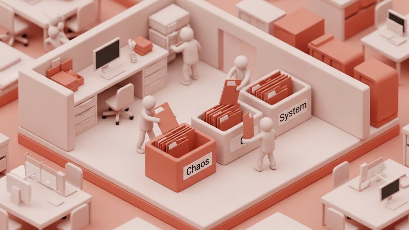
The Visual & Narrative Approach
Utilizing a "Claymorphism" style—soft, rounded 3D shapes in Clay White and Terracotta—this visual presents a friendly, miniature office floor plan. Tiny, stylized consultants are shown moving files from a red bin labeled "Chaos" to a neat, organized gray bin labeled "System." The lighting is soft and global, resembling a high-end toy set, making the concept of data migration feel manageable and even playful.
Psychological Impact & KPI Focus
- Niche Psychology: Implementation is the highest anxiety point. This style uses "cuteness" and softness to De-escalate Anxiety. It reframes the scary process of migration as a simple tidying-up exercise.
- Operational Impact: Visualizes Data Migration & Organization. It promises that the transition from legacy chaos to the new system will be structured, contained, and safe.
Strategic Implementation & Trade-offs
- Best Use Case: Support Portals / Onboarding Welcome Emails (16:9). It sets a patient, helpful tone for new users.
- Trade-off: The "toy-like" aesthetic might feel too juvenile for very serious, high-stakes finance brands if not balanced with professional copy.
Companies using similar video content -
Rocketlane – Onboarding and implementation for organized migration.
Acronis PSA – Straightforward implementation for de-escalating anxiety.
16. Dark Mode UI Showcase
Onboarding | Accelerating Time-to-Value

The Visual & Narrative Approach
Designed specifically for the technical implementer, this style features a sleek Dark Mode UI. The background is Deep Charcoal, popping with Neon Purple and Green syntax highlighting and graph lines. A dual-monitor composition is implied: one side shows raw code/API documentation, and the other shows the resulting visual workflow in the CRM. The scene is lit only by the screen's glow, evoking a "Deep Focus" atmosphere.
Psychological Impact & KPI Focus
- Niche Psychology: Appeals to the IT/Developer Persona within the firm. It signals that the platform is "developer-friendly," customizable, and robust under the hood. It respects their preference for dark mode environments.
- Operational Impact: Visualizes Customization & API Capabilities. It proves that the "low-code" front end is supported by "pro-code" flexibility, ensuring the software can adapt to unique firm processes.
Strategic Implementation & Trade-offs
- Best Use Case: In-App Modals / Developer Documentation (16:9).
- Trade-off: Less appealing to the non-technical Managing Partner who may find the code intimidatory. This is strictly for the technical stakeholder.
Companies using similar video content -
WSO2 API Manager – Open-source API management for customization.
IBM – App Connect – Integration for developer-friendly environments.
17. 2D Line Art Animation
Onboarding | Self-Serve Onboarding
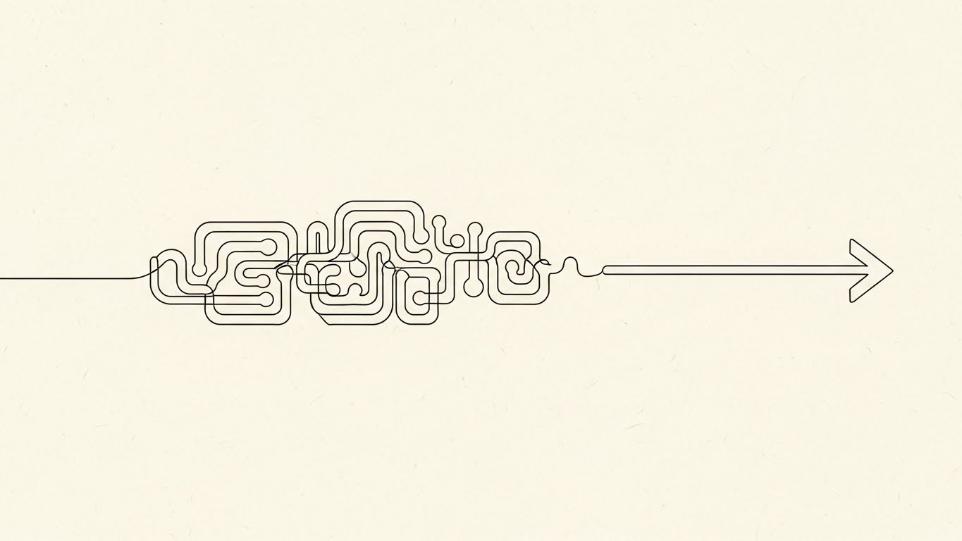
The Visual & Narrative Approach
Simplicity is the ultimate sophistication here. Using a continuous, elegant Black Ink line on a textured Cream Paper background, the animation draws a complex, tangled knot that gracefully unravels into a straight, unwavering arrow pointing forward. There is no shading or color distraction—just pure line weight variation. The motion is fluid and unhurried.
Psychological Impact & KPI Focus
- Niche Psychology: For the busy consultant, "learning new software" feels like a tangle. This style visualizes the Clarifying Effect of the software. It promises that the tool will untangle their complex mental processes, not add to them.
- Operational Impact: Visualizes Process Automation. It represents the stripping away of unnecessary administrative steps to reveal the "straight line" to revenue.
Strategic Implementation & Trade-offs
- Best Use Case: YouTube Help Center / "How-to" Videos (16:9). The lack of visual noise helps viewers focus entirely on the concept being explained.
- Trade-off: It is abstract. It doesn't show the UI, so it must be used for conceptual onboarding (e.g., "Understanding the Workflow") rather than button-pushing tutorials.
Companies using similar video content -
Asana – Process clarity for logical workflow untangling.
Trello – Card-based interface for continuous path visualization.
18. Photorealistic 3D Renders
BOFU | Building Trust & Credibility

The Visual & Narrative Approach
This style creates a "virtual photography" setup of a high-end executive desk. The lighting is natural and studio-quality. On the desk sits a brushed aluminum laptop displaying a blank or subtle screen, a leather notebook, and a ceramic coffee cup. Floating subtly above the laptop is a 3D metallic "Shield" logo. The textures—leather, metal, wood—are hyper-realistic, conveying a sense of permanence and expense.
Psychological Impact & KPI Focus
- Niche Psychology: Targeted at the Risk-Averse Decision Maker. It subconsciously links the software with "premium" and "established." It removes the "startup risk" feeling by presenting an image of established corporate stability.
- Operational Impact: Visualizes Enterprise Security. The shield and the clean, executive environment signal that client data is safe, secure, and treated with white-glove care.
Strategic Implementation & Trade-offs
- Best Use Case: Case Study PDFs / Trust Center Page (4:3). It adds a magazine-quality editorial look to text-heavy documents.
- Trade-off: Static. It creates a vibe of trust but communicates zero information about features or workflows.
Companies using similar video content -
IBM – Enterprise solutions for institutional trust.
SAP – ERP for professional services for corporate stability.
19. Split Screen: Optimized Reality and UI
BOFU | ROI Justification

The Visual & Narrative Approach
A split-screen composition that connects the human action to the digital result. The left side features a high-quality photo of two professionals shaking hands in a boardroom (Warm Crimson and Charcoal tones). The right side displays a high-fidelity UI on an iPad showing a "Success" notification with a large Green checkmark. A sharp white line divides them. The visual timing implies the handshake caused the digital success.
Psychological Impact & KPI Focus
- Niche Psychology: It bridges the Physical/Digital Divide. Consultants often feel that software disconnects them from clients. This visual argues the opposite: that the software captures and secures the value created in the meeting room.
- Operational Impact: Visualizes Revenue Capture. It directly links the "deal" (human effort) to the "billable" (digital record), validating the software as the vault for their hard-earned revenue.
Strategic Implementation & Trade-offs
- Best Use Case: LinkedIn Video Ads (1:1). It effectively targets the "Relationship Manager" persona who values human connection but needs digital tools.
- Trade-off: Relies heavily on the quality of the stock footage. Bad stock photos can ruin the credibility of the UI side.
Companies using similar video content -
Productive.io – CRM and project management for revenue capture.
Scoro – Quote-to-cash for tangible revenue attribution.
20. 3D X-Ray Visualization
BOFU | Risk Mitigation

The Visual & Narrative Approach
To answer the question "What's under the hood?", this style uses an X-Ray effect. A sleek briefcase (symbolizing the consultant's business) is rendered with a semi-transparent, X-Ray Blue shell. Inside, we see a glowing, solid internal core representing the software's architecture—encrypted data blocks and a central padlock. The background is a clean grid. It reveals the hidden strength of the system.
Psychological Impact & KPI Focus
- Niche Psychology: Appeals to the Skeptic who doubts the robustness of cloud platforms. It provides "radical transparency." It satisfies the need to see the mechanism of safety, not just be told about it.
- Operational Impact: Visualizes Compliance & Architecture. It shows that while the exterior (interface) is beautiful, the interior (backend) is engineered for security, GDPR compliance, and data integrity.
Strategic Implementation & Trade-offs
- Best Use Case: Security/Compliance Page (16:9). It creates a visual anchor for technical security audits.
- Trade-off: Very technical. It is not an emotional sell; it is a logical, defensive asset designed to remove objections rather than inspire desire.
Companies using similar video content -
ConnectWise PSA – Security and cloud solutions for structural security.
HaloPSA – Service management for compliance and architecture.
21. Hyper-lapse Stock Footage with Data
BOFU | Sales Cycle Acceleration
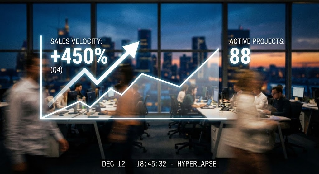
The Visual & Narrative Approach
This style captures the frantic energy of a high-performance consultancy and overlays it with the calm precision of data. We see a hyper-lapse (fast-forward) shot of a modern, glass-walled office at twilight. Staff move as blurs of light and motion, emphasizing high activity and long hours. Floating steadfastly in the foreground are crisp, static White and Blue HUD elements displaying "Sales Velocity" graphs spiking upward and "Active Projects" counters ticking rapidly.
Psychological Impact & KPI Focus
- Niche Psychology: High-growth firms often feel like they are moving too fast to track everything. This style validates that Speed and Control can coexist. It reassures the partner that while their team runs fast, the software captures every metric with stillness and accuracy.
- Operational Impact: Visualizes Real-Time Analytics. It demonstrates that the platform doesn't just store data; it keeps pace with the frenetic reality of the business, turning chaotic activity into structured growth metrics.
Strategic Implementation & Trade-offs
- Best Use Case: Retargeting Ads (9:16). The fast motion grabs attention in a social feed, while the static numbers deliver the value prop.
- Trade-off: Relies on high-quality stock footage. If the footage looks "generic corporate," it loses its premium feel.
Companies using similar video content -
Polaris PSA By Replicon – AI-driven resource optimization for accelerated metrics.
BigTime – Time and expense tracking for sales velocity.
22. Realistic Character Video
BOFU | ROI Justification Hook

The Visual & Narrative Approach
Trust in consulting is transferred peer-to-peer. This style features a high-fidelity, realistic character—a confident Managing Partner in his 40s, dressed in a tailored navy suit. He stands in a warm, well-lit office environment with soft bokeh in the background suggesting a busy team. He looks slightly off-camera, smiling as if confirming a successful outcome. The lighting is cinematic, highlighting the texture of the suit and the genuineness of the expression.
Psychological Impact & KPI Focus
- Niche Psychology: Consultants sell expertise. They buy from those they respect. This style triggers Social Proof and Authority Bias. It mirrors the buyer's self-image: successful, composed, and in control.
- Operational Impact: Visualizes Partner Satisfaction. It suggests that the "headache" of software adoption has been solved, leaving the partner free to focus on high-level strategy rather than admin.
Strategic Implementation & Trade-offs
- Best Use Case: Video Testimonials / Case Study Headers (16:9). It creates a human connection that abstract graphics cannot match.
- Trade-off: It is not a product demo. It builds trust but explains zero features. It must be supported by "How-to" content elsewhere.
Companies using similar video content -
4Degrees – Relationship intelligence for peer-to-peer trust.
OnePageCRM – Relationship-driven CRM for partner satisfaction.
23. Lifestyle Stock with UI Overlay
BOFU | Overcoming Objections

The Visual & Narrative Approach
This style bridges the gap between "lifestyle" freedom and "work" responsibility. We see a young female consultant working in a sunlit, upscale coffee shop—a common reality for the modern mobile workforce. An over-the-shoulder shot reveals her laptop screen, where a glowing, semi-transparent 3D UI layer pops out. It displays a "Support Chat" window with a smiling avatar and a "Human Support" bubble.
Psychological Impact & KPI Focus
- Niche Psychology: Remote work can feel isolating. This visual assuages the Fear of Abandonment. It promises that expert help is always just a click away, regardless of physical location.
- Operational Impact: Visualizes Support Responsiveness. It counters the objection that SaaS platforms are faceless and hard to troubleshoot. It frames the software as a "Partner," not just a tool.
Strategic Implementation & Trade-offs
- Best Use Case: Email Campaigns / Onboarding Sequences (4:5). It adds a warm, human touch to automated email flows.
- Trade-off: The UI overlay must be tracked perfectly to the laptop screen; otherwise, it looks fake and breaks immersion.
Companies using similar video content -
Agency Handy – Client communication platform for remote support.
Zendesk – Omnichannel ticketing for instant resolution.
24. Aspirational Stock Montage
BOFU | The Economic Buyer

The Visual & Narrative Approach
Focusing on the emotional result of good software: a happy team. This style uses a high-angle, crisp stock photo of a diverse group of corporate professionals high-fiving in a glass boardroom. Sunlight flares naturally through the window, creating an atmosphere of optimism and victory. The image is clean, high-resolution, and devoid of clutter.
Psychological Impact & KPI Focus
- Niche Psychology: High turnover is a plague in consulting. This style appeals to the Leadership Ideal of a cohesive, motivated culture. It subconsciously links the software to "Winning" and "Team Unity."
- Operational Impact: Visualizes Cultural Alignment. It suggests that the software removes friction, allowing the team to celebrate wins (closed deals) rather than fight with spreadsheets.
Strategic Implementation & Trade-offs
- Best Use Case: Investor Decks / "About Us" Pages (16:9). It sets the emotional tone for the company vision.
- Trade-off: Can feel like a cliché "stock photo" if used too frequently. It serves as an emotional anchor, not a literal representation of the product.
Companies using similar video content -
Wrike – Collaborative efforts for team synergy.
ClickUp – Customizable work management for corporate morale.
25. 2D Graphics Over Live Action
Retention | Driving Deep Feature Adoption

The Visual & Narrative Approach
A powerful visual metaphor for "ordering chaos." We start with a top-down photographic view of a messy wooden desk—coffee stains, crumpled papers, and tangled cables. Suddenly, a bright, Neon Orange vector grid overlays the scene. It scans the mess, and the physical clutter is conceptually replaced by neat, glowing digital file icons and a bold "DIGITAL ORDER" header.
Psychological Impact & KPI Focus
- Niche Psychology: Every consultant knows the stress of a messy desk (or desktop). This style triggers the Relief of Organization. It validates the transition from "Paper/Legacy" chaos to "Digital/SaaS" clarity.
- Operational Impact: Visualizes Digitization. It demonstrates the core value proposition: taking unstructured physical inputs and turning them into structured digital assets.
Strategic Implementation & Trade-offs
- Best Use Case: In-App Tips / Feature Announcements (1:1). The contrast makes the "Before/After" instantaneous and understood without audio.
- Trade-off: Requires excellent compositing to make the vector graphics feel like they are interacting with the real photo.
Companies using similar video content -
CMap – Replace spreadsheets for digital organization.
Projectworks – Eliminate admin for chaotic workflows.
26. Holographic UI over 3D Render
Retention | Reducing Churn

The Visual & Narrative Approach
The modern consultant is always moving. This style showcases a realistic 3D render of a smartwatch in a dark, premium void. A Hologram Pink projection beams upward from the watch face, displaying a "Daily Briefing" dashboard with client tasks and graphs. The lighting is crisp, cool, and scientific.
Psychological Impact & KPI Focus
- Niche Psychology: Appeals to the "Always-On" Professional. It strokes the ego of the consultant who needs to be on top of their game, everywhere. It frames the software as a futuristic, indispensable accessory.
- Operational Impact: Visualizes Mobile Extensibility. It proves that the CRM's power isn't locked in a desktop; it extends to the wrist, ensuring no task or notification is missed.
Strategic Implementation & Trade-offs
- Best Use Case: QBR Presentations / New Feature Launches (16:9). It positions the platform as cutting-edge and innovative.
- Trade-off: Smartwatch interfaces are limited. This is a conceptual sell for notifications and quick views, not deep work.
Companies using similar video content -
Salesforce – Mobile app for always-on consulting.
Zoho CRM – Mobile app for mobile extensibility.
27. Low-Poly 3D Modeling
Expansion | Driving Upsell/Cross-sell

The Visual & Narrative Approach
To visualize expansion without complex realism, we use a Low-Poly 3D aesthetic. A colorful, faceted map of the world sits on a surface. Oversized, playful Red location pins drop onto various continents with a "thud." As they land, white connection arcs spring up between them, visualizing a network. The look is friendly, accessible, and gamified.
Psychological Impact & KPI Focus
- Niche Psychology: Global expansion can feel daunting. This style makes it look Playful and Manageable. It simplifies the complexity of multi-currency, multi-language operations into a simple game of "connecting the dots."
- Operational Impact: Visualizes Multi-Entity Management. It is perfect for showing how the software handles parent/child company structures across borders.
Strategic Implementation & Trade-offs
- Best Use Case: Feature Updates / Expansion Module Marketing (16:9).
- Trade-off: The "cartoonish" look must be balanced. It works for "Expansion" concepts but might feel too light for "Security" or "Compliance" topics.
Companies using similar video content -
Kantata – Mid-large firms for global reach.
SEEBURGER Business Integration Suite – Global integration for multi-territory scale.
29. Abstract 3D AI Visualization
Expansion | Proactive Support/Announcements

The Visual & Narrative Approach
AI is often an invisible feature. This style gives it a form. On the left, a glowing "Brain" made of cyan particles represents raw intelligence. It shoots fiber-optic strands into a chaotic cloud of metallic shards (data) on the right, instantly organizing them into a perfect, crystalline sphere. The background is a stark black void to maximize contrast.
Psychological Impact & KPI Focus
- Niche Psychology: Clients fear AI as a "Black Box." This visual demystifies it as a process of Organization and Synthesis. It frames AI not as a replacement for the consultant, but as a tool that refines raw data into valuable gems.
- Operational Impact: Visualizes Predictive Analytics. It shows the "Magic" of the backend—taking messy historical data and turning it into a structured, predictive model.
Strategic Implementation & Trade-offs
- Best Use Case: Newsletters / AI Feature Reveals (16:9). It conveys "Innovation" and "Premium Tech."
- Trade-off: Highly abstract. It requires accompanying text to explain what the AI is actually doing (e.g., "Predicting Project Overruns").
Companies using similar video content -
Keap – Automation and follow-ups for growth.
30. Dynamic Data Visualization
Expansion | Establishing Thought Leadership

The Visual & Narrative Approach
Data comes to life in this dynamic 3D visualization. We start with a standard flat bar chart on a white surface. Suddenly, the bars (colored in vivid Blue, Green, and Yellow) extrude rapidly upwards, transforming from simple data points into a 3D city skyline. Arrows arc over the "buildings," indicating growth trajectories. The camera pans around this data metropolis.
Psychological Impact & KPI Focus
- Niche Psychology: Every partner wants to build an empire. This style equates Data Growth with Physical Business Growth. It turns a boring "Year-End Report" into a celebration of scale and architectural solidity.
- Operational Impact: Visualizes Scaling & Reporting. It suggests that as your data grows, the platform scales with you, providing the infrastructure for a larger firm.
Strategic Implementation & Trade-offs
- Best Use Case: Annual Reports / "Year in Review" Videos (16:9).
- Trade-off: It is a metaphor. It works best for high-level summaries, not for detailed granular data analysis.
Strategic Knowledge Base: The Visual Operations Doctrine
To bridge the gap between "aesthetic choice" and "business outcome," we have synthesized a 3-segment framework. This doctrine moves beyond marketing and embeds visual strategy into the operational DNA of a consulting firm.
Strategic Alignment & Visual Architecture
The "Pre-Production" Strategy – Why and Who.
- The Cognitive Load Audit: Before creating a single video, audit your current training materials. If a PDF manual takes 20 minutes to read (High Load), replace it with a Style 10 (Rapid UI Montage) or Style 17 (Line Art) video that conveys the same concept in 60 seconds.
- Role-Based Visual Mapping: Do not use the same visuals for everyone.
- For Partners (The "Empire Builder"): Use Style 9 (Clean UI) and Style 30 (Data City). They need to see stability, reporting, and "God-view" control from their desktop.
- For Consultants (The "Road Warrior"): Use Style 26 (Holographic Wearable) and Style 23 (Lifestyle UI). They need to see mobility, speed, and ease of access on the road.
- The "Glanceability" Standard: In a high-pressure consulting environment, information must be absorbed instantly. Use Style 1 (Minimalist Flat) and Style 2 (Kinetic Typography) for internal announcements. If the message isn't understood in 3 seconds, the design has failed.
- Brand Voice Consistency: Your software visualizer must match your firm's brand. If you are a "High-Touch/Boutique" firm, use Style 3 (Organic Motion). If you are a "Data-Hard/Quant" firm, use Style 16 (Dark Mode Code). Inconsistency here breeds distrust.
- The Advids Strategic Audit: Visual strategy is not just about making things "pretty"; it's about information architecture. Engaging a partner like Advids early allows for a "Visual Operating System" audit, defining which styles map to which KPIs before production begins.
- Legacy System Integration: Use Style 12 (Wireframe to Reality) to visualize the transition from legacy spreadsheets to the new SaaS platform. Visualizing the "Old vs. New" bridge reduces the anxiety of migration.
- The Cross-Departmental Bridge: Sales talks in "Revenue," Ops talks in "Utilization." Use Style 19 (Split Screen) to visually link these worlds—showing how a Handshake (Sales) instantly becomes a Data Point (Ops).
- Accessibility in Global Teams: For firms with global, multi-lingual teams, prioritize Style 17 (Line Art) and Style 1 (Minimalist). These styles rely on visual logic rather than text, making training universally understood without translation.
- The Mobile-First Mandate: 60% of CRM interaction happens on the road. Ensure all assets, especially Style 8 (2D UI Composition), are optimized for vertical (9:16) mobile viewing to meet consultants where they are.
- Standardization vs. Customization: Use "Stock" based styles (like Style 24) for general morale, but strictly use Custom UI styles (like Style 13) for feature training. Never use generic UI to teach a specific workflow.
Operational Adoption & Implementation
The "Deployment" Phase – How to embed visuals into the workflow.
- Overcoming "Big Brother" Anxiety: Consultants often fear time-tracking is just surveillance. Use Style 6 (Character Story) to frame time-entry as "Value Capture" rather than "Monitoring." Show the character benefiting from the data, not just the boss.
- The Micro-Learning Shift: Kill the hour-long webinar. Slice training into 30-second Style 10 (Rapid UI) clips embedded directly in the software's tooltips. This is "Just-in-Time" learning.
- Just-in-Time Support: When a consultant is stuck on a proposal at 2 AM, they won't call support. Embed Style 17 (Line Art) "How-to" loops directly into the error messages to provide instant, frustration-free guidance.
- Gamification of Training: Use Style 5 (Bauhaus Motion) to visualize "Completion Streaks" or "Utilization Scores." High-energy motion graphics can turn boring compliance tasks into a dopamine-driven game.
- Reducing Support Ticket Volume: There is a direct correlation between the quality of your Style 13 (Macro UI) videos and the volume of "How do I do this?" tickets. High-fidelity visual guides preemptively answer questions.
- Remote Onboarding: You can't fly everyone to HQ anymore. Use Style 7 (Isometric Design) and Style 15 (Isometric Clay) to give new hires a "spatial" understanding of the company structure and tech stack without them ever stepping foot in the office.
- Visual SOPs: Transform text-heavy Standard Operating Procedures (SOPs) into Style 12 (Wireframe Transitions). Visualizing the process flow reduces error rates in complex tasks like billing or compliance checks.
- Feedback Loops: Use interactive video elements (Style 8) in internal newsletters to gather feedback. "Click the part of the UI that confuses you." This creates a visual heat map of user friction.
- Scalable Localization: When expanding to new territories (Style 27), use Advids to create "Master Templates" where text overlays can be swapped instantly for local languages while keeping the core animation intact.
- Leadership Communication: When the CEO announces a pivot, don't send a text email. Use Style 4 (Cinematic Video) or Style 22 (Realistic Character). High-fidelity video signals "This is important" and commands attention.
Measuring Impact & Future-Proofing
The "ROI" Phase – Measuring success and looking ahead.
- Beyond "Views" – Actionable KPIs: Do not measure video success by "Views." Measure it by "Time-to-Competency." Did the new cohort maximize their billable hours 2 weeks faster after watching the Style 15 onboarding series?
- The "Idle Time" Metric: Correlate the deployment of Style 9 (Clean UI) walkthroughs with a reduction in "Idle Time" (time spent navigating the software). Better visualization leads to faster navigation.
- Compliance Velocity: How fast does the firm reach 100% compliance on a new regulation (like GDPR)? Use Style 20 (X-Ray) to explain the "Why" behind the rule. Measure the speed of adoption pre- and post-video.
- Retention and Churn: High-quality UX visualization (Style 13) contributes to the "Perceived Value" of the software. Survey clients on "Ease of Use" and correlate high scores with the consumption of help content.
- The AI Visual Frontier: Prepare for the next wave. Generative AI will soon allow for real-time creation of Style 29 (Abstract AI) visualizations based on live client data. Start building a visual language that can adapt to this dynamic future.
- Scalability of Assets: Don't build "One-off" videos. Build a "Visual System." Ensure your icons, colors, and motion behaviors in Style 1 match those in Style 30. This allows for rapid assembly of new assets as features launch.
- The Advids Partnership: As your platform evolves, your visual library must keep pace. A long-term partner like Advids ensures that your "Style 22" testimonial from 2024 doesn't look alien next to your "Style 30" update in 2026. Consistency builds brand equity.
- Benchmarking Success: Regularly audit your competitors' visual output. If they are still using static screenshots and you are using Style 2 (Kinetic Typography), you have a "Perceived Innovation" advantage that can be leveraged in sales.
- The ROI of Security: Security breaches are costly. Using Style 20 (X-Ray) to effectively train staff on phishing and data protocol can be directly linked to insurance premium reductions and risk mitigation.
- Final Call to Innovation: Treat video not as "content marketing" but as "Visual Infrastructure." In an industry drowning in data, the firm that visualizes clarity wins. The 30 styles in this guide are your toolkit. Pick the right tool, measure the impact, and turn the invisible into the undeniable.
Companies using similar video content -
Sisense – AI-powered analytics for predictive insights.
Tableau – AI-driven data visualization for data alchemy.
Author & Editor Bio


