
Introduction
The Optimization Paradox: Visualizing the Invisible
The global consulting industry is currently navigating a precarious "Optimization Paradox." While firms are investing heavily in digital infrastructure to scale, the core metrics of operational efficiency are flashing warning signs. According to 2025 industry benchmarks, average billable utilization fell to 68.9%, dropping significantly below the optimal 75% threshold required for healthy margins. This erosion suggests that despite the influx of new tools, the connection between human talent and digital resources remains fraught with friction.
For Managing Partners and Operations Directors, the challenge is no longer just acquiring technology; it is ensuring value realization. The gap between deployment and adoption is stark: a recent survey reveals that 92% of operations leaders say their tech investments haven't delivered the expected results. The culprit is often "Cognitive Load." Complex ERPs and resource scheduling platforms are difficult to explain, hard to visualize, and easy to ignore.
This guide argues that the solution to this adoption gap is not just better software, but better visualization of that software’s value. In a high-stakes environment, video is not merely a marketing asset; it is a strategic lever for change management. By visualizing complex workflows, abstracting data architecture, and validating user anxieties, we can bridge the physical reality of paper contracts with the digital promise of automated dashboards.
The following 30 visual examples are curated to address specific operational challenges—from "profit leakage" to "resource scheduling"—transforming them from abstract anxieties into solved, visual narratives.
1. The Architecture of Stability
TOFU | Brand Awareness

The Visual & Narrative Approach
This style abandons standard fonts for a structural approach, where the word "GROWTH" is literally constructed from interconnecting data nodes and rigid geometric beams. The animation begins with these nodes scattered, rapidly snapping together with a mechanical satisfaction to form the letters. The aesthetic is flat and minimalist, utilizing a high-contrast palette of Electric Indigo and pure White to ensure the central shapes pop with kinetic energy.
Psychological Impact & KPI Focus
- Cognitive Authority: By treating text as a 3D structure, you subconsciously signal that your software provides a "solid foundation" rather than just a digital tool. It appeals to the "Operational Architect" persona who craves stability.
- KPI Alignment: Ideally suited for Brand Awareness (TOFU). It anchors the viewer's attention on singular, high-impact concepts like "SCALE" or "STABILITY" before they even hear a value proposition.
Strategic Implementation & Trade-offs
- Best Use Case: LinkedIn autoplay ads (silent loops) where you have 3 seconds to stop the scroll.
- Trade-off: High impact, but low informational density. It builds brand vibe, not product understanding.
Companies using similar video content -
Deltek – Maconomy – Enterprise ERP for professional services.
SAP – S/4HANA Professional Services – Integrated business suite for services.
2. Visualizing the Ecosystem
TOFU | Category Creation

The Visual & Narrative Approach
This visual metaphor tackles the concept of "Category Creation." The composition moves left-to-right, visualizing the transition from scattered noise to organized streams of connection. Nodes within the stream represent global resources (people, data, IP) flowing seamlessly across borders. The palette of Coral, Teal, and Slate Grey creates a professional yet modern vibe, visualizing the "digital nervous system" of a Connected Enterprise.
Psychological Impact & KPI Focus
- Cognitive Ease: It reduces the anxiety of complex global operations (Matrix Complexity) by presenting them as smooth, flowing lines. It promises order from chaos.
- KPI Alignment: Perfect for Market Education. It explains how the platform works (gathering scattered data, unifying it) without showing a single intimidating spreadsheet.
Strategic Implementation & Trade-offs
- Best Use Case: YouTube explainer intros or website hero backgrounds.
- Trade-off: Abstract visuals can sometimes be too vague. Ensure the voiceover explicitly connects the "flow" to specific business processes like "cash flow" or "data integration."
Companies using similar video content -
Kantata SX – Kantata Cloud for Professional Services – Unifying resource, project, and financial data.
MuleSoft – Anypoint Platform – API-led connectivity for enterprise integration.
3. Stopping the Bleeding
TOFU | Market Education
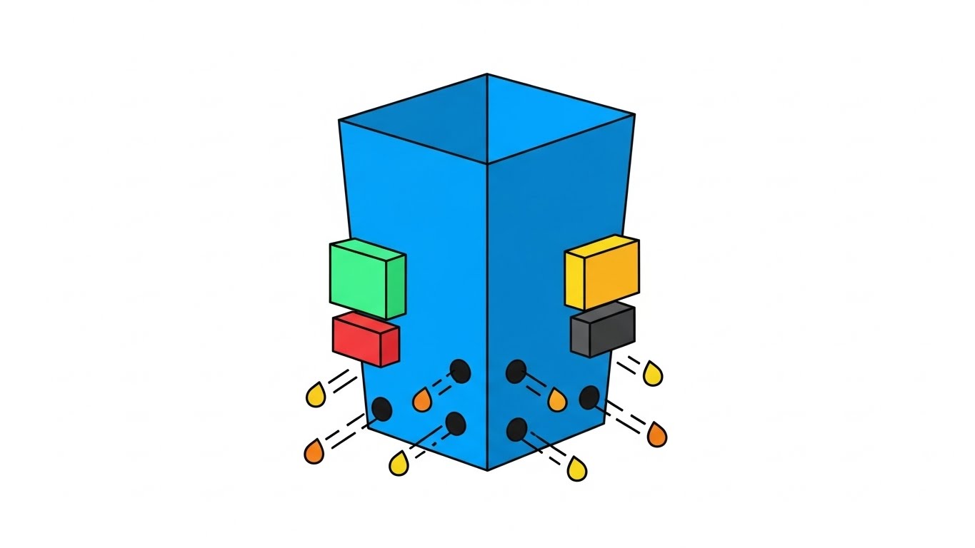
The Visual & Narrative Approach
Here, the "Leaky Bucket" syndrome—a classic consulting fear—is visualized with zero ambiguity. A blue geometric container represents the firm, with gold droplets (revenue) escaping from holes. The software is represented by vibrant, digital blocks in Mint Green and Charcoal that snap into place, physically plugging the leaks. The art style uses hard edges and no gradients, focusing on clarity and simplicity to explain the concept of profit leakage.
Psychological Impact & KPI Focus
- Urgency Creation: The visual of "leaking gold" triggers an immediate Loss Aversion response in partners who fear margin erosion.
- KPI Alignment: Highly effective for Market Education blog posts and whitepapers where you need to articulate the value of retention.
Strategic Implementation & Trade-offs
- Best Use Case: Embedded in blog posts about "Profitability" or "Utilization."
- Trade-off: While clear, this style can perceive as "entry-level" if not paired with sophisticated typography.
Companies using similar video content -
Retain.ai – Revenue Intelligence Platform – Identifies and prevents revenue churn.
Kimble Applications – PSA Software – Optimizes project profitability and utilization.
4. Bridging the Physical-Digital Divide
TOFU | LinkedIn Organic
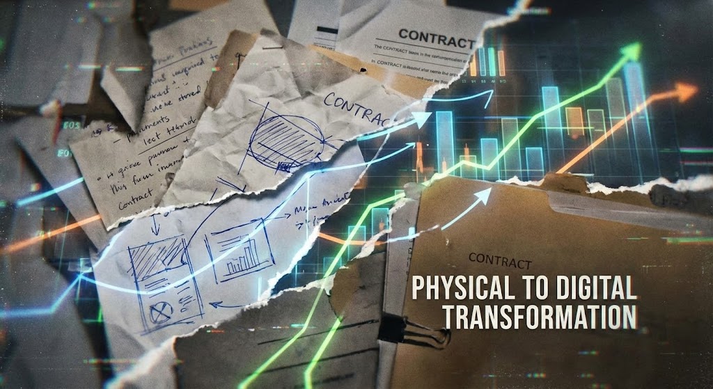
The Visual & Narrative Approach
This style captures the visceral transition from legacy systems to modern tech. The visual is a fast-paced collage blending real-world textures of paper documents and hand-drawn sketches with sharp, digital overlays of business charts. The scene depicts the transformation of physical chaos (crumpled contracts) morphing into sleek, glowing dashboard elements. It validates the "messy middle" of transformation.
Psychological Impact & KPI Focus
- Relatability: Most firms still operate in a hybrid reality of paper and Excel. This style acknowledges that reality (Empathy) before offering the solution.
- KPI Alignment: Strong for LinkedIn Organic content, as the texture stops the scroll and the "Before/After" format is inherently satisfying to watch.
Strategic Implementation & Trade-offs
- Best Use Case: Social media "Transformation Tuesday" style posts.
- Trade-off: Requires high-quality assets to avoid looking "messy." The chaos must be controlled chaos.
Companies using similar video content -
UiPath – Automation Platform – Automating manual, paper-based processes.
Appian – Low-Code Platform – Digitizing workflows from physical inputs.
5. Automating Capacity
TOFU | Shaping Brand Perception
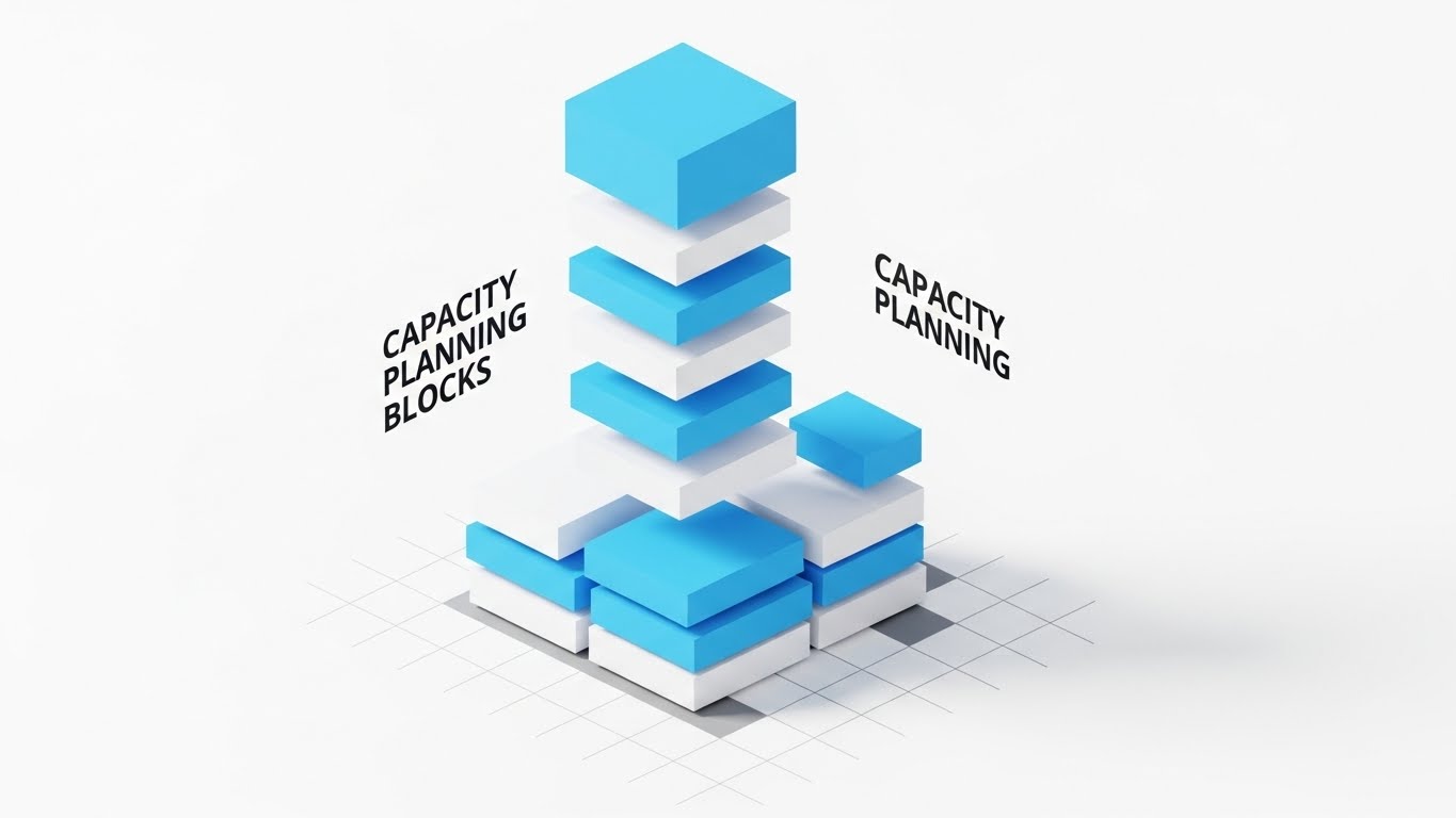
The Visual & Narrative Approach
Isometric design is the gold standard for visualizing "capacity" and "architecture." In this example, sky-blue blocks (representing consultant hours or skills) automatically stack and assemble themselves into a cohesive platform. The background is an infinite white floor with a subtle grid. The composition is clean and orderly, conveying the ease of setup and modular nature of the software.
Psychological Impact & KPI Focus
- Sense of Control: The "God’s eye view" of isometric design makes the viewer feel like an architect of their own business, fostering a sense of mastery over Resource Allocation.
- KPI Alignment: Excellent for Shaping Brand Perception on the website's "Features" page. It makes complex configuration look like simple building blocks.
Strategic Implementation & Trade-offs
- Best Use Case: Feature breakdown videos (e.g., "How Capacity Planning Works").
- Trade-off: Can feel cold or impersonal. Needs a warm voiceover to humanize the "building" process.
Companies using similar video content -
Float – Resource Management Software – Visualizing and scheduling team capacity.
Resource Guru – Resource Scheduling Software – Allocating and managing team availability.
6. The Global Stage
TOFU | Skippable Pre-Roll Ad

The Visual & Narrative Approach
To sell to the C-Suite, you need visuals that match their ambition. This style uses breathtaking aerial drone shots establishing a modern metropolis skyline at sunrise. Superimposed over the city architecture are subtle, flowing streams of data light connecting the skyscrapers. It subtly implies that your software is the invisible digital infrastructure powering the world's leading firms.
Psychological Impact & KPI Focus
- Prestige & Trust: The high production value (photorealistic 8K) signals that your platform is an enterprise-grade solution, safe for large-scale deployment.
- KPI Alignment: Ideal for YouTube Pre-Roll Ads (first 5 seconds) to establish authority immediately and reduce skip rates.
Strategic Implementation & Trade-offs
- Best Use Case: Brand manifesto videos or event openers.
- Trade-off: Expensive to produce. If the CGI looks cheap, it damages trust.
Companies using similar video content -
Accenture – myWizard – AI-powered platform for global delivery.
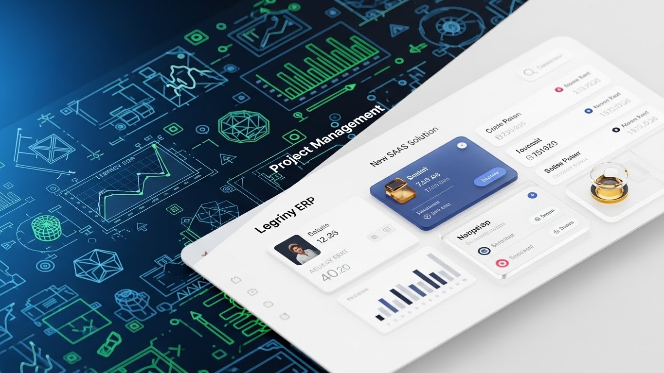
7. The Glass Box
MOFU | Feature Education
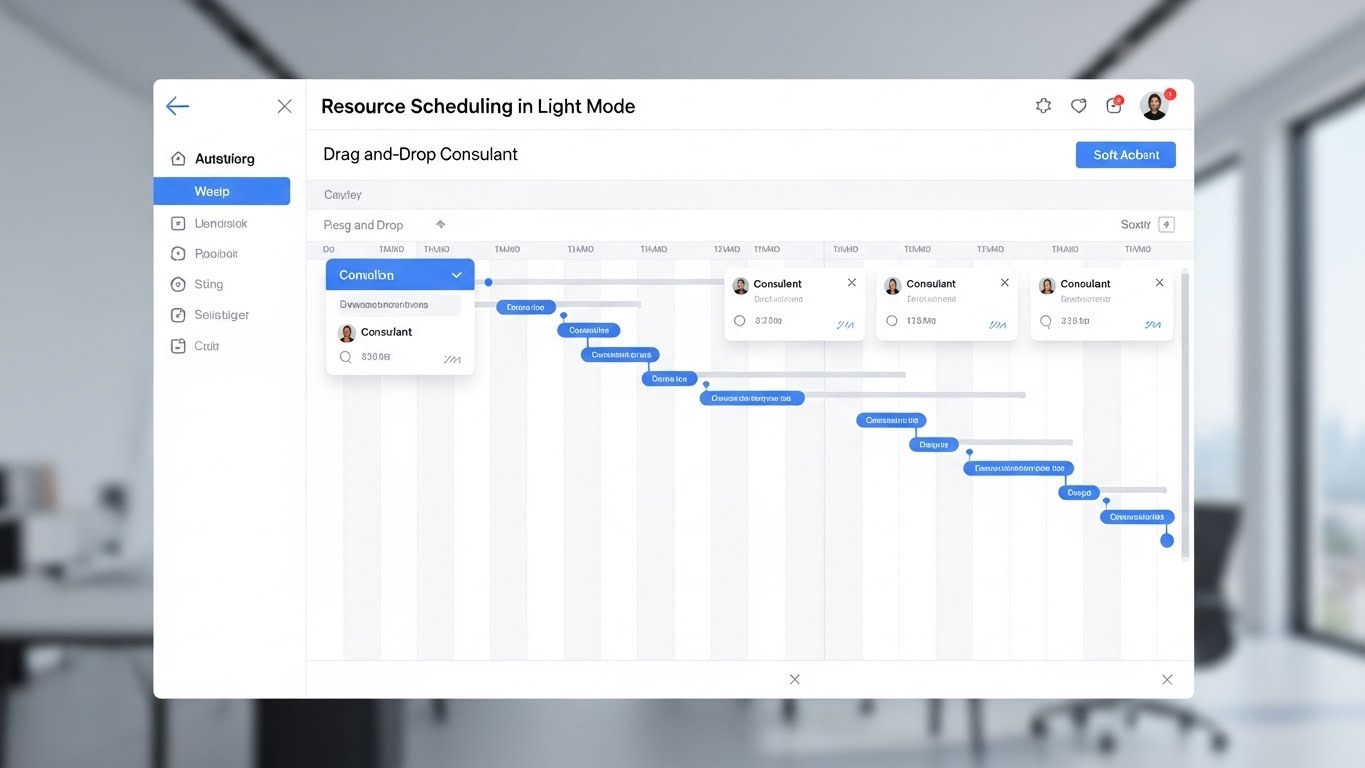
The Visual & Narrative Approach
Eventually, buyers need to see the tool. This style presents a pristine, high-resolution UI mockup of a Resource Scheduling platform. The interface features a clean White background with Light Grey panels and "soft" accent buttons in Sky Blue. The camera angle is a straight-on flat lay, emphasizing the symmetry and organization. It proves the promise of "operational efficiency" by showing a seamless drag-and-drop action.
Psychological Impact & KPI Focus
- Risk Reduction: Seeing the actual interface removes the fear of "clunky," hard-to-learn software. It validates the User Experience (UX) and reduces implementation anxiety.
- KPI Alignment: Critical for MOFU (Middle of Funnel) Product Pages and Demos.
Strategic Implementation & Trade-offs
- Best Use Case: "Product Tour" videos.
- Trade-off: UI changes frequently. These videos have a shorter shelf-life and require updates whenever the software interface is patched.
Companies using similar video content -
monday.com – Work OS – Visualizing project timelines and tasks.
Wrike – Project Management Software – Collaborative work management with Gantt charts.
8. The Intelligence Engine
MOFU | Product/Solution Differentiation

The Visual & Narrative Approach
How do you visualize an algorithm? This style uses an abstract 3D visualization of an Artificial Intelligence "Neural Net." The scene is composed of thousands of floating particles in Violet, Magenta, and White. The camera focuses on a macro level with shallow depth of field, highlighting the connection points where data merges to form insights. It represents the invisible brain of your platform.
Psychological Impact & KPI Focus
- Future-Proofing: It signals that the platform is AI-native and cutting-edge, appealing to buyers looking for a competitive technology advantage (Product Differentiation).
- KPI Alignment: Strong for sections explaining "Predictive Analytics" or "Margin Forecasting" that have no physical form.
Strategic Implementation & Trade-offs
- Best Use Case: Background loop for the "AI Features" section of a landing page.
- Trade-off: It is purely metaphorical. It must be paired with concrete text explaining what the AI actually does.
Companies using similar video content -
DataRobot – AI Platform – Building and deploying AI models for insights.
Alteryx – Analytics Automation Platform – Automating data science and machine learning.
9. Humanizing the Workflow
MOFU | Establishing Thought Leadership

The Visual & Narrative Approach
This style humanizes the B2B experience. We see a stylized, non-cartoony 2D vector illustration of a professional consultant character. Initially, they are juggling floating geometric shapes (tasks), representing burnout. Then, they seamlessly transition to using a tablet where the shapes organize themselves. The palette uses soft Pastel Blue and energetic Orange, implying a calm, productive energy.
Psychological Impact & KPI Focus
- Empathy & Identification: It focuses on the user's pain (burnout, chaos) rather than just the business's pain. It builds an emotional connection and addresses Talent Retention concerns.
- KPI Alignment: Great for Thought Leadership blogs focused on "Culture" and "Consultant Experience."
Strategic Implementation & Trade-offs
- Best Use Case: Case study videos or "Day in the Life" narratives.
- Trade-off: Avoid "cute" or "childish" character designs. The characters must look like professional consultants to be taken seriously.
Companies using similar video content -
Planday – Employee Scheduling Software – Reducing burnout through efficient scheduling.
ConnectWise – PSA Software – Streamlining operations to improve consultant experience.
10. The Value Contrast
MOFU | Competitive Displacement
The Visual & Narrative Approach
This visual utilizes a sharp diagonal split. The left half displays a complex, messy white wireframe blueprint on a Blueprint Blue background, representing "Legacy ERP." The right half transforms this into a polished, 3D rendered dashboard with Gold accents and glass textures. This "Wireframe to Reality" transition visually argues that the competitor is just a "plan," while your solution is the "finished product."
Psychological Impact & KPI Focus
- Superiority Bias: It visually frames the current state (or competitor) as "draft mode" and your solution as "production ready." It triggers FOMO regarding Modernization.
- KPI Alignment: Highly effective for Competitive Displacement campaigns on LinkedIn, targeting users of legacy systems.
Strategic Implementation & Trade-offs
- Best Use Case: Direct competitor comparison ads.
- Trade-off: Can be aggressive. Ensure the "wireframe" side represents a generic legacy state, not a specific competitor's trademarked UI.
Companies using similar video content -
Certinia – PSA & ERP – Modernizing legacy financial and services systems.
Unit4 – ERP for Services – Transforming outdated enterprise resource planning.
11. The Digital Gem
MOFU | Reducing Implementation Friction

The Visual & Narrative Approach
This style reimagines the concept of a "Lead Magnet" or whitepaper. Instead of a static PDF icon, we visualize the content as a precious, tangible object. The animation features fluid, liquid-like shapes in Metallic Silver and Glossy White that undulate smoothly, representing the "implementation flow." In the center, these organic forms crystallize into a sharp, rotating diamond-like gem. The aesthetic is premium and pristine, using reflective surfaces to suggest that the insights contained within are refined and high-value.
Psychological Impact & KPI Focus
- Perceived Value: By rendering digital content with the properties of a gemstone, you subconsciously elevate its worth. It triggers the Reciprocity bias; the user feels they are receiving something of significant value in exchange for their email.
- KPI Alignment: Designed to increase Click-Through Rates (CTR) on email campaigns and landing pages by making the "Download" action feel like acquiring an asset.
Strategic Implementation & Trade-offs
- Best Use Case: Embedded GIFs in "Thank You" emails or landing page headers.
- Trade-off: The abstract nature means it relies heavily on the accompanying copy to define what the "gem" represents (e.g., "Download the 2026 Benchmark Report").
Companies using similar video content -
HubSpot – Marketing Hub – Creating and distributing high-value content assets.
12. The Profitability Cloud
MOFU | Driving Demo Requests
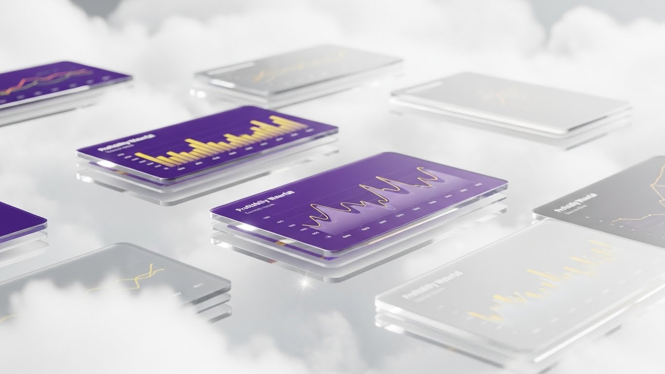
The Visual & Narrative Approach
To sell the "Cloud Advantage," you must elevate the data above the noise. This style suspends sleek UI screens displaying "Profitability Waterfalls" amongst bright white clouds. The screens are angled dynamically (Dutch angle) to create a sense of depth. The palette blends Deep Purple backgrounds with Gold data lines, while the lighting catches the glass edges of the interfaces. It signals a modern, lightweight architecture that lifts the user out of the operational weeds.
Psychological Impact & KPI Focus
- Cognitive Lift: The "floating in clouds" metaphor visually reinforces the ease of access and the removal of heavy, on-premise legacy systems. It appeals to the Sales Leader's need for agility.
- KPI Alignment: Highly effective for Display Ads targeting decision-makers. The parallax depth stops the scroll, while the financial charts promise measurable insight.
Strategic Implementation & Trade-offs
- Best Use Case: Retargeting ads for users who viewed the "Pricing" page.
- Trade-off: Avoid overcrowding. The text on the floating screens must be large enough to be legible even when the camera moves.
Companies using similar video content -
Sage Intacct – Cloud Financial Management – Providing real-time financial visibility.
Acumatica – Cloud ERP – Elevating business data to the cloud for insights.
13. The Blueprint of Logic
MOFU | Demand Gen & Lead Capture

The Visual & Narrative Approach
Consultants respect methodology. This style utilizes a single, continuous line in Turquoise to draw the "Architecture" of a complex project on a textured Cream paper background. The line weaves and loops, seamlessly forming a maze-like structure that resolves into a clear, organized plan. The aesthetic mimics a technical blueprint, implying precision, accuracy, and a foundational approach to problem-solving.
Psychological Impact & KPI Focus
- Methodological Trust: The blueprint aesthetic signals that your software is built on sound logic. It appeals to the "Methodical Planner" persona who fears Scope Creep and values structured workflows.
- KPI Alignment: Strong for Social Media (LinkedIn) feeds where a "clean" visual breaks the pattern of photographic clutter, driving engagement for technical webinars.
Strategic Implementation & Trade-offs
- Best Use Case: Explainer videos for "Implementation Methodologies" or "Process Maps."
- Trade-off: It is minimalist. It relies heavily on the quality of the animation physics; if the line moves too stiffly, the illusion of "flow" breaks.
Companies using similar video content -
Jira (Atlassian) – Software Development Tool – Visualizing agile workflows and project plans.
14. The Hybrid Commitment
MOFU | ABM Awareness

The Visual & Narrative Approach
In high-stakes consulting, the deal is human, but the execution is digital. This style captures a photorealistic close-up of a handshake between two diverse professionals in a sunlit boardroom. Overlaying this human connection are sleek, glowing Cyan vector graphics—lock icons and "smart contract" nodes—that map onto the hands. This visualizes the concept that the software secures the relationship rather than replacing it.
Psychological Impact & KPI Focus
- Trust Transfer: It bridges the gap between "relationship selling" (the handshake) and "platform reliability" (the graphics). It reassures partners that the tech is an enabler of Client Trust.
- KPI Alignment: Ideal for Account-Based Marketing (ABM) campaigns targeting Managing Partners, showing you understand their high-touch culture.
Strategic Implementation & Trade-offs
- Best Use Case: "About Us" videos or Partnership Announcement posts on LinkedIn.
- Trade-off: The stock footage must be impeccable. Poor acting or lighting in the live-action segment will degrade the perceived quality of the software.
Companies using similar video content -
DocuSign – eSignature & Agreement Cloud – Securing digital agreements and trust.
Adobe Acrobat Sign – e-Signature Solution – Digitizing and securing contract processes.
15. The Growth Vertical
BOFU | ROI Justification
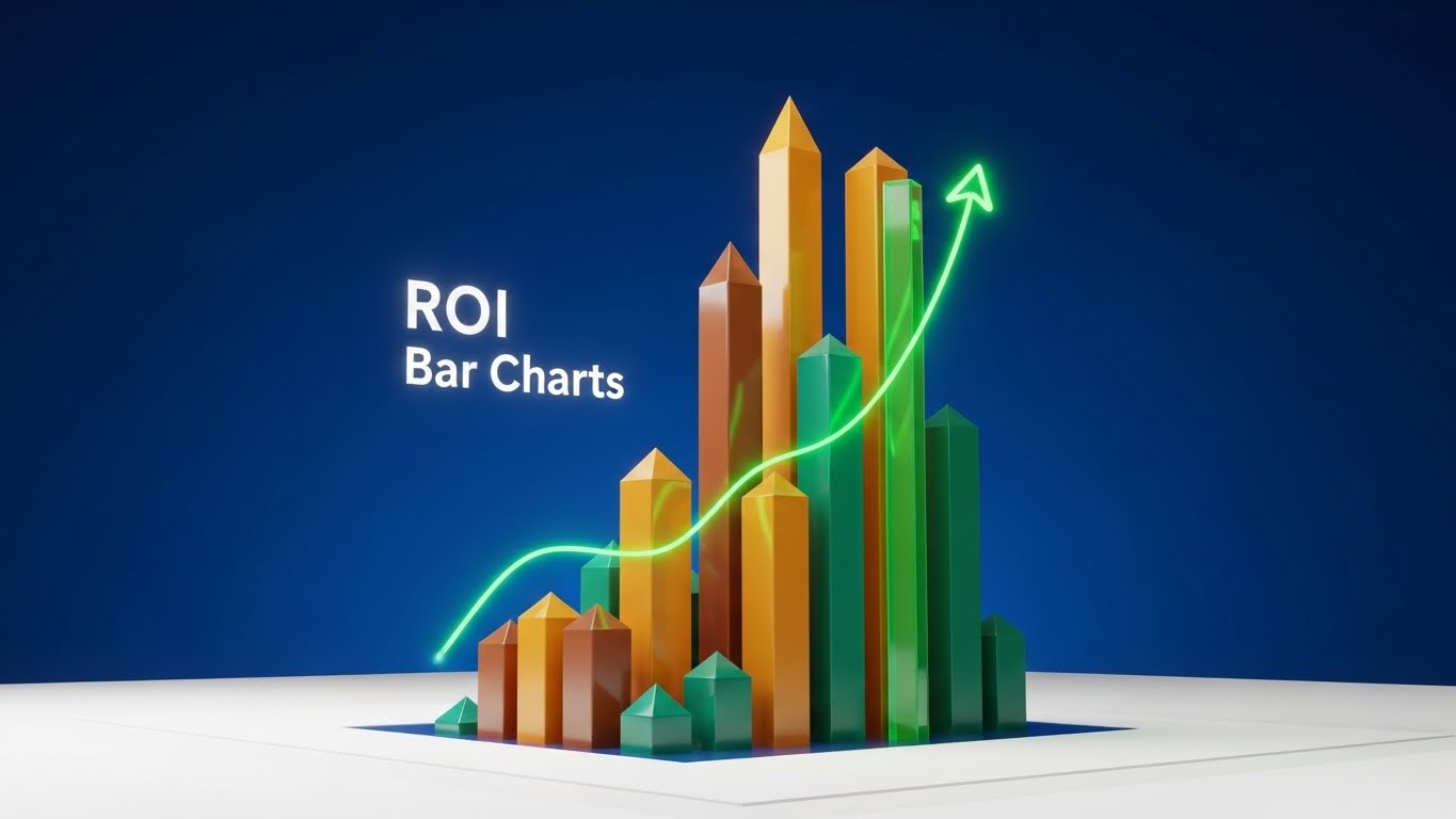
The Visual & Narrative Approach
When speaking to the CFO, abstract promises must become concrete numbers. This style treats "ROI Bar Charts" like rising skyscrapers. Rendered in 3D with textures of Gold and Bronze, the bars rise from the ground, creating a skyline of success against a clean white surrounding. The camera looks up at the towering charts, emphasizing scale and dominance. It transforms a spreadsheet metric into a monument of financial growth.
Psychological Impact & KPI Focus
- Tangibility of Wealth: By rendering data as physical, gold structures, you subconsciously link the software’s output to real-world asset accumulation. It validates the Subscription Cost.
- KPI Alignment: Critical for Presentation Decks and proposal videos where you need to justify the investment against projected revenue gains.
Strategic Implementation & Trade-offs
- Best Use Case: The "Value Realization" slide in a sales deck or an "ROI Calculator" landing page.
- Trade-off: Ensure the data trends shown (the "up and to the right") are realistic. Over-promising with exaggerated visuals can trigger skepticism.
Companies using similar video content -
Vena Solutions – CPM Software – Visualizing financial growth and performance.
Board International – Decision-Making Platform – Driving business growth with data.
16. The Compliance Core
BOFU | Building Trust & Credibility

The Visual & Narrative Approach
Security is often invisible, which makes it hard to sell. This style uses an "X-Ray" effect to look inside a server rack. The outer shell is translucent Blue-Grey, revealing a glowing Gold "Compliance Lock" mechanism and intricate internal circuitry. It visualizes concepts like "GDPR Compliance" and "Audit Trails" not as checkboxes, but as a robust, engineered fortress protecting client data.
Psychological Impact & KPI Focus
- Safety Assurance: The complexity of the internal mechanism signals "Robustness." It tells the IT Director that the system is engineered, not just coded, directly addressing Risk Mitigation.
- KPI Alignment: Essential for the "Security" Page of the website to reduce friction during the technical review process.
Strategic Implementation & Trade-offs
- Best Use Case: Background video for the "Trust Center" section.
- Trade-off: It is highly technical. Avoid using this for general marketing; keep it for the technical buyer who appreciates the "under the hood" view.
Companies using similar video content -
LogicManager – ERM Software – Visualizing risk and compliance frameworks.
17. The Night Watch
BOFU | Risk Mitigation
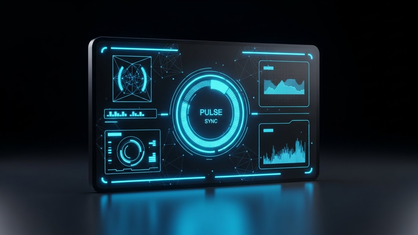
The Visual & Narrative Approach
Senior partners often work late. This style embraces the "Dark Mode" aesthetic, emphasizing a premium, focused work environment. The screen displays "Premium Analytics" with glowing Neon Violet and Electric Blue lines against a deep Midnight Blue background. The high contrast draws the eye strictly to the data signals—the "Pulse" of the firm. It creates an atmosphere of calm, command-center control.
Psychological Impact & KPI Focus
- Professional Focus: Dark mode is often associated with "Pro" features and developer tools. It signals a sophisticated, power-user environment for the Operational Analyst.
- KPI Alignment: Strong for Whitepapers or brochures discussing "Real-Time Monitoring" or "Crisis Management."
Strategic Implementation & Trade-offs
- Best Use Case: "Feature Deep Dive" videos focusing on analytics and reporting.
- Trade-off: Ensure the text remains legible. High contrast can sometimes cause "vibration" on screen if not balanced correctly with sufficient negative space.
Companies using similar video content -
Splunk – SIEM – Monitoring real-time security data.
18. The Efficiency Mirror
BOFU | Overcoming Objections
The Visual & Narrative Approach
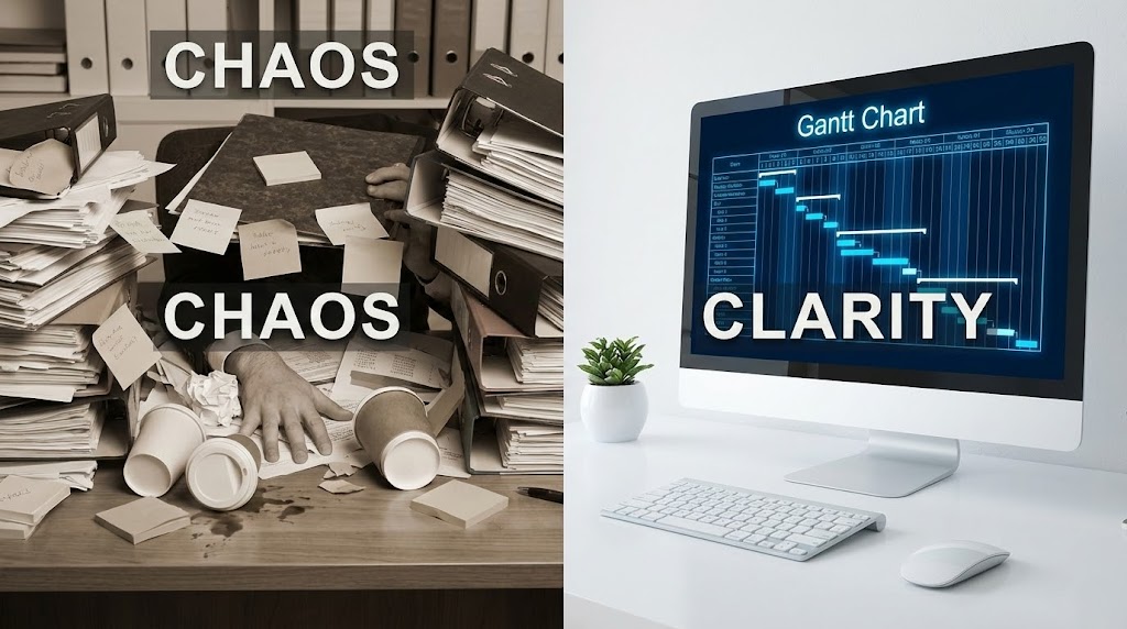
This is the ultimate "Before and After" proof point. The screen is split horizontally. The left side is a desaturated, sepia-toned scene of a desk buried under "CHAOS"—stacks of paper and sticky notes. The right side is bright, crisp, and clean, showing a modern monitor displaying a Vivid Blue "Gantt Chart" labeled "CLARITY." The contrast is stark and immediate, visually proving the software's ability to declutter the physical workspace.
Psychological Impact & KPI Focus
- Cognitive Relief: The brain naturally prefers the organized right side. It visually validates the feeling of relief that the software promises, overcoming the Status Quo Bias.
- KPI Alignment: High-converting hero image for Landing Pages focused on "Migration" or "Digital Transformation."
Strategic Implementation & Trade-offs
- Best Use Case: Direct response landing pages or retargeting ads.
- Trade-off: It’s a classic trope. To keep it fresh, ensure the UI on the right looks cutting-edge and the "Chaos" on the left looks stressful but realistic.
Companies using similar video content -
Asana – Work Management Platform – Transforming chaotic tasks into clear workflows.
ClickUp – All-in-one Productivity Platform – Organizing scattered work into a unified view.
19. The Executive Lens
BOFU | The Economic Buyer
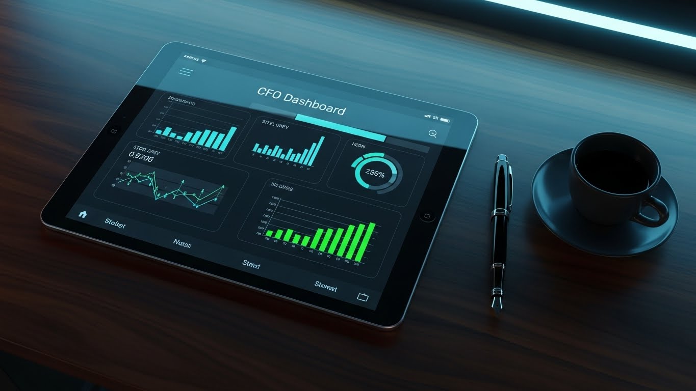
The Visual & Narrative Approach
To sell to the C-Suite, you must mirror their environment. This style uses ray-traced photorealism to place the software on a Mahogany executive desk. Next to a premium fountain pen and an espresso, a high-end glass tablet displays the "CFO Dashboard." The metrics are serious—Steel Grey and Green—focusing on margin and utilization. This contextualizes the software not as a "tool" for staff, but as a "dashboard" for leadership.
Psychological Impact & KPI Focus
- Status Alignment: It respects the status of the Economic Buyer. It says, "This software belongs in the boardroom, not just the back office."
- KPI Alignment: Perfect for Website Homepages or "Solutions for Executives" pages to assist the champion in selling internally to the C-level.
Strategic Implementation & Trade-offs
- Best Use Case: The primary header image for the "Enterprise" tier pricing page.
- Trade-off: It must look 100% real. Any "uncanny valley" effect in the rendering or lighting will destroy the premium feel.
Companies using similar video content -
Tableau – Analytics Platform – Presenting executive-level data dashboards.
Power BI (Microsoft) – Business Intelligence Service – Creating high-impact executive reports.
20. The Virtual Partner
BOFU | Sales Cycle Acceleration
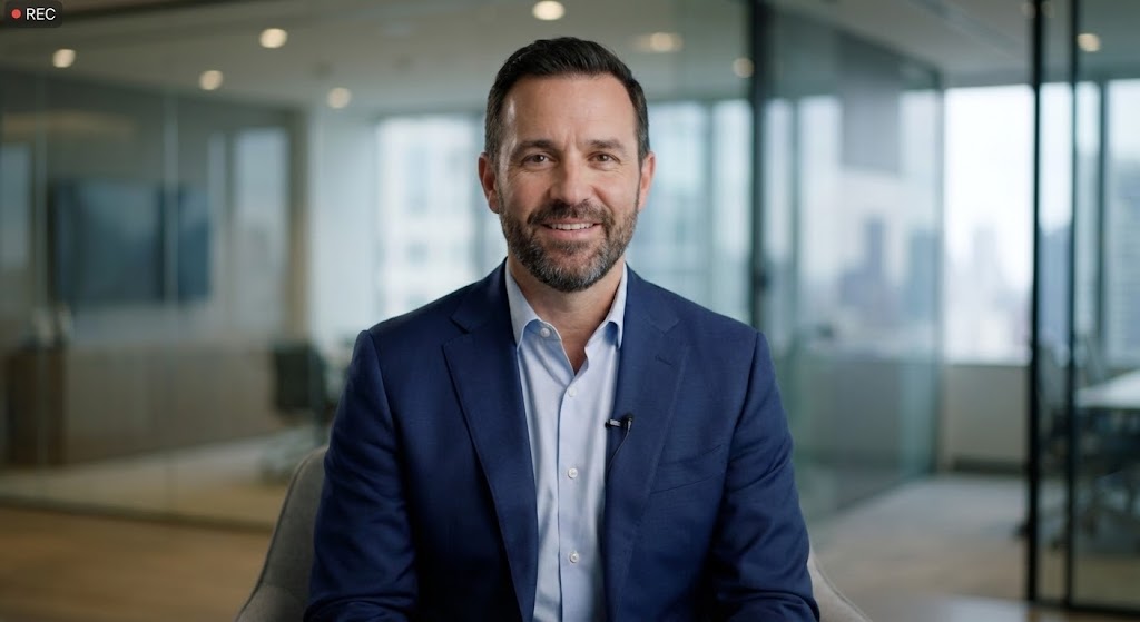
The Visual & Narrative Approach
Sometimes, you need a face to close the deal, but scaling personal outreach is difficult. This style utilizes a high-fidelity AI-generated character—a professional male consultant in a navy suit. He maintains direct eye contact, speaking with a friendly, trustworthy expression against a blurred, modern office background. This is not a cartoon; it is a hyper-realistic avatar delivering a personalized message, humanizing the final stages of the sales cycle.
Psychological Impact & KPI Focus
- Social Connection: Humans are wired to respond to faces. This style mimics a one-on-one consultation, building Rapport and trust even asynchronously.
- KPI Alignment: Revolutionary for Email Follow-ups after a demo (e.g., "Hi, I wanted to clarify..."), increasing response rates significantly.
Strategic Implementation & Trade-offs
- Best Use Case: Personalized video messages embedded in sales emails.
- Trade-off: Ethical transparency is key. Ensure the avatar quality is top-tier to avoid the "creepy" effect, and use it to represent a generic "Success Manager" rather than faking a specific real person.
Companies using similar video content -
Synthesia – AI Video Generation Platform – Creating realistic AI avatars for communication.
21. The Onboarding Sprint
Onboarding | Self-Serve Onboarding
The Visual & Narrative Approach
Onboarding is a race against boredom. This style utilizes a high-octane montage technique to combat user inertia. We see a stylized cursor moving with exaggerated kinetic energy across a flat UI interface. It rapidly clicks "Approve," toggles settings, and drags tasks in a rhythmic sequence synchronized to a fast beat. Motion blur effects are applied to the cursor movements, and the palette uses Bright Primary Colors (Red, Blue, Yellow) to guide the eye. It creates a visual sensation of "speed" and "effortlessness."
Psychological Impact & KPI Focus
- Competence Trigger: The speed of the animation subconsciously tells the user, "You can master this fast." It combats the fear of a steep learning curve, directly addressing Time-to-Competency.
- KPI Alignment: Designed to boost Activation Rates within the first 7 days of a trial by making the software feel intuitive and snappy.
Strategic Implementation & Trade-offs
- Best Use Case: Welcome emails or "Getting Started" modal pop-ups inside the app.
- Trade-off: Don't use this for complex training. It implies speed; if the actual feature is slow or requires deep thought, the video will feel deceptive.
Companies using similar video content -
WalkMe – Digital Adoption Platform – Guiding users through rapid feature adoption.
Appcues – Product Adoption Platform – Creating in-app onboarding flows.
22. The Moment of Truth
Onboarding | Accelerating Time-to-Value
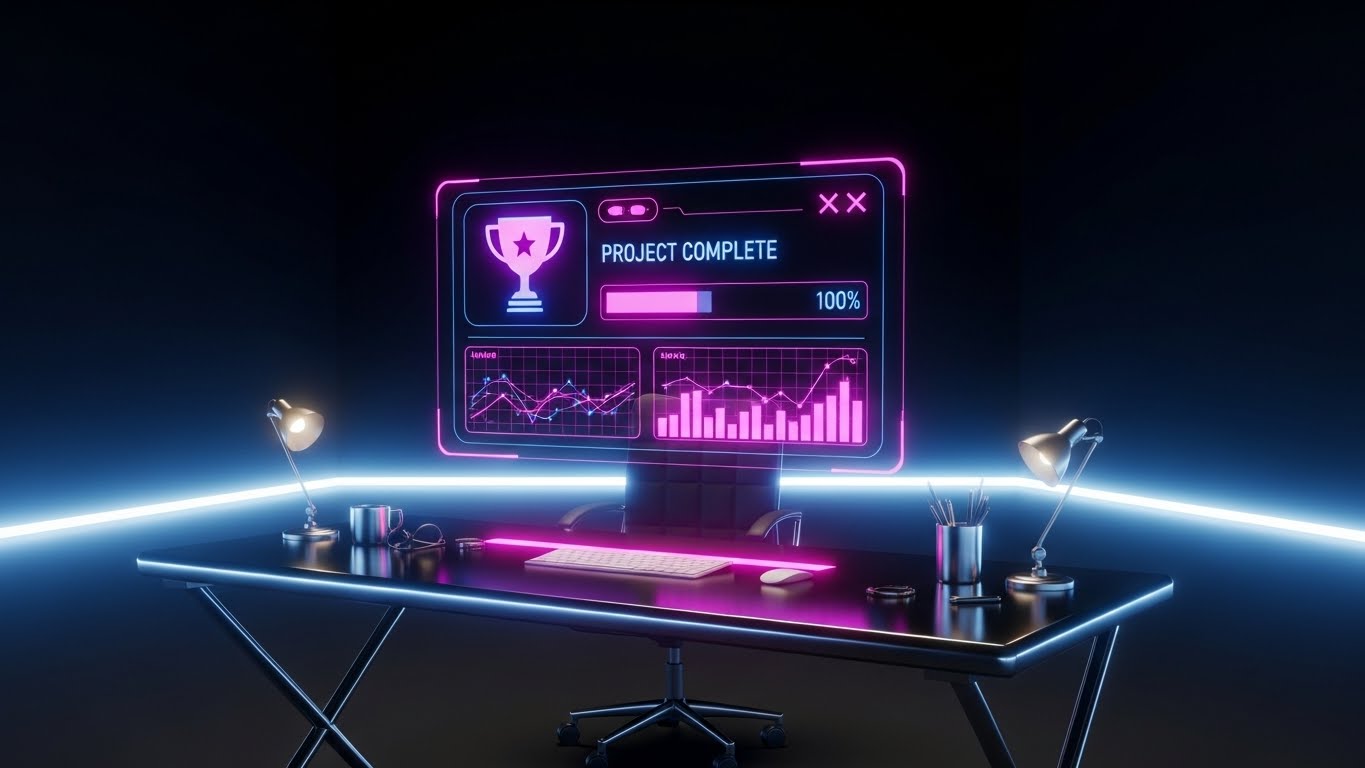
The Visual & Narrative Approach
The "First Win" is critical in SaaS. This style elevates a simple task completion into a cinematic event. In a realistic 3D render of a modern minimalist desk, a futuristic, translucent Hologram Blue projection materializes above the workspace. It displays a "Project Complete" trophy icon and a progress bar hitting 100%. The hologram emits a soft, rewarding glow that lights up the surrounding physical objects. It symbolizes the "Aha!" moment when the software delivers on its promise.
Psychological Impact & KPI Focus
- Dopamine Reward: By treating task completion as a holographic ceremony, you trigger a dopamine response. It validates the user's effort and cements the Perceived Value of the platform.
- KPI Alignment: Critical for reducing Early Churn. It emotionally anchors the user to the feeling of success.
Strategic Implementation & Trade-offs
- Best Use Case: A "Congratulations" video sent after the user completes their first major workflow (e.g., "First Invoice Sent").
- Trade-off: High production value is required. A low-quality render will look like a gimmick rather than a reward.
Companies using similar video content -
Gainsight – Customer Success Platform – Celebrating customer milestones and achievements.
23. The Clutter Clearing
Onboarding | Trial/Freemium User Activation
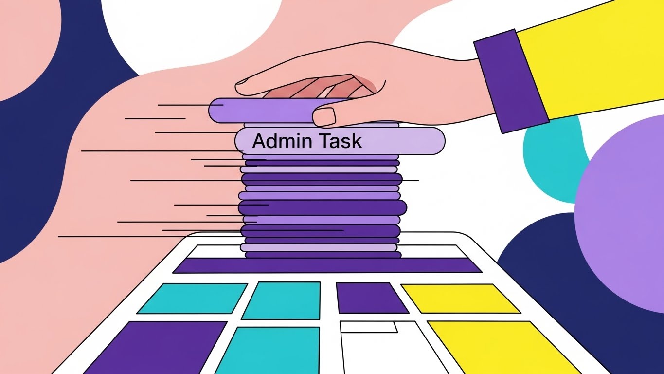
The Visual & Narrative Approach
Consultants are often overwhelmed by administrative noise. This style uses a playful, Cel-Shaded illustration to visualize the removal of that noise. A stylized hand enters the frame and physically swipes away a messy stack of "Admin Task" cards (Timesheets, Expenses, Scheduling). Underneath the clutter, a clean, organized dashboard is revealed. The background uses abstract patterns in Soft Pink and Navy. It captures the specific emotional relief of "getting organized."
Psychological Impact & KPI Focus
- Cognitive Unburdening: It visualizes the "Before/After" state of the user's mind—from cluttered to clear. It appeals to the End User who just wants to get their work done without friction.
- KPI Alignment: Excellent for Freemium Activation campaigns, encouraging users to log in and experience the "clean" state.
Strategic Implementation & Trade-offs
- Best Use Case: Re-engagement emails for inactive trial users (e.g., "Clear your desk in one click").
- Trade-off: The tone is casual. Ensure it aligns with your brand voice; it may be too playful for ultra-conservative enterprise clients.
Companies using similar video content -
Evernote – Note-Taking App – Clearing digital clutter for organized notes.
Notion – Workspace Software – Organizing information and tasks into clear views.
24. The Support Transformer
Retention | Reducing Support Overhead

The Visual & Narrative Approach
How do you visualize a problem being solved? This style combines flat 2D elements with Low Poly 3D. A "Help Ticket," represented as a jagged, grey rock, sits on an isometric plane. As it passes through a "Support Portal," it smooths out and transforms into a green Low Poly checkmark. The background is a warm Orange. The animation is satisfyingly smooth, visually conveying that your support system takes "rough" problems and refines them into solutions.
Psychological Impact & KPI Focus
- Reliability Assurance: It visually promises that problems are temporary and resolution is inevitable. It builds trust in the Support Ecosystem.
- KPI Alignment: Ideal for the Help Center loading screens or "Support Request Received" auto-responders to reduce anxiety while waiting.
Strategic Implementation & Trade-offs
- Best Use Case: Embedded in the "Help" widget or support portal.
- Trade-off: Abstract. It doesn't show how the problem is solved, just that it is solved. Use for reassurance, not instruction.
Companies using similar video content -
Zendesk – Customer Service Software – Transforming support tickets into resolutions.
25. The Value Factory
Retention | Reducing Churn
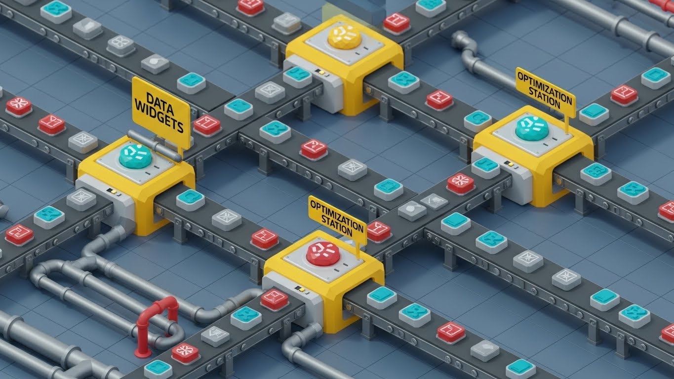
The Visual & Narrative Approach
To prevent churn, customers must see your software as a living engine of their business. This style uses a detailed Isometric 3D factory floor visualization. "Data widgets" move smoothly along conveyor belts made of Industrial Grey piping, passing through "Optimization Stations" highlighted in Safety Yellow. The widgets are polished and improved at each station. The entire system looks like a well-oiled machine, visualizing the ongoing, automated value the software provides 24/7.
Psychological Impact & KPI Focus
- Systemic Dependency: It frames the software not as a static tool, but as an active production facility. Removing it would mean "stopping the factory," triggering Loss Aversion.
- KPI Alignment: Strong for Quarterly Business Reviews (QBRs) to visually demonstrate the volume of work processed and value generated.
Strategic Implementation & Trade-offs
- Best Use Case: Renewal presentations or "Year in Review" videos.
- Trade-off: Complexity. The animation needs to loop perfectly. If it looks chaotic, it suggests your software creates work rather than doing it.
Companies using similar video content -
Celonis – Process Mining Software – Visualizing and optimizing continuous business processes.
Automation Anywhere – RPA Platform – Automating repetitive tasks in a continuous loop.
26. The Precision Switch
Retention | Driving Deep Feature Adoption

The Visual & Narrative Approach
Deep adoption protects against churn. This style focuses on the beauty of functionality. We see an extreme macro close-up of a single UI toggle switch labeled "AI Forecast." The switch is slowly toggled to "ON," glowing with a Teal light against a textured White surface. The depth of field is extremely shallow, blurring the background. It emphasizes the power and high-tech nature of a specific, advanced feature, making the act of enabling it feel significant.
Psychological Impact & KPI Focus
- Feature Curiosity: The macro perspective makes a small UI element feel like a major control mechanism. It drives curiosity to "flip the switch" in the actual product, boosting Feature Adoption.
- KPI Alignment: Perfect for Social Media Teasers introducing new updates or "Pro" features.
Strategic Implementation & Trade-offs
- Best Use Case: "New Feature" announcement GIFs in newsletters.
- Trade-off: Requires high-resolution texture assets. Standard screenshots will look pixelated at this zoom level.
Companies using similar video content -
Amplitude – Product Analytics – Highlighting specific feature activation and impact.
Mixpanel – Product Analytics – Tracking granular user interactions and feature usage.
27. The Expansion Grid
Expansion | Driving Upsell/Cross-sell

The Visual & Narrative Approach
Upselling requires showing the client a bigger world. This style uses a futuristic neon illustration in Vivid Lime Green and Charcoal. A Cyberpunk-style city grid is viewed with a Tilt-Shift effect, making it look like a miniature strategy board. A specific, previously dark section of the grid suddenly lights up brightly, representing a "New Market Opportunity" or an "Add-on Module." The aesthetic appeals to the desire for growth and "Pro" level command.
Psychological Impact & KPI Focus
- Ambition Activation: The "Dark Mode" aesthetic signals premium capabilities. Lighting up new areas visualizes Total Addressable Market (TAM) expansion, prompting the user to upgrade.
- KPI Alignment: Effective for In-App Upsell Prompts (e.g., "Unlock International Markets").
Strategic Implementation & Trade-offs
- Best Use Case: Background visuals for the "Enterprise Plan" upgrade page.
- Trade-off: Can look too "Gaming" oriented. Ensure the data overlay remains business-focused (e.g., currency symbols, growth percentages).
Companies using similar video content -
Gong.io – Revenue Intelligence Platform – Illuminating new sales opportunities and market insights.
Chorus.ai (ZoomInfo) – Conversation Intelligence – Revealing untapped market potential in calls.
28. The Velocity Stream
Expansion | Proactive Support/Announcements
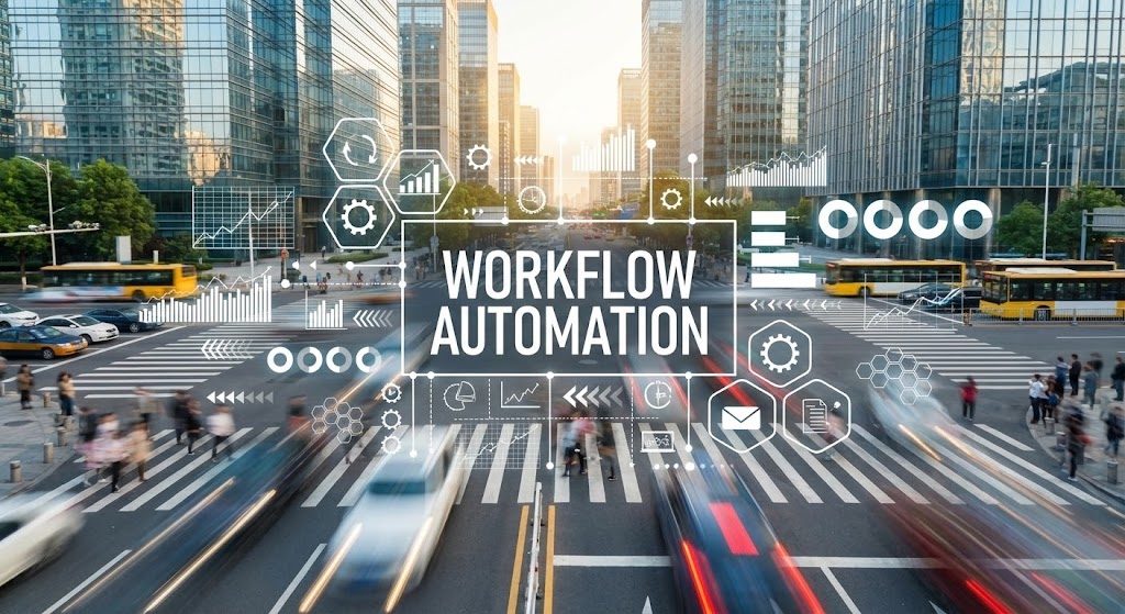
The Visual & Narrative Approach
Consulting moves fast. This style uses hyper-lapse footage of a sunny, busy city intersection where traffic becomes streaks of light (long exposure). Overlaid on this real-world motion are crisp, white vector icons and data lines representing "Workflow Automation." The graphics move in sync with the traffic flow. It conveys that your software is the invisible layer of order managing the chaos of modern business speed.
Psychological Impact & KPI Focus
- Market Momentum: It associates your brand with the pulse of the industry. It reassures customers that your platform evolves as fast as the market, supporting Customer Confidence.
- KPI Alignment: Great for Social Stories (Instagram/LinkedIn) announcing platform updates or performance improvements.
Strategic Implementation & Trade-offs
- Best Use Case: "State of the Industry" updates or "Performance Patch" announcements.
- Trade-off: Motion sickness. Keep the camera movement stable; only the subject (traffic) should be moving fast.
Companies using similar video content -
Bloomberg Terminal – Financial Data Platform – Visualizing real-time market velocity.
29. The Anywhere Consultant
Expansion | In-App Upsell

The Visual & Narrative Approach
To sell the mobile app or mobile add-ons, you must sell freedom. This style uses a high-quality vertical shot of a business traveler in a sunlit airport lounge. The focus is over-the-shoulder as they look at a smartphone. A sleek, semi-transparent UI overlay floats slightly above the phone screen, displaying a "Mobile Time Entry Success" message. It connects the software utility directly to the lifestyle benefit of "working from anywhere."
Psychological Impact & KPI Focus
- Lifestyle Aspiration: It sells the absence of the desk. It appeals to the consultant's desire for flexibility and autonomy, driving Mobile App Downloads.
- KPI Alignment: High performing for Mobile Ad Networks or internal banners promoting the mobile app to desktop users.
Strategic Implementation & Trade-offs
- Best Use Case: "Download the App" prompts.
- Trade-off: The UI overlay must look readable on a small screen. Do not clutter the floating interface.
Companies using similar video content -
Expensify – Expense Management Software – Mobile expense tracking for consultants on the go.
Concur (SAP) – Travel & Expense Management – Managing travel and expenses from anywhere.
30. The Culture of Success
Expansion | Driving Referrals & Advocacy

The Visual & Narrative Approach
Finally, the software isn't just about efficiency; it's about winning. This style features high-resolution photography of a diverse team in a glass-walled conference room. They are in the middle of a celebration, high-fiving over a laptop screen displaying your software's dashboard. The lighting is bright and airy (Warm Office Tones). It captures genuine emotion and camaraderie, representing the ultimate output of using your tool: a happy, successful team.
Psychological Impact & KPI Focus
- Social Proof: Seeing a happy team triggers the desire to belong to a "winning" culture. It creates the emotional capital necessary to ask for a Referral or Case Study.
- KPI Alignment: Essential for Referral Campaigns and "Customer Success Story" headers.
Strategic Implementation & Trade-offs
- Best Use Case: The background for a "Refer a Peer" landing page.
- Trade-off: Stock photography risk. Avoid "cheesy" smiles. The emotion must look candid and earned, not staged.
Strategic Knowledge Base: The Visual Operations Doctrine
To bridge the gap between "having a video" and "building a Visual Operating System," this section synthesizes the 30 visual examples into a cohesive operational framework. It moves beyond "style" to "strategy," outlining how Managing Partners and Operations Directors can deploy these assets to drive measurable business outcomes.
Strategic Alignment & Visual Architecture
The "Pre-Production" Strategy: Why and Who
Before a single pixel is rendered, the visual strategy must align with the firm's operational reality. The "Optimization Paradox" introduced in Part 1 can only be solved if the visual language speaks directly to the cognitive needs of the workforce.
- The Cognitive Load Audit: Conduct an audit of your current training materials. If a workflow takes 10 pages to explain in a PDF, it is a candidate for a Style 7 (Glass Box) video. Visuals should be deployed primarily where text fails, simplifying the complexity rather than masking it.
- Role-Based Visual Mapping: Differentiate your visual strategy by persona.
- For Partners (The Fleet Commanders): Use Style 15 (Growth Vertical) and Style 19 (The Executive Lens) to provide macro-level data and financial implications.
- For Consultants (The Drivers): Use Style 29 (The Anywhere Consultant) and Style 21 (Rapid UI Feature Montage) to emphasize speed, mobile utility, and friction reduction.
- The "Glanceability" Standard: In a high-utilization environment, consultants don't have time to watch 5-minute tutorials. Adopt a "Glanceability" standard: can the core concept of the video be understood in 3 seconds without sound? (Style 1 and Style 26).
- Brand Voice Consistency: Your software likely spans multiple modules (CRM, ERP, HR). A disjointed visual style erodes trust. Establish a "Visual Operating System"—a unified palette and motion language that spans all 30 styles, ensuring a cohesive user experience.
- The Advids Strategic Audit: Partnering with a specialized agency like Advids allows for an impartial audit of your current visual assets. We help define the "Visual Operating System" before production begins, ensuring that every asset, from TOFU ads to BOFU support clips, shares a cohesive DNA.
- Standardization vs. Customization: For core features (Time Entry), use standardized Style 5 (Isometric 3D Workflow) assets to build familiarity. For bespoke, high-value pitches to enterprise clients, invest in custom Style 6 (Global Stage) cinematics to signal unique value.
- The Cross-Departmental Bridge: Use visuals to unify terminology. A "Resource" in Sales might be a "Cost Center" in Ops. A unified Style 2 (Visualizing the Ecosystem) video ensures everyone visualizes the data flow the same way, bridging departmental silos.
- Legacy System Integration: Visualizing the connection between legacy on-premise ERPs and your modern SaaS layer is critical. Use Style 4 (Bridging the Physical-Digital Divide) to validate the complexity of the client's current reality before selling the solution.
- Accessibility in Global Firms: Global consulting firms employ diverse, multi-lingual teams. Motion graphics with text overlays (Style 1) are superior to voiceover-only videos because they can be easily localized/translated for international offices without re-recording audio.
- The Mobile-First Mandate: Partners are rarely at their desks. Ensure all executive-facing styles (like Style 19) and field-facing styles (like Style 29) are formatted for vertical mobile consumption.
Operational Adoption & Implementation
The "Deployment" Phase: Embedding Visuals into the Workflow
A video sitting on YouTube helps no one. The "Visual Operations Doctrine" mandates that visual assets be embedded directly into the software and the daily workflow.
- Overcoming "Big Brother" Anxiety: Automated resource tracking can feel invasive. Use empathy-driven styles like Style 9 (Humanizing the Workflow) to reframe these tools as "Burnout Prevention" rather than "Surveillance," addressing cultural resistance head-on.
- The Micro-Learning Shift: Kill the PDF manual. Replace the 60-minute "Onboarding Webinar" with a playlist of 15-second Style 21 (Rapid UI) clips. This "Just-in-Time" learning reduces bench time and accelerates Time-to-Billable.
- Just-in-Time Support: Embed Style 24 (Support Transformer) loops directly into the "Help" widget. Visualizing that a ticket is being processed reduces user anxiety, while visual answers deflect up to 40% of Tier 1 support queries.
- Gamification of Training: Use Style 22 (Holographic UI) visuals to reward training completion. Visualizing a "Level Up" or a "Trophy" triggers the achievement-oriented psychology of consultants, boosting engagement with otherwise boring admin tasks.
- Reducing Support Ticket Volume: There is a direct correlation between proactive visual guides and reduced helpdesk load. If users see the "Leaky Bucket" (Style 3) explained visually, they understand the "Why" behind the process, reducing clarification tickets.
- Remote Onboarding: For distributed firms, physical onboarding is often impossible. Use Style 10 (The Value Contrast) to visually demonstrate the "Old Way vs. New Way" effectively to remote hires, accelerating their cultural integration.
- Standard Operating Procedures (SOPs): Transform text-heavy SOPs into Style 13 (Blueprint of Logic) animations. A visual process map is referenced 4x more often than a text document and reduces error rates in critical workflows.
- Feedback Loops: Use interactive video elements. After a Style 7 (Glass Box) tutorial, pop up a one-click survey: "Did this help?" This data refines your visual strategy and identifies UX friction points.
- Scalable Localization: When expanding to new regions (e.g., EMEA, APAC), use Style 2 (Visualizing the Ecosystem) visuals that rely on abstract iconography rather than specific text. This allows for rapid, low-cost translation of on-screen text without re-animating geometry.
- Leadership Communication: When the CEO announces a new digital strategy, don't send an email. Use Style 28 (The Pace of Innovation) to visually demonstrate why the change is happening, aligning the entire firm with the new direction.
Measuring Impact & Future-Proofing
The "ROI" Phase: Measuring Success and Looking Ahead
Visual strategy is an investment, not an expense. To justify it, you must move beyond "Vanity Metrics" (views) to "Value Metrics" (action).
- Beyond "Views" - Measuring Competency: Do not measure "Video Views." Measure "Time-to-Competency." Does a cohort exposed to Style 21 videos reach full billable utilization faster than a cohort using traditional manuals?
- The "Idle Time" Metric: Correlate better visualization with reduced software navigation time. Every minute saved navigating a clunky interface due to a clear Style 26 (Precision Switch) guide is a billable minute gained.
- Compliance Velocity: How fast are new compliance standards (e.g., GDPR updates) understood? Use Style 16 (The Compliance Core) to disseminate complex regulatory changes rapidly and track the completion rate.
- Retention and Churn: High-quality UX visualization (Style 25) reminds clients of the "invisible value" the system provides. Track the correlation between engagement with these assets and Net Revenue Retention (NRR).
- The AI Visual Frontier: Prepare for Generative UI. Future interfaces will build themselves. Your visual style guide must be flexible enough to accommodate Style 8 (The Intelligence Engine) abstractions as AI becomes central to the user experience.
- Scalability of Assets: Build a "Visual Component Library." If you change your UI button color, you shouldn't have to re-shoot 30 videos. Use vector-based assets (Style 3, 11) that are easy to update globally.
- The Advids Partnership: Maintaining this library requires a long-term partner. Advids acts as the custodian of your visual source code, ensuring that as your software evolves, your visual assets evolve in lockstep, preventing "Visual Debt."
- Benchmarking Success: Compare your "Feature Adoption Rates" against industry standards. If a feature isn't being used, re-launch it with a Style 26 campaign to drive awareness.
- The ROI of Safety (Data Security): Quantify the risk reduction. If a visual training program using Style 16 reduces "non-compliant expense filings" by 20%, that is a direct financial saving that covers the cost of production.
- Final Call to Innovation: Treat video as infrastructure. It is not a promotional wrapper; it is the interface through which your value is understood. In the Optimization Paradox, the firms that visualize their value best are the ones that will win.
Companies using similar video content -
Culture Amp – Employee Experience Platform – Fostering a culture of success and engagement.
Author & Editor Bio


