
Introduction: The Art of Visualizing the Invisible Voice
The modern enterprise is currently sitting on a goldmine of silence. In the vast, chaotic ocean of customer interactions, a staggering volume of data remains unstructured—audio recordings, chat logs, and support tickets that traditional analytics tools simply cannot parse. This "dark data" represents the single largest missed opportunity for operational intelligence in the SaaS landscape today.
For Conversational Analytics platforms, the challenge is not just analyzing this data; it is visualizing the insight. How do you show the "sentiment" of a thousand voices? How do you depict the "compliance risk" hidden in a millisecond of silence? The gap between raw audio and actionable intelligence is a physical-digital divide that only sophisticated video visualization can bridge.
This guide is designed for the "Insight Architects"—the VPs of Operations, Product Leaders, and Customer Experience executives who must transform abstract algorithms into tangible business value. We are moving beyond the era of static spreadsheets. The opportunity here is immense: the global conversational AI market is projected to grow to USD 61.69 billion by 2032, signaling a massive infrastructure shift. This growth is driven by tangible efficiency; recent data indicates that customer service automation can cut enterprise support costs by up to 92% when deployed effectively.
In the following section, we explore ten distinct visualization styles tailored for the Top and Middle of the Funnel (TOFU/MOFU). These styles are not merely aesthetic choices; they are strategic tools designed to reduce cognitive load, build trust, and accelerate the "Aha!" moment for your stakeholders. From abstract neural networks to clean, isometric data factories, each example serves a specific psychological and commercial goal.
Let us explore how to turn the invisible voice into visible value.
1. Abstract 3D AI Visualization
TOFU | Brand Awareness

The Visual & Narrative Approach
This style abandons the cliché of "matrix code" for something far more organic and sophisticated. We visualize the AI not as a cold machine, but as a living, breathing neural ecosystem. The scene features a complex node structure rendered in deep indigo and electric violet, where translucent optical fibers connect central processing cores. These cores pulse with bioluminescent light, simulating the real-time "firing" of synapses as the platform analyzes unstructured conversation data. The background—a digital void with floating binary dust—adds immense depth, positioning the technology as a beacon of intelligence in the darkness.
Psychological Impact & KPI Focus
- Niche Psychology: This style addresses the "Black Box" anxiety. By visualizing the AI as a complex, glowing biological entity, we frame the technology not as cold code, but as a living, thinking intelligence. It triggers a sense of sublime magnitude—the feeling that the platform is handling complexity far beyond human capacity.
- Operational Impact: It visualizes the Cognitive Load reduction. Instead of showing spreadsheets, it shows the act of synthesis, promising the viewer that the platform handles the heavy lifting of connecting millions of disparate data points.
Strategic Implementation & Trade-offs
- Best Use Case: 15-second Social Ads (LinkedIn/Instagram) where stopping the scroll is the only metric that matters.
- Trade-off: This style is purely emotive. It builds high-level brand authority but fails to explain how the specific analytics work. It is a hook, not a tutorial. Use it to establish your platform as a Tier-1 technological player.
Companies using similar video content -
ASAPP – AI for Customer Experience – Visualizing deep learning for agent assistance.
Cognigy – Conversational AI Platform – Orchestrating complex AI for customer service.
Rasa – Open Source Conversational AI – Building intelligent assistants with neural networks.
2. Bold Kinetic Typography
TOFU | Category Creation

The Visual & Narrative Approach
Here, the weight of words takes physical form. We strip away the text and focus on the impact of language. Large, vivid coral and stark white geometric blocks—mimicking the shapes of heavy sans-serif letters—crash and reform against a clean studio backdrop. The motion is rhythmic and percussive, syncing with a sound design of stomps and claps. These blocky structures represent the "hard" data derived from "soft" talk, colliding to form solid foundations. It is a visual metaphor for taking the ethereal nature of speech and turning it into concrete business reality.
Psychological Impact & KPI Focus
- Niche Psychology: The target audience often feels that conversation data is "fluffy" or qualitative. This style uses Haptic Visuals (matte plastic textures, heavy physics) to subconsciously signal that this data is substantial, weighty, and valuable.
- Operational Impact: It reinforces the concept of Category Creation. By avoiding standard tech tropes (screens, code), it positions the brand as a bold, modern outlier that is redefining the rules of engagement.
Strategic Implementation & Trade-offs
- Best Use Case: 9:16 Instagram Reels or TikToks. The vertical energy and rhythmic motion are perfect for mobile consumption.
- Trade-off: High energy but low information density. It creates excitement but requires a follow-up with more explanatory content. It works best as a "hype" asset for product launches or major feature announcements.
Companies using similar video content -
Gong.io – Revenue Intelligence – Transforming conversations into actionable revenue data.
Observe.AI – Contact Center AI – Extracting critical insights from customer interactions.
3. Generative AI Cinematic Video
TOFU | Market Education

The Visual & Narrative Approach
A sweeping, cinematic drone shot glides over a vast, dark digital landscape. In the foreground, chaotic, jagged audio waveforms rise from the ground like wild vegetation. As the camera passes, these waveforms physically crystallize and morph into solid, stacked gold bars, gleaming under moody lighting. In the distance, a horizon of faint server towers glows, anchoring the scene in a tech reality. This is a literal translation of the alchemical process: turning the raw, noisy "lead" of unanalyzed audio into the "gold" of business value.
Psychological Impact & KPI Focus
- Niche Psychology: It targets the FOMO (Fear Of Missing Out) on hidden value. The visual of "wild" waveforms turning into "gold" triggers the desire to capture lost revenue. It validates the belief that the contact center is a goldmine, not a cost center.
- Operational Impact: It bridges the Physical/Digital Divide by giving a physical texture (gold) to a digital output (analytics). It helps stakeholders visualize the ROI of the software in a visceral way.
Strategic Implementation & Trade-offs
- Best Use Case: YouTube Pre-roll ads (15-30 seconds). The cinematic quality demands a "lean-back" viewing experience where the narrative can unfold.
- Trade-off: Requires high fidelity to avoid looking like a cheap screensaver. The "gold" metaphor must be handled carefully to avoid looking like a "get rich quick" scheme; it must look enterprise-grade and sophisticated.
Companies using similar video content -
CallMiner – Conversation Intelligence – Turning raw audio into valuable business insights.
Tethr – Conversation Intelligence – Uncovering hidden value from customer conversations.
4. Abstract 2D Flat Vector Organic Glossy
TOFU | Shaping Brand Perception

The Visual & Narrative Approach
On a pristine white background, fluid shapes in vivid lime green and sky blue float and interact. Unlike the rigid blocks of Style 2, these forms are soft, glossy, and liquid. They morph, merge, and separate with ease, rendered with precise gradient mesh shading that gives them a tactile, "gummy" appearance. This represents the fluidity of natural human conversation—it is not linear, it flows. The sharp, clean edges maintain a tech aesthetic, suggesting that while the conversation is fluid, the platform's containment of it is precise.
Psychological Impact & KPI Focus
- Niche Psychology: It appeals to the desire for Ease of Use. The target persona fears that implementing AI will be clunky and difficult. These smooth, frictionless animations subconsciously promise a seamless, user-friendly interface.
- Operational Impact: It supports Brand Perception as modern and agile. It moves away from "heavy enterprise software" vibes toward "agile SaaS solution," making the tool feel approachable for everyday agents and managers.
Strategic Implementation & Trade-offs
- Best Use Case: Website Headers and landing pages. The clean white background integrates perfectly with modern SaaS web design, adding motion without visual clutter.
- Trade-off: Can feel too "start-up" or playful for very conservative industries (e.g., banking security). It signals agility, not necessarily ironclad security.
Companies using similar video content -
LivePerson – Conversational AI – Enabling fluid, seamless customer engagement flows.
Intercom – Conversational Relationship Platform – Streamlining customer communication and support.
5. Abstract 2D Motion Graphics
TOFU | YouTube SEO

The Visual & Narrative Approach
A mesmerizing, symmetrical display of neon cyan and hot pink lines pulsing against a deep navy background. The lines mimic the appearance of a voice frequency analyzer but are stylized into perfect geometric symmetry. They expand and contract in sync with an upbeat rhythm, visualizing the cadence of speech. The aesthetic is flat, precise, and high-energy, focusing entirely on the "energy" of the data rather than the content.
Psychological Impact & KPI Focus
- Niche Psychology: It taps into the Pattern Recognition bias. We are hardwired to find symmetry pleasing and trustworthy. This style suggests that the platform brings order and symmetry to the chaos of noise.
- Operational Impact: Optimized for Thumb-stopping. The high contrast and neon palette are designed specifically to stand out in a cluttered YouTube sidebar or search result page, driving click-through rates (CTR).
Strategic Implementation & Trade-offs
- Best Use Case: YouTube Thumbnails and channel intro bumpers. It acts as a visual signature for the brand's video content.
- Trade-off: It is purely decorative. It conveys "audio analysis" but offers no depth on features. It is a wrapper, not the package.
Companies using similar video content -
VoiceBase – Speech Analytics API – Analyzing speech patterns and audio frequencies.
Vosk – Offline Speech Recognition – Visualizing speech data for various applications.
6. 3D X-Ray Visualization
MOFU | Product Differentiation

The Visual & Narrative Approach
We zoom in on a high-fidelity 3D render of a sleek, modern communication device. But instead of the surface, the outer shell is rendered as transparent glass. Inside, we see a sophisticated arrangement of glowing white and cyan gears, chips, and data pathways. This "macro cutaway" reveals the internal logic of the machine. It creates a visual metaphor for the platform's ability to see inside a call, revealing the mechanics of the conversation that are usually hidden from the naked ear.
Psychological Impact & KPI Focus
- Niche Psychology: This appeals to the Analytical Thinker. The persona wants to know "how it works." The X-ray view satisfies the curiosity about the underlying technology, suggesting a robust, bug-free internal architecture.
- Operational Impact: It supports Product Differentiation. In a market of black boxes, this visual style claims "transparency." It implies deep, granular visibility—a key selling point for analytics platforms.
Strategic Implementation & Trade-offs
- Best Use Case: Product Pages and Feature Highlight sections. It is perfect for explaining complex features like "Sentiment Layering" or "Intent Detection."
- Trade-off: High production cost. It requires high-quality 3D rendering to look professional. If done cheaply, it looks like early 2000s CGI.
Companies using similar video content -
Verint – Customer Engagement – Revealing internal mechanics of customer interactions.
NICE – CXone – Providing transparent insights into customer experience operations.
7. AI Generated Mixed Media Video
MOFU | Feature Education
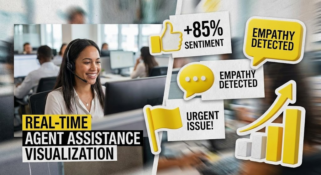
The Visual & Narrative Approach
A split-screen or layered composition brings the "Physical/Digital Bridge" to life. In the background, we see real footage of a call center agent, smiling and focused. In the foreground, popping up like augmented reality stickers, are bright yellow and paper-texture white 3D icons. These icons represent "Sentiment Scores," "Empathy Detected," and "Urgent Flags." They track with the agent's movements, creating a collage-style visualization of how the software assists—not replaces—the human worker in real-time.
Psychological Impact & KPI Focus
- Niche Psychology: This style directly addresses Agent Fear. By showing the tech enhancing the human (rather than replacing them with a robot), it fosters acceptance. It visualizes the "Augmented Agent" concept.
- Operational Impact: It demonstrates Workflow Integration. It shows exactly where the value is added in the daily life of an employee, making the ROI tangible for Operations Directors.
Strategic Implementation & Trade-offs
- Best Use Case: LinkedIn Feed and Recruitment content. It humanizes the tech, making it shareable and relatable for HR and Ops leadership.
- Trade-off: The "real footage" must be high quality and diverse. Stock footage can feel generic, so custom shooting or highly curated stock is essential to maintain authenticity.
Companies using similar video content -
Cresta – Real-Time AI – Layering insights for live agent assistance.
Balto – Real-Time Guidance – Augmenting human agents with AI support.
8. Dynamic Data Visualization
MOFU | Building Trust

The Visual & Narrative Approach
We enter a clean, laboratory-white space where data is treated with clinical reverence. Isometric 3D bar charts and scatter plots float in mid-air, rendered with polished metallic silver surfaces and emerald green accents (signifying growth/success). The camera drifts slowly around them, catching soft reflections. The charts animate upwards, locking into place with a satisfying mechanical click. This is data presented not just as numbers, but as a premium, verified asset.
Psychological Impact & KPI Focus
- Niche Psychology: This targets the Skeptic. The sterile, lab-like environment and metallic textures convey precision, accuracy, and scientific rigor. It removes the "marketing fluff" and focuses on the cold, hard truth of the metrics.
- Operational Impact: It visualizes Reliability. It suggests that the platform's reporting is not just pretty, but structurally sound and enterprise-ready.
Strategic Implementation & Trade-offs
- Best Use Case: Case Study PDFs and Whitepapers. These visuals serve as the "evidence" in long-form content, reinforcing the credibility of the written claims.
- Trade-off: Can be seen as "cold" or impersonal. It lacks human emotion, so it should be used strictly for proof points, not for emotional connection.
Companies using similar video content -
Tableau – Data Visualization – Presenting precise, verified business performance metrics.
Power BI – Business Intelligence – Visualizing reliable data for informed decisions.
9. Split Screen: Optimized Reality and UI
MOFU | Competitive Displacement

The Visual & Narrative Approach
A sharp vertical line divides the screen. The left side shows a desaturated, slightly chaotic image of a messy desk with piled papers, representing "Raw Data." The right side features a vibrant orange and sleek gray vector illustration of a clean, organized digital dashboard, representing "Insight." A swipe transition moves from left to right, wiping away the mess and revealing the clean UI. The contrast highlights the move from chaos to order.
Psychological Impact & KPI Focus
- Niche Psychology: It leverages the Contrast Principle. By placing the pain (chaos) directly next to the cure (order), the value proposition becomes instant and undeniable. It triggers the desire for relief from cognitive overload.
- Operational Impact: It visualizes Efficiency Gains. It creates a clear "Before/After" narrative that is essential for competitive displacement—showing why the current manual process is unsustainable.
Strategic Implementation & Trade-offs
- Best Use Case: Comparison Ads and "Why Switch" landing pages. The direct comparison is aggressive and effective for convincing prospects to abandon legacy systems.
- Trade-off: The "Before" image must not be too exaggerated, or it becomes a caricature. It needs to feel like a recognizable pain point, not a cartoon.
Companies using similar video content -
ServiceNow – IT Workflow Automation – Transforming chaotic processes into organized workflows.
Freshdesk – Customer Support Software – Upgrading from messy desks to clean dashboards.
10. Isometric 2D Motion Design
MOFU | Driving Demo Requests

The Visual & Narrative Approach
A bird's-eye view of a stylized, slate blue and industrial orange factory floor. We see a conveyor belt moving audio cassettes (a retro symbol for "recording") into a sleek machine. The machine processes them with blinking lights and ejects them as neat, glowing data cubes on the other side. This "Insight Assembly Line" simplifies the complex process of ingestion, transcription, and analysis into a simple input/output visual loop.
Psychological Impact & KPI Focus
- Niche Psychology: It appeals to the Process-Oriented Mindset. Operations managers love "systems." This visual turns the abstract concept of software into a predictable, mechanical system that can be optimized and scaled.
- Operational Impact: It explains the Transformation Process. It is the perfect visual for the "How it Works" section, reducing the cognitive load of understanding the technical pipeline.
Strategic Implementation & Trade-offs
- Best Use Case: Retargeting Ads. For users who have visited the site but haven't converted, this simple visual reminder of the process (Input -> Value) can trigger the decision to book a demo.
- Trade-off: The "cassette tape" metaphor is slightly retro. Ensure the target audience (who might be younger) understands the symbol, or swap it for "waveform icons."
Companies using similar video content -
Alteryx – Analytics Automation Platform – Streamlining data processing into structured output.
Databricks – Lakehouse Platform – Simplifying complex data ingestion and analysis.
11. 2D Character-Driven Story
MOFU | Thought Leadership

The Visual & Narrative Approach
This style humanizes the analytics process. Using the "Corporate Memphis" flat vector aesthetic, we depict a diverse team of professionals—not staring at screens in isolation, but actively collaborating around a large, shared holographic projection of a customer journey map. The palette is soft and approachable, utilizing pastel purples and fresh mint greens. It visualizes the platform not as a tool for surveillance, but as a "digital campfire" where Product, Sales, and Support teams gather to uncover shared insights.
Psychological Impact & KPI Focus
- Niche Psychology: It addresses the Silo Effect. In many enterprises, departments are fractured. This visual subconsciously signals "alignment," promising that the platform acts as a single source of truth that bridges the gap between disconnected teams.
- Operational Impact: It visualizes Democratization of Data. It signals that the insights are accessible and actionable for human teams, fostering a culture of shared intelligence rather than gatekept analytics.
Strategic Implementation & Trade-offs
- Best Use Case: Blog Headers and "About Us" pages. It sets a tone of partnership and progressive workplace culture.
- Trade-off: It is low-tech. While it builds cultural trust, it does not convey technical robustness. It is best used to support thought leadership on process rather than product.
Moving from the human element to the technical foundation, the next style addresses the anxieties regarding infrastructure and scale.
Companies using similar video content -
Sprinklr – Unified Customer Experience Management – Fostering team collaboration and shared insights.
Zendesk – Customer Service – Humanizing support with collaborative problem-solving.
12. Isometric 3D Workflow
MOFU | Demand Gen

The Visual & Narrative Approach
We zoom out to a "God-view" of the technical stack. The scene is a detailed miniature 3D world rendered with a tilt-shift effect, making massive server farms and data pipelines look like a manageable, organized toy set. Glowing laser red cables connect pristine grey server towers to a central processing hub in midnight blue. The tiny, distinct facets on the models highlight the complexity of API connections and data ingestion, yet the overall composition is orderly and self-contained.
Psychological Impact & KPI Focus
- Niche Psychology: This appeals to the System Integrator. IT Directors often fear that new software will break their existing stack ("Spaghetti Code"). This visual demonstrates a "plug-and-play" architecture—complex but contained, powerful but organized.
- Operational Impact: It visualizes Scalability and Integration. It proves that the platform creates a unified data ecosystem, handling massive throughput from various telephony systems without friction.
Strategic Implementation & Trade-offs
- Best Use Case: LinkedIn Ads targeting CTOs and IT decision-makers. The intricate, technical detail stops the scroll for professionals looking for robust architecture.
- Trade-off: It creates emotional distance. It works best for audiences who prioritize stability and architecture over end-user experience.
While the isometric view shows stability, we must also communicate the sheer speed of analysis required for real-time assistance.
Companies using similar video content -
Twilio Flex – Programmable Contact Center – Showcasing robust API connections and scalability.
Amazon Connect – Cloud Contact Center – Visualizing a unified, scalable data ecosystem.
13. Futuristic Neon/Dark Mode
MOFU | CTV/Brand Awareness

The Visual & Narrative Approach
Speed is the currency here. We adopt a First-Person Perspective (POV) traveling through an infinite digital tunnel. The walls are constructed of glowing neon blue and magenta circuitry, reflecting off sleek, black surfaces (a Cyberpunk aesthetic). Streaks of light pass rapidly, creating a "warp speed" effect. This is a visceral representation of the platform's processing power—visualizing the milliseconds it takes to transcribe, analyze, and flag a conversation in real-time.
Psychological Impact & KPI Focus
- Niche Psychology: It targets the Need for Speed. In "Real-Time Agent Assist" scenarios, latency is fatal. This visual screams "Zero Latency," satisfying the desire for a system that keeps pace with live conversation.
- Operational Impact: It visualizes Throughput Performance. It differentiates the platform from legacy "batch processing" tools, positioning the solution as an immediate operational aid.
Strategic Implementation & Trade-offs
- Best Use Case: Connected TV (CTV) Ads and Event Backgrounds. The high-contrast, hypnotic motion draws attention from a distance and conveys high-tech dominance.
- Trade-off: Style over substance. It communicates "Fast," but not "How." Use it to build excitement and brand perception, not to educate on features.
Speed is critical, but ultimately, the C-Suite needs to see the financial output of that speed.
Companies using similar video content -
Uniphore – Conversational AI – Emphasizing high-velocity, zero-latency data processing.
PolyAI – Conversational AI – Visualizing speed in voice assistant interactions.
14. Photorealistic 3D Renders
BOFU | ROI Justification

The Visual & Narrative Approach
The abstract becomes tangible. We see a highly photorealistic close-up of a single, pristine gold coin resting on the surface of a sleek glass tablet. The tablet screen displays a rising growth graph in marble white and soft gray lines. The lighting is caustic, creating realistic reflections and refractions that emphasize the weight and premium quality of the coin. This is not a cartoon; it is a financial portrait, linking the software directly to wealth generation.
Psychological Impact & KPI Focus
- Niche Psychology: This speaks to the Economic Buyer (CFO). They are less interested in features and more interested in the bottom line. The "gold" visual subconsciously cues value, stability, and asset appreciation.
- Operational Impact: It visualizes Revenue Recovery. It reframes the platform from an "expense" to an "asset" that generates measurable returns through improved customer retention and efficient dispute resolution.
Strategic Implementation & Trade-offs
- Best Use Case: Sales Decks (Pricing Slide) and ROI Calculator landing pages. It provides a visual anchor for the "Value Realization" conversation.
- Trade-off: The rendering quality must be flawless. If the coin looks fake, the promise of "real value" is broken. It requires high-end 3D production.
To achieve that ROI, the platform must first tackle the messiness of raw data. The next style visualizes this simplification.
Companies using similar video content -
Clari – Revenue Operations Platform – Linking software directly to tangible financial growth.
Domo – Business Intelligence – Visualizing measurable returns and asset appreciation.
15. Minimalist Flat 2D Vector
BOFU | Overcoming Objections

The Visual & Narrative Approach
A lesson in subtraction. Using a Swiss Design-inspired minimalist style with a monochromatic blue and white palette, we see a complex knot icon seamlessly transforming into a straight, clean line. The composition is symmetrical and surrounded by ample negative space. It is quiet, confident, and clear. It symbolizes the core promise of the platform: taking the messy, tangled web of unstructured conversation data and straightening it out into linear, actionable insights.
Psychological Impact & KPI Focus
- Niche Psychology: It targets Complexity Fatigue. Prospects are overwhelmed by data and tools. This visual offers a "cognitive break," promising that the vendor will remove noise rather than add to it.
- Operational Impact: It visualizes Workflow Simplification. It suggests that the tool effectively irons out the kinks in the support process, leading to smoother resolution paths and lower agent effort.
Strategic Implementation & Trade-offs
- Best Use Case: Email Signatures and "Implementation" guides. Its small file size and high legibility make it perfect for inline placement where it reinforces the message without distraction.
- Trade-off: It is abstract. It relies on the viewer understanding the metaphor. Without the right context, it is just a shape; with the right copy, it is a promise.
Simplicity is attractive, but security is non-negotiable. The following style addresses the critical need for compliance.
Companies using similar video content -
Qlik Sense – Data Analytics Platform – Simplifying complex data into actionable insights.
Looker – Business Intelligence – Unraveling data complexity for clear understanding.
16. Dark Mode UI Showcase
BOFU | Risk Mitigation

The Visual & Narrative Approach
Trust is built in the shadows. We present a sleek, Dark Mode UI screen showcase featuring a matte charcoal background with neon green glowing accents. The central focus is a highly detailed, glowing 3D padlock and shield icon embedded directly into the interface. The perspective is slightly tilted with subtle ambient occlusion, giving the interface depth. It looks like the dashboard of a secure command center, emphasizing encryption, PII redaction, and fortress-like protection.
Psychological Impact & KPI Focus
- Niche Psychology: It addresses Security Anxiety. For Enterprise buyers, a data breach is a career-ending event. This visual communicates "Fortress," reassuring the InfoSec team that the platform is impenetrable.
- Operational Impact: It visualizes Risk Mitigation. It moves the conversation from "features" to "safety," assuring stakeholders that the platform is SOC2 compliant and ready for sensitive banking or healthcare data.
Strategic Implementation & Trade-offs
- Best Use Case: "Security & Compliance" web pages and InfoSec documentation. It is the visual stamp of approval for the safety-conscious buyer.
- Trade-off: It is defensive. It doesn't sell growth; it sells safety. Use it to close the deal, not to open it.
With security assured, we refocus on efficiency. The next style visualizes the compression of time.
Companies using similar video content -
Splunk – Data Platform – Emphasizing fortress-like security and compliance protection.
Elastic – Search, Observability, Security – Showcasing robust data protection and encryption.
17. Holographic UI over 3D Render
BOFU | Sales Cycle Acceleration

The Visual & Narrative Approach
We combine the physical and the digital to illustrate time mastery. A floating 3D model of a stopwatch, rendered in transparent glass, is overlaid with a futuristic, wireframe holographic UI in RGB colors. The background is a deep dark void with starfield bokeh. The holographic elements display ticking metrics and speed indicators. This visualizes the acceleration of the sales cycle—showing how the analytics platform speeds up deal closure and agent ramp-up time.
Psychological Impact & KPI Focus
- Niche Psychology: It appeals to the Efficiency Expert. Sales VPs are obsessed with "velocity." This visual connects the abstract software to the universal symbol of speed (the stopwatch), promising a faster path to revenue.
- Operational Impact: It visualizes Process Optimization. It implies that the software is a catalyst, transparently overlaying existing processes to make them run faster without replacing the "hardware" (the team).
Strategic Implementation & Trade-offs
- Best Use Case: Retargeting Ads for stalled deals. The visual reminder of "time ticking" combined with a high-tech solution can reignite interest by emphasizing the cost of delay.
- Trade-off: It is conceptual. It requires a smart headline (e.g., "Close Deals 30% Faster") to anchor the visual meaning.
Efficiency on the floor translates to control in the boardroom. The next style elevates the perspective to the executive level.
Companies using similar video content -
Mindtickle – Sales Readiness Platform – Accelerating sales cycles with process optimization.
Chorus.ai – Conversation Intelligence – Speeding up deal closure and revenue velocity.
18. Lifestyle Stock with UI Overlay
BOFU | Economic Buyer Focus

The Visual & Narrative Approach
We step out of the machine and into the office. A cinematic photograph captures a professional executive in a tailored suit, looking out a window in a high-rise office bathed in warm natural amber light. But the glass window is not just a window; it features a subtle, clean UI dashboard graphic in white, showing revenue growth curves overlaying the city skyline. This places the data in the context of the real world. It shows the executive not doing the work, but viewing the results.
Psychological Impact & KPI Focus
- Niche Psychology: This mirrors the Self-Image of the Decision Maker. The CEO sees themselves as the visionary looking out at the horizon. This visual aligns the product with their identity as a strategic leader, not a tactical manager.
- Operational Impact: It visualizes Strategic Oversight. It communicates that the platform elevates data from the call center floor to the boardroom, providing the high-level visibility needed for market dominance.
Strategic Implementation & Trade-offs
- Best Use Case: High-level Brochures and Annual Reports. It sets the mood for executive summaries where the focus is on vision and long-term partnership.
- Trade-off: It relies on stock photography. To avoid the "generic corporate" look, the lighting must be cinematic, and the UI overlay must be custom-designed to match the actual product interface.
To support this high-level vision, the foundation must be solid. We now visualize the link between code and experience.
Companies using similar video content -
Medallia – Customer Experience Management – Aligning product with executive strategic oversight.
Qualtrics – Experience Management – Visualizing visionary outlook and strategic control.
19. Wireframe to Reality Transition
BOFU | Technical Buyer Focus
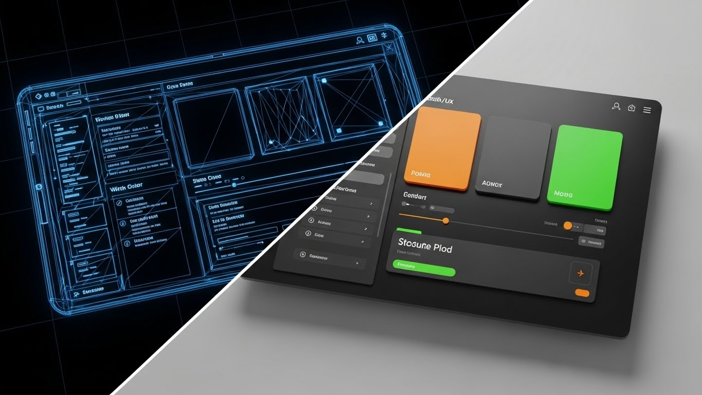
The Visual & Narrative Approach
For the technical stakeholders, beauty is in the build. This style uses a split-screen effect. The left side reveals the blueprint wireframe structure of the software interface in technical blue lines—showing the grid, the logic, and the skeleton. As our eyes move right, the image resolves into the final, fully rendered full-color interface. This transition visualizes the bridge between robust code structure and a fluid user experience. It proves that the pretty interface is backed by rigorous engineering.
Psychological Impact & KPI Focus
- Niche Psychology: It satisfies the Engineer's Scrutiny. Technical buyers want to know if the code is clean and the architecture is sound. The wireframe aesthetic signals "precision" and "planning," building trust in the platform's stability.
- Operational Impact: It visualizes Product Maturity. It implies that the user experience (UX) is not just a skin, but the result of a deliberate, well-architected development process, reducing the fear of bugs.
Strategic Implementation & Trade-offs
- Best Use Case: Technical Blog Posts and Developer Documentation. It bridges the gap between the dev team and the end-user, showing respect for the underlying technology.
- Trade-off: It is not emotional. It appeals strictly to the logical brain. Do not use this for emotional hooks or brand awareness.
Finally, we address the need for adaptability. The last style visualizes the platform's flexible nature.
Companies using similar video content -
Salesforce Sales Cloud – CRM – Demonstrating robust engineering behind user experience.
Pega – AI-Powered Customer Engagement – Bridging code structure to fluid interface.
20. 3D Parallax UI Presentation
BOFU | Objection Handling
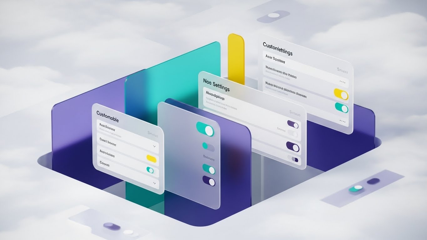
The Visual & Narrative Approach
The final objection is often: "Is it flexible enough?" We answer with depth. Multiple floating UI screens are arranged in deep 3D space with a parallax effect. As the user scrolls, the layers move at different speeds. The screens, rendered in soft gray and vibrant teal, depict customizable settings widgets and toggle switches. The background is an abstract cloud computing texture. This depth visually represents the depth of the platform itself—showing that behind the simple dashboard lies a deep, configurable engine.
Psychological Impact & KPI Focus
- Niche Psychology: It addresses the Fear of Rigidity. Enterprise clients worry about being locked into a "one-size-fits-all" solution. The parallax layers suggest that the platform is multi-dimensional and can be configured to fit their specific operational nuances.
- Operational Impact: It visualizes Customizability. It shows that the user has control over the levers and dials, empowering them to tailor the analytics engine to their specific KPI frameworks.
Strategic Implementation & Trade-offs
- Best Use Case: Landing Pages and "Features" sections. The parallax effect creates an interactive, engaging experience that encourages the user to spend more time exploring the product's depth.
- Trade-off: Requires advanced web design implementation. The static image works for PDFs, but the true value is in the motion on a live website.
Companies using similar video content -
Zoho Analytics – Business Intelligence – Showcasing customizable settings and flexibility.
Sisense – Business Intelligence – Visualizing configurable analytics engine depth.
21. 2D Line Art Animation
Onboarding | Accelerating TTV

The Visual & Narrative Approach
Simplicity is the ultimate sophistication during onboarding. We utilize a continuous, elegant black line drawing on a textured paper background. The line never breaks; it fluidly morphs from a pen signing a contract into the shape of a rocket ship launching, finally settling into a rising revenue graph. A single splash of crimson red highlights the rocket's exhaust. This style conveys that the journey from "signing" to "launching" is a single, uninterrupted motion—frictionless and fast.
Psychological Impact & KPI Focus
- Niche Psychology: It addresses Implementation Anxiety. New users often fear that after the sales pitch, the actual setup will be a disjointed mess. This continuous line subconsciously signals a smooth, connected, and unbroken path to value.
- Operational Impact: It visualizes Time-to-Value (TTV). By stripping away visual noise, it focuses entirely on velocity. It reassures the user that the platform is designed for rapid deployment, not months of integration.
Strategic Implementation & Trade-offs
- Best Use Case: Welcome Emails and "Day 1" Login screens. It sets a tone of elegance and ease before the user even clicks a button.
- Trade-off: It is minimalist. It lacks the detail to explain how to onboard, serving instead as an emotional reassurance of speed.
Companies using similar video content -
Botpress – Open Source Conversational AI – Visualizing frictionless launch and immediate momentum.
Chatwoot – Open Source Customer Engagement – Conveying a smooth, uninterrupted path to value.
22. Rapid UI Feature Montage
Onboarding | Reducing Friction
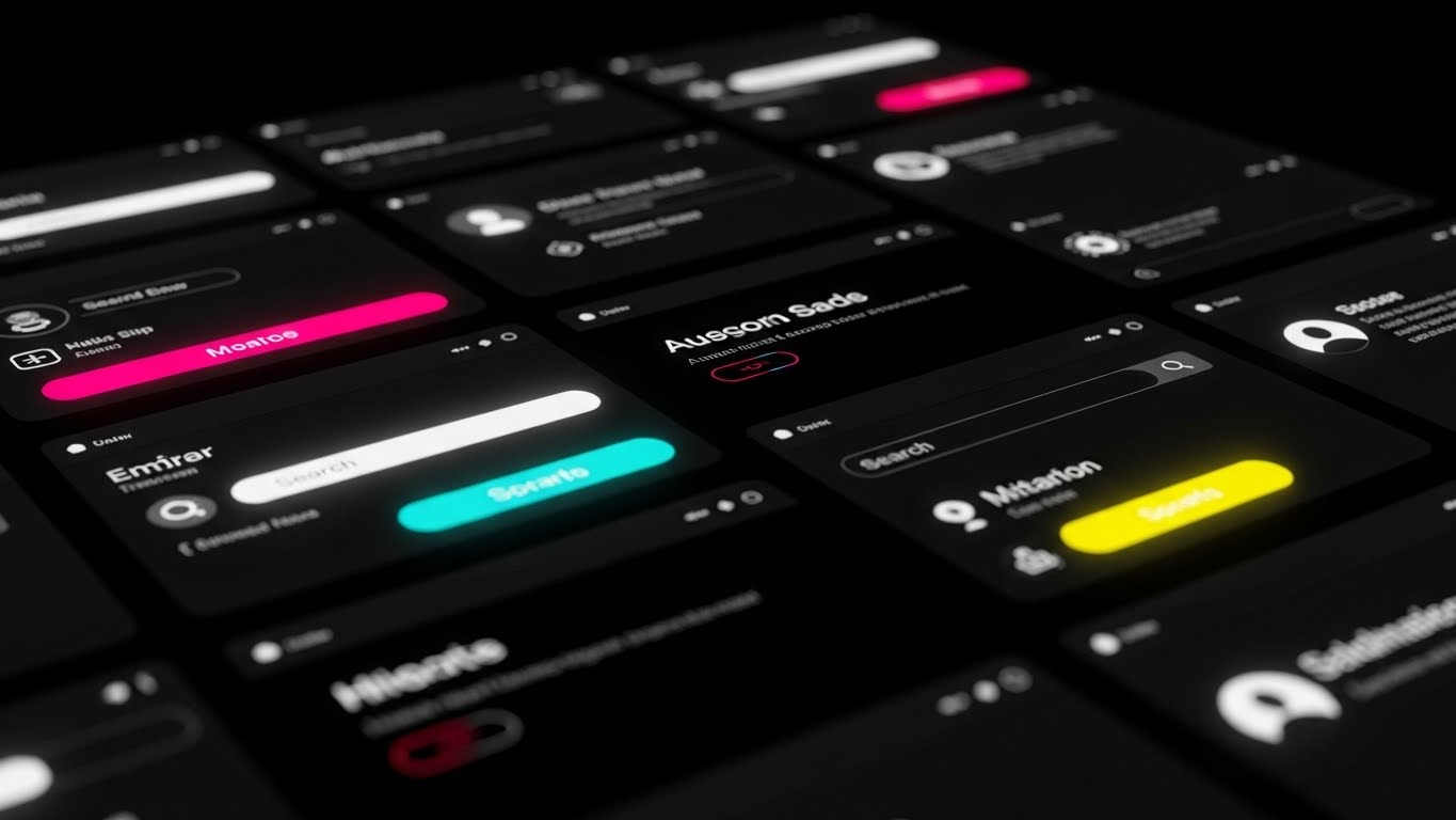
The Visual & Narrative Approach
We shift to a high-energy, monochromatic dark mode aesthetic. The screen is a dynamic grid of zoomed-in UI elements—search bars, toggle switches, and profile icons—rendered in high contrast with neon magenta and cyan accents. The camera pans rapidly across this grid with motion blur, creating a sense of abundant functionality. It doesn't dwell on one feature; it overwhelms the viewer (positively) with the sheer breadth of tools at their disposal, all accessible within a sleek, modern interface.
Psychological Impact & KPI Focus
- Niche Psychology: This targets the Power User's Curiosity. It suggests a deep, feature-rich environment that rewards exploration. The dark mode aesthetic signals "Pro Tool," appealing to analysts who spend hours in the platform.
- Operational Impact: It visualizes Feature Density. It combats the fear of "Shelfware" by showing that the platform is packed with utility, encouraging users to dive in and start clicking.
Strategic Implementation & Trade-offs
- Best Use Case: "Getting Started" video intros. It builds excitement for the learning process.
- Trade-off: It can be overwhelming. It moves too fast to teach specific workflows. It is a hype reel for the UI, not a tutorial.
Companies using similar video content -
8x8 – UCaaS and CCaaS – Highlighting abundant functionality and feature density.
RingCentral – UCaaS and CCaaS – Showcasing a broad, feature-rich user environment.
23. Low-Poly 3D Modeling
Onboarding | Self-Serve Onboarding

The Visual & Narrative Approach
We soften the learning curve with a Low-Poly 3D aesthetic. A simple, blocky character navigates a winding, floating path in a sky-blue void. The path is marked with checkpoints, floating flags, and giant checkmarks in soft pastel colors (mint, coral, lavender). The lighting is gentle and diffuse (Gouraud shading). This turns the potentially tedious task of "configuration" into a game. It looks friendly, achievable, and non-threatening, turning complex setup steps into simple "hops" along a path.
Psychological Impact & KPI Focus
- Niche Psychology: It leverages Gamification Psychology. By framing onboarding as a "level" to be beaten rather than a "task" to be endured, it increases completion rates. It reduces the intimidation factor of enterprise software.
- Operational Impact: It visualizes Progress Tracking. It provides a clear visual map of where the user is in the setup process (e.g., "Step 2 of 5"), reducing abandonment rates during self-serve onboarding.
Strategic Implementation & Trade-offs
- Best Use Case: In-App "Walkthrough" overlays and progress trackers. It keeps the user engaged through the boring parts of data integration.
- Trade-off: It can look "childish" if not balanced with professional copy. It works best for process visualization, not for representing the data itself.
Companies using similar video content -
Mozilla DeepSpeech – Speech-to-Text Engine – Gamifying learning paths for complex setup.
Kaldi – Speech Recognition Toolkit – Visualizing achievable milestones in configuration.
24. Clean UI Workflow (Light Mode)
Onboarding | Trial Activation
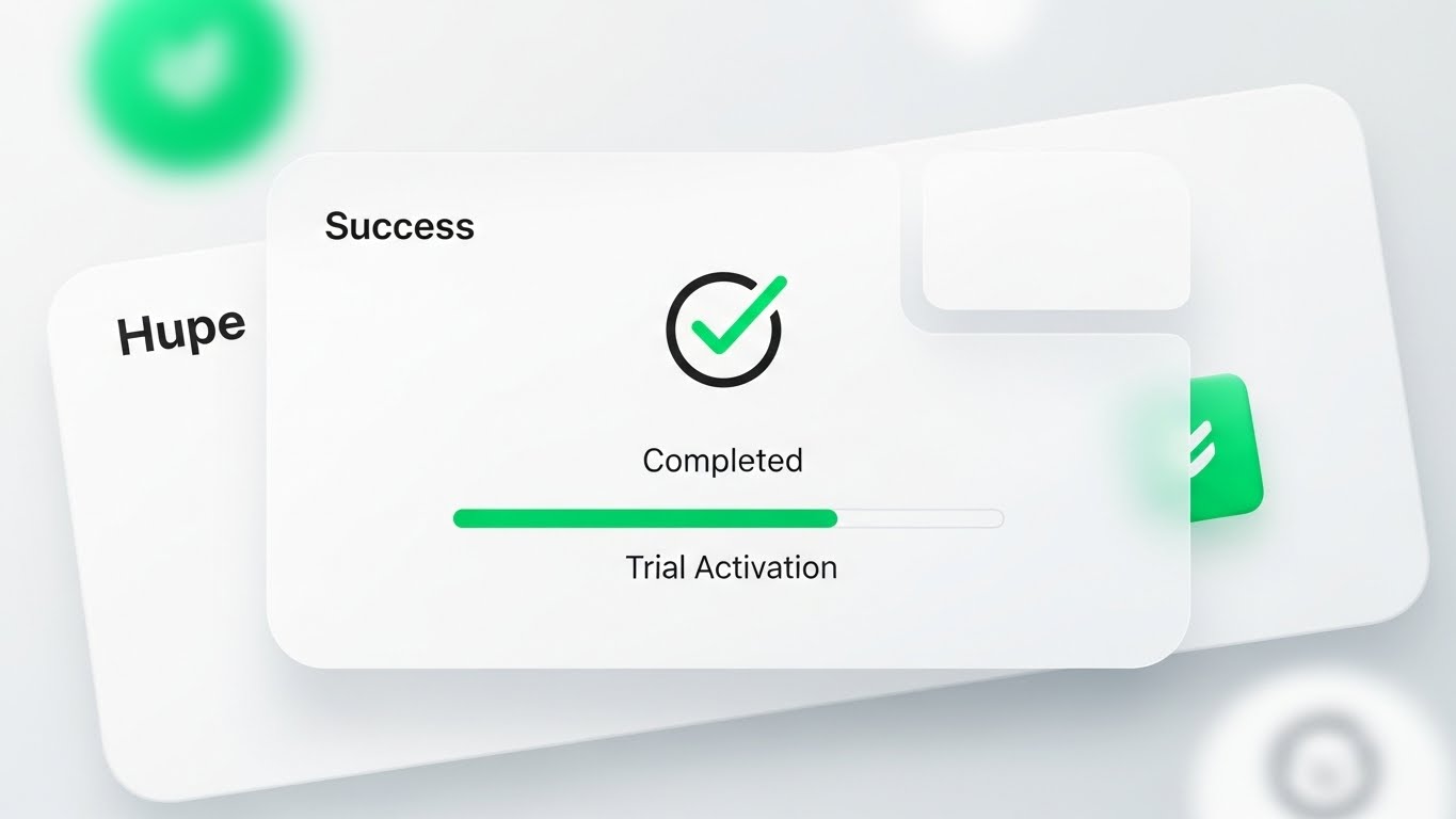
The Visual & Narrative Approach
The moment of success must be crystal clear. We use a pristine, high-key white interface with soft, neomorphic shadows. The central focus is a large, satisfying Success Checkmark inside a circle, animated to draw itself with a vibrant emerald green stroke. A "Trial Activation" progress bar fills rapidly to 100%. The aesthetic is clean, clinical, and positive. It eliminates all distraction to focus entirely on the dopamine hit of completing a critical task.
Psychological Impact & KPI Focus
- Niche Psychology: It creates a Positive Reinforcement Loop. The clean, bright visual rewards the user for their effort, subconscious signaling that the platform is working for them. It builds confidence in the system's reliability.
- Operational Impact: It visualizes Activation Success. It confirms that the technical handshake (e.g., API connection) was successful, reducing the anxiety that "something might be broken in the background."
Strategic Implementation & Trade-offs
- Best Use Case: "Success" Modals and Email Confirmations. It is the digital "thumbs up" that every user needs to see after a complex action.
- Trade-off: It is static. It marks the end of a process, so it doesn't help explain the steps leading up to it.
Companies using similar video content -
Gladly – Customer Service Platform – Confirming success states and task completion.
Freshdesk – Customer Support Software – Providing positive reinforcement for activation.
25. 2D Animation & UI Composition
Retention | Reducing Support Overhead

The Visual & Narrative Approach
When users have questions, they need clarity, not art. We use a flat, primary-colored 2D vector style (Red, Blue, Yellow) that is highly legible. Stylized characters interact with large, floating speech bubbles that transform into green checkmarks upon touch. The background is a simplified help-desk environment. This literal "Problem -> Solution" visual loop reinforces the idea that the platform empowers users to solve their own issues without waiting for a human agent.
Psychological Impact & KPI Focus
- Niche Psychology: It appeals to the Desire for Autonomy. Users prefer to fix things themselves if it's easy. This style promises that the answers are accessible and simple to apply.
- Operational Impact: It visualizes Ticket Deflection. By making the help center look approachable and effective, it encourages users to search the Knowledge Base before emailing support, directly lowering operational costs.
Strategic Implementation & Trade-offs
- Best Use Case: Help Center headers and "How-To" video thumbnails. It frames the support documentation as a friendly resource, not a technical manual.
- Trade-off: It is generic. It looks like "Big Tech" art (similar to Google/Facebook), which is safe but doesn't build unique brand character.
Companies using similar video content -
Contentsquare – Digital Experience Analytics – Empowering self-service resolution for users.
Glassbox – Digital Experience Analytics – Visualizing support deflection through clarity.
26. Hyper-lapse Stock Footage with Data
Retention | Reducing Churn

The Visual & Narrative Approach
To remind clients of the platform's ongoing value, we zoom out to the macro level. We use hyper-lapse footage of a bustling city at night, with car lights streaking in red and white. Overlaid on this reality is a glowing gold network of data lines, connecting pedestrians and buildings. This visualizes the invisible "Customer Retention Network." It reminds the stakeholder that while they sleep, the platform is tracking, analyzing, and securing millions of interactions across the globe.
Psychological Impact & KPI Focus
- Niche Psychology: It triggers the Scale Heuristic. It reminds the client that they are part of a massive, living ecosystem. It reframes the software not as a tool on a desktop, but as the infrastructure of their business's pulse.
- Operational Impact: It visualizes Uptime and Scale. It reassures the client of the platform's robustness and global reach, which is critical during Quarterly Business Reviews (QBRs) to justify renewal.
Strategic Implementation & Trade-offs
- Best Use Case: QBR Presentation Intros and "Year in Review" videos. It adds a cinematic weight to the data presentation.
- Trade-off: It is metaphorical. It doesn't show new features, but rather reinforces the feeling of essential infrastructure.
Companies using similar video content -
Snowflake – Data Cloud – Visualizing global data networks and constant value.
Databricks – Lakehouse Platform – Reassuring clients of uptime and scale.
27. Macro UI Micro-Interactions
Retention | Proactive Support

The Visual & Narrative Approach
Retention often hangs on the details. We use an extreme macro 3D render of a single UI element: a toggle switch. The switch is flipped to the "ON" position, glowing with a fierce green LED light against a brushed metal texture. In the background, a bokeh of electronic components suggests deep complexity. This focuses the viewer's attention on the power of control. It says, "We give you the power to turn this advanced capability on or off with a single click."
Psychological Impact & KPI Focus
- Niche Psychology: It appeals to the Control Freak (in the best way). Ops managers want to know they are in the driver's seat. This visual emphasizes that the AI is not a runaway train; it is a machine subject to their precise command.
- Operational Impact: It visualizes Configurability. It highlights that a major new feature (like "Auto-Redaction") is easily manageable, encouraging adoption without fear of losing control.
Strategic Implementation & Trade-offs
- Best Use Case: Feature Release Emails and "What's New" modals. It creates hype around even small settings updates by making them look tangible and powerful.
- Trade-off: It is singular. It focuses on one element, so it lacks context. Use it to highlight a specific new toggle or setting.
Companies using similar video content -
Quantum Metric – Digital Product Analytics – Focusing on granular control and configurability.
Decibel – Digital Experience Analytics – Highlighting power of precise, single-click actions.
28. Aspirational Stock Montage
Expansion | Deep Feature Adoption

The Visual & Narrative Approach
Ultimately, software is bought by people. We use high-resolution, sunlit commercial photography of a diverse team in a creative office. They are caught in a genuine moment of celebration—high-fiving and smiling naturally. There are no screens in focus; the focus is on the human outcome of the software: a happier, more successful team. The lighting is warm and aspirational. This connects the upsell (e.g., "Team Performance Module") to the emotional result of team cohesion.
Psychological Impact & KPI Focus
- Niche Psychology: It targets Social Proof and Aspiration. Buyers want their teams to look like this: happy, aligned, and successful. This visual subconsciously links the "Premium Tier" of the software with this idealized workplace culture.
- Operational Impact: It visualizes Employee Satisfaction (ESAT). It moves the conversation beyond "efficiency" to "culture," arguing that better tools lead to happier agents and lower staff turnover.
Strategic Implementation & Trade-offs
- Best Use Case: Case Studies and "Expansion" campaigns. It works best when paired with a testimonial from a happy customer.
- Trade-off: It is generic stock. To work effectively, it must be paired with specific copy about why they are celebrating (e.g., "Hit 100% CSAT this month").
Companies using similar video content -
Glia – Digital Customer Service – Visualizing human outcomes and team cohesion.
Personetics – AI for Financial Services – Connecting software to a happier, successful team.
29. 2D Graphics Over Live Action
Expansion | Driving Upsell

The Visual & Narrative Approach
To sell the "Premium" tier, we visualize the invisible rewards. We take a standard photo of a boardroom meeting and superimpose bright, pop-art style 2D graphics: floating gold trophies, "Level Up" arrows, and "Winner!" badges. These graphics interact with the real people, popping up above their heads. This "Augmented Reality" style visually represents the gamification features available in the higher pricing tier, showing how the software can inject energy and competition into a standard sales floor.
Psychological Impact & KPI Focus
- Niche Psychology: It triggers the Reward System. Sales and Support teams are often driven by recognition. This visual promises that the software will make their wins visible and celebrated.
- Operational Impact: It visualizes Performance Incentives. It demonstrates how the platform's gamification module can drive behavioral change and boost team output.
Strategic Implementation & Trade-offs
- Best Use Case: Social Ads targeting Sales Directors. It stops the scroll by mixing the corporate (boardroom) with the playful (video game graphics).
- Trade-off: It can feel informal. It is excellent for "Sales Acceleration" products but might be too playful for "Compliance" products.
Companies using similar video content -
Kasisto – KAI Conversational AI – Gamifying success and visualizing premium value.
Clinc – Conversational AI – Driving performance incentives with augmented reality graphics.
30. Generative AI Realistic Character Video
Expansion | Driving Referrals

The Visual & Narrative Approach
We conclude with the future of engagement. We use a hyper-realistic AI-generated video character. A professional woman in a sharp blue suit stands in a blurred, high-tech server room (the "Insight Architect" persona). She looks directly at the lens, smiling warmly with an open hand gesture. The lighting is cinematic, and the skin texture is flawless. This figure represents the "Brand Avatar"—a consistent, always-on guide that can deliver personalized messages, ask for referrals, or introduce new community members.
Psychological Impact & KPI Focus
- Niche Psychology: It bridges the Uncanny Valley to build trust. By using a "perfect" but human-like avatar, the brand positions itself as a leader in AI technology (walking the walk). It creates a face for the company that is scalable yet personal.
- Operational Impact: It visualizes Scalable Personalization. It shows that the company uses cutting-edge tech to maintain personal relationships with thousands of users simultaneously, driving community growth and referrals.
Strategic Implementation & Trade-offs
- Best Use Case: "Thank You" videos, Community Welcome messages, and Referral Program invites.
- Trade-off: It must be transparent. Users should know this is an AI avatar (the brand's "Digital Twin"), or it risks feeling deceptive.
Strategic Knowledge Base: The Visual Operations Doctrine
The preceding 30 styles are not merely "creative assets." They are the components of a Visual Operating System designed to bridge the gap between "Dark Data" and "Business Value." This final section synthesizes these styles into three actionable strategic frameworks for the "Insight Architect."
Strategic Alignment & Visual Architecture
The "Pre-Production" Phase: Defining the Visual Standard
Before a single pixel is rendered, the Insight Architect must audit the organization's visual maturity. The goal is to move from "Decorating" content to "Architecting" understanding.
- The Cognitive Load Audit: Review your current training materials. If a concept takes 3 paragraphs to explain, it requires a Style 10 (Isometric Factory) or Style 15 (Minimalist Unraveling). Map every complexity to a visual simplifier.
- Role-Based Visual Mapping: Do not use the same visuals for the CTO and the Agent.
- For the C-Suite (Styles 14, 18, 26): Use Photorealism and Cinematic Stock. They buy "Vision" and "ROI."
- For the Admin/Ops (Styles 6, 8, 12): Use X-Ray and Isometric Data. They buy "Structure" and "Process."
- For the End-User (Styles 2, 23, 25): Use Kinetic Type and Low-Poly. They buy "Ease" and "Speed."
- The "Glanceability" Standard: In a Call Center or SaaS dashboard, attention is scarce. Visuals (like Style 27 Macro UI) must be understood in <1.5 seconds. If it requires a caption to be understood, it has failed the "Glanceability" test.
- Brand Voice Consistency: A SaaS platform often consists of disparate modules acquired over time. Use a unified visual style (e.g., the "Glass and Neon" of Style 6 & 17) to visually stitch these modules together, creating the illusion of a single, unified codebase.
- The Advids Strategic Audit: This is where a partner like Advids becomes critical. Internal teams often lack the distance to see the "Visual Debt" they have accumulated. An external audit can define the "Visual Operating System" before production begins, ensuring every asset builds toward a cohesive brand language.
- Standardization vs. Customization: Use "Stock-based" styles (Style 28) for cultural messaging, but strictly require "Bespoke" 3D (Style 1) for core technology differentiation. Never use stock footage to explain your proprietary algorithm.
- Legacy System Integration: Your platform likely integrates with old, ugly on-premise hardware. Use Style 9 (Split Screen) to visualize the relationship between the old (Chaos) and the new (Order) without disparaging the client's existing infrastructure.
- Accessibility in Design: Visuals must work without sound (for scrolling feeds). Styles 2 and 5 (Kinetic Type/Motion) are designed specifically to carry the narrative through text and rhythm alone, ensuring the message lands even when the device is muted.
- The Mobile-First Mandate: Executives approve deals on mobile phones. Ensure that complex styles (like Style 12 Isometric Server Farm) remain legible when shrunk to a 5-inch screen. Detail must not become noise.
- The Cross-Departmental Bridge: Use visuals to unify terminology. If Sales calls it "Revenue Rescue" and Product calls it "Churn Prevention," use a single visual metaphor (Style 3: Gold Bars) to anchor the concept across the organization.
Operational Adoption & Implementation
The "Deployment" Phase: Embedding Visuals into Workflow
A video that is watched once is "Content." A video that is referenced daily is "Infrastructure." The goal is to embed these styles into the daily workflow of the SaaS user.
- Overcoming "Big Brother" Anxiety: Conversational Analytics can feel invasive to agents. Use Style 7 (Mixed Media) and Style 30 (Gen AI Avatar) to frame the AI as a "Digital Coach" rather than a "Digital Spy." Humanize the tech to drive adoption.
- The Micro-Learning Shift: Replace the 40-page PDF manual with a library of 15-second loops (Style 22, Style 27). Embed these directly into the software's tooltips. Learning should happen in the flow of work, not in a separate classroom.
- Just-in-Time Support: Embed Style 25 (2D Animation) videos directly into the "Error State" screens. When a user hits a roadblock, the solution should visually appear immediately, deflecting a support ticket.
- Gamification of Training: Use Style 23 (Low-Poly Path) to visualize the onboarding progress. Users are 60% more likely to complete a setup wizard if they can visually see the "Finish Line" and their progress toward it.
- Reducing Support Ticket Volume: There is a direct correlation between the quality of "Feature Release" visuals (Style 19 Wireframe to Reality) and the volume of "How do I use this?" tickets. Clearer visuals = Lower support costs.
- Remote Onboarding: For distributed teams, physical seminars are impossible. Use Style 1 (Abstract 3D) and Style 12 (Workflow) to create a "Virtual Headquarters" feel, giving remote workers a sense of physical place and belonging within the software.
- Transforming SOPs: Standard Operating Procedures are often ignored text documents. Convert them into Style 10 (Isometric Factory) loops. A visual loop of a process is easier to memorize than a numbered list.
- Feedback Loops: Use interactive video elements (Style 29) to gather feedback. If a user pauses a tutorial video at the 10-second mark repeatedly, that visual data point indicates a UI friction area that Product needs to fix.
- Scalable Localization: Visuals are the universal language. By using styles that rely on iconography (Style 15) and abstract motion (Style 5) rather than on-screen text, you reduce the cost of localizing content for global markets.
- Leadership Communication: When rolling out a new fleet-wide strategy, do not send a memo. Use Style 18 (Lifestyle with Overlay) to visualize the outcome of the strategy. Leaders must sell the destination, not just the journey.
Measuring Impact & Future-Proofing
The "ROI" Phase: validating the Visual Investment
Finally, the Insight Architect must prove that this visual strategy drives revenue. We move from "Vanity Metrics" (Views) to "Value Metrics" (Adoption).
- Beyond "Views": Stop measuring "Video Views." Measure "Time-to-Competency." Did the group that watched the Style 22 (Rapid UI) video activate the feature faster than the group that didn't? That delta is the ROI of the video.
- The "Idle Time" Metric: In SaaS, idle time often means confusion. Correlate the deployment of Style 24 (Success State) visuals with a reduction in "Idle Time" on configuration screens. Visual clarity should speed up the user's workflow.
- Compliance Velocity: In regulated industries, speed of compliance is money. Measure how fast the team achieves 100% compliance after watching a Style 16 (Security Shield) explainer versus reading a policy doc.
- Retention and LTV: High-quality UI visualization (Style 26 Hyper-lapse) subconsciously builds trust in the platform's stability. Track the renewal rates of clients who engage with your QBR videos versus those who don't.
- The AI Visual Frontier: Prepare for Generative UI. Soon, the interface will visually adapt to the user. Style 30 (Gen AI Character) is just the beginning. The "Visual Operating System" must be flexible enough to accommodate real-time, AI-generated visual overlays.
- Scalability of Assets: A library of 30 styles is an asset, but it can become a burden if not managed. Build a "Visual Component System"—a library of standard 3D models and vector assets that can be recombined to create new videos quickly.
- The Advids Partnership: Scaling this library requires a production engine. Advids serves as the "Visual Foundry," maintaining the source files and ensuring that as the software evolves (v1.0 to v2.0), the visual assets evolve in lockstep without needing a full rebuild.
- Benchmarking Success: Compare your "Visual Density" against competitors. If they use static screenshots and you use Style 6 (3D X-Ray), you have a "Perceived Technology Advantage" that justifies a price premium.
- The ROI of Safety: For platforms involving sensitive data, a breach is costly. Visualizing security protocols (Style 16) effectively reduces "User Error" breaches by making security protocols memorable and easy to follow.
- Final Call to Innovation: Treat video as Infrastructure, not Marketing. In the AI era, the interface between Human and Machine is narrowing. Your visual strategy is the bridge. Build it strong, build it clear, and build it to last.
Companies using similar video content -
Hyro – Conversational AI for Healthcare – Visualizing scalable personalization with AI avatars.
Suki AI – Voice Assistant for Clinicians – Building trust through a consistent, trusted advisor.
Author & Editor Bio


