
Introduction: Visualizing the Shift from Monolith to Modular
The global banking sector is currently navigating its most significant architectural shift in fifty years. We are moving from the era of "Castle and Moat" monolithic mainframes to the dynamic, fluid world of Composable Banking. However, for the technology leaders driving this change, the challenge is often not just building the new infrastructure, but explaining it.
How do you visualize an API? How do you show the "agility" of a microservice to a non-technical Board member who is terrified of risk?
The stakes are incredibly high. Recent industry data reveals that 92% of banks are concerned about the risks associated with their current levels of legacy technical debt. This shared anxiety often paralyzes decision-making, leading to "analysis paralysis" where critical modernization projects are stalled by fear.
Yet, the opportunity for those who break through this paralysis is immense. The global core banking software market is projected to skyrocket to USD 64.96 billion by 2032. This growth isn't just about new software; it represents a fundamental reconfiguration of how value moves around the world—a shift toward "Digital Liquidity."
The Visual Bridge
At Advids, we believe that Strategic Visualization is the bridge between the physical anxiety of "rip and replace" and the digital promise of the cloud. A well-executed motion graphic does not just decorate your value proposition; it translates complex code into a clear business advantage. It reduces Cognitive Load, allowing stakeholders to instantly grasp how an abstract concept like "Headless Banking" translates into concrete operational efficiency.
This guide is your blueprint. We have curated 30 distinct visual styles, mapped to the B2B sales funnel, to help you articulate the value of your Core Banking Software. From the "Vivid Coral" fluidity of digital data to the "Chrome" certainty of modern security, these examples are designed to turn skepticism into consensus.
Let’s explore the first 10 styles, focused on the critical Top of Funnel (TOFU) and Middle of Funnel (MOFU) stages, where the goal is to disrupt legacy thinking and educate the market on the new possible.
1. The Fluidity of Digital Liquidity
TOFU | Brand Awareness

The Visual & Narrative Approach
This style abandons literal representations of money or servers in favor of pure concept. It utilizes organic, fluid shapes in Vivid Coral and Deep Indigo to represent the concept of "Digital Liquidity." The motion is rhythmic and continuous, flowing from left to right to subconsciously suggest progress and ease. The glossy, liquid-like textures catch the light, implying a premium, frictionless ecosystem where assets move without resistance.
Psychological Impact & KPI Focus
- Niche Psychology: Legacy bankers are used to "batch processing"—rigid, stop-start cycles. This continuous, fluid motion visually counters that fatigue. It triggers a feeling of Operational Ease.
- Operational Impact: This style effectively communicates Throughput and Latency Reduction without a single line of code. It sells the feeling of speed.
Strategic Implementation & Trade-offs
- Best Use Case: Instagram or LinkedIn scroll-stoppers (15 seconds). Perfect for announcing a rebranding or a new "Real-Time" payment module.
- Trade-off: It is highly abstract. It builds Brand Sentiment but explains zero technical details. Do not use this for deep technical demos.
Companies using similar video content -
Mambu – Cloud Banking Platform – Flexible, API-first core banking.
Thought Machine – Vault Core – Cloud-native core banking platform.
Infosys Finacle – Finacle – Cloud-based core banking with real-time processing.
2. The Architecture of Composability
TOFU | Category Creation
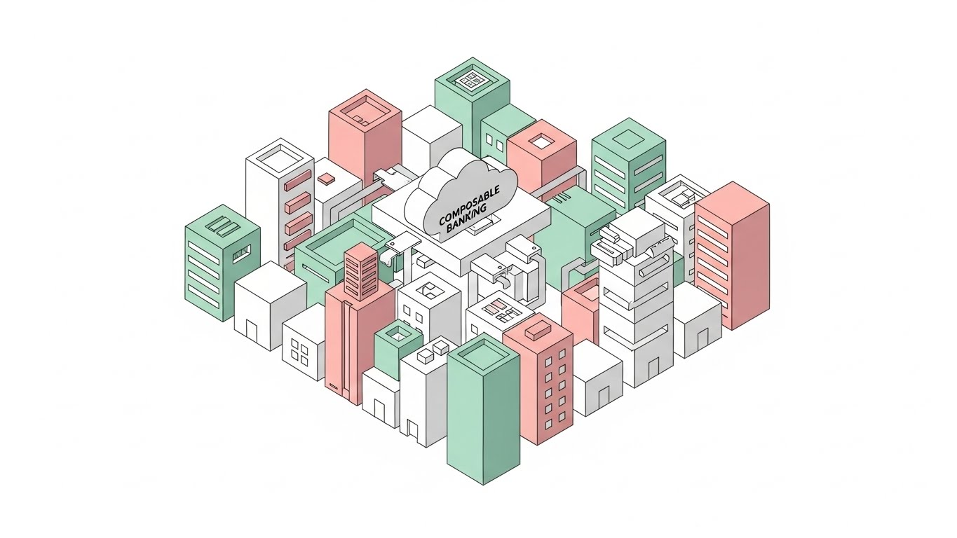
The Visual & Narrative Approach
This style brings order to chaos. Using a clean, shadowless isometric grid, we visualize the banking ecosystem as a series of modular, interlocking blocks in Pastel Mint and Soft Pink. The narrative focuses on "pluggability"—showing how distinct modules (Lending, KYC, Payments) seamlessly connect to a central cloud hub. The clean white background ensures the focus remains entirely on the architecture.
Psychological Impact & KPI Focus
- Niche Psychology: The "Pragmatic Modernizer" fears the "Spaghetti Code" of legacy systems. This clean, grid-based visual is the antidote. It satisfies the brain's desire for Order and Structure.
- Operational Impact: Directly supports the narrative of Faster Time-to-Market and Reduced Integration Costs by showing how easy it is to add new "blocks."
Strategic Implementation & Trade-offs
- Best Use Case: Blog headers or "How it Works" web pages (30-45 seconds).
- Trade-off: The "cartoonish" isometric style can sometimes feel too lightweight for very serious Risk/Compliance topics. Keep the color palette professional (High-Key) to maintain authority.
Companies using similar video content -
Temenos – Temenos Transact – Composable banking architecture for financial institutions.
Akkuro – Composable Banking Platform – Modular, cloud-native building blocks for agility.
Union Fintech – Cloud-Native Core Banking Platform – Modular solution for next-gen financial services.
3. The Kinetic Clash of Eras
TOFU | Market Education

The Visual & Narrative Approach
This is a visual metaphor for disruption. We use a split composition: the bottom half features heavy, cracked grey concrete (Legacy Infrastructure) visually crumbling under its own weight. In sharp contrast, the upper half features vibrant Bright Orange aerodynamic shapes self-assembling into a sleek structure (Cloud Agility). The motion is aggressive and energetic, emphasizing the "Break and Build" philosophy of modernization.
Psychological Impact & KPI Focus
- Niche Psychology: It validates the customer's pain. They feel the weight of that concrete (Technical Debt) every day. Seeing it crumble is cathartic.
- Operational Impact: Excellent for highlighting Modernization and Cost Reduction (eliminating the heavy maintenance of the concrete blocks).
Strategic Implementation & Trade-offs
- Best Use Case: TikTok or LinkedIn Stories (10-15 seconds). A pure "Visual Hook."
- Trade-off: It is aggressive. Use it to highlight the problem, but quickly pivot to the solution to avoid being labeled as alarmist.
Companies using similar video content -
Finastra – FusionFabric.cloud – Modernizing legacy to agile online banking solutions.
Newgen – Cloud-Native Core Banking – Transforming traditional banking with cloud architecture.
4. The Intelligent Nervous System
TOFU | Shaping Brand Perception

The Visual & Narrative Approach
To visualize the intelligence of AI and Open Banking, this style uses a vast, glowing network of particle systems. Filaments of light connect nodes in Deep Space Blue and Cyan, representing API calls firing in real-time. The background is a Bright Silver, keeping the tone optimistic and "high-key," avoiding the dark, ominous "hacker" aesthetic often associated with cyber-security.
Psychological Impact & KPI Focus
- Niche Psychology: It appeals to the aspiration of the "Future-Ready" bank. It suggests that your software is not just a tool, but a living, thinking ecosystem.
- Operational Impact: Supports narratives around AI-Driven Insights, Scalability, and Ecosystem Connectivity.
Strategic Implementation & Trade-offs
- Best Use Case: Keynote backgrounds or high-level Brand Vision videos (60 seconds).
- Trade-off: It is expensive to produce (requires high-end 3D rendering) and can be vague. It requires a strong voiceover to anchor the visuals to specific business outcomes.
Companies using similar video content -
IBM – AI in Banking – AI algorithms for credit, cybersecurity, customer tools.
Banking Labs – Cloud Banking Platform – AI and data science for enhanced experience.
SymphonyAI – SensaAI for AML – AI-driven SaaS for financial crime detection.
5. The Human ROI
TOFU | ABM Awareness
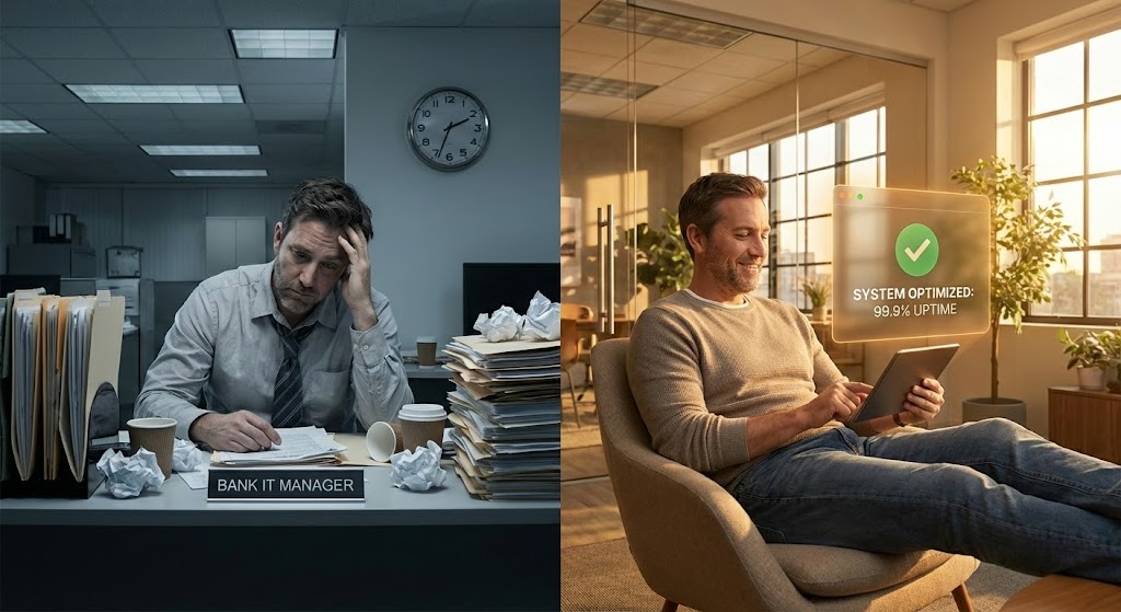
The Visual & Narrative Approach
B2B buyers are humans too. This style uses a direct comparisons to communicate value instantly. The left side (The Problem) is desaturated and cluttered, showing the physical burden of paper-based legacy processes. The right side (The Solution) is warm, sunlit, and clean, focusing on the human benefit of the software. The Vivid Amber UI overlay acts as the bridge, proving that the software is the catalyst for this lifestyle change.
Psychological Impact & KPI Focus
- Niche Psychology: It addresses Burnout. IT teams in banks are often overworked. This visual promises not just better software, but a better work-life balance for the team.
- Operational Impact: Directly visualizes Operational Efficiency, Employee Satisfaction, and Reduced Manual Errors.
Strategic Implementation & Trade-offs
- Best Use Case: Account-Based Marketing (ABM) ads targeting HR or Operations Heads (30 seconds).
- Trade-off: It relies on stock photography (or custom shoots). If the acting feels cheesy, it undermines credibility. The UI overlay must look premium to save it.
Companies using similar video content -
Newgen – Digital Customer Onboarding – Efficient, AI-first customer onboarding platform.
InvestGlass – Banking Workflow Software – Automates processes, enhances operational efficiency.
6. From Blueprint to Vault
TOFU | Competitive Displacement
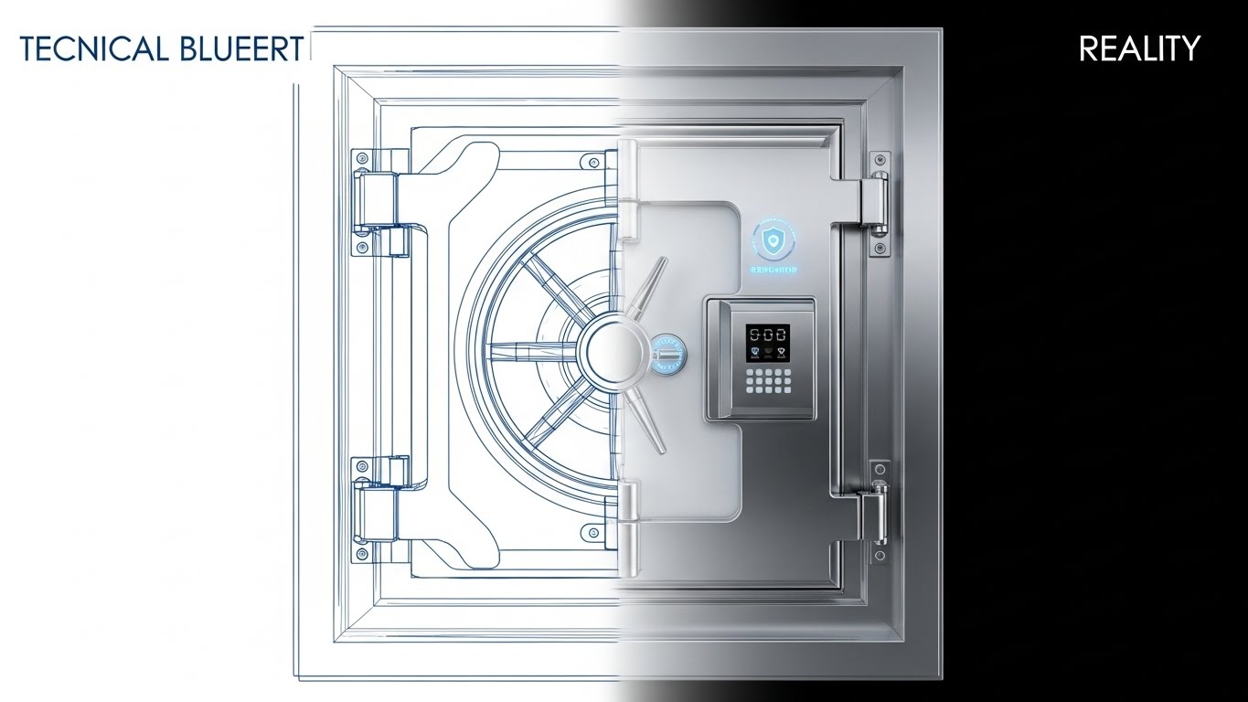
The Visual & Narrative Approach
This transition style visualizes the engineering rigor behind your software. We start with a Technical Blueprint Blue wireframe (the plan) and morph seamlessly into a photorealistic Chrome and White Glass interface (the product). This suggests that your software is not "vaporware"—it is architected with precision and delivered with high fidelity.
Psychological Impact & KPI Focus
- Niche Psychology: It creates Cognitive Certainty. The viewer sees the structure (wireframe) and the result (reality) simultaneously, reducing the fear of buying something that doesn't exist.
- Operational Impact: Perfect for discussing Security Compliance, Robustness, and Architecture Quality.
Strategic Implementation & Trade-offs
- Best Use Case: Product landing pages or "Security" feature sections (15-20 seconds loop).
- Trade-off: Requires high-fidelity 3D modeling to make the "Reality" part look convincing. If the final render looks fake, the trust is lost.
Companies using similar video content -
Thought Machine – Vault Core – Built from scratch, cloud-native core banking.
Akkuro – Composable Core Banking – API-first, compliant by design platform.
7. The Friendly Factory
TOFU | Product Differentiation
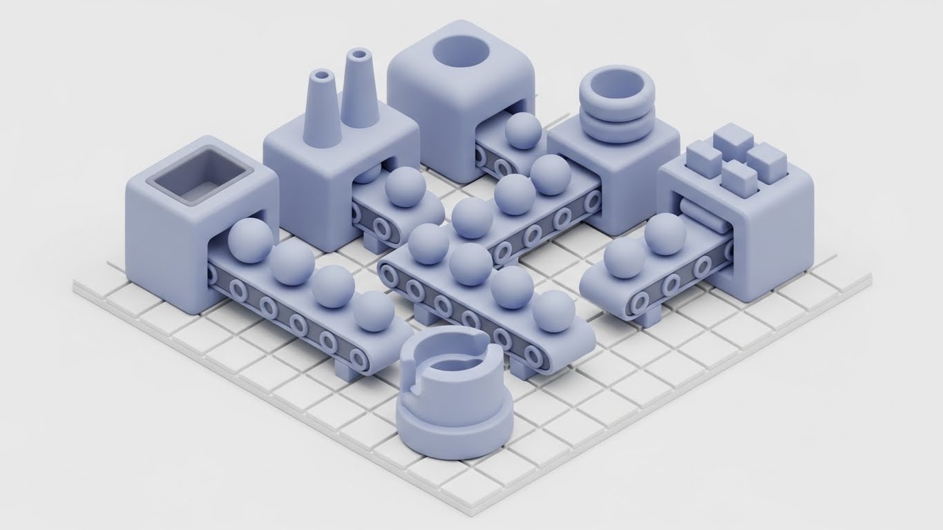
The Visual & Narrative Approach
Backend batch processing is boring. This style reimagines it as a charming, stylized factory. "Soft Clay Grey" and "Pastel Blue" machines process smooth spheres (data) along conveyor belts. It applies "Clay-morphism"—a tactile, toy-like texture—to make the heavy lifting of banking engines look accessible and smooth.
Psychological Impact & KPI Focus
- Niche Psychology: It lowers Cognitive Load. Complex diagrams scare people; simple factories explain processes instantly. It makes the scary backend feel manageable.
- Operational Impact: Explains Workflow Automation, Data Processing logic, and Straight-Through Processing (STP).
Strategic Implementation & Trade-offs
- Best Use Case: Explainer videos for non-technical stakeholders (60-90 seconds).
- Trade-off: Can feel "too cute" for high-stakes investment banking. Use for Retail or SME banking solutions where "Simplicity" is a key value proposition.
Companies using similar video content -
Flowable – Flowable Platform – Automates processes from lending to KYC.
UiPath – Robotic Process Automation – Bots for routine banking tasks.
8. The Archipelago of Microservices
MOFU | Feature Education

The Visual & Narrative Approach
How do you show that your system doesn't crash if one part fails? This style depicts specific banking services (Payments, KYC, Ledger) as floating, geometric islands. If one island dims, the others stay bright. The "Low Poly Purple" and "Gold" facets catch the light, emphasizing the distinct, independent nature of each microservice.
Psychological Impact & KPI Focus
- Niche Psychology: It visualizes Resilience. The separation of islands visually proves the concept of "fault isolation"—a key anxiety reliever for CTOs fearing system-wide outages.
- Operational Impact: Deeply explains High Availability (HA), Uptime, and Modular Upgrades.
Strategic Implementation & Trade-offs
- Best Use Case: Technical deep-dive snippets for LinkedIn or Developer Documentation (30 seconds).
- Trade-off: The "Low-Poly" aesthetic is very distinct (video game style). Ensure it aligns with your brand guidelines.
Companies using similar video content -
Thought Machine – Vault Core – Microservices architecture for banking.
Temenos – Temenos Transact – Composable architecture with modularity.
9. The Tunnel of Speed
MOFU | Feature Education

The Visual & Narrative Approach
"Real-Time Payments" needs to feel fast. This style uses speed lines, motion blur, and a high-contrast "Electric Lime" and "Silver" palette. Spheres (transactions) zip through a data tunnel without friction. It’s high-energy, sharp, and modern, mimicking the visual language of high-performance racing.
Psychological Impact & KPI Focus
- Niche Psychology: Speed is the new currency. This style triggers the Dopamine hit of instant gratification, which is exactly what the bank's customers want.
- Operational Impact: Visualizes TPS (Transactions Per Second), Low Latency, and High Performance.
Strategic Implementation & Trade-offs
- Best Use Case: Trade show loops (attracting attention to the booth) or performance metric visualizations (10-15 seconds).
- Trade-off: It can be visually overwhelming. Avoid using text overlays on top of the fast motion; they will be unreadable.
Companies using similar video content -
Finastra – Real-Time Core Banking Engine – Fast, agile online banking solutions.
Oracle FLEXCUBE – Oracle FLEXCUBE – Real-time processing engine.
10. The Transparent Core
MOFU | Building Trust

The Visual & Narrative Approach
Security is usually a "black box." This style makes it transparent. We see a stylized server rack in "Translucent White Glass," revealing a glowing "Neon Green" padlock mechanism inside. It suggests that security is not an addon, but the core of the hardware architecture. The clean "Laboratory White" background reinforces sterility and safety.
Psychological Impact & KPI Focus
- Niche Psychology: Trust is built on transparency. By "showing the inside," you subconsciously signal that you have Nothing to Hide. It appeals to the "Risk & Compliance" officer.
- Operational Impact: Supports Encryption at Rest, Data Privacy (GDPR), and Secure Architecture.
Strategic Implementation & Trade-offs
- Best Use Case: The "Security" page of your website or compliance audit presentations (45 seconds).
- Trade-off: High production cost. The glass texture rendering requires advanced 3D skills to look "clean" rather than "ghostly."
Companies using similar video content -
Kernolab Core – Kernolab Core – Built with highest security in mind.
Alkami – Alkami Platform – Industry-leading security for digital banking.
11. The Cyber-Shield
MOFU | Risk Mitigation
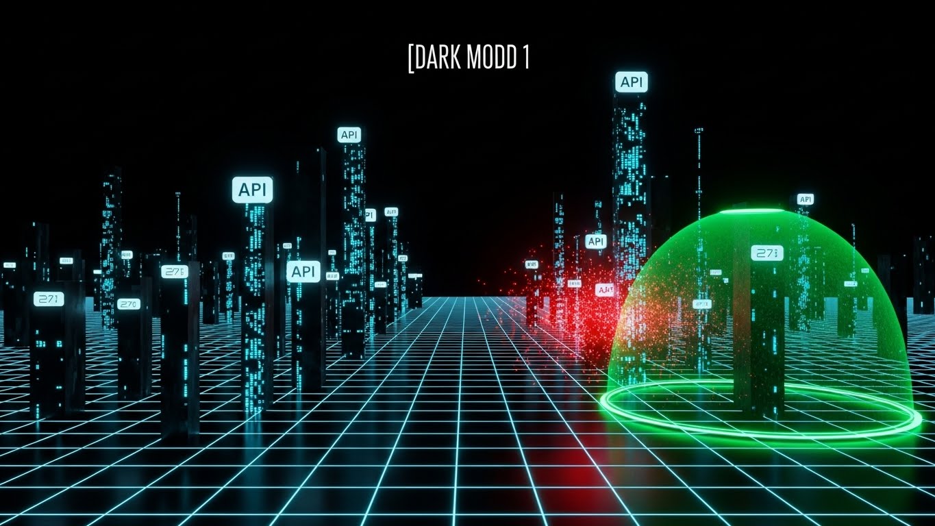
The Visual & Narrative Approach
Security in banking is often invisible until it fails. This style makes protection visible and active. Utilizing a "Cyberpunk" aesthetic with a "Laser Grid Black" background, we visualize the digital ecosystem as a fortified city. Glowing "Neon Cyan" streams represent valid API calls, while "Red" threat particles attempt to breach the perimeter. A "Green" forcefield—representing your AI security layer—dynamically blocks these threats in real-time. The atmosphere is tech-heavy, precise, and impenetrable.
Psychological Impact & KPI Focus
- Niche Psychology: This style directly addresses the Fear of Vulnerability. For the Risk Officer, a "black box" security system is terrifying. Seeing the "Shield" actively blocking threats provides a visceral sense of Control and Protection.
- Operational Impact: Visually demonstrates Real-Time Threat Detection, DDoS Protection, and the robustness of your API Gateway.
Strategic Implementation & Trade-offs
- Best Use Case: Whitepapers on Cybersecurity or "Trust Center" web pages (15-30 seconds loops).
- Trade-off: The dark, neon aesthetic can feel "gaming-centric." Ensure the UI elements look sophisticated (like a SOC dashboard) rather than a video game to maintain enterprise credibility.
Companies using similar video content -
ComplyAdvantage – AML Risk Detection – AI-driven fraud and AML protection.
LexisNexis Risk Solutions – Risk Solutions – Predictive analytics for AML/fraud.
Feedzai – Feedzai Platform – AI/ML for fraud prevention and AML.
12. The Developer's Canvas
MOFU | Reducing Friction
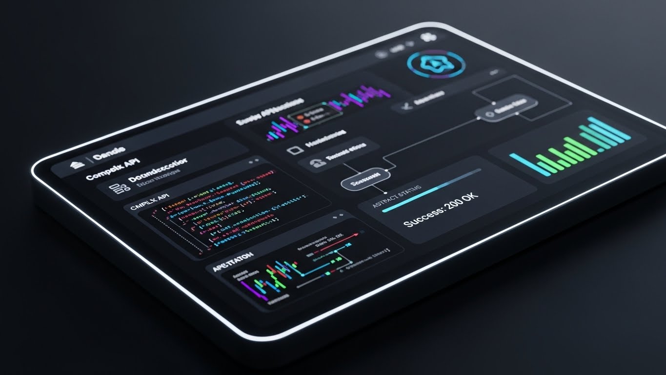
The Visual & Narrative Approach
To win the platform war, you must win the developers. This style glamorizes the coding experience. We focus on a close-up of a sleek "Dark Mode" IDE (Integrated Development Environment) or API documentation portal. The background is "Dark Charcoal," making the "Neon Purple," "Blue," and "Green" syntax highlighting pop. The narrative focus is on the "Success: 200 OK" status indicator—visualizing the ease of integration. It promises a friction-free, modern building experience.
Psychological Impact & KPI Focus
- Niche Psychology: Developers judge a platform by its documentation (DX). A beautiful, dark-mode interface signals Modernity and Respect for their workflow. It combats the dread of working with clunky, legacy SOAP XML.
- Operational Impact: Directly supports narratives around Developer Velocity, Ease of Integration, and Sandbox Availability.
Strategic Implementation & Trade-offs
- Best Use Case: API Documentation headers, Hackathon promo videos, or technical recruiting materials (Looping GIFs).
- Trade-off: This is purely for a technical audience. A business user (CEO) will find this unintelligible. Use strictly for the "Builders."
Companies using similar video content -
Mambu – Cloud Banking Platform – API-first platform for developers.
SDK.finance – Core Banking Platform – API-first digital banking.
13. The Tangible Touchpoint
MOFU | Thought Leadership

The Visual & Narrative Approach
Sometimes, software needs a physical avatar to feel valuable. This style uses high-end photorealism to render a futuristic credit card—the ultimate symbol of banking. The card is crafted from "Brushed Platinum" and "Sapphire Glass," resting on a reflective surface. Subtly, streams of "Blue Data Light" flow through the card, implying that the physical object is powered by your digital core. It merges the tactile luxury of private banking with the speed of fintech.
Psychological Impact & KPI Focus
- Niche Psychology: It appeals to Prestige and Status. It reminds the viewer that ultimately, their software powers the customer's wallet. It anchors the abstract cloud code to a premium consumer experience.
- Operational Impact: Visualizes Premium Card Management, White-Label Capabilities, and End-User Experience.
Strategic Implementation & Trade-offs
- Best Use Case: Product launch announcements or high-level "Vision" posts on LinkedIn (10-15 seconds).
- Trade-off: Requires "Apple-level" rendering quality. Any imperfection in the lighting or texture will make it look cheap. It is a "Brand" asset, not a "Feature" asset.
Companies using similar video content -
DECTA – Digital Banking Platform – Payment acquiring, card issuing.
Mitek Systems – Mobile Capture – Seamless mobile identity verification.
15. The Hybrid Architect
MOFU | Technical Buyer Focus

The Visual & Narrative Approach
Architects need to see how the pieces fit. This style hybridizes 3D depth with 2D clarity. Against a "Clinical White" background, we feature a central "Silver 3D Node" (The Core) connected to flat, clean vector cards representing "Identity," "Ledger," and "Wallet" in "Cyan" and "Grey." The connection lines are crisp and diagrammatic. It is a "living architecture diagram"—clean enough to read, but dynamic enough to engage.
Psychological Impact & KPI Focus
- Niche Psychology: It reduces Cognitive Load for the System Architect. It validates their need for a logical, decoupled structure. It says, "We fit perfectly into your existing stack."
- Operational Impact: Clearly explains Integration Logic, Module Dependencies, and the Hub-and-Spoke Model.
Strategic Implementation & Trade-offs
- Best Use Case: "Technology" or "Architecture" pages on your website (Static images or slow-moving loops).
- Trade-off: It can feel a bit "textbook." Ensure the motion remains fluid to keep it feeling modern and not like a static PDF from 2010.
Companies using similar video content -
FIS – FIS Platform – Open and flexible structure for modernized banks.
TCS BaNCS – TCS BaNCS – Comprehensive suite for diverse banking operations.
16. The Liquidity of Profit
MOFU | Economic Buyer Focus
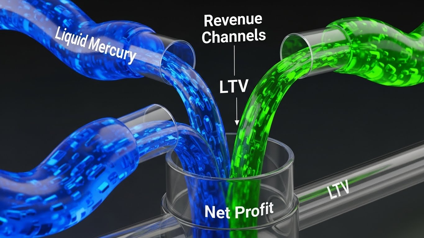
The Visual & Narrative Approach
The CFO doesn't care about APIs; they care about yield. This style speaks the language of money using a fluid metaphor. We see glass conduits carrying "Liquid Mercury" (Efficiency) and "Emerald Green" (Revenue) streams pouring through glass conduits, merging into a central vessel labeled "Net Profit." The physics of the liquid—smooth, abundant, and fast-flowing—metaphorically represents healthy cash flow and optimized revenue channels.
Psychological Impact & KPI Focus
- Niche Psychology: It triggers the Accumulation Instinct. Seeing "liquid value" fill a container is viscerally satisfying. It subconsciously reinforces the idea that your software is a funnel for profit, not a cost center.
- Operational Impact: Visualizes ROI, Cost Savings, Revenue Diversification, and Customer Lifetime Value (LTV) aggregation.
Strategic Implementation & Trade-offs
- Best Use Case: Investor Pitch Decks or the "Business Case" slide of a sales presentation (Animated GIF).
- Trade-off: Highly metaphorical. You must pair it with hard numbers (e.g., "Reduce Leakage by 15%") or it risks looking like a science experiment rather than a financial projection.
Companies using similar video content -
Comarch – Business Intelligence in Banking – Data-driven insights for profitability.
Oracle FLEXCUBE – Oracle FLEXCUBE – Machine-learning driven insights for efficiency.
17. The Frictionless Workflow
MOFU | Functional Buyer Focus
The Visual & Narrative Approach
For the Operations Manager who will actually use the software, clarity is king. This style utilizes a direct, front-on view of a pristine "Light Mode" UI. The palette is "Clean White," "Soft Grey," and "Trust Blue." We focus on a specific workflow—like "Product Launch"—showing a progress bar filling up and a "Success" notification. There is no distortion or fancy camera angles; just the honest, clean interface proving that the job gets done easily.
Psychological Impact & KPI Focus
- Niche Psychology: It addresses Change Management Anxiety. The user thinks, "Will my team be able to learn this?" This visual answers, "Yes, it’s as easy as their iPhone apps."
- Operational Impact: Demonstrates UX/UI Intuition, Reduced Training Time, and Process Automation.
Strategic Implementation & Trade-offs
- Best Use Case: Email nurture campaigns targeting operational leads ("See how easy it is to launch a product").
- Trade-off: It is not "sexy." It won't win design awards, but it wins the trust of the people who do the work. Do not use for high-level brand awareness.
Companies using similar video content -
Activepieces – Workflow Automation – Automates digital workflows, reduces delays.
Autonom8 – Hyperautomation Platform – Streamlines loan processing, KYC.
18. The Face of Transformation
MOFU | ROI Justification
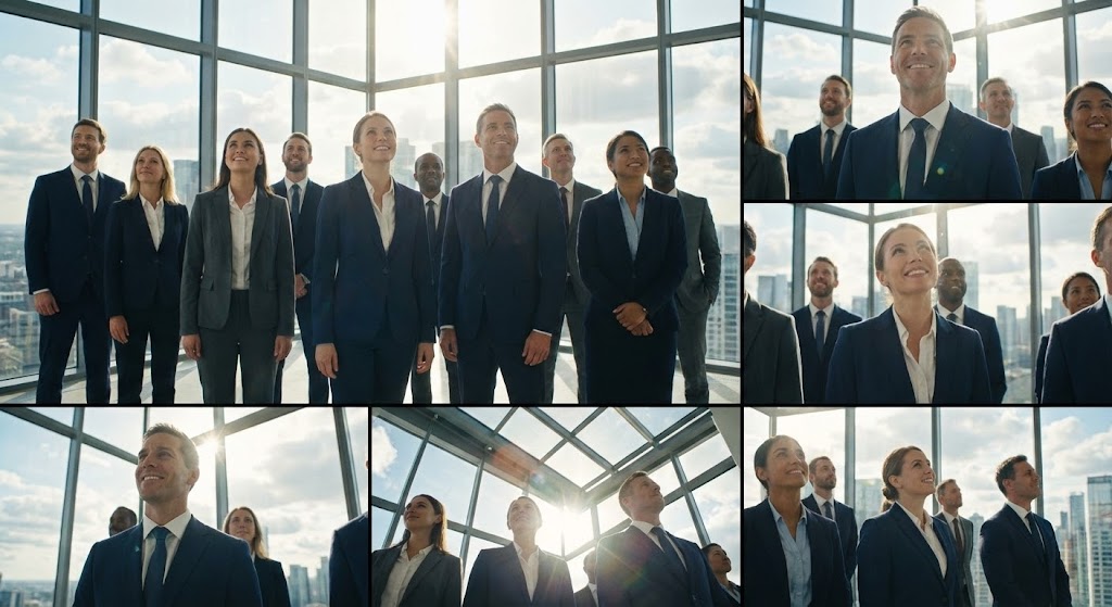
The Visual & Narrative Approach
B2B decisions are emotional. This style humanizes the success of the project. We use a high-quality montage of diverse corporate professionals in a glass-walled skyscraper boardroom. They are dressed in formal "Navy and Grey," bathed in "Natural Sunlight" and lens flares. They look upward/forward with expressions of confidence and relief. It visualizes the result of the implementation: a team that is empowered, strategic, and successful.
Psychological Impact & KPI Focus
- Niche Psychology: It sells Social Validation and Career Success. The stakeholder sees themselves in the video—the hero who successfully modernized the bank.
- Operational Impact: Indirectly communicates Organizational Alignment, Strategic Success, and Leadership.
Strategic Implementation & Trade-offs
- Best Use Case: The closing slide of a Keynote presentation or a "Client Success Story" video (Background visual).
- Trade-off: Can easily drift into "Cheesy Stock Footage" territory. Authenticity is key—avoid over-posed handshakes. Use candid, "in-the-moment" shots.
Companies using similar video content -
Backbase – Engagement Banking Platform – Enhances digital presence, customer experience.
nCino – Cloud Banking Platform – Enhances onboarding and origination processes.
19. The Binary Switch
BOFU | Overcoming Objections

The Visual & Narrative Approach
Migration is the biggest objection. "It's too hard." This style simplifies the complex. Using a minimalist "Royal Blue" and "Pure White" palette, we show a simple geometric transformation: a Red "X" (Legacy/Error) morphs smoothly into a Green "Checkmark" (Modern/Success). It uses zero gradients, just clear color fields. It is a subconscious signal that the transition from "Old" to "New" is a binary, managed decision, not a messy swamp.
Psychological Impact & KPI Focus
- Niche Psychology: It utilizes Reductionism. It reduces the terrifying complexity of a data migration down to a simple "Switch." It comforts the risk-averse brain.
- Operational Impact: Conceptually visualizes Seamless Migration, Error Resolution, and System Upgrades.
Strategic Implementation & Trade-offs
- Best Use Case: Sales Decks dealing with "Implementation Timeline" or "Migration Strategy" (Icon animation).
- Trade-off: It is highly symbolic. You must follow it up with a detailed Gantt chart or technical plan, otherwise, it looks like you are trivializing the difficulty.
Companies using similar video content -
DXC Technology – Hogan – Integrates traditional banking with blockchain.
FintechLab – Banking Engine – Transforms business models, PSD2 compliant.
20. The Ecosystem Glance
BOFU | Sales Cycle Acceleration
The Visual & Narrative Approach
Omnichannel is a requirement, not a feature. This style proves you are everywhere. We split the screen into a 4-grid montage: Mobile App Login, Desktop Dashboard, Smartwatch Notification, and Tablet View. The screens are slightly angled for dynamism. A unifying color palette of "Corporate Orange" and "Teal" ties the disparate devices together. The motion is rapid—eyes dart from screen to screen, registering the consistent experience across all devices.
Psychological Impact & KPI Focus
- Niche Psychology: It creates a sense of Ubiquity and Completeness. The viewer perceives a mature, fully-fleshed-out ecosystem, not a point solution.
- Operational Impact: Visualizes Omnichannel Support, Responsive Design, and Unified Customer Experience.
Strategic Implementation & Trade-offs
- Best Use Case: Instagram Reels or YouTube Shorts (9:16 vertical format). High energy, quick consumption.
- Trade-off: The details of the UI are lost in the speed. This is about breadth of coverage, not depth of features. Don't expect viewers to read the text on the screens.
Companies using similar video content -
Fiserv – Core Banking Solutions – Omnichannel customer experience.
Alkami – Alkami Platform – Seamless, personalized digital banking across channels.
21. The Depth of Detail
BOFU | Driving Demo Requests
The Visual & Narrative Approach
When a prospect reaches the Bottom of Funnel, they need to verify that the interface isn't just a pretty shell. This style uses a sophisticated 3D parallax effect to explode the UI into floating layers. Against a soft "Airy Blue" gradient, "Interface White" dashboards hover in space. As the camera pans, the depth reveals layers of data—graphs, transaction logs, and controls—casting soft shadows on one another. It visually communicates that behind the clean surface lies deep, robust functionality.
Psychological Impact & KPI Focus
- Niche Psychology: It counters the fear of "Vaporware." By giving the UI physical depth and dimension, it subconsciously signals Substance and Maturity. It looks like a tangible product, not just a sketch.
- Operational Impact: Visualizes Multi-Layered Architecture, Drill-Down Capabilities, and Rich Data Reporting.
Strategic Implementation & Trade-offs
- Best Use Case: The "Product" or "Features" page header, specifically near the "Request Demo" CTA (Auto-playing loop).
- Trade-off: It requires careful animation to avoid motion sickness. The parallax effect should be subtle—slow and smooth—rather than jerky or aggressive.
Companies using similar video content -
Avaloq – Core Banking Platform – Highly modular with 70+ modules.
Skaleet – Core Banking Platform – Workflow orchestrator, product engine.
22. The Empathetic Guide
BOFU | Objection Handling

The Visual & Narrative Approach
The biggest objection at the bottom of the funnel is: "What happens if we get stuck?" This style answers with empathy. We use a flat, clean 2D vector style featuring a diverse bank employee looking relieved and happy. A semi-transparent "Chatbot" bubble with a smiling icon floats nearby, actively guiding them through a task. The "Warm Beige" and "Trust Blue" palette creates a welcoming, low-stress atmosphere. It visualizes the support ecosystem, not just the software.
Psychological Impact & KPI Focus
- Niche Psychology: It addresses the Fear of Abandonment. Banking IT teams dread being left alone with a broken system. This visual promises a Partnership, reassuring them that help is always hovering nearby.
- Operational Impact: Demonstrates 24/7 Support, AI-Assisted Troubleshooting, and Ease of Maintenance.
Strategic Implementation & Trade-offs
- Best Use Case: "Objection Handling" email sequences sent to hesitant leads (GIF format).
- Trade-off: It can look "Retail" if not styled correctly. Ensure the character is dressed professionally (business casual) to maintain B2B relevance.
Companies using similar video content -
Advapay – SaaS Banking Engine – Manages clients, AML/KYC, payments.
Signicat – Digital Identity Platform – Secure and compliant digital transactions.
23. The Verified Setup
Onboarding | Self-Serve Onboarding

The Visual & Narrative Approach
Onboarding needs to feel grounded in reality. This style blends high-quality photography with digital overlays. We see a real person’s hands holding a phone in a sunlit coffee shop—a relatable, real-world setting. Floating above the screen are animated 2D "Bright Green" checkmarks and bubbles indicating a successful setup. The background is blurred (bokeh), keeping the focus on the successful interaction. It proves the software works in the wild, not just in a test lab.
Psychological Impact & KPI Focus
- Niche Psychology: It leverages Social Proof. Seeing a real human environment makes the technology feel accessible and "live." It lowers the barrier to entry for non-technical users.
- Operational Impact: Visualizes Remote Onboarding, Mobile Accessibility, and User Verification (KYC) success.
Strategic Implementation & Trade-offs
- Best Use Case: Welcome emails or the first video in an onboarding playlist (15-30 seconds).
- Trade-off: The live-action footage must be high quality. Grainy or poorly lit stock footage will make the software look cheap.
Companies using similar video content -
Onfido – Identity Verification – AI-powered remote user verification.
TrustDecision – KYC++ Solution – AI-driven identity verification.
24. The Dopamine Click
Onboarding | Accelerating Time-to-Value

The Visual & Narrative Approach
How do you get a new user to take their first action? Make it look satisfying. This style uses an extreme macro close-up of a single UI button (e.g., "Launch Product" or "Approve Loan"). The button is "Electric Violet" with a tactile texture. As a mouse cursor hovers, the button glows with a halo effect. The click is punchy and responsive. It focuses entirely on the micro-interaction, promising that the system is responsive and delightful to use.
Psychological Impact & KPI Focus
- Niche Psychology: It triggers Anticipation. By fetishizing the UI interaction, you make the user want to click. It turns a boring banking task into a tactile, rewarding experience.
- Operational Impact: Directly supports User Adoption Rates, Reduced Training Friction, and System Responsiveness.
Strategic Implementation & Trade-offs
- Best Use Case: "Nudge" emails for inactive users ("You're one click away...") or feature highlight reels.
- Trade-off: Extremely abstract. It doesn't explain what the button does, only that it feels good to do it. Use in conjunction with broader context.
Companies using similar video content -
Mitek Systems – Mobile Capture – Tactile mobile identity verification.
Narmi – Digital Banking Platform – Enhances user experience.
25. The Elegant Flow
Onboarding | Driving Trials
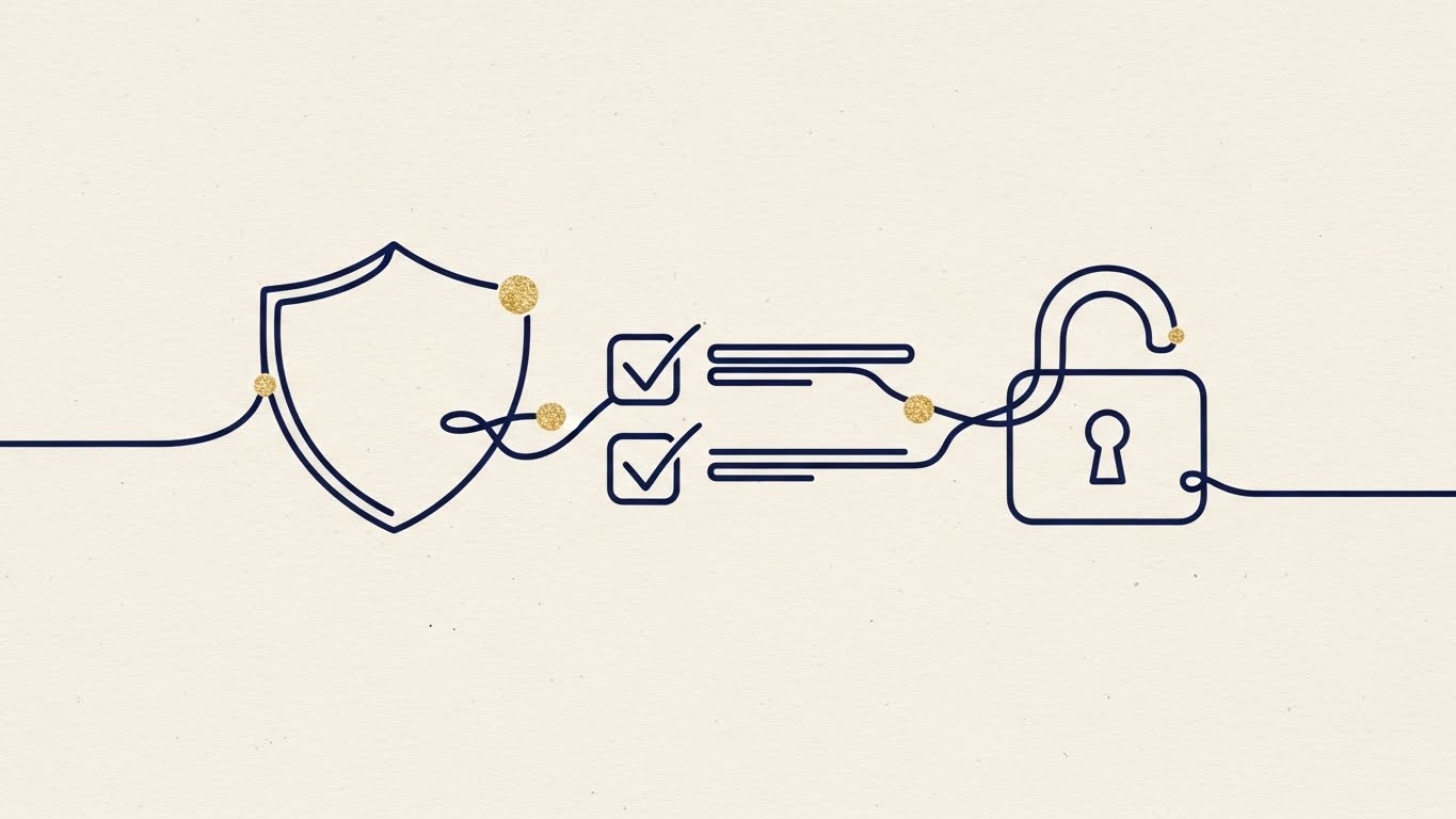
The Visual & Narrative Approach
To sell a free trial or a sandbox test, you must promise simplicity. This style uses a single, continuous "Navy Blue" line drawing on a "Cream Paper" texture. The line effortlessly morphs from a shield (Security) to a checklist (Compliance) to an open lock (Access). Gold leaf dots highlight the transition points. It is elegant, sophisticated, and implies that the process is an unbroken, smooth journey.
Psychological Impact & KPI Focus
- Niche Psychology: It appeals to the Sophistication of the buyer. It suggests that your solution is not "clunky enterprise software," but a refined, boutique experience. It reduces the Cognitive Load of starting a trial.
- Operational Impact: Visualizes Workflow Automation, Seamless Integration, and Process Continuity.
Strategic Implementation & Trade-offs
- Best Use Case: LinkedIn carousel ads or "Start Trial" landing pages (Looping animation).
- Trade-off: The minimalist style can feel "light." Ensure the voiceover or copy emphasizes the robust technology backing this elegance.
Companies using similar video content -
Fenergo – Client Lifecycle Management – Streamlines complex onboarding processes.
HES Core – Core Banking Solution – Streamlined lending and loan management.
26. The Empowered User
Retention | Reducing Churn

The Visual & Narrative Approach
Retention is about reminding the customer of the value they receive. This style places the software in the context of a happy life. We see a bank manager at a cafe, relaxed and smiling while working. A subtle, clean holographic card showing an "Upward Trend" (+12.5%) floats near his laptop. The lighting is "Warm Sunlight." The message is clear: Our software gives you peace of mind and positive results.
Psychological Impact & KPI Focus
- Niche Psychology: It targets Job Satisfaction. It reminds the user that the software makes their life easier, not harder. A happy user is a retained user.
- Operational Impact: Visualizes Remote Work Capabilities, Positive ROI, and User Efficiency.
Strategic Implementation & Trade-offs
- Best Use Case: "Year in Review" emails or Quarterly Business Review (QBR) presentations.
- Trade-off: Avoid "Cheesy Stock" vibes. The UI overlay must track perfectly with the camera movement to feel integrated and premium.
Companies using similar video content -
Comarch – Loyalty Management for Banking – Enhances customer satisfaction.
nCino – Cloud Banking Platform – Improves onboarding and origination.
27. The Future of Help
Retention | Knowledge Base

The Visual & Narrative Approach
Nobody reads PDF manuals anymore. This style envisions the help center as a futuristic lab. A glass mannequin head (representing the user) views a floating, semi-transparent "Hologram Blue" menu. The menu options (Chat, Guide, API Key) glow softly. The background is "Laboratory White." It elevates the concept of "Support" from a drudgery to a high-tech, self-serve experience.
Psychological Impact & KPI Focus
- Niche Psychology: It frames learning as Discovery, not homework. It appeals to the tech-forward user who prefers to solve problems themselves rather than wait on a phone line.
- Operational Impact: Promotes Self-Serve Adoption, Reduced Ticket Volume, and Knowledge Base Utilization.
Strategic Implementation & Trade-offs
- Best Use Case: Header videos for your Support Portal or Developer Hub.
- Trade-off: It is very stylized. Ensure the actual support portal is easy to navigate, or the contrast between the video and reality will be jarring.
Companies using similar video content -
IBM – AI-powered Chatbots – Streamlines customer service with AI.
Banking Labs – Cloud Banking Platform – AI-driven customer experience.
28. The Pulse of the Market
Expansion | Driving Deep Feature Adoption

The Visual & Narrative Approach
To upsell high-volume modules, you need to show scale. This style uses a hyper-lapse of a busy city intersection—cars and people blurring in motion. Overlaying this organic chaos are streams of "Gold" numbers and data points, moving in perfect sync with the traffic. It visualizes the invisible economy: the millions of transactions your software processes every second amidst the hustle of the real world.
Psychological Impact & KPI Focus
- Niche Psychology: It triggers a sense of Omnipotence. The viewer feels like they can see the "Matrix" of the banking world. It reinforces the Scale and Power of your core engine.
- Operational Impact: Visualizes High Transaction Throughput, Real-Time Analytics, and Market Penetration.
Strategic Implementation & Trade-offs
- Best Use Case: LinkedIn posts announcing new scaling features or "End of Year" transaction milestones.
- Trade-off: Can be visually busy. Keep the data overlays clean and legible, ensuring they don't obscure the city scene completely.
Companies using similar video content -
ThetaRay – AML Solution – Real-time monitoring of cross-border transactions.
Ripple – RippleNet – Facilitates faster cross-border payments.
29. The Enterprise Vision
Expansion | Driving Upsell

The Visual & Narrative Approach
For the biggest deals, you need cinematic authority. This style uses a steady-cam shot moving through a pristine, futuristic server room. The racks are "White and Chrome" with soft "Pulse Blue" LEDs—avoiding the dark, scary server room cliché. A CIO walks confidently down the aisle. The lighting is bright (Kubrick-style). It sells the feeling of having a state-of-the-art, clean, and perfectly managed infrastructure.
Psychological Impact & KPI Focus
- Niche Psychology: It appeals to Executive Ego and Legacy. This is what the CIO wants their department to look like: clean, modern, and under control. It sells Peace of Mind.
- Operational Impact: Visualizes Infrastructure Modernization, Cloud Governance, and Security Standards.
Strategic Implementation & Trade-offs
- Best Use Case: Brand anthems or "Vision 2030" videos shown at executive summits.
- Trade-off: High production cost (requires a set or high-end 3D environment). It must look expensive to work.
Companies using similar video content -
Temenos – Temenos Transact – Comprehensive core banking for large institutions.
DXC Technology – Hogan – Core banking for large-scale deposits.
30. The Trusted Peer
Expansion | Driving Referrals
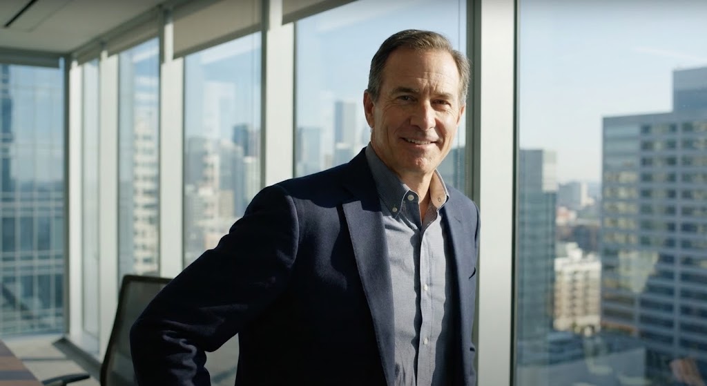
The Visual & Narrative Approach
The most powerful sales tool is a peer recommendation. This style uses a highly realistic, AI-generated character of a CIO in a modern glass office. They look directly into the lens with a "knowing smile." The lighting is natural and flattering. It simulates a testimonial or a "thought leader" snippet. It creates an intimate, human connection, suggesting, "I made this choice, and it was the right one."
Psychological Impact & KPI Focus
- Niche Psychology: It creates Social Validation. People buy from people. Seeing a confident peer (even a stylized one) validates the decision to choose your software.
- Operational Impact: Supports Brand Trust, NPS Scores, and Community Building.
Strategic Implementation & Trade-offs
- Best Use Case: Social media shorts or "Customer Story" teasers.
- Trade-off: The "Uncanny Valley." The AI generation must be top-tier. If the eyes or mouth look unnatural, it destroys trust immediately.
The Visual Operations Doctrine: A Strategic Framework
Having defined the visual language of Core Banking Software across 30 styles, we must now operationalize it. A pretty video is a marketing asset; a Visual Strategy is a business driver.
At Advids, we have synthesized these styles into a 3-part doctrine designed to bridge the gap between "Content" and "ROI." This framework allows technology leaders to transform how they communicate value, train teams, and measure success.
Strategic Alignment & Visual Architecture
The "Pre-Production" Strategy – Why and Who.
- The Cognitive Load Audit: Before commissioning a video, audit the complexity of the topic (e.g., ISO 20022 migration). If the complexity is High, use Style 2 (Isometric City) or Style 7 (Friendly Factory) to simplify. If the complexity is Low but the emotional stakes are High, use Style 29 (Cinematic).
- Role-Based Visual Mapping: Differentiate your visual language. For the CTO, use Dark Mode/Code styles (Style 12) to signal technical competence. For the Board, use Fluid/Liquid styles (Style 1) to signal market agility. One style does not fit all.
- The "Glanceability" Standard: In banking operations, speed is safety. Design your internal training visuals so that a user can understand the "Error State" vs. "Success State" in under 2 seconds. Use the high-contrast logic of Style 19 (Binary Switch).
- Brand Voice Consistency: Your "Visual Voice" must be as consistent as your legal terms. Ensure that the "Blue" used in your Style 8 (Microservices) animation is the exact hex code used in your Style 22 (Support) illustration. Disconnected visuals suggest disconnected code.
- The Advids Strategic Audit: We don't just animate; we architect. Engage Advids early to map your entire product suite to these visual archetypes, ensuring that every module (Lending, Payments, Treasury) has a distinct yet cohesive visual identity.
- Standardization vs. Customization: Use "Stock-based" styles (Style 28) for generic market trends to save budget. Save your custom 3D budget (Style 4) for your proprietary IP and core differentiators.
- The Cross-Departmental Bridge: Use these visuals to translate. A Style 15 (Hybrid Architect) diagram can help Sales explain "latency" to a client without needing a Systems Engineer in the room.
- Legacy System Integration: Visually acknowledge the old to sell the new. Use Style 3 (Kinetic Clash) to validate the customer's struggle with legacy systems before introducing the solution. Ignoring the legacy reality alienates the buyer.
- Accessibility by Design: Banking is global. Ensure text overlays in styles like Style 9 (Tunnel of Speed) are large enough to be legible on mobile and separated from the background for screen readers.
- The Mobile-First Mandate: C-Suite executives review pitch decks on iPhones. Ensure all "Detail-heavy" styles (Style 21) have a "Simplified" variant optimized for small vertical screens.
Operational Adoption & Implementation
Goal: Using visualization to grease the gears of deployment and training.
- Overcoming "Black Box" Anxiety: The biggest fear in banking adoption is the "Unknown." Use Style 10 (Transparent Core) and Style 11 (Cyber-Shield) in your training materials to show users exactly how the security layer works, transforming fear into confidence.
- The Micro-Learning Shift: Stop sending 50-page PDF manuals. Break them down into ten 30-second clips using Style 17 (Frictionless Workflow). Engagement rates for video SOPs are historically higher than text.
- Just-in-Time Support: Embed Style 24 (Micro-Interactions) GIFs directly into your software's "Tooltip" or "Help" hover states. Show the user what happens before they click.
- Gamification of Training: Use Style 25 (Line Art) to create "Progress Trackers" for employee training modules. Visualizing the completion of compliance training increases completion velocity.
- Reducing Support Ticket Volume: There is a direct correlation between the clarity of your "Error Handling" videos and support calls. A clear Style 22 (Empathetic Guide) video explaining "Common Login Errors" can deflect 20% of Tier 1 tickets.
- Remote Onboarding: In a distributed workforce, you cannot hold seminar room training. Use Style 23 (Real-World Bridge) to show remote employees how the software fits into their home-office workflow.
- SOP Transformation: Convert your "End of Day Reconciliation" SOP into a Style 7 (Friendly Factory) animation. It turns a tedious chore into a clear, visualized process flow.
- Feedback Loops: Use interactive video elements. At the end of a Style 18 (Face of Transformation) case study, include a clickable "Poll" to gauge viewer sentiment immediately.
- Scalable Localization: When expanding to new regions, using abstract 3D styles (Style 1, 4, 8) saves money because they require no "actor reshoots"—only text translation.
- Leadership Communication: When the CIO presents the "2025 Roadmap," do not use bullet points. Use a Style 29 (Cinematic) background loop to visually reinforce the message of "Modernization" and "Scale."
Measuring Impact & Future-Proofing
Goal: Moving beyond "Vanity Metrics" to measure the real business impact of visualization.
- Beyond "Views": Do not measure video success by "Views." Measure it by "Feature Adoption Rate." Did the users who watched the Style 20 (Ecosystem Glance) video activate the Mobile Module?
- The "Idle Time" Metric: In Operations, time is money. Correlate the use of Style 17 (Workflow) tutorials with a reduction in "Average Handling Time" (AHT) for banking tasks.
- Compliance Velocity: Measure how fast your organization reaches 100% compliance after a new regulation is released. Video-based training using Style 5 (Human ROI) often outperforms text-based circulars.
- Retention and Churn: Use Style 26 (Lifestyle Overlay) in your Quarterly Business Reviews (QBRs). Reminding clients of the "Human Benefit" they are receiving reinforces emotional loyalty and reduces churn.
- The AI Visual Frontier: Prepare for the future. The Style 30 (Gen AI Character) is just the beginning. Soon, you will need real-time, personalized video headers for every client login.
- Scalability of Assets: Build a "Visual Component Library." If you build a 3D server asset for Style 29, ensure it can be reused in Style 10. Advids specializes in creating these reusable asset ecosystems.
- The Advids Partnership: You need a partner who understands the code as well as the camera. Advids acts as your long-term visual R&D lab, ensuring your visual assets evolve as fast as your software stack.
- Benchmarking Success: Compare your visual collateral against the "Neobanks." If your materials look like 1990, you are vulnerable. Constant visual auditing is a competitive necessity.
- The ROI of Safety: In banking, "Safety" means data security. Quantify the reduction in "Phishing Clicks" after deploying a Style 11 (Cyber-Shield) security awareness campaign.
- Final Call to Innovation: Treat video as Infrastructure, not marketing. Just as you refactor your code to avoid technical debt, you must refactor your visuals to avoid "Communication Debt." The future of banking is not just about moving money; it's about moving minds.
End of Part 3
This concludes the Comprehensive Video Style Guide for Core Banking Software.
Companies using similar video content -
Comarch – Open Platform – Thought leadership in digital banking.
Ababil – Banking Software – Modern banking solutions.
Author & Editor Bio


