
Introduction: Bridging the Gap Between Compliance Complexity and Visual Clarity
The corporate tax landscape stands on the precipice of a "touchless" future—an aspiration where data flows seamlessly from ERPs to regulatory bodies without manual intervention. However, for the CFOs and Tax Directors navigating today’s reality, the experience is often far less streamlined. They face a growing physical-digital divide: the stark contrast between the rigid, fragmented reality of legacy spreadsheets and the fluid, real-time demands of global digital reporting.
For software vendors, the challenge is not just to build the engine that powers compliance but to visualize the peace of mind it delivers. Effective video strategies in this domain must do more than showcase features; they must bridge this divide, translating the anxiety of the 80% of tax leaders who report that disparate data sources complicate tax reporting into a visual language of order, accuracy, and control.
The opportunity for category leadership is immense because the gap between readiness and reality is wider than most admit. With 87% of CFOs and tax leaders believing that integrating GenAI will drive increased efficiency and effectiveness, the market is primed for innovation. However, optimism is not enough. To convert interest into adoption, you must signal to the market that your platform is the bridge that turns fragmented intent into standardized, audit-proof reality.
This guide outlines 30 distinct visual strategies designed to dismantle skepticism and build trust. We move beyond generic "tech" aesthetics to explore specific, psychology-driven visualization frameworks. Whether you are aiming to demystify complex data flows or validate a new category of AI-driven compliance, these examples provide the blueprint for articulating value in a market that demands absolute precision.
1. The Ordered Logistics Map
TOFU | Brand Awareness
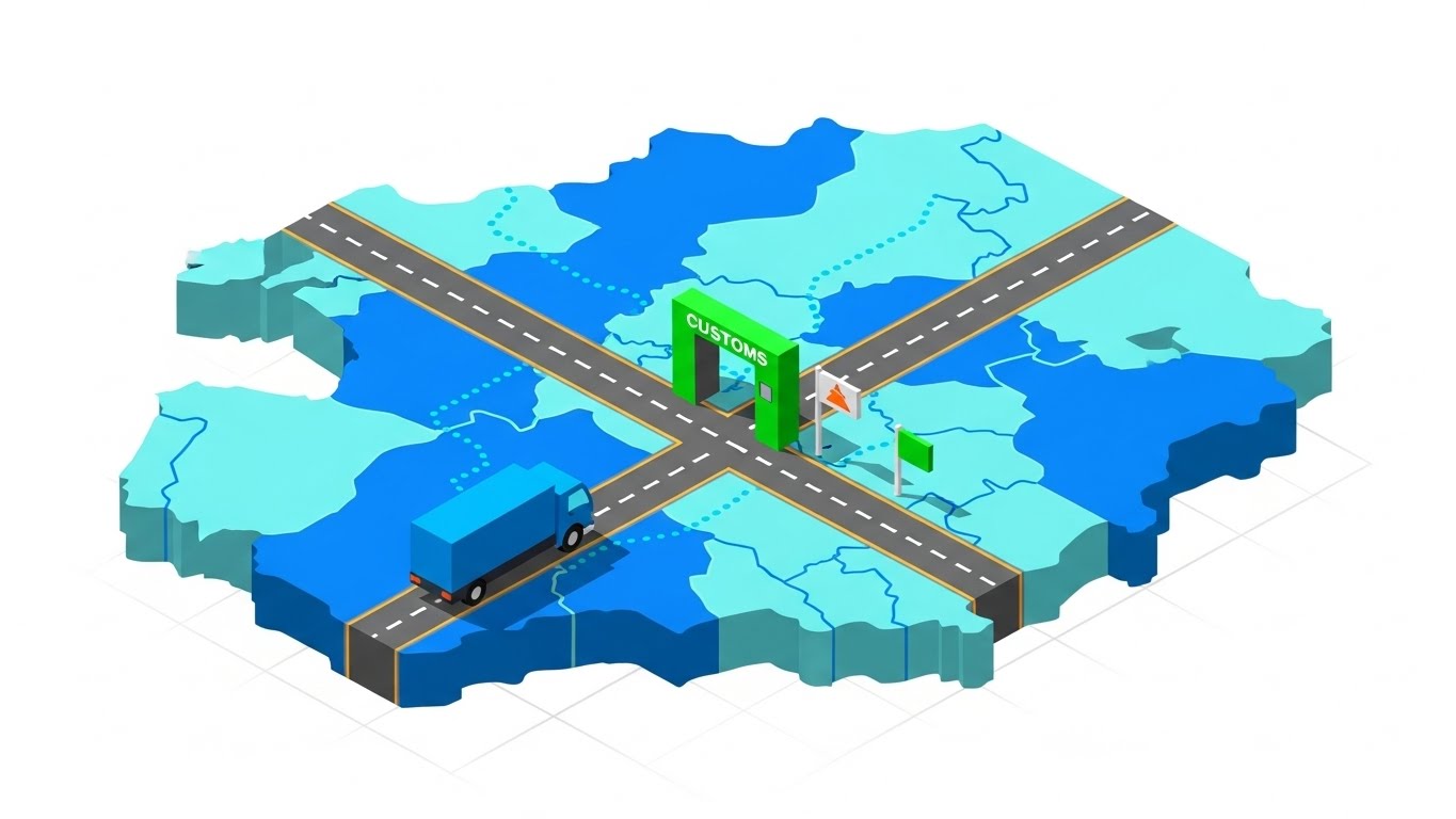
The Visual & Narrative Approach
This style utilizes a "God’s-eye view" to impose order on the complex logistical web of global tax. The visualization features a stylized, isometric map where the supply chain is represented as a clean, geometric infrastructure. A delivery truck moves along a defined path towards a vibrant green "Customs" gate, symbolizing the flow of goods across borders. The aesthetic is flat yet dimensional, using a palette of cyan and electric blue to represent the "digital twin" of the physical supply chain, conveying that every physical movement has a corresponding digital tax event.
Psychological Impact & KPI Focus
Niche Psychology: For Tax Directors managing global trade, the anxiety often stems from the invisibility of cross-border liabilities (Nexus). This visual style reduces that cognitive load by presenting the supply chain as a controllable, monitorable board game.
Operational Impact: It directly addresses the KPI of Risk Mitigation, visually demonstrating how the software intercepts transactions to calculate VAT/GST or customs duties in real-time, preventing costly border delays or non-compliance penalties.
Strategic Implementation & Trade-offs
- Funnel Stage: TOFU (Brand Awareness).
- Best Use Case: LinkedIn Organic posts targeting manufacturing or logistics-heavy industries.
- Trade-off: This style excels at showing structure but fails at showing experience. Do not use this to demonstrate ease-of-use or specific dashboard features.
- Duration: 30-60 Seconds.
Companies using similar video content -
Thomson Reuters – ONESOURCE Global Trade – Streamlining customs, supply chain tax, cross-border compliance.
Sovos – Global Tax Determination – Managing cross-border tax liabilities, ensuring compliance.
2. The Fluid Consolidation Engine
TOFU | Market Education

The Visual & Narrative Approach
This style abandons rigid grids for fluid, organic motion, using soft shapes to represent the often nebulous nature of multi-entity management. In the center of the frame, glossy "blobs" of coral and teal—representing disparate data sources or subsidiary entities—morph and merge effortlessly into a unified whole. The motion is smooth and liquid, set against a matte cream background. This abstraction visually metaphorizes the consolidation process, turning the "messy" reality of transfer pricing and intercompany adjustments into a harmonious, synchronized event.
Psychological Impact & KPI Focus
Niche Psychology: Tax consolidation is notoriously rigid and prone to friction. The psychology here is "Ease of Adaptation." By using soft, adaptable shapes, the video subtly communicates that the software is flexible enough to handle organizational changes like M&A without breaking.
Operational Impact: The focus is on Operational Agility, reassuring the viewer that the platform can absorb complexity and yield a unified "source of truth" without manual forcing.
Strategic Implementation & Trade-offs
- Funnel Stage: TOFU (Market Education).
- Best Use Case: Website Hero sections or "Philosophy" videos.
- Trade-off: The high level of abstraction means this style struggles to explain specific features. It is purely a brand-shaping tool.
- Duration: 15-30 Seconds (Looping).
Companies using similar video content -
OneStream Software – Intelligent Finance Platform – Unifying financial close, consolidation, tax reporting.
Wolters Kluwer – CCH Tagetik Financial Close – Seamless multi-entity reporting, harmonizing tax data.
LucaNet – Financial Consolidation – Harmonizing financial data for tax.
3. The Sovereign Data Fortress
TOFU | Shaping Brand Perception

The Visual & Narrative Approach
Targeting the IT and Tax Technology stakeholders, this style leans heavily into the "Dark Mode" aesthetic favored by power users. It depicts a towering 3D data center where server racks rise like skyscrapers, illuminated by pulsing neon cyan lines. Floating dollar ($) and euro (€) symbols travel rapidly along these data highways, symbolizing the high-speed processing of financial transactions. The low camera angle evokes a sense of scale and power, positioning the software not just as an app, but as enterprise-grade critical infrastructure.
Psychological Impact & KPI Focus
Niche Psychology: The viewer here is often skeptical about performance and security. This visual style speaks the language of Data Integrity and Speed.
Operational Impact: The "dark mode" aesthetic signals a "Pro" tool, while the robust server imagery addresses anxieties about system crashes during peak filing seasons. It visually promises that the backend is powerful enough to handle millions of transaction lines for Real-Time Reporting.
Strategic Implementation & Trade-offs
- Funnel Stage: TOFU (Shaping Brand Perception).
- Best Use Case: "Security & Infrastructure" overview videos on YouTube.
- Trade-off: This style can appear "cold" or overly technical to non-technical buyers.
- Duration: 45-90 Seconds.
Companies using similar video content -
SAP – Tax Compliance – Enterprise-grade tax infrastructure, secure data processing.
Aptitude Software – Tax Calculation Engine – Robust, real-time tax processing, ensuring integrity.
4. The Complexity Untangler
TOFU | Category Creation

The Visual & Narrative Approach
This visualization provides a perfect metaphor for the "Black Box" of AI. It features a complex, tangled knot of metallic silver and blue strings floating in a magenta-tinted void. As the animation progresses, an invisible force (the AI) gently pulls the strands, untangling the knot into precise, parallel lines that extend infinitely. This elegant transition represents the software's ability to ingest messy, unstructured tax code or ledger data and straighten it into linear, compliant workflows.
Psychological Impact & KPI Focus
Niche Psychology: Tax codes are often described as "tangled webs." This visual directly validates that feeling and offers a resolution. It triggers a sense of Cognitive Relief.
Operational Impact: It supports the KPI of Efficiency Gains, implying that the "untangling" that usually takes humans weeks can be done instantly by the AI, reducing the cognitive load of compliance.
Strategic Implementation & Trade-offs
- Funnel Stage: TOFU (Category Creation).
- Best Use Case: Social Ads (Instagram/LinkedIn) focused on "Tax AI".
- Trade-off: As a high-level metaphor, it risks being seen as "vaporware" if not immediately followed by a shot of the actual product interface.
- Duration: 10-15 Seconds.
Companies using similar video content -
Blue J Legal – Tax Research Platform – AI-driven interpretation of complex tax law.
Dataiku – AI/ML Platform – Automating complex tax data workflows, untangling insights.
5. The Professional Exhale (Cinematic)
TOFU | Vertical Social Organic

The Visual & Narrative Approach
Moving away from abstract shapes, this style centers on the human experience. We see a high-production-value shot of a tax professional standing in a sunlit, modern office. The lighting is warm and amber, suggesting the "golden hour" of a successfully completed day. Behind her, a chaotic whirlwind of paper documents is being sucked into a vacuum or vanishing into digital dust. Her expression is one of calm confidence, not stress.
Psychological Impact & KPI Focus
Niche Psychology: This appeals to the Talent Retention crisis in the tax industry. By showing the professional unburdened by paper (the "Shoebox" problem), it positions the software as a tool for employee satisfaction.
Operational Impact: It shifts the focus from "doing tax" to "being a tax leader," validating the persona's aspiration to move beyond data entry to strategic oversight.
Strategic Implementation & Trade-offs
- Funnel Stage: TOFU (Skippable Pre-Roll Ad).
- Best Use Case: Brand ads intended to evoke emotion and define the brand's "human" side.
- Trade-off: This is a pure "Brand Feeling" play. It requires a strong voiceover to connect the visual of "vanishing papers" to specific digital features.
- Duration: 15-30 Seconds.
Companies using similar video content -
Workiva – Financial Reporting & Compliance – Reducing manual drudgery, empowering finance teams.
FloQast – Close Management Software – Streamlining financial close, ensuring peace of mind.
6. The Blueprint of Truth
TOFU | Skippable Pre-Roll Ad
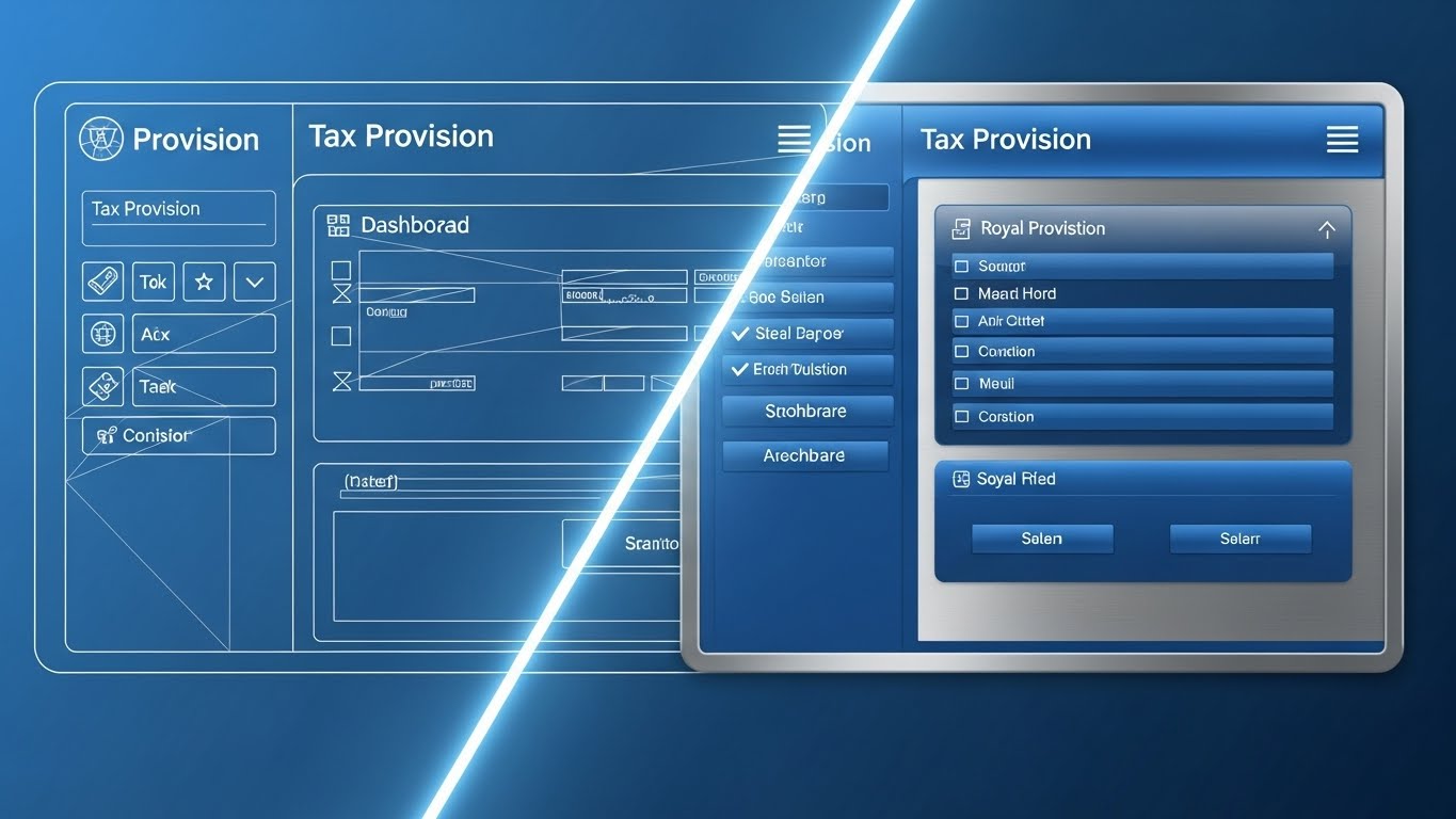
The Visual & Narrative Approach
This split-screen technique is a powerful way to validate the "Tax Tech" aspect of the platform. The left side reveals the skeletal "blueprint" of a Tax Provision dashboard—white lines on a blueprint blue background—highlighting the underlying logic and structure. A glowing diagonal beam sweeps across the screen, revealing the "Real" high-fidelity UI on the right: glossy royal blue buttons, sharp metallic panels, and clear text.
Psychological Impact & KPI Focus
Niche Psychology: Skepticism often surrounds the reliability of new dashboards. "Is this just a pretty skin on a bad database?" This style answers that by showing the bones of the software.
Operational Impact: It communicates Engineering Quality and Reliability. It reassures the technical buyer that the interface is built upon a deliberate, well-architected framework, differentiating it from "slideware" solutions.
Strategic Implementation & Trade-offs
- Funnel Stage: TOFU (Product Differentiation).
- Best Use Case: Website Product Pages or "How It Works" sections.
- Trade-off: It appeals more to the logical/rational side of the brain. Excellent for validation (MOFU) but less effective for generating initial excitement.
- Duration: 30-45 Seconds.
Companies using similar video content -
Corptax – Corporate Tax Software – Engineered precision for tax provision, robust framework.
Wolters Kluwer – CCH Integrator – Structured framework for tax reporting, ensuring reliability.
7. The Disruption Wall
TOFU | Product Differentiation

The Visual & Narrative Approach
Subtlety is abandoned here for raw impact. Massive, blocky abstract shapes in vivid lime green and black—resembling heavy text blocks—form a solid, impenetrable wall. This wall represents the "Old Way" of doing things (legacy systems, manual audits). Suddenly, the wall fractures and shatters, reassembling into a sleek, organized grid. The motion is aggressive and energetic, utilizing a stark grey background to make the green "pop."
Psychological Impact & KPI Focus
Niche Psychology: This is a "Challenger Brand" move. It targets the buyer's frustration with inertia. The shattering visual serves as a cathartic release for the pent-up annoyance with slow, outdated processes.
Operational Impact: The KPI here is Competitive Displacement. It visually commands that the new solution is powerful enough to break through established barriers and replace the incumbent vendors.
Strategic Implementation & Trade-offs
- Funnel Stage: TOFU (Competitive Displacement).
- Best Use Case: Social Media Ads (Square 1:1) designed to stop the scroll.
- Trade-off: It is aggressive. If the brand voice is typically conservative, this style might feel too jarring.
- Duration: 6-12 Seconds.
Companies using similar video content -
Fonoa – Indirect Tax Automation – Breaking barriers of traditional tax engines, modernizing compliance.
Taxdoo – VAT Automation – Disrupting e-commerce VAT compliance, simplifying processes.
8. The Velocity Montage
TOFU | Competitive Displacement
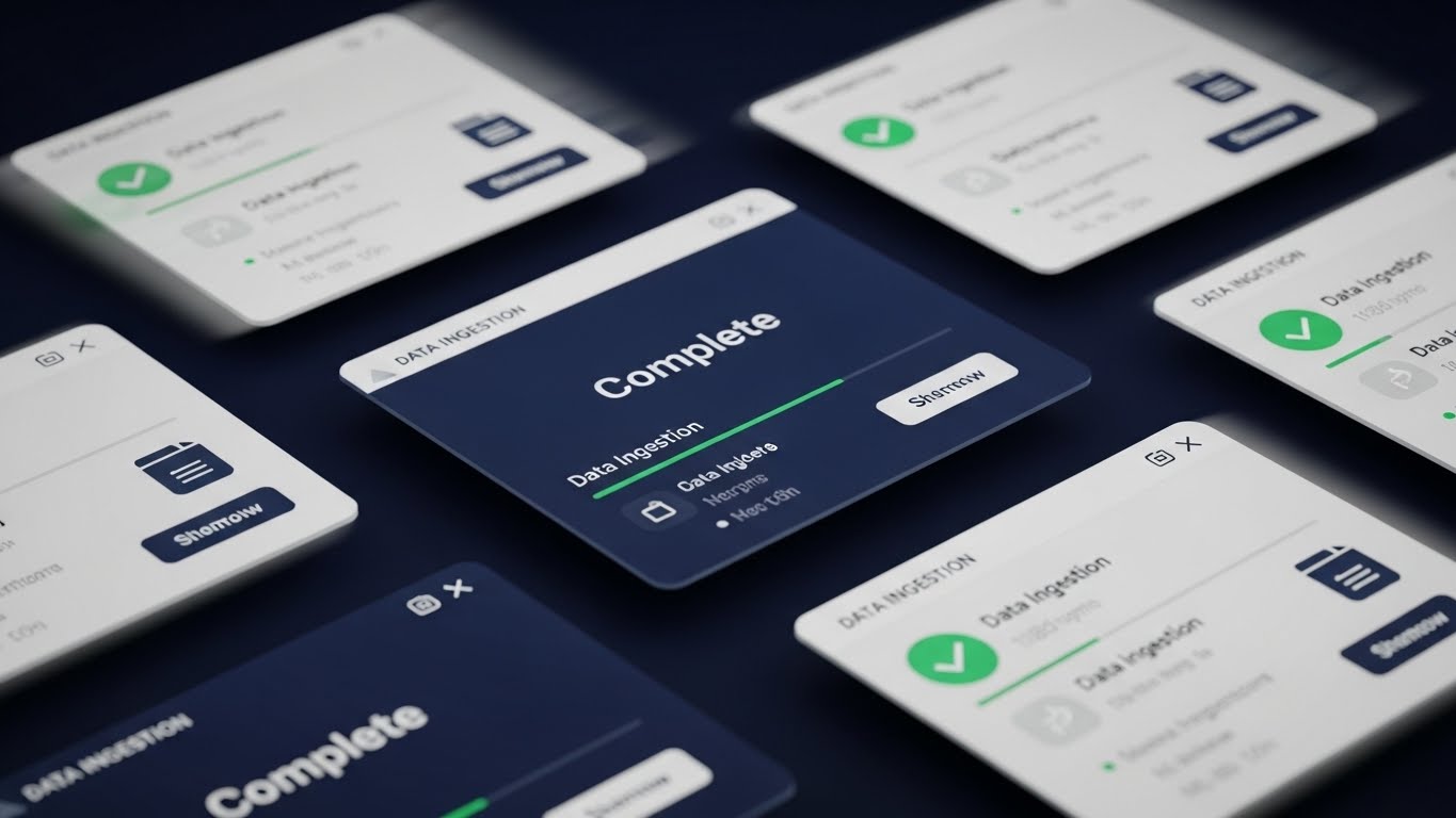
The Visual & Narrative Approach
When the objective is to prove feature depth without boring the viewer, the UI Montage is king. Multiple semi-transparent screens float in a digital void, specifically displaying "Data Ingestion" progress bars. We see files moving, green checkmarks appearing rapidly, and "Complete" statuses flashing. The central screen remains sharp and focused while peripheral screens have motion blur, simulating the high speed of batch processing.
Psychological Impact & KPI Focus
Niche Psychology: The "Data Ingestion" phase is often the biggest pain point in tax software implementation. This visual alleviates that fear by showing it as fast, automated, and error-free.
Operational Impact: The focus is on Throughput Efficiency, proving the system can handle the massive volume of data required for modern compliance without choking.
Strategic Implementation & Trade-offs
- Funnel Stage: MOFU (Feature Education).
- Best Use Case: YouTube Feature Explainers or Demo Intro videos.
- Trade-off: It can be overwhelming if too much text is shown. The text on the screens must be minimal and large to be legible.
- Duration: 30-60 Seconds.
Companies using similar video content -
SurePrep – Tax Automation – Rapid data ingestion for tax preparation, accelerating workflows.
Kofax – Intelligent Automation – High-speed document processing for tax, boosting efficiency.
ABBYY – Intelligent Document Processing – Automating data extraction for tax.
9. The Weightless Ledger
MOFU | Feature Education

The Visual & Narrative Approach
This style elevates the output of the software—the data—into art. Floating 3D bar charts in emerald green and gold pie charts hover in a clean, anti-gravity studio space. Thin, glowing lines connect the data points, illustrating the relationships between different tax positions. The use of gold hints at the "value" unlocked by tax savings, while the green reinforces growth.
Psychological Impact & KPI Focus
Niche Psychology: This speaks directly to the CFO and the Tax Director's desire to be seen as strategic advisors. It transforms "Tax Liability" from a scary number into a managed asset.
Operational Impact: The visualization suggests that the data is weightless and effortless to manipulate. It supports the KPI of Strategic Forecasting, showing that the software provides the clarity needed to make high-stakes financial decisions.
Strategic Implementation & Trade-offs
- Funnel Stage: MOFU (Feature Education).
- Best Use Case: Blog headers, Whitepapers, or Executive Summary videos.
- Trade-off: It is aspirational. It represents the result of the data, not the interface itself.
- Duration: 10-20 Seconds.
Companies using similar video content -
Anaplan – Tax Planning & Forecasting – Strategic insights from tax data, enabling foresight.
Tableau – Data Visualization for Tax – Elevating tax data into actionable intelligence.
11. The Global Nexus Map
MOFU | ABM Awareness

The Visual & Narrative Approach
This style creates a simplified, approachable model of the world to tackle the daunting complexity of multi-jurisdictional compliance. A top-down view reveals a pastel blue, low-poly world map. Bright, stylized orange pins drop rhythmically onto specific countries, representing established "Nexus" locations. As each pin lands, a soft ripple of light expands, connecting to a central hub. The aesthetic is clean and game-like, stripping away the geopolitical noise to focus purely on regulatory reach.
Psychological Impact & KPI Focus
Niche Psychology: Global tax liability (Nexus) is a constant moving target that generates significant stress. By rendering the world as a simplified, manageable board, this visual reduces Cognitive Load, making global reach feel organized rather than overwhelming.
Operational Impact: It directly addresses the KPI of Compliance Coverage, visually demonstrating how the software intercepts transactions to identify nexus triggers in real-time, preventing surprise assessments.
Strategic Implementation & Trade-offs
- Funnel Stage: MOFU (Account-Based Marketing Awareness).
- Best Use Case: Display Ads targeting multinationals or expansion-focused enterprises.
- Trade-off: The simplified geometry sacrifices geographical precision for clarity. It represents reach, not detail.
- Duration: 15-20 Seconds.
Companies using similar video content -
Avalara – Global Tax Determination – Managing multi-jurisdictional sales tax, tracking obligations.
Taxually – VAT Compliance – Tracking global VAT obligations, simplifying international tax.
TMF Group – Global Entity Management – Overseeing international tax presence.
12. The Shield of Continuity
MOFU | Overcoming Objections
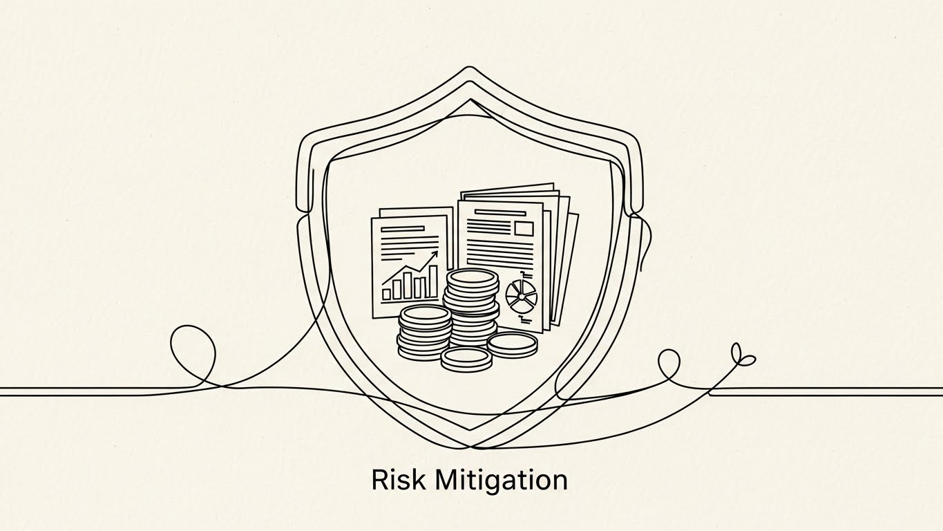
The Visual & Narrative Approach
Elegance and minimalism define this style, designed to speak to the conservative nature of tax auditing. A continuous, monoline black ink drawing weaves across a textured cream background. The line effortlessly forms the outline of a protective shield surrounding a stylized stack of coins and financial documents. The motion is unbroken and fluid, suggesting a seamless, uninterrupted defense against risk.
Psychological Impact & KPI Focus
Niche Psychology: "Audit Defense" is often sold through fear. This approach flips the script, selling Peace of Mind. The unbroken line subliminally communicates a gap-free audit trail—a system where nothing falls through the cracks.
Operational Impact: The visual focus is on Risk Mitigation. It reassures the viewer that the software provides a continuous, defensive wrapper around their financial data, ensuring constant compliance without manual oversight.
Strategic Implementation & Trade-offs
- Funnel Stage: MOFU (Overcoming Objections).
- Best Use Case: Sales Decks or "Security & Compliance" one-pagers.
- Trade-off: Its minimalism lacks "tech" excitement. It is a trust-building asset, not a hype-building one.
- Duration: 10-15 Seconds.
Companies using similar video content -
Trintech – Financial Close & Reconciliation – Continuous protection for financial data, audit defense.
BlackLine – Financial Close Automation – Ensuring audit-proof financial processes, mitigating risk.
13. The Encryption Core
MOFU | The Technical Buyer

The Visual & Narrative Approach
This style is explicitly designed for the "Technical Buyer"—the CIO or IT Director who must sign off on the purchase. We see a high-fidelity 3D cross-section of a server rack. The outer casing is rendered in frosted, translucent blue glass (the X-Ray effect), revealing the glowing internal architecture: white processing chips, copper cooling pipes, and golden padlock icons. The internal light pulses, visualizing the active encryption of data at rest and in transit.
Psychological Impact & KPI Focus
Niche Psychology: IT stakeholders fear "Black Box" solutions that compromise security standards. This "X-Ray" view offers Transparency, visually proving that the security architecture is robust, not just a marketing claim.
Operational Impact: It highlights Data Sovereignty and Encryption Standards, addressing critical non-functional requirements that often stall enterprise deals by visualizing the hardware-level security.
Strategic Implementation & Trade-offs
- Funnel Stage: MOFU (Technical Validation).
- Best Use Case: "Technology" or "Security" pages on the website.
- Trade-off: It is highly technical. Avoid using this with non-technical tax stakeholders who care more about the interface than the infrastructure.
- Duration: 20-30 Seconds.
Companies using similar video content -
Bloomberg Tax & Accounting – Tax Technology Solutions – Secure data handling for tax professionals.
Vertex Inc. – Cloud Solutions – Transparent security for cloud-based tax, ensuring integrity.
14. The Value Refinery
MOFU | ROI Justification

The Visual & Narrative Approach
To visualize the abstract concept of ROI, this style uses a literal "Transformation Factory" metaphor. In a pristine isometric studio, raw, grey numbers and chaotic data blocks enter a sleek metallic machine on the left. Inside the machine (visible through a cutout), gears turn smoothly. On the right, the machine dispenses perfectly stacked, glowing gold bars and organized green cubes. The lighting emphasizes the metallic textures, associating the output with tangible wealth.
Psychological Impact & KPI Focus
Niche Psychology: Tax departments are often viewed as cost centers. This visual re-frames tax technology as a Value Generator (finding savings/credits), appealing to the CFO’s desire for profitability.
Operational Impact: It illustrates Process Standardization—taking the "chaos" of raw ERP data and refining it into the "gold" of actionable financial insight.
Strategic Implementation & Trade-offs
- Funnel Stage: MOFU (ROI Justification).
- Best Use Case: LinkedIn Ads or ROI Calculator landing pages.
- Trade-off: The "factory" metaphor implies a linear process. It is less effective for showing iterative or collaborative features.
- Duration: 15-25 Seconds.
Companies using similar video content -
Longview – Tax Provision & Planning – Refining raw data into tax savings, maximizing ROI.
Sage – ERP Tax Modules – Transforming financial data into actionable insights, generating value.
15. The Executive Command
BOFU | The Functional Buyer

The Visual & Narrative Approach
This style grounds the software in the daily reality of the user. We see an over-the-shoulder shot of a confident Tax Director in a sunlit executive office. She is interacting with a laptop, but the screen content is replaced in post-production with a sharp, semi-transparent UI overlay. The dashboard floats slightly off the screen, displaying clear "Tax Liability" and "Audit Status" charts. The focus is on her calm control and the clean, modern interface.
Psychological Impact & KPI Focus
Niche Psychology: The target buyer often fears that new software will be clunky or difficult to learn. This visual offers Social Proof and Aspirational Identity, showing a peer successfully and easily using the tool.
Operational Impact: It validates Usability and Executive Visibility, demonstrating that critical data is just one click away in a distracting real-world environment.
Strategic Implementation & Trade-offs
- Funnel Stage: BOFU (Functional Buyer Validation).
- Best Use Case: Website Homepage or Customer Testimonials.
- Trade-off: Requires high-quality stock or custom filming. Poorly integrated UI overlays can look "fake" and damage credibility.
- Duration: 10-20 Seconds (Looping).
Companies using similar video content -
OneStream Software – Executive Dashboards – Strategic oversight for CFOs, real-time insights.
Board International – CPM & Analytics – Providing executive-level tax insights, informed decisions.
16. The Deep Dive Interface
BOFU | The Economic Buyer
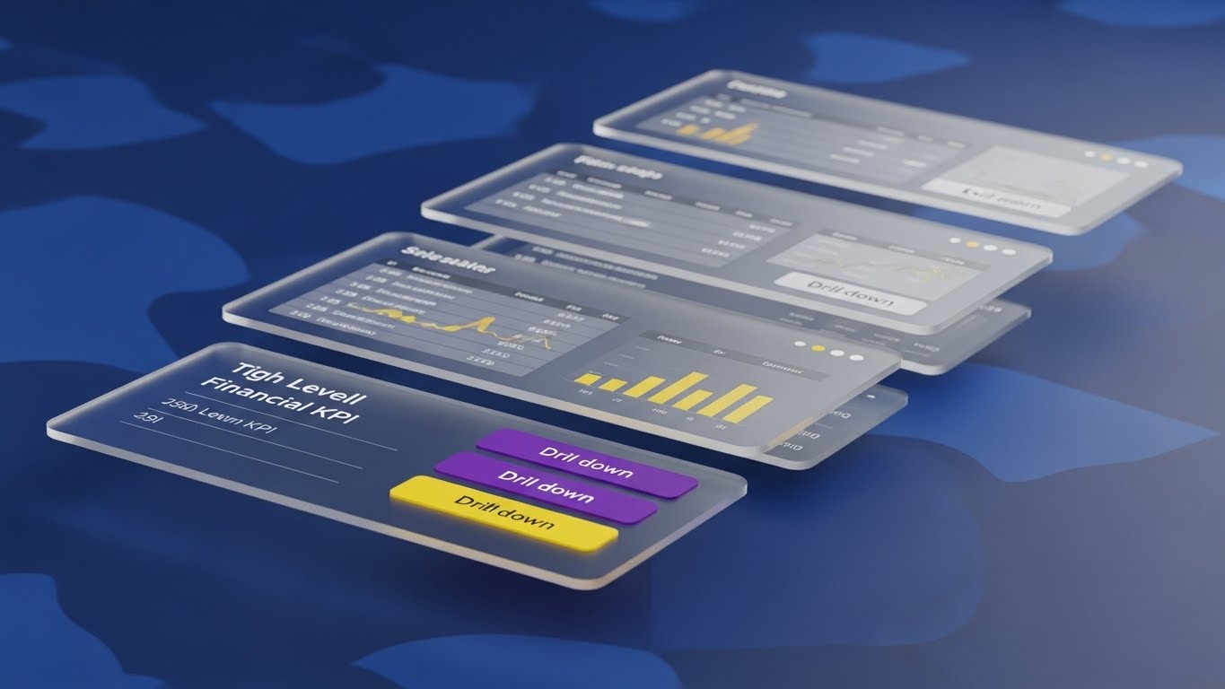
The Visual & Narrative Approach
When static screenshots fail to convey the depth of data, Parallax UI succeeds. Interface screens float in a sapphire blue digital void, arranged in layers. The camera pushes through the top layer (High-Level KPIs), revealing the layers underneath (Drill-down data, Variance Analysis, Source Documents). The glass-like edges of the panels catch the light, creating a premium, high-tech feel that suggests infinite depth.
Psychological Impact & KPI Focus
Niche Psychology: Tax professionals need to know they can "drill down" to the source transaction. A flat image implies surface-level data; a layered 3D image implies Granularity and Auditability.
Operational Impact: It visually represents Drill-Down Capability, reassuring the user that while the dashboard is simple, the underlying data is comprehensive and accessible.
Strategic Implementation & Trade-offs
- Funnel Stage: BOFU (The Economic Buyer).
- Best Use Case: Product Tour videos or Feature Deep Dives.
- Trade-off: It is abstract. Use this to sell the concept of depth, then cut to a Style 9 (Clean UI) to show the actual workflow.
- Duration: 30-45 Seconds.
Companies using similar video content -
Workiva – Audit & Controls Management – Multi-layered depth for audit readiness, granular data.
Corptax – Tax Provision Detail – Granular drill-down for tax data, comprehensive auditability.
17. The Perimeter of Compliance
BOFU | Risk Mitigation

The Visual & Narrative Approach
This style creates a visceral sense of security. A heavy, photorealistic steel vault door stands in a dark environment, lit by dramatic spotlights. Hovering in the foreground is a laser-red holographic grid and a glowing shield icon labeled "COMPLIANCE PERIMETER." The contrast between the heavy physical steel and the sharp digital hologram symbolizes the fusion of robust infrastructure with active, intelligent monitoring.
Psychological Impact & KPI Focus
Niche Psychology: In an era of constant data breaches, this visual triggers a primal sense of Safety. It speaks directly to the fear of non-compliance penalties and data leaks.
Operational Impact: It visualizes Active Monitoring. Unlike a passive firewall, the holographic elements suggest a dynamic system that is constantly scanning for and neutralizing threats.
Strategic Implementation & Trade-offs
- Funnel Stage: BOFU (Risk Mitigation).
- Best Use Case: Security Whitepapers or Trust Center headers.
- Trade-off: The "Vault" is a cliché if not executed with high-end rendering. It must look expensive to convey value.
- Duration: 10-15 Seconds.
Companies using similar video content -
Sovos – Regulatory Reporting – Impenetrable defense for compliance, active monitoring.
Pagero – E-invoicing Network – Secure perimeter for digital transactions, ensuring compliance.
18. The Virtual Analyst
BOFU | Driving Demo Requests

The Visual & Narrative Approach
Sometimes, the best interface is a face. This style uses an ultra-realistic GenAI avatar of a financial analyst to break the "fourth wall." Dressed in a professional blazer within a modern office, the avatar looks directly at the viewer, gesturing openly to a floating graphical element representing tax insights. The expression is warm and inviting, simulating a high-touch consultancy experience rather than a cold software login.
Psychological Impact & KPI Focus
Niche Psychology: B2B buyers often feel isolated during the evaluation phase. This visual creates a Personal Connection, suggesting that the software comes with guidance, support, and "human" understanding.
Operational Impact: It drives Demo Requests. By simulating a conversation, it lowers the barrier to entry, encouraging the viewer to click "Book a Demo" to continue the dialogue.
Strategic Implementation & Trade-offs
- Funnel Stage: BOFU (Driving Conversions).
- Best Use Case: Retargeting Ads on Social Media.
- Trade-off: GenAI avatars can sometimes fall into the "Uncanny Valley." Ensure the lip-sync and facial movements are of the highest commercial quality.
- Duration: 15-30 Seconds.
Companies using similar video content -
TaxBit – Crypto Tax Software – AI-driven guidance for digital asset tax.
Ledgible – Crypto Tax Platform – Expert guidance for complex crypto tax.
19. The Integration Handshake
BOFU | Sales Cycle Acceleration

The Visual & Narrative Approach
To visualize the abstract concept of "Integration," this style mixes reality with digital magic. A close-up shot captures a firm, professional handshake between two executives over a boardroom table. As hands clasp, vibrant yellow 2D vector sparks and a "puzzle piece" connection icon animate over the contact point. The text "INTEGRATION COMPLETE" appears in bold. This blends the human agreement with the technical connection.
Psychological Impact & KPI Focus
Niche Psychology: Implementation failure is the #1 fear for B2B buyers. This visual equates the software integration with a simple, human agreement—quick, positive, and finalized. It signals Ease of Adoption.
Operational Impact: It targets the KPI of Time-to-Value, visually promising that the partnership (and the software connection) will be sealed and functional without friction.
Strategic Implementation & Trade-offs
- Funnel Stage: BOFU (Sales Cycle Acceleration).
- Best Use Case: Email Signatures or "Thank You" pages after a demo download.
- Trade-off: It is symbolic. It does not prove technical integration, but rather relational success.
- Duration: 5-8 Seconds (Looping).
Companies using similar video content -
NetSuite – ERP Tax Integration – Seamless partnership with core financial systems.
Acumatica – Cloud ERP Tax Features – Frictionless integration for tax processes.
20. The Clarity Contrast
BOFU | Reducing Implementation Friction

The Visual & Narrative Approach
The most powerful argument is often a simple comparison. This split-screen composition divides the frame. The left side ("Chaos") is desaturated and blue-tinted, showing a messy desk with piles of paper, a calculator, and coffee stains—the chaos of manual entry. The right side ("Single Source of Truth") is warm, vibrant, and clean, featuring a single laptop displaying a "Cloud Sync" icon. The contrast is stark and immediate.
Psychological Impact & KPI Focus
Niche Psychology: This validates the buyer's pain (the mess) and sells them their dream (the clean desk). It leverages Contrast Bias to make the software seem like the only logical choice to restore order.
Operational Impact: It summarizes the entire value proposition: Efficiency and Accuracy. It visually proves that the software eliminates the fragmented, physical debris of legacy processes.
Strategic Implementation & Trade-offs
- Funnel Stage: BOFU (Final Validation).
- Best Use Case: Landing Pages or Final Sales Decks.
- Trade-off: It can feel slightly "infomercial" if the "Before" side is too exaggerated. Keep the mess realistic to maintain professional credibility.
- Duration: 10-15 Seconds.
Companies using similar video content -
Thomson Reuters – ONESOURCE Tax Automation – Single source of truth vs. manual chaos.
Vertex Inc. – Sales Tax Automation – Eliminating manual entry mess, restoring order.
21. The Open Doorway
Onboarding | Self-Serve Onboarding

The Visual & Narrative Approach
This style strips away the intimidation of complex enterprise software. It utilizes a pristine palette of mint green and pure white to depict a stylized, open doorway on a clean horizon line. There are no clutter, shadows, or complex gradients—just a smooth, straight path leading through the doorway into a bright, hopeful space. It metaphorically represents the "entry" into the system, framing the onboarding experience not as a technical hurdle, but as a welcoming passage into a more organized work life.
Psychological Impact & KPI Focus
Niche Psychology: Tax analysts often dread the "Learning Curve" of new platforms, fearing weeks of frustrating configuration. This minimalist aesthetic leverages Cognitive Fluency, visually promising that the system is intuitive, accessible, and ready for immediate use.
Operational Impact: It supports the KPI of Time-to-Competency. By visually framing the software as "Self-Serve," it encourages users to explore and learn independently, reducing the burden on central training teams.
Strategic Implementation & Trade-offs
- Funnel Stage: Onboarding (User Activation).
- Best Use Case: In-App "Welcome" screens or introductory emails for new user seats.
- Trade-off: The lack of detail means it cannot teach specific workflows. It is purely a mood-setting asset to lower resistance.
- Duration: 5-10 Seconds.
Companies using similar video content -
CCH Axcess – Tax Workflow Solutions – Enabling self-serve tax preparation, intuitive entry.
GoSystem Tax RS – Tax Preparation Software – Welcoming path to efficient filing.
22. The Activation Moment
Onboarding | Trial/Freemium User Activation

The Visual & Narrative Approach
Tax compliance is often viewed as a solitary, high-stress profession. This style counters that narrative by focusing on the team. We see a stylized illustration of two office workers (diverse, modern) high-fiving in a vibrant purple and pink server room environment. Behind them, abstract server racks hum with activity, but the focus is on their joy. The scene captures the "Eureka" moment of a successfully filed return or a balanced ledger, conveying energy and shared victory.
Psychological Impact & KPI Focus
Niche Psychology: Burnout is a major issue in tax departments. This visual appeals to the desire for Professional Validation and connection. It positions the software as a teammate that helps them win, rather than a tool that demands labor.
Operational Impact: The goal is User Activation. By associating the software with positive social emotions (high-fiving), it builds a subconscious preference for logging in and completing tasks.
Strategic Implementation & Trade-offs
- Funnel Stage: Onboarding (Nurture).
- Best Use Case: "Milestone Reached" emails (e.g., "First Return Filed") or internal case study videos.
- Trade-off: Character animation can feel "childish" if not executed with a sophisticated, corporate-appropriate art style.
- Duration: 15-30 Seconds.
Companies using similar video content -
UltraTax CS – Tax Software – Celebrating successful tax season completion.
Lacerte – Tax Preparation – Driving user activation through positive outcomes.
23. The Support Preserver
Onboarding | Knowledge Base

The Visual & Narrative Approach
When a tax professional gets stuck during filing season, panic sets in. This style alleviates that panic. A close-up composition focuses on a stylized orange hand clicking a "Help" button on a simplified blue UI. Instantly, the button emits a burst of supportive icons—hearts, life preservers, and chat bubbles—that float gently upwards. The motion is bouncy and responsive, visually reinforcing that help is immediate, friendly, and just one click away.
Psychological Impact & KPI Focus
Niche Psychology: The fear of being "stranded" with a technical error is high. This visual triggers a sense of Safety. It reassures the user that they are never alone in the platform; the "safety net" is woven into the interface.
Operational Impact: It targets Support Ticket Deflection. By making the "Self-Help" or "Chat" features look inviting and effective, it encourages users to solve problems in-app rather than calling a helpdesk.
Strategic Implementation & Trade-offs
- Funnel Stage: Onboarding (Retention).
- Best Use Case: Support Portal headers or "Help" widget instructional clips.
- Trade-off: It abstracts the support process. It implies a "magical" fix, so the actual support service must live up to this promise of speed.
- Duration: 5-8 Seconds (Looping).
Companies using similar video content -
Bloomberg Tax & Accounting – Research & Guidance – Immediate support for tax questions.
Wolters Kluwer – CCH Tagetik Support – In-app help for complex features.
24. The Velocity Stream
Retention | Accelerating Time-to-Value

The Visual & Narrative Approach
To visualize the global nature of modern tax compliance, this style blends the real world with the digital. We see a hyper-lapse of a bustling financial district at twilight—streaks of red and white car lights rushing through the city. Overlaid on the sky is a stable, sharp network of white data lines and nodes connecting the skyscrapers. The contrast is key: the city is chaotic and fast (the business environment), but the data overlay is fixed, clear, and controlling (the software).
Psychological Impact & KPI Focus
Niche Psychology: Tax Directors often feel like they are chasing the business. This visual flips the dynamic, showing Control amidst Chaos. It suggests the software moves as fast as the market, capturing data in real-time.
Operational Impact: The KPI is Accelerating Time-to-Value. It implies that the system is "always on," capturing value from global operations 24/7 without manual batching.
Strategic Implementation & Trade-offs
- Funnel Stage: Retention (Brand Reinforcement).
- Best Use Case: Social Media Ads (LinkedIn) or Event Background loops.
- Trade-off: It is generic "business" imagery. To make it ownable, the data overlay must strictly follow your brand's specific UI color palette.
- Duration: 10-15 Seconds.
Companies using similar video content -
GTreasury – Treasury & Risk Management – Global grid for financial velocity.
Kyriba – Liquidity Management – Accelerating time to value in global finance.
25. The Sphere of Perfection
Retention | Reducing Support Overhead

The Visual & Narrative Approach
In tax, accuracy is not a feature; it is the product. This style uses high-end 3D rendering to visualize "Perfection." A flawless, transparent glass sphere rests on a pristine white surface. Inside, a soft, glowing blue core pulses gently, representing the active intelligence of the system. The lighting is softbox studio quality, creating elegant reflections on the glass. This abstract object represents "Transparency" and the self-contained, self-healing nature of the support ecosystem.
Psychological Impact & KPI Focus
Niche Psychology: This speaks to the Perfectionist trait of tax professionals. It validates their standard of work. The visual purity of the glass object creates a feeling of calm and "cleanliness" regarding the data.
Operational Impact: It targets Reducing Support Overhead by subliminally communicating that the system is bug-free and self-sustaining. It builds high trust in the calculation engine's integrity.
Strategic Implementation & Trade-offs
- Funnel Stage: Retention (Trust Building).
- Best Use Case: Website "Technology" backgrounds or Premium Service tier branding.
- Trade-off: It is purely metaphorical. It establishes a premium feeling but communicates no functional information.
- Duration: 10-20 Seconds.
Companies using similar video content -
Aptitude Software – Tax Engine – Ensuring data integrity for tax calculations.
Corptax – Data Management – Flawless accuracy in corporate tax.
26. The Trust Chain
Retention | Building Trust

The Visual & Narrative Approach
The "Audit Trail" is usually a boring log file. This style turns it into a symbol of strength. We see a chain composed of interlocking geometric shapes in steel blue and silver stretching across the frame against a neutral grey background. The chain is taut and unbreakable. As it moves, new links seamlessly click into place. The aesthetic is flat but uses subtle gradients to suggest metallic strength, visualizing the concept of an "Unbroken Audit Trail."
Psychological Impact & KPI Focus
Niche Psychology: The fear of a "broken link"—a missing receipt or untracked adjustment—keeps Tax Directors up at night. This visual provides Reassurance. The unbroken chain visualizes a system where data loss is impossible.
Operational Impact: It reinforces Building Trust and Compliance Reliability. It visually guarantees that the history of every transaction is locked, secure, and retrievable.
Strategic Implementation & Trade-offs
- Funnel Stage: Retention (Account Expansion).
- Best Use Case: Email Footers for "Audit Season" tips or Compliance Newsletters.
- Trade-off: Chains can sometimes imply "restriction." Ensure the motion is smooth and forward-moving, not static or binding.
- Duration: 8-12 Seconds.
Companies using similar video content -
Workiva – Audit Management – Proving audit reliability with an unbroken chain.
BlackLine – Transaction Matching – Secure, traceable audit trails.
27. The Culture of Compliance
Retention | Reducing Churn

The Visual & Narrative Approach
Software adoption is ultimately about people. This style uses candid, high-quality photography to show the "After State" of a happy tax team. We see a diverse corporate group laughing and celebrating in a sunlit, glass-walled conference room. On the whiteboard behind them, blurred charts show upward trends. The lighting is warm and natural. It moves away from "people pointing at computers" to "people enjoying their work."
Psychological Impact & KPI Focus
Niche Psychology: With high turnover in the tax sector, leaders are desperate to improve Employee Experience. This visual suggests that using your software leads to a happier, less stressed, and more cohesive team.
Operational Impact: The KPI is Reducing Churn (both of the customer and their employees). It positions the platform as a tool for talent retention by removing the drudgery of manual work.
Strategic Implementation & Trade-offs
- Funnel Stage: Retention (Relationship Deepening).
- Best Use Case: Annual Business Reviews (QBRs) or "Customer Appreciation" campaigns.
- Trade-off: Stock footage can feel inauthentic. Select images that feel candid and "imperfect" rather than staged studio shots.
- Duration: Still Image or Slow Zoom (5 Seconds).
Companies using similar video content -
FloQast – Financial Close Management – Happy teams, reduced stress in finance.
Trintech – Reconciliation Software – Improving employee experience in accounting.
28. The Expansion Module
Expansion | Driving Upsell
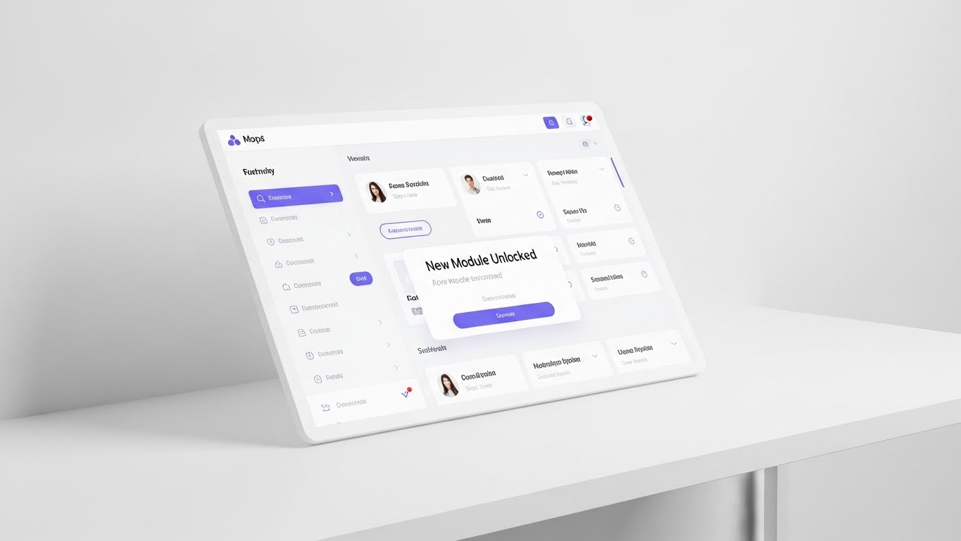
The Visual & Narrative Approach
Upselling new modules (e.g., Transfer Pricing or VAT) requires showing how easily they fit into the existing workflow. This style features a pristine, high-key image of the UI on a minimalist white desk. The screen, rendered in soft lavender and white, shows a sleek pop-up modal announcing "New Module Unlocked." The surrounding environment is airy and uncluttered, suggesting that adding complexity to the subscription does not add clutter to the workspace.
Psychological Impact & KPI Focus
Niche Psychology: Buyers fear "feature bloat." This visual uses White Space to communicate that the new module is a lightweight, elegant addition, not a heavy burden. It triggers the "shiny new object" dopamine response.
Operational Impact: It drives Upsell and Expansion. By making the upgrade look like a simple "unlock" rather than a complex installation, it lowers the psychological barrier to purchasing additional features.
Strategic Implementation & Trade-offs
- Funnel Stage: Expansion (Cross-Sell).
- Best Use Case: In-App notifications or "What's New" product update emails.
- Trade-off: It must accurately reflect the UI. If the actual software is gray and clunky, this pristine render will create a disconnect.
- Duration: Still Image or 5-Second Reveal.
Companies using similar video content -
Thomson Reuters – ONESOURCE Indirect Tax – Simple upgrade for new tax types.
Vertex Inc. – Payroll Tax Module – Driving expansion revenue with add-ons.
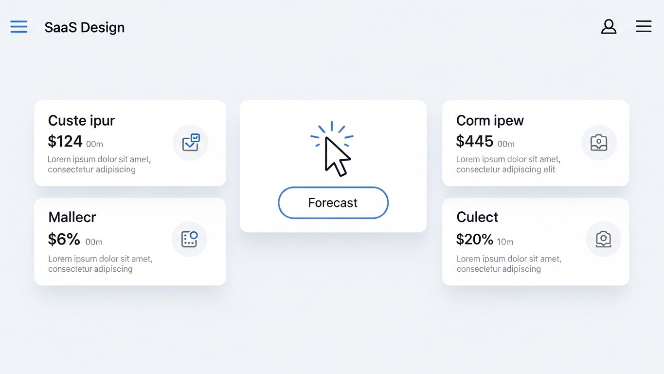
29. The Feature Focus
Expansion | Driving Deep Feature Adoption

The Visual & Narrative Approach
To encourage users to try deep features, you need to make the interaction feel satisfying. This style uses an extreme macro close-up of a specific UI element—a teal button labeled "Adoption" (or a specific feature name like "Forecast"). We see the button in a depressed state (being clicked), with a subtle ripple effect radiating outwards. The focus is intense, blurring the background, making the specific action the hero of the frame.
Psychological Impact & KPI Focus
Niche Psychology: It appeals to the Tactile sense. Even in digital software, "feeling" the click creates a sense of responsiveness and control. It makes the software feel tangible and high-quality.
Operational Impact: The goal is Driving Deep Feature Adoption. By highlighting a specific button or toggle, you direct the user's attention to underutilized features, encouraging them to click and explore.
Strategic Implementation & Trade-offs
- Funnel Stage: Expansion (Feature Utilization).
- Best Use Case: Tooltips, Feature Highlight blog posts, or release notes.
- Trade-off: Requires high-resolution asset generation. Blurry pixels at this zoom level destroy credibility.
- Duration: 3-5 Seconds.
Companies using similar video content -
Alteryx – Analytics for Tax – Increasing adoption of specific tax data features.
Microsoft – Power BI for Tax – Highlighting deep feature utilization.
30. The Referral Radius
Expansion | Driving Referrals
The Visual & Narrative Approach
This final style visualizes the community aspect of the platform. It hybridizes the Clean UI with an abstract network view. We see miniature UI screens arranged in a circle, connected by glowing green lines to a central globe. This illustrates that the user is part of a larger ecosystem of tax professionals. It reframes the software from a "tool" to a "standard" used by the industry's best.
Psychological Impact & KPI Focus
Niche Psychology: Tax leaders trust their peers above all else. This visual creates Social Proof and a sense of belonging. It implies, "Everyone is connected here; why aren't you?"
Operational Impact: It supports Driving Referrals. By visualizing the network, it subtly encourages users to invite colleagues or advocate for the platform in their professional circles.
Strategic Implementation & Trade-offs
- Funnel Stage: Expansion (Advocacy).
- Best Use Case: "Refer a Peer" landing pages or Community Forum headers.
- Trade-off: It can look like a "network topology" diagram if not careful. Keep the UI screens visible to ground it in the product experience.
- Duration: 10-15 Seconds.
Strategic Knowledge Base: The Visual Operations Doctrine
To transition from "Video Style" to "Business Outcome," we must operationalize these visuals. The following three strategic segments outline how to embed this visual language into the DNA of your Tax Operations, moving beyond marketing to drive adoption, compliance, and ROI.
STRATEGIC ALIGNMENT & VISUAL ARCHITECTURE
The "Pre-Production" Strategy. Why visual consistency is a compliance asset.
- The Cognitive Load Audit: Corporate tax codes are inherently complex. Before commissioning a video, audit the "Cognitive Load" of the feature being explained. If the regulation is dense (e.g., Pillar Two), use Style 1 (Isometric Map) or Style 9 (Low Poly) to simplify the structure before showing the interface.
- Role-Based Visual Mapping: Differentiate your visual strategy by persona. For the CFO, use Style 6 (Dynamic Data Viz) to show high-level trends and ROI. For the Tax Analyst, use Style 19 (Rapid UI Montage) to demonstrate batch processing speed. Do not bore the CFO with UI; do not confuse the Analyst with abstract gold bars.
- The "Glanceability" Standard: During filing seasons, tax teams are under extreme stress. Visual assets (in-app tooltips, help videos) must meet a "Glanceability" standard—comprehension within 5 seconds. Use Style 29 (Macro UI) for these moments to focus attention instantly on the solution.
- Brand Voice Consistency: Your visual language must be the "Source of Truth." If your marketing videos use "Neon/Dark Mode" (Style 3) but your product is "Light/Airy" (Style 15), you create a disconnect that breeds distrust. Advids recommends establishing a "Visual Concordance" document that aligns marketing aesthetics with product reality.
- The Advids Strategic Audit: We partner with tax software vendors to define this "Visual Operating System" before a single frame is rendered. We ensure that your visual metaphors (e.g., "The Shield" for security, "The Chain" for audit) are consistent across all 30 styles.
- Standardization vs. Customization: For core features (VAT calculation), use standardized, scalable styles (Style 28). For unique, high-value differentiators (AI-driven forecasting), invest in bespoke, high-end motion graphics (Style 4 - Untangler) to signal premium value.
- The Cross-Departmental Bridge: Use these visuals to unify terminology. Sales, Ops, and Support often use different words for the same tax event. A shared visual library (e.g., "The Fluid Consolidation Engine" - Style 2) forces the entire organization to visualize the process identically.
- Legacy System Integration: Many clients are migrating from on-premise ERPs. Use Style 7 (The Disruption Wall) or Style 27 (Split Screen) to visually acknowledge their "Legacy Pain" before presenting the "Cloud Cure." Validating their current reality builds trust.
- Accessibility in Global Tax: Tax teams are global. Motion graphics with text overlays (Style 8) are easier to localize than voiceover-heavy live action. Design your text layers for easy translation into Spanish, German, and French to support multi-jurisdictional rollout.
- The Mobile-First Mandate: While tax is done on desktop, decisions are often made on mobile. Ensure all 30 styles—especially the Executive Dashboards (Style 15)—are legible on a smartphone screen for the CFO reviewing status reports in transit.
OPERATIONAL ADOPTION & IMPLEMENTATION
The "Deployment" Phase. Embedding visuals into the tax workflow.
- Overcoming "Black Box" Anxiety: Tax professionals are skeptical of AI they can't verify. Use Style 13 (X-Ray) or Style 6 (Blueprint) to "open the box" and visually demonstrate how the calculation was derived. Transparency accelerates adoption.
- The Micro-Learning Shift: Replace the 200-page PDF manual with a library of 30-second clips. Use Style 29 (Macro UI) for specific tasks like "How to export an audit log." These "Micro-Assets" should be embedded directly into the software's "Help" widgets.
- Just-in-Time Support: Embed Style 23 (Support Preserver) visuals into error messages. Instead of a generic "Error 404," show a short loop of how to fix the data entry error. This reduces frustration and support ticket volume.
- Gamification of Training: Use Style 22 (Activation Moment) visuals to reward users for completing training milestones. A visual "High Five" or "Unlocked" animation triggers a dopamine release that encourages further learning.
- Reducing Support Ticket Volume: There is a direct correlation between the quality of your visual library and your support costs. Proactive visual guides (Style 19) answer "How-To" questions before the user calls the helpdesk.
- Remote Onboarding: Global rollouts often happen without on-site consultants. Use Style 1 (Logistics Map) and Style 16 (Deep Dive Parallax) to create an immersive "Virtual Onboarding" experience that simulates a guided tour.
- Standard Operating Procedures (SOPs): Transform text-based SOPs into visual process flows (Style 10 - Isometric Workflow). Visuals are processed 60,000x faster than text, ensuring that standardized filing procedures are actually followed.
- Feedback Loops: Use interactive video elements. After a Style 28 (Expansion Module) video plays, prompt the user with a simple "Did this help?" button. This data is invaluable for refining your product roadmap.
- Scalable Localization: When expanding to new regions (e.g., LATAM e-Invoicing), you don't need to reshoot. Simply swap the UI screens and text layers in your Style 11 (Global Map) assets. This allows for rapid market entry.
- Leadership Communication: Use high-end Style 5 (Cinematic) or Style 12 (Shield) visuals in your Executive Business Reviews (EBRs). These assets communicate "Partnership" and "Security" far better than a spreadsheet ever could.
MEASURING IMPACT & FUTURE-PROOFING
The "ROI" Phase. Measuring success and looking ahead.
- Beyond "Views": Do not measure success by video views. Measure it by Time-to-Competency. Did the user who watched the Style 29 video file their return faster than the one who didn't?
- The "Idle Time" Metric: High-quality visualization reduces "Software Idle Time"—the time users spend staring at the screen confused. Use visuals to keep the workflow moving.
- Compliance Velocity: How fast can your client base adapt to a new regulation (e.g., a VAT rate change)? A well-deployed Style 4 (Untangler) video can explain the change and the software's solution in seconds, ensuring rapid compliance.
- Retention and Churn: Clients who engage with your educational content are less likely to churn. Use Style 27 (Culture of Compliance) to remind them of the human value your software provides—peace of mind and time savings.
- The AI Visual Frontier: Prepare for the future where GenAI creates custom tutorials on the fly. Your Style 30 (Hybrid UI) assets are the precursor to a fully interactive, AI-driven support agent.
- Scalability of Assets: Build a "Visual Component Library." If you change your brand color, you should be able to update it across Style 1, 10, and 26 instantly. Design for modularity.
- The Advids Partnership: Building this library is not a one-time project; it is an ongoing operational strategy. Advids acts as your long-term partner, managing the scalability, localization, and evolution of your visual assets as your software grows.
- Benchmarking Success: "Good enough" visuals are a competitive risk. If your competitor uses Style 16 (Deep Dive) to show audit trails and you use a screenshot, you lose the trust battle. Visual quality is a proxy for product quality.
- The ROI of Safety: In tax, "Safety" means avoiding penalties. Quantify the value of the Style 12 (Shield). If your visual education prevents one major non-compliance fine, the ROI of the entire video program is secured.
- Final Call to Innovation: Treat video not as "marketing content" but as Digital Infrastructure. Just as you invest in your server architecture, invest in your visual architecture. It is the interface through which the market perceives your value.
Companies using similar video content -
DATEV – Tax & Accounting Network – Global hub for peer referrals in Germany.
Unitax – German Tax Software – Building community among tax professionals.
Author & Editor Bio


